Abstract
The planning of bicycle infrastructure across our cities remains a complex task involving many key stakeholders, including the community, who traditionally have had limited involvement in the planning process. This research develops an interactive bicycle prioritisation index tool which includes participatory spatial and textual citizen feedback. The research involves three components. Firstly, results of a survey of current cyclists in Sydney (n = 280), their current level of participation, priorities in investment in cycling and preferred locations for cycling infrastructure. This survey was undertaken between May and June 2020. Secondly, it documents the development of an interactive, digital bicycle planning tool which is informed through citizen feedback. Thirdly, it evaluates the approach in conversation with potential end-users, including government, planning practitioners, and advocacy group members. A clear preference for active participation mechanisms (86%) was articulated by current cyclists, as opposed to a reliance on the existing data available and passive data. The resulting tool was understood by interview participants and documented both existing utility and future work needed for practical implementation of similar systems. The research proposes the combination of multiple passive and active data traces with end-user evaluation to legitimise the citizen co-design of bicycle investment prioritisation initiatives. A case study approach was taken, focusing on the city of Sydney, Australia. The bicycle planning support system can be used by cities when engaging in cycle prioritisation initiatives, particularly with a focus on integrating citizen feedback and navigating the new and complex data landscapes introduced through recent, passively collected big data sets.
1. Introduction
All aspects of human life in cities rely on efficient and equitable transport. Without it, people cannot access employment, essential services, such as health and education, goods, such as fresh food, or each other to form the strong relationships which increase the economic productivity of society, our safety and our wellbeing. However, transport infrastructure is a public good—it will not be built without adequate government planning and public funding. As such, good public policy must leverage limited resources to achieve the best outcomes for citizens while balancing competing priorities.
Transport policy must prioritise more than just limited funding—it must face the challenge of allocating fixed amounts of space between cars, public mass transport and people. Prioritising public mass transport and active transit (cycling and walking) makes people healthier and happier [1]. Cities that give cars priority over people hurt property values and economic success [2,3]. However, many cities around the world, such as Australian cities, still allocate the majority of transport funding and policy effort to cars [4], resulting in the widening of freeways and roads. Conversely, there has been limited research and development of evidence-based tools in academic literature that support the planning of bicycle infrastructure in the Australian context.
This imbalance in the quantification of modes of transport is changing. Data about movements are collected from a wide range of sources—collection methods can be ‘purposeful’ or ‘active’ surveys or counting mechanisms or data collection from ‘organic’ or ‘passive’ data sources, such as third-party apps and services. Data collection from these apps and services has, in emerging research on surveillance and mobility, been identified as potentially non-transparent about commercial motives—whereby data from individual users are sold on to third parties with disregard to informed consent about how they are used [5,6,7]. Recent research on the use of natural language processing for social media listening has also suggested that people would prefer active ways to contribute opinions on transportation to primarily passive data collection, and this should be seen as a complementary data source [8].
In cities with low cycling rates, such as this research’s context in Australian cities, it is difficult to truly understand cyclists’ and potential cyclists’ desires from limited, opportunistically collected data [9]. Further, reliance on such data sources potentially leads to under-representation of groups who would cycle more if they had access to increased provision of infrastructure, such as separated bicycle lanes [9]. As such, decision-makers may not be able to see the whole picture. Official and available data sources inform policy decisions—if these data are wrong or incomplete, decision-makers will not make good decisions that balance priorities appropriately. It is important to investigate how the transport priorities of cyclists can be better collected and understood through the fusion of available data sources and increasing availability of digital tools.
This research investigates an approach that builds on previous investigations of public participation geographic information systems (PPGIS) [10]. These systems and technologies are currently used in research and practice to engage cyclists and collect information to inform cycling infrastructure prioritisation. In the context of Australia, PPGIS have had mixed uptake by local councils, who would obtain feedback from citizens on predetermined cycle routes already planned by transport planners. However, such tools do not generally capture the citizen priority routes and do not provide metrics on the likelihood that more people will cycle on a particular new piece of bicycle infrastructure if it is incorporated in the existing cycling network. In this context, this research endeavours to make a new contribution in the development and evaluation of a participatory planning support system.
The research proposes an approach for collecting data about cyclists’ (and potential cyclists’) priorities to help inform these decisions through a participatory analytics approach.
The study seeks to answer the following two research questions (RQs):
- RQ1
- —What are the existing passive and active participation mechanisms for collecting data on cycling behaviour and preferences?
- RQ2
- —How can these data be integrated within a participatory planning support system to better understand and communicate priorities for existing and potential future cyclists?
These research questions will be examined in the context of the city of Sydney, Australia. The remainder of the paper is structured as follows. First, it will describe the background to the research—in terms of data analysis approaches, data collection and digital approaches to cycling participation (Section 2). It will then outline the method of three different stages of this research to investigate these questions—a web survey, tool development and interviews (Section 3, Section 4, Section 5, Section 6 and Section 7). Following this, it will discuss the results (Section 8, Section 9 and Section 10), relevance of the findings and future implications on research and practice (Section 11 and Section 12).
2. Background
2.1. Data Analysis Approaches
The process of data analysis is commonly perceived to be a highly skilled activity that requires training in specific tools, as well as a high level of literacy and numeracy to do well. It can be time-consuming, tedious and mistakes can easily be made. Consequently, the process of data analysis is often excluded from public participation processes. Further, it can be argued that assigning analysis tasks to communities may be an inefficient use of a limited resource (particularly if researchers, experts and practitioners are already trained to take on these tasks; [11]. However, rather than adopting a deficit model (i.e., considering community members to lack skills or knowledge in particular areas), many researchers are finding ways to build on the wealth of community knowledge by engaging them in accessible analysis opportunities [11]. Such avenues have been explored by ([12], p. 7), who used the term ‘participatory data analytics’ to describe ‘development of interfaces to support collaborative, community-led inquiry into data’. Furthermore, the field of visual analytics specifically explores how visual interactive interfaces can support analytical reasoning [13]. In this context, the purposeful and opportunistic use of data for better city planning should be considered.
2.2. Data Collection
In many ways, citizens may be contributing to data analysis processes for city planning indirectly. In Australia—and many parts of the world—application services, such as Strava (an application used to record physical activity), TomTom and mobile phone providers, collect user data and re-package them for various urban planning purposes, such as for use by transportation planning authorities. The movements of users are distilled into metrics which help to inform infrastructure investment scenarios. A potential issue with this form of participation has been described as a ‘big data divide’ [14]. This is characterised by a lack of access to individuals’ own, passively collected data, as well as the analytical capabilities to understand how other organisations may be using it and a lack of means to validate the correctness of the assumptions and insights generated by its use [14]. On the other hand, purposeful data collection, such as national censuses and household travel surveys, is cross-sectional but potentially more likely to be aligned directly to citizens’ needs. However, these methods do not capture the same intricate details about the network’s use on a day-to-day basis or in response to certain events. As such, the participatory analytics approach described in this paper involves engaging end-users in interacting with organic (or ‘passive’) and purposeful (or ‘active’) data collected in a variety of ways and in designing and evaluating the digital interfaces within a cycling context in the city of Sydney, Australia.
2.3. Digital Approaches to Cycling Participation
As found by Falco and Kleinhans [15], academic literature has only provided a limited overview of digital participation platforms (DPPs) to date. This is characterised by a few demographic and spatial contexts and does not account for the significant volume of DPPs that have been used and developed in planning practice globally over the past decade. There has been a significant uplift in the technology available to perform digital engagement exercises. The authors highlight 113 active DPPs, which they identify, analyse and classify within a citizen–government relationship typology. This chapter focuses on DPPs related to cycling.
One term related to DPPs, specifically focusing on geographic data collection, is participatory planning geographic information systems (or PPGISs), which were originally developed and applied in the context of cities 20 years ago as a platform to better connect citizens with the planning process [16]. These are geographic information systems that enable local knowledge production through the creation of spatial data by local and non-government groups. In the context of bicycle planning, one popular approach to PPGISs for collecting public opinion is through a ‘pinboard’ approach. This approach allows users to drop a pin at an explicit location and provide a combination of tags (for example: like/dislike, safe/unsafe, attractive/unattractive) and comments.
One influential example of this for cycling has been Shareabouts [17], an open-source, participatory mapping platform. Shareabouts was developed from work by OpenPlans and the Department of Transportation in New York City. The project enabled thousands of crowdsourced ideas to be collected on the location of new stations for a new, large-scale bike-share system in the city. Many cycling participation applications have used Shareabouts’ open-source technology or similar. Crowdspot worked with the City of Melbourne in developing their Bicycle Plan for 2016 to 2020. Rather than bike-share locations, this system collected ideas, issues and ‘likes’. Since then, the same organisation has also adapted this map to assess the safety of the network on a greater, metropolitan scale.
Bikemaps.org is another PPGIS developed specifically for users to report near misses, hazards and thefts. Insights derived from the developers of the platform indicated that crowdsourced collision data can complement, as well as fill in the gaps of, existing official reports. It also found that crowdsourced reporting of near-miss collisions may be influenced by user perceptions of risk [18,19]. Other platforms, such as Maptionnaire, developed in Helsinki, are similar to Shareabouts but engage users in more detailed survey collection mechanisms, allowing users to navigate some descriptive, spatial data layers while making comments. An example of Maptionnaire’s application was in Spring 2017, when Caltrans (Californian Department of Transportation) conducted an online survey using Maptionnaire. This survey collected public opinion on needs, issues and recommendations for the Bay Area, San Francisco. Approximately 5000 individuals visited the interactive tool, playing a total of approximately 20,000 recommendations on the map—also later informing that region’s bicycle plan.
In terms of mapping passively collected data, companies such as Uber are publicly releasing data as part of their ‘city mobility campaign’ to show their bike volumes in the city [20]. This is intended to show where their system of shared bikes and scooters are used most to help inform cities’ decisions about where infrastructure opportunities exist, advocating a better network for their delivery partners. There are also research-led dashboards that provide transparent mechanisms to understand crowdsourced, voluntarily contributed cycle behaviour data; for example, the Riderlog dashboard for Australian cities [21].
Decoupled from active participatory input but available to the public online, digital planning tools, also known as planning support systems (PSSs), have typically facilitated indirect citizen involvement through the use of survey or movement data. The Impacts of Cycling Tool (ICT) is an open-source PSS with a simple web interface. The PSS uses travel survey data to model scenarios of cycling uptake among different segments of the population; including the impacts this would have on greenhouse gas emissions and health [22]. In a similar vein, the Propensity to Cycle Tool [23] is another example of a PSS which incorporates a web interface for users to understand current cycling use and areas with the most potential to grow under different scenarios. As well as potential to cycle, prioritisation indices have also been developed, such as the work of Larsen et al. [24] for Montreal, Canada. The authors produced an area-based prioritisation index for cycling prioritisation based on four variables—current cycling, cycling potential, injuries and locations suggested by current cyclists.
The earlier examples of PPGISs generally do not provide a clear pathway for how and where these citizen data are to be transformed into outcomes of a later analytical exercise. In addition to this, when participants provided feedback, they were exposed to limited contextual data which may have been useful in assisting them in making an informed comment. On the other hand, the PSSs described after this generally did not integrate direct citizen feedback. Rather, these tools relied on existing survey data, passive data and network characteristics. As well as this, many of the available PPGIS or PSS tools, focused on one particular aspect of the network, participating in one type of cycling infrastructure or one type of cycling incident (e.g., safety).
As such, this research examines a potential digital intervention that combines both active and passive citizen data in a singular interface. This interface is intended to be used by practitioners as a planning support system and by citizens as a participatory tool to view other citizens’ voices and explore the effect of alternate investment priorities on the network.
3. Method
The method for this case study is outlined by the workflow described in Figure 1. The case study was designed to investigate the active and passive data traces that are currently used by cyclists and those potentially interested in cycling. These were then combined into a technical tool. This was then shown to experts and those interested in giving more detailed input. Conceptually, this process was then reiterated until multiple aspects (active–long, active–short and passive) of participation were achieved. As such, several participation outlets were explored to design the final tool and create local planning decisions.

Figure 1.
Workflow of case study.
This research used a mixture of methods to allow a combination of numerical measurements and in-depth exploration. The first RQ1 relates to existing passive and active participation mechanisms and priorities for existing and potential cyclists in Sydney. In exploring this, both quantitative insights to rank and order these and qualitative insights to explore more overarching themes and issues were achieved. As such, a survey instrument was used to collect this data. In order to understand RQ2 and whether participation inputs are used in a meaningful way, more detailed qualitative feedback was required. This was obtained through more in-depth, one-on-one interviews.
Each stage of the research process analysed the previous stage—the digital tool analysed the participant input, and the interviews analysed the digital tool. Following this, the interviews and overall research were analysed.
4. RQ1—Existing Passive and Active Participation Mechanisms and Priorities
The first stage of this study was to conduct a web survey to capture elements which may influence participation in cycle planning in Sydney. This survey was created using the ArcGIS Online Survey123 platform, which allows spatial data to be captured alongside traditional survey questions. A snowball sampling method was used—the researcher sent the survey link to other researchers, transport planning practitioners, cycling advocacy groups and local and state government workers to distribute to potential participants. The survey began on 11 May 2020 and finished on 14 June 2020, when a sample of 280 was achieved. The first 250 respondents participated within the first two weeks. The full survey can be found in Appendix A. Initial background questions of survey participants included the following:
- Previous cycling experience, trip purposes, trip frequency and physical and navigational confidence;
- General engagement in cycle planning (through apps, surveys, meetings) in both active and passive terms;
- Satisfaction with current network and participation mechanisms;
- Preferred engagement format (passive or active);
- Observations of changes to cycling behaviour as a result of COVID-19 (expanded separately to this chapter; see [25].
Further to these background questions, a participation exercise was also embedded in the survey. This involved two components. Firstly, there was a prioritisation exercise, in which participants ranked the importance of the following factors:
- (1)
- Building more separated cycleways (off-road and away from traffic);
- (2)
- Creating a continuous network that does not stop and start;
- (3)
- Designing safer environments in areas where crashes and collisions have occurred;
- (4)
- Building and upgrading infrastructure where the most people cycle;
- (5)
- Building and upgrading infrastructure to specifically support commuter cyclists;
- (6)
- Building infrastructure where the gradient or slope is easy to ride;
- (7)
- Building infrastructure in critical locations that will encourage new people to ride bicycles;
- (8)
- Building infrastructure close to train stations.
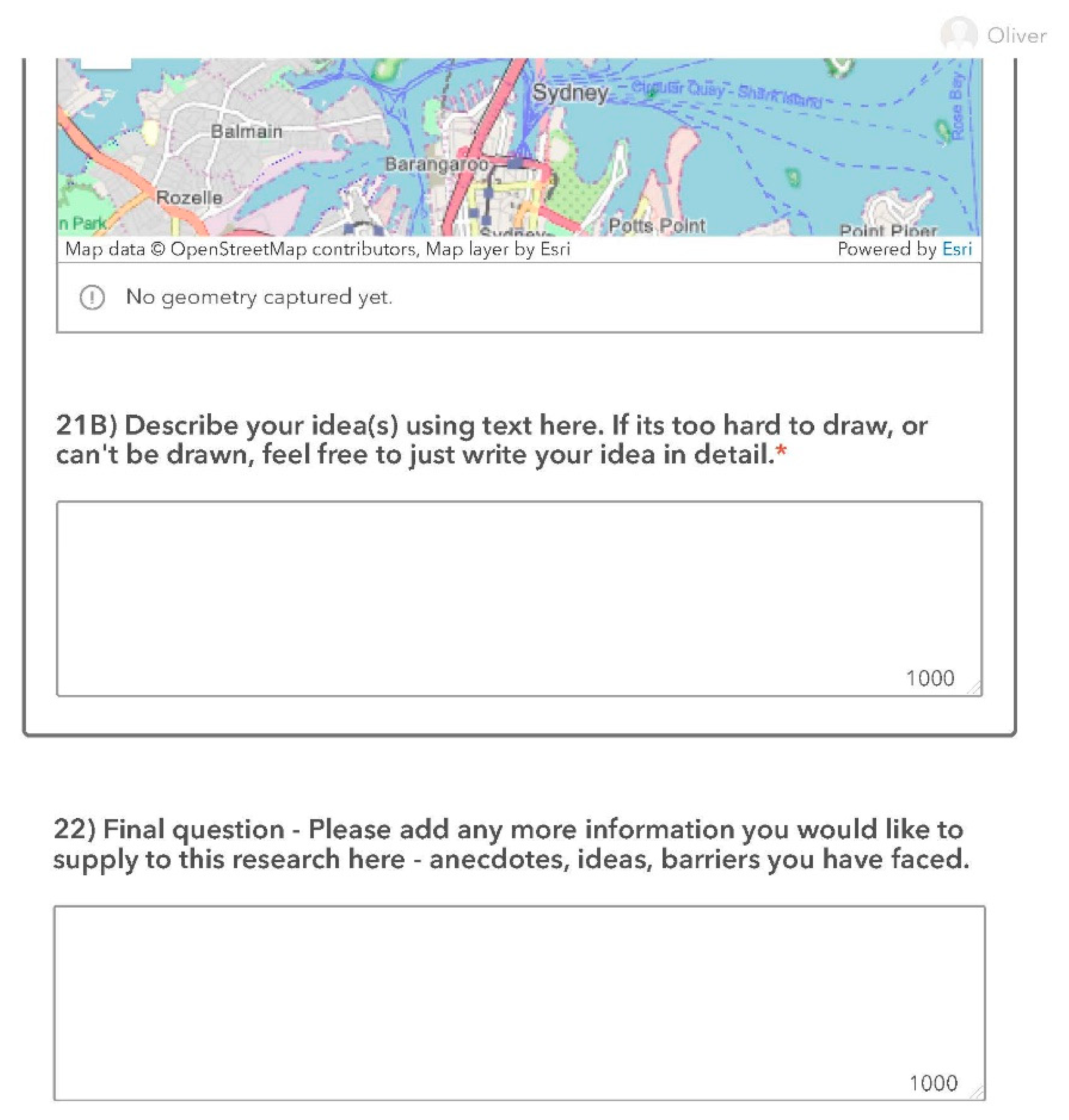
This was assessed using a Likert scale for each criterion, as well as a question asking for the single most important factor to focus on. The second component of the participation exercise was to ask participants to draw their top cycling improvement for Sydney. Here, participants were asked to draw one specific shape with some accompanying text (see Figure 2). The only restriction was that only one drawing was permitted—part of the research was to analyse how people responded to this and the various forms by which participants commented.
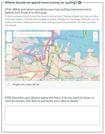
Figure 2.
Question asking participants to draw their improvement.
5. RQ2—Integrating into a Participatory Planning Support System for Cycling
5.1. Design
Spatial Collation
The second stage of this work fed the prioritisation and spatial results from the survey into a prioritisation index (PI) for cycling investments, expanding on the prioritisation elements developed by Larsen et al. [24]. The results were made into a participative, multicriteria GIS analysis [26]. A full description of these data sources can be found in Appendix B. An image summarising these layers can be found in Figure 3.
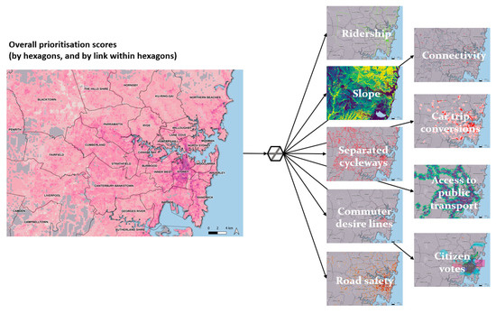
Figure 3.
The nine criteria used in participatory prioritisation index.
The criteria included the following:
- Priority should be given to areas with limited off-street cycleways;
- Priority should be given to areas that connect the existing network of off-street cycleways;
- Priority should be given to improving the safety of areas where cyclists have crashed;
- Priority should be given to areas where the highest volumes of cyclists use the network;
- Priority should be given to corridors that are currently used for commuting purposes;
- Priority should be given to areas within a 10 min cycle of a train station;
- Priority should be given to areas with a cyclable gradient;
- Priority should be given to areas which will potentially convert short car trips to bike trips;
- Priority should be given to areas where citizens voted or drew ideas for improvements.
Following the creation of these nine spatial layers, the layers were collated into hexagonal units for the city of Sydney. These hexagonal units were generated for the extent of Greater Sydney, with each approximate 100 metre square of the city covered by a unique hexagon. Each hexagonal unit received a score of 0, 1 or 2, depending on how well they fitted the above criteria. These are described in more detail in Appendix B. It is worth noting that the tool enables dynamic prioritisation—as such, the scoring system focused on natural/thematic breaks within the data that highlight key trends. While the scoring system as it is presented findings, these are meant to be discussion points, dynamic and iterative as part of this research.
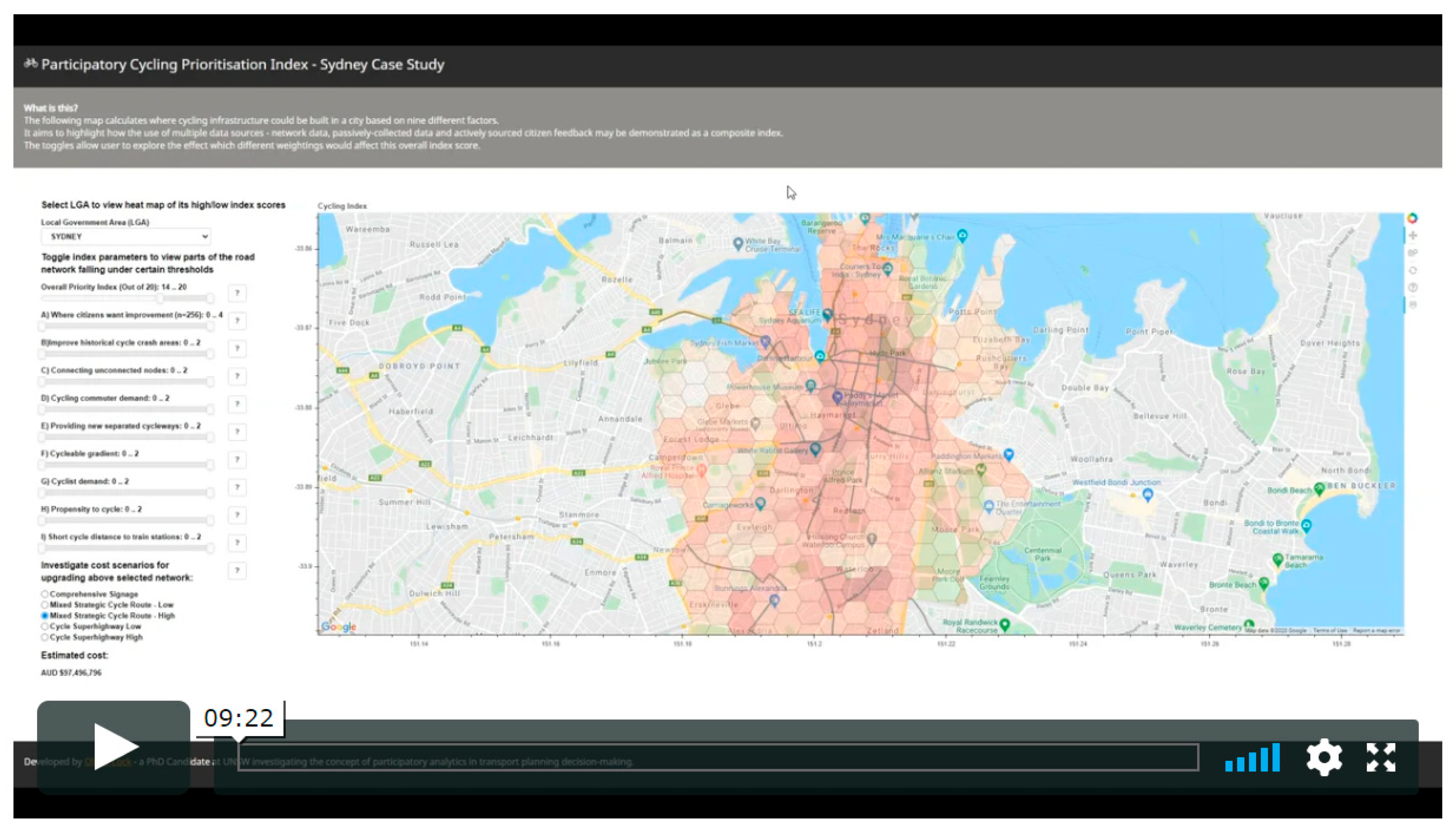
6. Dashboard Development
An interactive tool was developed to communicate the results of the participatory prioritisation index. This is described in Figure 4. The tool was developed using Bokeh (bokeh.org), a Python visualisation library.
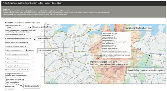
Figure 4.
Screenshot of tool with labels of key features.
The tool allows users to do the following:
- Select individual councils and view a heatmap of prioritisation in the area;
- Toggle each prioritisation criteria to be ‘more important’ or ‘less important’;
- Investigate which road areas score most highly on a customised prioritisation index;
- Investigate the impact of citizen votes on a prioritisation index;
- Investigate potential costing scenarios;
- View scorecards of how particular hexagonal units perform on the index;
- View details on the metric calculations.
One of the unique features of this tool was the ability to view the most relevant citizen comments for each hexagon. This was done by selecting the comment relating to the participant-drawn shape that had the highest proportion of its total area fitting within the hexagon. As such, a prioritisation process was also embedded in comments, allowing the most relevant comments about specific areas to be shown in those areas and more general comments to be shown in all others around them.
7. Evaluation
7.1. Semi-Structured Interviews
The third component of this research involved semi-structured interviews giving feedback on the first component (survey) and second component (tool) used in this study. Theoretically, this was to understand the lengthy, deliberative input that could occur at the later end of this process to inform reiterations of the participation process until a satisfactory process was achieved. In a practical sense, this also allowed an understanding of whether end-users considered the results of the survey to be useful, which aspects were surprising and their thoughts on extensions and potential applications of the interactive tool.
7.2. Interview Sampling
Invitations were sent to approximately 20 of the survey respondents and an additional ten people who were actively engaged in cycle planning or public participation exercises in Australia. This sample was used to achieve a variety of input and feedback from potential end-users. As such, they were selected based on their background or anything stated in the surveys which indicated that they would be a potential end-user. From this, a sample of professionals with local, state and federal government experience in transport; private consulting experience in transport; and experience in digital public participation technology roll-out were interviewed. As well as this, there were individuals with experience in cycle advocacy, the organisation of group and social rides and participation in local community and public hearing events. Several participants had significant amounts of anecdotal evidence of successful and failed cycling participation initiatives in the city. It is worth noting that many participants had years of experience with various combinations of these areas, so describing them as ‘one category’ would not do them justice. In total, 15 interviews summarised this knowledge base and provided a detailed database of thoughts on the survey and tool.
7.3. Interview Structure
The interviews were held during a period of restricted public movement in Sydney, Australia, due to COVID-19 pandemic. As such, face-to-face research was not possible; one-on-one interviews were conducted over video calls (Microsoft Teams). The interviews were semi-structured and lasted between 45 and 60 min.
Firstly, participants described their background, what interested them in cycling, their work experience related to the study and any other interesting personal anecdotes related to the study. Secondly, participants were shown a series of slides describing participatory analytics, passive data and actively collected data. Following this, they were shown survey results and asked questions about their thoughts on particular elements, as well as the open-ended question, ‘What did you find interesting about this survey?’ Participants then watched a 10 min video describing the full functionality of the tool (the video is also provided to complement this research in Appendix E). Following this, an open discussion was held with the following prompts:
- What did you think about the tool or process so far?
- What do you think is the advantage of using this tool or process over it not being used?
- What improvements do you think could be made to the tool or process?
- What additional data could be used in this tool or process?
- Do you think the data used in this tool or process represent all cyclists?
- Do you think you could use this tool or process in your work? How?
Following the collection of interview responses, key quotes were documented and arranged into themes where they were notable or created patterns among the responses. These themes and quotes are presented in results section.
8. Results
This section describes the results of the initial web survey (n = 280) and the longer one-on-one interviews (n = 15). The full survey results can be found in Appendix C.
8.1. Survey Results
Participant Backgrounds
A total of 280 responses were collected in the survey period between 11 May and 14 June 2020. The majority of responses occurred within the first week of the survey becoming available. The majority of respondents were aged 25–54, in age ranges 35–44 (30%), 45–54 (25%) and 25–34 (24%), respectively. Participants were skewed towards male (65%) in terms of gender. These results are in line with other survey results involving cyclists in Australia, showing a skew towards middle-aged males for over-18-year-olds [27]. The majority of participants were full-time employed (74%). In terms of education, a high proportion of the sample had tertiary education at bachelor’s level or above—24% had at least an undergraduate degree, and a further 61% had more specialised education beyond that (e.g., graduate certificate, master’s, PhD). The geographic spread of survey participants can be found in Figure 5, covering many areas of inner Sydney. It is noted that higher response rates were observed in higher density areas where there are more likely to be cyclists (e.g., where there is separated and more connected infrastructure, within cycling distance to major hubs and activity centres, where cycling would not involve many transfers). However, results were still observed in areas further west, south-west and north-west of Sydney.
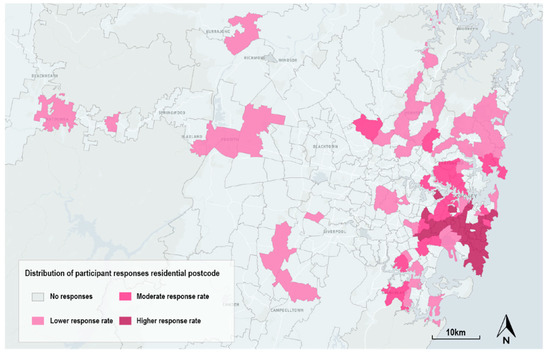
Figure 5.
Geographic spread of survey participants.
9. Cycling Habits
The main travel purposes by bicycle for participants were for fun and enjoyment (88%), for exercise (80%) and for commuting to and from work (76%). For recreation/exercise, this was found to be consistent with other surveys done in Australia [27], where this was found to be the most regularly cited reason for cycling (approximately 82%). However, commuting was observed to be much lower in the Austroads survey than in these results. The main frequency of cycling was every day or close to every day (36%) or at least a few times a week (36%). A total of 78% of respondents rated themselves as ‘confident’ or ‘very confident’ physically riding a bicycle, but only 60% were confident navigating with a bicycle.
9.1. Engagement and Satisfaction with Cycle Planning in Sydney
One of the key questions of this exercise was around engagement in bicycle infrastructure planning. The main forms of engagement in cycle planning were as follows:
- Participating in the Australian Census (64%);
- Giving feedback to a local council (55%);
- Posting on social media (55%);
- Giving feedback to a state government body (31%);
- Attending advocacy group meetings and events (20%).
When asked for the proportion of rides that they logged using applications (such as Strava), there was an interesting split between almost every ride to all rides (30%) being logged and no rides being logged (33%). Furthermore, for rides which were logged, these were mostly recreational (20%) or a mix of recreational and commuting (32%).
In terms of satisfaction with existing participation mechanisms, participants were generally not satisfied (42.5%) or very unsatisfied (11.79%) with mechanisms that were in place. A large number were also neutral (36%). Participants preferred the engagement format to be active participation. In terms of desired participation, the largest proportion wanted to participate ‘actively with no time’ (55%)—these participants wanted very quick ways to contribute to improvements to the network. As well as this, 31% of participants were willing to give up longer periods for active engagement. Interestingly, less than 1% wanted nothing to do with influencing the network. Furthermore, 13% of participants wanted their passive data to be primarily used as their preferred form of participation. On average, participants rated Sydney’s cycling network 3.8 out of 10 when prompted. Notably, only six out of the 280 respondents gave the network a score of eight or above.
9.2. Investment Prioritisation
When asked, ‘to you personally, how important are the following factors in improving the cycle network in Sydney?’ the most important factors were building a continuous network, increasing the number of separated cycleways and safety, as shown in Figure 6.
Figure 6.
Prioritisation responses assessed with a Likert scale.
The least important were gradient and infrastructure close to train stations. This was also consistent with naming the number one priority, where approximately 40% thought separated cycleways were most important, 40% chose a continuous network and less than 1% thought that infrastructure close to train stations was most important. A reliability analysis on these items was conducted with Cronbach’s alpha, showing the responses on this Likert scale to reach an acceptable reliability, α = 0.92. Other important factors discussed by participants were the following:
- More education, training and marketing programmes across all modes (vehicles, bicycles, pedestrians) to create positive behaviours, increase safety and reduce aggression on roads and cycleways;
- Reducing the severity of helmet laws to encourage more cycling trips or participation;
- Increased legal enforcement of rules which endanger cyclists;
- Additional infrastructure that allows children to ride to school;
- Reducing the speed of vehicles in areas with pedestrians and cyclists;
- Increasing the width available for cyclists on roads, shared footpaths and shared cycleways;
- Higher support for e-bikes to encourage a more diverse cyclist pool;
- Higher volume of bike lockers, storage facilities, end-of-trip facilities and carrying facilities;
- Re-designing road signals (‘green time’) and signage to better support seamless cycling journeys.
Additional information on the top-voted prioritisation factors and key quotes from the other important factors can be found in Appendix D.
9.3. Participant Comments
As well as rating priorities, participants within the survey were given the option to draw one spatial shape on a map representing their top idea for cycling investment in Sydney—i.e., what and where their top cycling improvement to Sydney would be. There was a median distance of 3.8 km between a respondent’s postcode and the centre point at which they commented. As there was a vast range of scales at which participants drew their response, filtering by area was found to be a useful way to identify areas and types of comment that were being made. Figure 7 demonstrates the top 200 comments covering the smallest area, which allowed key corridors to be highlighted. Figure 8 shows a heatmap of the comments summed into individual hexagonal units across the city (showing five or more comments only). Figure 9 shows the results of integrating these comments into the composite index.

Figure 7.
Map demonstrating top 200 smallest comments overlaid on top of each other, revealing key corridors and areas desired by citizens.
Figure 8.
Citizen comments assigned to hexagonal grids (shown, five or more comments covering each cell). Blue indicates a higher number of comments.
Figure 9.
Prioritisation results—combined prioritisation layers, including citizen votes, in one spatial layer. Dark purple indicates highest prioritisation.
10. Interview Results
After showing the results of the survey and interactive tool to practitioners, the following key feedback themes were identified.
10.1. Who Would Benefit Most from Using This Tool?
Overwhelmingly, the majority of interviewees responded that local governments were the main user group that would benefit from using this tool and process. One participant summarised this by stating, ‘in a polycentric city with lots of councils, with varying degrees to fund infrastructure, and varying capabilities to identify transport needs [in local government], tools like this are important’. Another stated, ‘a lot of bureaucracies could tap into this; rather than tap into discrete analysis on a case on case for independent studies’. Another stated that it is an:
Impressive and useful tool for councils. Often councils do not have an embedded cycling team. It is a good education tool for those who are not across the cycling network or issues. For those who are not working in cycling, it may be quite illuminating.
Beyond local governments, some other participants said the tool would assist with their transport planning work. For example, one participant stated the following:
As a transport planner, I could use this tool if I was looking at a study area I wasn’t familiar with. I could use it for initial intel to inform my analysis. If I was to do a bike plan for Camden council, I could see what the community has said, see the crashes and so on and how they are influencing the network.
From an advocacy perspective, one participant stated that they ‘would like to see the proposed network alongside this so we can comment on it and use it as an evidence base for advocacy’. Another participant saw it as a good tool for advocacy within government, identifying it as a tool to ‘negotiate with other road users, advocacy groups, project teams, or groups within government’. In a similar vein, one participant stated, ‘Great tool for promoting cycling within government, when meeting with car, freight, rail and heavy infrastructure gives cycling a quantitative evidence base’. Another participant highlighted that there were ‘no consistent approaches’ to merging participation with analytics work and that ‘high-level government want to see consistency’.
10.2. What Current Features Do You Like about the Tool?
Several participants stated that they enjoyed seeing everything in the same interface. One stated, ‘Love that you have combined lots of different things in one place’. Another stated that it was ‘awesome to be able to put everything together like that’. One participant had ‘never before seen’ so many data sources in one cycling tool.
Some participants stated that it was easy to understand. For example, one participant said, ‘If you are Joe Blogs, you would understand it’. Another stated, ‘It can be easily explained to anyone, you don’t need to be X, Y, Z. Very digestible and good communication’.
Participants also liked the feature that allowed the user to see priorities by individual councils, rather than the prioritisation of the whole network. One participant summarised this as ‘we need to stop concentrating so heavily on the CBD [central business district]—there are many work centres, strategic centres, satellite office spaces’.
Another positively highlighted feature was the comment-matching system, which provided the most relevant comment for each cell alongside the score. One participant described this as ‘a really effective way to combine qualitative and quantitative information’.
10.3. What Can Be Added to the Tool?
Some participants suggested including benchmarks of other cities or strategic visions. One participant wanted to know how each cell compared to ‘best practice around the world, in cities such as Auckland, San Francisco and London’. Another would like to have seen integration of where the councils or government want the city to be in terms of strategic objectives but also including proposed projects and how these match the participatory prioritisation work.
Another key suggestion articulated was to enable citizens to see the full array of comments relevant to the area, in order of their priority. This could include the ability to up-vote or add comments after the survey and after seeing the data and what participants had commented. Many of the interviewees saw the viewing of other citizens’ comments as a key beneficial factor of this tool—‘Would people be more motivated to participate if they see someone else, or many other people, are interested in the same issue?’.
In order to improve the tool, several participants suggested adding wider economic benefits, such as congestion reduction, air pollution reduction and population health improvements, into the costing module. Many interviewees also mentioned school drop-offs and considering additional prioritisation criteria that accounted for encouraging children to cycle to school. As well as this, many considered access to schools as more important than some included criteria—several participants considered access to stations less important than schools.
Additional limitations included by several participants were that, although there is a ‘propensity to cycle’ metric, the survey and tool did not capture all would-be cyclists. Several highlighted the need to deliberately find and seek opinions of those who do not and will never cycle, as well as those who would consider cycling.
10.4. Other Insights into Participation
Several participants explicitly showed their agreement with the concept of the participatory analytics exercise, one stating that ‘the analysis has even more legitimacy because it has been through a participatory process’. Some were critical of existing participation mechanisms, one stating that ‘a lot of people are not aware of things until once they start digging holes in the ground’.
One participant responded that it is ‘a lot of work to build a successful cycling participation exercise—partnership is needed amongst government agencies, advocacy, or user groups and other parties such as UberEATS [who can send internal messages to delivery partners]’.
A respondent also stated that ‘government adoption is a barrier to participation exercises. These digital approaches are still quite novel and challenge the role of the expert. Experts are better at solutions; however, the community is much better at identifying problems’. One participant suggested using virtual reality headsets, saying that many more non-cyclists engaged when using this participation mechanism than would engage otherwise. Another participant noted the effectiveness of the ‘Shared Spaces’ web map in New South Wales, which allowed them to see other participant comments. As a consultant, this participant could download the web map as a data set to use in their own transport planning work.
11. Discussion
This research investigated two key questions. Firstly, what are the existing passive and active participation mechanisms and priorities for cyclists and potential cyclists in Sydney? Secondly, how can digital tools that consolidate these participation inputs in a meaningful way for both citizens and practitioners be designed and evaluated? There were three stages to the research: an initial survey with 280 respondents, the creation of a prioritisation index and a tool integrating the responses and feedback through 15 in-depth interviews about the previous two stages.
The novel contributions of this work can be seen as an extension of the previous works performed on PPGISs and PSSs introduced in the initial sections of this paper—including a range of passive and active data sources in a singular interface that were given additional contextual information from survey data and in-depth follow-up interviews. It also provides applied research with specific, real-world-generated information, highlighting key desires and corridors from citizens, as well as from the multicriteria heat map for the specific geographic area of Sydney, Australia.
In answering the first aspect of the research question, it was found that the process was successful in enabling participants to identify key areas for improvement in the city. These participants identified very clear priorities of off-street and separated cycleways, as well as creating a continuous network. In general, the preference for separated cycleways related strongly to research identified in the initial review (Aldred et al. 2017). Participants also articulated strong preferences for additional considerations of promoting cycling among younger, school-aged populations—rather than more ‘strategic’ objectives such as access to train stations. A clear preference for active participation mechanisms (86%) was articulated, as opposed to a reliance on existing data available and passive data. Though many of the survey participants took part in the census and other participation mechanisms, participation was surprisingly low across many of the mechanisms which did not match the citizen-stated preferences for active engagement. In particular, given the reliance on official data sources, such as census and travel surveys, for calibrating the existing body of research on cycling PSS, it was surprising to find that only 64% of participants stated that they responded to this. This has implications on how these data are used, as well as on the importance of a data fusion exercise as performed in this research.
Given the preference for active participation shown by participants, it was unsurprising that the results revealed a general dissatisfaction with existing participation mechanisms—highlighting that there is a desire for more active processes to be employed by practitioners. In terms of the forms of passive data being used, such as logging rides through mobile applications, just over one-third of the sample population did not log their rides at all. Those that did log their rides showed a skew towards only for recreational purposes. This presents further challenges for the use of passive data and, again, highlights the need for a mixture of data sources to be used.
In answering the second aspect of the research question, it was found that the bicycle PSS developed was successful in consolidating participation inputs in a meaningful way for citizens and practitioners. This was evidenced through several factors. Firstly, it was found that drawing explicit, spatial shapes (rather than points on a map) was an effective way to highlight key suggestions which fed into a comment-weighting system in the prioritisation index. This allowed strong visuals as to the locations of the comments, as well as assigning relevant comments to particular hexagonal cells, to assist with the diagnosis of issues highlighted through the index.
Secondly, the prioritisation index was well understood by interview participants and seen as useful—particularly among local government users and for both internal and external advocacy. Through interviews, participants also, again, suggested features such as adding in access to schools, adding in the ability to vote again after the index has been formulated and measuring against international best practice, as well as strategic, government-led benchmarks.
The simple combination of multiple data and analytical layers, including the framing of active and passive participation, was seen by some participants as an important step in increasing the legitimacy of data-driven engagement exercises and the participatory prioritisation process. However, a key limitation was the lack of engagement from certain groups. Non-cyclists, potential cyclists and existing cyclists from other groups (such as recreational cyclists, children who cycle or food delivery drivers/couriers) were not well recorded through either active or passive engagement exercises in this study. These should be key additions in future research, which should discover how to include and engage those that would not have attended the survey, been a data point in the study or attended an interview. These above points should be considered by governments and researchers as they design and use such tools.
In terms of future work, additional research should consider the growing interest in understanding whether integrating the technique of immersion (e.g., through virtual-reality-type environments or narrative immersion) is helpful for the successful deployment of cycling DPPs. It could facilitate more insight, higher levels of engagement and more empathy in the process [28,29,30]. Many studies have investigated the use of bikes in immersive environments (such as head-mounted virtual reality headsets and immersive cave automatic virtual environments), but these have been limited to collecting biometric information, health information and understanding navigation techniques and have not been used to inform infrastructure planning [31,32,33,34]. As this avenue of exploration was not possible for this study, it could be investigated in further work.
Future research should also work to better understand the socio-technical challenges for local councils, the proposed most likely end users, and others in moving beyond PPGIS approaches into integrating these with similar bicycle PSS approaches to this study. This would investigate the bottlenecks in adoption of using such participatory, analytics-driven PSS tools.
12. Conclusions
As many cities around the world grapple with the challenge of improving active transport infrastructure, there is an increasing need for both participatory and evidence-based planning tools which can be used to retrofit our cities with better bicycle infrastructure. In this paper, a bicycle infrastructure planning support tool is presented which takes into account both passive and active citizen engagement. The research builds upon the body of work in PPGISs and PSSs to develop and evaluate an interactive tool which aims to prioritise future bicycle infrastructure as directly informed by the users of this infrastructure: the local community.
During this research, it is also worth noting and valuable to reflect that there was an exponential increase in the number of publicly available applications using human movement and activity data. This was supercharged by the need for individuals and authorities to understand movement and activity data in the context of the COVID-19 pandemic. Large technology companies are leading the way (for example, Facebook, SafeGraph, Cuebiq, Google and Mapbox) by sharing passive mobility data to assist with planning during this crisis. As such, at a time when passive data are being increasingly shared with the public and government and behaviours are being assumed, it could not be more important to emphasise the integration of active participation within this—to create a balanced approach and to match the desires of the participants in this study.
High-quality cycling infrastructure can be a significant investment, and constrained government budgets must balance competing priorities. Thus, investment decisions must be guided by sound analysis and transparent decision support tools. Effective citizen engagement improves the quality of information being developed and ensures that the government can proactively deal with emerging issues. The tool developed in this research enables citizens to identify priorities for themselves and share in decision-making, thereby assuming more ownership of solutions and more responsibility for their implementation. This fosters a sense of mutuality and empowerment, which reduces the risks of implementation and strengthens the resilience of future transport infrastructure.
Author Contributions
Oliver Lock: Conceptualization, Methodology, Software, Data Curation, Writing—Original draft preparation, Visualization, Investigation, Formal analysis. Christopher Pettit: Supervision, Writing—Reviewing and Editing. All authors have read and agreed to the published version of the manuscript.
Funding
This research was funded through the UNSW Scientia Scholarship scheme as part of Oliver Lock’s PhD thesis.
Institutional Review Board Statement
Not applicable.
Informed Consent Statement
Not applicable.
Data Availability Statement
Not applicable.
Acknowledgments
Research was conducted by Oliver Lock as part of his PhD studies, funded by the UNSW Scientia scholarship scheme.
Conflicts of Interest
The authors declare no conflict of interest.
Appendix A
Survey Design.

Appendix B

Table A1.
Description of elements within participatory prioritisation index.
Table A1.
Description of elements within participatory prioritisation index.
| ID | Priority Description | Metric | Prioritise | Method | Weightings | Data Source |
|---|---|---|---|---|---|---|
| A | Priority should be given to areas with limited off-street cycleways. | KM of separated or off-street cycleway (shared or designated pedestrian-shared). | Areas with low KMs of separated or off-street cycleways (shared or designated pedestrian-shared). | Calculated KM of infrastructure within a hexagonal unit. | 1 pts—Less than 1 km per area. 2 pts—Less than 500 m per area. | Cycleway data from NSW government [35] combined with cycleway data from City of Sydney (Transport for NSW [36]. |
| B | Priority should be given to areas which connect existing networks of off-street cycleways. | KM of dangling nodes. | Areas where a separated or off-street cycleway end and there is no connection within 100 metres of that end point. | Total number of ‘dangling nodes’ within hexagonal unit. | 1 pts—1 dangling node. 2 pts—2 or more dangling nodes. | Cycleway data from NSW government [35] combined with cycleway data from City of Sydney [36] |
| C | Priority should be given to improving the safety of areas where cyclists have crashed. | Number of cycling incidents. | Areas which experience a high volume of cycling incidents (crashes). | Raw number of cycling-related incidents within hexagonal unit. | 1 pts—1 to 2 incidents per area. 2 pts—3 or more incidents per area. | Geolocation of cycling accidents from TfNSW Centre for Road Safety [37]. Years available: 2014–2018. Type of crash (pedal cycle). |
| D | Priority should be given to where estimated volumes of all cyclists use the network. | Number of Strava cyclists (weighted to official cycleway statistics). | Areas used by many Strava cyclists (weighted to official counters). | Total volume of cyclists passing through hexagonal unit. | 1 pts—2000 cyclists a day per area. 2 pts—4000 cyclists a day per area. | Strava trip data weighted to official Roads and Maritime Services (RMS), now TfNSW cycleway counters. |
| F | Priority should be given to corridors that are currently used for commuting purposes (current census commuters). | Existing cyclist demand. | Areas along ‘desire line’ of current cycling commuters. | SA2 to SA2 matrix with desire lines calculated between them for existing cyclist commuters using a triangular irregular network (TIN). | 1 pts—On the desire line for over 100 cycle commuters. 2 pts—On the desire line for over 400 cycle commuters. | 2016 Census Method of Travel to Work [38] |
| G | Priority should be given to areas within a 10 min cycle to a train station. | Cycle accessibility model. | Number of train/metro stations. | Meshblock-based accessibility to train stations. | 1 pts—15 min cycle from a train station. 2 pts—7.5 min cycle from a train station. | Meshblocks [39], GTFS [40] and OpenTripPlanner [41] |
| H | Priority should be given to areas with a cyclable gradient. | Slope. | Low slope (%). | Digital elevation model/Slope calculations from 1 M LIDAR. | 1 pts—3–5% gradient (average per area). 2 pts—Less than 3% gradient (average per area). | ELVIS, NSW Spatial [42] |
| I | Converted short car trips. | Potential short car trips. | High volume of potential conversions. | Estimation of volume of potential trips generated at origins and generations if cycle improvements were made. The distribution of this is based on the age and distance profile of existing cycle commuters and the number of short car trips currently fitting the same profile in each statistical area. | 1 pts—15 additional estimated cycle trips per m2 in area. 2 pts—30 additional estimated cycle trips per m2 in area. | ABS Census Method of Travel to Work (Age, Mode, Trip Distance) [38] |
| J | Citizen preferred locations for new or improved cycling infrastructure. | Citizen-voted locations. | High volume of citizen-voted locations. | Survey sent where citizens draw explicit spatial shapes. Count the number of these shapes which fall within each hexagon. | 1 pts—5 to 15 votes/ideas per area. 2 pts—15 to 30 votes/ideas per area.3 pts—30–45 votes/ideas per area.4 pts—45+ votes/ideas per area. | ArcGIS Online Spatial Survey (Survey123) as explained in the method section of this document. |
Appendix C
Table A2.
Survey results summary.
Table A2.
Survey results summary.
| Age | Count (n = 280) | Percentage |
|---|---|---|
| 18–24 | 14 | 5% |
| 25–34 | 66 | 23.57% |
| 35–44 | 84 | 30% |
| 45–54 | 71 | 25.36% |
| 55–64 | 36 | 12.86% |
| 65+ | 9 | 3.21% |
| Gender | ||
| Male | 181 | 64.6% |
| Female | 96 | 34.3% |
| Non-binary | 2 | 0.7% |
| Did not specify | 1 | 0.4% |
| Employment status | ||
| Full-time employed | 208 | 74.29% |
| Part-time/casual employed | 26 | 9.29% |
| Full-time student | 11 | 3.93% |
| Full-time work combined with studies | 2 | 0.71% |
| Part-time/casual work combined with studies | 13 | 4.64% |
| Looking for work | 4 | 1.43% |
| Retired | 9 | 3.21% |
| Full-time parent or primary carer | 3 | 1.07% |
| Other | 4 | 1.43% |
| Education | ||
| Up to High School Certificate | 2 | 0.71% |
| High School Certificate | 8 | 2.86% |
| Trade/technical/vocational training | 0 | 0% |
| TAFE Certificate I-IV/Diploma. | 20 | 7.14% |
| Advanced Diploma/Associate Degree | 8 | 2.86% |
| Undergraduate degree (Bachelor) | 68 | 24.29% |
| Graduate Certificate, Diploma & Honours | 53 | 18.93% |
| Master’s Degree | 89 | 31.79% |
| Doctoral Degree | 30 | 10.71% |
| Other | 2 | 0.71% |
| Bicycle travel purposes | ||
| Commuting to and from a workplace | 213 | 76.07% |
| Travelling to and from education | 34 | 12.14% |
| Cycling for fun and enjoyment | 247 | 88.21% |
| Cycling to visit family and friends | 162 | 57.86% |
| Cycling for shopping trips | 176 | 62.86% |
| Cycling for exercise | 226 | 80.71% |
| Cycling as a group social activity | 134 | 47.86% |
| Cycling to fulfil your employment needs directly (e.g., as a Deliveroo/UberEATS/Menulog or other Courier) | 4 | 1.43% |
| Other | 25 | 8.93% |
| Cycling frequency | ||
| Every day, or close to every day | 101 | 36.07% |
| At least a few times a week | 100 | 35.71% |
| At least a few times a fortnight | 32 | 11.43% |
| At least a few times a month | 23 | 8.21% |
| Less than once a month | 14 | 5% |
| I haven’t ridden this year | 10 | 3.57% |
| Cycling confidence | ||
| Very confident—I am comfortable riding in almost any environment. | 103 | 36.79% |
| Confident—I am comfortable riding in many environments but still cautious in some. | 116 | 41.43% |
| Moderately confident—I am comfortable riding in some environments and cautious in others. | 44 | 15.71% |
| Cautious—I feel cautious riding in many environments but confident in some. | 14 | 5% |
| Very cautious—I feel the need to be cautious in almost any environment. | 3 | 1.07% |
| Navigational confidence | ||
| Very confident—I almost never need to use a map, app or service to get around. | 37 | 13.21% |
| Confident—I sometimes need to use a map, app or service to get around. | 131 | 46.79% |
| Moderately confident—Around half of my trips I need to check a map, app or service to get around. | 71 | 25.36% |
| Not confident—Most of my trips I need more information in order to get around. | 24 | 8.57% |
| Very little to no confidence—I am almost never able to navigate without needing to use a map, app or service to get around. | 8 | 2.86% |
| Other | 4 | 1.43% |
| Engagement in cycle planning | ||
| I was a participant in the 2016 Australian Census | 179 | 63.93% |
| I was a participant in the TfNSW Household Travel Survey (HTS) | 13 | 4.64% |
| I was a participant in a National Cycling Participant Survey (NCPS) | 14 | 5% |
| I have attended advocacy group meetings and events | 57 | 20.36% |
| I have posted to my social media profiles about cycling | 154 | 55% |
| I have attended physical meetings as a community member concerned about cycling | 54 | 19.29% |
| I have given feedback to a bike plan/proposal/strategy to a local council | 156 | 55.71% |
| I have given feedback to a bike plan/proposal/strategy to a state body | 88 | 31.43% |
| I have used a government-, industry- or research-led digital participatory pin-boarding tool which asked me about cycling | 42 | 15% |
| My employment has involved providing expertise related to cycling | 51 | 18.21% |
| I don’t think I have ever participated in activities that could influence cycle planning | 40 | 14.29% |
| Other | 11 | 3.93% |
| Satisfaction with participation mechanisms | ||
| Very unsatisfied | 33 | 11.79% |
| Not satisfied | 119 | 42.5% |
| Neutral | 100 | 35.71% |
| Satisfied | 25 | 8.93% |
| Very satisfied | 3 | 1.07% |
| Recorded rides | ||
| Almost every ride to all rides (76%–100%) | 85 | 30.36% |
| Most of my rides (51–75%) | 36 | 12.86% |
| Less than half of my rides (26%–50%) | 18 | 6.43% |
| Some of my rides (0–25%) | 48 | 17.14% |
| None of my rides | 93 | 33.21% |
| Type of logging | ||
| I mostly log recreational rides | 56 | 20% |
| I mostly log commuting rides | 20 | 7.14% |
| I log a mixture of these | 90 | 32.14% |
| I don’t log my rides | 102 | 36.43% |
| Other | 7 | 2.50% |
| Preferred engagement format | ||
| Passively—I don’t want anything that I do to influence the network. | 2 | 0.71% |
| Passively—I want data about me (e.g., Strava, census) to be used to improve the network with minimal effort from my end. | 37 | 13.21% |
| Actively, but with no time—I want very quick ways to be able to individually contribute to improvements to the network. | 154 | 55% |
| Actively, with time—I want to be involved and I am willing to give up my own time to contribute to improvements to the network. | 87 | 31.07% |
| What would you rate Sydney’s network out of 10? | ||
| Average | 3.8/10 | |
| 1 | 17 | 6.07% |
| 2 | 45 | 16.07% |
| 3 | 68 | 24.29% |
| 4 | 60 | 21.43% |
| 5 | 44 | 15.71% |
| 6 | 28 | 10% |
| 7 | 12 | 4.29% |
| 8 | 4 | 1.43% |
| 9 | 0 | 0% |
| 10 | 2 | 0.71% |
Appendix D
Table A3.
Number one priority, if can only pick one.
Table A3.
Number one priority, if can only pick one.
| Topic | Number (n = 275) | Percent |
|---|---|---|
| (A) Building more separated cycleways (off-road and away from traffic) | 111 | 39.64% |
| (B) Creating a continuous network that does not stop and start | 116 | 41.43% |
| (C) Designing safer environments in areas where crashes, doorings and collisions have already occurred | 19 | 6.79% |
| (D) Building and upgrading infrastructure where the most people cycle | 3 | 1.07% |
| (E) Building and upgrading infrastructure to specifically support commuter cyclists (including end-of-trip facilities) | 7 | 2.5% |
| (F) Building infrastructure where the gradient/slope is easy to ride | 4 | 1.43% |
| (G) Building infrastructure in critical locations that will encourage new people to ride bikes | 13 | 4.64% |
| (H) Building infrastructure close to train stations | 2 | 0.71% |
Table A4.
Thematic summary of survey participants’ additional factors to prioritise. 7024 total words. Avg of 25 words per response.
Table A4.
Thematic summary of survey participants’ additional factors to prioritise. 7024 total words. Avg of 25 words per response.
| Theme | Example Key Words/Codes | Key Quotes |
|---|---|---|
| More education, training and marketing programmes across all modes (vehicles, bicycles, pedestrians) to create positive behaviours, increase safety and reduce aggression on roads and cycleways | Education (29), Educate (2)/Training (4), Attitude (18), Behaviour (4) | ‘More efforts to shift driver behaviour/attitudes (e.g., evidence of how building off-road cycling infrastructure benefits drivers as well as cyclists; enforcement of 1.5 m passing rules etc)’. ‘Soft measures such as campaigning, encouraging and educating a wide audience on benefits of cycling, safe routes to use, body language and confidence on a bike, bike training courses etc. There needs to be a culture shift here in Sydney which I think is just starting to happen due to COVID’. ‘Infrastructure alone isn’t enough. Most people feel unsafe riding and behaviour change programs are necessary to help facilitate change’. ‘Motor vehicle driver education-we need to change the culture to remove the aggression and negative attitude towards cyclists’. |
| Lessening severity of helmet laws to encourage more cycling trips/participation | Helmet (12) | ‘Repeal Mandatory Helmet Laws, allow cycling on footpath, allow cyclist crossing on pedestrian crossing without dismounting, remove beg buttons’. ‘Prioritise lights for bikes not cars, reduce fines to more sensible amounts, repeal mandatory helmet and bicycle bell laws’. ‘Relaxation of compulsory helmet laws. Small gains in road safety cost the community massively in lower participation rates and adverse outcomes for community health through inactivity related lifestyle diseases. Helmets should be optional on off-road cycling environments (not including mountain bike trails)’. |
| Increased legal enforcement of rules which endanger cyclists | Law (9), Enforcement (3), Legal (5) | ‘Removing Mandatory Helmet Laws as the discourage cycling and create the impression that cycling is inherently dangerous!’‘Enforce the minimum passing distance’. ‘Regulate the bike being used especially by delivery riders that bypass laws’. |
| Additional infrastructure that allows children to ride to school | School (8), Kid (6), Child (9) | ‘Building infrastructure that enables children to ride to school’. ‘We know the morning and afternoon school run put massive loads on the road network and unfortunately it is often very short trips that are easily manageable, and more enjoyable, by bike’. |
| Reducing the speed of vehicles in areas with pedestrians and cyclists | Speed (15) | ‘Low speed local roads to create safer environments for peds and cyclists’. ‘Traffic calming; cars drive too fast and too dangerously and there is almost no reason not to drive that way’. |
| Increasing width available for cyclists on roads, shared footpaths and shared cycleways | Wide (8) | ‘For shared paths increasing their widths to better cater for harmony between pedestrians and cyclists’. ‘More than anything I just want a nice wide shoulder. That is what would make the biggest difference to safety. I prefer to ride on the road as it flows better than bike paths. There is less debris and hazards and I don’t get stick behind slow commuters’. ‘So often the infrastructure is only half baked, like shared paths that are no wider than a standard footpath’. |
| Higher support for e-bikes to encourage more diverse cyclist pool | Electric (4) Scooter (2) | ‘E-bikes have the potential to overcome many people’s reluctance to cycle because of perceived physical/fitness limitations. May also assist with limits to EOT facilities’. ‘Change the tax on E-bikes. They make commuting cycling accessible to everyone’. |
| Higher volume of bike lockers, storage facilities, end-of-trip facilities and carrying facilities | Storage (4) Rack (8) | ‘Better integration with Public Transport. Bike lockers at stations can be in very inconvenient places (e.g., Werrington Station). Buses should cater to bikes! No bike racks on buses is really disappointing’. ‘End of trip facilities are a big one, I’d love to ride into the city for work, but I only ever travel into other companies’ offices for meetings. I would like to see ‘pay per use’ end of trip facilities open to anyone, so I can ride in, securely lock my bike, have a shower leave bike clothes there before then walking to my meetings in the city’. ‘Ensuring safety in areas where cyclists would likely ride if there were safety features, and more casual parking (bike racks) in convenient places’. ‘Providing bicycle carrying capacity/racks on buses’. |
| Re-designing road signals (‘green time’) and signage to better support seamless cycling journeys | Signals (4), Sign (34), Signage (10), Sequence (2) | ‘Traffic prioritisation and ease of movement through intersections (i.e., traffic lights not working for cyclists or taking two cycles to activate)’. ‘Better signage & emphasis for construction to consider more vulnerable road users, replacement of beg buttons, more priority for bike/pedestrian crossings I.e. zebra/green bike path, shorter wait times on sequence’. ‘Light prioritisation—active transport: light rail, cyclists and pedestrians should be given the priority at intersections in the city. As an example, travelling north on the Kent Street cycle way at the corner of key street, the cyclists get a green light for 3 s! In the morning it is impossible for the queue of bikes to get through’. ‘Signage. And better apps. The rms map is ok but needs to be significantly more detailed. Google maps is ok but doesn’t do a great job of finding the fastest cycleway route’. ‘Still think there is not enough signage alerting motorists to be aware of cyclists-have never seen a sign advising motorists to be 1.5 m clear of a cyclist’. |
Appendix E
Video describing prioritisation tool.
The following media is also available to complement this research.
Accessible via: https://vimeo.com/432491693. accessed on 30 October 2021.
References
- Oja, P.; Titze, S.; Bauman, A.; De Geus, B.; Krenn, P.; Reger-Nash, B.; Kohlberger, T. Health Benefits of Cycling: A Systematic Review. Scand. J. Med. Sci. Sports 2011, 21, 496–509. [Google Scholar] [CrossRef] [PubMed]
- Kenworthy, J.R.; Laube, F.B. Patterns of Automobile Dependence in Cities: An International Overview of Key Physical and Economic Dimensions with Some Implications for Urban Policy. Transp. Res. Part A Policy Pract. 1999, 33, 691–723. [Google Scholar] [CrossRef]
- Kenworthy, J. Don’t Shoot Me I’m Only the Transport Planner (Apologies to Sir Elton John). World Transp. Policy Pract. 2012, 18, 6–26. [Google Scholar]
- Searle, G.; Legacy, C. Australian Mega Transport Business Cases: Missing Costs and Benefits. Urban Policy Res. 2019, 37, 458–473. [Google Scholar] [CrossRef]
- León, L.F.A. Eyes on the Road: Surveillance Logics in the Autonomous Vehicle Economy. Surveill. Soc. 2019, 17, 198–204. [Google Scholar] [CrossRef]
- Petersen, A.B. Scoot over Smart Devices: The Invisible Costs of Rental Scooters. Surveill. Soc. 2019, 17, 191–197. [Google Scholar] [CrossRef]
- Zuboff, S. The Age of Surveillance Capitalism: The Fight for a Human Future at the New Frontier of Power; Profile Books: London, UK, 2019. [Google Scholar]
- Lock, O.; Pettit, C. Social Media as Passive Geo-Participation in Transportation Planning—How Effective Are Topic Modelling & Sentiment Analysis in Comparison with Citizen Surveys? Geo-Spat. Inf. Sci. 2020, 23, 275–292. [Google Scholar]
- Aldred, R.; Elliott, B.; Woodcock, J.; Goodman, A. Cycling Provision Separated from Motor Traffic: A Systematic Review Exploring Whether Stated Preferences Vary by Gender and Age. Transp. Rev. 2017, 37, 29–55. [Google Scholar] [CrossRef]
- Sieber, R. Public Participation Geographic Information Systems: A Literature Review and Framework. Ann. Assoc. Am. Geogr. 2006, 96, 491–507. [Google Scholar] [CrossRef]
- Coghlan, D.; Brydon-Miller, M. Collaborative Data Analysis. SAGE Encycl. Action Res. 2014, 122–124. [Google Scholar] [CrossRef]
- Filonik, D.; Rittenbruch, M.; Foth, M. Participatory Data Analytics Collaborative Interfaces for Data Composition and Visualisation. In Proceedings of the 7th International Symposium on Visual Information Communication and Interaction (VINCI ’14), Sydney, Australia, 5–8 August 2014; pp. 248–249. [Google Scholar] [CrossRef] [Green Version]
- Thomas, J.J.; Cook, K.A. Visualization Viewpoints: A Visual Analytics Agenda. IEEE Comput. Graph. Appl. 2006, 26, 10–13. [Google Scholar] [CrossRef] [PubMed]
- Andrejevic, M. Big Data, Big Questions| the Big Data Divide. Int. J. Commun. 2014, 8, 17. [Google Scholar]
- Falco, E.; Kleinhans, R. Digital Participatory Platforms for Co-Production in Urban Development: A Systematic Review. Int. J. E-Plan. Res. 2018, 7, 1–27. [Google Scholar] [CrossRef] [Green Version]
- Carver, S.; Evans, A.; Kingston, R.; Turton, I. Public Participation, GIS, and Cyberdemocracy: Evaluating on-Line Spatial Decision Support Systems. Environ. Plan. B Plan. Des. 2001, 28, 907–921. [Google Scholar] [CrossRef] [Green Version]
- Shareabouts. Github-Shareabouts. 2012. Available online: https://github.com/openplans/shareabouts%0A (accessed on 30 October 2021).
- Branion-Calles, M.; Nelson, T.; Winters, M. Comparing Crowdsourced Near-Miss and Collision Cycling Data and Official Bike Safety Reporting. Transp. Res. Rec. J. Transp. Res. Board 2017, 2662, 1–11. [Google Scholar] [CrossRef]
- Nelson, T.A.; Denouden, T.; Jestico, B.; Laberee, K.; Winters, M. BikeMaps.Org: A Global Tool for Collision and Near Miss Mapping. Front. Public Health 2015, 3, 1–8. [Google Scholar] [CrossRef] [Green Version]
- Uber. Uber Newsroom|Uber Announces New Mobility Infrastructure Initiative for Safe Streets. 2020. Available online: https://www.uber.com/newsroom/city-mobility-campaign/ (accessed on 30 October 2021).
- Pettit, C.J.; Lieske, S.N.; Leao, S.Z. Big Bicycle Data Processing: From Personal Data to Urban Applications. ISPRS Ann. Photogramm. Remote Sens. Spat. Inf. Sci. 2016, 3, 173–179. [Google Scholar] [CrossRef] [Green Version]
- Woodcock, J.; Abbas, A.; Ullrich, A.; Tainio, M.; Lovelace, R.; Sa, T.H.; Westgate, K.; Goodman, A. Development of the Impacts of Cycling Tool (ICT): A Modelling Study and Web Tool for Evaluating Health and Environmental Impacts of Cycling Uptake. PloS Med. 2018, 15, e1002622. [Google Scholar] [CrossRef] [Green Version]
- Lovelace, R.; Goodman, A.; Aldred, R.; Berkoff, N.; Abbas, A.; Woodcock, J. The Propensity to Cycle Tool: An Open Source Online System for Sustainable Transport Planning. J. Transp. Land Use 2017, 10, 505–528. [Google Scholar] [CrossRef] [Green Version]
- Larsen, J.; Patterson, Z.; El-Geneidy, A. Build it. But where? The use of geographic information systems in identifying locations for new cycling infrastructure. Int. J. Sustain. Transp. 2013, 7, 299–317. [Google Scholar] [CrossRef]
- Lock, O. Cycling Behaviour Changes as a Result of COVID-19: A Survey of Users in Sydney, Australia. Findings 2020, 13405. [Google Scholar] [CrossRef]
- Milakis, D.; Athanasopoulos, K. What about People in Cycle Network Planning? Applying Participative Multicriteria GIS Analysis in the Case of the Athens Metropolitan Cycle Network. J. Transp. Geogr. 2014, 35, 120–129. [Google Scholar] [CrossRef]
- Austroads. National Cycling Participation Survey. 2019. Available online: https://austroads.com.au/publications/active-travel/ap-c91-19 (accessed on 30 October 2021).
- Van Leeuwen, J.P.; Hermans, K.; Jylhä, A.; Quanjer, A.J.; Nijman, H. Effectiveness of Virtual Reality in Participatory Urban Planning. In Proceedings of the 4th Media Architecture Biennale Conference (MAB18), Beijing, China, 13–16 November 2018; ACM International Conference Proceeding Series. pp. 128–136. [Google Scholar] [CrossRef] [Green Version]
- Gordon, E.; Schirra, S.; Hollander, J. Immersive Planning: A Conceptual Model for Designing Public Participation with New Technologies. Environ. Plan. B Plan. Des. 2011, 38, 505–519. [Google Scholar] [CrossRef]
- Çöltekin, A.; Lokka, I.; Zahner, M.; Halounova, L. On the Usability and Usefulness of 3D (Geo)Visualizations—A Focus on Virtual Reality Envrionments. In Proceedings of the International Archives of the Photogrammetry, Remote Sensing and Spatial Information Sciences XLI-B2 (ISPRS), Prague, Czech Republic, 12–19 July 2016; pp. 387–392. [Google Scholar] [CrossRef] [Green Version]
- Pedroli, E.; Greci, L.; Colombo, D.; Serino, S.; Cipresso, P.; Arlati, S.; Mondellini, M.; Boilini, L.; Giussani, V.; Goulene, K.; et al. Characteristics, Usability, and Users Experience of a System Combining Cognitive and Physical Therapy in a Virtual Environment: Positive Bike. Sensors 2018, 18, 2343. [Google Scholar] [CrossRef] [Green Version]
- Gaggioli, A.; Greci, L.; Arlati, S.; Stramba-Badiale, M.; Pedroli, E.; Colombo, D.; Serino, S.; Cipresso, P.; Riva, G. ‘Positive Bike’—An Immersive Biking Experience for Combined Physical and Cognitive Training of Elderly Patients. Annu. Rev. CyberTherapy Telemed. 2017, 15, 196–199. [Google Scholar]
- Chuang, T.Y.; Chen, C.H.; Chang, H.A.; Lee, H.C.; Chou, C.L.; Doong, J.L. Virtual Reality Serves as a Support Technology in Cardiopulmonary Exercise Testing. Presence Teleoper. Virtual Environ. 2003, 12, 326–331. [Google Scholar] [CrossRef]
- Bialkova, S.; Ettema, D.; Dijst, M. Urban Future: Unlocking Cycling with VR Applications. In Proceedings of the 2018 IEEE Workshop on Augmented and Virtual Realities for Good (VAR4Good), Reutlingen, Germany, 18 March 2018; IEEE: Piscataway, NJ, USA, 2018; pp. 1–5. [Google Scholar] [CrossRef]
- Transport for NSW. Cycleway Data. Open Data|Transport for NSW. 2019. Available online: https://opendata.transport.nsw.gov.au/dataset/cycleway-data (accessed on 30 October 2021).
- Transport for NSW. City of Sydney-Cycleway Data. Open Data|Transport for NSW. 2019. Available online: https://opendata.transport.nsw.gov.au/dataset/cycle-network-city-sydney (accessed on 30 October 2021).
- Transport for NSW. Centre for Road Safety|Interactive Crash Statistics. TfNSW Centre for Road Safety. 2019. Available online: https://roadsafety.transport.nsw.gov.au/statistics/interactivecrashstats/index.html (accessed on 30 October 2021).
- Australian Bureau of Statistics. Counting Persons, Place of Usual Residence 2016 Census. Tablebuilder. 2016. Available online: https://www.abs.gov.au/websitedbs/censushome.nsf/home/tablebuilder (accessed on 30 October 2021).
- Australian Bureau of Statistics. Mesh Blocks. 2016. Available online: https://www.abs.gov.au/ausstats/abs@.nsf/Lookup/by%20Subject/1270.0.55.001~July%202016~Main%20Features~Mesh%20Blocks%20(MB)~10012 (accessed on 30 October 2021).
- Google. GTFS Static Overview|Static Transit|Google Developers. 2018. Available online: https://developers.google.com/transit/gtfs/ (accessed on 30 October 2021).
- OpenTripPlanner. OpenTripPlanner. 2018. Available online: http://www.opentripplanner.org/ (accessed on 30 October 2021).
- NSW Government. ELVIS-Elevation and Depth-Foundation Spatial Data. NSW Spatial Services Portal. 2019. Available online: https://elevation.fsdf.org.au/ (accessed on 30 October 2021).
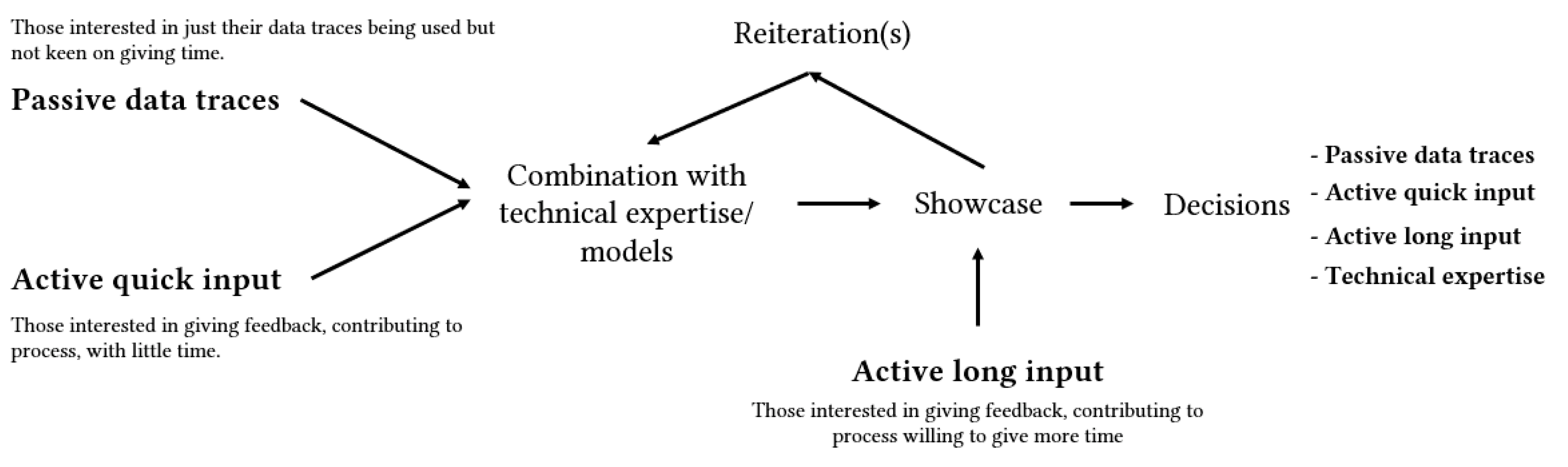
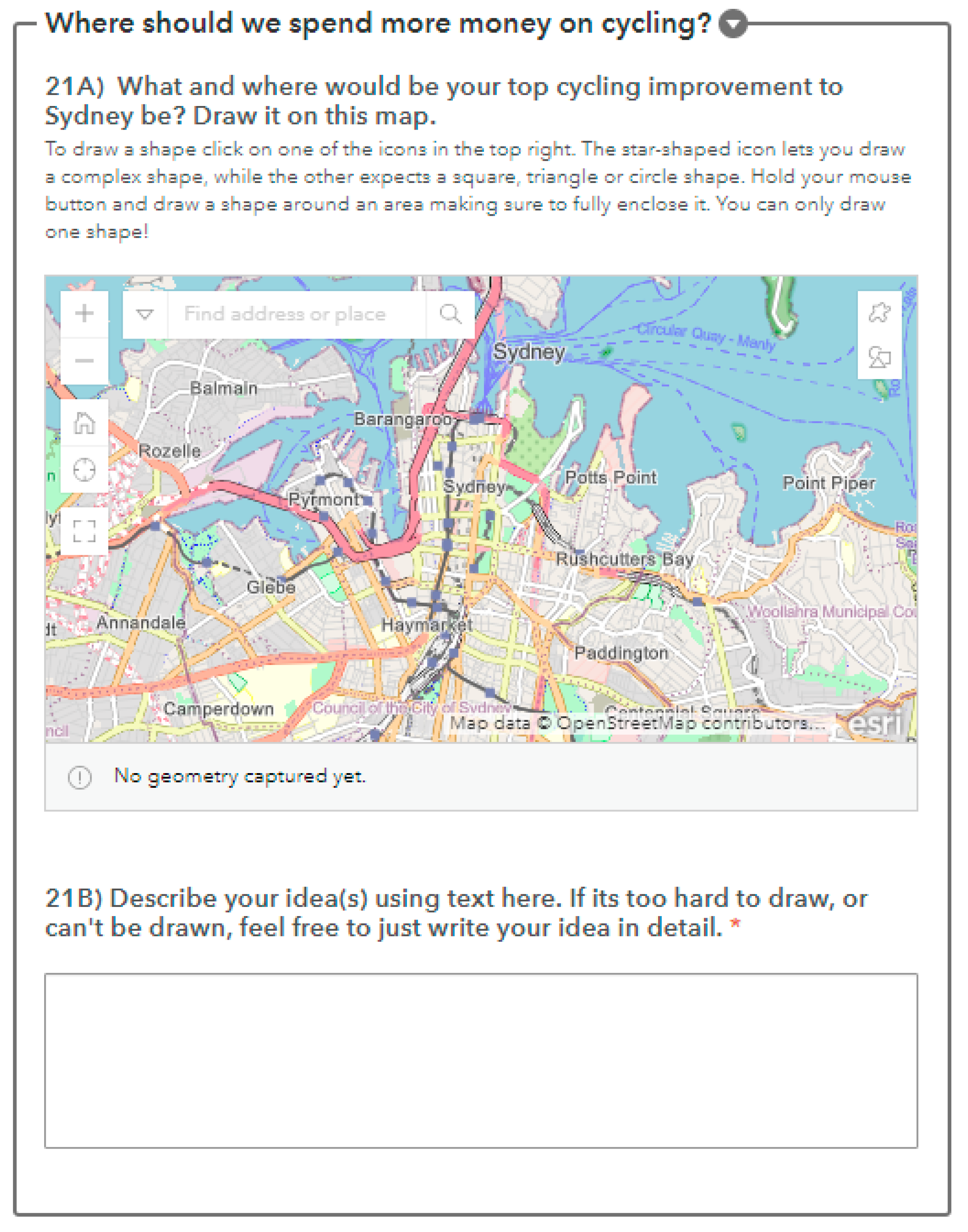
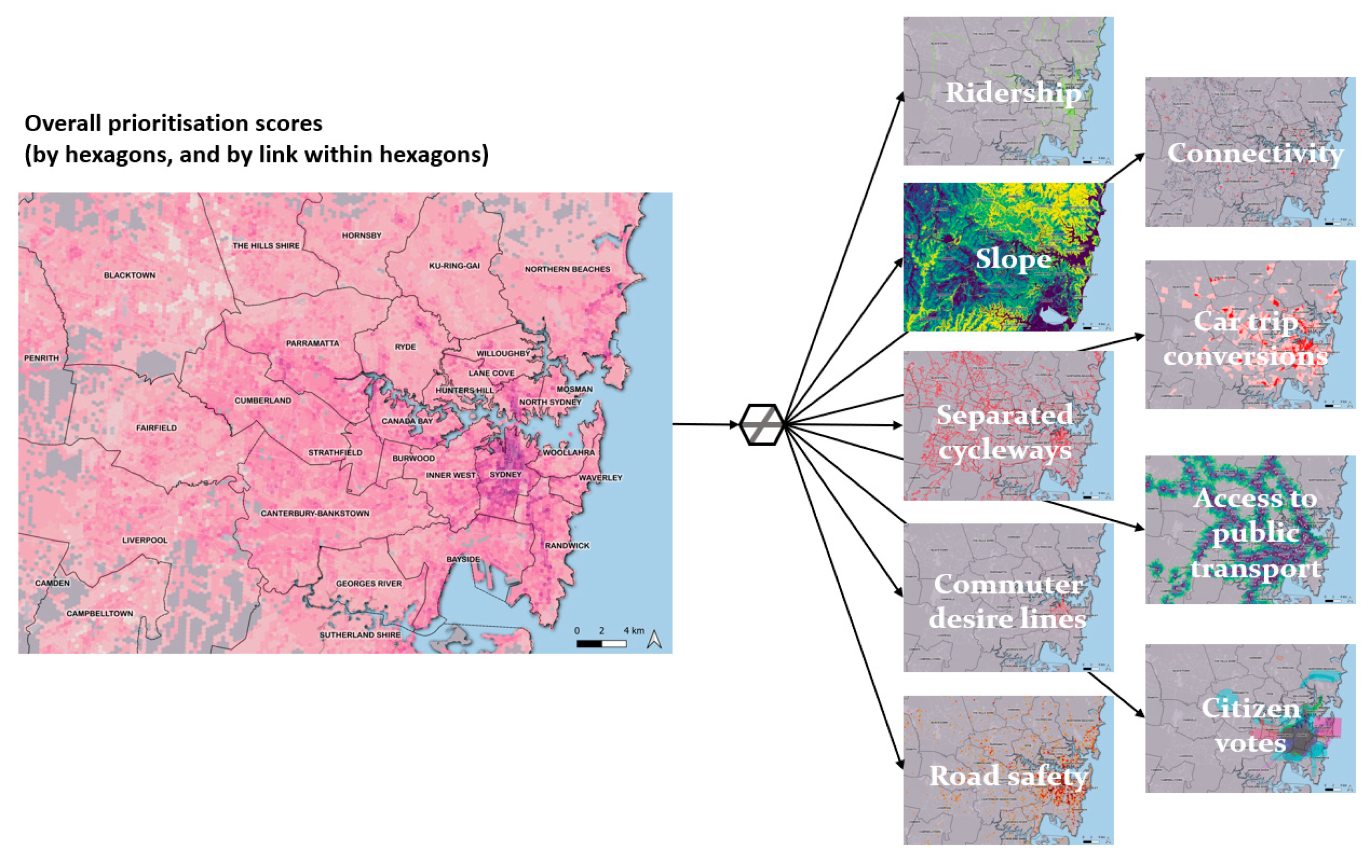

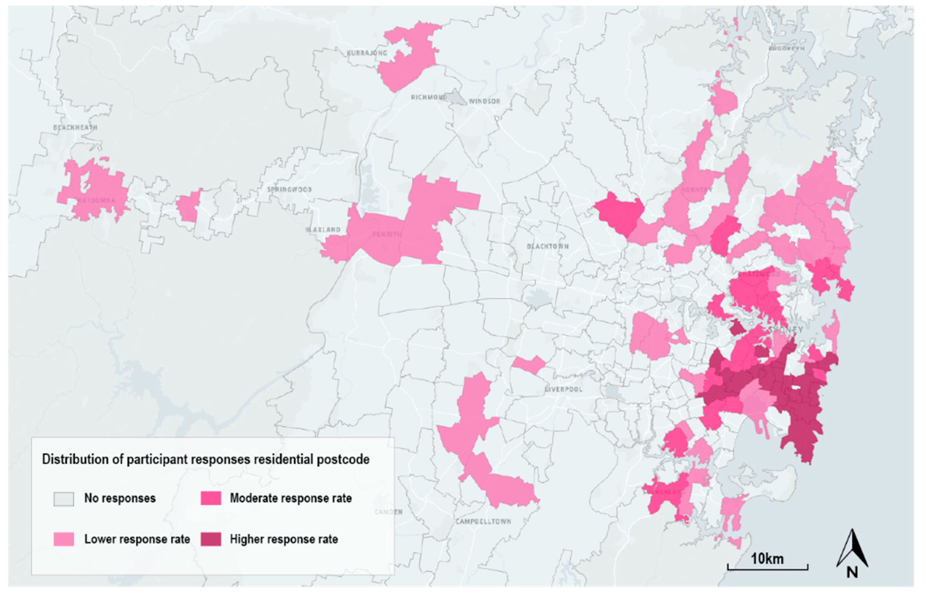
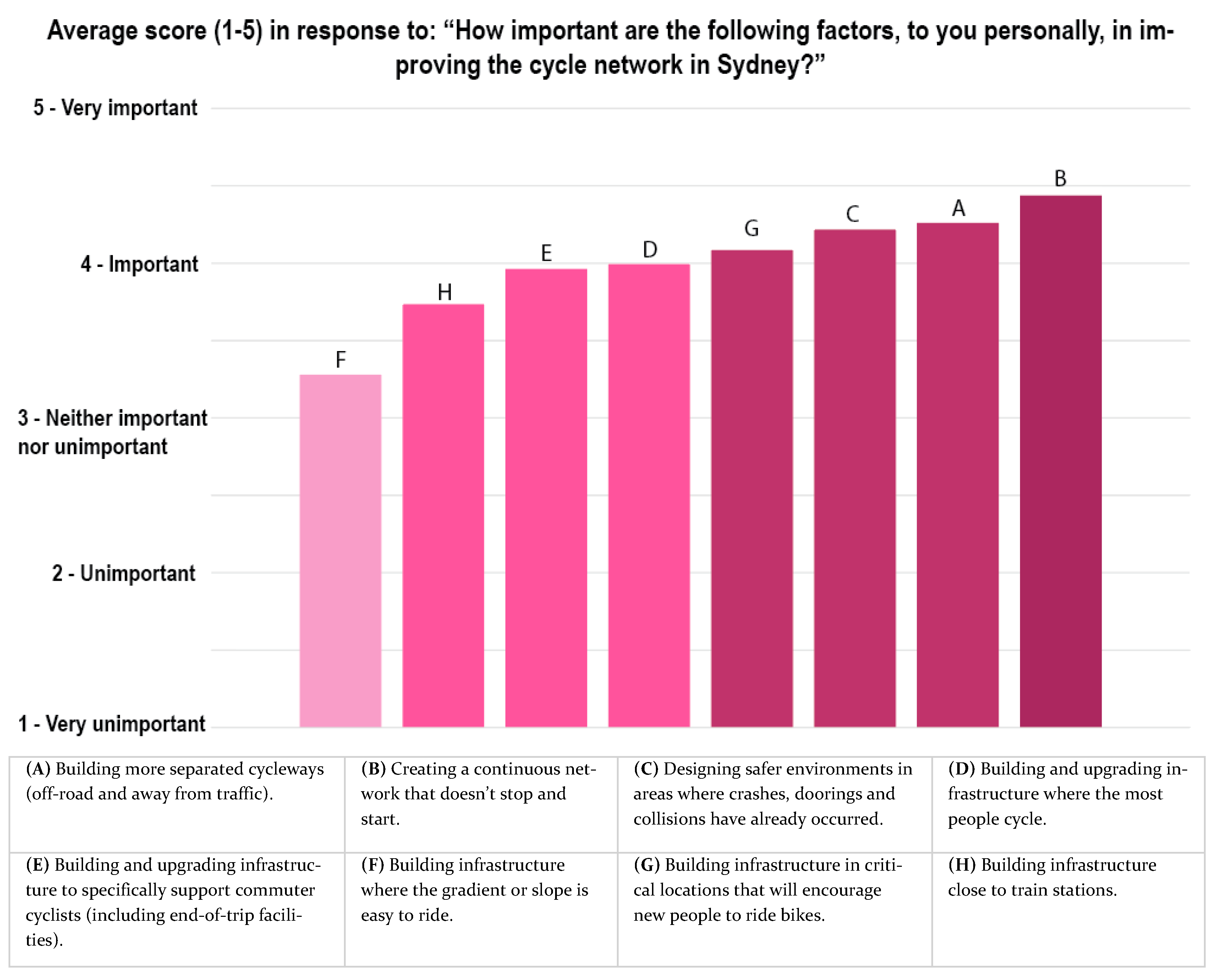
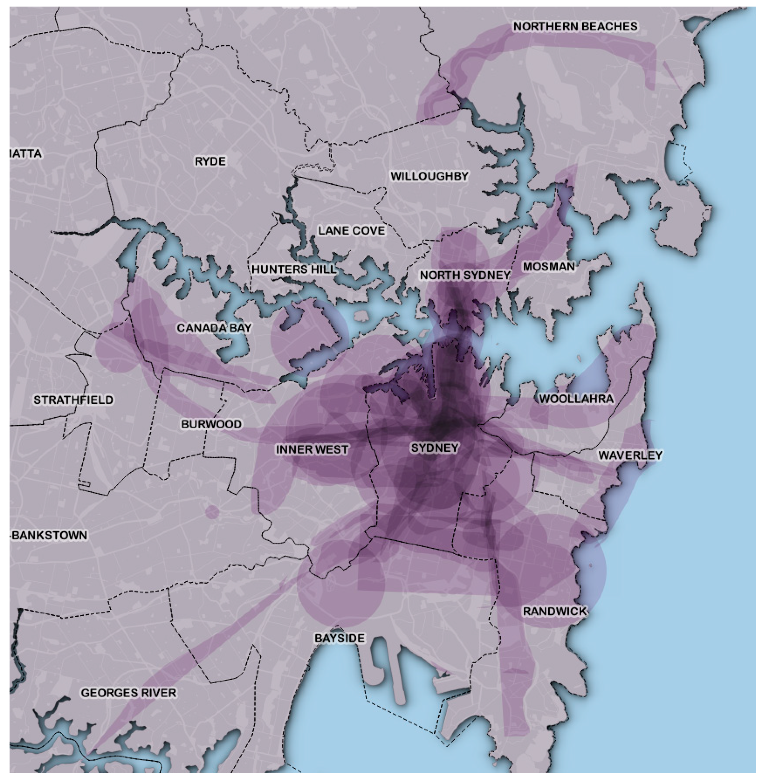
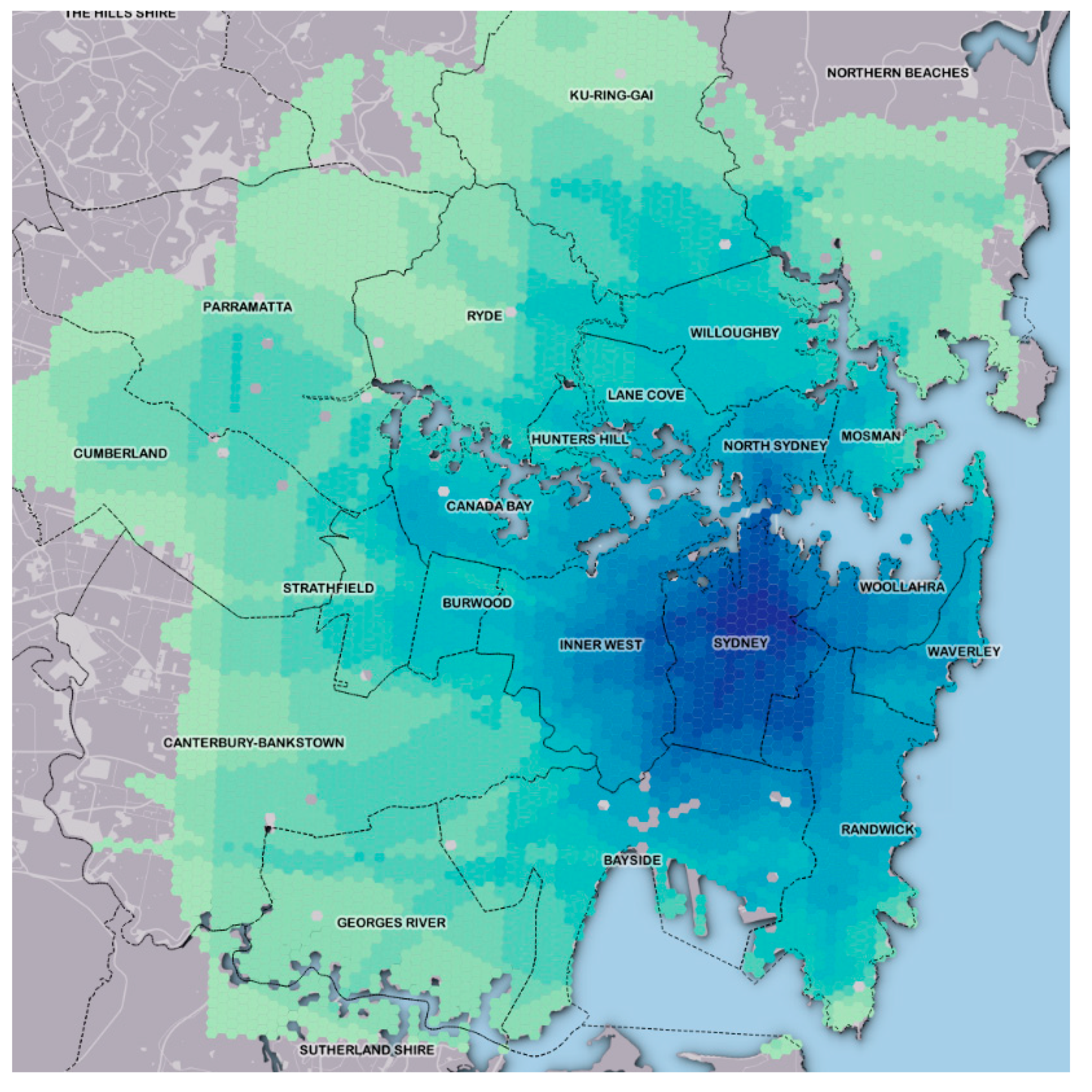

Publisher’s Note: MDPI stays neutral with regard to jurisdictional claims in published maps and institutional affiliations. |
© 2022 by the authors. Licensee MDPI, Basel, Switzerland. This article is an open access article distributed under the terms and conditions of the Creative Commons Attribution (CC BY) license (https://creativecommons.org/licenses/by/4.0/).