Abstract
Significant changes in the global climate are a focus of widespread concern, with profound implications for economies, daily life, and sustainable development. Analyzing and forecasting these trends relies heavily on meteorological data, which typically possess high-dimensional spatiotemporal attributes. Effectively extracting underlying patterns and meaningful information from such complex data is crucial for informed decision-making. This study addresses the challenge of visually representing temporal sequences within geospatial contexts, a process often hindered by the separate visualization of spatial and temporal dimensions. We propose a method that embeds a geographic map within a parallel coordinate plot: time is represented on the parallel axes, and high-dimensional attributes are encoded using color channels. This integrated view, combined with a suite of interactive techniques, enables detailed, multi-perspective, and holistic visual exploration and enhances the understanding of high-dimensional spatiotemporal meteorological data.
1. Introduction
Meteorological data are fundamental for assessing regional and global climate change. They are extensively applied to analyze its diverse impacts, such as on the economy [1,2] and hydrology [3], and to inform agricultural decision-making [4]. Furthermore, the study and application of such data substantially support weather forecasting [5,6], urban resource management and planning [7], and the development of renewable energy for climate-change mitigation [8].
Meteorological data are inherently temporal, as each measurement is linked to a specific timestamp [9]. They are also spatially variable, possessing intrinsic geospatial attributes. This study utilizes data from monitoring stations across China, comprising air temperature, dew point, wind speed, wind direction, atmospheric pressure, cloud cover, and precipitation. Consequently, such data are intrinsically high-dimensional, spanning both rich temporal sequences and spatial dimensions [10].
Analyzing high-dimensional spatiotemporal meteorological data is challenging, as it requires the fusion of multivariate attributes with their spatiotemporal context. This integration complicates pattern recognition and hinders the extraction of meaningful information. Consequently, techniques that facilitate the analysis and interpretation of such complex data are essential, as deriving actionable insights is a critical step in informed decision-making.
Consequently, there is a growing need for, and active development of, advanced visual analytics techniques tailored for meteorological data. Researchers are creating novel tools designed to enhance comprehension and facilitate the exploration of high-dimensional geospatial data to uncover actionable insights [11,12,13,14].
Parallel coordinate plots (PCPs) are a common and effective method for visualizing high-dimensional data, while maps serve as the natural tool for representing geospatial information. However, the representation of temporal attributes remains challenging, which is typically rendered as a time axis or through animation. Such approaches can lead to issues like visual fragmentation, page discontinuity, and difficulties in cross-temporal comparison, as they fail to present all temporal nodes within a single, coherent view. Consequently, a unified framework is required that holistically integrates high-dimensional, temporal, and geospatial attributes for interactive visual analysis. Moreover, to accommodate users with diverse backgrounds, skills, and application contexts, such frameworks must be designed with flexibility and varied interaction paradigms in mind.
In this study, we propose spatiotemporal visualization in parallel coordinate plots (STPCPs) framework for visual analysis of high-dimensional spatiotemporal meteorological data. STPCP integrates a geographic map to represent spatial attributes, uses parallel coordinate axes to display temporal sequences, and employs color channels on the polylines to encode high-dimensional variables. These components are seamlessly linked into a unified view through color-encoded polylines, directly addressing the issue of separated spatiotemporal visualization. The design adheres to the established visual information-seeking mantra of overview first, followed by zooming and filtering, with details available on demand [15]. Novel interaction techniques enhance the framework’s ability to reveal spatiotemporal patterns within complex data. Consequently, STPCP provides a cohesive analytical environment for the detailed and effective visualization of such datasets.
The principal contributions and advantages of the STPCP framework are threefold. First, it provides an intuitive, holistic, and seamless environment for visual analysis, effectively overcoming the limitations of split-view context switching, temporal page skipping, and the separation of spatial and temporal representations. Second, it implements focused interactive techniques; high-dimensional attributes which are represented by polylines are encoded via color channels, and hovering the mouse over a specific attribute in the view highlights all corresponding polylines, visually tracing their variation over time. Third, it enables location-driven exploration; hovering over a geographic region on the map highlights all associated multivariate profiles, directly linking spatial context with high-dimensional attributes.
Section 2 reviews previous work. Section 3 comprehensively describes the design of the STPCPs. In Section 4, we visually explore high-dimensional spatiotemporal meteorological data using STPCPs and provided a comparative experiment. In Section 5, conclusions and directions for future research are discussed.
2. Related Work
PCPs are a standard technique for visualizing high-dimensional data in a two-dimensional space [16,17]. Maps, likewise, serve as a fundamental medium for interpreting geospatial information [18]. A common strategy in visual analytics has been to integrate these two views. For instance, Jern et al. [19] combined PCPs with maps for scalable geographic analysis. Similarly, Meseery et al. [20] and Yuan et al. [21] employed coordinated views of PCPs, maps, and other charts like scatter plots to analyze high-dimensional spatial and seismic data. Johansson et al. [22] also developed enhanced components integrating these views to reveal attribute-geography relationships. These approaches typically rely on coordinated multiple-view systems. Dertinger et al. [23] further reviewed a spectrum of strategies for visualizing high-dimensional data effectively. Notably, Vieira et al. [24] adapted the PCP by repurposing its axes to represent temporal attributes, then used these axes as spatial coordinates alongside a map to create an integrated spatiotemporal display. While this method innovatively visualizes time within a PCP-map hybrid, it does not concurrently encode other high-dimensional attributes, representing a fundamental limitation for analyzing complex multivariate spatiotemporal datasets.
3. Materials and Methods
3.1. Design Rationale
The STPCP framework is designed as a holistic method for the visual analysis of high-dimensional spatiotemporal data. It builds on the robust mathematical foundation of PCPs, a versatile technique for visualizing diverse data types including quantitative, sequential, and categorical data. Simultaneously, STPCP incorporates a geographic map as the natural medium for representing spatial attributes. Within this integrated design, temporal dimensions are visualized via the PCP axes, and spatial context is provided by the map. These two core views are seamlessly linked through visually encoded polylines, eliminating disruptive view switching and preserving analytical context. High-dimensional attributes are encoded on polylines using color channels. This synthesis, supported by tailored interactive techniques, enables a unified, user-friendly exploration of complex datasets.
3.2. Data Preliminary Analysis
The meteorological dataset was sourced from https://quotsoft.net/air/ (accessed on 15 July 2025), comprising records from over 400 monitoring stations across China. Key meteorological elements include temperature, dew point temperature, sea-level pressure, wind speed, and precipitation depth.
A standardized preprocessing pipeline was applied, consisting of the following steps:
Step 1: Province-based Classification: Each station was assigned to its corresponding Chinese province to enable the calculation of provincial-level aggregates.
Step 2: Missing-Value Imputation: Missing entries were replaced with the value 0.
Step 3: Scaling Factor Removal: Instrument-specific scaling factors were identified and removed from the dataset to ensure data consistency.
Step 4: Mean Calculation: Annual averages were first computed for each station. These station-level averages were then aggregated to the provincial level.
Step 5: Normalization: To eliminate the influence of differing measurement units and to allow for coherent comparison across axes in the PCP, all attributes were normalized to the common interval [−1, 1] using Min-Max scaling. The formula is as follows:
where , represents the original attribute values, and denotes the normalized value. This transformation preserves the original distribution’s shape while aligning all variables to the same visual scale, which is essential for perceiving cross-dimensional relationships.
Step 6: Output: The fully processed data were saved in CSV format for visualization and analysis within the STPCP framework.
3.3. Data and Code Availability
To ensure this study would be entirely reproducible and align with open-science principles, we created and released a comprehensive replication package. All the materials required to regenerate the findings, figures, and tables presented in this manuscript are permanently archived and publicly accessible.
The replication package, hosted on the Zenodo open-access repository, includes the following core components:
Processed Dataset: The final analysis-ready dataset (space_time_weather_normalize2.csv) used to generate Figure 1, Figure 2, Figure 3, Figure 4, Figure 5, Figure 6 and Figure 7 and the explanatory summary table.
Preprocessing and Analysis Code: Documented Python (version 3.10.2, Python Software Foundation, Wilmington, DE, USA) scripts (space_time2.py) providing a complete computational workflow to recreate all analytical results and visualizations from the raw data.
STPCP Implementation Source Code: A compressed archive (STPCP.rar) containing the complete source code, dependencies, and assets required to implement the STPCP visualization framework.
Raw Data Archive: A compressed file (China_weather.rar) of the original meteorological data as downloaded from the source.
Documentation: A README.txt file detailing the package contents and instructions for use.
The entire replication package is permanently available under the Digital Object Identifier (DOI): 10.5281/zenodo.17970322, guaranteeing persistent citability and access.
3.4. Detailed Design
3.4.1. Time Series Visualization in PCP
The STPCP framework extends the standard PCP to support the integrated analysis of high-dimensional, temporal, and spatial attributes. In a conventional PCP, each vertical axis represents a distinct data attribute. The STPCP adapts this paradigm by dedicating these axes to represent sequential timestamps. The temporal evolution of data is thus visualized by the continuous trajectories of polylines connecting these time axes. This design provides a static, all-in-one view of the entire time series, eliminating the need for screen paging or animation and freeing the analyst from the cognitive burden of memorizing states across discrete time points.
A key advancement in PCP design is the development of sophisticated interaction techniques. For the STPCP, we implemented an interactive highlighting scheme [25] where polylines are emphasized based on specific meteorological attributes or regions. This technique significantly enhances the visual analysis of high-dimensional spatiotemporal data. To mitigate visual clutter and accentuate dominant patterns, we employ adjustable transparency. As demonstrated in Figure 1, hovering the mouse over a polyline highlights all polylines belonging to the same category while simultaneously dimming others, creating a clear focus-plus-context view [26].

Figure 1.
Interactive Highlighting for Focus+Context Analysis in the STPCP Framework.

3.4.2. Map in PCP
Two- and three-dimensional maps are fundamental for representing spatial data and serve as the base for numerous spatiotemporal visualizations [27]. For instance, Guo et al. [28] used a map as the primary view supplemented by other charts, integrating clustering and sorting algorithms to analyze high-dimensional spatiotemporal data. Similarly, the STPCP framework employs a two-dimensional map to encode geospatial attributes. Its key distinction lies in embedding the map directly within the parallel coordinate plot. This design achieves true integration of spatial and temporal dimensions; the attributes are connected via continuous polylines instead of being presented as separate, spliced visualizations. This seamless integration allows analysts to holistically explore spatial and temporal contexts [29].
The framework implements an interactive focus technique. When the mouse hovers over a geographic point on the map, the corresponding location is visually emphasized with bolded edges. Simultaneously, all polylines associated with that location are highlighted, while polylines representing other locations are dimmed, creating a clear focus-plus-context view as illustrated in Figure 2.

Figure 2.
Spatially Linked Highlighting in STPCP—colored polylines (selected attributes) are emphasized against a gray context when a geographic region is interacted with on the map.

3.4.3. Color-Encoded High-Dimensional Attributes
In the STPCP framework, high-dimensional attributes are encoded by assigning distinct colors to the polylines within the PCP, ensuring clear visual discriminability. A categorical color legend defining this mapping is provided, as shown in Figure 2. The geospatial context is represented by the map, and temporal progression is encoded by the PCP axes. These two core components are visually bridged by the polylines, forming an integrated display that consolidates multivariate, spatial, and temporal data into a single view. This design mitigates the cognitive disconnect of visual fragmentation. Analysts can thus follow a continuous analytical path: starting from the high-dimensional trends in the polylines, tracing them across geographic space on the map, and observing their evolution through time on the PCP axes, thereby perceiving integrated spatiotemporal patterns.
3.4.4. Data Table
A linked data table was integrated into the STPCP framework, serving as a detailed view that provides access to the sorted and normalized raw data. This component is connected to the main visualization through an interactive linking mechanism [30]. As demonstrated in Figure 3, hovering the mouse over a row in the data table highlights the corresponding polyline in the STPCP view, enabling analysts to instantly access the full contextual details of any selected data record.

Figure 3.
Bidirectional Linking between the Data Table and Visual Components—highlighting corresponding elements synchronously upon user interaction.

The integrated data table is equipped with dynamic filtering and bidirectional sorting capabilities, which further enhance the analytical utility of the STPCP framework, as illustrated in Figure 4.

Figure 4.
Integrated Interactive Controls for Data Filtering and Sorting within the STPCP Framework.

For clarity, a comprehensive reference table defining all abbreviated attributes and their units is provided, as shown in Figure 5.

Figure 5.
A Comprehensive Reference of Variables, Abbreviations, and Measurement Units.

3.4.5. Accessible Design Considerations
To ensure broad interpretability of the STPCP method, including for users with color vision deficiencies (CVDs) [31], we integrated inclusive design principles into its visual encoding scheme.
All color palettes for visual encoding data dimensions and highlights were replaced with CVD-optimized alternatives. Specifically, the “Tableau 10” palette was employed to encode the high-dimensional attributes, which were validated using the color Oracle simulator to ensure visual distinguishability under common forms of CVD.
To mitigate reliance on color as the sole discriminative channel, we ensured visual elements employ redundant encoding. Key categories or data clusters are distinguished not only by color but also by concurrent variations in line width and luminance. This design ensures interpretability in grayscale or under suboptimal viewing conditions, thereby enhancing the robustness and accessibility of the STPCP framework for a broader audience without compromising its analytical utility.
3.4.6. Prototype Implementation
The STPCP framework was implemented using the D3.js (version 7.3.0, an open-source JavaScript library; https://d3js.org/) visualization library [32], selected for its robust support for custom visual encoding and flexible implementation of interactive techniques. The client-side rendering leverages Scalable Vector Graphics to ensure high-quality, resolution-independent graphics. The supplementary data table was constructed using the jQwidgets (version 14.0.0, provided by jQWidgets, Sofia, Bulgaria) framework [33], which provides built-in functionalities for data filtering and sorting. The prototype is served via a Nginx (version 1.24.0, maintained by F5, Inc., Seattle, WA, USA) web server, chosen for its lightweight design and ease of deployment.
4. Meteorological Data Exploration
4.1. Case Study
The STPCP method was applied to analyze a meteorological dataset covering 31 Chinese provinces. The integrated visualization facilitates the identification of spatiotemporal outliers by revealing attributes that exhibit anomalous values in specific years. For instance, a pronounced spike in precipitation for Beijing in 2021 is readily apparent, as shown in Figure 6. Furthermore, the framework supports the visual assessment of inter-attribute relationships. Taking Xinjiang as an example, Figure 7 illustrates that wind speed and precipitation share highly similar temporal trends, suggesting a potential correlation between these variables. An interactive demonstration of this China weather visualization, implemented with STPCP, is available online http://124.71.229.165/stpcp/index.html (accessed on 10 December 2025).

Figure 6.
STPCP Analysis of Precipitation Dynamics in Tianjin for 2021.


Figure 7.
Analysis with the STPCP Framework Revealing Spatiotemporal Relationships among Meteorological Variables in Xinjiang.

4.2. Comparative Evaluation
A controlled comparative study was conducted to objectively assess the effectiveness and usability of the proposed STPCP method. The experimental design benchmarks STPCP against two established baseline techniques: the GCPC method [20] and the MPCP method [29].
4.2.1. Study Design
Thirty-two participants (17 male, 15 female, aged 24–55) with experience in data analysis or visualization were recruited. All had normal or corrected-to-normal vision.
Each participant performed three structured analytical tasks on the dataset:
Task 1 Spatiotemporal Attribute Query: Identify the station with the highest average temperature in July 2018 and trace its precipitation trend from 2014 to 2021.
Task 2 Correlation Analysis: Determine whether a consistent correlation exists between humidity and precipitation in the Sichuan Basin region across all years.
Task 3 Anomaly Detection: Locate the year and station that exhibited the most unusual combination of temperature and precipitation values.
Objective performance was measured by recording task completion time (in seconds) and the number of interactions, for example, clicks, filters, zooms. Subjective feedback on perceived ease of use was collected using a 5-point Likert scale [34], where 1 indicated “Somewhat difficult,” 2 “Neutral,” 3 “Easy to use,” and 4 “Very easy to use.”
4.2.2. Results and Statistical Analysis
The results presented in Figure 8 confirm that the integrated view significantly reduces the time cost of analysis by minimizing the need for context switching.
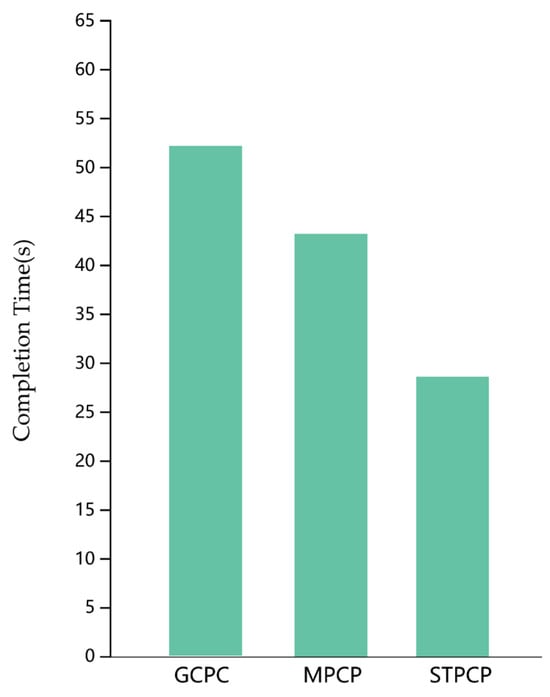
Figure 8.
Comparison of task completion times across three techniques.
To quantitatively compare task completion time across the three independent visualization techniques, a one-way ANOVA [35,36] analysis of variance was employed. The analysis was performed using SPSSPRO (version 1.0.11, provided by QingSi (Shanghai) Information Technology Co., Ltd., Shanghai, China, https://www.spsspro.com/).
First, the normality assumption for the one-way ANOVA) model was assessed using the Shapiro–Wilk test. The p-value is 0.064 *, indicating no significant deviation from normality (), supporting the use of parametric testing.
Then, a test for homogeneity of variances yielded a non-significant result (), confirming that the assumption of equal variances was met.
A one-way ANOVA was subsequently conducted. The result was statistically significant (), demonstrating that the use of different visual analysis methods had a significant effect on response time. The detailed results of the one-way ANOVA are presented in Table 1.

Table 1.
Results of one-way ANOVA for response time.
Next, Tukey’s Honestly Significant Difference (HSD) test was conducted for all pairwise comparisons. This post hoc procedure controls the family-wise error rate and is designed specifically for comparing all possible pairs of means after a significant ANOVA. The results, reported as mean differences with 95% confidence intervals and adjusted p-values, are detailed in Table 2. As none of the confidence intervals include zero, a significant difference exists between each pair of the three methods.
Table 2.
Results of Tukey’s HSD Post Hoc Test for response time.
Analysis of the interaction cost, as shown in Figure 9, reveals a marked reduction in the number of interactions required for STPCP compared to both GCPC and MPCP, thereby confirming its enhanced efficiency in minimizing manual effort during spatiotemporal analysis.
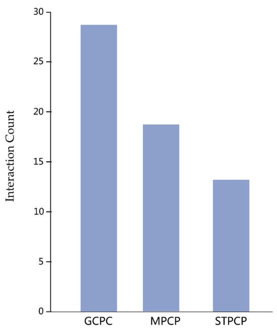
Figure 9.
Comparison of interaction counts across the three techniques.
Similarly, a one-way ANOVA performed on the interaction cost data revealed a statistically significant effect of visualization technique (), indicating that the method used substantially influences the interaction cost. Post hoc comparisons using Tukey’s HSD test confirmed significant differences between all three methods (all ). The detailed ANOVA and post hoc results are provided in Table 3 and Table 4, respectively.
Table 3.
Results of one-way ANOVA for interaction count.
Table 4.
Results of Tukey’s HSD Post Hoc Test for interaction count.
Subjective ratings revealed distinct user preferences, as shown in Figure 10. Participants favored STPCP for spatiotemporal analysis, frequently citing its provision of a comprehensive overview and support for seamless pattern tracking as key strengths. In contrast, MPCP was perceived as more suitable for tasks focused exclusively on attribute-level analysis without a temporal component. GCPC was consistently rated the least preferred, with users commonly reporting difficulty in associating data attributes with their geographic locations as a primary limitation.
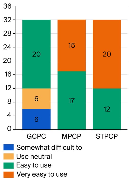
Figure 10.
Comparative subjective ratings of the three techniques.
4.2.3. Discussion
The evaluation indicates that STPCP provides significant advantages for analytical tasks involving spatiotemporal integration, specifically Tasks 1 and 3. Its integrated design effectively lowers the cognitive load and interaction cost associated with correlating temporal, geographic, and multivariate data, directly addressing a core challenge in conventional high-dimensional spatiotemporal analysis. In contrast, for tasks focused solely on temporal trends of high-dimensional attributes without a spatial component, such as Task 2, the familiarity of GCPC remains a viable alternative. While MPCP is applicable to static high-dimensional geospatial data, it is inadequate for tasks requiring spatiotemporal reasoning. These findings confirm that STPCP successfully meets its design objective of enabling efficient analysis through the seamless coupling of spatial, temporal, and multidimensional attributes.
5. Conclusions
To enable holistic visual analysis of high-dimensional spatiotemporal meteorological data, we developed the STPCP framework. This approach integrates three complementary visual encodings into a single, coherent view, including a parallel coordinate plot for temporal sequences, a map for spatial context, and color-coded polylines for multivariate attributes. By seamlessly connecting these elements, STPCP enhances analytical efficiency, supports data mining, and aids in decision-making and prediction for complex meteorological datasets.
The STPCP method holds significant practical value in domains such as operational meteorological forecasting, climate trend analysis, and disaster response management. It allows forecasters to intuitively track the spatiotemporal evolution of weather systems, identify multivariate anomalies, and make informed decisions from an integrated perspective.
Notwithstanding its advantages, the current STPCP implementation has several limitations. Firstly, as with all parallel coordinate techniques, it is susceptible to visual clutter and overplotting when the number of data records or dimensions exceeds the practical display limits, which can obscure patterns. For instance, the approach proposed by Zhang et al., which integrates subsampling with density-based visualization, effectively mitigates overplotting issues in parallel coordinate displays [37]. Likewise, Ohse et al. introduced a combination of parallel coordinate plots and clustering algorithms to enable intuitive exploration of high-dimensional parameter spaces [38]. In a similar vein, Meka et al. investigated the influence of axis aspect ratios on angle and line perception in parallel coordinate systems, highlighting the importance of adaptively adjusting axis scales to minimize visual distortion and maintain the interpretative reliability of the visualization [39]. Secondly, interactive analysis methods are insufficiently applied, which will reduce data-mining performance. The efficacy of data mining can be enhanced through the integration of more advanced interactive techniques. For example, Zhu et al. developed an interactive framework based on 3D manipulation within an immersive environment [40], demonstrating the potential of such approaches to improve analytical engagement and outcomes. Last but not least, the framework currently focuses on point-based geospatial data defined by latitude and longitude. Other prevalent spatial data types, such as movement trajectories or network-based representations, are not yet supported.
Building on these findings, we outline the following key directions for future research:
Scalability Enhancements: Immediate efforts will focus on integrating advanced clutter-reduction techniques. Implementing WebGL-based rendering and edge-bundling algorithms should significantly increase the volume and dimensionality of data that can be interactively visualized.
Advanced Encodings: Future versions will explore more sophisticated temporal representations and spatial encodings, such as circular axes for cyclic phenomena and 3D terrain or network-based maps. This will broaden the framework’s applicability to a wider array of spatiotemporal data structures.
Author Contributions
Conceptualization, J.L. and S.F.; methodology, J.L. and L.Y.; software, J.L.; validation, J.L.; formal analysis, J.L.; investigation, N.L.; resources, N.L.; data curation, J.L. and L.Y.; writing—original draft preparation, J.L.; writing—review and editing, N.L., L.Y. and S.F.; visualization, J.L. and L.Y.; supervision, S.F.; project administration, S.F. and N.L. All authors have read and agreed to the published version of the manuscript.
Funding
This research received no external funding.
Data Availability Statement
The meteorological data were downloaded from the following website: https://quotsoft.net/air/ (accessed on 15 July 2025). To ensure full reproducibility, a comprehensive replication package, containing the raw data, processed/versioned datasets, and all-source code, has been deposited on the Zenodo open-access repository and is available under the following permanent Digital Object Identifier (DOI): 10.5281/zenodo.17970322.
Conflicts of Interest
The authors declare that they have no known competing financial interests or personal relationships that could have appeared to influence the work reported in this paper.
References
- Kolstad, C.D.; Moore, F.C. Estimating the economic impacts of climate change using weather observations. Rev. Environ. Econ. Policy 2020, 14, 1–24. [Google Scholar] [CrossRef]
- Neumann, J.E.; Willwerth, J.; Martinich, J.; McFarland, J.; Sarofim, M.C.; Yohe, G. Climate damage functions for estimating the economic impacts of climate change in the United States. Rev. Environ. Econ. Policy 2020, 14, 25–43. [Google Scholar] [CrossRef]
- Gelfan, A.; Kalugin, A.; Krylenko, I.; Nasonova, O.; Gusev, Y.; Kovalev, E. Does a successful comprehensive evaluation increase confidence in a hydrological model intended for climate impact assessment? Clim. Change 2020, 163, 1165–1185. [Google Scholar] [CrossRef]
- Getirana, A.; Biswas, N.K.; Qureshi, A.S.; Rajib, A.; Kumar, S.; Rahman, M.; Biswas, R.K. Avert Bangladesh’s looming water crisis through open science and better data. Nature 2022, 610, 626–629. [Google Scholar] [CrossRef]
- Rasp, S.; Dueben, P.D.; Scher, S.; Weyn, J.A.; Mouatadid, S.; Thuerey, N. WeatherBench: A benchmark data set for data-driven weather forecasting. J. Adv. Model. Earth Syst. 2020, 12, e2020MS002203. [Google Scholar] [CrossRef]
- Price, I.; Sanchez-Gonzalez, A.; Alet, F.; Andersson, T.R.; El-Kadi, A.; Masters, D.; Ewalds, T.; Stott, J.; Mohamed, S.; Battaglia, P. Probabilistic weather forecasting with machine learning. Nature 2024, 637, 84–90. [Google Scholar] [CrossRef] [PubMed]
- Masson, V.; Heldens, W.; Bocher, E.; Bonhomme, M.; Bucher, B.; Burmeister, C.; de Munck, C.; Esch, T.; Hidalgo, J.; Kanani-Sühring, F. City-descriptive input data for urban climate models: Model requirements, data sources and challenges. Urban Clim. 2020, 31, 100536. [Google Scholar] [CrossRef]
- Neofytou, H.; Nikas, A.; Doukas, H. Sustainable energy transition readiness: A multicriteria assessment index. Renew. Sustain. Energy Rev. 2020, 131, 109988. [Google Scholar] [CrossRef]
- Hayawi, K.; Shahriar, S.; Hacid, H. Climate Data Imputation and Quality Improvement Using Satellite Data. J. Data Sci. Intell. Syst. 2024, 3, 87–97. [Google Scholar] [CrossRef]
- Atzmueller, M.; Fürnkranz, J.; Kliegr, T.; Schmid, U. Explainable and interpretable machine learning and data mining. Data Min. Knowl. Discov. 2024, 38, 2571–2595. [Google Scholar] [CrossRef]
- Andrienko, G.; Andrienko, N.; Demsar, U.; Dransch, D.; Dykes, J.; Fabrikant, S.I.; Jern, M.; Kraak, M.-J.; Schumann, H.; Tominski, C. Space, time and visual analytics. Int. J. Geogr. Inf. Sci. 2010, 24, 1577–1600. [Google Scholar] [CrossRef]
- Roberts, J.C. Coordinated multiple views for exploratory geovisualization. In Geographic Visualization: Concepts, Tools and Applications; John Wiley & Sons: Hoboken, NJ, USA, 2008; pp. 25–48. [Google Scholar]
- Donoho, D.L. High-dimensional data analysis: The curses and blessings of dimensionality. AMS Math Chall. Lect. 2000, 1, 32. [Google Scholar]
- Kerkad, A.; Gouri, R. Meta-visualization framework for spatiotemporal analytics: From data generation to advanced visualization on maps. Inf. Vis. 2025, 14738716251349509. [Google Scholar] [CrossRef]
- Shneiderman, B. The eyes have it: A task by data type taxonomy for information visualizations. In The Craft of Information Visualization; Elsevier: Amsterdam, The Netherlands, 2003; pp. 364–371. [Google Scholar]
- Inselberg, A. The plane with parallel coordinates. Vis. Comput. 1985, 1, 69–91. [Google Scholar] [CrossRef]
- Vali, Z.S.; Rastegar, H. Parallel coordinates plot: A visual examination of data structures in exploratory data analysis. Anal. Bioanal. Chem. Res. 2024, 11, 201–209. [Google Scholar]
- Kim, S.; Jeong, S.; Woo, I.; Jang, Y.; Maciejewski, R.; Ebert, D.S. Data flow analysis and visualization for spatiotemporal statistical data without trajectory information. IEEE Trans. Vis. Comput. Graph. 2017, 24, 1287–1300. [Google Scholar] [CrossRef]
- Jern, M.; Åström, T.; Johansson, S. In GeoAnalytics tools applied to large geospatial datasets. In Proceedings of the 2008 12th International Conference Information Visualisation, London, UK, 9–11 July 2008; IEEE: New York, NY, USA, 2008; pp. 362–372. [Google Scholar]
- El Meseery, M.; Hoeber, O. Geo-Coordinated Parallel Coordinates (GCPC): Field trial studies of environmental data analysis. Vis. Inform. 2018, 2, 111–124. [Google Scholar] [CrossRef]
- Yuan, X.; Xiao, H.; Guo, H.; Guo, P.; Kendall, W.; Huang, J.; Zhang, Y. Scalable multi-variate analytics of seismic and satellite-based observational data. IEEE Trans. Vis. Comput. Graph. 2010, 16, 1413–1420. [Google Scholar] [CrossRef]
- Johansson, S.; Jern, M. In GeoAnalytics visual inquiry and filtering tools in parallel coordinates plots. In Proceedings of the 15th Annual ACM International Symposium on Advances in Geographic Information Systems, Seattle, WA, USA, 7–9 November 2007; pp. 1–8. [Google Scholar]
- Dertinger, S.D.; Briggs, E.; Hussien, Y.; Bryce, S.M.; Avlasevich, S.L.; Conrad, A.; Johnson, G.E.; Williams, A.; Bemis, J.C. Visualization strategies to aid interpretation of high-dimensional genotoxicity data. Environ. Mol. Mutagen. 2024, 65, 156–178. [Google Scholar] [CrossRef] [PubMed]
- Vieira, A.P.S.B.; João, R.S.; Romani, L.A.; Ribeiro, M.X. The ST-Vis Tool for SpatioTemporal Visualization. In Information Technology-New Generations; Springer: Berlin/Heidelberg, Germany, 2018; pp. 577–587. [Google Scholar]
- Jeon, H.; Aupetit, M.; Lee, S.; Ko, K.; Kim, Y.; Quadri, G.J.; Seo, J. Distortion-aware Brushing for Reliable Cluster Analysis in Multidimensional Projections. IEEE Trans. Vis. Comput. Graph. 2025, 1–18. [Google Scholar] [CrossRef] [PubMed]
- Vahldiek, K.; Klawonn, F. Cluster-centered visualization techniques for fuzzy clustering results to judge single clusters. Appl. Sci. 2024, 14, 1102. [Google Scholar] [CrossRef]
- Bittner, O.; Zejdlik, J.; Burian, J.; Vozenilek, V. Exploring unconventional 3D geovisualization methods for land suitability assessment: A case study of Jihlava City. ISPRS Int. J. Geo-Inf. 2025, 14, 269. [Google Scholar] [CrossRef]
- Guo, D.; Chen, J.; MacEachren, A.M.; Liao, K. A visualization system for space-time and multivariate patterns (vis-stamp). IEEE Trans. Vis. Comput. Graph. 2006, 12, 1461–1474. [Google Scholar] [CrossRef] [PubMed]
- Liu, J.; Wan, G.; Jia, Y.; Liu, W.; Xie, Z.; Su, Z.; Li, C.; Peng, S. Map-in-Parallel-Coordinates Plot (MPCP): Field Trial Studies of High-Dimensional Geographical Data Analysis. Electronics 2023, 12, 2062. [Google Scholar] [CrossRef]
- Thijssen, J.; Tian, Z.; Telea, A. Interactive tools for explaining multidimensional projections for high-dimensional tabular data. Comput. Graph. 2024, 122, 103987. [Google Scholar] [CrossRef]
- Okabe, M.; Ito, K. Color Universal Design (CUD)—How to Make Figures and Presentations That Are Friendly to Colorblind People. Available online: https://www.scribd.com/presentation/35372210/Color-Blind (accessed on 10 December 2025).
- Bostock, M.; Ogievetsky, V.; Heer, J. D3 data-driven documents. IEEE Trans. Vis. Comput. Graph. 2011, 17, 2301–2309. [Google Scholar] [CrossRef]
- Pande, A.K. jqWidgets Framework. In jQuery 2 Recipes; Springer: Berlin/Heidelberg, Germany, 2014; pp. 473–542. [Google Scholar]
- Joshi, A.; Kale, S.; Chandel, S.; Pal, D.K. Likert scale: Explored and explained. Br. J. Appl. Sci. Technol. 2015, 7, 396. [Google Scholar] [CrossRef]
- Blanca, M.J.; Arnau, J.; García-Castro, F.J.; Alarcón, R.; Bono, R. Non-normal Data in Repeated Measures ANOVA: Impact on Type I Error and Power. Psicothema 2023, 35, 21–29. [Google Scholar] [CrossRef] [PubMed]
- Naganaidu, D.; Khalid, Z.M. ANOVA Assisted Variable Selection in High-dimensional Multicategory Response Data. Statistics 2023, 11, 92–100. [Google Scholar] [CrossRef]
- Zhang, K.; Zhou, L.; Chen, L.; He, S.; Weiskopf, D.; Wang, Y. Angle-uniform parallel coordinates. Comput. Vis. Media 2023, 9, 495–512. [Google Scholar] [CrossRef]
- Ohse, B.; Schneider, C. Exploration of High-Dimensional Performance Spaces via Clustering. IFAC-PapersOnLine 2025, 59, 421–426. [Google Scholar] [CrossRef]
- Meka, L. Line Perception in Parallel Coordinates Under Different Aspect Ratios. Master’s Thesis, Technische Universität Wien, Vienna, Austria, 2024. [Google Scholar]
- Zhu, Q.; Lu, T.; Guo, S.; Ma, X.; Yang, Y. CompositingVis: Exploring interactions for creating composite visualizations in immersive environments. IEEE Trans. Vis. Comput. Graph. 2025, 31, 591–601. [Google Scholar] [CrossRef] [PubMed]


Disclaimer/Publisher’s Note: The statements, opinions and data contained in all publications are solely those of the individual author(s) and contributor(s) and not of MDPI and/or the editor(s). MDPI and/or the editor(s) disclaim responsibility for any injury to people or property resulting from any ideas, methods, instructions or products referred to in the content. |
© 2025 by the authors. Licensee MDPI, Basel, Switzerland. This article is an open access article distributed under the terms and conditions of the Creative Commons Attribution (CC BY) license.