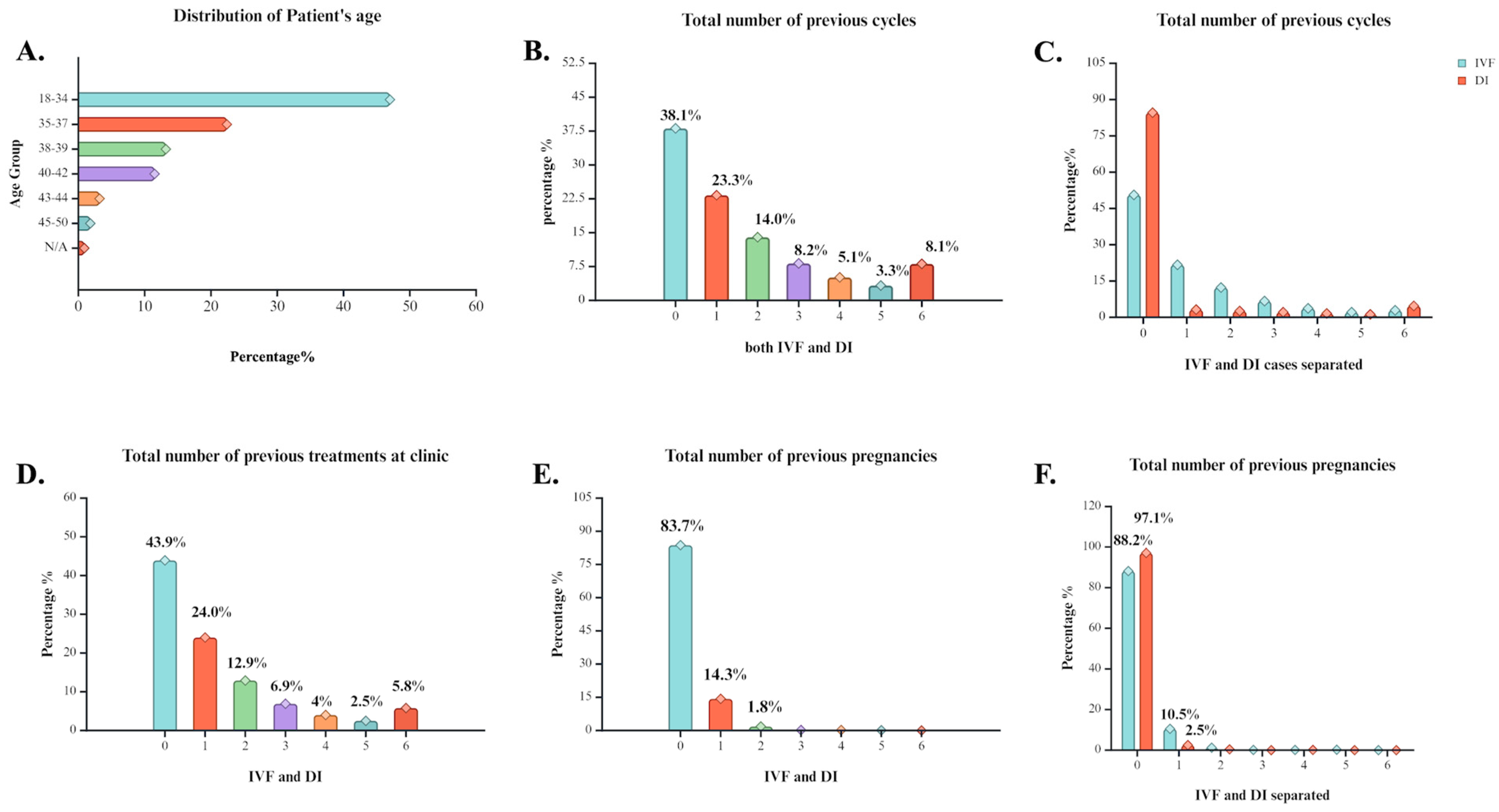
Figure 1.
Statistical analysis of general history characteristics of cases that underwent ART treatment at the clinic between 1991 and 2018. (A) Percentage distribution of individuals across different age groups. Age clusters vary from 18–50 years old and N/A refers to individuals with their age not registered. (B) Percentage distribution of individuals based on the number of previous ART cycles reported. (C) Percentage distribution of individuals based on the number of previous IVF or DI cycles reported. (D) Percentage distribution of individuals based on the number of previous treatment procedures at the clinic. (E) Percentage distribution of individuals based on the number of previous pregnancy occurrence. (F) Percentage distribution of individuals based on the number of previous pregnancy occurrence separated by method induced. Created with BioRender.com.
Figure 2.
Statistical analysis of treatment insights at the clinic of cases that underwent ART treatment at the clinic between 1991 and 2018. (A) Distribution of presence of specific cause of infertility among the cases. (B) Percentage of cases’ option for egg source. (C) Percentage of cases’ option for sperm source. (D) Distribution of main reason for treatment assigned. (E) General treatment type and percentage of its execution among the cases. (F) Percentage of stimulation induction usage among the cases. (G) Occurrence of preimplantation genetic diagnosis. (H) Occurrence of preimplantation genetic screening. (I) Percentage of cases that used either a fresh or a frozen cycle during the treatment. Created with BioRender.com.
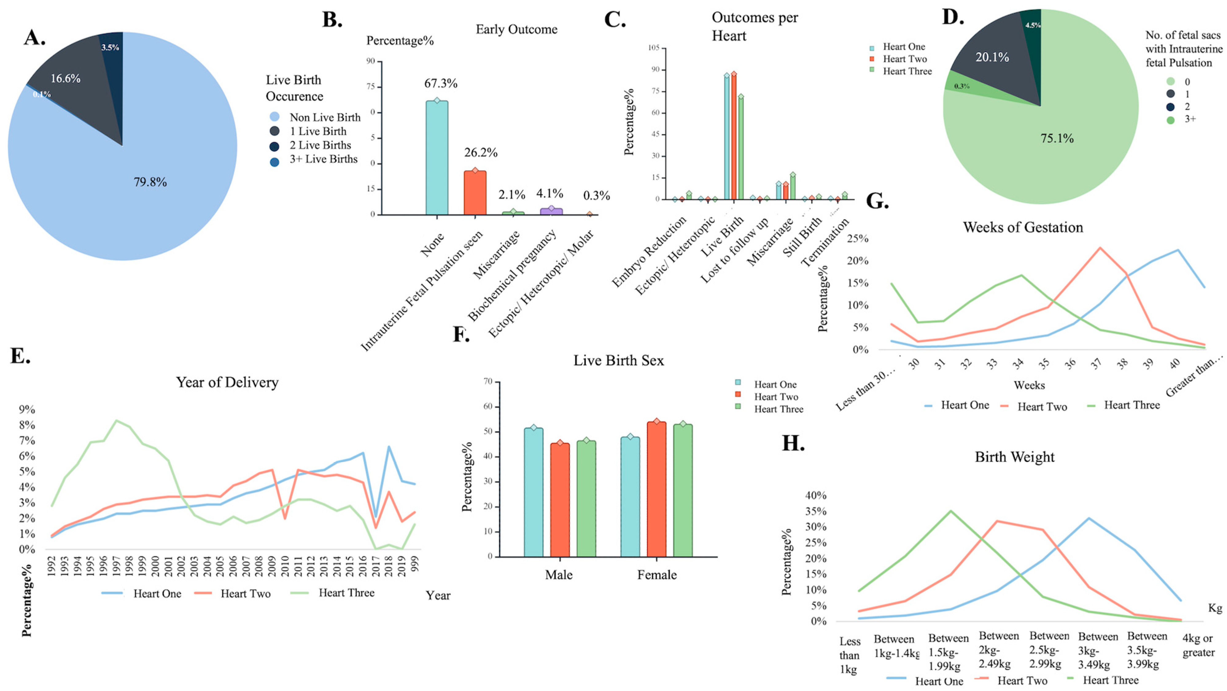
Figure 3.
Deliveries: fetal sacs’ characteristic insights. (A) Number of live birth occurrence pie chart. (B) Early outcome distribution among cases. (C) Different outcome distribution based on hearts found. (D) Number of fetal sacs seen with a pulsation pie chart. (E) Live birth delivery occurrence of Heart found, by year. (F) Birth sex assignment distribution by hearts found. (G) Weeks of gestation occurrence distribution for the different number of hearts found. (H) Newborn weight measurement distribution for the different number of hearts found. Created with BioRender.com.
Figure 4.
Statistical Analysis: a log-minus-log plot of the live birth occurrence for the year of treatment using as covariate the patient age at treatment, depicting CLBR in each age bracket throughout the years of IVF procedures at clinic.
Figure 4.
Statistical Analysis: a log-minus-log plot of the live birth occurrence for the year of treatment using as covariate the patient age at treatment, depicting CLBR in each age bracket throughout the years of IVF procedures at clinic.
Figure 5.
Blueprint extracted from the chosen algorithm of the “ar-2010-2018_complete features” dataset modeling. The blueprint explains the dataset’s pre-processing, post-processing, and algorithm deployment steps for model development.
Figure 5.
Blueprint extracted from the chosen algorithm of the “ar-2010-2018_complete features” dataset modeling. The blueprint explains the dataset’s pre-processing, post-processing, and algorithm deployment steps for model development.
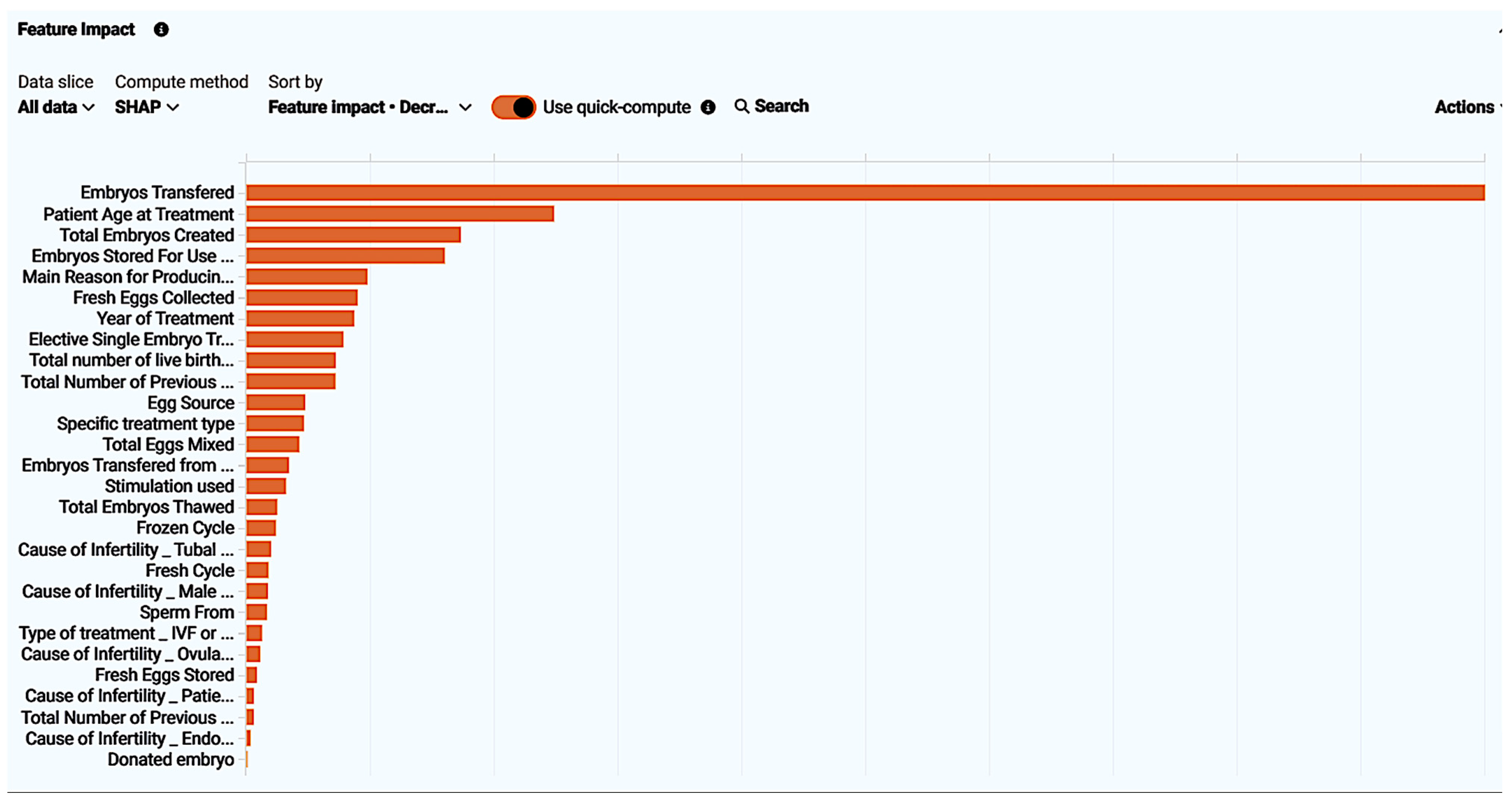
Figure 6.
Feature impact of every feature present in the “ar-2010-2018_compete features” dataset visualized. Feature impact ranks all features based on their influence in the live birth occurrence.
Figure 6.
Feature impact of every feature present in the “ar-2010-2018_compete features” dataset visualized. Feature impact ranks all features based on their influence in the live birth occurrence.
Figure 7.
Feature effect visualized by displaying the most common values with the target, resulting in a partial dependence graph line (blue dot line), the average prediction for an individual feature value (orange crosses), and the actual target outcome for the individual feature values (light blue circles). In this figure “Embryos Transferred” feature effect is displayed. All feature effects refer to “ar-2010-2018_complete features” dataset modeling.
Figure 8.
ROC curve insights for the model extracted from the “ar-2010-2018_complete features” dataset. Insights contain the prediction, distribution, which reveals that the model performance was effective as an illustration of the actual values distributed using as classification a threshold value. Additionally, metrics for the AUC score, sensitivity, specificity, etc., are displayed.
Figure 9.
Lift chart for the model extracted from the “ar-2010-2018_complete features” dataset. The lift chart reveals reliability by presenting the average predicted probability of live birth (orange chart) along with the average proportion of live births (blue graph) for the rows from the holdout data bin.
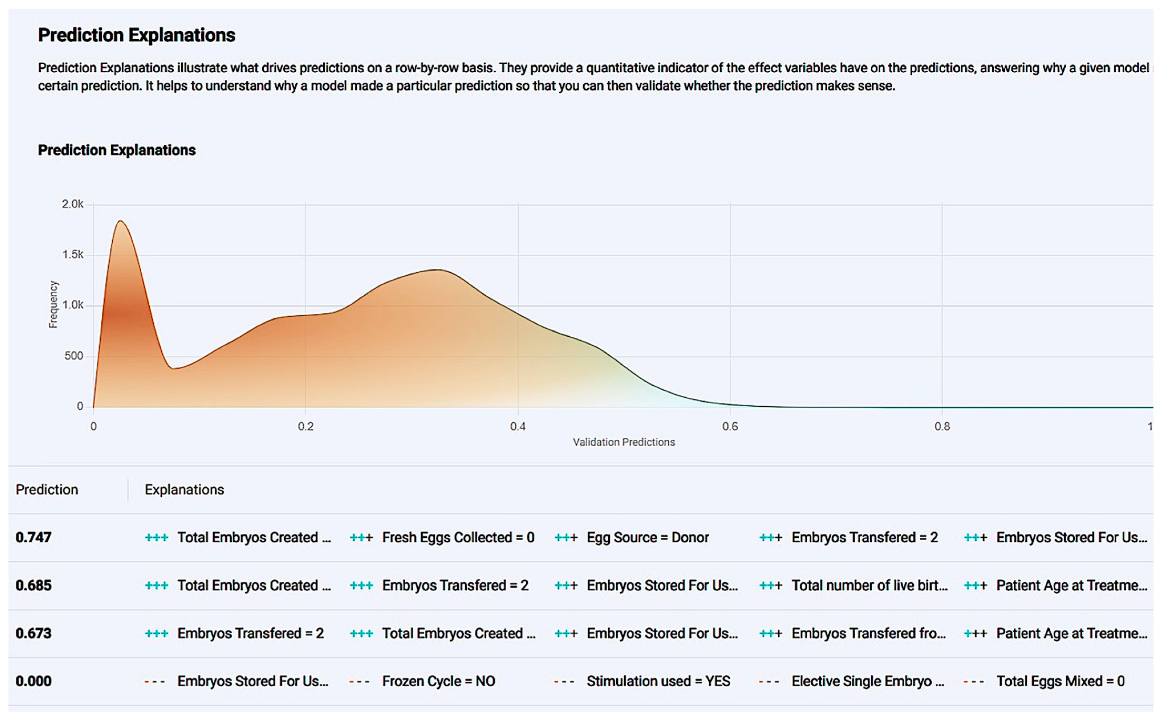
Figure 10.
The prediction explanation offers a comprehensive description of a case’s positive prediction score and the amount of positive or negative impact each value offered in contrast with the frequency of the result.
Figure 10.
The prediction explanation offers a comprehensive description of a case’s positive prediction score and the amount of positive or negative impact each value offered in contrast with the frequency of the result.
Figure 11.
Single-case new prediction environment derived from the application development of the “ar-2020-2018_complete feature” dataset model. User interaction table containing every impactful feature with different values present in the dataset were available as options.
Figure 11.
Single-case new prediction environment derived from the application development of the “ar-2020-2018_complete feature” dataset model. User interaction table containing every impactful feature with different values present in the dataset were available as options.
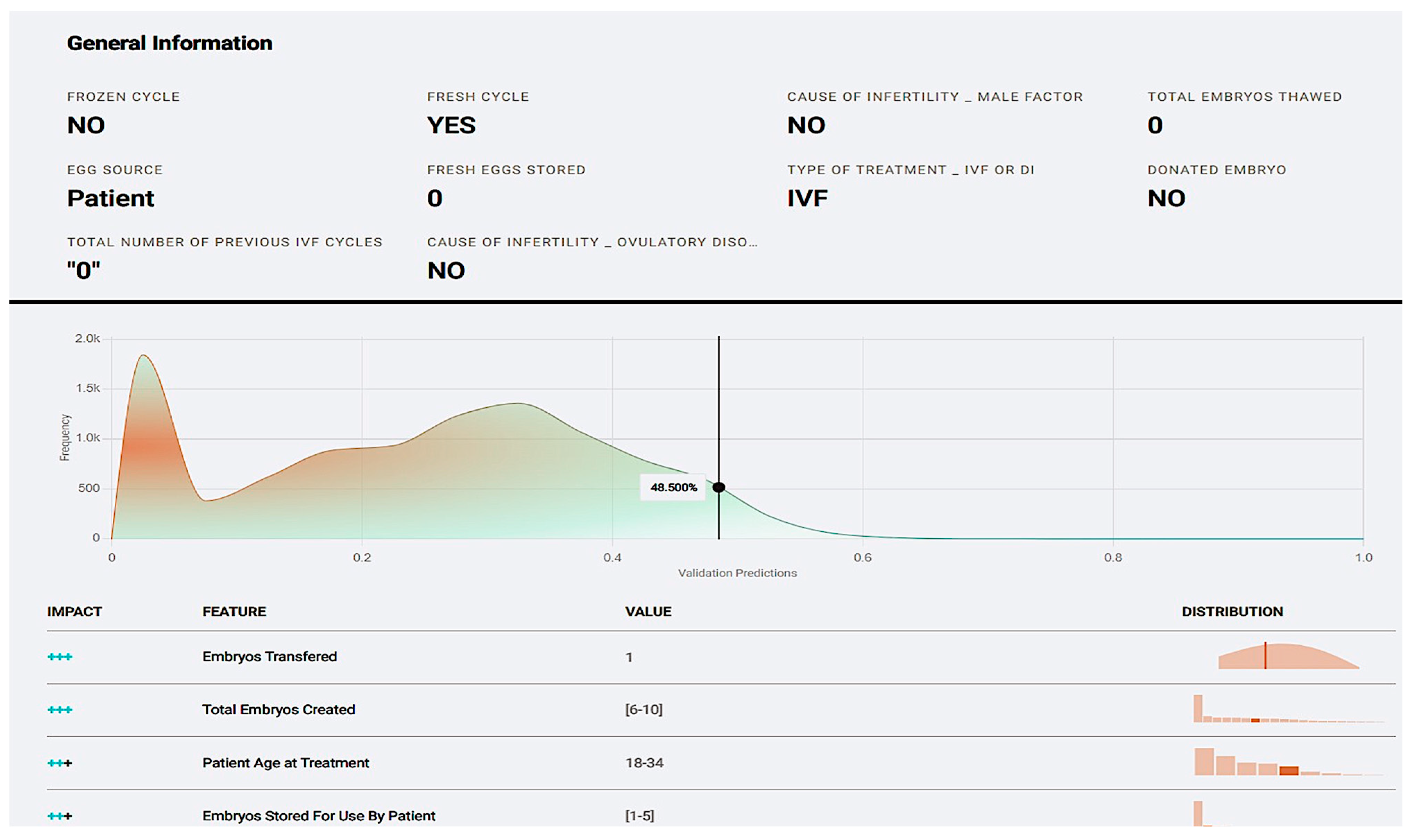
Figure 12.
User-submitted case prediction explanation based on features from the “ar-2010-2018_complete feature” model.
Figure 12.
User-submitted case prediction explanation based on features from the “ar-2010-2018_complete feature” model.
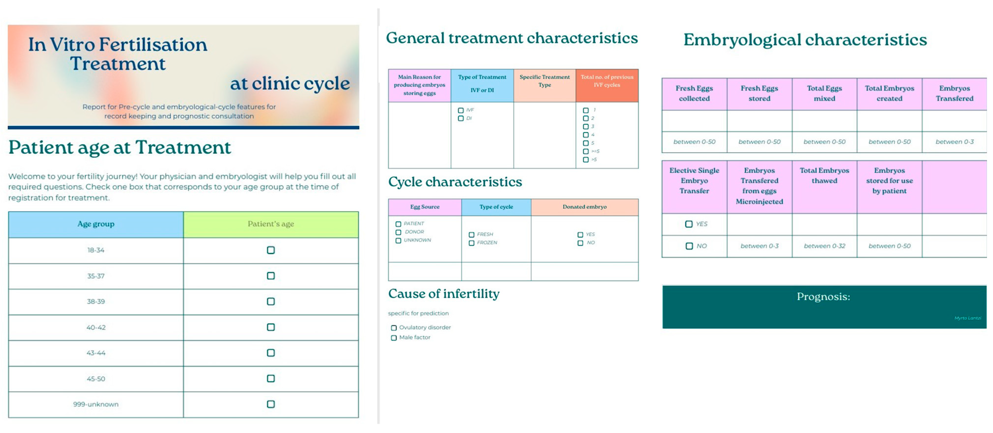
Figure 13.
Patient-friendly questionnaire created for potential incorporation in the data registration procedure for treatments at the clinic. The questionnaire was based on the features that appeared impactful for the model developed from the “ar-2010-2018_complete features” dataset.
Figure 13.
Patient-friendly questionnaire created for potential incorporation in the data registration procedure for treatments at the clinic. The questionnaire was based on the features that appeared impactful for the model developed from the “ar-2010-2018_complete features” dataset.
Figure 14.
Blueprint extracted from chosen algorithm of the “ar-2010-2018_pre-cycle features” dataset modeling. Blueprint explains the dataset’s pre-processing, post-processing, and algorithm deployment steps for model development.
Figure 14.
Blueprint extracted from chosen algorithm of the “ar-2010-2018_pre-cycle features” dataset modeling. Blueprint explains the dataset’s pre-processing, post-processing, and algorithm deployment steps for model development.
Figure 15.
Feature impact of every feature present in the “ar-2010-2018_pre-cycle features” dataset visualized. Feature impact ranks all features based on their influence in the live birth occurrence.
Figure 15.
Feature impact of every feature present in the “ar-2010-2018_pre-cycle features” dataset visualized. Feature impact ranks all features based on their influence in the live birth occurrence.
Figure 16.
Feature effect visualized by displaying the most common values with the target resulting in a partial dependence graph line (blue dots), the average prediction for an individual feature value (orange crosses), and the actual target outcome for the individual feature values (light blue circles). In this figure, “Patient Age at treatment” feature effect is displayed. All feature effects refer to “ar-2010-2018_pre-cycle features” dataset modeling.
Figure 17.
ROC curve insights for model extracted from the “ar-2010-2018_pre-cycle features” dataset. Insights contain prediction distributions, revealing that the model performance was effective as an illustration of the actual values distributed using as a classification of the threshold value. Additionally, metrics for AUC score, sensitivity, specificity, etc., are displayed.
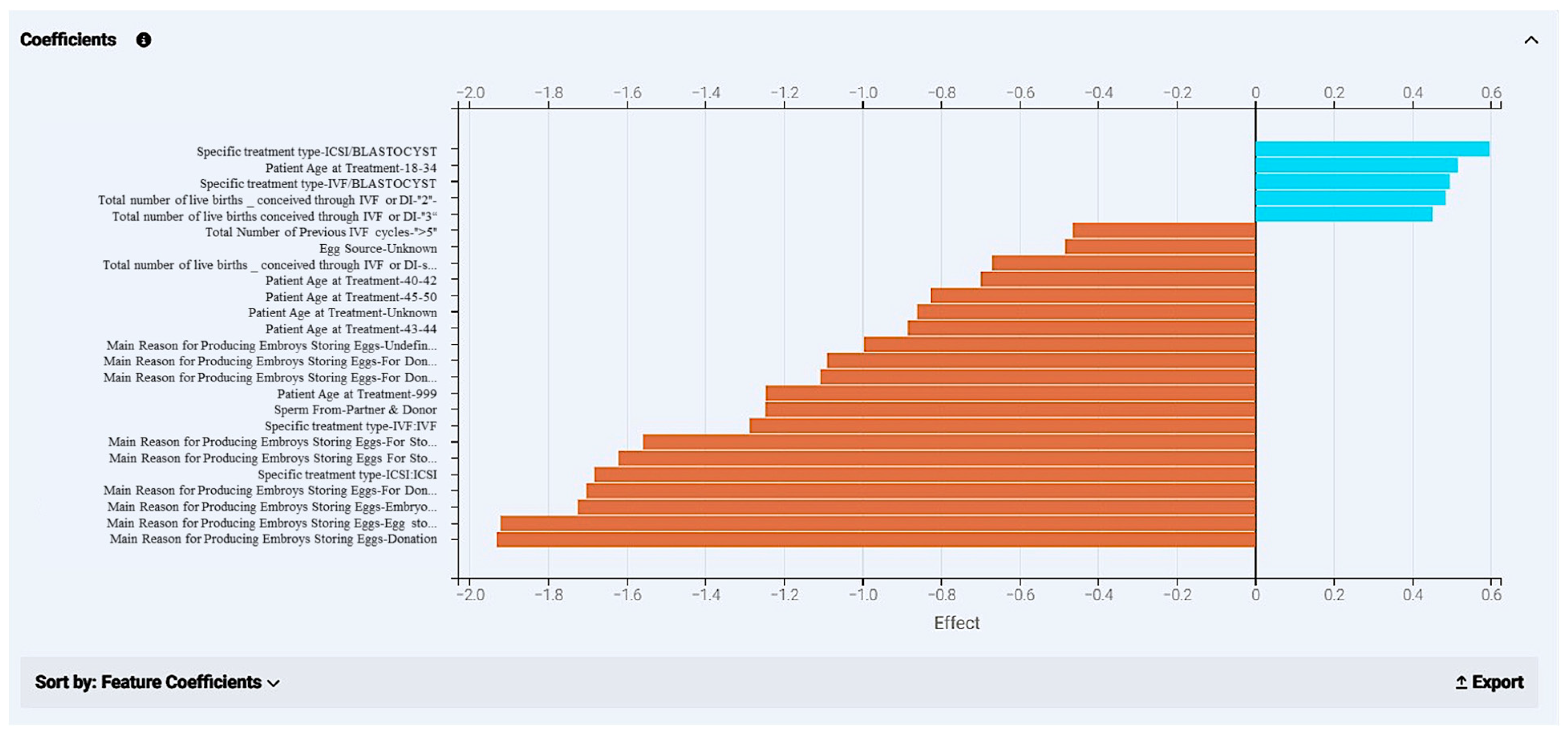
Figure 18.
Coefficients calculated from the model development of the “ar-2020-2018_pre-cycle features” dataset. The chart displays different kinds of features with the highest impact on the final prediction. Values that appear in blue have a positive effect in the outcome and display how much they navigate a case to a positive effect (“YES” in live birth occurrence); orange bars refer to values that drive a case towards a negative outcome (“NO” in live birth occurrence).
Figure 19.
Lift chart for the model extracted from the “ar-2010-2018_pre-cycle features” dataset. The lift chart reveals reliability by presenting the average predicted probability of live birth (orange chart) along with the average proportion of live births (blue graph) for rows from the holdout data bin.
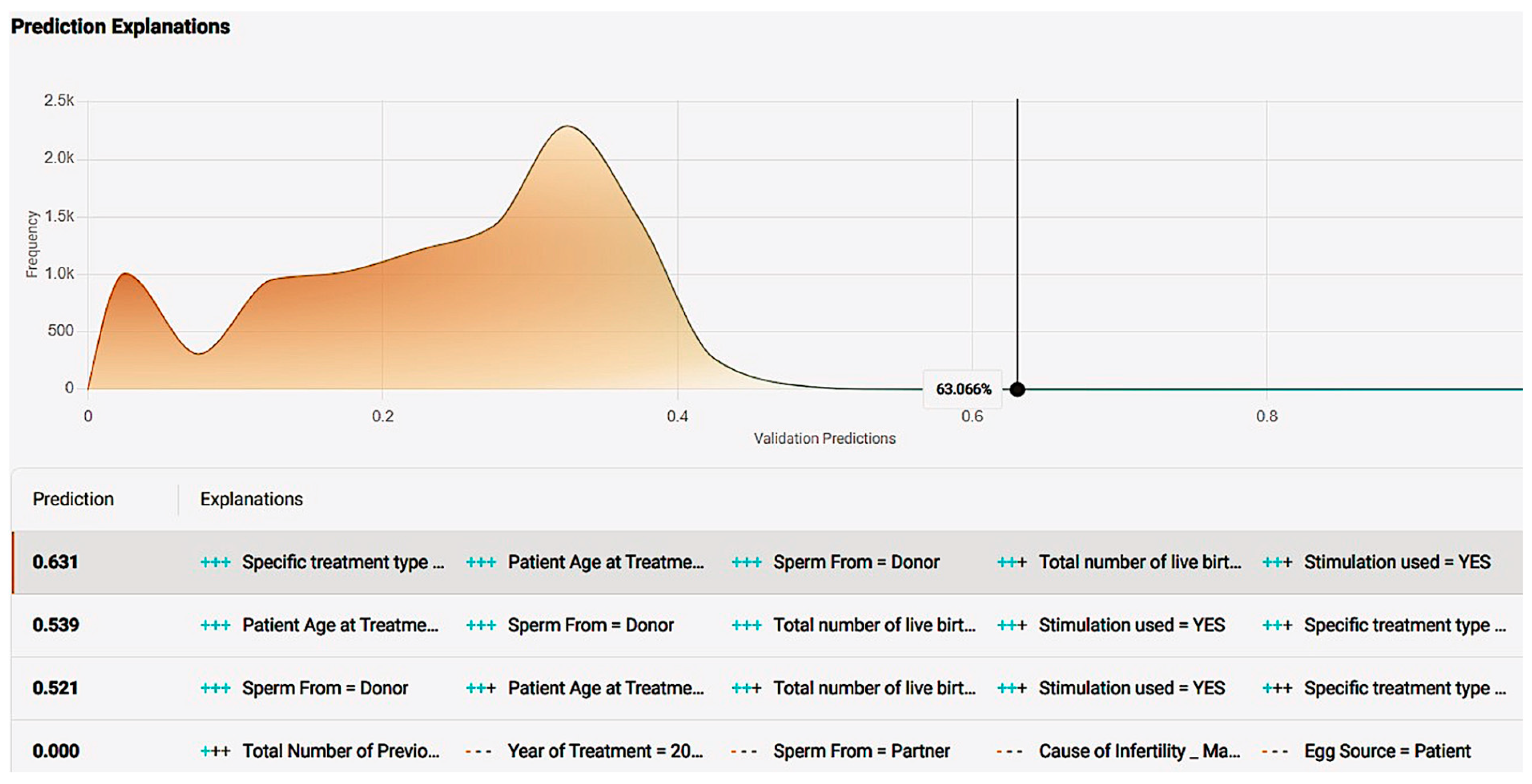
Figure 20.
Prediction explanation offering a comprehensive description of a case’s positive prediction score and the amount of positive or negative impact each value offered in contrast with the frequency of the result.
Figure 20.
Prediction explanation offering a comprehensive description of a case’s positive prediction score and the amount of positive or negative impact each value offered in contrast with the frequency of the result.
Figure 21.
Single-case new prediction environment derived from the application development of the “ar-2020-2018_pre-cycle features” dataset model. User interaction table containing every impactful feature with different values present in the dataset were available as options.
Figure 21.
Single-case new prediction environment derived from the application development of the “ar-2020-2018_pre-cycle features” dataset model. User interaction table containing every impactful feature with different values present in the dataset were available as options.
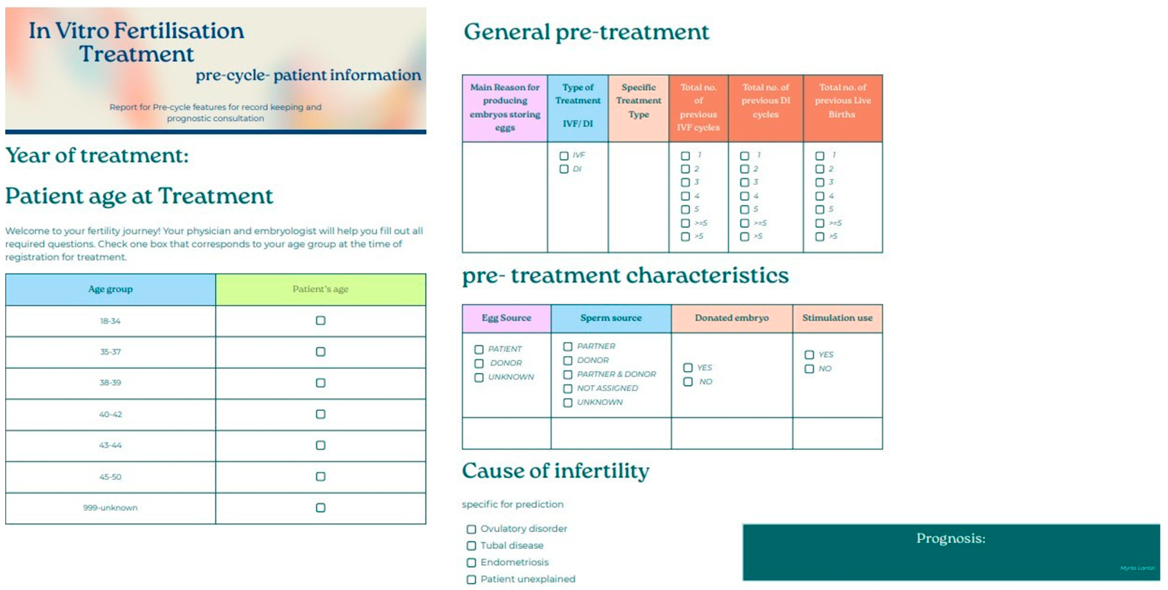
Figure 22.
Patient-friendly questionnaire created for potential incorporation in the data registration procedure for treatments at the clinic. The questionnaire was based on features that appeared impactful for the model developed from the “ar-2010-2018_pre-cycle features” dataset.
Figure 22.
Patient-friendly questionnaire created for potential incorporation in the data registration procedure for treatments at the clinic. The questionnaire was based on features that appeared impactful for the model developed from the “ar-2010-2018_pre-cycle features” dataset.
Table 1.
Dataset insights, number of features included, and number of final cases used. Both datasets include all cases between 2010 and 2018 after wrangling. Dataset named “ar-2010-2018_complete features” refers to pre-cycle and embryological, in-cycle characteristics; dataset “ar-2010-2018_pre-cycle features” contains features relevant to pre-treatment.
| Datasets | Features | Rows |
|---|
| IVF PREDICTION MODEL 2010–2018 complete features | 30 | 665.244 |
| IVF PREDICTION MODEL 2010–2018 pre-cycle features | 18 | 665.244 |
Table 2.
Descriptive statistics of various characteristics in fertilization procedure regarding the embryological parameters. The mean value, standard deviation, and minimum and maximum values displayed.
Table 2.
Descriptive statistics of various characteristics in fertilization procedure regarding the embryological parameters. The mean value, standard deviation, and minimum and maximum values displayed.
| | Mean | SD | Mdn | Min–Max |
|---|
| Fresh Eggs Collected | 7.3000 | 7.1000 | 6 | 0–50 |
| Fresh Eggs Stored | 0.0000 | 0.7000 | 0 | 0–46 |
| Total Eggs Mixed | 6.5000 | 6.4000 | 6 | 0–50 |
| Eggs Mixed With Partner Sperm | 6.3000 | 6.3000 | 5 | 0–50 |
| Eggs Mixed With Donor sperm | 0.4000 | 2.1000 | 0 | 0–50 |
| Total Embryos Created | 4.3000 | 4.6000 | 3 | 0–49 |
| Eggs Micro-injected | 2.8000 | 4.9000 | 0 | 0–50 |
| Embryos from Eggs Micro-injected | 1.9000 | 3.5000 | 0 | 0–43 |
| Total Embryos Thawed | 0.4000 | 1.3000 | 0 | 0–32 |
| Embryos Transfered | 1.5000 | 0.9000 | 2 | 0–4 |
| Embryos Transfered from Eggs Micro-injected | 0.6000 | 0.9000 | 0 | 0–4 |
| Embryos Stored For Use By Patient | 0.9000 | 2.5000 | 0 | 0–48 |
| Embryos (from Eggs Micro-injected) Stored For Use By Patient | 0.4000 | 1.5000 | 0 | 0–43 |
Table 3.
Differences in age (patient, egg, sperm donor) vs. live birth occurrence.
Table 3.
Differences in age (patient, egg, sperm donor) vs. live birth occurrence.
| | | Non-Live Birth | Live Birth | p-Value |
|---|
| Patient Age at Treatment | 18–34 | 0.4540 | 55.30% | <0.001 |
| 35–37 | 0.2230 | 23.90% |
| 38–39 | 0.1380 | 11.20% |
| 40–42 | 0.1280 | 6.90% |
| 43–44 | 0.0370 | 1.40% |
| Egg Donor Age at Registration | 45–50 | 0.0190 | 1.30% | <0.001 |
| <=20 | 0.0210 | 1.90% |
| 21–25 | 0.1380 | 15.30% |
| 26–30 | 0.32.50 | 34.70% |
| 31–35 | 0.5010 | 46.70% |
| 36–40 | 0.0160 | 1.50% |
| Sperm Donor Age at Registration | <=20 | 0.0950 | 7.70% | <0.001 |
| 21–25 | 0.3140 | 28.00% |
| 26–30 | 0.2270 | 23.00% |
| 31–35 | 0.1650 | 17.60% |
| 36–40 | 0.1290 | 15.00% |
| 41–45 | 0.0690 | 8.50% |
| >45 | 0.0010 | 0.20% |
Table 4.
Differences in history and procedure vs. live birth occurrence.
Table 4.
Differences in history and procedure vs. live birth occurrence.
| | | Non-Live Birth | Live Birth | p-Value |
|---|
| Total Number of Previous cycles (Both IVF & DI) | 0–1 | 60.20% | 66.20% | <0.001 |
| 2+ | 39.80% | 33.80% |
| Total number of previous pregnancies (Both IVF & DI) | 0 | 84.40% | 80.90% | <0.001 |
| 1+ | 15.60% | 19.10% |
| Type of treatment | IVF | 81.50% | 92.30% | <0.001 |
| DI | 18.50% | 7.7% |
| Elective Single Embryo Transfer | No | 87.50% | 76.70% | <0.001 |
| Yes | 12.50% | 23.30% |
| Egg Source | Patient | 95.50% | 94.10% | <0.001 |
| Donor | 4.50% | 5.90% |
| Sperm From | Partner | 77.10% | 86.20% | <0.001 |
| Donor | 22.90% | 13.80% |
Table 5.
Treatment cycle, stimulation used vs. live birth occurrence.
Table 5.
Treatment cycle, stimulation used vs. live birth occurrence.
| | | Non-Live Birth | Live Birth | p-Value |
|---|
| Cycle | Fresh | 0.7890 | 79.30% | <0.001 |
| Frozen | 0.2110 | 20.70% |
| Stimulation used | No | 0.3120 | 27.10% | <0.001 |
| Yes | 0.6880 | 72.90% |
Table 6.
Differences in various characteristics in fertilization procedure vs. live birth occurrence.
Table 6.
Differences in various characteristics in fertilization procedure vs. live birth occurrence.
| | Non-Live Birth | Live Birth | p-Value |
|---|
| Total Eggs Mixed | 6.08 ± 6.33 | 7.98 ± 6.25 | <0.001 |
| Eggs Mixed With Partner Sperm | 5.83 ± 6.26 | 7.81 ± 6.28 | <0.001 |
| Eggs Mixed With Donor sperm | 0.32 ± 1.97 | 0.48 ± 2.42 | <0.001 |
| Total Embryos Created | 3.87 ± 4.48 | 5.56 ± 4.62 | <0.001 |
| Embryos Transfered | 1.45 ± 0.97 | 1.80 ± 0.62 | <0.001 |
Table 7.
Cause of infertility vs. live birth occurrence.
Table 7.
Cause of infertility vs. live birth occurrence.
| | | Non-Live Birth | Live Birth | p-Value |
|---|
| Tubal disease | No | 83.2% | 83.8% | <0.001 |
| Yes | 16.8% | 16.2% |
| Ovulatory Disorder | No | 89.6% | 87.1% | <0.001 |
| Yes | 10.4% | 12.9% |
| Male Factor | No | 50.3% | 52.7% | <0.001 |
| Yes | 49.7% | 47.3% |
| Patient Unexplained | No | 75.7% | 72.8% | <0.001 |
| Yes | 24.3% | 27.2% |
| Endometriosis | No | 94.6% | 94.0% | <0.001 |
| Yes | 5.4% | 6.0% |
| Partner Sperm Concentration | No | 85.9% | 92.5% | <0.001 |
| Yes | 14.1% | 7.5% |
Table 8.
Model algorithm information for the “ar-2010-2018_complete features” dataset.
Table 8.
Model algorithm information for the “ar-2010-2018_complete features” dataset.
| | Model for Deployment: | | |
|---|
| eXtreme Gradient Boosted Trees Classifier with Early Stopping (Learning Rate = 0.02) |
|---|
| Training Scores: AUC | Training Settings |
|---|
| Validation | 0.7474 | Training feature list | Informative features- Leakage removed |
| Cross-validation | 0.747 | Training sample size | 100% (655,244 rows) |
| Holdout | 0.7466 | | |
Table 9.
Feature impact of every feature present in the “ar-2010-2018_compete features” dataset. Normalized score: relative importance. Feature impact ranks all features based on their influence in the live birth occurrence.
Table 9.
Feature impact of every feature present in the “ar-2010-2018_compete features” dataset. Normalized score: relative importance. Feature impact ranks all features based on their influence in the live birth occurrence.
| Feature Name | Relative Importance |
|---|
| Embryos Transfered | 1 |
| Patient Age at Treatment | 0.248421339 |
| Total Embryos Created | 0.173121607 |
| Embryos Stored For Use By Patient | 0.160096191 |
| Main Reason for Producing Embryos–Storing Eggs | 0.097558912 |
| Fresh Eggs collected | 0.089620152 |
| Year of treatment | 0.086912603 |
| Elective Single Embryo Transfer | 0.078173214 |
| Total number of live births _ conceived through IVF or DI | 0.071971854 |
| Total Number of Previous IVF cycles | 0.071772142 |
| Egg Source | 0.047395769 |
| Specific treatment type | 0.046299934 |
| Total Eggs Mixed | 0.042548409 |
| Embryos Transfered from Eggs Micro injected | 0.03432578 |
| Stimulation used | 0.031850656 |
| Total Embryos Thawed | 0.024764674 |
| Frozen Cycle | 0.023717849 |
| Cause of Infertility_ Tubal disease | 0.019816558 |
| Fresh Cycle | 0.017667274 |
| Cause of Infertility _ Male Factor | 0.017281755 |
| Sperm From | 0.01650989S |
| Type of treatment_ IVF or DI | 0.012494923 |
| Cause of Infertility _ Ovulatory Disorder | 0.010995262 |
| Fresh Eggs Stored | 0.008373111 |
| Cause of Infertility _ Patient Unexplained | 0.005891879 |
| Total Number of Previous DI cycles | 0.005842854 |
| Cause of Infertility _ Endometriosis | 0.003256256 |
| Donated embryo | 0.000734093 |
Table 10.
Model algorithm information for the “ar-2010-2018_pre-cycle features” dataset.
Table 10.
Model algorithm information for the “ar-2010-2018_pre-cycle features” dataset.
| Keras Deep Residual Neural Network Classifier Using Training Schedule (3 Layers: 512, 64, 64 Units) |
|---|
| Training Scores: AUC | Training Settings |
|---|
| Validation | 0.6725 | Training feature list | Informative features |
| Cross-Validation | 0.672 | Training sample size | 100% (655,244 rows) |
| Holdout | 0.6732 | | |
Table 11.
Feature impact of every feature present in the “ar-2010-2018_pre-cycle features” dataset. Normalized score: relative importance. Feature impact ranks all features based on their influence in the live birth occurrence.
Table 11.
Feature impact of every feature present in the “ar-2010-2018_pre-cycle features” dataset. Normalized score: relative importance. Feature impact ranks all features based on their influence in the live birth occurrence.
| Feature Name | Relative Importance |
|---|
| Patient Age at Treatment | 1 |
| Main Reason for Producing Embroys Storing Eggs | 0.8920162731263795 |
| Specific treatment type | 0.3887550025854647 |
| Stimulation used | 0.22568717745283595 |
| Total number of live births_ conceived through IVF or DI | 0.22391198318149877 |
| Sperm From | 0.20252134584065593 |
| Year of Treatment | 0.1928651226537317 |
| Total Number of Previous IVF cycles | 0.18957181358844258 |
| Egg Source | 0.16616890864503883 |
| Cause of Infertility Patient Unexplained | 0.1564999572046616 |
| Type of treatment_ IVF or DI | 0.11384410152058551 |
| Donated embryo | 0.092351681 |
| Cause of Infertility_Male Factor | 0.07976977 |
| Cause of Infertility_Tubal disease | 0.078500847 |
| Total Number of Previous DI cycles | 0.058750517288136066 |
| Cause of Infertility_Ovulatory Disorder | 0.041770416 |
| Cause of Infertility_Endometriosis | 0.017128636722770634 |
Table 12.
Success rates of IVF treatments at the clinic throughout the years 1991–2018. Live birth occurrence is assigned as successful treatment.
Table 12.
Success rates of IVF treatments at the clinic throughout the years 1991–2018. Live birth occurrence is assigned as successful treatment.
| Year of Treatment | Live Birth Occurrence (%) | Total Live Birth Occurrence (%) |
|---|
| 1991–1994 | 9.4396 | 20.1467 |
| 1995–1999 | 15.0564 |
| 2000–2004 | 18.2843 |
| 2005–2009 | 22.0873 |
| 2010–2014 | 24.0658 |
| 2015–2016 | 24.0236 |
| 2017–2018 | 24.1858 |


