Article

Legibility of Sans-Serif Typeface on Different Paper Grades Made from Invasive Alien Plant Species

by
Klementina Možina
1,*,
Dorotea Kovačević
2 and
Klemen Možina
1
1
Faculty of Natural Sciences and Engineering, University of Ljubljana, 1000 Ljubljana, Slovenia
2
Faculty of Graphic Arts, University of Zagreb, 10000 Zagreb, Croatia
*
Author to whom correspondence should be addressed.
Appl. Sci. 2024, 14(3), 1281; https://doi.org/10.3390/app14031281
Submission received: 25 December 2023 / Revised: 26 January 2024 / Accepted: 2 February 2024 / Published: 3 February 2024

Abstract

:

Featured Application

Papermaking and printing industry, usability, i.e., legibility of printed text.

Abstract

Invasive alien plant species (IAPS) may cause threats to native biodiversity in ecosystems. Researchers have been investigating all the possible ways that they can be used effectively for other purposes. Since IAPS are capable of forming cellulose fibre nets, in this research, papers were made from three different types of IAPS (Japanese knotweed, giant goldenrod, and black locust). This research examined these IAPS papers and their effectiveness when used as printing substrates. In comparison to commercial office paper, the differences in basic, surface, optical, and microscopic properties were measured. As a widely used technology, inkjet printing was applied. We tested a commonly used sans-serif typeface (which has been established as being more legible than other typefaces in previous research) in three different type sizes (i.e., 8, 10, and 12 pt). According to the results, paper made from IAPS could offer some usable properties and acceptable legibility, especially when printing typefaces with specific attributes, such as moderate counter size, higher x-height, and minimal differences in the letter stroke width, are used. An appropriate typographic tonal density should be achieved in combination with an adequate letter size, e.g., 10 pt type size when a sans-serif typeface is used.

1. Introduction

Invasive alien plant species (IAPS) are non-native plants that are a consequence of human activities and cause problems on a worldwide scale [1,2]. They significantly impact ecosystems from the local to landscape scale [3,4,5], and they also have a socio-economic influence on human well-being [6]. The costs associated with the control and containment of already established IAPS are very high [7,8]. Prevention, increased awareness, and rapid responses are essential for avoiding further spread of these species [9]. Engaging citizens to help with early detection may be highly useful [5,9]. In this case, ecologists and the community both work towards the same goal by obtaining information about the location of IAPS [5,10]. At the same time, the citizens improve their ecological knowledge, increase their ecological awareness, and foster a sense of community affiliation [11,12,13].
The APPLAUSE project, an abbreviation for Alien Plant Species from Harmful to Useful with Citizens’ Led Activities, explored the potential utilisation of invasive alien plant species in the creation of different products within a circular economy framework [14]. As part of this initiative, seven of these species were used in a trial about paper production, including varieties such as Japanese knotweed, giant goldenrod, and black locust [15].
Japanese knotweed (Fallopia japonica) is an extensively distributed invasive alien plant species (IAPS) found across Europe and North America [16]. It is recognisable by its abundant green foliage, dense yearly stems, and a rhizome crown located at the base of the plant [8,17]. It is a fast-growing competitor that adapts its growth very well to different environmental conditions [8]. Despite being invasive, it can have a positive impact on ecosystems. The plant can also be used as a source of food, dyes [16,17], or cellulose fibres.
Giant goldenrod (Solidago canadensis) is widely spread in North America. From there, it was introduced to Europe and Asia. It has a high growth rate due to its ability to spread via rhizomes, production of a considerable number of wind-borne seeds that germinate on a wide range of different soils, and allelopathic interactions which inhibit the growth of seedlings of other species [18,19,20].
Black locust (Robinia pseudoacacia) is an invasive species in Europe which also originates from North America. Considered as one of the most commonly planted woody species, it is used as an ornamental tree, for the production of different types of timber, as firewood, as bees’ nectar sources, and to control erosion [21,22,23]. It threatens natural habitats by reducing local biodiversity [24].
Some studies have reported [25,26] about the adequate strength properties of papers made from different fast-growing annual plant species. It was determined that enhancing the fibre processing and paper-making procedures is essential for achieving optimal printability. This involves increasing whiteness through elemental chlorine-free (ECF) delignification [27] and reducing roughness, often achieved through calendering [28]. Additionally, paper coating further enhances print quality [29]. The aim of our research was hence to investigate the usability of paper with fibres from Japanese knotweed, giant goldenrod, and black locust which can serve as printing substrates. The inkjet printing technology is well adapted to current trends in digital printing that have gained importance in recent years. The main advantages of the inkjet technology are low costs and reliability [30]. Therefore, these printing technologies are widely used in the home environment as well as for printing documents intended for storage.
When interpreting symbols into meaningful content, whether on paper or a screen, the ease of this process defines legibility [31]. Various studies emphasise the significance of legibility, which is essentially a facet of usability [32,33,34,35]. Legibility is, to a certain extent, associated with the characteristics of the substrate. Therefore, substrate properties, such as whiteness, gloss, and smoothness, may affect digital print quality [36]. Consequently, it is not surprising that certain paper attributes, including colour and structure, can determine the legibility and quality of a printed text [37]. While paper attributes significantly contribute to the clarity and legibility of a print, the influence of typographic characteristics on enhancing text legibility also plays an important role [38]. Notably, in smaller type sizes, differences in stroke weight and typographic tonal density significantly affect text legibility [39]. Typographic tonal density (TTD) denotes the darkness or grayscale of text on a page and can be quantified by ink concentration per unit area, be it in square centimetres, picas, or inches [40]. Thicker stroke widths imply more ink coverage per area [34,41]. Enhancing text legibility involves considering specific typeface characteristics, including distinct character features, x-height, ascenders, descenders, stroke weight contrast, letter width, typeface size, leading (line spacing), and more [42]. X-height represents the baseline-to-midline distance of lowercase letters, which impacts reading speed based on its visual angle [43]. Ascenders mark the distance between the midline and ascender line, while descenders indicate the space between the baseline and descender line. Contrast arises from the variance in thick and thin strokes within a letter [41]. Typically, for a continuous text at a standard reading distance of 30–35 cm, the recommended type size ranges from 8 or 9 to 11 or 12 points (1 point = 4.233 mm) [35]. However, the ideal type size depends on the typeface’s x-height—moderately larger x-heights generally enhance legibility, particularly at smaller sizes [43].
The aim of the present research was to establish the usability, i.e., legibility, of prints on different papers with cellulose fibres that are extracted from the above-mentioned IAPS. The most relevant characteristics, such as the paper, typographic, and colorimetric properties, of inkjet prints on papers made from Japanese knotweed, giant goldenrod, and black locust were measured and compared to the prints on commercial office paper. To evaluate legibility, a group of observers read texts in the sans-serif typeface Arial, a typeface which was [35] found to be more legible compared to the transitional typeface Times New Roman in previous research. Texts in three different type sizes were printed on all four paper grades for this assessment.

2. Materials and Methods

2.1. Paper Properties

To get an overall idea about the printability of some IAPS paper grades, we compared their properties with widely used common commercial office paper. The papers under investigation were all manufactured using specific industrial paper machines. Samples were ground to 0.5 mm. Papers derived from IAPS were processed using an Andritz paper machine situated at the Pulp and Paper Institute in Ljubljana, Slovenia, operated by Andritz AG, Graz, Austria. The commercial office paper was produced at the paper mill Radeče papir Nova in Radeče, Slovenia, using a Paper Machine 4 (PM4) from Voith Paper Krieger, located in Mönchengladbach, Germany. The production setups were fixed and not altered during the research.
The studied IAPS papers, i.e., cellulose fibres used to produce the papers, were delignified on a laboratory scale (18% NaOH and 6% Na2S; ratio between reagent and biomass 5:1 at 175 °C for 3 h and refined at 1600 rpm [15]), where the Japanese knotweed paper (S2) was produced from 40% of Japanese knotweed, 40% of eucalyptus, and 20% of unbleached spruce cellulose fibres. The studied giant goldenrod paper (S3) was produced from 45% of giant goldenrod, 30% of eucalyptus, and 25% of unbleached spruce cellulose fibres, while the studied black locust paper (S4) was produced from 52% of black locust, 24% of eucalyptus, and 24% of unbleached spruce cellulose fibres. These fibre compositions were chosen in order to gain the maximum balance between the physical–mechanical properties (cross linkage of long (conifer) and short (deciduous) fibres) and sustainability of the base materials. All studied IAPS papers comprised CaCO3 as a filler and conventional additives, i.e., starch, alkyl ketene dimer, and retention supplement. Commercial office paper (S1) consisted of spruce, pine, and beech fibres combined with CaCO3 and typical additives.
Before assessing the paper characteristics, the samples underwent conditioning procedures aligned with the ISO 187 standard [44]. Subsequently, the physical and colorimetric properties were evaluated on the felt side, i.e., upper side, which is topographically more equal, following ISO standards [45,46,47,48,49,50,51,52], and the findings are detailed in Table 1. The methods used in this research were selected so that the best information on the relevant basic, structural, surface, and optical properties of the papers could be obtained using procedures conducted according to the standards.

2.2. Colorimetric and Typographic Properties of Prints

Black prints were generated using an HP Officejet Pro X576dw MFP inkjet printer, produced by Hewlett-Packard Development Company in Dallas, TX, USA, operating at a resolution of 1200 dpi and a maximum speed of 42 ppm. These prints utilised the original pigment-based black ink. All prints were made on the felt side of the paper. For each of the four paper types, five screened field intensities (20%, 40%, 60%, 80%, and 100%) were printed during the analysis. One widely used typeface was tested, i.e., sans-serif typeface Arial, as previous research [35] established that it has better legibility than the other tested, widely used typeface (i.e., Times New Roman). The chosen typeface was printed in three different sizes, i.e., 8, 10, and 12 pt. Prior to printing, samples of all four papers underwent conditioning procedures in adherence with the ISO 187 standard [44]. The printing process occurred in a room maintained at a temperature of 22 °C with a relative humidity of 55%.
The CIELAB values of all the papers and the printed screened fields were investigated using a spectrophotometric analysis. This process followed the guidelines outlined in the ISO 13655 standard [53]. An iOne spectrophotometer from X-Rite, based in Grand Rapids, MI, USA, employing a (45°a:0°) measurement geometry, white backing, D65 illuminant, and a 10° standard observer, was utilised for the measurements.
To assess the typographic tonal density (TTD) across different typeface sizes, image analysis was conducted using ImageJ software [54]. This software enables the measurement, analysis, and generation of output values such as area, particle count, and coverage percentage [54]. All samples measured were uniform in size, specifically 800 × 300 pixels. Before the measurements, the printed texts in all sizes and on all papers were scanned. Subsequently, each image of the text was converted into a binary image by the software. The coverage of the surface with printed text was then measured by the software without considering the influence of background brightness, i.e., paper.

2.3. Legibility

In order to avoid the influence of content or the complexity of texts on legibility during the reading speed assessment, we used the same texts as in previous research [35] on legibility conducted on one of the IAPS papers. The texts were taken from a Slovenian edition of the National Geographic journal. The text length varied between 640 and 707 characters. The typographic properties of the texts were also in line with previous research [35]. The leading was 1 pt larger than the type size, i.e., for the 8 pt type size, the leading was 9 pt; for the 10 pt type size, it was 11 pt; and for the 12 pt type size, it was 13 pt. The vertical view angle [43] was 0.229° at the 8 pt type size. At the 10 pt type size, the vertical view angle was 0.278°. At the 12 pt type size, the vertical view angle was 0.327°. The time spent to read 700 characters was calculated based on the total time required to read the whole text and was measured in seconds. To assess reading comprehension, we examined the proportion of correct answers to multiple-choice questions which had two response alternatives.
The observers (N = 50) were between 20 and 23 years old (M = 21.82, SD = 5.1), with normal or corrected-to-normal vision. The research was conducted in two parts to avoid fatigue, which may influence human responses. In the first part, the observers read texts on Japanese knotweed paper (S2) and black locust paper (S4). During the second part, which was conducted a week later, the observers read texts printed on giant goldenrod paper (S3) and commercial office Paper (S1). The participants were divided into four groups. Two groups included 13 people and two groups included 12 people. Each participant read all 12 combinations which resulted from manipulation of different levels of two factors (i.e., 3 type sizes and 4 papers). In order to reduce the possibility of order effects, the combinations of factors were presented in random order to each participant.
The influence of type size and paper grade on legibility was statistically analysed with the program IBM SPSS 23 (IBM Corp., Armonk, NY, USA). A two-way analysis of variance (ANOVA) was conducted to investigate whether type size (8, 10, and 12 pt) and paper variant (Japanese knotweed paper (S2), giant goldenrod paper (S3), black locust paper (S4), and commercial office paper (S1)) influence the participants’ reading time of 700 characters. Statistical hypotheses were tested at a 0.05 error rate. Since the Mauchly’s test showed that the assumption of sphericity was violated, the Greenhouse–Geisser correction was used in the analysis. Cochran Q tests were performed to investigate the influence of samples on the observers’ correct responses.

3. Results and Discussion

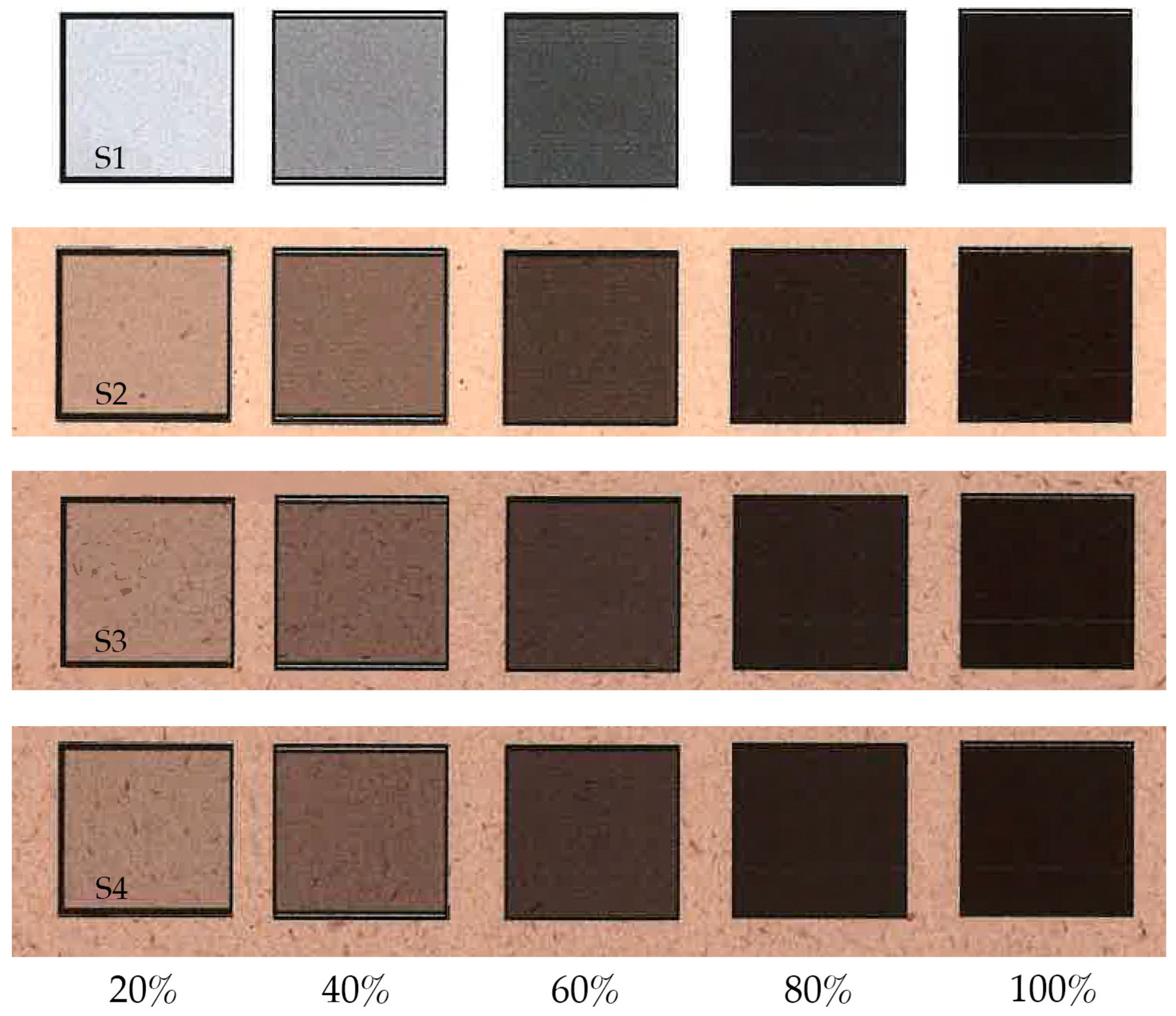
3.1. Colorimetric Properties of Prints

Figure 1 shows the five different field intensities printed on each of the four papers under investigation. Meanwhile, Table 2 outlines the CIELAB values for all the prints and papers. Notably, based on the L* value, the commercial office paper (S1 (91.81)) exhibited greater lightness compared to all of the IAPS papers (S2 (77.64), S3 (71.59), and S4 (71.18)). Moreover, the IAPS papers (S2–S4) were yellowish in colour (b* > 0) whereas the commercial office paper (S1) was bluish (b* < 0). Considering the whiteness values (Table 1), it is reasonable to infer that the commercial office paper contains a significant portion of optical brightening agents (OBAs), i.e., 101.91%.
We anticipated that there would be similar CIELAB values among the prints with 100% printing intensity across all four papers. However, differences in the a* and b* values were noticeable. For lightness (L*), differences among prints with 100% intensity were not noticeable, i.e., 30.87 (S1), 30.42 (S2), 30.59 (S3), and 30.29 (S4), which makes them suitable for office use.

3.2. Typographic Properties of Prints

The typographic tonal density (TTD) of the chosen typeface in different sizes was measured. In Figure 2, magnified images of the letter “a”, printed on four different papers and converted into binary images, are presented. The binary images of the text served as the basis for measuring the TTD. The printed samples of the studied typeface Arial at 8 and 10 pt size on all tested papers are presented in Figure 3. The printed texts, together with their TTD values of all three type sizes printed on all four different papers, are shown in Table 3.
In line with expectations, the highest typographic tonal density (TTD) was observed at the 8 pt typeface size across all printed papers (Table 3). The TTD for smaller typeface sizes is usually higher due to the smaller counter size of letters and leading [34,35,39].
According to the results (Table 3), paper selection can influence print properties. The IAPS papers (S2–S4) had higher TTDs among all the studied papers, which was expected based on their substantially higher roughness values (Table 1); the lowest TTD was found with commercial office paper (S1). The paper roughness affects the wicking and bleeding of the printed text, meaning that the sharpness of the edges of the letter images is reduced (Figure 2).

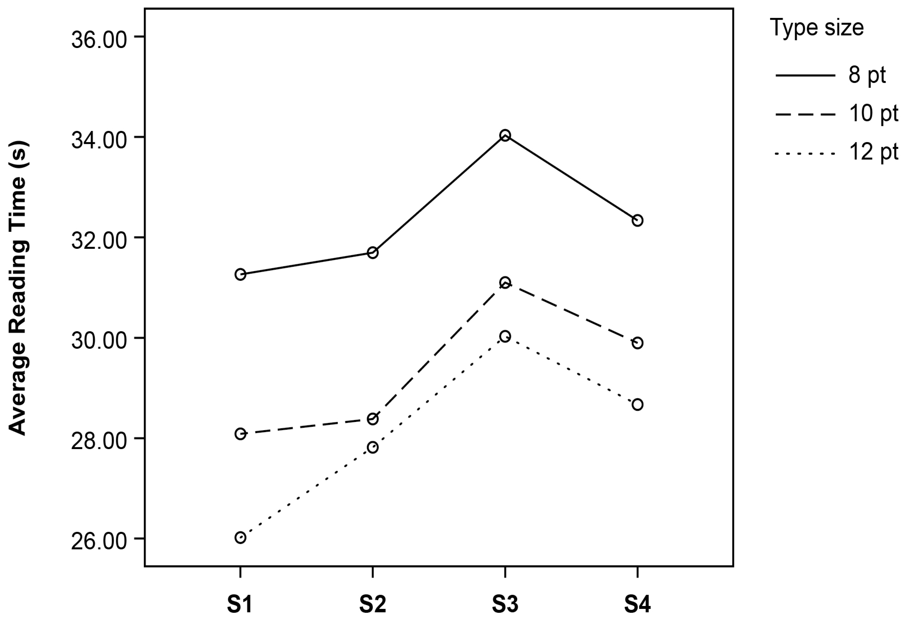
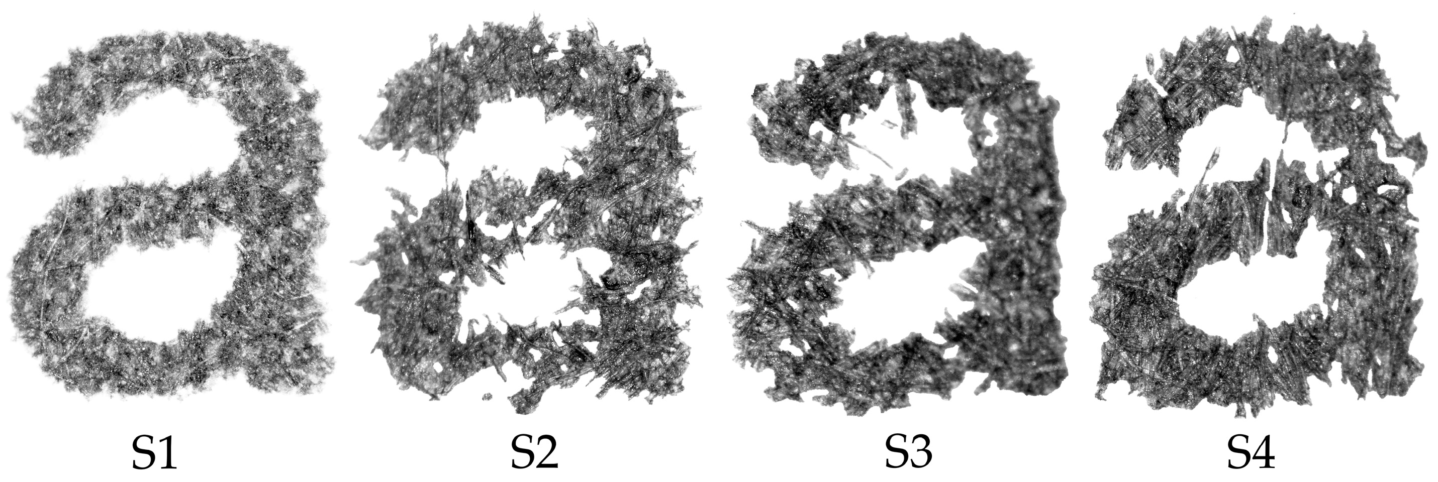
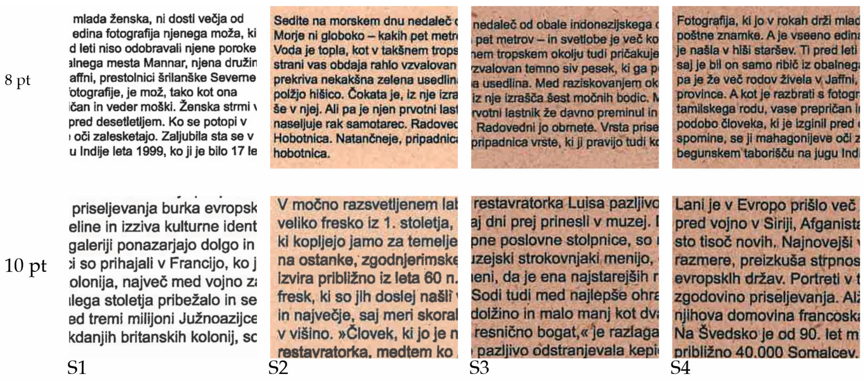
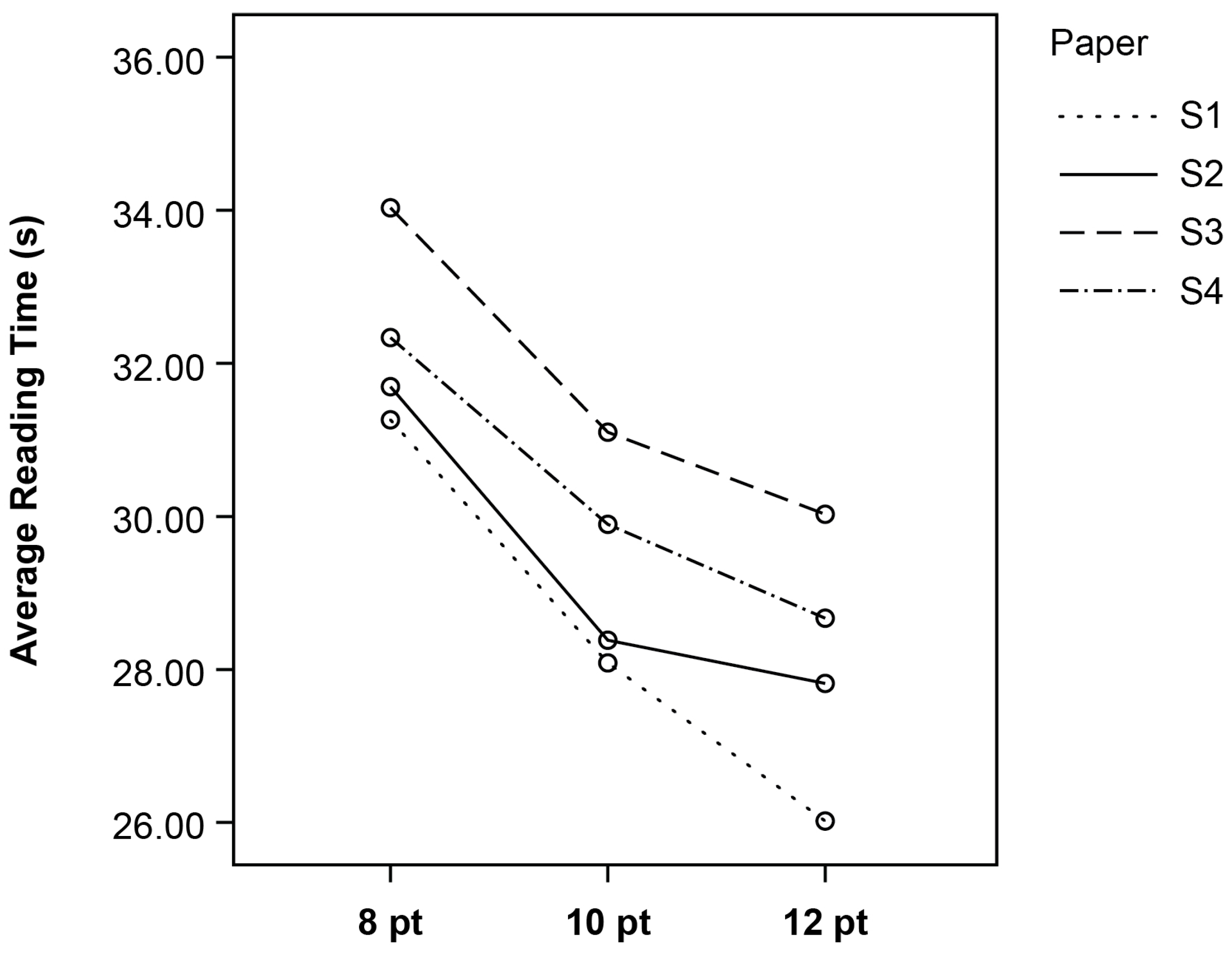
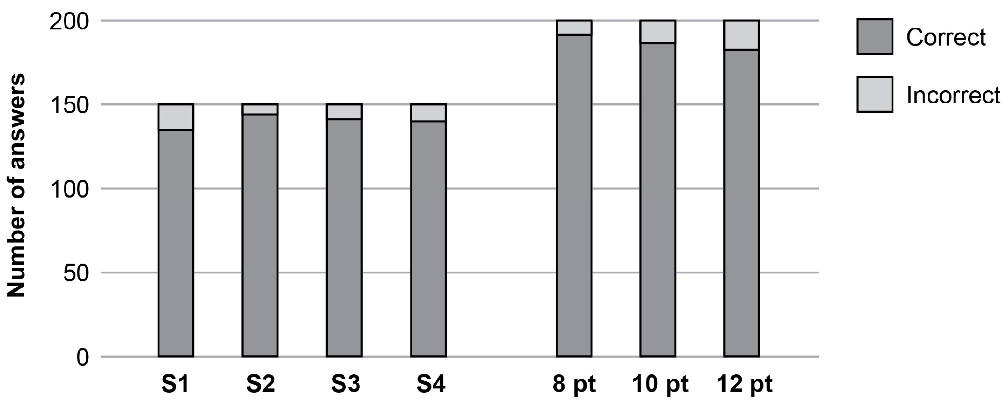
3.3. Legibility of Prints

Figure 4 shows the influence of type size on reading time. There was a significant effect of type size on reading time F(1.74, 85.36) = 64.03, p < 0.001. Post hoc analyses with Bonferroni adjustment indicated that the texts in 12 pt were read faster (M = 27.82 s, SD = 4.23) than the texts in 10 pt (M = 28.38 s, SD = 5.44), t(199) = 2.78, p < 0.05 and the texts in 8 pt (M = 31.69 s, SD = 4.88), t(199) = 9.52, p < 0.001. The texts in 10 pt had a shorter reading time than the texts in 8 pt t(199) = 7.38, p < 0.001. From the results, it can be inferred that in longer texts and higher type sizes, such as size 12 pt, the contrast between the background and the text significantly contributes to faster reading or better legibility. Commercial office paper (S1) has the highest whiteness. At smaller sizes, contrast is crucial for the reader’s ability to recognise individual characters. At larger sizes, where challenges in character recognition are not significant to the same extent, the combination of type size with a pronounced contrast enhances reading speed, i.e., legibility. Similar results, i.e., that a higher type size reduces reading time, were found in previous research [34,35], especially if the contrast between the background and printed text was reduced. Prior works suggest that contrast plays an important role in visual communication in terms of supporting functional legibility [55] and that poor contrast is one of the main factors that can cause difficulty for readers in general [56].
Figure 5 shows the influence of paper type on reading time. There was a significant effect of paper type on the participants’ reading time F(1.48, 72.49) = 5.74, p < 0.05. Additional post hoc analyses with Bonferroni adjustment indicated that the texts printed on Japanese knotweed paper (S2) (M = 31.69 s, SD = 4.89) had a shorter reading time than the texts printed on giant goldenrod paper (S3) (M = 34.03 s, SD = 7.92), t(149) = −3.31, p < 0.005. Similarly, the texts printed on commercial office paper (S1) (M = 31.26 s, SD = 5.34) had a significantly shorter reading time than the texts printed on giant goldenrod paper (S3), t(149) = 6.98, p < 0.001. The texts printed on commercial office paper (S1) also had a shorter reading time than the text printed on black locust paper (S4) (M = 32.34 s, SD = 6.00), t(149) = 3.04, p < 0.005. The other comparisons were not statistically significant. The shortest reading time was measured on commercial office paper (S1). These findings demonstrate that legibility is influenced by the whiteness of the background surface. While commercial office paper (S1) offers the most optimal conditions for a high text–background contrast, such high contrast levels were not achieved on the different IAPS papers. Among the papers from the IAPS, the reading time was the shortest for the texts printed on Japanese knotweed paper (S2) and the longest for the texts printed on giant goldenrod paper (S3). The latter finding is in accordance with our expectations, as we can see that, in line with the papers’ properties (Table 1), whiteness with UV of the IAPS papers (S2–S4) is just about one third of the value for commercial office paper (S1). This is especially important when the typeface has at most a moderate x-height [43].
The Cochran Q test was performed to analyse the effects of paper type and type size on the correctness of participants’ answers (Figure 6). The number of correct answers was the highest for the texts in 8 pt (95.0%) followed by the texts in 10 pt (92.5%) and the texts in 12 pt (90.5%). Regarding the paper variants, the results showed that the highest percentage of correct answers was with Japanese knotweed paper (S2) (71.5%) followed by giant goldenrod paper (S3) (70.0%), black locust paper (S4) (69.5%), and commercial office paper (S1) (67.0%). Some similarity was found with previous research [35]. This could suggest that when inappropriate typographic design, e.g., poor contrast, obstructed the reading, the texts were remembered better than when the texts were easily legible [57,58]. Nevertheless, our statistical analysis showed no significant difference between these percentages, suggesting that the participants’ answers were affected neither by variations in type size nor paper properties.
Studying prints on different papers with selected typeface and type sizes revealed that the substrate had more influence on the legibility than on the correctness of the participants’ answers. Our results suggest that if the contrast between the paper and typography are not good enough, the legibility can be improved with a typeface with a higher TTD and larger x-height.

4. Conclusions

Invasive alien plant species (IAPS) may cause threats to native biodiversity in ecosystems. Researchers have been trying to find some benefits of these plants in order to use them effectively for different purposes. Accordingly, papers from IAPS, i.e., Japanese knotweed, giant goldenrod, and black locust, were produced. The aim of the present research was to extensively examine these IAPS papers and test their effectiveness when used as printing substrates in comparison to commonly used commercial office paper. The results of measuring the reading speed revealed an important influence of paper characteristics, especially whiteness. The brownish colour of the IAPS papers diminished the contrast between the substrate and typeface and hindered readability. Therefore, it may be inappropriate to print typefaces in smaller sizes (e.g., footnotes, product manuals, patient information leaflets) on this paper due to a low contrast between the print and paper. Based on our results, we recommend that a typeface with a minor difference in stroke width and distinctive character features with at least 10 pt type size is selected. Moreover, even a slightly smaller type size could be effective in the cases when a sans-serif typeface with a higher x-height is used.
Another suggestion to improve the contrast between the substrate and impression is to add more ground calcium carbonate (GCC), i.e., H95 (OBAs), to the IAPS papers.
Our research had some limitations. The experiment included only Slovenian participants, which do not reflect the general population. Thus, future research would benefit from selecting a broader sample size that includes readers from other geographical areas where invasive alien plant species are more widespread. Furthermore, it would be interesting to explore how specific properties related to paper improvement (e.g., coatings) can enhance the text–background contrast and impact the legibility of a printed text, which could be a relevant issue when considering the widespread use of IAPS papers as printing substrates.

Author Contributions

Conceptualisation, K.M. (Klementina Možina) and K.M. (Klemen Možina); methodology, K.M. (Klementina Možina), D.K. and K.M. (Klemen Možina); formal analysis, K.M. (Klementina Možina) and K.M. (Klemen Možina); validation, D.K.; investigation, K.M. (Klementina Možina); resources, K.M. (Klementina Možina); writing—original draft preparation, K.M. (Klementina Možina); writing—review and editing, D.K. and K.M. (Klemen Možina); visualisation, D.K. and K.M. (Klemen Možina); supervision, K.M. (Klementina Možina), D.K. and K.M. (Klemen Možina); funding acquisition, K.M. (Klementina Možina) and K.M. (Klemen Možina). All authors have read and agreed to the published version of the manuscript.

Funding

This research was funded by the Slovenian Research and Innovative Agency, Innovative Graphic Technology programme.

Institutional Review Board Statement

In line with the rules of the Ethics Committee of the University of Ljubljana, no special approval is required for legibility tests. According to the Slovenian legislation, the participants involved in the research were of legal age, between 20 and 23 years old. Prior to the test, the participants were informed about how the test was going to be conducted, what tasks were involved, and approximately how long the test was going to take. Six different texts (12 different texts in total) were read twice, and 12 close-ended questions were answered. Prior to participating, all individuals who took part in the research agreed to participate voluntarily; they were not paid for or otherwise rewarded for their participation.

Informed Consent Statement

Informed consent was obtained from all subjects involved in the research.

Data Availability Statement

The data presented in this research are available upon request from the corresponding author.

Acknowledgments

The authors would like to express their sincere gratitude to the Pulp and Paper Institute, Slovenia, for producing the papers from the IAPS. We would also like to thank Jana Rozman for her assistance with the experiments.

Conflicts of Interest

The authors declare no conflicts of interest.

References

  1. Simberloff, D. Biological Invasions: What’s worth fighting and what can be won? Ecol. Eng. 2014, 65, 112–121. [Google Scholar] [CrossRef]
  2. Foxcroft, L.C.; Pyšek, P.; Richardson, D.M.; Genovesi, P.; MacFadyen, S. Plant invasion science in protected areas: Progress and priorities. Biol. Invasions 2017, 5, 1353–1378. [Google Scholar] [CrossRef]
  3. Coutts, S.R.; van Klinken, D.; Yokomizo, H.; Buckley, Y.M. What are the key drivers of spread in invasive plants: Dispersal, demography or landscape: And how can we use this knowledge to aid management? Biol. Invasions 2010, 7, 1649–1661. [Google Scholar] [CrossRef]
  4. Mattos, K.J.; Orrock, J.L. Behavioral consequences of plant invasion: An invasive plant alerts rodent antipredator behavior. Behav. Ecol. 2010, 3, 556–561. [Google Scholar] [CrossRef]
  5. César de Sá, N.; Marchante, H.; Marchante, E.; Cabral, J.A.; Honrado, J.P.; Vicente, J.R. Can citizen science data guide the surveillance of invasive plants? A model-based test with Acacia trees in Portugal. Biol. Invasions 2019, 6, 2127–2141. [Google Scholar] [CrossRef]
  6. Simberloff, D.; Martin, J.-L.; Genovesi, P.; Maris, V.; Wardle, D.A.; Aronson, J.; Courchamp, F.; Galil, B.; Garcia-Berthou, E.; Pascal, M.; et al. Impact of biological invasions: What’s what and the forward. Trends Ecol. Evol. 2013, 1, 58–66. [Google Scholar] [CrossRef]
  7. Hulme, P.E. Beyond control: Wider implications for the management biological invasions. J. Appl. Ecol. 2006, 43, 835–847. [Google Scholar] [CrossRef]
  8. Jones, D.; Bruce, G.; Fower, M.S.; Law-Cooper, R.; Graham, I.; Abel, A.; Street-Perrot, F.A.; Eastwood, D. Optimising physiochemical control of invasive Japanese knotweed. Biol. Invasions 2018, 8, 2091–2105. [Google Scholar] [CrossRef]
  9. European Union, Regulation (EU). No 1143/2014 of the European Parliament and of the Council of 22 October 2014 on the prevention and management of the introduction and spread invasive alien species. Off. J. Eur. Union. 2014, 317, 35–55. [Google Scholar]
  10. Pagès, M.; Fischer, A.; van der Wal, R.; Lambin, X. Empowered communities or “cheap labour”? Engaging volunteers in the rationalised management of invasive alien species in Great Britain. J. Environ. Manag. 2019, 229, 102–111. [Google Scholar] [CrossRef]
  11. Vaz, A.S.; Kueffer, C.; Kull, C.A.; Richardson, D.M.; Vicente, J.R.; Kühn, I.; Schröter, M.; Hauck, J.; Bonn, A.; Honrado, J.P. Integrating ecosystem services and disservices: Insights from plant invasions. Ecosyst. Serv. 2017, 23, 94–107. [Google Scholar] [CrossRef]
  12. McGinlay, J.; Parsons, D.; Morris, J.; Gaves, A.; Hubatova, M.; Bradbury, R.B.; Bullock, J.M. Leisure activities and social factors influence the generation of cultural ecosystem service benefits. Ecosyst. Serv. 2018, 31, 468–480. [Google Scholar] [CrossRef]
  13. Shackleton, R.S.; Larson, B.M.H.; Novoa, A.; Richardson, D.M.; Kull, C.A. The human and social dimension of invasion science and management. J. Environ. Manag. 2019, 229, 1–9. [Google Scholar] [CrossRef]
  14. Ficko, T. Ljubljana Circular Economy. Available online: https://www.uia-initiative.eu/en/uia-cities/ljubljana (accessed on 21 October 2023).
  15. Kapun, T.; Šinkovec, A.; Zule, J.; Skodlar, M.; Lavrič, G. Paper products made of paper from IPAS. In Proceedings of the 1st International Conference on Circular Packaging (CMC 2019), Ljubljana, Slovenia, 26–27 September 2019; pp. 197–204. [Google Scholar]
  16. Lavoie, C. The impact of invasive knotweed species (Reynoutria spp.) on the environment: Review and research perspectives. Biol. Invasions 2017, 19, 2319–2337. [Google Scholar] [CrossRef]
  17. Kimber, E. Invasive Non-Native Species (UK)–Japanese Knotweed. Inside Ecology: Online Magazine for Ecologists, Conservationists and Wildlife Professionals. Available online: https://insideecology.com/2017/08/23/invasive-non-native-species-uk-japanese-knotweed/ (accessed on 19 August 2023).
  18. Weber, E.; Jakobs, G. Biological flora of central Europe: Solidago gigantea Aiton. Flora-Morphol. Distrib. Funct. Ecol. Plants 2005, 200, 109–118. [Google Scholar] [CrossRef]
  19. De Groot, M.; Kleijn, D.; Jogan, N. Species groups occupying different trophic levels respond differently to the invasion of semi-natural vegetation by Solidago canadensis. Biol. Conserv. 2007, 136, 612–617. [Google Scholar] [CrossRef]
  20. Abhilasha, D.; Quintana, N.; Vivanco, J.; Joshi, J. Do allelopathic compounds in invasive Solidago canadensis restrain the native European flora? J. Ecol. 2008, 96, 993–1001. [Google Scholar] [CrossRef]
  21. Veitch, N.C.; Elliott, P.C.; Kite, G.C.; Lewis, G.P. Flavonoid glycosides of the black locust tree, Robinia pseudoacacia (Leguminosae). Phytochemistry 2010, 71, 479–486. [Google Scholar] [CrossRef]
  22. Vítková, M.; Müllerová, J.; Sádlo, J.; Pergl, J.; Pyšek, P. Black locust (Robinia pseudoacacia) beloved and despised: A story of an invasive tree in Central Europe. For. Ecol. Manag. 2017, 384, 287–302. [Google Scholar] [CrossRef]
  23. Nicolescu, V.N.; Hernea, C.; Bakti, B.; Keserű, Z.; Antal, B.; Rédei, K. Black locust (Robinia pseudoacacia L.) as a multi-purpose tree species in Hungary and Romania: A review. J. For. Res. 2018, 29, 1449–1463. [Google Scholar] [CrossRef]
  24. Kleinbauer, I.; Dullinger, S.; Peterseil, J.; Essl, F. Climate change might drive the invasive tree Robinia pseudacacia into nature reserves and endangered habitats. Biol. Conserv. 2010, 143, 382–390. [Google Scholar] [CrossRef]
  25. Ali, F.; Sarma, T.C.; Saikia, C.N. Pulp and paper from a certain fast-growing plant species. Bioresour. Technol. 1993, 1, 65–67. [Google Scholar] [CrossRef]
  26. Saikia, C.N.; Goswami, T.; Ali, F. Evaluation of pulp and paper making characterictis of certain fast growing plants. Wood Sci. Technol. 1997, 6, 467–475. [Google Scholar] [CrossRef]
  27. Iglesias, A.; Cancela, Á.; Soler Baena, A.; Sánches, Á. Characterization of Cellulose Derived from Invasive Alien Species Plant Waste for Application in the Papermaking Industry: Physic-Mechanical, Optical, and Chemical Property Analysis. Appl. Sci. 2023, 13, 11568. [Google Scholar] [CrossRef]
  28. Lavrič, G.; Pleša, T.; Mendizza, A.; Ropret, M.; Karlovits, I.; Gregor Svetec, D. Printability characteristics of paper made from a Japanese knotweed. In Proceedings of the 9th International Symposium Graphic Engineering and Design (Grid 2018), Novi Sad, Serbia, 8–10 November 2018; pp. 99–102. [Google Scholar] [CrossRef]
  29. Sarjanović, A.; Možina, K.; Gregor-Svetec, D. Print Quality of Coated paper from Invasive Alien Plant Goldenrod. Coatings 2023, 13, 1754. [Google Scholar] [CrossRef]
  30. Hudd, A. Inkjet printing technologies. In The Chemistry of Inkjet Inks; Magdassi, S., Ed.; World Scientific Publishing: Hackensack, NJ, USA, 2010; pp. 3–18. [Google Scholar]
  31. Galle, P.; Kroes, P. Science and design: Identical twins? Design Stud. 2014, 35, 201–231. [Google Scholar] [CrossRef]
  32. Tai, Y.; Sheedy, J.; Hayes, J. Effect of letter spacing on legibility, eye movements, and reading speed. J. Vis. 2006, 6, 994. [Google Scholar] [CrossRef]
  33. Sharmin, S.; Špakov, O.; Räihä, K.-J. The effect of different text presentation formats on eye movement metrics in reading. J. Eye Mov. Res. 2012, 5, 1–9. [Google Scholar] [CrossRef]
  34. Možina, K.; Podlesek, A.; Bračko, S. Preserving typographic cultural heritage using contemporary digital technology. J. Cult. Herit. 2019, 2, 166–173. [Google Scholar] [CrossRef]
  35. Možina, K.; Bračko, S.; Kovačević, D.; Blaznik, B.; Možina, K. Legibility of Prints on Paper Made from Japanese Knotweed. BioResources 2020, 15, 3999–4015. [Google Scholar] [CrossRef]
  36. Wang, Y.; Ai, Y. Research on the Influence of Digital Printing Quality. In Proceedings of the 2nd World Conference on Mechanical Engineering and Intelligent Manufacturing (WCMEIM 2019), Shanghai, China, 22–24 November 2019; pp. 392–395. [Google Scholar] [CrossRef]
  37. Ataeefard, M. Investigating the effect of paper properties on color reproduction of digital printing. Prog. Org. Coat. 2014, 77, 1376–1381. [Google Scholar] [CrossRef]
  38. Kamandhari, H.H. The Comparability of Typographic and Substrate Characteristics as Independent Variables in Legibility and Readability Studies: An Integrative Review. Inf. Medium Soc. J. Pub. Stud. 2022, 20, 17–43. [Google Scholar] [CrossRef]
  39. Rat, B.; Možina, K.; Bračko, S.; Podlesek, A. Influence of Temperature and Humidity on Typographic and Colorimetric Properties of Ink Jet Prints. J. Imaging Sci. Technol. 2011, 55, 050607-1–050607-8. [Google Scholar] [CrossRef]
  40. Keyes, E. Typography, color, and information structure. Tech. Commun. 1993, 4, 638–654. [Google Scholar]
  41. Bringhurst, R. The Elements of Typographic Style, 4th ed.; Hartley & Marks: Point Roberts, WA, USA, 2002; pp. 119–142. [Google Scholar]
  42. Tracy, W. Letters of Credit: A View of Type Design, 2nd ed.; David, R. Godine: Boston, MA, USA, 2003; pp. 48–70. [Google Scholar]
  43. Legge, G.E.; Bigelow, C.A. Does print size matter for reading? A review of findings from vision science and typography. J. Vis. 2011, 5, 1–22. [Google Scholar] [CrossRef]
  44. ISO 187; Paper, Board and Pulps–Standard Atmosphere for Conditioning and Testing and Procedure for Monitoring the Atmosphere and Conditioning of Samples. ISO: Geneva, Switzerland, 2022; 7p, ICS 85.060.
  45. ISO 534; Paper and Board–Determination of Thickness, Density and Specific Volume. ISO: Geneva, Switzerland, 2011; 13p, ICS 85.060.
  46. ISO 535; Paper and Board–Determination of Water absorptiveness–Cobb Method. ISO: Geneva, Switzerland, 2023; 8p, ICS 85.060.
  47. ISO 536; Paper and Board–Determination of Grammage. ISO: Geneva, Switzerland, 2019; 8p, ICS 85.060.
  48. ISO 2470-1; Paper, Board and Pulps–Measurement of Diffuse Blue Reflectance Factor. ISO: Geneva, Switzerland, 2016; 11p, ICS 85.060.
  49. ISO 2471; Paper and Board–Determination of Opacity (Paper Backing)–Diffuse Reflectance Method. ISO: Geneva, Switzerland, 2008; 8p, ICS 85.060.
  50. ISO 21920-2; Geometrical Product Specification (GPS)–Surface Texture: Profile Method–Terms, Definitions and Surface Texture Parameters. ISO: Geneva, Switzerland, 2021; 25p, ICS 17.040.20.
  51. ISO 5636-3; Paper and Board–Determination of Air Permeance (Medium Range)–Bendtsen Method. ISO: Geneva, Switzerland, 2019; 14p, ICS 85.060.
  52. ISO 8791-2; Paper and Board–Determination of Roughness/Smoothness (Air Leak Methods)–Bendtsen Method. ISO: Geneva, Switzerland, 2018; 16p, ICS 85.060.
  53. ISO 13655; Graphic Technology–Spectral Measurement and Colorimetric Computation for Graphic Arts Images. ISO: Geneva, Switzerland, 2022; 49p, ICS 37.100.01.
  54. National Institutes of Health. Research Services Branch. Available online: http://rsb.info.nih.gov/ij/ (accessed on 18 October 2023).
  55. O’Connor, Z. Colour, contrast and Gestalt theories of perception: The impact in contemporary visual communications design. Color Res. Appl. 2013, 40, 85–92. [Google Scholar] [CrossRef]
  56. Alton Mackey, M.; Metz, M. Ease of reading of mandatory information on Canadian food product labels. Int. J. Consum. Stud. 2009, 33, 369–381. [Google Scholar] [CrossRef]
  57. Diemand-Yauman, C.; Oppenheimer, D.M.; Vaughan, E.B. Fortune favors the bold (and the Italicized): Effect of disfluency on educational outcomes. Cognition 2011, 118, 111–115. [Google Scholar] [CrossRef]
  58. Price, J.; McElroy, K.; Martin, N.J. The role of font size and font style in younger and older adults’ predicted and actual recall performance. Aging Neuropsychil. Cogn. 2015, 23, 366–388. [Google Scholar] [CrossRef]
Figure 1. Field intensities printed on commercial office paper (S1), Japanese knotweed paper (S2), giant goldenrod paper (S3), and black locust paper (S4).
Applsci 14 01281 g001
Figure 2. Letter “a” characters at 50× magnification (Arial, 8 pt) and their binary pictures on commercial office paper (S1), Japanese knotweed paper (S2), giant goldenrod paper (S3), and black locust paper (S4).
Applsci 14 01281 g002
Figure 3. Samples of 8 pt and 10 pt Arial typeface printed on commercial office paper (S1), Japanese knotweed paper (S2), giant goldenrod paper (S3), and black locust paper (S4).
Applsci 14 01281 g003
Figure 4. Average reading time for texts in different type sizes (8 pt, 10 pt, and 12 pt) printed on commercial office paper (S1), Japanese knotweed paper (S2), giant goldenrod paper (S3), and black locust paper (S4).
Applsci 14 01281 g004
Figure 5. Average reading time for texts printed on commercial office paper (S1), Japanese knotweed paper (S2), giant goldenrod paper (S3), and black locust paper (S4).
Applsci 14 01281 g005
Figure 6. Correctness of participants’ answers across conditions, i.e., different papers (commercial office paper (S1), Japanese knotweed paper (S2), giant goldenrod paper (S3), and black locust paper (S4)) and different type sizes (8 pt, 10 pt, and 12 pt).
Applsci 14 01281 g006
Table 1. Properties of commercial office paper (S1), Japanese knotweed paper (S2), giant goldenrod paper (S3), and black locust paper (S4).
PropertiesStandard ISOS1S2S3S4
Grammage [g/m2]ISO 536 (2019)78.8 ± 1.276.8 ± 0.9102.6 ± 2.1109.7 ± 3.8
Thickness [mm]ISO 534 (2011)0.103 ± 0.0050.121 ± 0.0020.186 ± 0.0030.207 ± 0.005
Density [kg/m3]ISO 534 (2011)766 ± 27635 ± 10551 ± 8529 ± 17
Specific volume [cm3/g]ISO 534 (2011)1.307 ± 0.0461.576 ± 0.0251.817 ± 0.0261.892 ± 0.062
Roughness [mL/min]ISO 8791-2 (2013)198 ± 14860 ± 481191 ± 981786 ± 124
Roughness (Ra)—TR200 [μm]ISO 21920-2 (2021)4.681 ± 0.7125.565 ± 0.6887.082 ± 0.2717.420 ± 1.145
Porosity [mL/min]ISO 5636-3 (2019)1159 ± 42418 ± 441490 ± 551507 ± 32
Water absorption—Cobb [g/m2]ISO 535 (2023)20.4 ± 1.620.4 ± 1.815.7 ± 0.821.8 ± 5.5
D65 whiteness with UV [%]ISO 2470-1 (2016)101.91 ± 0.4335.22 ± 0.2228.78 ± 0.1528.08 ± 0.08
D65 whiteness without UV [%]ISO 2470-1 (2016)85.74 ± 0.1135.29 ± 0.3228.75 ± 0.1528.05 ± 0.08
Opacity [%]ISO 2471 (2008)94.47 ± 0.2096.58 ± 0.3399.77 ± 0.2599.90 ± 0.15
Table 2. CIELAB parameters of black prints with 20%, 40%, 60%, 80%, and 100% intensity printed on commercial office paper (S1), Japanese knotweed paper (S2), giant goldenrod paper (S3), and black locust paper (S4).
Specimen0% (Paper)20%Intensity
40%
60%80%100%
S1L*91.81 ± 0.2279.49 ± 0.1864.33 ± 0.2748.08 ± 0.3835.08 ± 1.3330.87 ± 0.40
a*1.52 ± 0.061.45 ± 0.071.38 ± 0.061.25 ± 0.071.02 ± 0.080.96 ± 0.08
b*−9.23 ± 0.22–6.20 ± 0.20−2.81 ± 0.13−0.08 ± 0.151.33 ± 0.171.80 ± 0.19
S2L*77.64 ± 0.2168.13 ± 0.3056.88 ± 0.3444.60 ± 0.3334.63 ± 0.4230.42 ± 0.52
a*3.51 ± 0.153.09 ± 0.142.69 ± 0.122.35 ± 0.061.67 ± 0.061.33 ± 0.07
b*18.21 ± 0.3015.29 ± 0.3012.28 ± 0.289.24 ± 0.155.98 ± 0.174.56 ± 0.20
S3L*71.59 ± 0.6064.13 ± 0.4454.52 ± 0.5943.88 ± 0.3734.70 ± 0.3830.59 ± 0.48
a*6.49 ± 0.145.31 ± 0.144.19 ± 0.152.96 ± 0.081.81 ± 0.081.37 ± 0.06
b*18.19 ± 0.2015.25 ± 0.3012.07 ± 0.248.54 ± 0.205.40 ± 0.194.24 ± 0.17
S4L*71.18 ± 0.5863.19 ± 0.4153.36 ± 0.5042.62 ± 0.3933.81 ± 0.3230.29 ± 0.38
a*6.63 ± 0.165.40 ± 0.124.32 ± 0.133.15 ± 0.091.90 ± 0.061.42 ± 0.07
b*18.31 ± 0.3015.24 ± 0.2512.14 ± 0.248.80 ± 0.235.52 ± 0.164.31 ± 0.17
Table 3. TTD values according to type size (8 pt, 10 pt, and 12 pt) on commercial office paper (S1), Japanese knotweed paper (S2), giant goldenrod paper (S3), and black locust paper (S4).
Sample8 ptTTD [%]
10 pt
12 ptAverage
S119.65 ± 0.4419.31 ± 0.4019.20 ± 0.3119.39 ± 0.38
S225.38 ± 0.5224.30 ± 0.4623.58 ± 0.4224.42 ± 0.47
S327.64 ± 0.5024.99 ± 0.4724.32 ± 0.4325.65 ± 0.47
S429.42 ± 0.5927.13 ± 0.4425.65 ± 0.4727.32 ± 0.50
Disclaimer/Publisher’s Note: The statements, opinions and data contained in all publications are solely those of the individual author(s) and contributor(s) and not of MDPI and/or the editor(s). MDPI and/or the editor(s) disclaim responsibility for any injury to people or property resulting from any ideas, methods, instructions or products referred to in the content.

