
Does the Driver Understand the Warning? Comprehension of the Request to Intervene

Abstract
:Featured Application
Abstract
1. Introduction
2. Materials and Methods
3. Results
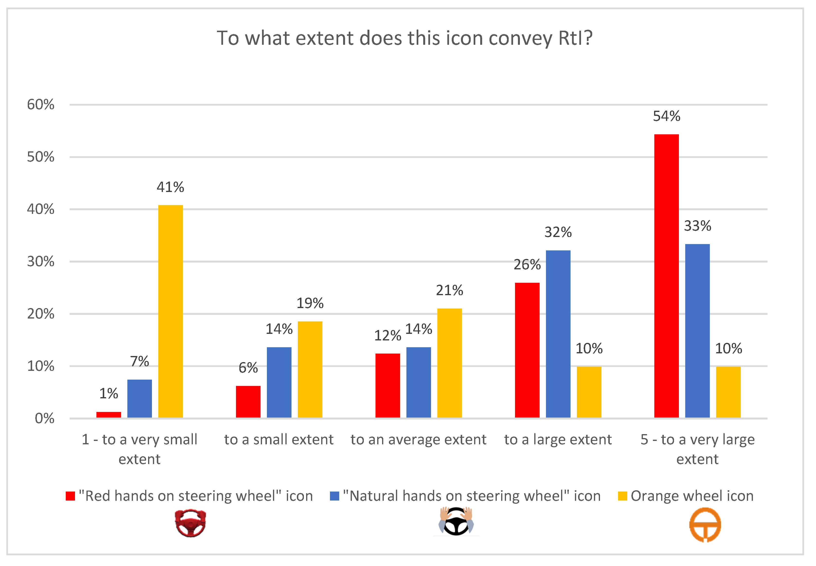
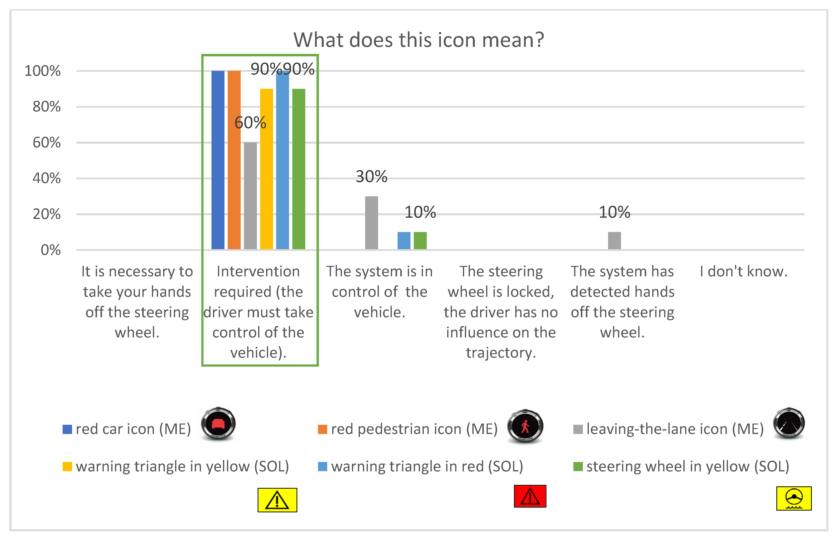
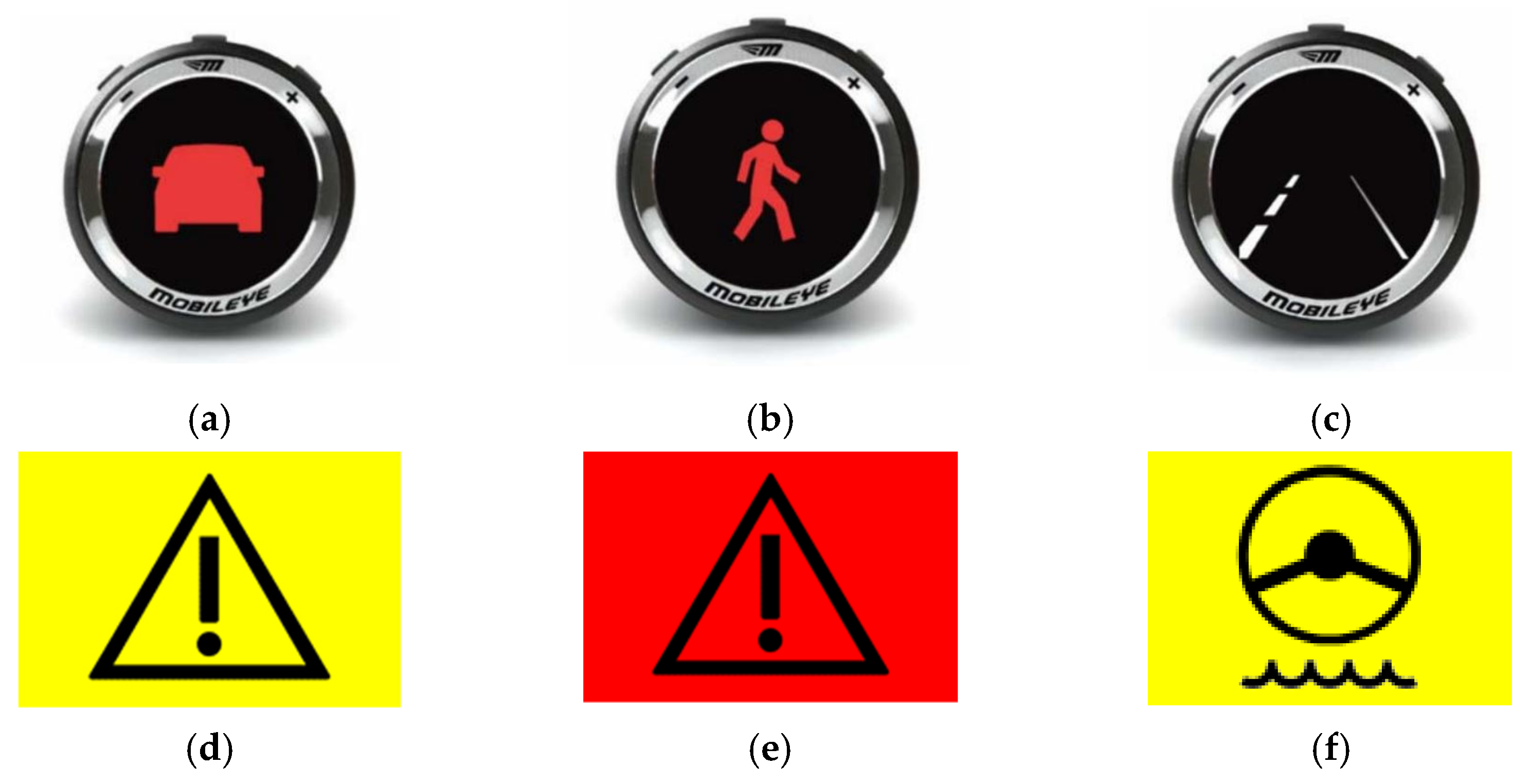
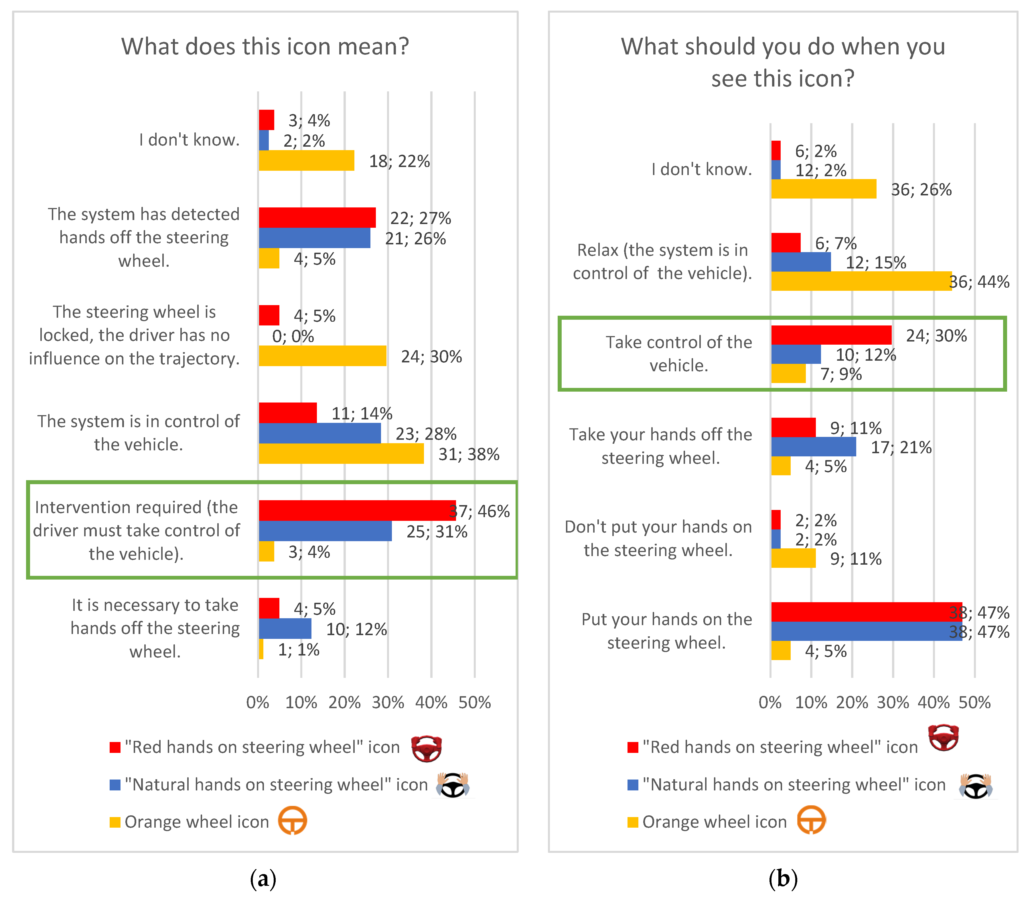
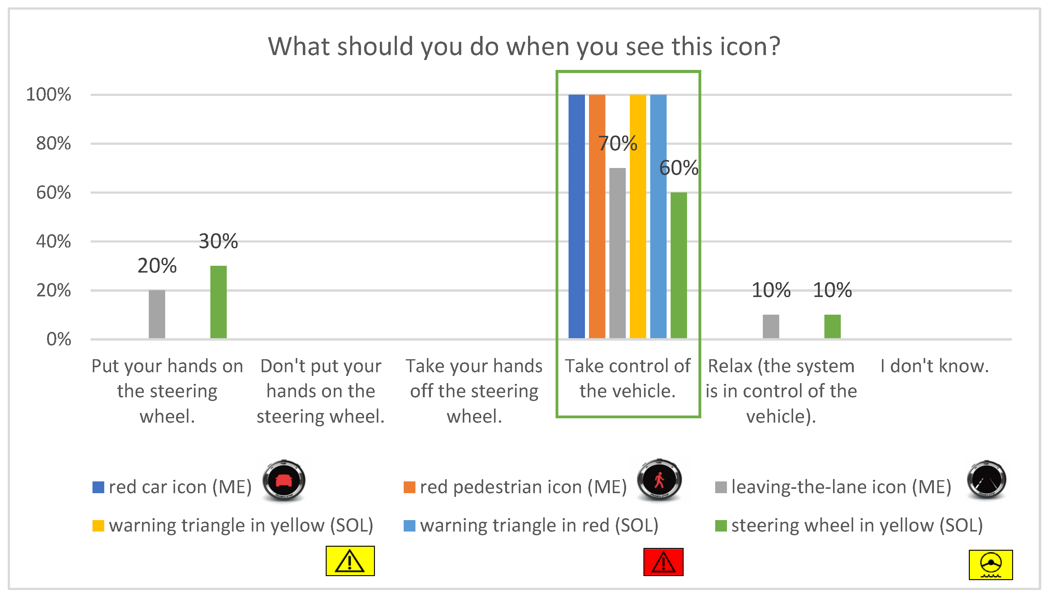
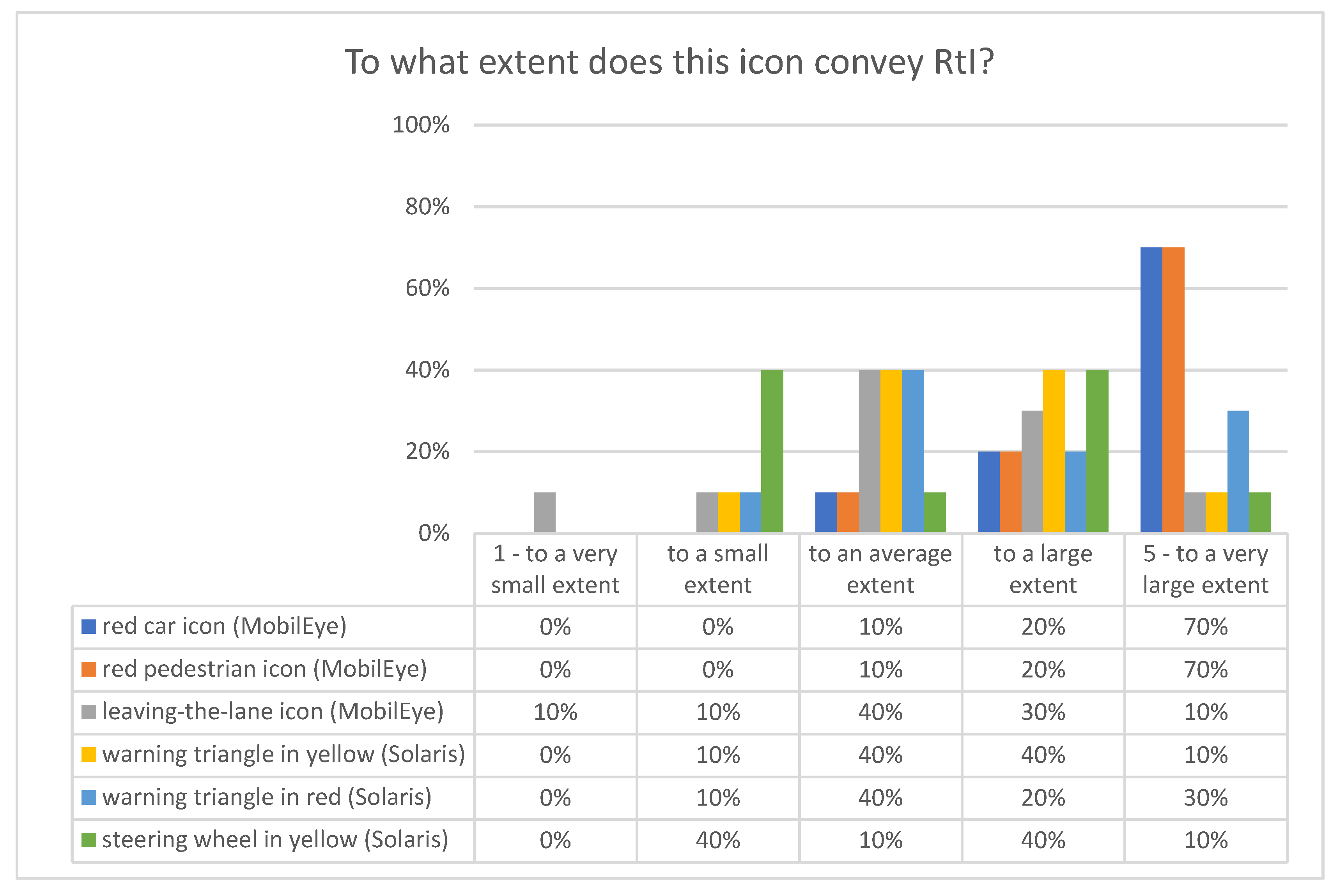
3.1. ITS Results
3.2. Solaris Results
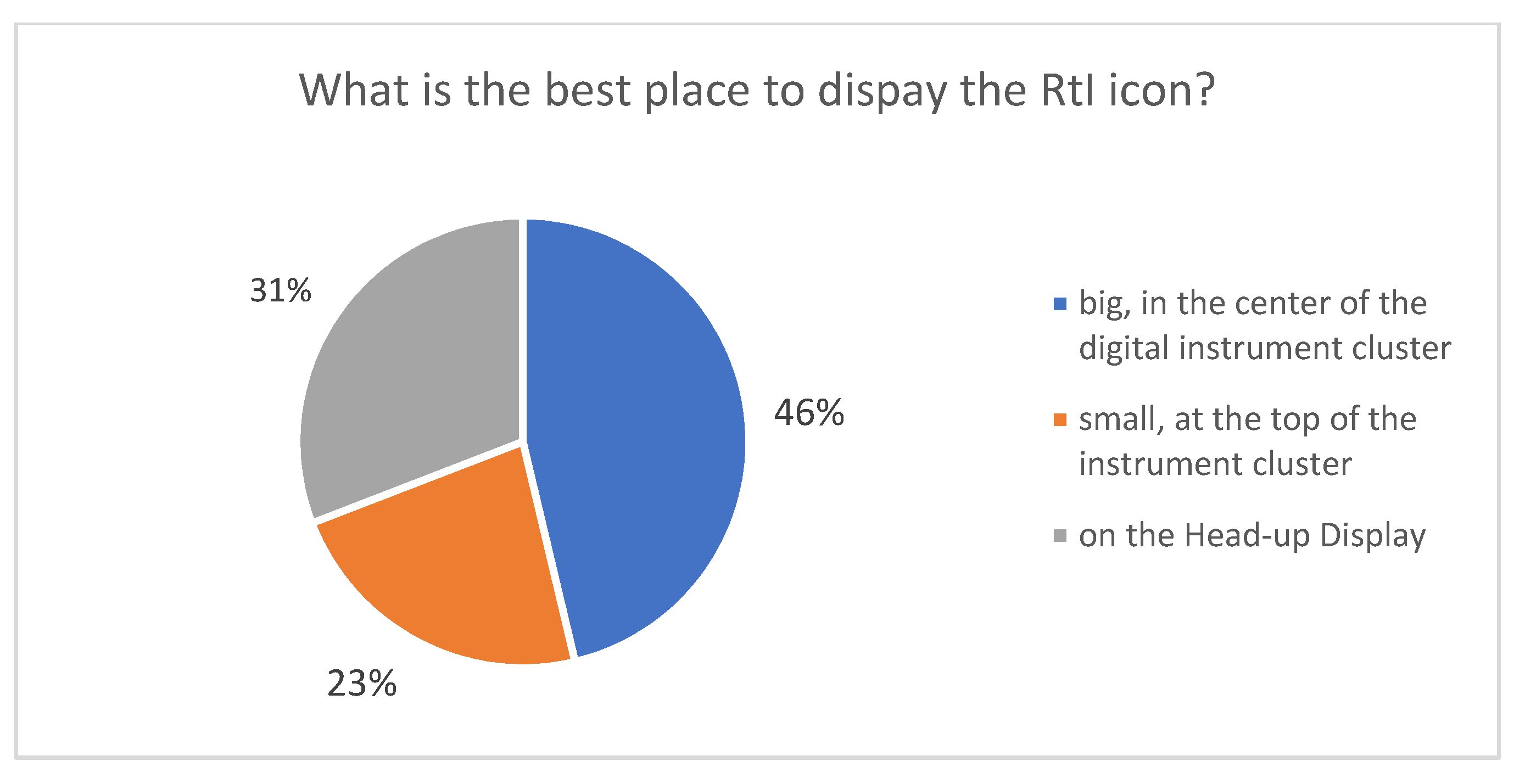
3.3. Icon Location
4. Discussion
Supplementary Materials
Author Contributions
Funding
Institutional Review Board Statement
Informed Consent Statement
Data Availability Statement
Acknowledgments
Conflicts of Interest
References
- Ng Annie, W.Y.; Chan Alan, H.S. The guessability of traffic signs: Effects of prospective-user factors and sign design features. Accid. Anal. Prev. 2007, 39, 1245–1257. [Google Scholar]
- Kirmizioglu, E.; Tuydes-Yaman, H. Comprehensibility of traffic signs among urban drivers in Turkey. Accid. Anal. Prev. 2012, 45, 131–141. [Google Scholar] [CrossRef] [PubMed]
- Campbell, J.L.; Hoffmeister, D.H.; Kiefer, R.J.; Selke, D.J.; Green, P.; Richman, J.B. Comprehension Testing of Active Safety Symbols. SAE Int. 2004, 113, 197–203. [Google Scholar]
- Siebenhandl, K.; Risku, H.; Brugger, C.; Simlinger, P.; Egger, S. Evaluating the comprehensibility of visualized information for the Trans-European Road Network (TERN), IN-SAFETY project results. Paper Number ID 07-0473. In Proceedings of the 20th International Technical Conference on the Enhanced Safety of Vehicles (ESV), Lyon, France, 18–21 June 2007. [Google Scholar]
- Jordan, P.W.; Draper, S.W.; MacFarlane, K.K.; McNulty, S.A. Guessability, learnability, and experienced user performance. In People and Computers VI; Diaper, D., Hamond, N., Eds.; Cambridge University Press: Cambridge, UK, 1991; pp. 237–248. [Google Scholar]
- Jordan, P.W. What is usability? In Contemporary Ergonomics; Robertson, S., Ed.; Taylor & Francis: London, UK, 1994; pp. 454–458. [Google Scholar]
- Schwambach, B.; Brooks, J.; Mims, L.; Rosopa, P.; Jenkins, C. Evaluating Drivers’ Preferences and Understanding of Powertrain and Advanced Driver Assistant Systems Symbols for Current and Future Vehicles. SAE Tech. Pap. 2020. [Google Scholar] [CrossRef]
- Pędzierska, M.; Kruszewski, M.; Ucińska, M.; Odachowska, E.; Niedzicka, A.; Vetulani-Rzewuski, A.; Socha, K.; Gąsiorek, K.; Pawlak, P. Badania Wybranych Systemów Wspomagania Jazdy w Krajowych Warunkach Ruchu Drogowego, AV-PL-ROAD Project Report, Warsaw. 2020. (In Polish) [Google Scholar]
- Green, P. Design and evaluation of symbols for automobile controls and displays. In Automotive Ergonomics; Peacock, B., Karwowski, W., Eds.; Taylor & Francis: London, UK, 1993; pp. 237–268. [Google Scholar]
- Materials of: CEDR—Conference of European Directors of Roads, Action FIVE: Framework for Harmonised Implementation of Variable Message Signs in Europe. 2003. Available online: http://www.esafetysupport.org/download/documents/Harmonisation_VMS_Systems.pdf (accessed on 17 June 2022).
- Goldberg, J.H.; Kotval, X.P. Computer interface evaluation using eye movements: Methods and constructs. Int. J. Ind. Ergon. 1999, 24, 631–645. [Google Scholar] [CrossRef]
- Just, M.A.; Carpenter, P.A. Eye fixations and cognitive processes. Cognit. Psychol. 1976, 8, 441–480. [Google Scholar] [CrossRef]
- Underwood, G.; Phelps, N.; Wright, C.; Van Loon, E.; Galpin, A. Eye fixation scanpaths of younger and older drivers in a hazard perception task. Ophthalmic Physiol. 2005, 25, 346–356. [Google Scholar] [CrossRef] [PubMed]
- McDougall, S.J.P.; Curry, M.B.; de Bruijn, O. Measuring symbol and icon characteristics: Norms for concreteness, complexity, meaningfulness, familiarity, and semantic distance for 239 symbols. Behav. Res. Methods 1999, 31, 487–519. [Google Scholar] [CrossRef]
- American National Standard Institute. ANSI 535.3 Criteria for Safety Symbols; National Electrical Manufacturers Association: Washington, DC, USA, 2007. [Google Scholar]
- Brugger, C. Public information symbols: A comparison of ISO testing procedures. In Visual Information for Everyday Use. Design and Research Perspectives; Zwaga, H.J.G., Boersma, T., Hoonhout, H.C.M., Eds.; Taylor & Francis: London, UK, 1999; pp. 347–356. [Google Scholar]
- Dewar, R. Design and evaluation of public information systems. In Visual Information for Everyday Use. Design and Research Perspectives; Zwaga, H.J.G., Boersma, T., Hoonhout, H.C.M., Eds.; Taylor & Francis: London, UK, 1999; pp. 285–303. [Google Scholar]
- Silver, N.C.; Wogalter, M.S.; Brewster, B.M.; Glover, B.L.; Murray, L.A.; Tillotson, C.A.; Temple, T.L. Comprehension and the perceived quality of warning pictorials. In Proceedings of the Human Factors and Ergonomics Society 39th Annual Meeting, San Diego, CA, USA, 9–13 October 1995; pp. 1057–1061. [Google Scholar]
- ISO 9186-1:2014 Standard; Graphical Symbols—Test Methods—Part 1: Method for Testing Comprehensibility. ISO: Geneva, Switzerland, 2014.
- FaceSymbol: Report on the Design, Development and Testing of 11 Instructional Symbols for Use with Automated, Facial Recognition Systems. ETSI STF 286 Project. 2011. Available online: https://www.bsigroup.com/LocalFiles/en-GB/biometrics/FaceSymbol-Project-Report-GB-EN.pdf (accessed on 17 June 2022).
- Shinar, D.; Dewar, R.E.; Summala, H.; Zakowska, L. Traffic sign symbol comprehension: A cross-cultural study. Ergonomics 2003, 46, 1549–1565. [Google Scholar] [CrossRef]
- Yakut, S. Comprehensibility of Traffic Signs. Master’s Thesis, Gazi University, Ankara, Turkey, 2006. [Google Scholar]
- Bazilinskyy, P.; Petermeijer, S.M.; Petrovych, V.; Dodou, D.; de Winter, J.C. Take-over requests in highly automated driving: A crowdsourcing survey on auditory, vibrotactile, and visual displays. Transp. Res. Part F Traffic Psychol. Behav. 2018, 56, 82–98. [Google Scholar] [CrossRef]
- Yun, H.; Yang, J.H. Multimodal warning design for take-over request in conditionally automated driving. Eur. Transport. Res. Rev. 2020, 12, 12–34. [Google Scholar] [CrossRef]
- Wang, Y.; Wu, B.; Ma, S.; Wang, D.; Gan, T.; Liu, H.; Yang, Z. Effect of mapping characteristic on audiovisual warning: Evidence from a simulated driving study. Appl. Ergon. 2022, 99, 103638. [Google Scholar] [CrossRef]
- ISO 2575:2021; Road Vehicles—Symbols for Controls, Indicators and Tell-Tales. ISO: Geneva, Switzerland, 2021.
- ISO 3864-1:2011 Standard; Graphical Symbols—Safety Colours and Safety Signs, Part 1: Design Principles for Safety Signs and Safety. ISO: Geneva, Switzerland, 2011.
- Ng, A.W.Y.; Chan, A.H.S. The effects of driver factors and sign design features on the comprehensibility of traffic signs. J. Saf. Res. 2008, 39, 321. [Google Scholar] [CrossRef] [PubMed]
- Al-Madani, H. Influence of drivers’ comprehension of posted signs on their safety related characteristics. Accid. Anal. Prev. 2000, 32, 575–581. [Google Scholar] [CrossRef]


Publisher’s Note: MDPI stays neutral with regard to jurisdictional claims in published maps and institutional affiliations. |
© 2022 by the authors. Licensee MDPI, Basel, Switzerland. This article is an open access article distributed under the terms and conditions of the Creative Commons Attribution (CC BY) license (https://creativecommons.org/licenses/by/4.0/).
Share and Cite
Rodak, A.; Kruszewski, M.; Sztandera, B. Does the Driver Understand the Warning? Comprehension of the Request to Intervene. Appl. Sci. 2022, 12, 9451. https://doi.org/10.3390/app12199451
Rodak A, Kruszewski M, Sztandera B. Does the Driver Understand the Warning? Comprehension of the Request to Intervene. Applied Sciences. 2022; 12(19):9451. https://doi.org/10.3390/app12199451
Chicago/Turabian StyleRodak, Aleksandra, Mikołaj Kruszewski, and Błażej Sztandera. 2022. "Does the Driver Understand the Warning? Comprehension of the Request to Intervene" Applied Sciences 12, no. 19: 9451. https://doi.org/10.3390/app12199451
APA StyleRodak, A., Kruszewski, M., & Sztandera, B. (2022). Does the Driver Understand the Warning? Comprehension of the Request to Intervene. Applied Sciences, 12(19), 9451. https://doi.org/10.3390/app12199451