Abstract
Visualization of geographic data is part of many widely used solutions that aim to communicate the information to the end user. Effective visualizations are those that are tailored to a specific group of users and their tasks, as well as to specific properties of the data. Usability is a key concept for such solutions, and the most effective way to achieve high usability is to incorporate user-centered design (UCD) into the development process. In visualization, data are often coded by colors, so the choice of color schemes and color range is critical to enable the reverse mapping of colors to data. In this paper, we present a method for integrating the principles of UCD into the development process. In doing so, we use a case involving the selection of the most appropriate color scheme and associated parameters for representing temperature values on geographic maps. The method described is suitable for use in UCD-based research related to the visualization of various types of data and is useful for researchers and developers of geovisualizations.
Keywords:
user-centered design; usability; user testing; visualization; GIS; geographic data; temperature; color scheme 1. Introduction
The rapid growth of Internet of Things (IoT) networks has led to an increase in sensor data and opened opportunities for many applications [1]. Sensor data are composed of spatial and temporal values that are typically integrated into a Geographic Information System (GIS), which is becoming an increasingly important component of IoT applications. GIS is a computer-based technology that enables the collection, management, analysis, modeling, and presentation of geospatial data for a variety of applications [2]. Data from weather stations, such as temperature, humidity, air pollution, etc., and data from satellites, such as altitude, cloud cover, etc., are used in GIS to explore, understand, describe, and predict various geographic phenomena [3,4]. One of the biggest challenges at GIS today is decision making, especially in the face of huge amounts of data that need to be processed in real time. GIS today must not only be powerful and profitable, but also more compatible with human thinking, easier, and more pleasant to use [5].
Well-represented data enable users to obtain information more effectively and efficiently, and user perception is the key concept [6]. Understanding the user as an important component of successful visualization in GIS can be achieved by integrating the principles of user-centered design (UCD) into the development process. User-centered design is part of a broader scope of human-centered design, covered by the ISO standard [7]. Roose et al. [8] showed how UCD can be used in the development of a web-based geospatial data platform. They strongly advocate an inclusive design that involves users with different expertise, from domain experts who participate in early stages of design to end users who should be involved in the development of a final product. Effective communication between developers and end users is critical in agile software development methods that enable rapid prototyping and product delivery [9]. These methods are also used in geovisualization applications development, where UCD techniques are used to map user tasks to data representations and interactions [10] and further develop the geovisualization approach [11].
Besides UCD, usability [12] is another concept from the Human–Computer Interaction (HCI) field that has to be considered in creating data visualization. According to ISO [13], usability is: “extent to which a system, product or service can be used by specified users to achieve specified goals with effectiveness, efficiency and satisfaction in a specified context of use”. Usability must be considered in the design of any product that people use, but in certain contexts usability requires special attention. Liberman-Pincu and Bitan [14] explained the importance of usability in medical device design and showed how usability is incorporated into the methodology of the UCD process of an autonomic breathing system. In [15], the authors investigated the relationships between usability and aesthetic features of the products. The results of their study show that users prefer aesthetics before using the product, while users consider both usability and aesthetics important after using the product.
UCD is an iterative process of designing, implementation, and evaluation. These phases are repeated as many times as necessary to reach the final phase where the design solution largely satisfies the user requirements [16]. Evaluation and design are closely related in the UCD process, so some of the usability evaluation methods are typically used in the user requirements specification phase [17]. Usability evaluation methodology includes a wide range of methods, some of which involve end users while others involve HCI experts [18]. One of the most widely used methods that involves end users is usability testing, also called user testing, in which users perform real tasks with a prototype or real system. User behavior is carefully observed, and several variables are measured, such as task completion time, accuracy of execution, navigation behavior, etc.
In GIS research, usability is often considered an important dimension of quality of service [19]. To make the right decision and be sure that the right information reaches the user, the visual representation must provide data that can be accurately read and interpreted by the user. Accurate readings in this context are referred to as usability. Based on user feedback obtained from usability testing, developers can adjust the user interface design and improve the HCI workflow [20]. Quality of service research in GIS leverages and extends quality of service studies, such as usability testing, to support more accurate discovery, evaluation, and presentation of data. Improved system usability motivates users to participate in editing, collaborating, and sharing their local geospatial knowledge [19]. Consequently, the usability of the user interface in geovisualization improves the performance of the service.
Visualization of geographic data plays an important role in decision making but is also part of many widely used solutions aimed at communicating the information to the end user. Examples of widely used GIS visualizations are as follows: Google Maps [21], ArcGIS [22], Data.gov [23], OpenStreetMap [24], as well as meteorological data and forecasts such as Accuweather [25] and DHMZ [26]. Nowadays, various visual representation tools are used in geographic visualization [27]. However, in practice, operational meteorology is still dominated by 2D visualization [28]. Quinan and Meyer [29] address the problem of inconsistent and often ineffective visual coding practices across a variety of visualizations as a common challenge in weather visualization.
In visualization, data are often encoded by colors, so the choice of color schemes and color range is critical to enable the inverse mapping of colors to data [30]. If color schemes are not carefully created and applied to the data, the reader may become frustrated, confused, or even misled [31]. In a network visualization use case, Karim et al. [32] showed that color schemes are related to user effectiveness in terms of time to complete tasks and accuracy of readings. Research on continuous maps [33] discusses that the effectiveness of color coding depends on both data complexity and user tasks. Accordingly, the color schemes are recommended. In [34], different color schemes for land use cases are presented. The authors propose a model for developing new qualitative color schemes. Endo and Nakano [35] propose guidelines for selecting color schemes for the hazard use case. They claim that the problem with visualizing environmental data also lies in the lack of standardization, which often results in maps that cannot be compared. The authors also stress the importance of testing the visibility of maps for different color schemes, considering color blindness as well.
Montello [5] also emphasizes individuality in visualization preferences. Considering usability and aesthetics, choosing a color scheme that is both effective and esthetically pleasing becomes a critical challenge [33]. It is not always possible to tailor visualization to individual user preferences, and in some cases, this may not be the best solution, for example, when results from different sources need to be compared visually. Visualization can and must be tailored to a specific group of users and their tasks [5] and to specific properties of the data [36]. Brewer [36] does not offer a definitive solution for the group of color schemes but suggests creating multiple maps of the same data.
In this paper, we describe how UCD can be integrated into the process of designing geographic data visualizations, such as choosing the right color scheme and configuring its attributes for specific user tasks. As a first step, we created maps based on measurements from ground stations and interpolated them to obtain a smooth image. Such maps are characterized by representing data that are generally smooth, i.e., the transition between pixels that are close to each other is gradual, while the colors and shades are similar. Consequently, the underlying data are more difficult to read. It is a very common type of map that represents natural phenomena such as temperature, humidity, and so on. It is therefore well suited to illustrate the use of UCD in geovisualization. In our work, we have studied different color schemes and their parameters such as the number of colors used in a color scheme and the order of colors.
The remainder of the paper is organized as follows. Section 2 describes the process of map generation and a method for spatiotemporal interpolation. The focus of this section is not on the interpolation method itself, but on the selection of the method suitable for the IoT and further investigation of its impact on the visualization of the results. Section 3 refers to the empirical study based on UCD. Research questions and hypotheses are formulated, and the study design is outlined. Section 4 presents the data analysis and the results obtained in each procedure of the study design. In Section 5, we discuss both the results and the method, and suggest improvements for future UCD-based geovisualization studies. Section 6 concludes the paper.
2. Generating Maps
The main characteristic of environmental data is the simultaneous possession of spatial (location) and temporal (timestamp) components. However, data sampling is discrete and, in most cases, unevenly distributed in space and time. To estimate environmental parameters and prepare data for further analysis, a near-continuous data layer is usually constructed from a discrete dataset collected at sample locations [4]. During the construction of such a layer, the data for the requested timestamp and location may be missing due to an error in the transmission of the data or in the operation of the sensor, or because there are no real measurements at some locations and/or times. Therefore, measurements for the requested timestamp and location should be reconstructed or interpolated. Environmental parameters that are spatially and temporally autocorrelated, e.g., data from nearby locations and times, are more likely to be similar than data that are far apart [3]. Therefore, such data can be interpolated in our analysis based on known measurements in the nearby environment.
The most common interpolation approach in GIS is to apply an exclusively spatial or exclusively temporal interpolation to a limited set of data, fixed in time or in space. Spatio-temporal interpolation, although more complex, is nowadays crucial for managing and analyzing any kind of geographic information, especially for heterogeneous, unevenly distributed data coming from IoT devices [37,38]. There are many approaches to spatio-temporal interpolation, the details of which are out of scope of this paper.
The method used in this paper is the Radial Basis Function (RBF), which was chosen for two reasons. First, deterministic methods in many cases outperform the widely used Kriging method [39], and RBF has been shown to achieve good results, better than Inverse Distance Weighting (IDW) [40]. Second, it is one of the deterministic methods whose characteristics are simplicity of implementation and speed of performance, which is crucial given the huge amount of sensor data that needs to be processed in real time.
In general, interpolation methods tend to find the set of nearest neighbors (according to some distance function) and apply the weighted average of them. RBF is weighted by a radial based function of the distance from the point of interest to the sampled points [41]. The value of interpolation for location at timestamp t is given by:
where c is the factor that determines the ratio between spatial and temporal components, N is the number of neighbors taken around , is a radial basis function (Gaussian, Exponential, Trigonometric, etc.), is the spatio-temporal Euclidean distance between and as one defined for IDW, are the measured values for , and P is a polynomial in .
The dataset used in this paper includes air temperature from 140 weather stations operated by the Croatian Meteorological and Hydrological Service (DHMZ). The stations measure weather parameters three times a day up to every hour, and all datasets are freely available at DHMZ website [26]. The dataset used to select the optimal interpolation method covers a randomly selected year, from 1 January to 31 December 2018.
To test the accuracy of the interpolation method and to select the optimal parameters for further interpolation, several parameters were varied: the radial-based function for RBF interpolation and the number of spatiotemporal neighbors.
We conducted validation using the leave-out-one cross-validation method (LOOCV) on DHMZ dataset. We calculated Root-Mean-Square Percentage Error (RMSPE), given by the formula:
where N is the size of dataset, is the measured value, and is the interpolated value of i-th element of the dataset.
The best result is achieved using Gauss function (GAU) and six neighbors (RMSPE = 1.66%).
The interpolation is calculated for each grid cell covering the Croatian territory using the methods and parameters chosen in the validation phase and the measured values from the DHMZ weather stations. We used the Discrete Global Grid System (DGGS) [42], a new standard that aims to reference the entire Earth spatially uniquely, more specifically its version Icosahedral Snyder Equal Area aperture 3 Hexagonal Grid, ISEA3H figure on level 12. The interpolation is performed for each cell centroid of the grid to generate temperature layers for specific time points. The example is shown in Figure 1.
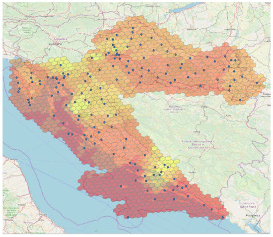
Figure 1.
Blue dots represent weather stations. The values from weather stations are interpolated at each centroid of the hexagons. The color, from yellow to red, represents temperature values.
3. User Study
The research presented in the following aims to answer the question of which color schemes are most appropriate for representing data in geographic maps. The suitability of a map is defined in terms of the accuracy of users’ visual perception of the data presented. Since human perception is generally subjective, we need to evaluate different color schemes and some of their parameters to find out which scheme leads to the most accurate user readings. To ensure high reliability of the obtained data, a large sample of participants is required. Following the usability testing guidelines for quantitative studies [18], we use 90 volunteers with no expertise in the field.
In this study participants were reading data related to temperature. Thus, we can say that the specific objective of the study is to conclude which color scheme leads to the most accurate readings of temperature and could be suggested for presentation of temperature data on geographic maps. However, the study is designed in a more general manner; thus, the method can be exploited for visualizing other types of data as well.
3.1. Research Questions and Hypotheses
In this study, we used several color schemes from ColorBrewer, a free online tool available at [43]. This tool contains 35 color schemes that are perceptually reliable and widely used by mapmakers [31,44]. The color schemes in ColorBrewer are divided into three groups, as presented in Figure 2:
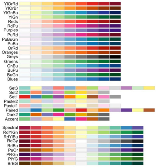
Figure 2.
ColorBrewer color schemes: sequential, qualitative, and diverging, respectively [44].
- Sequential color schemes use ordered shades of color and are therefore generally suitable for representing data that range from low to high values. Lighter shades represent low data values, and gradually darker colors represent higher values.
- Diverging color schemes use the extreme values at both ends of the data range and represent them with dark colors that have contrasting hues. The middle values of the data range are represented with the lightest hues.
- Qualitative color schemes do not use gradual shading but contrasting colors to highlight the visual differences between data classes. These schemes are best suited for displaying nominal or categorical data.
For each color scheme in the ColorBrewer tool, the user can select the number of colors or shades to use when creating a map. Figure 3 shows a sequential scheme that ranges from pink to blue-green and contains three to nine color classes in ascending order. Using fewer color classes in a map provides better contrast between classes, while more classes provide more options for displaying and reading the data. In ascending order, lighter hues in sequential schemes and perceptually colder colors in diverging schemes are used to represent lower values, while darker hues and perceptually warmer colors are used to represent higher values. In descending order, the representation is reversed. Exceptions with respect to the order of colors are qualitative color schemes in which the colors are not ordered (see Figure 2).
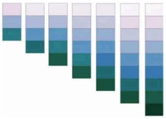
Figure 3.
A multi-hued sequential scheme with 3–9 color classes [31].
In addition to the type of color scheme, it is possible that the number of colors in the scheme and the order of the colors may also affect the user’s perception and the accuracy of reading. Therefore, these parameters are also included in the study. Finally, the study aims to answer the following questions:
- Q1.
- Is there a difference in the accuracy of the readings in relation to different color schemes?
- Q2.
- Is there a difference in the accuracy of the readings with respect to the number of colors in the color schemes?
- Q3.
- Is there a difference in the accuracy of the readings with respect to the order of the colors in the color schemes (ascending/descending)?
The answers to these questions should provide deeper insight into the color schemes and specific parameters that are most appropriate for geographic maps representing temperature data.
In accordance with the research questions, we state corresponding hypotheses, H1, H2, and H3, respectively. To address the research question Q1, the null hypothesis and the affirmative hypothesis regarding the color schemes are as follows:
H01.
There is no difference in the accuracy of the readings on maps with different color schemes.
H1.
The reading accuracy is related to the color scheme of a map.
To address the research question Q2, the null hypothesis and the affirmative hypothesis regarding the number of colors used to create a map are as follows:
H02.
There is no difference in the accuracy of readings on maps with different numbers of colors in the color scheme.
H2.
The accuracy of readings is related to the number of colors in the color scheme.
Finally, to address research question Q3, we consider the sequential and diverging color schemes which apply order of colors, and test the following hypotheses:
H03.
There is no difference in reading accuracy between ascending and descending order of colors.
H3.
Reading accuracy is related to the order of colors in a map (ascending/descending).
3.2. Study Design
The hypotheses are tested in the user study using a specially designed questionnaire with maps in different color schemes and with different numbers of colors. When designing a questionnaire for a user study, it is important to be considerate of the users. To obtain reliable results, we need to maintain a high level of user attention, which means that the possibility of user cognitive fatigue must be minimized [45]. A multifactorial design of the questionnaire seems to be the appropriate solution for this study. In this way, a potentially large number of questions normally required to cover all hypotheses is reduced to only 11 questions. Each question represents a map and considers different values of all three parameters: the type of color scheme, the number of colors, and the order—except for maps with qualitative schemes that have no order. The empirical research is carried out in five steps, which are shown in Figure 4:
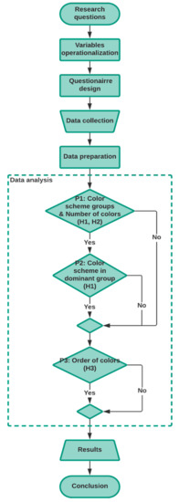
Figure 4.
Experimental research design.
- Operationalization of the variables
- Design of the questionnaire
- Distribution of the questionnaire and data collection
- Data preparation
- Data analysis
Given the multifactorial design of the questionnaire, the data analysis cannot strictly follow the research hypotheses. Instead, the analysis is conducted in several consecutive steps, with the results of the previous step determining the requirements for further analysis, if any. Since all color schemes from the same group (sequential, diverging, and qualitative) share certain similar characteristics; it is interesting to see if there are differences in the accuracy of readings on maps created with color schemes from different groups. Therefore, the first procedure (P1 in Figure 4) addresses the color scheme groups and the number of colors in the multifactorial analysis. This procedure does not cover the order of colors in the color schemes because qualitative color schemes do not use ordered colors (as shown in Figure 2) and we wanted to use all the questions from the questionnaire in the first procedure. Therefore, we test hypotheses H1 and H2 in the first procedure. In the case that the first procedure gives a clear answer (the so-called “dominant group”, which means that we have a color scheme group with a unique number of colors that is significantly better than all other combinations of these two factors), additional analysis can be performed only for the dominant group. Accordingly, a similar analysis is also warranted in the case where the first procedure results in a worse group instead of the best group, as such an analysis could also provide valuable conclusions. This additional analysis is referred to as P2 in the study design (Figure 4). Finally, hypothesis H3 is tested separately by the third procedure (P3). Following the presented study design, we describe the individual steps of the method in the following sections.
3.3. Instruments, Variables, and Measures
For the study, a questionnaire was created in Google forms. The questions are written in the Croatian language. Demographic data are collected in the first group of questions. The second group of questions is used to test the users’ color recognition abilities. Figure 5 shows the three cards used from the Ishihara test [46]. Participants were asked to write the number shown on the card.
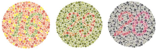
Figure 5.
The cards used in the questionnaire for the color blindness test [39].
The third group of questions in the questionnaire are single point reading questions that refer to the maps showing the temperature in Croatia at a given time. The maps used in these questions were created using the R programming language. The measured temperature values are obtained from weather stations and interpolated as explained in Section 2. The interpolation is performed using the geosptdb package [47]. Color schemes are generated using the RColorBrewer package [48], which uses color schemes defined in the ColorBrewer tool. Finally, the results are visualized on the map using the Leaflet package [49].
The maps for each question are created with a different color scheme and contain different parameters in terms of the number of colors and the order of the scale. Thus, a map for each question represents one type of color scheme (sequential, diverging, or qualitative) with a scale using three, six, or nine colors in ascending or descending order (excluding qualitative schemes). All these parameters are independent variables in the study. Figure 6 shows as an example a map created with a sequential color scheme using three colors in ascending order.
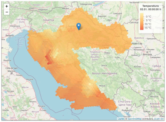
Figure 6.
A map used in the questionnaire: YLOrRd color scheme with three colors in ascending order. The user is asked to read the temperature at the marked location (Ivanić-Grad, Croatia).
On each map, a participant is asked to read the temperature at a specific location, annotated with a marker. The dependent variable of the study is the error in the participant’s reading with respect to the actual value of the temperature at that location. To avoid cognitive bias of participants, each question refers to a different location and the actual temperature value is different at each location.
The color schemes used to represent the maps in the questionnaire are as follows: YLOrRd and Reds from the sequential group, Spectral from the diverging group, and Set1 from the qualitative group [31]. The selection is shown in Table 1. Since the ColorBrewer tool has twice as many color schemes in the sequential group as in diverging and qualitative groups (see Figure 2), it makes sense to choose two sequential color schemes over one diverging and one qualitative color scheme. From the sequential schemes, we therefore selected YLOrRd from a pool of multi-hued schemes and Reds as a representative of single-hued schemes. The saturation was set to 80% for all maps in the questionnaire.

Table 1.
Color schemes used to represent maps in the questionnaire.
As for the number of colors, the schemes with three, six, and nine colors are used in the maps. Each type of color scheme is presented with at least one map for each number of colors. The multifactorial design of the questionnaire items is shown in Table 2.
Table 2.
The number of questionnaire items per factor.
The number of colors used in the study in selected sequential, diverging, and qualitative color schemes is presented in Figure 7.
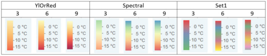
Figure 7.
The range of colors in YLOrRd, Spectral, and Set1 color schemes with three, six, and nine colors’ classes.
To illustrate the difference in the order of the colors, Figure 8 shows the Reds color scheme (sequential) in ascending and descending order.
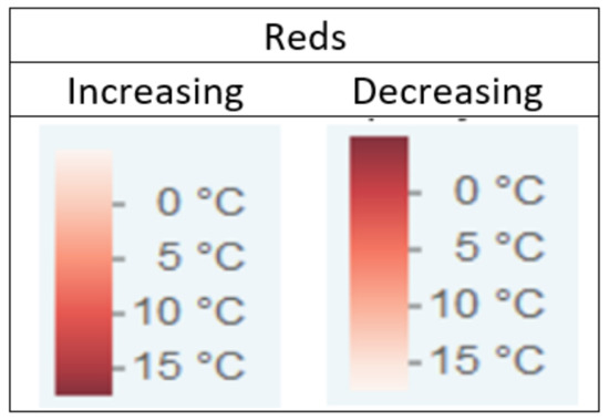
Figure 8.
The order of colors for Reds color scheme.
4. Results
The questionnaire was distributed by e-mail to students at the University in Split, Croatia, and their acquaintances, so the study used convenience sampling. In total, 90 volunteers completed the online questionnaire: 80% were female and 20% were male. Most participants were between 18 and 25 years old (76.7%), followed by 26 to 36 years old (21.1%). Participants were mainly students (76.7%) and professionals (11.1%).
When analyzing the responses to three questions on color blindness, we found that two participants failed one question each. To achieve the highest possible reliability of the data, these two participants were excluded from further analysis. Thus, 88 complete datasets were analyzed.
The methods of data analysis follow the questionnaire design, so the multifactorial ANOVA is used. The analysis is performed using the R programming language. The dependent variable, error, is calculated as the difference between the participant’s response and the actual value (participant’s response minus actual value). The value of the error is taken as it is (signed + or −), rather than the absolute value of the error, because we want to know not only the magnitude, but also the direction of the error, especially since we want to test the hypothesis about the order of the colors. For example, if the actual value of the temperature is 23C and the participant’s response is 25C, the error is 2. If the response is 21C, the error is −2. An error of 0 means that the temperature read by the user is the same as the actual temperature at the location.
According to the research design shown in Figure 4, data analysis was performed in three procedures. In all procedures, a ratio variable, the user reading error, is a dependent variable, while the independent variables are different for each procedure.
4.1. Procedure 1: Color Scheme Group, Number of Colors
In the first procedure, we analyze the difference between the color scheme groups as well as between the number of colors in the color schemes. Table 3 shows the header of the first procedure, which brings the details about the questions used and the values of all variables in the analysis.
Table 3.
Header of the first procedure.
The first analysis considers two independent categorical variables, the color scheme group, and the number of colors in the color scheme, so the factorial two-way ANOVA is applied.
First, we examine the assumptions for ANOVA, i.e., normality of the data and homogeneity of variance. The Shapiro–Wilk test shows that the data are not normally distributed for each color scheme group (W = 0.8999, p = 2.2 × 10⁻¹⁶ for the sequential; W = 0.87775, p = 1.06 × 10⁻¹³ for the diverging; and W = 0.90789, p = 1.189 × 10⁻¹¹ for the qualitative group). Normality is also not confirmed for the number of colors (W = 0.89177, p = 8.514 × 10⁻¹³ for three colors; W = 0.85452, p = 4.714 × 10⁻¹⁵ for six colors; and W = 0.86512, p = 2.2 × 10⁻¹⁶ for nine colors). Levene’s test shows that the variances of the data are not equal (F = 68.964, p = 2.2 × 10⁻¹⁶ for color scheme groups and F = 8.0426, p = 0.0003435 for number of colors). In an additional analysis, the Shapiro–Wilk test and Levene’s test show quite similar results for both log-transformed data and root-transformed data. Log-transformation of data is the transformation of initial data (in this case: color schemes and number of colors variables) by replacing x variable with log(x). The same applies for root-transformation of the data: the variable x is replaced by sqrt(x).
Since normality and homogeneity of variance are not satisfied for either the original or transformed data, the rank-based ANOVA type statistic is applied as an appropriate nonparametric method [50,51]. The ANOVA-type statistic is the modern and robust alternative to rank transformation in factorial ANOVA design [50,52]. The ANOVA-type statistic can be used in data analytic situations in which ANOVA is traditionally used. Data analysis is performed using the R package GFD for nonparametric factorial tests [51]. The method is robust and resistant to unbalanced data [51]. The descriptive statistics of this analysis can be found in Table 4 and Table 5. A more detailed look at the distribution of the results is provided by the spread of error in Figure 9 and Figure 10.
Table 4.
Descriptive statistics of the error for the color scheme group.
Table 5.
Descriptive statistics of the error for the number of colors.
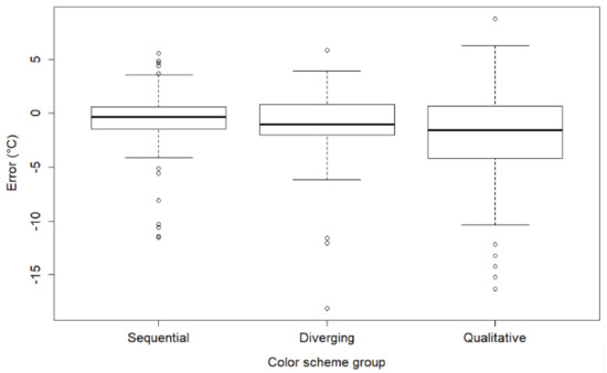
Figure 9.
Spread of error according to the color scheme group.
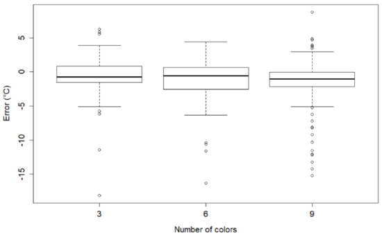
Figure 10.
Spread of error according to the number of colors.
The results of the rank-based ANOVA-type statistics [53] are shown in Table 6. There are statistically significant differences in the means of the errors by each factor, color scheme group, and number of colors, but also by the interaction of these factors, with extremely low p-values in all tests (p << 0.001). The p-values are rounded to three decimal places in the table, as will be the case in the other tables of results later in the paper.
Table 6.
The results of the ANOVA-type statistics.
Following these results, a post hoc analysis is performed to determine which color scheme groups, which number of colors, and which combination of factors are significant. For non-parametric methods with more than two groups, Dunn’s test [54] is used.
4.1.1. Color Scheme Group
The first post hoc test is performed for the color scheme group. According to the results of Dunn’s test (Table 7), there is a statistically significant difference between the groups for all pairs of color scheme groups (p < 0.05). Considering the above descriptive statistics (Table 4) and spread of error (Figure 9), which shows that the sequential group has the lowest error in user readings; this result means that sequential color schemes are significantly better than diverging and qualitative color schemes. Similar considerations lead to the conclusion that qualitative color schemes perform significantly less accurately compared to sequential and diverging color schemes.
Table 7.
The results of the post hoc test for color scheme group, with additional information—effect size (Cohen’s d).
To show the magnitude of the difference between color scheme groups, the Cohen’d ratio (the standardized mean difference) is calculated [55]. The effect size is medium to high between diverging and qualitative and between qualitative and sequential color schemes, while the effect size between diverging and sequential color schemes is low (Table 7). This result shows that the qualitative color schemes are significantly inferior to the other color schemes, and this result has a practical significance.
These results partially confirm the H1 hypothesis; as at this point in the study, we found that the highest accuracy of user readings is achieved for maps with sequential color schemes and the lowest accuracy of user readings is achieved for maps with qualitative color schemes. Further analysis is needed to clarify which color scheme from these color scheme groups is related to user reading accuracy and to fully confirm the H1 hypothesis. This analysis will be performed later in a separate procedure (Procedure 2).
4.1.2. Number of Colors
The second post hoc test is performed for the number of colors and the results are presented in Table 8. Dunn’s test shows a significant difference between the accuracy of user readings in maps with three and nine colors (p = 0.009) as well as in maps with six and nine colors (p = 0.013).
Table 8.
The results of the post hoc test and effect size (Cohen’s d) for number of colors.
According to the descriptive statistics (Table 5) and spread of error (Figure 10), maps with three and six colors obtain lower error in user readings than maps with nine colors. Thus, the result of the post hoc test means that maps with nine colors obtained the significantly worst score in user readings. The effect size for this difference is small (Table 8). Since there is no significant difference between maps with three and six colors, there is no indication of which number of colors is best to choose. The findings in this analysis confirm the H2 hypothesis that accuracy of user readings is related to the number of colors in the color scheme.
4.1.3. Interaction of Color Scheme Group and the Number of Colors
In two previous post hoc tests, the data were analyzed individually with respect to the color scheme group and the number of colors. Since each map belongs to a specific color scheme group and is created with a specific number of colors, the interaction of these variables must be considered as a factor that can be associated with the accuracy of the user readings.
Figure 11 shows interaction plots for the two-way interaction between color scheme group and number of colors. The mean error in user readings is calculated with respect to this interaction and the results of the Kruskal–Wallis rank sum test are shown.
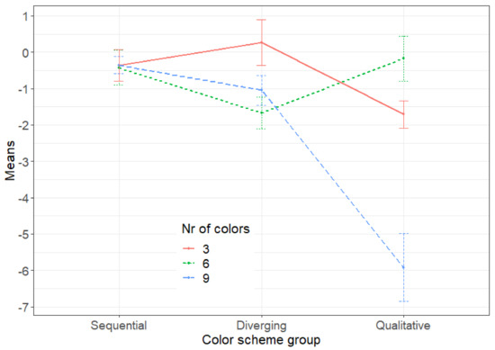
Figure 11.
Interaction plot of the error means for different color scheme groups and numbers of colors.
As shown in Figure 11, sequential color schemes achieve almost the same results regardless of the number of colors (low error: −0.360 for three colors, −0.427 for six colors, and −0.357 for nine colors). For qualitative color schemes, on the other hand, the results vary depending on the number of colors (from a mean of −0.176 for six colors to a mean of −5.92 for nine colors).
Table 9 shows the results of the post hoc test for interaction. Looking for a combination that is significantly different from all others, we can find only one combination, namely a qualitative color scheme with nine colors. According to the interaction plot (Figure 11), this is the combination with the highest error, i.e., the lowest accuracy.
Table 9.
The results of the post hoc test for interaction of color scheme group and the number of colors. The first number in each cell is the value of Z and the second number is the respective p-value.
Considering each color scheme group individually, the interaction results (Figure 11 along with Table 9) can be interpreted as follows:
- For maps using qualitative color schemes, the reading accuracy is significantly better for six colors than for any other number of colors.
- For maps using sequential color schemes, the reading accuracy is not significantly different for a different number of colors.
- For maps using diverging color schemes, the reading accuracy of the values for three colors is significantly better than for the other colors.
However, compared to all combinations of color scheme groups and number of colors, neither of these two significant combinations is better than all other combinations. Therefore, we can conclude that the interaction analysis does not give the best combination of color scheme group and number of colors, while the worst combination is the qualitative scheme with nine colors.
In summary, Procedure 1 has shown that sequential color schemes achieve the lowest error, i.e., the highest accuracy in user reading, and that this result is invariant to the number of colors used in particular maps. Thus, we can conclude that the sequential color scheme group is the dominant group, and that further analysis can be performed to find out whether the accuracy of user readings is related to a particular sequential color scheme (Procedure 2) and to the order of colors in sequential maps (Procedure 3).
4.2. Procedure 2: Color Scheme
To keep the analysis clean and avoid the influence of covariates, we selected the items of the questionnaire with two sequential color schemes controlled by the number of colors and their order. Table 10 shows the parameters of the maps used.
Table 10.
Header of the second procedure.
Descriptive statistics of the error obtained in these two maps is given in Table 11.
Table 11.
Descriptive statistics of error for sequential color schemes.
As shown in Procedure 1, normality and homogeneity of variance are not satisfied; thus, we apply a non-parametric method for two groups. The result of Wilcoxon rank sum test shows that the difference in error between the YLOrRd and Reds color schemes is not statistically significant (W = 4413, p = 0.1063). Thus, the H1 hypothesis is not confirmed at the level of color schemes, and it remains confirmed only at the level of color scheme group.
4.3. Procedure 3: Order of Colors
Using the same rationale about the dominant group, we conduct an order-related analysis only for sequential group. The analysis of the order is controlled by the color scheme and the number of colors. The parameters of the corresponding questionnaire items are listed in Table 12.
Table 12.
Header of the third procedure.
The descriptive statistics of the error in two maps made with Reds color scheme with nine colors in ascending and descending order or colors is given in Table 13.
Table 13.
Descriptive statistics of error in two maps used in Procedure 3.
Descriptive statistics of error in two maps made with Reds color scheme with nine colors in ascending and descending order or colors is given in Table 13.
The result of the Wilcoxon rank sum test is W = 4310 with p = 0.1897, which means that there is no statistically significant difference in error of user readings between maps with ascending and descending order of colors. Thus, the null-hypothesis H03 is confirmed.
5. Discussion
We can summarize the results for visualizing temperature on geographic maps as follows. Sequential color schemes significantly outperformed other schemes in user reading of temperature values. Qualitative color schemes are significantly inferior to the other color schemes, with the worst combination being the qualitative scheme with nine colors. Further examination of the color schemes in the best performing group, the sequential group, revealed no significantly better color scheme among the two observed (YLOrRd/Reds). It also appears that the user’s reading accuracy is not related to the number of colors used in the color schemes (3/6/9) nor to the order of the colors on the respective maps (ascending/descending). The results are consistent with related studies showing that sequential color schemes best represent sequential data [56,57].
In this discussion, we also consider the method performed and suggest improvements for future UCD-based geovisualization studies. The number of participants in the study and their level of expertise (novice) are consistent with the guidelines for usability testing in quantitative studies [18]. The methodology performed is in line with related evaluation studies in the field of geoinformation services [58]. In data analysis, the rank-based ANOVA statistics are applied as an alternative to parametric ANOVA. The theoretical and simulation results prove the high accuracy of the method [59,60].
However, the method has some design and procedural limitations that need to be addressed here. Considering the instruments used in the study, it is noticeable that sequential color schemes are used more frequently than qualitative and diverging color schemes. Color schemes were selected based on recommendations for ordered data [31] and with the intention of covering both multi-hued and single-hued color schemes. However, because we used a relatively small number of questions (the reasons for this are explained in Section 3.2), the data available for further analysis seem to cover only a relatively small number of maps in terms of color schemes (Procedure 2) and the order of colors in sequential maps (Procedure 3), as shown in respective descriptive statistics reports (Table 11 and Table 13). This limitation could be overcome by increasing the number of questions while attempting to keep participants’ cognitive fatigue low and the reliability of their readings high.
Furthermore, Procedures 2 and 3 are performed on the maps with nine colors, which scored significantly lower than maps with three and six colors in the Procedure 1 (although equal to other numbers of colors when considered in interaction with the color schemes, as shown in Table 9). This can also be considered as a limitation of the study. The questionnaire was designed before the study was conducted, and we had no opportunity to obtain additional data. For future studies, we may recommend a different study design in which the questionnaire could be constructed in multiple phases, with questions in subsequent phases building on the results of the previous phases. Such a design would require a much larger number of participants, as a new sample would be needed for each phase. In addition to sample size, future studies should also consider a larger pool of geovisualization users to ensure randomization of age and gender in the sample. Both requirements could be met by crowdsourcing rather than convenience sampling.
6. Conclusions
The research of UCD in geovisualization brings and extends upon GIS-related studies. In modern GISs, which place high demands on human–computer interaction and geovisualization, user experience is an important component of quality of service, along with software and data quality. Usability of product and readability of data are closely related to the accuracy of data representation. As user requirements are constantly changing, UCD can serve as a method to improve usability and communication of scientific and geographic data.
The study shows a use case of how UCD can be exploited for color mapping related to temperature. The method described is suitable for application in UCD-based research related to visualization of various types of data on maps and GISs. The multifactorial design as applied in this study is very efficient in terms of balancing the cognitive load of the participants and the number of questions required to test all hypotheses.
In future work, we will address the limitations of the study and extend our research. We intend to improve the research design and use it to consider other aspects such as different ways of data representation and multiple data readings on the same map.
Author Contributions
Conceptualization, J.N. and I.N.K.; methodology, J.N. and I.N.K.; software, I.N.K. and A.F.; validation, J.N. and I.N.K.; formal analysis, J.N. and I.N.K.; investigation, J.N. and I.N.K.; resources, J.N., I.N.K. and A.F.; data curation, A.F.; writing—original draft preparation, J.N., I.N.K. and A.F.; writing—review and editing, J.N.; visualization, J.N., I.N.K. and A.F.; supervision, J.N. All authors have read and agreed to the published version of the manuscript.
Funding
This research received no external funding.
Institutional Review Board Statement
Not applicable.
Informed Consent Statement
Not applicable.
Data Availability Statement
The dataset used in this paper is publicly available at Croatian Meteorological and Hydrological Service (DHMZ) website, https://meteo.hr/ (accessed on 1 July 2022).
Conflicts of Interest
The authors declare no conflict of interest.
References
- Al-Fuqaha, A.; Guizani, M.; Mohammadi, M.; Aledhari, M.; Ayyash, M. Internet of Things: A Survey on Enabling Technologies, Protocols, and Applications. IEEE Commun. Surv. Tutor. 2015, 17, 2347. [Google Scholar] [CrossRef]
- Davis, B.E. GIS: A Visual Approach, 2nd ed.; Onword Press/Cengage Learning: New York, NY, USA, 2001. [Google Scholar]
- O’Sullivan, D.; Unwin, D.J. Geographic Information Analysis and Spatial Data. In Geographic Information Analysis, 2nd ed.; John Wiley & Sons: Hoboken, NJ, USA, 2010; pp. 1–32. [Google Scholar] [CrossRef]
- Webster, R.; Oliver, M.A. Geostatistics for Environmental Scientists, 2nd ed; John Wiley & Sons: Hoboken, NJ, USA, 2007. [Google Scholar]
- Montello, D.R. Handbook of Behavioral and Cognitive Geography; Department of Geography, University of California: Santa Barbara, CA, USA, 2018. [Google Scholar]
- Szafir, D.A. Modeling Color Difference for Visualization Design. IEEE Trans. Vis. Comput. Graph. 2018, 24, 392. [Google Scholar] [CrossRef] [PubMed]
- ISO 9241-210:2019 Ergonomics of Human-System Interaction—Part 210: Human-Centred Design for Interactive Systems. Available online: https://www.iso.org/obp/ui/#iso:std:iso:9241:-210:ed-2:v1:en (accessed on 1 July 2022).
- Roose, M.; Nylén, T.; Tolvanen, H.; Vesakoski, O. User-Centred Design of Multidisciplinary Spatial Data Platforms for Human-History Research. ISPRS Int. J. Geo-Inf. 2021, 10, 467. [Google Scholar] [CrossRef]
- Lugnet, J.; Ericson, Å.; Larsson, A. Realization of Agile Methods in Established Processes: Challenges and Barriers. Appl. Sci. 2021, 11, 2043. [Google Scholar] [CrossRef]
- Nelson, J.K.; MacEachren, A.M. User-centered Design and Evaluation of a Geovisualization Application Leveraging Aggregated Quantified-Self Data. Cartogr. Perspect. 2020, 96, 7. [Google Scholar] [CrossRef]
- Lloyd, D.; Dykes, J.; Radburn, R. Understanding geovisualization users and their requirements: A user-centred approach. In Proceedings of the Geographical Information Science Research UK Conference (GISRUK 2007), Maynooth, Ireland, 11–13 April 2007; pp. 209–214. [Google Scholar]
- Norman, D.A. Cognitive Engineering. In User-Centered System Design: New Perspectives on Human-Computer Interaction; Norman, D.A., Draper, S.W., Eds.; Lawrence Erlbaum Associates: Hillsdale, NJ, USA, 1986; pp. 31–61. [Google Scholar]
- ISO 9241-11:2018 Ergonomics of Human-System Interaction—Part 11: Usability: Definitions and Concepts. Available online: https://www.iso.org/obp/ui/#iso:std:iso:9241:-11:ed-2:v1:en (accessed on 1 July 2022).
- Liberman-Pincu, E.; Bitan, Y. FULE—Functionality, Usability, Look-and-Feel and Evaluation Novel User-Centered Product Design Methodology—Illustrated in the Case of an Autonomous Medical Device. Appl. Sci. 2021, 11, 985. [Google Scholar] [CrossRef]
- Lee, S.; Koubek, R. Understanding user preferences based on usability and aesthetics before and after actual use. Interact. Comput. 2010, 22, 530. [Google Scholar] [CrossRef]
- Nakić, J.; Burčul, A.; Marangunić, N. User-Centred Design in Content Management System Development: The Case of EMasters. Int. J. Interact. Mob. Technol. 2019, 13, 43. [Google Scholar] [CrossRef]
- Preece, J.; Rogers, Y.; Sharp, H. Interaction Design: Beyond Human-Computer Interaction, 4th ed.; John Wiley & Sons: Hoboken, NJ, USA, 2015. [Google Scholar]
- Shneiderman, B.; Plaisant, C.; Cohen, M.; Jacobs, S.; Elmqvist, N.; Diakopoulos, N. Designing the User Interface: Strategies for Effective Human-Computer Interaction, 6th ed.; Pearson: London, UK, 2016. [Google Scholar]
- Hu, K.; Gui, Z.; Cheng, X.; Wu, H.; McClure, S.C. The Concept and Technologies of Quality of Geographic Information Service: Improving User Experience of GIServices in a Distributed Computing Environment. ISPRS Int. J. Geo-Inf. 2019, 8, 118. [Google Scholar] [CrossRef] [Green Version]
- Qi, K.; Gui, Z.; Li, Z.; Guo, W.; Wu, H.; Gong, J. An Extension Mechanism to Verify, Constrain and Enhance Geoprocessing Workflows Invocation. Trans. GIS 2016, 20, 240. [Google Scholar] [CrossRef]
- Google Maps. Available online: https://map.google.com (accessed on 22 August 2022).
- ArcGIS. Available online: https://www.esri.com/en-us/arcgis/products/arcgis-online/overview (accessed on 22 August 2022).
- Data.gov. Available online: https://www.data.gov (accessed on 22 August 2022).
- OpenStreetMap. Available online: https://www.openstreetmap.org (accessed on 22 August 2022).
- Accuweather. Available online: https://www.accuweather.com (accessed on 22 August 2022).
- DHMZ. Available online: https://meteo.hr/index_en.php (accessed on 22 August 2022).
- Wei, L.L.Y.; Ibrahim, A.A.A.; Nisar, K.; Ismail, Z.I.A.; Welch, I. Survey on geographic visual display techniques in epidemiology: Taxonomy and characterization. J. Ind. Inf. Integr. 2020, 18, 100139. [Google Scholar] [CrossRef]
- Rautenhaus, M.; Böttinger, M.; Siemen, S.; Hoffman, R.; Kirby, R.M.; Mirzargar, M.; Röber, N.; Westermann, R. Visualization in Meteorology—A Survey of Techniques and Tools for Data Analysis Tasks. IEEE Trans. Vis. Comput. Graph. 2018, 24, 3268. [Google Scholar] [CrossRef] [PubMed]
- Quinan, P.S.; Meyer, M. Visually Comparing Weather Features in Forecasts. IEEE Trans. Vis. Comput. Graph. 2016, 22, 389. [Google Scholar] [CrossRef]
- Moreland, K. Diverging Color Maps for Scientific Visualization. In Advances in Visual Computing, Proceedings of the 5th International Symposium, ISVC 2009, Las Vegas, NV, USA, 30 November–2 December 2009; Lecture Notes in Computer Science, 5876; Bebis, G., Boyle, R., Parvin, B., Koracin, D., Kuno, Y., Wang, J., Pajarola, R., Lindstrom, P., Hinkenjann, A., Encarnação, M.L., Eds.; Springer: Berlin/Heidelberg, Germany, 2009. [Google Scholar] [CrossRef]
- Harrower, M.; Brewer, C.A. ColorBrewer.org: An Online Tool for Selecting Colour Schemes for Maps. Cartogr. J. 2003, 40, 27. [Google Scholar] [CrossRef]
- Karim, R.M.; Kwon, O.-H.; Park, C.; Lee, K. A Study of Colormaps in Network Visualization. Appl. Sci. 2019, 9, 4228. [Google Scholar] [CrossRef]
- Reda, K.; Nalawade, P.; Ansah-Koi, K. Graphical Perception of Continuous Quantitative Maps: The Effects of Spatial Frequency and Colormap Design. In Proceedings of the 2018 CHI Conference on Human Factors in Computing Systems, Montreal, QC, Canada, 21–26 April 2018. Paper No. 272.. [Google Scholar] [CrossRef]
- Wu, M.; Chen, T.; Lv, G.; Chen, M.; Wang, H.; Sun, H. Identification and formalization of knowledge for coloring qualitative geospatial data. Color. Res. Appl. 2018, 43, 198. [Google Scholar] [CrossRef]
- Endo, R.; Nakano, T. Improvement suggestions for problems of hazard map from the viewpoint of color scheme. Proc. Int. Cartogr. Assoc. 2019, 2, 1–7. [Google Scholar] [CrossRef]
- Brewer, C.A. Basic mapping principles for visualizing cancer data using geographic information systems (GIS). Am. J. Prev. Med. 2006, 30, S25. [Google Scholar] [CrossRef]
- Li, L.; Revesz, P. Interpolation methods for spatio-temporal geographic data. Comput. Environ. Urban. Syst. 2004, 28, 201. [Google Scholar] [CrossRef]
- Eldrandaly, K.A.; Abdelmouty, A. Spatio-temporal interpolation: Current Practices and Future Prospects. Int. J. Digit. Contents Appl. 2017, 11, 9. [Google Scholar]
- Li, L.; Losser, T.; Yorke, C.; Piltner, R. Fast Inverse Distance Weighting-Based Spatiotemporal Interpolation: A Web-Based Application of Interpolating Daily Fine Particulate Matter PM2.5 in the Contiguous U.S. Using Parallel Programming and k-d Tree. Int. J. Environ. Health Res. 2014, 11, 9101. [Google Scholar] [CrossRef] [PubMed]
- Zarychta, A.; Zarychta, R. Aplication of IDW and RBF methods to develop models of temperature distribution within a spoil tip located in Wojkowice, Poland. Environ. Socio.-Econ. Stud. 2018, 6, 38. [Google Scholar] [CrossRef]
- Losser, T.; Li, L.; Piltner, R. A spatiotemporal interpolation method using radial basis functions for geospatiotemporal big data. In Proceedings of the 5th International Conference on Computing for Geospatial Research and Application, Washington, DC, USA, 4–6 August 2014; pp. 17–24. [Google Scholar] [CrossRef]
- ISO 19170-1:2021 Geographic Information—Discrete Global Grid Systems Specifications—Part 1: Core Reference System and Operations, and Equal Area Earth Reference System. Available online: https://www.iso.org/standard/32588.html (accessed on 1 July 2022).
- ColorBrewer. Available online: http://colorbrewer2.org (accessed on 22 August 2022).
- The R Graph Gallery. Available online: https://www.r-graph-gallery.com/38-rcolorbrewers-palettes/ (accessed on 1 March 2022).
- Holtzer, R.; Shuman, M.; Mahoney, J.R.; Lipton, R.; Verghese, J. Cognitive fatigue defined in the context of attention networks. Neuropsychol. Dev. Cogn. B Aging Neuropsychol. Cogn. 2011, 18, 108. [Google Scholar] [CrossRef] [PubMed]
- ColorBlindness: Ishihara Color Test. Available online: https://www.colour-blindness.com/colour-blindness-tests/ishihara-colour-test-plates/ (accessed on 1 July 2022).
- geosptdb: Spatio-Temporal; Inverse Distance Weighting and Radial Basis Functions with Distance-Based Regression. Available online: https://CRAN.R-project.org/package=geosptdb (accessed on 1 March 2022).
- RColorBrewer: ColorBrewer Palettes. Available online: https://CRAN.R-project.org/package=RColorBrewer (accessed on 1 March 2022).
- Leaflet: Create Interactive Web Maps with the JavaScript ‘Leaflet’ Library. Available online: https://CRAN.R-project.org/package=RColorBrewer (accessed on 1 March 2022).
- Erceg-Hurn, D.M.; Mirosevich, V.M. Modern Robust Statistical Methods: An Easy Way to Maximize the Accuracy and Power of Your Research. Am. Psychol. 2008, 63, 591. [Google Scholar] [CrossRef]
- Friedrich, S.; Konietschke, F.; Pauly, M. GFD: An R package for the analysis of general factorial designs. J. Stat. Softw. 2017, 79, 1. [Google Scholar] [CrossRef]
- Brunner, E.; Puri, M.L. Nonparametric methods in factorial designs. Statistical Papers. 2001, 42, 1. [Google Scholar] [CrossRef]
- Brunner, E.; Dette, H.; Munk, A. Box-type approximations in nonparametric factorial designs. J. Am. Stat. Assoc. 1997, 92, 1494. [Google Scholar] [CrossRef]
- Dunn, O.J. Multiple comparisons using rank sums. Technometrics 1964, 6, 241. [Google Scholar] [CrossRef]
- Cohen, J. Statistical Power Analysis for the Behavioral Sciences, 2nd ed.; Routledge: Abingdon, UK, 1988. [Google Scholar]
- Liu, Y.; Heer, J. Somewhere Over the Rainbow: An Empirical Assessment of Quantitative Colormaps. In Proceedings of the 2018 CHI Conference on Human Factors in Computing Systems—CHI’18, Montreal, QC, Canada, 21–26 April 2018. [Google Scholar]
- Schloss, K.B.; Gramazio, C.C.; Silverman, A.T.; Parker, M.L.; Wang, A.S. Mapping Color to Meaning in Colormap Data Visualizations. IEEE Trans. Vis. Comput. Graph. 2018, 25, 810. [Google Scholar] [CrossRef]
- Kalantari, M.; Syahrudin, S.; Rajabifard, A.; Subagyo, H.; Hubbard, H. Spatial Metadata Usability Evaluation. ISPRS Int. J. Geo-Inf. 2020, 9, 463. [Google Scholar] [CrossRef]
- Fan, C.; Zhang, D. On power and sample size of the ANOVA-type rank test. Commun. Stat.—Simul. Comput. 2017, 46, 3224. [Google Scholar] [CrossRef]
- Terpstra, J.T.; McKean, J.W. Rank-based analyses of linear models using R. J. Stat. Softw. 2005, 14, 1. [Google Scholar] [CrossRef] [Green Version]


Publisher’s Note: MDPI stays neutral with regard to jurisdictional claims in published maps and institutional affiliations. |
© 2022 by the authors. Licensee MDPI, Basel, Switzerland. This article is an open access article distributed under the terms and conditions of the Creative Commons Attribution (CC BY) license (https://creativecommons.org/licenses/by/4.0/).