Abstract
Manufacturers can plan predictive maintenance by remotely monitoring their assets. However, to extract the necessary insights from monitoring data, they often lack sufficiently large datasets that are labeled by human experts. We suggest combining knowledge-driven and unsupervised data-driven approaches to tackle this issue. Additionally, we present a dynamic dashboard that automatically visualizes detected events using semantic reasoning, assisting experts in the revision and correction of event labels. Captured label corrections are immediately fed back to the adaptive event detectors, improving their performance. To the best of our knowledge, we are the first to demonstrate the synergy of knowledge-driven detectors, data-driven detectors and automatic dashboards capturing feedback. This synergy allows a transition from detecting only unlabeled events, such as anomalies, at the start to detecting labeled events, such as faults, with meaningful descriptions. We demonstrate all work using a ventilation unit monitoring use case. This approach enables manufacturers to collect labeled data for refining event classification techniques with reduced human labeling effort.
1. Introduction
In industry, remote monitoring of assets allows companies to optimally plan maintenance, improve the design of products, or provide extra services to the customer. For example, a business selling ventilation units for residential buildings may provide customers (the people who bought the product and monitor the ventilation unit to verify the correct functioning of the product) with insights about their indoor air quality while at the same time allowing the company (or more precisely, the operators) to offer maintenance when required [1]. Both operators and customers can use the same monitoring tools, defined by different user profiles.
To provide interesting insights about monitored assets, three research domains are useful: (D1) anomaly detection [2], which attempts to find abnormal patterns (or outliers) in the data, (D2) fault detection, which attempts to find patterns that are abnormal with respect to the knowledge of experts about expected system behavior, and (D3) event detection, which attempts to find a broader range of defined patterns.
To provide such insights, three challenges arise: (C1) Remote assets need to be monitored and sensor data need to be centrally collected. (C2) Algorithms need to be designed that can mine the enormous amount of sensor data, to derive insights within a reasonable time. Furthermore, finally, (C3) sensor data and generated insights need to be visualized to stakeholders in a meaningful and low-effort way.
Many state-of-the-art services exist to tackle the first challenge of centralizing sensor data in a (private or public) cloud, ranging from commercial solutions (Microsoft Azure, Amazon Web Services, Google Cloud Platform, etc.) to more research-based solutions such as Obelisk [3]. The focus of this paper is on the latter two challenges, i.e., analyzing sensor data for decision support and visualization.
1.1. Solving Challenge 2 (C2): Analysis of Sensor Data
Two types of data analysis are generally recognized: knowledge-driven and data-driven analysis. Knowledge-driven approaches provide analytics by applying human-implemented logic rules on available data. These approaches are based on evidence, guidelines, as well as expert and domain knowledge. Their biggest benefit is that the resulting models are white-box, providing all the needed insights into a decision support system. However, knowledge-driven approaches require intensive, and therefore costly, intervention of experts to construct and maintain them. Moreover, often system experts cannot express all system behavior with logic rules, this limits knowledge-driven techniques in their capabilities to detect unknown events or anomalies, since these can only detect what is modelled. On the other hand, the data-driven approach is based on machine learning techniques, which learn patterns directly from the data. The benefit of these techniques is that they require minimal expert intervention, are very efficient, and adaptable to new situations. However, training these models requires a large amount of data that is representative for all operating conditions to avoid data bias. Moreover, these models are often black-box models, making results difficult to interpret.
In the context of anomaly detection, knowledge-driven techniques are better at detecting known faults by checking system behavior against the available expert knowledge. However, they cannot detect system failures that experts are not yet aware of, i.e., unknown faults or anomalies [4]. On the contrary, data-driven approaches can detect anomalies that experts have not yet described, but they lack specificity when they cannot be trained on large, labeled datasets. Unfortunately, the unavailability of labeled datasets is a problem in many industry domains.
When companies have both sufficiently large (unlabeled) datasets and expert knowledge at their disposal, or are prepared to collect them, knowledge- and data-driven techniques can be combined, overcoming the disadvantages of both techniques. When datasets are unlabeled and too large in size to have experts label them, data-driven methods can be used to detect candidate events. It then suffices to have experts validate these candidate events, rather than have them explicitly label all data, saving a lot of effort. In this way, the expert knowledge is also incorporated into the decision making process. As user feedback becomes more detailed, adaptive detection algorithms become more accurate and/or will be able to find new types of events. This process can be facilitated by combining visualization and feedback mechanisms, as discussed next.
1.2. Solving Challenge 3 (C3): Meaningful and Low-Effort Visualization
The other challenge deals with presenting stakeholders with a tool that visualizes sensor data and collected insights. Often, a wide range of stakeholders are interested in such a visualization tool. One challenge here is that the best visualization can vary depending on the type of data to be visualized and the background, or role, of the stakeholder. This requires dashboarding software to be dynamic.
A vast amount of such software tools exist on the business intelligence (BI) market, such as Qlik Sense (https://www.qlik.com/us/products/qlik-sense, accessed on 26 October 2021), Microsoft Power BI (https://powerbi.microsoft.com, accessed on 26 October 2021), Tableau (https://www.tableau.com, accessed on 26 October 2021) and Sisense (https://sisense.com, accessed on 26 October 2021). Traditional dashboarding platforms require that their users handcraft visualization widgets one by one using a wizard, in which one or more data source(s) and a visualization must be selected and configured. Many dashboarding tools provide a plethora of visualization types to select from, which can lead to choice overload for the user and/or inappropriate visualizations for the data type as a result of lack of expert knowledge about the data they want to visualize. A dashboarding platform that enables a wide range of stakeholders to visualize the data according to their interests should not require stakeholders to intensively study the available data, data types, or visualization options. The user-driven dynamic dashboarding software presented in [5] reduces visualization choice overload by suggesting visualizations that match with chosen data sources, using semantic reasoning on the available metadata. This metadata includes information about which types of data sensors provide and what the abilities of visualizations are.
Ideally, dashboards actively help to investigate problems when they occur. When an expert wants to investigate an event, the dashboarding software could automatically render an entire set of visualizations by matching the known abilities of visualizations with the information gathered about the observation(s) that constitute the event, the sensors that measured it and the detection techniques involved. This allows experts to focus on monitoring industrial assets only, rather than repeatedly spending time on constructing visualizations manually. Essentially, this presents the opportunity to move from user-driven dashboarding to automated, event-driven dashboarding. To the best of our knowledge, no tools currently generate dashboards for detected events.
1.3. Our Research
In this work, we present two innovations: the fusion of knowledge- and data-driven learning, as well as event-driven dashboards. We validate the research on a remote ventilation unit monitoring use case. The following goals were set for this research:
- build an event detection system for real-world, streaming ventilation monitoring data, fusing knowledge- and data-driven approaches;
- automatically and rapidly construct dashboards for detected events;
- capture user feedback in the dashboard that enables increased detector performance and automated event labeling; and
- the presented solution should be dynamic and adaptive end-to-end, such that it can be applied to other use cases.
Software components were created for each of the above goals and integrated into a full architecture, and were validated on the streaming data of a real ventilation unit monitoring use case. We show that our symbiosis of data-driven and knowledge-driven techniques, combined with our dynamic dashboards for anomaly investigation and feedback capturing makes anomaly detection more accurate and results in meaningful labels, partly automatically assigned, therefore reducing human labeling effort.
The remainder of this paper is structured as follows. Section 3 will present the indoor ventilation monitoring use case. Next, Section 4 provides a general summary of how knowledge-driven, data-driven and a feedback system can be combined. Two data-driven anomaly detectors and one knowledge-driven fault detector will be introduced in Section 5. Section 6 details how we semantically describe anomalies and faults. Then, we explain our approach to automated, anomaly driven dashboarding in Section 7 and user feedback capturing in Section 8. Section 9 explains how three additional detectors, again combining both data-driven and knowledge-driven techniques, are able to incorporate user feedback. In Section 10, we present an overview of the implemented, overarching architecture that integrates all detectors and the dynamic dashboard and evaluate the results obtained on real, streaming data of a ventilation unit monitoring use case. Section 11 concludes this research and presents future work.
2. Related Work
Dashboard applications, providing the output of a machine learning detector in a predictive maintenance setting are still in its initial stage. Tran et al. describes such an application to show and derive faults within an IoT use case [6]. While their focus is mainly on the detection of possible cyber attacks on the IoT system, the underlying system only evaluates the detection rate of the deployed machine learning model. No continuous interaction between the provided dashboard and the used detector is provided in this research work. The provided training dataset for the detector algorithm was also labelled upfront. Such a labelled dataset is rather scarce in a predictive maintenance context.
In addition, multiple platforms exist to monitor, steer and adapt machine learning models designed for such predictive maintenance cases [7,8,9]. The incorporation of expert knowledge within these platforms is, however, limited to the data ingestion layer. The goal of these platforms is to help the data scientist to deliver useful insights. These platforms themselves are not created to adapt based on these generated insights automatically.
The more general human-in-the-loop concepts are also applied within a predictive maintenance setting [10,11]. Here, the human from this perspective also provides data in the form of maintenance documents which are (semantically) annotated for further usage. By incorporating the human within the decision making flow, more reliable information about the occurring incident or the performed maintenance operations can be captured.
While all fields contribute to the ultimate goal of providing useful information for automated predictive maintenance, a system which combines all these concepts and also relies on the decisions of a real human is, to our knowledge, still underexplored.
3. Use Case: Indoor Ventilation Monitoring
In this work, we demonstrate our approach on an indoor ventilation dataset provided by Renson. Renson is a Belgian company that produces ventilation and shading products, including the Healthbox 3.0 ventilation unit (https://www.renson.eu/gd-gb/producten-zoeken/ventilatie/mechanische-ventilatie/units/healthbox-3-0, accessed on 13 August 2021). When installed in a domestic environment, ventilation shafts connect the unit to nearby rooms. The shaft connector contains a valve to regulate airflow and is equipped with sensors that measure various air quality metrics such as humidity, CO2 or VOC (volatile organic compounds, i.e., odours). Using these sensors, the unit estimates the air quality and regulates the airflow by positioning the valves. The air quality and operating metrics of the healthbox are also sent to cloud infrastructure, provided customers agreed to this. This allows Renson to remotely monitor the performance of the Healthboxes, so they can predict when maintenance will be required. Additionally, this allows customers to monitor and control their indoor air quality through a smartphone app.
The Renson dataset used in this work was captured from a Healthbox 3.0 installed in a real house with two ventilated rooms: a bathroom and bedroom. The data contains time series for the following sensor metrics: temperature, , absolute and relative humidity and VOC (bathroom only). The data were sampled at 30 s intervals and was collected for 94 days. During the first 3 days, the house was not yet in use; during the next 14 days, the house was used normally; and during the remaining 77 days, the bathroom door was kept open so temperature/humidity/VOC was easily transferred between both rooms. Figure 1 displays the absolute humidity signals present in the dataset. Large spikes in the humidity signal of the bathroom (top of the figure) are attributed to showers. Smaller increases in the humidity signal of the bedroom (bottom of the figure) often occur after a shower and capture the spreading of humidity in the bedroom when the bathroom door is opened, a so-called shower echo effect. Humidity spikes do not occur at the start of the dataset, since the house was not in use during the first three days. Please note that variance in the indoor humidity signals is also influenced by outside weather conditions. Zero values in the signals indicate missing values due to data transmission failures.
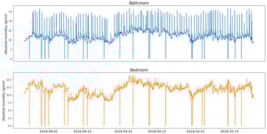
Figure 1.
Absolute humidity in the evaluation dataset, shown for the bathroom (top) and bedroom (bottom).
Renson’s smartphone app for customers overlays air quality time series data with event markers to provide insights about changes in air quality and to explain ventilation boosts taken by the Healthbox. Renson is continuously expanding the set of detectors to display more useful event markers, however, in this paper, we focus on the interplay of different detectors rather than detecting as many events as possible. Therefore, in this paper, the detected events are limited to the following humidity related events: showers (large humidity spikes occurring in the bathroom), echo effects of showers (smaller humidity increases in rooms near the bathroom after a shower) and humid weather (high humidity caused by the outside weather when doors or windows are left open).
While relevant events have a limited occurrence frequency, the sheer volume of the data does make manual labeling a challenging job. Data-driven methods can be used to bootstrap the labeling process by isolating candidate relevant events. However, not all candidate events found in this manner will be correct. Luckily, asking for customer feedback at this point is straightforward, by presenting the suggested events. Customers may notice mislabeled candidate events, incorrect candidate events or even events that were not suggested. This way, customer feedback can be used to improve the quality of the detected events. Of course, the goal should be to present the customer with correct labels as much and as fast as possible, using feedback from only a limited amount of customers or experts.
4. Combining Knowledge- and Data-Driven Techniques
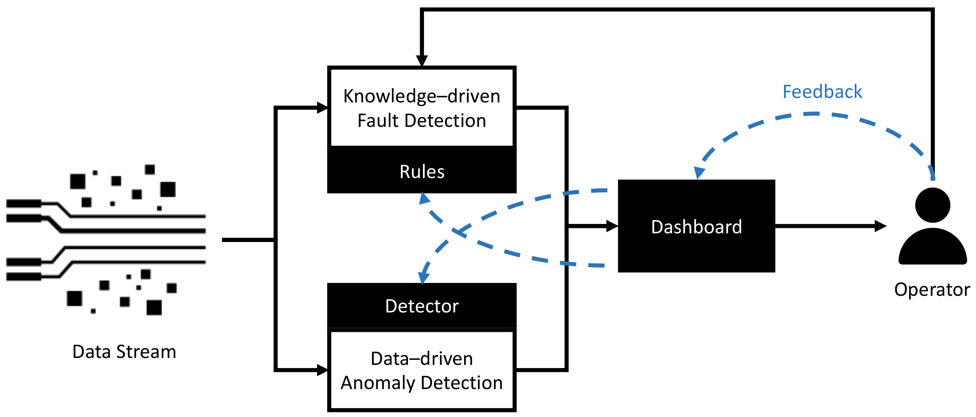
The general overview of how knowledge- and data-driven techniques can be combined is provided in Figure 2 and is a schematic representation from the work described in previous research [4]. The events originating from the data stream are being delivered to both the knowledge-driven fault detection component and the data-driven anomaly detection component. Based thus on either predefined rules (in the knowledge-driven component) or a machine learning technique (in the data-driven component), faults and/or anomalies are, respectively, visualized in a dashboard application to the operator. This operator is able to tune the rules within the fault detector manually. However, by providing feedback through the dashboard application, both the knowledge- and data-driven detection models can be updated automatically. In the knowledge-driven model, new rules are automatically derived from confirmed anomalies by analyzing the correlation between such occurring events. In the data-driven model, additional labelled feedback is used to detect similar future unseen events, evaluating to a more general supervised detection approach. In this case, the labelled feedback instantiates a supervised machine learning fault detector.
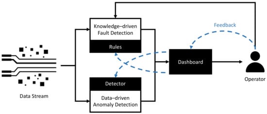
Figure 2.
Overview representing how data- and knowledge-driven techniques can be combined in an anomaly and/or fault detection system.
The feedback mechanism is standardized for both the data-driven as well as the knowledge-driven detection techniques to prevent the operator from needing to know which detection model provided the information. The next sections will focus individually on each of these more general concepts in more detail, and also provide the technology which was being used to derive the anomalies and faults for our use case described in Section 3.
5. Event Detection
As discussed in Section 1, detection of events can be done using a combination of data-driven and knowledge-driven techniques, allowing us to both exploit available expert knowledge and learn yet unknown system behavior from the data. In this section, we briefly motivate, with regard to related work, the choice for two unsupervised event detection techniques, one data-driven and one knowledge-driven, to be applied on the ventilation monitoring use case. Later, in Section 9, three additional supervised detectors will be introduced, which are able to use available user feedback. Please note that as this work focuses on the functionality of the dynamic dashboard, the feedback mechanisms and the integration of the system as a whole, we keep the description of the detection techniques brief and refer to other works for more in-depth discussion.
5.1. Data-Driven Event Detection
Events related to air quality typically occur over a period of time, examples include showers (short humidity peak), social events (increased humidity and ) or windows left open (ventilation has lower effect). As such, time series event mining techniques are particularly interesting, which evaluate time series subsequences rather than individual data points. One domain-agnostic state-of-the-art technique is the Matrix Profile (MP) [12], which can be used to look for time series discords and motifs. Discords are sequences that are unique in a time series, i.e., behavior that is novel or anomalous. Motifs are sequences that are well preserved (repeated) in time series, i.e., behavior that is repeated throughout a series. Various extensions have been suggested for the MP, including variants for streaming data [13], multi-dimensional data [14], missing data [15] and noisy data [16], making it a well suited technique to monitor real-world data. Our first data detector uses the MP to find discords in incoming data, since discords consist of previously unseen patterns, we name this detector the unknown pattern detector.
Per Healthbox, we assigned one unknown pattern detector. This instance ingested the and relative humidity signals for all rooms. For each of these signals, a streaming MP instance compared the incoming signal against the most recent available year of data. For performance reasons, the incoming signals were subsampled to 1 sample per minute and blocks of missing values were replaced by a single marker value. The subsequence lengths were chosen in function of the events we wanted to detect: 1 h (60 samples) for the relative humidity metric and 8 h for . Additionally, we applied a correction for the noise present in the data and added a restraint that ensured peaks would only be matched with other peaks, more details can be found in the work by De Paepe et al. [17].
5.2. Knowledge-Driven Event Detection
A second detector uses a knowledge-driven approach that employs expert knowledge and therefore detects events for which descriptions are available. Techniques for collecting expert knowledge have been mostly applied for describing risks and failures, e.g., Fault Tree Analysis (FTA) [18] or Failure Mode and Effects Analysis (FMEA) [19], but a similar methodology can be followed for non-fault based events. Once collected, expert knowledge can then be expressed semantically, in the form of ontologies and rules [20,21] such as the FOLIO ontology [4], whose purpose is to describe anomalies and root causes thereof. This acquired expert knowledge can be combined together with semantic expressions of the sensor observations and system context into a Knowledge Graph (KG). When the sensor observations and context in this KG trigger a rule created by a domain expert, an event is detected.
The second detector on the ventilation unit monitoring use case applies this knowledge-driven approach. It maintains, for every sensor and observed property, a window of the ten last semantic observations (5 min of data) and enriches them with semantic descriptions of the operating context (observed property, sensor and the type of the monitored room). For example, one expert rule states that a large enough increase over time of the humidity in a bathroom is indicative of a shower. If instead the humidity increase takes place in a bedroom, the detector will consider the pattern as a humid weather event. Two dedicated works further detail the expert knowledge collection [21] and the semantic event detector (applied on a train bogie monitoring use case) [4].
6. Semantic Event Description
As our system consists of many components dealing with events, communication between these components needs to be considered. We created a common message format to describe events that could be used for bidirectional exchange of information between event detectors and dashboards, containing the details needed for event visualization and feedback capturing. This way, components only need to understand a single message format, instead of one per communication path.
Since our system contains both semantic and non-semantic components, we opted for a semantic format. Semantic descriptions use the Resource Description Framework (RDF) [22], a standard data exchange format representing data as a set of facts (also called triples), expressed as subject-predicate-object relationships such as “Event 1 was detected by detector X”. The resources used as subject, predicate or object are represented by an IRI (Internationalized Resource Identifier), facilitating the uniqueness and unambiguity of identifiers. Most often, IRIs are constructed using URLs (Uniform Resource Locators), i.e., addresses of resources on the Internet. In addition to resources, triple objects may be literals, i.e., data-typed values such as a date or a number. A set of triples is called a (knowledge) graph. Reuse of resources from other graphs is highly encouraged. Vocabularies or ontologies are graphs that bundle reusable resources and relationships and additional information such as restrictions and logic rules. Because of these mechanisms, using the RDF standard as a common event message format allows detectors and dashboards to unambiguously refer to specific events, detectors, sensors, sensor observations, etc. Moreover, the addition of identified resource relations, restrictions and logic rules enable machine-understandable semantics: consumers of event information messages can interpret the meaning of the described resources. This enables semantic reasoning about the event information, which is the basis of the knowledge-driven event detectors and automated event dashboarding presented in this paper.
An example event description can be found in Listing 1. Please note that we use the Notation3 (N3) [23] to serialize the RDF. N3 is one of the standard serialization formats of RDF and provides good human-readability and low verbosity.
| Listing 1. Semantic description of an example event detected by the Unknown Pattern Detector, serialized in N3 notation. |
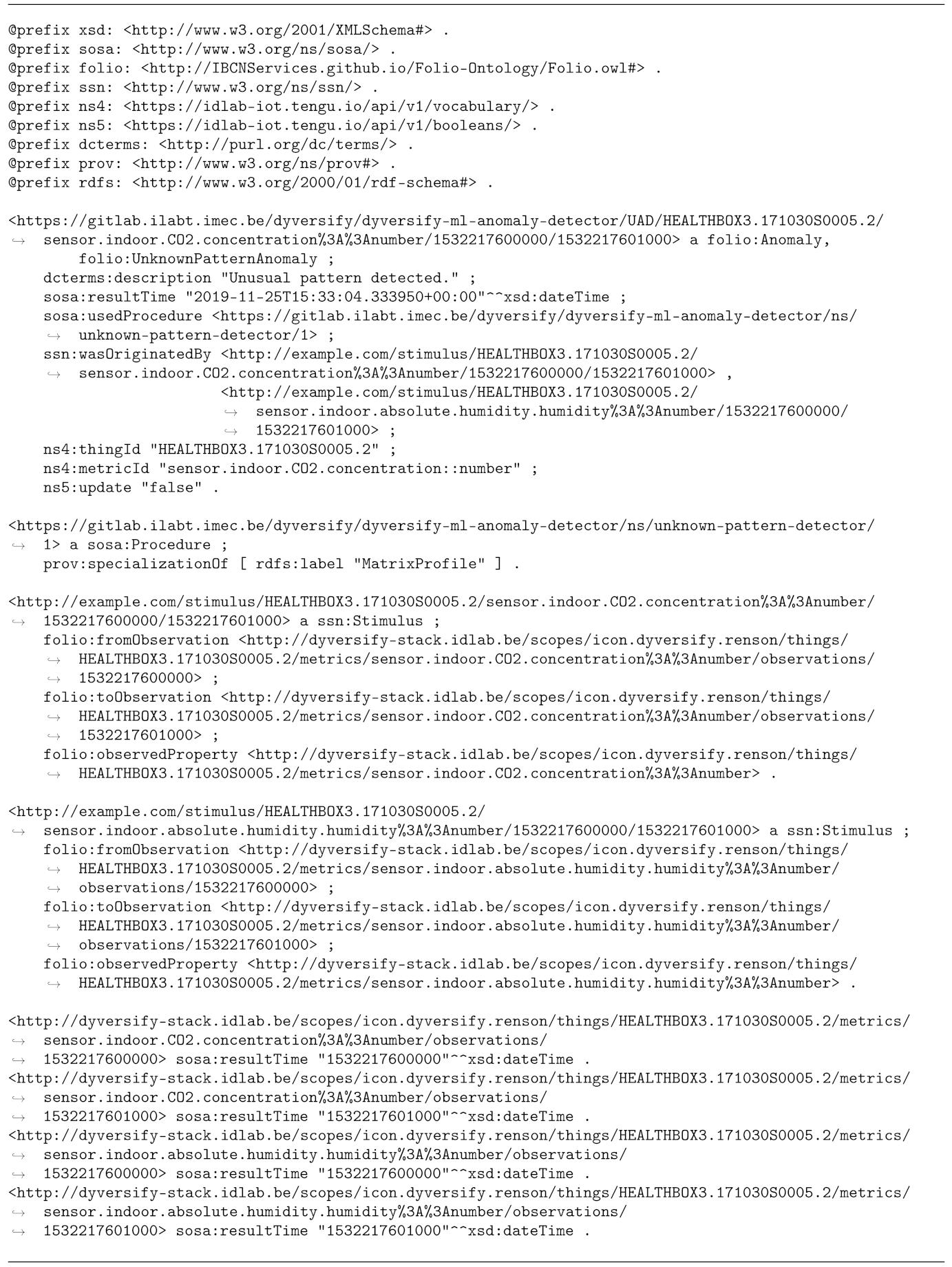 |
Our event description model reuses resources from several ontologies. Prefixes for the ontology namespaces are defined at the top of Listing 1. Two ontologies are key in our event descriptions. The first one is the SOSA (Sensor, Observation, Sample, and Actuator) ontology [24], which is the core ontology contained in the SSN (Semantic Sensor Network) ontology [25,26], the W3C (The World Wide Web Consortium is an international organization of researchers and industry stakeholders, proposing standards for the Web) recommendation for describing sensors and sensor observations. Finally, we use the FOLIO ontology, described in the previous section, to represent the events themselves.
The URL of an event (see Listing 1) is constructed using values that together constitute a unique identifier, i.e., a base URL; the sensor and observed property for which the event was detected; and finally, the start and end timestamps of the event. Since the Linked Data principles recommend using a base URL of a controlled domain when defining new resources, we used the base URL of the code repository for the detector.
The example event shown in Listing 1 was detected with the Matrix Profile-based Unknown Pattern Detector described in Section 5. As mentioned, this detector detects unique patterns (discords) in time series, i.e., sensors measurements, but it cannot attribute any specific label to discords, such as “Shower”. Because of this, the event is reported by the detector as an instance of the folio:UnknownPatternAnomaly class provided by the FOLIO ontology (see Listing 1). Other subclasses of folio:Anomaly are used to label faults detected by the knowledge-driven event detector, discussed in Section 5, or by the adaptive event detectors that attribute labels to events using expert feedback, as will be discussed in Section 8. A distinction between faults and anomalies is made from this perspective. Faults are defined as unwanted behaviour which can be clarified either upfront or due additional investigation of an operator. Anomalies are all unwanted events for which no clarification is found (yet). The knowledge-driven event detector will always detect faults here, while the data-driven event detector will initially only detect anomalies, but, based on the feedback given, can shift towards detecting faults.
Detectors also provide an event description (dcterms:description). Since the Unknown Pattern Detector cannot attribute a specific label to the event, a generic description is used. More information about the event include the time at which the event occurred, the detector that reported the event (sosa:usedProcedure) and which sensor properties (ssn:wasOriginatedBy) showed unexpected time series behavior leading to the detection of the event. For the event in Listing 1, observations for two sensor properties are documented to have led to the reporting of a discord: and absolute humidity.
Additionally, a trace of the detecting procedure is left in the event information, most importantly documenting the name of the detection technique used. Next, the stimuli are reported that led to the detection of the event, i.e., unexpected patterns seen in the time series data produced by the sensors. Stimuli information includes the specific sensor properties and the start and end observations of the unexpected patterns.
7. Automated Event Visualization Using Semantic Reasoning
Remote monitoring systems in industry integrate with a plethora of sensors. At the same time, many dynamic dashboards provide a large set of visualizations. Users must select one of these visualizations and configure it such that it knows how to parse and display a selected data source. This makes matching sensor data sources with available visualizations a burdensome task for the user. However, by combining the event data presented in the previous section with available metadata about the involved sensors, automatic visualization through reasoning becomes possible. In this section, we demonstrate a semantic reasoning approach that will enable automatic creation of visualization widgets in a dashboard tab to investigate an event in more detail, as a result of the user selecting that event.
In order to visualize events, the system needs to know what type of information is captured by each sensor. This information is available in the sensor metadata, which is stored in a semantic database. To describe dashboard specific components (e.g., metrics, widgets, visualizations) and their relationships, an open-source ontology has been created and published in an online repository (https://github.com/idlab-predict/ddashboard-ontology, accesssed on 15 October 2021). Listing 2 shows the metadata for the sensor It describes what type of data the sensor holds that a dashboard can visualize. In this case, values are specifically supported. This allows dashboard operators to attach visualization configurations such as boundaries for sensor values (e.g., “acceptable values are between 400 and 1000 ppm and can be displayed with green dots”) or document that special visualizations are supported. In addition to this metadata, the property of a sensor (e.g., a sensor of a specific Healthbox, is linked to a dashboard metric that is supported and can be visualized (dashb:produces).
| Listing 2. Metadata describing a single sensor. This metadata is stored in the semantic database and is used by the dashboard when reasoning the proper widget selection for visualizing an event. |
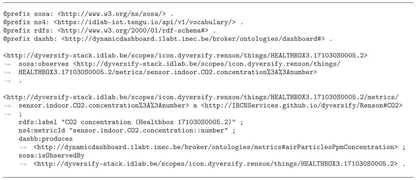 |
Visualization reasoning is initiated when the user selects an event in the dashboard. Listing 3 provides an example RDF triple stating that a new dashboard tab needs to be created to investigate the unknown pattern described in the previous section. Since the dashboard tab has not been created yet, it is here represented by a blank node, which is constructed in Notation3 with an underscore namespace prefix [23]. The event selected by the user for investigation, is identified by the URL that originates from the original event description in Listing 1.
| Listing 3. Input for the automated dashboarding approach, stating which event was selected by a user to be visualized in a new, dedicated tab in the dashboard. |
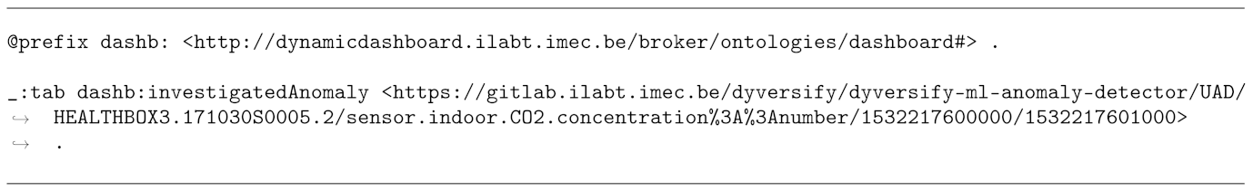 |
The contents of Listing 3 and the event metadata from Listing 1 are the first inputs passed to the EYE reasoner [27], a fast semantic reasoner software package. The speed of the EYE reasoner will guarantee low visualization delays for the end user. This reasoner takes RDF facts, logic rules and a query file as input. Listing 4 defines the query for this use case. This query essentially states that the output expected from the reasoner consists of all widget instances that are able to visualize the applicable data sources, which will be either the event selected by the user, or sensor properties linked to the selected event. Any outputted dashboard widget instances must document which data source they visualize, which visualization is constructed and which name was given to the widget. The query is constructed as a logic rule, written in N3 Logic [23]. The first part of the query specifies the combination of triples that is expected to be found in the reasoner’s RDF graph. Variable names, starting with a question mark, act as a placeholder for any RDF resource that matches the specified combination of rules. The second part of the query specifies the exact triples expected to be outputted by the reasoner, if any triples are found that match with the requirements. This conditional logic is written with the => symbol, which serves as a shorthand for the predicate log:implies (from the logic namespace (http://www.w3.org/2000/10/swap/log#, accessed on 17 August 2021)), stating that if one formula of triples (delimited by the accolades) exists, it leads to another formula as a result [23]. In this case, because the logic condition is in a separate query file, the EYE reasoner knows the resulting triples must be outputted as the final result of the reasoning process.
| Listing 4. The query passed to the EYE reasoner, stating which triples are expected output for the automatic event visualization process. |
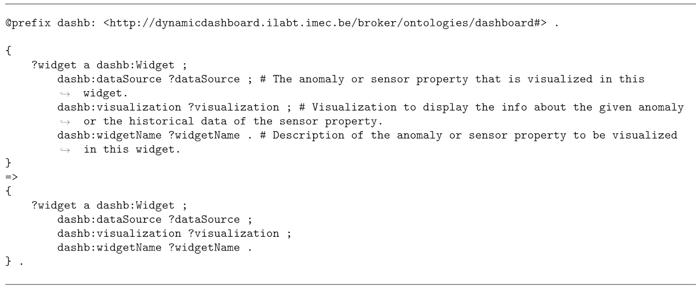 |
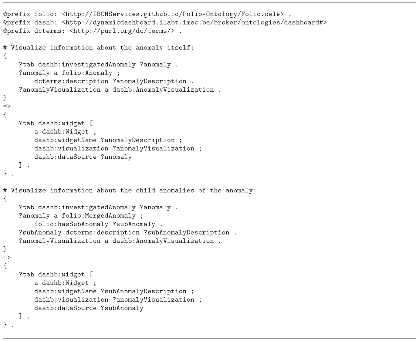
With the RDF input from Listings 1 and 3, the logic condition in the query is not yet fulfilled. Additional files passed to the reasoner express visualization logic and facts about available visualizations. With this additional knowledge, the semantic reasoner will continuously apply logic rules on existing facts to deduce new facts, until no new knowledge can be derived, after which the query output is returned. The visualization logic is shown in Listings 5–7. Please note that in these listings, events are referred to as “anomalies” instead of the more broad “event”. This is because the original use case only foresaw anomalies as interesting, whereas it became quickly obvious that various interesting events, such as showers, cannot really be considered anomalous behavior. The logic is summarized as follows:
- create a widget that visualizes basic information about the selected event, such as the names of the sensors and observed properties for which the event was detected, and during which time interval it has been detected;
- create a similar basic information widget for child events linked to an event (if any), as Section 8 will explain;
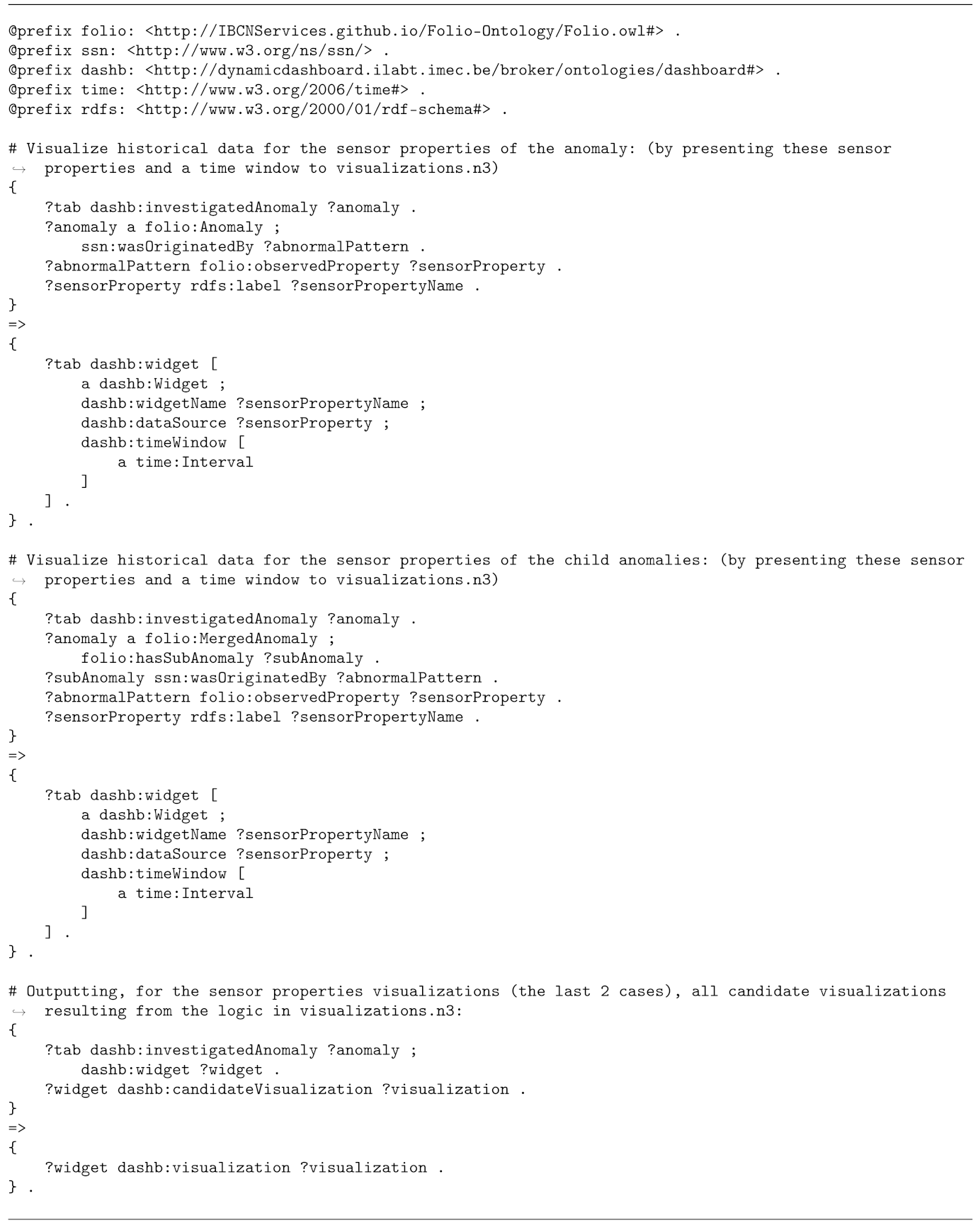
- for each sensor property linked to the selected event (e.g., ), create a widget that visualizes the historical observations made for the sensor property;
- similarly, create historical sensor data widgets for each sensor property linked to child events (if any) of the selected event.
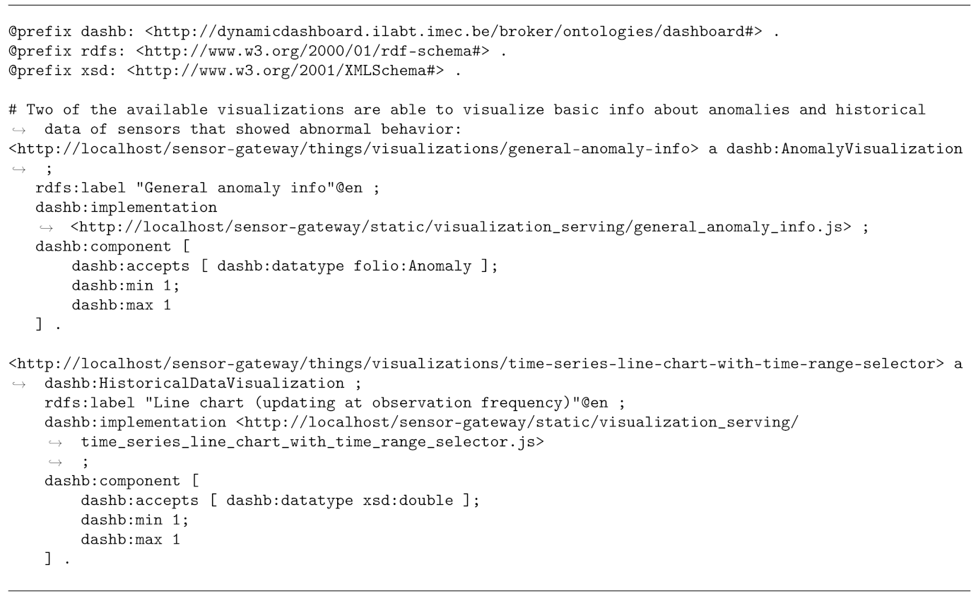
For the first two cases, the type of visualization to be displayed in the dashboard widget is directly set to be of type dashb:AnomalyVisualization, for which one concrete, basic anomaly visualization was currently sufficient. Its RDF metadata is shown in Listing 7. It specifies that the only accepted input data is one anomaly and documents which javascript file contains the code for construction of the visualization, which the dashboarding platform will import.
For the latter two cases listed above, the visualization choice is less trivial though. Sensor observations can be visualized with gauges, textual displays, bar charts, line charts, etc. Therefore, the logic rules of the latter two cases in the above list add that the sensor data originates from a time window, rather than a single timestamp. Additional visualization logic then determines that the only currently supported visualization for this case is a line chart. The additional visualization logic is published, together with all other files involved, in an online repository (https://github.com/idlab-predict/ddashboard-reasoning, accessed on 15 October 2021), and is discussed in detail in Vanden Hautte et al. [5]. As a result, the line chart’s RDF resource is set as a dashb:candidateVisualization for the widget. The number of candidate visualizations for all widgets on the event dashboard tab has been reduced by reasoning over all rules expressed in the visualization logic [5]. Eventually, only one candidate visualization remains, and future work will foresee additional rules at the end of the reasoning process in case of ties to select the candidate visualization that is used most frequently among all dashboard operators.
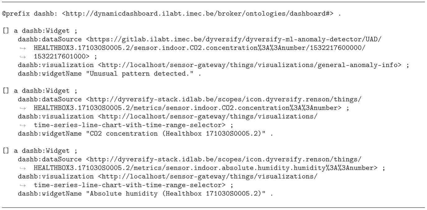
The presented reasoner input, query, event and sensor metadata, visualization logic and visualization annotations lead to the reasoner output shown in Listing 8. Based on this output, the dashboarding platform will create an event investigation tab that will contain, for the specific event discussed in this section, a widget displaying basic information about the event (event type, description, sensor properties involved, timestamps) and two additional widgets, for the time series data of the and absolute humidity properties, respectively.
In summary, this event visualization reasoning allows the dashboarding platform to construct visualizations automatically for events that users want to investigate. This way, users can spend their time on investigating events instead of losing time on constructing visualization widgets manually.
| Listing 5. Input for the anomaly visualization reasoning: Semantic rules for visualization of the anomaly itself. |
 |
| Listing 6. Input for the anomaly visualization reasoning: Semantic rules for visualization of the stimuli of the anomaly. |
 |
| Listing 7. Input for the anomaly visualization reasoning: Semantic description of the visualizations. |
 |
| Listing 8. Output of the anomaly visualization reasoning for an event detected by the Unknown Pattern Detector. Based on this output, a dashboard tab will be created for the investigation of the event, consisting of a widget displaying key event information and two widgets displaying historical sensor data for the and absolute humidity sensor properties for which the unexpected time series was detected. |
 |
8. Capturing User Feedback
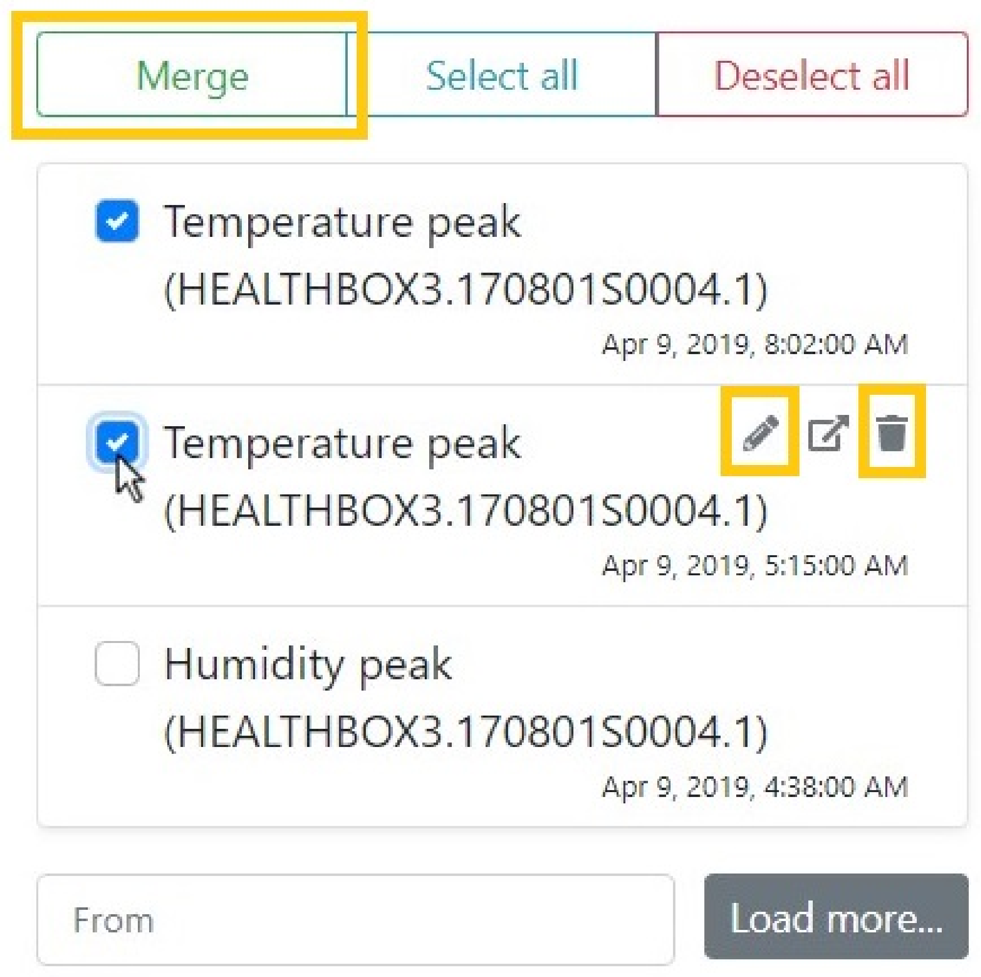
Through the dashboard user’s analysis of visualized events, user feedback can be captured to assess the correctness of detected events. We implemented the following three actions for users to submit feedback (Figure 3 visualizes which interaction can be performed by the user):

Figure 3.
Options in the event alert list for a user to submit feedback: relabeling (using the pencil icon), merging (selecting multiple events and clicking the merge button) and deleting (using the trash bin icon).
- (Re)labeling event alerts: by clicking the pencil icon next to an alert (see Figure 3) the user can give the event a meaningful free-text description. Suggestions of similar descriptions pop up below the text box to avoid that many variations of the same description are entered in the system. As a result, the dashboard’s back end system updates the event’s folio:description and adds the types folio:RelabeledAnomaly and folio:ConfirmedAnomaly from the FOLIO ontology to the semantic description of the event (see Section 6). The former indicates the user has changed the event description, the latter indicates the user has acknowledged the event as a positive example of the event. Please note that the event description is always shown in the list of detected anomalies, just like the date of detection and the sensor on which the event was detected.
- Merging event alerts, by selecting multiple alerts and then clicking the merge button (see Figure 3). This indicates that multiple detections (e.g., over different signals) actually belong to a single event. When doing so, a new event is created in the dashboard’s back end system with the types folio:MergedAnomaly and folio:ConfirmedAnomaly. The selected events will be linked as children to the new, parent event with the property folio:hasSubAnomaly. If all child events have the same description or are of the same type (e.g., folio-ext:ShowerAnomaly), the merged event is also assigned that description and/or type, otherwise an additional manual labeling by the user is required.
- Deleting (rejecting) event alerts, by clicking the trash bin icon. The user can reject events when they are false alerts. Instead of deleting the event from the database, we mark it as a folio:RejectedAnomaly instead, such that detectors can learn from these negative examples.
Please note that we made the design choice of immediately flagging relabeled or merged events as folio:ConfirmedAnomaly as well. We argue that when events are relabeled or merged, their correctness is actually inherently confirmed, given that otherwise (i.e., if an alert was deemed incorrect) the user would delete the alert.
Whenever any kind of user interaction updates an event, the dashboard posts the updated event description to the message bus. From here, the update will reach the event detectors and be persisted in a semantic database. Because events are persisted, the dashboard can retrieve historic events if needed, this functionality is shown on the bottom of Figure 3. In the next section, we discuss how the detectors use this user feedback.
9. Improved Event Detection with Captured User Feedback
Using the feedback captured in the dashboard, the performance of event detectors can be improved. For our use case, we employed three additional detectors that incorporate user feedback to automatically detect and label new events. Similar to Section 5, we keep explanations brief and instead refer to dedicated works [4,17] for further details.
9.1. Matrix Profile-Based Known Pattern Detector
The first feedback-incorporating detector is data-driven and based on the Matrix Profile, similar to the unknown pattern detector described in Section 5. However, where that detector was used to detect unique pattern sequences, this detector is used to detect similarities. Specifically, the detector checks for similarities between previously confirmed events and new incoming data, firing an event when a predefined similarity threshold is reached. Events detected this way will be linked to the original event (i.e., the one they are similar to), and will be assigned the same label. Because the similarity technique in the Matrix Profile can only efficiently compare one series against a single pattern, we need to create one instance per each confirmed event. Though this lead to a much higher number of detector instances, the memory load of each detector is many times smaller as this detector does not require historic data for detections. Since this detector focuses on patterns that have been labeled by the user, it is named the “known pattern detector”.
9.2. Temporal Rule Mining
Rule mining is most known for association rule mining as part of market basket analysis [28], where rules are mined over products bought by customers to predict which products are often bought together. Association rules consist of two parts, antecedent and consequent, each representing an item set, e.g., a set of products, where the antecedent predicts the consequent. Rule utility is determined by its confidence, the ratio of correct predictions, and its support, the number of times a rule can be applied to a dataset. Temporal rule mining [29] differs only in that it searches for rules in streams of timed events, rather than item sets. As such, rules predict a future event (consequent) after several preceding events (antecedent) have been observed.
The second feedback-incorporating component performs temporal rule mining using the algorithm described in Fahed et al. [30]. The events being mined consist of all user confirmed events, as well as several meaningful generic indicators such as the time of day (per hour), the weekday or season. This allows the component to find rules such as “windows are often opened at 8AM during summer”. While the component does not detect events itself, the rules can be used to help the user understand specific types of events (e.g., event X only occurs in winter), or to suggest likely event descriptions to events being relabeled by the user. As the component periodically mines for rules using the confirmed events, rules may become replaced by others as the user provides more input.
9.3. Semantic Rule Mining
The unified semantic format of events described in this paper also allows for semantic reasoning-based rule mining techniques. All detected events are continuously added into a single Knowledge Graph (KG), stored in a semantic database. From this KG, a semantic rule miner [4] infers cause-effect rules that predict events. These rules are inferred using the supervised framework Descriptive Logic Learner (DL-Learner) [31]. They must predict, with a configured minimum confidence, which occurrences of observations, sensors and system contexts typically lead to new events. Design details of this semantic rule miner are documented in Steenwinckel et al. [4].
The mined rules are similar to the expert rules used by the semantic fault detector, but they are now gathered automatically. Moreover, as operators relabel, merge or reject events in the dashboard, the corresponding event knowledge in the semantic database is constantly evolving. So, semantic rule mining allows adapting the detection system continuously and automatically, rather than having to rely on the constant presence of system experts to manually provide and adapt system logic.
On the ventilation unit monitoring data, this detection technique is able to learn rules to detect and label new shower echo effects.
10. Implementation and Evaluation
This section will overview a system architecture that integrates all discussed event detectors and the dynamic dashboard and will evaluate the results obtained on the real-world, streaming data of the ventilation unit monitoring use case that was presented in Section 3.
10.1. A Monitoring Architecture for Real-World, Streaming Data
The first research objective set in this paper was building a complete architecture for monitoring real-world home ventilation units that upload sensor data continuously. To this end, we have built an architecture that combines all components presented in the previous sections and guarantees that all event detectors can cope with the volume and velocity of streaming sensor data uploaded in real time by many ventilation units. The dynamic dashboarding platform must display event alerts as soon as they have been detected. Feedback from dashboard users about the correctness of detected events must rapidly be exchanged with adaptive event detectors. A unified, semantic event data model was already proposed to exchange event information between the system components. However, the system also needs a solution for fast exchange of event information and for permanent storage of event information, to enable later retrieval in bulk by the dashboard, e.g., when a user wants to list events detected over the past weekend.
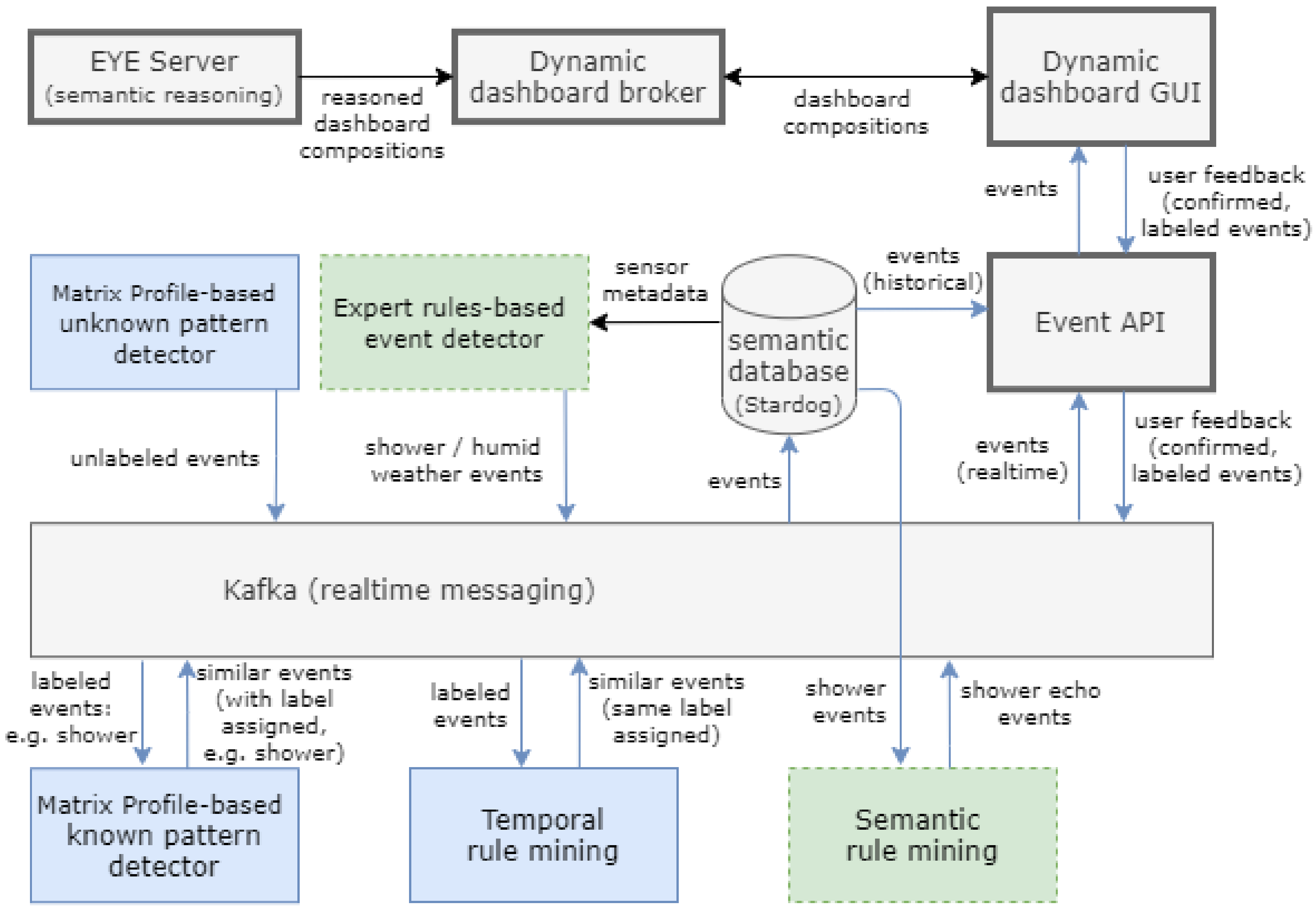
Figure 4 provides an overview of our system architecture and shows how event information is passed between all system components. Data-driven detectors are displayed in blue, knowledge-driven detectors in green. Arrows indicate the flow direction of information, often a detected event or an update of event information, e.g., an update based on user feedback (displayed at the top right of the figure). Where this work focuses on the dashboard architecture, the work by De Paepe et al. [17] discusses the overall system architecture of our use case, including sensor data ingest, deployment and semantification.
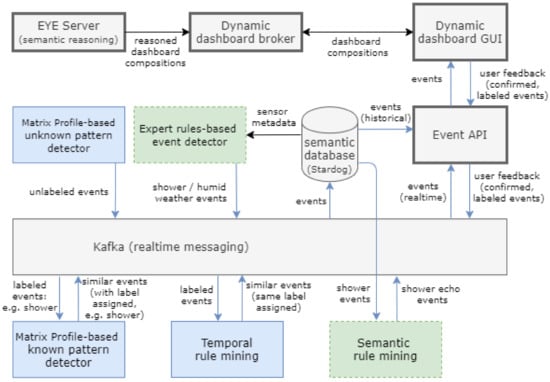
Figure 4.
Overview of the interplay of event detectors (colored, thin border) and the dashboarding platform (grey, thick border). Data-driven detectors are displayed in blue (solid border), knowledge-driven in green (dashed border). Arrows indicate the flow direction of information.
Kafka (http://kafka.apache.org/, accessed on 26 October 2021) is a highly scalable distributed message passing platform that enables real-time, in-order and at-least-once processing of messages. It is used to stream incoming sensor observations in real time to the event detectors. When an event is detected, it is again published through Kafka where it is picked up by the dashboard, but also persisted in Stardog (https://www.stardog.com/, accessed on 26 October 2021), a semantic database specialized in storing RDF graphs. This permanent storage of events allows the dashboarding platform to retrieve them in bulk at a later stage.
The dynamic dashboarding platform mainly consists of a graphical user interface (GUI) for its users and a broker component [5]. The dashboarding GUI is a web application that users run in their web browser to create dashboards that visualize sensor data and event information. The dashboard broker acts as the central back-end service for all dashboarding operations, such as listing available sensors and saving dashboard compositions.
An Event API serves as a utility web service to the dashboarding GUI for retrieving, storing or updating events. The Event API streams events, as soon as they are detected, from Kafka, to the dashboarding GUI, using the WebSocket protocol (https://tools.ietf.org/html/rfc6455, accessed on 17 August 2021). Furthermore, the dashboarding GUI uses the Event API for fetching historical events (e.g., the events that occurred over the past month) from permanent event storage, using Stardog’s data querying endpoint and the SPARQL querying language (https://www.w3.org/TR/sparql11-overview/, accessed on 17 August 2021).
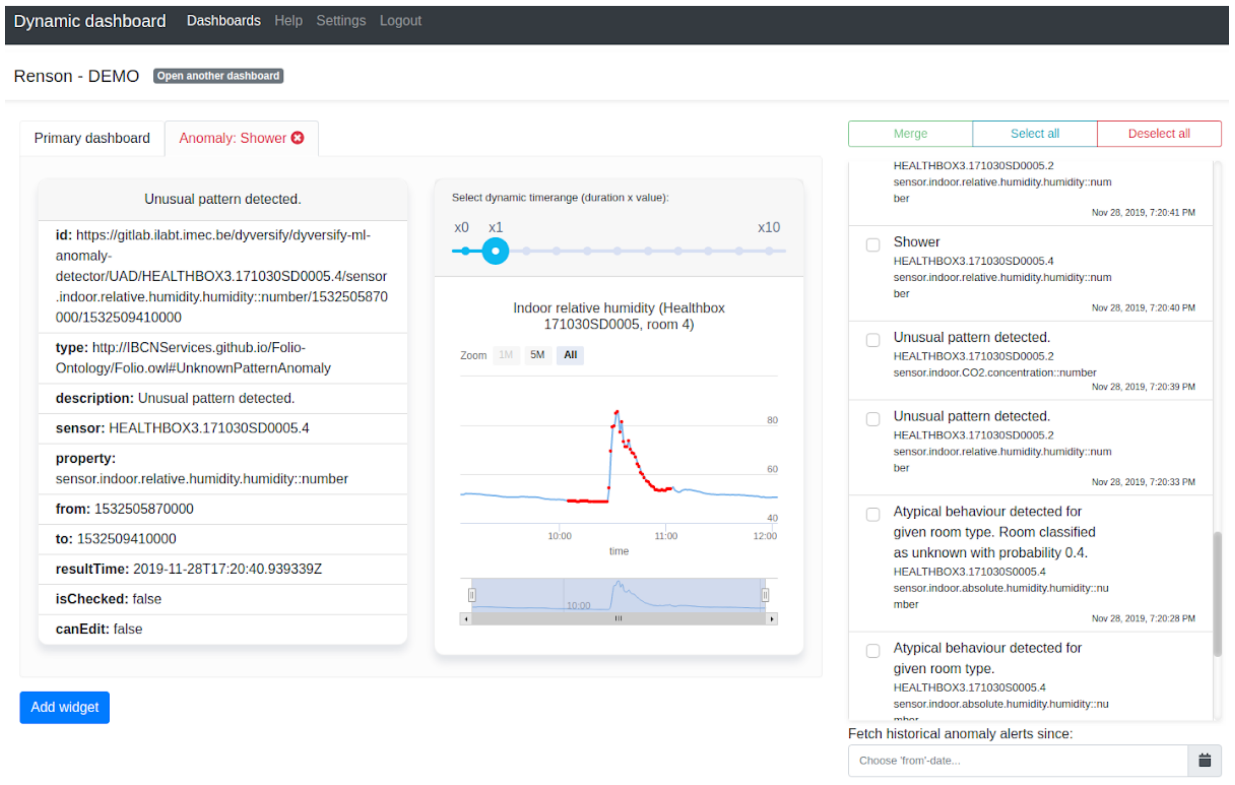
Figure 5 shows the dashboard GUI, where the event list on the right side is updated in real time through the Event API. When a user selects an event from the list, the dashboard broker automatically composes a dashboard tab to visualize the selected event. Specifically, it performs the event-driven visualization reasoning process as described in Section 7 using the EYE Server (https://github.com/RubenVerborgh/EyeServer, accessed on 17 August 2021), which exposes the EYE reasoner as a service. The reasoning output specifies a set of visualization widgets for the new dashboard tab and is passed by the broker to the dashboard GUI, where the widgets are added to the web page.
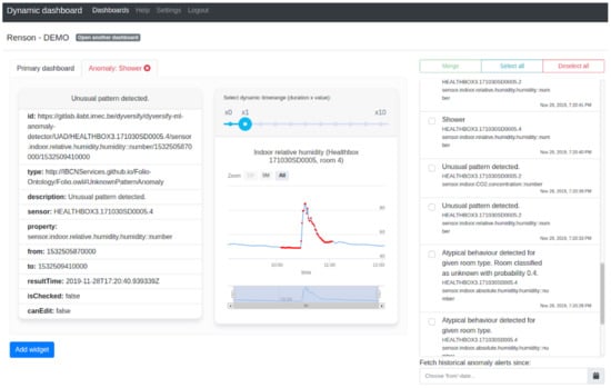
Figure 5.
The dynamic dashboard GUI displaying a shower event. On the right, events are listed as they are detected. The user can also retrieve historical events using the input field at the bottom. The dashboard tab on the left displays an event detected by the unknown pattern detector.
Please note that the dashboard broker automatically discovers the semantic annotations of all sensors and visualizations that are used for the event visualization reasoning. This allows operators to update the information of sensors and monitored assets, as well as the set of available visualizations, in a decentralized way. The design of the Dynamic Dashboard is documented in detail in Vanden Hautte et al. [5].
Whenever a user interacts with the dashboard and provides feedback about an event alert, the dashboard GUI informs the Event API, which then publishes the update on Kafka. The update is in turn ingested by the known pattern detector and rule miner components, who use it to improve their event detection performance on new sensor data. This essentially closing a feedback loop and creates a synergy between detectors and dashboard for obtaining better-quality event detection.
We validated the throughput of this architecture by replacing the stream of incoming measurements by a high-speed replay of recorded measurements originating from a single ventilation unit. This way, all incoming data and events would be visualized in a single dashboard. In our experiment, we achieved a throughput rate of 400 measurement values per second, where a normal throughput would be 16 measurement values per minute. As the event data comes in at a much lower rate than the measurements, it has little effect on the total throughput rate.
In summary, this architecture succeeds in combining event detection techniques, knowledge-driven as well as data-driven, with dynamic dashboarding for feedback capturing, under high load of streaming data representative for real-time ventilation monitoring in the field.
10.2. Automated and Fast Event-Driven Dashboard Creation
Companies will welcome any reduction of human effort required to monitor the sheer amount of assets and event alerts, as this will reduce costs and will help experts focus more on the monitoring task itself. Therefore, the second objective in this paper was attaining fully automated and rapid dashboard creation for events selected for further investigation by an expert.
Contrary to earlier design of the dynamic dashboard, as published in Vanden Hautte et al. [5], event visualization is done using semantic reasoning as described in Section 7 and no longer requires the dashboard user to manually select, per widget, a visualization from a set of well-matching candidate visualizations. The number of candidate visualizations for all widgets on the event dashboard tab is systematically reduced by subsequent reasoning over all rules expressed in the visualization logic. Eventually, either only a single candidate visualization remains, or additional rules at the end of the reasoning process select the candidate visualization that is used most frequently among all dashboard operators.
To achieve good user experience, it is important that the delay required to construct the event dashboard is below one second. The semantic reasoning involved is the most complex step in this process. Table 1 shows the execution times of the semantic reasoner on all types of events: those produced by data-driven and knowledge-driven detectors, as well as relabeled and merged events. Each of these tests (We have published these tests at https://github.com/idlab-predict/ddashboard-reasoning, accessed on 15 October 2021) show that the reasoning completes within half a second, a delay that will not disturb the user experience.
Table 1.
Execution times, in seconds, required for the visualization reasoning of all types of events.
In summary, fully automated event-driven (rather than user-driven) visualization of events using semantic reasoning can be achieved, with reasoning delays well below one second.
10.3. User Feedback Capture for Increased Detector Performance and Automated Labeling
In industry, it is often hard to set up powerful data-driven monitoring systems because large, labeled datasets are seldom available. Therefore, the third research objective set in this paper was to capture and use user feedback in the monitoring system. As labels become available, adaptive detection methods should improve in utility through higher detection accuracy or a wider range of detected relevant events.
As described in Section 8, we added functionality in the dynamic dashboard’s user interface to label events with meaningful descriptions (event relabeling), to merge events reported by multiple detectors and to reject incorrect event alerts. As a result, the event description is updated and the event is classified as a folio:ConfirmedAnomaly, indicating a user has validated the event. Depending on the user interaction, the event is also classified as a folio:RelabeledAnomaly, folio:Merged-
Anomaly or folio:RejectedAnomaly. As a semantic ontology, FOLIO could be easily extended to fit the needs of specific use cases. For example, a folio-ext:ShowerEvent could be defined if specific functionality or visualizations were needed for shower events. Furthermore, if this class was defined as a subclass of folio:Anomaly, no other system would be impacted by this change.
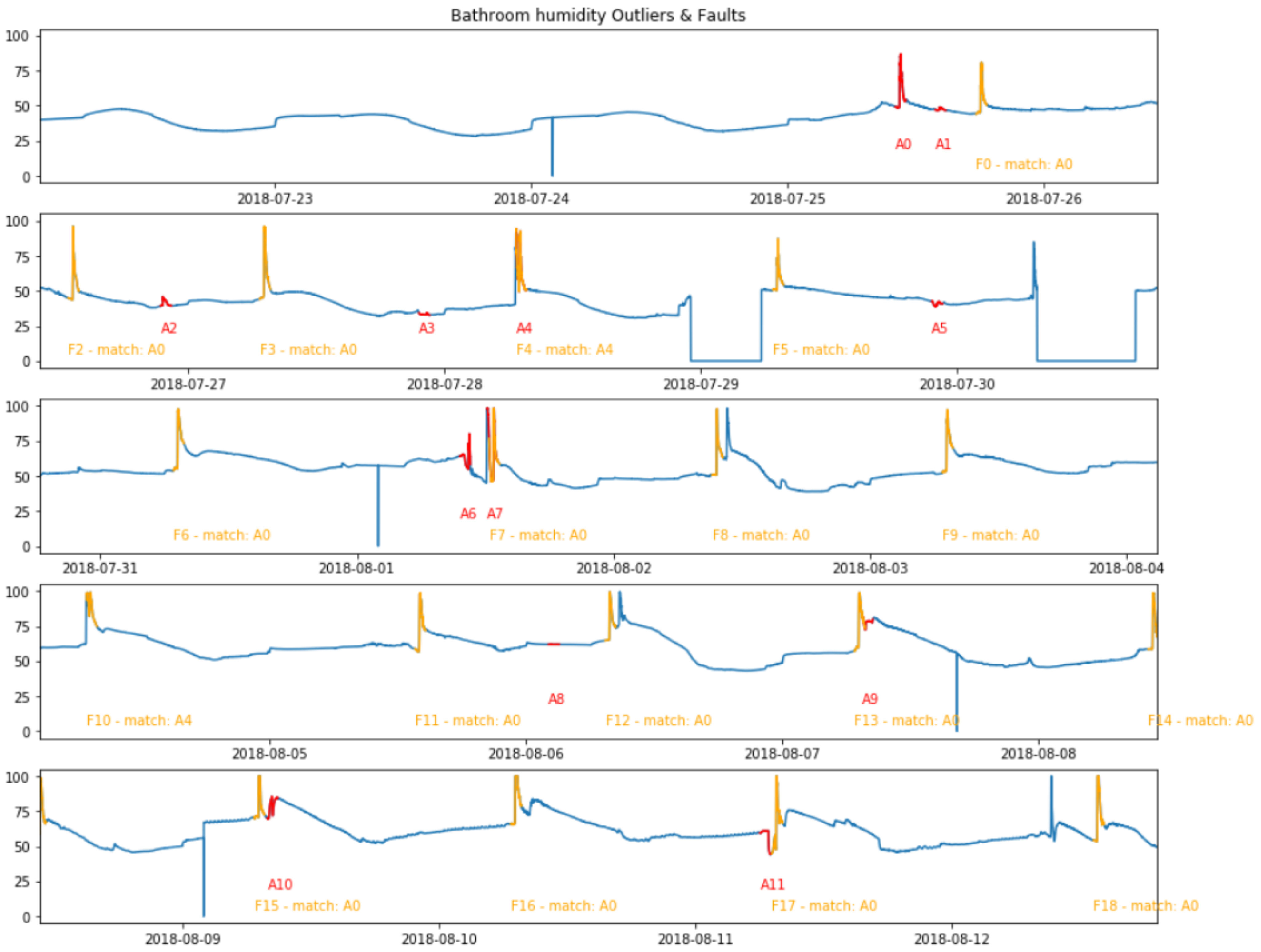
The descriptive labels assigned to events can be reused by the adaptive detectors described in Section 9. Figure 6 illustrates how the known pattern detector can automatically suggest many labels based on a small amount of patterns that were verified and labeled by the user. In this figure, we see the humidity of the bathroom over a period of 21 days. Red segments (annotated with “A”) are suggested events detected by the unknown pattern detector from Section 5. After a user verifies and labels A0 and A4 as shower events (with A4 representing two consecutive showers), the known pattern detector will automatically recognize the orange segments (annotated with “F”) as shower events because of the pattern-wise similarity. These matches will be reported as new events that are linked to the original event. In this short example, two interactions of the user in the first week of data led to a total of seventeen automatic labels. A demo movie (Available at https://www.youtube.com/watch?v=r7ygntYFLxo, accessed on 11 July 2021) shows the full system in action and demonstrates this automated event labeling over a larger timespan.
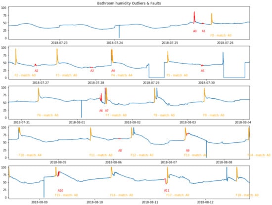
Figure 6.
Bathroom humidity over a period of 21 days. Red fragments (“A”) indicate events detected by the unknown pattern detector from Section 5. After a user confirms events A0 and A4, seventeen similar segments are found by the known pattern detector (orange, “F”). This mechanism can greatly reduce labeling efforts.
Therefore, with very limited feedback collected from the dashboard user, the detectors are able to automatically label a large amount of similar patterns. In contrast, without the detectors, a considerable amount of dashboard users would be required to try to cope with the data velocity, meaning that event labeling would be much more costly and many events would likely go undetected. Moreover, the relabeling of incorrectly detected events again leads to more precise labeling. The demonstrated symbiosis of dashboards for feedback capturing and different event detection techniques therefore enable label collection and correction on large datasets with only limited human intervention.
10.4. Dynamic and Adaptive Solution End-to-End, Applicable to Other Use Cases
The expert knowledge and training data used in this work originate from a ventilation monitoring use case. Other use cases may of course benefit from a similar approach. We designed the system in such a way that components are generic solutions that can be easily reused for other use cases, i.e., the unified RDF-based event data model, the event-driven dashboard generation, feedback capturing and the architecture for streaming and permanent storage of events. In Steenwinckel et al. [4], the system is applied on a train bogie monitoring case to detect train issues and wheel issues. In Moens et al. [3], the event model, dashboard and overarching architecture are used for monitoring accelerated bearing lifetime tests, where the dashboard reports degradation in rolling elements bearings and displays their estimated remaining useful lifetime.
10.5. Summary
In summary, all research objectives for this paper were attained. We explained the role of different components in our architecture and explained how events are exchanged and stored persistently. The system enables detection and alerting of events in real-time measurement data at high volume and velocity, as evaluated on the ventilation monitoring use case. Semantic reasoning avoids the need for human intervention when visualizing events. As reasoning time stays well below one second, a smooth user experience is ensured. Through user interaction with the dashboard, limited amounts of human feedback enable automatic methods to label a large amount of new events automatically. Finally, other industrial use cases can easily reuse the dynamic dashboard for event visualization and feedback capturing, the unified event data format, and the architecture for exchange of event information.
11. Conclusions
In industry, the lack of available large, labeled datasets is often a problem for the roll-out of accurate, remote asset monitoring systems. Moreover, such monitoring systems traditionally employ dashboards that overview the state of assets in the field, these require a lot of manual effort from the operator to visualize important events occurring in the data. In this paper, we present an approach to detect events in sensor data, with no initial labels available and requiring only limited intervention from system experts, applied to a ventilation monitoring use case.
Our approach consists of a dynamic dashboard that displays both measurement data and detected events within these measurements. Events originate from both data-driven and knowledge-driven detector components and are described in a semantic format. When a user wishes to inspect an event, semantic reasoning is used to automatically determine suitable widgets to be displayed, reducing the workload for the user. By interacting with the dashboard, the user provides feedback by describing events or providing a ground truth regarding the events. As soon as feedback is available, it is fed back to the dynamic detectors. Even with a limited amount of feedback, these dynamic detectors can automatically detect and label a large amount of future events. As such, this system addresses many of the roadblocks faced in industry.
Next, we present some suggestions for future work. A dashboard user will likely not deem all visualizations as an interesting event. For instance, an event detector may report that a combination of three sensor properties was important in its decision for flagging a pattern as unexpected, but an expert may immediately see that only one of the three sensor properties actually shows abnormal behavior. In such cases, the user may delete irrelevant widgets from the dashboard, or add additional widgets. Such dashboard interactions can be used to improve the automatically generated visualizations for similar events. Ideally, the dashboard is able to tailor the visualizations to the specific context in which the event occurred (e.g., the asset or operating conditions), or to personalize the dashboard for the user. To this end, the semantic reasoning approach may be fused with machine learning-based recommendation engines to further optimize and tailor the visualisation suggestions.
Besides more advanced dashboard interactions, the scalability of the whole system should also be evaluated to ensure a large amount of unknown events can be defined and visualized to the end user. While the currently implemented system already uses the Obelisk stack through a consumer-producer paradigm [3], a clear evaluation investigating the load and the possible user burden of such a system is still needed.
A different research direction is also related to personalization, be it on the detection side. Currently, the semantic event model captures the feedback provided by an expert. However, it is possible that experts may have different opinions whether or not specific events are relevant and how to classify them. To tackle this situation, the data model would have to be extended with the ability to track labels by different users, for example using the provenance ontology [32]. Next, detection algorithms would have to incorporate this info into their detection process.
Author Contributions
Conceptualization, S.V.H. (Sander Vanden Hautte); methodology, S.V.H. (Sander Vanden Hautte), D.D.P. and B.S.; software, P.M., S.V.H. (Sander Vanden Hautte), D.D.P., B.S., S.V. (Stijn Verstichel) and S.V. (Steven Vandekerckhove); validation, P.M. and S.V.H. (Sander Vanden Hautte); investigation, S.V.H. (Sander Vanden Hautte), D.D.P. and B.S.; resources, S.V. (Steven Vandekerckhove); writing—original draft preparation, S.V.H. (Sander Vanden Hautte); writing—review and editing, P.M., S.V.H. (Sander Vanden Hautte), D.D.P. and B.S.; visualization, S.V.H. (Sander Vanden Hautte) and D.D.P.; supervision, F.O. and S.V.H. (Sofie Van Hoecke); project administration, D.D.P., F.O. and S.V.H. (Sofie Van Hoecke); funding acquisition, S.V.H. (Sofie Van Hoecke); All authors have read and agreed to the published version of the manuscript.
Funding
This research is part of the imec ICON project Dyversify, co-funded by imec, VLAIO, Renson Ventilation NV, Televic Rail and Cumul.io (project HBC.2017.0147).
Acknowledgments
Renson Ventilation NV, the manufacturer of the Healthbox 3.0, delivered the use case data, expert knowledge and additional metadata to evaluate the proposed methodology.
Conflicts of Interest
The authors declare no conflict of interest. The funders had no role in the design of the study; in the collection, analyses, or interpretation of data; in the writing of the manuscript, or in the decision to publish the results.
References
- De Maré, B.; Germonpré, S.; Laverge, J.; Losfeld, F.; Pollet, I.; Vandekerckhove, S. Large-scale performance analysis of a smart residential MEV system based on cloud data. In Proceedings of the 40th AIVC Conference, Ghent, Belgium, 15–16 October 2019. [Google Scholar]
- Chandola, V.; Banerjee, A.; Kumar, V. Anomaly detection: A survey. ACM Comput. Surv. 2009, 41, 1–58. [Google Scholar] [CrossRef]
- Moens, P.; Bracke, V.; Soete, C.; Vanden Hautte, S.; Nieves Avendano, D.; Ooijevaar, T.; Devos, S.; Volckaert, B.; Van Hoecke, S. Scalable Fleet Monitoring and Visualization for Smart Machine Maintenance and Industrial IoT Applications. Sensors 2020, 20, 4308. [Google Scholar] [CrossRef] [PubMed]
- Steenwinckel, B.; De Paepe, D.; Vanden Hautte, S.; Heyvaert, P.; Bentefrit, M.; Moens, P.; Dimou, A.; Van Den Bossche, B.; De Turck, F.; Van Hoecke, S.; et al. FLAGS: A methodology for adaptive anomaly detection and root cause analysis on sensor data streams by fusing expert knowledge with machine learning. Future Gener. Comput. Syst. 2021, 116, 30–48. [Google Scholar] [CrossRef]
- Vanden Hautte, S.; Moens, P.; Van Herwegen, J.; De Paepe, D.; Steenwinckel, B.; Verstichel, S.; Ongenae, F.; Van Hoecke, S. A Dynamic Dashboarding Application for Fleet Monitoring Using Semantic Web of Things Technologies. Sensors 2020, 20, 1152. [Google Scholar] [CrossRef] [PubMed] [Green Version]
- Tran, M.Q.; Elsisi, M.; Mahmoud, K.; Liu, M.K.; Lehtonen, M.; Darwish, M.M. Experimental setup for online fault diagnosis of induction machines via promising IoT and machine learning: Towards industry 4.0 empowerment. IEEE Access 2021, 9, 115429–115441. [Google Scholar] [CrossRef]
- Elsisi, M.; Mahmoud, K.; Lehtonen, M.; Darwish, M.M. Reliable industry 4.0 based on machine learning and IOT for analyzing, monitoring, and securing smart meters. Sensors 2021, 21, 487. [Google Scholar] [CrossRef] [PubMed]
- Aksa, K.; Aitouche, S.; Bentoumi, H.; Sersa, I. Developing a Web Platform for the Management of the Predictive Maintenance in Smart Factories. Wirel. Pers. Commun. 2021, 119, 1469–1497. [Google Scholar] [CrossRef]
- Ayvaz, S.; Alpay, K. Predictive maintenance system for production lines in manufacturing: A machine learning approach using IoT data in real-time. Expert Syst. Appl. 2021, 173, 114598. [Google Scholar] [CrossRef]
- Jwo, J.S.; Lin, C.S.; Lee, C.H. Smart technology–driven aspects for human-in-the-loop smart manufacturing. Int. J. Adv. Manuf. Technol. 2021, 114, 1741–1752. [Google Scholar] [CrossRef]
- Kaur, K.; Selway, M.; Grossmann, G.; Stumptner, M.; Johnston, A. Towards an open-standards based framework for achieving condition-based predictive maintenance. In Proceedings of the 8th International Conference on the Internet of Things, Santa Barbara, CA, USA, 15–18 October 2018; pp. 1–8. [Google Scholar]
- Yeh, C.C.M.; Zhu, Y.; Ulanova, L.; Begum, N.; Ding, Y.; Dau, H.A.; Silva, D.F.; Mueen, A.; Keogh, E. Matrix Profile I: All Pairs Similarity Joins for Time Series: A Unifying View That Includes Motifs, Discords and Shapelets. In Proceedings of the 2016 IEEE 16th International Conference on Data Mining (ICDM), Barcelona, Spain, 12–15 December 2016; pp. 1317–1322. [Google Scholar] [CrossRef]
- Zhu, Y.; Zimmerman, Z.; Senobari, N.S.; Yeh, C.C.M.; Funning, G.; Brisk, P.; Keogh, E. Matrix Profile II: Exploiting a Novel Algorithm and GPUs to Break the One Hundred Million Barrier for Time Series Motifs and Joins. In Proceedings of the 2016 IEEE 16th International Conference on Data Mining (ICDM), Barcelona, Spain, 12–15 December 2016; pp. 739–748. [Google Scholar] [CrossRef]
- Yeh, C.C.M.; Kavantzas, N.; Keogh, E. Matrix Profile VI: Meaningful Multidimensional Motif Discovery. In Proceedings of the 2017 IEEE International Conference on Data Mining (ICDM), New Orleans, LA, USA, 18–21 November 2017; pp. 565–574. [Google Scholar] [CrossRef]
- Zhu, Y.; Mueen, A.; Keogh, E. Admissible time series motif discovery with missing data. arXiv 2018, arXiv:1802.05472. [Google Scholar]
- De Paepe, D.; Janssens, O.; Van Hoecke, S. Eliminating Noise in the Matrix Profile. In Proceedings of the 8th International Conference on Pattern Recognition Applications and Methods, Prague, Czech Republic, 19–21 February 2019; pp. 84–93. [Google Scholar]
- De Paepe, D.; Vanden Hautte, S.; Steenwinckel, B.; Moens, P.; Vaneessen, J.; Volckaert, B.; Ongenae, F.; Van Hoecke, S. A Complete Software Stack for IoT Time Series Analysis that Combines Semantics and Machine Learning—Lessons Learned from the Dyversify Project. J. Syst. Softw. 2021. submitted. [Google Scholar]
- Lee, W.S.; Grosh, D.L.; Tillman, F.A.; Lie, C.H. Fault Tree Analysis, Methods, and Applications: A Review. IEEE Trans. Reliab. 1985, 34, 194–203. [Google Scholar] [CrossRef]
- Stamatis, D.H. Failure Mode and Effect Analysis: FMEA from Theory to Execution; ASQ Quality Press: Milwaukee, WI, USA, 2003. [Google Scholar]
- Lykourentzou, I.; Papadaki, K.; Kalliakmanis, A.; Djaghloul, Y.; Latour, T.; Charalabis, I.; Kapetanios, E. Ontology-based Operational Risk Management. In Proceedings of the 2011 IEEE 13th Conference on Commerce and Enterprise Computing, Luxembourg, 5–7 September 2011; pp. 153–160. [Google Scholar] [CrossRef]
- Steenwinckel, B.; Heyvaert, P.; De Paepe, D.; Janssens, O.; Vanden Hautte, S.; Dimou, A.; De Turck, F.; Van Hoecke, S.; Ongenae, F. Automated extraction of rules and knowledge from risk analyses: A ventilation unit demo. In Proceedings of the ISWC 2018 Posters & Demonstrations, Industry and Blue Sky Ideas Tracks, Co-Located with 17th International Semantic Web Conference (ISWC 2018), Monterey, CA, USA, 8–12 October 2018; Volume 2180, p. 4. [Google Scholar]
- Cyganiak, R.; Wood, D.; Lanthaler, M.; Klyne, G.; Carroll, J.J.; McBride, B. RDF 1.1 concepts and abstract syntax. W3C Recomm. 2014, 25, 1–22. [Google Scholar]
- Berners-Lee, T.; Connolly, D.; Kagal, L.; Scharf, Y.; Hendler, J. N3Logic: A logical framework for the World Wide Web. Theory Pract. Log. Program. 2008, 8, 249–269. [Google Scholar] [CrossRef] [Green Version]
- Janowicz, K.; Haller, A.; Cox, S.J.D.; Phuoc, D.L.; Lefrancois, M. SOSA: A lightweight ontology for sensors, observations, samples, and actuators. J. Web Semant. 2019, 56, 1–10. [Google Scholar] [CrossRef] [Green Version]
- Haller, A.; Janowicz, K.; Cox, S.J.D.; Lefrançois, M.; Taylor, K.; Le Phuoc, D.; Lieberman, J.; García-Castro, R.; Atkinson, R.; Stadler, C. The modular SSN ontology: A joint W3C and OGC standard specifying the semantics of sensors, observations, sampling, and actuation. Semant. Web 2019, 10, 9–32. [Google Scholar] [CrossRef] [Green Version]
- Haller, A.; Janowicz, K.; Cox, S.; Phuoc, D.L.; Taylor, K.; Lefrançois, M.; Atkinson, R.; García-Castro, R.; Lieberman, J.; Stadler, C. Semantic Sensor Network Ontology. W3C Recomm. 2017, 56, 1–10. [Google Scholar]
- Verborgh, R.; De Roo, J. Drawing Conclusions from Linked Data on the Web: The EYE Reasoner. IEEE Softw. 2015, 32, 23–27. [Google Scholar] [CrossRef]
- Agrawal, R.; Imieliński, T.; Swami, A. Mining Association Rules between Sets of Items in Large Databases. In Proceedings of the 1993 ACM SIGMOD International Conference on Management of Data, Washington, DC, USA, 25–28 May 1993; Association for Computing Machinery: New York, NY, USA, 1993; pp. 207–216. [Google Scholar] [CrossRef]
- Shokoohi-Yekta, M.; Chen, Y.; Campana, B.; Hu, B.; Zakaria, J.; Keogh, E. Discovery of meaningful rules in time series. In Proceedings of the 21th ACM SIGKDD International Conference on Knowledge Discovery and Data Mining, Sydney, Australia, 10–13 August 2015; pp. 1085–1094. [Google Scholar] [CrossRef]
- Fahed, L.; Brun, A.; Boyer, A. Efficient Discovery of Episode Rules with a Minimal Antecedent and a Distant Consequent. In Knowledge Discovery, Knowledge Engineering and Knowledge Management; Fred, A., Dietz, J.L.G., Aveiro, D., Liu, K., Filipe, J., Eds.; Springer International Publishing: Zurich, Switwerland, 2015; pp. 3–18. [Google Scholar]
- Lehmann, J. DL-Learner: Learning Concepts in Description Logics. J. Mach. Learn. Res. 2009, 10, 2639–2642. [Google Scholar] [CrossRef]
- Lebo, T.; Sahoo, S.; McGuinness, D.; Belhajjame, K.; Cheney, J.; Corsar, D.; Garijo, D.; Soiland-Reyes, S.; Zednik, S.; Zhao, J. PROV-O: The PROV Ontology; W3C Recommendation, World Wide Web Consortium: Cambridge, MA, USA, 2013. [Google Scholar]

Publisher’s Note: MDPI stays neutral with regard to jurisdictional claims in published maps and institutional affiliations. |
© 2021 by the authors. Licensee MDPI, Basel, Switzerland. This article is an open access article distributed under the terms and conditions of the Creative Commons Attribution (CC BY) license (https://creativecommons.org/licenses/by/4.0/).