Article

A Method for Studying Building Color Harmony in Coastal Historic and Cultural Districts: A Case Study of Mojiko, Japan

1
School of Art and Design, Shenyang Jianzhu University, Shenyang 110168, China
2
School of Architecture and Urban Planning, Shenyang Jianzhu University, Shenyang 110168, China
3
Faculty of Environmental Engineering, The University of Kitakyushu, Kitakyushu 808-0135, Japan
4
College of Management, Maharishi International University, Fairfield, IA 52557, USA
*
Author to whom correspondence should be addressed.
Buildings 2025, 15(9), 1496; https://doi.org/10.3390/buildings15091496
Submission received: 24 March 2025 / Revised: 9 April 2025 / Accepted: 13 April 2025 / Published: 28 April 2025
(This article belongs to the Section Architectural Design, Urban Science, and Real Estate)

Abstract

Coastal historic and cultural districts are distinctive urban public spaces which reflect the urban cultural and historical narratives. As an important symbol, coastal historic and cultural districts’ building colors play a crucial role in enhancing the historic and cultural districts’ visual quality and shaping the urban coastal landscape. Japan was one of the earliest countries to research urban color and building color regulation. This study selected Mojiko in Japan as the study site using street-view images, semantic segmentation technology, and ColorImpact4 software to collect information about the street building color. Based on the Moon–Spencer (M–S) color coordination theory and applied psychology methods, this study evaluated the building color quality and street color harmony from objective and subjective perspectives. It explored the impact of the building color on the coastal historic and cultural districts’ landscape quality. The results indicated that the building color of Mojiko generally presented a harmonious and unified characteristic. Most street buildings were soft, warm color tones, with higher color harmony and continuity. However, there were some problems, such as colors disrupting the overall street color environment, or color combinations were overly uniform. This study proposed a comprehensive method for building color analysis and evaluation, which is a reference value for guiding the color planning and construction for coastal historic and cultural districts’ landscape control.

1. Introduction

Color is the most direct factor that stimulates visual perception and affects psychological feelings in the urban environment [1,2]. As the first perceptual element of the environment, color is often the first to be noticed by people [3]. Urban coastal historic and cultural districts are not only special urban waterfront public spaces but also have unique environmental colors [4]. These districts reflect the historical context and spirit, which represent a successful combination of artificial and natural landscapes. Buildings are the major component of urban public spaces [5]. The building color shows the urban style and features, which promotes the dissemination of cultural values. With the growing demand for urban regeneration, especially the preservation of historic districts, more and more urban color research is beginning to focus on the distinctive urban style and features and building color combinations of waterfront historic cultural districts. Correspondingly [6], the study of coastal historic cultural districts building color is essential for planning and preserving of the coastal historic and cultural district [7,8,9].
The study of urban building color is based on color science and chromatics, with theoretical studies involving disciplines such as psychology, physiology, and aesthetics. Vision’s ability to perceive color changes is predicated on the three dimensions of hue, saturation, and lightness, which were established by Grassmann in 1853. For the first time, this theory explained human’s three-dimensional perception of color in mathematical language, which laid a foundation for modern colorimetry [10]. Colorimetry is an important technical tool for urban color planning, which proposes color spaces and standard systems and enables color expressions and color measurement systems to be used. The Munsell Color System, which was created by Albert Munsell in 1905, built the first standardized color 3D model using hue rings, lightness axes, and chrominance radii and is widely used today [11]. To meet multiple needs, various color space mixing models have emerged [12] (See Table 1). Practical research is based on the concept of color geography (introduced by French color scientist Lenclos) [13,14], which has developed a series of color planning ideas and methods. Color geography emphasizes exploring and guiding urban, buildings, and landscape colors by integrating regional and contextual color theories [15] (See Table 2).
Traditional methods for collecting and studying urban building color mainly rely on field surveys and manual measurements using colorimetric cards or spectrophotometers. These methods are not enough to meet the needs of urban fine management and cannot adapt to the data updates in rapidly developing areas [18]. For example, some scholars [19,20] have used field surveys and manual measurements, Problems such as a limited scope of research, efficiency, and labor intensity were present.
With the advancement of science and technology, particularly objective measurement and digital technologies, urban color studies have turned from qualitative descriptions to quantitative analysis [21]. Through new technologies and devices, colors can be calculated as binary digits and recognized by computers for encoding, calculation, and analysis now [22,23]. The accuracy of urban block-building color data collection has improved [24].
Street-view images (SVI) provide data from a human perspective to describe large-scale street spaces. Semantic segmentation based on Convolutional Neural Networks (CNN), such as SegNet [25], PSPNet [26], and DeepLabV3 [27], has been widely used to automatically extract various elements from street-view images. These algorithms can achieve pixel-level semantic parsing of streetscape images, automatically identify and segment different semantic elements (such as roads, buildings, vegetation, vehicles, etc.) in the image, and transform the original image into a structured semantic label map, thus providing structured data for urban spatial analysis. A large number of color information identification in images is possible [24]. With the help of SVI and deep learning, the feasibility of quantifying building color has been realized [28]. Some methods, such as k-means clustering, have been used to extract the buildings dominant color features from SVIs and analyze urban color characteristics [29,30], Most of the current color studies are objective studies for the body of the building color spatial distribution or color harmony evaluation and perception [31,32,33]. However, fewer studies have combined buildings body color and color harmony [34,35].
Existing research on urban building color from the perspective of colorimetry has mainly focused on the measurement and analysis of monochromatic relationships [36]. Color is a spatially defined element, and building color typically exists in the form of combinations of two or more colors [37,38]. Harmonious color design not only plays a crucial role in shaping the visual identity but is also significant for the renewal and preservation of historic buildings [39,40,41]. Studies have indicated that color harmony directly affects people’s preferences for an object and visual psychological feelings [42,43,44]. Ref. [45] explored the relationship between color harmony and diversity. Refs. [46,47] explored the impact of primary color and color contrast on the harmony of building facades, and the color combination of a primary color and one complementary color was used. Refs. [48,49,50] quantified color harmony using the similarity of color histograms. Most existing studies on building color harmony and evaluation have focused primarily on measuring similarity [51,52,53]. Compared to other color harmony theories, the –S theory is more suitable for research and analysis on color quantification at the micro-scale [54].
This study selected Moji, Japan, as the research site. As the data source, street-view images were used to extract the building color information from the Moji Port streets. A method based on the M–S theory and psychophysics was proposed to evaluate the color harmony of the building facades in Mojiko. It aimed to provide valuable insights and color control experiences for the preservation and development of coastal historic and cultural districts.

2. Materials and Methods

2.1. Study Site

The Mojiko of Kitakyushu, Japan was selected as the study site. Mojiko is located at the junction of the Kanmon Strait and the Bungo Channel. It used to be an important international trade port in Japan. There are many historic sites preserved. Mojiko is no longer used for port trade but is characterized by historic buildings and has become a popular tourist destination. The study area was centered on the port, to the north of Dong Mojiko Line 12, and to the south of Dairen Street. The west was the coast, and to the east was the West Coast Line 1, with a total area of about 57.9 hectares. Based on the current situation of the streets in the area, we numbered the streets street A, street B, and so on (Table 3).
According to the building orientation and the street number, the buildings in Mojiko were numbered A1, A2, and so on (Figure 1).

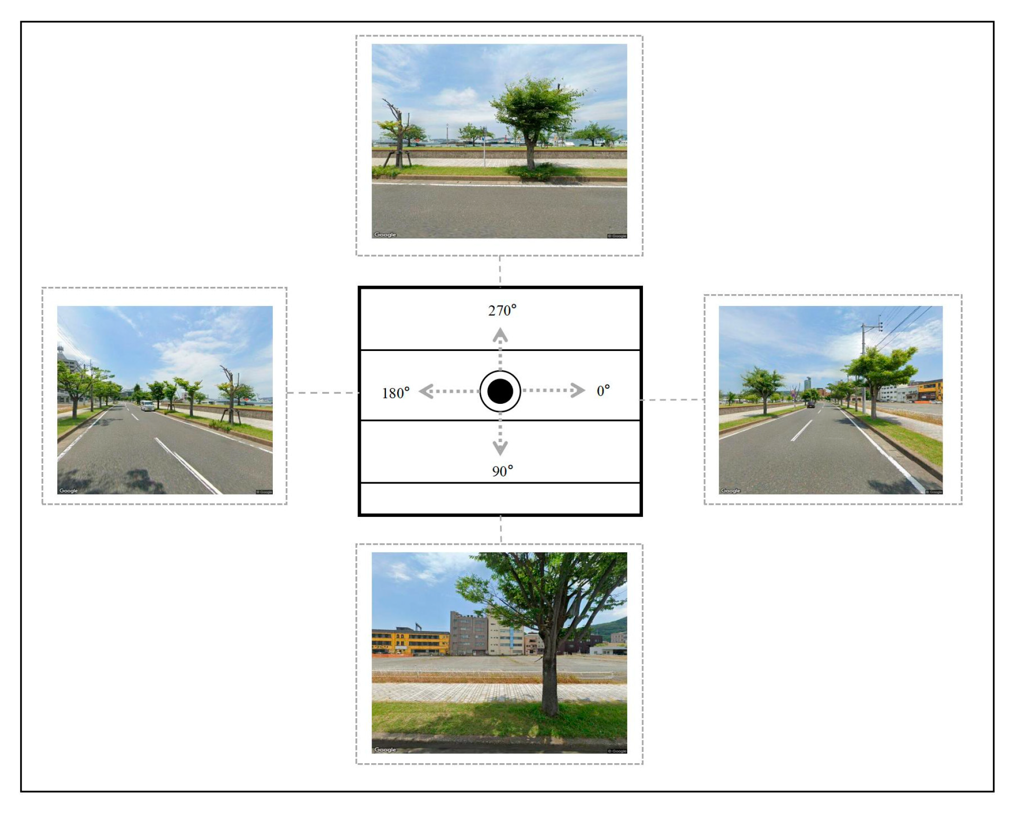
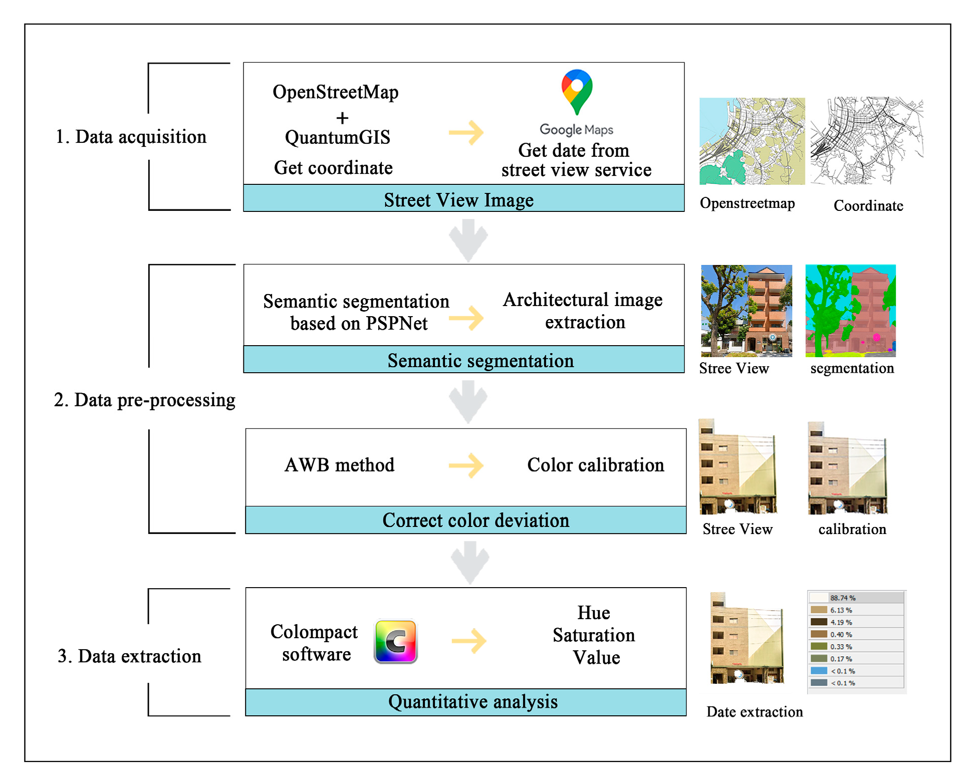
2.2. Data Acquisition and Processing

The basic road network data of Mojiko, Kitakyushu, Japan, was obtained by OpenStreetMap. We manually screened and labeled major streets that were worth researching. Street-view sample points were generated at 20 m intervals using the ArcGIS platform. We ensured that the main building color near each sampling point could be captured. After obtaining each point’s latitude and longitude coordinates, street-view images were collected from the Open-Source Street-View Data for each sample point. Each image was 640 × 640 pixels, with specific sample angles of 0°, 90°, 180°, and 270° (Figure 2). In total, 163 sample points were used, resulting in 197 streetview images of individual building facades after filtering (Figure 3). After obtaining the street-view images, the MIT ADE20K dataset combined with a semantic segmentation model was applied in Python3.9 to perform semantic segmentation on the images, extracting the building elements. Additionally, to reduce color interference caused by different lighting conditions, an automatic white balance (AWB) algorithm was used to process the images, ensuring the accuracy of the color data in the collected samples, Since the Mensel color system and closer to the human perception of color, the relevant data information acquired will undergo hue, saturation, value (HSV)) spatial color conversion to quantify the color seen by the human eye [55].

2.3. Subjective Evaluation Method of Building Color Harmony Degree

In the research area, a 100 m boundary was used to group buildings on the street facades within the range into pairs. The 10 street segments had 157 sample data groups. The building color quality was then evaluated using a Likert scale. For the evaluation, 50 urban color and related professionals were invited. A brief explanation of the evaluation content and scoring standard was provided to the evaluators before the assessment, along with a preview of the building group facade photos to assist in determining the evaluation standards. Scoring was limited to 10 s per image to ensure the consistency and accuracy of the score [56]. Experts independently judged and scored in the Likert scale, using the 7-point system principle: 1 represents the lowest color harmony, and 7 represents the highest color harmony. A total of 48 valid questionnaires were collected. To minimize the impact of aesthetic differences among individuals on the evaluation results, the scores were standardized. Finally, we used the following formula to calculate the building color harmony degree (BCHD) subjective evaluation results.
Z xy = R xy R y S xy
Z x = y i = 1 Z xy / N y

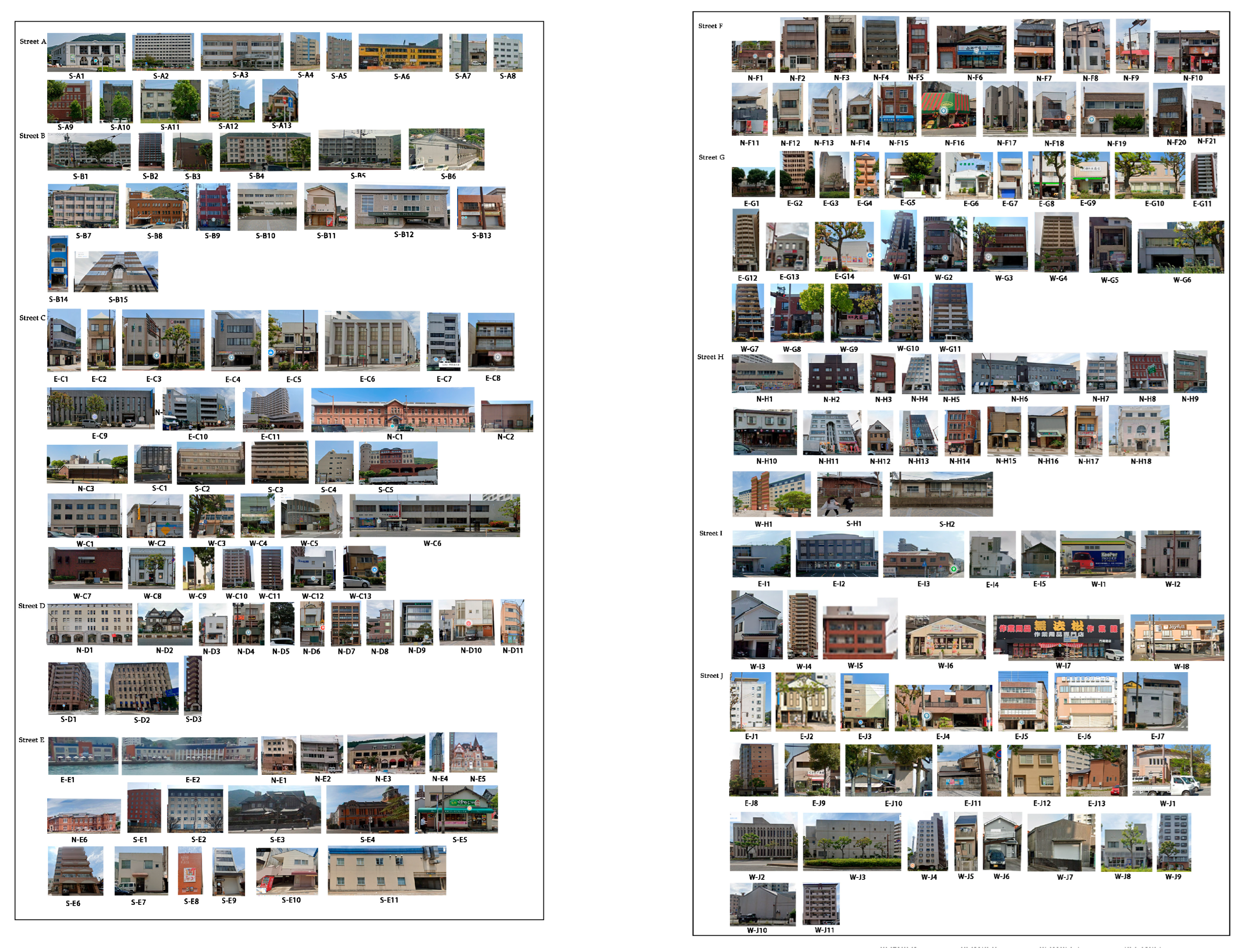
2.4. Building Façades Primary Color Extraction

Based on the Python platform, we integrated semantic segmentation and image mask technology to eliminate non-building landscape elements in the photos to eliminate the interference on the extraction of build building color features in batches [57,58]. Then Colorlmpact4 software was used to extract the building facade colors of 197 sample photos.
As shown in Figure 4, ColorImpact4 software could accurately extract and quantitatively analyze the color of the image. The tool provides a color clustering function, which can automatically identify the main color, auxiliary color, and their proportion, and is suitable for the statistical analysis of building color.

2.5. Objective BCHD Calculation Method

Color harmony refers to a visual perception where color combinations are unified [59], coordinated, and enjoyable. It is a normal form of aesthetic appreciation. The color geometric formalization in the M–S theory provides a quantitative description of hue, saturation, and brightness [60]. The calculation of the BCHD in Mojiko used the aesthetic formula proposed by the American mathematician George David Birkhoff [61].
M = O C = O t + O v + O g C m + C t + C v + C g
where M represents the aesthetic harmony, O represents the order factor, and C represents the complex factor.
Ot = the hue harmony value between adjacent buildings façades color;
Ov = the brightness harmony value between adjacent buildings façades color;
Og = the saturation harmony value between adjacent buildings façades color.
Cm = the total number of colors in the color combination;
Ct = the number of color pairs with hue differences;
Cv = the number of color pairs with brightness differences;
Cg = the number of color pairs with saturation differences [62].

3. Results

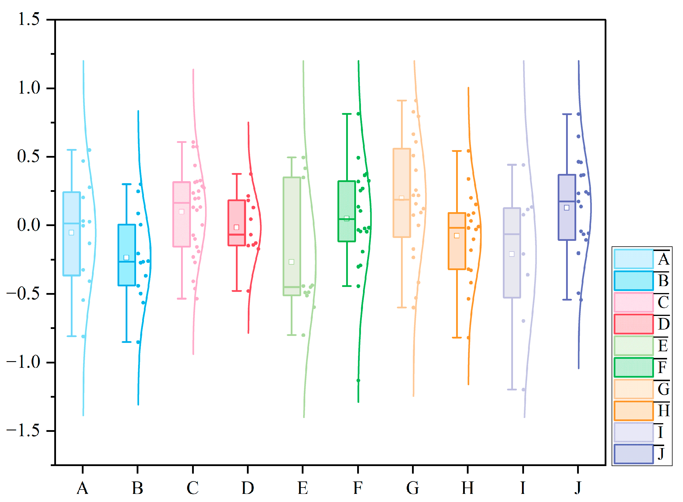
3.1. BCHD Subjective Evaluation

3.1.1. Comparison of BCHD Subjective Evaluation Between High Sample and Low Sample

According to the above color quality evaluation method, we obtained the color harmony degree subjective evaluation results of 157 adjacent buildings using Likert scales evaluation. The evaluation results were classified using the natural breakpoint method. The core objective of the natural breakpoint method is to automatically determine classification breakpoints or interval boundaries based on the distribution characteristics of the data. The application of this method not only enhances the rationality of data classification but also improves the realism and clarity of the map visualization. Ultimately, the color harmony evaluation results were divided into ‘higher color harmony value’, ‘normal color harmony value’, and ‘lower color harmony value’ (Table A1).
The results showed that the subjective evaluation of the overall color harmony of the region was at a high and medium-high level, and only a small number of samples had low subjective evaluation results. There were 52 samples with high color harmony, accounting for 33.12% of the total samples. The proportion of medium color harmony samples was the highest, with 63 samples, accounting for 40.13% of the total samples. Low color harmony samples accounted for the lowest proportion, a total of 42, accounting for 26.75% of the total number of samples.
The high-harmony value range was 0.204–0.911, the mean value was 0.421, and the standard deviation was 0.183. The range of moderate-harmony degree was −0.259~0.204, the mean value was −0.008, and the standard deviation was 0.128. The range of low-harmony degree was −1.198~−0.260, the mean was −0.509, and the standard deviation was 0.210.
Figure 5 shows the spatial distribution of BCHD subjective evaluation. The figure shows that the samples with high color harmony were mainly distributed in the areas far from the sea, such as streets G, J, C, and F, and the samples with medium- and low-harmony levels were mainly distributed in the coastal areas, such as streets A, H and E.
By comparing the high- and the low-harmony degree samples, we analyzed the Mojiko BCHD from the perspective of the public. In the high color harmony degree samples, the dominant color of building combination was mostly off-white, beige, earthy yellow, and light brown. Most of them were medium-high brightness and low saturation. In the top 10 high-harmony samples, the brightness and saturation values of the adjacent building dominant color were similar. For example, E-G13 and E-G14, as well as W-J1 and W-J2, were high brightness and low-saturation color matching. Although there were some differences in some samples, these differences were usually in a relatively small range, for example, in N-F13 and N-F14 and W-G2 and W-G3.
In the low-harmony degree samples, the hue distribution was irregular. The color combinations were mostly the colorless, high-brightness, and low-saturation gray and black, as well as high-brightness and high-saturation blue, bright yellow, and green combination collocations, such as W-I6 and W-I7, W-I7 and W-I8, N-F16 and N-F17 and S-B14 and S-B15. This strong contrast led to inconsistent colors, resulting in visual incongruity (Figure 6).

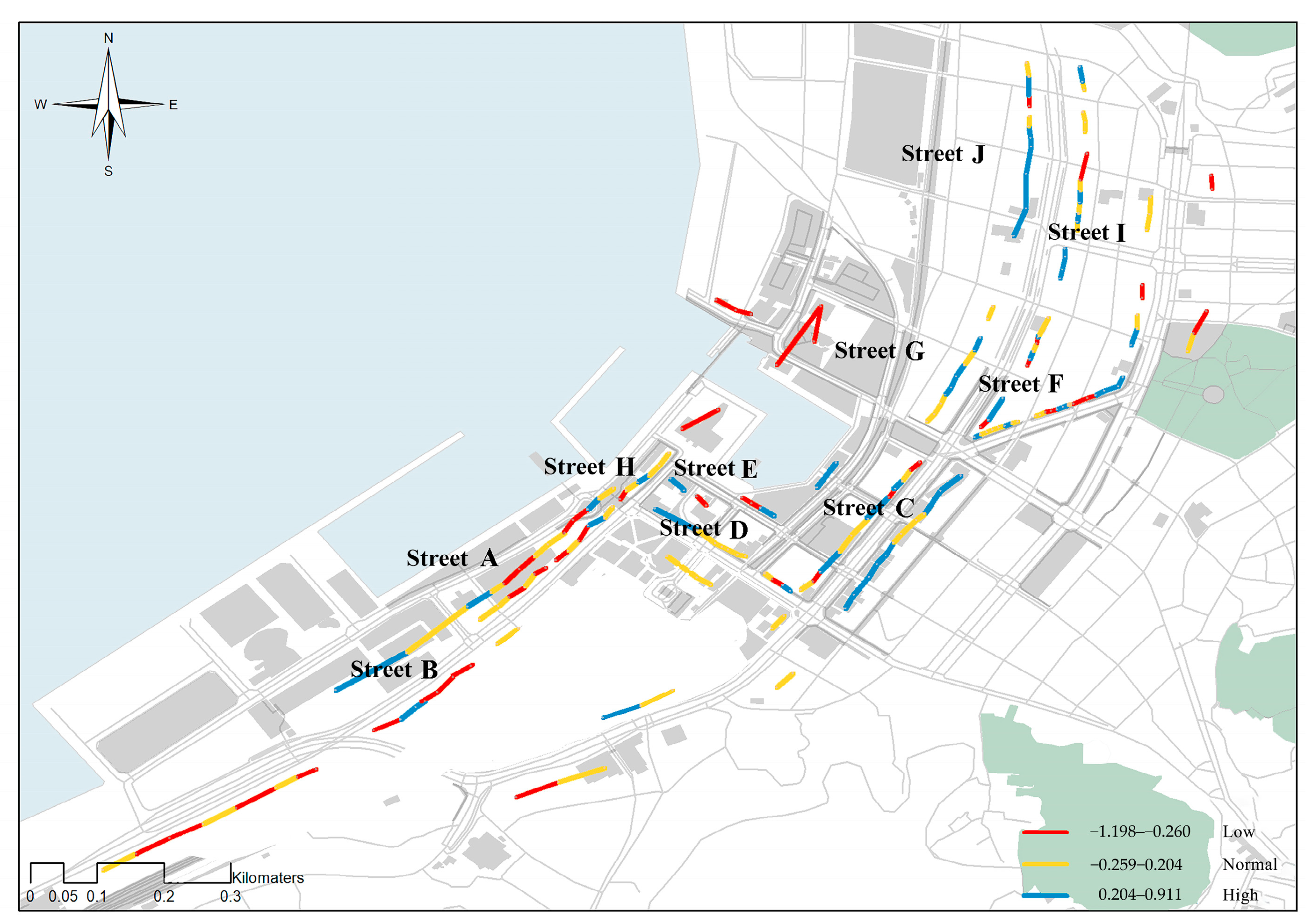
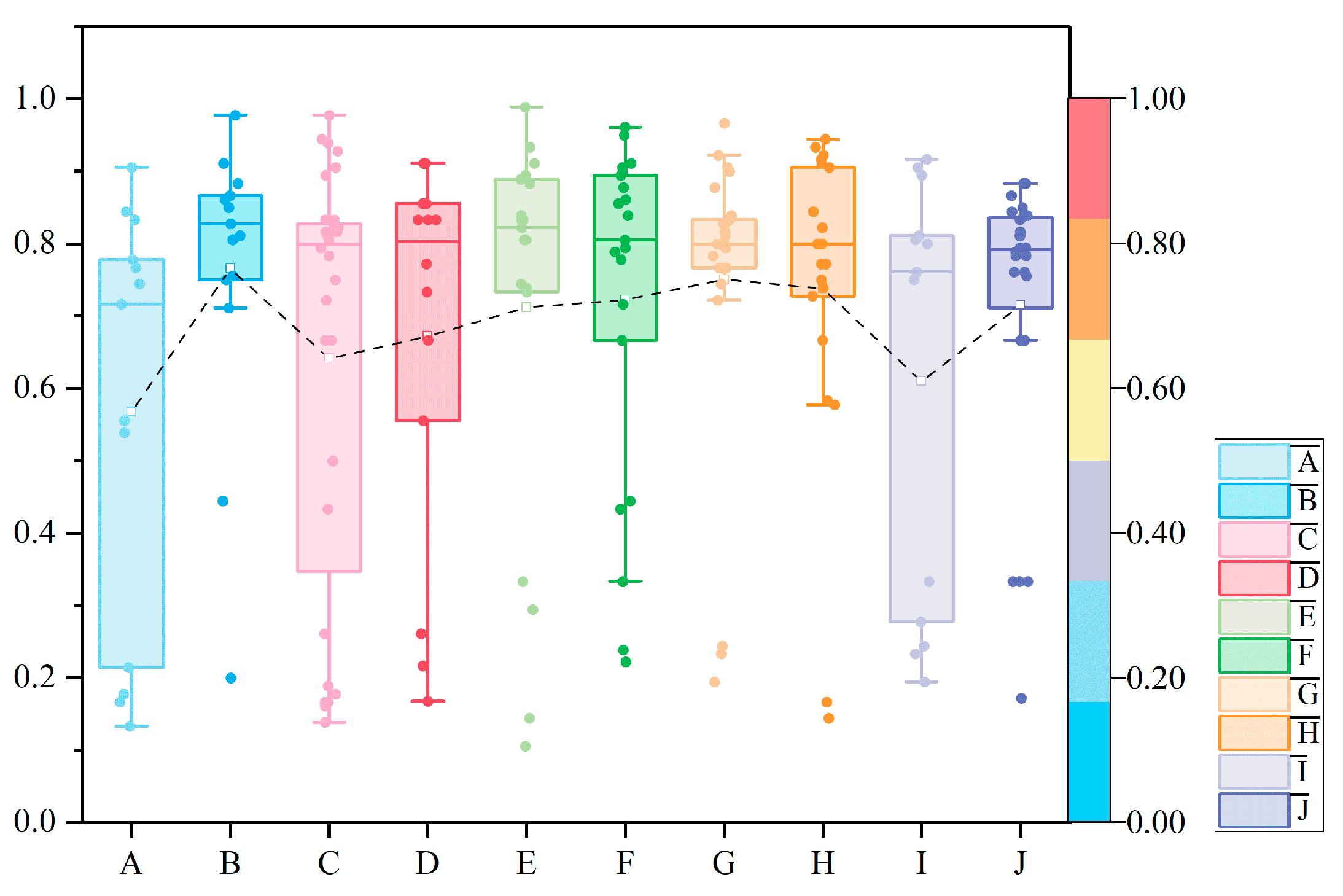
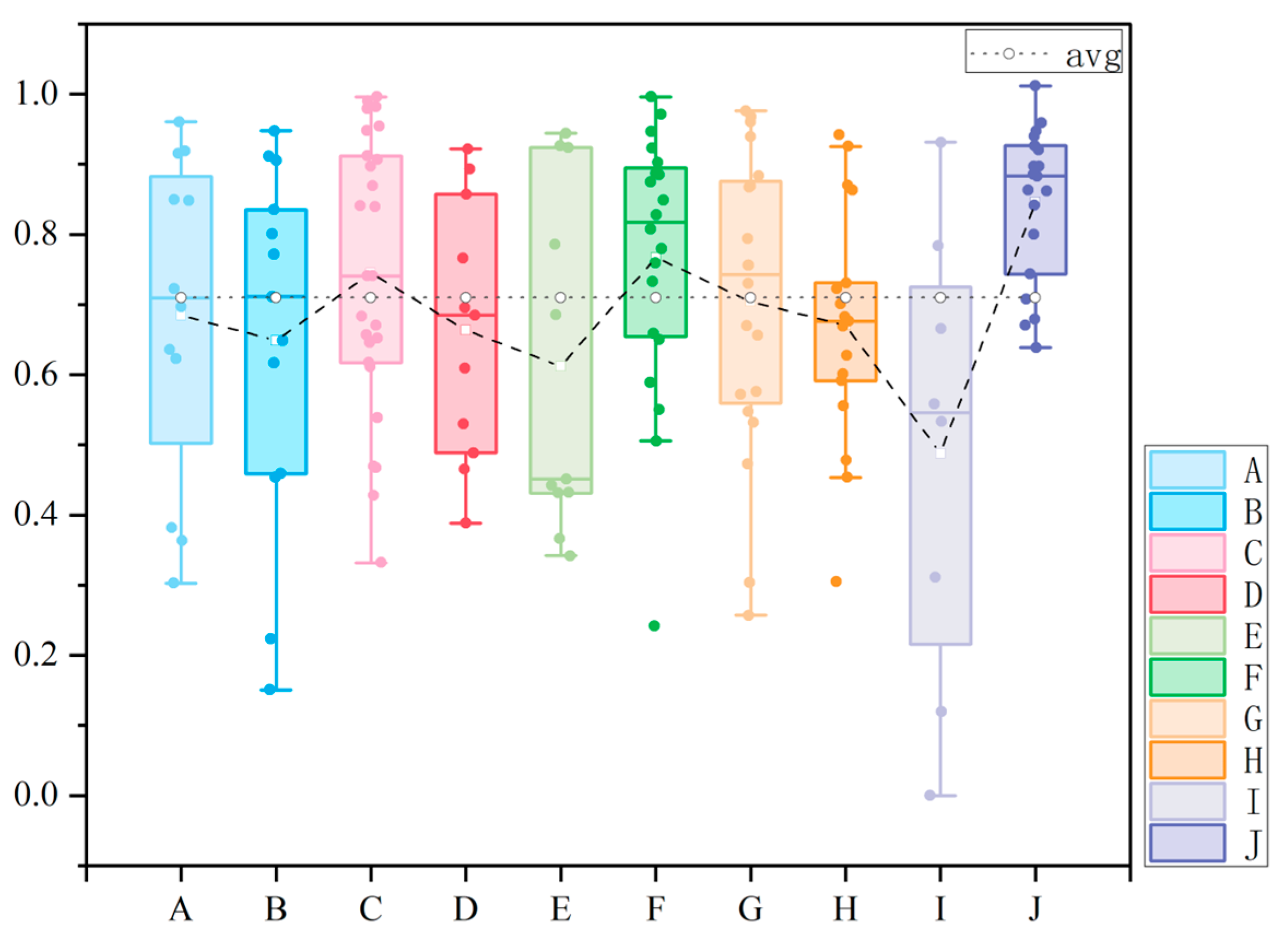
3.1.2. Street BCHD Subjective Evaluation Analysis

The color of a single building will affect the color environment of the whole street. To obtain the overall color information of the street, we calculated the average BCHD subjective evaluation of each street (Figure 7). The results showed that the average value of BCHD subjective evaluation was sorted as follows: street G > street J > street C > street F > street D >street A > street H > street I > street B > street E.
In street G, with the highest average value of BCHD subjective evaluation, the building color was prominent, mainly beige, reddish brown, and khaki, which belonged to the same color contrast. In street J, the dominant colors of buildings were khaki, brick red, and rice white. The colors were similar in tone and hue and also showed a high color harmony. In street E, the average value of BCHD subjective evaluation was the lowest. Although there were individual high-score samples, the hues of most adjacent buildings were not coordinated. There was a strong contrast between the cold and warm colors of the building, resulting in poor overall harmony. For example, for S-E1 and S-E2 and S-E3 and S-E4, the color matching between the cold blue and warm orange formed a strong conflict, giving a visual sense of discomfort. In the penultimate street B of the ranking, the building color was chaotic, and the color saturation changed greatly. Moreover, there was more glass on the surfaces of the buildings, reflecting blue and cold gray, which was in contrast to the warm color of the building, resulting in a disharmonious visual feeling.
From the perspective of the degree of dispersion of data, the Interquartile Range (IQR) values of streets C, F, H, and J were moderate; it showed that the distribution of BCHD subjective evaluation results was relatively concentrated. The IQR value of streets A, G, and I was larger, which indicated that the value range of BCHD subjective evaluation was wide, and the difference in color harmony perception was significant. The IQR value of street B was medium, indicating that the data dispersion was moderate, but it was mainly concentrated near the lower value. The IQR value of street E was the largest, and the data dispersion was extremely high, which highlights the instability of color harmony evaluation. The IQR value of street D was the smallest, the dataset was highly concentrated, and the degree of dispersion was low, indicating that most of the evaluation results were close to the same.

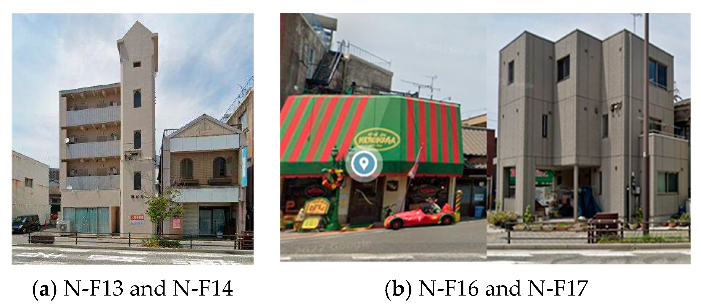
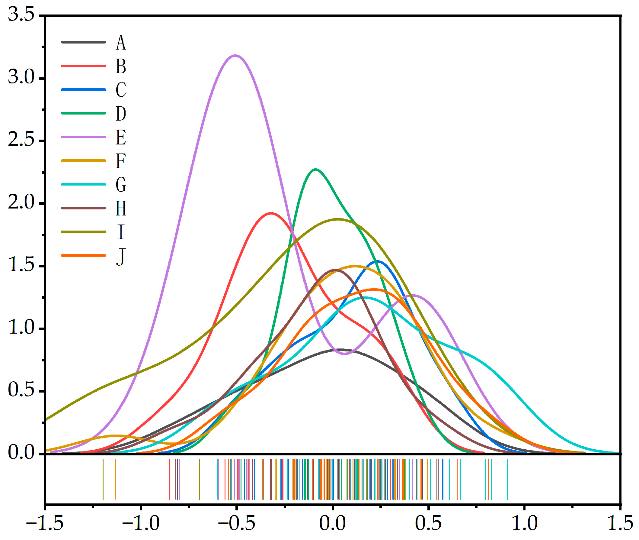
3.1.3. Positively Skewed Distribution

By comparing the average, median, and mode values in 10 streets, it indicated that the fluctuation of the BCHD subjective evaluation in Mojiko mainly presented the characteristics of positive skewness distribution and negative skewness distribution (Figure 8). In statistics, if the tail of the data extends to the right, that is, most data points are concentrated in the low-value area, and a few high values lengthen the tail, the data are positively skewed. This distribution usually makes the mean greater than the median. If the tail of the data extends to the left, that is, most of the data points are concentrated in the high-value area, and a few low values lengthen the tail, the data are negative skewed, and the average value is usually less than the median.
In the 10 streets, the average value of BCHD subjective evaluation of B, D, E, F, and G streets exceeded the median. The result showed a positively skewed distribution, which indicated that there was a statistical maximum value in these streets. It had a positive impact on the overall street environment color. The BCHD subjective evaluation value of the street B was lower in the overall ranking, but there were high-score samples S-B11 and S-B12, S-B4 and S-B5, S-B10 and S-B11. S-B11 and S-B12 was the highest score sample of street B, and the dominant color of building was a combination of gray and pale pink with low saturation. The color saturation of the two buildings in S-B4 and S-B5 was low, and the gray combination with different brightness. In the overall street, the ranking of the street D was at a medium level, and N-D10 and N-D11, N-D1 and N-D2, N-D2 and N-D3, S-D2 and S-D3 were the high-score samples. N-D10 and N-D11 was a color combination of rice white and low-saturation orange yellow; in the N-D1 and N-D2 color combination, the dominant color of N-D1 was prominent and beige, the N-D2 dominant color was dark grey, and beige was used as a supporting color, which had harmony and continuity with the color of N-D1. The average score of street E was the lowest, but there were two high-harmony samples of E-E1 and E-E2 and S-E10 and S-E11. The dominant color of building, supporting color, and accent color of E-E1 and E-E2 buildings were consistent. S-E10 and S-E11 buildings were off-white and beige, which were similar in brightness and different in saturation. Street F was ranked fourth, which contained the high-score building combination samples N-F12 and N-F13 and N-F13 and N-F14. They were mainly beige, with light brown as the supporting color. The color matching was coordinated and unified. Street G ranked second, and E-G13 and E-G14 was a high-score sample. It was the highest value in the overall samples, which was composed of low saturation gray and off-white.

3.1.4. Negative Skewed Distribution

The average value of BCHD subjective evaluation for street A, C, H, and I was less than the median, which showed a negative skewness characteristic and represented the minimum value with statistical significance. Affected by it, the top of the distribution map curve was most offset to the right side.
Street A ranked in the middle. S-A5 and S-A6 and S-A6 and S-A7 were the lowest values. The building color was combined with gray, yellow, and white. Yellow jumped brightly in the color combination, and the color harmony was poor; the BCHD subjective evaluation value of street C ranked third, but there were low-score samples such as W-C12 and W-C13 and W-C9 and W-C10. In the W-C12 and W-C13 building combination, the color matching was blue-gray and khaki, which formed a complementary color contrast. The color matching of W-C9 and W-C10 was a combination of colorless high-brightness white and low-brightness low-saturation orange-red, which formed a colorless and colored contrast, and the contrast effect is strong. In street H, N-H11 and N-H12, N-H3 and N-H4 were the low-score samples. Especially, N-H11 and N-H12 was also the second lowest score in all samples. The building color combination was light blue-gray and medium yellow.
The BCHD subjective evaluation value of the street I ranked third from the bottom and was low. W-I7 and W-I8 was the lowest on this street. It was also the lowest score in all samples. The W-I7 dominant color was dreary and heavy black; the W-I8 dominant color was light orange-yellow. The contrast between them was strong.

3.2. Analysis of Building Color Measurement

3.2.1. Building Color Hue, Brightness, and Saturation Analysis

ColorImpact4 software was used to extract the HSB values of the single building samples in the Mojiko. The hue distribution, brightness, and saturation of all samples were further performed by statistics (Table 4).
The result showed that the building color predominantly warm hues were observed, and this was a concentrated trend in the Mojiko district. Among them, orange buildings accounted for the largest proportion of 48.7%; white and gray colorless buildings accounted for more than 18.4%; red buildings accounted for 16.8%; blue and purple buildings accounted for a relatively small proportion, accounting for 12.6%.
In the statistics, the proportion of low-brightness samples was 29.4%, the proportion of high-brightness samples was 19.3%, and the number of medium-brightness samples was the largest, which was 101, accounting for 51.3%, more than half. It showed that the brightness distribution of the samples was relatively balanced, and the proportion of medium-brightness samples was the highest.
In the statistics of building color saturation, the number of samples with low saturation was the largest, accounting for up to 72.6%. The number of samples with medium saturation and high saturation was small, with the high-saturation samples only accounting for 4.6%, and the medium saturation samples accounting for 22.8%.
Figure 9 showed the hue–saturation (a) and hue–brightness (b) distribution of all building samples. The result indicated that the aggregation degree of the building color samples in the warm tone range was higher than in the cold tone range. The distribution sector was small and mainly concentrated between R~10 YR. The low-saturation samples were mainly concentrated in the range from 5 YR to 10. High-saturation samples were mainly distributed on the 10R color axis. The number of cold-tone samples was relatively small, and the fan width distributed on the hue axis was also small, mainly concentrated in the range from 10 GB to 10 B, and dominated by the 5 B hue axis. Low-saturation color samples showed high intensity, including 104 warm-tone and 39 cold-tone samples. Meanwhile, in the middle- and high-saturation region, the number of warm-tone samples was 44, and cold-tone samples was 1. There were seven warm colors and two cold colors in the high-saturation area.
The building color of Mojiko was mainly medium and high brightness. There were 21 warm colors and 7 cold colors in the high-brightness area. There are 84 warm tones and 17 cold tones in the brightness area. It showed that the overall tone of building color in the historic and cultural district of Mojiko tended to be warm yellow with a low saturation of warm gray.

3.2.2. Analysis of Color Warmth and Coldness of Street Buildings

The hue value of dominant color was normalized and mapped to a specific interval on the color wheel. We calculated the warmth and coldness table of the dominant color. In the table, colors with hue values ranging from 0 to 0.5 were regarded as cold colors, while colors with hue values ranging from 0.5 to 1 were regarded as warm colors. The closer the value was to 0, the more obvious the cold color characteristics of the buildings were. On the contrary, when the value was close to 1, the buildings showed stronger warm color characteristics.
By calculating the building warmth and coldness degree average value, the warmth and coldness degree values of each street were obtained. These data clearly showed the trend of warmth and coldness degree of different blocks. Figure 10 shows the average building color warmth and coldness degree in Mojiko was 0.69, and the overall color was warm. The average building color warmth and coldness degree in the street was higher than 0.5. It was consistent with the result of dominant color hue distribution map.
From the perspective of the degree of aggregation of data, the IQR values of streets A, C, and I were larger, indicating that the data were more discrete, the building color was not uniform, and the difference between cold and warm was obvious. The IQR values of streets B, E, G, and J were small, and the data were concentrated near the median; the degree of data dispersion was small. Although the color distribution of these streets was relatively concentrated, there were still some significant abnormal values, which represented extreme cold-tone buildings and deviated from most building color. These abnormal values did not significantly affect the overall color trend; especially in street E, there were some cold-toned buildings, but the amount was small, and the overall street color was still dominated by warm colors. The IQR value of street G was the smallest, the data were concentrated, and the degree of dispersion was small, indicating that the color style of street architecture was similar, mainly in warm colors. The data dispersion of streets D, H, and F was moderate, indicating that the building styles in the streets were diverse, and there were mixed buildings with different cold and warm colors, but the differences in cold and warm degrees were not extreme.

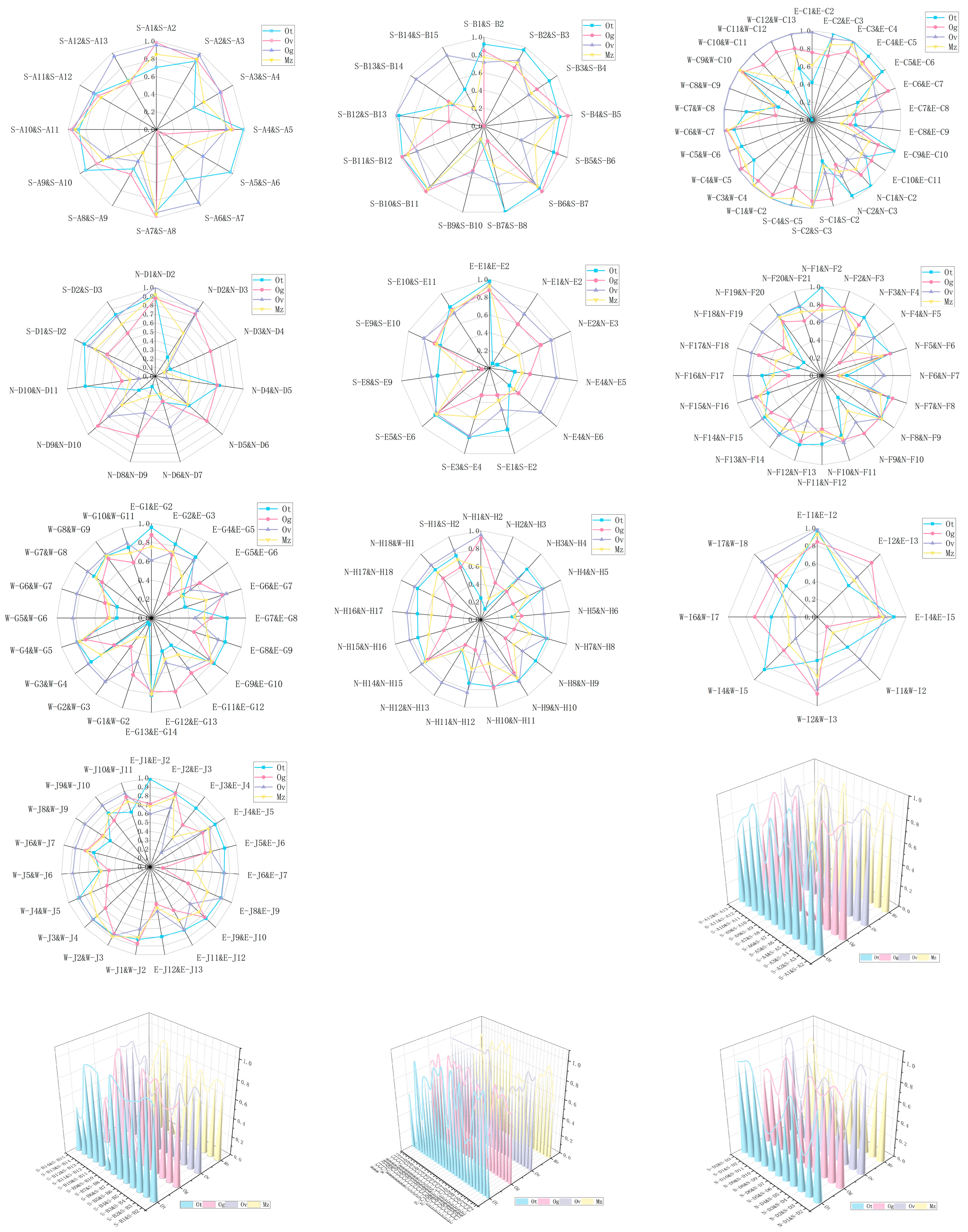
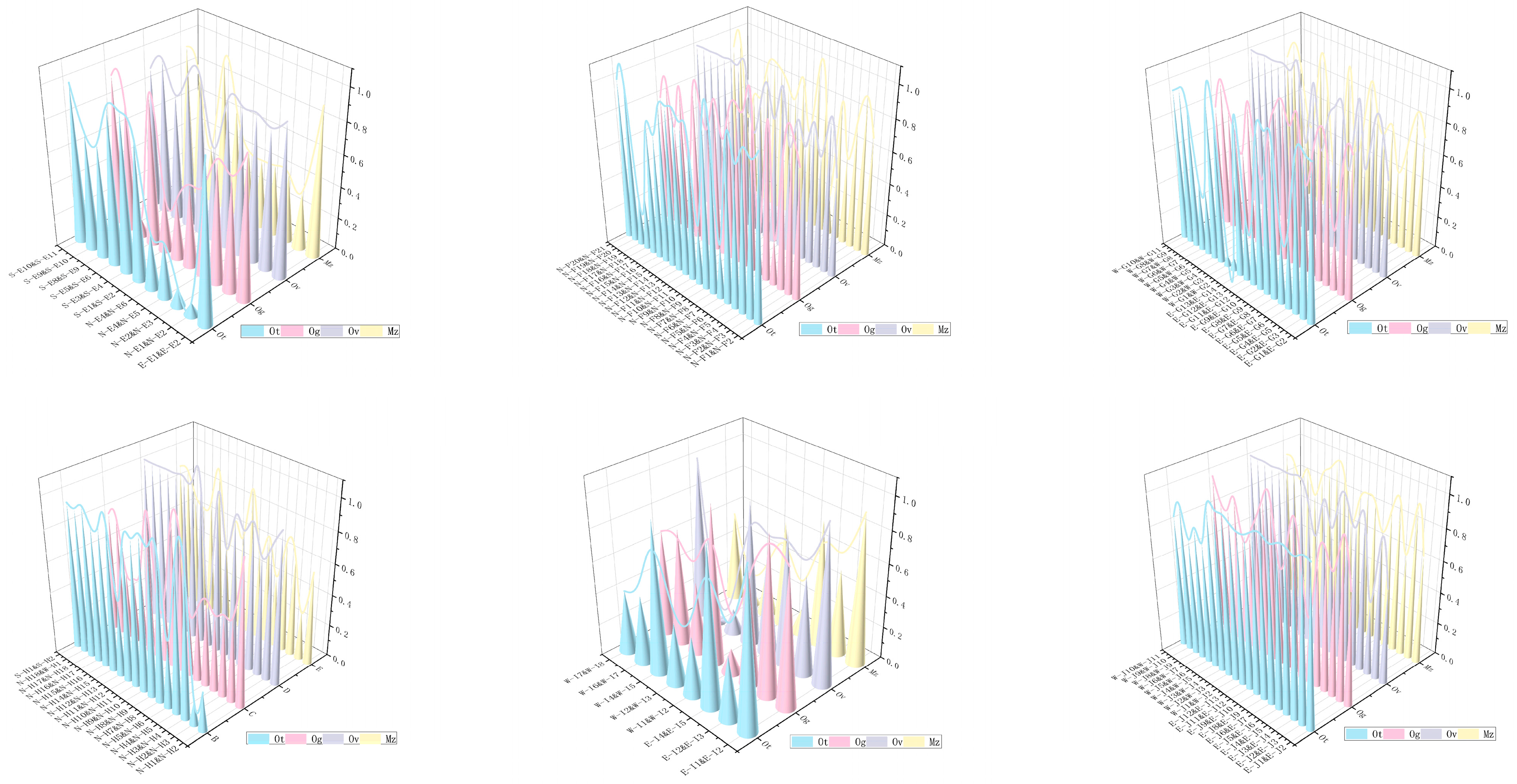
3.3. Analysis of Objective BCHD

The hue difference, saturation difference, and lightness difference of the adjacent buildings were calculated. Then, the harmony beauty formula M = O/C was used to calculate the color harmony index (M) of adjacent buildings in Mojiko. Finally, the calculation results were normalized to obtain the objective BCHD (Mz). The evaluation results were divided into three grades according to the natural breakpoint method: ‘high color harmony’, ‘medium color harmony’, and ‘low color harmony’ (Table A2).
It could be seen from Table A2 that the overall objective BCHD of the region was at a high and medium-high level, and only a small number of buildings had a low harmony degree. The range of high harmony value was 0.770~1.000, and the highest proportion of samples was 70, accounting for 44.59% of the total number of samples. The range of moderate harmony degree was 0.4790~0.770, with a total of 58 samples, accounting for 36.94% of the total number of samples. The range of low harmony degree was 0.000~0.490, and the proportion of samples was the lowest, a total of 30, accounting for 19.11% of the total number of samples. It showed that overall color harmony in Mojiko was high. The objective calculation and subjective evaluation were consistent with the results, which verified that the BCHD of Mojiko was mainly high and medium-high, and the proportion of low harmony degree was relatively small.
Based on ArcGIS10.6, the spatial distribution of BCHD was obtained by quantitative statistics (Figure 11). The high, middle, and low values alternated in space. There were some high values in the coastal part, and most of the high values appeared in the coastal zone. The samples with low harmony were concentrated in the port area.
In terms of BCHD continuity, the S-C2–W-C7 sections of street C and the E-J8–W-J11 sections of street J showed better continuity characteristics. The building color in street C was mostly khaki and beige with low saturation and high brightness. In street J, the dominant color of building was usually orange-yellow and reddish brown, with medium saturation and low brightness, and warm gray with low saturation and medium brightness. The building color of the two streets was unified, and the difference between the saturation and brightness changes was weak. The building color continuity was high; the color continuity of N-E1~S-E9 in street E was poor.
Figure 12 shows the box diagram of BCHD in each street, which is helpful to describe and compare the color harmony state of each street. It can be seen that the average value of the overall building color harmony in Mojiko was 0.71, and the overall harmony was good. The average value of the BCHD in street (from high to low) was street J, street F, street C, street G, street A, street H, street D, street B, street E, street I.
The J median of the street was the highest, which showed that the middle level of the adjacent BCHD in the street was the best among all the streets. The IQR value was small, which indicated that the data were concentrated; the dispersion degree was small, and the color harmony degree of most buildings was very good and relatively close. Regarding the overall color harmony, the median of F street was higher, which indicated that more than half of the adjacent buildings in the street had a good color harmony degree. Three more were outliers, which indicated that most of the BCHD were in the normal range, but there were some special cases. They were quite different from other building color, resulting in extreme color harmony, and overall color harmony was not affected by these samples. The medians of A, B, D, and G streets were all in the middle position. The overall color harmony degree was medium, and the IQR value was also in the middle level. There was no abnormal value, which indicated that the degree of data aggregation was moderate, and the color matching of buildings was relatively uniform and stable. The median level of H street was low, and the IQR value was the smallest, which indicated that the data concentration degree of adjacent BCHD in H street was very high, the degree of dispersion was very small, and the color harmony degree evaluation between buildings was very close. However, there were some special buildings with large differences in color from other buildings, and the color contrast was strong. However, these special situations did not change the characteristics of the overall data. The median level of street E was the lowest, and the IQR value was large, which reflected that the BCHD of the street was not only low as a whole but also had significant internal differences. The IQR value of street I was the largest, which highlighted the high discreteness of data. The color harmony degree between buildings was very different, and there was a very low value, which made it difficult to form a harmonious visual experience.
In general, the BCHD in Mojiko was better, which revealed that any two colors attributes or three attributes between the two adjacent building color were in the harmony area. However, there were individual building color, which influenced environmental color harmony.
Figure 13 shows the comprehensive performance of each street under multiple indicators (Ot, Ov, Og, Mz). The score of each indicator was between 0 (worst) and 1 (best). It could be seen from the figure that with the change of the test group, the numerical distribution of each performance index showed regularity and difference.
Specifically, in street A: the value of the Ot index fluctuated little, and the values of S-A4 and S-A5, S-A5 and S-A6, and S-A7 and S-A8 were the largest, at close to 1, which indicated that the dominant color of three pairs buildings was more harmonious. The high and low values of the Ov index fluctuated violently, with a very small score in S-A6 and S-A7 and a very large score in S-A7 and S-A8, which indicated that the brightness difference between S-A6 buildings and adjacent buildings was large. In most parts, the Og index showed a small continuous change in the high value, which indicated that the overall saturation and harmony value of the street were better. The Mz index reached the maximum value in S-A7 at S-A8, and other indicators reached the maximum value, which indicated that the part is best in the street.
In street B: The index Ot was stable at high values in the S-B1~S-B8 region, and the fluctuation was small. In the S-B9~S-B15 region, the high and low values changed continuously, and the fluctuation was large. The value of Og fluctuated continuously and was the lowest value in S-B14 and S-B15. The index Ov in S-B13 and S-B14 and S-B14 and S-B15 was opposite to other indicators, which showed that the brightness harmony value in the part was significantly better than other indicators. The index Mz showed the same change trend as Ot and Og, which indicated that hue and saturation jointly affected the BCHD of the street.
In street C: For the Ot index, the change range was more intense; the value was extremely low at W-C11 and W-C12, at close to 0, and the value was extremely high at E-C3 and E-C4, at close to 1, which indicated that the dominant color of street building varied greatly. The value of index Ov was stable at a high level in most parts and fluctuated continuously and slightly in some parts, which indicated that the street building color was generally harmonious. The value of index Og fluctuated continuously, and the range of change was high and low. The index Mz and Ot had the same change trend, which indicated that hue was the main factor affecting the street buildings color harmony.
In street D: The number of low values in each index was more r, and the change range was larger, which indicated that the performance of each index in the street was poor and unstable. In N-D3 and N-D4, the indicators Ot, Ov, and Mz all reached the lowest value, which indicated that hue and brightness jointly affected the color harmony of the region.
In street E: The multi-point score of the indicator Ot was low, which indicated that the hue of the street building color was quite different, which affected the BCHD. The index Ov value was stable in a higher range, and the fluctuation range was small, which indicated that the street brightness value was more uniform. The Og value of the index fluctuates widely, and the value level was close to 0 in the S-E8 and S-E9 region, while the Mz value was the lowest, which indicated that the saturation affected the building color harmony in the region.
In street F: The values of Ot and Og changed continuously and fluctuated violently. The scores of Ot, Og, and Mz in samples N-F6 and N-F7 were the lowest, which indicated that the hue and saturation of N-F6 and adjacent buildings were quite different, which together affected the building color harmony. The value of index Ov was stable at a high value in some parts and fluctuated steadily between 0.6 and 0.8 in some parts, which indicated that the street brightness change control was better.
In street G: The index Ot, Og, and Mz values fluctuate continuously and changed greatly. In the W-G1~W-G3 area, the index Ot value was low, which indicated that the color contrast of dominant color in the part was strong, which affected the Mz score. The index Og was stable at a high level in some regions and fluctuated continuously between 0.6 and 1 in some regions, which indicated that the overall performance of the lightness and harmony level in this region was better.
In street H: The index Ot fluctuated slightly in the high value range in most areas but was significantly reduced in the N-H2 and N-H3 area. The index Ov value was generally stable at a high level but reached the lowest value in the N-H10 and N-H11 areas. The numerical fluctuation index Og and Mz scores were continuously fluctuating at a medium level, which indicated that the overall street building color harmony was moderate, and there were individual parts. The extremely low value of hue or brightness affected the street building color harmony and produced disharmonious visual feelings.
In street I: The change trend of each index was inconsistent, and different regions were affected by different indexes. For example, in W-I1 and W-I2, the values of Og and Mz were low, and the values of Ot and Ov were high, indicating that the building color saturation in the part was quite different, thus affecting the BCHD. In W-I6 and W-I7, the values of Ov and Mz were low, and the values of Og and Ot were high, which indicated that the difference in building color brightness in this part was large, thus affecting the building color harmony.
In street J: The index Ot and the index Ov were stable at a high level in most parts and fluctuated continuously in some parts. The index Og and the index Mz fluctuated continuously at a high level. The Ov index value was the lowest in the E-J3 and E-J4 regions, and the Og index was the lowest in the E-J6 and E-J7 regions. It showed that the indicators of the street were at a high level as a whole. Although there were abnormal changes in the brightness or saturation of individual regions, they did not affect the overall color harmony level.

4. Discussion

In the process of urban color aesthetic perception, building color will have an impact on the overall street color environment [63]. We found that BCHD in Mojiko had significant differences in different streets. Samples with high harmony were mainly warm color tones, which effectively enhanced visual comfort and created a warm and pleasant feeling.
This result is consistent with Rikard Küller, Byron Mikellides, and Jan Janssens [64], who pointed out that warm color tones in building design could enhance psychological comfort and promote positive emotional responses.
On the other hand, the low-harmony samples presented confusing color combinations, with low brightness and high-saturation colors. These were the main factors contributing to visual disharmony. This is consistent with J Itten F Birren, E Van Hagen [65], as well as Li et al. [66].

4.1. Street Color Harmony

The buildings in Mojito, particularly side by the sea, use natural materials in Japanese buildings, and control saturation. It makes the overall color environment harmonious. Most streets buildings have a soft warm color tone, with higher color harmony and continuity. These buildings maintain traditional Japanese building elements, with softer colors that are less saturated and brighter. They are usually natural wood tones and off-white shades. The high contrast of cold and warm in the color combination affects the BCHD and is the main reason for low scores [67]. Glass is widely used in modern buildings, but the result indicates that the building glass area is large, and the reflection of blue is greater. Correspondingly, if the adjacent building color are mostly soft and warm, it will form a strong contrasting relationship between warm and cold, creating a low warmth and coldness harmony degree than other streets [68].

4.2. BCHD in the Coastal Cultural District

Some buildings are also influenced by the marine environment, using colors like blue-gray, sea blue, and white to match the port atmosphere [69]. These colors not only harmonize with the surrounding natural environment but also strengthen the connection between the buildings and geographic location. These findings not only reflect the aesthetic tendencies in color choices of the region but also emphasize the influence of environmental and cultural factors on color. Li Kerun, Yang Yaqian, and Zheng Zhiqiang emphasized the importance of the natural environment and cultural background in the application of building color [66]. In high-harmony samples of coastal building color, when the color contrast between adjacent buildings was weak, the harmony was higher. The combination of high brightness and low saturation resulted in greater visual comfort. This is consistent with the research of Burchett [70].

4.3. The Relationship Between the Color Combination of the Building and the Graph

The relationship between the color combination of the building and the graph; the study-identified color harmony was established within a certain range, as well as the harmonious combination of the adjacent building color. We considered the two-color combinations and the graph’s relationships between colors. Moreover, the result showed that color adjustments with a specific hue range did not reduce total harmony, which is the same as the findings of Munsell [67]. Colors with the same hue, saturation, and different brightness values tended to appear harmonious, which is consistent with previous research findings [70,71]. However, Yang Ruyi and Deng Xinyan suggested that the bigger the brightness difference is, the higher the harmony is of the building color [29], which is different from the result of this study. The difference is since studies on color harmony in two-color combinations are influenced by multiple factors, such as the proportion of color areas, spatial layout, and cultural background [72]. Specifically, the proportion of color areas and spatial layout may influence people’s perception of color harmony, while cultural background can affect individuals’ preferences and understanding of colors.

5. Limitation

This study has some limitations that can be solved in future research. This study used street-view images and semantic segmentation technology for color quantification, but these techniques may introduce some errors when dealing with complex environments. For example, factors such as the angle of street-view image capture, variations in lighting, and changes in background colors may affect the true look of color, thereby influencing human visual perception. The accuracy of semantic segmentation technology will be improved in future research by gradually expanding the dataset to achieve better precision. Although this study analyzed the harmony of adjacent building color, the factors influencing the complexity of color combinations are relatively complicated. This will be further explored in future research. In the research process of building color in historical and cultural districts, it is very important to further study the relationship between color and urban environment. The difference between different building materials with the same color and people’s visual experience is also very worthy of study. In the future research, the impact of this aspect will be considered. Additionally, due to the limitations of the field of view of the human eye, people perceive color stimuli in a fragmented way. In future studies, psychological and physiological research will be further integrated, and dynamic environments can be simulated to observe participants’ responses to color changes.

6. Conclusions

This study selected Mojiko as the study site and used street-view image analysis, semantic segmentation technology, and the M–S color coordination theory to quantitatively assess the building color features.
The study analyzed the public color preferences and the BCHD from both subjective and objective perspectives, proposing a new method for assessing BCHD. The results showed the feasibility and rationality of the method proposed in this study. In particular, the visual analysis tools used effectively presented the impact of different building color combinations on total color harmony, providing specific color strategies for urban renewal and building renovation.
This method can also be widely applied to other cities around the world to identify discordant building color in specific functional areas. The study provides a valuable tool for researchers and professionals, enabling them to quickly identify the building color problem and propose targeted color suggestions. It contributes to urban regeneration and cultural heritage activation.

Author Contributions

Conceptualization, M.L.; methodology, M.L. and D.S.; validation, D.S.; formal analysis, M.L. and G.Q.; investigation, J.S. and Y.T.; resources, J.S.; data curation, G.Q.; writing—original draft, M.L. and G.Q. All authors have read and agreed to the published version of the manuscript.

Funding

This study is supported by the Liaoning Provincial Department of Education, General Project (JYTMS20231583).

Data Availability Statement

The raw data supporting the conclusions of this article will be made available by the authors on request.

Acknowledgments

We would like to thank the reviewers for their careful reading of the manuscript and look forward to their comments on the problems and corrections in the manuscript.

Conflicts of Interest

The authors declare no conflicts of interest.

Abbreviations

The following abbreviations are used in this manuscript:
BCHDBuilding color harmony degree
IQRInterquartile Range

Appendix A

Table A1. Statistical table of BCHD subjective evaluation.
GradeBuilding Number
High BCHD
(0.204~0.911)
E-G13 & E-G14, E-G5 & E-G6, N-F13 & N-F14, W-J1 & W-J2, W-G2 & W-G3, E-G6 & E-G7, E-J2 & E-J3, E-G9 & E-G10, W-C5 & W-C6, W-C8 & W-C9, E-C2 & E-C3, S-A11 & S-A12, N-H10 & N-H11, E-G7 & E-G8, E-E1 & E-E2, N-F12 & N-F13, S-A1 & S-A2, E-J3 & E-J4, W-J3 & W-J4, E-I1 & E-I2, N-C1 & N-C2, S-E3 & S-E4, W-G7 & W-G8, N-F19 & N-F20, N-D10 & N-D11, E-J5 & E-J6, N-F18 & N-F19, E-J4 & E-J5, S-E10 & S-E11, N-H15 & N-H16, E-C9 & E-C10, N-F20 & N-F21, N-F1 & N-F2, E-C4 & E-C5, E-C3 & E-C4, S-B11 & S-B12, E-C10 & E-C11, S-A3 & S-A4, W-C10 & W-C11, N-F17 & N-F18, W-G8 & W-G9, N-F6 & N-F7, E-C5 & E-C6, S-B10 & S-B11, E-J9 & E-J10, E-C1 & E-C2, E-J1 & E-J2, W-J10 & W-J11, W-G5 & W-G6, W-G10 & W-G11, N-D1 & N-D2, S-A2 & S-A3.
Normal BCHD
(−0.259~0.204)
N-H16 & N-H17, S-C2 & S-C3, E-C8 & E-C9, N-D2 & N-D3, W-J8 & W-J9, E-G8 & E-G9, N-H17 & N-H18, W-J9 & W-J10, N-F2 & N-F3, W-I2 & W-I3, W-C1 & W-C2, E-C6 & E-C7, S-D2 & S-D3, W-G6 & W-G7, W-I1 & W-I2, N-C2 & N-C3, N-F7 & N-F8, W-G3 & W-G4, N-H14 & N-H15, S-B4 & S-B5, E-I2 & E-I3, N-H2 & N-H3, E-G4 & E-G5, S-D1 & S-D2, N-H8 & N-H9, S-A4 & S-A5, S-A12 & S-A13, S-B6 & S-B7, W-C3 & W-C4, E-G11 & E-G12, S-A7 & S-A8, S-H1 & S-H2, N-F14 & N-F15, N-H1 & N-H2, N-F8 & N-F9, N-H18 & W-H1, N-F3 & N-F4, E-J11 & E-J12, N-F4 & N-F5, N-F9 & N-F10, W-J6 & W-J7, W-J2 & W-J3, N-D4 & N-D5, S-C4 & S-C5, W-C6 & W-C7, N-H11 & N-H12, W-J4 & W-J5, N-D6 & N-D7, S-A8 & S-A9, N-D5 & N-D6, N-D3 & N-D4, W-C7 & W-C8, N-D8 & N-D9, E-G2 & E-G3, N-H4 & N-H5, W-C11 & W-C12, N-F5 & N-F6, E-J6 & E-J7, E-J12 & E-J13, S-B1 & S-B2, W-I4 & W-I5, E-C7 & E-C8, E-G1 & E-G2.
Low BCHD
(−1.198~−0.260)
S-B12 & S-B13, S-B5 & S-B6, W-C4 & W-C5, S-B3 & S-B4, N-F11 & N-F12, N-F10 & N-F11, N-H5 & N-H6, S-A10 & S-A11, N-H7 & N-H8, W-I6 & W-I7, S-B7 & S-B8, S-A9 & S-A10, S-C1 & S-C2, W-G4 & W-G5, N-H12 & N-H13, S-E8 & S-E9, S-B2 & S-B3, N-E1 & N-E2, N-F15 & N-F16, S-E5 & S-E6, W-C9 & W-C10, N-D9 & N-D10, S-E1 & S-E2, N-E2 & N-E3, E-J8 & E-J9, S-B13 & S-B14, N-E4 & N-E5, W-G1 & W-G2, W-C12 & W-C13, N-H9 & N-H10, W-J5 & W-J6, S-A6 & S-A7, S-B14 & S-B15, S-E9 & S-E10, E-G12 & E-G13, E-I4 & E-I5, N-E4 & N-E6, S-A5 & S-A6, N-H3 & N-H4, S-B9 & S-B10, N-F16 & N-F17, W-I7 & W-I8.
Table A2. Objective BCHD statistical table.
GradeBuilding Number
High BCHD
(0.770~1.000)
W-C1 & W-C2, N-F8 & N-F9, W-C9 & W-C10, S-C2 & S-C3, W-C3 & W-C4, W-G8 & W-G9, N-F19 & N-F20, E-G13 & E-G14, S-A7 & S-A8, W-G4 & W-G5, E-J2 & E-J3, E-C3 & E-C4, W-C6 & W-C7, S-B10 & S-B11, W-J3 & W-J4, N-F2 & N-F3, S-E5 & S-E6, N-H14 & N-H15, W-J1 & W-J2, E-G9 & E-G10, E-I1 & E-I2, E-J4 & E-J5, E-E1 & E-E2, N-H9 & N-H10, S-E10 & S-E11, N-F14 & N-F15, N-D1 & N-D2, W-J10 & W-J11, S-A10 & S-A11, S-A2 & S-A3, S-C4 & S-C5, S-B11 & S-B12, W-C4 & W-C5, S-B6 & S-B7, N-F20 & N-F21, W-J9 & W-J10, E-J9 & E-J10, W-C5 & W-C6, S-D1 & S-D2, N-F10 & N-F11, W-J4 & W-J5, N-F13 & N-F14, E-G2 & E-G3, W-J6 & W-J7, N-F15 & N-F16, S-H1 & S-H2, E-C2 & E-C3, W-G10 & W-G11, W-G7 & W-G8, E-J8 & E-J9, N-H18 & W-H1, E-J5 & E-J6, S-D2 & S-D3, S-A1 & S-A2, N-F5 & N-F6, S-A4 & S-A5, E-J11 & E-J12, E-C4 & E-C5, E-C5 & E-C6, S-B4 & S-B5, N-F7 & N-F8, N-F12 & N-F13, S-B2 & S-B3, W-J8 & W-J9, W-G3 & W-G4, S-E9 & S-E10, E-I4 & E-I5, N-F3 & N-F4, S-B1 & S-B2, W-J2 & W-J3
Normal BCHD
(0.479~0.770)
N-D2 & N-D3, N-F11 & N-F12, E-G1 & E-G2, E-G8 & E-G9, W-J5 & W-J6, N-C1 & N-C2, W-C12 & W-C13, N-F1 & N-F2, N-H15 & N-H16, E-G6 & E-G7, N-H17 & N-H18, S-A11 & S-A12, S-B12 & S-B13, E-J6 & E-J7, N-H4 & N-H5, S-A9 & S-A10, N-D9 & N-D10, S-E3 & S-E4, N-D5 & N-D6, E-C9 & E-C10, N-H7 & N-H8, E-J1 & E-J2, N-H11 & N-H12, E-C10 & E-C11, E-J12 & E-J13, E-G7 & E-G8, N-H16 & N-H17, W-I2 & W-I3, N-F16 & N-F17, N-C2 & N-C3, E-G4 & E-G5, W-C10 & W-C11, N-F17 & N-F18, S-B3 & S-B4, E-C6 & E-C7, E-J3 & E-J4, S-A12 & S-A13, N-H3 & N-H4, S-A3 & S-A4, E-C1 & E-C2, S-B5 & S-B6, W-C7 & W-C8, N-D4 & N-D5, N-H10 & N-H11, N-H1 & N-H2, N-F9 & N-F10, E-G11 & E-G12, W-G6 & W-G7, W-I7 & W-I8, N-H8 & N-H9, N-F4 & N-F5, E-G12 & E-G13, S-C1 & S-C2, E-I2 & E-I3, W-G5 & W-G6, N-D10 & N-D11, N-F18 & N-F19
Low BCHD
(0.000~0.490)
N-D8 & N-D9, N-H12 & N-H13, E-G5 & E-G6, W-C8 & W-C9, W-C11 & W-C12, N-D6 & N-D7, S-B7 & S-B8, N-H5 & N-H6, S-B13 & S-B14, S-E1 & S-E2, N-E4 & N-E5, N-E2 & N-E3, N-E4 & N-E6, E-C7 & E-C8, N-D3 & N-D4, S-A5 & S-A6, N-E1 & N-E2, S-A6 & S-A7, S-E8 & S-E9, E-C8 & E-C9, W-I4 & W-I5, N-H2 & N-H3, W-G2 & W-G3, S-A8 & S-A9, W-G1 & W-G2, N-F6 & N-F7, S-B14 & S-B15, S-B9 & S-B10, W-I6 & W-I7, W-I1 & W-I2

References

  1. Jalil, N.A.; Yunus, R.M.; Said, N.S.J.P.-S.; Sciences, B. Environmental Colour Impact upon Human Behaviour: A Review. Procedia-Soc. Behav. Sci. 2012, 35, 54–62. [Google Scholar] [CrossRef]
  2. Singh, M.; Singari, R.; Bholey, M.J. The Influence of Color on Visual Psychology and Cognitive Behavior: A Study in Paediatrics Hospital Environment. Educ. Adm. Theory Pract. 2024, 30, 13164–13177. [Google Scholar]
  3. Gorzaldini, M.N. The effects of colors on the quality of urban appearance. Mediterr. J. Soc. Sci. 2016, 7, 225–231. [Google Scholar] [CrossRef]
  4. Llopis, J.; Torres, A.; Serra, J.; García, Á. The preservation of the chromatic image of historical cities as a cultural value. The old city of Valencia (Spain). J. Cult. Herit. 2015, 16, 611–622. [Google Scholar] [CrossRef]
  5. Breskich, V.; Kurochkina, V. Urban water bodies as the basis for functioning of public spaces. E3S Web Conf. 2020, 217, 02005. [Google Scholar] [CrossRef]
  6. Hussain, M.A.; Yunos, M.Y.M.; Ismail, S.; Utaberta, N.; Ismail, N.A.; Intan, R.; Daud, M.L. The role of urban form at historical waterfront: Case of Marsaxlokk waterfront. Adv. Environ. Biol. 2015, 9, 142–147. [Google Scholar]
  7. Ortiz, P.; Antunez, V.; Martín, J.M.; Ortiz, R.; Vázquez, M.A.; Galán, E. Approach to environmental risk analysis for the main monuments in a historical city. J. Cult. Herit. 2014, 15, 432–440. [Google Scholar] [CrossRef]
  8. Al-hagla, K.S. Sustainable urban development in historical areas using the tourist trail approach: A case study of the Cultural Heritage and Urban Development (CHUD) project in Saida, Lebanon. Cities 2010, 27, 234–248. [Google Scholar] [CrossRef]
  9. Xing, Z.; Guo, W. Addressing cities’ color issues and planning urban colors with regional features to preserve the history and culture of cities: The case of Suzhou, Wuxi, and Changzhou (China). J. Asian Archit. Build. Eng. 2024, 1–13. [Google Scholar] [CrossRef]
  10. Kalloniatis, M.; Luu, C. The Perception of Color. In Webvision: The Organization of the Retina and Visual System; University of Utah Health Sciences Center: Salt Lake City, UT, USA, 1995. [Google Scholar]
  11. Cochrane, S. The Munsell Color System: A scientific compromise from the world of art. Stud. Hist. Philos. Sci. Part A 2014, 47, 26–41. [Google Scholar] [CrossRef]
  12. Ibraheem, N.A.; Hasan, M.M.; Khan, R.Z.; Mishra, P.K. Understanding Color Models: A Review. ARPN J. Sci. Technol. 2012, 2, 265–275. [Google Scholar]
  13. Zhang, S.; Liu, Y.; Nie, H. Geographical Feature based Research on Urban Color Environment—Taking Wuhan as an Example. IERI Procedia 2014, 9, 190–195. [Google Scholar] [CrossRef]
  14. Lowenthal, D.J. Geography, Experience, and Imagination: Towards a Geographical Epistemology. Ann. Assoc. Am. Geogr. 1961, 51, 241–260. [Google Scholar] [CrossRef]
  15. Lenclos, J.P. The Geography of Colour. In Colour for Architecture Today; Taylor & Francis: Oxfordshire, UK, 2019. [Google Scholar]
  16. Nickerson, D. History of the Munsell Color System and Its Scientific Application. J. Opt. Soc. Am. 1940, 30, 575–586. [Google Scholar] [CrossRef]
  17. Katoh, N.; Ito, M.; Ohno, S.J.J.o.E.I. Three-dimensional gamut mapping using various color difference formulae and color spaces. J. Electron. Imaging 1999, 8, 365–379. [Google Scholar] [CrossRef]
  18. Zhang, J.; Fukuda, T.; Yabuki, N. Development of a City-Scale Approach for Façade Color Measurement with Building Functional Classification Using Deep Learning and Street View Images. ISPRS Int. J. Geo-Inf. 2021, 10, 551. [Google Scholar] [CrossRef]
  19. Chen, L.; Kong, F. Quantitative Method of Regional Color Planning–Field Investigation on Renewal Design of Jiangchuan Street. In Proceedings of the International Conference on Applied Human Factors and Ergonomics, Orlando, FL, USA, 25–29 July 2021; pp. 608–617. [Google Scholar]
  20. Nguyen, L.; Teller, J. Color in the urban environment: A user-oriented protocol for chromatic characterization and the development of a parametric typology. Color Res. Appl. 2016, 42, 131–142. [Google Scholar] [CrossRef]
  21. Wang, Y.J. Quantitative Measurement and Preference Research of Urban Landscape Environmental Image Based on Computer Vision. Int. J. Adv. Comput. Sci. Appl. 2024, 15, 91. [Google Scholar] [CrossRef]
  22. Yu, D.; Fang, C.J.R.S. Urban Remote Sensing with Spatial Big Data: A Review and Renewed Perspective of Urban Studies in Recent Decades. Remote Sens. 2023, 15, 1307. [Google Scholar] [CrossRef]
  23. Yu, M.; Zheng, X.; Qin, P.; Cui, W.; Ji, Q. Urban Color Perception and Sentiment Analysis Based on Deep Learning and Street View Big Data. Appl. Sci. 2024, 14, 9521. [Google Scholar] [CrossRef]
  24. Yoshida, S. The Techniques of Environmental Color Design: Creating Streetscape Color Schemes; China Architecture & Building Press: Beijing, China, 2011. [Google Scholar]
  25. Badrinarayanan, V.; Kendall, A.; Cipolla, R. SegNet: A Deep Convolutional Encoder-Decoder Architecture for Image Segmentation. IEEE Trans. Pattern Anal. Mach. Intell. 2017, 39, 2481–2495. [Google Scholar] [CrossRef]
  26. Han, X.; Yu, Y.; Liu, L.; Li, M.; Wang, L.; Zhang, T.; Tang, F.; Shen, Y.; Li, M.; Yu, S.; et al. Exploration of street space architectural color measurement based on street view big data and deep learning—A case study of Jiefang North Road Street in Tianjin. PLoS ONE 2023, 18, e0289305. [Google Scholar] [CrossRef] [PubMed]
  27. Chen, L.C.; Papandreou, G.; Kokkinos, I.; Murphy, K.; Yuille, A.L. DeepLab: Semantic Image Segmentation with Deep Convolutional Nets, Atrous Convolution, and Fully Connected CRFs. IEEE Trans. Pattern Anal. Mach. Intell. 2018, 40, 834–848. [Google Scholar] [CrossRef]
  28. Zhang, C.; Tan, G. Quantifying architectural color Quality: A Machine learning integrated framework driven by quantitative color metrics. Ecol. Indic. 2023, 157, 111237. [Google Scholar] [CrossRef]
  29. Yang, R.; Deng, X.; Shi, H.; Wang, Z.; He, H.; Xu, J.; Xiao, Y. A novel approach for assessing color harmony of historical buildings via street view image. Front. Archit. Res. 2024, 13, 764–775. [Google Scholar] [CrossRef]
  30. Gou, J. Science Development. Discuss. Urban Color Creat. Shanghai 2020, 2, 72–78. [Google Scholar]
  31. Jaglarz, A. Perception of Color in Architecture and Urban Space. Buildings 2023, 13, 2000. [Google Scholar] [CrossRef]
  32. Adams, F.M.; Osgood, C.E. A cross-cultural study of the affective meanings of color. J. Cross-Cult. Psychol. 1973, 4, 135–156. [Google Scholar] [CrossRef]
  33. Wang, Z.; Shen, M.; Huang, Y. Exploring the Impact of Facade Color Elements on Visual Comfort in Old Residential Buildings in Shanghai: Insights from Eye-Tracking Technology. Buildings 2024, 14, 1758. [Google Scholar] [CrossRef]
  34. Luo, M.R.; Cui, G.; Li, C. Uniform colour spaces based on CIECAM02 colour appearance model. Color Res. Appl. 2006, 31, 320–330. [Google Scholar] [CrossRef]
  35. Biederman, I.; Ju, G. Surface versus edge-based determinants of visual recognition. Cogn. Psychol. 1988, 20, 38–64. [Google Scholar] [CrossRef] [PubMed]
  36. Porter, T. Architectural Color: A Design Guide to Using Color on Buildings; Whitney Library of Design: New York, NY, USA, 1982. [Google Scholar]
  37. Shannon, G.J. Le Corbusier and the Daughter of Light: Color and Architecture of the 1920s. Master’s Thesis, The University of Texas at Arlington, Arlington, TX, USA, 2009. [Google Scholar]
  38. Mojsilovic, A. A computational model for color naming and describing color composition of images. IEEE Trans. Image Process. 2005, 14, 690–699. [Google Scholar] [CrossRef] [PubMed]
  39. Zhang, L.; Kim, C. Chromatics in Urban Landscapes: Integrating Interactive Genetic Algorithms for Sustainable Color Design in Marine Cities. Appl. Sci. 2023, 13, 10306. [Google Scholar] [CrossRef]
  40. Xia, J.; Gu, X.; Fu, T.; Ren, Y.; Sun, Y. Trends and Future Directions in Research on the Protection of Traditional Village Cultural Heritage in Urban Renewal. Buildings 2024, 14, 1362. [Google Scholar] [CrossRef]
  41. Zhang, Y.; Wang, P.; Wei, W.; Wang, Z. How to Construct an Urban Color System? Taking the Historic Center of Macau as an Example. Buildings 2024, 14, 2874. [Google Scholar] [CrossRef]
  42. Schloss, K.B.; Palmer, S.E. Aesthetic response to color combinations: Preference, harmony, and similarity. Atten. Percept. Psychophys. 2010, 73, 551–571. [Google Scholar] [CrossRef]
  43. Palmer, S.E.; Schloss, K.B.; Sammartino, J.J. Visual aesthetics and human preference. Annu. Rev. Psychol. 2013, 64, 77–107. [Google Scholar] [CrossRef]
  44. Jiang, Q.; Chen, L.-C.; Zhang, J. Perception and Preference Analysis of Fashion Colors: Solid Color Shirts. Sustainability 2019, 11, 2405. [Google Scholar] [CrossRef]
  45. Ding, M. Quantitative contrast of urban agglomeration colors based on image clustering algorithm: Case study of the Xia-Zhang-Quan metropolitan area. Front. Archit. Res. 2021, 10, 692–700. [Google Scholar] [CrossRef]
  46. Dai, J.; Lu, X.; Luo, Y. Research on Quantitative Extraction and Evaluation of Rural Color Landscape Based on K-means Clustering. Dev. Small Cities Towns 2024, 42, 20–27. [Google Scholar]
  47. Lu, X.; Cheng, L.; Li, Q.Y. Evaluation Study on the Effectiveness of Colour Renewal for the Renovation of Older Districts in Shenyang City. In Proceedings of the 2024 Annual Conference on Urban Planning in China, Hefei, China, 5–8 July 2024; p. 11. [Google Scholar]
  48. Zhang, H.; Jiang, M.; Kou, Q. Color Image Retrieval Algorithm Fusing Color and Principal Curvatures Information. IEEE Access 2020, 8, 184945–184954. [Google Scholar] [CrossRef]
  49. Han, W.; Zhang, C.; Wang, C.; Yin, L. Constructing a Forest Color Palette and the Effects of the Color Patch Index on Human Eye Recognition Accuracy. Forests 2023, 14, 627. [Google Scholar] [CrossRef]
  50. Yuan, J.; Wu, H.; Xie, L.; Zhang, L.; Xing, J. Learning multi-color curve for image harmonization. Eng. Appl. Artif. Intell. 2025, 146, 110277. [Google Scholar] [CrossRef]
  51. Zhang, J.; Yu, Z.; Li, Y.; Wang, X. Uncovering Bias in Objective Mapping and Subjective Perception of Urban Building Functionality: A Machine Learning Approach to Urban Spatial Perception. Land 2023, 12, 1322. [Google Scholar] [CrossRef]
  52. Wang, Z.; Bovik, A.C.; Sheikh, H.R.; Simoncelli, E.P. Image quality assessment: From error visibility to structural similarity. IEEE Trans. Image Process. 2004, 13, 600–612. [Google Scholar] [CrossRef] [PubMed]
  53. Li, K. Research on the Factors Influencing the Spatial Quality of High-Density Urban Streets: A Framework Using Deep Learning, Street Scene Images, and Principal Component Analysis. Land 2024, 13, 1161. [Google Scholar] [CrossRef]
  54. Shi, X.; Zhu, L.; Yan, C.; Lan, S. Evaluation of color harmony of traditional commercial streets based on ms theory—Nanhou street, Sanfangqixiang, Fuzhou City as an example. J. Shandong Agric. Univ. 2020, 51, 140–146. [Google Scholar]
  55. Dubois, E. The Structure and Properties of Color Spaces and the Representation of Color Images; Springer: Berlin/Heidelberg, Germany, 2010; Volume 11. [Google Scholar]
  56. Tullis, T.; Albert, W. Measuring the User Experience: Collecting, Analyzing, and Presenting Usability Metrics, 2nd ed.; Newnes: Oxford, UK, 2008. [Google Scholar]
  57. Guo, Y.; Liu, Y.; Georgiou, T.; Lew, M.S. A review of semantic segmentation using deep neural networks. Int. J. Multimed. Inf. Retr. 2018, 7, 87–93. [Google Scholar] [CrossRef]
  58. Garcia-Garcia, A.; Orts-Escolano, S.; Oprea, S.; Villena-Martinez, V.; Garcia-Rodriguez, J.J. A review on deep learning techniques applied to semantic segmentation. arXiv 2017, arXiv:1704.06857. [Google Scholar]
  59. Garau, A. Color Harmonies; University of Chicago Press: Chicago, IL, USA, 1993. [Google Scholar]
  60. Szafir, D.A. Modeling Color Difference for Visualization Design. IEEE Trans. Vis. Comput. Graph. 2017, 24, 392–401. [Google Scholar] [CrossRef]
  61. Birkhoff, G.D. Aesthetic Measure; Harvard University Press: Cambridge, MA, USA, 1933. [Google Scholar]
  62. Moon, P.; Spencer, D.E. Area in Color Harmony. J. Opt. Soc. Am. 1944, 34, 93–103. [Google Scholar] [CrossRef]
  63. Wang, Z.; Sun, H.; Li, J. Research on Architectural Color and Visual Comfort in Historic Landscape Areas. Buildings 2023, 13, 1004. [Google Scholar] [CrossRef]
  64. Küller, R.; Mikellides, B.; Janssens, J. Color, Arousal, and Performance-A Comparison of Three Experiments. Color Res. Appl. 2009, 34, 141–152. [Google Scholar] [CrossRef]
  65. Itten, J.; Birren, F.; Van Hagen, E.J. Elements of Color: A Treatise on the Color System of Johannes Itten Based on His Book the Art of Color; Chapman & Hall: Boca Raton, FL, USA, 1970. [Google Scholar]
  66. Li, K.R.; Yang, Y.Q.; Zheng, Z.Q. Research on color harmony of building façades. Color Res. Appl. 2019, 45, 105–119. [Google Scholar] [CrossRef]
  67. Munsell, A.H. A Color Notation; Munsell Color Company: Boston, MA, USA, 1919. [Google Scholar]
  68. Rezaei, S.D.; Shannigrahi, S.; Ramakrishna, S. A review of conventional, advanced, and smart glazing technologies and materials for improving indoor environment. Sol. Energy Mater. Sol. Cells 2017, 159, 26–51. [Google Scholar] [CrossRef]
  69. Doherty, G. Paradoxes of Green: Landscapes of a City-State; Univ of California Press: Berkeley, CA, USA, 2017. [Google Scholar]
  70. Burchett, K.E.J.C.R. Application: Endorsed by Inter-Society Color Council, T.C.G., Canadian Society for Color, Color Science Association of Japan, Dutch Society for the Study of Color, The Swedish Colour Centre Foundation, Colour Society of Australia, Centre Français de la Couleur. Color Harmon. 2002, 27, 28–31. [Google Scholar]
  71. Ou, L.C.; Luo, M.R.; Woodcock, A.; Wright, A.J. A study of colour emotion and colour preference. Part I: Colour emotions for single colours. Color Res. Appl. 2004, 29, 232–240. [Google Scholar] [CrossRef]
  72. Mehdipour, M.; Yazdanfar, S.A.; Ekhlasi, A.; Sedghpour, B.S. Determining the components describing the harmony-contrast of the color combination in residential buildings exterior. Int. J. Architect. Eng. Urban Plan 2021, 31, 1–17. [Google Scholar]
Figure 1. The sample points’ distribution of Mojiko.
Buildings 15 01496 g001
Figure 2. Street-view photos.
Buildings 15 01496 g002
Figure 3. Sample photos.
Buildings 15 01496 g003
Figure 4. Flowchart of the color feature extraction for building façades.
Buildings 15 01496 g004
Figure 5. Spatial distribution map of BCHD subjective evaluation.
Buildings 15 01496 g005
Figure 6. High vs. low harmony.
Buildings 15 01496 g006
Figure 7. Street BCHD subjective evaluation box diagram.
Buildings 15 01496 g007
Figure 8. Street BCHD skew graph.
Buildings 15 01496 g008
Figure 9. The distribution map of the hue–saturation and hue–brightness of the buildings.
Buildings 15 01496 g009
Figure 10. Analysis of the warmth and coldness degree of dominant color in each street.
Buildings 15 01496 g010
Figure 11. Spatial distribution map of the objective BCHD.
Buildings 15 01496 g011
Figure 12. Analysis of BCHD in each street.
Buildings 15 01496 g012
Figure 13. Objective BCHD radar chart.
Buildings 15 01496 g013aBuildings 15 01496 g013b
Table 1. Chromatics research results.
YearsInstitutions/ScholarsTheory
1800Thomas YoungThe three-color theory was proposed. The human eye can perceive three basic colors: red (R), green (G), and blue (B). This theory laid the foundation for later development.
Before 1924CIEStudy on the standard colorimetry system.
1931W. DTright &
J. Guild
The CIE1931 standard colorimetric observer spectral tristimulus values were specified, the CIE standard colorimetric system was constructed, and the CIE1931 chromaticity diagram was drawn.
1950American National Standards InstituteThe Munsell Color System, the first international standard color system, was founded. It divides color into three dimensions: hue, brightness, and purity, and provides an important basis for color standardization and application [16].
1964W.S.Stiles, J.M. Bruch & N. I. SperanskayaThe CIE1964 supplementary colorimetric system and the corresponding chromaticity diagram were developed, which were widely used in the world for the calculation of chroma and color differences.
1964CIEThe concept of three-dimensional space of uniform color space was proposed [17].
1976CIECIE1976 was formulated, and a new color difference formula CIELAB was proposed. Publication of CIE standard light source.
Late 20th century Color theories and models in digital image processing and computer graphics, such as RGB and CYK color models, provide an application platform for modern colorimetry.
Table 2. Research on color theory.
Research PerspectiveScholarsContentCountry
Geography and CulturologyJean-Philippe LenclosDifferent geographical environments affect the formation and development of race, nation, customs, culture, and so on. These factors lead to different color expressions.France
Lois SwirnoffThe relationship between color selection and cultural characteristics.United
States
Gareth DohertyThe relationship between color and geographical location, spatiality, and built urban environment.United States
Salman HasanvandThe influence of color on urban space and the concept of readability.United States
Kazuki
Yoshida
Studied the relationship between landscape method and color. The relationship between color and spatial form, the importance of color background, color relevance, andcolor attractiveness level in planning; the role of color harmony theory in landscape planning and landscape diversion; and the phenomenon of color clustering and segmentation caused by color similarity and similarity were studied theoretically.Japan
Kelvin John
Lancaster
From the landscape level, it was proposed to display the color characteristics under the context.United States
SociologyKrisztina FehrvaryColor reflects the material culture associated with the political and economic system.United States
Color and Environmental ScienceHaroldtingThe research involved building materials, historical buildings, and landscapes; light and environmental colors; color education; industrial colors; color formalism; environmental colors and light; color education; and research.United States
EdtavereThe background of color formation of historical buildings, color protection, and meditation.United Kingdom
Color PsychologyShigetoshi KobayashiThe coordinate system of color image provides an effective method for studying color psychology and providing a color scheme in line with color psychology.Japan
Table 3. Street number.
Title 1Title 3
Street ADairen St
Street BNishikaigan St
Street CNat’l Rte 3
Street DNat’l Rte 198
Street EKyuosakashosen St, Gas to St, Retro Central St
Street FNat’l Rte 3
Street G1 Hamamachi
Street HNat’l Rte 198
Street IOimatsu Park St
Street JHamamachi 2
Table 4. Statistics of hue, brightness, and saturation of dominant color.
Hue Statistics
HRYRYGYGBGBPBPPRN
number of samples339643001832236
Percentage16.848.72.01.5009.11.51.01.018.4
Brightness statistics
Vlow brightness
0 < V ≤ 0.3
Medium brightness
0.3 < V ≤ 0.7
high brightness
0.7 < V ≤ 1
number of samples5810138
Percentage29.451.319.3
Saturation statistics
Clow saturation
0 < C ≤ 0.3
Medium saturation
0.3 < C ≤ 0.7
high saturation
0.7 < C ≤ 1
number of samples143459
Percentage72.622.84.6
Disclaimer/Publisher’s Note: The statements, opinions and data contained in all publications are solely those of the individual author(s) and contributor(s) and not of MDPI and/or the editor(s). MDPI and/or the editor(s) disclaim responsibility for any injury to people or property resulting from any ideas, methods, instructions or products referred to in the content.

