1. Introduction
Color and lighting have long been acknowledged as critical environmental factors influencing human perception, emotion, and behavior within architectural spaces. Significant academic attention has been paid to the psychological effects associated with various interior colors and lighting. Researchers consistently explore the strong influence of color on emotional and perceptual experiences. Previous research has emphasized the physiological impact of color, demonstrating that cool hues such as blue and green tend to calm the nervous system, whereas warm tones like red and yellow are more likely to stimulate arousal [
1,
2,
3]. Kaufman [
4] extended these findings by showing that green vegetation elicited calming physiological responses, while red and yellow plants were associated with heightened arousal. In addition to physiological effects, studies have explored the psychological implications of interior color schemes. Cool tones are frequently linked to feelings of calmness and concentration, while warm colors are associated with energy and creativity [
5,
6]. Empirical evidence suggests that cooler hues are often perceived more positively in built environments. Blue classroom walls were rated more favorably than pink or cream across multiple perceptual dimensions [
7], and both pale and vivid blues were consistently associated with freshness, relaxation, and emotional comfort [
8]. Similarly, violet-colored interiors were perceived as more pleasant and spacious compared to yellow ones [
9]. Despite these consistent trends, some studies emphasize that color perception can vary depending on contextual factors. Magnini and Kim [
10] found no significant emotional differences between warm and cool palettes in hospitality environment. Siamionava et al. [
11] suggested that individual preferences and cultural factors may mediate how color is experienced.
Research on indoor lighting has emphasized the role of brightness and color temperature in shaping spatial impressions. Prior studies have demonstrated that low color temperatures combined with high illuminance can evoke feelings of comfort, relaxation, and enjoyment [
12,
13]. Complementing these results, Honrao [
14] reported that warmer hues promote relaxation, while cooler tones support cognitive engagement. Beyond mood regulation, lighting conditions have been shown to influence social and behavioral responses, with intensity affecting levels of interpersonal interaction [
15,
16,
17]. In educational environments, lighting quality plays a critical role in visual comfort and ocular health, both of which directly impact students’ learning experiences [
18]. Daylighting strategies, such as light shelves, have been widely recognized for their dual benefits in enhancing visual comfort and promoting psychological well-being and productivity [
19]. Complementary findings from Emara et al. [
20] further underscore the significance of daylight in academic settings, revealing that increased exposure to natural light positively influences student satisfaction, mood, and behavioral engagement. These studies collectively highlight the importance of both architectural configuration and lighting design in shaping user experience and performance.
Expanding the scope of lighting research, recent studies have begun to explore colored lighting, which offers new possibilities for spatial expression beyond conventional white lighting. Early research established that lighting and color jointly shape atmosphere, with color emerging as the most influential factor among atmospheric elements [
21]. Another study confirmed that certain wall colors, such as yellow, were perceived most positively regardless of lighting type [
22]. However, exploration of colored light itself remain relatively nascent. Emerging studies indicate that colored lighting not only enhances aesthetic perception but also elicits distinct emotional and physiological responses [
23,
24]. Xie et al. [
25] demonstrated through galvanic skin response and electrocardiography that red light produces the strongest arousal, followed by blue and green. Liu et al. [
26] further refined this understanding by showing that medium-saturation warm tones evoke positive emotions, whereas high saturation, regardless of hue, can provoke negative effects. Contextual elements such as music or spatial setting were also shown to moderate these effects, underscoring the complexity of lighting perception. These findings emphasize the importance of lighting color as a design variable that can be strategically leveraged to enhance spatial impression, emotional engagement, and overall user experience in interior environments. Despite these advances, gaps remain. Much of the foundational literature emphasizes illuminance and correlated color temperature, with fewer studies systematically examining the broader spectrum of lighting colors. In response to this need, the present study expands the scope of existing research by systematically investigating both primary and secondary colors as lighting sources. By converting primary and secondary colors into lighting conditions and examining their psychological and perceptual effects, this study aims to offer meaningful insights into how a broader spectrum of colored lighting can shape spatial impressions in interior environments using Mehrabian and Russell’s PAD model [
27].
The PAD model was primarily developed to explore how people respond to physical or social stimuli in the environment and has since been adapted and used by researchers in various fields. The PAD model was proposed based on the Stimulus–Organism–Response paradigm that posits that environmental stimuli influence people’s emotional states of Pleasure, Arousal, and Dominance, which, in turn, affect their behavioral responses. While PAD model focuses on the effects of environmental stimuli on emotional states, scholars have extended this model to suit their own research because of its limitation to explain diverse stimuli and responses. Some fields of research that adopted the PAD model include consumer services, design, hospitality management, marketing, and retail [
11,
28,
29]. Within these domains, researchers have employed the PAD model to examine how individuals perceive and respond to various interior environmental elements, including color, lighting, music, scent, and spatial configuration [
13,
30,
31]. A substantial body of research has specifically focused on the emotional and perceptual effects of interior color and lighting using the PAD framework [
10,
13,
32]. Building upon this foundation, the present study establishes a theoretical framework grounded in the PAD model to explore the relationship between colored lighting and spatial impression in interior environments.
This research investigates the emotional and perceptual impact of six highly saturated lighting colors (i.e., red, green, blue, yellow, orange, and purple) commonly used in immersive interior settings such as spas, swimming pools, themed rooms, exhibition booths, performance venues, clubs, and lounges. These colors serve as the independent variable, while spatial impression is measured through 15 adjective pairs representing spatial impressions:
- (1)
pleasant–unpleasant,
- (2)
unhappy–happy,
- (3)
excited–calm,
- (4)
unaroused–aroused,
- (5)
satisfied–dissatisfied,
- (6)
wide awake–sleepy,
- (7)
uncomfortable–comfortable,
- (8)
relaxed–stimulated,
- (9)
warm–cool,
- (10)
dull–bright,
- (11)
impressive–unimpressive,
- (12)
beautiful–ugly,
- (13)
unattractive–attractive,
- (14)
cheerful–gloomy, and
- (15)
unappealing–appealing.
The selection of these word pairs was informed by prior studies related to spatial impression and environmental psychology, and factor analysis was conducted to group semantically related items. By examining the interplay between colored lighting and spatial impression, this study aims to generate insights that inform lighting design strategies in environments where atmospheric manipulation is central to user experience. The findings are expected to contribute to the development of evidence-based design practices that enhance emotional engagement and spatial perception through strategic use of colored lighting.
2. Methods
2.1. Research Design and Settings
A quantitative experimental research design was employed to examine the effects of lighting color on spatial impressions. The independent variable, lighting color, was categorical and tested at six levels: red, green, blue, yellow, orange, and purple. The dependent variables, spatial impressions, were assessed quantitatively using structured instruments and analyzed through statistical methods.
A voluntary sampling method was utilized in this study to recruit participants. An online research tool was employed to advertise the study to potential participants and coordinate their visits to the experimental laboratory. A total of 101 subjects actively participated in the experiment.
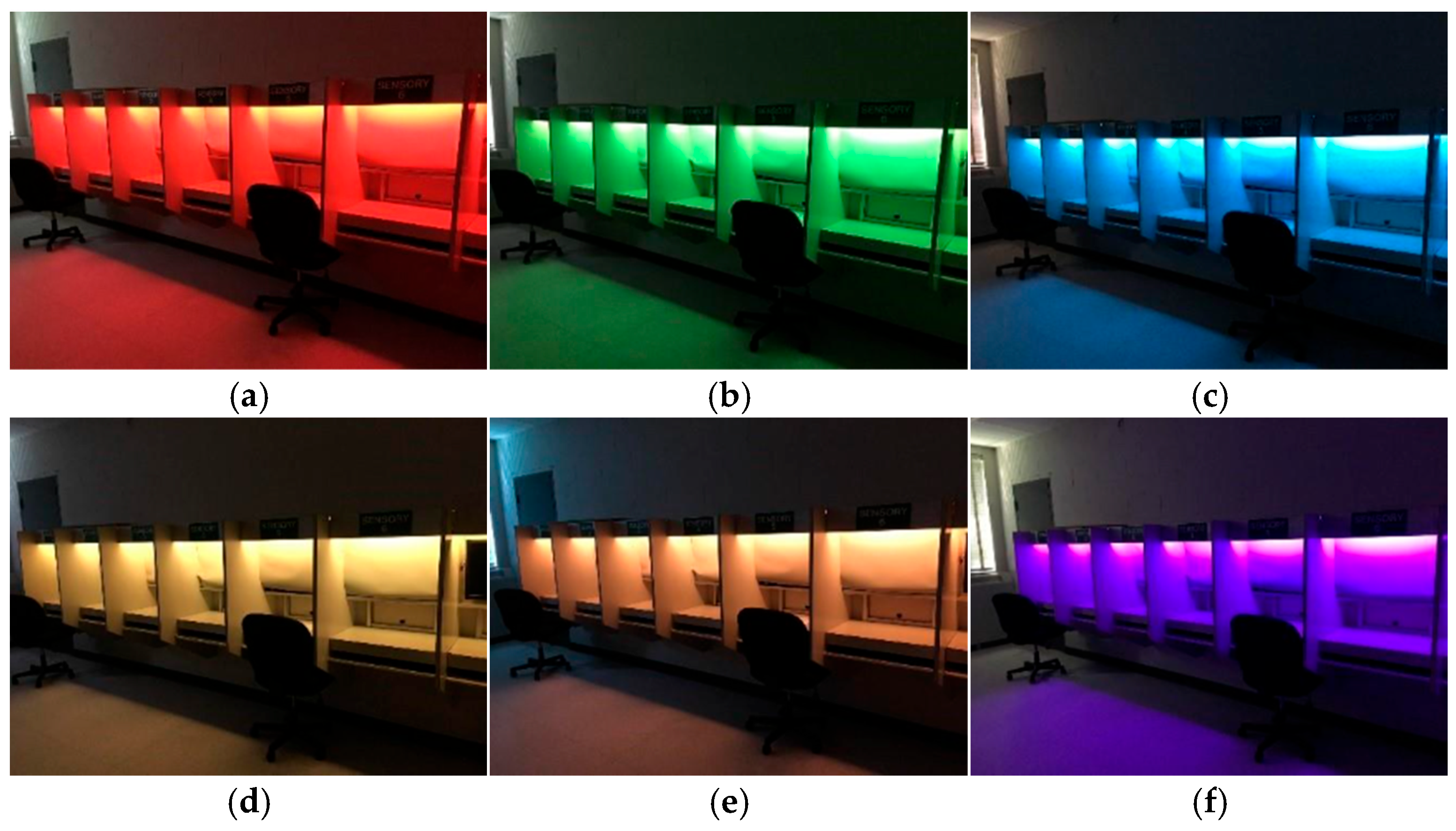
The experiment took place at a university in the Midwest, specifically in their sensory laboratory. The laboratory consists of seven separate booths, each measuring 26″ × 27″ × 35″ in size (width, length, and height). To enhance the environment, each booth was fitted with color-changing LED lighting fixtures positioned at the top. These fixtures were Philips Hue Light Strip Plus fixtures (Signify N.V., Eindhoven, The Netherlands), featuring LED bulbs (
Figure 1). All booth walls, including side, top, and bottom surfaces, were finished in mid-grey color, commonly used in color research as a neutral background to minimize color bias and visual distraction. This choice ensures that participants’ perception is primarily influenced by the lighting color rather than wall reflectance or chromatic interference.
The experiment involved six LED lighting colors, comprising three primary colors and three secondary colors. These colors were chosen from the Natural Color System (NCS) and accurately converted to CIELAB values, including hue angle, lightness, and chroma (
Table 1). The illuminance level for each lighting condition was measured in foot-candles (fc) at the center of the desk surface within each booth, following the recommendations of the Illuminating Engineering Society (IES) handbook. Due to inherent differences in luminous efficacy and spectral output among colored LEDs, each hue naturally produces a different range of intensity. This study specifically focused on the perceptual effects of primary and secondary colors as lighting hues. To preserve the authentic chromatic expression of each color, illuminance levels were not artificially equalized across conditions. Equalizing illuminance would have required adjusting the output in a way that could distort the natural appearance of certain hues—particularly those with lower luminous efficiency—thereby compromising the integrity of the color experience.
2.2. Procedure and Analysis
Prior to the main experiment, a pilot study was conducted. Four participants were tested to provide insights into the overall experiment process which resulted in modifications to the procedures of the main experiment. When the main experimental design was finalized, participants were asked to visit the laboratory for experiments. Upon arrival, participants took Ishihara’s color-blind test and were informed about the experiment procedures before the experiment began.
Participants were exposed to randomly ordered six lighting colors with 40-s break times in between. In the first session of each experiment, a randomly selected lighting color was turned on for 3 min and the participants were asked to complete the given questionnaire during those 3 min under the given lighting color. Participants were asked to close their eyes to rest for 40 s to reduce eye strain and afterimage after each session. The duration of this break was determined through a pilot test, as prior lighting studies show inconsistent standards for break time between lighting exposures. The pilot test aimed to identify a duration that allows sufficient visual rest without causing boredom or disengagement. Based on participant feedback, 40 s was found to be optimal for balancing eye recovery and maintaining engagement. Then the next session began with another randomly selected lighting color turned on for 3 min, and participants were asked to complete the questionnaire. The same procedure was repeated until participants were exposed to all colors of lighting.
The test instrument in a questionnaire format was developed based on previous literature that explored the psychological effects of environmental stimuli on spatial impressions and studies that employed the extended PAD model [
21,
22,
33]. 15 pairs of words expressing spatial impression with a seven-point semantic differential scale were adapted. The 15 pairs of words are:
- (1)
pleasant–unpleasant,
- (2)
unhappy–happy,
- (3)
excited–calm,
- (4)
unaroused–aroused,
- (5)
satisfied–dissatisfied,
- (6)
wide awake–sleepy,
- (7)
uncomfortable–comfortable,
- (8)
relaxed–stimulated,
- (9)
warm–cool,
- (10)
dull–bright,
- (11)
impressive–unimpressive,
- (12)
beautiful–ugly,
- (13)
unattractive–attractive,
- (14)
cheerful–gloomy, and
- (15)
unappealing–appealing.
Participants were asked to rate their level of spatial impressions under the given lighting color.
Data were collected from a total of 101 subjects and were analyzed using the Statistical Package of the Social Sciences (SPSS, version 29). Descriptive statistics, including frequencies, percentages, means, and standard deviations, were employed to determine the distributional characteristics of each variable. Factor analysis was conducted to validate the construct validity of the dependent variables of spatial impressions. The internal consistency of the variable was assessed using Cronbach’s alpha value in reliability test. A one-way analysis of variance (ANOVA) was conducted to compare the mean scores of the spatial impressions among six different lighting colors.
4. Discussion
This study investigated the influence of highly saturated colored lighting on spatial impression, using the PAD (Pleasure–Arousal–Dominance) model as a theoretical framework. While prior studies have largely focused on primary colors, this research expands the theoretical application of the PAD model by incorporating secondary lighting colors, offering a broader understanding of how hue influences affectivity, tranquility, and thermality. The findings confirmed that lighting color significantly influences individuals’ perception of space, aligning with prior research [
12,
21,
32].
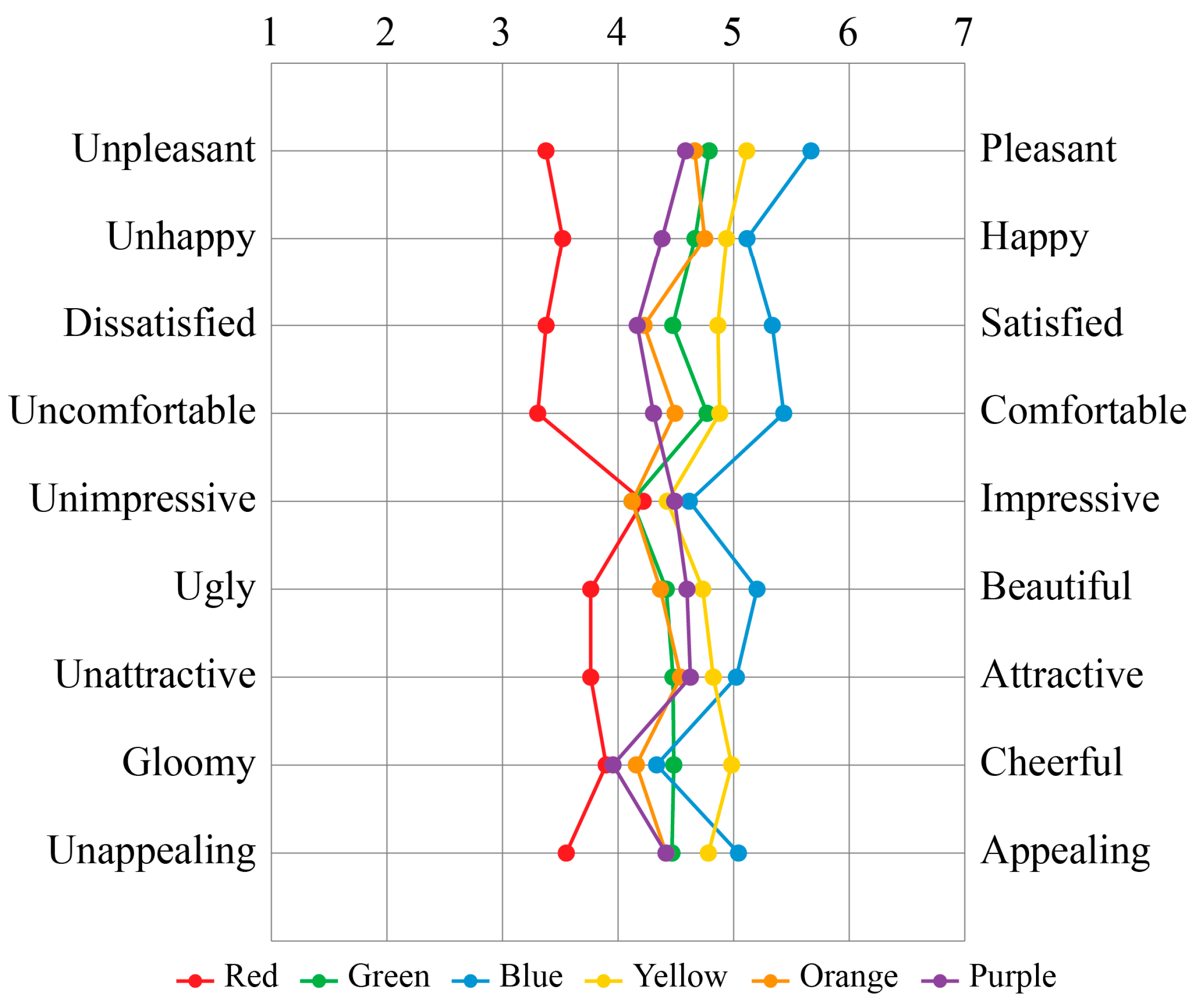
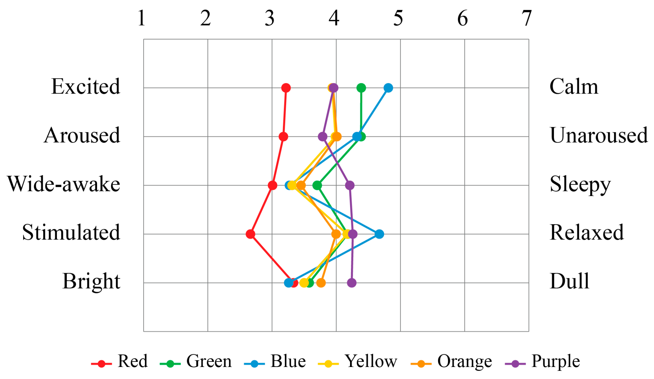
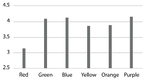
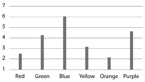
Among the tested hues, blue lighting elicited the most positive emotional responses, whereas red lighting was perceived most negatively. Green, yellow, and orange lighting did not show statistically significant differences from blue, suggesting that these colors also contribute to favorable spatial impressions. The alignment with previous research, where cool colors such as blue and green are associated with calmness, and warm colors like red are linked to arousal and less favorable affective states, highlights the importance of hue in determining how colored lighting is experienced. In terms of tranquility, purple lighting was found to be the lighting color that evokes the most tranquil impression in the space while red lighting was rated the lowest, significantly different from all other lighting colors. Although purple lighting did not show any significant difference from green, blue, yellow, and orange lighting, analysis proved that blue was strongly associated with feelings of calmness and comfort, whereas purple was linked to sensations of sleepiness and dullness, suggesting a deeper connection to physical relaxation. Red lighting emerged as the most arousing and stimulating, consistent with prior studies on physiological and psychological responses to warm colors [
12,
25,
26].
In relation to thermality of space, the way lighting colors conveyed warmth or coolness mirrored how interior colors influence environmental temperature impressions. Unlike previous studies that primarily investigated wall color and its thermal associations [
9,
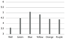
22], this study separated the lighting colors into independent variables, differentiating the effects of color lighting from interior color effects. Warm colors such as red, yellow, and orange elicit a feeling of warmth when used as lighting colors, while cool colors like blue, green, and purple create a sense of coolness when employed in lighting design. Furthermore, significant differences were observed even within these categories. Blue lighting was perceived as cooler than green and purple, while red and orange lighting were rated warmer than yellow. These findings suggest that colored lighting functions as an active environmental factor in shaping thermal awareness, comfort, and psychological well-being. For instance, in warmer climates, the use of cool-colored lighting may help alleviate perceived thermal discomfort, whereas in colder climates, warm-colored lighting can enhance feelings of coziness without altering the actual ambient temperature.
Based on these findings, several practical implications can be proposed for professionals such as architects, facility managers, interior designers, and lighting designers. Red lighting, while highly stimulating and arousing, was found to evoke the most negative emotional responses among all tested hues. This duality suggests that while red may be effective in energizing environments such as clubs, concerts, and bars, its application should be carefully considered in spaces where a positive emotional impression is desired. The potential for red lighting to induce discomfort or negative effects highlights the importance of thoughtful design decisions based on the intended atmosphere and user experience. Purple lighting, associated with sleepiness and relaxation, may be suitable for bedrooms or spa settings. In spaces where thermal perception is relevant, orange lighting may be optimal for conveying warmth, while blue lighting can effectively communicate coolness. These insights offer valuable guidance for the strategic use of colored lighting in shaping spatial experiences.
Some limitations of this study pertain to the experimental design, particularly the environmental settings and sampling method. The experiment was conducted in a controlled booth environment equipped with a color-changing LED lighting system. Compared to studies that rely on photographic simulations or virtual renderings, this approach offers greater rigor by exposing participants to actual lighting conditions. However, the booths used in this study were relatively small (26″ × 27″ × 35″), which may limit ecological validity. While the controlled setting allowed for precise manipulation of lighting variables, it does not fully replicate the complexity of real-world environments. In particular, the absence of furniture, surface detail, and spatial depth may reduce the realism of participants’ perceptual experience. As spatial impressions are strongly influenced by contextual elements such as materials, textures, and objects, future research should consider incorporating more realistic spatial features and furnishings to enhance ecological validity and better reflect everyday lighting experiences.
Additionally, the participant sample (n = 101) was predominantly composed of individuals in their 20s, as recruitment was conducted through a voluntary online research pool. This demographic concentration may restrict the generalizability of the findings to broader populations. A more diverse and randomized sampling strategy is recommended for future studies to improve external validity and capture a wider range of perceptual responses across age groups and cultural backgrounds.
Another limitation pertains to the statistical analysis. Thermality was measured using a single item (“warm–cool”), which restricts its interpretation as a latent construct. Although factor analysis identified three dimensions, the thermality dimension consisted of only one item, whereas the other two were composed of multiple semantically related items. While the results offer meaningful insights into thermal perception, this limitation should be taken into account when interpreting the findings. Furthermore, although Tukey’s HSD controls familywise errors, the potential for Type I error inflation remains and should be acknowledged in the interpretation of statistical significance.
In future studies, there is a need to expand the range of colors examined. Few studies have explored colors beyond primary or secondary colors of lighting. Given the capabilities of current lighting technology to offer a wide array of colors with varying levels of chroma and values, it is advisable for future research to investigate colors beyond the primary and secondary spectrum. It is also advisable to incorporate varying illumination intensities, as changes in brightness can significantly alter perceptual and emotional responses.
5. Conclusions
This study presents empirical evidence that high-saturation colored lighting significantly influences spatial impressions in indoor environments, particularly in relation to perceived affectivity, tranquility, and thermality. Participants were invited into a controlled laboratory setting and exposed to lighting conditions, including both primary and secondary colors of lighting. This methodological approach contributes to the advancement of the PAD framework and facilitates a more nuanced understanding of how lighting color affects emotional and perceptual responses.
The findings reveal that blue lighting consistently elicited the most favorable emotional and thermal impressions, whereas red lighting was associated with negative affective responses and lower tranquility. Purple lighting, although perceived as tranquil, was also linked to sleepiness and dullness, suggesting its suitability for relaxation-focused environments. The study also confirms that warm-colored lighting (e.g., red, orange) enhances perceived warmth, while cool-colored lighting (e.g., blue, green, purple) evokes a sense of coolness.
These insights offer practical implications for designers and architects seeking to optimize user experience through strategic lighting choices. The results highlight the importance of aligning lighting color choices with the intended emotional and atmospheric objectives of a space, whether to stimulate, soothe, or modulate thermal perception. Future research should explore a broader spectrum of lighting hues, incorporate ecologically valid settings, and engage more diverse populations to enhance the generalizability of findings. Ultimately, this research reinforces the role of colored lighting as a powerful design tool capable of shaping spatial impressions and emotional engagement in built environments.
