Article

A VR Experimental Study on the Influence of Chinese Hotel Interior Color Design on Customers’ Emotional Experience

1
Department of Tourism Management, South China University of Technology, Guangzhou 510006, China
2
State Key Laboratory of Subtropical Building Science, Guangzhou 510006, China
3
The Art Department, Communication University of China, Beijing 100024, China
4
Media Art Department, Communication University of China, Beijing 100024, China
5
Drama-Light and Shadow Space Art, Communication University of China, Beijing 100024, China
6
Landscape Architecture, Communication University of China, Beijing 100024, China
*
Author to whom correspondence should be addressed.
Buildings 2022, 12(7), 984; https://doi.org/10.3390/buildings12070984
Submission received: 1 June 2022 / Revised: 30 June 2022 / Accepted: 4 July 2022 / Published: 11 July 2022
(This article belongs to the Special Issue Indoor Environmental Quality and Occupant Comfort)

Abstract

:
As an important part of a hotel’s internal environment, color design affects not only customers’ hotel stay experiences, but also their check-in experiences. However, how hotel guests’ emotional experiences are affected by interior color design is understudied in China. Drawing on the theory of color psychology, we designed a Virtual Reality (VR) experiment and a questionnaire to explore how hotel guests’ emotional experience can be influenced by the color scheme of hotel interior color design. The results show that hotel rooms decorated in yellow have a pleasurable effect, those decorated in gray a calming effect, and those decorated in blue a relatively neutral effect. Young participants have more negative emotional responses to rooms decorated in dark yellow. The emotional impact of both gray and yellow with higher grayscale values shifts from positive to negative with the improvement of customers’ educational background. Low grayscale color schemes are preferred over high grayscale ones, and indoor environments with synergistic colors are preferred over contrasting colors. It is also found that male subjects tend to have more positive emotional reactions to all color schemes than females. For most subjects, age and education have no effect on their emotional reactions to different color schemes. These findings have important implications for hotel interior environment color design.

1. Introduction

Color plays an important role in influencing human perception. About 83% of human perceptual information comes from vision, and visual information is dominated by color [1]. As a sensory attribute, the impact of color on the service industry has been of interest to some scholars, and some studies have been carried out on customers’ perceptions of the wall color of barber shops [2], clothing stores [3], restaurants [4], etc. Studies of this type have examined customers’ visit intentions or attitudes by changing the color of a space [5] and have traced the changes in their psychological and physical perception of the space [6]. Hotel rooms are the spaces where customers spend most of their stay time [7]. Therefore, compared with other parts of a hotel, the decoration and design of rooms have a more substantial impact on customers’ emotional experiences. As color is one of the dominant visual elements in hotel internal environments [8], many scholars have conducted in-depth research on it. Color has been proven to significantly affect customers’ aesthetic perceptions, emotional experiences, behavioral intentions, and other subjective reactions [9,10]. Although subjective evaluation methods have been used in most existing studies, the contents evaluated in them vary from one to another. For example, though Selin [8] and Lee [11] both adopted subjective evaluation methods to investigate hotel guests’ emotional experiences of interior color design, the former focused on the subjects’ states of pleasure in blue, yellow, and gray rooms of urban hotels, whereas the latter concerned itself with the influence of cold color-themed rooms, especially those dominated by green, on customers’ emotional well-being. Virtual digital image experiments have been designed in some recent studies, which have found that the influence of warm color schemes on arousal, stimulation, and excitement is stronger than that of cold color and colorless schemes, and cold color schemes can produce a better ambience of spaciousness and tranquility than warm color and colorless schemes [12]. Notably, previous research has mainly dealt with the emotional effect of the singular cold/warm dimension of colors. Hence, further research is needed to fully reveal the impact of different color systems and different color schemes of different grayscale values in the hotel indoor environment on customers’ emotional experiences, and whether the synergistic and contrasting colors of such items as bed flags and pillows in the room will cause changes in customers’ emotional responses.
Color psychology is the study of human psychological activities in relation to colors. Drawing on traditional psychological theories, it scientifically studies the relationship between color, humans, and the environment. Different colors convey different visual information to the brain, where different associations are formed, and different psychological and emotional reactions are generated, including the perception of temperature and distance as well as the feeling of excitement, depression, irritability, and stability [13]. Research on the relationship between color and psychological function can be traced back to W. Goethe, a German poet and erudite who intuitively speculated on the relationship between color perception and emotional experience and divided colors into positive and negative categories. Positive colors, namely, yellow, red yellow, and yellow red, are considered to be stimulants of positive emotions, such as liveliness, ambition, and warmth, and blue, red blue, and blue red are regarded as the ideal colors that trigger negative emotions, such as anxiety and cold [14]. Psychological research has proved that different colors have different meanings [15] and can affect human perceptions [16]. For example, red represents excitement and passion [17], blue is related to openness and peace [18], yellow means happiness, while green generally symbolizes safety and environmental awareness [10], and so forth. Existing research on color psychology in China mainly focuses on packaging design [19], interior decoration design [20], architectural design [21], etc. As is widely accepted by color psychologists, the meaning of colors is culturally bounded [22], and due to the influence of traditional Chinese culture, high purity red and yellow are favored by most people in China. However, with the influx of foreign cultures, the color preferences of the younger generation are more diverse, and the color choice of the living environment is related to the decoration style, the location of the city, and the purpose of living. According to the authoritative data analysis of “Nippon CCM Color Management System”, red and yellow are not among the 13 Chinese favorite colors released in 2022, which indicates that the color issue in hotel interior design is in need of further investigation. While the hotel indoor environment is under-researched in the realm of color psychology, the rise of boutique hotels in recent years, especially those with more diverse and bold colors, has further pushed the boundaries of the research field.
Previous studies have used field experiments or combined virtual digital images with questionnaires to investigate the impact of different colors on subjects’ emotional responses. Field experiments can obtain objective and practical information and eliminate the deviation of subjective estimation. Nonetheless, experimental studies are time-consuming, costly, and highly demanding of the experimental conditions. By contrast, subjective evaluation of virtual digital images based on 2D screens is more cost-effective. Nevertheless, such studies may well be problematic in that the subjects cannot be completely immersed and are susceptible to external interference. In a word, current research on the emotional experience of hotel indoor environment is either confronted with the challenge of variable control and color classification, or it is defective due to the inadequate immersion of the hotel indoor environment and the diversity of color collocation. Therefore, this study was intended not only to focus on the impact of gray, blue, and yellow hotel indoor environments on customers’ emotional experiences, but also to take a further step to explore the emotional effect of gray, blue, and yellow rooms of different grayscale values. Despite the demanding requirements of the colors of hotel indoor environments, the virtual environment makes it possible to combine the control of laboratory measures with the fidelity of daily experience [23] and hence ensures the reliability of subjective evaluations. Virtual reality (VR) can evaluate cognition, emotion, and behavior in an ecologically effective environment, and individuals can experience it in an immersive VR environment [24]. Moreover, the experimental cost of VR technology is relatively low, and the experimental process is relatively simple and convenient. In this study, VR modeling was used to build virtual hotel rooms, and experiments were carried out through VR technology to overcome the challenges of demanding requirements for hotel color and difficult control of the external environment. When the experiment was over, the subjects were immediately invited to fill out a questionnaire to report their authentic feelings in a direct and timely manner. The questionnaire was designed in line with the most updated scale of existing studies and has high reliability and validity.
To sum up, this study first collected the main color systems of contemporary hotels through Ctrip and summarized the three main color systems of hotel indoor environments, i.e., yellow, blue, and gray, in reference to the color wheel. Drawing on color psychology theories, it was intended to provide a new perspective for the influence mechanism of color on customers’ emotional experience of hotel indoor environments by addressing the following four specific questions:
  • Q1: Whether and how hotel rooms decorated in gray, blue and yellow have a significantly different emotional impact on customers’ hotel stay experience.
  • Q2: Whether and how changing the grayscale value of gray, blue, and yellow leads to a change in customers’ emotional experience.
  • Q3: Whether synergistic colors or contrasting colors have a significantly different emotional impact on customers’ emotional experiences, and what color preferences customers have.
  • Q4: Are the impacts indicated in Questions 1–3 associated with demographic characteristics ?
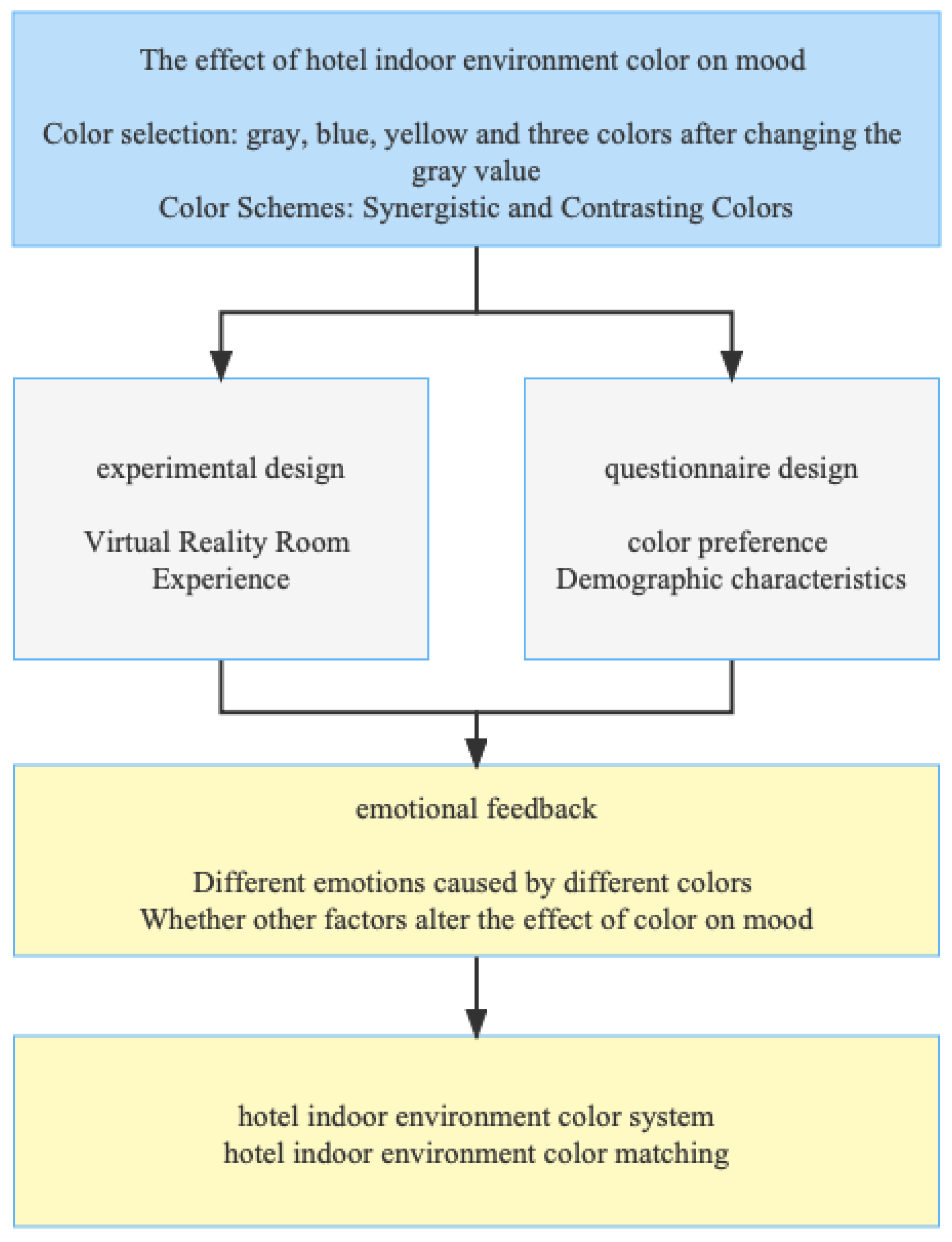
In accordance with the principle of positivist philosophy, this study applied VR technology and conducted a questionnaire to ensure the authenticity and objectivity of the subjects’ reported emotional responses. From the perspective of color psychology, it is a useful attempt to explore the impact of different colors in the hotel indoor environment on customers’ emotional experience. It can not only complement with existing research on potential factors affecting the mood of hotel guests, but also provide new insights into the interior color design of hotels.

2. Methodology

2.1. Research Framework

This study was comprised of a VR experiment and a questionnaire. When the experiment on each participant was completed, the participant was invited to fill out the questionnaire, which was intended to collect their emotional perception of the hotel internal environment decorated in different colors. Subsequently, the relationship between different colors and respondents’ mood, age, education background, and gender were explored through repeated measures analysis of variance, one-way analysis of variance, and an independent samples t-test. Finally, the interior color design of hotels, particularly the choice of specific color systems and the combination of different colors, was discussed, and implications were provided for the design of hotel interior environments. The research framework of this paper is demonstrated in Figure 1.

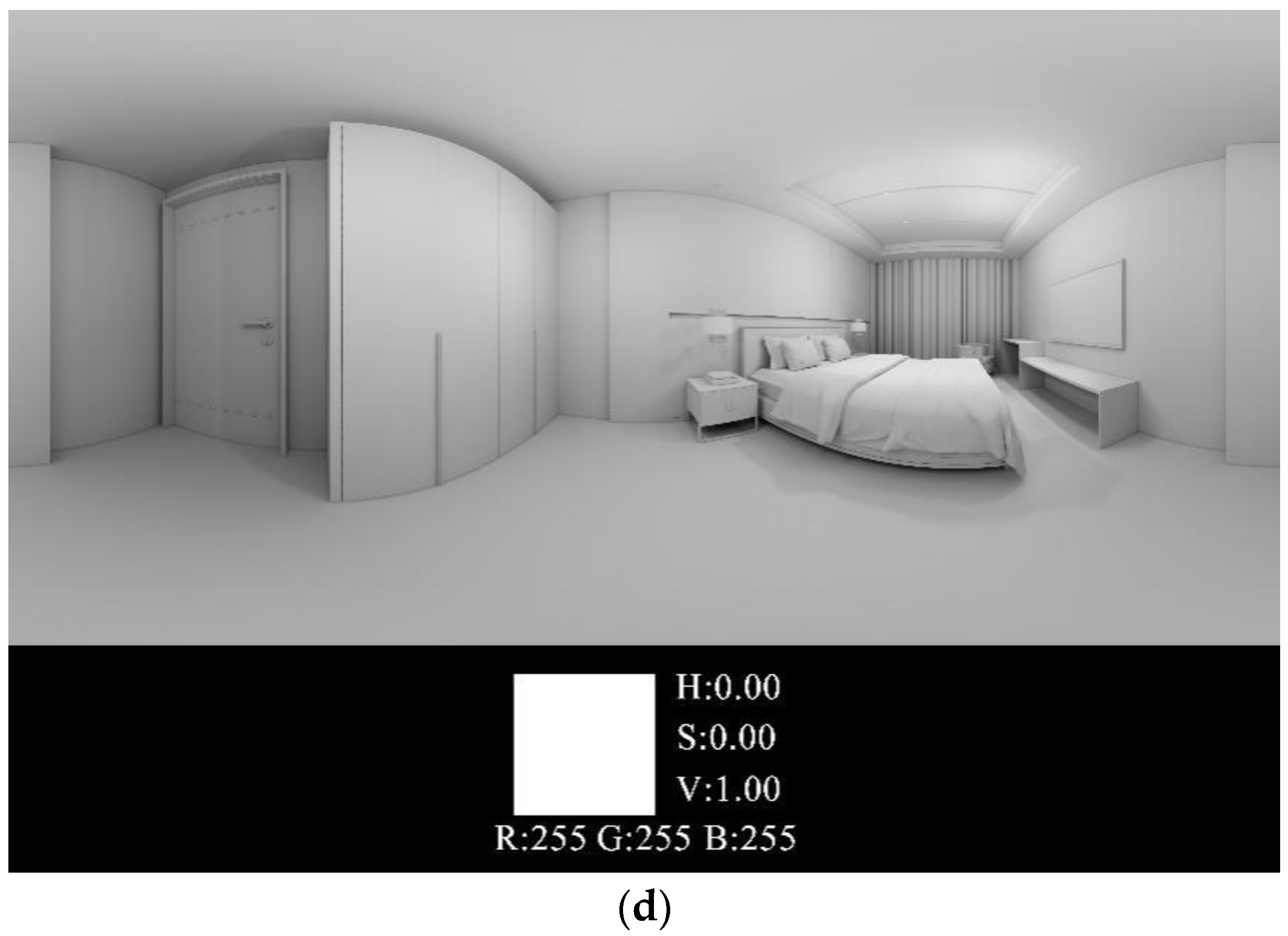
2.1.1. Experimental Design

(1)
Experimental instrument
VR technology has proven to have an incomparable edge over two-dimensional planes in subjective evaluation. It can overcome the limitation of time and space; integrate immersion, interactivity, and imagination; and bring immersive life experience to users through virtual environment maps, videos, audios, etc., so that users can immerse themselves in it and have a sense of intuition substitution or intuition enhancement [25,26,27,28]. In addition, the virtual environment fully reflects the complexity of the real world, and the value obtained by virtual space is almost the same as the value obtained from the real world [4]. Stamp’s meta-analysis gives full support to the use of virtual space in studying the effectiveness of responses to architectural features [29].
The VR device used in this study was Pico/Bird Look, which has the merits of simple setup steps, better clarity, and more stable connection. The specific parameters of the device are displayed in Table 1.
(2)
VR scene building
In order to measure the emotional effect of color schemes on hotel guests’ stay experiences, this study showed the participants a series of digital images of virtual rooms that differed only in the color of indoor walls, curtains, pillows, and bed-end cloth. According to the auditory scale in environmental psychology, the convenient distance of conversation is less than 3 m, and the most effective distance of hearing is less than 6 m [30]. As the standard rooms of express hotels are usually occupied by two people, the length is 6 m. As for the width, according to the human body scale in ergonomics, the best width of express hotels is 3.6 m [30]. Therefore, the virtual room designed in this study was a 21.6 m2 large bedroom, including a 1.8 m × 2.2 m bed, two bedside cabinets of 0.42 m × 0.55 m × 0.5 m each, a 2.4 m × 0.6 m × 2.1 m wardrobe, a 0.4 m × 1.6 m × 0.54 m TV table, and a 1.05 m × 0.4 m × 0.79 m desk. In this study, Sketch-up was used to model, and Enscape was used to obtain a surreal attempt. As regards the color scheme of the virtual space, the three color systems of yellow, blue, and gray were adopted to compare indoor items with the five color schemes of yellow, green, blue, green, purple, and gray. In light of previous research [8,31] and the color wheel, we chose these five color schemes. The reason is that on the color wheel, the radial areas of green and yellow form a rectangle, and purple is opposite to yellow, which makes them complementary. In other words, the five color schemes can encompass all the color systems contained in the color wheel. Twelve 15 W white LED downlights, a 10.2 m white 3000 K LED strip, and two 8 W white LED bedside chandeliers were used for the lighting of the virtual space. In order to improve the reliability of the experiment, the furniture and decoration of each experimental VR room remained unchanged, and only two colors were contrasted. For the first contrast, the lightness and saturation of yellow, blue, green, and purple were fixed, and only the hue of the four colors was changed. For the second contrast, the hue and saturation of yellow, blue, and gray were fixed, and the grayscale value of each color was reduced by 40% (as shown in Figure 2a–c).
In addition to the six virtual experimental settings mentioned above, a colorless (pure white) auxiliary setting was set up separately (Figure 2d). The major consideration to do so was that the subjects needed to observe different color combinations within a certain period of time, which might cause visual fatigue, which would in turn lead to inconsistency in their feedback. The color-free auxiliary setting was designed to reduce this type of error. Before the formal experiment, a 3–5 min transition period was arranged to allow the subjects to wear VR glasses, enter the colorless auxiliary setting for observation, and to become familiar with the color as well as the spatial environment of the virtual room. Furthermore, the subjects were required to wear noise-reducing headphones that played light music so as to alleviate experiment-induced anxiety and tension. Throughout the experiment, the subjects always wore noise-reducing headphones to ensure that there was no external auditory interference.
This experiment was carried out from late February to March 2022 in Jian Xu’s laboratory of South China University of Technology, Guangzhou, Guangdong, China. February to March is the time for teachers and students to return to school, and they have a low level of work-related pressure and are in a relaxed state of mind. The experimental time was intentionally set between two o’clock and five o’clock in the afternoon, for the temperature at this time is also suitable. Teachers’ laboratories are bright, quiet, and dull in color, which can minimize external interference.

2.1.2. Questionnaire Design
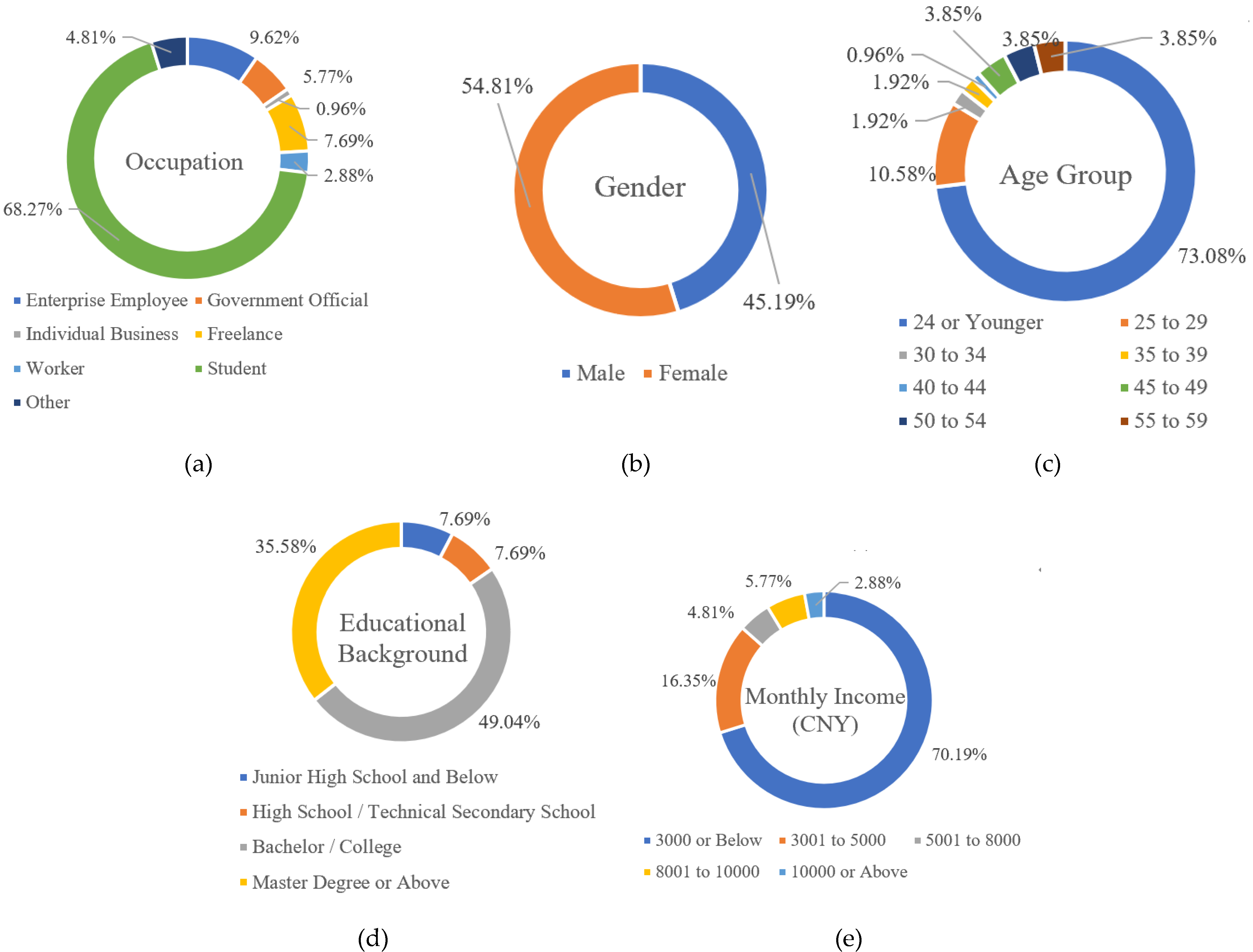
The questionnaire used in this experiment consisted of three parts and contained 61 questions in total. The first part of the questionnaire was designed as a color blindness and color weakness test with a view to screening out the subjects insensitive to color. For that purpose, three test charts were provided, and the subject was required to identify the numbers or images in the charts. If the subject failed to identify the symbols in all the three charts, which meant that he/she could not accurately distinguish the colors, the VR experiment would not be conducted on the subject. Only the qualified subjects would proceed to the second part, that is, to choose a favorite color system from the color wheel. The third part was designed to obtain the subjects’ subjective feelings while observing the virtual rooms. The subjects would enter different virtual rooms that were randomly ordered. When observing each virtual room, subjects were requested to answer questions concerning the emotional experience of brightness satisfaction and color combination, etc. In light of existing research, a seven-level semantic gradient scale was adopted, and the subjects were asked to report their emotional responses to a given color scheme simply by marking the semantic level. The specific measurement items of the scale were optimized in accordance with existing research [12] and are listed as follows: happy/unhappy, warm/cold, vivid/lackluster, stimulating/non-stimulating, calm/restless, peaceful/unpeaceful. Questions concerning demographic information, including gender, age, education, occupation, income, etc., were also placed in the third part in order to ensure that the subjects’ willingness to participate in the experiment would not be affected due to privacy concerns.
Prior to the formal recruitment of experimental subjects, a host of male and female testers with different educational backgrounds aged between 18 and 52 were invited to evaluate the comprehensibility of the questionnaire items, and all the testers were able to correctly understand and answer the questions. Excluding individual factors (such as reaction to and acceptance of the VR device) and equipment debugging, the total amount of time each subject spent wearing VR equipment was within 5 min [31], the duration of the experiment was reasonable enough, and no sign of fatigue or impatience was detected in each subject. During the experiment, the researchers asked the questions orally, the subjects answered each of them orally, and the researchers recorded the answers.

2.2. Participants

From January to February 2022, 112 participants, who were born and brought up in different regions of China but all living in Guangzhou, were recruited to participate in the experiment through online and offline promotion. The researchers promised to the recruited participants that they would be presented a carefully prepared prize if they could take active participation in the experiment.
A color blindness and weakness test was then administered on the recruited participants. Those who were color blind or unable to accurately distinguish colors were identified, and the data of the subsequent experiment on them were to be excluded. In addition, those who had received color education or engaged in professional color research were also screened out. In the end, a total of 104 valid experimental samples was obtained in this study, and the effective response rate reached 92.86%. As displayed in Figure 3, the gender ratio was roughly balanced, with females slightly outnumbering males; the age distribution was dominated by the group aged 24 and below; and most of the participants were mainly from young and middle-aged groups. As for education level, the majority was bachelors, junior college students, and students of master programs or above, and the proportion of bachelor/junior college students/graduates was the highest. With respect to occupation, the proportion of students was the highest, followed by enterprise employees and freelancers. With regard to average monthly income, all income segments were covered, but because the subjects were mainly students, the average monthly income was dominantly 3000 yuan or less.

2.3. Data Analysis

SPSS 26 was applied to analyze the statistical data in this study. First, the reliability and validity of the dependent variables were examined, the existence of a relationship between the dependent variables was evaluated by correlation tests, and then the average and standard deviation of the data were calculated. The repeated measures ANOVA was used to test the effect of the interior color design on the participants’ emotional experience. One-way analysis of variance was used to test the effect of age and education. An independent-samples T test was used to test whether there was a significant difference between different age groups’ responses. The data obtained were presented in graphical or tabular form.

2.4. Reliability and Validity Test

Cronbach’s consistency coefficient α value in the alpha analysis model was used to analyze the reliability of the scale. As can be seen from Table 2, the α coefficient of the scale was 0.956, much higher than the standard value of 0.7, indicating that the scale had high internal consistency; the results of the KMO and Bartlett tests, as displayed in Table 3, showed that the significance was less than 0.05, and the KMO statistic was 0.839, higher than 0.7, indicating that the scale had construct validity [32,33]. Initially, 112 participants were recruited, and when the invalid experimental results were excluded, 104 valid experimental samples were finally obtained, which met the basic requirements of the current research.

3. Results

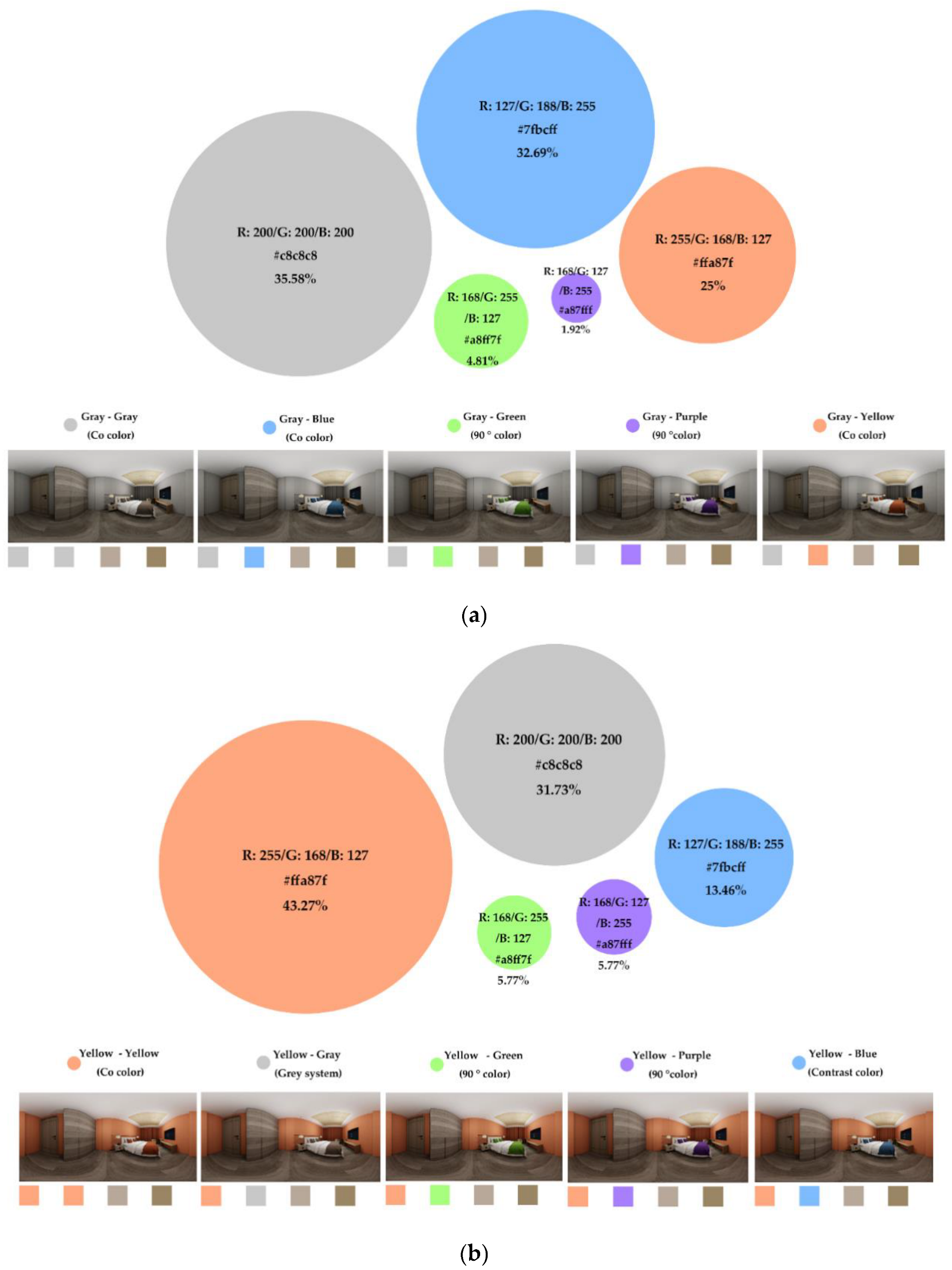
3.1. Color Preference Statistics

The results of the first part of the questionnaire revealed that the participants had the highest preference for yellow (47.11%), followed by blue (28.84%) and gray (7.69%). Of the five color systems, the aforementioned three were favored by more than 80% (83.64%) of all participants (Figure 4). It was also found that synergistic and gray colors were preferred over the others, which indicates that in interior decoration, synergistic and gray color schemes are more pleasurable and welcoming to individuals.

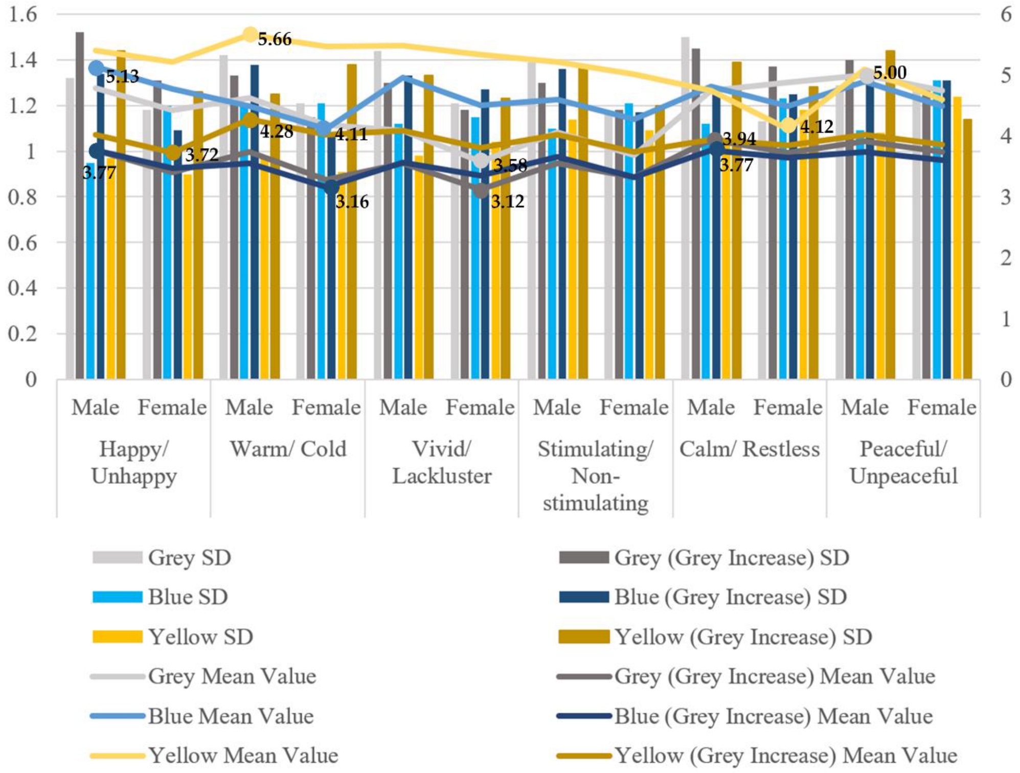
3.2. Effect of Color on Emotional Experience

The results of the six experimental settings were analyzed to reveal the statistical relationship between different color schemes and the participants’ emotional responses. The means and standard deviations of the participants’ ratings of their emotional responses to the six virtual rooms are shown in Table 4. Differences between participants’ emotional responses to the color schemes of the virtual room are shown in Figure 5. The following findings could be drawn from the statistical analysis:
(1)
Among the three color systems of gray, yellow, and blue, yellow could evoke more positive individual emotions than gray and blue, which is supportive of Jonauskaite et al.’s conclusion [34] that yellow is more related to positive emotions such as happiness.
(2)
Hotel rooms decorated in gray and blue were more effective in bringing customers a sense of calmness, which is also consistent with previous research, indicating that cool colors can give people a more calm and quiet mood [34]. For example, Ayash et al.’s [16] experimental study on the effect of color on students’ mood, heart rate, and performance in the learning environment suggests that blue makes people feel more relaxed and calm.
(3)
As the grayscale values of the three color systems were increased, the participants’ emotional responses become less strong, and yet the positive impact of the yellow room remained higher than that of the gray room and the blue room. In addition to the fact that the yellow system chosen in the experiment was a warm color, and warm colors can bring more positive emotions, there was another reason that the dark yellow hotel internal environment was still brighter than the dark gray one and the dark blue one. Bright colors are more likely to generate positive emotions, which is in accord with Ulusoy et al.’s findings [35]. In other words, lighter and less saturated colors evoke more positive meanings than darker and more saturated colors [36,37].
As the p value of the Mauchly’s test of sphericity was less than 0.05 (Table 5), the null hypothesis of sphericity was rejected. Combined with the results obtained by the multivariate test (p = 0.000) (Table 6), it was found that there was a statistically significant difference (p < 0.001) between the emotional effects of different colors.
As shown in Figure 6, it is apparent that different color schemes had different effects on emotional responses. Among the color systems of gray (color 1), blue (color 3), and yellow (color 5), gray had the least impact on emotions, followed by blue, and yellow was most likely to cause emotional fluctuations. Among the adjusted schemes of dark gray (color 2), dark blue (color 4), and dark yellow (color 6), the effect of dark gray and dark blue on human emotions was not significantly different; compared with the other two schemes, dark yellow was still more likely to cause emotional fluctuations. It can also be found that changing the grayscale value of each color system could change their emotional influence: the average rating of the gray system was reduced from 4.383 to 3.572, the blue system from 4.609 to 3.540, and the yellow system from 5.098 to 3.933, indicating that changing the grayscale value could effectively stabilize the emotion. The comparison between the different color systems showed that changing the grayscale value of the gray system resulted in the least emotional fluctuation; the marginal average rating of the blue system, with the grayscale changed, was closer to the median of 3.540, indicating that the blue system with a lowered grayscale value was more stabilizing; the effect of the yellow system with a lowered grayscale on emotion was accordingly weakened, but it was still statistically significant. The following three aspects were further elaborated in accordance with the results of the questionnaire content and findings of existing research [8,38,39].

3.2.1. Pleasing

Yellow received the highest rating in the happy/unhappy item with a mean of 5.298, and no obvious difference was shown between the ratings of blue and gray. The average ratings of the three colors with adjusted grayscale values were all within the range of 3.5–4, and there was no significant difference between them. It was found that yellow had a role to play in generating pleasurable emotions, and colors with lower grayscale values could also make people enter into a pleasant state of mind. In the warm/cold item, the yellow system had a very significant warming effect, with a mean of 5.557. Even the warming effect of the yellow system with a lower grayscale value was not substantially different from that of the blue and gray systems. However, the blue and gray systems with lower grayscale values had a negative effect in this respect, and the mean was lower than the median of 3.5.

3.2.2. Evoking

In the vivid/lackluster item, the yellow system still received the highest average rating, followed by the blue system—there was a moderate difference between the two—and the rest of the colors had a weak wake-up effect. The average ratings of dark blue and dark gray were both lower than the median of 3.5, indicating that they were counterproductive to emotional evocation. It was the same with the results of the stimulating/non-stimulating item. These results demonstrated that yellow and blue systems had arousing and stimulating effects on emotions, while other colors were rather weak or even negative in this respect.

3.2.3. Calming

When it comes to the calm/restless item, the gray, blue, and yellow systems were slightly different from each other, with gray receiving the highest average rating, followed by blue. This shows that color systems with lower grayscale values had a moderately calming effect on people’s emotions, especially the gray one. The emotional influence of the three color systems after changing the grayscale values was relatively weak, and there was no obvious difference between them. In the peaceful/unpeaceful item, the ratings of the gray and yellow systems were close to the average, followed by blue, indicating that gray and blue were more placating than yellow. With the grayscale values changed, the ratings of the three color systems were similar to the results of the previous item, and their emotional influence was relatively weak.
In a word, the three colors with lower grayscale values had a higher influence on emotions than the three colors with higher grayscale values.

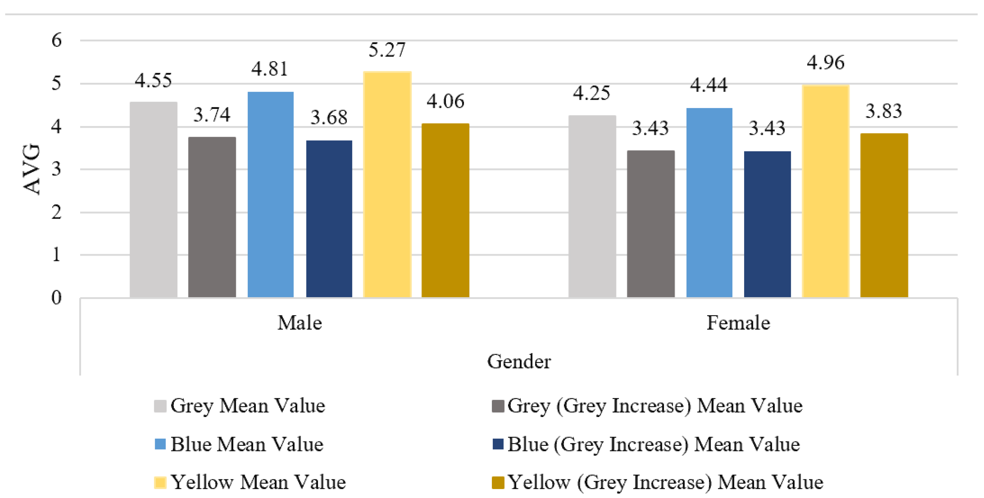
3.3. Impact of Demographic Variables on the Results

3.3.1. The Effect of Gender on the Results

From the results of the six sets of experiments, it can be seen that there were differences between the responses of male and female participants to the six virtual hotel rooms respectively decorated in the color schemes of gray, blue, yellow, dark gray, dark blue, and dark yellow (Figure 7 and Figure 8). The results of “one-way ANOVA” analysis (Table 7) showed that there was no gender difference in the participants’ responses to the gray, blue, and yellow systems, with the mere exception of the calm/restless rating of the yellow system, but the means of the male participants’ ratings of all items were higher than those of the female participants, which means that males were more positive towards each of the color schemes than females. When it came to the hotel interior color design, the yellow system, whether its grayscale value was changed or not, could bring greater emotional pleasure to both male and female subjects than the other color schemes. In terms of the strength of emotional impact, the three basic color systems followed the order of: yellow > blue > gray.

3.3.2. The Effect of Education on the Results

The results of “one-way ANOVA” analysis (Table 8) suggested that there was no significant difference between the emotional responses of participants from different educational backgrounds to the color systems of gray, blue, and yellow (p > 0.05), with the only exception of the stimulating/non-stimulating rating of the gray system, which indicated that education level was not a factor that had an effect on people’s emotional responses to different color schemes. Although the stimulating/non-stimulating rating of the gray system was significantly higher than that of the others (p = 0.03 < 0.05), it can be drawn from multiple sets of data that this set of data was not representative, and its significance belonged to a small probability event. Thus, it can be concluded that the color effect on emotional experience of hotel internal environment was generally independent of educational background when the grayscale values were not changed. Nonetheless, when the grayscale values of the above three color systems were adjusted, the change of the participants’ emotional responses was dependent on their educational backgrounds (p < 0.05), with the only exception being the dark blue color scheme, which was also an event of small probability, indicating that education had a significant effect on people’s emotional perception of the grayscale of different colors.

3.3.3. The Effect of Age on the Results

As shown in Table 9, there was no significant difference between the emotional responses to the gray system of participants of all age groups (p > 0.05), which means that age had no significant effect on the emotional perception of the gray system. No significant difference was shown in their emotional responses to the dark gray color scheme, except for the vivid/lackluster and stimulating/non-stimulating ratings. As verified by multiple sets of data, the p values showed that the ratings of these two items were also small probability events, indicating that age had no significant effect on the emotional perception of dark gray. No statistically significant difference was shown between different age groups’ emotional responses to blue and dark blue (p > 0.05 in), indicating that age had no significant effect on the emotional perception of these two color schemes. Notably, this was not the case with yellow and dark yellow. While the p values of different age groups’ emotional responses to yellow were all above 0.05, indicating that age had no significant effect on the emotional perception of this color system, the overall p value of their responses to dark yellow was below 0.05, indicating that age had a significant impact on the emotional perception of the color with an adjusted grayscale value. To sum up, it can be generally argued that the emotional effect of different color schemes is not affected by age, with the exception of dark yellow.

4. Discussion

4.1. Theoretical Contributions

This study is both linked to and different from existing research, such as the studies by Bilal et al. [8] and Kim et al. [40]. In Bilal et al.’s study, the color of the bedding was changed, while the color of the walls was fixed, and it was concluded that the subjects preferred yellow and blue to gray. In Kim et al.’s study, only the color of the walls in the room was changed, and the color of the bedding remained constant, and it was found that the subjects preferred brighter colors. This study, however, is a progression of these studies by changing not only the color of the walls in the room, but also the color of the bedding.
Color psychologists believe that yellow can activate thinking but will cause emotional instability; and that blue can eliminate tension, reduce the pulse rate and calm the mood. People have less emotional fluctuations in a non-colored environment, and it is difficult-to-produce pleasant feelings through color design. The conclusions of this study are supportive of the basic theory of color psychology and are in agreement with the findings of Yildirim et al. [12]. Other studies also suggest that blue is the most popular color [41,42], and Marco et al.’s research even shows that yellow is one of the most unpopular colors for college students [43].
Labkin, a famous color scientist from the former Soviet Union, found that the colors in the middle of the spectrum, that is, light yellow, light green, light blue, white, etc., cause the least fatigue to the eyes [44]. From the perspective of color psychology, bright colors will bring people a positive and energetic feeling, while dark colors will bring people a sense of heaviness and depression. In short, this study confirms that bright light colors are more popular, which is consistent with existing research [43,45].
The combination of synergistic colors will increase the sense of light and shade and regularity and give people a sense of the beauty of order. The emotional impact of such color schemes is milder than the combination of contrasting colors, and it is the most conservative and safe method to use synergistic colors in interior color design [46]. Yildirim et al. believe that changing the spatial characteristics (such as furniture and decoration) of an indoor environment where the color remains the same will also lead to the change of emotional responses [12]. In comparison, this study explores people’s preferences of different schemes of color combination in an indoor environment where the spatial characteristics remain unchanged and is an endeavor to expand the scope of research in this direction.

4.2. Innovations of Research Design

Although the emotional influence of color shades on hotel guests has been dealt with in some previous studies [43], this study has pushed the boundary of this line of research by introducing the variable of grayscale. In most existing studies, only gender has been utilized to distinguish groups of respondents. This study, however, differs from previous studies by introducing the previously ignored variables of age and educational background and offering new insights into the potential influence of age and education on the emotional experiences of different color schemes. In addition, this study added color blindness and weakness tests to the experimental design and hence avoided errors caused by color-blind subjects. In order to make customers have a good accommodation experience, it is common practice that a stable, gentle, and homelike environment be created to soothe their nerves and guarantee a good night’s sleep. In light of this practice, the indoor environment of the virtual hotel room built in the current study is decorated with more high-end items so as to simulate an emotional experience that is better than feeling at home. Overall, this study created a fine-grained virtual hotel internal environment and has convincingly validated numerous basic theories of color psychology.
Despite the dominant effect of the main interior color, this study innovatively presented to the participants virtual hotel rooms decorated with a range of color combination schemes, including the combination of synergistic colors, contrasting colors, and 90° colors, and found that the combination of synergistic colors was preferable over that of all others, which gives further evidence to clarify the emotional effect of different color schemes in an indoor environment where the dominant color remains unchanged.

4.3. Limitations and Future Directions

Considering that prolonged experimental processes and questionnaires may cause respondents to lose patience, only three color systems were selected in the current study to minimize the duration of the experiment and the questionnaire and to reduce fatigue-induced errors. It is advisable for future research to take more colors into account through innovative research design. Marco et al. [43] stretched the timespan of their study and recorded respondents’ overall perceptions of interior color designs longitudinally over a year. Such a design may be recommendable for practitioners in the field of long-term rentals (such as timeshares), but it should be noted that respondents may develop attachments to the environment in which they have lived for a year [47,48] and hence give biased responses.
This study was based on a largely homogeneous cultural background, and most of the subjects were young and middle-aged. The researchers believed that although a multicultural background might help yield results with higher generalizability, there would be an overwhelming number of experimental variables, and consequently the researchers would be deterred from progressing the research agenda. However, we suggest that participants from multicultural backgrounds be recruited in future research so as to identify the similarities and differences across different cultures in the emotional experience of hotel internal environment colors.
To better control the experimental variables and ensure the accuracy of the results, this study fixed the lighting conditions and did not involve the discussion of the emotional effect of lighting. In future research, lighting can be added as a variable. Jingyi et al. examined the effect of different lights and concluded that limited light has a negative emotional effect on elderly subjects [49]. Natural light, or artificial light that is close to natural light, can be pleasant, reduce fatigue, and improve sleep [50,51]. Therefore, different lighting environments may also have an emotional impact. Future research can also take materials and texture into consideration, because the color of materials is a key factor in interior design or architectural design. Kim et al. mentioned that different indoor building materials have different degrees of reflection, which can affect people’s emotional experience of the color scheme in an indoor environment [52].
This study merely focused on the subjective evaluations of the participants, so the data collected comprised the participants’ emotional responses to different color schemes. Yilin et al. used eye-tracking glasses to record the subjects’ eye movements as affected by the lighting environment and simultaneously applied E-Prime 3.0 tools to obtain subjects’ psychological reactions [53]. We suggest that behavioral data and psychological data be collected to triangulate participants’ subjective evaluations in future research.

5. Conclusions and Suggestions

5.1. Conclusions

This study set out to investigate how hotel rooms decorated with different color schemes affect customers’ emotional experiences through experiments and questionnaires, and the answers to the four research questions can be summarized as follows:
  • Without changing the grayscale value, the three color systems of yellow, blue, and gray all have impacts on customers’ emotional responses, and males give more positive emotional responses than females, which is consistent with the results of existing studies [25,26]. Yellow rooms evoke more positive emotions than blue and gray rooms. The yellow system has obvious advantages in creating pleasure and arousing senses and produces the greatest emotional fluctuations; the gray system has a prominently calming effect and causes less emotional fluctuations, and the blue system is relatively neutral. Warm colors can bring people a higher sense of pleasure and arousal, while cool colors make people calmer and more peaceful [45], which is in agreement with the findings of existing research [8].
  • Light colors cause more pronounced mood changes in customers, as opposed to dark colors; room colors that are less gray are more preferable. When the grayscale value is increased (i.e., the color becomes darker), all three color systems are not only less likely to bring positive emotions to customers but also more likely to weaken arousal and to stimulate “cold” and “uneasy” emotions, etc.
  • Compared with hotels rooms decorated with contrasting colors, customers prefer hotel rooms that are decorated with synergistic colors.
  • In general, there is no significant difference in the color preferences of different age groups, but in the case of the yellow-colored room, if the grayscale value is increased, different age groups may have different emotional responses. Respondents under the age of 49 had slightly more negative emotional responses to the high grayscale yellow rooms, and there was no obvious emotional bias among them. However, the group aged 35 to 39 might be an exception, as they obviously gave more positive emotional responses. Respondents aged 50 to 59 also had significantly more positive emotional reactions. Due to the limited number of samples, this study did not collect sufficient data concerning customers’ emotional responses to high grayscale yellow rooms, but it could be tentatively concluded that there could be a positive correlation between age and positive emotional experience as the participants under the age of 24 were not satisfied with the high grayscale yellow indoor environment.
Educational background does not have an obvious impact on the emotional experience of blue rooms, but for gray and yellow rooms with higher grayscale values, the emotional responses of different educational groups are different. This study found that the participants’ emotional responses to these two high grayscale color systems gradually shifted from positive to negative with the improvement of educational background. Considering that the majority of the subjects were college students and under the age of 24, it would be questionable to claim a definite connection between age and educational background, but those dissatisfied with the high grayscale yellow color were all undergraduates/college graduates or above and under the age of 24.

5.2. Suggestions

Taken together, the findings of this study have a number of implications.
  • Light colors with lower grayscale values are preferable over other colors in hotel interior color design.
  • Color psychologists believe that the combination of more than three main colors in a room will stimulate optic nerves and easily cause excitement and insomnia. Therefore, it is suggested that synergistic colors be of primary consideration in hotel interior color design.
Specifically, different types of hotels need to apply different color schemes. Hotel image is an important factor affecting customer expectations [54]. Yaoqi et al. introduced hotel image perception as an intermediary variable between decoration style and customer purchase intention [55] and found that the hotel image will affect customers’ evaluations and expectations of room decoration. In that light, the following recommendations are put forward:
  • Hotels with social attributes, such as social hotels, youth hostels, home-stays, and inns should choose yellow as a pleasant color.
  • For budget hotels that focus on sleep, it is suggested to use blue as the primary color for hotel indoor environments.
  • High-end luxury hotels and designed hotels can choose gray as the main color for hotel indoor environments to create an ambiance of elegance, tranquility, and profundity for customers.

Author Contributions

Supervision and revision, J.X., M.L. and K.C.; investigation, F.Z., B.L. and Z.L.; resources, F.Z. and B.L.; draft, F.Z., B.L., Z.L., Z.C. and K.Z.; proof-reading and editing, F.Z., B.L., Z.L. and K.Z.; data analysis, F.Z.; formal analysis, Z.L. and Z.C.; methodology, Z.L.; visualization, Z.L. and Z.C.; modeling, K.Z. All authors have read and agreed to the published version of the manuscript.

Funding

This study was part of the project called “The study on rural tourism revitalization planning and sustainable living coordination mechanism” funded by the International Cooperation Open Project of State Key Laboratory of Subtropical Building Science, South China University of Technology, the funding number is 2019ZA02. “Image construction and branding output of rural landscape in Beijing–Tianjin–Hebei region: based on spatial communication perspective”, the funding number is CUC220B024. And “Guangzhou philosophy and social science planning project: Research on Guangzhou Higher Education Reform Promoting the coordinated development of Guangdong Hong Kong Macao Greater Bay Area”, the funding number is 2022GZGJ131.

Data Availability Statement

Data are available on request from the authors.

Acknowledgments

We would especially like to thank Jian Xu and Muchun Li, for their assistance in proofreading the manuscript, and the International Cooperation Open Project of State Key Laboratory of Subtropical Building Science, South China University of Technology. Furthermore, we are grateful to Guangwei Chen for his contribution to Python programming.

Conflicts of Interest

The authors declare no conflict of interest.

References

  1. Jianming, S. Color theory, design, professional and experimental psychology. Zhuangshi 2020, 4, 21–26. (In Chinese) [Google Scholar]
  2. Yildirim, K.; Capanoglu, A.; Cagatay, K.; Hidayetoglu, M.L. Effect of wall colour on the perception of hairdressing salons. Int. Colour Assoc. 2012, 7, 51–63. [Google Scholar]
  3. Cho, J.Y.; Lee, E.-J. Impact of Interior Colors in Retail Store Atmosphere on Consumers' Perceived Store Luxury, Emotions, and Preference. Cloth. Text. Res. J. 2017, 35, 33–48. [Google Scholar] [CrossRef] [Green Version]
  4. Wardono, P.; Hibino, H.; Koyama, S. Effects of interior colors, lighting and decors on perceived sociability, emotion and behavior related to social dining. Procedia Soc. Behav. Sci. 2012, 38, 362–372. [Google Scholar] [CrossRef] [Green Version]
  5. Tantanatewin, W.; Inkarojrit, V. The influence of emotional response to interior color on restaurant entry decision. Int. J. Hospit. Manag. 2018, 69, 124–131. [Google Scholar] [CrossRef]
  6. Uluçay, N.Ö. An interior design exhibition: An assessment of color scheme preferences and the emotional states of students. Color Res. Appl. 2019, 44, 132–138. [Google Scholar] [CrossRef]
  7. Jones, P.; Lockwood, A. The Management of Hotel Operations; Cassell: London, UK, 1989. [Google Scholar]
  8. Bilal, S.Y.; Aslanolu, R.; Olguntürk, N. Colour, emotion, and behavioral intentions in city hotel guestrooms. Color Res. Appl. 2021, 47, 771–782. [Google Scholar] [CrossRef]
  9. Alfakhri, D.; Harness, D.; Nicholson, J.; Harness, T. The role of aesthetics and design in hotelscape: A phenomenological investigation of cosmopolitan consumers. J. Bus. Res. 2018, 85, 523–531. [Google Scholar] [CrossRef] [Green Version]
  10. Labrecque, L.I.; Patrick, V.M.; Milne, G.R. The Marketers’ Prismatic Palette: A Review of Color Research and Future Directions. Psychol. Mark. 2013, 30, 187–202. [Google Scholar] [CrossRef]
  11. Lee, A.H.; Guillet, B.D.; Law, R. Tourists’ emotional wellness and hotel indoor environment colour. Curr. Issues Tour. 2018, 21, 856–862. [Google Scholar] [CrossRef]
  12. Yildirim, K.; Hidayetoglu, M.L.; Capanoglu, A. Effects of Interior Colors on Mood and Preference: Comparisons of Two Living Rooms. Percept. Mot. Skills 2011, 112, 509–524. [Google Scholar] [CrossRef] [PubMed]
  13. Shishan, H.; Xu, A.; Aihua, Z. Research progress of color psychology in adjuvant treatment of diseases. Chin. Gen. Pract. Nurs. 2020, 18, 288–290. (In Chinese) [Google Scholar]
  14. Goethe, W. Theory of Colors; Frank Cass: London, UK, 1810. [Google Scholar]
  15. Cyr, D.; Head, M.; Larios, H. Colour appeal in website design within and across cultures: A multi-method evaluation. Int. J. Hum. Comput. Stud. 2010, 68, 1–21. [Google Scholar] [CrossRef]
  16. AL-Ayash, A.; Kane, R.T.; Smith, D.; Green-Armytage, P. The influence of color on student emotion, heart rate, and performance in learning environments. Color Res. Appl. 2016, 41, 196–205. [Google Scholar] [CrossRef]
  17. Labrecque, L.I.; Milne, G.R. Exciting red and competent blue: The importance of color in marketing. J. Acad. Mark. Sci. 2012, 40, 711–727. [Google Scholar] [CrossRef]
  18. Hsieh, Y.C.; Chiu, H.C.; Tang, Y.C.; Lee, M. Do colors change realities in online shopping? J. Interact. Mark. 2018, 41, 14–27. [Google Scholar] [CrossRef]
  19. Jian, Z. Packaging design of edible fungus products based on color psychology. Edible Fungi China 2020, 39, 129–131. (In Chinese) [Google Scholar]
  20. Yin, F.; Wei, W. Research on the application of color psychology in interior design of tea house. Tea Fujian 2017, 39, 51. (In Chinese) [Google Scholar]
  21. Yiwei, C.; Ye, H.; Lei, L. Research on color optimization of Lingnan campus architecture based on color psychology. Design 2021, 34, 142–145. (In Chinese) [Google Scholar]
  22. Xuan, C. Application of color psychology in interior design. China National Exhib. 2020, 18, 192–193. (In Chinese) [Google Scholar]
  23. Parsons, T.D.; Courtney, C.G.; Arizmendi, B.; Dawson, M. Virtual Reality Stroop Task for Neurocognitive Assessment. Stud Health. Technol. Inform. 2011, 163, 433–439. [Google Scholar] [PubMed]
  24. Valmaggia, L.R.; Latif, L.; Kempton, M.J.; Rus-Calafell, M. Virtual reality in the psychological treatment for mental health problems: An systematic review of recent evidence. Psychiatry Res. 2016, 236, 189–195. [Google Scholar] [CrossRef] [PubMed] [Green Version]
  25. Qing, Y.; Shuhua, Z. A Study on the Development of Virtual Reality Technology in China: Review and Prospect. Sci. Manage. Res. 2020, 38, 20–26. (In Chinese) [Google Scholar]
  26. Qin, L.; Lili, Q.; Tianyu, Y.; Yewei, C. A Review of Virtual Tourism Research: Bibliometrics and Content Analysis Based on Scopus Database. Tourism Sci. 2022, 36, 16–35. (In Chinese) [Google Scholar]
  27. Sherman, W.R.; Craig, A.B. Understanding Virtual Reality: Interface, Application, and Design; Morgan Kauffman: San Francisco, CA, USA, 2018; pp. 441–442. [Google Scholar]
  28. Wang, Y.; Yu, Q.; Fesenmaier, D.R. Defining the virtual tourist community: Implications for tourism marketing. Tour. Manag. 2002, 23, 407–417. [Google Scholar] [CrossRef]
  29. Stamps, A.E. Use of static and dynamic media to simulate environments: A meta-analysis. Percept. Mot. Skills. 2010, 111, 355–362. [Google Scholar] [CrossRef]
  30. Yudi, Z. Study on Convenience of Room Space Design in Express Hotel—Take Standard Room of Beijing Chain Hotel as an Example. Master’s Thesis, North China University of Science and Technology, Beijing, China, 2020. (In Chinese). [Google Scholar]
  31. Leiqing, X.; Ruoxi, M.; Shuqing, H.; Zheng, C. Healing Oriented Street Design: Experimental Explorations via Virtual Reality. Urban. Plan. Int. 2019, 34, 38–45. (In Chinese) [Google Scholar]
  32. Gieyong, A.; Pearce, S. A beginner’s guide to factor analysis: Focusing on exploratory factor analysis. Tutor. Quant. Methods Psychol. 2013, 9, 79–94. [Google Scholar]
  33. Williams, B.; Onsman, A.; Brown, T. Exploratory factor analysis: A five-step guide for novices. Australas. J. Paramed. 2010, 19, 42–50. [Google Scholar] [CrossRef] [Green Version]
  34. Jonauskaite, D.; Althaus, B.; Dael, N.; Dan-Glauser, E.; Mohr, C. What color do you feel? Color choices are driven by mood. Color Res. Appl. 2019, 44, 272–284. [Google Scholar] [CrossRef]
  35. Ulusoy, B.; Olguntürk, N.; Aslanoğlu, R. Pairing colours in residential architecture for different interior types. Color Res. Appl. 2021, 46, 1079–1090. [Google Scholar] [CrossRef]
  36. Kaya, N.; Crosby, M. Color associations with different building types: An experimental study on American college students. Color Res. Appl. 2006, 31, 67–71. [Google Scholar] [CrossRef]
  37. Ulusoy, B.; Olguntürk, N.; Aslanoğlu, R. Colour semantics in residential interior architecture on different interior types. Color Res. Appl. 2020, 45, 941–952. [Google Scholar] [CrossRef]
  38. Valdez, P.; Mehrabian, A. Effects of colour on emotions. J. Exp. Psychol. 1994, 123, 394–409. [Google Scholar] [CrossRef]
  39. Mehrabian, A.; Russell, J.A. An Approach to Environmental Psychology; MIT Press: Cambridge, UK, 1974. [Google Scholar]
  40. Kim, D.; Hyun, H.; Park, J. The effect of interior color on customers' aesthetic perception, emotion, and behavior in the luxury service. J. Retail. Consum. Serv. 2020, 57, 102252. [Google Scholar] [CrossRef]
  41. Singh, S. Impact of color on marketing. Manag. Decis. 2006, 44, 783–789. [Google Scholar] [CrossRef]
  42. Amsteus, M.; Al-Shaaban, S.; Wallin, E.; Sjöqvist, S. Colors in marketing: A study of color associations and context (in)dependence. Int. J. Bus. Soc. Sci. 2015, 6, 32–45. [Google Scholar]
  43. Costa, M.; Frumento, S.; Nese, M.; Predieri, I. Interior Color and Psychological Functioning in a University Residence Hall. Front. Psychol. 2018, 9, 1580. [Google Scholar] [CrossRef] [Green Version]
  44. Peng, D.; Yushu, C. Analysis on Color Matching Methods of Panel Furniture. Furnit. Inter. Design 2017, 2, 26–27. (In Chinese) [Google Scholar]
  45. Qingqing, Z.; Lina, Z. Color matching of interior design and its influence on people's psychology. Art Panorama 2018, 9, 96–97. (In Chinese) [Google Scholar]
  46. Fangmin, L.; Chenyang, Z.; Haiyong, L. Application of physiological and psychological effects of color in interior design. Dazhongwenyi 2018, 8, 128–129. (In Chinese) [Google Scholar]
  47. Tognoli, J. Leaving home: Homesickness, place attachment, and transition among residential college students. J. Coll. Stud. Psychother. 2003, 18, 35–48. [Google Scholar] [CrossRef]
  48. Rioux, L.; Scrima, F.; Werner, C.M. Space appropriation and place attachment: University students create places. J. Environ. Psychol. 2017, 50, 60–68. [Google Scholar] [CrossRef]
  49. Jingyi, M.; Shanshan, Z.; Wu, Y. The Influence of Physical Environmental Factors on Older Adults in Residential Care Facilities in Northeast China. Herd-Health Env. Res. Des. J. 2022, 15, 131–149. [Google Scholar] [CrossRef]
  50. Cajochen, C.; Freyburger, M.; Basishvili, T.; Garbazza, C.; Rudzik, F.; Renz, C.; Kobayashi, K.; Shirakawa, Y.; Stefani, O.; Weibel, J. Effect of daylight LED on visual comfort, melatonin, mood, waking performance and sleep. Lighting Res. Technol. 2019, 51, 1044–1062. [Google Scholar] [CrossRef]
  51. Agnes, D.; Acacia, A.; Jean, F.; Philippe, G.; Anne, K.; Odile, B. Bright light affects alertness and performance rhythms during a 24-h constant routine. Physiol. Behav. 1993, 53, 929–936. [Google Scholar]
  52. Kim, I.T.; Choi, A.S.; Sung, M.K. Development of a Colour Quality Assessment Tool for indoor luminous environments affecting the circadian rhythm of occupants. Build. Environ. 2017, 126, 252–265. [Google Scholar] [CrossRef]
  53. Yilin, L.; Shanshan, Z.; Yue, W.; Da, Y. Studies on visual health features of luminous environment in college classrooms. Build. Environ. 2021, 205, 108184. [Google Scholar]
  54. Flavian, C.; Guinaliu, M.; Torres, E. The influence of corporate image on consumer trust: A comparative analysis in traditional versus internet banking. Internet Res. 2005, 15, 447–470. [Google Scholar] [CrossRef]
  55. Yaoqi, L.; Hui, F.; Songshan, S.H. Does conspicuous decoration style influence customer's intention to purchase? The moderating effect of CSR practices. Int. J. Hosp. Manag. 2015, 51, 19–29. [Google Scholar]
Figure 1. Experimental simulation diagram and their relevant parameters.
Buildings 12 00984 g001
Figure 2. Experimental simulations and relevant parameters: (a) gray schemes and relevant parameters; (b) blue schemes and relevant parameters; (c) yellow schemes and relevant parameters; (d) colorless scheme and relevant parameters.
Buildings 12 00984 g002aBuildings 12 00984 g002bBuildings 12 00984 g002c
Figure 3. Demographic characteristics of the sample: (a) occupation; (b) gender; (c) age group; (d) educational background; (e) monthly income.
Buildings 12 00984 g003
Figure 4. Preference statistics of color combination in hotel internal environment: (a) color preference statistics of the gray room; (b) color preference statistics of the yellow room; (c) color preference statistics of the blue room.
Buildings 12 00984 g004aBuildings 12 00984 g004b
Figure 5. Influence of different color schemes in hotel internal environment on mood.
Buildings 12 00984 g005
Figure 6. Estimated marginal average of emotional responses.
Buildings 12 00984 g006
Figure 7. The influence of gender on color perception.
Buildings 12 00984 g007
Figure 8. Gender differences in emotional perception of color.
Buildings 12 00984 g008
Table 1. Equipment parameters.
Brand NamePico/Bird Look
ModelPico Neo3 Xiaomang joint edition
TypePico Neo3 128G Xiaomang Pioneer Edition
Production enterpriseGoertek Inc.
Intelligent typeOther intelligence
Time to market1 February 2022
Product details and display Buildings 12 00984 i001
Table 2. Reliability analysis.
ProjectIndex
Cronbach’s alpha0.956
Number of items45
Table 3. KMO and Bartlett’s Test.
KMO (Kaiser–Meyer–Olkin)0.839
Bartlett test of sphericityApprox. Chi-Square4737.332
Degrees of freedom990
Significance0.000
Table 4. Means and standard deviations of participants’ ratings of emotional experience.
Dependent VariableColor
GrayGray (Grayscale Increase 40%)BlueBlue (Grayscale Increase 40%)YellowYellow (Grayscale Increase 40%)
MSDMSDMSDMSDMSDMSD
Happy/Unhappy4.5871.2513.5671.4134.9331.1003.6061.2105.2980.9343.8561.347
Warm/Cold4.3751.3233.4901.2464.2791.2183.3371.2355.5580.9434.1351.322
Vivid/Lackluster3.8081.3373.3171.2484.7121.1553.4521.2995.4041.0103.9331.279
Stimulating/Non-Stimulating3.8561.2803.4231.2364.4231.1633.4711.2625.1061.1143.8651.285
Calm/Restless4.8171.3053.8171.4064.6351.1833.7021.2534.4041.1623.8851.324
Peaceful/Unpeaceful4.8561.2803.8171.3284.6731.2263.6731.3104.8171.1893.9331.279
Table 5. Mauchly’s test of sphericity a.
Measure: Emotion
Within Subjects EffectMauchly’s WApproximate Chi-SquareDf.Sig.Epsilon b
Greenhouse–Huynh–Lower–
GeisserFeldtbound
Color0.44681.5961400.7530.7850.2
Test the null hypothesis that the error covariance matrix of the dependent variable after the orthogonal transformation is proportional to the identity matrix. a Design: Intercept: Main body design: color; b The degrees of freedom that can be used to adjust the mean significance test. Modified: tests are displayed in the Tests for Within-Subject Effects table.
Table 6. Multivariate test a.
Effect ValueFHypothesis dfError dfSig.
ColorPillai’s trace0.68142.314 b5.00099.0000.000
Wilks’ lambda0.31942.314 b5.00099.0000.000
Hotelling’s trace2.13742.314 b5.00099.0000.000
Roy’s largest root2.13742.314 b5.00099.0000.000
a Design: Intercept: Main body design: color; b Precise Statistics.
Table 7. Perception of different gender groups of the color of hotel indoor environment.
Happy/UnhappyWarm/ColdVivid/LacklusterStimulating/Non-StimulatingCalm/RestlessPeaceful/Unpeaceful
BGWGSumBGWGSumBGWGSumBGWGSumBGWGSumBGWGSum
3.454157.767161.2215.023175.352180.3756.600177.554184.1543.712165.124168.8370.452175.077175.5291.784167.053168.837SSGray Virtual Room
3.4541.547 5.0231.719 6.6001.741 3.7121.619 0.4521.716 1.7841.638103MS
2.233 2.922 3.791 2.293 0.264 1.089 F
0.138 0.090 0.054 0.133 0.609 0.299 Sig.
3.384202.145205.5295.545154.445159.9904.771155.757160.5291.452155.933157.3851.212202.317203.5290.817180.712181.53SSGray Virtual Room
(Grayscale Increase)
3.3841.982 5.5451.514 4.7711.527 1.4521.529 1.2121.984 0.8171.772 MS
1.708 3.662 3.125 0.950 0.611 0.461 F
0.194 0.058 0.080 0.332 0.436 0.499 Sig.
3.260121.269124.5293.800149.113152.9135.186132.161137.3462.557136.828139.3852.593141.522144.1154.171150.714154.885SSBlue Virtual Room
3.2601.189 3.8001.462 5.1861.296 2.5571.341 2.5931.387 4.1711.478 MS
2.742 2.600 4.002 1.906 1.869 2.823 F
0.101 0.110 0.048 0.170 0.175 0.096 Sig.
2.200148.636150.8374.025153.196157.2211.288172.472173.7603.044160.869163.9130.352161.408161.7600.440176.445176.885SSBlue Virtual Room
(Grayscale Increase)
2.2001.457 4.0251.502 1.2881.691 3.0441.577 0.3521.582 0.4401.730 MS
1.510 2.680 0.762 1.930 0.222 0.254 F
0.222 0.105 0.385 0.168 0.638 0.615 Sig.
0.96788.79389.7600.89090.76491.6540.627104.411105.0380.982126.855127.8379.962129.077139.0386.150139.379145.529SSYellow Virtual Room
0.9670.871 0.8900.890 0.6271.024 0.9821.244 9.9621.265 6.1501.366 MS
1.111 1.000 0.613 0.789 7.872 4.501 F
0.294 0.320 0.436 0.376 0.006 0.036 Sig.
2.349184.487186.8371.729178.387180.1151.992166.537168.5292.084168.031170.1150.228180.387180.6150.673167.856168.529SSYellow Virtual Room
(Grayscale Increase)
2.3491.809 1.7291.749 1.9921.633 2.0841.647 0.2281.769 0.6731.646 MS
1.299 0.988 1.220 1.265 0.129 0.409 F
0.257 0.322 0.272 0.263 0.720 0.524 Sig.
110210311021031102103110210311021031102103dfAll
Table 8. Perception of different educational groups of the color of hotel internal environment.
Happy/UnhappyWarm/ColdVivid/LacklusterStimulating/Non-StimulatingCalm/RestlessPeaceful/Unpeaceful
BGWGSumBGWGSumBGWGSumBGWGSumBGWGSumBGWGSum
6.02155.2161.223.12177.25180.385.73178.42184.159.55159.29168.8410.92164.61175.532.23166.6168.84SSGray Virtual Room
0.861.62 0.451.85 0.821.86 1.361.66 1.561.71 0.321.74 MS
0.53 0.24 0.44 0.82 0.91 0.18 F
0.81 0.97 0.87 0.57 0.5 0.99 Sig.
23.45182.08205.5317.29142.7159.9924.62135.91160.5324.6132.79157.3812.5191.03203.5320.19161.33181.53SSGray Virtual Room
(Grayscale Increase)
3.351.9 2.471.49 3.521.42 3.511.38 1.791.99 2.881.68 MS
1.77 1.66 2.48 2.54 0.9 1.72 F
0.1 0.13 0.02 0.02 0.51 0.11 Sig.
10.64113.89124.5317.35135.57152.914.92132.43137.356.72132.66139.388.04136.08144.127.37147.51154.88SSBlue Virtual Room
1.521.19 2.481.41 0.71.38 0.961.38 1.151.42 1.051.54 MS
1.28 1.75 0.51 0.69 0.81 0.69 F
0.27 0.11 0.83 0.68 0.58 0.68 Sig.
9.46141.37150.8410.34146.88157.2211.15162.61173.7613.15150.76163.9113.02148.74161.7616.85160.03176.88SSBlue Virtual Room
(Grayscale Increase)
1.351.47 1.481.53 1.591.69 1.881.57 1.861.55 2.411.67 MS
0.92 0.97 0.94 1.2 1.2 1.44 F
0.5 0.46 0.48 0.31 0.31 0.2 Sig.
4.2485.5289.764.4387.2391.654.14100.9105.0410.87116.97127.8411.95127.08139.0413.78131.75145.53SSYellow Virtual Room
0.610.89 0.630.91 0.591.05 1.551.22 1.711.32 1.971.37 MS
0.68 0.7 0.56 1.27 1.29 1.43 F
0.69 0.68 0.78 0.27 0.26 0.2 Sig.
34.24152.59186.8430.01150.11180.1220.38148.15168.5324.93145.19170.1225.85154.76180.6219.45149.08168.53SSYellow Virtual Room
(Grayscale Increase)
4.891.59 4.291.56 2.911.54 3.561.51 3.691.61 2.781.55 MS
3.08 2.74 1.89 2.35 2.29 1.79 F
0.01 0.01 0.08 0.03 0.03 0.1 Sig.
796103796103796103796103796103796103dfAll
Table 9. Perception of different age groups of the color of hotel internal environment.
Happy/UnhappyWarm/ColdVivid/LacklusterStimulating/Non-StimulatingCalm/RestlessPeaceful/Unpeaceful
BGWGSumBGWGSumBGWGSumBGWGSumBGWGSumBGWGSum
6.94154.29161.226.05174.33180.3811.54172.61184.1514.15154.68168.847.07168.46175.535.61163.22168.84SSGray Virtual Room
2.311.54 2.021.74 3.851.73 4.721.55 2.361.68 1.871.63 MS
1.5 1.16 2.23 3.05 1.4 1.15 F
0.22 0.33 0.09 0.03 0.25 0.33 Sig.
37.63167.89205.5326.9133.09159.9932.87127.66160.5320.56136.83157.3819.32184.21203.5316.44165.09181.53SSGray Virtual Room
(Grayscale Increase)
12.541.68 8.971.33 10.961.28 6.851.37 6.441.84 5.481.65 MS
7.47 6.74 8.58 5.01 3.5 3.32 F
0 0 0 0 0.02 0.02 Sig.
4.05120.48124.531.59151.32152.912.78134.56137.352.11137.27139.385.56138.55144.120.37154.52154.88SSBlue Virtual Room
1.351.2 0.531.51 0.931.35 0.71.37 1.851.39 0.121.55 MS
1.12 0.35 0.69 0.51 1.34 0.08 F
0.34 0.79 0.56 0.67 0.27 0.97 Sig.
13.94136.89150.848.73148.49157.225.95167.81173.767.6156.31163.9110.61151.15161.769.23167.65176.88SSBlue Virtual Room
(Grayscale Increase)
4.651.37 2.911.48 1.981.68 2.531.56 3.541.51 3.081.68 MS
3.39 1.96 1.18 1.62 2.34 1.84 F
0.02 0.12 0.32 0.19 0.08 0.15 Sig.
0.4389.3389.760.9590.791.650.56104.48105.042.33125.51127.8410.97128.07139.046.01139.52145.53SSYellow Virtual Room
0.140.89 0.320.91 0.191.04 0.781.26 3.661.28 21.4 MS
0.16 0.35 0.18 0.62 2.86 1.44 F
0.92 0.79 0.91 0.6 0.04 0.24 Sig.
39.06147.78186.8421.05159.07180.1224.95143.57168.5325.87144.24170.1226.04154.57180.6215.93152.6168.53SSYellow Virtual Room
(Grayscale Increase)
13.021.48 7.021.59 8.321.44 8.621.44 8.681.55 5.311.53 MS
8.81 4.41 5.79 5.98 5.62 3.48 F
0 0.01 0 0 0 0.02 Sig.
310010331001033100103310010331001033100103dfAll
Publisher’s Note: MDPI stays neutral with regard to jurisdictional claims in published maps and institutional affiliations.

