


Assessing Socio-Economic Vulnerabilities to Urban Heat: Correlations with Land Use and Urban Morphology in Melbourne, Australia


Abstract
1. Introduction
1.1. Socio-Economic Factors That Reduce Green Space Accessibility of Vulnerable Communities
1.2. Analysis of Urban Heat Patterns Using Remote Sensing and Geographical Information Systems
2. Methods
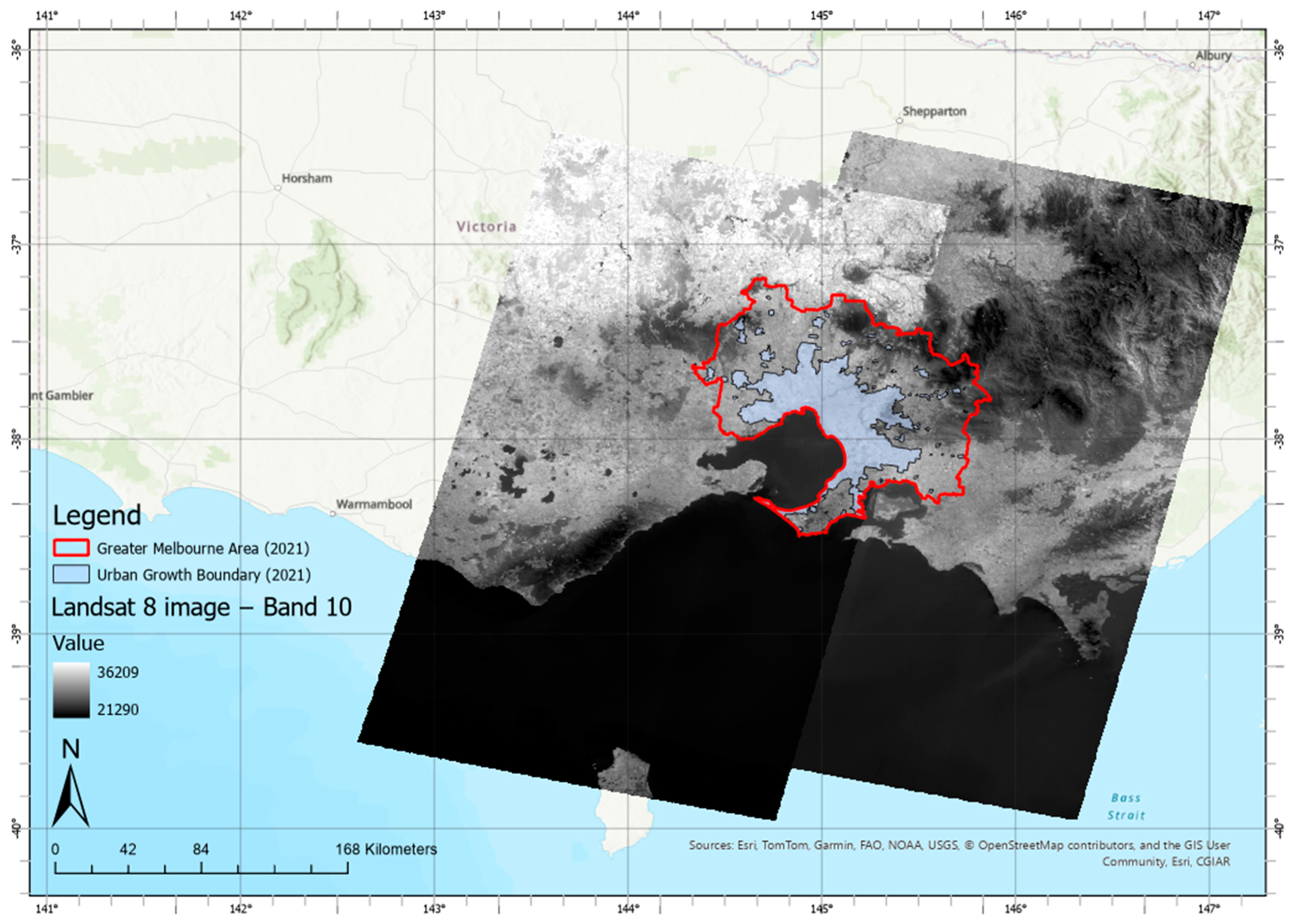
2.1. Study Area
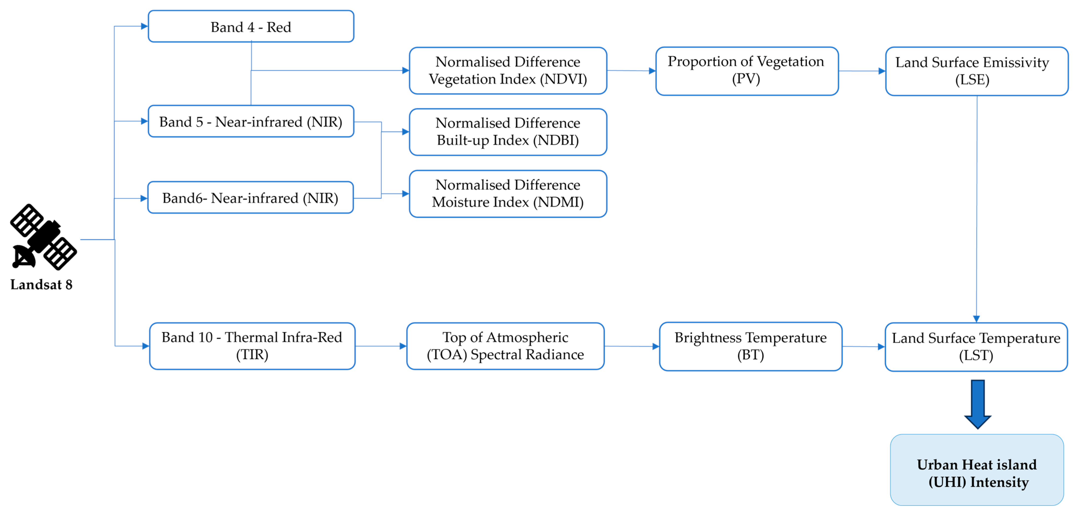
2.2. Using the Landsat 8 Satellite Image for Analysis
- Firstly, the satellite images were chosen between 1 January 2021 and 31 December 2021. Although there are more recent satellite images that can be obtained from the USGS, the correlation analysis also involves the use of the 2021 ABS Census and the DEWLP planning zone scheme 2021; hence, the satellite images from 2021 are considered more relevant to the other datasets.
- Secondly, the cloud cover conditions are limited to a maximum of 2% to avoid any excessive cloud that might block or reflect certain wavelengths, hence influencing the accuracy of the results [49].
- Thirdly, the satellite images need to have the orbit path and row that allow coverage over the selected study area of the Greater Melbourne region; therefore, only images with orbit paths between 92 and 93, and orbit rows between 86 and 87 can fulfil the requirements.
- Step 1: Conversion to Top-of-Atmospheric (TOA) Spectral Radiance.
- Step 2: Conversion to TOA spectral radiance to Brightness Temperature (BT)
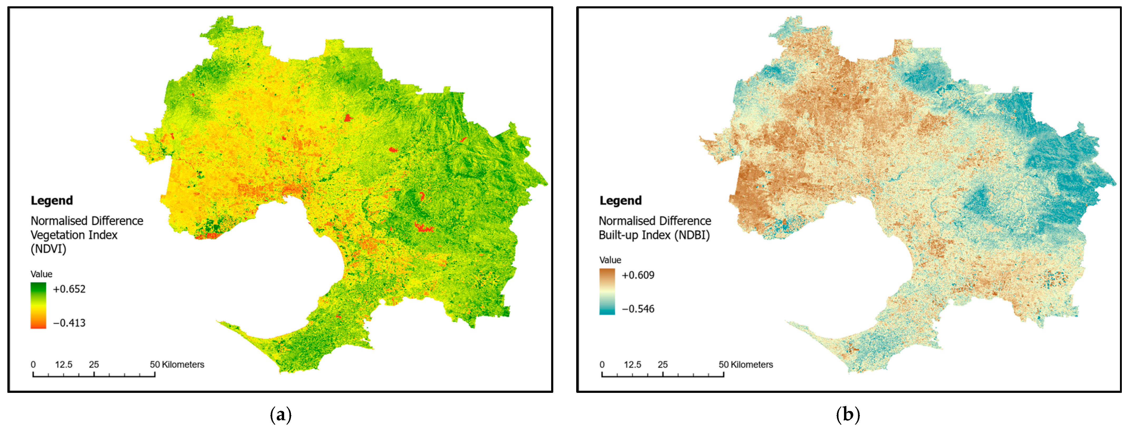
- Step 3: Normalised Difference Vegetation Index (NDVI)
- Step 4: Calculating the Proportion of Vegetation, PV
- Step 5: Calculating the Land Surface Emissivity (LSE)
- Step 6: Calculate the Land surface temperature (LST)
- Step 7: Calculate the UHI intensity
2.2.1. Normalised Difference Built-Up Index (NDBI)
2.2.2. Normalised Difference Moisture Index (NDMI)
2.3. Land Zone and Land Use Categories
2.4. Socio-Economic Factors That Contribute to Urban Heat
- Index of Relative Socio-economic Disadvantage (IRSD) focuses on the economic and social conditions of people and households within an area and measures only the relative disadvantage.
- Index of Relative Socio-economic Advantage and Disadvantage (IRSAD) is similar to the IRSD in that it focuses on the economic and social conditions of people and households within an area, but measures both the advantages and disadvantages.
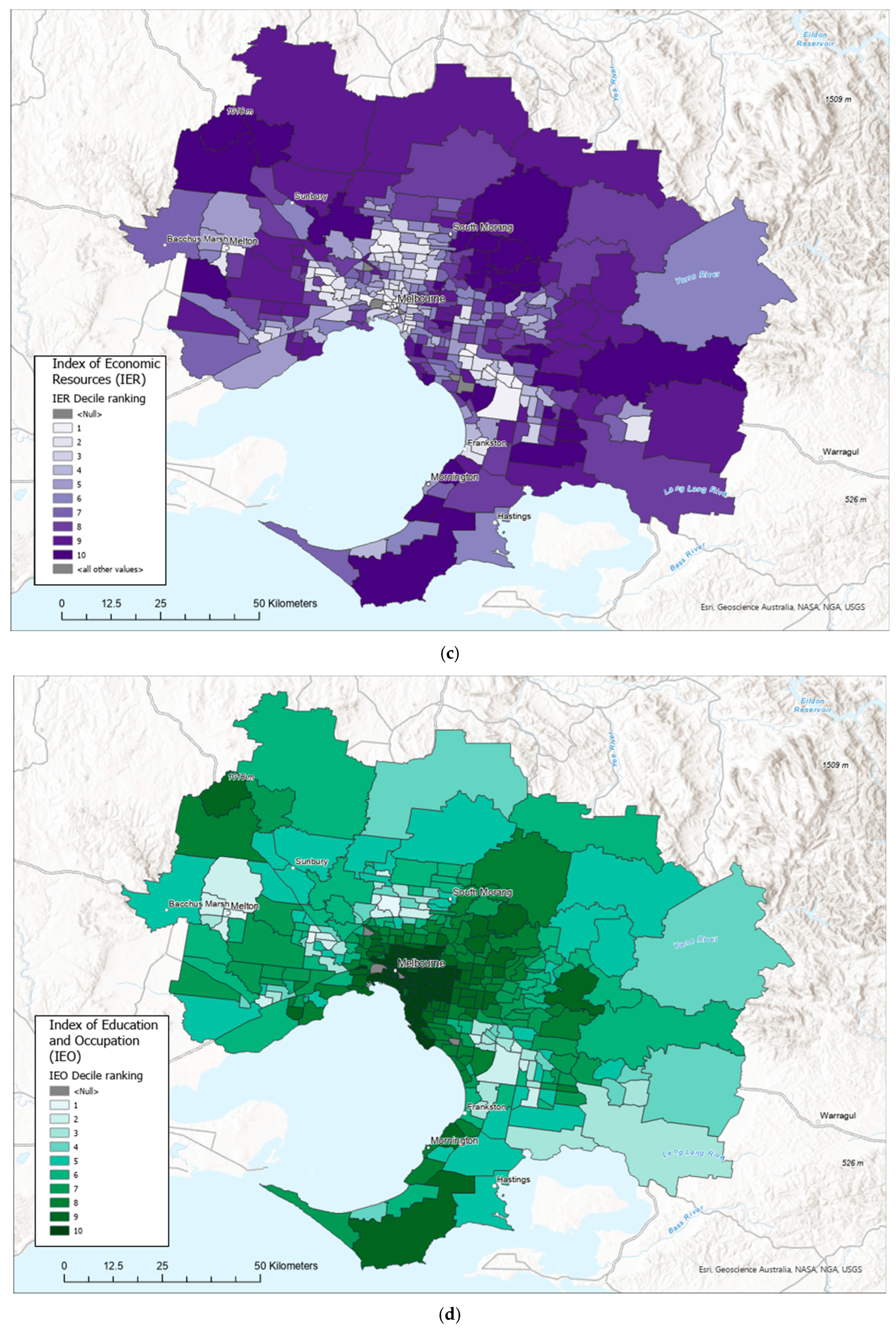
- Index of Economic Resources (IER) focuses on the financial aspects by summarising variables related to income and housing.
- Index of Education and Occupation (IEO) reflects the educational and occupational level of communities.
3. Results
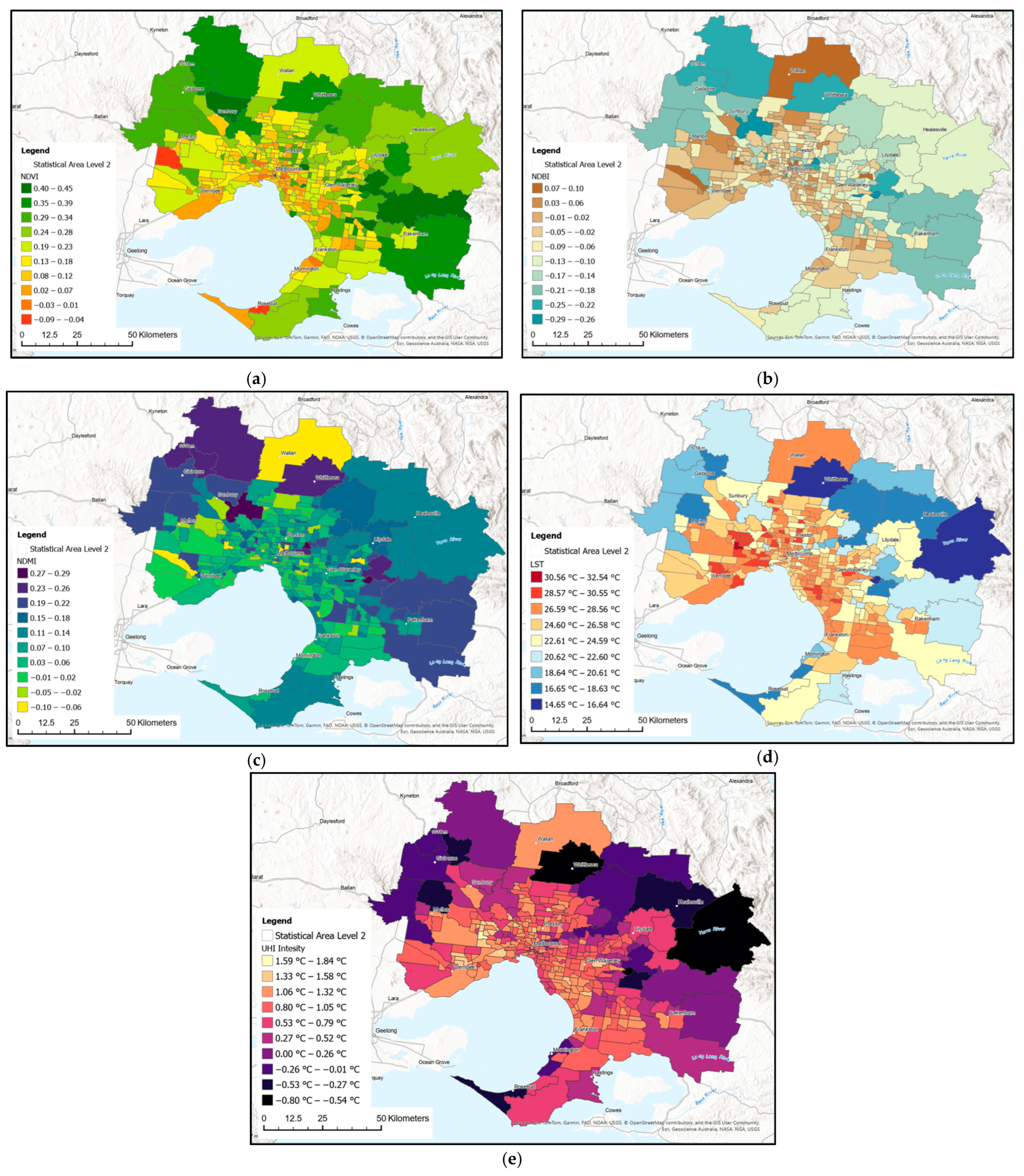
3.1. Digitalised Maps Integrated with Satellite Data in Statistical Area Level 2
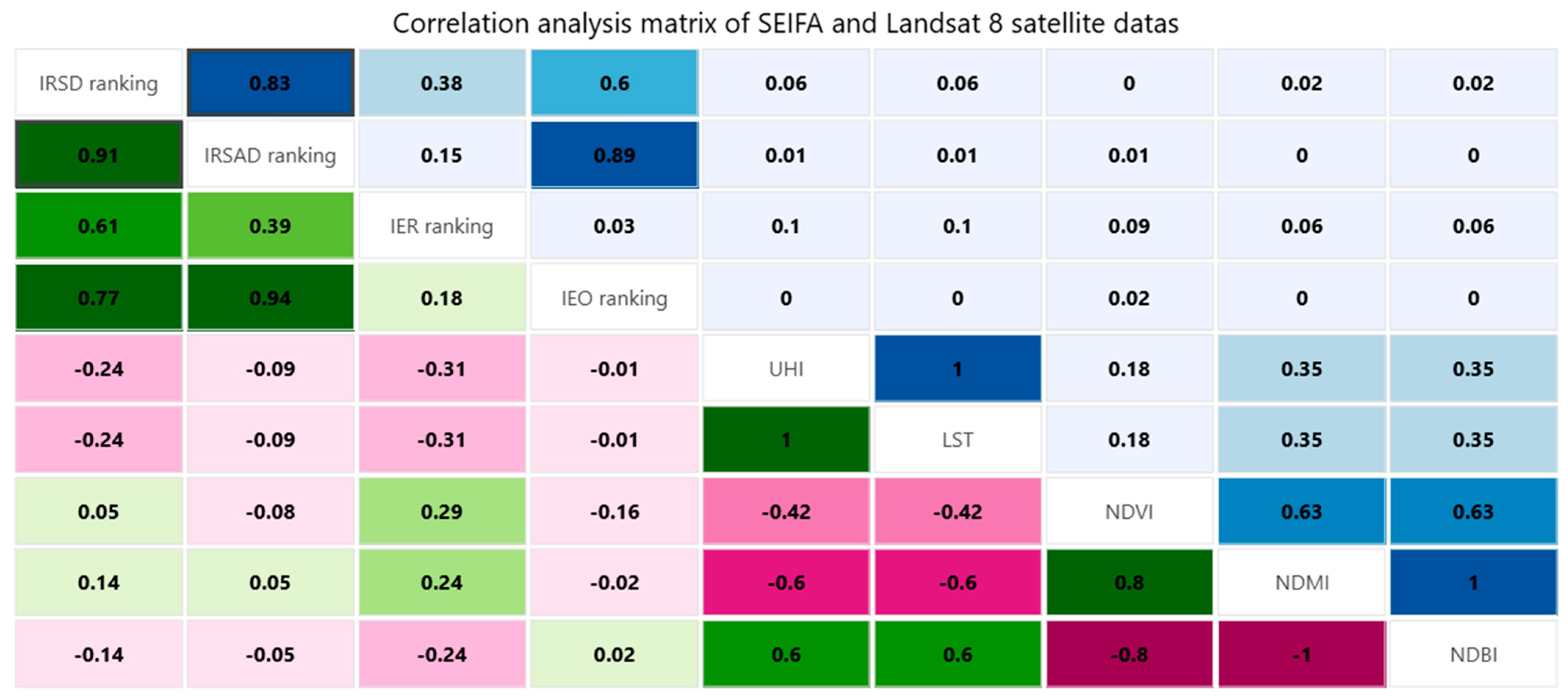
3.2. Correlation Analysis Between Landsat 8 Satellite Data and Socio-Economic Factors
4. Discussion
Limitations
- The availability of satellite images is limited to the date range starting from 2021/01/01 to 2021/12/31 to match with the dataset from the 2021 Census, with the condition of cloud cover range restricted to a maximum of 2%, which largely reduces the available Landsat 8 satellite images that cover the same path and row orbits. As the satellite orbit did not cover the entire study area on the same day, this study uses the geoprocessing tool in ArcGIS Pro to merge satellite images from two different dates into one single image.
- The UHI intensity used in this study is based on land surface temperatures only due to the lack of weather stations to provide sufficient localised data for air temperature across the region on this scale. Therefore, the UHI intensity value can only identify surface urban heat islands and is not able to provide atmospheric UHI calculated by the near-surface air temperature; hence, the result might not be able to emphasise the impact of microclimate characteristics, such as the wind velocity and relative humidity.
- Although satellites are hardly affected by the weather conditions on Earth directly, certain weather conditions would reduce the accuracy of the remote sensing instruments, particularly the cloud density, smoke, fog, and snow that can reflect, refract, or diffuse electromagnetic waves.
- The function of the original Department of Environment, Land, Water and Planning (DELWP) has differentiated into two different departments: The Department of Energy, Environment and Climate Action (DEECA) established in 2023, which focuses on the environment, energy, water, and climate actions aspect of Victoria state; and the Department of Transport and Planning, which focus on planning functions. These changes might affect the future policy makings that relate to the planning zone scheme used in this study.
- The correlation analysis conducted in this study used the default scatter plot matrix chart tool within the ArcGIS Pro software, which provides basic and quick correlation analysis based on simple linear regression models, but limited functions to adjust the formula for better interpretation of the dataset.
- This study focused on the NDVI to determine the vegetation coverage and plant health based on the Landsat 8 images, which did not provide enough information on different vegetation types, such as grassland, shrub, and tree canopies, that have different plant heights and evapotranspiration rates that impact the UHI effect. This study is focused on the macro-city-scale analysis, which limits the ability to track individual heat sources across the city, such as power plants and hospitals.
5. Conclusions and Recommendations
Author Contributions
Funding
Data Availability Statement
Acknowledgments
Conflicts of Interest
References
- Roser, M.; Rodés-Guirao, L. Future Population Growth. Our World in Data. 2013. Available online: https://ourworldindata.org/future-population-growth (accessed on 8 November 2022).
- Ritchie, H.; Roser, M. Urbanization. Our World in Data. 2018. Available online: https://ourworldindata.org/urbanization (accessed on 8 November 2022).
- Rydlewski, J.; Rajabi, Z.; Tariq, M.A.; Muttil, N.; Sidiqui, P.; Shah, A.A.; Khan, N.A.; Irshad, M.; Alam, A.; Butt, T.A.; et al. Identification of Embodied Environmental Attributes of Construction in Metropolitan and Growth Region of Melbourne, Australia to Support Urban Planning. Sustainability 2022, 14, 8401. [Google Scholar] [CrossRef]
- NHFIC Research. State of the Nation’s Housing 2022–2023. Sydney. 2020. Available online: https://www.housingaustralia.gov.au/sites/default/files/2023-03/state_of_the_nations_housing_report_2022-23.pdf (accessed on 16 July 2024).
- ABS. Capital City Growth the Highest on Record. Australia Bureau of Statistics. 2024. Available online: https://www.abs.gov.au/media-centre/media-releases/capital-city-growth-highest-record (accessed on 12 January 2025).
- Jim, C.Y.; Chen, S.S. Comprehensive greenspace planning based on landscape ecology principles in compact Nanjing city, China. Landsc. Urban Plan. 2003, 65, 95–116. [Google Scholar] [CrossRef]
- Ahmad, T.; Aibinu, A.; Thaheem, M.J. The Effects of High-rise Residential Construction on Sustainability of Housing Systems. Procedia Eng. 2017, 180, 1695–1704. [Google Scholar] [CrossRef]
- Stewart, I.D.; Oke, T.R. Local Climate Zones for Urban Temperature Studies. Bull. Am. Meteorol. Soc. 2012, 93, 1879–1900. [Google Scholar] [CrossRef]
- Yang, L.; Yan, H.; Lam, J.C. Thermal comfort and building energy consumption implications—A review. Appl. Energy 2014, 115, 164–173. [Google Scholar] [CrossRef]
- Luo, X.; Vahmani, P.; Hong, T.; Jones, A. City-Scale Building Anthropogenic Heating during Heat Waves. Atmosphere 2020, 11, 1206. [Google Scholar] [CrossRef]
- Convertino, F.; Vox, G.; Schettini, E. Evaluation of the cooling effect provided by a green façade as nature-based system for buildings. Build. Environ. 2021, 203, 108099. [Google Scholar] [CrossRef]
- Andric, I.; Kamal, A.; Al-Ghamdi, S.G. Efficiency of green roofs and green walls as climate change mitigation measures in extremely hot and dry climate: Case study of Qatar. Energy Rep. 2020, 6, 2476–2489. [Google Scholar] [CrossRef]
- Evola, G.; Costanzo, V.; Magrì, C.; Margani, G.; Marletta, L.; Naboni, E. A novel comprehensive workflow for modelling outdoor thermal comfort and energy demand in urban canyons: Results and critical issues. Energy Build. 2020, 216, 109946. [Google Scholar] [CrossRef]
- Pearsall, H. Staying cool in the compact city: Vacant land and urban heating in Philadelphia, Pennsylvania. Appl. Geogr. 2017, 79, 84–92. [Google Scholar] [CrossRef]
- Dandou, A.; Papangelis, G.; Kontos, Τ.; Santamouris, M.; Tombrou, M. On the cooling potential of urban heating mitigation technologies in a coastal temperate city. Landsc. Urban Plan. 2021, 212, 104106. [Google Scholar] [CrossRef]
- Obiefuna, J.N.; Okolie, C.J.; Nwilo, P.C.; Daramola, O.E.; Isiofia, L.C. Potential Influence of Urban Sprawl and Changing Land Surface Temperature on Outdoor Thermal Comfort in Lagos State, Nigeria. Quaest. Geogr. 2021, 40, 5–23. [Google Scholar] [CrossRef]
- Balany, F.; Ng, A.W.M.; Muttil, N.; Muthukumaran, S.; Wong, M.S. Green infrastructure as an urban heat island mitigation strategy—A review. Water 2020, 12, 3577. [Google Scholar] [CrossRef]
- Norouzi, M.; Chau, H.-W.; Jamei, E. Design and Site-Related Factors Impacting the Cooling Performance of Urban Parks in Different Climate Zones: A Systematic Review. Land 2024, 13, 2175. [Google Scholar] [CrossRef]
- Chen, Y.; Yue, W.; La Rosa, D. Which communities have better accessibility to green space? An investigation into environmental inequality using big data. Landsc. Urban Plan. 2020, 204, 103919. [Google Scholar] [CrossRef]
- Sarricolea, P.; Smith, P.; Romero-Aravena, H.; Serrano-Notivoli, R.; Fuentealba, M.; Meseguer-Ruiz, O. Socioeconomic inequalities and the surface heat island distribution in Santiago, Chile. Sci. Total Environ. 2022, 832, 155152. [Google Scholar] [CrossRef]
- Astell-Burt, T.; Feng, X.; Mavoa, S.; Badland, H.M.; Giles-Corti, B. Do low-income neighbourhoods have the least green space? A cross-sectional study of Australia’s most populous cities. BMC Public Health 2014, 14, 292. [Google Scholar] [CrossRef]
- Vidal, D.G.; Fernandes, C.O.; Viterbo, L.M.F.; Vilaça, H.; Barros, N.; Maia, R.L. Combining an evaluation grid application to assess ecosystem services of urban green spaces and a socioeconomic spatial analysis. Int. J. Sustain. Dev. World Ecol. 2021, 28, 291–302. [Google Scholar] [CrossRef]
- Cheshmehzangi, A.; Butters, C.; Xie, L.; Dawodu, A. Green infrastructures for urban sustainability: Issues, implications, and solutions for underdeveloped areas. Urban For. Urban Green. 2021, 59, 127028. [Google Scholar] [CrossRef]
- Saverino, K.C.; Routman, E.; Lookingbill, T.R.; Eanes, A.M.; Hoffman, J.S.; Bao, R. Thermal Inequity in Richmond, VA: The Effect of an Unjust Evolution of the Urban Landscape on Urban Heat Islands. Sustainability 2021, 13, 1511. [Google Scholar] [CrossRef]
- Lo, A.Y.; Jim, C.Y.; Cheung, P.K.; Wong, G.K.L.; Cheung, L.T.O. Space poverty driving heat stress vulnerability and the adaptive strategy of visiting urban parks. Cities 2022, 127, 103740. [Google Scholar] [CrossRef]
- Mushore, T.D.; Mutanga, O.; Odindi, J.; Dube, T. Determining extreme heat vulnerability of Harare Metropolitan City using multispectral remote sensing and socio-economic data. J. Spat. Sci. 2018, 63, 173–191. [Google Scholar] [CrossRef]
- Luo, M.; Wang, Z.; Ke, K.; Cao, B.; Zhai, Y.; Zhou, X. Human metabolic rate and thermal comfort in buildings: The problem and challenge. Build. Environ. 2018, 131, 44–52. [Google Scholar] [CrossRef]
- Jesdale, B.M.; Morello-Frosch, R.; Cushing, L. The Racial/Ethnic Distribution of Heat Risk–Related Land Cover in Relation to Residential Segregation. Environ. Health Perspect. 2013, 121, 811–817. [Google Scholar] [CrossRef] [PubMed]
- Mushangwe, S.; Astell-Burt, T.; Steel, D.; Feng, X. Ethnic inequalities in green space availability: Evidence from Australia. Urban For. Urban Green. 2021, 64, 127235. [Google Scholar] [CrossRef]
- Wai, C.Y.; Muttil, N.; Tariq, M.A.U.R.; Paresi, P.; Nnachi, R.C.; Ng, A.W.M. Investigating the Relationship between Human Activity and the Urban Heat Island Effect in Melbourne and Four Other International Cities Impacted by COVID-19. Sustainability 2022, 14, 378. [Google Scholar] [CrossRef]
- Kim, S.W.; Brown, R.D. Urban heat island (UHI) intensity and magnitude estimations: A systematic literature review. Sci. Total Environ. 2021, 779, 146389. [Google Scholar] [CrossRef]
- Wai, C.Y.; Tariq, M.A.U.R.; Muttil, N. A Systematic Review on the Existing Research, Practices, and Prospects Regarding Urban Green Infrastructure for Thermal Comfort in a High-Density Urban Context. Water 2022, 14, 2496. [Google Scholar] [CrossRef]
- Macarof, P.; Florian, S. Comparasion of NDBI and NDVI as Indicators of Surface Urban Heat Island Effect in Landsat 8 Imagery: A Case Study of Iasi. Present Environ. Sustain. Dev. 2017, 11, 141–150. [Google Scholar] [CrossRef]
- Florim, I.; Albert, B.; Shpejtim, B. Measuring UHI using Landsat 8 OLI and TIRS data with NDVI and NDBI in Municipality of Prishtina. Disaster Adv. 2021, 14, 25–36. [Google Scholar] [CrossRef]
- Sresto, M.A.; Morshed, M.M.; Siddika, S.; Almohamad, H.; Al-Mutiry, M.; Abdo, H.G. Impact of COVID-19 Lockdown on Vegetation Indices and Heat Island Effect: A Remote Sensing Study of Dhaka City, Bangladesh. Sustainability 2022, 14, 7922. [Google Scholar] [CrossRef]
- Landsat Missions Normalized Difference Moisture Index. USGS. 2025. Available online: https://www.usgs.gov/landsat-missions/normalized-difference-moisture-index (accessed on 1 April 2025).
- Nakata-Osaki, C.M.; Souza, L.C.L.; Rodrigues, D.S. THIS—Tool for Heat Island Simulation: A GIS extension model to calculate urban heat island intensity based on urban geometry. Comput. Environ. Urban Syst. 2018, 67, 157–168. [Google Scholar] [CrossRef]
- Gallacher, C.; Benz, S.; Boehnke, D.; Jehling, M. A collaborative approach for the identification of thermal hot-spots: From remote sensing data to urban planning interventions. Agil. GISci. Ser. 2024, 5, 23. [Google Scholar] [CrossRef]
- Sun, Y.; Li, Y.; Ma, R.; Gao, C.; Wu, Y. Mapping urban socio-economic vulnerability related to heat risk: A grid-based assessment framework by combing the geospatial big data. Urban Clim. 2022, 43, 101169. [Google Scholar] [CrossRef]
- Viju, T.; Nambiar, A.; Firoz, C.M. Chapter 8—Sustainable land management strategies, drivers of LULC change and degradation: An assessment of Malappuram Metropolitan region, Kerala, India. In Science of Sustainable Systems; Chatterjee, U., Pradhan, B., Kumar, S., Saha, S., Zakwan, M., Fath, B.D., Fiscus, D., Eds.; Water, Land, and Forest Susceptibility and Sustainability; Academic Press: Cambridge, MA, USA, 2023; Volume 2, pp. 191–214. [Google Scholar]
- Imtiaz, F.; Farooque, A.A.; Randhawa, G.S.; Wang, X.; Esau, T.J.; Acharya, B.; Hashemi Garmdareh, S.E. An inclusive approach to crop soil moisture estimation: Leveraging satellite thermal infrared bands and vegetation indices on Google Earth engine. Agric. Water Manag. 2024, 306, 109172. [Google Scholar] [CrossRef]
- Sidiqui, P.; Tariq, M.A.; Ng, A.W.M. An Investigation to Identify the Effectiveness of Socioeconomic, Demographic, and Buildings’ Characteristics on Surface Urban Heat Island Patterns. Sustainability 2022, 14, 2777. [Google Scholar] [CrossRef]
- Sun, C.; Hurley, J.; Amati, M.; Arundel, J.; Saunders, A.; Boruff, B.; Caccetta, P. Urban Vegetation, Urban Heat Islands and Heat Vulnerability Assessment in Melbourne. 2018. Available online: https://www.planning.vic.gov.au/__data/assets/pdf_file/0032/655826/UHI-and-HVI2018_Report_v1.pdf (accessed on 30 October 2024).
- Sharifi, F.; Nygaard, A.; Stone, W.M.; Levin, I. Accessing green space in Melbourne: Measuring inequity and household mobility. Landsc. Urban Plan. 2021, 207, 104004. [Google Scholar] [CrossRef]
- ABS Regional Population: Statistics About the Population and Components of Change (Births, Deaths, Migration) for Australia’s Capital Cities and Regions. Australia Bureau of Statistics. 2024. Available online: https://www.abs.gov.au/statistics/people/population/regional-population/2022-23 (accessed on 12 January 2025).
- USGS. EarthExplorer. 2024. Available online: https://earthexplorer.usgs.gov/ (accessed on 3 January 2024).
- Arnfield, A.J. Köppen Climate Classification. Encyclopedia Britannica. 11 November 2020. Available online: https://www.britannica.com/science/Koppen-climate-classification (accessed on 11 April 2021).
- NASA. LANDSAT 8. National Aeronautics and Space Administration. 2024. Available online: https://landsat.gsfc.nasa.gov/satellites/landsat-8/ (accessed on 13 May 2024).
- Shukla, G.; Tiwari, P.; Dugesar, V.; Srivastava, P.K. Chapter 9—Estimation of evapotranspiration using surface energy balance system and satellite datasets. In Agricultural Water Management; Srivastava, P.K., Gupta, M., Tsakiris, G., Quinn, N.W., Eds.; Academic Press: Cambridge, MA, USA, 2021; pp. 157–183. [Google Scholar]
- USGS. Landsat 8 Data Users Handbook 2019; Landsat Project Science Office: Sioux Falls, SD, USA, 2019; Available online: https://d9-wret.s3.us-west-2.amazonaws.com/assets/palladium/production/s3fs-public/atoms/files/LSDS-1574_L8_Data_Users_Handbook-v5.0.pdf (accessed on 10 March 2024).
- Avdan, U.; Jovanovska, G. Algorithm for Automated Mapping of Land Surface Temperature Using LANDSAT 8 Satellite Data. J. Sens. 2016, 2016, 1480307. [Google Scholar] [CrossRef]
- Gao, B. NDWI—A normalized difference water index for remote sensing of vegetation liquid water from space. Remote Sens. Environ. 1996, 58, 257–266. [Google Scholar] [CrossRef]
- Australian Bureau of Statistics. Socio-Economic Indexes for Areas (SEIFA), Australia. ABS. 2023. Available online: https://www.abs.gov.au/statistics/people/people-and-communities/socio-economic-indexes-areas-seifa-australia/latest-release (accessed on 1 May 2024).
- ABS. Socio-Economic Indexes for Areas (SEIFA), Australia Methodology. Australia Bureau of Statistics. 2023. Available online: https://www.abs.gov.au/methodologies/socio-economic-indexes-areas-seifa-australia-methodology/2021 (accessed on 13 April 2025).
- Profillidis, V.A.; Botzoris, G.N. Chapter 5—Statistical Methods for Transport Demand Modeling. In Modeling of Transport Demand: Analyzing, Calculating, and Forecasting Transport Demand; Profillidis, V.A., Botzoris, G.N., Eds.; Elsevier: Amsterdam, The Netherlands, 2019; pp. 163–224. [Google Scholar]
- Basyouni, Y.A.; Mahmoud, H. Affordable green materials for developed cool roof applications: A review. Renew. Sustain. Energy Rev. 2024, 202, 114722. [Google Scholar] [CrossRef]
- Wai, C.Y.; Chau, H.-W.; Paresi, P.; Muttil, N. Experimental Analysis of Cool Roof Coatings as an Urban Heat Mitigation Strategy to Enhance Thermal Performance. Buildings 2025, 15, 685. [Google Scholar] [CrossRef]


| Sensor | Band No. | Band Name | Wavelength Range (μm) | Resolution (m) |
|---|---|---|---|---|
| OLI | 1 | Coastal | 0.43–0.45 | 30 |
| OLI | 2 | Blue | 0.45–0.61 | 30 |
| OLI | 3 | Green | 0.53–0.59 | 30 |
| OLI | 4 | Red | 0.63–0.67 | 30 |
| OLI | 5 | NIR | 0.85–0.88 | 30 |
| OLI | 6 | SWIR 1 | 1.57–1.65 | 30 |
| OLI | 7 | SWIR 2 | 2.11–2.29 | 30 |
| OLI | 8 | Panchromatic | 0.50–0.68 | 15 |
| OLI | 9 | Cirrus | 1.36–1.38 | 30 |
| TIRS | 10 | TIRS 1 | 10.60–11.19 | 100 |
| TIRS | 11 | TIRS 2 | 11.50–12.51 | 100 |
| Location (Climate Zone) | Landsat Product ID | Path | Row | Data Acquired | Land Cloud Cover |
|---|---|---|---|---|---|
| Melbourne (Cfb) | LC08_L1TP_093087_20210108_20210307_02_T1 | 093 | 087 | 2021/01/08 | 0.21% |
| LC08_L1TP_093086_20210108_20210307_02_T1 | 093 | 086 | 2021/01/08 | 0.05% | |
| LC08_L1TP_092087_20210218_20210302_02_T1 | 092 | 087 | 2021/02/18 | 0.13% | |
| LC08_L1TP_092086_20210218_20210302_02_T1 | 092 | 086 | 2021/02/18 | 0.35% |
| # | SA2 Zones 1 | IRSD Ranking | IRSAD Ranking | IER Ranking | IEO Ranking | Average Ranking 2 | UHI (°C) | LST (°C) |
|---|---|---|---|---|---|---|---|---|
| 1 | Deer Park | 1 | 2 | 3 | 3 | 2.25 | 1.84 | 32.54 |
| 2 | Hoppers Crossing—North | 3 | 4 | 5 | 4 | 4 | 1.50 | 30.18 |
| 3 | Hoppers Crossing—South | 2 | 3 | 3 | 3 | 2.75 | 1.46 | 29.92 |
| 4 | Coburg—East | 6 | 8 | 4 | 9 | 6.75 | 1.45 | 29.90 |
| 5 | Altona North | 3 | 5 | 3 | 6 | 4.25 | 1.45 | 29.86 |
| 6 | Delahey | 1 | 2 | 3 | 2 | 2 | 1.43 | 29.77 |
| 7 | Melbourne CBD—North | 3 | 8 | 1 | 10 | 5.5 | 1.43 | 29.71 |
| 8 | Lalor—East | 1 | 2 | 2 | 2 | 1.75 | 1.42 | 29.64 |
| 9 | Tullamarine | 3 | 4 | 3 | 4 | 3.5 | 1.41 | 29.58 |
| 10 | Burnside Heights | 5 | 6 | 9 | 6 | 6.5 | 1.39 | 29.43 |
| 11 | Tarneit—Central | 6 | 6 | 8 | 7 | 6.75 | 1.37 | 29.34 |
| 12 | Keysborough—North | 2 | 2 | 4 | 3 | 2.75 | 1.36 | 29.29 |
| 13 | Cairnlea | 3 | 4 | 8 | 5 | 5 | 1.36 | 29.28 |
| 14 | Kings Park (Vic.) | 1 | 1 | 2 | 1 | 1.25 | 1.36 | 29.25 |
| 15 | Keilor Downs | 3 | 4 | 5 | 4 | 4 | 1.35 | 29.22 |
| 16 | Clarinda—Oakleigh South | 4 | 5 | 6 | 6 | 5.25 | 1.35 | 29.17 |
| 17 | Wantirna South | 7 | 8 | 8 | 7 | 7.5 | 1.34 | 29.11 |
| 18 | Derrimut | 4 | 5 | 8 | 6 | 5.75 | 1.33 | 29.06 |
| 19 | Seddon—Kingsville | 8 | 9 | 6 | 10 | 8.25 | 1.33 | 29.05 |
| 20 | St Albans—South | 1 | 1 | 1 | 2 | 1.25 | 1.32 | 29.01 |
| Total Average | 3.35 | 4.45 | 4.60 | 5.00 | 4.35 |
| # | SA2 Zones 1 | IRSD Ranking | IRSAD Ranking | IER Ranking | IEO Ranking | Average Ranking 2 | UHI (°C) | LST (°C) |
|---|---|---|---|---|---|---|---|---|
| 1 | Yarra Valley | 5 | 4 | 6 | 4 | 4.75 | −0.80 | 14.65 |
| 2 | Upwey—Tecoma | 9 | 8 | 9 | 8 | 8.5 | −0.65 | 15.66 |
| 3 | Whittlesea | 6 | 6 | 8 | 5 | 6.25 | −0.57 | 16.19 |
| 4 | Rosebud—McCrae | 4 | 3 | 4 | 4 | 3.75 | −0.49 | 16.77 |
| 5 | Point Nepean | 7 | 6 | 7 | 7 | 6.75 | −0.48 | 16.83 |
| 6 | Healesville—Yarra Glen | 6 | 5 | 8 | 5 | 6 | −0.36 | 17.64 |
| 7 | Belgrave—Selby | 9 | 8 | 9 | 8 | 8.5 | −0.34 | 17.80 |
| 8 | Riddells Creek | 9 | 8 | 10 | 7 | 8.5 | −0.29 | 18.11 |
| 9 | Kurunjang—Toolern Vale | 3 | 2 | 5 | 2 | 3 | −0.28 | 18.14 |
| 10 | Mount Martha | 9 | 8 | 10 | 8 | 8.75 | −0.24 | 18.44 |
| 11 | Panton Hill—St Andrews | 10 | 9 | 10 | 8 | 9.25 | −0.24 | 18.45 |
| 12 | Warrandyte—Wonga Park | 10 | 9 | 10 | 8 | 9.25 | −0.22 | 18.60 |
| 13 | Mount Dandenong—Olinda | 9 | 9 | 9 | 9 | 9 | −0.19 | 18.75 |
| 14 | Kew East | 10 | 10 | 9 | 10 | 9.75 | −0.16 | 18.97 |
| 15 | Macedon | 10 | 9 | 10 | 9 | 9.5 | −0.14 | 19.08 |
| 16 | Gisborne | 9 | 8 | 10 | 8 | 8.75 | −0.14 | 19.14 |
| 17 | Bacchus Marsh | 5 | 5 | 7 | 5 | 5.5 | −0.12 | 19.23 |
| 18 | Kinglake | 7 | 6 | 9 | 6 | 7 | −0.11 | 19.35 |
| 19 | Templestowe | 9 | 9 | 10 | 9 | 9.25 | −0.05 | 19.70 |
| 20 | Mount Eliza | 10 | 10 | 10 | 9 | 9.75 | −0.05 | 19.75 |
| Total Average | 7.8 | 7.1 | 8.5 | 6.95 | 7.59 |
Disclaimer/Publisher’s Note: The statements, opinions and data contained in all publications are solely those of the individual author(s) and contributor(s) and not of MDPI and/or the editor(s). MDPI and/or the editor(s) disclaim responsibility for any injury to people or property resulting from any ideas, methods, instructions or products referred to in the content. |
© 2025 by the authors. Licensee MDPI, Basel, Switzerland. This article is an open access article distributed under the terms and conditions of the Creative Commons Attribution (CC BY) license (https://creativecommons.org/licenses/by/4.0/).
Share and Cite
Wai, C.Y.; Tariq, M.A.U.R.; Muttil, N.; Chau, H.-W. Assessing Socio-Economic Vulnerabilities to Urban Heat: Correlations with Land Use and Urban Morphology in Melbourne, Australia. Land 2025, 14, 958. https://doi.org/10.3390/land14050958
Wai CY, Tariq MAUR, Muttil N, Chau H-W. Assessing Socio-Economic Vulnerabilities to Urban Heat: Correlations with Land Use and Urban Morphology in Melbourne, Australia. Land. 2025; 14(5):958. https://doi.org/10.3390/land14050958
Chicago/Turabian StyleWai, Cheuk Yin, Muhammad Atiq Ur Rehman Tariq, Nitin Muttil, and Hing-Wah Chau. 2025. "Assessing Socio-Economic Vulnerabilities to Urban Heat: Correlations with Land Use and Urban Morphology in Melbourne, Australia" Land 14, no. 5: 958. https://doi.org/10.3390/land14050958
APA StyleWai, C. Y., Tariq, M. A. U. R., Muttil, N., & Chau, H.-W. (2025). Assessing Socio-Economic Vulnerabilities to Urban Heat: Correlations with Land Use and Urban Morphology in Melbourne, Australia. Land, 14(5), 958. https://doi.org/10.3390/land14050958