Figure 1.
Timeline of geoinformation demand for risk analysis, response, and recovery after a natural disaster. Sketch courtesy CEOS.
Figure 1.
Timeline of geoinformation demand for risk analysis, response, and recovery after a natural disaster. Sketch courtesy CEOS.
Figure 2.
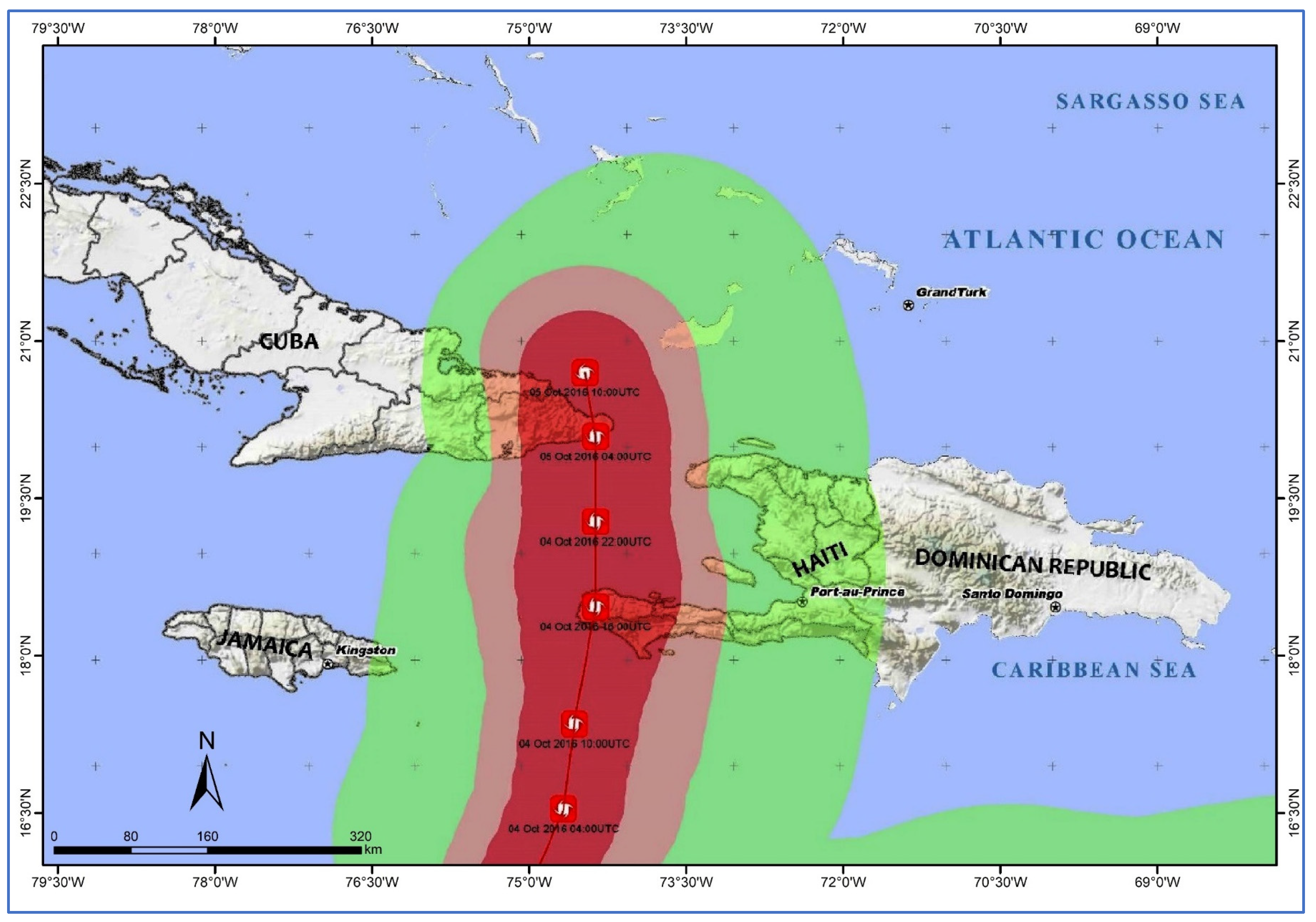
Trajectory of Hurricane Matthew across Haiti between 4 and 5 October 2016. In red is the area where it hit with the strongest sustained winds of over 120 km/h, while in green are the areas affected by winds of approximately 60 km/h (data source: [
5]).
Figure 2.
Trajectory of Hurricane Matthew across Haiti between 4 and 5 October 2016. In red is the area where it hit with the strongest sustained winds of over 120 km/h, while in green are the areas affected by winds of approximately 60 km/h (data source: [
5]).
Figure 3.
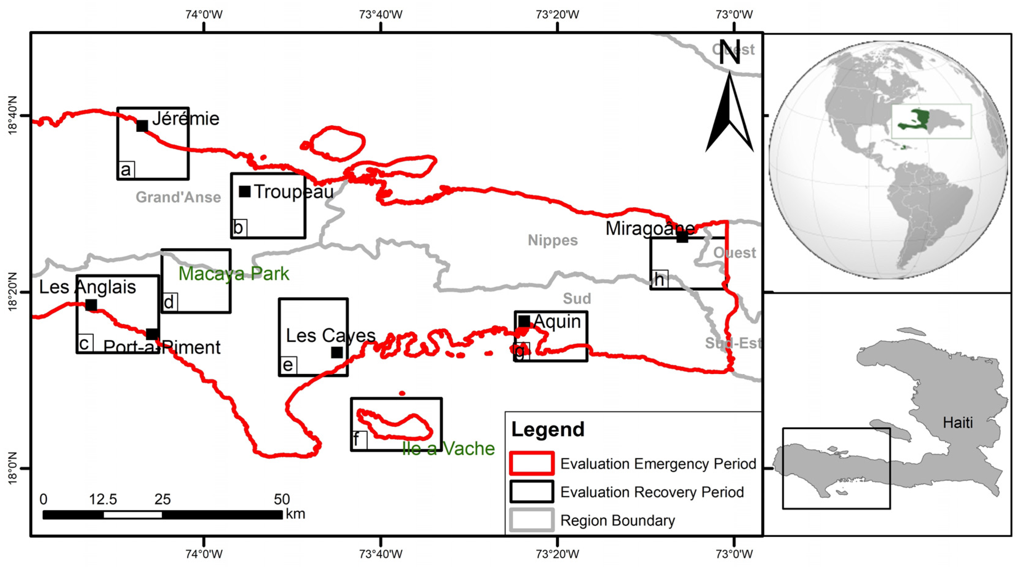
Location of the study area in south-western Haiti: in red is the area analysed prior, during and soon after Hurricane Matthew (2016); in black are the eight sectors analysed during the recovery and reconstruction period (2017–2020), i.e., (a) the city of Jérémie, capital of the Grand’Anse department; (b) the rural area of Troupeau; (c) the city of Port-à-Piment; (d) the Macaya National Park; (e) the city of Les Cayes, capital of the Sud department; (f) the conservation forest and mangrove areas of Ile-à-Vache; (g) the city of Aquin; and (h) the flood zones of the Miragoane lagoon.
Figure 4.
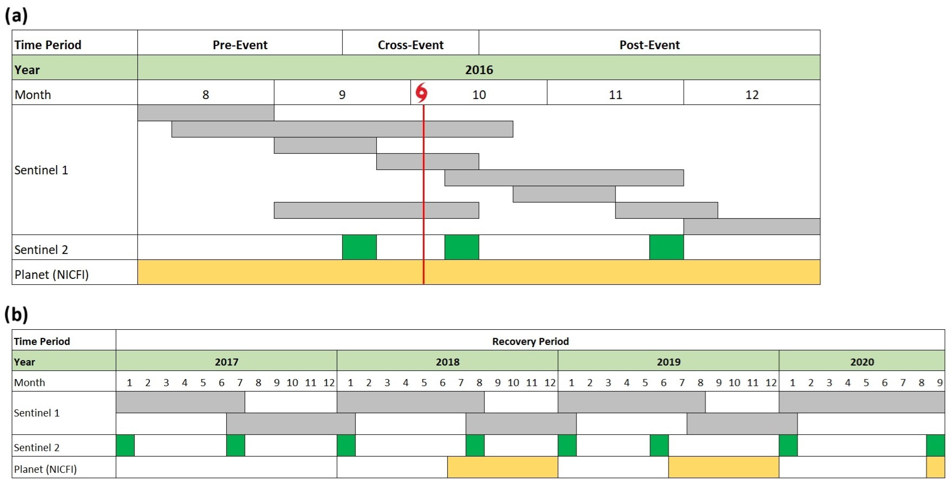
Timeline of satellite data used for the case study of Hurricane Matthew: (a) data for pre-event, cross-event and post-event analysis; the red line indicates the date on which the hurricane hit the island; (b) data for the analysis of the recovery period. Grey bars indicate the whole time interval covered by each Sentinel-1 image pair used for change detection. Green narrow bars indicate the precise period for which cloud-free Sentinel-2 images provide a snapshot of the situation on the ground. Yellow bars indicate the periods for which NICFI Planet data were made available.
Figure 5.
Study area of the 2023 June flooding event. (a) Spatial extent and location of the scene from the Sentinel-1 SAR image used for change detection. (b) Zoomed view of the areas of Leogane south of Port-au-Prince and Desdunes to the north that were affected by the floods and analysed.
Figure 5.
Study area of the 2023 June flooding event. (a) Spatial extent and location of the scene from the Sentinel-1 SAR image used for change detection. (b) Zoomed view of the areas of Leogane south of Port-au-Prince and Desdunes to the north that were affected by the floods and analysed.
Figure 6.
Example of amplitude change map as a raster output of Sentinel-1 cloud-based systematic processing with initial data before extraction of valid data. Colour scale notation: blue indicates decreased SAR amplitude, red increased SAR amplitude.
Figure 6.
Example of amplitude change map as a raster output of Sentinel-1 cloud-based systematic processing with initial data before extraction of valid data. Colour scale notation: blue indicates decreased SAR amplitude, red increased SAR amplitude.
Figure 7.
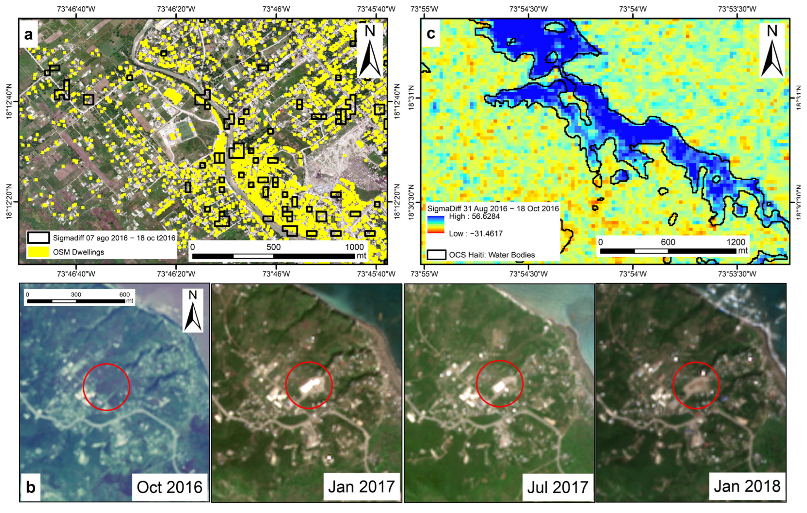
Examples of (a) geospatial intersection between SAR amplitude change pixels extracted by thresholding of Sentinel-1 change maps (black polygons) and the OSM dwellings (yellow polygons) in Les Cayes; (b) temporary humanitarian aid camp (highlighted by the red circle), south of Jérémie, from October 2016 to January 2018, detected in the Sentinel-2 optical sensor and matching with Sentinel-1 SAR amplitude change pixels suggesting backscatter increase; and (c) selection of the amplitude changes in Troupeau according to the threshold set with the water bodies layer (black) provided by the OCS_Haiti_2017 land cover dataset.
Figure 8.
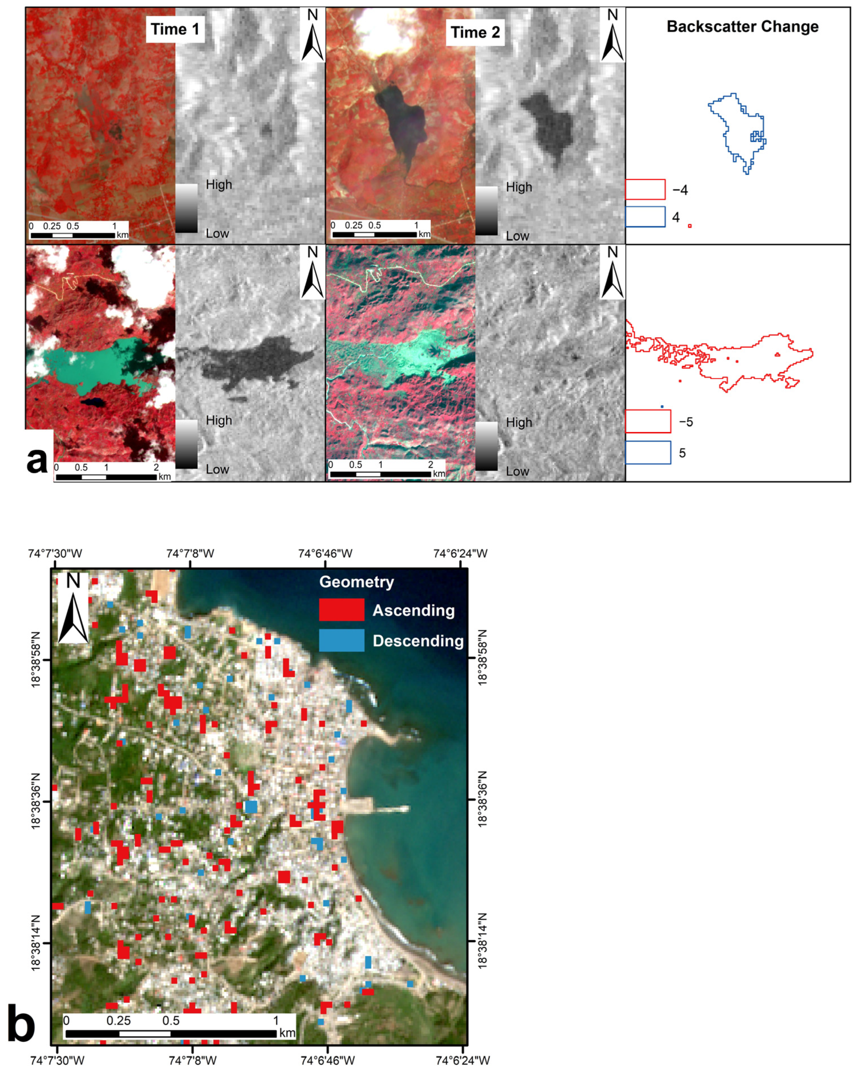
(a) Example of multi-temporal reconstruction of hurricane-induced flooding and subsequent water recession by integration of Sentinel-1 amplitude change detection and verification with Sentinel-2 false-coloured infrared (R: Band 8—NIR; G: Band 4—red; B: Band 3—green) composites. In the top row images, the value is higher at time 1, thus giving a positive backscatter change result, while, in the bottom row images, the value is higher at time 2, giving a negative backscatter change result. (b) Example of map of building changes during the second half of the recovery period in 2017 in Jérémie captured by combining ascending and descending Sentinel-1 image pairs.
Figure 9.
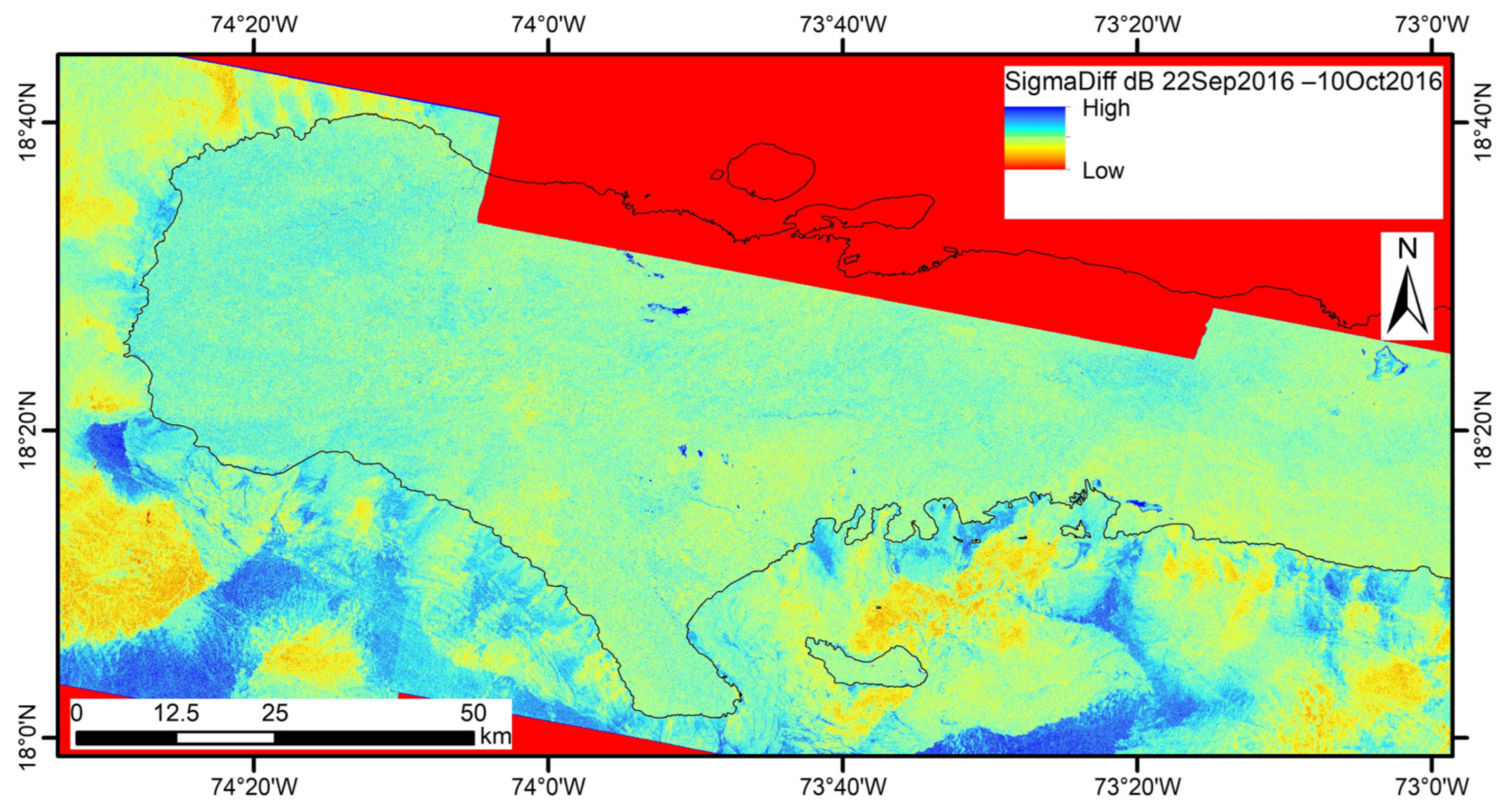
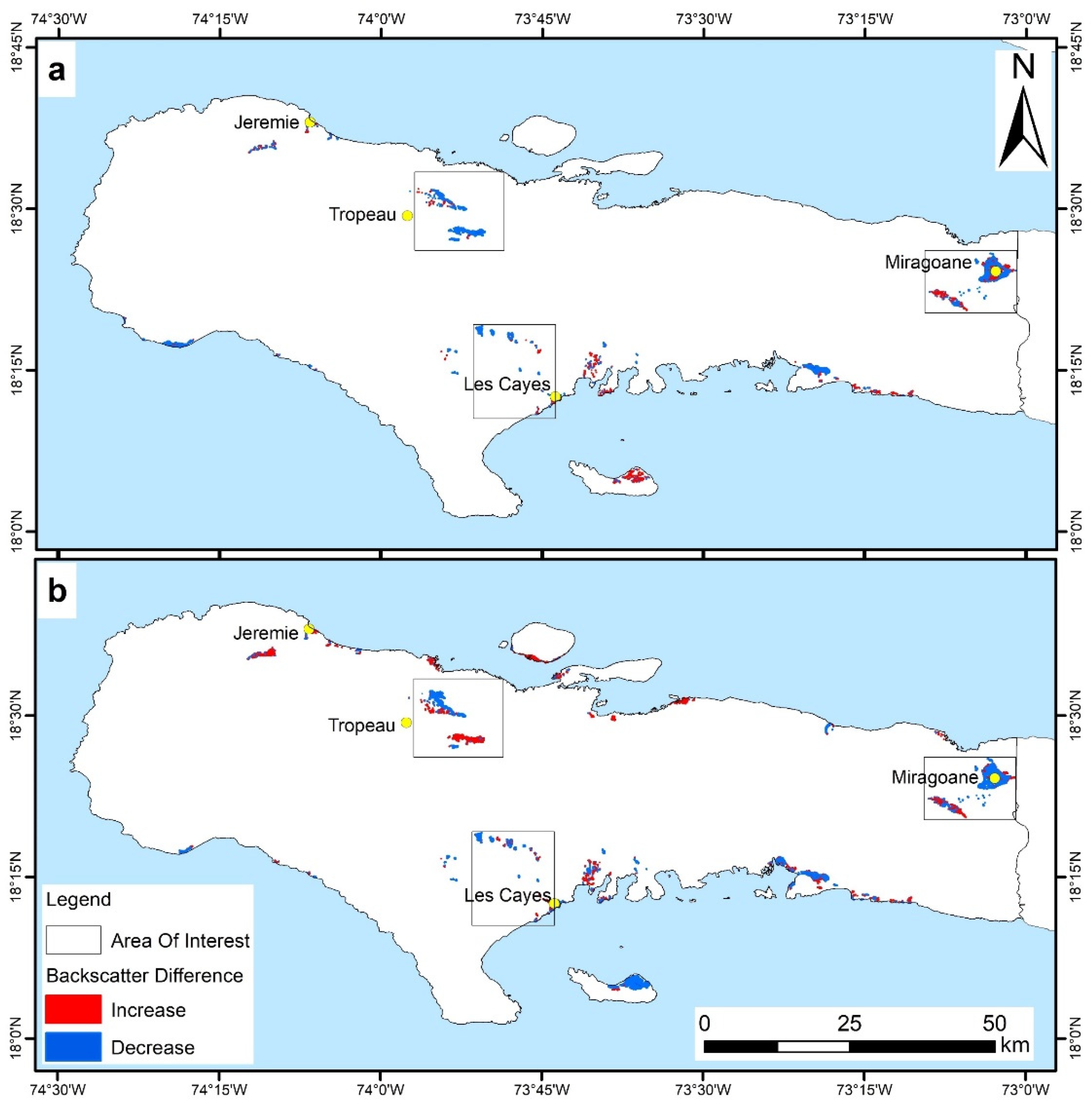
Multi-temporal thematic maps of flooded areas (backscatter decrease; blue colour) and areas not flooded or where backscatter increased due to water recession (red colour) for the cross-event Sentinel-1 image pairs collected along (a) descending (22 September–10 October 2016) and (b) ascending (24 September–18 October 2016) orbits.
Figure 10.
Changes along river lowlands, mouths and sediment plumes south of Jérémie, visible by comparison of Sentinel-2 images collected (a) before and (b) 5 days after the hurricane passed.
Figure 10.
Changes along river lowlands, mouths and sediment plumes south of Jérémie, visible by comparison of Sentinel-2 images collected (a) before and (b) 5 days after the hurricane passed.
Figure 11.
Zoomed view of the multi-temporal thematic maps of flooded areas (compared with
Figure 9) showing the spatio-temporal evolution of (
a,
d,
g) Troupeau, (
b,
e,
h) Miragoane and (
c,
f,
i) Les Cayes, before and after the hurricane and up to the end of 2016.
Figure 11.
Zoomed view of the multi-temporal thematic maps of flooded areas (compared with
Figure 9) showing the spatio-temporal evolution of (
a,
d,
g) Troupeau, (
b,
e,
h) Miragoane and (
c,
f,
i) Les Cayes, before and after the hurricane and up to the end of 2016.
Figure 12.
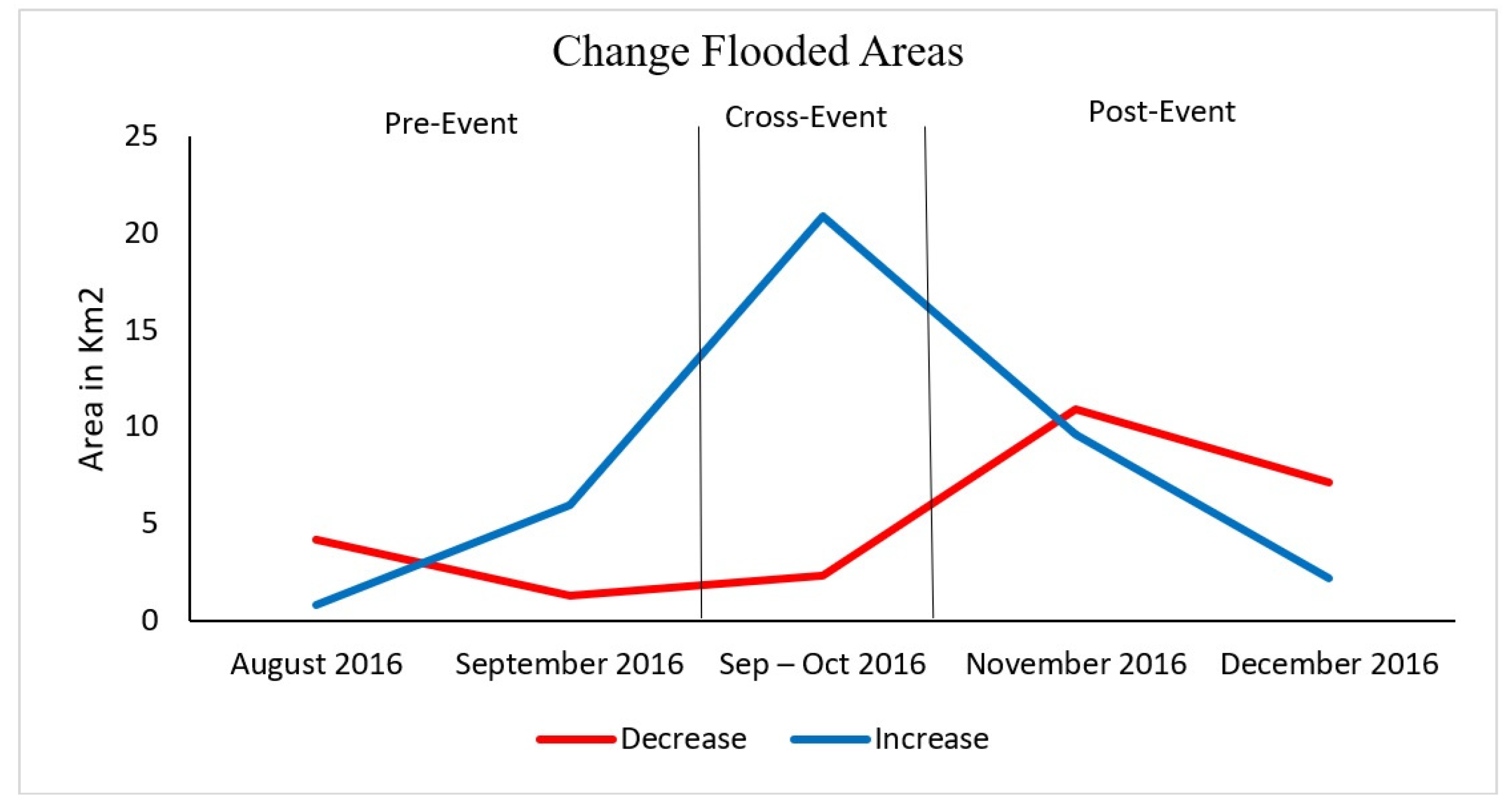
Evolution of changes in flooded areas (increase) and drained areas (decrease), after the passage of Hurricane Matthew during the different phases of the 2016 event analysis.
Figure 12.
Evolution of changes in flooded areas (increase) and drained areas (decrease), after the passage of Hurricane Matthew during the different phases of the 2016 event analysis.
Figure 13.
Multi-temporal thematic maps of changes due to hurricane impacts on buildings and urban settlement in (a) Jérémie and (b) Les Cayes during the pre-event and cross-event.
Figure 13.
Multi-temporal thematic maps of changes due to hurricane impacts on buildings and urban settlement in (a) Jérémie and (b) Les Cayes during the pre-event and cross-event.
Figure 14.
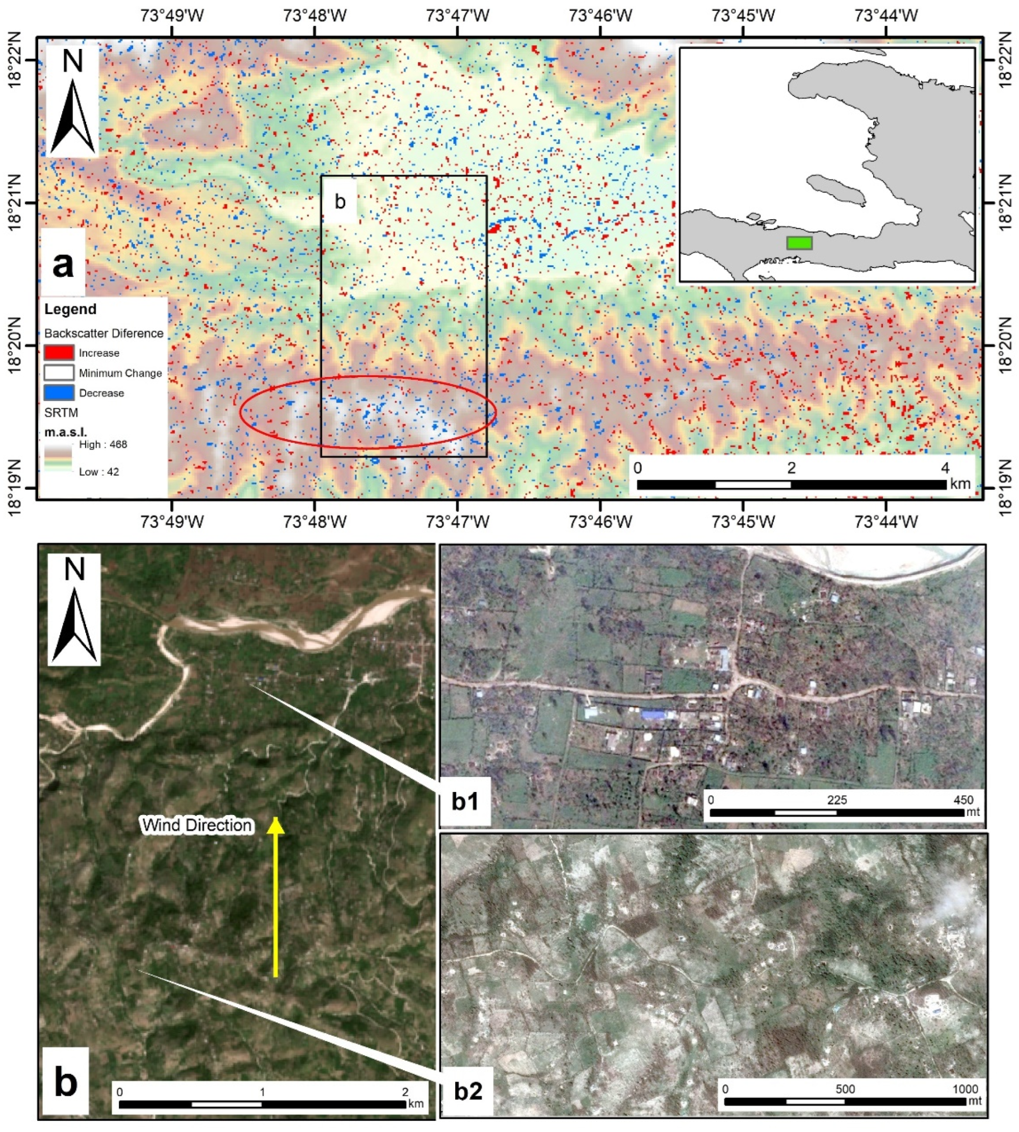
(a) Multi-temporal thematic map of changes due to hurricane impacts on the central mountainous range of Haiti, north of the agricultural district of Les Cayes, superimposed onto the Shuttle Radar Topography Mission (SRTM) Digital Elevation (DEM). (b) Zoomed view on an area where the difference in the destruction of buildings is evident from high-resolution Google Earth imagery, collected days after the passage of the hurricane in relation to strong wind direction, location and topography, between (b1) houses in the alluvial plain at the foot of the mountains (10 October 2016 image) vs. (b2) almost completely destroyed houses on the mountains (8 October 2016 image).
Figure 15.
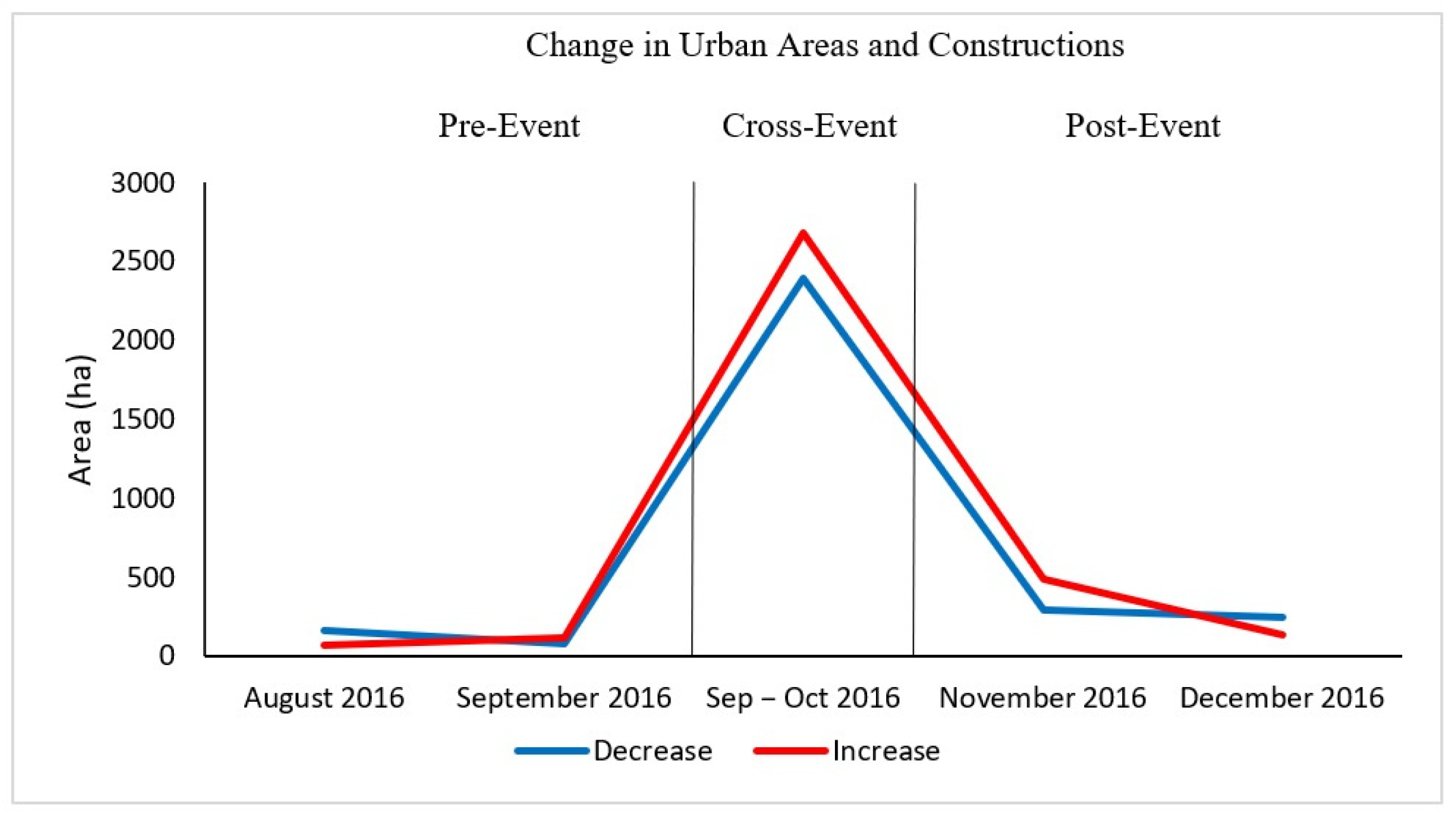
Temporal distribution of increasing (red) or decreasing (blue) changes in radar backscatter in Sentinel-1 image pairs over the built-up area of south-western Haiti that were hit by the hurricane from the pre-event up to December 2016. Area values are intentionally displayed in hectares due to the scale of the affected areas.
Figure 16.
Multi-temporal thematic map of changes due to flooding and water recession during the recovery phase (2017–2020) in the area of Troupeau that was most affected in 2016 by Hurricane Matthew-induced floods.
Figure 16.
Multi-temporal thematic map of changes due to flooding and water recession during the recovery phase (2017–2020) in the area of Troupeau that was most affected in 2016 by Hurricane Matthew-induced floods.
Figure 17.
Time series of flooded areas in km2 during the recovery phase (2017–2020), compared with the emergency phase (late 2016).
Figure 17.
Time series of flooded areas in km2 during the recovery phase (2017–2020), compared with the emergency phase (late 2016).
Figure 18.
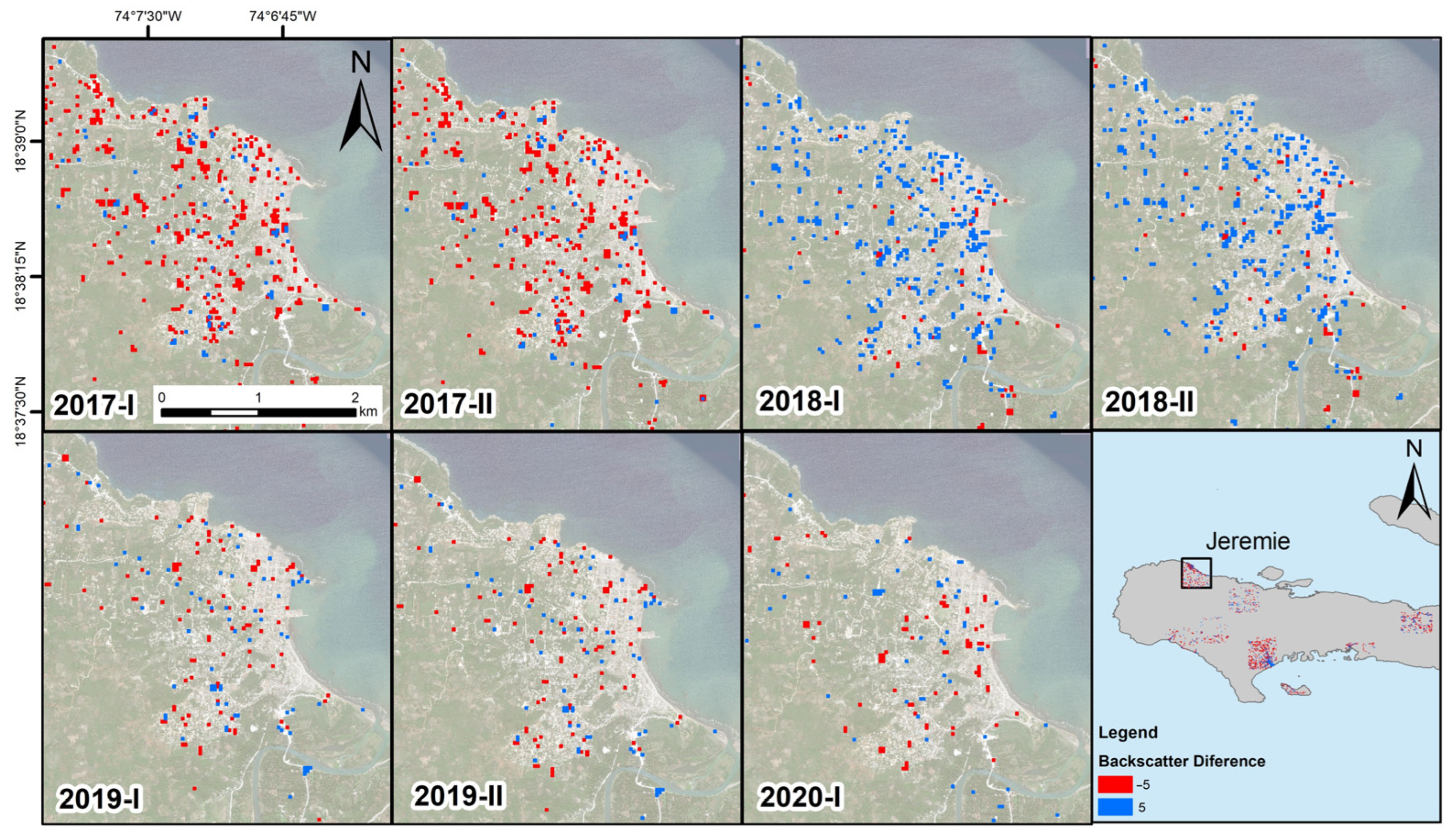
Multi-temporal thematic maps of changes due to reconstruction, new building constructions and dismantlement of emergency assets, highlighting the spatial patterns and temporal evolution of the recovery phase in Jérémie.
Figure 18.
Multi-temporal thematic maps of changes due to reconstruction, new building constructions and dismantlement of emergency assets, highlighting the spatial patterns and temporal evolution of the recovery phase in Jérémie.
Figure 19.
Example of visual inspection and verification with high resolution RGB Sentinel-2 images, collected on (a) 7 January 2017 and (b) 17 January 2019, to detect the appearance and dismantlement of emergency assets such as huge tents and tensile structures (see the area marked with the red circle) and new buildings near the beach (see red arrows) during the recovery phase.
Figure 20.
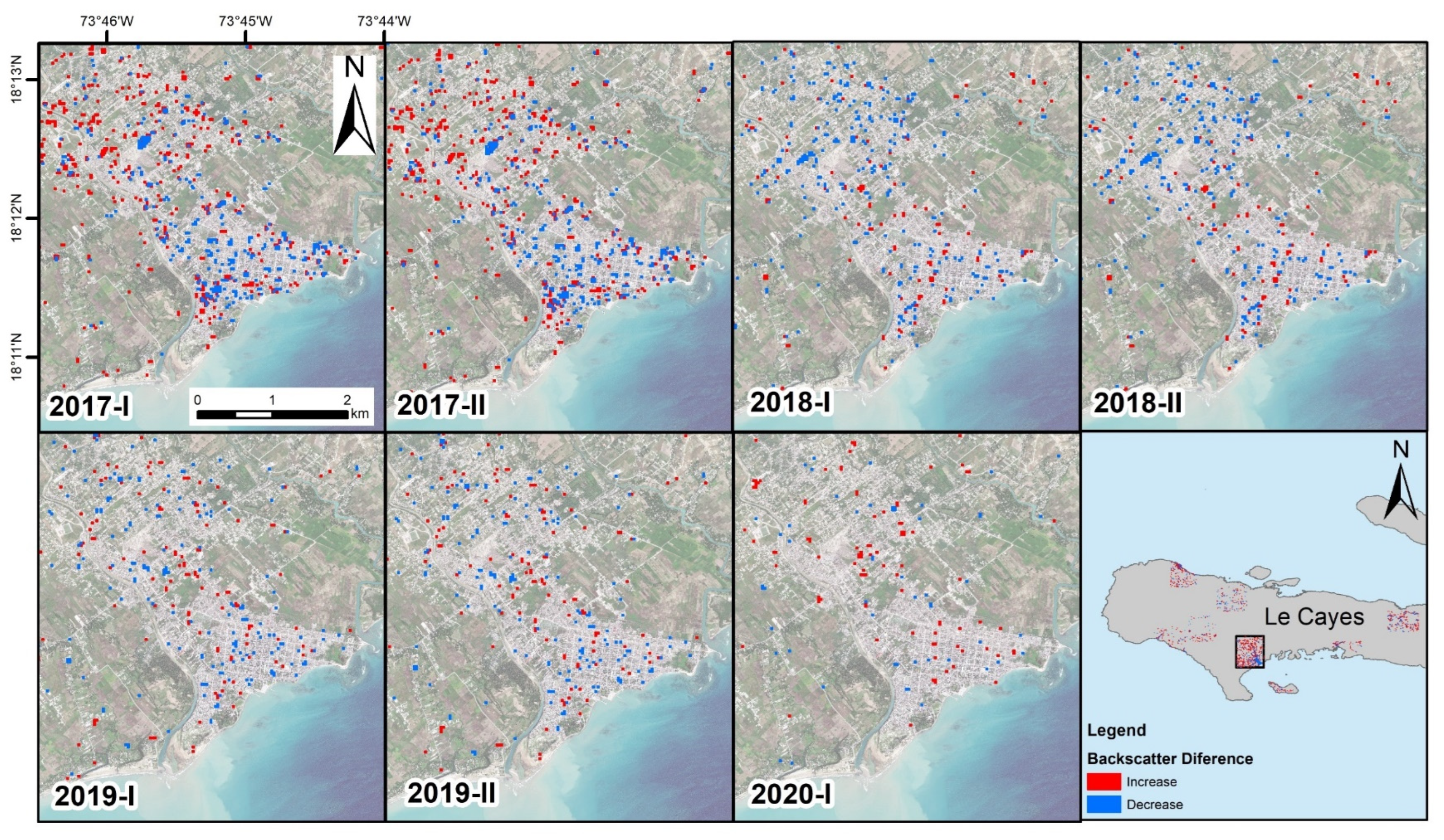
Multi-temporal thematic maps of changes due to reconstruction, new building constructions and dismantlement of emergency assets, highlighting the spatial patterns and temporal evolution of the recovery phase in Les Cayes.
Figure 20.
Multi-temporal thematic maps of changes due to reconstruction, new building constructions and dismantlement of emergency assets, highlighting the spatial patterns and temporal evolution of the recovery phase in Les Cayes.
Figure 21.
Evolution of changes in buildings during the recovery period, calculated in hectares, compared with the changes observed during the emergency phase for the eight sectors analysed in detail (see location in
Figure 3). It should be noted that a greater number of hectares of changed areas does not mean that more changes occurred in one area than another, but rather that there is a greater number of buildings.
Figure 22.
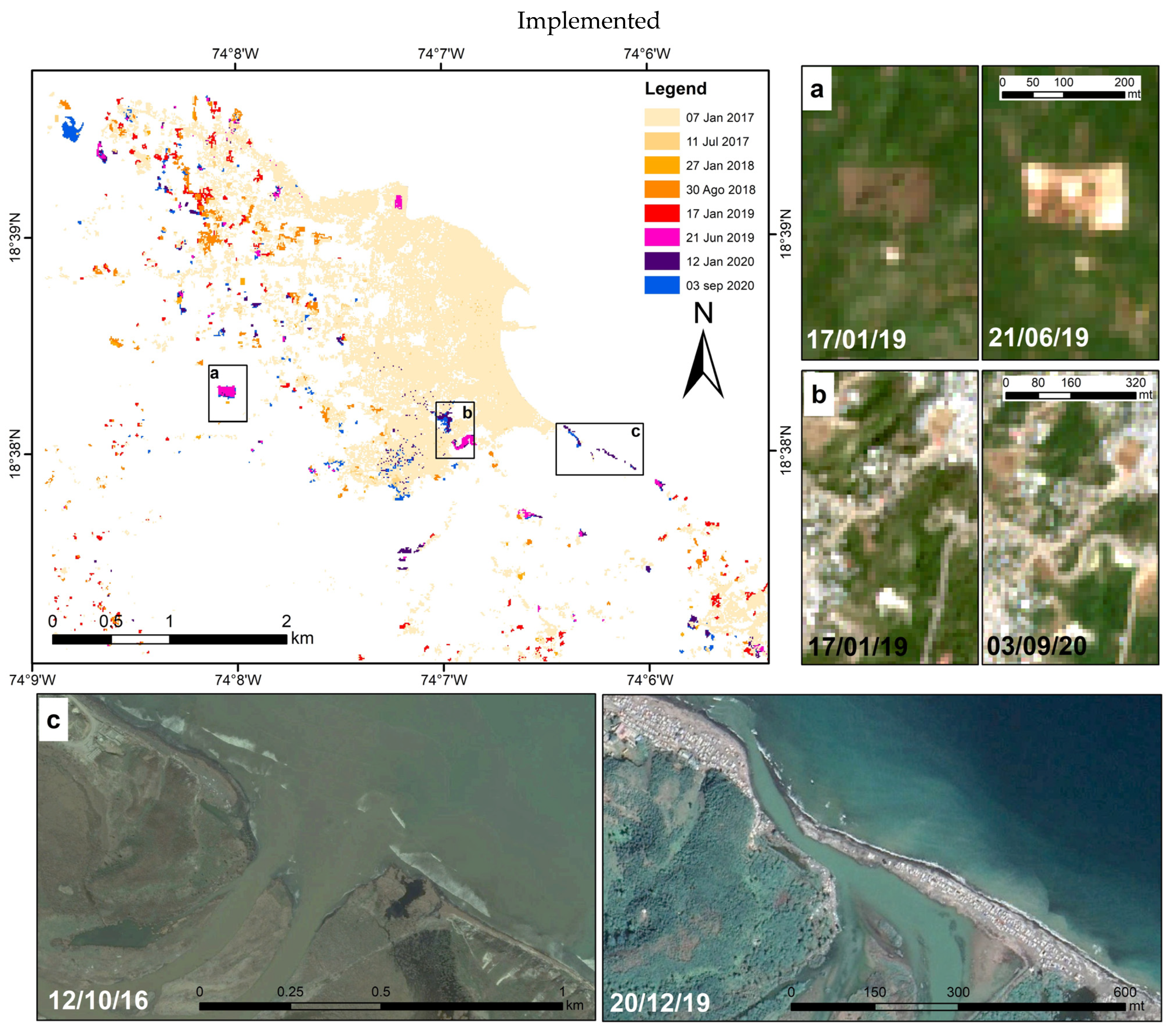
Multi-temporal urban land cover classification map of Jérémie during the recovery period from 2017 (lighter colours) to 2020 (darker colours), where clusters of new buildings and constructions are highlighted. Sentinel-2 images showing examples of (a) new construction areas and (b) new road infrastructure. (c) Comparison of Google Earth images showing new temporary constructions along the coast, south of Jérémie, in front of the Grande-Anse river mouth.
Figure 23.
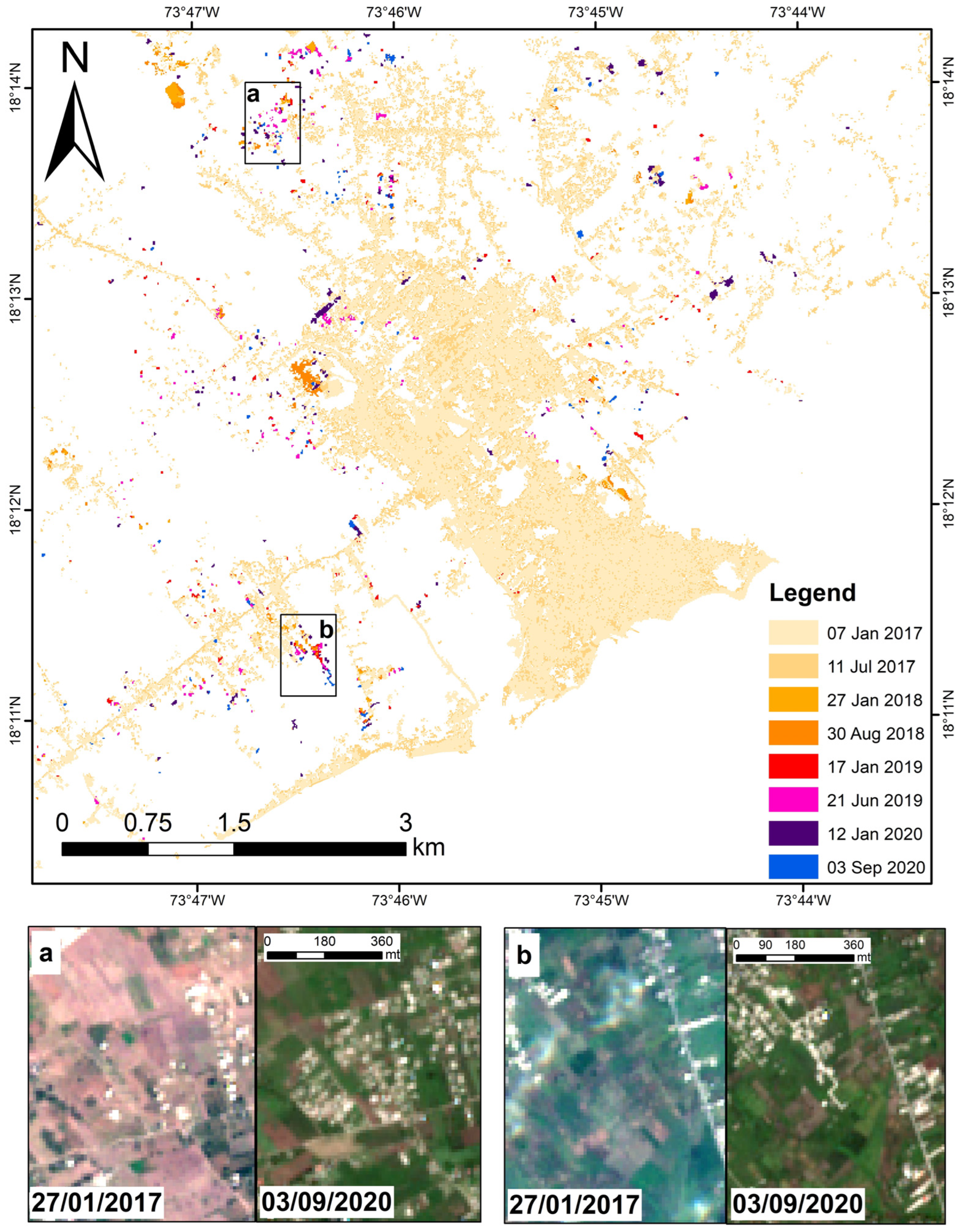
Multi-temporal urban land cover classification map of Les Cayes during the recovery period from 2017 to 2020. Sentinel-2 images showing examples of (a) new constructions in the north and (b) new constructions more aggregated and along a newly built road in the south-western part.
Figure 23.
Multi-temporal urban land cover classification map of Les Cayes during the recovery period from 2017 to 2020. Sentinel-2 images showing examples of (a) new constructions in the north and (b) new constructions more aggregated and along a newly built road in the south-western part.
Figure 24.
Example of impact assessment due to the 2023 flooding event in Fossé Naboth district, northern Haiti, that was among the areas with significant backscatter decrease change due to inundation: (a) initial change map after thresholding with a value equal to 5; and (b) after spatial intersection with the urban footprint as depicted in the WSF.
Figure 25.
Country-scale impact assessment of the June 2023 floods. Troupeau plain as seen from Sentinel-1 (a) pre-event image (27/05/2023) and (b) post-event (08/06/2023) and (c) RGB cross-event composite image. (d) Inundation in Desdunes captured by RGB cross-event Sentinel-1 composite. (e) Floods in the Léogâne area as observed in the same cross-event Sentinel-1 composite and Sentinel-2 pre- and post-event images.
Figure 26.
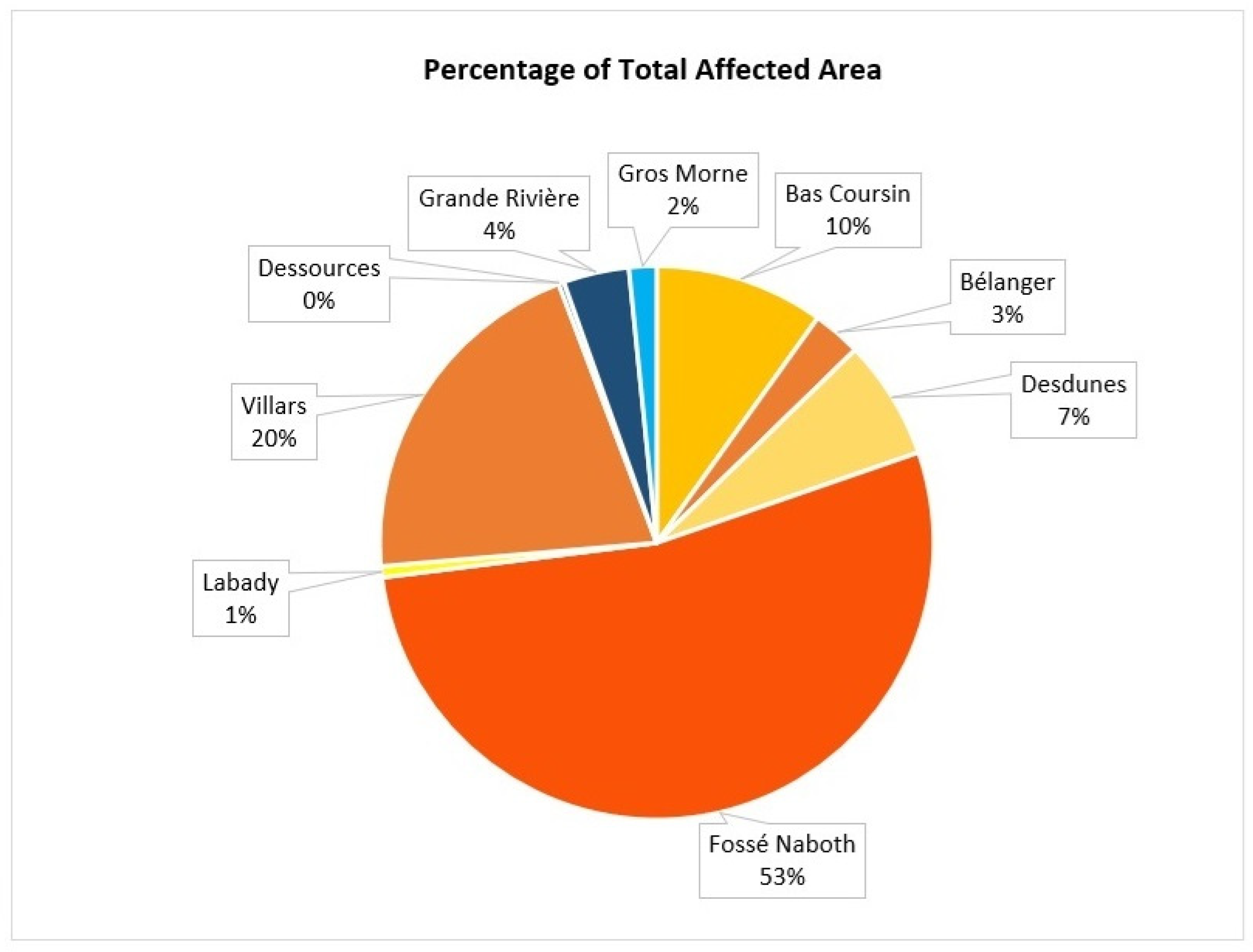
Percentage distribution of the areas affected by the 2023 June event, highlighting that the majority of them were located in the districts/towns north of Port-au-Prince, with Fossé Nabot being the most impacted.
Figure 26.
Percentage distribution of the areas affected by the 2023 June event, highlighting that the majority of them were located in the districts/towns north of Port-au-Prince, with Fossé Nabot being the most impacted.
Table 1.
Dates of the SAR data used for the analysis.
Table 1.
Dates of the SAR data used for the analysis.
| SAR Images | Geometry | Date |
|---|
| Sentinel-1 | Ascending | 07 August 2016 |
| 31 August 2016 |
| 24 September 2016 |
| 18 October 2016 |
| 11 November 2016 |
| 05 December 2016 |
| 29 December 2016 |
| 22 January 2017 |
| 09 July 2017 |
| 05 January 2018 |
| 21 August 2018 |
| 24 January 2019 |
| 16 August 2019 |
| 07 January 2020 |
| 03 September 2020 |
| Descending | 05 August 2016 |
| 29 August 2016 |
| 22 September 2016 |
| 10 October 2016 |
| 03 December 2016 |
| 27 December 2016 |
| 20 January 2017 |
| 07 July 2017 |
| 03 January 2018 |
| 19 August 2018 |
| 10 January 2019 |
| 14 August 2019 |
| 05 January 2020 |
| 01 September 2020 |
Table 2.
Dates of the optical data used for the analysis.
Table 2.
Dates of the optical data used for the analysis.
| Optical Images | Cloud COVERAGE | Date |
|---|
| | Low Clouds | 19 September 2016 |
| | 09 October 2016 |
| | Mid Clouds | 28 November 2016 |
| | Low Clouds | 07 January 2017 |
| | 11 July 2017 |
| Sentinel-2 | | 28 November 2017 |
| | Mid Clouds | 03 December 2017 |
| | | 27 January 2018 |
| | | 30 August 2018 |
| | Low Clouds | 17 January 2019 |
| | | 21 June 2019 |
| | | 12 January 2020 |
| | Free Clouds | 03 September 2020 |
| | | August–December 2016 |
| Planet (NICFI) | Free Clouds | August–December 2018 |
| | | August–December 2019 |
| | | 01–30 September 2020 |
Table 3.
Change detection maps with the specific threshold applied. Notation of the nomenclature of the change detection maps: sigmaDiff—backscatter ratio expressed in sigma nought; dB—decibel; IW—Sentinel-1 Interferometric Wide Swath Mode; VV—vertical–vertical polarisation; DDmonthYYYY indicates the dates of acquisition of the pre- and post- images, respectively. The standard threshold value was −5 and 5 (i.e., changes 5 times more or less intense). For some maps, it was necessary to set the threshold to −6 and 6 or −4 and 4 because these dates were affected by noise, so the threshold was adjusted according to this sensitivity.
| Time Period | Image Pair Date | Range< | Range> |
|---|
| Pre-Event | sigmaDiff_dB_IW_VV_05Aug2016_29Aug2016.tif | −5 | 5 |
| sigmaDiff_dB_IW_VV_07Aug2016_31Aug2016.tif | −5 | 5 |
| sigmaDiff_dB_IW_VV_29Aug2016_22Sep2016.tif | −5 | 5 |
| sigmaDiff_dB_IW_VV_31Aug2016_24Sep2016.tif | −6 | 6 |
| Cross-Event | sigmaDiff_dB_IW_VV_07Aug2016_18Oct2016.tif | −4 | 4 |
| sigmaDiff_dB_IW_VV_31Aug2016_18Oct2016.tif | −4 | 4 |
| sigmaDiff_dB_IW_VV_22Sep2016_10Oct2016.tif | −4 | 4 |
| sigmaDiff_dB_IW_VV_24Sep2016_18Oct2016.tif | −4 | 4 |
| Post-Event | sigmaDiff_dB_IW_VV_10Oct2016_03Dec2016.tif | −5 | 5 |
| sigmaDiff_dB_IW_VV_18Oct2016_11Nov2016.tif | −5 | 5 |
| sigmaDiff_dB_IW_VV_11Nov2016_05Dec2016.tif | −5 | 5 |
| sigmaDiff_dB_IW_VV_03Dec2016_27Dec2016.tif | −5 | 5 |
| sigmaDiff_dB_IW_VV_05Dec2016_29Dec2016.tif | −5 | 5 |
| sigmaDiff_dB_IW_VV_27Dec2016_20Jan2017.tif | −5 | 5 |
| Recovery Period | sigmaDiff_dB_IW_VV_20Jan2017_07Jul2017.tif | −6 | 6 |
| sigmaDiff_dB_IW_VV_22Jan2017_09Jul2017.tif | −5 | 5 |
| sigmaDiff_dB_IW_VV_07Jul2017_03Jan2018.tif | −5 | 5 |
| sigmaDiff_dB_IW_VV_09Jul2017_05Jan2018.tif | −5 | 5 |
| sigmaDiff_dB_IW_VV_03Jan2018_19Aug2018.tif | −5 | 5 |
| sigmaDiff_dB_IW_VV_05Jan2018_21Aug2018.tif | −5 | 5 |
| sigmaDiff_dB_IW_VV_19Aug2018_10Jan2019.tif | −5 | 5 |
| sigmaDiff_dB_IW_VV_21Aug2018_24Jan2019.tif | −5 | 5 |
| sigmaDiff_dB_IW_VV_10Jan2019_14Aug2019.tif | −5 | 5 |
| sigmaDiff_dB_IW_VV_24Jan2019_16Aug2019.tif | −5 | 5 |
| sigmaDiff_dB_IW_VV_14Aug2019_05Jan2020.tif | −5 | 5 |
| sigmaDiff_dB_IW_VV_16Aug2019_07Jan2020.tif | −5 | 5 |
| sigmaDiff_dB_IW_VV_05Jan2020_01Sep2020.tif | −5 | 5 |
| sigmaDiff_dB_IW_VV_07Jan2020_03Sep2020.tif | −5 | 5 |
Table 4.
Statistics of the 2023 June event impacts; spatial extent in square metres of the affected areas in each district/town.
Table 4.
Statistics of the 2023 June event impacts; spatial extent in square metres of the affected areas in each district/town.
| Region | Town | Square Metres |
|---|
| | Bas Coursin | 16,393.9 |
| | Bélanger | 4693.2 |
| North of Port-au-Prince | Desdunes | 11,599.0 |
| | Fossé Naboth | 88,381.7 |
| | Labady | 1073.8 |
| | Villars | 34,148.0 |
| Region 1 | Total | 156,289.6 |
| | Dessources | 527.6 |
| West of Port-au-Prince | Grande Rivière | 6359.0 |
| | Gros Morne | 2668.6 |
| | Total | 9555.2 |

