Article

A Machine-Learning-Based Data Science Framework for Effectively and Efficiently Processing, Managing, and Visualizing Big Sequential Data †

by
Alfredo Cuzzocrea
1,2,*,‡,
Islam Belmerabet
1,
Abderraouf Hafsaoui
1 and
Carson K. Leung
3
1
iDEA Lab, University of Calabria, 87036 Rende, Italy
2
Department of Computer Science, University of Paris City, 75006 Paris, France
3
Department of Computer Science, University of Manitoba, Winnipeg, MB R3T 2N2, Canada
*
Author to whom correspondence should be addressed.
This paper is the extension of our paper: Cuzzocrea, A.; Sisara, M.A.; Leung, C.K.; Wen, Y.; Jiang, F. Effectively and Efficiently Supporting Visual Big Data Analytics over Big Sequential Data: An Innovative Data Science Approach. In Proceedings of the 22nd International Conference on Computational Science and Its Applications, Malaga, Spain, 4–7 July 2022, pp. 113–125. https://doi.org/10.1007/978-3-031-10450-3_9.
This research has been made in the context of the Excellence Chair in Big Data Management and Analytics at University of Paris City, Paris, France.
Computers 2025, 14(7), 276; https://doi.org/10.3390/computers14070276 (registering DOI)
Submission received: 31 January 2025 / Revised: 10 June 2025 / Accepted: 11 June 2025 / Published: 14 July 2025
(This article belongs to the Special Issue Computational Science and Its Applications 2024 (ICCSA 2024))

Abstract

In recent years, the open data initiative has led to the willingness of many governments, researchers, and organizations to share their data and make it publicly available. Healthcare, disease, and epidemiological data, such as privacy statistics on patients who have suffered from epidemic diseases such as the Coronavirus disease 2019 (COVID-19), are examples of open big data. Therefore, huge volumes of valuable data have been generated and collected at high speed from a wide variety of rich data sources. Analyzing these open big data can be of social benefit. For example, people gain a better understanding of disease by analyzing and mining disease statistics, which can inspire them to participate in disease prevention, detection, control, and combat. Visual representation further improves data understanding and corresponding results for analysis and mining, as a picture is worth a thousand words. In this paper, we present a visual data science solution for the visualization and visual analysis of large sequence data. These ideas are illustrated by the visualization and visual analysis of sequences of real epidemiological data of COVID-19. Through our solution, we enable users to visualize the epidemiological data of COVID-19 over time. It also allows people to visually analyze data and discover relationships between popular features associated with COVID-19 cases. The effectiveness of our visual data science solution in improving the user experience of visualization and visual analysis of large sequence data is demonstrated by the real-life evaluation of these sequenced epidemiological data of COVID-19.

1. Introduction

Nowadays, the advance of big data along with the emergence of open data initiatives have led to an era characterized by an unprecedented availability of valuable information collection (e.g., [1,2,3]). These vast data repositories cross diverse disciplinary boundaries and offer a wealth of diverse and comprehensive foundations suitable for analysis and investigation across a wide range of domains.
Furthermore, instances of open big data entail diverse datasets, integrating biodiversity data [4], biomedical and healthcare data along with disease surveillance reports (e.g., COVID-19 statistics) [5,6,7], census data [8], financial time series [9,10,11], music data [12], patient registers [13], social networks [14], transportation and urban data [15,16,17], weather data [18], and web data [19]. Indeed, how to extract useful and interesting patterns from such voluminous datasets?
The latter is a research issue that is still under investigation. Due to the fact that open big data are embedded with valuable information and knowledge [20], contemporary approaches and methodologies that featured prominently in the active literature mostly adhere to the concept of applying Data Mining (DM) algorithms [21], data analytics methods [22,23], visual analytics methods [24,25,26,27,28], and Machine Learning (ML) techniques [5].
In this paper, we consider the healthcare domain, particularly the exploration of epidemiological data. In fact, the extracted knowledge from these epidemiological data stands to be significantly beneficial for researchers, epidemiologists, and policymakers by fostering a deeper comprehension of diseases. This understanding, in turn, serves as a foundation to facilitate the development of innovative strategies aimed at the detection, prevention, and management of diseases, mainly viral illnesses. Notably, some viral diseases that have appeared include
  • Severe Acute Respiratory Syndrome outbreak (SARS) in 2003, which was caused by a coronavirus (CoV), associated with SARS;
  • Swine flu outbreak, which was caused by influenza A (A/H1N1) and led to a pandemic from 2009 to 2010;
  • MERS-CoV caused Middle East Respiratory Syndrome (MERS). This disease was predominantly present in the Middle East (e.g., Saudi Arabia) from 2012 until 2018, while in 2015, a notable occurrence of MERS was reported in South Korea;
  • Zika virus disease was primarily transmitted by the bite of an infected mosquito. An outbreak was reported in Brazil during 2015–2016;
  • SARS-CoV-2 caused coronavirus disease 2019 (COVID-19), which was initially reported in early 2020. This outbreak swiftly escalated into a worldwide pandemic.
Indeed, due to the fact that COVID-19 has spread during the last few years, a surge in research activities is directed toward various dimensions of the disease, encompassing clinical and treatment information [29,30], drug discovery [31], and research in the medical and health sciences. In contrast, our pursuit in computer science focuses specifically on the realm of epidemiological data analysis within the COVID-19 landscape.
Visual data science is an essential facet within the realm of data science, leveraging visualization and analytics techniques to convert datasets into easily comprehensible representations. It acts as a conduit, transforming raw data into meaningful representations such as graphs, charts, and interactive dashboards, enabling swift extraction of information and revealing hidden patterns [32]. This discipline not only conveys data but also facilitates dynamic interaction, empowering users to uncover correlations and temporal changes crucial for informed decision-making, especially in our case (COVID-19 data). As data volume and complexity grow in today‘s digital era, visual data science remains indispensable to transform data into actionable representation.
Consequently, several pertinent works appeared in active literature, reflecting a growing interest in leveraging data visualization and analytics tools to deal with pressing global challenges. Notably, [33] presents a big data visualization and visual analytics tool tailored specifically for COVID-19 epidemiological data. This innovative tool does not only display raw statistics but delves deeper into the heart of the pandemic by examining cumulative COVID-19 data. By performing so, it illuminates prevalent trends and essential facets (e.g., frequently used transmission methods, hospitalization status, clinical outcomes) associated with the majority of COVID-19 cases.
Moreover, the extensive duration of the COVID-19 pandemic, surpassing a year, has yielded cumulative statistics that offer a consolidated overview of various characteristics of COVID-19 cases over this period. However, these cumulative statistics might not effectively capture the evolving temporal dynamics and nuanced changes in disease patterns. This gap motivates our ongoing efforts by building upon our previous work, where we developed a tool for visualizing cumulative COVID-19 data; we recognize the crucial necessity for a more refined approach to delve into temporal changes within this data. Hence, our current focus centers on the creation of a sophisticated data science solution tailored explicitly for the visualization and analysis of temporal COVID-19 epidemiological data (COVID-19 sequential data).
In parallel with the vast potential of big data analytics, the increasing reliance on distributed data sources and Cloud-based infrastructures raises critical concerns regarding the processing of confidential data and the risks of cyberattacks. In contexts such as healthcare and epidemiology, where sensitive personal and clinical information is involved, ensuring data privacy and security is paramount. As large-scale data analysis becomes increasingly common, the potential vulnerabilities exposed by cyber threats, data breaches, or inference attacks (e.g., extracting sensitive data from machine learning models) become significant barriers. These concerns underscore the urgent need for robust cybersecurity frameworks and secure data processing protocols in big data analytics (e.g., [34]). Addressing these challenges is crucial to maintain trust, ensure ethical compliance, and protect individual privacy in the digital era.
Despite the progress in the big data analytics paradigm (e.g., [35,36,37,38]), big sequential data introduce several technical limitations and challenges, which this work explicitly aims to overcome:
  • Volume and Velocity: the continuous inflow of temporal data (e.g., daily COVID-19 reports) results in high-volume and high-frequency updates that require scalable processing mechanisms.
  • Heterogeneity and Integration: epidemiological data come from diverse sources (e.g., public health agencies, and hospitals), often in varied formats and structures, necessitating robust integration strategies.
  • High Dimensionality: the presence of multiple co-occurring features (e.g., age, hospitalization, transmission method) calls for advanced techniques in pattern mining and dimensional reduction.
  • Temporal Complexity: capturing the temporal evolution of patterns demands methods capable of both aggregating over time and preserving chronological nuances.
  • Visualization Bottlenecks: conventional tools struggle with rendering and interpreting large-scale patterns over time.

1.1. Research Questions and Objectives

In the context of an increasingly data-driven world, and particularly within the realm of epidemiological and public health data, our research aims to reply to the following research questions:
RQ1. 
How can we effectively and efficiently analyze and visualize large-scale sequential epidemiological data to uncover meaningful temporal trends?
RQ2. 
What methodological frameworks can be designed to support interactive and interpretable visual analytics over complex, multidimensional, time-evolving datasets?
RQ3. 
How can such a framework be generalized to support various domains beyond healthcare, such as finance or social media analytics that similarly deal with sequential big data?

1.2. Key Research Contributions

In this paper, our main contribution consists of introducing an innovative framework for supporting big data analytics and visualization over big sequential data. Specifically, our work stands out in its ability to uncover and visualize temporal trends present within sequential data (in this case, COVID-19 data). These valuable insights and patterns provide a practical solution to analyze and visualize COVID-19 trends, which enables users to observe and understand the change in its various characteristics over a specific period.
Notably, this framework extends its application beyond COVID-19 data to encompass diverse types of sequential data, such as the visualization and analysis of financial time series, stock prices, etc. This paper is an extended version of [39], where we introduced the basic and fundamental concepts and models of the proposed framework. The actual paper makes important advancements to the previous one. Overall, in this paper, we make the following contributions:
  • We initiate by presenting a comprehensive overview of the context, background, and motivation that inspired us to conduct this research;
  • We also provide a detailed state-of-the-art analysis, which allows us to provide a comprehensive vision of the most pertinent work related to our research;
  • We demonstrate a working methodology of our proposed framework that clearly shows its anatomy and functionalities;
  • We illustrate a case study along with a reference architecture where our approach can be practically employed to analyze and visualize COVID-19 sequential data;
  • We conduct a rigorous experimental evaluation and analysis of real-life Canadian COVID-19 data to ensure the effectiveness and reliability of the proposed framework in handling and analyzing large-scale and real-life sequential data.
Through this paper, we aim to provide a forward-looking perspective on the convergence of visual big data analytics and the epidemiology context, setting an example for future interdisciplinary studies that require expertise from diverse fields. Our proposed approach is designed to be both versatile and future-proof, accommodating emerging trends and technologies in the rapidly evolving landscape of data science. Moreover, it is important to recognize that this general analytical framework is particularly suitable for big data, as pinpointed by recent studies in the field (e.g., [40]), since big COVID-19 sequential data are naturally high-dimensional and multi-granular, following the same processes that generate them (e.g., industry 4.0 processes, epidemiological studies, censorship campaigns, prognostic systems, etc.).

1.3. Paper Organization

The remaining part of this paper is organized as follows. In Section 2, we delve into an exploration of some pertinent work related to our research. Section 3 illustrates and discusses the background analysis in this context. In Section 4, we provide a comprehensive description of the proposed framework for effectively and efficiently supporting visual big data analytics over big sequential data, as well as several pseudo-algorithms that clearly show the working methodology of our framework. Section 5 focuses on an innovative case study where we describe and present how our proposed framework operates and functions in a real-life scenario. After that, in Section 6, we present the results of our experimental assessments and evaluations conducted on the Canadian COVID-19 epidemiological data in order to prove the reliability and efficiency of the framework. Section 7 presents a discussion of our proposed approach as well as possible limitations that need to be addressed. Finally, Section 8 contains conclusions and also sketches possible future directions for this investigated context.

2. Related Work

Recently, the analysis and visualization of big sequential data (e.g., COVID-19 epidemiological data) has garnered significant attention from researchers, leading to a wealth of publications that appeared in active literature. This section aims to highlight some of the most pertinent research proposals that are related to our work.
Ref. [41] serves as a comprehensive survey and comparative analysis of visualization techniques utilized in the context of frequent itemsets, association rules, and sequential patterns in data mining. Acknowledging the critical role of human intuition in pattern recognition, this study underscores the importance of effectively mining and visualizing these patterns to facilitate decision-making processes. Emphasizing the iterative feedback loop within visual analytics, where users refine parameters based on mining outcomes, this paper systematically reviews visual designs specific to each pattern category. Through a meticulous analysis, it examines and compares the strengths and weaknesses inherent in these visualization techniques. The final goal is to empower decision-makers by providing a nuanced understanding of these methodologies, enabling the selection of appropriate techniques tailored to their tasks and systems, while also delineating the limitations associated with each approach.
In [42], Liu et al. aimed to introduce a specialized system designed to tackle the visualization and analysis of big musical data, specifically focusing on discovering and exploring frequent patterns within these datasets. This approach addresses and deals with the growing demand for big data visualization and visual analytics across various real-life applications by emphasizing the significance of uncovering valuable insights embedded in musical data. Moreover, the experimental evaluations clearly show and demonstrate the benefit of the proposed approach. On the other hand, the system contribution lies in its specialized focus on visualizing collections of frequently occurring items within musical repositories, highlighting its applicability in facilitating big data visualization and visual analytics. Finally, the proposed system offers a solution for handling the complexities of musical data, demonstrating its potential to uncover patterns and trends, thereby serving as a valuable tool for big data visualization and visual analytics.
Jentner et al. [43] focused attention on the realm of infectious disease visualization tools tailored specifically for public health professionals, with a keen focus on geographic information systems (GIS), molecular epidemiological data, and social network analysis. The paper findings highlight diverse user preferences and a varied landscape of existing tools, with inconsistent descriptions of tool architecture and limited usability studies. Regarding concerns in data sharing, quality, and organizational support that hinder tool adoption, this study emphasizes the challenge of synthesizing complex data for effective communication and decision-making in public health. Furthermore, the goal of this research is to emphasize the importance of integrating tools into workflows and address issues like data uncertainty, representation, and cognitive overload for future tool development.
Ghouzali et al. [44] provided a comprehensive data visualization-based solution that presents an overview of the COVID-19 restrictions and spread across various regions in Saudi Arabia. Particularly, this research leverages several big sequential epidemiological datasets (i.e., spread and fatality rates) alongside robust big data visualization solutions such as Tableau and Power BI to uncover the dynamic nature of virus propagation and its fatality rates, thereby shedding light on critical facets of the pandemic trajectory within the Saudi Arabian landscape. Furthermore, the study highlights the inconsistent impact of the pandemic on specific demographics, notably the elderly and individuals with underlying health conditions, while also revealing the substantial socio-economic effects experienced in the country. Indeed, these insights and findings can be helpful in informing public health interventions and policy decisions in the country, shedding light on the pandemic impact on different populations.
In [45], Angelini et al. proposed an innovative approach aimed at revolutionizing the landscape of interactive COVID-19 data analysis by addressing and overcoming the limitations in current state-of-the-art models for analyzing the epidemic spread. The anticipated outcomes of this research involve the development and evaluation of three progressive visualization techniques tailored for Susceptible-Infectious-Recovered (SIR) model data. These techniques are designed to perform a trade-off between computation time and result quality. The contributions of this innovative research involve not only the creation but also the analysis and evaluation of these visualization techniques. Through this evaluation, the proposed solution clearly highlights and demonstrates promising outcomes and significant potential to enhance the efficiency and effectiveness of the COVID-19 data analysis process. Finally, these findings facilitate the process of extracting insights and empowering decision-making in the face of evolving epidemic trends.
Dey et al. [46] contributed significantly to the scientific effort in response to the global crisis surrounding the emergence of SARS-CoV-2. This epidemic underscores the urgency of swiftly collecting and analyzing epidemiological data obtained from reputable institutions, such as Johns Hopkins University and the World Health Organization. Through meticulous analysis, the study aims to provide comprehensive insights into COVID-19 outbreak dynamics by using exploratory data analysis and data visualization tools to dissect reported confirmed cases, fatalities, and recoveries. Emphasizing the critical role of rapid information dissemination during early pandemic phases, the research highlights how these data serve as the foundation for informed decision-making, risk assessments, and the implementation of targeted containment measures globally. Finally, this research seeks to guide effective response strategies by presenting a detailed understanding of the outbreak trends and patterns, supporting global efforts to address the impact of the pandemic.
In [47], Milano et al. carried out an innovative network-based methodology tailored for comprehensively analyzing the spatiotemporal evolution of COVID-19 data. Focused on integrating spatial and temporal dimensions, the methodology employs statistical tests to discern similarities or dissimilarities among homogeneous datasets collected from diverse regions and periods. Mapping these relationships onto a graph and employing community detection algorithms, the methodology visualizes the dynamic changes in COVID-19 data over time and across different geographical areas. By utilizing publicly available COVID-19 data gathered from the Italian Civil Protection Department, the study also integrates climate data in order to uncover potential associations between pandemic measures and climatic variations. This methodology serves as a powerful tool to represent pandemic measures within a network framework, shedding light on regional behaviors and their correlation with pandemic and climate-related data. The methodology offers researchers and practitioners an accessible means to delve into and comprehend the multifaceted dynamics of COVID-19.
Healey et al. [48] sought to enhance the understanding of the COVID-19 pandemic by integrating advanced data analytics and visualization techniques. While acknowledging the existence of established resources like the Johns Hopkins Novel Coronavirus Dashboard, the focus here is on providing predictive insights through sophisticated analytics, thus avoiding replication of available information. The objective of this research revolves around region-to-region comparisons, predictive trend analysis, and examining testing and vaccination dynamics. Through the utilization of a web-based jQuery + Tableau dashboard, the aim is to offer and provide policymakers and the public with informative visualizations and valuable patterns that shed light on the current state and potential trajectories and trends of the pandemic across diverse countries and regions. This approach emphasizes accessibility, catering to both public people and also domain experts, striving for a comprehensive understanding of the evolving nature of the pandemic.
In [49], Liao and Zhu delved into the exploration of how Artificial Intelligence (AI) has been integrated during the COVID-19 pandemic across various crucial areas like disease diagnosis, treatment, epidemic prediction, drug research, and the field of telemedicine. This comprehensive analysis acknowledges the significant role AI has played during the global health crisis and aims to conduct a detailed review of AI applications within these domains. The primary focus centers on the meticulous evaluation of AI advantages and disadvantages in the fight against the pandemic.
Cui and Kong [50] introduced an innovative method for representing and visualizing COVID-19 epidemic data through a combination of scraping crawler technology and powerful visualization tools. This novel approach encompasses several steps, starting with data collection by means of scrapy crawler technology. Then, the collected data go through meticulous processing phases in order to construct a spatiotemporal dataset, which serves as the foundation for subsequent analysis. Notably, the research leverages pie charts as a visual tool to facilitate the analysis of this dataset. Through this methodology, the research aims to provide accessible and intuitive insights into the pandemic‘s development across countries and regions. The focus is on uncovering patterns and trends within the epidemic COVID-19 landscape; these valuable insights play a pivotal role in informing and guiding strategies for epidemic prevention and control.
In [51], Ali et al. provided a comprehensive exploration of the pivotal role played by data visualization and analytics in leveraging the vast realm of big data. By emphasizing the drawbacks of processing data without visual representation, they underscore the transformative potential of visualizing information for enhanced comprehension and decision-making across diverse sectors. Moreover, this paper aims to delve into the challenges inherent in visualizing massive volumes of data, providing a nuanced analysis while reviewing prominent tools and methodologies employed in this domain. Through analysis, real-life examples, and a structured methodology, the proposal sets the stage for understanding the transformative impact and opportunities presented by effective data visualization in the contemporary data-driven landscape.
Delange et al. [52] introduced LinkR, a novel low-code and collaborative data science platform designed to streamline the manipulation, visualization, and analysis of healthcare data within clinical data warehouses (CDWs). By addressing the critical challenges of data interoperability and the technical barriers faced by healthcare professionals, the platform builds on the OMOP Common Data Model to enhance accessibility and usability. Through an intuitive graphical interface complemented by an advanced programming environment, LinkR empowers users to create and manage studies leveraging both individual and population-level data. The platform not only simplifies the recreation of electronic medical records for specific research needs but also facilitates robust statistical analyses through integrated visualization tools.
In [53], Basu addressed the inherent complexities involved in analyzing and visualizing time-series healthcare data, emphasizing the challenges posed by temporal variability, heterogeneous physiological signals, and the high dimensionality of such datasets. By framing the research around machine learning and data visualization techniques, the work explores innovative approaches to extract and represent clinically significant moments within vast streams of medical data. The study aims to answer two core questions: (i) how to leverage machine learning for identifying key events in multidimensional healthcare records; (ii) how to visualize these findings in a way that remains interpretable and actionable for healthcare professionals. This research underlines the critical role of interpretable visual analytics in bridging the gap between complex data-driven insights and real-life clinical decision-making.
Dixon et al. [54] examined structural limitations of traditional U.S. public health information systems, particularly their inability to deliver timely and comprehensive visualizations of healthcare system impacts during emergent crises such as the COVID-19 pandemic. This research explores the role of Health Information Exchanges (HIEs) as a mechanism for aggregating data across healthcare institutions to enable almost real-time monitoring. Focusing on a statewide HIE implementation in Indiana, the research highlights the development of an adaptive dashboard that integrates data from all healthcare facilities within the state. This system provides dynamic insights into hospitalization rates, emergency department utilization, and other essential metrics of interest to both public health agencies and broader policy stakeholders.
In [55], Saravanan et al. investigated the application of AI for stock price prediction, addressing the inherent challenges posed by high volatility in financial time series data. By employing Long Short-Term Memory Networks (LSTM), the study aims to forecast future stock prices of publicly traded companies such as Twitter and Facebook on the NYSE. The research further incorporates sentiment analysis to capture investor sentiment from news and social media, recognizing its critical role in influencing market dynamics. Central to this approach is the integration of LSTM-based models with Natural Language Processing (NLP) techniques, enabling the automatic extraction of meaningful features without human intervention.
By analyzing all the active literature, we recognize the following main gaps that actually exist, which we summarize as follows:
  • Lack of multidimensional modelling: Reference works do not introduce powerful multidimensional modelling during the data modelling/processing phase, thus losing the power of multidimensional, intuitive spaces that are able to capture multiple aspects of the investigated target big data domains;
  • Lack of supervised learning metaphors combined with multidimensional hierarchies: Out of the addressed solutions, no one proposes the innovative idea of combining supervised learning metaphors with multidimensional hierarchies to strengthen the overall expressive power of the surrounding mining process;
  • Lack of comprehensive combination with authoritative visualization tools: Combination of multidimensional modelling, multidimensional supervised learning, and visualization tools is yet another relevant gap in the actual literature, especially when applied to real-life case studies.
The contributions of our research cumulative solve all these existing literature gaps, thus turning to be a milestone for next-generation research in the reference scientific area.

3. Background Analysis

In this section, we provide and describe a comprehensive overview of the context, background, and tools of the big data processing, management, and visualization realm necessary for comprehending the complex landscape of this research.

3.1. Processing and Mining Big Sequential Data with Multidimensional Metaphors

The explosion of sequential data in modern applications has generated an urgent need for advanced modeling and analysis strategies. Traditional one-dimensional or flat representations fall short of capturing the complex interdependencies and temporal dynamics inherent in such data. To address this limitation, multidimensional modeling has emerged as a powerful paradigm (e.g., [56,57]), offering a richer and more structured abstraction that allows data scientists to explore sequences along multiple analytical dimensions (e.g., time, location, demographic, etc.).
This metaphorical shift from flat sequences to multidimensional representations facilitates enhanced data organization, enabling more effective slicing, dicing, and aggregation across multiple granularities. In turn, it unlocks new possibilities for pattern discovery, correlation analysis, and temporal trend visualization. Moreover, multidimensional metaphors support advanced OLAP-based modeling (e.g., [58]) and frequent pattern mining, providing a natural foundation for efficient querying, feature correlation analysis, and the generation of interpretable visual outputs.
By taking a look into the active literature, several approaches and methodologies have been proposed. Here, we describe the most relevant in the context.
Mining sequential patterns from multidimensional sequence data (e.g., [59,60]) is a critical extension of traditional sequential pattern mining, aimed at capturing complex interdependencies among diverse contextual dimensions within large-scale sequential datasets. Unlike standard techniques that analyze sequences in isolation, this approach simultaneously considers multiple attributes associated with each item in a sequence, thus enabling the discovery of richer and more semantically meaningful patterns. For instance, healthcare analytics allows for identifying temporal sequences of medical events that co-occur under specific demographic or geographic conditions. It typically involves encoding multidimensional data into structured formats and then applying specialized mining algorithms that can efficiently traverse the expanded search space while preserving interpretability and performance. Several enhancements, including dimension weighting, temporal constraints, and support thresholds tailored to each dimension (e.g., [61]), have been proposed to improve both the scalability and relevance of the mined patterns. This multidimensional view is particularly beneficial for applications involving user behavior modeling, bioinformatics, and spatiotemporal trend analysis.
Moreover, mining multidimensional sequential patterns over data streams (e.g., [62]) represents another sophisticated evolution of pattern mining techniques, designed to address the dynamic nature of streaming data while capturing rich contextual relationships across multiple dimensions. Unlike static batch-processing approaches, this paradigm must contend with the challenges of real-time data arrival and limited memory. Each item in a sequence is enriched with multiple attributes, which collectively define the multidimensional context in which patterns emerge. The core methodology in this domain typically relies on sliding windows and incremental update mechanisms to maintain efficiency and adaptiveness. Such techniques are particularly critical for applications in smart city surveillance, financial event monitoring, and real-time epidemiological tracking.
On the other hand, scanning and sequential decision-making for multidimensional data (e.g., [63,64]) constitute a critical class of analytical tasks aimed at incrementally exploring complex data spaces and making informed real-time decisions. In noise-free environments (e.g., [63]), these processes rely on the availability of accurate and complete information across multiple dimensions, by enabling the use of optimal strategies based on dynamic programming, greedy heuristics, and reinforcement learning. Systematic data scanning through multidimensional indexing structures or OLAP cubes allows for efficient identification of relevant patterns, while sequential decision-making models apply learned or predefined policies to optimize a cumulative utility function over time. However, real-life data are rarely perfect. In the presence of noise, manifesting as missing values, outliers, inconsistencies, or sensor errors, these methods (e.g., [64]) must be augmented with robust preprocessing techniques and uncertainty-aware models.

3.2. Visualization and Big Data Characteristics

Data visualization encompasses the graphical depiction of data, serving as a pivotal tool for comprehending and exploring extensive datasets. Its systematic interpretation is indispensable for deriving nuanced insights from voluminous data. This visual representation is crucial for consolidating disparate data points, unraveling intricate data interconnections, addressing real-time challenges, and directing investigative efforts (e.g., [65,66,67]). Moreover, it empowers data scientists by facilitating the detection of latent data patterns and the underlying methodologies governing their storage. Additionally, data visualization tools are instrumental for business analysts, enabling the identification of areas necessitating alteration or enhancement, the focused examination of variables influencing consumer behavior, and the anticipation of revenue projections.
In the context of big data, these visualization tasks are deeply linked with the inherent characteristics and challenges associated with large-scale datasets, often summarized by the 5Vs, i.e., Volume, Velocity, Variety, Veracity, and Value.
  • Volume relates to the enormous quantity of data generated from diverse sources, necessitating scalable visualization techniques capable of summarizing and filtering vast information.
  • Velocity reflects the high speed at which data are produced and must be analyzed, which requires visualization tools to support real-time or streaming data representation.
  • Variety encompasses the heterogeneity of data formats—including structured, semi-structured, and unstructured data, which demands adaptable visualization methods.
  • Veracity refers to data uncertainty and quality issues; visual analytics can help detect anomalies, inconsistencies, or gaps in datasets.
  • Value signifies the meaningful insights derived from data; visualization plays a critical role in uncovering hidden correlations, patterns, and actionable knowledge.
However, visualizing big multidimensional data introduces unique technical challenges. The curse of dimensionality may overcome conventional visualization tools, making it difficult to discern meaningful trends or patterns. High-dimensional datasets increase cognitive load and may obscure rather than clarify insights unless properly abstracted or aggregated. Addressing these issues calls for advanced visualization frameworks that integrate dimensionality reduction, data summarization, and interactive exploration to support scalable and insightful analytics over massive and complex datasets.

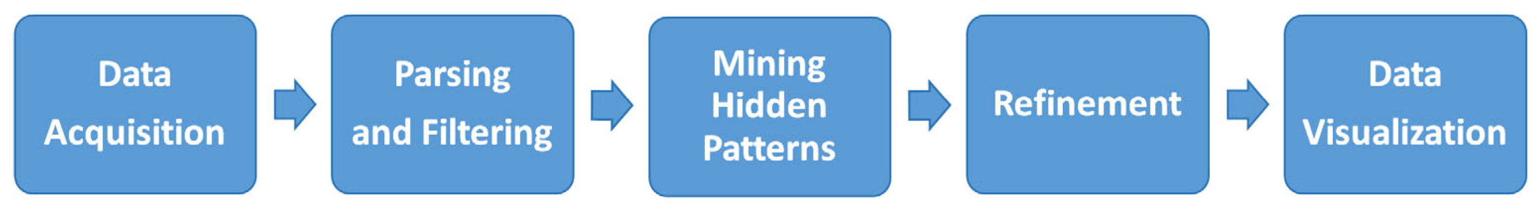
3.3. Big Data Visualization Process

In this section, we provide a comprehensive description of the key steps and phases involved in the big data visualization process.
Figure 1 shows the big data visualization process, which encompasses several key phases (e.g., [68,69]).
As shown in Figure 1, the big data visualization process consists of the following sequential steps:
  • Data Acquisition: This initial step involves collecting raw data from a wide range of sources such as sensors, transaction logs, and social media platforms (e.g., [70]). Data can be often unstructured or semi-structured, which necessitates transformation into a consistent format suitable for further analysis.
  • Parsing and Filtering: The acquired data undergo parsing to convert them into a structured format. Filtering is then applied to remove noise, inconsistencies, and irrelevant elements, ensuring that only high-quality and relevant data are retained for further processing.
  • Mining Hidden Patterns: In this phase, advanced data mining techniques (e.g., [71,72]) are used to extract meaningful patterns, associations, and trends from the cleaned data. These hidden patterns form the foundation for insight generation and serve as the analytical core of the visualization process.
  • Refinement: The extracted patterns are then refined through operations such as dimensionality reduction, normalization, and contextual enrichment. This step enhances the clarity and interpretability of data, preparing them for effective visual representation.
  • Data Visualization: The final step involves representing the refined data through various visual formats such as charts, graphs, heatmaps, and dashboards. The goal is to convey complex insights in an intuitive and accessible manner, allowing users to explore relationships, detect trends, and support data-driven decision-making.

3.4. Big Data Visualization Methods

Several big data visualization techniques have been developed. These techniques are typically classified according to the size, variety, and dynamics of data. In the context of sequential big data, which often involves time-series information, the choice of visualization method plays a crucial role in enabling meaningful interpretation and analysis. Among the most used visualization methods:
  • Tree Map involves the visualization of hierarchical data by representing them as a series of nested rectangles. An algorithm known as a tiling algorithm (e.g., [73]) partitions the initial parent rectangle into sub-rectangles to illustrate hierarchy. This technique is particularly useful when sequential data exhibit hierarchical categorization, such as web traffic logs grouped by domain and subdomain over time (e.g., [74]). However, it may not be ideal for visualizing precise time-dependent trends due to its static, space-filling layout. Tree maps can handle zero and negative values effectively and are suitable when space optimization and category comparison are crucial [75].
  • Circle Packing serves as an alternative technique for hierarchical data visualization, utilizing nested circles instead of rectangles. While less space-efficient than tree maps, it can be used in interactive dashboards where aesthetics and intuitive groupings are prioritized, for example, in visual storytelling of sequential data from social media engagement grouped by topic. Like tree maps, it is more suited to structural overviews than detailed sequential trends.
  • Parallel Coordinates are employed for visualizing large-scale and multivariate datasets, especially when data contain sequential records with multiple attributes evolving over time, such as financial data. This visualization technique allows for the observation of inter-variable relationships by mapping each attribute to a vertical axis. It is particularly useful when identifying correlations and trends across high-dimensional sequential data, although it suffers from over-plotting when data volume is very high, and it is less effective for categorical data [76].
  • Stream Graph is suitable for visualizing the temporal evolution of values across multiple categories, making them highly suitable for sequential big data. For example, stream graphs are effective in displaying how the popularity of various search terms, product categories, or website traffic sources change over time. The flowing, organic shapes support an intuitive reading of rise and fall trends, although fine-grained comparisons can be challenging due to distortion in stream widths [77].
Additionally, several alternative and emerging visualization techniques are being explored to handle the complexity of sequential big data:
  • Time Curves: This technique transforms sequential data into a 2D spatial layout using temporal distance as a guiding metric (e.g., [78]). They are effective for detecting co-occurrence and temporal clusters in sequences such as user behavior logs and system events.
  • Arc Diagrams: This technique is useful when identifying repetitions and patterns in sequences; arc diagrams (e.g., [79]) represent data items along a horizontal axis with arcs connecting related items. This technique is effective for text or DNA sequence analysis, but may not be suitable for large-scale datasets.
  • Visual Analytics Dashboards: In real-time monitoring systems (e.g., [80]), such as stock markets and IoT sensor networks, animated transitions help track changes dynamically, supporting continuous user engagement and temporal coherence.
  • Virtual Reality-Based Visualization: Tools like Space Titans 2.0 enable users to immerse themselves in multidimensional, evolving datasets. These tools are particularly promising for exploratory analysis of high-dimensional and spatially distributed sequential data, such as climate simulations or astrophysical data (e.g., [81]).
The propagation of these tools facilitates the continuous exploration of dynamically evolving datasets, enabling the identification of hidden patterns, anomalies, and transitions. In conclusion, the selection of a visualization technique for sequential big data should consider data nature (i.e., categorical or numerical), data volume, and analytical goals.

3.5. Big Data Visualization Challenges

Conventional visualization tools encounter significant limitations when handling exceedingly large and continuously evolving datasets (e.g., [82]). Although some extensions to traditional visualization methodologies exist, they often fall short of meeting the performance, scalability, and responsiveness required for such data volumes. An ideal visualization tool in this context should deliver interactive visualizations with minimal latency. Strategies to mitigate latency should include
  • utilizing pre-computed data;
  • implementing parallel processing and rendering techniques;
  • integrating predictive middleware.
Furthermore, the effectiveness of big data visualization depends heavily on the ability to manage semi-structured and unstructured data, formats commonly found within extensive datasets. The enormity of big data necessitates advanced parallelization efforts, which remain a critical challenge in the visualization domain. Addressing this challenge demands algorithms capable of decomposing problems into independent tasks executable in parallel (e.g., [83]).
The primary goal of big data visualization is to uncover meaningful patterns and correlations within massive datasets. This process involves a trade-off in dimensionality selection: reducing dimensions can simplify interpretation but risks omitting crucial insights, while including all dimensions may result in over-plotting and visual clutter that exceed human cognitive limits [84].
In practice, the limitations of current visualization tools, especially in terms of scalability, functionality, and response time, have prompted the development of integrated approaches that combine data visualization with processing capabilities (e.g., [85,86,87]). Despite these advancements, several persistent challenges remain in big data visualization (e.g., [88]), including
  • Visual Noise: high similarity among data objects complicates visual differentiation;
  • Information Loss: simplifying visual output for faster rendering can omit critical insights;
  • Perception of Large Images: physical and cognitive limitations affect users’ ability to interpret dense visual content;
  • High Rate of Image Change: the rapid visual updates can hinder user comprehension and reaction;
  • High-Performance Requirements: dynamic visualization demands low-latency performance, which static tools often fail to provide.
In the next section, we discuss emerging tools and platforms designed to address these various challenges. These tools incorporate features such as scalable distributed architectures, advanced data preprocessing, real-time rendering, and user-interactive interfaces, directly targeting the limitations highlighted here and advancing toward more responsive and insightful big data visualization solutions.

3.6. Big Data Visualization Tools

To address the complex challenges outlined in Section 3.5, several tools have been proposed and adopted in both academic research and industry applications (e.g., [89,90,91,92,93,94,95]). These tools vary in their capabilities but generally aim to enhance the effectiveness of big data visualization through advanced features and architectures. In the following, we detail some of the most widely used tools and illustrate how each aligns with the identified problems and working hypotheses.
  • Tableau: This tool addresses the challenge of interactivity and user responsiveness by providing real-time, dynamic dashboards that allow users to zoom, filter, and drill down into large datasets. It reduces visual noise and information overload by enabling custom filtering and aggregation. While it supports structured data well, integration with external analytics helps extend its utility to more complex modeling tasks involving semi-structured data, partially mitigating data heterogeneity issues. Its speed and adaptability also contribute to latency mitigation.
  • Microsoft Power BI: Power BI enhances accessibility and scalability by supporting more than 60 data sources and integrating seamlessly with enterprise tools such as MS Office and SQL Server. Its natural language querying directly addresses the usability challenge by lowering the barrier for non-technical users. By allowing the execution of R scripts, it also contributes to advanced analytics and model integration, enabling richer insights without compromising performance.
  • Plotly 6.2.0: Designed with a developer-centric approach, Plotly is particularly adept at producing high-dimensional and multi-modal visualizations, including 3D and multi-axis charts, thereby tackling the problem of dimensionality and dense visualizations. The availability of offline modes and private Cloud deployment helps ensure data security and low-latency rendering, especially in restricted environments. Its integration with environments like Jupyter Notebooks also facilitates real-time exploration and prototyping, aligning well with interactive exploratory analysis goals.
  • Gephi 0.10.1: Specifically built for network-based visualizations, Gephi addresses the scalability and complexity challenges posed by large, relational datasets. Its GPU-accelerated 3D engine enables real-time interaction with extensive graph structures, directly confronting the performance bottlenecks often seen in traditional visualization tools. Its ability to render dynamic data over time also supports the visual perception and temporal change rate challenges.
  • Excel 2021: Though traditionally a spreadsheet tool, Excel has evolved to handle semi-structured data through its Power Query and Cloud integration features. By enabling connections to systems like Hadoop Distributed File System (HDFS) and Software as a Service (SaaS) platforms, Excel supports basic big data processing and interactive visualization, particularly for business users. Its ease of use and familiar interface help mitigate cognitive load and usability barriers, although it is best suited for medium-scale datasets.
Each of these tools embodies distinct strategies for overcoming one or more of the core limitations identified earlier (see Section 3.5). Their effectiveness varies based on the use case, data complexity, and user expertise, but collectively, they represent an evolving ecosystem focused on achieving scalable, interactive, and cognitively manageable big data visualization.

3.7. Visualization and Visual Analytics Application on COVID-19 Data

As for the application to visualization and visual analytics of COVID-19 data, many visualizers and dashboards have been developed since COVID-19‘s declaration as a pandemic. In this regard, the following dashboards are noteworthy: (i) the COVID-19 dashboard created by the World Health Organization (WHO) [96]; (ii) the COVID-19 dashboard developed by the Center for Systems Science and Engineering (CSSE) at Johns Hopkins University [97]; and (iii) the COVID-19 dashboard created by the European Center for Disease Prevention and Control (ECDC) [98]. They provide a summary of global COVID-19 situations. Moreover, visualizers and dashboards are provided by local governments (e.g., Government of Canada) and media (e.g., TV, Wikipedia) for local COVID-19 situations. A feature that these visualizers and dashboards all have in common is that they display the number of new/confirmed cases and deaths, as well as their cumulative totals. They serve the purpose of fast dissemination of these crucial numbers related to COVID-19 cases. However, we embed additional information and knowledge in the data and yet to be discovered.
To address this issue, we developed a big data visualization and visual analytics tool for identifying infrequent patterns in COVID-19 statistics. In terms of related works on visualizing frequent patterns, [41] surveyed several visualization techniques for frequent patterns. We can generalize these techniques into four categories:
  • Frequent patterns are best represented visually through lattice representation [99]. With it, frequent patterns are represented as nodes in a lattice (a concept hierarchy). Edges connect immediate supersets and subsets of a frequent pattern;
  • Using pixels as the representation, a frequent k -itemset (a pattern consisting of k items) is represented by a pixel [100];
  • Linear visualization, in which frequent patterns are represented linearly. For example, a frequent k -itemset in a polyline is represented by FIsViz [101], which connects k nodes in a two-dimensional space. Rather than representing frequent patterns in an orthogonal diagram (i.e., a wiring-type diagram), FpVAT [26] represents them as frequent patterns;
  • Tree visualization, in which frequent patterns are represented according to a tree hierarchy. For example, frequent patterns with a side-view of the pyramid are shown by PyramidVizi [102], which puts short patterns on the bottom of the pyramid and longer related patterns (e.g., extensions of short patterns) on the top. Likewise, FpMapViz [103], which shows frequent patterns by overlaying related patterns over shorter patterns, shows frequent patterns in the foreground and background.
Similarly to the aforementioned tree visualization, our big data visualization and visual analytics tool [33] for visualizing frequent patterns from the cumulative COVID-19 statistics also follows a hierarchy so that patterns can be connected to their extensions. We can consider it as showing frequent patterns from a top-view perspective. This scheme, however, instead of placing short patterns in the background and overlaying long related patterns in the foreground, places short patterns in the inner ring near the center and long related patterns in the outer ring (although they do not overlap or overlay with the inner ring). Immediate extensions of a pattern are put just outside (but touching) the sector representing the pattern. More specifically, we represent the frequent patterns and their relationships in a pie chart or a sunburst diagram (i.e., a doughnut chart).
To elaborate, when mining and analyzing a Canadian COVID-19 epidemiological dataset collected from the Public Health Agency of Canada (PHAC) and Statistics Canada for the period from 2020 to 29 May 2021 (i.e., Week 21 of 2021), our big data visualization and visual analytics tool visualizes transmission methods of 1,368,422 COVID-19 cases in Canada. Figure 2 shows a frequent 1-itemset (i.e., a singleton pattern) {domestic acquisition}: 82.35% and its patterns {unstated transmission method}: 17.19% and {international travel}: 0.46%. These patterns reveal that 82.35% (represented by the yellow ring sector) of these cases acquired the disease domestically via community exposures, 17.19% (as represented by the grey ring sector) were without any stated transmission methods, and the remaining 0.46% (as represented by the tiny light-blue ring sector) were exposed to the disease via international travel.
Expanding the frequent singleton pattern, we find a frequent 2-itemset (i.e., non-singleton pattern) {domestic acquisition, non-hospitalized}: 52.41%. This reveals that, among those who domestically acquired the disease from community exposures, a large fraction (52.41% ÷ 82.35% ≈ 0.64) did not require hospitalization.
As shown in Figure 3, our big data visualization and visual analytics tool represents this frequent 2-itemset by putting a green ring sector outside of (but touching) the white ring sector representing domestic acquisition. In addition, Figure 3 reveals that, while most of them did not require hospitalization, a significant proportion (25.83% ÷ 82.35% ≈ 0.31) of patients were not listed in hospitals (represented by the gray rings). Smaller fractions of patients were admitted to hospitals. Specifically, 3.38% ÷ 82.35% ≈ 0.04 were hospitalized but did not require admission to the intensive care unit (ICU), as the small yellow ring sector represents; 0.73% ÷ 82.35% ≈ 0.01 were admitted to the ICU, as the tiny red ring sector represents.
Among those who domestically acquired COVID-19 but were not hospitalized, a significant number (50.87% ÷ 52.41% ≈ 0.97) recovered. In this direction, a frequent 3-itemset {domestic acquisition, not hospitalized, recovered}: 50.87% indicates that, among those who domestically acquired the disease but were not hospitalized, a significant number (50.87% ÷ 52.41% ≈ 0.97) recovered. This pattern is represented by a golden ring sector, which was put outside of (but touching) the green ring sector representing those that domestically acquired the disease but were not hospitalized, in Figure 4.
The remaining two tiny fractions (i.e., 0.91% ÷ 52.41% ≈ 0.02 and 0.63% ÷ 52.41% ≈ 0.01) belong to those without stated clinical outcome and those deceased, represented by grey and black ring sectors, respectively.
To summarize, a visual data science solution for showing temporal changes and visualizing big sequential data has been designed, developed, and implemented in response to the observation that visualization of frequent patterns may not reveal temporal changes. Moreover, [41] also surveyed several visualization techniques for sequential patterns. Individual representation [104] is included in flow diagram visualization [105], aggregated pattern visualization [106], visual representation with pattern placement strategies [107], and episode visualization [108].

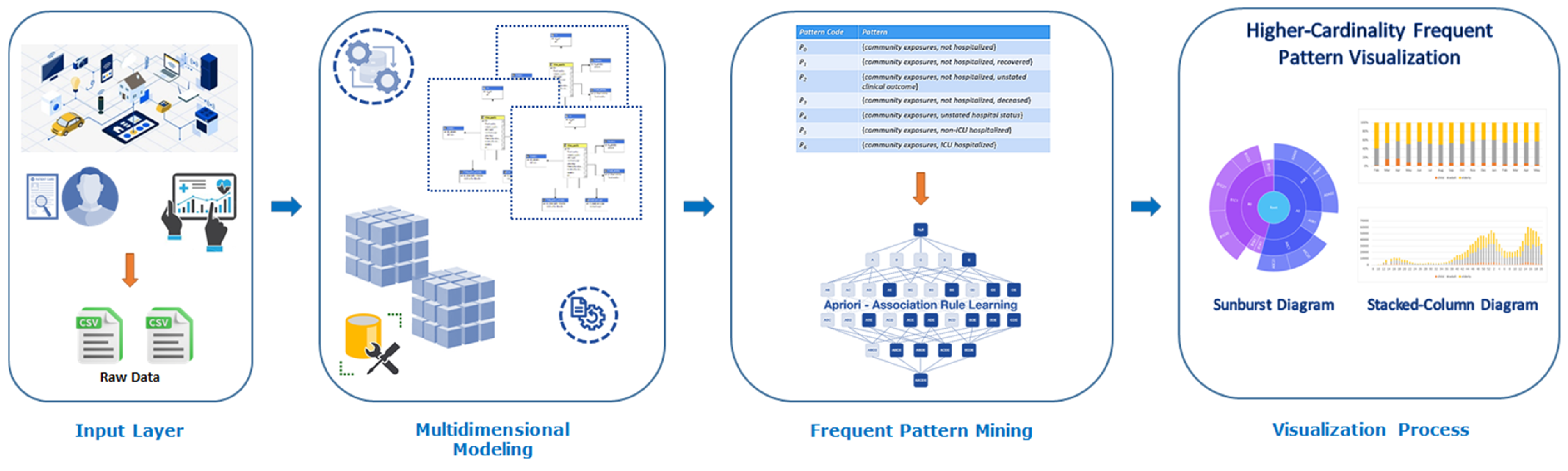
4. An Innovative Data Science Approach for Supporting Visual Big Data Analytics over Big Sequential Data Effectively and Efficiently

In this section, we illustrate a detailed examination of the working methodology of our innovative framework for supporting big data analytics and visualization over sequential data.
We develop a visual data science solution to explore and visualize temporal changes in big sequential data. Specifically, our approach is organized into four main stages: (i) Data Collection and Integration; (ii) Data Preprocessing and Multidimensional OLAP Modeling; (iii) Frequent Pattern Mining; (iv) Visualization and Interpretation. Each stage involves specific tasks, employs appropriate techniques, and contributes to uncovering meaningful temporal patterns over big sequential data. Figure 5 shows this multi-stage pipeline.
As shown in Figure 5, our multi-stage methodology for supporting visual big data analytics over big sequential data involves the following stages:

4.1. Data Collection and Integration

The first stage involves acquiring and integrating large-scale sequential data from multiple heterogeneous sources, such as governmental health portals, smart cities, and sensor data. Data integration involves resolving schema inconsistencies, aligning temporal formats, removing redundancies, and merging data from multiple systems into a unified format. The output is a consolidated raw dataset, which serves as input for the preprocessing and multidimensional modeling stage.

4.2. Data Processing and Multidimensional OLAP Modeling

In this stage, we prepare the data for analysis by performing temporal abstraction, data quality handling, and OLAP modeling. Following data integration from heterogeneous sources, it is common to encounter incomplete or missing values, often represented as NULL. Such NULL values may result from inconsistencies in data management processes. Rather than discarding these values, our methodology explicitly captures and quantifies NULL entries alongside stated values, which ensures that the analysis remains representative.
In order to enable scalable temporal analysis, we construct a temporal hierarchy that enables the grouping of records into intervals such as daily, weekly, or monthly units. This hierarchy supports scalable temporal analysis (e.g., analyzing COVID-19 statistics at a weekly level smoothing out daily fluctuations). Once data are temporally structured, we proceed to build a multidimensional OLAP data cube, where dimensions (e.g., source, location, status) and measures (e.g., counts, frequencies) are clearly defined. Using the approach outlined in Algorithm 1, we identify these dimensions and measures, define hierarchical levels where applicable, and compute aggregate values for analytical exploration. The resulting OLAP data cube serves as a foundational analytical structure that supports fast aggregation of large-scale sequential data, across multiple dimensions, with full consideration of both complete and incomplete attribute values.
Algorithm 1. MultidimensionalModeling
Input Dataset R .
Output OLAP Data Cube A .
  Begin
     A new  C u b e R ;
     d null;
     R p r e p r e P r o c e s s R ;
     D i d e n t i f y D i m e n s i o n s R p r e ;
    M ← identifyMeasures(R_pre )
    for ( d D ) do
       d d e f i n e H i e r a r c h y L e v e l s d ;
    end for
     A c o m p u t e A g g r e g a t e s R p r e , D , M ;
    return  A ;
  End

4.3. Frequent Pattern Mining

The third stage focuses on extracting frequent patterns from the OLAP cube across temporal hierarchies. This process involves scanning each temporal segment (e.g., each week) of the data cube to discover frequently co-occurring combinations of attribute values that meet a predefined minimum support threshold. The mining process iteratively generates candidate patterns, counts their support, and filters out infrequent ones. Techniques such as Apriori [109] and FP-growth [110] can be adapted for this multidimensional input. The output of this stage is a set of frequent patterns for each time interval. Algorithm 2 shows in detail the process of frequent pattern mining over the computed OLAP data cube.

4.4. Visualization and Interpretation

In the final stage, the frequently mined patterns are visually represented to facilitate intuitive understanding and temporal comparison. Rather than visualizing raw individual sequences, we focus on pattern compositions and their evolution over time. Stacked column charts are used to represent both absolute and relative frequencies of categorical feature values at each temporal point. Additional visualizations, such as sunburst diagrams and 100% stacked bars, offer alternative perspectives on composition dynamics.
Algorithm 2. FrequentPatternMining
Input OLAP Data Cube A , Minimum Support Threshold θ .
Output Frequent Pattern Set F .
  Begin
     F null;
     T e x t r a c t S a m p l e A ;
     L 1 g e t F r e q u e n t S a m p l e T , θ ;
     k 2 ;
    while ( L k 1 ) do
       C k g e n e r a t e C a n d i d a t e s ( L k 1 ) ;
      for ( t T ) do
        Ct ← getSubset(C_k,t)
        for ( c C t ) do
          count[c] ← count[c] + A.measure(t)
        end for
      end for
       L k g e t F r e q u e n t C a n d i d a t e ( c , c o u n t c , θ ) ;
       k k + 1 ;
       F . a d d L k ;
    end while
    return  R ;
  End
Furthermore, our visual data science solution represents and visualizes a feature’s temporal composition by using stacked columns to make the composition easy to understand. We observe that, when visualizing the composition of a (categorical) feature, each record takes on a single value (including NULL) for the feature. Hence, for singleton patterns on a feature, the total number of records should match the sum of the frequencies of each distinct value. If there are no singleton patterns on the k features, then the sum of the frequencies of the k features, since each one comes from a distinct domain, should be equal to the total number of records that exist. As a concrete example, with two transmission methods (i.e., domestic acquisition and international travel) and an unstated transmission method (i.e., NULL) for the feature “transmission method”, the sum of frequencies of these 2 + 1 = 3 feature values should match the total number of records. With three hospital statuses (i.e., ICU, non-ICU hospitalized, and not hospitalized) and NULL for the additional feature “hospital status”, the sum of frequencies (2 + 1) × (3 + 1) = 12 combinations of these two features should match the total number of records.
For easy comparison of compositions of features over n temporal points, our visual data science solution represents these n compositions with n stacked columns arranged according to their temporal order. The absolute frequency at time t is given by the height of the entire stacked column. In some cases, the height of the entire stacked column or segments of it may reveal the uptrend or downtrend. In addition, our solution provides users with an alternative representation in which compositions are represented by 100% stack columns. By doing so, we can easily observe the relative frequency of different values of features. It is also possible to observe changes in relative frequency.

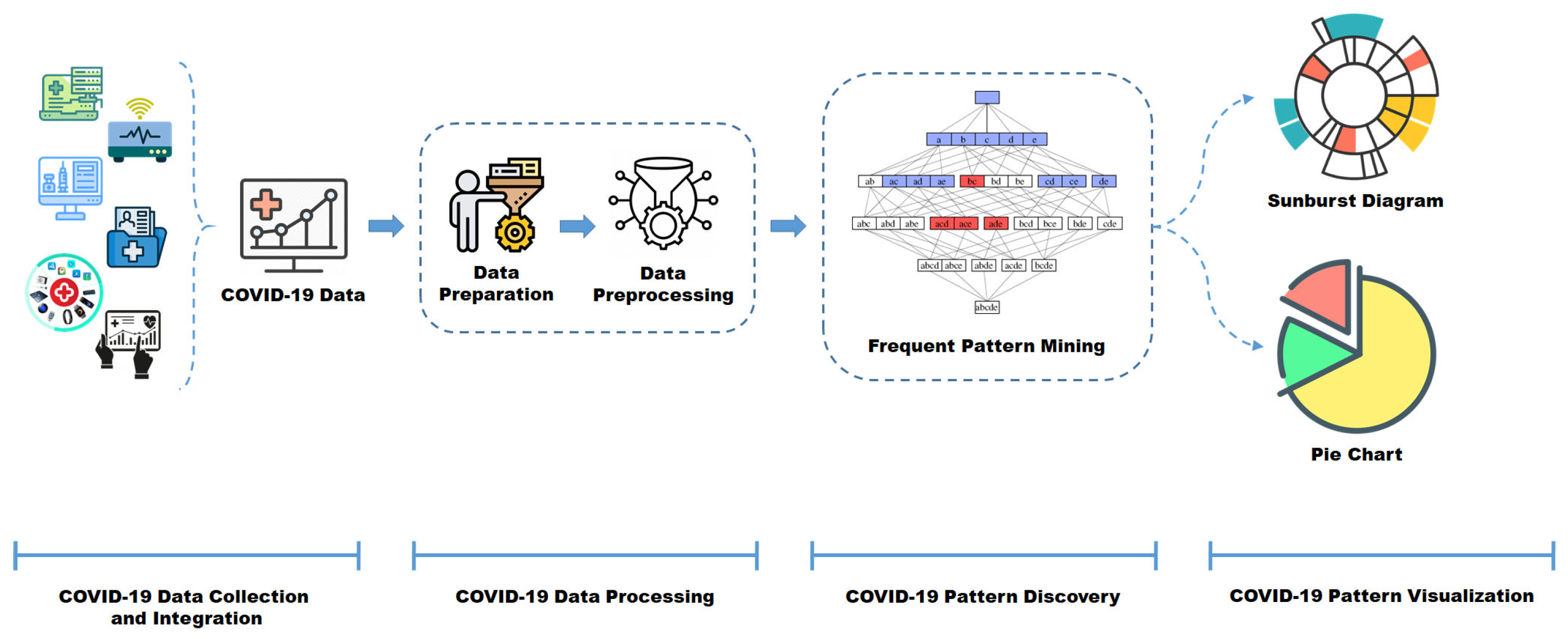
5. Case Study: Big COVID-19 Data Analysis

In this section, we present the conceptual blueprint of our proposed reference architecture, specifically designed for a groundbreaking innovative framework aimed at facilitating comprehensive big data analytics centered around COVID-19 epidemiological data. Our framework distinguishes itself through its incorporation of integrated visualization functionalities, crucially augmenting the analysis process by providing a layered comprehension of the data. The comprehensive structure of this architecture is meticulously depicted and elucidated in Figure 6.
As illustrated in Figure 6, the architectural design comprises several pivotal components and layers synergistically orchestrated to facilitate effective big data analytics over COVID-19 datasets. These layers are succinctly delineated below, offering a preliminary overview before comprehensive exploration in the subsequent section:
  • COVID-19 Data Collection and Integration: This layer addresses the intricate task of aggregating COVID-19 data originating from diverse and heterogeneous sources;
  • COVID-19 Data Processing: Serves as the center wherein data undergoes modeling in a multidimensional structure. The data are meticulously processed based on derived dimensions and measures, laying the groundwork for subsequent elaboration and analysis within the subsequent analytical layer. The initial phase in this process is data preparation, involving the meticulous selection of optimal data samples after an exhaustive data review. Data pre-processing becomes imperative to refine data quality, requiring appropriate transformations to enhance the efficacy of data modeling [111,112];
  • COVID-19 Data Pattern Discovery: This layer constitutes the primary component of the architectural framework, serving as the front-end layer where the primary objective of big data analytics is executed. This layer encompasses several integral components, including the Frequent Pattern Mining Component and supervised Learning Component: These components aid in the ultimate prediction of clinical patterns, leveraging the insights garnered from the frequent pattern mining process to generate conclusive predictions regarding COVID-19-related clinical patterns;
  • COVID-19 Data Pattern Visualization: This crucial segment emphasizes the facilitation of visualization techniques aimed at presenting intricate frequent patterns. It particularly focuses on scenarios involving datasets with high-cardinality attributes or values, ensuring an enhanced visualization of discovered patterns within the COVID-19 dataset.
In the next subsection, we will focus on these layers and components with greater detail.

5.1. Big COVID-19 Data Collection and Integration

Big data collection and integration constitute fundamental pillars in contemporary scientific endeavors, facilitating a comprehensive understanding of complex phenomena across diverse domains. The data collection process entails acquiring vast volumes of structured and unstructured information from heterogeneous sources. Data, often characterized by their volume, velocity, and variety, require advanced integration techniques to be usable [113].
The process of big data collection involves harmonizing disparate datasets by resolving inconsistencies, standardizing formats, and linking related information across sources [114]. These processes are essential for uncovering meaningful patterns, relationships, and trends. When performed effectively, big data collection and integration empower researchers to build accurate predictive models and derive actionable insights, transforming disciplines from healthcare and environmental monitoring to economics and public policy [115]. This layer is responsible for aggregating, assimilating, and organizing COVID-19 data from a diverse set of sources, including governmental health agencies, hospitals, clinical laboratories, and publicly available online databases [116]. The collected data span multiple dimensions, such as confirmed cases, mortality rates, hospitalization records, testing protocols, symptoms, contact tracing information, and transmission pathways. Given the heterogeneous and often fragmented nature of COVID-19 data, robust data consolidation and harmonization are essential to produce a coherent and unified dataset. To this end, advanced data ingestion and standardization techniques (e.g., real-time ETL, schema mapping, and data fusion) are employed to ensure real-time updates (e.g., [117]), enhance data quality, and support analytical consistency [118]. These processes involve error detection and correction, deduplication, handling of missing values, and schema alignment. The outcome is a high-quality, integrated dataset that ensures reliability and supports downstream analytical processes with precision and trustworthiness.

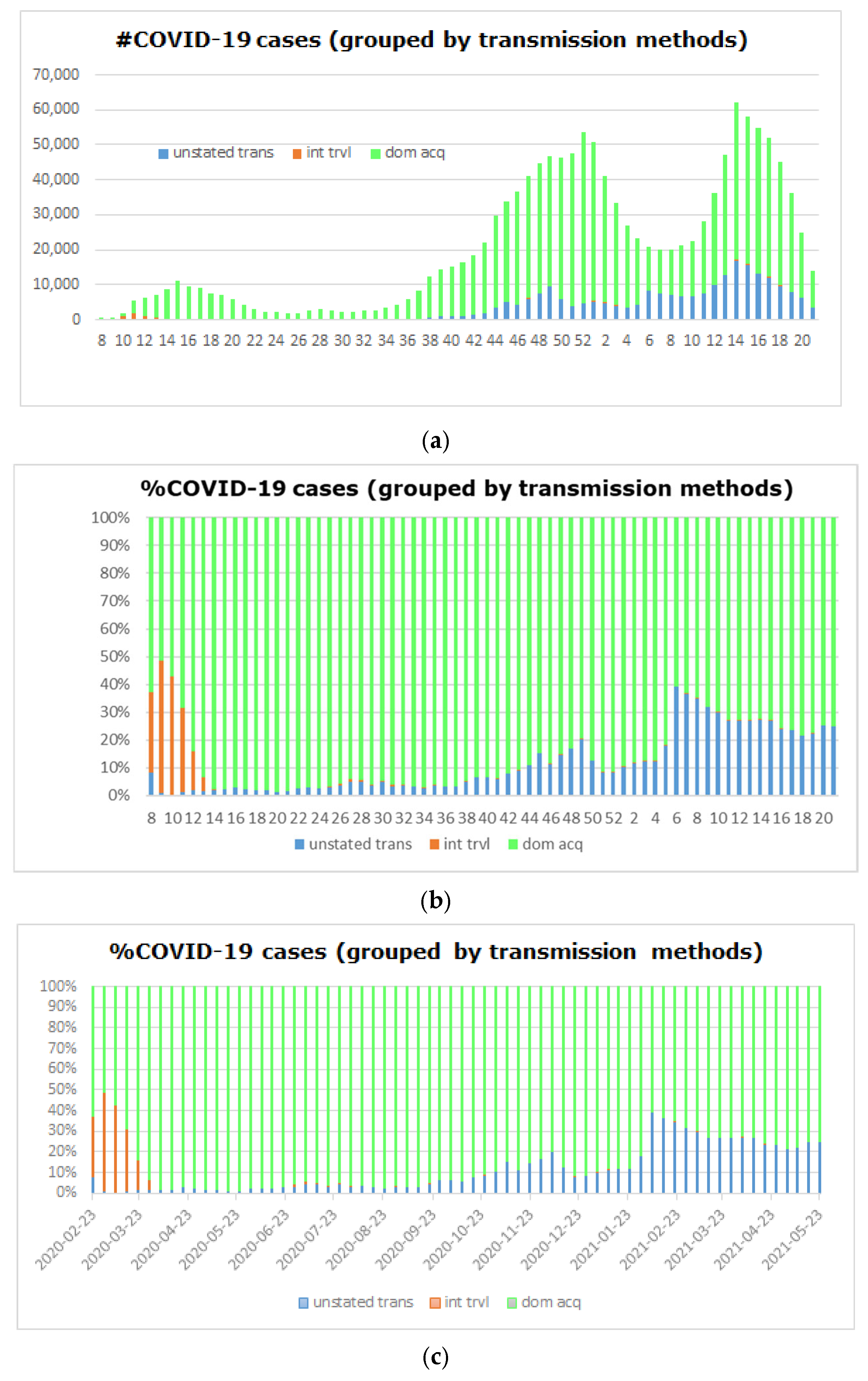
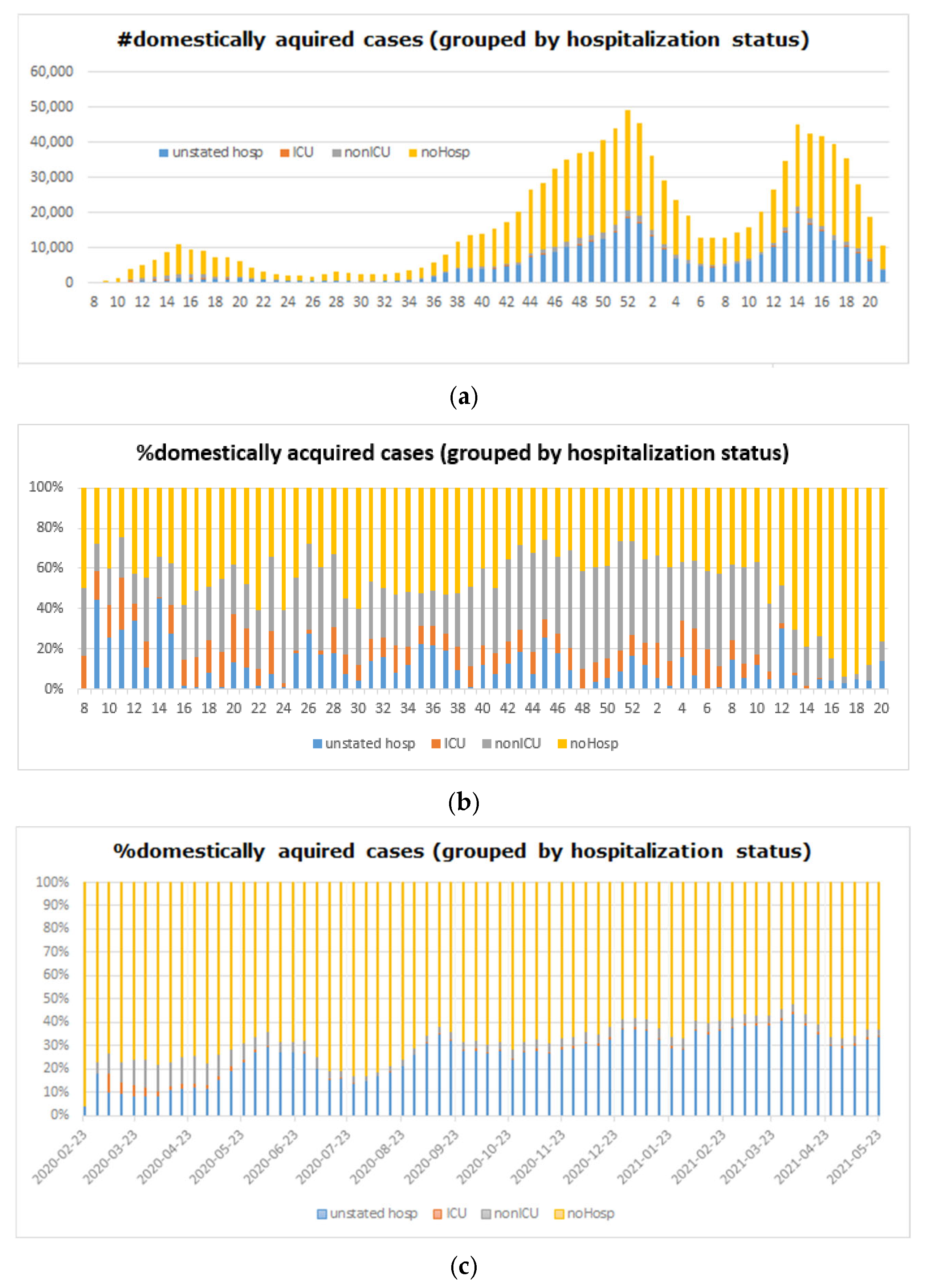
5.2. Big COVID-19 Data Processing

Big data processing stands as a foundational phase in the analytical workflow, especially for large-scale and heterogeneous datasets like those related to COVID-19. This stage is composed of two main components: (i) data preprocessing; (ii) Online Analytical Processing (OLAP) modeling.
Data preprocessing is crucial for transforming raw, inconsistent, and incomplete data into a high-quality and structured format suitable for analysis. This phase involves several standardized operations:
  • Data Cleaning (e.g., [119,120]), which includes handling missing values, eliminating duplicate records, correcting inconsistencies, and resolving data integration issues from multiple sources;
  • Data Transformation (e.g., [121,122]) standardizes the data format and structure. Common techniques include normalization, feature scaling, discretization, and encoding categorical variables;
  • Data Reduction (e.g., [123,124,125]) enhances performance and reduces complexity by using dimensionality reduction techniques such as Principal Component Analysis (PCA) and feature selection (e.g., [126,127]);
  • Data Integration (e.g., [128,129]), particularly for COVID-19 datasets and integration from varied sources (e.g., WHO reports, hospital records, mobility data), is critical.
The second component involves constructing OLAP data cubes, which are essential for enabling multidimensional analysis of the COVID-19 data. Based on dimensional modeling principles (e.g., [58,130,131,132,133,134]), the OLAP data cubes significantly enhance performance by pre-aggregating data and enabling users to interactively analyze patterns and trends across dimensions. This is particularly important for public health analysis, where fast responses and complex queries are required.

5.3. Big COVID-19 Data Pattern Discovery

Frequent pattern mining is a fundamental data mining task that aims to uncover meaningful associations and co-occurrences within large-scale datasets. In the context of big data, especially during public health crises like the COVID-19 pandemic, the ability to detect such patterns is essential for timely and informed decision-making. This process involves identifying sets of attributes or events, such as symptoms, comorbidities, geographic spread, and intervention outcomes that recur frequently across the dataset, beyond a specified minimum support threshold.
Algorithms such as Apriori (e.g., [109]) and FP-growth (e.g., [110]) are commonly used for this purpose. These algorithms efficiently identify frequent itemsets by exploring transactional databases and OLAP data cubes [135], which serve as the structured input layer in our framework. The OLAP cube, previously constructed from multidimensional COVID-19 data, enables fast, structured access to aggregated information, facilitating effective pattern mining. Within the COVID-19 use case, frequent pattern mining supports the discovery of (i) recurrent symptom combinations (e.g., fever, cough, and anosmia); (ii) patterns in demographic susceptibility (e.g., age and chronic disease profiles); (iii) spatial-temporal trends of case outbreaks; and (iv) common vaccination trajectories.
To enhance the analytical depth, machine learning-based methodologies are integrated as a complementary component, enabling predictive and exploratory capabilities beyond descriptive analysis. This layer includes
  • Supervised Learning Algorithms: algorithms, such as, Decision Trees (e.g., [136]), Random Forests (e.g., [137]), and Support Vector Machines (e.g., [138]), enable the prediction and classification of COVID-19 patterns, allowing for the forecasting of clinical outcomes or disease trajectories;
  • Unsupervised Learning Techniques: unsupervised algorithms such as K-Means (e.g., [139]) or anomaly detection (e.g., [140]) facilitate the identification of hidden structures or irregularities within COVID-19 data;
  • Deep Learning Models: deep learning (DL) models offer intricate pattern recognition capabilities beneficial for tasks such as Convolutional Neural Networks (CNNs) for radiographic image analysis (e.g., [141]), Natural Language Processing (e.g., [142]), and LSTM for time series forecasting (e.g., [143]) within COVID-19 data;
  • Ensemble Learning Approaches: these techniques merge multiple models to enhance predictive accuracy and robustness, potentially improving COVID-19 prediction models (e.g., [144,145]);
  • Transfer Learning Methods: transfer learning facilitates the adaptation of pre-trained models to address specific COVID-19-related challenges (e.g., [146,147]), leveraging knowledge gained from related domains or datasets to optimize model performance;
  • Reinforcement Learning Frameworks: these algorithms enable dynamic decision-making within evolving COVID-19 scenarios (e.g., [148,149]), potentially aiding in policy formulation or resource allocation based on learned interactions and rewards.
These ML approaches are supported by scalable computational environments (e.g., [150,151]) capable of processing real-time streaming data and historical COVID-19 records. They allow for high-level tasks such as trend forecasting, cluster detection, and automated policy suggestions, all of which directly support the goal of informed, evidence-based pandemic management.

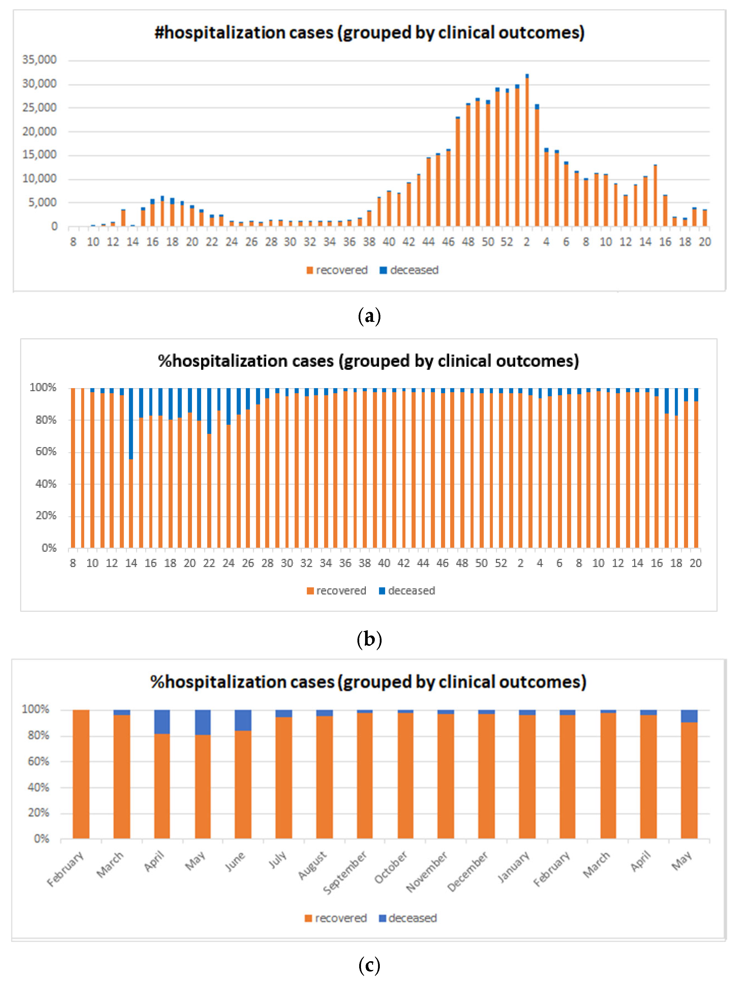
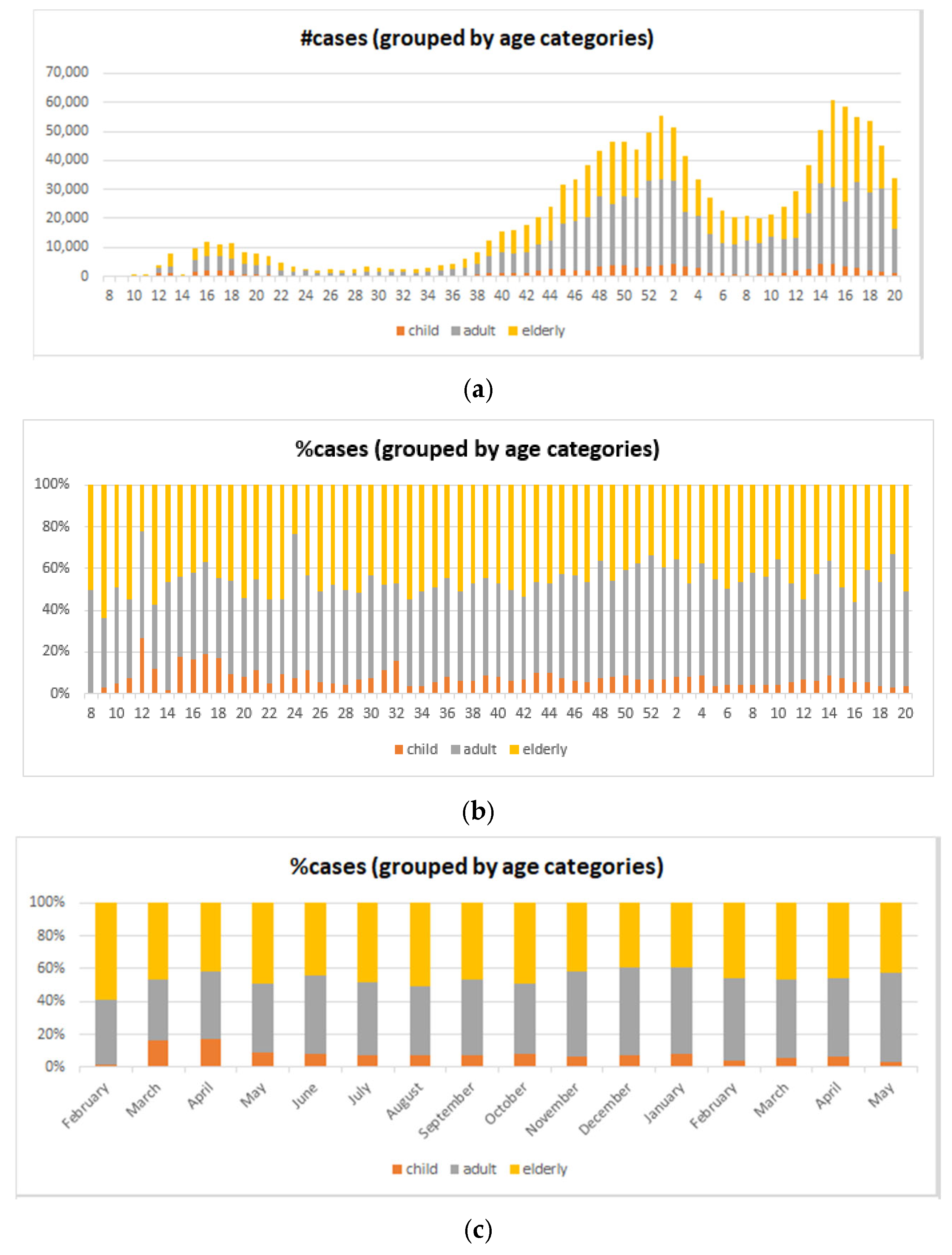
5.4. Big COVID-19 Data Pattern Visualization

Big data visualization plays a pivotal role in transforming complex, high-volume datasets into intuitive visual formats that support understanding, exploration, and decision-making. Using advanced tools and techniques (e.g., [152,153,154]), it converts raw data into charts, maps, and dashboards, enabling users to identify patterns, trends, and anomalies with ease. Visualization bridges the gap between data complexity and human interpretation, supporting effective communication and actionable insight across domains such as public health, finance, and policy (e.g., [155]).
In our architecture, the visualization layer applies multidimensional visual analytics tools to present discovered frequent patterns in an accessible and engaging manner. Techniques such as heatmaps, pie charts, and sunburst diagrams help users interpret complex co-occurrence relationships and distribution patterns within the data. This layer enhances the interpretability of mined insights, making it easier to identify key structures and guide informed decisions based on COVID-19 analytics.

6. Experimental Assessment and Analysis

In this section, we present our extensive experimental assessments and evaluations conducted using real-life Canadian COVID-19 epidemiological data.
Through this rigorous evaluation, we aim to demonstrate and substantiate both the effectiveness and efficiency of our framework. The results obtained from the analysis not only highlight the robustness of our framework but also shed light on its practical applicability in real-life scenarios. Moreover, it should be noted that that this research primarily focuses on the visualization capabilities of our proposed framework, whereas details concerning its implementation, and comparative evaluation are comprehensively addressed in our previous studies (e.g., [33,156,157]).
In order to evaluate our methodology concerning the analysis and visualization of extensive sequential data, we applied it to the real-life Canadian COVID-19 epidemiological dataset collected from the Public Health Agency of Canada (PHAC) and Statistics Canada for the period from 2020 to 29 May 2021 (i.e., Week 21 of 2021). The compositions of features associated with these 1,368,422 Canadian COVID-19 cases are graphically represented through the use of stacked column charts within our analytical framework. Each individual column encapsulates the distribution and composition of features observed throughout individual weeks within the aforementioned period.
Figure 7a shows sequences of stacked columns, where each column delineates the distribution of two stated transmission modes. The representation of COVID-19 case counts per week is clearly specified by the heights of these columns. Indeed, in each column, the (absolute) heights of the segments correspond to the domestically acquired cases, foreign-exposed cases, and cases without indication of transmission methods. Notably, earlier weeks exhibit noticeable numbers of travel-related cases, while in later or more recent periods, a higher frequency of cases with undetermined transmission methods can be seen (probably still under investigation). As the general trends illustrate, three waves of COVID-19 can be observed in Canada, characterized by fluctuations in case numbers.
Furthermore, to clearly provide a depiction of the proportional distribution among the three transmission modes (including cases where transmission modes were unstated), our visual framework provides users with a graphical representation utilizing 100% stacked columns. As presented in Figure 7b, this visualization aids in facilitating an enhanced understanding of the relative percentages attributed to each transmission mode. A noteworthy observation by users consists of the significant percentages of cases exposed to COVID-19 via international travel, which is close to 50% of infected cases during Week 9 of 2020 (i.e., 1–7 March). Subsequently, as a result of international travel restrictions, a remarkable decrease in such cases is apparent from Week 14 (5–11 April) of 2020.
Nevertheless, to enhance user convenience and flexibility, our analytical framework offers customizable options, enabling users to include or exclude NULL values. This functionality allows for tailored representations of the data. An example of the exclusion of NULL values is demonstrated in Figure 7c, which illustrates the visual representation of the relative percentages attributed to the explicitly stated transmission modes of cases.
Additionally, extending beyond the prior experiment, our framework reveals and elucidates the frequencies associated with domestic acquisition within the exposure group, delineated by varying hospital statuses. These configurations are considered the most frequent transmission modes. Figure 8 illustrates the frequencies of these hospital statuses (i.e., not hospitalized, non-ICU hospitalization, ICU hospitalization, and unstated hospital status) are represented by green, yellow, red, and white segments within stacked columns, respectively. As an observation, Figure 8a indicates a predominant occurrence of domestically acquired cases that were not subjected to hospitalization.
On the other hand, Figure 8b,c shows the weekly and monthly statistics, respectively. It can be noticed that in Week 9 of 2020, approximately 20% of domestically acquired cases led to hospitalization, with nearly 10% of them necessitating ICU admission. Following the onset of the second wave, the situation notably stabilized, which indicates a consistent trend where less than 10% of domestically acquired cases necessitated hospitalization.
As a continuation of our investigation, our focus moves toward the third phase of our experiments. Indeed, we embark on a profound exploration of clinical outcomes (i.e., Recovery and Deceased). Our aim is to dissect the frequencies associated with the trajectories of these outcomes among individuals undergoing ICU hospitalization. This critical analysis allows us to investigate the patterns and probabilities underlying the journeys toward recovery or unfortunate death.
Figure 9a comprises sequences of stacked columns, each column distinctly representing the distribution of the two clinical outcome modes. The heights of these columns precisely represent the counts of ICU hospitalization cases per week. A noticeable pattern emerges as earlier weeks prominently display elevated counts of deceased cases, whereas in recent periods, there has been an increase in the frequency of recovered cases. This general trend signifies a shift from higher mortality rates to increased instances of successful recovery over time. Notably, these observations culminate in the identification of three distinct COVID-19 waves in Canada, delineated by the evolving patterns of clinical outcomes among ICU-hospitalized individuals. Moreover, our framework employs a graphical representation utilizing 100% stacked columns to offer a clear depiction of the proportional distribution between the two clinical outcomes.
As displayed in Figure 9b, this visualization serves to enhance users‘ comprehension by illustrating the relative percentages associated with each clinical outcome mode. One noteworthy observation consists of the substantial proportion of cases admitted to the ICU and resulting in unfortunate death, which is close to 50% of infected cases during Week 14 of 2020 (i.e., 1–7 April). However, a pivotal shift becomes evident subsequently, related to the start of the vaccination campaign.
From Week 41 of 2020 (i.e., 5–11 October), a remarkable decrease in such cases is observable, signifying an important decline in the percentage of cases leading to mortality among those admitted to the ICU. This decline stands as evidence of the impact and effectiveness of vaccination efforts in altering clinical outcomes within this specific group.
Nevertheless, in order to enhance user convenience and flexibility, our analytical framework incorporates a more aggregate view option, enabling users to understand the pattern and the features present within COVID-19 data. This particular functionality allows for tailored representations of the data. An example of this aggregation view is demonstrated in Figure 9c, which presents an aggregated view illustrating the monthly relative percentages attributed to each clinical outcome among COVID-19 ICU hospitalization cases. This aggregated view empowers users to discern how the proportions of recovered and deceased cases among ICU patients fluctuate over monthly intervals during the pandemic.
In the final section of our experiments, we center our focus towards a comprehensive investigation of the different Age Categories affected by COVID-19. Indeed, we seek here to conduct a thorough examination of the frequencies associated with different age groups affected by the virus, categorizing them into Child, Adult, and Elderly demographics. The objective is to unravel and comprehend the distribution patterns among these age categories concerning individuals affected by COVID-19. This meticulous analysis will shed light on the prevalence and incidence rates within each distinct age group, providing valuable insights into how the virus affects individuals across various stages of life.
Moreover, Figure 10a shows the distribution of the three distinct age categories affected by COVID-19. The column heights precisely denote the counts of COVID-19 cases per week, which provides a clear representation of the prevalence over time. An interesting trend emerges, as earlier weeks prominently display substantial numbers of COVID-19 cases among different categories, whereas recent periods exhibit a noticeable decline in frequency. An important observation from these trends underscores that elderly individuals constitute the age category most significantly affected by COVID-19 in Canada. The data distinctly reveal a higher incidence rate among the elderly population compared to other age groups, reflecting the disproportionate influence of the virus on this demographic. This insight aids in understanding the differential susceptibility of age groups and highlights the increased vulnerability of the elderly to COVID-19 infections within the Canadian context.
On the other hand, Figure 10b serves as a visual aid by offering an improved understanding of the relative proportions of infected individuals across each age category. An interesting observation arises from this depiction, highlighting the substantial percentage of elderly individuals affected by COVID-19. During the first weeks of the pandemic (i.e., from Week 9 to Week 25 of 2020), approximately 64% of infected cases were among the elderly population. Subsequently, as a result of the start of the vaccination campaign in Week 40 (September 2020), a notable decrease in the percentage of cases among the elderly emerged. This decline is attributed to the launch of vaccination, coupled with the higher willingness of the elderly population to receive the vaccine. Despite the complexity of the data, our analytical framework aims to prioritize user convenience and flexibility. To achieve this, we provide an aggregate view option, allowing users to comprehend patterns and features inherent within the COVID-19 data.
One such example of this aggregated perspective is showcased in Figure 10c, which offers a visual representation of the monthly relative percentages attributed to each age category among COVID-19 cases. By consolidating the information into monthly relative percentages, this visualization enables a clearer understanding of how the proportions of infections among different age groups fluctuate over time. This aggregated view aids in capturing the main trends and variations within the age-specific infection rates, facilitating a complete comprehension of the evolving patterns in COVID-19 cases across various age demographics on a monthly basis.
As a result mined from these experiments, between February 2020 and May 2021, Canada suffered from three distinct waves of COVID-19. Primarily, the virus spread through international travel transmission, and subsequently, due to travel restrictions, domestic acquisition was the most influential transmission mode. Hospitalization rates varied based on regional outbreaks, highlighting higher risks for older adults and those with underlying health conditions, contributing to increased ICU admissions and unfortunate mortality. Another significant observation is that elderly adults, particularly those over 65 years old, bore the effect of severe outcomes, with higher hospitalization and mortality rates compared to younger age groups. This period witnessed the implementation of public health measures and the beginning of vaccination campaigns, which played pivotal roles in mitigating the virus impact.

7. Discussion and Remarks

Our proposed framework introduces a unified and scalable approach for multidimensional modeling, pattern discovery, and visual analytics over large-scale sequential datasets. It addresses an increasingly critical challenge in big data research, how to efficiently and interpretably analyze vast, time-dependent datasets across heterogeneous sources. One of the core strengths of the framework lies in its modular architecture, which integrates OLAP-based modeling with frequent pattern mining and interactive visualizations, thus ensuring high usability, extensibility, and domain adaptability.
Furthermore, the originality of the work is anchored in the use of stacked column-based visual modeling to enable temporal comparisons, as well as in the layered structure that facilitates seamless transitions from data acquisition to actionable insight extraction. The application to COVID-19 epidemiological data demonstrates both the practical relevance and real-life applicability of the system.
As regards the research questions raised in Section 1.1, in the following we report the corresponding research answers:
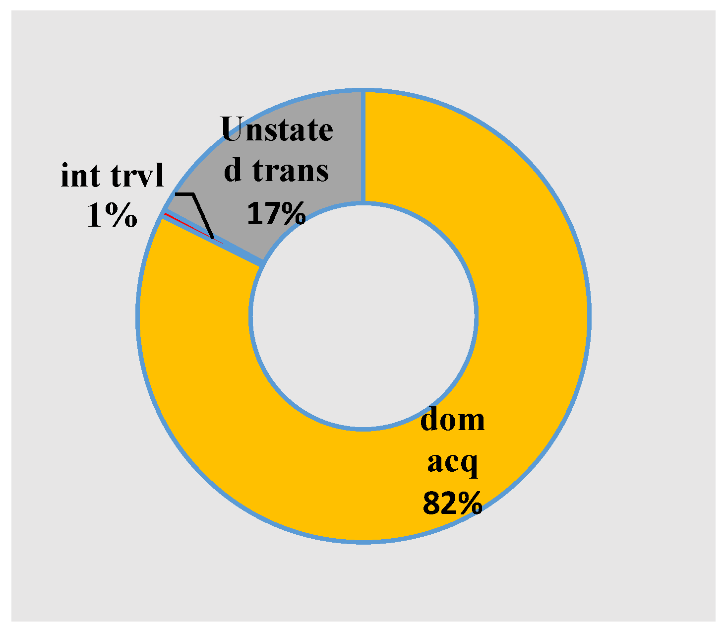
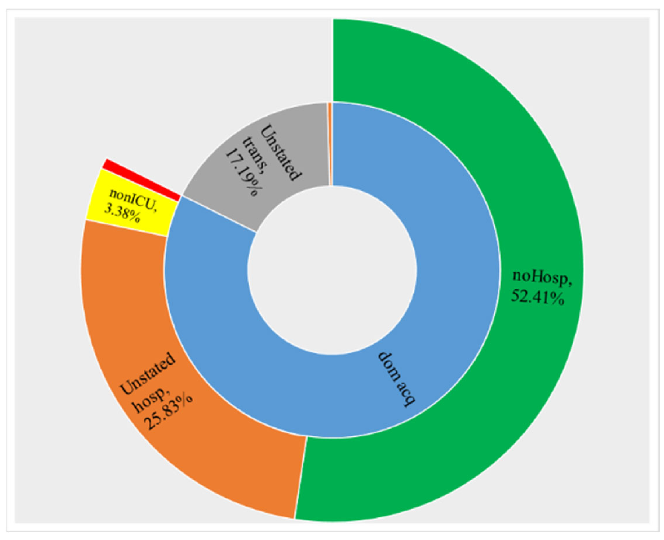
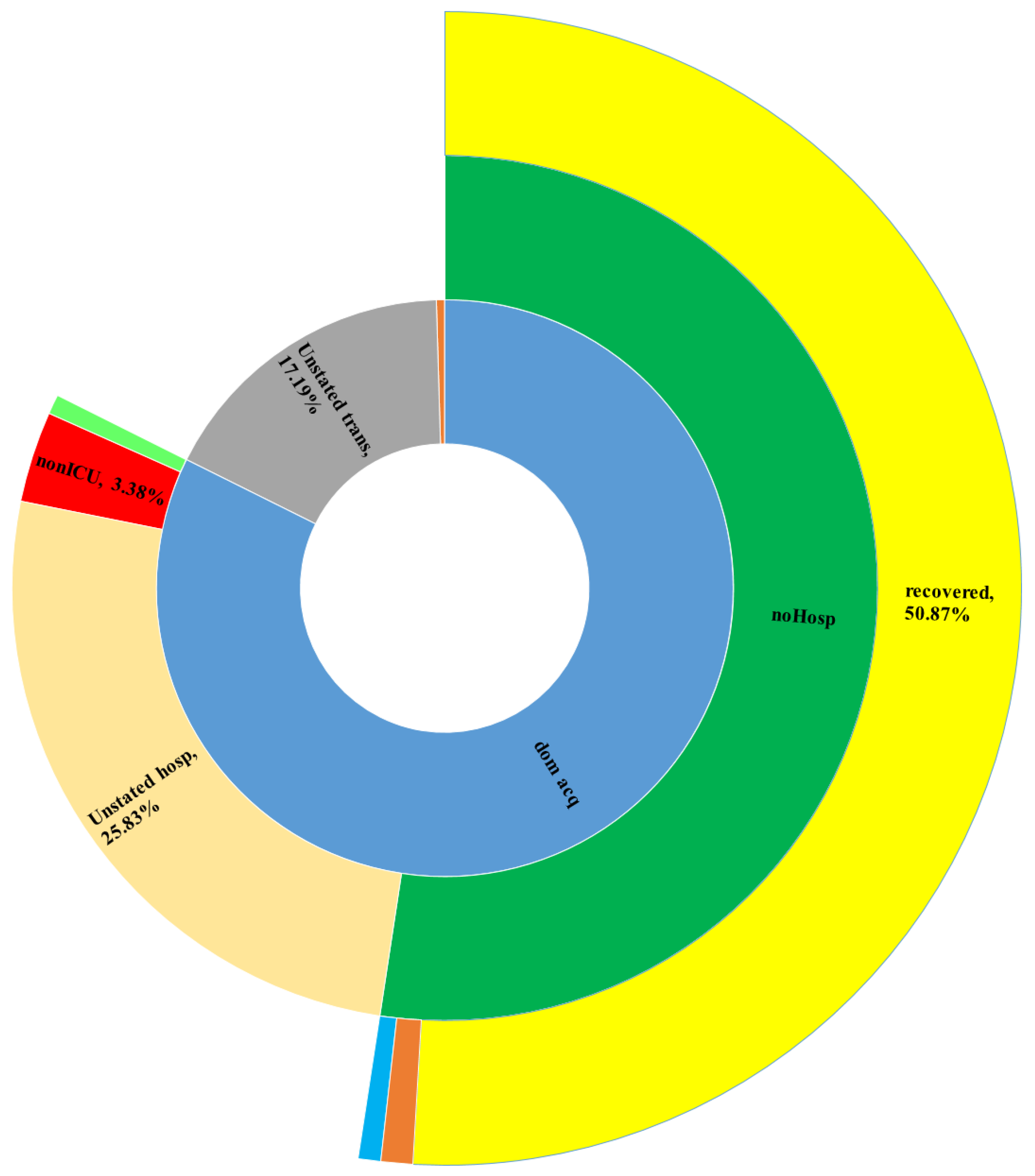
  • RA1. Our visual data science framework combines multidimensional OLAP modeling, frequent pattern mining, and interactive visualization to analyze large-scale sequential epidemiological data. Specifically, our framework processes COVID-19 data to construct OLAP data cubes that support efficient aggregation across different hierarchies. It then mines frequent patterns over OLAP data cubes (e.g., co-occurrence of hospitalization status, transmission mode, and so forth) and visualizes these using intuitive charts such as stacked columns and 100% stacked bars. The case study using Canadian COVID-19 data shows the framework can uncover temporal trends, such as the decline in ICU deaths after vaccination and the shift from international to domestic transmission over time.
  • RA2. In this research, we designed a modular, four-stage framework consisting of (i) Data Collection and Integration from heterogeneous sources; (ii) Preprocessing and Multidimensional OLAP Modeling to handle missing data, build temporal hierarchies, and generate data cubes; (iii) Frequent Pattern Mining using algorithms like Apriori or FP-growth adapted to multidimensional input; and (iv) Visualization and Interpretation through stacked column visualizations and sunburst diagrams to facilitate user interaction and interpretation.
  • RA3. Our framework is domain-agnostic and designed to be generalized by relying on sequential, multidimensional data structures and frequent pattern mining, which are applicable in many domains beyond healthcare, such as (i) financial analytics; (ii) social media; (iii) environmental monitoring; and (iv) industrial IoT systems. The framework architecture, built on data integration, OLAP modeling, ML pattern mining, and visual analytics, can be adapted to the specific semantics and structures of other domains by changing the input dimensions and mining criteria.
Beyond this, our framework opens several lines of discussion and improvement that are crucial for its evolution. Below, we outline some of the key open challenges and research directions in this context:
  • Sequential Data Complexity: sequential data in domains like healthcare, finance, or IoT often involve long, irregular, and multivariate sequences (e.g., [158,159]). Handling such complexity while preserving scalability and interpretability remains an open research challenge;
  • Real-Time Processing: although the current system supports large-scale data analysis, it primarily focuses on batch processing. Real-time sequential data streams (e.g., [160,161]) require low-latency, high-throughput mechanisms that can be integrated in future versions;
  • Data Quality and Heterogeneity: our framework relies on accurate, standardized data. However, sequential data often suffer from noise, sparsity, and temporal misalignment (e.g., [162,163]). Developing robust preprocessing and normalization layers is crucial for ensuring analytical validity;
  • Cross-Domain Generalization: while our framework has been validated using COVID-19 data, it shows strong potential for generalization to other domains with sequential data, such as (i) Environmental monitoring (e.g., [164,165,166]); (ii) Financial analytics (e.g., [167,168]); and (iii) Industrial IoT (e.g., [169,170]).

8. Conclusions and Future Work

In this paper, we introduced and presented an innovative framework for supporting big data analytics and visualization over big sequential data. The novelty of the proposed approach consists of representing the extracted feature values in stacked columns, which facilitates later temporal comparisons. Moreover, we started with an in-depth exploration of the context and motivations driving this study, along with a thorough review of existing work in the field, which offers a detailed analysis of the current state-of-the-art. After that, we demonstrated the working methodology of our method, which clearly showed its anatomy and functionalities. As well, we illustrated the practical application of the framework through a case study with a reference architecture that highlighted the utility of our approach in analyzing and visualizing COVID-19 sequential data. On the other hand, despite the fact that we evaluated and showed the practicality and reliability of the framework using real-life Canadian COVID-19 data, it can be applicable to the visualization and visual analytics of other big sequential data.
Future work is mainly oriented toward addressing and dealing with some related challenges of our proposed framework, such as privacy (e.g., [171,172]), security (e.g., [173,174]), interpretability (e.g., [175,176]), and explainability (e.g., [177,178]).

Author Contributions

Conceptualization, A.C. and C.K.L.; methodology, A.C. and C.K.L.; validation, A.C., C.K.L., I.B. and A.H.; formal analysis, A.C., I.B. and A.H.; investigation, A.C., I.B. and A.H.; resources, A.C. and C.K.L.; data curation, I.B. and A.H.; writing—original draft preparation, A.C. and C.K.L.; writing—review and editing, A.C., C.K.L., I.B. and A.H.; visualization, I.B. and A.H.; supervision, A.C. All authors have read and agreed to the published version of the manuscript.

Funding

This research is supported by the ICSC National Research Centre for High Performance Computing, Big Data and Quantum Computing within the NextGenerationEU program (Project Code: PNRR CN00000013), the Natural Sciences and Engineering Research Council of Canada (NSERC), and University of Manitoba.

Data Availability Statement

The data presented in this study are openly available in https://www.canada.ca/en/public-health.html.

Acknowledgments

The authors are grateful to Majid Abbasi Sisara, Yan Wen and Fan Jiang for their contributions to early versions of this research.

Conflicts of Interest

The authors declare no conflicts of interest.

References

  1. Kang, Y.S.; Park, I.H.; Rhee, J.; Lee, Y.H. MongoDB-Based Repository Design for IoT-Generated RFID/Sensor Big Data. IEEE Sens. J. 2015, 16, 485–497. [Google Scholar] [CrossRef]
  2. Bellatreche, L.; Ordonez, C.; Méry, D.; Golfarelli, M.; Abdelwahed, E.H. The Central Role of Data Repositories and Data Models in Data Science and Advanced Analytics. Future Gener. Comput. Syst. 2022, 129, 13–17. [Google Scholar] [CrossRef]
  3. Ohno-Machado, L.; Sansone, S.A.; Alter, G.; Fore, I.; Grethe, J.; Xu, H.; Gonzalez-Beltran, A.; Rocca-Serra, P.; Gururaj, A.E.; Bell, E.; et al. Finding Useful Data across Multiple Biomedical Data Repositories using DataMed. Nat. Genet. 2017, 49, 816–819. [Google Scholar] [CrossRef]
  4. Novotný, P.; Wild, J. The Relational Modeling of Hierarchical Data in Biodiversity Databases. Databases 2024, 2024, baae107. [Google Scholar] [CrossRef]
  5. Diallo, A.H.; Camara, G.; Lo, M.; Diagne, I.; Lamy, J.B. Proportional Visualization of Genotypes and Phenotypes with Rainbow Boxes: Methods and Application to Sickle Cell Disease. In Proceedings of the 23rd IEEE International Conference on Information Visualisation, Paris, France, 2–5 July 2019; pp. 1–6. [Google Scholar]
  6. Hamdi, S.; Chaabane, N.; Bedoui, M.H. Intra and Inter Relationships between Biomedical Signals: A VAR Model Analysis. In Proceedings of the 23rd IEEE International Conference on Information Visualisation, Paris, France, 2–5 July 2019; pp. 411–416. [Google Scholar]
  7. Pellecchia, M.T.; Frasca, M.; Citarella, A.A.; Risi, M.; Francese, R.; Tortora, G.; De Marco, F. Identifying Correlations among Biomedical Data through Information Retrieval Techniques. In Proceedings of the 23rd IEEE International Conference on Information Visualisation, Paris, France, 2–5 July 2019; pp. 269–274. [Google Scholar]
  8. Genadek, K.R.; Alexander, J.T. The Missing Link: Data Capture Technology and the Making of a Longitudinal U.S. Census Infrastructure. IEEE Ann. Hist. Comput. 2022, 44, 57–66. [Google Scholar] [CrossRef]
  9. Jonker, D.; Brath, R.; Langevin, S. Industry-Driven Visual Analytics for Understanding Financial Timeseries Models. In Proceedings of the 23rd IEEE International Conference on Information Visualisation, Paris, France, 2–5 July 2019; pp. 210–215. [Google Scholar]
  10. Luong, N.N.T.; Milosevic, Z.; Berry, A.; Rabhi, F.A. A Visual Interactive Analytics Interface for Complex Event Processing and Machine Learning Processing of Financial Market Data. In Proceedings of the 24th IEEE International Conference on Information Visualisation, Melbourne, Australia, 7–11 September 2020; pp. 189–194. [Google Scholar]
  11. Prokofieva, M. Visualization of Financial Data in Teaching Financial Accounting. In Proceedings of the 24th IEEE International Conference on Information Visualisation, Melbourne, Australia, 7–11 September 2020; pp. 674–678. [Google Scholar]
  12. Li, T.; Ogihara, M.; Tzanetakis, G. Music Data Mining; CRC Press: Boca Raton, FL, USA, 2012. [Google Scholar]
  13. Schröder, M.; Muller, S.H.A.; Vradi, E.; Mielke, J.; Lim, Y.M.F.; Couvelard, F.; Mostert, M.; Koudstaal, S.; Eijkemans, M.J.C.; Gerlinger, C. Sharing Medical Big Data While Preserving Patient Confidentiality in Innovative Medicines Initiative: A Summary and Case Report from BigData@Heart. Big Data 2023, 11, 399–407. [Google Scholar] [CrossRef]
  14. Huang, M.L.; Zhao, R.; Hua, J.; Nguyen, Q.V.; Huang, W.; Wang, J. Designing Infographics/Visual Icons of Social Network by Referencing to the Design Concept of Ancient Oracle Bone Characters. In Proceedings of the 24th IEEE International Conference on Information Visualisation, Melbourne, Australia, 7–11 September 2020; pp. 694–699. [Google Scholar]
  15. Audu, A.A.; Cuzzocrea, A.; Leung, C.K.; MacLeod, K.A.; Ohin, N.I.; Pulgar-Vidal, N.C. An Intelligent Predictive Analytics System for Transportation Analytics on Open Data Towards the Development of a Smart City. In Proceedings of the 13th International Conference on Complex, Intelligent, and Software Intensive Systems, Sydney, Australia, 3–5 July 2019; pp. 224–236. [Google Scholar]
  16. Balbin, P.P.F.; Barker, J.C.R.; Leung, C.K.; Tran, M.; Wall, R.P.; Cuzzocrea, A. Predictive Analytics on Open Big Data for Supporting Smart Transportation Services. In Proceedings of the 24th International Conference on Knowledge-Based and Intelligent Information & Engineering Systems, Verona, Italy, 16–18 September 2020; pp. 3009–3018. [Google Scholar]
  17. Shawket, I.M.; El Khateeb, S. Redefining Urban Public Space’s Characters after COVID-19: Empirical Study on Egyptian Residential Spaces. In Proceedings of the 24th IEEE International Conference on Information Visualisation, Melbourne, Australia, 7–11 September 2020; pp. 614–619. [Google Scholar]
  18. Gahwera, T.A.; Eyobu, O.S.; Mugume, I. Analysis of Machine Learning Algorithms for Prediction of Short-Term Rainfall Amounts Using Uganda’s Lake Victoria Basin Weather Dataset. IEEE Access 2024, 12, 63361–63380. [Google Scholar] [CrossRef]
  19. Meroño-Peñuela, A.; Simperl, E.; Kurteva, A.; Reklos, I. KG.GOV: Knowledge Graphs as the Backbone of Data Governance in AI. J. Web Semant. 2025, 85, 100847. [Google Scholar] [CrossRef]
  20. Muñoz-Lago, P.; Usula, N.; Parada-Cabaleiro, E.; Torrente, A. Visualising the Structure of 18th Century Operas: A Multidisciplinary Data Science Approach. In Proceedings of the 24th IEEE International Conference on Information Visualisation, Melbourne, Australia, 7–11 September 2020; pp. 530–536. [Google Scholar]
  21. Von Richthofen, A.; Zeng, W.; Asada, S.; Burkhard, R.; Heisel, F.; Arisona, S.M.; Schubiger, S. Urban Mining: Visualizing the Availability of Construction Materials for Re-use in Future Cities. In Proceedings of the 21st IEEE International Conference on Information Visualisation, London, UK, 11–14 July 2017; pp. 306–311. [Google Scholar]
  22. Casalino, G.; Castellano, G.; Mencar, C. Incremental and Adaptive Fuzzy Clustering for Virtual Learning Environments Data Analysis. In Proceedings of the 23rd IEEE International Conference on Information Visualisation, Paris, France, 2–5 July 2019; pp. 382–387. [Google Scholar]
  23. Huang, M.L.; Yue, Z.; Nguyen, Q.V.; Liang, J.; Luo, Z. Stroke Data Analysis through a HVN Visual Mining Platform. In Proceedings of the 23rd IEEE International Conference on Information Visualisation, Paris, France, 2–5 July 2019; pp. 1–6. [Google Scholar]
  24. Afonso, A.P.; Ferreira, A.; Ferreira, L.; Vaz, R. RoseTrajVis: Visual Analytics of Trajectories with Rose Diagrams. In Proceedings of the 24th IEEE International Conference on Information Visualisation, Melbourne, Australia, 7–11 September 2020; pp. 378–384. [Google Scholar]
  25. Kaupp, L.; Nazemi, K.; Humm, B. An Industry 4.0-Ready Visual Analytics Model for Context-Aware Diagnosis in Smart Manufacturing. In Proceedings of the 24th IEEE International Conference on Information Visualisation, Melbourne, Australia, 7–11 September 2020; pp. 350–359. [Google Scholar]
  26. Leung, C.K.; Carmichael, C.L. FpVAT: A Visual Analytic Tool for Supporting Frequent Pattern Mining. ACM SIGKDD Explor. 2009, 11, 39–48. [Google Scholar] [CrossRef]
  27. Maçãs, C.; Polisciuc, E.; Machado, P. VaBank: Visual Analytics for Banking Transactions. In Proceedings of the 24th IEEE International Conference on Information Visualisation, Melbourne, Australia, 7–11 September 2020; pp. 336–343. [Google Scholar]
  28. Perrot, A.; Bourqui, R.; Hanusse, N.; Auber, D. HeatPipe: High Throughput, Low Latency Big Data Heatmap with Spark Streaming. In Proceedings of the 21st IEEE International Conference on Information Visualisation, London, UK, 11–14 July 2017; pp. 66–71. [Google Scholar]
  29. Ardakani, A.A.; Kanafi, A.R.; Acharya, U.R.; Khadem, N.; Mohammadi, A. Application of Deep Learning Technique to Manage COVID-19 in Routine Clinical Practice using CT Images: Results of 10 Convolutional Neural Networks. Comput. Biol. Med. 2020, 121, 103795. [Google Scholar] [CrossRef]
  30. Jamshidi, M.; Lalbakhsh, A.; Talla, J.; Peroutka, Z.; Hadjilooei, F.; Lalbakhsh, P.; Jamshidi, M.; La Spada, L.; Mirmozafari, M.; Dehghani, M.; et al. Artificial Intelligence and COVID-19: Deep Learning Approaches for Diagnosis and Treatment. IEEE Access 2020, 8, 109581–109595. [Google Scholar] [CrossRef] [PubMed]
  31. Robson, B. COVID-19 Coronavirus Spike Protein Analysis for Synthetic Vaccines, A Peptidomimetic Antagonist, and Therapeutic Drugs, and Analysis of a Proposed Achilles’ Heel Conserved Region to Minimize Probability of Escape Mutations and Drug Resistance. Comput. Biol. Med. 2020, 121, 103749. [Google Scholar] [CrossRef] [PubMed]
  32. Bishop, C.M.; Nasrabadi, N.M. Pattern Recognition and Machine Learning; Springer: New York, NY, USA, 2006. [Google Scholar]
  33. Leung, C.K.; Chen, Y.; Hoi, C.S.H.; Shang, S.; Wen, Y.; Cuzzocrea, A. Big Data Visualization and Visual Analytics of COVID-19 Data. In Proceedings of the 24th IEEE International Conference on Information Visualisation, Melbourne, Australia, 7–11 September 2020; pp. 415–420. [Google Scholar]
  34. Pleshakova, E.; Osipov, A.; Gataullin, S.; Gataullin, T.; Vasilakos, A. Next Gen Cybersecurity Paradigm Towards Artificial General Intelligence: Russian Market Challenges and Future Global Technological Trends. J. Comput. Virol. Hacking Tech. 2024, 20, 429–440. [Google Scholar] [CrossRef]
  35. Cuzzocrea, A. Innovative Paradigms for Supporting Privacy-Preserving Multidimensional Big Healthcare Data Management and Analytics: The Case of the EU H2020 QUALITOP Research Project. In Proceedings of the 4th International Workshop on Semantic Web Meets Health Data Management Co-Located with 20th International Semantic Web Conference, Virtual, 24 October 2021; pp. 1–7. [Google Scholar]
  36. Cuzzocrea, A.; Bringas, P.G. CORE-BCD-mAI: A Composite Framework for Representing, Querying, and Analyzing Big Clinical Data by Means of Multidimensional AI Tools. In Proceedings of the 17th International Conference on Hybrid Artificial Intelligent Systems, Salamanca, Spain, 5–7 September 2022; pp. 175–185. [Google Scholar]
  37. Cuzzocrea, A. Multidimensional Big Data Analytics over Big Web Knowledge Bases: Models, Issues, Research Trends, and a Reference Architecture. In Proceedings of the 8th IEEE International Conference on Multimedia Big Data, Naples, Italy, 5–7 December 2022; pp. 1–6. [Google Scholar]
  38. Cuzzocrea, A. A Reference Architecture for Supporting Multidimensional Big Data Analytics over Big Web Knowledge Bases: Definitions, Implementation, Case Studies. Int. J. Semant. Comput. 2023, 17, 545–568. [Google Scholar] [CrossRef]
  39. Cuzzocrea, A.; Sisara, M.A.; Leung, C.K.; Wen, Y.; Jiang, F. Effectively and Efficiently Supporting Visual Big Data Analytics over Big Sequential Data: An Innovative Data Science Approach. In Proceedings of the 22nd International Conference on Computational Science and Its Applications, Malaga, Spain, 4–7 July 2022; pp. 113–125. [Google Scholar]
  40. Lin, G.; Lin, A.; Cao, J. Multidimensional KNN Algorithm Based on EEMD and Complexity Measures in Financial Time Series Forecasting. Expert Syst. Appl. 2021, 168, 114443. [Google Scholar] [CrossRef]
  41. Jentner, W.; Keim, D.A. Visualization and Visual Analytic Techniques for Patterns. In High-Utility Pattern Mining; Springer: Cham, Switzerland, 2019; pp. 303–337. [Google Scholar]
  42. Liu, X.; Zhou, Y.; Wang, Z. Can the Development of a Patient’s Condition be Predicted through Intelligent Inquiry under the E-Health Business Mode? Sequential Feature Map-Based Disease Risk Prediction upon Features Selected from Cognitive Diagnosis Big Data. Int. J. Inf. Manag. 2020, 50, 463–486. [Google Scholar] [CrossRef]
  43. Carroll, L.N.; Au, A.P.; Detwiler, L.T.; Fu, T.C.; Painter, I.S.; Abernethy, N.F. Visualization and Analytics Tools for Infectious Disease Epidemiology: A Systematic Review. J. Biomed. Inform. 2014, 51, 287–298. [Google Scholar] [CrossRef]
  44. Ghouzali, S.; Bayoumi, S.; Larabi-Marie-Sainte, S.; Shaheen, S. COVID-19 in Saudi Arabia: A Pandemic Data Descriptive Analysis and Visualization. In Proceedings of the 7th ACM Annual International Conference on Arab Women in Computing, Sharjah, United Arab Emirates, 25–26 August 2021; pp. 1–5. [Google Scholar]
  45. Angelini, M.; Cazzetta, G. Progressive Visualization of Epidemiological Models for COVID-19 Visual Analysis. In Proceedings of the 2020 AVI Workshop on Big Data Applications, Ischia, Italy, 9 June 2020; pp. 163–173. [Google Scholar]
  46. Dey, S.K.; Rahman, M.M.; Siddiqi, U.R.; Howlader, A. Analyzing the Epidemiological Outbreak of COVID-19: A Visual Exploratory Data Analysis Approach. J. Med. Virol. 2020, 92, 632–638. [Google Scholar] [CrossRef]
  47. Milano, M.; Zucco, C.; Cannataro, M. COVID-19 Community Temporal Visualizer: A New Methodology for the Network-Based Analysis and Visualization of COVID-19 Data. Netw. Model. Anal. Health Inform. Bioinform. 2021, 10, 46. [Google Scholar] [CrossRef]
  48. Healey, C.G.; Simmons, S.J.; Manivannan, C.; Ro, Y. Visual Analytics for the Coronavirus COVID-19 Pandemic. Big Data 2022, 10, 95–114. [Google Scholar] [CrossRef]
  49. Liao, M.; Zhu, T. Applications of Artificial Intelligence and Big Data for COVID-19 Pandemic: A Review. In Proceedings of the 9th ACM International Conference on Biomedical and Bioinformatics Engineering, Kyoto, Japan, 10–13 September 2022; pp. 253–259. [Google Scholar]
  50. Cui, L.; Kong, W. Visualization Analysis of Spatiotemporal Data of COVID-19. In Proceedings of the 16th IEEE International Conference on Intelligent Systems and Knowledge Engineering, Chengdu, China, 26–28 November 2021; pp. 565–571. [Google Scholar]
  51. Ali, S.M.; Gupta, N.; Nayak, G.K.; Lenka, R.K. Big Data Visualization: Tools and Challenges. In Proceedings of the 2nd IEEE International Conference on Contemporary Computing and Informatics, Greater Noida, India, 14–17 December 2016; pp. 656–660. [Google Scholar]
  52. Delange, B.; Popoff, B.; Séité, T.; Lamer, A.; Parrot, A. LinkR: An Open Source, Low-Code and Collaborative Data Science Platform for Healthcare Data Analysis and Visualization. Int. J. Med. Inform. 2025, 199, 105876. [Google Scholar] [CrossRef] [PubMed]
  53. Basu, S. Machine Learning and Visualizations for Time-Series Healthcare Data. In Proceedings of the 11th IEEE International Conference on Healthcare Informatics, Houston, TX, USA, 26–29 June 2023; p. 485. [Google Scholar]
  54. Dixon, B.E.; Grannis, S.J.; Tachinardi, U.; Williams, J.L.; McAndrews, C.; Embí, P.J. Daily Visualization of Statewide COVID-19 Healthcare Data. In Proceedings of the 2020 IEEE Workshop on Visual Analytics in Healthcare, Virtual, 14–18 November 2020; pp. 1–3. [Google Scholar]
  55. Saravanan, V.; Pramod, A.; Poudel, L.; Paramasivam, P. Predictive Precision: LSTM-Based Analytics for Real-time Stock Market Visualization. In Proceedings of the 2023 IEEE International Conference on Big Data, Sorrento, Italy, 15–18 December 2023; pp. 1–6. [Google Scholar]
  56. Romero, O.; Abelló, A. A Survey of Multidimensional Modeling Methodologies. Int. J. Data Warehous. Min. 2009, 5, 1–23. [Google Scholar] [CrossRef]
  57. Malinowski, E.; Zimányi, E. Hierarchies in a Multidimensional Model: From Conceptual Modeling to Logical Representation. Data Knowl. Eng. 2006, 59, 348–377. [Google Scholar] [CrossRef]
  58. Gray, J.; Chaudhuri, S.; Bosworth, A.; Layman, A.; Reichart, D.; Venkatrao, M.; Pellow, F.; Pirahesh, H. Data Cube: A Relational Aggregation Operator Generalizing Group-by, Cross-Tab, and Sub Totals. Data Min. Knowl. Discov. 1997, 1, 29–53. [Google Scholar] [CrossRef]
  59. Yu, C.C.; Chen, Y.L. Mining Sequential Patterns from Multidimensional Sequence Data. IEEE Trans. Knowl. Data Eng. 2005, 17, 136–140. [Google Scholar]
  60. Tang, H.; Liao, S.S.; Sun, S.X. Mining Sequential Relations from Multidimensional Data Sequence for Prediction. In Proceedings of the 2008 International Conference on Information Systems, Paris, France, 14–17 December 2008; p. 197. [Google Scholar]
  61. Plantevit, M.; Laurent, A.; Laurent, D.; Teisseire, M.; Choong, Y.W. Mining Multidimensional and Multilevel Sequential Patterns. ACM Trans. Knowl. Discov. Data 2010, 4, 4. [Google Scholar] [CrossRef]
  62. Raïssi, C.; Plantevit, M. Mining Multidimensional Sequential Patterns over Data Streams. In Proceedings of the 10th International Conference on Data Warehousing and Knowledge Discovery, Turin, Italy, 2–5 September 2008; pp. 263–272. [Google Scholar]
  63. Cohen, A.; Merhav, N.; Weissman, T. Scanning and Sequential Decision Making for Multidimensional Data-Part I: The Noiseless Case. IEEE Trans. Inf. Theory 2007, 53, 3001–3020. [Google Scholar] [CrossRef]
  64. Cohen, A.; Weissman, T.; Merhav, N. Scanning and Sequential Decision Making for Multidimensional Data-Part II: The Noisy Case. IEEE Trans. Inf. Theory 2008, 54, 5609–5631. [Google Scholar] [CrossRef]
  65. Abdullah, P.Y.; Zeebaree, S.R.; Jacksi, K.; Zeabri, R.R. An HRM System for Small and Medium Enterprises (SME) Based on Cloud Computing Technology. Int. J. Res. 2020, 8, 56–64. [Google Scholar] [CrossRef]
  66. Haji, L.M.; Zeebaree, S.; Ahmed, O.M.; Sallow, A.B.; Jacksi, K.; Zeabri, R.R. Dynamic Resource Allocation for Distributed Systems and Cloud Computing. TEST Eng. Manag. 2020, 83, 22417–22426. [Google Scholar]
  67. Khalifa, I.A.; Zeebaree, S.R.; Ataş, M.; Khalifa, F.M. Image Steganalysis in Frequency Domain using Co-Occurrence Matrix and BPNN. Sci. J. Univ. Zakho 2019, 7, 27–32. [Google Scholar] [CrossRef]
  68. Chawla, G.; Bamal, S.; Khatana, R. Big Data Analytics for Data Visualization: Review of Techniques. Int. J. Comput. Appl. 2018, 182, 37–40. [Google Scholar] [CrossRef]
  69. Chen, C.P.; Zhang, C.Y. Data-Intensive Applications, Challenges, Techniques and Technologies: A Survey on Big Data. Inf. Sci. 2014, 275, 314–347. [Google Scholar] [CrossRef]
  70. Leung, C.K.; Braun, P.; Cuzzocrea, A. AI-Based Sensor Information Fusion for Supporting Deep Supervised Learning. Sensors 2019, 19, 1345. [Google Scholar] [CrossRef]
  71. Pereira, C.A.; Peixoto, R.C.R.; Kaster, M.P.; Grellert, M.; Carvalho, J.T. Using Data Mining Techniques to Understand Patterns of Suicide and Reattempt Rates in Southern Brazil. In Proceedings of the 17th International Joint Conference on Biomedical Engineering Systems and Technologies, Rome, Italy, 21–23 February 2024; pp. 385–392. [Google Scholar]
  72. Movahedi, F.; Zhang, Y.; Padman, R.; Antaki, J.F. Mining Temporal Patterns from Sequential Healthcare Data. In Proceedings of the 2018 IEEE International Conference on Healthcare Informatics, New York, NY, USA, 4–7 June 2018; pp. 461–462. [Google Scholar]
  73. Greene, N. Hierarchical Polygon Tiling with Coverage Masks. In Proceedings of the 23rd ACM Annual Conference on Computer Graphics and Interactive Techniques, New Orleans, LA, USA, 4–9 August 1996; pp. 65–74. [Google Scholar]
  74. Tedesco, J.; Dudko, R.; Sharma, A.; Farivar, R.; Campbell, R. Theius: A Streaming Visualization Suite for Hadoop Clusters. In Proceedings of the 2013 IEEE International Conference on Cloud Engineering, San Francisco, CA, USA, 25–27 March 2013; pp. 177–182. [Google Scholar]
  75. Tennekes, M.; de Jonge, E. Top-Down Data Analysis with Treemaps. In Proceedings of the 2011 International Conference on Information Visualization Theory and Applications, Algarve, Portugal, 5–7 March 2011; pp. 236–241. [Google Scholar]
  76. Johansson, J.; Forsell, C.; Lind, M.; Cooper, M. Perceiving Patterns in Parallel Coordinates: Determining Thresholds for Identification of Relationships. Inf. Vis. 2008, 7, 152–162. [Google Scholar] [CrossRef]
  77. Byron, L.; Wattenberg, M. Stacked Graphs–Geometry & Aesthetics. IEEE Trans. Vis. Comput. Graph. 2022, 14, 1245–1252. [Google Scholar]
  78. Bach, B.; Shi, C.; Heulot, N.; Madhyastha, T.M.; Grabowski, T.J.; Dragicevic, P. Time Curves: Folding Time to Visualize Patterns of Temporal Evolution in Data. IEEE Trans. Vis. Comput. Graph. 2016, 22, 559–568. [Google Scholar] [CrossRef]
  79. Wattenberg, M. Arc Diagrams: Visualizing Structure in Strings. In Proceedings of the 2002 IEEE Symposium on Information Visualization, Boston, MA, USA, 27 October–1 November 2002; pp. 110–116. [Google Scholar]
  80. Kargupta, H.; Park, B.H.; Pittie, S.; Liu, L.; Kushraj, D.; Sarkar, K. MobiMine: Monitoring the Stock Market from a PDA. SIGKDD Explor. 2002, 3, 37–46. [Google Scholar] [CrossRef]
  81. Olshannikova, E.; Ometov, A.; Koucheryavy, Y.; Olsson, T. Visualizing Big Data with Augmented and Virtual Reality: Challenges and Research Agenda. J. Big Data 2015, 2, 22. [Google Scholar] [CrossRef]
  82. Agrawal, R.; Kadadi, A.; Dai, X.; Andrès, F. Challenges and Opportunities with Big Data Visualization. In Proceedings of the 7th ACM International Conference on Management of Computational and Collective Intelligence in Digital Ecosystems, Caraguatatuba, Brazil, 25–29 October 2015; pp. 169–173. [Google Scholar]
  83. Childs, H.; Geveci, B.; Schroeder, W.J.; Meredith, J.S.; Moreland, K.; Sewell, C.M.; Kuhlen, T.W.; Wes Bethel, E. Research Challenges for Visualization Software. IEEE Comput. 2013, 46, 34–42. [Google Scholar] [CrossRef]
  84. Okada, K.; Itoh, T. Scatterplot Selection for Dimensionality Reduction in Multidimensional Data Visualization. J. Vis. 2025, 28, 205–221. [Google Scholar] [CrossRef]
  85. Wang, L.; Wang, G.; Alexander, C.A. Big Data and Visualization: Methods, Challenges and Technology Progress. Digit. Technol. 2015, 1, 33–38. [Google Scholar]
  86. Cai, L.; Guan, X.; Chi, P.; Chen, L.; Luo, J. Big Data Visualization Collaborative Filtering Algorithm Based on RHadoop. Int. J. Distrib. Sens. Netw. 2015, 11, 271253. [Google Scholar] [CrossRef]
  87. Freitag, B.; Maskey, M.; Barciauskas, A.; Solvsteen, J.; Colliander, J.; Munroe, J. The Visualization, Exploration, and Data Analysis (VEDA) Platform: A Modular, Open Platform Lowering the Barrier to Entry to Cloud Computing. In Proceedings of the 2024 IEEE International Geoscience and Remote Sensing Symposium, Athens, Greece, 7–12 July 2024; pp. 3736–3739. [Google Scholar]
  88. Gorodov, E.Y.E.; Gubarev, V.V.E. Analytical Review of Data Visualization Methods in Application to Big Data. J. Electr. Comput. Eng. 2013, 2013, 969458. [Google Scholar] [CrossRef]
  89. Rajeevan, S.; Ramachandran, S.; Poulose, A. Tableau-driven Data Analysis and Visualization of COVID-19 Cases in India. In Proceedings of the 5th IEEE International Conference on Innovative Trends in Information Technology, Kottayam, India, 15–16 March 2024; pp. 1–6. [Google Scholar]
  90. Singh, G.; Kumar, A.; Singh, J.; Kaur, J. Data visualization for developing effective performance dashboard with Power BI. In Proceedings of the 2023 IEEE International Conference on Innovative Data Communication Technologies and Application, Uttarakhand, India, 14–16 March 2023; pp. 968–973. [Google Scholar]
  91. Gorle, D.L.; Padala, A. The Impact of COVID-19 Deaths, Medical Analysis & Visualization Using Plotly. Int. J. Health Sci. 2022, 6, 11957–11971. [Google Scholar]
  92. Zhang, Y.; Sun, Y.; Gaggiano, J.D.; Kumar, N.; Andris, C.; Parker, A.G. Visualization Design Practices in a Crisis: Behind the Scenes with COVID-19 Dashboard Creators. IEEE Trans. Vis. Comput. Graph. 2023, 29, 1037–1047. [Google Scholar] [CrossRef]
  93. Bastian, M.; Heymann, S.; Jacomy, M. Gephi: An Open Source Software for Exploring and Manipulating Networks. In Proceedings of the 3rd International AAAI Conference on Weblogs and Social Media, San Jose, CA, USA, 17–20 May 2009; pp. 361–362. [Google Scholar]
  94. Cernile, G.; Heritage, T.; Sebire, N.J.; Gordon, B.; Schwering, T.; Kazemlou, S.; Borecki, Y. Network Graph Representation of COVID-19 Scientific Publications to Aid Knowledge Discovery. BMJ Health Care Inform. 2021, 28, 100254. [Google Scholar] [CrossRef]
  95. Alvarez, M.M.; González-González, E.; Trujillo-de Santiago, G. Modeling COVID-19 Epidemics in an Excel Spreadsheet to Enable First-Hand Accurate Predictions of the Pandemic Evolution in Urban Areas. Sci. Rep. 2021, 11, 4327. [Google Scholar] [CrossRef]
  96. Albahri, A.S.; Hamid, R.A.; Alwan, J.K.; Al-Qays, Z.T.; Zaidan, A.A.; Zaidan, B.B.; Albahri, O.S.; Al-Amoodi, A.H.; Khlaf, J.M.; Almahdi, E.M.; et al. Role of Biological Data Mining and Machine Learning Techniques in Detecting and Diagnosing the Novel Coronavirus (COVID-19): A Systematic Review. J. Med. Syst. 2020, 44, 122. [Google Scholar] [CrossRef]
  97. Johns Hopkins University & Medicine. COVID-19 Dashboard. Available online: https://coronavirus.jhu.edu/map.html (accessed on 20 December 2024).
  98. European Centre for Disease Prevention and Control. COVID-19 EU/EEA Daily Cases and Deaths Dashboard. Available online: https://qap.ecdc.europa.eu/public/extensions/COVID-19/COVID-19.html (accessed on 20 December 2024).
  99. Bothorel, G.; Serrurier, M.; Hurter, C. Visualization of Frequent Itemsets with Nested Circular Layout and Bundling Algorithm. In Proceedings of the 9th International Symposium on Advanced in Visual Computing, Rethymnon, Crete, Greece, 29–31 July 2013; pp. 396–405. [Google Scholar]
  100. Wong, P.C. Visual Data Mining. IEEE Comput. Graph. Appl. 1999, 19, 20–21. [Google Scholar] [CrossRef]
  101. Leung, C.K.; Irani, P.; Carmichael, C.L. FIsViz: A Frequent Itemset Visualizer. In Proceedings of the 12th Pacific-Asia Conference on Knowledge Discovery and Data Mining, Osaka, Japan, 20–23 May 2008; pp. 644–652. [Google Scholar]
  102. Leung, C.K.; Kononov, V.V.; Pazdor, A.G.M.; Jiang, F. PyramidViz: Visual Analytics and Big Data Visualization for Frequent Patterns. In Proceedings of the 14th IEEE DASC/PICom/DataCom/CyberSciTech, Auckland, New Zealand, 8–12 August 2016; pp. 913–916. [Google Scholar]
  103. Leung, C.K.; Jiang, F.; Irani, P.P. FpMapViz: A Space-Filling Visualization for Frequent Patterns. In Proceedings of the 11th IEEE International Conference on Data Mining Workshops, Vancouver, BC, Canada, 11 December 2011; pp. 804–811. [Google Scholar]
  104. Cappers, B.C.M.; Van Wijk, J.J. Exploring Multivariate Event Sequences using Rules, Aggregations, and Selections. IEEE Trans. Vis. Comput. Graph. 2018, 24, 532–541. [Google Scholar] [CrossRef] [PubMed]
  105. Zhao, J.; Liu, Z.; Dontcheva, M.; Hertzmann, A.; Wilson, A. MatrixWave: Visual Comparison of Event Sequence Data. In Proceedings of the 33rd Annual ACM Conference on Human Factors in Computing Systems, Seoul, Republic of Korea, 18–23 April 2015; pp. 259–268. [Google Scholar]
  106. Chen, Y.; Xu, P.; Ren, L. Sequence Synopsis: Optimize Visual Summary of Temporal Event Data. IEEE Trans. Vis. Comput. Graph. 2017, 24, 45–55. [Google Scholar] [CrossRef] [PubMed]
  107. Stolper, C.D.; Perer, A.; Gotz, D. Progressive Visual Analytics: User-Driven Visual Exploration of In-Progress Analytics. IEEE Trans. Vis. Comput. Graph. 2014, 20, 1653–1662. [Google Scholar] [CrossRef] [PubMed]
  108. Jentner, W.; El-Assady, M.; Gipp, B.; Keim, D.A. Feature Alignment for the Analysis of Verbatim Text Transcripts. In Proceedings of the 8th International EuroVis Workshop on Visual Analytics, Barcelona, Spain, 12–13 June 2017; pp. 13–17. [Google Scholar]
  109. Agrawal, R.; Srikant, R. Fast Algorithms for Mining Association Rules in Large Databases. In Proceedings of the 20th International Conference on Very Large Data Bases, Santiago de, Chile, Chile, 12–15 September 1994; pp. 487–499. [Google Scholar]
  110. Han, J.; Pei, J.; Yin, Y.; Mao, R. Mining Frequent Patterns without Candidate Generation: A Frequent-Pattern Tree Approach. Data Min. Knowl. Discov. 2004, 8, 53–87. [Google Scholar] [CrossRef]
  111. Imtiaz, S.A.; Shah, S.L. Treatment of Missing Values in Process Data Analysis. Can. J. Chem. Eng. 2008, 86, 838–858. [Google Scholar] [CrossRef]
  112. Nelson, P.R.C.; Taylor, P.A.; MacGregor, J.F. Missing Data Methods in PCA and PLS: Score Calculations with Incomplete Observations. Chemom. Intell. Lab. Syst. 1996, 35, 45–65. [Google Scholar] [CrossRef]
  113. Hashem, I.A.T.; Yaqoob, I.; Anuar, N.B.; Mokhtar, S.; Gani, A.; Khan, S.U. The Rise of “Big Data” on Cloud Computing: Review and Open Research Issues. Inf. Syst. 2015, 47, 98–115. [Google Scholar] [CrossRef]
  114. Batini, C.; Lenzerini, M.; Navathe, S.B. A Comparative Analysis of Methodologies for Database Schema Integration. ACM Comput. Surv. 1986, 18, 323–364. [Google Scholar] [CrossRef]
  115. Chen, M.; Mao, S.; Liu, Y. Big Data: A survey. Mob. Netw. Appl. 2014, 19, 171–209. [Google Scholar] [CrossRef]
  116. Jagadish, H.V.; Gehrke, J.; Labrinidis, A.; Papakonstantinou, Y.; Patel, J.M.; Ramakrishnan, R.; Shahabi, C. Big Data and its Technical Challenges. Commun. ACM 2014, 57, 86–94. [Google Scholar] [CrossRef]
  117. Naeem, M.A.; Mehmood, E.; Malik, M.A.; Jamil, N. Optimizing Semi-Stream CACHEJOIN for Near-Real-Time Data Warehousing. J. Database Manag. 2020, 31, 20–37. [Google Scholar] [CrossRef]
  118. Shi, P.; Cui, Y.; Xu, K.; Zhang, M.; Ding, L. Data Consistency Theory and Case Study for Scientific Big Data. Information 2019, 10, 137. [Google Scholar] [CrossRef]
  119. Rahm, E.; Do, H.H. Data Cleaning: Problems and Current Approaches. IEEE Data Eng. Bull. 2000, 23, 3–13. [Google Scholar]
  120. Chu, X.; Ilyas, I.F.; Krishnan, S.; Wang, J. Data Cleaning: Overview and Emerging Challenges. In Proceedings of the 2016 ACM International Conference on Management of Data, San Francisco, CA, USA, 26 June–1 July 2016; pp. 2201–2206. [Google Scholar]
  121. Adikaram, K.K.L.B.; Hussein, M.A.; Effenberger, M.; Becker, T. Data Transformation Technique to Improve the Outlier Detection Power of Grubbs’ Test for Data Expected to Follow Linear Relation. J. Appl. Math. 2015, 2015, 708948. [Google Scholar] [CrossRef]
  122. Jolai, F.; Ghanbari, A. Integrating Data Transformation Techniques with Hopfield Neural Networks for Solving Travelling Salesman Problem. Expert Syst. Appl. 2010, 37, 5331–5335. [Google Scholar] [CrossRef]
  123. Li, X.; Lee, J.; Rangarajan, A.; Ranka, S. Attention Based Machine Learning Methods for Data Reduction with Guaranteed Error Bounds. In Proceedings of the 2024 IEEE International Conference on Big Data, Washington, DC, USA, 15–18 December 2024; pp. 1039–1048. [Google Scholar]
  124. Li, S.; Marsaglia, L.; Garth, C.; Woodring, J.; Clyne, J.P.; Childs, H. Data Reduction Techniques for Simulation, Visualization and Data Analysis. Comput. Graph. Forum 2018, 37, 422–447. [Google Scholar] [CrossRef]
  125. Sorzano, C.O.S.; Vargas, J.; Pascual-Montano, A.D. A Survey of Dimensionality Reduction Techniques. arXiv 2014, arXiv:1403.2877. [Google Scholar]
  126. Abdi, H.; Williams, L.J. Principal Component Analysis. WIREs Comput. Stat. 2010, 2, 433–459. [Google Scholar] [CrossRef]
  127. Molina, L.C.; Belanche, L.; Nebot, À. Feature Selection Algorithms: A Survey and Experimental Evaluation. In Proceedings of the 2002 IEEE International Conference on Data Mining, Maebashi City, Japan, 9–12 December 2002; pp. 306–313. [Google Scholar]
  128. Yang, S.; Kim, J.K. Statistical Data Integration in Survey Sampling: A Review. Jpn. J. Stat. Data Sci. 2020, 3, 625–650. [Google Scholar] [CrossRef]
  129. Levy, A.Y. Logic-Based Techniques in Data Integration. In Logic-Based Artificial Intelligence; Springer: Boston, MA, USA, 2000; pp. 575–595. [Google Scholar]
  130. Dobre, C.; Xhafa, F. Parallel Programming Paradigms and Frameworks in Big Data Era. Int. J. Parallel Program. 2014, 42, 710–738. [Google Scholar] [CrossRef]
  131. Cuzzocrea, A. Improving Range-Sum Query Evaluation on Data Cubes via Polynomial Approximation. Data Knowl. Eng. 2006, 56, 85–121. [Google Scholar] [CrossRef]
  132. Cuzzocrea, A.; Moussa, R.; Xu, G. OLAP*: Effectively and Efficiently Supporting Parallel OLAP over Big Data. In Proceedings of the 3rd International Conference on Model and Data Engineering, Amantea, Italy, 25–27 September 2013; pp. 38–49. [Google Scholar]
  133. Chaudhuri, S.; Dayal, U. An Overview of Data Warehousing and OLAP Technology. SIGMOD Rec. 1997, 26, 65–74. [Google Scholar] [CrossRef]
  134. Cuzzocrea, A.; Furfaro, F.; Mazzeo, G.M.; Saccà, D. A Grid Framework for Approximate Aggregate Query Answering on Summarized Sensor Network Readings. In Proceedings of the 2004 OTM Confederated International Workshops on the Move to Meaningful Internet Systems, Agia Napa, Cyprus, 25–29 October 2004; pp. 144–153. [Google Scholar]
  135. Orji, F.A.; Vassileva, J. Using Machine Learning to Explore the Relation between Student Engagement and Student Performance. In Proceedings of the 24th IEEE International Conference on Information Visualisation, Melbourne, Australia, 7–11 September 2020; pp. 480–485. [Google Scholar]
  136. Alves, M.A.; Castro, G.Z.; Oliveira, B.A.S.; Ferreira, L.A.; Ramírez, J.A.; Silva, R.; Guimarães, F.G. Explaining Machine Learning Based Diagnosis of COVID-19 from Routine Blood Tests with Decision Trees and Criteria Graphs. Comput. Biol. Med. 2021, 132, 104335. [Google Scholar] [CrossRef]
  137. Gupta, V.K.; Gupta, A.; Kumar, D.K.; Sardana, A. Prediction of COVID-19 Confirmed, Death, and Cured Cases in India Using Random Forest Model. Big Data Min. Anal. 2021, 4, 116–123. [Google Scholar] [CrossRef]
  138. Dixit, A.; Mani, A.; Bansal, R. CoV2-Detect-Net: Design of COVID-19 Prediction Model Based on Hybrid DE-PSO with SVM Using Chest X-Ray Images. Inf. Sci. 2021, 571, 676–692. [Google Scholar] [CrossRef]
  139. Al-Aziz, S.N.; Albayati, B.; El-Bagoury, A.A.H.; Shafik, W. Clustering of COVID-19 Multi-Time Series-Based K-Means and PCA with Forecasting. Int. J. Data Warehous. Min. 2023, 19, 1–25. [Google Scholar] [CrossRef]
  140. Homayouni, H.; Ray, I.; Ghosh, S.; Gondalia, S.; Kahn, M.G. Anomaly Detection in COVID-19 Time-Series Data. SN Comput. Sci. 2021, 2, 279. [Google Scholar] [CrossRef]
  141. Liu, Z.; Shen, L. CECT: Controllable Ensemble CNN and Transformer for COVID-19 Image Classification. Comput. Biol. Med. 2024, 173, 108388. [Google Scholar] [CrossRef]
  142. Perez, C.; Karmakar, S. An NLP-Assisted Bayesian Time-Series Analysis for Prevalence of Twitter Cyberbullying During the COVID-19 Pandemic. Soc. Netw. Anal. Min. 2023, 13, 51. [Google Scholar] [CrossRef]
  143. Malviya, A.; Dixit, R.; Shukla, A.; Kushwaha, N. A Novel Approach to Detection of COVID-19 and Other Respiratory Diseases Using Autoencoder and LSTM. SN Comput. Sci. 2025, 6, 27. [Google Scholar] [CrossRef]
  144. Amin, S.U.; Taj, S.; Hussain, A.; Seo, S. An Automated Chest X-Ray Analysis for COVID-19, Tuberculosis, and Pneumonia Employing Ensemble Learning Approach. Biomed. Signal Process. Control 2024, 87, 105408. [Google Scholar] [CrossRef]
  145. Saleh, S.N. Enhancing Multilabel Classification for Unbalanced COVID-19 Vaccination Hesitancy Tweets Using Ensemble Learning. Comput. Biol. Med. 2025, 184, 109437. [Google Scholar] [CrossRef] [PubMed]
  146. Altarawneh, L.; Agarwal, A.; Yang, Y.; Jin, Y. A Multi-Source Window-Dependent Transfer Learning Approach for COVID-19 Vaccination Rate Prediction. Eng. Appl. Artif. Intell. 2024, 136, 109037. [Google Scholar] [CrossRef]
  147. Prabakaran, G.; Jayanthi, K. Efficient Deep Transfer Learning Based COVID-19 Detection and Classification Using CT Images. Int. J. Syst. Syst. Eng. 2024, 14, 174–189. [Google Scholar] [CrossRef]
  148. Song, B.; Wang, X.; Sun, P.; Boukerche, A. Robust COVID-19 Vaccination Control in a Multi-City Dynamic Transmission Network: A Novel Reinforcement Learning-Based Approach. J. Netw. Comput. Appl. 2023, 219, 103715. [Google Scholar] [CrossRef]
  149. Sarwar, A.; Almadani, A.; Agu, E.O. Early Time Series Classification Using Reinforcement Learning for Pre-Symptomatic Covid-19 Screening From Imbalanced Health Tracker Data. IEEE J. Biomed. Health Inform. 2025, 29, 2246–2256. [Google Scholar] [CrossRef]
  150. Nawrocki, P.; Smendowski, M. FinOps-Driven Optimization of Cloud Resource Usage for High-Performance Computing Using Machine Learning. J. Comput. Sci. 2024, 79, 102292. [Google Scholar] [CrossRef]
  151. Jamal, M.K.; Faisal, M. Machine Learning-Driven Implementation of Workflow Optimization in Cloud Computing for IoT Applications. Internet Technol. Lett. 2025, 8, e571. [Google Scholar] [CrossRef]
  152. Keim, D.A.; Mansmann, F.; Schneidewind, J.; Thomas, J.J.; Ziegler, H. Visual Analytics: Scope and Challenges. In Visual Data Mining; Springer: Berlin/Heidelberg, Germany, 2008; pp. 76–90. [Google Scholar]
  153. Heer, J.; Bostock, M.; Ogievetsky, V. A Tour Through the Visualization Zoo. Commun. ACM 2010, 53, 59–67. [Google Scholar] [CrossRef]
  154. Liu, D. Application of High-Dimensional Data Visualization and Visual Communication Technology in Virtual Reality Environment. Scalable Comput. Pract. Exp. 2024, 25, 2548–2557. [Google Scholar] [CrossRef]
  155. Fekete, J.D.; Van Wijk, J.J.; Stasko, J.T.; North, C. The Value of Information Visualization. In Information Visualization; Springer: Berlin/Heidelberg, Germany, 2008; pp. 1–18. [Google Scholar]
  156. Cuzzocrea, A.; Leung, C.K.; Soufargi, S.; Gallo, C.; Shang, S.; Chen, Y. OLAP over Big COVID-19 Data: A Real-Life Case Study. In Proceedings of the DASC/PiCom/CBDCom/CyberSciTech 2022, Falerna, Italy, 15–18 September 2022; pp. 1–6. [Google Scholar]
  157. Leung, C.K.; Chen, Y.; Hoi, C.S.H.; Shang, S.; Cuzzocrea, A. Machine Learning and OLAP on Big COVID-19 Data. In Proceedings of the 2020 IEEE International Conference on Big Data, Atlanta, GA, USA, 10–13 December 2020; pp. 5118–5127. [Google Scholar]
  158. Bukhari, A.H.; Raja, M.A.Z.; Sulaiman, M.; Islam, S.; Shoaib, M.; Kumam, P. Fractional Neuro-Sequential ARFIMA-LSTM for Financial Market Forecasting. IEEE Access 2020, 8, 71326–71338. [Google Scholar] [CrossRef]
  159. Dixit, K.K.; Aswal, U.S.; Muthuvel, S.K.; Chari, S.L.; Sararswat, M.; Srivastava, A. Sequential Data Analysis in Healthcare: Predicting Disease Progression with Long Short-Term Memory Networks. In Proceedings of the 2023 IEEE International Conference on Artificial Intelligence for Innovations in Healthcare Industries, Raipur, India, 29–30 December 2023; pp. 1–6. [Google Scholar]
  160. Safaei, A.A. Real-Time Processing of Streaming Big Data. Real-Time Syst. 2017, 53, 1–44. [Google Scholar] [CrossRef]
  161. Gürcan, F.; Berigel, M. Real-Time Processing of Big Data Streams: Lifecycle, Tools, Tasks, and Challenges. In Proceedings of the 2nd IEEE International Symposium on Multidisciplinary Studies and Innovative Technologies, Ankara, Turkey, 19–21 October 2018; pp. 1–6. [Google Scholar]
  162. Poulinakis, K.; Drikakis, D.; Kokkinakis, I.W.; Spottswood, S.M. Machine-Learning Methods on Noisy and Sparse Data. Mathematics 2023, 11, 236. [Google Scholar] [CrossRef]
  163. Sahoo, S.K.; Makur, A. Sparse Sequential Generalization of K-Means for Dictionary Training on Noisy Signals. Signal Process. 2016, 129, 62–66. [Google Scholar] [CrossRef]
  164. Hino, M.; Benami, E.; Brooks, N. Machine Learning for Environmental Monitoring. Nat. Sustain. 2018, 1, 583–588. [Google Scholar] [CrossRef]
  165. Ghannam, R.B.; Techtmann, S.M. Machine Learning Applications in Microbial Ecology, Human Microbiome Studies, and Environmental Monitoring. Comput. Struct. Biotechnol. J. 2021, 19, 1092–1107. [Google Scholar] [CrossRef]
  166. Himeur, Y.; Rimal, B.; Tiwary, A.; Amira, A. Using Artificial Intelligence and Data Fusion for Environmental Monitoring: A Review and Future Perspectives. Inf. Fusion 2022, 86, 44–75. [Google Scholar] [CrossRef]
  167. Wang, J.L.; Chan, S.H. Stock Market Trading Rule Discovery Using Pattern Recognition and Technical Analysis. Expert Syst. Appl. 2007, 33, 304–315. [Google Scholar] [CrossRef]
  168. Dorr, D.H.; Denton, A.M. Establishing Relationships among Patterns in Stock Market Data. Data Knowl. Eng. 2009, 68, 318–337. [Google Scholar] [CrossRef]
  169. Leukel, J.; González, J.; Riekert, M. Adoption of Machine Learning Technology for Failure Prediction in Industrial Maintenance: A Systematic Review. J. Manuf. Syst. 2021, 61, 87–96. [Google Scholar] [CrossRef]
  170. Olsen, C.R.; Mentz, R.J.; Anstrom, K.J.; Page, D.; Patel, P.A. Clinical Applications of Machine Learning in the Diagnosis, Classification, and Prediction of Heart Failure. Am. Heart J. 2020, 229, 1–17. [Google Scholar] [CrossRef] [PubMed]
  171. Xu, K.; Yue, H.; Guo, L.; Guo, Y.; Fang, Y. Privacy-Preserving Machine Learning Algorithms for Big Data Systems. In Proceedings of the 35th IEEE International Conference on Distributed Computing Systems, Columbus, OH, USA, 29 June–2 July 2015; pp. 318–327. [Google Scholar]
  172. Servin, C.; Kosheleva, O.; Kreinovich, V. Adversarial Teaching Approach to Cybersecurity: A Mathematical Model Explains Why It Works Well. In Proceedings of the 24th IEEE International Conference on Information Visualisation, Melbourne, Australia, 7–11 September 2020; pp. 313–316. [Google Scholar]
  173. Masum, M.; Shahriar, H.; Haddad, H.; Faruk, J.H.; Valero, M.; Khan, M.A.; Rahman, M.A.; Adnan, M.I.; Cuzzocrea, A.; Wu, F. Bayesian Hyperparameter Optimization for Deep Neural Network-based Network Intrusion Detection. In Proceedings of the 2021 IEEE International Conference on Big Data, Orlando, FL, USA, 15–18 December 2021; pp. 5413–5419. [Google Scholar]
  174. Faruk, M.J.H.; Shahriar, H.; Valero, M.; Barsha, F.L.; Sobhan, S.; Khan, M.A.; Whitman, M.E.; Cuzzocrea, A.; Lo, D.C.; Rahman, A.; et al. Malware Detection and Prevention using Artificial Intelligence Techniques. In Proceedings of the 2021 IEEE International Conference on Big Data, Orlando, FL, USA, 15–18 December 2021; pp. 5369–5377. [Google Scholar]
  175. De Abreu Araújo, I.; Hidaka Torres, R.; Neto, N.C.S. A Review of Framework for Machine Learning Interpretability. In Proceedings of the 16th International Conference on Human-Computer Interaction, Washington DC, USA, 29 June-4 July 2022; pp. 261–272. [Google Scholar]
  176. Mollas, I.; Bassiliades, N.; Tsoumakas, G. Truthful Meta-Explanations for Local Interpretability of Machine Learning Models. Appl. Intell. 2023, 53, 26927–26948. [Google Scholar] [CrossRef]
  177. Belle, V.; Papantonis, I. Principles and Practice of Explainable Machine Learning. Front. Big Data 2022, 4, 688969. [Google Scholar] [CrossRef] [PubMed]
  178. Blanco-Justicia, A.; Domingo-Ferrer, J. Machine Learning Explainability through Comprehensible Decision Trees. In Proceedings of the 3rd International Cross-Domain Conference on Machine Learning and Knowledge Extraction, Canterbury, UK, 26–29 August 2019; pp. 15–26. [Google Scholar]
Figure 1. Big Data Visualization Process.
Computers 14 00276 g001
Figure 2. Visualization of Transmission Methods.
Computers 14 00276 g002
Figure 3. Visualization of Hospital Status among Those who Domestically Acquired COVID-19 via Community Exposures: 52.41% not hospitalized (colored in green in the outer ring) + 25.83% with unstated hospitalization status (orange) + 3.38% admitted into non-ICU hospital unit (yellow) + 0.73% admitted into the ICU (red) = 82.35% of COVID-19 patients.
Computers 14 00276 g003
Figure 4. Visualization of Clinical Outcomes among Those who Domestically Acquired COVID-19 via Community Exposures But Did Not Require Hospitalization: 50.87% recovered (colored in yellow in the outer ring) + 0.91% with unstated clinical outcome (orange) + 0.63% deceased (blue) = 52.41% of COVID-19.
Computers 14 00276 g004
Figure 5. The Methodology of our Data Science Approach for Supporting Visual Big Data Analytics over Big Sequential Data.
Computers 14 00276 g005
Figure 6. Supporting Visual Big Data Analytics over COVID-19 Data: A Reference Architecture.
Computers 14 00276 g006
Figure 7. Visual Representation of (a) Absolute Frequency—(b) Relative Percentage per Week—(c) Relative Percentage per Month of Different Transmission Modes among COVID-19 Cases.
Computers 14 00276 g007
Figure 8. Representation of (a) Absolute Frequency—(b) Relative Percentage per Week—(c) Relative Percentage per Month of Different Hospital Statuses among Domestically Acquired COVID-19 Cases.
Computers 14 00276 g008
Figure 9. Visual Representation of (a) Absolute Frequency—(b) Relative Percentage per Week—(c) Relative Percentage per Month of Clinical Outcomes among COVID-19 ICU Hospitalization Cases.
Computers 14 00276 g009
Figure 10. Visual Representation of (a) Absolute Frequency—(b) Relative Percentage per Week—(c) Relative Percentage per Month of Age Categories among COVID-19 Cases.
Computers 14 00276 g010
Disclaimer/Publisher’s Note: The statements, opinions and data contained in all publications are solely those of the individual author(s) and contributor(s) and not of MDPI and/or the editor(s). MDPI and/or the editor(s) disclaim responsibility for any injury to people or property resulting from any ideas, methods, instructions or products referred to in the content.

