Article

Local PM2.5 Hotspot Detector at 300 m Resolution: A Random Forest–Convolutional Neural Network Joint Model Jointly Trained on Satellite Images and Meteorology

1
Department of Civil and Environmental Engineering, Duke University, 121 Hudson Hall, Science Dr, Durham, NC 27708, USA
2
Amazon Alexa AI, 300 Pine St, Seattle, WA 98181, USA
3
Department of Biostatistics and Bioinformatics, Duke University Medical Center, Suite 1102 Hock Plaza, 2424 Erwin Rd, Durham, NC 27710, USA
*
Author to whom correspondence should be addressed.
Remote Sens. 2021, 13(7), 1356; https://doi.org/10.3390/rs13071356
Submission received: 18 February 2021 / Revised: 25 March 2021 / Accepted: 29 March 2021 / Published: 1 April 2021
(This article belongs to the Special Issue Remote Sensing of Air Pollutants and Carbon Emissions in Megacities)

Abstract

:
Satellite-based rapid sweeping screening of localized PM2.5 hotspots at fine-scale local neighborhood levels is highly desirable. This motivated us to develop a random forest–convolutional neural network–local contrast normalization (RF–CNN–LCN) pipeline that detects local PM2.5 hotspots at a 300 m resolution using satellite imagery and meteorological information. The RF–CNN joint model in the pipeline uses three meteorological variables and daily 3 m/pixel resolution PlanetScope satellite imagery to generate daily 300 m ground-level PM2.5 estimates. The downstream LCN processes the estimated PM2.5 maps to reveal local PM2.5 hotspots. The RF–CNN joint model achieved a low normalized root mean square error for PM2.5 of within ~31% and normalized mean absolute error of within ~19% on the holdout samples in both Delhi and Beijing. The RF–CNN–LCN pipeline reasonably predicts urban PM2.5 local hotspots and coolspots by capturing both the main intra-urban spatial trends in PM2.5 and the local variations in PM2.5 with urban landscape, with local hotspots relating to compact urban spatial structures and coolspots being open areas and green spaces. Based on 20 sampled representative neighborhoods in Delhi, our pipeline revealed an annual average 9.2 ± 4.0 μg m−3 difference in PM2.5 between the local hotspots and coolspots within the same community. In some cases, the differences were much larger; for example, at the Indian Gandhi International Airport, the increase was 20.3 μg m−3 from the coolest spot (the residential area immediately outside the airport) to the hottest spot (airport runway). This work provides a possible means of automatically identifying local PM2.5 hotspots at 300 m in heavily polluted megacities and highlights the potential existence of substantial health inequalities in long-term outdoor PM2.5 exposures even within the same local neighborhoods between local hotspots and coolspots.

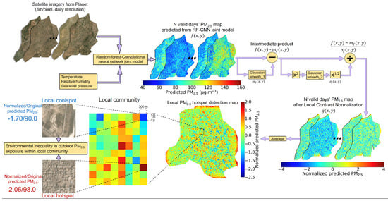
Graphical Abstract

1. Introduction

Exposure to fine particulate matter (PM2.5, with an aerodynamic diameter of 2.5 μm and smaller) has wide-ranging adverse health effects on, for example, cardiovascular, cardiopulmonary and respiratory wellness [1]. Exposure to higher levels of PM2.5 can lead to increased risks of mortality and loss of life expectancy mostly due to lower respiratory infections and non-communicable diseases, such as ischemic heart disease, stroke, chronic obstructive pulmonary disease, lung cancer, diabetes and cataracts (e.g., [2,3,4,5,6]). A recent study also suggests that a higher historical exposure to PM2.5 is, in particular, associated with a higher COVID-19 mortality rate [7]. Novel measurement approaches including mobile sampling (e.g., [8,9,10,11,12]) and low-cost air quality sensor networks (e.g., [13,14,15,16,17,18]) have had success in revealing urban air pollution patterns at considerably greater spatial precision than existing rather sparse regulatory air quality monitoring (AQM) stations, which have advanced our understanding of the adverse impacts of highly dynamic and heterogenous air pollutants, such as PM2.5, at higher spatiotemporal resolutions; however, these two approaches can be further complemented by a satellite-based modeling approach that requires much less manpower for sampling or instrument calibration and maintenance to potentially rapidly screen localized PM2.5 hotspots over wider spatial areas.
Satellite data have been most commonly used for mapping PM2.5 at a high spatial resolution. With the help of the recent rapid >advance in satellite sensors and rise in computing power suitable for big data wrangling, a handful of satellite-based methods have succeeded in estimating ambient PM2.5 concentrations at sub-km levels with reasonably low retrieval uncertainties, such as between 500 m and 1 km (e.g., [19,20,21]) and below 500 m (e.g., [22,23,24,25,26]), with [19,20,21,22,23,24,25] using aerosol optical depth (AOD) while [26] (and this study) using satellite imagery for ambient PM2.5 retrievals. However, few of the studies in [19,20,21,22,23,24,25,26] took their fine-grain ambient PM2.5 estimates a step further by adapting them to be an automated PM2.5 hotspot detector—a missed opportunity to inform decision makers about the main urban PM2.5 emission sources in a never-before-realizable fashion and to facilitate the effective formulation and implementation of commensurate policy interventions and prioritization of resources for combatting air pollution in megacities. There are a few notable exceptions: for instance, Zhang et al. [25] managed to precisely identify the main PM2.5 emission sources and their contribution proportions at a 160 m resolution in Wuhan, China, by leveraging the new 160 m AOD data retrieved by the Chinese Gaofen-1 satellite; although only at a 1 km resolution, the work by Bi et al. [15] is worth mentioning in that they demonstrated how massive uncalibrated PM2.5 measurements from a large-scale PurpleAir low-cost sensor network can be creatively calibrated spatially first, then given lower weights and finally incorporated into a satellite AOD-based PM2.5 prediction system to help further boost prediction performance and locate the four most destructive wildfire hotspots in 2018 in California. However, the PM2.5 hotspots identified in these satellite-based studies are all “global” hotspots that have the absolute highest PM2.5 levels over the entire study region. The “local” hotspots that have the highest PM2.5 levels only relative to their neighbors at a fine-scale local community level were not studied. The PM2.5 gradients even between these local hotspots and coolspots within the same local community can still be rather large, which in turn can translate into a huge difference in the risks of mortality associated with PM2.5 exposure for people (and particularly those potentially vulnerable subgroups) even residing in the same community [3,4,5].
In light of these limitations, we parlayed our previous success in estimating ground-level PM2.5 concentrations from satellite imagery at a 200 m resolution [26] into a satellite imagery-based local PM2.5 hotspot detector at a 300 m resolution in this study, with 200 and 300 m being the optimal satellite imagery sizes (determined by the search method in Section 3.3 of [26]) for PM2.5 modeling for the prediction systems in our previous study [26] and the current one, respectively. Our previous PM2.5 prediction system [26] is a deep convolutional neural network (CNN)–random forest (RF; [27]) sequential model that is fueled by meteorological conditions and daily 3 m/pixel resolution PlanetScope satellite imagery from Planet [28]. However, this previous CNN–RF sequential model, despite effectively capturing spatial variations, was found to yield higher average PM2.5 prediction errors than its RF part alone using only meteorological conditions, most likely the result of CNN–RF sequential model being unable to fully use the information in satellite images in the presence of meteorological conditions. To overcome this bottleneck in PM2.5 prediction performance, this study reformulated the previous CNN–RF sequential model into an RF–CNN joint model where the RF part uses only meteorological data to predict a PM2.5 baseline map on each day, whereas the CNN part uses PlanetScope satellite imagery of a 300 × 300 m spatial coverage to fill in the PM2.5 residuals at a 300 m spatial resolution. The revamped RF–CNN joint model adopts a residual learning ideology [29] that forces the CNN part to most effectively exploit the information in satellite images that is only “orthogonal” to meteorology, thus yielding a greater PM2.5 prediction performance than both the CNN–RF sequential model and the RF part alone using only meteorological conditions. A local contrast normalization (LCN) algorithm [30] follows downstream to further process the PM2.5 maps estimated by the RF–CNN joint model so that local PM2.5 hotspots can be automatically revealed.
We place an emphasis on the megacity Delhi in this study. Delhi is among the most PM2.5-polluted megacities worldwide according to the World Health Organization (WHO)’s ambient air pollution database update in 2016 [31]. India, as a whole, had ~0.98 million deaths attributable to PM2.5 in 2019, a large increase of ~6.5 μg m−3 in population-weighted annual average PM2.5 exposure and a ~0.37 million deaths attributable to PM2.5 since 2010 [32]. Health benefits gained from reductions in PM2.5 would be much more significant for countries such as India that have the highest PM2.5 levels [3]. Air quality mapping and hotspot analysis at a fine spatial resolution can put the air quality states in megacities “under the microscope” and help governments and policy makers put the air pollution issues in megacities into a clearer perspective [33], and is, therefore, the right path forward, particularly for regions such as India. Here, we first show that our proposed RF–CNN joint model can achieve equally low PM2.5 prediction errors at a 300 m spatial resolution for both Beijing and Delhi, which are the study areas of interest in our previous study [26] and the current one, respectively, that have drastically different PM pollution levels and urban spatial structures. We then provide insights into the local PM2.5 hotspot patterns in Delhi by applying our proposed RF–CNN–LCN pipeline. We demonstrate that for megacities, such as Delhi, which is abundant in PM2.5 measurements from reference AQM stations, a simpler and scalable subsampling strategy to estimate local PM2.5 hotspots is plausible and favorable. Finally, we elucidate the local PM2.5 hotspots and coolspots revealed by the RF–CNN–LCN pipeline in Delhi and the possible disparities of long-term outdoor PM2.5 exposures and associated mortality risks between people living in the local hotspots and coolspots within the same local communities. This work presents and highlights a prediction system that can be potentially informative about local PM2.5 hotspots at a 300 m resolution in heavily polluted megacities. This work reveals that there can be a substantial health inequality in long-term outdoor PM2.5 exposure even within the same fine-scale local neighborhoods between local hotspots and coolspots, suggesting that more attention should be paid to the populations in local community hotspots who can often be shadowed by those in global hotspots when planning actions to control air pollution in megacities.

2. Materials and Methods

2.1. Ground-Level PM2.5 Data

Daily ground-level PM2.5 concentrations from 51 available AQM stations in the National Capital Territory (NCT) of Delhi and its satellite cities, including Gurgaon, Faridabad, Noida, Ghaziabad, Baghpat, Sonipat and Bahadurgarh, from 1 January 2018, to 30 June 2020, were acquired to build a high-resolution PM2.5 hotspot detector for Delhi NCT [34]. Detailed documentation of topographical, climatic and air quality conditions and the local and regional sources that contribute to the air pollution in Delhi can be found in studies such as [35,36,37,38,39]. The current study window was chosen to maximize the total number of available AQM stations, because abundant new AQM stations in the study domain have emerged since February 2018. Figure 1 displays the distribution of these 51 stations. As can be seen in Figure 1, the 51 stations (except for the two stations with the highest and lowest mean PM2.5, which were reserved for the training set for the sake of good training quality) were randomly divided into a ~50–50% split or more precisely a 24–27 station split as the respective training and test datasets that have roughly comparable summary statistics for ground-truth ambient PM2.5 concentrations. Specifically, the PM2.5 of the training set averaged 103.8 μg m−3 standard deviation (Std Dev): 81.3 μg m−3; range: 0.0–928.3 μg m−3), and the test set averaged 105.2 μg m−3 (Std Dev: 78.1 μg m−3; range: 5.3–985.0 μg m−3). The names of these stations along with their corresponding coordinates, categories (training or test) and means of ground-truth ambient PM2.5 concentrations over the sampling period can be found in Table 1. The approximately even split between training and test stations may appear to differ from the common practice (e.g., around 75–25%), but it is ideal for this study in that: (1) given that the dataset is large with a total of 51 stations, but only about half of them are more than enough for training our model, increasing the number of holdout stations (for testing) to as high as possible will significantly improve our confidence in the estimation of our model’s spatial predictability on never-before-seen scenes, which is essential to generating both a pollutant concentration prediction map and a pollutant hotspot detection map; (2) more holdout stations means more holdout samples on each sampling day, which gives us more power to fairly examine the model’s spatial predictability at a high daily temporal resolution, which in turn enables us to use only the days on which the model makes the most accurate spatial PM2.5 predictions (as assessed on the holdout samples) to detect PM2.5 hotspots, thus yielding a scalable (in both runtime and storage) hotspot detection algorithm. It is worth mentioning that algorithm scalability is very important here; since we are dealing with the computation and the storage of large, high-resolution and high-frequency satellite imagery over more than 2.5 years, it would be much less ideal if we had to rely on such images on all sampling days to uncover potential hotspots. It is also worth highlighting that only stations, but not time periods, were held out for testing in this study. This is because the local hotspot detection only requires spatial predictability, meaning that it is only important that the model can spatially fill in where there are no station data on the historical days.

2.2. Meteorological Data

Meteorological data are a mainstay for our RF–CNN joint model in this paper. Similar to [23,40], ground-based meteorological measurements from weather stations were used for PM2.5 modeling. We acquired the daily temperature (T), relative humidity (RH) and sea level pressure (SLP) measurements from the available weather stations at the 51 AQM stations from the exact same portal where we obtained the daily ground-level PM2.5 concentrations [34]. We should mention that SLP and wind speed are interchangeable for the RF–CNN joint model, as including either of them yields similar PM2.5 prediction performances, while including both does not increase; hence, only one of the two (e.g., SLP) is used. On each individual day, we averaged the daily meteorological measurements from all AQM stations that had any of the T, RH and SLP measurements on that day and then matched all 51 AQM stations with the same stationwide averaged meteorological records (i.e., all 51 AQM stations have the same set of meteorological records on each individual day). The daily meteorological data after stationwide averaging had a completeness of 100% over the study period (the % uptime of the weather station at each of the 51 AQM stations can be found in Table 1). The strategy of stationwide meteorological data averaging and sharing was chosen after considering several potential alternatives: (1) common global gridded meteorological datasets, such as the European Center for Medium-Range Weather Forecasts 5th generation climate reanalysis dataset (ERA5) with a spatial resolution of 0.25° latitude by 0.25° longitude; the Goddard Earth Observing System Data Assimilation System GEOS-5 Forward Processing (GEOS 5-FP) at 0.25° by 0.3125°; and the Modern-Era Retrospective Analysis for Research and Applications, version 2 (MERRA-2) at 0.5° by 2/3°, were considered. However, they can be too coarse for Delhi NCT. For instance, the latitudes and longitudes of Delhi vary between (28.413, 28.881) and (76.838, 77.348), respectively. Even with a 0.25° resolution, Delhi NCT would overlap at most around only 4 meteorological grids. More importantly, these analysis data are also generally less accurate than the ground-truth measurements. Resampling these coarse assimilated meteorological data using any of the nearest neighbor (NN) or bilinear or bicubic or cubic spline approaches to match the fine prediction grids (e.g., 300 m), in fact, resulted in a poorer PM2.5 prediction performance for our RF–CNN joint model in the test set than simply using stationwide averaged meteorological data; (2) the strategy of using NN to resample the daily meteorological measurements from all available AQM stations to the prediction grids (e.g., 300 m) was also considered. This strategy did not increase the RF–CNN joint model’s PM2.5 prediction performance in the test set, and most importantly, the RF–CNN estimated PM2.5 maps resulting from this strategy are off, as they resemble a Voronoi diagram where grids that were matched to the same AQM station had the exact same predicted PM2.5 value, and PM2.5 values were discontinuous at boundaries of clusters; (3) one can also argue that these ground-based meteorological measurements should be spatially interpolated to fine prediction grids (e.g., 300 m) using approaches such as bilinear, bicubic, cubic spline or inverse distance weighting. We, however, consider this interpolation not necessary (at least for this study). On one hand, the meteorological conditions are rather homogeneous across Delhi with relatively consistent meteorological measurements across stations. The mean T, RH and SLP of the 40 (out of 51) weather stations that had at least 80% uptime (see Table 1) averaged 25.7 °C, 58.5% and 98,686 Pa with Std Devs of 1.2 °C, 5.0% and 622 Pa, respectively. Second, as mentioned in (2), using site-specific meteorological conditions did not outperform using stationwide meteorological data averaging in terms of PM2.5 prediction for the RF–CNN joint model. Hence, we finally settled on the strategy of stationwide meteorological data averaging and sharing. This strategy holds well both theoretically and empirically. Theoretically, a prediction system using the same meteorological records for all the stations in Delhi on a day can be thought of as generating a single homogeneous baseline map that has the same PM2.5 prediction across Delhi on that day. The PM2.5 variation for each location can be filled in later by the prediction system using other sub-km site-specific high-resolution input variables—such as the high-resolution satellite imagery in our study. Empirically, the RF part (of our RF–CNN joint model) alone using stationwide averaged meteorological conditions already yields low PM2.5 prediction errors, and the spatial variations of PM2.5 added by the CNN part using satellite imagery further decrease PM2.5 prediction errors.

2.3. Satellite Imagery

As in [26], we continued using the PlanetScope three-band (red-blue-green, RGB) scene visual product for local PM2.5 hotspot detection in this study. This satellite product is distributed by the Planet Team [28] and has a ground spatial resolution of 3 m/pixel. In general, the satellite imagery retrieval, filtering and matching in this study followed the procedures outlined in [26], from step 1 of defining areas of interest (AOI) as the 51 N × N square grid cells with each of the 51 AQM stations located at the geographical center of the square grid; to step 2 of searching and downloading all available images that intersect with our AOI, matching our study date range, and meeting any other potential criteria; and step 3 of weeding out the images that intersect with the AOI but below a certain threshold, and finally matching the remaining images to their corresponding stations’ daily PM2.5 observations and meteorological conditions. However, two technicalities in total were improved in steps 2 and 3 in this study to enlarge our dataset and to enable us to provide PM2.5 predictions for as many days as possible. Specifically, unlike our previous study, we no longer constrained ourselves to only the images on uncloudy days by turning off the cloud coverage filter in step 2, and we lowered the AOI intersection threshold from 90% (area-wise) to only 50% in step 3. It should also be noted that the N in step 1 is the spatial resolution of PM2.5 concentration prediction and hotspot detection that our model offers and was set to 300 m or equivalently 100 pixels, because 300 m was tested to be the resolution at which our prediction system performed best. Details on how to investigate the sensitivity of our model to the satellite imagery size (or spatial coverage) and how to determine the optimal satellite imagery size for PM2.5 modeling can be found in Section 3.3. of [26]. Example satellite images for each of the 24 training and 27 test AQM stations in Delhi, which show the range of urban land covers that the model is trained and tested on, can be found in Figures S1 and S2, respectively (see Supplementary Materials). Additionally, Videos S1 and S2 show the temporal evolutions of all the images used in the model training and test at an example training site, #18 Mandir Marg, and an example test site, #37 NSIT Dwarka (the training and test sites that have the most samples), in chronological order, respectively. Table 1 shows the number of image–meteorology–PM2.5 triplets for each of the 51 stations. In total, we obtained 31,568 image–meteorology–PM2.5 samples, including 15,045 (from the 24 training AQM stations) for training the prediction system and 16,523 (from the 27 holdout AQM stations) for testing.

2.4. RF–CNN Joint Model

While the model in this paper and the one in our previous work [26] both use RF and CNN as building blocks, the formulations of the two are drastically different.
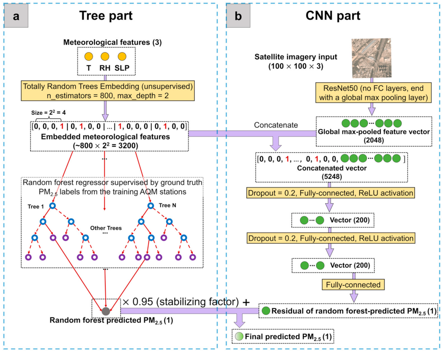
First, the model in [26] is a CNN–RF sequential model, with CNN and RF trained separately and in that particular sequence. Specifically, CNN was first trained on a satellite image to extract satellite image features that best predict PM2.5, and RF was then trained on the CNN-extracted image features along with meteorological conditions to provide final predictions of PM2.5. In contrast, the model in this paper, as shown in Figure 2, is an RF–CNN joint model jointly trained on satellite images and high-dimensional embedded meteorological conditions (details in Section 2.4.1.). The joint training of RF and CNN was made possible by adding the RF-predicted PM2.5 (i.e., the gray dot at the bottom of Figure 2a) and the CNN-predicted PM2.5 (i.e., the last solid green dot in Figure 2b) together to provide final predictions of PM2.5 (i.e., the gray-to-green dot at the bottom of Figure 2b). In this way, CNN is forced to predict the residual of RF-predicted PM2.5 (i.e., true PM2.5 RF-predicted PM2.5). The decision to switch to a joint model by deploying CNN to predict residuals was made considering the following findings or reasonings: (1) RF alone using meteorological conditions yields low PM2.5 prediction errors; (2) the previous CNN–RF sequential model was found to yield higher average PM2.5 prediction errors than RF alone using meteorological conditions. This finding indicates that the CNN–RF sequential model cannot fully use the information in satellite images in the presence of meteorological conditions. The optimization of the CNN–RF sequential model seems to always reach a local (rather than global) optimum solution, despite in which both satellite image and meteorological features being equally important for PM2.5 prediction, as shown in [26]; (3) therefore, it makes sense to “piggyback” on RF’s low prediction error while forcing CNN to effectively use the information in satellite images that is “orthogonal” to meteorology for PM2.5 prediction, and hence the current architecture. This RF–CNN joint model is guaranteed to yield lower average PM2.5 prediction errors than RF alone using meteorological conditions. The RF–CNN joint model is also much easier to train than the CNN–RF sequential model, because the former only requires back-propagation to tune both RF and CNN’s parameters, while the latter requires first back-propagation to tune CNN and then an additional 5-fold cross-validation (CV) to tune RF.
Second, Zheng et al. [26] followed a transfer learning ideology by modifying and (iteratively) training only the several upper layers of a VGG16 network [41] while keeping the remaining lower-level layers’ weights fixed at the original ImageNet weights. In contrast, in this paper, we trained the entire deep CNN architecture (at one go) to best adapt it to our dataset and task. This was made possible by switching from VGG16 to ResNet50 [29]; although over 3 times deeper than VGG16, ResNet50 (with ~23 million parameters) has only ~1/6 of VGG16′s parameters (~138 million parameters). The significantly deeper CNN representations of satellite images along with the more specific optimization of these representations for our own task and dataset guarantee a performance at least as good as the previous VGG16 transfer learning approach.

2.4.1. RF Details

In this first stage, an RF regressor gives its PM2.5 predictions based on meteorological conditions only. Three distinctive operations involved in this stage are worth emphasizing:
  • Instead of directly using the T, RH and SLP meteorological features (as they are) for prediction by RF and CNN, they were first embedded in/mapped to a significantly higher dimension using an unsupervised algorithm called Totally Random Trees Embedding [43], as shown in Figure 2a. Totally Random Trees Embedding can be easily implemented in Scikit-Learn. The idea of this unsupervised algorithm is to first build an RF classifier (by fitting it to only all the meteorology datapoints that you have without using your associated PM2.5 labels) that aims to separate the original observed meteorology datapoints from the synthetic ones that are generated by sampling from a joint distribution of the observed T, RH and SLP values. Then, this RF classifier transforms each observed meteorology datapoint into the indices of leaf nodes which that datapoint ends up in, expressed in a one-hot encoding format (i.e., for K leaf nodes in each tree in the forest, only the leaf node which the datapoint is sorted into is encoded in 1, while the rest of the K-1 leaf nodes are all encoded in 0). For instance, in this paper, we embedded meteorological data using an RF classifier that consisted of 800 trees, each of which had a max depth of 2 or equivalently at most 22 = 4 leaf nodes. See Figure 2a for the example of a meteorology datapoint embedded by such an RF classifier with the dimension increasing from 3 to at most 3200 (800 trees × at most 4 leaf nodes = 3200). Additionally, notice the sparse binary nature of the embedded meteorological feature vector; that is, for each tree in the forest, only one of the (at most) 4 leaf nodes is encoded in 1 and the rest all in 0. The intuition behind the high-dimensional embedded meteorological feature vectors is that two similar meteorology datapoints are more likely to lie within the same leaf node of a tree. Embedding meteorological features, however, is not so much to improve RF regressor’s PM2.5 prediction performance as to improve CNN’s. Embedding meteorological features to a high dimension that rivals the dimension of satellite image features helps CNN cope with the difficulty of combining and effectively using multi-modality data, thus improving its PM2.5 prediction performance.
  • Unlike what is commonly seen in studies that explicitly train an RF using a 5-fold CV, this study only implicitly trained the RF regressor in the tree part (Figure 2a) together with explicitly training the entire CNN using back-propagation. This joint training strategy was possible because we made the tree part’s information flow into the CNN by adding the scaled RF-predicted PM2.5 to the CNN-predicted PM2.5 (i.e., the last solid green dot in Figure 2b). Scaling RF-predicted PM2.5 by a stabilizing factor of ~0.90−0.95 (0.95 was used in this study) is important in that it leaves reasonably more room for CNN to learn to predict PM2.5 (since RF alone using meteorological conditions can already yield low PM2.5 prediction errors, as mentioned in Section 2.4.). The optimal hyperparameters for the RF regressor in the tree part were determined to be ~600, 1 and total   features for the number of trees in the forest (N); the minimum number of samples required to be at a leaf node (n); and the number of input features to consider when splitting data at a decision node (m), respectively. The optimal values of N and n (the most influential parameter of the three) are consistent with [26], indicating that the RF setting can be universal, regardless of the locations (i.e., hyperparameter tuning is not necessary for RF in the future), although m needs to be switched to total   features for a joint model rather than total   features for a sequential model.
  • As discussed in Section 2.3, the meteorological data used in this study were determined to be daily measurements averaged from all available AQM stations on each day (i.e., all AQM stations that have any of the T, RH and SLP measurements on each day), meaning that all 51 AQM stations were matched with the same set of meteorological records on each individual day. The tree part of our prediction system can be thought of as using the same meteorological records to first generate a single homogeneous baseline map that has the same PM2.5 prediction across Delhi on each day, and the CNN part can be thought of as using the location-specific high-resolution satellite imagery information to then fill in the PM2.5 variation for each location (e.g., a 300 × 300 m grid) across Delhi on each day. Hence, in addition to thinking that CNN learns to predict the residual of PM2.5, readers can also think that it learns to predict the spatial variation of PM2.5. This also subtly explains why RF alone is not sufficient for detecting hotspots, even though RF alone using meteorological conditions can already yield low PM2.5 prediction errors. Regardless of how low the RF predictions are, all the RF prediction values on a day are the same, and this is where CNN with satellite imagery information is useful, as it breaks ties and reveals spatial patterns.

2.4.2. CNN Details

With most of the difficult operations involved in the RF–CNN joint model having already been described in Section 2.4.1, the CNN part (see Figure 2b) is fairly standard. Each satellite image of an initial size of 100 (height) × 100 (width) × 3 (channel number) is first forward-passed through a ResNet50 architecture whose top layers (including an average pooling, a 1000-dimensional fully connected and a softmax layer) have been replaced by a global max pooling layer, yielding a 2048-dimensional global max-pooled feature vector. This vector, after being concatenated with the ~3200-dimensional meteorology embedding, then proceeds down two identical blocks of dropout (rate = 0.2)—200-way fully connected layer—ReLU activation, before finally going through a fully connected layer of dimension 1 to yield the CNN-predicted residual, which adds the scaled RF-predicted PM2.5 to provide the final PM2.5 prediction. The RF regressor and the entire CNN were jointly trained to minimize the mean squared error (MSE) between the final predicted and true PM2.5 values in the test dataset (i.e., the 27 AQM stations used for testing), using back-propagation with an Adam optimization algorithm with α =   0.0001, β 1 = 0.01 and β 2 = 0.01 [44] on mini-batches of size 32 of the training dataset (i.e., the 24 AQM stations used for training) within 20 epochs, including early stopping if the model’s performance on the test dataset did not improve in 5 epochs. It is worth mentioning that the model performance is highly susceptible to several settings in the CNN, part including the dropout rates, the number and dimensions of fully connected layers, the Adam setting and the numbers of training and early stopping epochs. These settings were found to be generally not transferable between locations, thus requiring fine tuning when applied to a new location.

2.4.3. RF–CNN Joint Model Evaluation

We evaluated the RF–CNN joint model’s PM2.5 estimation performance on the test dataset (i.e., the 27 AQM stations used for testing). The evaluation was performed by first forward-passing all the images in the test dataset along with their associated meteorological conditions through the trained RF–CNN joint model and then comparing the model’s final predicted PM2.5 to the ground truth values based on metrics of spatial Pearson correlation coefficients (r), root mean square error (RMSE), mean absolute error (MAE), normalized RMSE (NRMSE) and normalized MAE (NMAE). Spatial Pearson r is more appropriate than total or temporal Pearson r to unbiasedly evaluate the model’s true spatial predictability (i.e., the only predictability that is of interest to our current application). It is defined as the Pearson r from regressing the mean of the true PM2.5 over the entire sampling period against the mean of the predicted PM2.5 over the entire sampling period at each test station [22,45,46,47]. The latter four metrics are defined by Equations (1)–(4). We reported both RMSE (and NRMSE) and MAE (and NMAE) as the errors (and percent errors) of our model, even though our model was trained to minimize only MSE. This is because RMSE is more influenced by outliers than MAE, and by doing this, we ensured that we did not completely ignore the effect of outliers on our model performance, but at the same time, we did not let the performance be misrepresented due to potential outliers either.
R M S E = 1 N y y ^ 2 2
M A E = 1 N y y ^ 1
N R M S E = R M S E m e a n   P M 2.5   c o n c . i n   t e s t   s e t
N M A E = M A E m e a n   P M 2.5   c o n c .     i n   t e s t   s e t
where y , y ^ and N are the true, model-predicted ground-level PM2.5 concentrations and the number of samples in the test set, respectively.

2.5. Local Contrast Normalization (LCN)

An LCN algorithm [30] was used to further process the PM2.5 maps estimated by the RF–CNN joint model so that PM2.5 hotspots can be automatically detected. In this study, PM2.5 hotspots are defined as the “locally” (i.e., in a N by N pixels neighborhood where N 100 pixels = 300 m) rather than “globally” (i.e., in the whole Delhi NCT region) brightest spots (spots are 100 × 100 pixels or 300 × 300 m squares). LCN was originally designed to reduce uneven illumination or shading artifacts in an image by standardizing (i.e., uniformizing the mean and variance of) an image around its local neighborhoods. Readers are encouraged to interact with some LCN examples in [48] to build an understanding that reducing the effect of non-uniform illumination on an image is exactly equivalent to finding local pollutant hotspots around local neighborhoods in a pollutant prediction map. We take the rice images, which can be found in the link above, as an example to illustrate how correcting image uneven illumination is equivalent to finding local hotspots. The rice images on the left and right are before and after the correction of the uneven illumination artifact by LCN, respectively. The rice at the top of the uncorrected image on the left is analogous to both global and local hotspots because it has the brightest pixels not only in the whole image but also with respect to its surrounding black background in its local neighborhood. In contrast, the rice at the bottom of the uncorrected image is a strictly local hotspot (i.e., only local but not global hotspot) because, while it does not have the brightest pixels in the image, it is indeed still much brighter than its surrounding black background in its local neighborhood. It is interesting to note that wherever the rice is in the image, its relative strength to its surrounding black background in its local neighborhood is roughly the same. Therefore, once the uneven illumination in the image has been corrected by the LCN algorithm, that is, once the image has been detrended by standardizing all the pixel values in their local neighborhoods so that all the local patterns (or hotspots) in the image emerge, these revealed local hotspots (i.e., all the rice) in the image on the right have almost the exact same normalized pixel value (or better interpreted as local hotspot strength in local neighborhood). This example intuitively highlights why local hotspots are worth studying: despite strictly local rice hotspots at the bottom of the uncorrected image having comparatively lower pixel values (analogous to lower absolute PM2.5 concentrations) than global rice hotspots at the top, they are of the same strength as local hotspots in their respective local communities in comparison to their neighbors, because all the rice in the corrected image has the same brightness, indicating that people in strictly local and global hotspots, in reality, can be subject to the same degree of health inequality due to air pollution in comparison to their own neighbors.
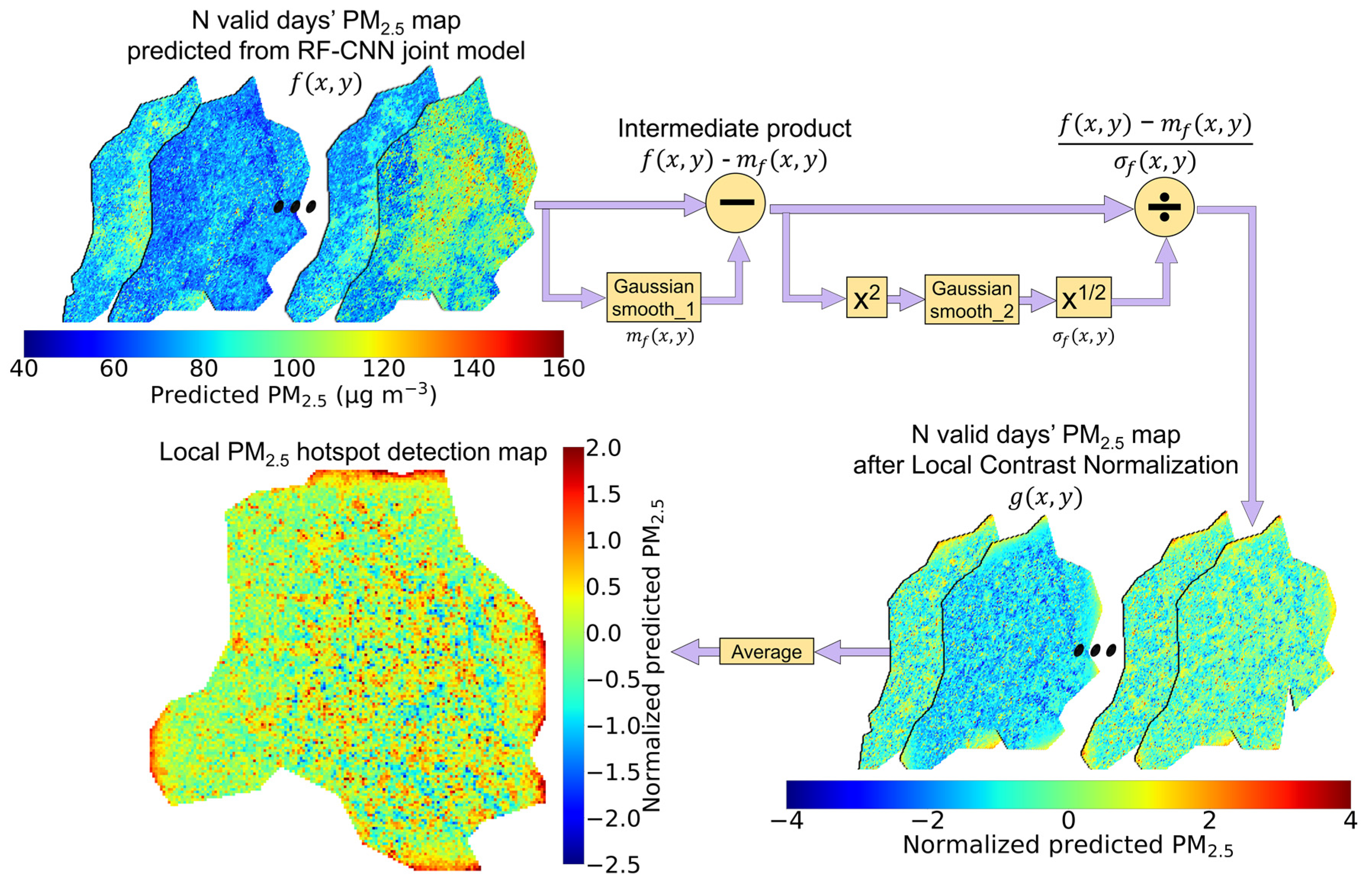
The procedure for converting available PM2.5 prediction maps to a local PM2.5 hotspot detection map is visualized in Figure 3 and can be summarized by Equation (5). First, the PM2.5 prediction maps produced by the RF–CNN joint model on N valid days are obtained, each of which is denoted as f x , y . Then, for each f x , y , an m f x , y is derived by applying a 2-D Gaussian Smoothing/Blur (with a Std Dev of σ 1 and a neighborhood size default to 8 ×   σ 1 + 1) to each f x , y , after which the intermediate product f x , y m f x , y is obtained. A 2-D Gaussian Smoothing/Blur is a 2-D convolution operation that transforms each pixel’s value to a spatially weighted average of all the values in that center pixel’s neighborhood with a filter whose weights are calculated by a 2-D Gaussian function defined by Equation (6) and whose size is the 2-D Gaussian Smoothing’s neighborhood size. Then, for each f x , y m f x , y , a σ f x , y is derived by taking the square root of the second 2-D Gaussian convolution blurred f x , y m f x , y 2 (similar to the first Gaussian Blur, the second one has a Std Dev of σ 2 and a neighborhood size default to 8 ×   σ 2 + 1). After yielding σ f x , y for each f x , y m f x , y , the LCN-normalized- f x , y , that is g x , y , is obtained by dividing f x , y m f x , y by σ f x , y . Finally, averaging N valid days’ g x , y s yields the final local PM2.5 hotspot detection map. These normalized PM2.5 values in the hotspot detection map are directly comparable to one another and indicate the intensity of these 300 × 300 m squares as local PM2.5 sources in their local neighborhoods. The 300 × 300 m squares of dark red and dark blue colors at opposite ends of the spectrum are of the most interest, as they indicate extreme local hotspots and coolspots, respectively.
g x ,   y =   f x ,   y     m f x ,   y σ f x , y
where f x , y is each of N valid days’ PM2.5 maps predicted by the RF–CNN joint model; m f x , y is each f x , y ’s corresponding mean map estimated by applying a 2-D Gaussian Smoothing/Blur to each f x , y ; σ f x , y is each f x , y ’s corresponding Std Dev map estimated by applying a series of operations, including square, another 2-D Gaussian Smoothing/Blur and square root to each f x , y m f x , y ; and g x , y is each LCN-normalized- f x , y .
w x ,   y =   1 2 π σ 2 e x p ( x 2   +   y 2 2 σ 2 )
where w x , y is the weight of the 2-D Gaussian Smoothing filter at x , y in the neighborhood, and σ is the Std Dev of 2-D Gaussian Smoothing/Blur. Note that the pixel at the center of the filter (0, 0) receives the highest weight, while its neighboring pixels x , y (i.e., pixels that are x and y pixels away from the center in x - and y -directions) receive increasingly smaller weights as they move away from the center pixel.
Examining Equation (5) at a high level, one can probably recognize that it is simply an extension of the 1-D standardization formula to 2-D. The two 2-D Gaussian Smoothing operations simply facilitate the estimation of the mean and Std Dev values of each pixel x , y based on that pixel’s (weighted) neighbors. Selecting appropriate σ 1 and σ 2 for the two 2-D Gaussian Smoothing operations is likely the only part that requires expertise when using LCN. In this study, σ 1 and σ 2 were both chosen to be 6 (hence, the neighborhood sizes were both 8 × 6 + 1 = 49), under which the local hotspot detection map appears to be trustworthy without being highly speckled due an insufficient neighborhood size or having excessive edge effects due to an overly large bandwidth. With σ 1 = σ 2 = 6,   T h e   s i z e   o f   n e i g h b o r h o o d T h e   s i z e   o f   D e l h i   N C T is ~0.30. We suggest using this ratio as a rule of thumb to initialize the values of σ 1 and σ 2 for new locations.

3. Results

3.1. RF–CNN Joint Model PM2.5 Prediction Performances

3.1.1. Delhi

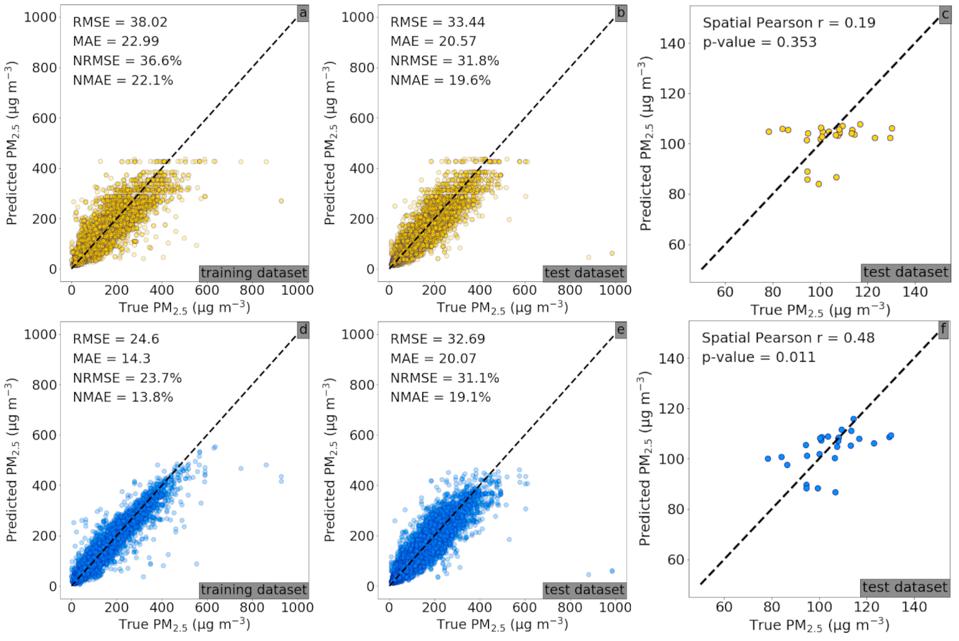
Figure 4a–c present the spatial prediction performances of the RF part of the RF–CNN joint model, while Figure 4d–f show the performances of the full RF–CNN joint model on the 24 training and 27 holdout AQM stations in Delhi, respectively. As can be seen in Figure 4a,b, the RF part (of our RF–CNN joint model) alone using the same stationwide averaged T, RH and SLP meteorological conditions for all stations on each day yielded low PM2.5 spatial prediction errors in the training and more importantly in the test set with an RMSE, MAE, NRMSE and NMAE of 33.44 μg m−3, 20.57 μg m−3, 31.8% and 19.6%, respectively. Additionally, as demonstrated in Figure 4d,e, the full RF–CNN joint model with the additional CNN part that uses satellite imagery to predict the residual of RF-predicted PM2.5 further improved the PM2.5 spatial prediction errors in both training and test sets with an RMSE, MAE, NRMSE and NMAE of 32.69 μg m−3, 20.07 μg m−3, 31.1% and 19.1%, respectively, in the test set. The RF–CNN joint model also appreciably increased the predictions’ spatial Pearson r over RF (0.48 in Figure 4f vs. 0.19 in Figure 4c), indicating that a reasonable amount of additional information was added by the satellite imagery over meteorology that helped significantly improve the RF–CNN joint model’s spatial predictability. This also explains why, despite the RF–CNN joint model not decreasing RMSE or MAE by a significant margin over RF in Delhi, it still captured the spatial variation in PM2.5 rather well (as shown in Section 3.3). Our model’s prediction errors rival a state-of-the-art ensemble framework in a recent Delhi PM2.5 prediction study [47] that reported an RMSE of ~47.2 μg m−3 over 2010 to 2016 based on a 10-fold CV of 17,152 samples, but our framework outperforms [47] in terms of the spatial resolution of predictions (300 m vs. 1 km). These results empirically support our model design—the RF part of our prediction system uses the same station-wide averaged meteorological records to first generate a single homogeneous PM2.5 baseline map across Delhi on each day (which already has low errors on average in comparison to the corresponding “true map”), and then, the CNN part uses high-resolution satellite imagery information at 300 × 300 m to fill in the PM2.5 variations across Delhi at a 300 m resolution to complete the estimated PM2.5 map (which has even lower average errors in comparison to the corresponding “true map”).

3.1.2. Beijing

It is worth pointing out that the two features that our model possesses, which are (1) RF alone using meteorological conditions yields low PM2.5 prediction errors and (2) the RF–CNN joint model is guaranteed to yield lower average PM2.5 prediction errors than RF alone using meteorological conditions, are not only applicable to the most polluted megacities, including Delhi. They also hold well for other megacities, such as Beijing, which is the area of interest in our previous study [26] that first presents the possibility of estimating daily ambient PM2.5 at below 500 m from high-resolution and high-frequency satellite imagery using a deep learning-based model (i.e., CNN–RF sequential model). Beijing is naturally an additional megacity for benchmarking the RF–CNN joint model’s PM2.5 prediction performance, because (1) the image, meteorological and PM2.5 data are readily available; more importantly (2), it is in Beijing that the issue of inefficient use of the information in satellite images in the presence of meteorological conditions by the previous CNN–RF sequential model was first found, which directly motivated the formulation of the RF–CNN joint model in this study. It is, therefore, reasonable to show that the reformulated RF–CNN joint model is indeed superior in that it is able to overcome the CNN–RF sequential model’s bottleneck in PM2.5 prediction performance exactly where the issue was first identified.
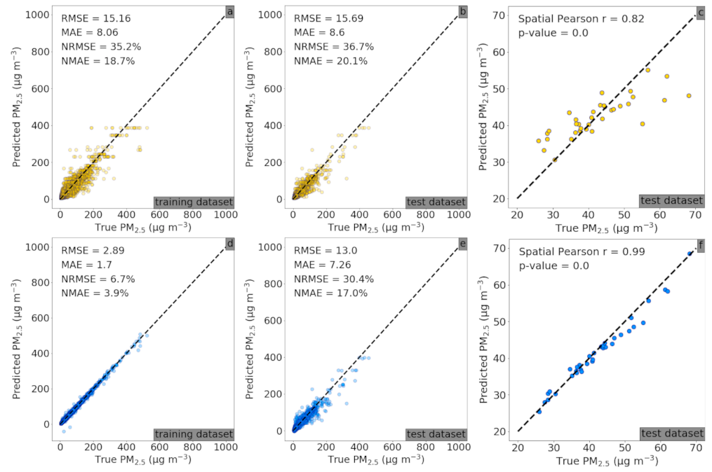
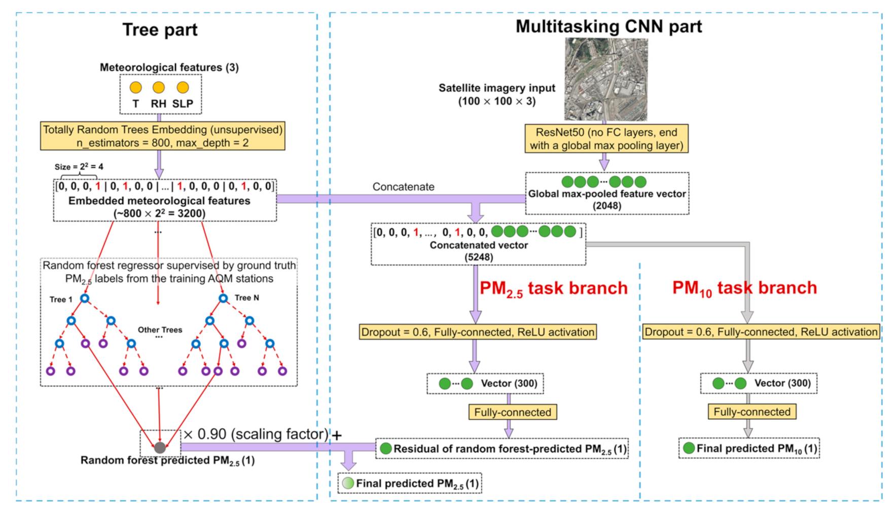
For the Beijing experiment, the training and test sets are the exact same ones as in [26], with 13,022 image–meteorology–PM2.5 samples from 35 ground AQM stations randomly divided into ~80% and ~20% splits for the training (10,400 pairs) and test (2622 pairs) sets, respectively. The settings of the RF–CNN joint model and its Adam optimizer for Beijing are drastically different from those for Delhi. The RF–CNN joint model for Beijing has a stabilizing factor of 0.90; a dropout rate of 0.6; one fully connected vector of dimension 400; ~200 training and ~60 early stopping epochs; and an Adam setting of α =   0.0001, β 1 = 0.9 (default value) and β 2 = 0.999 (default value), which stands in stark contrast to 0.95; 0.2; two fully connected vectors of dimension 200; ~20 and ~5; and α =   0.0001, β 1 = 0.01 and β 2 = 0.01 for Delhi. As can be seen in Appendix A Figure A1, by switching from RF alone to the full RF–CNN joint model, the PM2.5 spatial prediction performances improved significantly over both training (see Figure A1a,d) and more importantly test sets (see Figure A1b,c,e,f) with the RMSE, MAE, NRMSE, NMAE and spatial Pearson r improving from 15.69 to 13.00 μg m−3, 8.6 to 7.26 μg m−3, 36.7% to 30.4% (a 17.2% relative drop), 20.1% to 17.0% (a 15.4% relative drop) and 0.82 to 0.99, respectively. The previous CNN–RF sequential model achieved only 17.6 μg m−3, 10.1 μg m−3, 41.2%, 23.7% and 0.91 [26], respectively, on the same test set, which is considerably poorer than the RF–CNN joint model and even RF alone. The comparison among the three model performances over the Beijing dataset perfectly demonstrates the superiority of the RF–CNN joint model and that it can effectively use the information in satellite images that is “orthogonal” to meteorology for greater PM2.5 prediction over RF, which the previous CNN–RF sequential model failed to do.

3.1.3. Comparison between Delhi and Beijing

It is encouraging to observe that with measurements of only three meteorological variables and satellite imagery as input, the RF–CNN joint model achieved similarly low NRMSE (within ~31%) and NMAE (within ~19%) on the test samples in both Delhi and Beijing that have drastically different levels of PM pollution and urban spatial structures, even though Delhi had a less significant improvement from RF to RF–CNN than Beijing. The most plausible explanation for Delhi’s lesser improvement is that Delhi is the more polluted region of the two, and as a result, its satellite imagery quality is in general far inferior to Beijing (based on our observation) with Delhi’s landscapes most of the time being covered in haze or fog. In other words, there is comparatively less to learn from the images in Delhi. The facts that Delhi’s model and optimizer settings are drastically different from Beijing and that Delhi’s model stopped learning within ~20 epochs, while Beijing lasted around 100 epochs, also support this explanation. The comparison implies that the settings of the RF–CNN joint model and its Adam optimizer for Beijing should be considered as the default when initializing the RF–CNN joint model for new locations.

3.2. A Subsampling Strategy to Detect Hotspots in Delhi

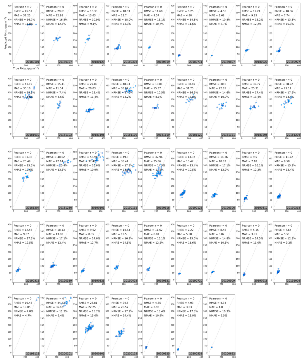
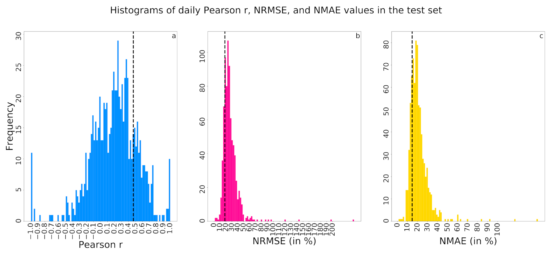
The substantial number of 16,523 samples from a total of 27 holdout stations give us the unique advantage to examine the full RF–CNN joint model’s spatial prediction performance at a daily resolution. The daily performances of the RF–CNN joint model for all available test samples on each available day during the study period as assessed by the daily spatial Pearson r (i.e., the Pearson r from regressing the true PM2.5 against predicted PM2.5 at each available test station on one given day), NRMSE and NMAE are illustrated in Figure 5a–c, respectively, in the form of frequency distribution. The r values (excluding the negative ones), NRMSE and NMAE average 0.35 ± 0.22, 27.0 ± 15.1% and 21.0 ± 10.2%, respectively. These average values are, in general, consistent with the results in Figure 4. Figure 5, in general, demonstrates that all days cannot be predicted equally well, but the RF–CNN joint model can indeed perform extraordinarily well on a subset of days. The most interesting long-term persistent PM2.5 hotspots were supposed to be uncovered, regardless of which days were randomly sampled, as long as the RF–CNN joint model performed exceptionally well on those days. Therefore, it is days like these on which the satellite imagery added the most information to the baseline RF prediction (assessed by Pearson r) and the RF–CNN joint model most accurately predicted PM2.5 (assessed by NRMSE and NMAE) for the holdout samples that we can take advantage of to reveal the hotspots, thus yielding a scalable (in both runtime and storage) subsampling hotspot detection algorithm.
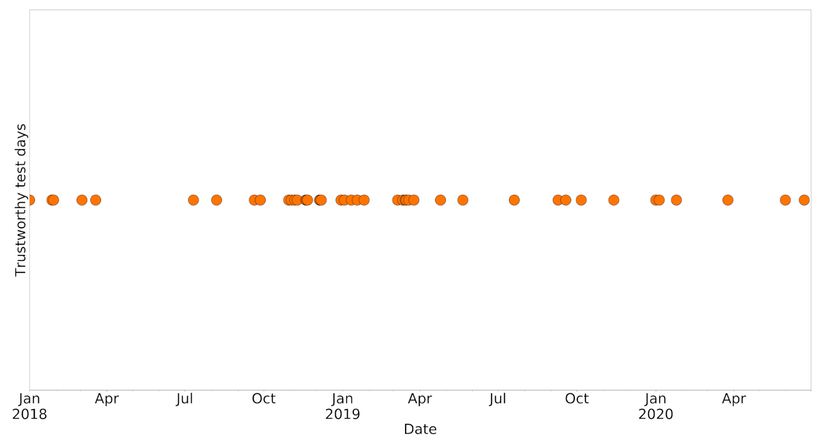
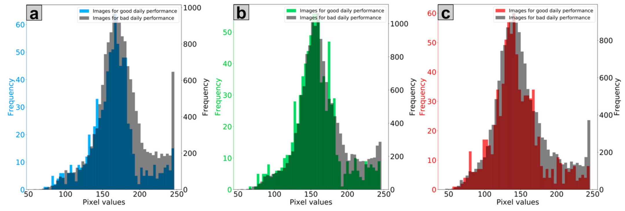
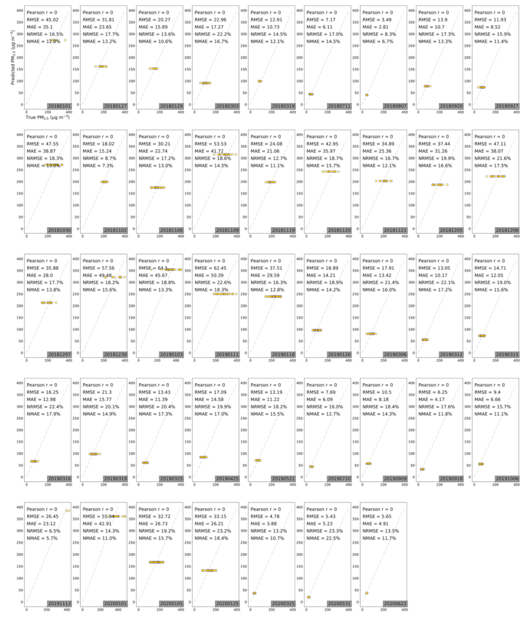
The days on which the RF–CNN joint model performed extraordinarily well on the available test samples in Delhi are defined as the days on which the Pearson r, NRMSE and NMAE values were all in the best 20% (>0.47, <18.3% and <14.6%, respectively) among all 801 available test days (each of which had at least two test samples), as shown in Figure 5. There are 43 such “exceptional” days, and Figure A2 (in Appendix B) shows that these 43 days are approximately evenly scattered throughout the study period without any obvious bias or pattern except for the apparent lack of samples from June to September due to monsoon season. We also compared the satellite images in the test dataset of these 43 days and of the remaining available test days on which the RF–CNN joint model had suboptimal performances in Appendix C Figure A3. The imagery pixel value frequency distributions for the two groups exhibit no major discrepancy in any of the blue (Figure A3a), green (Figure A3b) or red (Figure A3c) channels, further suggesting that the images on these 43 days are not associated with any specific pattern and qualify as random subsamples for estimating hotspots. The contrast between the performances of RF (see Appendix D Figure A4) and the RF–CNN joint model (see Appendix E Figure A5) on these 43 days is huge. The daily Pearson r, NRMSE and NMAE values for RF alone on these 43 days average 0, 17.3% and 13.7%, as compared to 0.62 (a 0.62 absolute increase), 14.4% (a 16.8% relative improvement) and 11.2% (a 18.2% relative improvement), respectively, for the RF–CNN joint model. It is days like these on which the satellite imagery added the most information to the baseline RF prediction and the RF–CNN joint model most accurately predicted PM2.5 for the test samples that we can trust to reveal the perennial hotspots. Figure A4 highlights why RF alone is not sufficient for detecting hotspots, even though RF alone using meteorological conditions can already yield low PM2.5 prediction errors. Regardless of how low the RF predictions are, all the RF prediction values on a day are the same, and this is where CNN with satellite imagery information aids in revealing the spatial patterns. Due to the subsampling strategy, our devised hotspot detection algorithm is scalable in both runtime and storage. It is worth mentioning that algorithm scalability is very important in this case, since we are dealing with the computation and storage of large-scale high-resolution and high-frequency satellite imagery over a long study period.
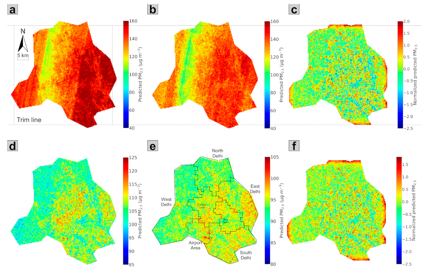
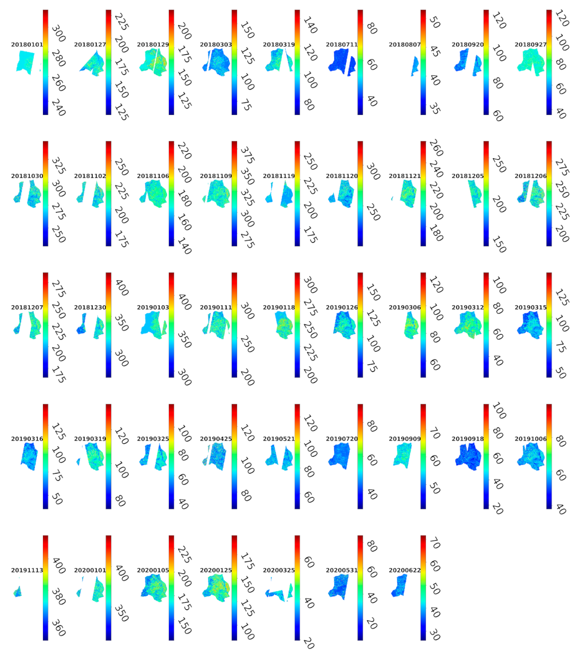
The RF–CNN-predicted daily PM2.5 maps of Delhi on the most trustworthy 43 days can be found in Appendix F Figure A6. Averaging these 43 maps yields the averaged PM2.5 prediction map as shown in Figure 6a. Similar to [25], to cope with the potential influences of severe haze episodes (uniformly high across a region) and excellent diffusion days (uniformly low across a region) on hotspot estimation, a corresponding adjusted averaged PM2.5 prediction map in Figure 6b was derived by first excluding the top 10% highest and the top 10% lowest values among all pixels over the 43 days and then averaging. By applying the LCN algorithm in Figure 6b, we obtained the corresponding local PM2.5 hotspot detection map in Figure 6c that is based on the most trustworthy 43 days. These normalized PM2.5 values in the local hotspot detection map are directly comparable to one another and indicate the intensity of these 300 × 300 m squares as local PM2.5 sources in their local neighborhoods. The 300 × 300 m squares of dark red and dark blue colors at opposite ends of the spectrum are of most interest, as they indicate extreme local hotspots and coolspots, respectively. Figure 6c appears to be highly speckled with widespread extreme local hotspots all over Delhi. This is because the hotspots we attempted to find in this study are local hotspots, whose PM2.5 values are just higher than their neighbors but not (necessarily) the highest in the whole study region. It is, therefore, reasonable to see hotspots appearing in even the relatively less populated North and West Delhi. We also examined the averaged PM2.5 prediction map (Figure 6d), the adjusted averaged PM2.5 prediction map (Figure 6e) and the corresponding local PM2.5 hotspot detection map (Figure 6f) that were generated based on all available days from January 1, 2018, to June 30, 2020. Seven subregions within Delhi (i.e., North, South, West, East, Central and New Delhi and the airport area) are demarcated in Figure 6e based on the spatial clusters in [47]. The estimated gradients of PM2.5 concentrations in both Figure 6d and e show that the densely populated East and Central Delhi and airport area are among the subregions that on average have relatively high ambient PM2.5 concentrations, while the relatively less populated North and West Delhi have on average relatively low ambient PM2.5 concentrations. These patterns, in general, bear a strong resemblance to the results in [35,47], even though their results are for the periods of 2001–2016 and 2010–2016, respectively. However, we did find New Delhi and South Delhi to be experiencing elevated PM2.5 levels, as shown in Figure 6e, which was not reported in [47] or [35,47]. Kumar et al. [49], on the other hand, reported similarly elevated PM2.5 levels in these two subregions and attributed the elevated PM2.5 levels to heavy traffic at major transport corridors. The PM2.5 hotspot detection map based on the whole study period (Figure 6f) reveals essentially the same extreme local hotspots as the hotspot detection map based on the most trustworthy 43 days (Figure 6c), which further supports the validity of using a subsampling strategy to detect hotspots. However, the averaged PM2.5 prediction maps generated from a subsampling strategy in Figure 6a,b with striping artifacts because of the relatively small sample size appear to be less useful in uncovering the spatial gradient of PM2.5 concentrations. In fact, Figure 6c,f being identical came as no surprise. Note that the predictions would be akin to baseline RF predictions (a flat line) on a large majority of the days when satellite imagery added little information, and the noise in each pixel’s estimation cancels out when averaging over abundant samples, so the critical votes would still depend on those subsampled “exceptional” days. Figure 6c and f being identical offers another insight: for places with limited PM2.5 data that we are not generally able to proactively find the most trustworthy days from the test set, we can simply let the most trustworthy days reveal themselves by using the whole study period to detect hotspots, although some runtime and storage are sacrificed by doing this. We also want to point out one advantage and one drawback associated with our local hotspot detection LCN algorithm. The advantage is that, regardless of whether an averaged or adjusted averaged PM2.5 prediction map is used to produce a hotspot detection map, the resulting local hotspot detection maps are identical, implying that LCN is robust to perturbations in PM2.5 estimations. The apparent flaw is that LCN can cause major edge effects because of zero paddings beyond the study region by 2-D Gaussian Smoothing/Blur in LCN, as can be seen in Figure 6c,f. One solution, however, is to always predict slightly over the boundary of the area of interest so that the area of interest falls outside the edges in the future.

3.3. Case Study: Hottest and Coolest 300 × 300 m Spots within Each of the 20 Sampled Neighborhoods in Delhi

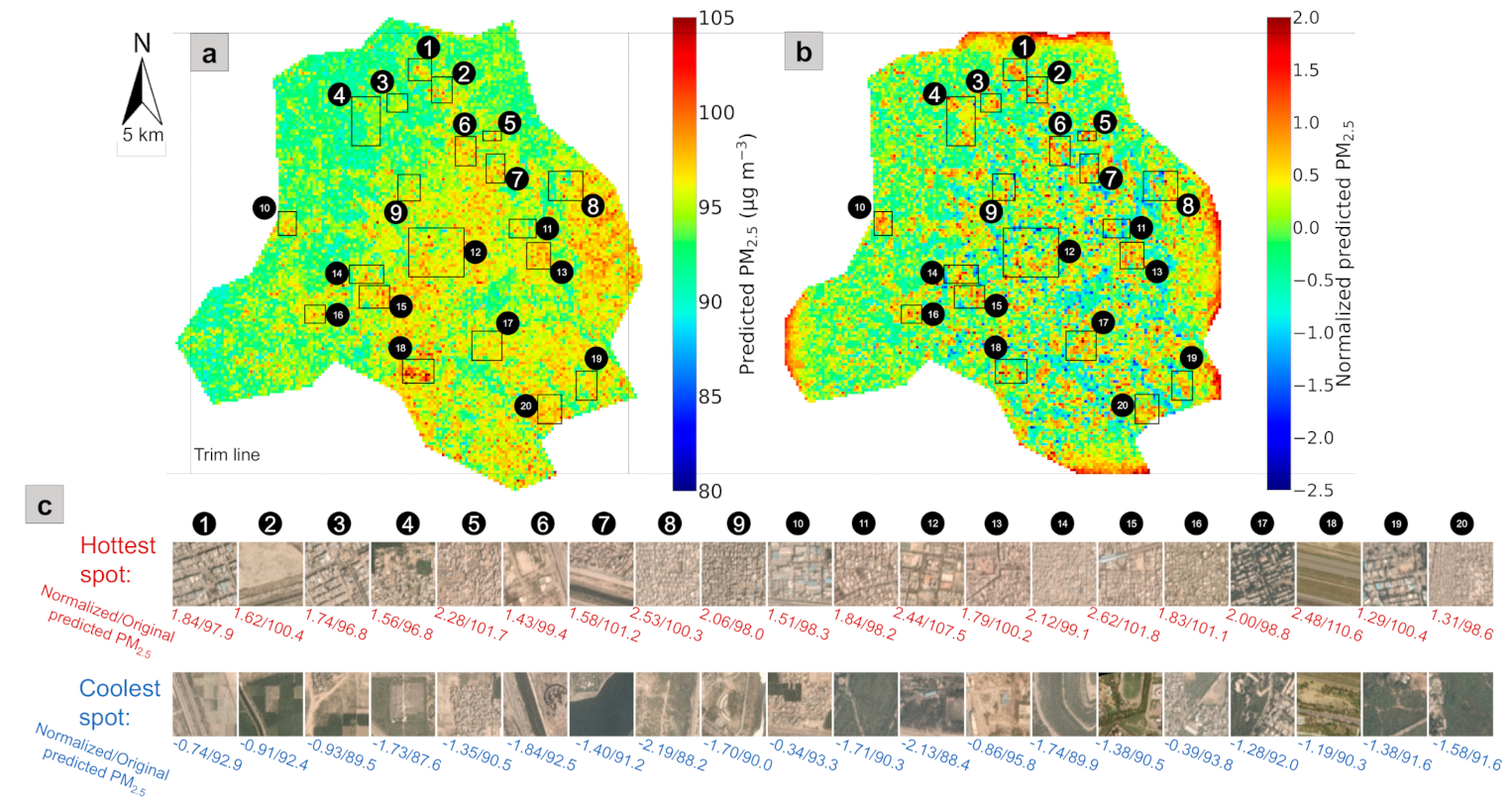
It is critical to make sense of the messages the RF–CNN–LCN pipeline attempts to convey by examining the patterns of some predicted local hotspots and coolspots, such as those in the 20 sampled representative neighborhoods across Delhi (see their coordinates in Appendix G Table A1) labeled in Figure 7a,b. We conducted the sampling randomly but also considering diversity: (1) at least one sample should be from each of the seven subregions within Delhi, as demarcated in Figure 6e; (2) the sampled neighborhoods (i.e., the rectangles labeled in Figure 7a,b) should come in various sizes, with the rectangles aiming to cover the complete local patterns and preferably but not necessarily at least one dark red and dark blue pixel in the local neighborhoods. The landscapes, the LCN-normalized PM2.5 values (see Section 2.5 for details) and the mean RF–CNN-predicted PM2.5 concentrations over the whole study period associated with the hottest and coolest spots (each of which is a 300 × 300 m grid), respectively, within each of the 20 sampled neighborhoods are displayed in Figure 7c. The mean PM2.5 concentration estimates over the whole study period are referenced here because they approximate long-term outdoor PM2.5 exposures, enabling the relation of the PM2.5 concentrations in Delhi to the corresponding health risks discussed later in this section. The PM2.5 hotspot detection map based on the most trustworthy 43 days rather than throughout the whole study period is referenced here because the former has more contrast and is, therefore, better for visualization, although both of them reveal essentially the same information about the local hotspots (and coolspots). We want to emphasize that local hotspots can be, but are not necessarily, global hotspots. Zhang et al. [25] defined global hotspots as the pixels that are among the top 5% of the adjusted annual averaged PM2.5 estimates. We borrow the concept in this study. With a 95th percentile of 98.2 μg m−3 in Figure 7a, we can see that cases 1, 3, 4 and 9 that have concentrations below 98.2 μg m−3 are strictly local hotspots, meaning that they are only local but not global hotspots. In fact, a large number of the hotspots in West and North Delhi (the subregions that have comparatively low PM2.5 concentrations) are strictly local hotspots. Similarly, local cool spots only have low PM2.5 concentrations relative to their neighbors but not necessarily the lowest concentrations in the entire study region. For instance, the coolest spot in case 13 had a PM2.5 concentration of 95.8 μg m−3, which is on-par with the concentrations of the hottest spots in cases 3 and 4 (96.8 μg m−3). It is also worth mentioning that the strengths of local hotspots and coolspots are only dependent on their neighbors. For instance, despite the hottest spot in case 15 (Uttam Nagar West subway station) not having the highest PM2.5 concentrations out of the 20 cases, it is the strongest local hottest spot with the highest normalized PM2.5 score of 2.62. In a similar vein, although the PM2.5 concentrations of the coolest spots in cases 3 and 13 differ by 6.3 μg m−3, they are both relatively mild to weak coolest spots with similar normalized PM2.5 scores of −0.93 and −0.86, respectively. We should also point out that the strength of a strictly local hotspot (see case 9 with a normalized PM2.5 score of 2.06) can be much stronger than the strengths of a large majority of global hotspots (i.e., cases 2, 6, 7, 10, 11, 13, 16, 17, 19 and 20). The contrasts of landscapes between the hottest and coolest spots in Figure 7c indicate that the RF–CNN–LCN pipeline made reasonable and informed predictions for these spots by capturing both the fluctuations of PM2.5 in microenvironments induced by local built environment features and the main intra-urban spatial trends in PM2.5. The pipeline made reasonable estimates of the local variations (thanks to the satellite imagery), because Figure 7c illustrates that the hottest spots are mostly associated with scenes of dense buildings, while the coolest spots are typically associated with scenes of green space, water area, open space or considerably less dense buildings. However, obviously, the pipeline did not make the decisions solely based on landscapes, as can be seen from the variations within the hottest and coolest spots. For instance, the hottest spot in case 12 with a much less dense setting in Central Delhi has a higher PM2.5 concentration than the hottest spot in case 16 with a very dense setting in West Delhi. Similarly, despite the coolest spot in case 11 having an (almost) all green setting, it has a higher PM2.5 concentration (90.3 μg m−3) than the coolest spots in cases 4 and 8 (87.6 and 88.2 μg m−3, respectively), which barely have any green in them.
The main reason that we are interested in these local hotspots is because large gradients of long-term average PM2.5 concentrations can exist even within local neighborhoods/communities between extreme local hotspots and coolspots, as shown in Figure 7c. The gradients average 9.2 ± 4.0 μg m−3 over the 20 sampled representative neighborhoods. Among the 20 cases, case 18 (Indian Gandhi International Airport area) had the steepest increase of 20.3 μg m−3 from the coolest spot (the residential area immediately outside the airport) to the hottest spot (airport runway), followed by case 12 with an increase of 19.1 μg m−3 from park area (coolest spot) to dense school area (hottest spot), to the smallest increase of 4.4 μg m−3 in case 13 from a parking lot near New Delhi Railway Station (coolest spot) to a dense commercial area (hottest spot).
With the PM2.5 prediction values averaged over the whole study period (i.e., from 1 January 2018 to 30 June 2020) approximating long-term outdoor PM2.5 exposure, we are able to gauge the disparity of risks of death attributable to long-term outdoor PM2.5 exposure within the same neighborhood. According to Burnett et al. [3], who examined the association between long-term outdoor PM2.5 exposure and the risk of death by relying on data from 41 cohort studies from 16 countries of outdoor air pollution that covered most of the global concentration range, the association exhibits a near-linear relationship in the high concentration range (e.g., the concentrations in Delhi), and an increase of 10 μg m−3 in PM2.5 was estimated to be associated with an increase in the risk of death of ~6.7% (95% confidence interval (CI)], 4.6% to 9.2%). This translates into an average of a significant 6.2% (95% CI, 4.2% to 8.5%), a maximum 13.6% (95% CI, 9.3% to 18.7%) and a minimum 2.9% (95% CI, 2.0% to 4.0%) difference in the risks of mortality between the hottest and coolest spots within a local community in Delhi based on the 20 sampled neighborhoods. In particular, the four strictly local community hotspots in cases 1, 3, 4 and 9 also had a significant average difference of 5.0% (95% CI, 3.4% to 6.8%). The results reflect that there can be a huge health inequality in the long-term outdoor PM2.5 exposure even within the same local neighborhood. The results also call for more attention to be paid to the people living in strictly local community hotspots, who can be equally disproportionately affected by air pollution as people in global hotspots in comparison to their respective neighbors but who can often be shadowed by those living in global hotspots when authorities plan actions to control air pollution in megacities. It is, however, critical to emphasize that these roughly estimated differences in the risks of mortality are only the upper limits, as people are generally unlikely to stay in their grids all day.

4. Discussion

Validating local hotspots remains a challenge. Moving forward, it is of paramount importance to corroborate the validity of these local hotspots and coolspots in terms of both their absolute PM2.5 concentrations and their rankings in neighborhoods by conducting field investigation and ground monitoring with low-cost air quality sensor (AQS) networks. The synergy between satellite PM2.5 monitoring and low-cost AQS network PM2.5 monitoring should be explored in future studies. Community air monitoring programs can deploy low-cost AQS under the guidance of high-resolution satellite estimates of PM2.5 to conduct surveillance in locations that appear to have high concentrations and validate the satellite estimates for those locations at the same time. Low-cost AQS networks can also provide significantly more training samples that cover much more wide-ranging landscapes than reference AQM stations to further improve the model’s generalization/prediction performance, although a downweighting strategy [15] should be followed by assigning a lower weight to the loss function for low-cost AQS samples during the training of our deep learning model in order to reduce the negative impact of the residual errors of calibrated low-cost AQS. The enhanced PM2.5 prediction model can, in turn, help monitor the health of low-cost AQS networks and report any potential malfunction or drift in calibration in a timely fashion.
This study demonstrates that the RF–CNN joint model can achieve similarly low PM2.5 prediction errors in both Delhi and Beijing, the two heavily polluted megacities that have drastically different levels of PM pollution. A natural follow-up research question is the following: will this single (in contrast to ensemble-based [22,47]) ambient PM2.5 prediction framework perform equally well at 300 m in lightly polluted megacities that have relatively limited PM2.5 data (e.g., Los Angeles with only a few Federal Reference Method monitors that most commonly sample only once in 3, 6 or even 12 days)? A multitasking [50] variation of the original RF–CNN joint model could be a solution to the issue of PM2.5 data limitation in these lightly polluted megacities. The architecture of this multitasking RF–CNN joint model is displayed in Appendix H Figure A7 with a detailed description and explanation in Appendix H. In summary, the multitasking RF–CNN joint model derives from the original RF–CNN joint model by simply growing additional branch(es) from the root of the 5248-way concatenated vector in the CNN part in order to learn to predict additional air pollutants that are highly relevant to PM2.5 (such as PM10) as side tasks in addition to its main PM2.5 prediction task. Take PM10 as an example, by learning to predict PM10 through its PM10 side task branch, the upstream of the CNN part (i.e., from the satellite imagery input to global max-pooled feature vector) learns more about the structure of the satellite imagery and consequently how to more effectively extract the satellite imagery feature vector that can be more informative about PM pollution, which in turn improves the model’s performance in its main task of predicting PM2.5. Therefore, multitasking is essentially a data augmentation technique, with the limited PM2.5–image training pairs being augmented by the datasets of PM2.5′s highly relevant air pollutants, such as PM10. With the local PM2.5 hotspot detection maps based on the whole study period and the subsampled most trustworthy days revealing essentially the same information about local hotspots and coolspots, as shown in Section 3.2, LCN shows promise of identifying local PM2.5 hotspots even for places where PM2.5 data can be somewhat limited (such as in lightly polluted megacities) that we are not generally able to proactively find the most trustworthy days from the test set. This is because via LCN, the most trustworthy days can reveal themselves when using the whole study period to detect local hotspots. A lingering research question along the same vein, however, is as follows: will LCN still make reasonable predictions about local PM2.5 hotspots at 300 m in low PM2.5 concentration environments with no prevalent local point sources or in environments whose air quality regimes are dominated by large particles (i.e., the antithesis of Delhi)? Benchmarking the PM2.5 prediction performances of the RF–CNN joint model and its multitasking variation and examining LCN at 300 m in low PM2.5 concentration environments with comparatively limited regulatory monitoring PM2.5 data and local PM2.5 point sources and in different air quality regimes are critical in future studies.
While the RF–CNN joint model can achieve reasonably low PM2.5 prediction errors with only three meteorological variables and satellite imagery as input, it might be worthwhile to explore additional variables that RF can use to generate an improved PM2.5 baseline map on each day in future studies, although we speculate that the improvement will not be significant. Benefiting from our RF–CNN–LCN pipeline and the established association between long-term outdoor PM2.5 exposure and the risk of death in the high concentration range [3], we identified and analyzed local major PM2.5 sources (i.e., local hotspots) and local background areas (i.e., local coolspots) at a 300 m resolution, based on which we conveniently gauged the potential maximum disparity in risks of death attributable to long-term outdoor PM2.5 exposure within Delhi local neighborhoods. The finding of the possible existence of huge health inequality in fine-scale local neighborhoods in this study can be a prelude to more rigorous future studies that will investigate the precise health implications of long-term PM2.5 exposure at a fine-grain community level using the air quality analytic products resulting from our RF–CNN–LCN pipeline.

5. Conclusions

The RF–CNN–LCN pipeline presented in this study can be potentially informative about local PM2.5 hotspots at a 300 m resolution in heavily polluted megacities—thanks to (1) the RF–CNN joint model in the pipeline that was proven to achieve a low NRMSE for PM2.5 of within ~31% and an NMAE of within ~19% for the holdout samples at a 300 m spatial resolution in both Delhi and Beijing and (2) the ability of LCN in the pipeline to reasonably reveal local major PM2.5 sources by further processing the RF–CNN-estimated PM2.5 maps. We placed emphasis on analyzing the local PM2.5 hotspot patterns in Delhi as an example in this study to showcase the effectiveness of the RF–CNN–LCN pipeline. The pipeline revealed an annual average 9.2 ± 4.0 μg m−3 difference in PM2.5 between the local hotspots and coolspots within the same community in Delhi, based on 20 sampled representative neighborhoods across Delhi. In some cases, the differences were much larger; for example, at the Indian Gandhi International Airport, the increase was 20.3 μg m−3 from the coolest spot (the residential area immediately outside the airport) to the hottest spot (airport runway). The results imply that substantial health inequalities in long-term outdoor PM2.5 exposure can potentially exist even within the same local communities between local hotspots and coolspots. This implication could be a wake-up call for governments and policy makers who might have only paid attention to the health impacts of outdoor air pollution on the populations in global hotspots but not those in community-level local hotspots when designing policy interventions to control air pollution in megacities. Future studies should explore the synergy between satellite PM2.5 monitoring and low-cost AQS network PM2.5 monitoring, examine the RF–CNN–LCN pipeline in low PM2.5 concentration environments with comparatively limited regulatory monitoring PM2.5 data and local PM2.5 point sources and shed light on the precise health implications of long-term PM2.5 exposure at a fine-grain community level using novel air quality analytic products at high spatial resolutions (such as those produced by our RF–CNN–LCN pipeline).

Supplementary Materials

The following are available online at https://www.mdpi.com/article/10.3390/rs13071356/s1, Figure S1: Example satellite image for each of the 24 training air quality monitoring (AQM) stations in Delhi to show the range of urban land covers that the model is trained on (the site numbers shown in Table 1 are superimposed on the images); Figure S2: same as Figure S1 but for each of the 27 test stations; Video S1: Temporal evolution of all the images used in the model training at an example training site, #18 Mandir Marg (the training site that has the most samples), in chronological order; Video S2: same as Video S1 but for an example test site, #37 NSIT Dwarka (the test site that has the most samples); Video S3: A video that shows the RF–CNN-predicted daily PM2.5 maps of Delhi on the most trustworthy 43 days in Figure A6 frame by frame.

Author Contributions

Conceptualization, M.B., T.Z. and D.C.; Methodology, D.C., G.W. and T.Z.; Software, T.Z. and G.W.; Formal Analysis, T.Z.; Investigation, T.Z.; Resources, M.B. and D.C.; Data Curation, T.Z.; Writing—Original Draft Preparation, T.Z.; Writing—Review and Editing, T.Z., M.B. and D.C.; Visualization, T.Z.; Supervision, M.B. and D.C.; Project Administration, M.B. and D.C.; Funding Acquisition, M.B. All authors have read and agreed to the published version of the manuscript.

Funding

This research was supported under the Energy Data Analytics Ph.D. Student Fellows Program funded by the Alfred P. Sloan Foundation.

Institutional Review Board Statement

Not applicable.

Informed Consent Statement

Not applicable.

Data Availability Statement

The data and code used in this study are available on request from the corresponding author. The data are not publicly available due to the Data Use Agreement with Planet.

Acknowledgments

The authors would like to thank Kyle Bradbury at Duke University for suggesting the PlanetScope imagery. The authors are also grateful to the Central Pollution Control Board, the Delhi Pollution Control Committee, the India Meteorological Department, the Uttar Pradesh and Haryana States Pollution Control Boards, Beijing Municipal Bureau of Environmental Protection, US EPA and NOAA for providing the data used in the current study.

Conflicts of Interest

The authors declare no conflict of interest.

Appendix A

Figure A1. Scatterplots of the true PM2.5 concentrations against PM2.5 concentrations predicted from (a) only RF using T, RH and SLP meteorological features for the Beijing training dataset (the exact same one used in [26]); (b) only RF using T, RH and SLP meteorological features for the Beijing test dataset (the exact same one used in [26]); (c) same as (b) but regressing the mean of the true PM2.5 over the entire sampling period against the mean of the predicted PM2.5 over the entire sampling period at each test station to estimate spatial Pearson r; (d) RF–CNN joint model using satellite images and high-dimensional embedded T, RH and SLP meteorological features for the Beijing training dataset; (e) RF–CNN joint model using the same set of predictors as (d) for the Beijing test dataset; and (f) same as (c) but using RF–CNN joint model for prediction. Note that in (af), the black dashed lines are the 1:1 lines.
Remotesensing 13 01356 g0a1

Appendix B

Figure A2. The 43 days during the study period of 1 January 2018 to 30 June 2020, on which the RF–CNN joint model best predicted PM2.5 for the available test AQM stations in Delhi, with Pearson r, NRMSE and NMAE values all in the best 20% among all available days.
Remotesensing 13 01356 g0a2

Appendix C

Figure A3. Comparison of the pixel value frequency distributions in (a) blue, (b) green and (c) red channels between the satellite images in the Delhi test set of the 43 days (in Figure A2) on which the RF–CNN joint model performed best in terms of predicting PM2.5 for the available test samples and the images in the Delhi test set of the remaining available test days on which the RF–CNN joint model had suboptimal performances.
Remotesensing 13 01356 g0a3

Appendix D

Figure A4. Scatterplots of the true PM2.5 concentrations against PM2.5 concentrations predicted by only RF using T, RH and SLP meteorological features for all available test AQM stations in Delhi on the most trustworthy 43 days, as shown in Figure A2.
Remotesensing 13 01356 g0a4

Appendix E

Figure A5. Scatterplots of the true PM2.5 concentrations against RF–CNN-predicted PM2.5 concentrations for all available test AQM stations in Delhi on the most trustworthy 43 days, as shown in Figure A2.
Remotesensing 13 01356 g0a5

Appendix F

Figure A6. The RF–CNN-predicted daily PM2.5 maps of Delhi on the most trustworthy 43 days (as shown in Figure A2). These daily PM2.5 maps were used to generate the maps in Figure 6a–c. A video that shows these prediction maps frame by frame can be found in Video S3.
Remotesensing 13 01356 g0a6

Appendix G

Table A1. The latitudes and longitudes of the hottest and coolest spots within each of the 20 sampled neighborhoods, as shown in Figure 6.
Case #Hottest SpotsCoolest Spots
LatLonLatLon
128.8287220477.1070099928.8235014177.09460978
228.8094907977.1250627528.8042236177.11573631
328.8021377977.0757433628.8047017977.08501388
428.8055449177.0297116628.7997139477.05725672
528.7653139577.179462828.7708741877.17036198
628.7522761577.1484758928.7413544777.15439489
728.7326940677.1879983928.7464713977.17292852
828.7233638977.2615004828.7315325777.2586055
928.7097513577.0984796428.7286939177.09885802
1028.6902625676.9538039528.6955419276.96311248
1128.6782767377.2052824228.6835381877.2146013
1228.6744291677.1069832128.6796015477.1224344
1328.6563284377.2232351728.64279977.22294971
1428.634870277.0386902928.6400043377.05720023
1528.6210610277.0568307228.6077618377.041234
1628.6030792876.9920650828.608716476.97683348
1728.5732889677.1693584128.5815049477.16339384
1828.5448667277.0829389328.5364173877.10423034
1928.522774477.2786573328.5418692477.26987231
2028.5072014777.2384858728.5206298677.24489909

Appendix H

Figure A7. The multitasking variation of the RF–CNN joint model (see Figure 2). This multitasking RF–CNN joint model can theoretically improve its main PM2.5 prediction task performance by also learning to predict additional air pollutants that are highly relevant to PM2.5 (e.g., PM10) as side tasks through its side task branches that start from the 5248-way concatenated vector in the CNN part. The default settings of the multitasking RF–CNN joint model and its Adam optimizer are identical to the default settings of the original RF–CNN joint model and its Adam optimizer (as seen in the Beijing experiment in Section 3.1.2), which consist of a stabilizing factor of 0.90; a dropout rate of 0.6; one fully connected vector of dimension 400; ~200 training and ~60 early stopping epochs; and an Adam setting of α = 0.0001, β 1 = 0.9 (default value) and β 2 = 0.999 (default value).
Remotesensing 13 01356 g0a7
Figure A7 shows the multitasking variation of the original RF–CNN joint model (see Figure 2). This multitasking RF–CNN joint model is specifically designed for lightly polluted megacities that are causally somewhat deficient in PM2.5 data (e.g., Los Angeles) by taking advantage of the datasets of other air pollutants that are highly relevant to PM2.5 (e.g., PM10). “Multitasking” stems from the fact that starting from the 5248-way concatenated vector in the CNN part, the original RF–CNN joint model branches out into learning to predict other air pollutants that are highly relevant to PM2.5 (such as PM10 in Figure A7) as side tasks in addition to its main PM2.5 prediction task. By learning to predict, for instance PM10, through its PM10 side task branch, the upstream of the CNN part (i.e., from the satellite imagery input to global max-pooled feature vector) learns more about the structure of the satellite imagery and consequently how to more effectively extract the satellite imagery feature vector that can be more informative about PM pollution. Mathematically speaking, this is because the MSE of the PM10 prediction propagates back through the PM10 task branch all the way up to the satellite imagery input and, therefore, optimizes all the model parameters on this route. Note that while the MSE of the PM10 prediction does not propagate back through the PM2.5 task branch (which is parallel to the PM10 task branch), the model’s PM2.5 prediction performance will improve as a result of the more effective extraction of the satellite imagery feature vector due to it learning to predict PM10 as an additional side task. It is also worth pointing out that since we are not concerned with the model’s PM10 prediction performance (note that we are only concerned about the model’s PM2.5 prediction performance), we do not ever need to test the model’s PM10 prediction performance on any holdout PM10–image pairs. In other words, the test sites for the multitasking RF–CNN joint model do not need to have any PM10 samples. In a sense, PM10 can be considered an extra predictor for the RF–CNN joint model (in addition to satellite images and high-dimensional embedded meteorological features). However, more precisely, PM10 should be thought of as a data augmenter for the limited PM2.5–image training pairs.

References

  1. Pope, C.A.; Dockery, D.W. Health effects of fine particulate air pollution: Lines that connect. J. Air Waste Manag. Assoc. 2006, 56, 709–742. [Google Scholar] [CrossRef] [PubMed]
  2. Brook, R.D.; Rajagopalan, S.; Pope, C.A.; Brook, J.R.; Bhatnagar, A.; Diez-Roux, A.V.; Holguin, F.; Hong, Y.L.; Luepker, R.V.; Mittleman, M.A.; et al. Particulate Matter Air Pollution and Cardiovascular Disease An Update to the Scientific Statement From the American Heart Association. Circulation 2010, 121, 2331–2378. [Google Scholar] [CrossRef] [Green Version]
  3. Burnett, R.; Chen, H.; Szyszkowicz, M.; Fann, N.; Hubbell, B.; Pope, C.A.; Apte, J.S.; Brauer, M.; Cohen, A.; Weichenthal, S.; et al. Global estimates of mortality associated with long-term exposure to outdoor fine particulate matter. Proc. Natl. Acad. Sci. USA 2018, 115, 9592–9597. [Google Scholar] [CrossRef] [PubMed] [Green Version]
  4. Di, Q.; Dai, L.Z.; Wang, Y.; Zanobetti, A.; Choirat, C.; Schwartz, J.D.; Dominici, F. Association of Short-term Exposure to Air Pollution With Mortality in Older Adults. JAMA J. Am. Med Assoc. 2017, 318, 2446–2456. [Google Scholar] [CrossRef]
  5. Di, Q.; Wang, Y.; Zanobetti, A.; Wang, Y.; Koutrakis, P.; Choirat, C.; Dominici, F.; Schwartz, J.D. Air Pollution and Mortality in the Medicare Population. N. Engl. J. Med. 2017, 376, 2513–2522. [Google Scholar] [CrossRef]
  6. India State-Level Disease Burden Initiative Air Pollution Collaborators. The impact of air pollution on deaths, disease burden, and life expectancy across the states of India: The Global Burden of Disease Study 2017. Lancet Planet. Health 2019, 3, E26–E39. [Google Scholar] [CrossRef] [Green Version]
  7. Wu, X.; Nethery, R.C.; Sabath, M.B.; Braun, D.; Dominici, F. Air pollution and COVID-19 mortality in the United States: Strengths and limitations of an ecological regression analysis. Sci. Adv. 2020, 6. [Google Scholar] [CrossRef]
  8. Apte, J.; Messier, K.P.; Gani, S.; Brauer, M.; Kirchstetter, T.; Lunden, M.; Marshall, J.; Portier, C.; Vermeulen, R.; Hamburg, S. High-Resolution Air Pollution Mapping with Google Street View Cars: Exploiting Big Data. Environ. Sci. Technol. 2017, 51, 6999–7008. [Google Scholar] [CrossRef]
  9. Alexeeff, S.E.; Roy, A.; Shan, J.; Liu, X.; Messier, K.; Apte, J.S.; Portier, C.; Sidney, S.; Van Den Eeden, S.K. High-resolution mapping of traffic related air pollution with Google street view cars and incidence of cardiovascular events within neighborhoods in Oakland, CA. Environ. Health 2018, 17, 38. [Google Scholar] [CrossRef] [PubMed] [Green Version]
  10. Simon, M.C.; Patton, A.P.; Naumova, E.N.; Levy, J.I.; Kumar, P.; Brugge, D.; Durant, J.L. Combining Measurements from Mobile Monitoring and a Reference Site To Develop Models of Ambient Ultrafine Particle Number Concentration at Residences. Environ. Sci. Technol. 2018, 52, 6985–6995. [Google Scholar] [CrossRef]
  11. Li, H.Z.; Gu, P.; Ye, Q.; Zimmerman, N.; Robinson, E.S.; Subramanian, R.; Apte, J.S.; Robinson, A.L.; Presto, A.A. Spatially dense air pollutant sampling: Implications of spatial variability on the representativeness of stationary air pollutant monitors. Atmos. Environ. X 2019, 2, 100012. [Google Scholar] [CrossRef]
  12. Miller, D.J.; Actkinson, B.; Padilla, L.; Griffin, R.J.; Moore, K.; Lewis, P.G.T.; Gardner-Frolick, R.; Craft, E.; Portier, C.J.; Hamburg, S.P.; et al. Characterizing Elevated Urban Air Pollutant Spatial Patterns with Mobile Monitoring in Houston, Texas. Environ. Sci. Technol. 2020, 54, 2133–2142. [Google Scholar] [CrossRef] [Green Version]
  13. Tanzer, R.; Malings, C.; Hauryliuk, A.; Subramanian, R.; Presto, A.A. Demonstration of a Low-Cost Multi-Pollutant Network to Quantify Intra-Urban Spatial Variations in Air Pollutant Source Impacts and to Evaluate Environmental Justice. Int. J. Environ. Res. Public Health 2019, 16, 2523. [Google Scholar] [CrossRef] [PubMed] [Green Version]
  14. Xu, S.; Zou, B.; Lin, Y.; Zhao, X.; Li, S.; Hu, C. Strategies of method selection for fine-scale PM2.5 mapping in an intra-urban area using crowdsourced monitoring. Atmos. Meas. Tech. 2019, 12, 2933. [Google Scholar] [CrossRef] [Green Version]
  15. Bi, J.Z.; Wildani, A.; Chang, H.H.; Liu, Y. Incorporating Low-Cost Sensor Measurements into High-Resolution PM2.5 Modeling at a Large Spatial Scale. Environ. Sci. Technol. 2020, 54, 2152–2162. [Google Scholar] [CrossRef]
  16. Rose Eilenberg, S.; Subramanian, R.; Malings, C.; Hauryliuk, A.; Presto, A.A.; Robinson, A.L. Using a network of lower-cost monitors to identify the influence of modifiable factors driving spatial patterns in fine particulate matter concentrations in an urban environment. J. Expo. Sci. Environ. Epidemiol. 2020, 30, 949–961. [Google Scholar] [CrossRef] [PubMed]
  17. Bi, J.; Wallace, L.A.; Sarnat, J.A.; Liu, Y. Characterizing outdoor infiltration and indoor contribution of PM2.5 with citizen-based low-cost monitoring data. Environ. Pollut. 2021, 276, 116763. [Google Scholar] [CrossRef] [PubMed]
  18. Kelly, K.E.; Xing, W.W.; Sayahi, T.; Mitchell, L.; Becnel, T.; Gaillardon, P.-E.; Meyer, M.; Whitaker, R.T. Community-Based Measurements Reveal Unseen Differences during Air Pollution Episodes. Environ. Sci. Technol. 2021, 55, 120–128. [Google Scholar] [CrossRef]
  19. Bai, Y.; Wu, L.X.; Qin, K.; Zhang, Y.F.; Shen, Y.Y.; Zhou, Y. A Geographically and Temporally Weighted Regression Model for Ground-Level PM2.5 Estimation from Satellite-Derived 500 m Resolution AOD. Remote Sens. 2016, 8, 262. [Google Scholar] [CrossRef] [Green Version]
  20. Xie, Y.Y.; Wang, Y.X.; Bilal, M.; Dong, W.H. Mapping daily PM2.5 at 500 m resolution over Beijing with improved hazy day performance. Sci. Total Environ. 2019, 659, 410–418. [Google Scholar] [CrossRef]
  21. Yao, F.; Wu, J.S.; Li, W.F.; Peng, J. Estimating Daily PM2.5 Concentrations in Beijing Using 750-M VIIRS IP AOD Retrievals and a Nested Spatiotemporal Statistical Model. Remote Sens. 2019, 11, 841. [Google Scholar] [CrossRef] [Green Version]
  22. Di, Q.; Amini, H.; Shi, L.H.; Kloog, I.; Silvern, R.; Kelly, J.; Sabath, M.B.; Choirat, C.; Koutrakis, P.; Lyapustin, A.; et al. An ensemble-based model of PM2.5 concentration across the contiguous United States with high spatiotemporal resolution. Environ. Int. 2019, 130. [Google Scholar] [CrossRef] [PubMed]
  23. Kloog, I.; Chudnovsky, A.A.; Just, A.C.; Nordio, F.; Koutrakis, P.; Coull, B.A.; Lyapustin, A.; Wang, Y.J.; Schwartz, J. A new hybrid spatio-temporal model for estimating daily multi-year PM2.5 concentrations across northeastern USA using high resolution aerosol optical depth data. Atmos. Environ. 2014, 95, 581–590. [Google Scholar] [CrossRef] [PubMed] [Green Version]
  24. Yang, Q.Q.; Yuan, Q.Q.; Yue, L.W.; Li, T.W.; Shen, H.F.; Zhang, L.P. Mapping PM2.5 concentration at a sub-km level resolution: A dual-scale retrieval approach. ISPRS J. Photogramm. Remote Sens. 2020, 165, 140–151. [Google Scholar] [CrossRef]
  25. Zhang, T.H.; Zhu, Z.M.; Gong, W.; Zhu, Z.R.; Sun, K.; Wang, L.C.; Huang, Y.S.; Mao, F.Y.; Shen, H.F.; Li, Z.W.; et al. Estimation of ultrahigh resolution PM2.5 concentrations in urban areas using 160 m Gaofen-1 AOD retrievals. Remote Sens. Environ. 2018, 216, 91–104. [Google Scholar] [CrossRef]
  26. Zheng, T.S.; Bergin, M.H.; Hu, S.J.; Miller, J.; Carlson, D.E. Estimating ground-level PM2.5 using micro-satellite images by a convolutional neural network and random forest approach. Atmos. Environ. 2020, 230. [Google Scholar] [CrossRef]
  27. Breiman, L. Random Forests. Mach. Learn. 2001, 45, 5–32. [Google Scholar] [CrossRef] [Green Version]
  28. Planet Team. Planet Application Program Interface: In Space for Life on Earth. Available online: https://api.planet.com (accessed on 13 November 2020).
  29. He, K.; Zhang, X.; Ren, S.; Sun, J. Deep Residual Learning for Image Recognition. In Proceedings of the 2016 IEEE Conference on Computer Vision and Pattern Recognition (CVPR), Las Vegas, NV, USA, 27–30 June 2016; pp. 770–778. [Google Scholar]
  30. Sage, D.; Unser, M. Teaching image-processing programming in Java. IEEE Signal Process. Mag. 2003, 20, 43–52. [Google Scholar] [CrossRef] [Green Version]
  31. WHO Global Urban Ambient Air Pollution Database (Update 2016). Available online: https://www.who.int/phe/health_topics/outdoorair/databases/cities/en/ (accessed on 1 December 2020).
  32. State of Global Air. A Special Report on Global Exposure to Air Pollution and its Health Impacts; State of Global Air: Boston, MA, USA, 2020. [Google Scholar]
  33. Mahato, S.; Pal, S.; Ghosh, K.G. Effect of lockdown amid COVID-19 pandemic on air quality of the megacity Delhi, India. Sci. Total Environ. 2020, 730. [Google Scholar] [CrossRef] [PubMed]
  34. Central Control Room for Air Quality Management–Delhi NCR. Available online: https://app.cpcbccr.com/ccr/#/caaqm-dashboard/caaqm-landing (accessed on 12 November 2020).
  35. Chowdhury, S.; Dey, S.; Di Girolamo, L.; Smith, K.R.; Pillarisetti, A.; Lyapustin, A. Tracking ambient PM2.5 build-up in Delhi national capital region during the dry season over 15 years using a high-resolution (1 km) satellite aerosol dataset. Atmos. Environ. 2019, 204, 142–150. [Google Scholar] [CrossRef]
  36. Gorai, A.K.; Tchounwou, P.B.; Biswal, S.S.; Tuluri, F. Spatio-Temporal Variation of Particulate Matter(PM2.5) Concentrations and Its Health Impacts in a Mega City, Delhi in India. Environ. Health Insights 2018, 12. [Google Scholar] [CrossRef] [Green Version]
  37. Tiwari, G. Urban transport prioritiesMeeting the challenge of socio-economic diversity in cities, a case study of Delhi, India. Cities 2002, 19, 95–103. [Google Scholar] [CrossRef]
  38. Tiwari, S.; Hopke, P.K.; Pipal, A.S.; Srivastava, A.K.; Bisht, D.S.; Tiwari, S.; Singh, A.K.; Soni, V.K.; Attri, S.D. Intra-urban variability of particulate matter (PM2.5 and PM10) and its relationship with optical properties of aerosols over Delhi, India. Atmos. Res. 2015, 166, 223–232. [Google Scholar] [CrossRef]
  39. Zheng, T.S.; Bergin, M.H.; Sutaria, R.; Tripathi, S.N.; Caldow, R.; Carlson, D.E. Gaussian process regression model for dynamically calibrating and surveilling a wireless low-cost particulate matter sensor network in Delhi. Atmos. Meas. Tech. 2019, 12, 5161–5181. [Google Scholar] [CrossRef] [Green Version]
  40. Song, W.; Jia, H.; Huang, J.; Zhang, Y. A satellite-based geographically weighted regression model for regional PM2.5 estimation over the Pearl River Delta region in China. Remote Sens. Environ. 2014, 154, 1–7. [Google Scholar] [CrossRef]
  41. Simonyan, K.; Zisserman, A. Very Deep Convolutional Networks for Large-Scale Image Recognition. arXiv 2015, arXiv:1409.1556. [Google Scholar]
  42. Malof, J.M.; Bradbury, K.; Collins, L.M.; Newell, R.G. Automatic detection of solar photovoltaic arrays in high resolution aerial imagery. Appl. Energy 2016, 183, 229–240. [Google Scholar] [CrossRef] [Green Version]
  43. Shi, T.; Horvath, S. Unsupervised Learning With Random Forest Predictors. J. Comput. Graph. Stat. 2006, 15, 118–138. [Google Scholar] [CrossRef]
  44. Kingma, D.P.; Ba, J. Adam: A Method for Stochastic Optimization. arXiv 2015, arXiv:1412.6980. [Google Scholar]
  45. Kloog, I.; Koutrakis, P.; Coull, B.; Lee, H.J.; Schwartz, J. Assessing temporally and spatially resolved PM2.5 exposures for epidemiological studies using satellite aerosol optical depth measurements. Atmos. Environ. 2011, 45, 6267–6275. [Google Scholar] [CrossRef]
  46. Di, Q.; Kloog, I.; Koutrakis, P.; Lyapustin, A.; Wang, Y.; Schwartz, J. Assessing PM2.5 Exposures with High Spatiotemporal Resolution across the Continental United States. Environ. Sci. Technol. 2016, 50, 4712–4721. [Google Scholar] [CrossRef] [PubMed] [Green Version]
  47. Mandal, S.; Madhipatla, K.K.; Guttikunda, S.; Kloog, I.; Prabhakaran, D.; Schwartz, J.D.; GeoHlth Hub India Team. Ensemble averaging based assessment of spatiotemporal variations in ambient PM2.5 concentrations over Delhi, India, during 2010–2016. Atmos. Environ. 2020, 224. [Google Scholar] [CrossRef]
  48. Local Normalization. Available online: http://bigwww.epfl.ch/demo/ip/demos/local-normalization (accessed on 7 November 2020).
  49. Kumar, A.; Mishra, R.K.; Sarma, K. Mapping spatial distribution of traffic induced criteria pollutants and associated health risks using kriging interpolation tool in Delhi. J. Transp. Health 2020, 18. [Google Scholar] [CrossRef]
  50. Ruder, S. An Overview of Multi-Task Learning in Deep Neural Networks. arXiv 2017, arXiv:1706.05098. [Google Scholar]
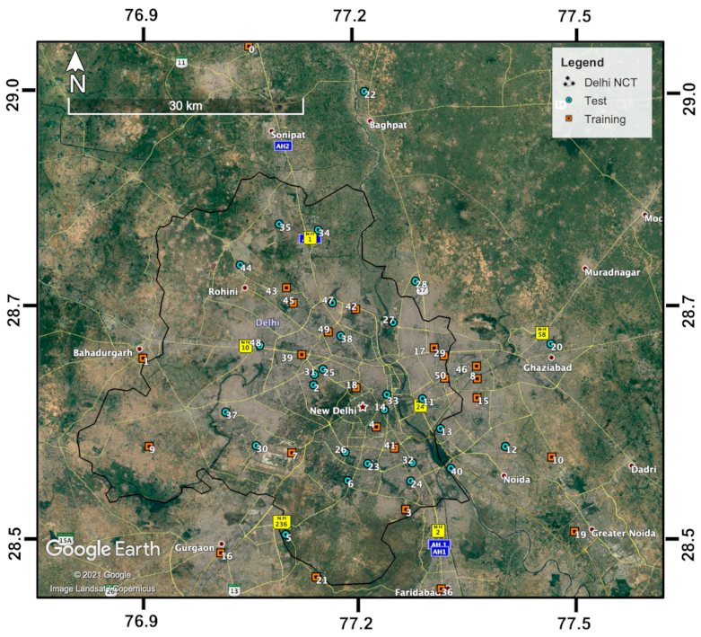
Figure 1. Locations of the 51 air quality monitoring (AQM) stations that had PM2.5 measurements during the period of 1 January 2018 to 30 June 2020 in Delhi and its satellite cities, of which 24 stations (orange squares) were used for training and 27 stations (teal dots) were used for testing the forest–convolutional neural network (RF–CNN) joint model in this paper.
Remotesensing 13 01356 g001
Figure 2. The RF–CNN joint model that includes: (a) an RF regressor to predict PM2.5 from the three meteorological features, temperature (T), relative humidity (RH) and sea-level pressure (SLP); and (b) a CNN model trained on the satellite images; the high-dimensional embedded T, RH and SLP meteorological features; and the RF-predicted PM2.5 to give the final prediction of PM2.5. Notations such as 100 × 100 × 3 indicate image size × image size × channel number. The visualization of RF was adapted from [42].
Remotesensing 13 01356 g002
Figure 3. The flow diagram illustrating the use of the local contrast normalization (LCN) image processing technique to estimate the local PM2.5 hotspot detection map. First, N valid days’ PM2.5 maps predicted from the RF–CNN joint model are obtained, each of which is denoted as f x , y . Second, obtain f x , y m f x , y , where m f x , y is estimated by applying a 2-D Gaussian Smoothing/Blur to each f x , y . Third, obtain each g x , y , that, is LCN-normalized- f x , y , where g x , y =   f x , y m f x , y σ f x , y , and σ f x , y is estimated by applying a series of operations, including square, another 2-D Gaussian Smoothing/Blur, and square root to each f x , y m f x , y . Fourth, averaging N valid days’ g x , y s yields the final local PM2.5 hotspot detection map. Note the change in the scales of the color bars of the prediction maps throughout the flow diagram. Additionally, note that the final local PM2.5 hotspot detection map has a slightly different shape, which is because LCN can cause major edge effects due to zero paddings beyond the study region by 2-D Gaussian Smoothing/Blur in LCN, and we trimmed these problematic edges off the hotspot detection map so that it can be more properly displayed. The visualization of LCN was adapted from [30].
Remotesensing 13 01356 g003
Figure 4. Scatterplots of the true PM2.5 concentrations against PM2.5 concentrations predicted from: (a) only RF using T, RH and SLP meteorological features for the 24 training AQM stations; (b) only RF using T, RH and SLP meteorological features for the 27 test AQM stations; (c) same as (b) but regressing the mean of the true PM2.5 over the entire sampling period against the mean of the predicted PM2.5 over the entire sampling period at each test station to estimate spatial Pearson r; (d) RF–CNN joint model using satellite images and high-dimensional embedded T, RH and SLP meteorological features for the 24 training AQM stations; (e) RF–CNN joint model using the same set of predictors as (d) for the 27 test AQM stations; and (f) same as (c) but using RF–CNN joint model for prediction. Note that in (af), the black dashed lines are the 1:1 lines.
Remotesensing 13 01356 g004
Figure 5. Histograms illustrating the frequency distributions of the daily performances, as assessed by: (a) Pearson r, (b) NRMSE (in %) and (c) NMAE (in %), of the RF–CNN joint model in terms of predicting ground-level PM2.5 for all available test AQM stations in Delhi on each available day during the period of January 1, 2018, to June 30, 2020. Note that in (ac), the black dashed lines indicate the thresholds for the top 20% best Pearson r (>0.47), NRMSE (<18.3%) and NMAE (<14.6%), respectively.
Remotesensing 13 01356 g005
Figure 6. (a) The averaged PM2.5 prediction map, (b) the adjusted averaged PM2.5 prediction map after excluding the top 10% highest and the top 10% lowest values and (c) the local PM2.5 hotspot detection map after LCN are generated from the RF–CNN-predicted PM2.5 maps on the most trustworthy 43 days, as shown in Figure A2. (d) The averaged PM2.5 prediction map, (e) the adjusted averaged PM2.5 prediction map after excluding the top 10% highest and the top 10% lowest values with demarcation of seven subregions within Delhi and (f) the local PM2.5 hotspot detection map after LCN are generated from the RF–CNN-predicted PM2.5 maps on all available days from 1 January 2018 to 30 June 2020. Note that the scales in (af) are the same. Additionally, note that because LCN can cause major edge effects due to zero paddings beyond the study region by 2-D Gaussian Smoothing/Blur in LCN, to more properly display the final hotspot detection maps in (c,f), we trimmed these problematic edges off (c,f) with the trim lines shown in the figure.
Remotesensing 13 01356 g006
Figure 7. Twenty sampled neighborhoods illustrated in (a) the adjusted mean PM2.5 prediction map for the whole study period (i.e., from 1 January 2018 to 30 June 2020) after excluding the top 10% highest and the top 10% lowest values (i.e., Figure 6e) and (b) the PM2.5 hotspot detection map based on the most trustworthy 43 days (i.e., Figure 6c); (c) illustrates the contrast between the landscape, the mean RF–CNN-predicted PM2.5 concentrations over the whole study period and the normalized PM2.5 after LCN of the hottest and coolest 300 × 300 m spots within each of the 20 sampled neighborhoods (sorted in ascending order from north to south). Note that the scales in (a,b) are the same. Additionally, note that the meaning of the trim lines shown in the figure can be found in the caption of Figure 6.
Remotesensing 13 01356 g007
Table 1. The number, name, latitude, longitude, category (training or test), mean of PM2.5 concentrations, weather station uptime (in %) and number of daily satellite image–stationwide averaged meteorology–PM2.5 triplets for each of the 51 AQM stations in Delhi. The table is sorted based on each site’s mean PM2.5 concentrations in ascending order. Note that the uptime of the weather station is different from the uptime of the instrument that measures PM2.5 at each AQM station.
NumberSitesLatLonCategoryMean of PM2.5 (μg m−3)Weather Station Uptime (in %)Number of Daily Image–Stationwide Mean Meteorology–PM2.5 Triplets
0Murthal29.0272177.06208train62.20392
1Arya_Nagar28.6700876.92541train68.896387
2Pusa_IMD28.6396577.14626test78.381711
3Shooting_Range28.4985777.26484train81.1100683
4Lodhi_Rd28.5918277.22731train81.81718
5Aya_Nagar28.4706277.10993test84.13740
6Sri_Aurobindo_Marg28.5313277.19015test86.5100572
7IGI_Airport_T328.5627877.11801train86.80733
8Indirapuram28.6461577.3581train88.997361
9Najafgarh28.5701276.93374train90.895655
10Knowledge_ParkV28.5570377.45365train91.7100240
11Patparganj28.6236477.28717test94.399706
12Sector11628.5692177.39384test94.5100224
13Sector128.589877.3101test94.6100247
14Major_Dhyan_Chand_National_Stadium28.6112877.23773test94.9100720
15Sector6228.6245577.35771train95.13729
16Vikas_Sadan28.4500477.02634train95.199671
17IHBAS28.6811777.30252train96.2100722
18Mandir_Marg28.6364377.20107train98.5100778
19Knowledge_ParkIII28.4727377.48199train98.997567
20Sanjay_Nagar28.6853977.45383test99.396339
21NISE_Gwal_Pahari28.4226777.14893train99.60530
22New_Collectorate28.9747977.21335test100.171269
23Sirifort28.5504277.21594test100.397694
24Okhla_Phase228.5307277.27121test100.8100706
25North_Campus28.6573877.15854test101.14678
26R_K_Puram28.5632677.18694test103.6100753
27Sonia_Vihar28.7103277.24945test106.4100715
28Loni28.7572877.27879test106.698351
29Vivek_Vihar28.6722977.31532train106.6100748
30Dwarka_Sector_828.5709977.07193test107.4100744
31Shadipur28.6514877.14731test107.999714
32CRRI_MTR_Rd28.551277.27357test108.04734
33ITO28.6285577.24102test108.10715
34Alipur28.8160677.15266test109.497429
35Narela28.822777.10191test113.298708
36Sector16A28.4088477.30988train113.399723
37NSIT_Dwarka28.6090277.03251test113.4100798
38Ashok_Vihar28.6953877.18163test114.3100715
39Punjabi_Bagh28.6740577.13102train115.199719
40Sector12528.5447677.32313test116.998703
41Nehru_Nagar28.5678677.25046train117.9100714
42Burari_Crossing28.7255677.20111train118.82453
43DTU28.7500577.11126train119.898700
44Bawana28.7761877.0511test123.199557
45Rohini28.7325177.11993train124.899690
46Vasundhara28.6603377.35726train125.399735
47Jahangirpuri28.7327877.17064test129.4100697
48Mundka28.6844977.07668test130.3100584
49Wazirpur28.6997277.1654train132.299725
50Anand_Vihar28.646977.31592train136.091672
Publisher’s Note: MDPI stays neutral with regard to jurisdictional claims in published maps and institutional affiliations.