Abstract
The Covid-19 pandemic led Catalan universities to do all teaching and evaluation online from 11 March 2020 until the end of term on 30 July. Conventional universities made the transition to online teaching in just a few days and suddenly virtual platforms become the centre of interaction between lecturers and students. Data that were obtained from the virtual platforms gave extremely valuable information about what was being done in class. This paper analyses data taken from Atenea, the Moodle virtual platform at the Universitat Politècnica de Catalunya (UPC), during quarantine. The key indicators and a data analysis design for Moodle have been proposed, which reveal teaching developments at various levels (overall and at the centre and subject level). This is applied to study data from the UPC Moodle and the results are discussed. The methodology can be extrapolated to other universities with Moodle platforms because the UPC is a set of small campuses and centres.
1. Introduction
1.1. Emergency Education in Times of COVID-19
The emergence of COVID-19 and its rapid global expansion generated great consternation and a climate of uncertainty, constant danger, and a desire for protection—even in terms of cybersecurity. The pandemic and quarantine increased public dependence on digital technology. In terms of education, this dependence was even more acute, and the shortcomings of an educational system that had failed to achieve digital transformation were exposed [1]. Paper [1] points to some short-, medium-, and long-term challenges regarding universities and the pandemic:
- Short-term: finishing the course with short-term fixes. Universities adapt to the pandemic and offer a teaching-learning process that is mediated by digital technologies.
- Medium-term: learning to live with the virus in a hybrid environment with virtuality as a new scenario. Universities begin redesigning teaching to be face-to-face with tones of virtuality.
- Long-term: the digital transformation of university teaching. Digitisation was a pending task and the pandemic forces new scenarios and the achievement of the digital transformation demanded by society.
In this paper, we present with data how the UPC faced short-term challenges, how it adapted to emergency learning within a pandemic, and how it used a virtual learning environment to teach with near normality and the minimum of incidents.
1.2. UPC Context
The teaching and learning processes at the Universitat Politècnica de Catalunya (UPC) take place on campus, and most knowledge transfer takes place in lecture rooms. However, like many universities, the UPC also integrates the Moodle virtual learning environment to facilitate access to content, resources, documentation, and to deliver digital tasks [2,3,4,5,6,7].
Academic analytics and learning management systems have become increasingly common in recent times [8,9,10,11,12], especially Moodle systems [13,14,15,16,17,18] or also in MOOCs [19,20,21,22,23,24]. Given the circumstances that were imposed by the pandemic, virtual learning environments enable us to measure how the transition from face-to-face teaching to online has been made [25].
The UPC is a federated university [26] that brings together 16 school centres, such as faculties (Facultat d’Informàtica de Barcelona) or school centres (Escola d’Enginyeria de Telecomunicació i Aeroespacial de Castelldefels or Escola Politècnica Superior d’Enginyeria de Vilanova i la Geltrú).
Although each organisation within the UPC has its characteristics within a federation, the regulation of training, learning opportunities, educational technology adoption, updating, and recycling of the knowledge of lecturers is managed by the Institut de Ciències de l’Educació de la UPC (ICE-UPC). This unit regulates and contributes to the improvement of teaching quality, especially regarding the training, updating, and retraining of lecturers [26,27,28]. ICE is responsible for training lecturers and managers in the use of learning management systems that are based on Moodle. Similar units are also found in other universities, for example, in the La Salle Campus Barcelona (Universitat Ramon Llull), which is jointly managed by the Directorate of Educational Innovation and the Department of Management of Methodologies and Teaching Processes. Two of the objectives of the ICE at the UPC are to:
- Provide effective support and advice for quality assurance on issues related to the design of degrees, training development, and the teaching work of lecturers.
- Improve teaching by increasingly exploiting the potential that is offered by technological resources.
The ICE is responsible for ensuring that the digital educational tools used throughout the UPC are understood and used appropriately. Therefore, ICE played an important role in the adaptation to the pandemic and in ensuring that teaching–learning tools were effectively used in an environment of uncertainty and fear. Given that the teaching model at the the UPC had always been eminently face-to-face, the transition to online tools always faced a risk of failure.
1.3. Adaptation to the COVID-19 Pandemic
The UPC was one of the first Catalan universities to temporarily abandon its normal teaching–learning model. It was decided to close the classrooms and move from face-to-face to online teaching. Nobody was prepared for the resulting situation and decisions had to be made quickly, despite considerable political, economic, and social uncertainty. This radical change was made, despite the fact that students were unaccustomed to a completely virtual environment using technologies, such as Moodle. Moreover, the faculty—whose average age was 57—had not been taught how to teach online. However, age proved to be no obstacle and the determination of faculty was key to overcoming the crisis and completely changing the teaching model within the UPC.
1.4. Educational Data Analytics as a Game-Changer
The UPC has a unique Moodle virtual platform, known as Atenea, which manages about 5000 courses and has 31,000 registered users in the various school centres and faculties. Some of the Atenea indicators have been stored on the platform since 2016, and various proposals to add a friendly dashboard were unsuccessful, because it was felt that, because the UPC is not an online university, it was not a priority to visualise such indicators. Lecturers generally have a basic knowledge of Moodle, but the use of the platform was not extensive. In July 2019, ICE-UPC began the extraction and initial analysis of Atenea indicators with the help of undergraduate students without any previous knowledge. These practices and tests during over a period of two years gave us an insight into how to gain the maximum benefit from these indicators.
Atenea’s corporate business intelligence indicators for the UPC are currently being designed with advice from ICE, and it will soon be accessible for all the community.
During the period of Covid-19 quarantine, face-to-face teaching moved online in just a few days and all teaching and learning activity was handled from within the virtual platform. The virtual classroom indicators provided important information regarding the type of teaching activity and everything that was done for teaching the subject during the quarantine—such as the creation of deliverable tasks or the level of teaching activity for a given subject (even including assignments that were completed per user in a subject). These learning management systems plus the Google Workspace G Suite (which was deployed to lecturers and students in just one week) became the backbone of the virtual learning environment that the university relied on to successfully complete the academic year [7,29]. Given this background, a methodology and technique for analysing key Moodle indicators are proposed to visualise teaching behaviour in the virtual classroom. These were applied in the UPC during quarantine. The proposed guidelines can be automatically extrapolated to another university or set of regional universities.
2. Materials and Methodology
Atenea is the Moodle virtual platform of the UPC that, during the 2019–2020 academic year, managed some 5000 courses/subjects and 31,217 users: including 2885 lecturers, 381 administrative staff, and 27,951 students. Specifically, Atenea supported 2022 courses that were taught in the various school centres during the pandemic (degree and masters courses).
2.1. Data Analysed
Atenea Moodle data have been stored on the ElasticSearch platform [30] since 2016 (hereafter ES). We downloaded, filtered, analysed, and graphed data with the help of the R; R is a free software environment for statistical computing and graphics [31].
The volume of stored data per day is considerable: some 100,000 items of data (20 variables for about 5000 subjects). The process to obtain the ES data for a whole academic year took some two hours because of the more than 5000 queries needed, one for each subject. The process for obtaining the information for one subject during one year in isolation would be almost instantaneous on a PC (less than six seconds).
The data stored in ES were limited to the information summarized in Table 1 for each subject and day without distinguishing student/lecturer and type of use (read/load/send). As an example, for a particular subject, the data are stored day-by-day, together with the overall number of uses of a file without specifying the type of use or the type of user. Table 1 shows which resources and activities are not saved.

Table 1.
Type of Moodle data stored (and not stored) since 2016 on the Elastic Search platform for each subject and day without distinguishing student/lecturer and type of use (read/load/send).
In addition, data include qualitative information regarding the subject, such as the centre where it belongs, and if it is a masters or undergraduate degree subject.
The ES data used in the present paper contain information for each UPC subject for the second term of the academic year 2019–2020, from 2/2020 to 7/2020 (hereafter Q2-2020), as well as for the anterior Q2-2019 term.
Moodle provides much more information, which monitors the functioning of the Atenea virtual campus. Specifically, during the limited period of online classes from March to July 2020, the UPC stored additional data by center and week (see Table 2), including total use of resources/activities and the use of most common deliverables: quizzes and assignments.
Table 2.
Type of Moodle data stored during quarantine period, from March to July 2020, by centre and week. Deliveries distinguish student and lecturer.
This information is valuable when compared with Table 1, because it distinguishes the actions of lecturers (creating) from those of students (sending) and so interaction can be measured. The handicap is that there was no information related to each subject. The UPC downloaded this data with Google Analytics and stored it in Excel format. We filtered, analysed, and graphically represented the data with the help of R.
2.2. Data Analysis Design: Key Indicators
Data analysis design in a large university, such as the UPC, is not easy because many variables are playing together. Table 1 and Table 2 summarise the UPC data available, and these data are also available to any university with a Moodle platform. An exercise to make the data useful was performed, so that we could extract overall teaching information.
In an initial approach, Moodle activity can be measured at different levels (see the summary in Table 3), where a unit is a centre (faculty or school centre that usually offers specific degrees and masters courses) or a department.
Table 3.
Different levels to measure Moodle activity. by mean value dividing by active users. in mean/median/maximum value considering all data from subjects.
This work performs the study at levels 1, 2, 3, and 4 for the UPC, measuring the activity of: a subject, a master or degree course, a school centre or department, and all of the university. The information at level 0 is private and we did not have access.
In addition, activity at levels 1–4 can be measured per:
- -
- user by mean value dividing by all active users.
- -
- subject using mean/median/maximum values considering all data from subjects.
With this in mind and the limited information obtained (see Section 2.1), we found certain key indicators to be useful to measure online teaching on the virtual platform over a period of time (see the summary in Table 4):
Table 4.
Key indicators to measure teaching activity over a period. by mean value dividing by users; by mean/median/maximum value considering all data from subjects.
- K1:
- Concurrent users of a subject: the maximum number of users connected at the same time.
- K2:
- Active subjects: the number of subjects with at least one user who performed one action (read/send/load). This can measure a specific resource/activity, for instance, the total number of subjects that use tasks.
- K3:
- Subject activity: total number of actions. This can be a measure of a specific type of resource/activity, such as counting total actions related with quizzes.
- K4:
- Activity of a unit or all the university: total number of actions performed with resources and activities within a school centre, department, or the whole university. This can be a measure of a specific type of resource/activity, such as the total number of actioned files for a centre and even detail:
- (a)
- per user mean value: the number of actions divided by active users.
- (b)
- per subject mean/median/maximum value: calculated using number of actions performed for each subject.
Both can be measured of a specific type of resource/activity. - K5:
- Level of activity of a subject during a term. The subjects are classified according to the level of activity: low, medium, hight. We define the level of activity depending on the number of actions by user in mean value. The reference values were taken from a previous academic year, the Q2-2019 term, when there was face-to-face teaching. The division was done, so that 66% of the subjects are medium activity and the rest are equally divided between high and low activity levels.
- K6:
- Deliverables (quiz and assignments) created by lecturers in a unit.
- K7:
- Deliverables (quiz and assignments) sent by the students in a unit.
Indicators K1 and K3 collect data for a subject, but the interesting key indicators are the averages for all subjects in median or maximum values. K5 is a qualitative new valuable indicator that we have defined in terms of the number of actions in a subject, but, in another context, we could define for a unit or a whole university, or even a regional set of universities. In the present paper, indicators K6 and K7 are limited to level 3 (unit), but it would be desirable to have level 1 (of a subject) for a better overall analysis. Indicators are also limited to quiz and assignments, but it would be useful to be able to measure all the activities created and sent. With respect to the time period, we have detailed information from one day (K1–K5) to a week (K6 and K7), and the study over time is limited to weekly changes.
Finally, other useful guidelines to study key indicators include:
- Absolute values: total numbers.
- The relative values between terms: related to an analogous term, to measure relative changes.
- Comparison between mean and median values of a set. The median value is the value separating the top half from the lower half of a data set. The comparison between mean and median value is quite fruitful, similar values imply a homogeneous behaviour because the median is unaffected by extreme values. The median values give better information about the central tendency of the sample, while the mean measures intensity. For example, to evaluate the impact of the use of quizzes for all subjects: the mean measures the intensity of its use, a high mean value implies a greater use of quizzes. The median value gives an idea of the use of quizzes for 50% of subjects.
- Temporal behaviour: measure the consecutive changes and changes over time. For instance, some weekly indicators can be plotted for a term.
- A comparison of key indicators between units in bar diagrams or boxplots with the overall mean/median level plotted to reveal the difference between them.
- Comparison of mean/median values of activity (or specific activity) between different units in bar diagrams.
- Bivariate diagrams between the deliveries of students and lecturers per unit and the plot for all units. Linear regression line and correlation coefficients measure the engagement of students with the proposed deliveries by lecturers. This is key to measuring feedback between lecturer and student.
Specifically, to discuss the effect of Covid-19 at a university, it would be useful to show the results following these steps:
- -
- General indicators for the Covid-19 period: during the affected term.
- -
- Vision of the term affected before and during the quarantine.
- -
- Student response to the actions of lecturers by centres during affected terms.
- -
- Comparison between units during affected terms.
- -
- Comparison of terms affected with the homologous term the previous year.
3. Results and Discussion
Following the methodology and guidelines outlined in Section 2, the significant results of the effect of Covid-19 on the work done by UPC lecturers and students are presented. Key indicators (Table 4) from the Atenea virtual platform are used and referenced in the table and figure captions.
3.1. General Indicators of Period COVID-19: Q2-2020 Term
The Q2-2020 term, which was affected by quarantine, had 78% active subjects of a total of 2022. This means that 78% of subjects were active with at least one action during the period. As a starting point, subjects are classified according to the level of activity (K5, see the definition in Section 2.2). Table 5 (rows 1 to 3) shows what this definition means in present case. Figure 1 shows that only 8% of subjects had a low level of activity and, in contrast, 29% of the subjects were highly active.
Table 5.
The number of actions that define the level of activity (K5, see Section 2.2) and percentatge of subjects in Q2-2019 and Q2-2020 terms—classified according to the level of activity.
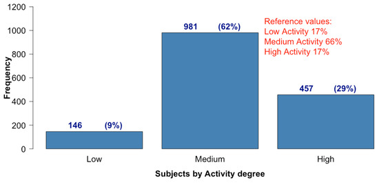
Figure 1.
Number of subjects (and percentage) during Q2-2020 term classified according to the level of activity (K5, see Section 2.2) and the reference values before Covid-19.
There was an important increase in the number of high activity subjects, from 17% last year to 29% this year. This increase was compensated by a reduction of 4% in the number of subjects with medium activity, and a 9% reduction in subjects with low activity.
With respect to percentage of subjects that use resources and activities, the most frequent were forum, files, and assignments—with 96%, 93%, and 81% of subjects using them, respectively. The resources folder and URL were also used in a significant number of courses (see Figure 2). The use of data, workshop, book, glossary, lesson, SCORM and survey was residual, with less than ten subjects using each. Moreover, the situation is similar when master and degree subjects are compared: forum, files, and assignments also led in the ranking of subjects using these resources (see Figure 2).
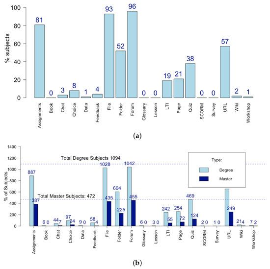
Figure 2.
Subjects that use Moodle resources and activities during Q2-2020 term (K2). (a) percentage; (b) number of master and degree courses.
Being related to the resources and activities used (load/create/send), Figure 3 shows the percentage of each type of action per subject performed during this period in the virtual learning environment. The use of files (37%), quizzes (30%), and forum (14%) can be highlighted as the main actions performed per subject. Note that each question in a questionnaire counts as a quiz. Taking this into account, the number of quizzes used is not especially meaningful, and one can conclude that files were the preferred resource for providing information and material. The use of forum was also important during quarantine, as it represented a communication channel between lecturers and students. Although assignments are used by most subjects, its use within specific subjects is not intensive.
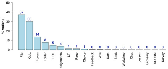
Figure 3.
Actions (percentage) of different Moodle resources and activities per subject during Q2-2020 term (K4 of total UPC per subject).
The number of concurrent users for a subject was saved (ES data, see Section 2), and this included the maximum number of users connected per day. That number during a specific period was calculated in the same way as the maximum value for all days in the period. Boxplot is a useful graphic to plot this: the box collects 50% of the central data, the middle line is the median, the whiskers give an idea of variability, and the points are considered to be outlier data. The boxplot of concurrent users of all subjects (see Figure 4) shows that more than 50% of subjects had more than 67% of concurrent users, as its median is almost 67. The boxplot also shows that 50% of subjects had between 45% and 95% of concurrent users. The mean shows us that the average number of concurrent users per subject is nearly 63 students. The mean and median value were nearly matching, and so the concurrence was very homogeneous for all subjects.
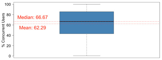
Figure 4.
A boxplot of the concurrent users (percentage) for each subject during Q2-2020 term (K1).
The number of actions per user for each subject was also studied (see Figure 5): more than 50% of subjects had more than 65 actions per user. In some outlier subjects, the users performed 450 actions. The mean shows that the average user performed 56 actions per subject during the term. In this case, the mean and median value vary, so the subjects were heterogeneous regarding the actions that were performed by each user.
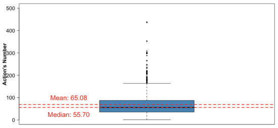
Figure 5.
Boxplot of the number of actions per user for each subject during Q2-2020 term (K3).
3.2. Vision of the Q2-2020 Term before and during Quarantine
The material created by lecturing staff was initially analysed, particularly the generation of material to deliver: quiz and assignment activities (see Figure 6). The period considered is the four weeks before quarantine until the end of July, when there was a week without classes (Easter week) and where the evaluation period began on 1 July.
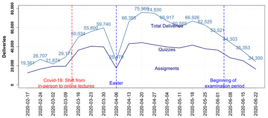
Figure 6.
Total Moodle resources/activities and number of deliveries (quiz and assignment) created per week by UPC teaching staff during Q2-2020 term (K6).
Figure 6 shows how the total number of Moodle resources and activities created by lecturers increased rapidly with the shift from online to in-person learning. Before quarantine, the lecturers created about 1500 materials each week—but, during the first week of quarantine, that number more than doubled to a peak of 3355 materials. Another peak of work (3102) occurred after Easter week, showing that lecturers were preparing materials even during Easter week.
During the quarantined academic period before evaluation, the number of deliveries created per week (quiz and assignments) remained larger than before quarantine. Also noticeable was that after Easter week, the number of deliveries created increased to reach a maximum (1391), and this is reasonable as the lecturers needed time to learn to use Moodle. Moreover, the weight of the questionnaires and tasks significantly increased with respect to the total number of resources during the assessment period, as these were the tools that lecturers used to assess students.
Figure 7 shows the trend for the total deliverables (assignments and quizzes) sent by students during the whole term. The work done and the progression was surprising. In first week of quarantine, there were some 50,000 deliverables, 1.7 times the weekly deliverables of the maximum activity detected before Covid-19 (about 29,000). In addition, after Easter, a maximum of some 76,000 deliverables were performed, which is more than 2.6 times the maximum activity detected before quarantine. Finally, it is remarkable that, from the first week of the online period, the work per week increased for five consecutive weeks (except for Easter). Additionally, it is noticeable that, even during the Easter period, all students accounted for 25,000 deliveries.
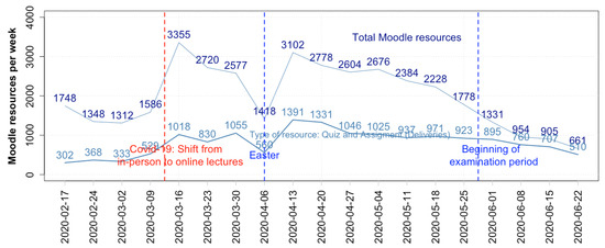
Figure 7.
Number of deliverables (quiz and assignment) sent per week by UPC students during Q2-2020 term (K7).
A similar trend was found when carefully examining assignments and quizzes, bearing in mind that the number of quizzes (one quiz is a question in a questionnaire) is higher than assignments.
3.3. Student Response by Centre to the Actions of Lecturers
Although lecturers and students both significantly increased their computable teaching actions on Atenea, we wondered whether the increase in the creation of deliveries by lecturers had the expected response from students—or if the activities were created in vain. Online teaching could easily have a negative consequence on the level of student commitment. This aspect is analysed week-by-week for the whole term: before and during quarantine. A bivariate plot is made to establish whether student response was in line with the demands by lecturers (see Figure 8). The deliverables created per week by lecturer and those sent by students from each centre form two coordinates. For each week, a regression line is plotted, and the correlation coefficient r is calculated with all of the points from all the centers. Correlation coefficient r is understood as the statistical association between two variables.
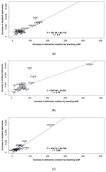
Figure 8.
Q2-2020 term: Deliveries per week (quiz and assignment resources) for each center, deliveries sent by the student vs creation of deliverables by lecturers, with the regression line and correlation coefficient r (K8 versus K7). (a): Before quarantine , (week 16 March). (b): During quarantine (week 20 April). (c): During quarantine and evaluation period (week 22 June).
Figure 8 shows three cases, one before the quarantine with a high value of and two during quarantine: one with (week 20 April) and another with a higher value (week during the evaluation period). Even in the worst case shown (week 20 April), the level of response of students to the actions of lecturers is good in all centres, as responses from all of the centres are near the line. The school centres with the most students (EEBE, ESEIAAT, and ETSEIB) led the deliverables and appeared to be separate from the rest of the centres, which seems reasonable. The ESEIAAT centre led deliveries during quarantine.
The engagement is measured by looking into the correlation coefficient per week. The correlation coefficients that are plotted in Figure 9 are high, indicating strong linear dependence between the two variables. As expected, this is more evident at the evaluation period with higher values (>0.9).
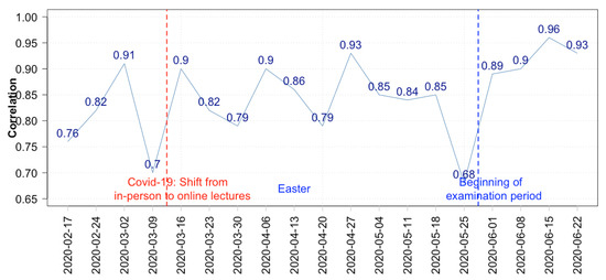
Figure 9.
Q2-2020 term: Correlation coefficients per week of the deliveries made by students vs creation of deliverables by lecturers from each centre (from K6–K7).
High coefficients imply that student response was synchronised with the number of lecturer actions for all centres in the same way, week by week. Furthermore, it seems that all centres performed a continuous evaluation during quarantine: coefficients increased rather than decreased.
Only two weeks showed a lower coefficients of about 0.7:
- -
- 16 March: the week before the quarantine can be explained by the uncertainty associated with the pandemic,
- -
- 25 May: last term week before evaluations, which is acceptable, as there was a shift in attention by lecturers from lessons to evaluations.
3.4. Comparison between Units during Q2-2020 Term
Taking the different units into consideration, we explored which units have adapted to this new situation, and where they struggle to reshape.
Figure 10 clearly shows a difference in the behaviour of the school centres and departments with respect to activity levels. All of the units have a percentage of low activity subjects below 16%. One centre (FME) leads the percentage of highly active courses, with 56% and no courses with low levels of activity, while another centre (ETSEIB) shows 88% of courses with medium levels of activity and 2% with low levels. The MAT department stands out among the departments that show variations—with 47% being highly active courses and only 2% of courses with low activity levels.
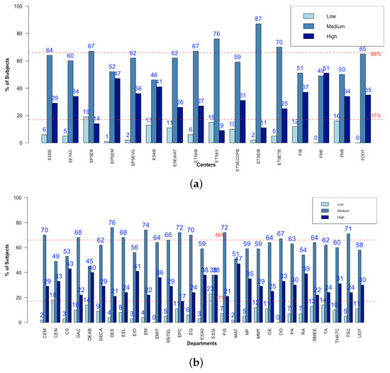
Figure 10.
Comparison of the level of activity during Q2-2020 (K5 for each unit) between: (a) school centres; (b) departments.
The use of questionnaires within subjects varied between school centres. As an initial approach, a comparison of the mean actions in a subject reveals information regarding intensity of use (see Figure 11a). More than a half of centres have a mean quiz actions per subject greater than 843 (the global mean value at the UPC). ESAB leads with 2271 actions in contrast to another centre with 0 actions.
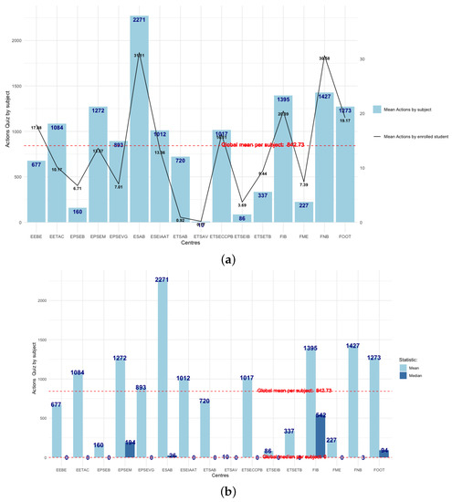
Figure 11.
A comparison between school centers of quiz actions per subject during Q2-2020 (K4 of a unit per subject and user). (a) mean and per active user; (b) mean and median.
However, the number of students in each school centre must also be considered before drawing appropriate conclusions and the number of students per subject also varies greatly—with some subjects reaching 500 students. For this reason, the number of actions per student and subject, on average, is also plotted (see Figure 11a). The centre with most actions per subject is also leader at the UPC, with 31 actions per user on average. In contrast, another centre (FNB) shows less intensity, but has the same number of actions per user (31). The interpretation for this is either that there is a difference between the two centres with respect to the number of students enrolled, or that questionnaires at the ESAB include more questions. The mean number of enrolled students by subject is similar in both centres: 34 at the FNB and 26 at the ESAB, so the latter is the explanation.
To better understand what happens, we need to know more; perhaps there is one subject with a huge use of questionnaires that overlaps the rest. As the mean is not a robust statistic, we need to add the median to gain a better understanding (see Figure 11b). In the ESAB school centre, there is a major difference between mean and median (2271/26), most likely due to some subjects making great use of questionnaires (50% of subjects asked less than 26 questions). There is one school centre (FIB) with a more homogeneous use of quizzes within subjects—with 50% of subjects with more than 542 questions asked and 21 questions per user and subject.
At a next level of insight, boxplots are useful for making detailed comparisons between school centres (see Figure 12). There are clearly many differences between centres, for instance, in the ETSAB, the use of questionnaires is limited to some outlying subjects. The FIB reveals that 50% of its subjects with the most actions are very homogeneous in their use, while, in the ESAB, there is a considerable variability between subjects. The length of the box is a measure of the variability of 50% of the central data, and the length of the whiskers shows variability for extreme values. There is clearly a major variation between centres with respect to the use of quizzes.
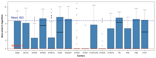
Figure 12.
Boxplots of number of quiz actions of subjects for each center during Q2-2020 (K3 for quiz).
3.5. Comparison of Q2-2020 Term with the Previous Q2-2019
The comparison between analogous terms helps to quantify the impact of quarantine. For instance, the number of subjects with a level of activity shows a change when Q2-2020 and Q2-2019 are compared (see Table 5): the percentage of subjects with little activity was reduced to half, while subjects with a lot of activity almost doubled.
A comparison of the number of concurrent users of a subject is also made (see Table 6). No difference was found between the mean and median, and this denoted homogeneity in all subjects for both terms. A relative increase of 37% is found during quarantine with a median of 67% of students per day. The difference increased when all of the information was processed—in Figure 13, some 50% of subjects only had between 35% and 45% of concurrent users in Q2-2019 in contrast to Figure 6.
Table 6.
Concurrent users (mean/median) in Q2-2020 and previous Q2-2019, and the percentage of relative difference. (Mean/median K1 of all subjects).
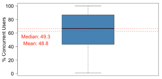
Figure 13.
Boxplot of the concurrent users (%) for each subject during Q2-2019 term. (K1).
The average number of actions per user was obtained for each subject. The mean, median, and maximum were calculated (see Table 7). There was a significant increase in the mean value: a user passed from 45 to 65 actions per subject. The length of the box also changed (this is the range that includes 50% of subjects), as can be deduced by comparing Figure 5 and Figure 14.
Table 7.
The average number of actions per user for each subject. Mean/median/maximum in Q2-2020 and previous Q2-2019 and percentage of relative difference.
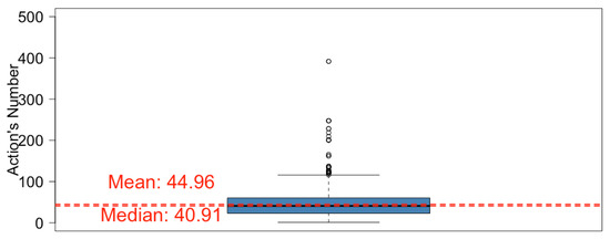
Figure 14.
Boxplot of the number of actions per user of subjects, during Q2-2019 term. (K3 per user).
The comparison in the use of resources/activities is also made (see Figure 15). From Q2-2019 to Q2-2020, there is a significant increase in the use of the main tools (assignment, file, quiz, and forum).
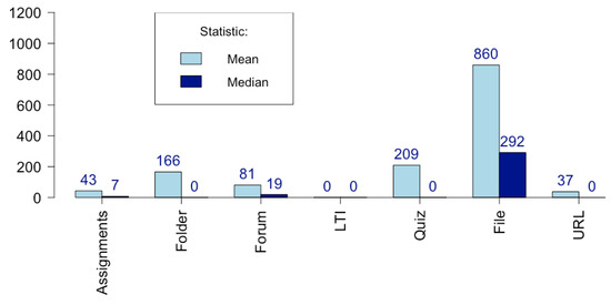
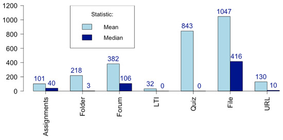
Figure 15.
Comparison between Q2-2019 (top) and Q2-2020 term (bottom): actions for each resource/activity per subject (mean and median values). (K4 per subject).
Table 8 shows a summary of results considering the number of subjects in which the main resources/activities (assignment, file, quiz, and forum): 81% of subjects used tasks in contrast with in Q2-2019 term, approximately 40% of subjects used questionnaires, up from 14% during the previous term. The number of subjects in which questionnaires were used almost tripled. These are important data, because the use and design of a questionnaire in Moodle are considered to be difficult.
Table 8.
Comparison of subjects (%) that used assignments, quiz, files, and forum between terms Q2-2019 and Q2-2020. (K2).
Table 9 compares the number of actions (assignment, file, quiz, and forum) mean/median per user for each subject between terms. The number of assignments per user has more than doubled, and half of the subjects reveal more than 40 tasks per user (compared to seven in the previous term). The number of quizzes and forums per user and subject more than quadrupled and some 40% of courses use questionnaires.
Table 9.
Comparison of number of actions (assignment, file, quiz, and forum) per user in mean/median of all subject between terms Q2-2019 and Q2-2020. (Mean/median K3 per user).
4. Conclusions
An effort has been made to structure data from a university Moodle platform. The data were intended to be useful for extracting teaching information at the subject level, as well as the school centre and university levels in a general context; this has made the description complex. The data that we believe are most significant, especially in an online teaching environment, we have called ‘key indicators’, some of which have been newly defined at the subject activity level. These are not the only indicators and more may arise. However, any university with a virtual platform (especially, but not necessarily, a Moodle) can access similar data and replicate the study. In addition to defining and organising the data, a design has been made of how the data can be analysed: guidelines have been given regarding types of graphs and how to make data comparisons between terms, school centres, faculties, and universities. For example, a bivariate diagram and correlation coefficient reveal whether the student response in each centre was in line with the demands made by lecturers.
The pitfall to reproducing such work in another university or environment is not having Moodle indicators on hand, or not having them in a processable spreadsheet format.
We can remark that: (1) weekly is a sufficient period for saving the indicators, and it is not necessary to have them saved daily; (2) it is useful to save the indicators at level 1 of the subject, so that, within a unit, it is possible to produce averages, medians, maximums per subject and student, and use graphics, such as boxplots, which include all subject behaviour in a unit; (3) it is not generally necessary to specify the type of use of the resources (read, send, create) and the aggregate is sufficient. However, it would be necessary to distinguish use between students and lecturers; and, (4) as an exception, it is necessary to specify and save the data separately for activities that are created by lecturers and submitted by students.
The analysis is applied to the Universitat Politècnica de Catalunya data during the pandemic term with online teaching (second term of academic year 2019–2020). The data made available were restricted. A thorough study and analysis of the indicators shows how valuable information can be extracted from the overall data. Students have generally responded very well to the demands of lecturers by working online, with the results obtained in a sustained and seemingly natural manner during the course. The correlation coefficients for all of the centres measured between 0.8 and 0.95—which reveals that the centres were sincronized and making continuous evaluations. Surprisingly, there is a sharp increase in deliveries by students during the first week of quarantine, multiplying by 1.7 and the volume of deliveries increases week after week for five consecutive weeks until reaching 2.5 times before online teaching. A considerable amount of work was produced, even in Easter week.
The file format remains the preferred subject resource for providing information and material to students and it is used in 93% of the subjects. Some four out of ten subjects use questionnaires, with triple the number of subjects using this resource when compared to normal terms; however, when used, they are used intensely.
Under normal conditions, some 17% of subjects show a high level of activity with more than 80 actions per student and, during quarantine, almost twice as many subjects showed a high level of activity on average. There is a surprising contrast between school centres or departments, where some reveal that about half of their courses had high levels of activity. In general, all of the indicators in the virtual classroom indicate that there was a good subject monitoring: both for the lecturers (who needed to be trained) and for students.
The aim of this paper is not to compare academic performance indicators with Moodle indicators, and we leave this study for the future. However, we know that, in the case of the UPC, there was an improvement in performance indicators ([32]).
It must be said that the results of such good teaching performances at the UPC during quarantine cannot be explained without a set of actors. One is the key role that is played by ICE, especially in offering assistance and teaching support during the pandemic [29]. It must be added that, during the first week of quarantine, the UPC offered Google Workspace G Suite to the entire community. In addition, Atenea offered several unique Moodle utilities, such as the lecturer’s briefcase, which enables storing and testing (including as a fictional student) all of the Moodle resource [29]. The technological profile of the university must also have helped.
Author Contributions
Conceptualization, J.P., A.L., M.A. and D.A.; Data curation, F.S.; Formal analysis, J.P. and M.A.; Funding acquisition, A.L.; Investigation, J.P., A.L., F.S. and M.A.; Methodology, J.P., A.L., F.S., M.A. and D.A.; Project administration, A.L. and M.A.; Resources, F.S. and M.A.; Software, F.S.; Supervision, J.P., M.A. and D.A.; Validation, J.P.; Writing original draft, J.P. and F.S.; Writing, review and editing, J.P., D.A. and A.L. All authors have read and agreed to the published version of the manuscript.
Funding
This research was funded by ICE-UPC.
Institutional Review Board Statement
Not applicable.
Informed Consent Statement
Not applicable.
Data Availability Statement
Not applicable.
Acknowledgments
We are grateful for the constant support received from the Universitat Politècnica de Catalunya (UPC) in developing this work, with special acknowledgments to Professor Santiago Silvestre (UPC). We are also grateful for the support received from the Institut de les Ciències de l’Educació (ICE-UPC), and especially for the help in analysing Moodle data. Finally, we are grateful for the technical support received from UPCnet, ICT services, and in particular, from Sisco Villas and Joaquin Morte.
Conflicts of Interest
The authors declare no conflict of interest.
References
- García-Peñalvo, F.J. El Sistema Universitario ante la COVID-19: Corto, Medio y Largo Plazo. Universídad. 2020. Available online: https://bit.ly/2YPUeXU (accessed on 28 April 2021).
- Adell, J.; Bellver, A.J.; Bellver, C. Entornos virtuales de aprendizaje y estándares de e-learning. In Psicología de la Educación Virtual; Ediciones Morata: Las Rozas, España, 2008; pp. 274–298. [Google Scholar]
- Alier, M.; Casan, M.J.; Conde, M.A.; García-Peñalvo, F.J.; Severance, C. Interoperability for LMS: The missing piece to become the common place for e-learning innovation. Int. J. Knowl. Learn. 2010, 6, 130–141. [Google Scholar] [CrossRef]
- García-Peñalvo, F.J.; Seoane-Pardo, A.M. Una revisión actualizada del concepto de eLearning. Décimo Aniversario. Educ. Knowl. Soc. 2015, 16, 119–144. [Google Scholar] [CrossRef]
- Sclater, N. Web 2.0, personal learning environments, and the future of learning management systems. Res. Bull. 2008, 13, 1–13. [Google Scholar]
- Vinuesa, R.; Theodorou, A.; Battaglini, M.; Dignum, V. A socio-technical framework for digital contact tracing. arXiv 2020, arXiv:2005.08370. [Google Scholar] [CrossRef]
- Alier, M.; Casan, M.J.; Llorens, A.; Alcober, J.; Prat, J. Atenea exams, an IMS LTI application to solve scalability problems: A study case. Appl. Sci. (Switzerland) 2021, 11, 80. [Google Scholar] [CrossRef]
- Conde, M.Á.; Hérnandez-García, Á.; García-Peñalvo, F.J.; Séin-Echaluce, M.L. Exploring Student Interactions: Learning Analytics Tools for Student Tracking. In Proceedings of the International Conference on Learning and Collaboration Technologies, Los Angeles, CA, USA, 2–7 August 2015; Springer: Cham, Switherland, 2015; pp. 50–61. [Google Scholar]
- Hadavand, A.; Muschelli, J.; Leek, J. crsra: A learning analytics tool for understanding student behaviour in massive open online courses. J. Learn. Anal. 2019, 6, 140–152. [Google Scholar] [CrossRef]
- Uskov, V.L.; Bakken, J.P.; Shah, A.; Hancher, N.; McPartlin, C.; Gayke, K. Innovative InterLabs System for Smart Learning Analytics in Engineering Education. In Proceedings of the 2019 IEEE Global Engineering Education Conference (EDUCON), Dubai, United Arab Emirates, 8–11 April 2019; pp. 1363–1369. [Google Scholar]
- Pantazatos, D.; Grammatikou, M.; Barth, I.; Lariccia, S.; Maglaris, V. Continuous Professional Development for Secondary Education Teachers to adopt Next Generation Digital Learning Environment Platforms. In Proceedings of the 2020 IEEE Global Engineering Education Conference (EDUCON), Porto, Portugal, 27–30 April 2020; pp. 1176–1182. [Google Scholar]
- Vázquez, M.P.Á.; Álvarez-Méndez, A.; Bravo-Llatas, C.; Barrios, J.C.; Carrere, M.T.A. Tipologies d’estudiants de Fisioteràpia segons l’ús que fan del campus virtual. Revista d’Innovació Docent Universitaria 2020, 74–81. [Google Scholar] [CrossRef]
- Mwalumbwe, I.; Mtebe, J.S. Using learning analytics to predict students’ performance in Moodle learning management system: A case of Mbeya University of Science and Technology. Electron. J. Inf. Syst. Dev. Ctries. 2017, 79, 1–13. [Google Scholar] [CrossRef]
- Akçapınar, G.; Bayazıt, A. MoodleMiner: Data Mining Analysis Tool for Moodle Learning Management System. Elem. Educ. Online 2019, 18. [Google Scholar] [CrossRef]
- Dondorf, T.; Pyka, C.; Gramlich, R.; Sewilam, H.; Nacken, H. Learning Analytics Software Implementation for the Moodle Learning Management System. In Proceedings of the ICERI2019, Sevilla, Spain, 11–13 November 2019; pp. 6957–6964. [Google Scholar] [CrossRef]
- Liu, D.Y.T.; Atif, A.; Froissard, J.C.; Richards, D. An Enhanced Learning Analytics Plugin for Moodle: Student Engagement and Personalised Intervention. In Proceedings of the ASCILITE 2015-Australasian Society for Computers in Learning and Tertiary Education, Conference Proceedings, Perth, Australia, 29 November–2 December 2015. [Google Scholar]
- Monllor, F.J.V.; Molina, M.C.; Perales, J.A.R.; Alonso, F.L.G.; Esteve, Y.V. Learning analytics, moodle y matemáticas. In Memòries del Programa de Xarxes-I3CE de Qualitat, Innovació i Investigació en docència Universitària; Convocatòria 2018–2019; Instituto de Ciencias de la Educación, Universitat d’Alacant: Alicante, Spain, 2019; p. 665. Available online: http://hdl.handle.net/10045/99511 (accessed on 28 April 2021).
- Tzelepi, M.; Petroulis, I.; Papanikolaou, K. Investigating Gamification and Learning Analytics Tools for Promoting and Measuring Communities of Inquiry in Moodle Courses. In Proceedings of the International Conference in Methodologies and intelligent Systems for Techhnology Enhanced Learning, Ávila, Spain, 26–28 June 2019; Springer: Cham, Switherland, 2019; pp. 89–96. Available online: https://link.springer.com/chapter/10.1007/978-3-030-23990-9_11 (accessed on 28 April 2021).
- Wang, Y.; Paquette, L.; Baker, R. A Longitudinal Study on Learner Career Advancement in MOOCs. J. Learn. Anal. 2014, 1, 203–206. [Google Scholar] [CrossRef]
- Drachsler, H.; Kalz, M. The MOOC and learning analytics innovation cycle (MOLAC): A reflective summary of ongoing research and its challenges. J. Comput. Assist. Learn. 2016, 32, 281–290. [Google Scholar] [CrossRef]
- Milligan, S.K.; Griffin, P. Understanding Learning and Learning Design in MOOCs: A Measurement-Based Interpretation. J. Learn. Anal. 2016, 3, 88–115. [Google Scholar] [CrossRef]
- Klemke, R.; Eradze, M.; Antonaci, A. The Flipped MOOC: Using Gamification and Learning Analytics in MOOC Design: A Conceptual Approach. Educ. Sci. 2018, 8, 25. [Google Scholar] [CrossRef]
- Er, E.; Gómez-Sánchez, E.; Dimitriadis, Y.; Bote-Lorenzo, M.L.; Asensio-Pérez, J.I.; Álvarez-Álvarez, S. Aligning learning design and learning analytics through instructor involvement: A MOOC case study. Interact. Learn. Environ. 2019, 27, 685–698. [Google Scholar] [CrossRef]
- Shirvani Boroujeni, M.; Dillenbourg, P. Discovery and Temporal Analysis of MOOC Study Patterns. J. Learn. Anal. 2019, 6, 16. [Google Scholar] [CrossRef]
- Iglesias-Pradas, S.; Ernández-García, Á.; Chaparro-Peláez, J.; Prieto, J.L. Emergency remote teaching and students’ academic performance in higher education during the COVID-19 pandemic: A case study. Comput. Hum. Behav. 2021, 119, 106713. [Google Scholar] [CrossRef]
- Universitat Politècnica de Catalunya. La institución. UPC Universitat Politècnica de Catalunya. 2021. Available online: https://www.upc.edu (accessed on 28 April 2021).
- Universitat Politècnica de Catalunya. Institut de Ciències de l’Educació. UPC Universitat Politècnica de Catalunya. Available online: https://www.ice.upc.edu/ca (accessed on 28 April 2021).
- Prat, J.; Recio, F. Teacher’s Briefcase in Moodle. In Proceedings of the MoodleMoot Global, Online. 6–10 July 2020. [Google Scholar]
- Prat, J.; Llorens, A.; Alier, M.; Salvador, F.; Amo, D. Impact of Covid-19 on UPC’s Moodle Platform and ICE’s Role. In Proceedings of the TEEM’20: Eighth International Conference on Technological Ecosystems for Enhancing Multiculturality, Salamanca, Spain, 21–23 October 2020; pp. 765–769. [Google Scholar] [CrossRef]
- Elastic Enterprise Search. Available online: https://www.elastic.co/ (accessed on 28 April 2021).
- The R Project for Statistical Computing. Available online: https://www.r-project.org/ (accessed on 28 April 2021).
- Gabinet de Planificació, Avaluació i Qualitat. UPC Universitat Politècnica de Catalunya. Available online: https://gpaq.upc.edu/lldades/indicador.asp?index=1_1_12 (accessed on 10 April 2021).
Publisher’s Note: MDPI stays neutral with regard to jurisdictional claims in published maps and institutional affiliations. |
© 2021 by the authors. Licensee MDPI, Basel, Switzerland. This article is an open access article distributed under the terms and conditions of the Creative Commons Attribution (CC BY) license (https://creativecommons.org/licenses/by/4.0/).