
A Privacy-Oriented Local Web Learning Analytics JavaScript Library with a Configurable Schema to Analyze Any Edtech Log: Moodle’s Case Study


Abstract
1. Introduction
1.1. Context in Big Data and Small Data
1.2. Current Situation: Sensible and Fragile
- Educational data is fragmented. As more third-party educational tools are being used, the more dispersed the students’ data will be and the less control there will be over privacy.
- Low data protection is evident. Data is accessed freely by third parties and even shared, where students are identified.
- There is no control over the data. Anyone who has access to the data can modify it at will and share it with third parties. Consequently, no one can ensure that the data is stored in the original form or free from unauthorized access.
1.3. Local Instead of Outside
1.4. Ethical Principles to Foster Local-First Technology
- Avoid transferring data to remote servers outside the control of institutions;
- Distribute analysis to local educational role devices to reduce centralized computing complexity;
- Enable analysis of data from any log of educational tools;
- Enable ad hoc visualizations to be generated from logs.
1.5. Research Gaps and Our Contribution
2. Materials and Methods
- Design and implementation of the JavaScript library.
- Design and implementation of a front-end-*dashboard as a pilot test of the library.
- Usability improvement via an evaluation of Nielsen heuristics.
- Teacher survey to validate the interest and usefulness of the tool, the metrics and indicators used, and the visualizations presented.
2.1. JavaScript Learning Analytics Library
- Run in local environments, such as personal devices, e.g., computers or smartphones;
- Run with technologies available in personal devices;
- Visualize data and insights from any learning tool’s log of students’ data and interactions.
- Loads a log into an array.
- Transforms the log array items to the desired format.
- Analyzes and computes data to represent it.
- Schema: This is a JavaScript function that the JSLA library uses to transform each field on record inside the logs. Developers can implement this function considering the original log format and the transformations required to visualize the analysis results. Hence, the schema defines the transformations needed to be applied to raw data.
- Widget: This is a JSON that the JSLA library uses to create visualizations. In each widget CSS styles, JavaScript Charts libraries, and JavaScript code can be specified so the web browser can execute to analyze data and create visualizations. Hence, the representation of a widget could be any result computed by JSLA.
2.2. JavaScript Moodle Learning Analytics Front End
- Develop a schema and different widgets based on the information collected and extracted from the Moodle LMS.
- Develop a front-end application to generate a dashboard with built-in drill-down capability and predefined visualizations.
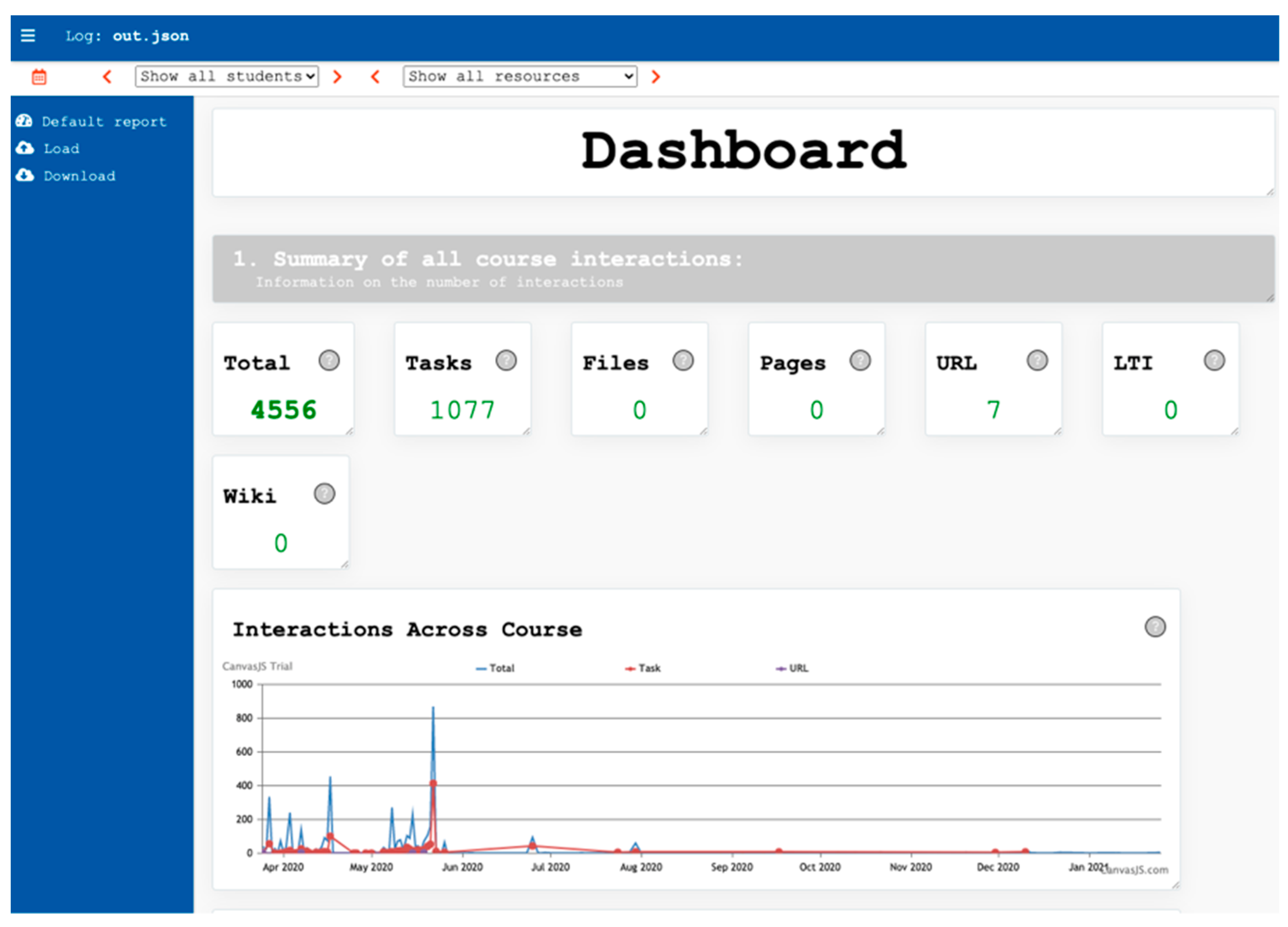
2.2.1. Widgets
- Key Performance Indicators (KPI);
- Line chart;
- Pie chart;
- Table.
2.2.2. Basic Functionalities
2.3. Heuristic Analysis
2.4. Survey
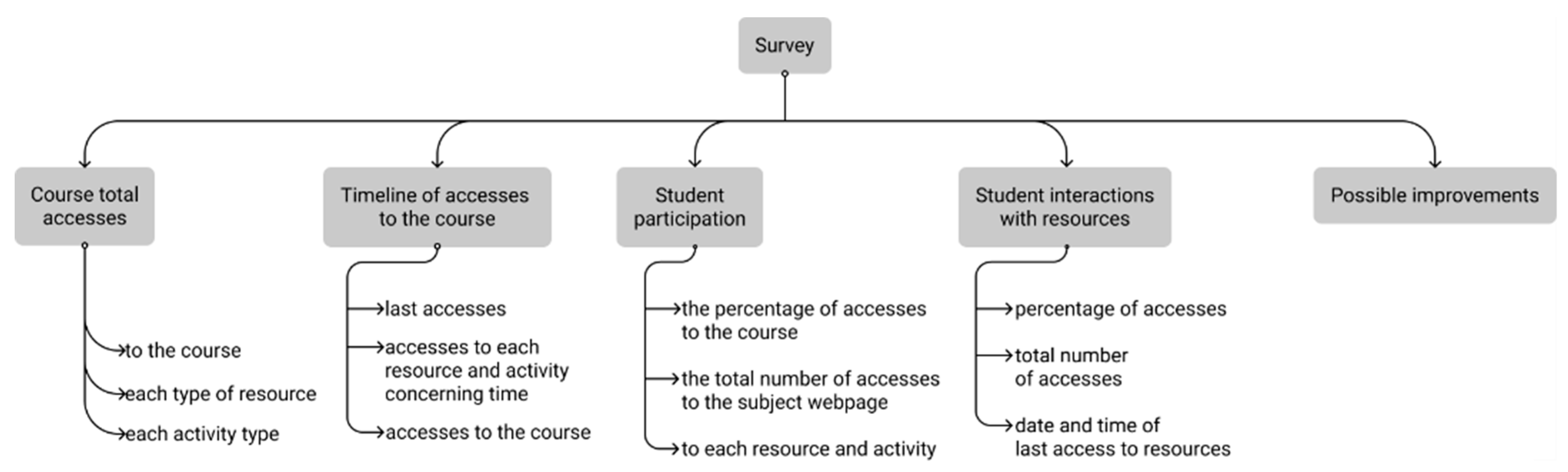
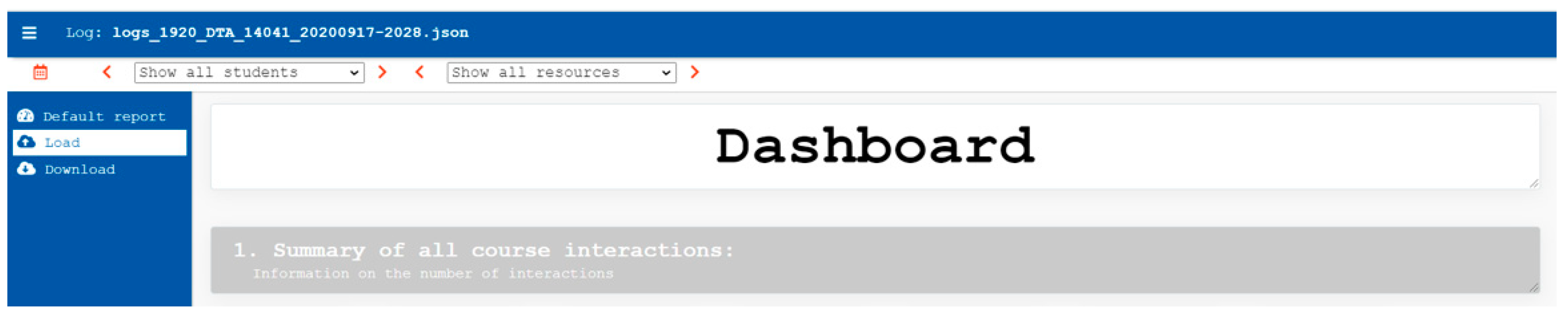
Structure
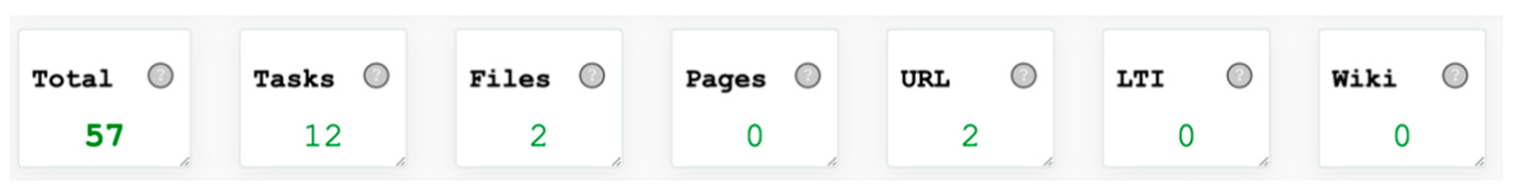
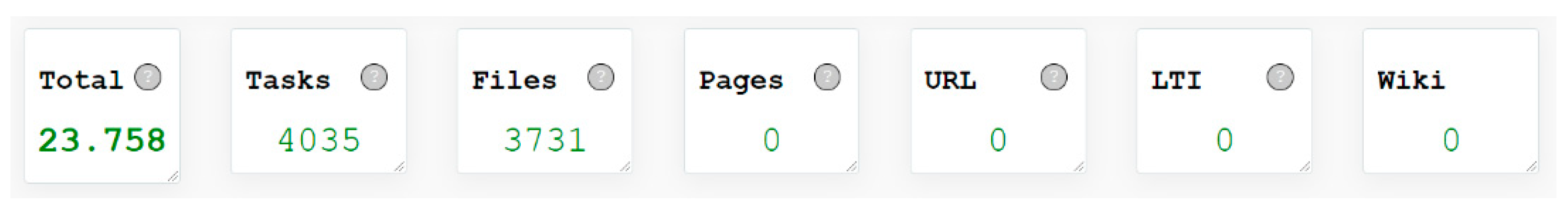
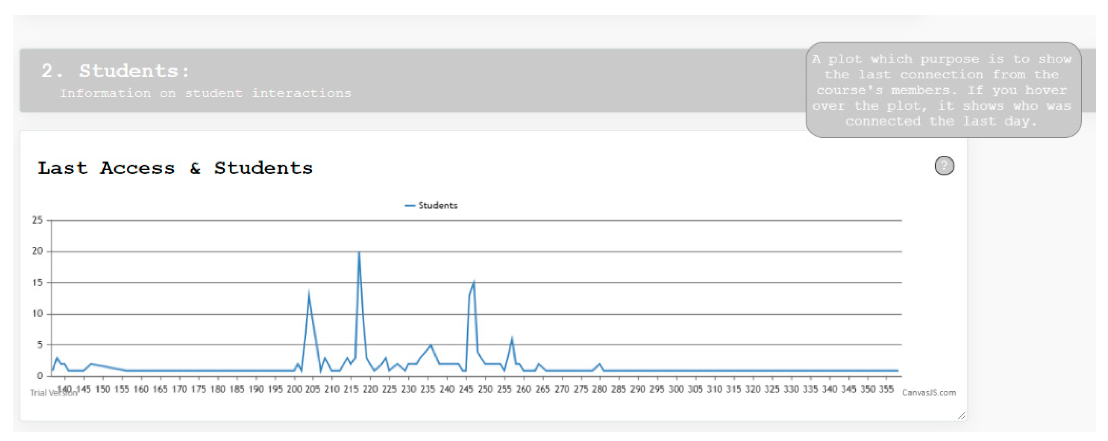
- Course totals;
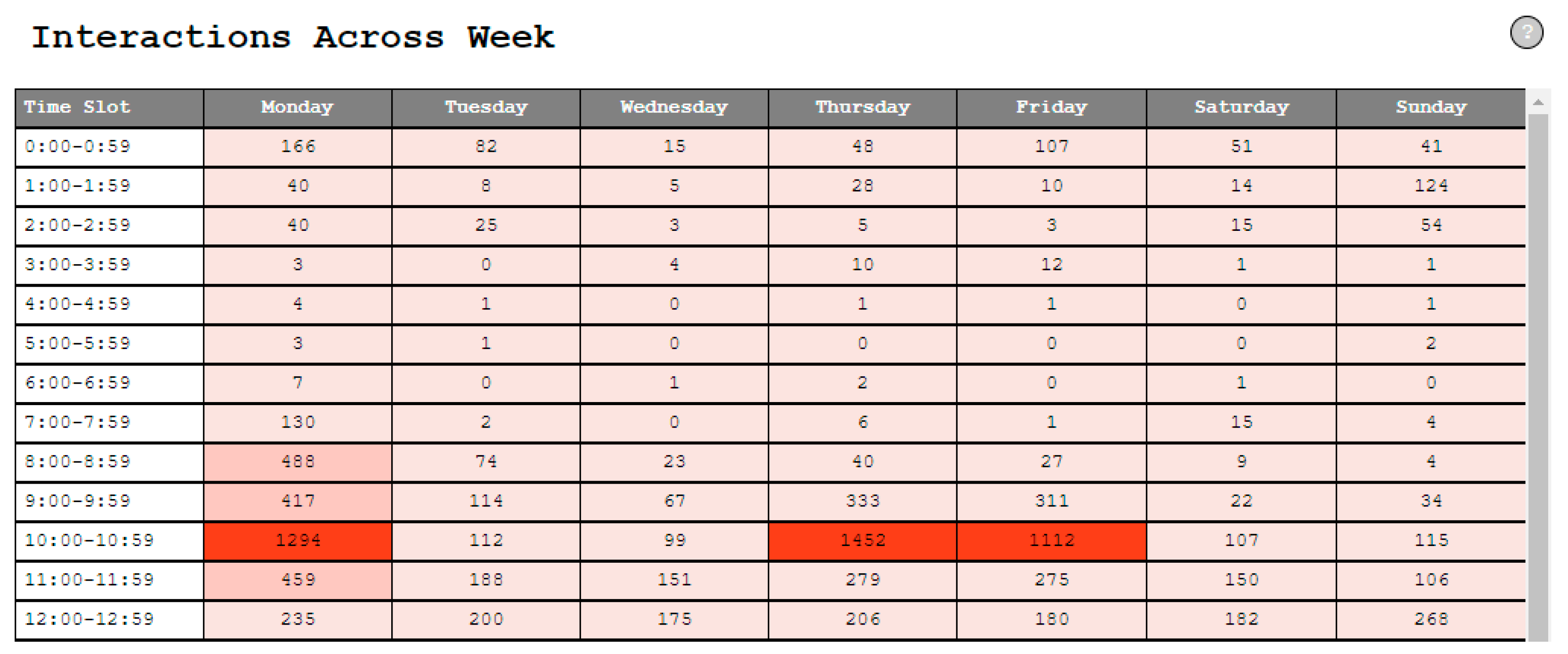
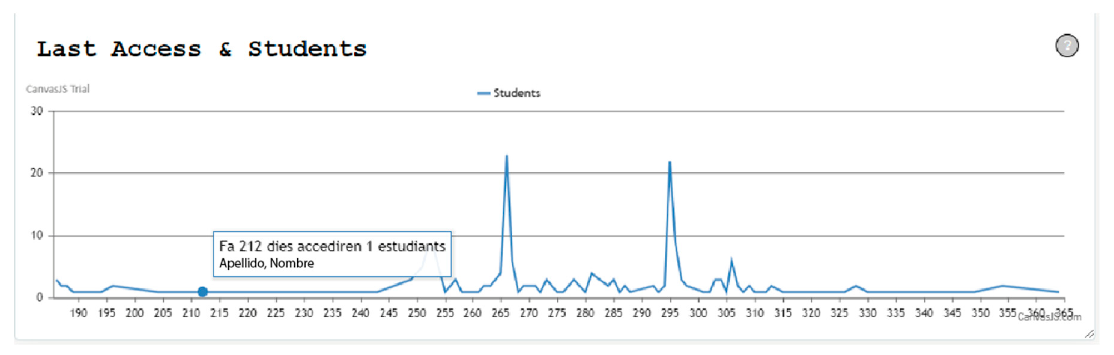
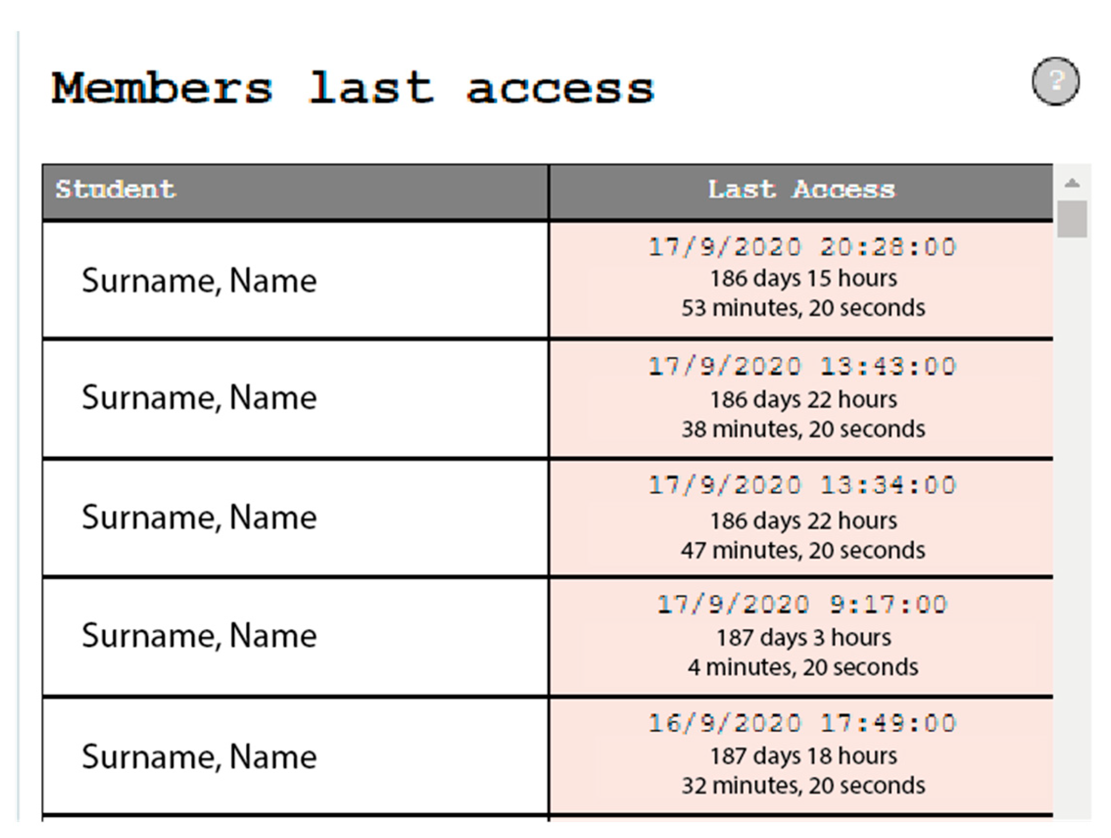
- Timeline of accesses to the course;
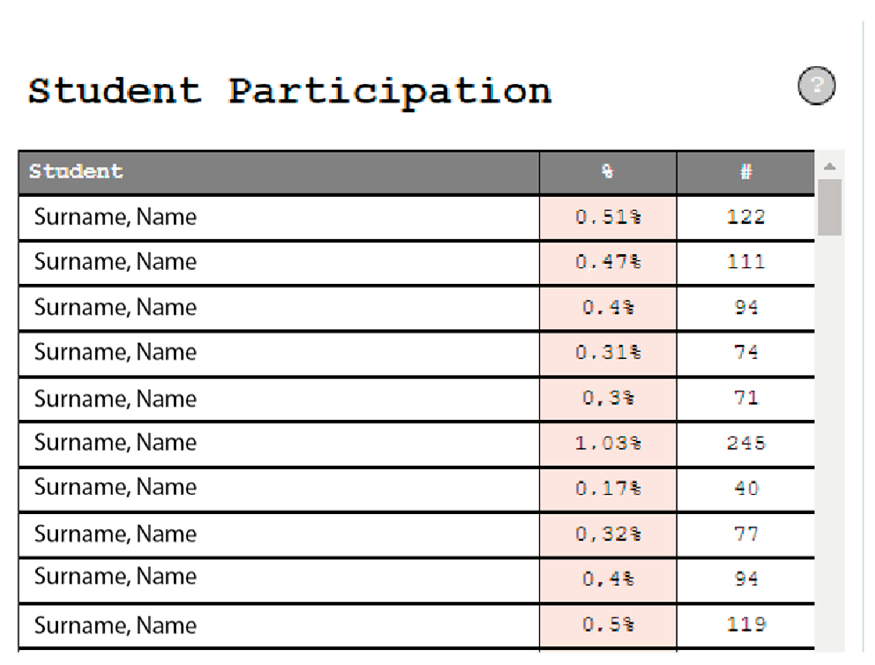
- Student participation;
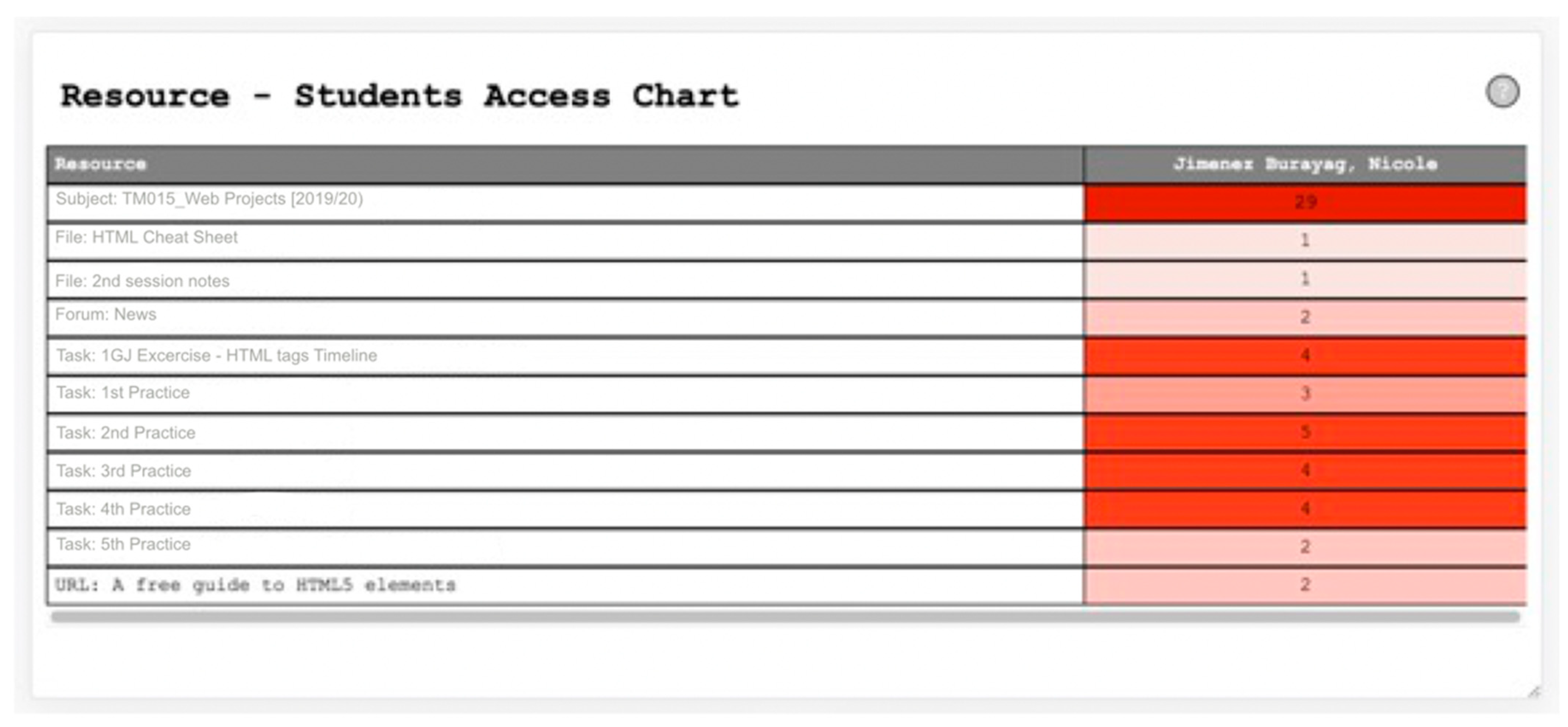
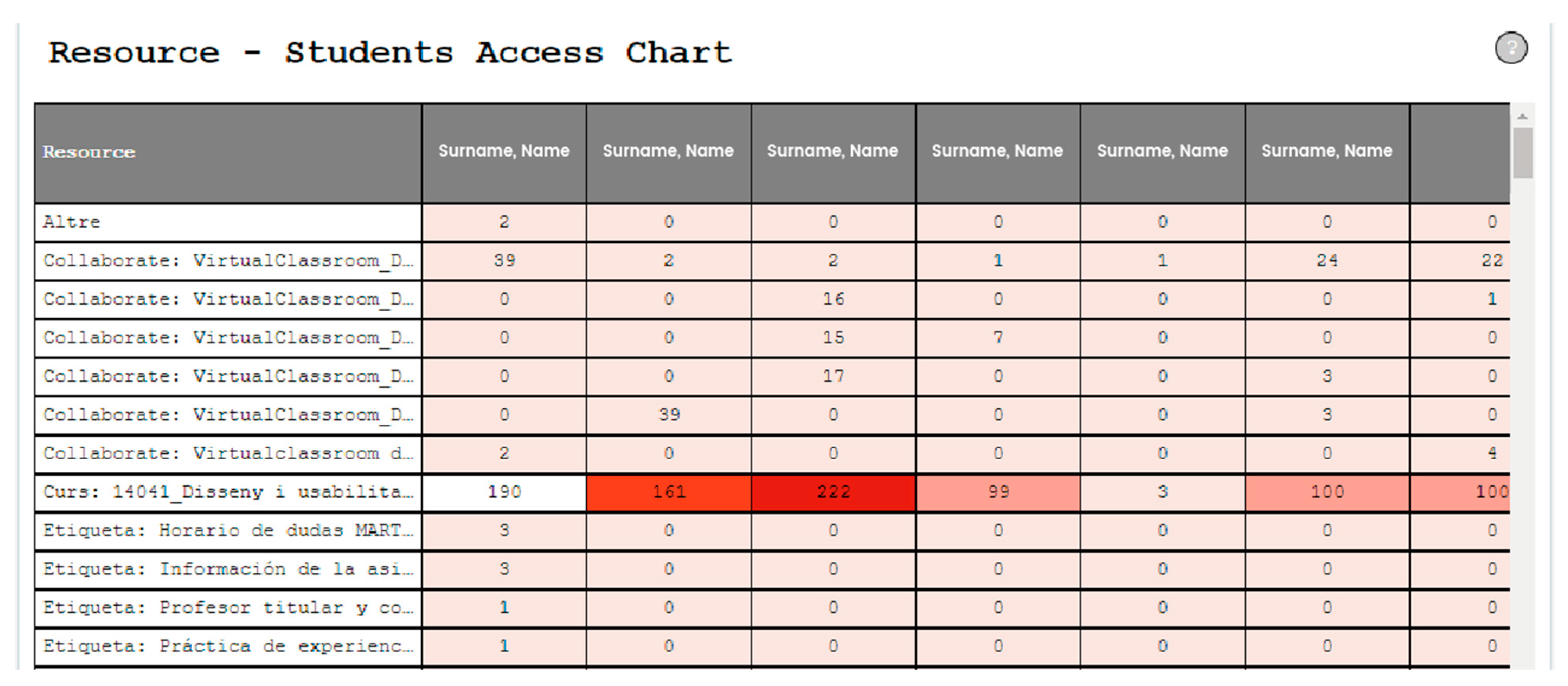
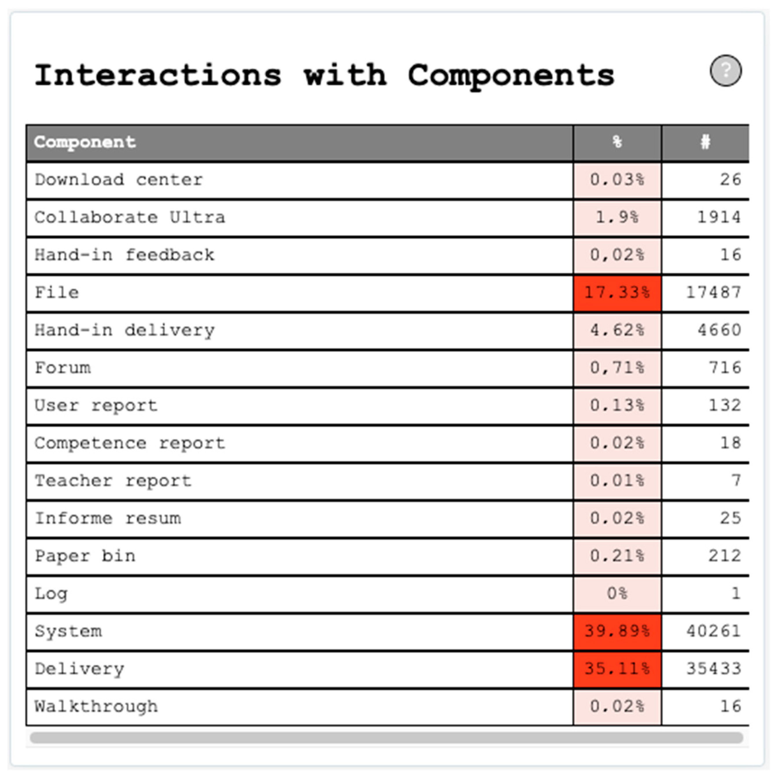
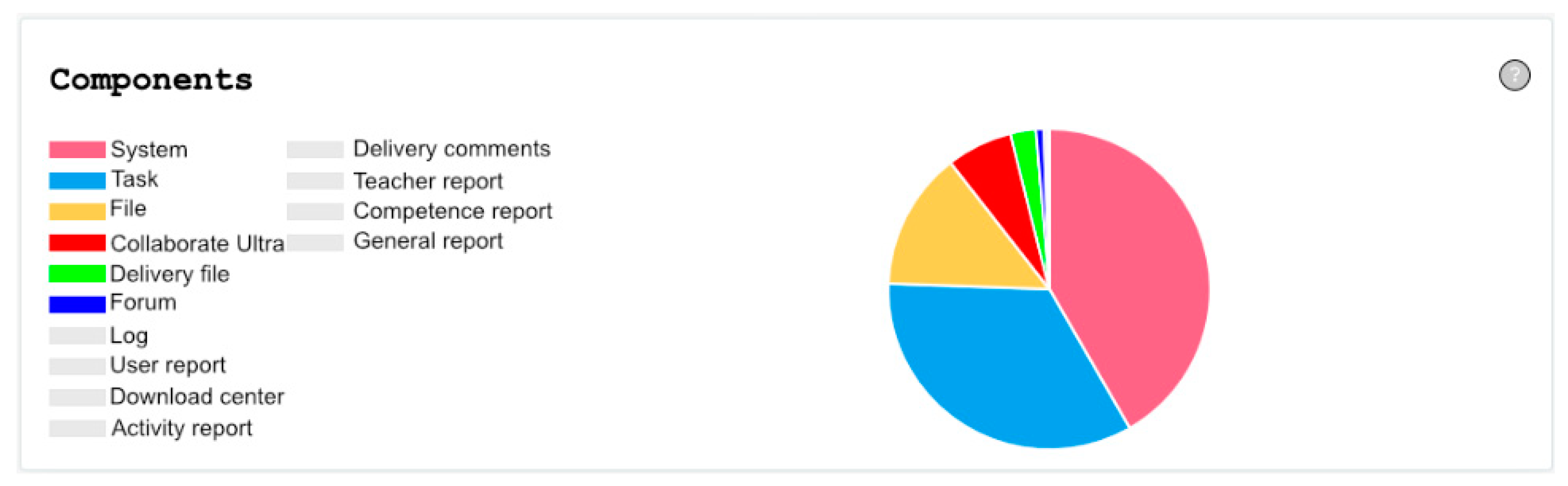
- Student interactions with resources.
3. Results
3.1. Heuristic Analysis Results
- Visibility of system status: system always inform users about intern processes.
- Math between system and real world: system speaks a language that the user easily understands.
- User control and freedom: the system permits undo and redo of every function.
- Consistency and standards: same meanings are represented equal, maintain consistency over icons.
- Error prevention: prevention of errors occurring in the first place.
- Recognition rather than recall: make actions visible to minimize user’s use of memory.
- Flexibility and efficiency of use: allow users to tailor frequent actions.
- Aesthetic and minimalist design: no extra information is given.
- Help users recognize errors: express error messages in plain language.
- Help and documentation: provides help and documentation.
- Remove elements that do not contain any information or nonfunctioning buttons;
- Enable resizing of tables and graphs;
- Correctly align the content of tables.
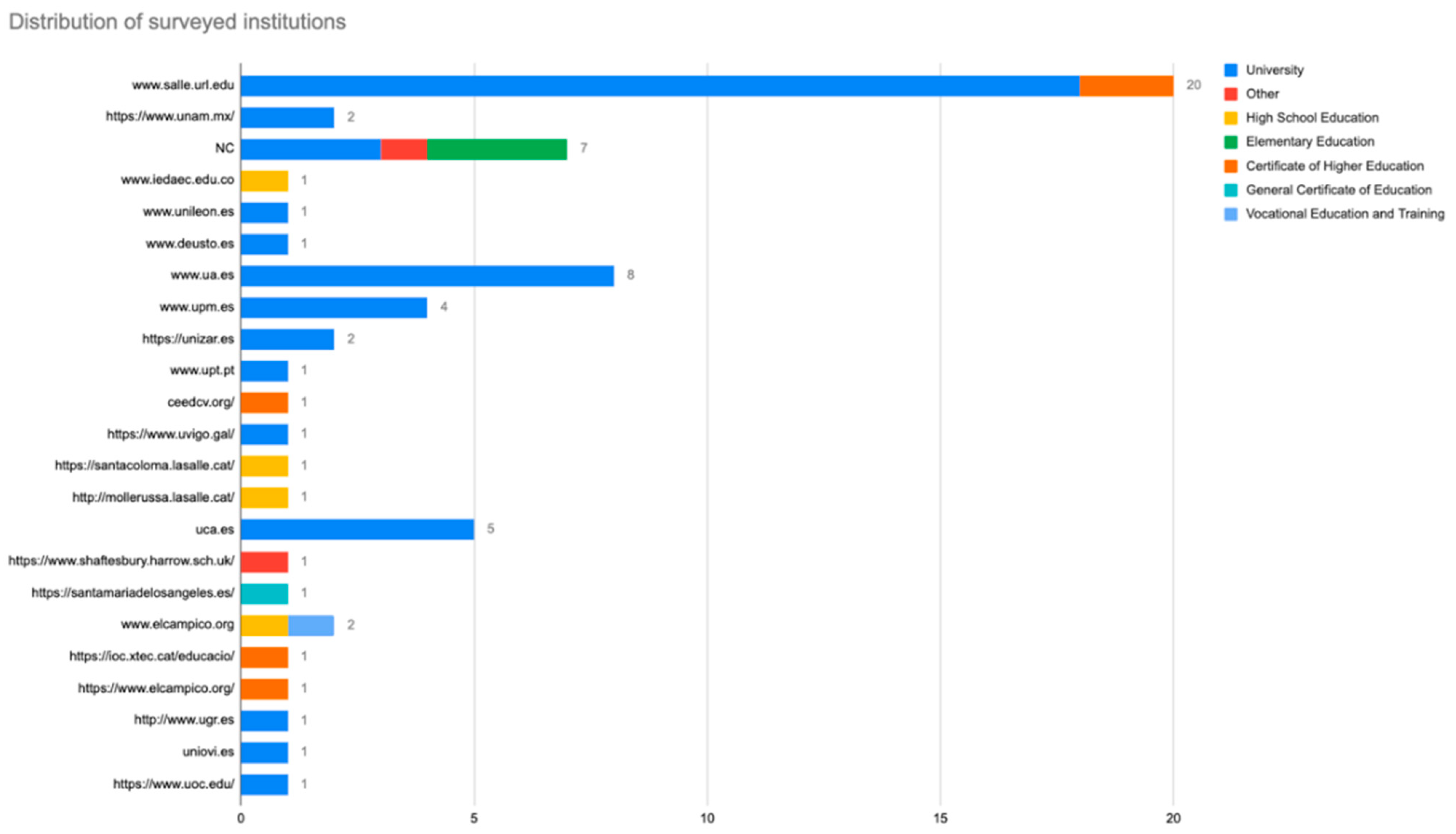
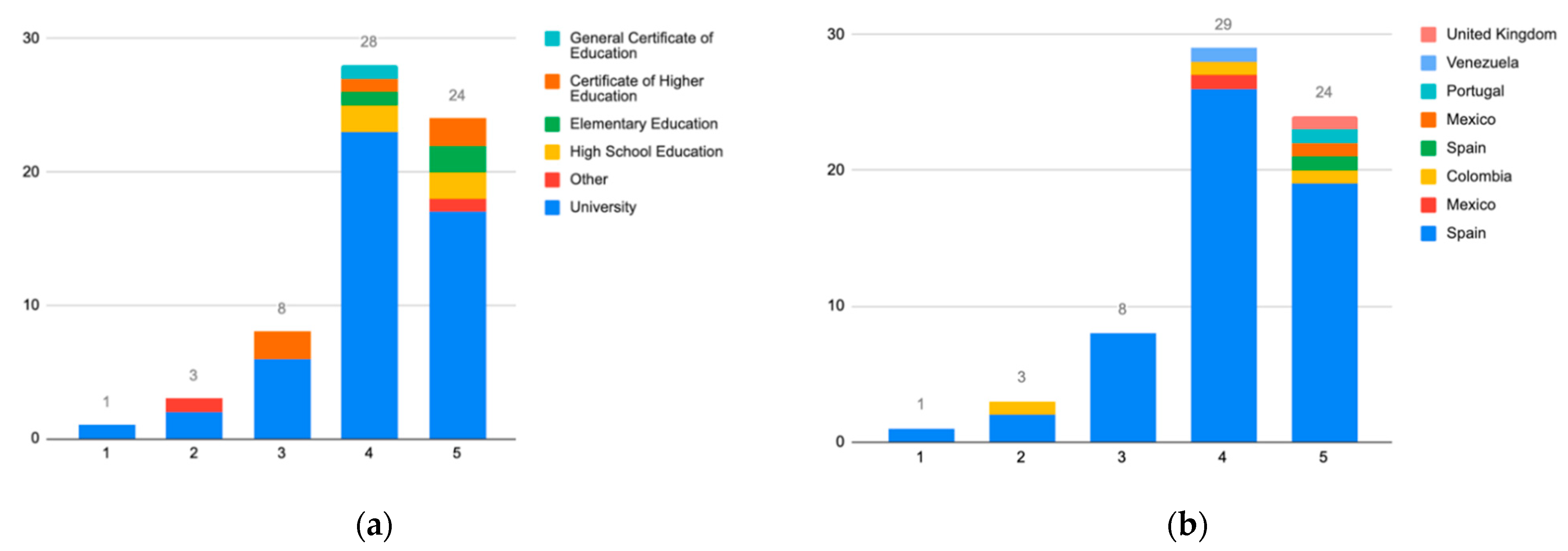
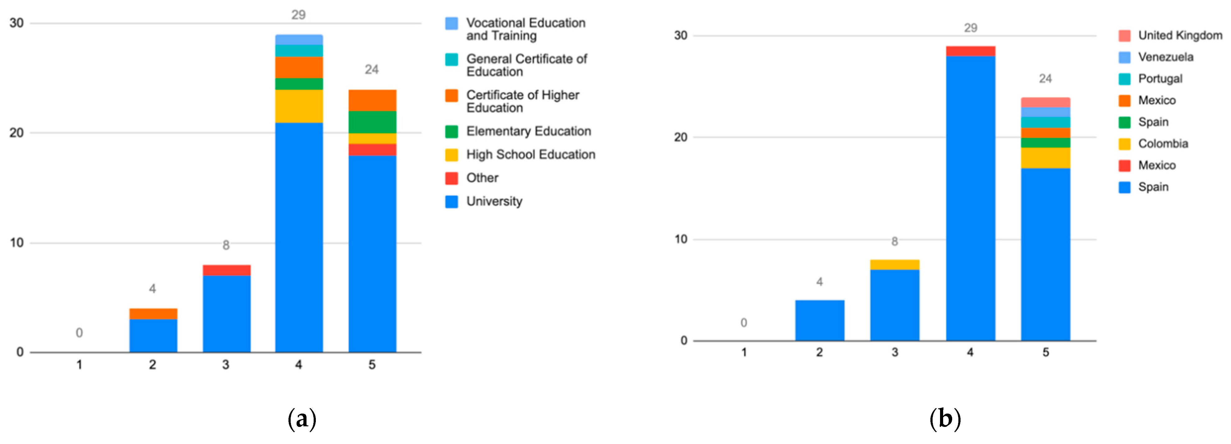
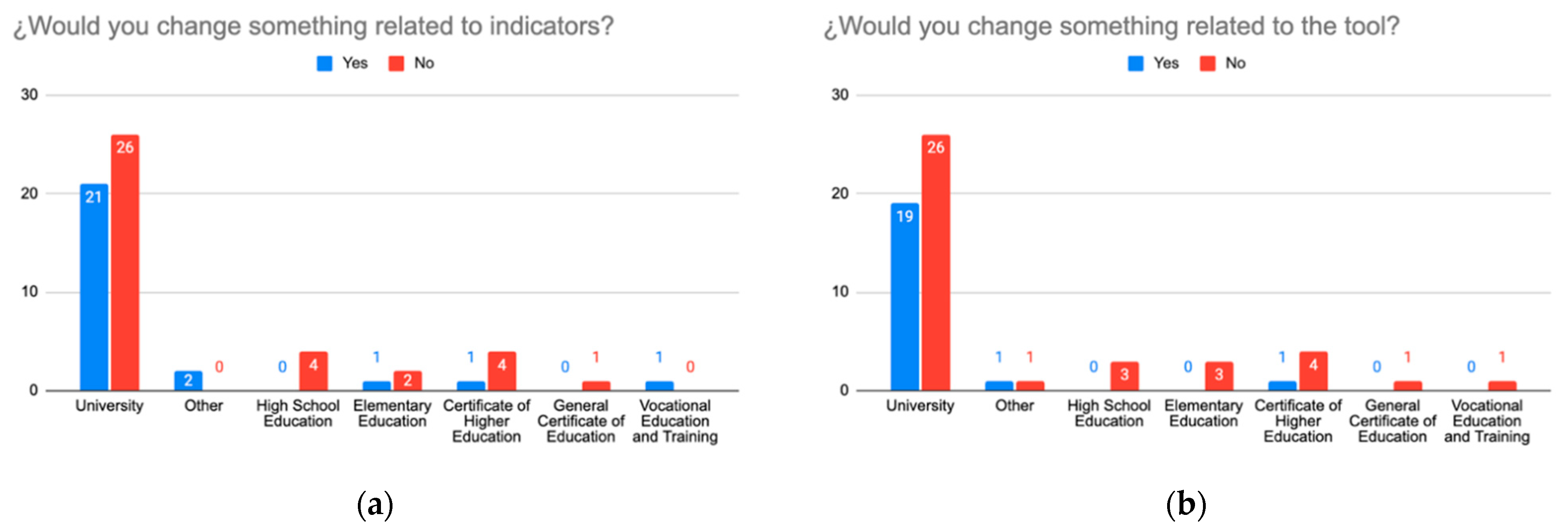
3.2. Teacher Survey
- It allows to determine which content is more attractive to the learner and thus makes adjustments, among others.
- It gives an idea, but the exact reason for the access is not known.
- It allows to know the utilization of the resources and to follow up the activity of the students. The use of the resources will allow the (re)design of these in a cycle of continuous improvement of the design of the subject.
- It is a piece of useful information to contrast the students’ perceptions of work.
- For continuous assessment perhaps, but if they have entered earlier or later, it is not so interesting.
- It allows the detection of periods of more and less activity. It would be interesting to provide the ability to compare between subjects to detect moments of less activity and to be able to plan deliveries in those moments.
- It can be interesting, although the result depends on the Campus activities, which often have static information. Thus, a very organized student who downloads a PDF may not download it again but may review it more than another student who accesses it multiple times.
- It would facilitate the attention to diversity, to dedicate more support to those who need it most, among many other things.
- We can know whether a specific student is using the platform or not. Their degree of interaction with the subject.
- I find this information very useful to be able to identify which resources are ‘preferred’ by students. This information can help a teacher to improve the quality of a course by focusing on generating resources that students ‘like’.
- Information to revamp the course or update.
- Depends on the resource and how easy it is to show that the resource is being used.
- Time indicator (graph): determine how much time a student spends in the subject from the interactions.
- Indicator of the relationship between the number of interactions of a student and the grade obtained (dedication vs. grade obtained).
- Indicator that includes academic results.
- Include more graphs instead of using so many tables, text, or numerical data.
- Include the possibility of downloading a file with information from the tool in Excel or HTML format.
- Indicator with the possibility for a teacher to establish his/her metrics (for example, an indicator based on choosing other indicators with a weight each or similar).
4. Discussion
- Replace tables with graphs when possible so that it is more intuitive to extract the information shown.
- To incorporate new metrics that allow relating student involvement with the information displayed, such as information regarding the time students spend on resources or reviewing the tool.
- Add a flowchart that allows users to interpret the students’ paths through the resources.
- Offer more export formats for the generated data.
Findings Found across Previous Studies and Current
- Amount of time related to different resources and type of activities and including a flowchart to interpret the student’s path. This is a new concept which was not explored previously as it was not a current feature related to the nature of the previous study.
- Replace tables with graphs when possible so that it is more intuitive to extract the information shown. As this study introduces the population’s ability to understand data, this result was provided as a result of introducing user’s voice onto the content they see. At the heuristic analysis, the principles followed were not based on data visualization or the types of standards applied to the educational sector.
5. Conclusions
Author Contributions
Funding
Institutional Review Board Statement
Informed Consent Statement
Data Availability Statement
Acknowledgments
Conflicts of Interest
References
- Faraway, J.J.; Augustin, N.H. When small data beats big data. Stat. Probab. Lett. 2018, 136, 142–145. [Google Scholar] [CrossRef]
- Lambrecht, A.; Tucker, C. Algorithmic bias? An empirical study of apparent gender-based discrimination in the display of stem career ads. Manag. Sci. 2019, 65, 2966–2981. [Google Scholar] [CrossRef]
- Zagitova, V.; Bokulich, A.N. Gender Biased Algorithms: Word Embedding Models’ impact on Gender Equality. Available online: https://d1wqtxts1xzle7.cloudfront.net/63551362/Gender_Biased_Algorithms_Zagitova20200607-19380-es6je5.pdf?1591513955=&response-content-disposition=inline%3B+filename%3DGender_Biased_Algorithms_Word_Embedding.pdf&Expires=1619777016&Signature=bcC1dWPv33Fri5i~vvs-8CRrt9HGO6-WAs4DKfUV4Qw9Ihm3SLrHMZxxnFxh5ldOGQIioGRJDd4p7iH40IwlnqUveulWlKXUg5Hk83YzSrPgV3f0YLwW1JotwPfGysjU83qLysDuHKvHgYnKU~rw9CXA6UQM~~yPjm1pkW4-eFCHqtEIqX1S2zExbBgf-Jxbh4vP5MJj8jGu190juDu7TzqAghmGkJ8u2Yg6hz7JEJp0-vQE~ROxbPV5O7gjd-6sC9hVTt-7qnMo-KBgNLHvac13if-ERSE89WgwPfBr0ks~VPMblJto156U6IgyXzOaRO~j3Kaef0ZlHID63LzXBw__&Key-Pair-Id=APKAJLOHF5GGSLRBV4ZA (accessed on 25 April 2021).
- Broos, T.; Verbert, K.; Langie, G.; Van Soom, C.; De Laet, T. Small data as a conversation starter for learning analytics. J. Res. Innov. Teach. Learn. 2017, 10, 94–106. [Google Scholar] [CrossRef]
- Berland, M.; Baker, R.S.; Blikstein, P. Educational data mining and learning analytics: Applications to constructionist research. Technol. Knowl. Learn. 2014, 19, 205–220. [Google Scholar] [CrossRef]
- Duval, E. Learning Analytics and Educational Data Mining. Available online: https://www.google.com.hk/url?sa=t&rct=j&q=&esrc=s&source=web&cd=&ved=2ahUKEwihsda2zqXwAhVLM94KHVLvC6IQFjAGegQIChAD&url=https%3A%2F%2Fwww.upenn.edu%2Flearninganalytics%2Fryanbaker%2FLAKs%2520reformatting%2520v2.pdf&usg=AOvVaw2cNyNbifMEbNFMbuTKVofa (accessed on 25 April 2021).
- Williamson, B. Digital education governance: Data visualization, predictive analytics, and ‘real-time’ policy instruments. J. Educ. Policy 2016, 31, 123–141. [Google Scholar] [CrossRef]
- Lupton, D.; Williamson, B. The datafied child: The dataveillance of children and implications for their rights. New Media Soc. 2017, 19, 780–794. [Google Scholar] [CrossRef]
- Amo, D.; Alier, M.; García-Peñalvo, F.J.; Fonseca, D.; Casañ, M.J. Protected Users: A Moodle Plugin To Improve Confidentiality and Privacy Support through User Aliases. Sustainability 2020, 12, 2548. [Google Scholar] [CrossRef]
- Amo, D.; Alier, M.; García-Peñalvo, F.J.; Fonseca, D.; Casany, M.J. GDPR security and confidentiality compliance in LMS’ a problem analysis and engineering solution proposal. In Proceedings of the ACM International Conference Proceeding Series; Conde, M.Á., Rodríguez, F.J., Fernández, C., García-Peñalvo, F.J., Eds.; ACM: New York, NY, USA, 2019; pp. 253–259. [Google Scholar]
- Hoel, T.; Chen, W. Implications of the European Data Protection Regulations for Learning Analytics Design. Available online: https://www.estandard.no/files/LAEDM_Kanazawa_Sep2016_Hoel_Chen_final_w_header.pdf (accessed on 25 April 2021).
- Pardo, A.; Siemens, G. Ethical and privacy principles for learning analytics. Br. J. Educ. Technol. 2014, 45, 438–450. [Google Scholar] [CrossRef]
- Ethics & Privacy in Learning Analytics—A DELICATE Issue—LACE—Learning Analytics Community Exchange. Available online: https://learning-analytics.info/index.php/JLA/article/view/4912 (accessed on 25 April 2021).
- Drachsler, H.; Greller, W. Privacy and analytics: It’s a DELICATE issue a checklist for trusted learning analytics. In Proceedings of the Sixth International Conference on Learning Analytics & Knowledge, Edinburgh, UK, 25–29 April 2016; ACM Press: New York, NY, USA, 2016; pp. 89–98. [Google Scholar]
- Chatti, M.A.; Dyckhoff, A.L.; Schroeder, U.; Thüs, H. A reference model for learning analytics. Int. J. Technol. Enhanc. Learn. 2012, 4, 318–331. [Google Scholar] [CrossRef]
- Lang, C.; Siemens, G.; Wise, A.; Gasevic, D. Handbook of Learning Analytics. Available online: https://www.solaresearch.org/publications/hla-17/ (accessed on 25 April 2021).
- Amo, D.; Torres, R.; Canaleta, X.; Herrero-Martín, J.; Rodríguez-Merino, C.; Fonseca, D. Seven Principles to Foster Privacy and Security in Educational Tools: Local Educational Data Analytics. Available online: https://dl.acm.org/doi/abs/10.1145/3434780.3436637 (accessed on 25 April 2021).
- Amo, D.; Fonseca, D.; Alier, M.; García-Peñalvo, F.J.; Casañ, M.J.; Alsina, M. Personal Data Broker: A Solution to Assure Data Privacy in EdTech. In Proceedings of the HCII: International Conference on Human-Computer Interaction. Learning and Collaboration Technologies, Designing Learning Experiences (LNCS), Orlando, FL, USA, 26–31 July 2019; Zaphiris, P., Loannou, A., Eds.; Springer: Cham, Switzerland; Volume 11590, pp. 3–14. [Google Scholar]
- Amo, D.; Alier, M.; García-Peñalvo, F.; Fonseca, D.; Casañ, M.J. Privacidad, seguridad y legalidad en soluciones educativas basadas en Blockchain: Una Revisión Sistemática de la Literatura. RIED Rev. Iberoam. Educ. Distancia 2020, 23, 213. [Google Scholar] [CrossRef]
- Gong, C.; Liu, J.; Zhang, Q.; Chen, H.; Gong, Z. The characteristics of cloud computing. In Proceedings of the International Conference on Parallel Processing Workshops, San Diego, CA, USA, 13–16 September 2010; pp. 275–279. [Google Scholar]
- Daniel, S.J. Education and the COVID-19 pandemic. Prospects 2020, 49, 91–96. [Google Scholar] [CrossRef]
- Prat, J.; Llorens, A.; Alier, M.; Salvador, F.; Amo, D. Impact of Covid-19 on UPC’s Moodle platform and ICE’s role. Available online: https://dl.acm.org/doi/10.1145/3434780.3436687 (accessed on 28 April 2021).
- Corell, A.; García-Peñalvo, F.J. COVID-19: La Encerrona que Transformó las Universidades en Virtuales. Available online: https://repositorio.grial.eu/handle/grial/2182 (accessed on 28 April 2021).
- EP and the CEU Regulation (EU) 2016/679 GDPR. Available online: https://eur-lex.europa.eu/legal-content/EN/TXT/PDF/?uri=CELEX:32016R0679 (accessed on 28 April 2021).
- Mandinach, E.B.; Gummer, E.S. A Systemic View of Implementing Data Literacy in Educator Preparation. Educ. Res. 2013, 42, 30–37. [Google Scholar] [CrossRef]
- Nielsen, J. 10 Usability Heuristics for User Interface Design. Available online: https://www.nngroup.com/articles/ten-usability-heuristics/ (accessed on 28 April 2021).
- Distante, D.; Villa, M.; Sansone, N.; Faralli, S. MILA: A SCORM-compliant interactive learning analytics tool for moodle. In Proceedings of the IEEE 20th International Conference on Advanced Learning Technologies (ICALT 2020), Tartu, Estonia, 6–9 July 2020; pp. 169–171. [Google Scholar]
- Amo, D. JSMLA GitHub Repository. Available online: https://github.com/danielamof/jsmla (accessed on 1 December 2020).
- Troussas, C.; Krouska, A.; Sgouropoulou, C.; Voyiatzis, I. Ensemble learning using fuzzy weights to improve learning style identification for adapted instructional routines. Entropy 2020, 22, 735. [Google Scholar] [CrossRef] [PubMed]
- Hines, A. Using Timelines to Enhance Comprehension. Available online: https://www.readingrockets.org/article/using-timelines-enhance-comprehension#:~:text=Botheducatorsandparentscan,significance(Moline%2C1995) (accessed on 5 February 2021).
- University of Leicester Numeracy Skills. Available online: https://www.le.ac.uk/oerresources/ssds/numeracyskills/page_53.htm (accessed on 5 February 2021).
- Pharmacoepidemiological Research on Outcomes of Therapeutics by a European Consortium (PROTECT) Visualisations—Tables. Available online: https://protectbenefitrisk.eu/tables.html#:~:text=Tables (accessed on 5 February 2021).
- Villegas, E.; Gómez, P. jsMLA Heuristic Report. Available online: https://lasalleuniversities-my.sharepoint.com/:b:/g/personal/pablo_gp_salle_url_edu/EZSyl5hGBhhFt10hT9Sv1W4BU18lpErNrhISakkyxmEWyA?e=l2F3gx (accessed on 25 March 2021).
- Amo, D. Call to Teachers across Social Media. Available online: https://twitter.com/danielamof/status/1353992372670107654?s=20 (accessed on 25 March 2021).
- Publicación|Feed|LinkedIn. Available online: https://www.linkedin.com/feed/update/urn:li:activity:6763045426766606337/?updateEntityUrn=urn%3Ali%3Afs_feedUpdate%3A%28V2%2Curn%3Ali%3Aactivity%3A6763045426766606337%29 (accessed on 25 March 2021).
- Amo, D.; Gómez, P.; Cea, S.; Marie, J.N. JSMLA Validation Tool. Available online: https://docs.google.com/forms/d/e/1FAIpQLSetPbr9IH4MLE9hZ7VyUO6EYao0HFDdMSU1MX7xPU0FpDun6A/viewform (accessed on 25 March 2021).
- El Haji, E.; Mohamed, M.; Harzli, E.L. Using KNN Method for Educational and Vocational Guidance Essaid el Haji Faculté Polydisciplinaire-Larache Using KNN Method for Educational and Vocational Guidance. Artic. Int. J. Comput. Appl. 2014, 100, 975–8887. [Google Scholar] [CrossRef][Green Version]
- Ministerio de la Presidencia Real Decreto 1112/2018, de 7 de Septiembre, Sobre Accesibilidad de los Sitios web y Aplicaciones para Dispositivos Móviles del Sector Público. Available online: https://www.boe.es/diario_boe/txt.php?id=BOE-A-2018-12699 (accessed on 1 September 2020).


Publisher’s Note: MDPI stays neutral with regard to jurisdictional claims in published maps and institutional affiliations. |
© 2021 by the authors. Licensee MDPI, Basel, Switzerland. This article is an open access article distributed under the terms and conditions of the Creative Commons Attribution (CC BY) license (https://creativecommons.org/licenses/by/4.0/).
Share and Cite
Amo, D.; Cea, S.; Jimenez, N.M.; Gómez, P.; Fonseca, D. A Privacy-Oriented Local Web Learning Analytics JavaScript Library with a Configurable Schema to Analyze Any Edtech Log: Moodle’s Case Study. Sustainability 2021, 13, 5085. https://doi.org/10.3390/su13095085
Amo D, Cea S, Jimenez NM, Gómez P, Fonseca D. A Privacy-Oriented Local Web Learning Analytics JavaScript Library with a Configurable Schema to Analyze Any Edtech Log: Moodle’s Case Study. Sustainability. 2021; 13(9):5085. https://doi.org/10.3390/su13095085
Chicago/Turabian StyleAmo, Daniel, Sandra Cea, Nicole Marie Jimenez, Pablo Gómez, and David Fonseca. 2021. "A Privacy-Oriented Local Web Learning Analytics JavaScript Library with a Configurable Schema to Analyze Any Edtech Log: Moodle’s Case Study" Sustainability 13, no. 9: 5085. https://doi.org/10.3390/su13095085
APA StyleAmo, D., Cea, S., Jimenez, N. M., Gómez, P., & Fonseca, D. (2021). A Privacy-Oriented Local Web Learning Analytics JavaScript Library with a Configurable Schema to Analyze Any Edtech Log: Moodle’s Case Study. Sustainability, 13(9), 5085. https://doi.org/10.3390/su13095085