1. Introduction
To achieve a sustainable transport system requires understanding transport demand, which is a key element in transport planning. However, it is also a challenging task due to the high costs of travel surveys. The new technologies developed for intelligent transport systems (ITS) increasingly facilitate data collection, and, to this end, automated fare collection (AFC) systems can play a key role. Although AFC systems were introduced almost fifty years ago in Germany, their usage in the transport sector has increased enormously during recent years [
1,
2]. Fraud detection, the reduction of boarding times, and management of transport operators’ revenue were among the main reasons leading transport companies to convert their traditional ticketing systems to more up-to-date AFC systems [
3,
4,
5]. Data coming from AFC systems are also useful for analyzing passenger mobility patterns [
6,
7,
8], as well as spatiotemporal information on boarding and alighting [
9,
10,
11].
A further advantage of AFC systems is provided by the possibility of extending ticketing systems to different transport operators and other modes of transport, making multimodal trips possible and simpler.
Furthermore, more recently, validation data have also been used by transport authorities and transport operators to monitor load factors and analyze users’ travel behavior and trips [
1,
12]. Therefore, data obtained from validations can be seen as a valuable complement to travel surveys to better design a transport supply based on user needs [
13,
14].
State-of-the-art systems which focus on the estimation of origin-destination matrices from smart-card validations can be differentiated according to the type of validation. In some transport systems both check-in and check-out are mandatory while, in other cases, passengers have to validate their transport titles only when they board. Only a few cases provide an entry-exit system, like those of south-east Queensland in Australia [
7] and Seoul [
15], while the majority of cases concern entry-only systems [
1], such as, for example, those of New York [
16], Chicago [
8], Santiago [
17], and Guangzhou [
18]. Thus, many researchers have focused on entry-only systems, trying to define the destination from the origin [
8,
16,
19,
20,
21,
22,
23]. Nevertheless, additional effort is needed to estimate destinations through check-in validations because the adopted methods are diverse and matching rates differ [
24].
Models used to infer destinations differ according to the validation system; trip-chaining models are used mostly where entry-only systems are present, and validated where entry-exit systems are used. Probability models and deep learning models have begun to be used more recently. Tian et al. [
24] review the methods and models to infer destination from origins recorded by smart cards and they make a comparison, showing the pros and cons of the above methods (
Table 1).
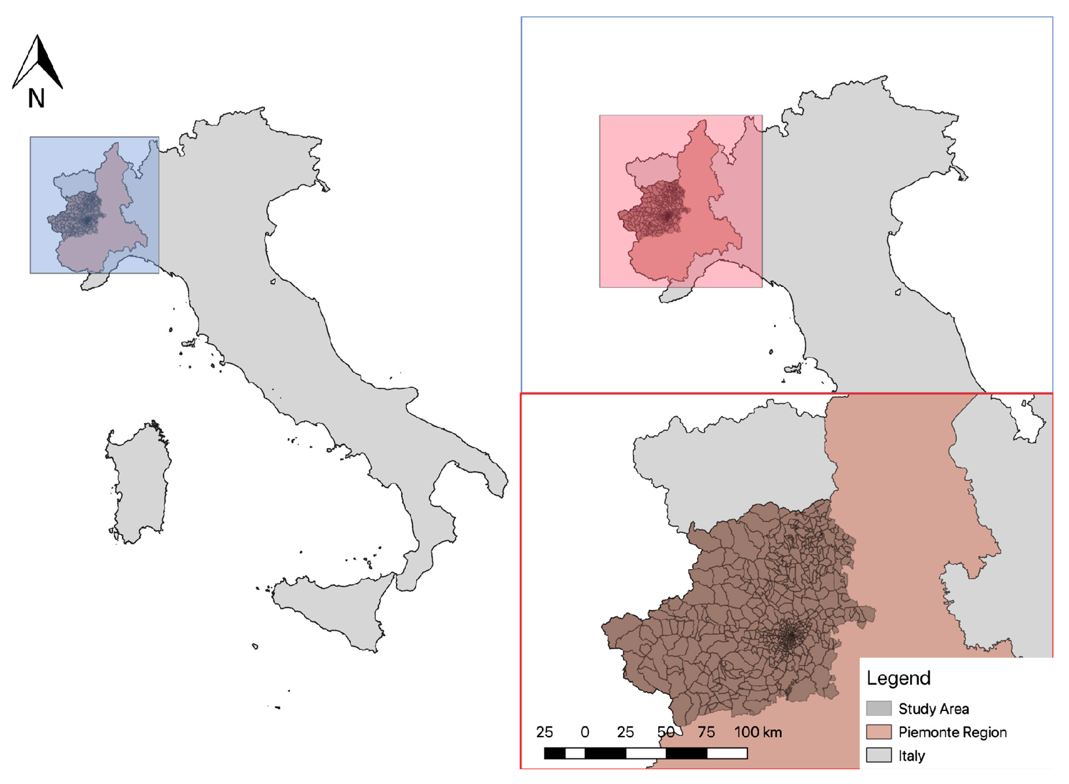
This paper aims to define the mobility patterns of the users of public transport in the rural areas of the province of Torino (situated in north-west Italy and including more than 300 municipalities), thanks to smart card data. While much research work is focused on urban areas [
25,
26,
27], our paper focuses on long-distance trips, implying a longer leg outside the city followed by a transfer in a city hub. This aspect challenges the methods described above, which are mainly applied in urban environments, as well as the adopted hypotheses that need to be verified in different contexts. Furthermore, the diversity of the available data coming from AFC systems is a constraint in the selection of the most appropriate method. To this end, the Extra.To company, which supplies public transport in the aforementioned area, asked us to determine the destinations of users from their AFC system providing entry-only validations. Thus, selection of the most appropriate methodology to be used is another key aspect of this paper.
The ultimate aim of the company, given knowledge of the origins/destinations of their users, was to check if the public transport network in such an area truly fulfils the users’ needs, and if it is efficiently designed, or if a reorganization could lead to an increase in the quality and attractiveness of its service and, thus, its ridership.
The next section focuses on the methodology, describing the survey, the model definition, and the data analysis design. Finally, results are discussed, conclusions made, and suggestions to policy makers are put forward.
2. Materials and Methods
The regional transport authority and the Piedmont Region assert that BIP (Biglietto Integrato Piemonte: Integrated Ticket Piedmont) can play a key role in the certification of the quality and the quantity of transport demand [
28]; thus, since 2017, check-in validation is mandatory on all urban and provincial transport services. The smart card validation data are collected thanks to the automatic vehicle monitoring (AVM) system, a contactless validator paired with a GPRS-GNSS-WiFi antenna (GPRS: General Packet Radio Service. GNSS: global navigation satellite system).
The methodological approach has been set up to define an algorithm capable of building the origin-destination matrix from the entry-only data collected in the area of Torino province (Italy), where thousands of people commute each day using smart cards to validate their travel documents while boarding (
Figure 1). This research focuses on validations occurring between 22 February and 8 May 2016, on the buses of the Extra.To consortium that adopted mandatory validation prior to it being introduced as a legal requirement. From 2010, Extra.To has been the only transport operator in the area of Torino province; the group includes the seventeen main transport operators, which operate 212 bus lines with more than 650 vehicles.
The methodology involves five steps: (1) zoning of the study area; (2) extraction and analysis of the validation data; (3) selection and definition of the model to infer destinations; (4) definition of transport supply and demand; and (5) analysis and visual display of transport supply and demand, and of their interaction.
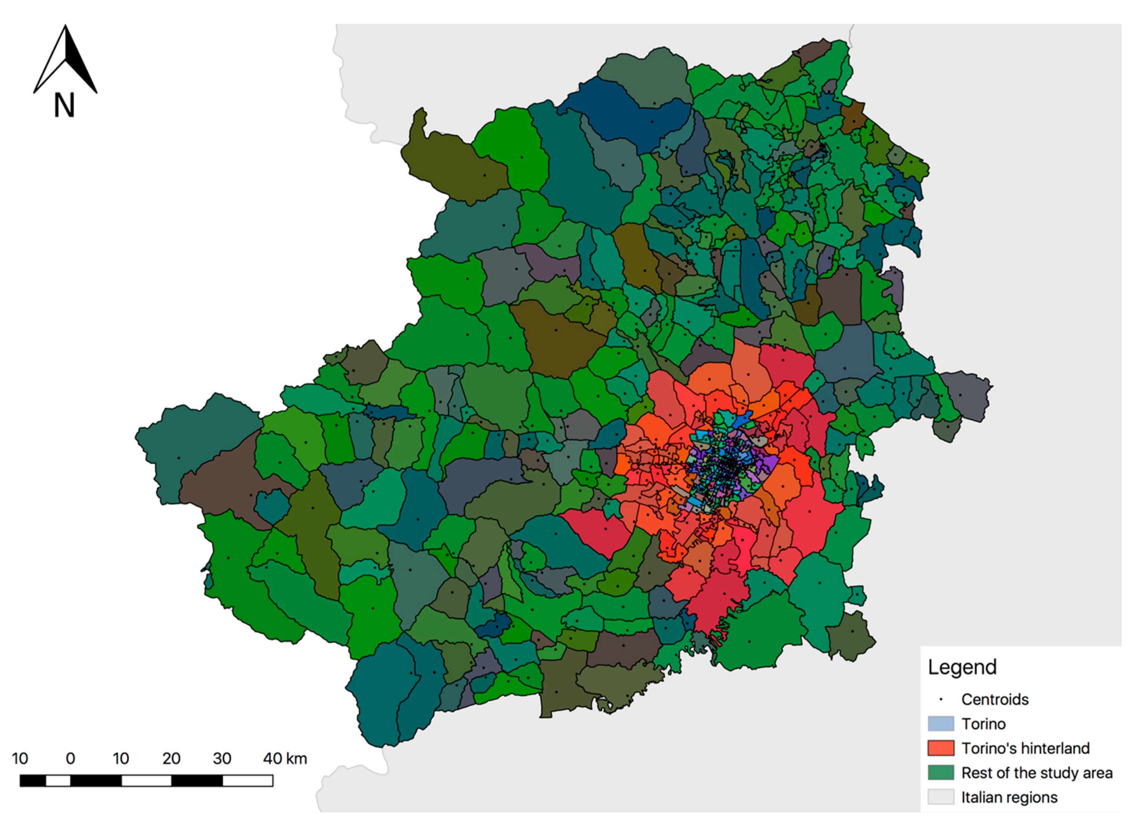
The definition of traffic zones within the study area was constrained by the current zoning used by the transport authority in the metropolitan area of Torino, as shown in
Figure 2; there are 261 zones, comprising 166 in Torino and 95 in the metropolitan area [
29]. Outside of the metropolitan area, a further 281 zones have been defined, corresponding to the administrative territory (281 municipalities).
The centroids of the zones of the metropolitan area correspond to the position defined by the transport authority, while for the Torino province the city center has been used for each zone (municipality). In
Figure 3, a detail of the location of centroids (white points) in the zones outside the metropolitan area is shown.
Since the area of Torino province counts more than 9500 bus stops within 6830 km
2, the stops located in the same zone were aggregated and assigned to the centroids in order to facilitate the analysis and the visualization of the desired lines.
Table 2 shows the number of stops among the different zones.
After defining zoning of the study area, the validation data were extracted from the control center through the Business Object of SAP [
30]. To guarantee user privacy, the IDs of smart cards were encrypted and all sensitive information removed, in accordance with Italian privacy policy [
31]. Next, a database was established, including both the information contained in the report listing all the validations and data related to the service. Notably, information included: Smart Card ID, Date of birth, Age, Age Range, Gender, Company ID, Company Name, Company ID, Seat number, Bus license plate, Bus Line ID, Stop ID, Zone ID, Stop Latitude, Stop Longitude, Validation day, Name of day, Validation time, Validation time slot, Type of journey, System error related to data collection, Origin Stop ID, Destination Stop ID, Origin Zone ID, and Destination Zone ID.
Finally, the evaluation of the data quality was carried out. To this end, validations collected during the research period were assessed to exclude those not containing information related to the bus line (bus line ID); notably, the most frequent errors observed were “Bus line ID = 0” and “No AVM”. At the same time, validations were classified as a function of fare subscription to understand the percentage of commuters and occasional passengers. The distribution of the number of validations during the daytime was analyzed to define the main peak and off-peak hours for both weekdays and weekends.
2.1. Model Selection and Definition
The availability of data influenced the choice of the most appropriate model to infer destinations. Indeed, our data refer to entry-only validations; we did not have any data related to origin-destination information from buses to train the model and we did not have any information about travel distances of the passengers. Given the above situation, the trip-chaining model revealed itself as the model which best fit our data, following the hypotheses of Barry et al. [
16], and improved by Zhao et al. [
8].
Figure 4 shows the schematic flow chart of the data-set and of the processing to define a procedure to generate linked passenger trips—origin and destination—for a given day. More precisely, the left of the flow chart depicts the available data related to the user characteristics and to the service (operator; line, bus and stop ID; time of validation; and, fare). Algorithm components are shown at the right of
Figure 4: time period and type of trip, as well as age ranges to characterize the user and the related fare. The details of the data processing are given below.
The trip chain is formed by a series of linked trips having one origin and one destination related to a single activity. Each trip leg has, in turn, an origin and a destination aimed at connecting the legs of the whole trip chain. The demand analysis implied distinguishing the validations according to the travel typology made by the user. The time basis of the analysis is 24 h (00:00–23:99) and the time between two validations is contained in this interval.
In
Table 3, validations of two cards are shown with the information related to the time interval between two check-ins (Δt check-in). Such a time interval allowed us to understand if the travel associated with a specific validation was for a trip or a trip-chain (i.e., if the time interval was too small).
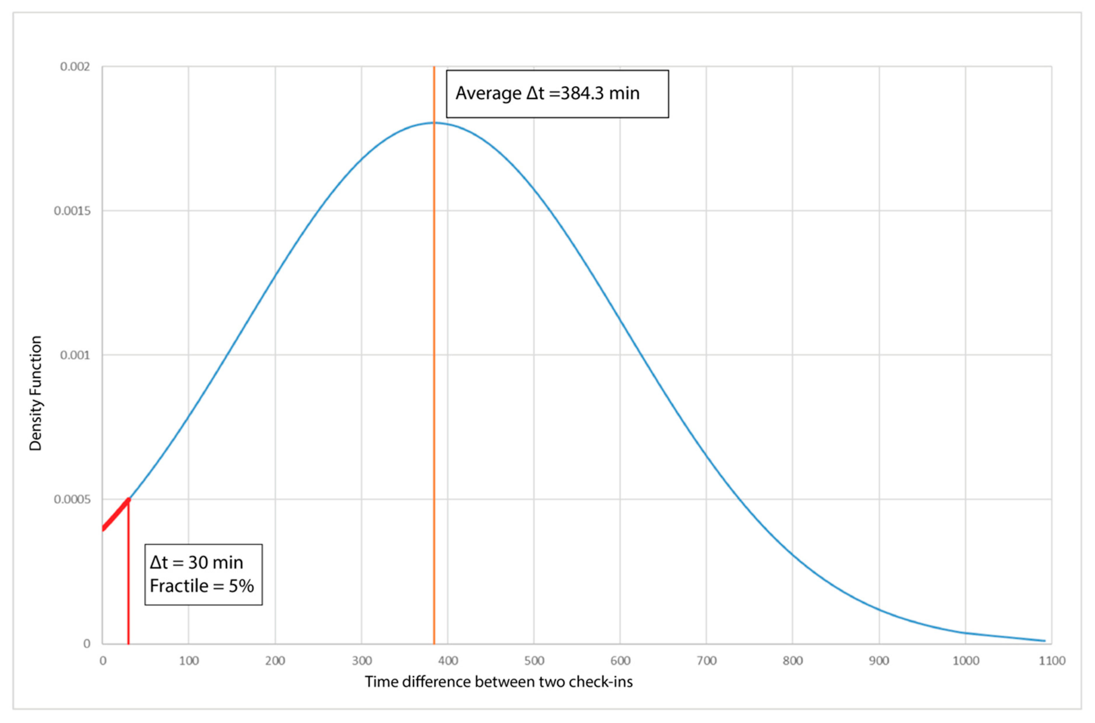
At the same time, the minimum time difference to consider that two check-ins were a leg of a trip-chain was defined via analysis of its density function (
Figure 5), showing that the average time between two check-ins is 384 min (about 6.5 h). This value is close to the duration of a school day and, in fact, most users are students.
To confirm the hypothesis of the minimum time difference between two check-ins, check-in time was compared with the travel times between pairs of stops. This comparison allowed us to distinguish between waiting time and travel time. The network analysis tool ArcMap [
32] was used, allowing average travel times (considering the average speed on the routes) between origins and destinations to be calculated. The calculation was carried out for the Extra.To network, where stops represented nodes, and links, for all the bus lines, were represented by the geometric lines between two stops. The network was built in three steps: (a) construction of the graph; (b) addition of the information on origins and destinations related to the stops; and (c) construction of the origin-destination matrix using network analysis, including all the information related to the travel time and distance between each pair of stops. The matrix has the format shown in
Table 4. Finally, the travel time between two stops was compared with the time difference between two validations of two consecutive stops. The trips with a Δt check-in (time interval between two check-ins) of less than 30 min were selected; we observed that the time obtained from network analysis was consistent with Δt check-in, confirming the reliability of the calculation.
Thus, 30 min was considered the maximum time interval between two consecutive validations forming a leg, corresponding to the 5% fractile of the probability density function shown in
Figure 5. Thus, two validations occurring with a time interval longer than 30 min correspond to two trips separated by an activity in the middle.
Zhao et al. [
8], instead, use a maximum time interval of 40 min, stating that 99% of transfers are made within this period; this figure shows how diverse contexts can influence travel behavior. Similarly, all validations occurring after a time interval shorter than 3 min from the previous validation were considered errors and deleted. Finally, the maximum number of trips made by a user in a 24-h period was set to 6 (from T
1 to T
6), observing the distribution of trip typology (see Figure 7 in
Section 3).
The second part of the algorithm assigns each validation to its origin and destination. By knowing the stop at which the check-in was done, the zone in which the stop is located can also be known. Three rules were adopted:
- -
the origin of each trip is always the stop in which the validation occurs;
- -
the destination of each trip, excluding the last of the day, is the stop of the check-in of the following validation;
- -
the destination of the last trip of the day is the stop of the check-in of the first validation of the next day.
2.2. Definition of Transport Supply and Demand
Transport demand refers to validation data collected over 11 weeks (22 February–8 May 2016) that allowed a database to be created with the structure shown in
Table 5.
To represent transport demand and, notably, the origin-destination matrix, a statistically representative week was individuated to better understand how the number of validations changes according to the day of the week. The representative week consists of the seven days of the week, with records for each of the number of validations closest to the average value. To estimate the average number of validations for each day of the week, outliers were removed.
Indeed, between the 22 March 2016 and 8 May 2016, some days were characterized by an anomalous number of validations. The median of the absolute deviations (
MAD) from the data’s median (Equation (1)) was used to detect the statistical dispersion of data and to understand if these days could be considered outliers:
where
xj = number of validations for day
j.
In order to use the
MAD as a reliable estimator for the estimation of the standard deviation,
σ, (Equation (2)), one takes:
where
k is equal to 1.4826 in the case of normally distributed data. Therefore, validation variables were standardised using both the classic method (
z = standard variable; Equation (3)) and the robust method (
zR = standard robust variable; Equation (4)).
where μ = mean of the daily validations.
Analyzing the density distribution of the standard variables, zR had a larger standard deviation than z. Thus, it was possible to select zR = 3.5 as a threshold. According to the standard normal distribution tables, zR = 3.5 is equivalent to a 0.02% probability that the values assessed as outliers are included in the normal distribution.
After the MAD application, outlier values were excluded and mean values were recalculated. In this manner, the representative week was defined by choosing the days where the number of validations closest to the average values were recorded.
To assess the interaction between transport supply and demand, a classification of Extra.To lines was conducted using some of the criteria suggested by Janecki & Karoń [
33].
The definition of the transport supply is based on 6 criteria, as follows.
- (1)
The first criterion—demography—is used to classify the lines into two groups according to the population living in the municipalities served by the lines: the “main lines”, crossing at least one municipality with a population between 10,000 and 20,000 inhabitants, and the “secondary lines” (the rest).
- (2)
The second criterion refers to the typology of the line—school lines, commuter lines, airport lines and ordinary lines—to which a specific weight is given.
- (3)
The third criterion is the daily average number of validations according to the percentiles of 40% and 90%, split between weekdays and the weekend.
- (4)
The fourth criterion is related to the daily frequency of lines according to the percentiles of 40% and 90%, likewise split between weekdays and the weekend.
- (5)
The fifth criterion is the average number of seats for every line according to the percentiles of 40% and 90%.
- (6)
The last criterion is the ratio between the number of stops on each line and the number of lines serving each stop. For this criterion, the percentiles of 40% and 90% were again used.
2.3. Visualization of the Transport Supply and Demand and Analysis of Their Interaction
To represent transport supply and demand (desire lines), validation data and the timetable referring to Extra.To’s buses were used. Validation data were collected and elaborated with QGis software to represent the desire lines for different days of the week and different time slots. The overlapping of Extra.To lines (as classified according to the methodology) on the desire lines allows any mismatches between transport supply and demand to be shown.
In particular, a detailed analysis was conducted on the main lines recording a low transport demand. In this case, the visualization of desire lines was based on bus-stops rather than centroids. Finally, for the main lines, the average number of validations at each bus stop was computed in order to find the most- and least-used stops.
3. Results
As described in
Section 2, all validations that did not contain information on the bus lines were excluded from the analysis. In particular, 11% of the validations contained the error “No AVM” which means that automatic vehicle monitoring was not working at the moment of validation. Furthermore, 21% of the validations logged the error “Line ID = 0”, mainly due to the fact that a driver did not manually input the line ID into the on-board device.
Looking at smart-card subscriptions during the study period, users are mainly commuters, with a subscription equal to or greater than one month (56%) (
Figure 6). The users are predominantly students and women (57.1%).
In
Figure 7 the distribution of trip typology for one week (21–27 March 2016) is reported; only 0.51% of validations refer to the fourth, fifth and sixth trip (pie-chart on the right).
Analysing the distribution of the number of daily validations, peak and off-peak slots have been defined for both weekdays and weekends. In particular, as shown in
Figure 8, the peaks for weekdays are 06:00–08:29; 13:00–14:59 and 16:00–18:59, while for weekends there are only two peaks: 6:00–08:29 and 12:00–13:59.
The statistically representative week defined to understand better how the number of validations changes according to the day of the week is reported in
Table 6. In particular,
Figure 9 shows how the average values changed after the exclusion of outlier values.
Transport Supply and Demand and Analysis of Their Interaction
According to the methodology concerning bus line classifications, three main classes were obtained.
Figure 10 shows the classification of the bus lines where the “main lines” predominantly operate along the north-south axis. All cross the city of Torino.
Considering all trips during the study period, the maximum number of legs was defined for each trip. More precisely, most of the validations recorded between 22 March 2016 and 8 May 2016 were the first leg of a first trip (66.65%), while only 27.85% were the first leg of a second trip.
Figure 11 shows the overlap between line classifications and desire lines during the representative Monday; it is possible to observe that there are some zones with “main lines” (high-level supply) but with low transport demand, notably in the west and north-east parts of the analyzed area.
Figure 12 shows the number of generated and attracted trips by zone during the representative Monday. The zones generating the majority of trips are Pinerolo and its surroundings (south-west) as well as Poirino and Chivasso, respectively in the south-east and north-east of Torino. Similarly, the zones attracting most trips are Pinerolo and Giaveno in the south-west, and Chivasso in the north-east.
Among the different time slots of the representative days of the week, the results show a constant high number of trips both in the south-west and in the north-west of the study area.
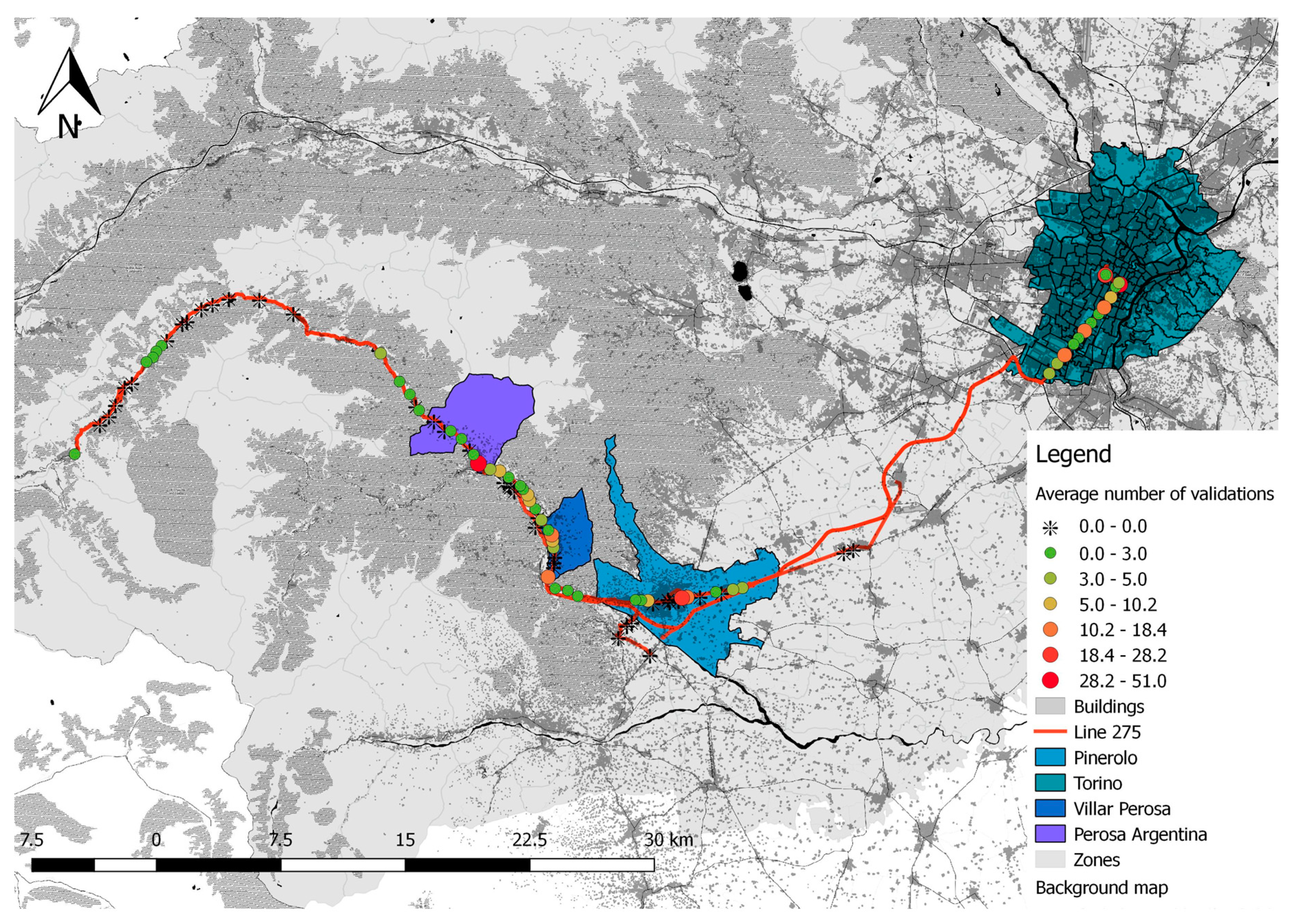
Therefore, a more detailed analysis was conducted in the south-west area of Torino, considering the lines connecting Torino to Pinerolo, an important hub for the province of Torino. A detailed analysis of the desire lines was carried out for provincial lines 275, 282, 510, and 901. In order to identify the most frequented stops on each line, further analysis was conducted.
Figure 13 shows a detailed analysis of desire lines on Monday, 21 March 2016; it is possible to observe during the second time range (06.00–08:29) that even though line 275 is an important provincial line, there are not many passengers who travel on the west section of this line. Indeed,
Figure 13 shows that most trips go from Perosa Argentina to Pinerolo, and from Pinerolo to Torino (red arrows) which is in line with the flow of commuters from the province area.
Figure 14 shows the average number of validations (during all Mondays of the analyzed period) for each stop on line 275. The analysis highlighted that the number of validations recorded at the bus stops serving the most mountainous municipalities was low, while, on the other hand, most of the validations were recorded in Torino, at the terminus and in the municipalities close to Pinerolo.
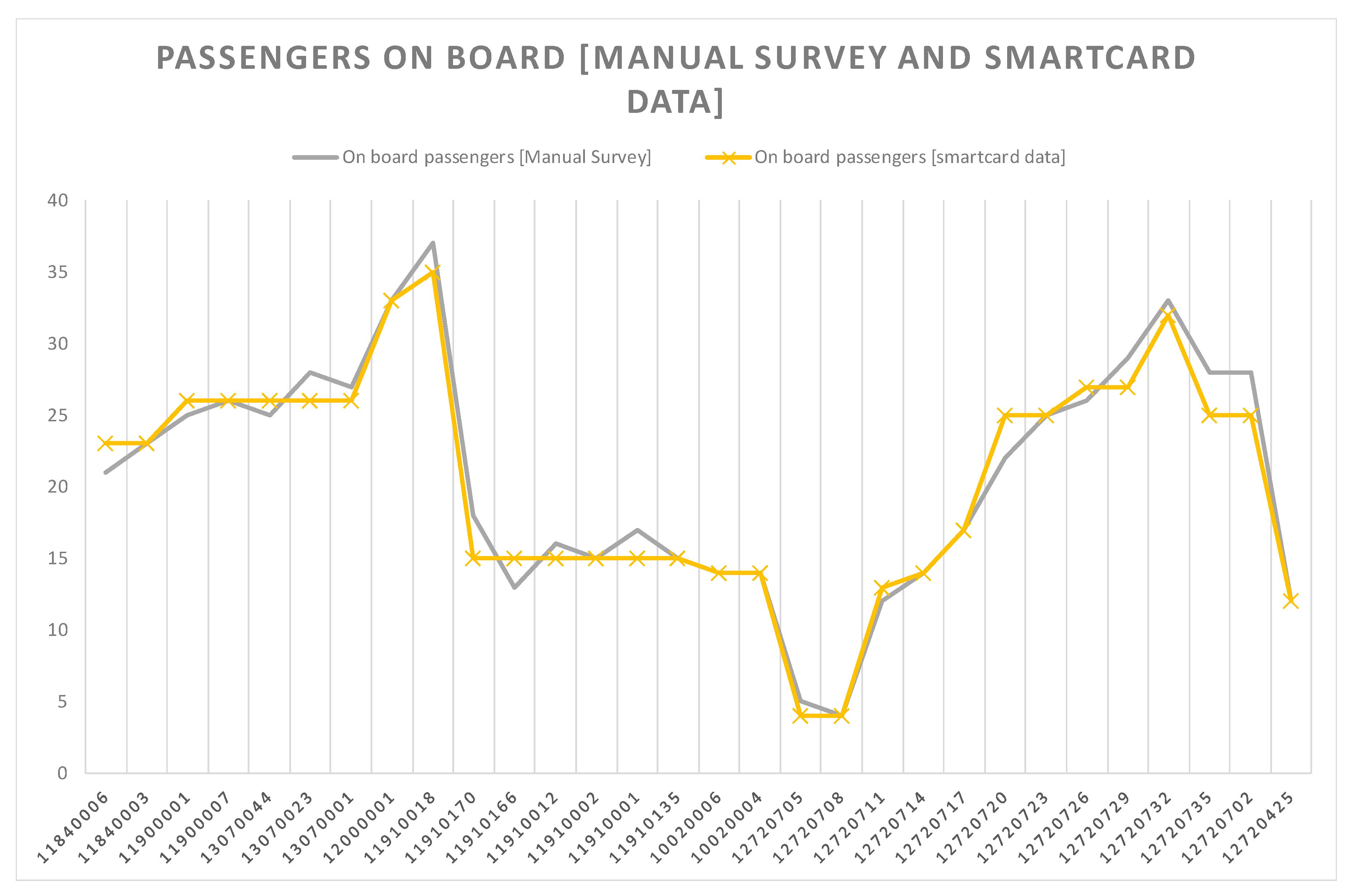
To verify the reliability of the above results, thanks to the collaboration of the transport company Extra.To, some sample measurements were carried out on the line 275 (Perosa Argentina-Pinerolo- Torino) to verify the correctness of the model in terms of demand on the line and passengers at the bus stops (
Figure 15 and
Table 7).
The measurements showed an average error of 5%. This good result is also due to the fact that this line is operated by one of the two companies of the consortium with the best functioning validation system and a 100% rate of validations. There are other rural lines, operated by small companies, with relatively poor-performing AFC systems, where the error considerably increases due to the lack of data.
4. Discussion and Conclusions
This research proposes a method to analyze smart-card validations in urban, suburban and rural areas to better understand how transport demand matches existing supply, most particularly of bus services. Arguably, mining smart-card validations can facilitate data collection traditionally carried out through surveys or travel diaries.
Even though many studies of AFC systems and origin-destination estimation have been carried out [
25,
26,
27], a detailed analysis on large areas (provinces) is something new. In fact, our area covers more than 6000 km
2 while Gswchwender et al. [
25] and Seaborn et al. [
27] focused on areas of about 650 km
2 and 1500 km
2, respectively in Santiago, Chile, and London, England.
However, like several studies in the literature, this research is also affected by a lack of validation of the model, since entry-exit data are not available. As Tian et al. [
24] explain, only half of the studies examined validate the models, even though sample data sources and sizes are quite diverse. In our case, the agreement made with Extra.To has proven to be essential to the collection of validation data over several months; other case studies collected validation data for only a few weeks. This longer duration allowed us to obtain a relatively large sample (1,500,000 validations) and to analyze recurrent patterns of users that allowed us to verify the correctness of the hypotheses. Furthermore, sample measurements have allowed us to check the reliability of the results, at least on a few lines, showing that the hypotheses made were close to real user behavior and that the algorithm performed sufficiently well.
Detailed analyses of flows and desire lines can be conducted according to the day of the week and time slot. In particular, more detailed analysis related to travel behavior can be carried out by considering the age-range of users or by analyzing socio-economic information through questionnaires and/or focus groups. This approach, however, is becoming more and more challenging due to the recent DGPR (also known as Directive 95/46/EC), the EU Data Protection Directive to protect the privacy of, and all personal data collected for or about, citizens of the EU; this especially relates to processing, using or exchanging such data. In the case where ID cards have to be continuously changed (as already occurs in France), analysis of recurrent patterns will not be possible, and additional work will be needed to try to individuate recurrent patterns.
Nevertheless, transport authorities can easily apply this methodology for several purposes:
- -
redesigning public transport lines and bus services according to passenger flows, together with data related to latent demand;
- -
improving the quality of infrastructure at stops—namely, bus-shelters or screens to display real-time information—using the information related to the number of users boarding at each stop;
- -
individuating potentially redundant stops and, thus, increasing average travel speed, as stops are eliminated due to lack (or low number) of boarding/alighting passengers.
Arguably, the overlap between the classification of bus lines and passenger flows highlighted the fact that some of the main lines do not carry an adequate number of passengers. In addition, the detailed analysis that focused on line number 275 identified a number of stops where no validations were recorded. This result can be important to alert public transport companies and transport authorities, calling for a further analysis of the overall transport demand (served by all modes). If there is a transport demand served by modes other than public transport, this may imply that the service is not offered in accordance with user needs and should be reorganized to attract more customers. Furthermore, transport operators could assess passenger flows and the most frequented bus stops to identify the most profitable lines and bus services, and eventually provide demand responsive transport (DRT) for those areas characterized by low transport demand. As suggested by Ma et al. [
26], investing in direct bus services in areas with higher transport demand can influence user behavior and reduce car congestion.
Much research has already focused on the estimation of origin–destination matrices in wide urban areas and megacities such as Beijing, Santiago, London, Istanbul, etc. [
8,
25,
26]. This paper has tried to go further, however, focusing on an uneven study area, both from the point of view of geographical features and local topography, and population density. Indeed, such heterogeneity was borne out by the classification of lines. In this regard, the methodology used for comparing transport demand and supply, as well as for representing the desire lines, can also fit other contexts well, including at smaller geographical scales, and help to understand how to improve existing bus services.
Methodologically, our approach does not substantially differ from previous studies aimed at inferring the destination from boarding-entry data [
8,
16]. Our data-collection method, however, allows a far more fine-grained temporal analysis than Barry et al. [
16], where limitations of the validation system imposed a precision of ±3 min on transaction times. Whereas Zhao et al. [
8] focused on the study of personal mobility patterns, using a similar methodology, our scope was to set up a tool for transport planners that can directly feed existing transport models with our aggregated origin–destination matrix. Finally, a cross-model combining our trip-chaining algorithm with a table of effective bus rides would allow us to improve the spatial-temporal analysis of traveler’s mobility patterns.
Our research is now continuing with the analysis of latent demand, using the most recent regional survey carried out by the transport authority in 2013, and thanks to a new survey launched at the end of 2017 (data analysis is ongoing). The goal is to understand mobility patterns (all modes) in greater detail and improve the estimation of origin-destination matrices from smart-cards, adding new variables related to socio-demographic characteristics, travel times and distances, etc., to, finally, put forward more innovative policies and solutions.
Besides the enrichment of the model with additional variables, our current effort is devoted to model validation. In the Oise department (Hauts-de-France region, north of France) data collection from smart-cards is ongoing, and the model developed to date will be validated using a two-fold approach. These data come from two sources: (a) APC systems installed on a few buses to check the number of passengers on board; and (b) equipment developed by us to count passengers through the detection of mobile devices. Furthermore, the refined model will be tested again in the Piedmont region on some bus lines in the Cuneo province (southern part of Piedmont) where, in the last month, a test has been ongoing, and passengers have been validating both boarding and alighting.
All these initiatives are supported by the local authorities (municipalities, provinces, transport authorities and transport operators) due to their need to know the number of customers using public transport and desire to provide an attractive public transport service able to trigger a significant modal shift, as expected by most Sustainable Urban Mobility Plans (SUMPs). In fact, continuous budgetary cuts to public transport require a new approach towards mobility, in which it should be considered a service and, hence, tailored to user needs, taking into account the ever-scarcer resources devoted to funding public transport.


