An Alertness-Adjustable Cloud/Fog IoT Solution for Timely Environmental Monitoring Based on Wildfire Risk Forecasting

 ,
,  , , ,
, , ,  and
and 
Abstract
1. Introduction
1.1. Challenges and Motivation
1.2. Contribution
- A robust three-layered cloud/fog computing architecture for environmental monitoring, capable of dynamically conforming its sensing functionality to meet stringent latency requirements and the needs for energy conservation, and high accuracy and throughput.
- A thorough presentation of its data flow and operations, starting from the initialization of the field WSNs and reaching up to the remote cloud infrastructure, in order to contextualize the steps undertaken from data acquisition to the creation of the appropriate response analysis.
- The design, analysis, and development of a proof-of-concept prototype, mirroring the given architecture and utilizing state-of-art and low-cost hardware modules for transparent interactions.
- Its performance evaluation primarily via the response time metric, which is crucial for time-sensitive agricultural applications of the future, especially those keeping track of wildfire activity.
- The experimentation with real fire risk data considering the fire fighting season of 2019 for Corfu Island, which demonstrates how the considered approach can be effectively utilized to deal with such phenomena and showcases its alertness-adjustable character.
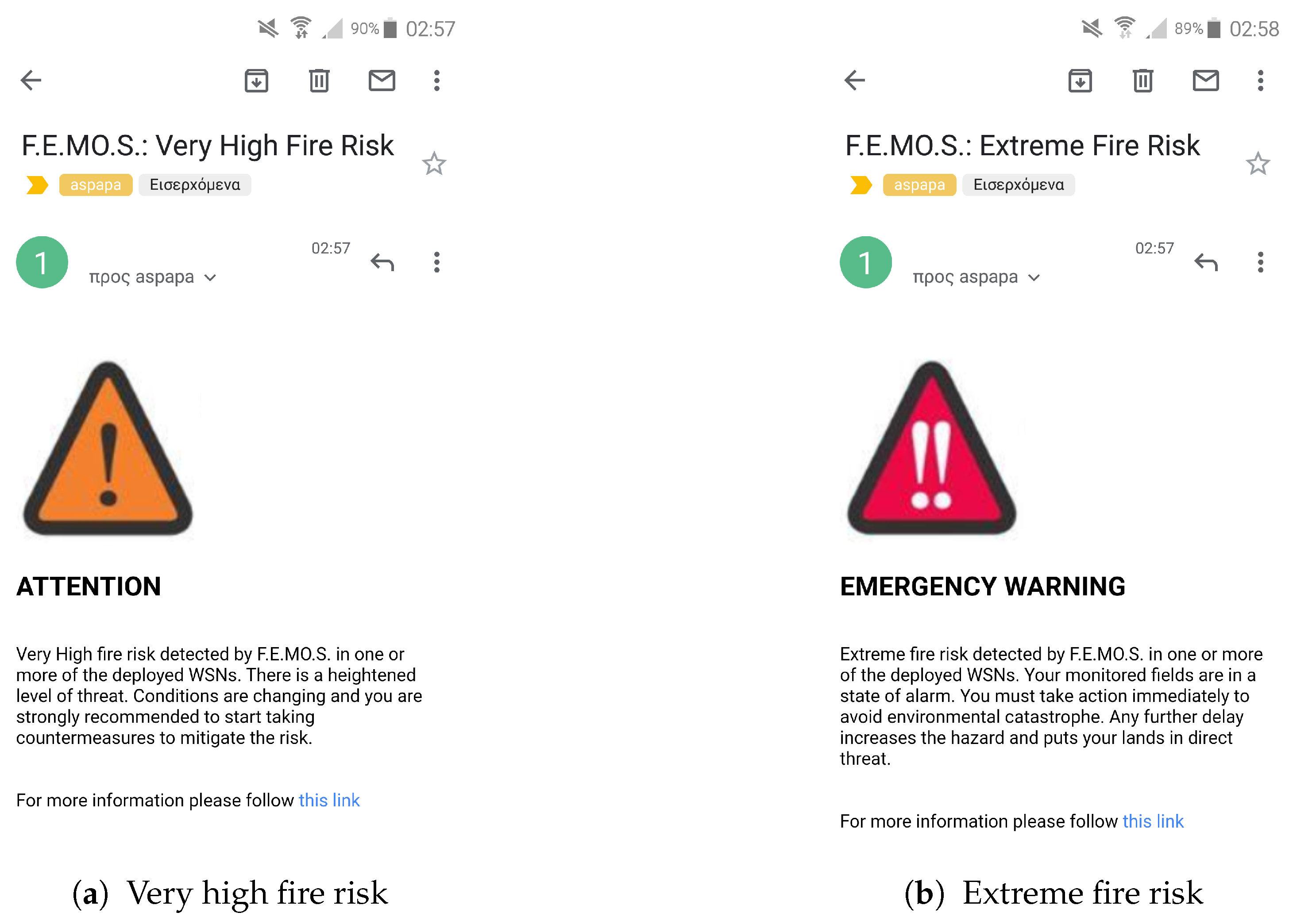
- The implementation of an accompanying user-friendly web application to monitor the system’s behavior and data curation and acquire real-time information relating to the monitored fields’ health, including CBI-based fire risk severity forecasting along with the autonomous generation of appropriate notification alerts to actuate fast mobilization and countermeasures.
2. Literature Background
2.1. Internet of Things and Wireless Sensor Networks
2.2. Related Research in the Agricultural/Environmental Monitoring Sector
2.3. Related Research in the Wildfire Monitoring Sector
2.4. Overview of Fire Danger Indexes
3. System Design and Configuration
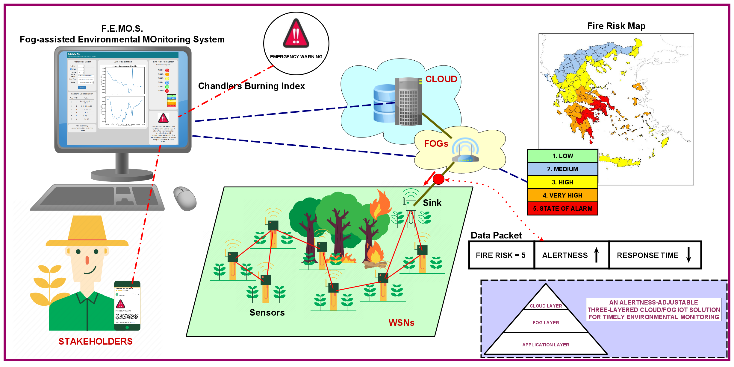
3.1. The Considered Cloud/Fog Computing Network Architecture
3.2. Hardware and Software Specifications
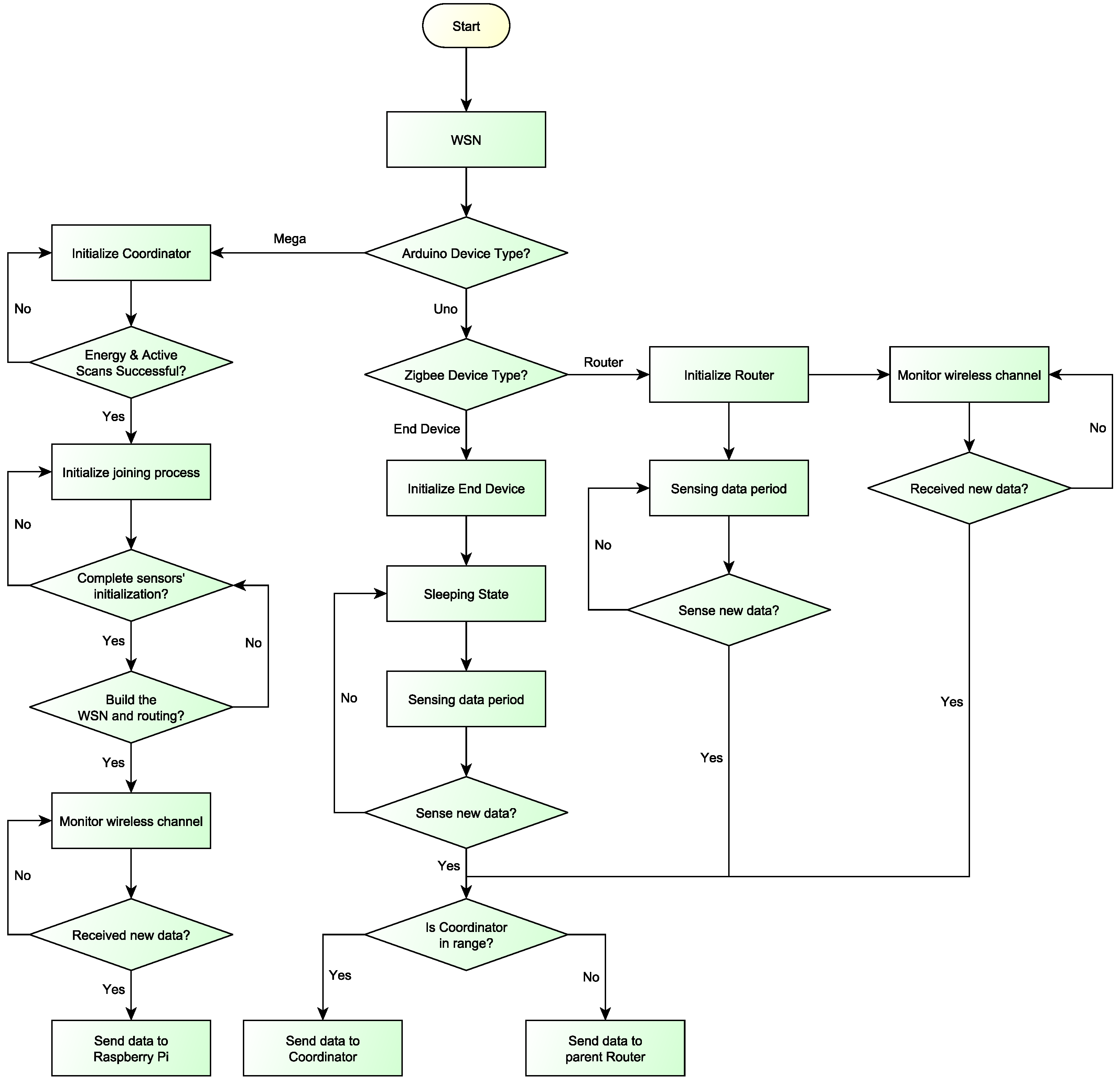
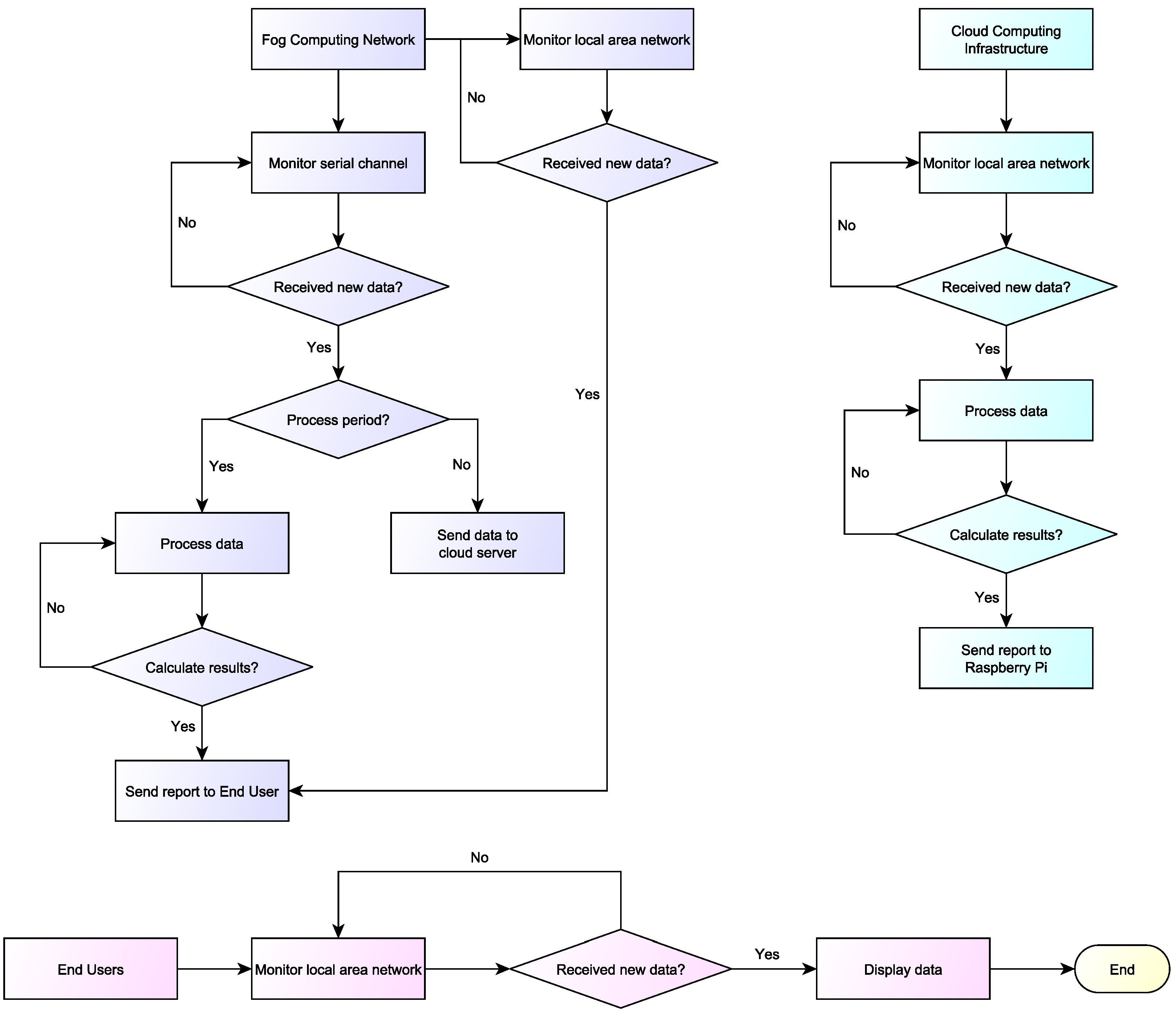
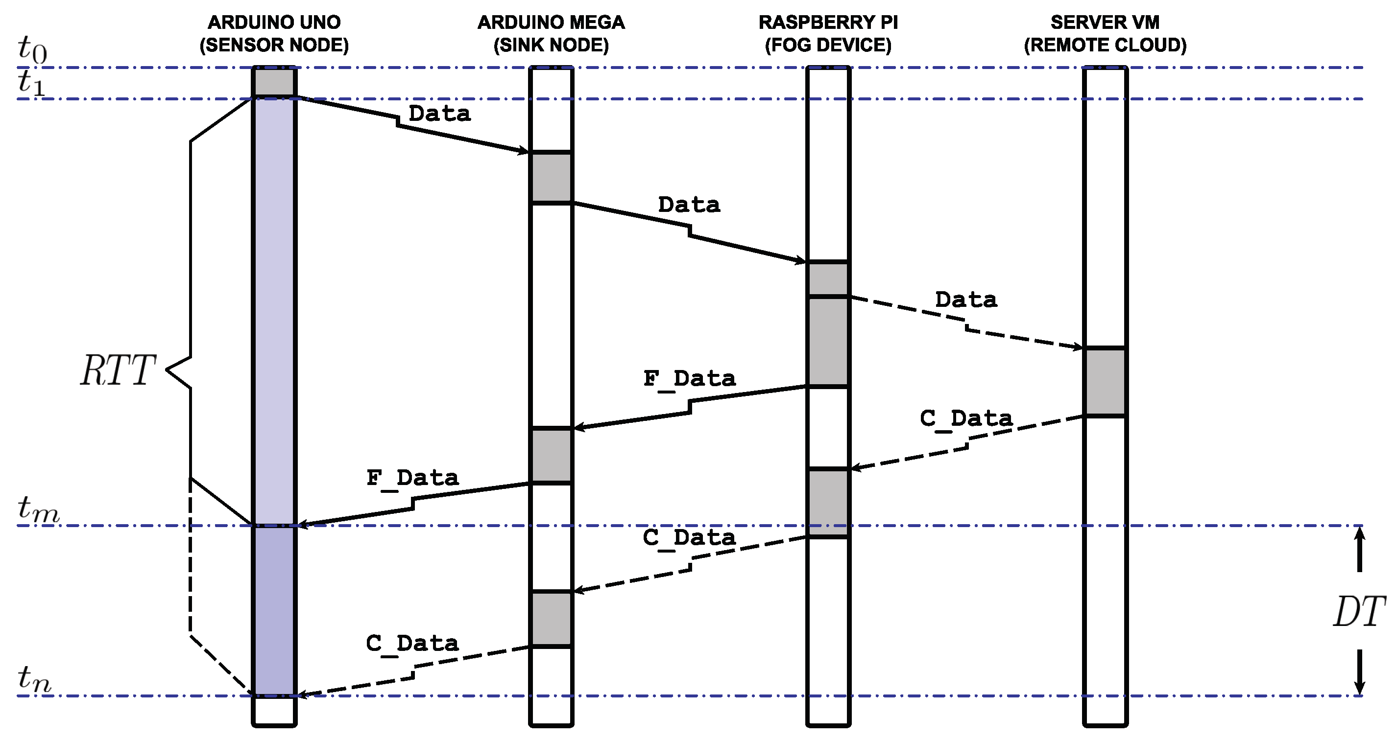
3.3. Data Flow and Processing Methodology
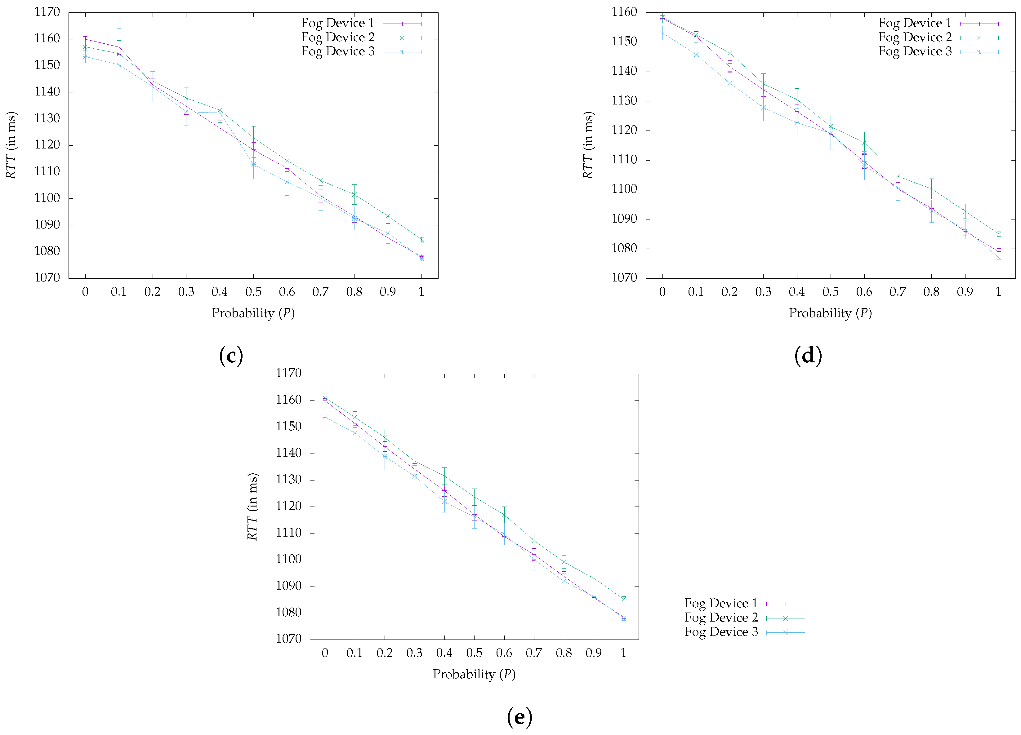
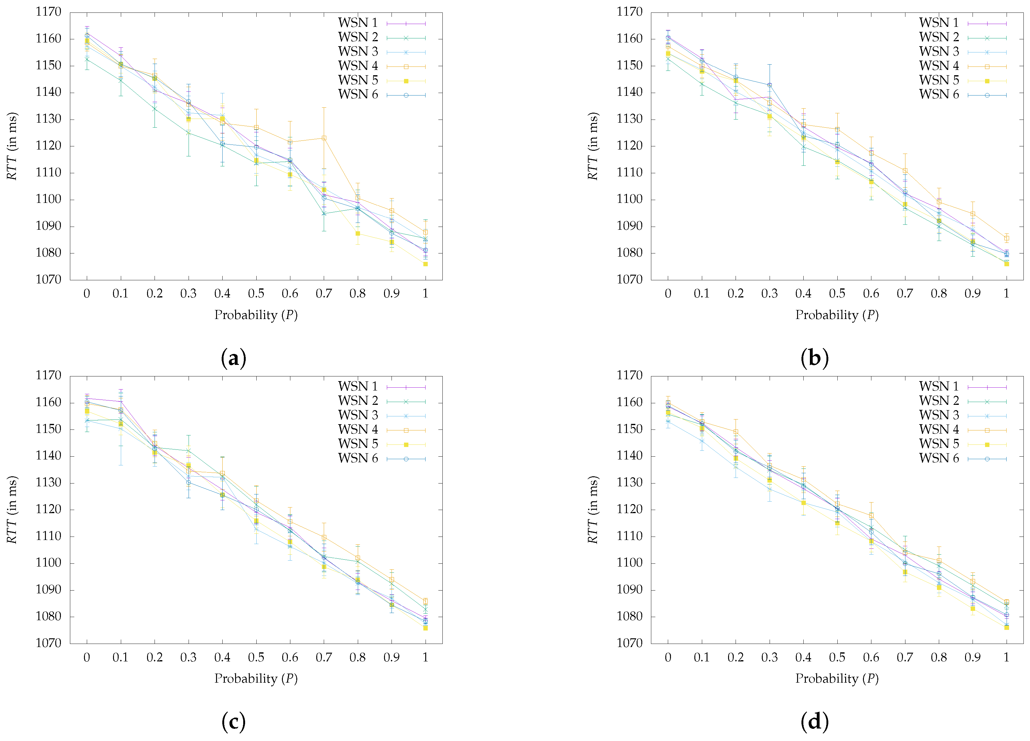
4. Evaluation
4.1. Experimentation Setup
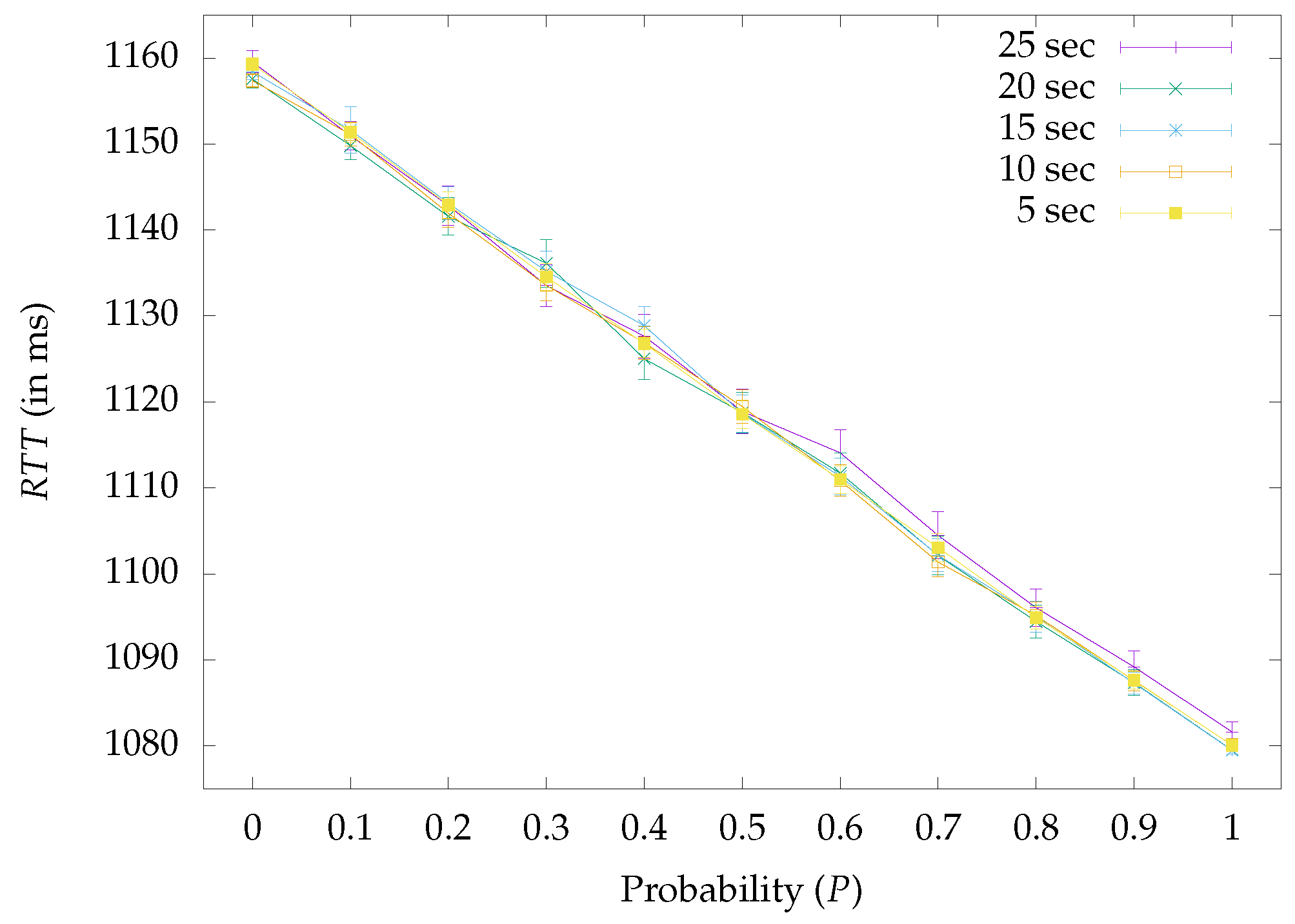
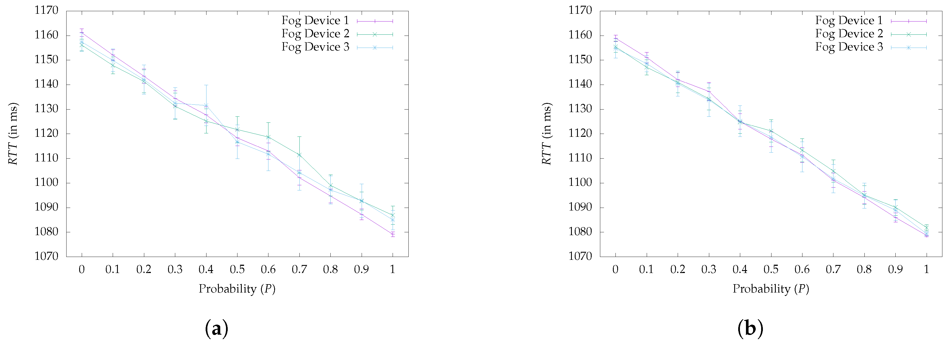
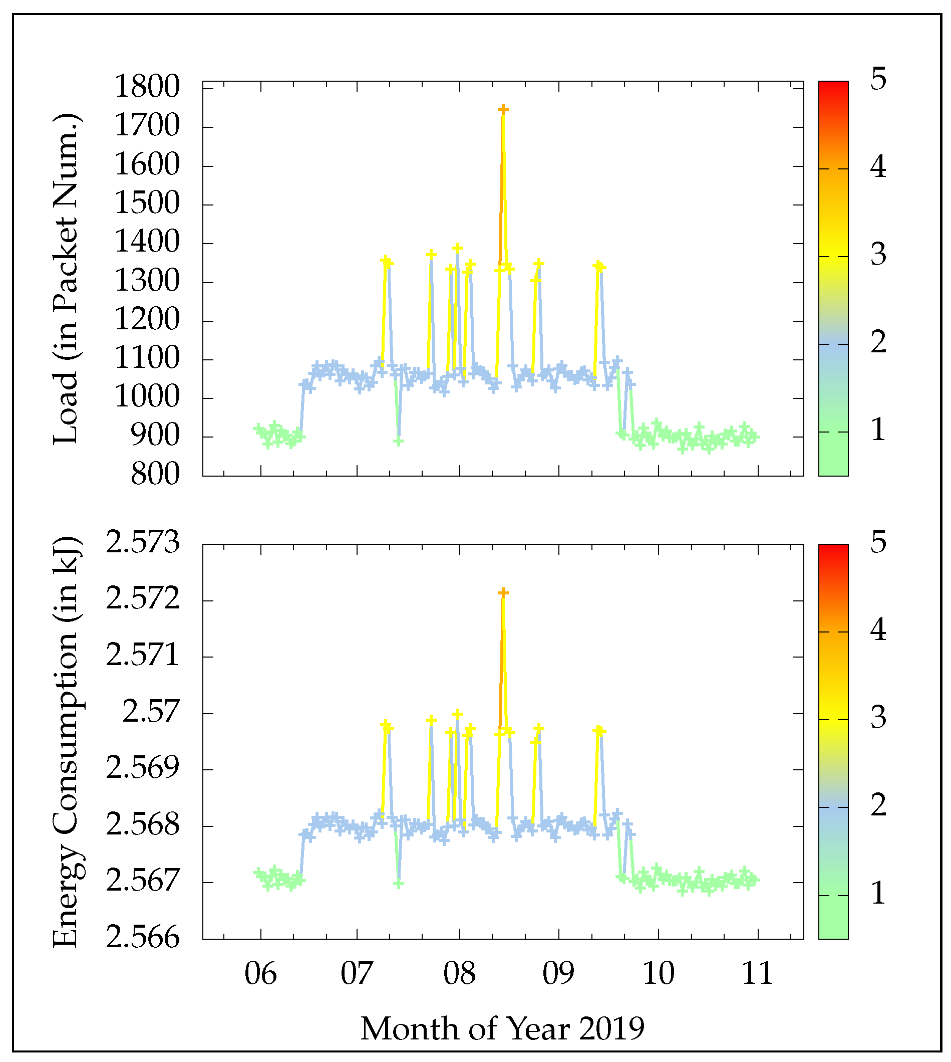
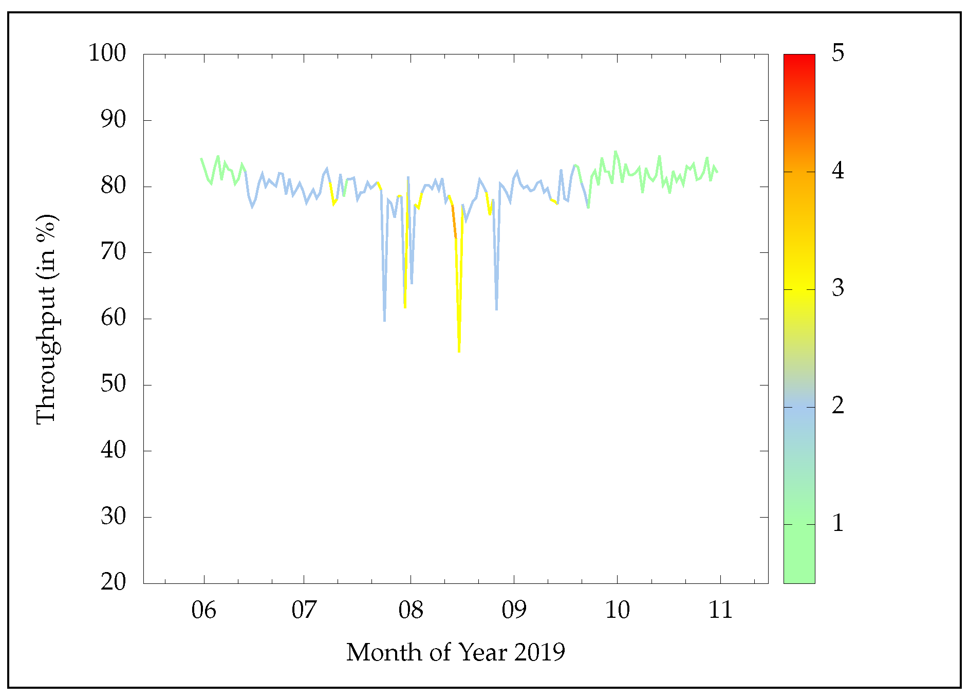
4.2. Experimentation Results
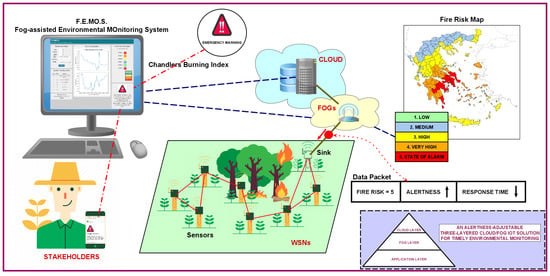
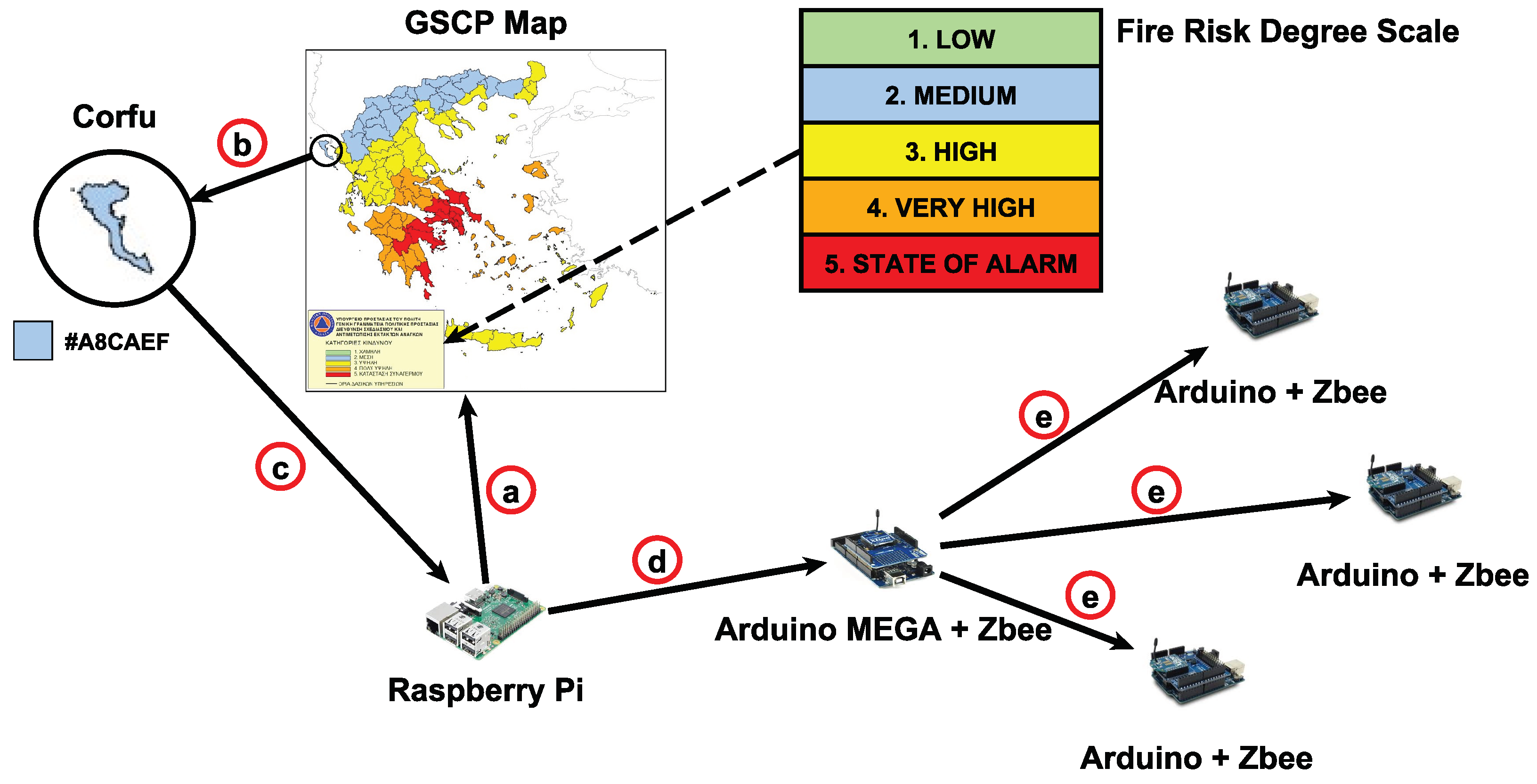
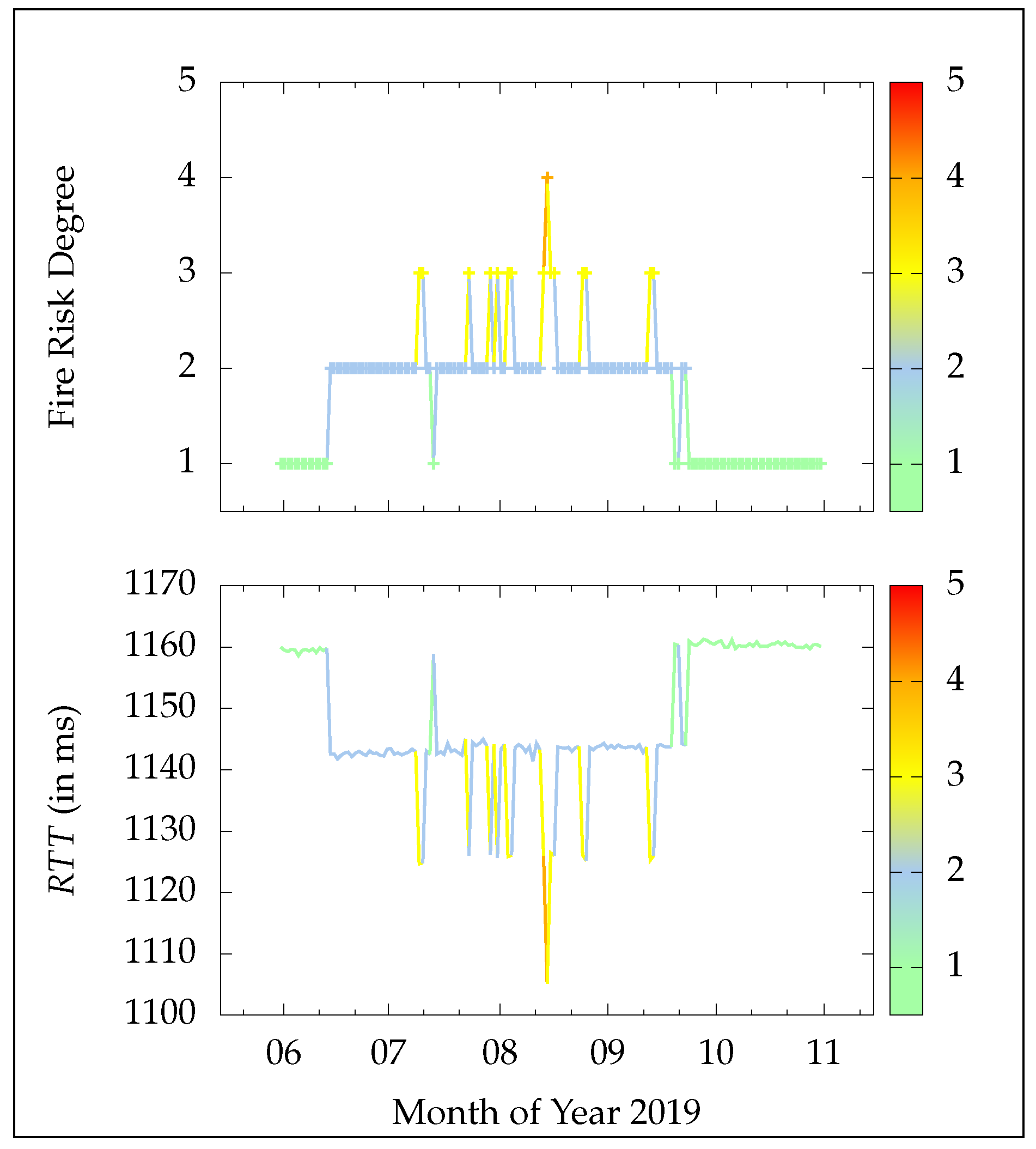
5. System Conformation Based on Wildfire Risk Forecasting
5.1. The Case of Greece’s Wildfires
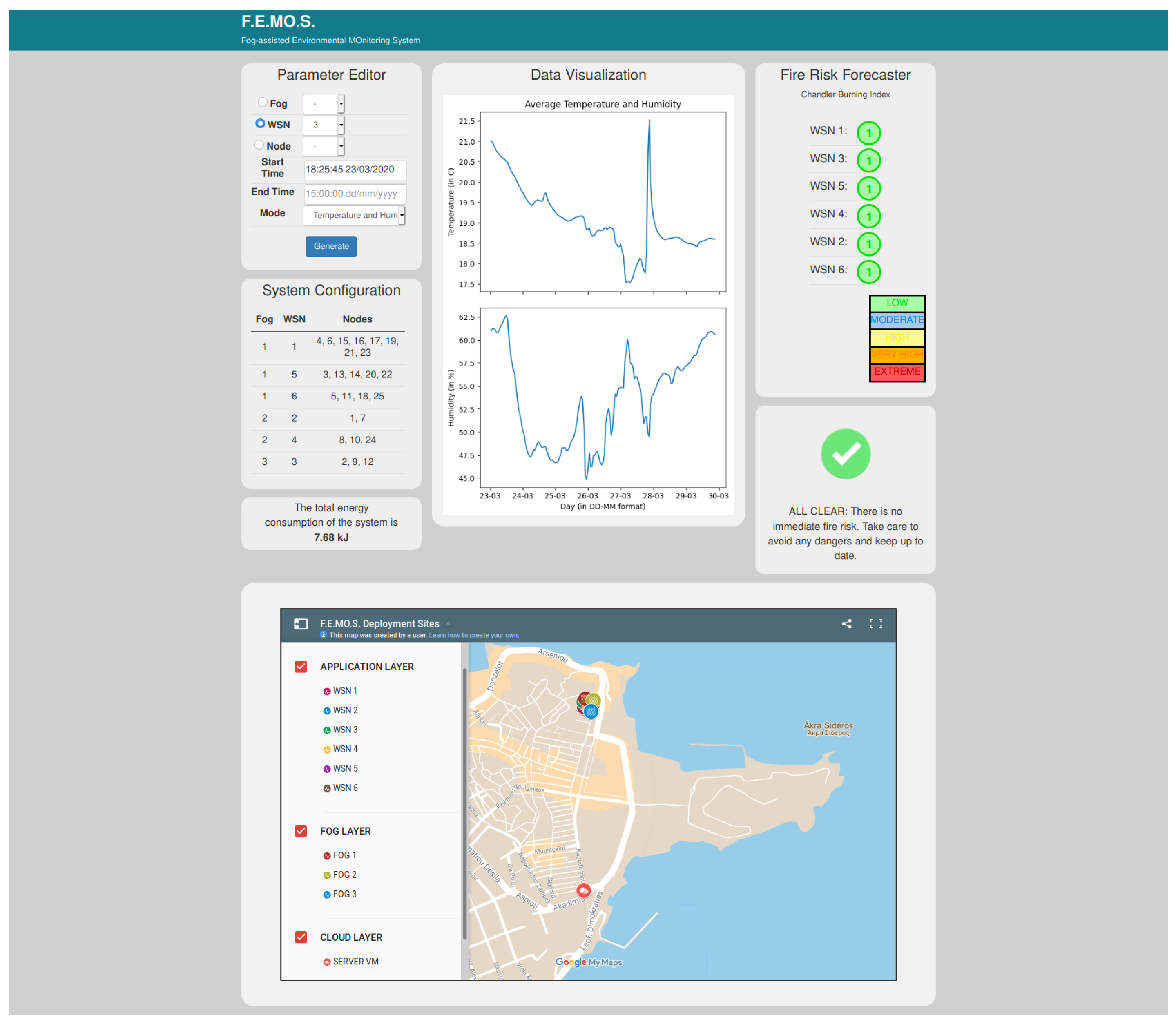
5.2. F.E.MO.S.: The Fog-Assisted Environmental Monitoring System
6. Conclusions and Future Directions
Author Contributions
Funding
Acknowledgments
Conflicts of Interest
Abbreviations
| 3G | Third Generation of Wireless Mobile Telecommunications |
| 5G | Fifth Generation of Wireless Mobile Telecommunications |
| CBI | Chandler Burning Index |
| CPU | Central Processing Unit |
| CSMA/CA | Carrier-Sense Multiple Access with Collision Avoidance |
| ESA | European Space Agency |
| F | Simple Fire Danger Index |
| FDI | Fire Danger Index |
| FFDI | Forest Fire Danger Index |
| F.E.MO.S. | Fog-Assisted Environmental Monitoring System |
| FWI | Fire Weather Index |
| GFB | Greece’s Fire Brigade |
| GSCP | General Secretariat for Civil Protection |
| GUI | Graphical User Interface |
| ID | Identity |
| ICT | Information Communication Technologies |
| IoT | Internet of Things |
| MAC | Media Access Control |
| PAN | Personal Area Network |
| RAM | Random Access Memory |
| RTT | Round Trip Time |
| SD | Secure Digital |
| VM | Virtual Machine |
| WSN | Wireless Sensor Network |
Appendix A. The Prototype’s Utilized Hardware and Software Specifications
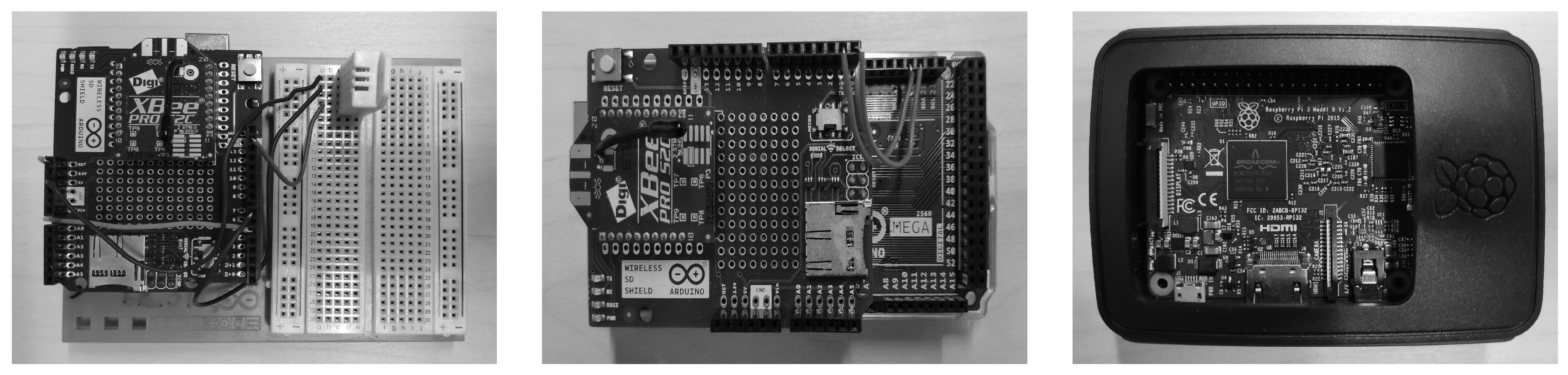
- Arduino Uno: In the current project implementation, the considered WSN sensors consist of an Arduino Uno Rev. 3, which is built on top of the Atmel ATmega328P micro-controller. This is in turn enhanced with a Digi XBee-PRO S2C ZigBee module [116] for wireless communication. The sensors were equipped with a DHT22 sensory module which is able to calculate the temperature in the scale of −40 C to 80 C, with a ±5 C inaccuracy, and assess the humidity atmospheric levels in a scale of to , with an accuracy deviation between and .
- Arduino Mega: For the programming of the WSNs’ sink nodes, an Arduino Mega 2560 micro-controller board was chosen, which is based on the ATmega2560. The sink nodes were augmented with communication capabilities using a wireless SD shield and a Digi XBee-PRO S2C module. They were also equipped with an SD memory card to save logs regarding the incoming readings. Moreover, they serially forwarded the data packets to their overseeing Raspberry Pi at a data rate of 115,200 bps.
- Raspberry Pi Model B: The fog devices composing the second hierarchy layer of the system’s architecture, correspond to Raspberry Pis 3 Model B. This model was chosen due to its low-cost and low-power consumption attributes and its ability for wireless and serial connectivity. Essentially it is a small computer board that supports a number of different operating systems. For the purposes of current work, the Debian-based Linux operating system, named “Raspbian”, was used.
- Cloud Server VM: The cloud server runs on a Unix-based VM, with a four-core central processing unit (CPU) and 4 GB of random access memory (RAM), which is part of the Ionian University’s central cloud data center infrastructure, capable of high-speed computation and data transmission.

| Specification | Arduino Uno Rev 3 [126] | Arduino Mega 2560 [127] | Raspberry Pi 3 Model B [128] |
|---|---|---|---|
| Microcontroller | ATmega328P | ATmega2560 | Broadcom BCM2837 64 bit |
| Connectivity | - | - | Bluetooth 4.1 Classic/Low Energy, CSI, |
| 10/100 Ethernet, 2.4 GHz 802.11b/g/n wireless | |||
| RAM | 2 KB SRAM, 32 KB Flash Memory | 8 KB SRAM, 256 KB Flash Memory | 1GB LPDDR2 (900 MHz) |
| Pins | 14 (of which 6 provide PWM output) | 54 (of which 14 provide PWM output) | 40-pin GPIO header |
| CPU | Intel Quark (x86) 16 MHz | Intel Quark (x86) 16 MHz | 4 × ARM Cortex-A53, 1.2 GHz |
| GPU | - | - | Broadcom VideoCore IV @ 250 MHz |
| MSRP | ≃20 € | ≃35 € | ≃40 € |

Appendix B. Comparison of Existing Wireless Technologies
| Wireless Technology | Range | Security | Deployment Cost | Power Usage | Maximum Data Rate |
|---|---|---|---|---|---|
| Zigbee | ≤100 m | LOW | LOW | LOW | 250 Kbps |
| LoRa | ≤20 Km | HIGH | LOW | LOW | 50 Kbps |
| NB-IoT | ≤10 Km | HIGH | HIGH | HIGH | 200 Kbps |
| Sigfox | ≤50 Km | HIGH | MEDIUM | MEDIUM | 100 Bps |
| BLuetooth | ≤50 m | HIGH | LOW | HIGH | 2 Mbps |
| LTE | ≤30 Km | HIGH | MEDIUM | MEDIUM | 1 Mbps |
| Z-Wave | ≤100 m | LOW | MEDIUM | LOW | 100 Kbps |
| Weigtless | ≤5 km | HIGH | LOW | MEDIUM | 100 Kbps |
References
- Yost, M.; Sudduth, K.; Walthall, C.; Kitchen, N. Public-private collaboration toward research, education and innovation opportunities in precision agriculture. Precis. Agric. 2019, 20, 4–18. [Google Scholar] [CrossRef]
- Mekala, M.S.; Viswanathan, P. A Survey: Smart agriculture IoT with cloud computing. In Proceedings of the IEEE International Conference on Microelectronic Devices, Circuits and Systems (ICMDCS), Vellore, India, 10–12 August 2017; pp. 1–7. [Google Scholar]
- Ojha, T.; Misra, S.; Raghuwanshi, N.S. Wireless sensor networks for agriculture: The state-of-the-art in practice and future challenges. Comput. Electron. Agric. 2015, 118, 66–84. [Google Scholar] [CrossRef]
- Baronti, P.; Pillai, P.; Chook, V.W.; Chessa, S.; Gotta, A.; Hu, Y.F. Wireless sensor networks: A survey on the state of the art and the 802.15. 4 and ZigBee standards. Comput. Commun. 2007, 30, 1655–1695. [Google Scholar] [CrossRef]
- Kalaivani, T.; Allirani, A.; Priya, P. A survey on Zigbee based wireless sensor networks in agriculture. In Proceedings of the IEEE 3rd International Conference on Trendz in Information Sciences & Computing (TISC2011), Chennai, India, 8–9 December 2011; pp. 85–89. [Google Scholar]
- Gupta, M.; Abdelsalam, M.; Khorsandroo, S.; Mittal, S. Security and privacy in smart farming: Challenges and opportunities. IEEE Access 2020, 8, 34564–34584. [Google Scholar] [CrossRef]
- Lee, I.; Lee, K. The Internet of Things (IoT): Applications, investments, and challenges for enterprises. Bus. Horizons 2015, 58, 431–440. [Google Scholar] [CrossRef]
- Chiang, M.; Zhang, T. Fog and IoT: An overview of research opportunities. IEEE Internet Things J. 2016, 3, 854–864. [Google Scholar] [CrossRef]
- Popović, T.; Latinović, N.; Pešić, A.; Zečević, Ž.; Krstajić, B.; Djukanović, S. Architecting an IoT-enabled platform for precision agriculture and ecological monitoring: A case study. Comput. Electron. Agric. 2017, 140, 255–265. [Google Scholar] [CrossRef]
- Bonomi, F.; Milito, R.; Zhu, J.; Addepalli, S. Fog computing and its role in the Internet of Things. In Proceedings of the First Edition of the MCC Workshop on Mobile Cloud Computing, Helsinki, Finland, 17 August 2012; ACM: New York, NY, USA, 2012; pp. 13–16. [Google Scholar]
- Channe, H.; Kothari, S.; Kadam, D. Multidisciplinary model for smart agriculture using internet-of-things (IoT), sensors, cloud-computing, mobile-computing & big-data analysis. Int. J. Comput. Technol. Appl. 2015, 6, 374–382. [Google Scholar]
- Guardo, E.; Di Stefano, A.; La Corte, A.; Sapienza, M.; Scatà, M. A Fog Computing-based IoT Framework for Precision Agriculture. J. Internet Technol. 2018, 19, 1401–1411. [Google Scholar]
- Dastjerdi, A.V.; Gupta, H.; Calheiros, R.N.; Ghosh, S.K.; Buyya, R. Fog computing: Principles, architectures, and applications. In Internet of Things; Morgan Kaufmann, Elsevier: Amsterdam, The Netherlands, 2016; pp. 61–75. [Google Scholar]
- Nundloll, V.; Porter, B.; Blair, G.S.; Emmett, B.; Cosby, J.; Jones, D.L.; Chadwick, D.; Winterbourn, B.; Beattie, P.; Dean, G.; et al. The design and deployment of an end-to-end IoT infrastructure for the natural environment. Future Internet 2019, 11, 129. [Google Scholar] [CrossRef]
- Sethi, P.; Sarangi, S.R. Internet of things: Architectures, protocols, and applications. J. Electr. Comput. Eng. 2017, 2017. [Google Scholar] [CrossRef]
- Ray, P.P.; Mukherjee, M.; Shu, L. Internet of things for disaster management: State-of-the-art and prospects. IEEE Access 2017, 5, 18818–18835. [Google Scholar] [CrossRef]
- Visconti, P.; Primiceri, P.; Orlando, C. Solar powered wireless monitoring system of environmental conditions for early flood prediction or optimized irrigation in agriculture. J. Eng. Appl. Sci. 2016, 11, 4623–4632. [Google Scholar]
- Alphonsa, A.; Ravi, G. Earthquake early warning system by IOT using Wireless sensor networks. In Proceedings of the IEEE International Conference on Wireless Communications, Signal Processing and Networking (WiSPNET), Chennai, India, 23–25 March 2016; pp. 1201–1205. [Google Scholar]
- Awadallah, S.; Moure, D.; Torres-González, P. An Internet of Things (IoT) Application on Volcano Monitoring. Sensors 2019, 19, 4651. [Google Scholar] [CrossRef]
- Tsipis, A.; Papamichail, A.; Koufoudakis, G.; Tsoumanis, G.; Polykalas, S.E.; Oikonomou, K. Latency-Adjustable Cloud/Fog Computing Architecture for Time-Sensitive Environmental Monitoring in Olive Groves. AgriEngineering 2020, 2, 175–205. [Google Scholar] [CrossRef]
- Meyn, A.; White, P.S.; Buhk, C.; Jentsch, A. Environmental drivers of large, infrequent wildfires: the emerging conceptual model. Prog. Phys. Geogr. 2007, 31, 287–312. [Google Scholar] [CrossRef]
- Pausas, J.G.; Llovet, J.; Rodrigo, A.; Vallejo, R. Are wildfires a disaster in the Mediterranean basin?–A review. Int. J. Wildland Fire 2009, 17, 713–723. [Google Scholar] [CrossRef]
- Papadopoulos, A.; Paschalidou, A.; Kassomenos, P.; McGregor, G. Investigating the relationship of meteorological/climatological conditions and wildfires in Greece. Theor. Appl. Climatol. 2013, 112, 113–126. [Google Scholar] [CrossRef]
- Chandler, C.; Cheney, P.; Thomas, P.; Trabaud, L.; Williams, D. Fire in forestry. In Forest Fire Management and Organization; John Wiley & Sons: New York, NY, USA, 1983; Volume 2. [Google Scholar]
- Akpakwu, G.A.; Silva, B.J.; Hancke, G.P.; Abu-Mahfouz, A.M. A survey on 5G networks for the Internet of Things: Communication technologies and challenges. IEEE Access 2017, 6, 3619–3647. [Google Scholar] [CrossRef]
- Li, S.; Da Xu, L.; Zhao, S. 5G Internet of Things: a survey. J. Ind. Inf. Integr. 2018, 10, 1–9. [Google Scholar] [CrossRef]
- Jawad, H.M.; Nordin, R.; Gharghan, S.K.; Jawad, A.M.; Ismail, M. Energy-Efficient Wireless Sensor Networks for Precision Agriculture: A Review. Sensors 2017, 17, 1781. [Google Scholar] [CrossRef] [PubMed]
- Tzounis, A.; Katsoulas, N.; Bartzanas, T.; Kittas, C. Internet of Things in agriculture, recent advances and future challenges. Biosyst. Eng. 2017, 164, 31–48. [Google Scholar] [CrossRef]
- Yaqoob, I.; Ahmed, E.; Hashem, I.A.T.; Ahmed, A.I.A.; Gani, A.; Imran, M.; Guizani, M. Internet of things architecture: Recent advances, taxonomy, requirements, and open challenges. IEEE Wirel. Commun. 2017, 24, 10–16. [Google Scholar] [CrossRef]
- Botta, A.; De Donato, W.; Persico, V.; Pescapé, A. Integration of cloud computing and internet of things: A survey. Future Gener. Comput. Syst. 2016, 56, 684–700. [Google Scholar] [CrossRef]
- Yu, W.; Liang, F.; He, X.; Hatcher, W.G.; Lu, C.; Lin, J.; Yang, X. A survey on the edge computing for the Internet of Things. IEEE Access 2017, 6, 6900–6919. [Google Scholar] [CrossRef]
- Puliafito, C.; Mingozzi, E.; Longo, F.; Puliafito, A.; Rana, O. Fog computing for the internet of things: a Survey. ACM Trans. Internet Technol. 2019, 19, 1–41. [Google Scholar] [CrossRef]
- Cao, H.; Wachowicz, M.; Renso, C.; Carlini, E. Analytics everywhere: Generating insights from the internet of things. IEEE Access 2019, 7, 71749–71769. [Google Scholar] [CrossRef]
- Bellavista, P.; Berrocal, J.; Corradi, A.; Das, S.K.; Foschini, L.; Zanni, A. A survey on fog computing for the Internet of Things. Pervasive Mob. Comput. 2019, 52, 71–99. [Google Scholar] [CrossRef]
- Xu, L.; Collier, R.; O’Hare, G.M. A survey of clustering techniques in WSNs and consideration of the challenges of applying such to 5G IoT scenarios. IEEE Internet Things J. 2017, 4, 1229–1249. [Google Scholar] [CrossRef]
- Qiu, T.; Chen, N.; Li, K.; Atiquzzaman, M.; Zhao, W. How can heterogeneous Internet of Things build our future: a survey. IEEE Commun. Surv. Tutor. 2018, 20, 2011–2027. [Google Scholar] [CrossRef]
- Akyildiz, I.; Su, W.; Sankarasubramaniam, Y.; Cayirci, E. Wireless sensor networks: A survey. Comput. Networks 2002, 38, 393–422. [Google Scholar] [CrossRef]
- Abbas, Z.; Yoon, W. A survey on energy conserving mechanisms for the internet of things: Wireless networking aspects. Sensors 2015, 15, 24818–24847. [Google Scholar] [CrossRef] [PubMed]
- Akyildiz, I.F.; Su, W.; Sankarasubramaniam, Y.; Cayirci, E. A survey on sensor networks. IEEE Commun. Mag. 2002, 40, 102–114. [Google Scholar] [CrossRef]
- Jindal, V. History and Architecture of Wireless Sensor Networks for Ubiquitous Computing. History 2018, 7, 214–217. [Google Scholar]
- Kooijman, M. Building Wireless Sensor Networks Using Arduino; Packt Publishing Ltd.: Birmingham, UK, 2015. [Google Scholar]
- Bacco, M.; Berton, A.; Ferro, E.; Gennaro, C.; Gotta, A.; Matteoli, S.; Paonessa, F.; Ruggeri, M.; Virone, G.; Zanella, A. Smart farming: Opportunities, challenges and technology enablers. In Proceedings of the IEEE IoT Vertical and Topical Summit on Agriculture-Tuscany (IOT Tuscany), Tuscany, Italy, 8–9 May 2018; pp. 1–6. [Google Scholar]
- McConnell, M.D. Bridging the gap between conservation delivery and economics with precision agriculture. Wildl. Soc. Bull. 2019, 43, 391–397. [Google Scholar] [CrossRef]
- Farooq, M.S.; Riaz, S.; Abid, A.; Abid, K.; Naeem, M.A. A Survey on the Role of IoT in Agriculture for the Implementation of Smart Farming. IEEE Access 2019, 7, 156237–156271. [Google Scholar] [CrossRef]
- Joris, L.; Dupont, F.; Laurent, P.; Bellier, P.; Stoukatch, S.; Redouté, J.M. An Autonomous Sigfox Wireless Sensor Node for Environmental Monitoring. IEEE Sens. Lett. 2019, 3, 01–04. [Google Scholar] [CrossRef]
- Botero-Valencia, J.; Castano-Londono, L.; Marquez-Viloria, D.; Rico-Garcia, M. Data reduction in a low-cost environmental monitoring system based on LoRa for WSN. IEEE Internet Things J. 2018, 6, 3024–3030. [Google Scholar] [CrossRef]
- Yao, Z.; Bian, C. Smart Agriculture Information System Based on Cloud Computing and NB-IoT. In Proceedings of the 2019 International Conference on Computer Intelligent Systems and Network Remote Control (CISNRC 2019), Shanghai, China, 29–30 December 2019. [Google Scholar] [CrossRef]
- Biswas, S. A remotely operated Soil Monitoring System: An Internet of Things (IoT) Application. Int. J. Internet Things Web Serv. 2018, 3, 32–38. [Google Scholar]
- Jawad, H.M.; Jawad, A.M.; Nordin, R.; Gharghan, S.K.; Abdullah, N.F.; Ismail, M.; Abu-Al Shaeer, M.J. Accurate Empirical Path-loss Model Based on Particle Swarm Optimization for Wireless Sensor Networks in Smart Agriculture. IEEE Sensors J. 2019. [Google Scholar] [CrossRef]
- Li, N.; Xiao, Y.; Shen, L.; Xu, Z.; Li, B.; Yin, C. Smart Agriculture with an Automated IoT-Based Greenhouse System for Local Communities. Adv. Internet Things 2019, 9, 15. [Google Scholar] [CrossRef][Green Version]
- Kumar, S.A.; Ilango, P. The impact of wireless sensor network in the field of precision agriculture: A review. Wirel. Pers. Commun. 2018, 98, 685–698. [Google Scholar] [CrossRef]
- Azfar, S.; Nadeem, A.; Alkhodre, A.; Ahsan, K.; Mehmood, N.; Alghmdi, T.; Alsaawy, Y. Monitoring, Detection and Control Techniques of Agriculture Pests and Diseases using Wireless Sensor Network: a Review. Int. J. Adv. Comput. Sci. Appl. 2018, 9, 424–433. [Google Scholar] [CrossRef]
- Azfar, S.; Nadeem, A.; Basit, A. Pest detection and control techniques using wireless sensor network: A review. J. Entomol. Zool. Stud. 2015, 3, 92–99. [Google Scholar]
- Grift, T. The first word: the farm of the future. Resour. Mag. 2011, 18, 1. [Google Scholar]
- Chunduri, K.; Menaka, R. Agricultural Monitoring and Controlling System Using Wireless Sensor Network. In Soft Computing and Signal Processing; Springer: Berlin, Germany, 2019; pp. 47–56. [Google Scholar]
- Suárez-Albela, M.; Fernández-Caramés, T.M.; Fraga-Lamas, P.; Castedo, L. A practical evaluation of a high-security energy-efficient gateway for IoT fog computing applications. Sensors 2017, 17, 1978. [Google Scholar] [CrossRef]
- Castillo-Cara, M.; Huaranga-Junco, E.; Quispe-Montesinos, M.; Orozco-Barbosa, L.; Antúnez, E.A. FROG: a robust and green wireless sensor node for fog computing platforms. J. Sensors 2018, 2018. [Google Scholar] [CrossRef]
- Hossein Motlagh, N.; Mohammadrezaei, M.; Hunt, J.; Zakeri, B. Internet of Things (IoT) and the energy sector. Energies 2020, 13, 494. [Google Scholar] [CrossRef]
- Nikhade, S.G. Wireless sensor network system using Raspberry Pi and zigbee for environmental monitoring applications. In Proceedings of the IEEE International Conference on Smart Technologies and Management for Computing, Communication, Controls, Energy and Materials (ICSTM), Avadi, Chennai, India, 6–8 May 2015; pp. 376–381. [Google Scholar]
- Flores, K.O.; Butaslac, I.M.; Gonzales, J.E.M.; Dumlao, S.M.G.; Reyes, R.S. Precision agriculture monitoring system using wireless sensor network and Raspberry Pi local server. In Proceedings of the IEEE Region 10 Conference (TENCON), Singapore, 22–25 November 2016; pp. 3018–3021. [Google Scholar]
- Deshmukh, A.D.; Shinde, U.B. A low cost environment monitoring system using raspberry Pi and arduino with Zigbee. In Proceedings of the International Conference on Inventive Computation Technologies (ICICT), Tamilnandu, India, 26–27 August 2016; Volume 3, pp. 1–6. [Google Scholar]
- Ahmed, N.; De, D.; Hussain, I. Internet of Things (IoT) for Smart Precision Agriculture and Farming in Rural Areas. IEEE Internet Things J. 2018, 5, 4890–4899. [Google Scholar] [CrossRef]
- Bin Baharudin, A.M.; Saari, M.; Sillberg, P.; Rantanen, P.; Soini, J.; Jaakkola, H.; Yan, W. Portable fog gateways for resilient sensors data aggregation in internet-less environment. Eng. J. 2018, 22, 221–232. [Google Scholar] [CrossRef]
- Keshtgari, M.; Deljoo, A. A wireless sensor network solution for precision agriculture based on zigbee technology. Wirel. Sens. Netw. 2012. [Google Scholar] [CrossRef]
- Cabaccan, C.N.; Cruz, F.R.G.; Agulto, I.C. Wireless sensor network for agricultural environment using raspberry pi based sensor nodes. In Proceedings of the IEEE 9th International Conference on Humanoid, Nanotechnology, Information Technology, Communication and Control, Environment and Management (HNICEM), Manila, Philippines, 1–3 December 2017; pp. 1–5. [Google Scholar]
- Zamora-Izquierdo, M.A.; Santa, J.; Martínez, J.A.; Martínez, V.; Skarmeta, A.F. Smart farming IoT platform based on edge and cloud computing. Biosyst. Eng. 2019, 177, 4–17. [Google Scholar] [CrossRef]
- Souissi, I.; Azzouna, N.B.; Said, L.B. A multi-level study of information trust models in WSN-assisted IoT. Comput. Networks 2019, 151, 12–30. [Google Scholar] [CrossRef]
- Fortino, G.; Fotia, L.; Messina, F.; Rosaci, D.; Sarné, G.M. Trust and Reputation in the Internet of Things: State-of-the-Art and Research Challenges. IEEE Access 2020, 8, 60117–60125. [Google Scholar] [CrossRef]
- Cao, X.; Chen, J.; Zhang, Y.; Sun, Y. Development of an integrated wireless sensor network micro-environmental monitoring system. ISA Trans. 2008, 47, 247–255. [Google Scholar] [CrossRef]
- Casado-Vara, R.; Prieto-Castrillo, F.; Corchado, J.M. A game theory approach for cooperative control to improve data quality and false data detection in WSN. Int. J. Robust Nonlinear Control 2018, 28, 5087–5102. [Google Scholar] [CrossRef]
- Adeel, A.; Gogate, M.; Farooq, S.; Ieracitano, C.; Dashtipour, K.; Larijani, H.; Hussain, A. A survey on the role of wireless sensor networks and IoT in disaster management. In Geological Disaster Monitoring Based on Sensor Networks; Springer: Berlin, Germany, 2019; pp. 57–66. [Google Scholar]
- Poslad, S.; Middleton, S.E.; Chaves, F.; Tao, R.; Necmioglu, O.; Bügel, U. A semantic IoT early warning system for natural environment crisis management. IEEE Trans. Emerg. Top. Comput. 2015, 3, 246–257. [Google Scholar] [CrossRef]
- Kodali, R.K.; Sahu, A. An IoT based weather information prototype using WeMos. In Proceedings of the IEEE 2nd International Conference on Contemporary Computing and Informatics (IC3I), Greater Noida, India, 14–17 December 2016; pp. 612–616. [Google Scholar]
- Ayele, T.W.; Mehta, R. Air pollution monitoring and prediction using IoT. In Proceedings of the IEEE Second International Conference on Inventive Communication and Computational Technologies (ICICCT), Coimbatore, India, 20–21 April 2018; pp. 1741–1745. [Google Scholar]
- Ghapar, A.A.; Yussof, S.; Bakar, A.A. Internet of Things (IoT) architecture for flood data management. Int. J. Future Gener. Commun. Netw. 2018, 11, 55–62. [Google Scholar] [CrossRef]
- Abraham, M.T.; Satyam, N.; Pradhan, B.; Alamri, A.M. IoT-based geotechnical monitoring of unstable slopes for landslide early warning in the Darjeeling Himalayas. Sensors 2020, 20, 2611. [Google Scholar] [CrossRef]
- Shaikh, S.F.; Hussain, M.M. Marine IoT: Non-invasive wearable multisensory platform for oceanic environment monitoring. In Proceedings of the IEEE 5th World Forum on Internet of Things (WF-IoT), Limerick, Ireland, 15–18 April 2019; pp. 309–312. [Google Scholar]
- García, E.M.; Serna, M.Á.; Bermúdez, A.; Casado, R. Simulating a WSN-based wildfire fighting support system. In Proceedings of the IEEE International Symposium on Parallel and Distributed Processing with Applications, Sydney, Australia, 10–12 December 2008; pp. 896–902. [Google Scholar]
- Kovács, Z.G.; Marosy, G.E.; Horváth, G. Case study of a simple, low power WSN implementation for forest monitoring. In Proceedings of the IEEE 12th Biennial Baltic Electronics Conference, Tallinn, Estonia, 4–6 October 2010; pp. 161–164. [Google Scholar]
- Cantuña, J.G.; Bastidas, D.; Solórzano, S.; Clairand, J.M. Design and implementation of a Wireless Sensor Network to detect forest fires. In Proceedings of the IEEE Fourth international conference on eDemocracy & eGovernment (ICEDEG), Quito, Ecuador, 19–21 April 2017; pp. 15–21. [Google Scholar]
- Yu, L.; Wang, N.; Meng, X. Real-time forest fire detection with wireless sensor networks. In Proceedings of the IEEE International Conference on Wireless Communications, Networking and Mobile Computing, Wuhan, China, 26 September 2005; Volume 2, pp. 1214–1217. [Google Scholar]
- Li, Y.; Wang, Z.; Song, Y. Wireless sensor network design for wildfire monitoring. In Proceedings of the IEEE 6th World Congress on Intelligent Control and Automation, Dalian, China, 21–23 June 2006; Volume 1, pp. 109–113. [Google Scholar]
- Díaz, S.E.; Pérez, J.C.; Mateos, A.C.; Marinescu, M.C.; Guerra, B.B. A novel methodology for the monitoring of the agricultural production process based on wireless sensor networks. Comput. Electron. Agric. 2011, 76, 252–265. [Google Scholar] [CrossRef]
- Manolakos, E.S.; Logaras, E.; Paschos, F. Wireless sensor network application for fire hazard detection and monitoring. In Proceedings of the International Conference on Sensor Applications, Experimentation and Logistic, Athens, Greece, 25 September 2009; Springer: Berlin, Germany, 2009; pp. 1–15. [Google Scholar]
- Liu, Y.; Liu, Y.; Xu, H.; Teo, K.L. Forest fire monitoring, detection and decision making systems by wireless sensor network. In Proceedings of the IEEE Chinese Control and Decision Conference (CCDC), Shenyang, China, 9–11 June 2018; pp. 5482–5486. [Google Scholar]
- Ha, Y.g.; Kim, H.; Byun, Y.c. Energy-efficient fire monitoring over cluster-based wireless sensor networks. Int. J. Distrib. Sens. Networks 2012, 8, 460754. [Google Scholar] [CrossRef]
- Zhang, J.; Li, W.; Han, N.; Kan, J. Forest fire detection system based on a ZigBee wireless sensor network. Front. For. China 2008, 3, 369–374. [Google Scholar] [CrossRef]
- Jadhav, P.; Deshmukh, V. Forest fire monitoring system based on ZIG-BEE wireless sensor network. Int. J. Emerg. Technol. Adv. Eng. 2012, 2, 187–191. [Google Scholar]
- Trivedi, K.; Srivastava, A.K. An energy efficient framework for detection and monitoring of forest fire using mobile agent in wireless sensor networks. In Proceedings of the IEEE International Conference on Computational Intelligence and Computing Research, Coimbatore, India, 18–20 December 2014; pp. 1–4. [Google Scholar]
- Muhammad, K.; Ahmad, J.; Baik, S.W. Early fire detection using convolutional neural networks during surveillance for effective disaster management. Neurocomputing 2018, 288, 30–42. [Google Scholar] [CrossRef]
- Kaur, H.; Sood, S.K. Fog-assisted IoT-enabled scalable network infrastructure for wildfire surveillance. J. Netw. Comput. Appl. 2019, 144, 171–183. [Google Scholar] [CrossRef]
- Khalaf, O.I.; Abdulsahib, G.M.; Zghair, N.A.K. IOT fire detection system using sensor with Arduino. AUS 2019, 26, 74–78. [Google Scholar]
- Jadon, A.; Omama, M.; Varshney, A.; Ansari, M.S.; Sharma, R. Firenet: A specialized lightweight fire & smoke detection model for real-time iot applications. arXiv 2019, arXiv:1905.11922. [Google Scholar]
- Roque, G.; Padilla, V.S. LPWAN Based IoT Surveillance System for Outdoor Fire Detection. IEEE Access 2020, 8, 114900–114909. [Google Scholar] [CrossRef]
- Brito, T.; Pereira, A.I.; Lima, J.; Valente, A. Wireless Sensor Network for Ignitions Detection: an IoT approach. Electronics 2020, 9, 893. [Google Scholar] [CrossRef]
- Khan, S.; Muhammad, K.; Mumtaz, S.; Baik, S.W.; de Albuquerque, V.H.C. Energy-efficient deep CNN for smoke detection in foggy IoT environment. IEEE Internet Things J. 2019, 6, 9237–9245. [Google Scholar] [CrossRef]
- Muhammad, K.; Khan, S.; Elhoseny, M.; Ahmed, S.H.; Baik, S.W. Efficient fire detection for uncertain surveillance environment. IEEE Trans. Ind. Inform. 2019, 15, 3113–3122. [Google Scholar] [CrossRef]
- Cui, F. Deployment and integration of smart sensors with IoT devices detecting fire disasters in huge forest environment. Comput. Commun. 2020, 150, 818–827. [Google Scholar] [CrossRef]
- Khan, R.H.; Bhuiyan, Z.A.; Rahman, S.S.; Khondaker, S. A smart and cost-effective fire detection system for developing country: an IoT based approach. Int. J. Inf. Eng. Electron. Bus. 2019, 11, 16. [Google Scholar]
- Kalatzis, N.; Avgeris, M.; Dechouniotis, D.; Papadakis-Vlachopapadopoulos, K.; Roussaki, I.; Papavassiliou, S. Edge computing in IoT ecosystems for UAV-enabled early fire detection. In Proceedings of the IEEE International Conference on Smart Computing (SMARTCOMP), Taormina, Italy, 18–20 June 2018; pp. 106–114. [Google Scholar]
- Vimal, V.; Nigam, M.J. Forest Fire Prevention Using WSN Assisted IOT. Int. J. of Eng. & Tech. 2018, 7, 1317–1321. [Google Scholar]
- Antunes, M.; Ferreira, L.M.; Viegas, C.; Coimbra, A.P.; de Almeida, A.T. Low-Cost System for Early Detection and Deployment of Countermeasures Against Wild Fires. In Proceedings of the IEEE 5th World Forum on Internet of Things (WF-IoT), Limerick, Ireland, 15–18 April 2019; pp. 418–423. [Google Scholar]
- Jiang, H. Mobile Fire Evacuation System for Large Public Buildings Based on Artificial Intelligence and IoT. IEEE Access 2019, 7, 64101–64109. [Google Scholar] [CrossRef]
- Xu, Y.H.; Sun, Q.Y.; Xiao, Y.T. An Environmentally Aware Scheme of Wireless Sensor Networks for Forest Fire Monitoring and Detection. Future Internet 2018, 10, 102. [Google Scholar] [CrossRef]
- Lule, E.; Bulega, T.E. A scalable wireless sensor network (WSN) based architecture for fire disaster monitoring in the developing world. Int. J. Comput. Netw. Inf. Secur. 2015, 7, 40. [Google Scholar] [CrossRef]
- Yang, Y.; Prasanna, R.; Yang, L.; May, A. Opportunities for WSN for facilitating fire emergency response. In Proceedings of the IEEE Fifth International Conference on Information and Automation for Sustainability, Colombo, Sri Lanka, 17–19 December 2010. [Google Scholar]
- Kalatzis, N.; Routis, G.; Marinellis, Y.; Avgeris, M.; Roussaki, I.; Papavassiliou, S.; Anagnostou, M. Semantic interoperability for iot platforms in support of decision making: an experiment on early wildfire detection. Sensors 2019, 19, 528. [Google Scholar] [CrossRef]
- Van Wagner, C.E. Structure of the Canadian Forest fire Weather Index; Environment Canada, Forestry Service: Ottawa, ON, USA, 1974; Volume 1333. [Google Scholar]
- Hamadeh, N.; Karouni, A.; Daya, B.; Chauvet, P. Using correlative data analysis to develop weather index that estimates the risk of forest fires in Lebanon & Mediterranean: Assessment versus prevalent meteorological indices. Case Stud. Fire Saf. 2017, 7, 8–22. [Google Scholar]
- Noble, I.; Gill, A.; Bary, G. McArthur’s fire-danger meters expressed as equations. Aust. J. Ecol. 1980, 5, 201–203. [Google Scholar] [CrossRef]
- de Groot, W.J.; Wang, Y. Calibrating the fine fuel moisture code for grass ignition potential in Sumatra, Indonesia. Int. J. Wildland Fire 2005, 14, 161–168. [Google Scholar] [CrossRef]
- Sharples, J.; McRae, R.; Weber, R.; Gill, A.M. A simple index for assessing fire danger rating. Environ. Model. Softw. 2009, 24, 764–774. [Google Scholar] [CrossRef]
- Agusti-Torra, A.; Raspall, F.; Remondo, D.; Rincón, D.; Giuliani, G. On the feasibility of collaborative green data center ecosystems. Ad Hoc Networks 2015, 25, 565–580. [Google Scholar] [CrossRef]
- Hong, K.; Lillethun, D.; Ramachandran, U.; Ottenwälder, B.; Koldehofe, B. Mobile fog: A programming model for large-scale applications on the internet of things. In Proceedings of the Second ACM SIGCOMM Workshop on Mobile Cloud Computing, Hong Kong, China, 12 August 2013; pp. 15–20. [Google Scholar]
- Banzi, M.; Shiloh, M. Getting Started with Arduino: The Open Source Electronics Prototyping Platform; Maker Media, Inc.: Sebastopol, CA, USA, 2014. [Google Scholar]
- Faludi, R. Building Wireless Sensor Networks: With ZigBee, XBee, Arduino, and Processing; O’Reilly Media, Inc.: Sebastopol, CA, USA, 2010. [Google Scholar]
- Farahani, S. ZigBee Wireless Networks and Transceivers; Newnes, Elsevier: Oxford, UK, 2011. [Google Scholar]
- Osanaiye, O.; Chen, S.; Yan, Z.; Lu, R.; Choo, K.K.R.; Dlodlo, M. From cloud to fog computing: A review and a conceptual live VM migration framework. IEEE Access 2017, 5, 8284–8300. [Google Scholar] [CrossRef]
- Ojo, M.O.; Giordano, S.; Procissi, G.; Seitanidis, I.N. A Review of Low-End, Middle-End, and High-End Iot Devices. IEEE Access 2018, 6, 70528–70554. [Google Scholar] [CrossRef]
- Khutsoane, O.; Isong, B.; Abu-Mahfouz, A.M. IoT devices and applications based on LoRa/LoRaWAN. In Proceedings of the IEEE IECON 2017-43rd Annual Conference of the IEEE Industrial Electronics Society, Beijing, China, 29 October–1 November 2017; pp. 6107–6112. [Google Scholar]
- GFB. Data Sets. 2020. Available online: https://www.fireservice.gr/en_US/synola-dedomenon (accessed on 27 May 2020).
- ESA. Greece Suffers More Fires in 2007 than in Last Decade, Satellites Reveal. 2007. Available online: http://www.esa.int/esaCP/SEMMGZLPQ5F_index_0.html (accessed on 2 July 2020).
- GSCP. Daily Fire Risk Map. 2019. Available online: https://www.civilprotection.gr/en/daily-fire-prediction-map (accessed on 7 December 2019).
- Adafruit. Digital Relative Humidity and Temperature Sensor AM2302/DHT22. Available online: https://cdn-shop.adafruit.com/datasheets/Digital+humidity+and+temperature+sensor+AM2302.pdf (accessed on 3 July 2020).
- Digi. XBee®/XBee-PRO S2C Zigbee® RF Module User Guide. Available online: https://tinyurl.com/y5posdyh (accessed on 3 July 2020).
- Aduino. ARDUINO UNO REV3. 2020. Available online: https://store.arduino.cc/arduino-uno-rev3 (accessed on 4 July 2020).
- Aduino. ARDUINO MEGA 2560 REV3. 2020. Available online: https://store.arduino.cc/arduino-mega-2560-rev3 (accessed on 4 July 2020).
- Foundation, R.P. Raspberry Pi 3 Model B. 2020. Available online: https://www.raspberrypi.org/products/raspberry-pi-3-model-b/ (accessed on 4 July 2020).
- Al-Sarawi, S.; Anbar, M.; Alieyan, K.; Alzubaidi, M. Internet of Things (IoT) communication protocols. In Proceedings of the IEEE 8th International Conference on Information Technology (ICIT), Jordan, 27–29 December 2017; pp. 685–690. [Google Scholar]
- Glória, A.; Cercas, F.; Souto, N. Comparison of communication protocols for low cost Internet of Things devices. In Proceedings of the IEEE South Eastern European Design Automation, Computer Engineering, Computer Networks and Social Media Conference (SEEDA-CECNSM), Kastoria, Greece, 23–29 September 2017; pp. 1–6. [Google Scholar]
- Yaqoob, I.; Hashem, I.A.T.; Mehmood, Y.; Gani, A.; Mokhtar, S.; Guizani, S. Enabling communication technologies for smart cities. IEEE Commun. Mag. 2017, 55, 112–120. [Google Scholar] [CrossRef]
- Ali, A.I.; Partal, S.Z.; Kepke, S.; Partal, H.P. ZigBee and LoRa based Wireless Sensors for Smart Environment and IoT Applications. In Proceedings of the IEEE 1st Global Power, Energy and Communication Conference (GPECOM), Cappadocia, Turkey, 12–15 June 2019; pp. 19–23. [Google Scholar]
- Mekki, K.; Bajic, E.; Chaxel, F.; Meyer, F. A comparative study of LPWAN technologies for large-scale IoT deployment. ICT Express 2019, 5, 1–7. [Google Scholar] [CrossRef]


| WSN ID | Number of Sensory Nodes | Fog Device |
|---|---|---|
| One (1) | Eight (8) | One (1) |
| Two (2) | Two (2) | Two (2) |
| Three (3) | Three (3) | Three (3) |
| Four (4) | Three (3) | Two (2) |
| Five (5) | Five (5) | One (1) |
| Six (6) | Four (4) | One (1) |
| Fire Risk Degree | Interval Period | Value of P |
|---|---|---|
| One (1) | 25 s | 5% |
| Two (2) | 20 s | 25% |
| Three (3) | 15 s | 50% |
| Four (4) | 10 s | 75% |
| Five (5) | 5 s | 95% |
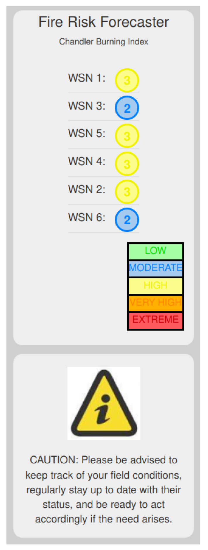
| Chandler Burning Index | Label & Color Code | Fire Risk Forecasting Rating |
|---|---|---|
| CBI | LOW (Green) | 1 |
| CBI | MODERATE (Blue) | 2 |
| CBI | HIGH (Yellow) | 3 |
| CBI | VERY HIGH (Orange) | 4 |
| CBI | EXTREME (Red) | 5 |
© 2020 by the authors. Licensee MDPI, Basel, Switzerland. This article is an open access article distributed under the terms and conditions of the Creative Commons Attribution (CC BY) license (http://creativecommons.org/licenses/by/4.0/).
Share and Cite
Tsipis, A.; Papamichail, A.; Angelis, I.; Koufoudakis, G.; Tsoumanis, G.; Oikonomou, K. An Alertness-Adjustable Cloud/Fog IoT Solution for Timely Environmental Monitoring Based on Wildfire Risk Forecasting. Energies 2020, 13, 3693. https://doi.org/10.3390/en13143693
Tsipis A, Papamichail A, Angelis I, Koufoudakis G, Tsoumanis G, Oikonomou K. An Alertness-Adjustable Cloud/Fog IoT Solution for Timely Environmental Monitoring Based on Wildfire Risk Forecasting. Energies. 2020; 13(14):3693. https://doi.org/10.3390/en13143693
Chicago/Turabian StyleTsipis, Athanasios, Asterios Papamichail, Ioannis Angelis, George Koufoudakis, Georgios Tsoumanis, and Konstantinos Oikonomou. 2020. "An Alertness-Adjustable Cloud/Fog IoT Solution for Timely Environmental Monitoring Based on Wildfire Risk Forecasting" Energies 13, no. 14: 3693. https://doi.org/10.3390/en13143693
APA StyleTsipis, A., Papamichail, A., Angelis, I., Koufoudakis, G., Tsoumanis, G., & Oikonomou, K. (2020). An Alertness-Adjustable Cloud/Fog IoT Solution for Timely Environmental Monitoring Based on Wildfire Risk Forecasting. Energies, 13(14), 3693. https://doi.org/10.3390/en13143693