Deep Learning for Gravitational-Wave Data Analysis: A Resampling White-Box Approach


Abstract
1. Introduction
2. Methods and Materials
2.1. Problem Statement
2.2. Dataset Description
2.3. Data Pre-Processing
2.3.1. Data Cleaning
2.3.2. Strain Samples
2.3.3. Wavelet Transform
2.4. Resampling and White-Box Approach
2.5. CNN Architectures
- Image Input Layer. Inputs images and applies a zero-center normalization. Denoting an th input sample as the matrix of pixels belonging to a dataset of same size training images, this layer outputs the normalized image:where the second term is the average image of the whole dataset. Normalization is useful for dimension scaling, making changes in each attribute, i.e., each pixel along all images, of a common scale. Because normalization does not distort relative intensities too seriously and helps to enhance contrast of images, we can apply it to the entire training dataset, independently what class each image belong for.
- Convolution Layer. Convolves each image with sliding kernels of dimension . Denoting each th kernel by with , this layer outputs feature maps, and each of them is an image that is composed by the elements or pixels:where b is a bias term, and indices p and q run over all values that lead to legal subscripts of and . Depending on the parametrization of subscripts m and n, dimension of images can vary. If we include the width and height of output maps (in pixels) in of a two-dimensional vector just for notation, these spatial sizes are computed by:where str (i.e., stride) is the step size in pixels with which a kernel moves above , and padd (i.e., padding) denotes time rows and/or frequency columns of pixels that are added to for moving the kernel beyond the borders of the former. During the training, components of kernel and bias terms are iteratively learned from certain initial values appropriately chosen (see Section 2.6); then, once the CNN has captured and fixed optimal values for these parameters, convolution is applied to all testing images.
- ReLU Layer. Applies the Rectified Linear Unit (ReLU) activation function to each neuron (pixel) of each feature map obtained from the previous convolutional layer, outputting the following:In practice, this layer detects nonlinearities in input sample images; and, its neurons can output true zero values, generating sparse interactions that are useful for reducing system requirements. Besides, this layer does not lead to saturation in hidden units during the learning, because its form, as given by Equation (11), does not converge to finite asymptotic values. (Saturation is the effect when an activation function located in a hidden layer of a CNN converge rapidly to its finite extreme values, becoming the CNN insensitive to small variations of input data in most of its domain. In feedforward networks, activation functions as or are prone to saturation, hence they use are discouraged except when the output layer has a cost function able to compensate their saturation [23] as, for example, the cross-entropy function).
- Max Pooling Layer. Downsamples each feature map with the maximum on local sliding regions of dimension . Each pixel of a resulting reduced featured map is given by the following:where ranges for indices r and s depend on the spatial sizes of outputs maps; and these sizes, i.e., width and height , being included in a two-dimensional vector just for notation, are computed by:where the padding and stride values have the same meanings as in the convolutional layer. Interestly and apart of reducing system requeriments, max pooling layer leaves invariant output values under small translations in the input images, which could be useful for working with a network of detectors—the case in which a detected GW signal appears with a time lag between two detectors.
- Fully Connected Layer. This is the classic perceptron layer used in ANNs and it performs the binary classification. It maps all images to the two-dimensional vector by the affine transformation:where is a vector of dimensions, with the total number of neurons considering all input feature maps, a two-dimensional bias vector, and a weight matrix of dimension . Similarly to the convolutional layer, elements of and are model parameters to be learn in the training. Matrix includes pixels of all feature maps (with ) as a single “flattened” column vector of pixels; then, information about topology or edges of sample images is lost.
- Softmax Layer. Applies the softmax activation function to each component j of vector :where , depending on the class. Softmax layer is the multiclass generalization of sigmoid function, and we include it in the CNN, because, by definition, transform real output values of fully connected layer in probabilities. In fact, according to [58], output values are interpreted as posterior distributions of class conditioned by model parameters. That is to say , where is a multidimensional vector containing all model parameters. It is common to refer to values as the output scores of the CNN.
- Classification Layer. Stochastically takes samples and computes the cross-entropy function:where and are the two posterior probabilites that are outputted by softmax layer and a likelihood function. Cross-entropy is a measure of the risk of our classifier and, following a discriminative approach [22], Equation (16) defines the maximum likelihood estimation for parameters included in . Now, we need now a learning algorithm for maximizing the likelihood or, equivalently, minimizing , with respect to model parameters. Section 2.6 introduces this algorithm. (Take in mind that our approach estimates the model parameters through a feedforward learning algorithm from classification layer to previous layers of the CNN. Alternatively, when considering that posterior probability outputted by softmax layer is because of the Bayes theorem, the other approach could be maximize likelihood funcion with respect to model parameters. This alternative approach is called generative and will be not considered in our CNN model. In short, in Section 3.4 we will present the simplest generative models to compare with our CNN algorithms, namely Naive Bayes classifiers).
2.6. Model Training
2.7. Global and Local Validation
2.8. Performance Metrics
3. Results and Discussion
3.1. Learning Monitoring per Fold
3.2. Hyperparameter Adjustments
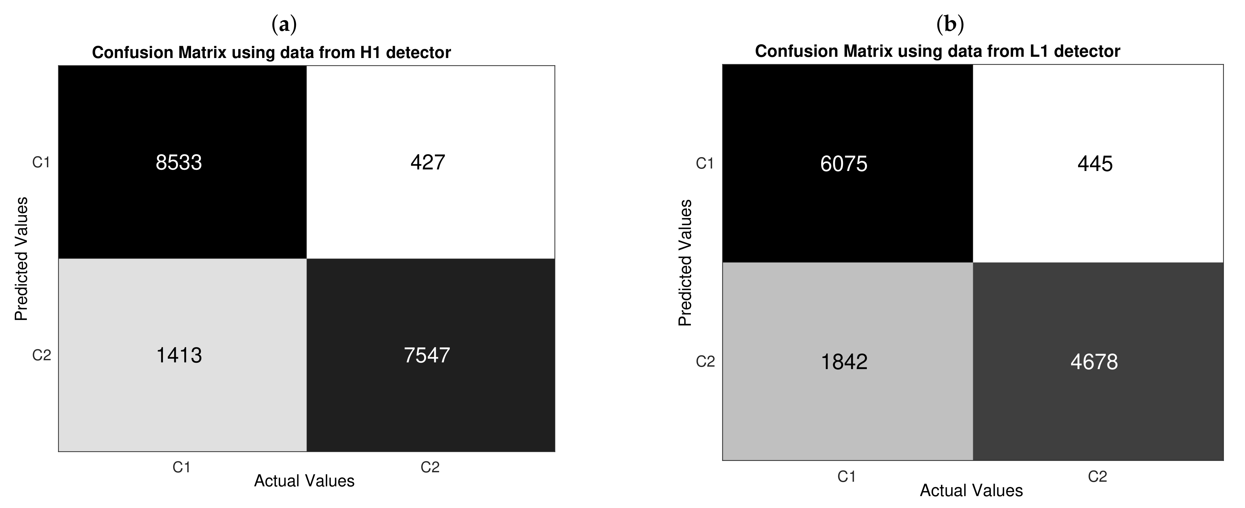
3.3. Confusion Matrices and Standard Metrics
3.4. ROC Comparative Analyses
3.5. Shuffling and Output Scoring
4. Conclusions
Author Contributions
Funding
Data Availability Statement
Conflicts of Interest
Abbreviations
| ANN | Artificial neural network |
| ASD | Amplitude spectral density |
| AUC | Area under the ROC curve |
| BBH | Binary black hole |
| BNS | Binary neutron star |
| CBC | Compact binary coalescence |
| CCSNe | Core-collapse supernovae |
| CNN | Convolutional neural network |
| CV | Cross-validation |
| DFT | Discrete Fourier transform |
| DL | Deep learning |
| FN | False negative (s) |
| FP | False positive (s) |
| GPS | Global Positioning System |
| GW | Gravitational wave |
| GWOSC | Gravitational Wave Open Science Center |
| LIGO | Laser Interferometer Gravitational-Wave Observatory |
| MF | Matched filter |
| ML | Machine learning |
| NB | Naive Bayes |
| NPV | Negative predictive value |
| OOP | Optimal operating point |
| OT | Optimal threshold |
| PSD | Power spectral density |
| ReLU | Rectified linear unit |
| ROC | Receiving Operating Characteristic |
| SGD | Stochastic gradient descent |
| SNR | Signal-to-noise ratio |
| SVM | Support vector machines |
| TN | True negative (s) |
| TP | True positive (s) |
| WT | Wavelet transform |
References
- Abbott, B.P.; Abbott, R.; Abbott, T.D.; Abernathy, M.R.; Acernese, F.; Ackley, K.; Adams, C.; Adams, T.; Addesso, P.; Adhikari, R.X.; et al. Observation of Gravitational Waves from a Binary Black Hole Merger. Phys. Rev. Lett. 2016, 116, 061102. [Google Scholar] [CrossRef]
- Abbott, B.P.; Abbott, R.; Abbott, T.D.; Abraham, S.; Acernese, F.; Ackley, K.; Adams, C.; Adhikari, R.X.; Adya, V.B.; Affeldt, C.; et al. GWTC-1: A Gravitational-Wave Transient Catalog of Compact Binary Mergers Observed by LIGO and Virgo during the First and Second Observing Runs. Phys. Rev. X 2016, 9, 031040. [Google Scholar] [CrossRef]
- Abbott, R.; Abbott, T.D.; Abraham, S.; Acernese, F.; Ackley, K.; Adams, A.; Adams, C.; Adhikari, R.X.; Adya, V.B.; Affeldt, C.; et al. GWTC-2: Compact Binary Coalescences Observed by LIGO and Virgo During the First Half of the Third Observing Run. arXiv 2020, arXiv:2010.14527. [Google Scholar]
- Abbott, B.P.; Abbott, R.; Abbott, T.D.; Abraham, S.; Acernese, F.; Ackley, K.; Adams, C.; Adya, V.B.; Affeldt, C.; Agathos, M.; et al. Prospects for observing and localizing gravitational-wave transients with Advanced LIGO, Advanced Virgo and KAGRA. Living Rev. Relativ. 2020, 23, 23. [Google Scholar] [CrossRef] [PubMed]
- Abbott, B.P.; Abbott, R.; Abbott, T.D.; Abernathy, M.R.; Acernese, F.; Ackley, K.; Adamo, M.; Adams, C.; Adams, T.; Addesso, P.; et al. Characterization of transient noise in Advanced LIGO relevant to gravitational wave signal GW150914. Class. Quantum Grav. 2016, 33, 134001. [Google Scholar] [CrossRef] [PubMed]
- Cabero, M.; Lundgren, A.; Nitz, A.H.; Dent, T.; Barker, D.; Goetz, E.; Kissel, J.; Nuttall, L.K.; Schale, P.; Schofield, R.; et al. Blip glitches in Advanced LIGO data. Class. Quantum Grav. 2019, 36, 155010. [Google Scholar] [CrossRef]
- Turin, G.L. An introduction to matched filters. IRE Trans. Inf. Theory 1960, 6, 311–329. [Google Scholar] [CrossRef]
- Allen, B.; Anderson, W.G.; Brady, P.R.; Brown, D.A.; Creighton, J.D.E. FINDCHIRP: An algorithm for detection of gravitational waves from inspiraling compact binaries. Phys. Rev. D 2012, 85, 122006. [Google Scholar] [CrossRef]
- Babak, S.; Biswas, R.; Brady, P.R.; Brown, D.A.; Cannon, K.; Capano, C.D.; Clayton, J.H.; Cokelaer, T.; Creighton, J.D.E.; Dent, T.; et al. Searching for gravitational waves from binary coalescence. Phys. Rev. D 2013, 87, 024033. [Google Scholar] [CrossRef]
- Antelis, J.M.; Moreno, C. Obtaining gravitational waves from inspiral binary systems using LIGO data. Eur. Phys. J. Plus 2017, 132, 10. [Google Scholar] [CrossRef]
- Usman, S.A.; Nitz, A.H.; Harry, I.W.; Biwer, C.M.; A Brown, D.; Cabero, M.; Capano, C.D.; Canton, T.D.; Dent, T.; Fairhurst, S.; et al. The PyCBC search for gravitational waves from compact binary coalescence. Class. Quantum Grav. 2016, 33, 215004. [Google Scholar] [CrossRef]
- Nitz, A.H.; Canton, T.D.; Davis, D.; Reyes, S. Rapid detection of gravitational waves from compact binary mergers with PyCBC Live. Phys. Rev. D 2018, 98, 024050. [Google Scholar] [CrossRef]
- Messick, C.; Blackburn, K.; Brady, P.; Brockill, P.; Cannon, K.; Cariou, R.; Caudill, S.; Chamberlin, S.J.; Creighton, J.D.E.; Everett, R.; et al. Analysis Framework for the Prompt Discovery of Compact Binary Mergers in Gravitational-wave Data. Phys. Rev. D 2017, 95, 042001. [Google Scholar] [CrossRef]
- Adams, T.; Buskulic, D.; Germain, V.; Guidi, G.M.; Marion, F.; Montani, M.; Mours, B.; Piergiovanni, F.; Wang, G. Low-latency analysis pipeline for compact binary coalescences in the advanced gravitational wave detector era. Class. Quantum Grav. 2016, 33, 175012. [Google Scholar] [CrossRef]
- Cuoco, E.; Cella, G.; Guidi, G.M. Whitening of non-stationary noise from gravitational wave detectors. Class. Quantum Grav. 2004, 21, S801–S806. [Google Scholar] [CrossRef]
- Allen, B. A chi-squared time-frequency discriminator for gravitational wave detection. Phys. Rev. D 2005, 71, 062001. [Google Scholar] [CrossRef]
- Abbott, B.P.; Abbott, R.; Abbott, T.D.; Abraham, S.; Acernese, F.; Ackley, K.; Adams, C.; Adhikari, R.X.; Adya, V.B.; Affeldt, C.; et al. All-sky search for long-duration gravitational-wave transients in the second Advanced LIGO observing run. Phys. Rev. D 2019, 99, 104033. [Google Scholar] [CrossRef]
- Antelis, J.M.; Moreno, C. An independent search of gravitational waves in the first observation run of advanced LIGO using cross-correlation. Gen. Relativ. Gravit. 2019, 51, 61. [Google Scholar] [CrossRef]
- Harry, I.; Privitera, S.; Bohé, A.; Buonanno, A. Searching for Gravitational Waves from Compact Binaries with Precessing Spins. Phys. Rev. D 2016, 94, 024012. [Google Scholar] [CrossRef]
- Huerta, E.A.; Kumar, P.; Agarwal, B.; George, D.; Schive, H.-Y.; Pfeiffer, H.P.; Haas, R.; Ren, W.; Chu, T.; Boyle, M.; et al. Complete waveform model for compact binaries on eccentric orbits. Phys. Rev. D 2017, 95, 024038. [Google Scholar] [CrossRef]
- Thompson, J.E.; Fauchon-Jones, E.; Khan, S.; Nitoglia, E.; Pannarale, F.; Dietrich, T.; Hannam, M. Modeling the gravitational wave signature of neutron star black hole coalescences: PhenomNSBH. Phys. Rev. D 2020, 101, 124059. [Google Scholar] [CrossRef]
- Bishop, C.M. Pattern Recognition and Machine Learning; Springer: Singapore, 2006; p. 61. [Google Scholar]
- Goodfellow, I.; Bengio, Y.; Courville, A. Deep Learning; Academic Press: Cambridge, MA, USA; London, UK, 2016. [Google Scholar]
- Biswas, R.; Blackburn, L.; Cao, J.; Essick, R.; Hodge, K.A.; Katsavounidis, E.; Kim, K.; Kim, Y.-M.; Le Bigot, E.-O.; Lee, C.-H.; et al. Application of machine learning algorithms to the study of noise artifacts in gravitational-wave data. Phys. Rev. D 2013, 88, 062003. [Google Scholar] [CrossRef]
- Kim, K.; Harry, I.W.; Hodge, K.A.; Kim, Y.M.; Lee, C.H.; Lee, H.K.; Oh, J.J.; Oh, S.H.; Son, E.J. Application of artificial neural network to search for gravitational-wave signals associated with short gamma-ray bursts. Class. Quantum Grav. 2015, 32, 245002. [Google Scholar] [CrossRef]
- Torres-Forné, A.; Marquina, A.; Font, J.A.; Ibáñez, J.M. Denoising of gravitational wave signals via dictionary learning algorithms. Phys. Rev. D 2016, 94, 124040. [Google Scholar] [CrossRef]
- Mukund, N.; Abraham, S.; Kandhasamy, S.; Mitra, S.; Philip, N.S. Transient classification in LIGO data using difference boosting neural network. Phys. Rev. D 2017, 95, 104059. [Google Scholar] [CrossRef]
- Zevin, M.; Coughlin, S.; Bahaadini, S.; Besler, E.; Rohani, N.; Allen, S.; Cabero, M.; Crowston, K.; Katsaggelos, A.K.; Larson, S.L.; et al. Gravity Spy: Integrating advanced LIGO detector characterization, machine learning, and citizen science. Class. Quantum Grav. 2017, 34, 064003. [Google Scholar] [CrossRef]
- Cavagliá, M.; Gaudio, S.; Hansen, T.; Staats, K.; Szczepanczyk, M.; Zanolin, M. Improving the background of gravitational-wave searches from core collapse supernovae: A machine learning approach. Mach. Learn. Sci. Technol. 2020, 1, 015005. [Google Scholar] [CrossRef]
- Gabbard, H.; Williams, M.; Hayes, F.; Messenger, C. Matching Matched Filtering with Deep Networks for Gravitational-Wave Astronomy. Phys. Rev. Lett. 2018, 120, 141103. [Google Scholar] [CrossRef]
- George, D.; Huerta, E.A. Deep neural networks to enable real-time multimessenger astrophysics. Phys. Rev. D 2018, 97, 044039. [Google Scholar] [CrossRef]
- George, D.; Huerta, E.A. Deep Learning for real-time gravitational wave detection and parameter estimation: Results with Advanced LIGO data. Phys. Lett. B 2018, 778, 64–70. [Google Scholar] [CrossRef]
- Razzano, M.; Cuoco, E. Image-based deep learning for classification of noise transients in gravitational wave detectors. Class. Quantum Grav. 2018, 35, 095016. [Google Scholar] [CrossRef]
- Gebhard, T.D.; Kilbertus, N.; Harry, I.; Schölkopf, B. Convolutional neural networks: A magic bullet for gravitational-wave detection? Phys. Rev. D 2019, 100, 063015. [Google Scholar] [CrossRef]
- Wang, H.; Wu, S.; Cao, Z.; Liu, X.; Zhu, J.-Y. Gravitational-wave signal recognition of LIGO data by deep learning. Phys. Rev. D 2020, 101, 104003. [Google Scholar] [CrossRef]
- Krastev, P.G. Real-time detection of gravitational waves from binary neutron stars using artificial neural networks. Phys. Lett. B 2020, 803, 135330. [Google Scholar] [CrossRef]
- Astone, P.; Cerda-Duran, P.; Palma, I.D.; Drago, M.; Muciaccia, F.; Palomba, C.; Ricci, F. New method to observe gravitational waves emitted by core collapse supernovae. Phys. Rev. D 2018, 98, 122002. [Google Scholar] [CrossRef]
- Iess, A.; Cuoco, E.; Morawski, F.; Powell, J. Core-Collapse supernova gravitational-wave search and deep learning classification. Mach. Learn. Sci. Technol. 2020, 1, 025014. [Google Scholar] [CrossRef]
- Miller, A.L.; Astone, P.; D’Antonio, S.; Frasca, S.; Intini, G.; La Rosa, I.; Leaci, P.; Mastrogiovanni, S.; Muciaccia, F.; Mitidis, A.; et al. How effective is machine learning to detect long transient gravitational waves from neutron stars in a real search? Phys. Rev. D 2019, 100, 062005. [Google Scholar] [CrossRef]
- Daubechies, I. Ten Lectures on Wavelets; Society for Industrial and Applied Mathematics: Philadelphia, PA, USA, 1992. [Google Scholar]
- Morales, M.D.; Antelis, J.M. Source Code for “Deep Learning for Gravitational-Wave Data Analysis: A Resampling White-Box Approach”. 2021. Available online: https://github.com/ManuelDMorales/dl_gwcbc (accessed on 20 April 2021).
- Abbott, R.; Abbott, T.D.; Abraham, S.; Acernese, F.; Ackley, K.; Adams, C.; Adhikari, R.X.; Adya, V.B.; Affeldt, C.; Agathos, M.; et al. Open data from the first and second observing runs of Advanced LIGO and Advanced Virgo. SoftwareX 2021, 13. [Google Scholar] [CrossRef]
- LIGO Scientific Collaboration; Virgo Collaboration. Sensitivity Achieved by the LIGO and Virgo Gravitational Wave Detectors during LIGO’s Sixth and Virgo’s Second and Third Science Runs. arXiv 2012, arXiv:1203.2674v2. [Google Scholar]
- LIGO-Virgo GWOSC. S6 Compact Binary Coalescence Hardware Injections. Available online: https://www.gw-openscience.org/s6hwcbc/ (accessed on 1 April 2020).
- Biwer, C.; Barker, D.; Batch, J.C.; Betzwieser, J.; Fisher, R.P.; Goetz, E.; Kandhasamy, S.; Karki, S.; Kissel, J.S.; Lundgren, A.P.; et al. Validating gravitational-wave detections: The Advanced LIGO hardware injection system. Phys. Rev. D 2017, 95, 062002. [Google Scholar] [CrossRef]
- Mehrabi, N.; Morstatter, F.; Saxena, N.; Lerman, K.; Galstyan, A. A Survey on Bias and Fairness in Machine Learning. arXiv 2019, arXiv:1908.09635. [Google Scholar]
- Welch, P. The use of fast Fourier transform for the estimation of power spectra: A method based on time averaging over short, modified periodograms. IEEE Trans. Audio Electroacoust. 1967, 15, 70–73. [Google Scholar] [CrossRef]
- Martynov, D.V.; Hall, E.D.; Abbott, B.P.; Abbott, R.; Abbott, T.D.; Adams, C.; Adhikari, R.X.; Anderson, R.A.; Anderson, S.B.; Arai, K.; et al. Sensitivity of the Advanced LIGO detectors at the beginning of gravitational wave astronomy. Phys. Rev. D 2016, 93, 112004. [Google Scholar] [CrossRef]
- LeCun, Y. Generalization and Network Design Strategies; Technical Report CRG-TR-89-4; University of Toronto: Toronto, ON, Canada, 1989. [Google Scholar]
- LeCun, Y.; Bengio, Y.; Hinton, G. Deep Learning. Nature 2015, 521, 436–444. [Google Scholar] [CrossRef] [PubMed]
- Mallat, S. A Wavelet Tour of Signal Processing: The Sparse Way, 3rd ed.; Academic Press: Boston, MA, USA, 2009. [Google Scholar] [CrossRef]
- Kronland-Martinet, R.; Morlet, J.; Grossmann, A. Analysis of sound patterns through wavelet transforms. Int. J. Patt. Recogn. Art. Intell. 1987, 1, 273–302. [Google Scholar] [CrossRef]
- Abbott, B.P.; Abbott, R.; Abbott, T.D.; Abraham, S.; Acernese, F.; Ackley, K.; Adams, C.; Adhikari, R.X.; Adya, V.B.; Affeldt, C.; et al. Binary Black Hole Population Properties Inferred from the First and Second Observing Runs of Advanced LIGO and Advanced Virgo. Astrophys. J. Lett. 2019, 882, L24. [Google Scholar] [CrossRef]
- Abbott, R.; Abbott, T.D.; Abraham, S.; Acernese, F.; Ackley, K.; Adams, A.; Adams, C.; Adhikari, R.X.; Adya, V.B.; Affeldt, C.; et al. Population Properties of Compact Objects from the Second LIGO-Virgo Gravitational-Wave Transient Catalog. arXiv 2021, arXiv:2010.14533. [Google Scholar]
- Japkowicz, N.; Shah, M. Evaluating Learning Algorithms: A Classification Perspective; Cambridge University Press: New York, NY, USA, 2011; p. 178. [Google Scholar] [CrossRef]
- Zhang, C.; Bengio, S.; Hardt, M.; Recht, B.; Vinyals, O. Understanding deep learning requires rethinking generalization. In Proceedings of the 5th International Conference on Learning Representations, ICLR, Toulon, France, 24–26 April 2017. [Google Scholar]
- MATLAB Deep Learning Toolbox; The MathWorks Inc.: Natick, MA, USA, 2020.
- Bridle, J.S. Probabilistic Interpretation of Feedforward Classification Network Outputs, with Relationships to Statistical Pattern Recognition. In Neurocomputing: Algorithms, Architectures and Applications; Fogelman-Soulié, F., Hérault, J., Eds.; Springer: Berlin, Germany, 1989; pp. 227–236. [Google Scholar] [CrossRef]
- Glorot, X.; Bengio, Y. Understanding the difficulty of training deep feedforward neural networks. In Proceedings of the 13th International Conference on Machine Learning, Sardinia, Italy, 13–15 May 2010; Volume 9, pp. 249–256. [Google Scholar]
- Huerta, E.A.; Allen, G.; Andreoni, I.; Antelis, J.M.; Bachelet, E.; Berriman, G.B.; Bianco, F.B.; Biswas, R.; Kind, M.C.; Chard, K.; et al. Enabling real-time multi-messenger astrophysics discoveries with deep learning. Nat. Rev. Phys. 2019, 1, 600–608. [Google Scholar] [CrossRef]
- Sagiroglu, S.; Sinanc, D. Big data: A review. In Proceedings of the 2013 International Conference on Collaboration Technologies and Systems, San Diego, CA, USA, 20–24 May 2013; pp. 42–47. [Google Scholar] [CrossRef]
- Mosteller, F.; Tukey, J.W. Data analysis, including statistics. In Handbook of Social Psychology, 1st ed.; Lindzey, G., Aronson, E., Eds.; Addison-Wesley: Reading, MA, USA, 1968; Chapter 10; Volume 2. [Google Scholar]
- Hastie, T.; Tibshirani, R.; Friedman, J. The Elements of Statistical Learning: Data Mining, Inference, and Prediction, 2nd ed.; Springer: Berlin/Heidelberg, Germany, 2009; p. 241. [Google Scholar] [CrossRef]
- Breiman, L.; Friedman, J.H.; Olshen, R.A.; Stone, C.J. Classification and Regresssion Trees; Wadsworth International Group: Washington, DC, USA, 1984. [Google Scholar] [CrossRef]
- Weiss, S.M.; Indurkhya, N. Decision tree pruning: Biased or optimal. In Proceedings of the Twelfth National Conference on Artificial Intelligence, Seattle, WA, USA, 31 July–4 August 1994; Hayes-Roth, B., Korf, R.E., Eds.; AAAI Press and MIT Press: Seattle, WA, USA, 1994; pp. 626–632. [Google Scholar]
- Kohavi, R. A study of cross-validation and bootstrap for accuracy estimation and model selection. In Proceedings of the Fourteenth International Joint Conference on Artificial Intelligence, Montreal, QC, Canada, 20–25 August 1995; Volume 2, pp. 1137–1143. [Google Scholar]
- Molinaro, A.M.; Simon, R.; Pfeiffer, R.M. Prediction error estimation: A comparison of resampling methods. Bioinformatics 2005, 21, 3301–3307. [Google Scholar] [CrossRef] [PubMed]
- Kim, J.H. Estimating classification error rate: Repeated cross-validation, repeated hold-out and bootstrap. Comput. Stat. Data Anal. 2009, 53, 3735–3745. [Google Scholar] [CrossRef]
- Fawcett, T. An introduction to ROC analysis. Pattern Recognit. Lett. 2006, 27, 861–874. [Google Scholar] [CrossRef]
- Davis, J.; Goadrich, M. The relationship between Precision-Recall and ROC curves. In Proceedings of the 23rd International Conference on Machine Learning, Pittsburgh, PA, USA, 25–26 June 2006; pp. 233–240. [Google Scholar] [CrossRef]
- Kay, S.M. Statistical Signal Processing Volume II: Detection Theory; Prentice Hall PTR: Hoboken, NJ, USA, 1998; p. 62. [Google Scholar]
- MATLAB Statistics and Machine Learning Toolbox; The MathWorks Inc.: Natick, MA, USA, 2020.
- Bradley, A.P. The use of area under the ROC curve in the evaluation of machine learning algorithms. Pattern Recognit. 1997, 30, 1145–1159. [Google Scholar] [CrossRef]


| Layer | Activations per Image Sample | Learnables per Image Sample |
|---|---|---|
| Image Input | – | |
| Convolution of size , kernels Strides: 1, Paddings: 0 | Weights: Biases: | |
| ReLU | – | |
| Max Pooling of size Strides: 2, Paddings: 0 | – | |
| Convolution of size , kernels Strides: 1, Paddings: 0 | Weights: Biases: | |
| ReLU | – | |
| Max Pooling of size Strides: 2, Paddings: 0 | – | |
| Convolution of size , kernels Strides: 1, Paddings: 0 | Weights: Biases: | |
| ReLU | – | |
| Max Pooling of size Strides: 1, Paddings: 0 | – | |
| Fully Connected | Weights: Biases: | |
| Softmax | – | |
| Ouput Cross-Entropy | – | – |
| Metric | Definition | What Does It Measure? | |
|---|---|---|---|
 | |||
| Accuracy | How often a correct classification is made | ||
| Precision | How many selected examples are truly relevant | ||
| Recall | How many truly relevant examples are selected | ||
| Fall-out | How many no relevant examples are selected | ||
| F1 score | Harmonic mean of precision and recall. | ||
| G mean1 | Geometric mean of recall and fall-out. |
| Standard Metrics with H1 Data | ||||
|---|---|---|---|---|
| Metric | Mean | Min | Max | SD |
| Accuracy | ||||
| Precision | ||||
| Recall | ||||
| Fall-out | ||||
| F1 score | ||||
| G mean1 | ||||
| Standard Metrics with L1 Data | ||||
| Metric | Mean | Min | Max | SD |
| Accuracy | ||||
| Precision | ||||
| Recall | ||||
| Fall-out | ||||
| F1 score | ||||
| G mean1 | ||||
| Data | Model | Optimal Operating Point | Optimal Threshold | Optimal | AUC |
|---|---|---|---|---|---|
| H1 | CNN | ||||
| SVM | |||||
| NB | |||||
| L1 | CNN | ||||
| SVM | |||||
| NB |
Publisher’s Note: MDPI stays neutral with regard to jurisdictional claims in published maps and institutional affiliations. |
© 2021 by the authors. Licensee MDPI, Basel, Switzerland. This article is an open access article distributed under the terms and conditions of the Creative Commons Attribution (CC BY) license (https://creativecommons.org/licenses/by/4.0/).
Share and Cite
Morales, M.D.; Antelis, J.M.; Moreno, C.; Nesterov, A.I. Deep Learning for Gravitational-Wave Data Analysis: A Resampling White-Box Approach. Sensors 2021, 21, 3174. https://doi.org/10.3390/s21093174
Morales MD, Antelis JM, Moreno C, Nesterov AI. Deep Learning for Gravitational-Wave Data Analysis: A Resampling White-Box Approach. Sensors. 2021; 21(9):3174. https://doi.org/10.3390/s21093174
Chicago/Turabian StyleMorales, Manuel D., Javier M. Antelis, Claudia Moreno, and Alexander I. Nesterov. 2021. "Deep Learning for Gravitational-Wave Data Analysis: A Resampling White-Box Approach" Sensors 21, no. 9: 3174. https://doi.org/10.3390/s21093174
APA StyleMorales, M. D., Antelis, J. M., Moreno, C., & Nesterov, A. I. (2021). Deep Learning for Gravitational-Wave Data Analysis: A Resampling White-Box Approach. Sensors, 21(9), 3174. https://doi.org/10.3390/s21093174