
Systematic Review

Visualising Machine Learning Model Outputs in Data Analytics: A Systematic Review

1
School of Information, Journalism and Communication, The University of Sheffield, Sheffield S10 2AH, UK
2
Tubr, Sheffield S1 2NS, UK
*
Author to whom correspondence should be addressed.
Analytics 2026, 5(3), 24; https://doi.org/10.3390/analytics5030024
Submission received: 29 March 2026 / Revised: 17 June 2026 / Accepted: 21 June 2026 / Published: 20 July 2026
(This article belongs to the Special Issue Reviews on Data Analytics and Its Applications)

Abstract

As data analytics increasingly rely on machine learning models for forecasting, classification, and prediction, effective visualisation becomes essential for transforming model outputs into practical insight. Yet the ways these outputs are visualised, and the evidence supporting those designs, remain fragmented across domains. This paper presents a systematic literature review of visualising machine learning model outputs in data analytics, focusing on how predicted outputs are communicated to end-users alongside performance and uncertainty information, and how these visual systems are evaluated in practice. Following PRISMA, we screened 330 articles from ACM Digital Library, IEEE Xplore, and PubMed and included 88 peer-reviewed studies published between Jan 2015 and July 2024. Across the corpus, we identify (1) recurring visual encoding and interaction patterns for interpreting predictions in temporal, spatio-temporal, and event-based settings; (2) common strategies for presenting model validation, calibration, and uncertainty; and (3) a wide range of evaluation approaches, from informal expert feedback to controlled user studies and deployments. The synthesis highlights persistent gaps in rigorous and comparable evaluation, challenges in supporting diverse user goals and expertise levels, and practical constraints that arise in operational contexts. We conclude by distilling practical implications for designing and assessing predictive visualisations, as well as outlining recommendations for future research and practice, with particular attention to improving uncertainty communication, strengthening evaluation rigour and comparability, and adopting evaluation methods that better reflect operational data analytics practice.

1. Introduction

The field of predictive modelling and machine learning has seen unprecedented growth over the past decade, driven by advancements in computational capabilities and the exponential increase in data availability. As these models become more sophisticated and widely used, the need for effective data visualisation has significantly increased [1]. Visualisation serves as a bridge between complex algorithms and human understanding, with a growing need to understand how users depend on them for critical decision making and communication [2]. Effective visualisation helps improve trust, usability, and stakeholder engagement, while ineffective visualisation may (unintentionally) increase cognitive load, misinterpretation, or overreliance on predictions. Alongside academic interest, there is also significant industry demand for visualisation approaches that more effectively support expert use in operational settings. Yet the ways such outputs are visualised, and the evidence supporting those designs, remain fragmented across domains. Recent developments suggest a growing convergence between predictive visualisation and explainable artificial intelligence (XAI). These studies demonstrate how XAI is increasingly used to generate high-level meaningful explanations of model behaviour and support interpretability through structured reasoning and interactive visualisation workflows.

1.1. Existing Reviews on Visualisation of ML Results

A closely related study [2] explored the growing use of complex models and visualisation techniques within predictive systems, providing a structured overview of tasks such as regression, classification, and clustering, alongside user interactions like visual feedback and model steering. It introduces a Predictive Visual Analytics (PVA) pipeline, covering stages from data preprocessing through to output interpretation. Despite its comprehensive system-level focus, the paper places limited emphasis on how predictive outputs, such as classifications, forecasts, or confidence intervals, are visually communicated to users. Moreover, it is largely anchored within the visual analytics discipline, with little consideration for domain diversity or cross-context generalisability. More recently, Shakeel et al. [3] surveyed visualisation tools and techniques across a variety of domains, including smart cities, healthcare, IoT, and urban management. Their taxonomy reveals how visualisation strategies are typically shaped by domain-specific constraints and goals, often resulting in designs that are tightly coupled to specific data types or decision tasks. While the study highlighted the potential for interactive, web-based, and collaborative tools, it simultaneously acknowledges a lack of unified frameworks to guide the visualisation of predictive insights across domains.
Several relevant domain-specific systematic literature reviews reflect growing interest in how data visualisation supports predictive modelling and decision-making. Namoun and Alshanqiti [4] conduct a review on machine learning-based prediction of student performance, with a particular focus on outcome-based education. While the review synthesises predictive models and explores performance indicators such as grades, learning outcomes, and dropout rates, it does not evaluate how these predictions are visualised for stakeholders, such as students, teachers, or policymakers. Similarly, Mauludina et al. [5] reviewed the role of visualisation in auditing, highlighting benefits in exploratory analysis and decision support, yet did not examine how predictive risk scores or anomaly detections are visually conveyed to auditors. In transport analytics, Clarinval and Dumas [6] focused on spatio-temporal representations in intelligent transportation systems, again prioritising real-time operational control over the communication of predictive model outcomes. The same pattern appears in the sports domain, where Perin et al. [7] catalogued tools used for game analysis, performance tracking, and tactical review, but without isolating the visualisation of predictive outputs, such as win probabilities or player fatigue forecasts. While these reviews tend to focus on broader themes, such as system usability, model outcomes, or risk detection, visual representations of machine learning outputs themselves are predominantly left under-discussed.
Lastly, there are studies that focus on how predictive visualisations are evaluated. Eberhard [8] provided a synthesis on the effects of visualisation on judgement and decision-making, emphasising cognitive load, task complexity, and user characteristics as mediators of effectiveness. However, it does not explicitly isolate visualisation techniques used to communicate predictive model outputs, nor does it consistently analyse how uncertainty or risk is conveyed within these visuals. Similarly, Alhadad [9] examined the role of data visualisation in supporting inference and decision-making in educational contexts, drawing from cognitive psychology to highlight how attention and perception affect comprehension. Yet the paper remains situated in learning analytics and lacks focus on visualising predictive outputs or communicating model-derived results across broader use cases. More recently, Islam et al. [10] presented a review of evaluation strategies in visual analytics systems, including insight-based evaluations, heuristic frameworks, and eye-tracking studies. While this work maps the methodological terrain well, it addresses visual analytics systems in general, with limited attention to evaluations of visuals presenting predictive model results.
Our work addresses a critical yet underexplored gap in the literature, as while existing studies reflect a growing maturity in the integration of visualisation within predictive systems, there is still limited understanding of how machine learning outputs, such as classifications, probabilities, or forecast intervals, are visually communicated to end-users, especially in ways that support trust, understanding, and decision-making. Most existing reviews focus on system design, model interpretability, or user interaction, but few isolate the design and evaluation of visualisation strategies that directly represent predictive results. Domain-specific reviews provide valuable context-sensitive visualisation insight; however, they lack cross-domain synthesis. Our study systematically examines how predictive outputs are visualised and evaluated across different audiences and application settings, providing generalisable guidance on how to design and evaluate predictive visualisations.
In addition to academic interest, there is significant industry demand for more effective data visualisation approaches that serve the end-users. Technology companies building customer-facing platforms face substantial challenges in designing visualisations that communicate complex model outputs in accessible ways. Despite incorporating research-backed insights into their designs, UI/UX designers often default to conventional visualisation patterns that fail to effectively communicate meaning to users, especially those without technical backgrounds. This disconnect creates a critical gap between data availability and usability, particularly in contexts where busy professionals need to quickly extract actionable insights from dashboards viewed on mobile devices. Industry practitioners report that existing visualisation solutions frequently overwhelm users, resulting in low engagement and reduced operational value. These industry-reported challenges underscore the pressing need for this systematic review to bridge the gap between theoretical research and practical implementation in the visual communication of ML predictive model outputs.

1.2. Research Objectives

This systematic literature review focuses on the visual presentation of predictive model outputs, rather than on the models or system architectures themselves. It examines recent advances in academic research over the last decade to capture how the visual communication of model outputs has evolved, and how the recent studies have adapted and extended classical visualisation principles to emerging predictive modelling contexts.
It is structured around four key research questions listed in Table 1. Through this framework, the review identifies patterns, limitations, and opportunities in existing approaches to visualising predictive machine learning outputs across domains.
Subsequently, the paper aims to develop recommendations for future research and practice by synthesising lessons from the corpus, with particular attention to trends in visualisation outputs and model metrics, evaluation strategies, and potential solutions to common challenges. These recommendations seek to inform the design of predictive visualisations that are both interpretable and actionable across a range of use cases.

1.3. Contributions

Our contributions are summarised as follows.
  • We provide a systematic, cross-domain review and synthesis of the recent advances in how different predictive machine learning models’ mechanisms and outputs are visually represented, as well as how model performance is communicated.
  • We synthesise how these predictive visualisations are evaluated and identify recurring challenges that limit their effectiveness.
  • Building on the synthesis, we propose recommendations for future research and practices for designing and evaluating predictive visualisations.
The remainder of this review article is organised as follows. Section 2 gives the methodology of the systematic literature review. Section 3 presents our main findings and implications. Section 4 provides discussion emerging from the findings and recommends possible future research directions and practices. Section 5 acknowledges the limitations of the review and concludes the paper.

2. Methodology

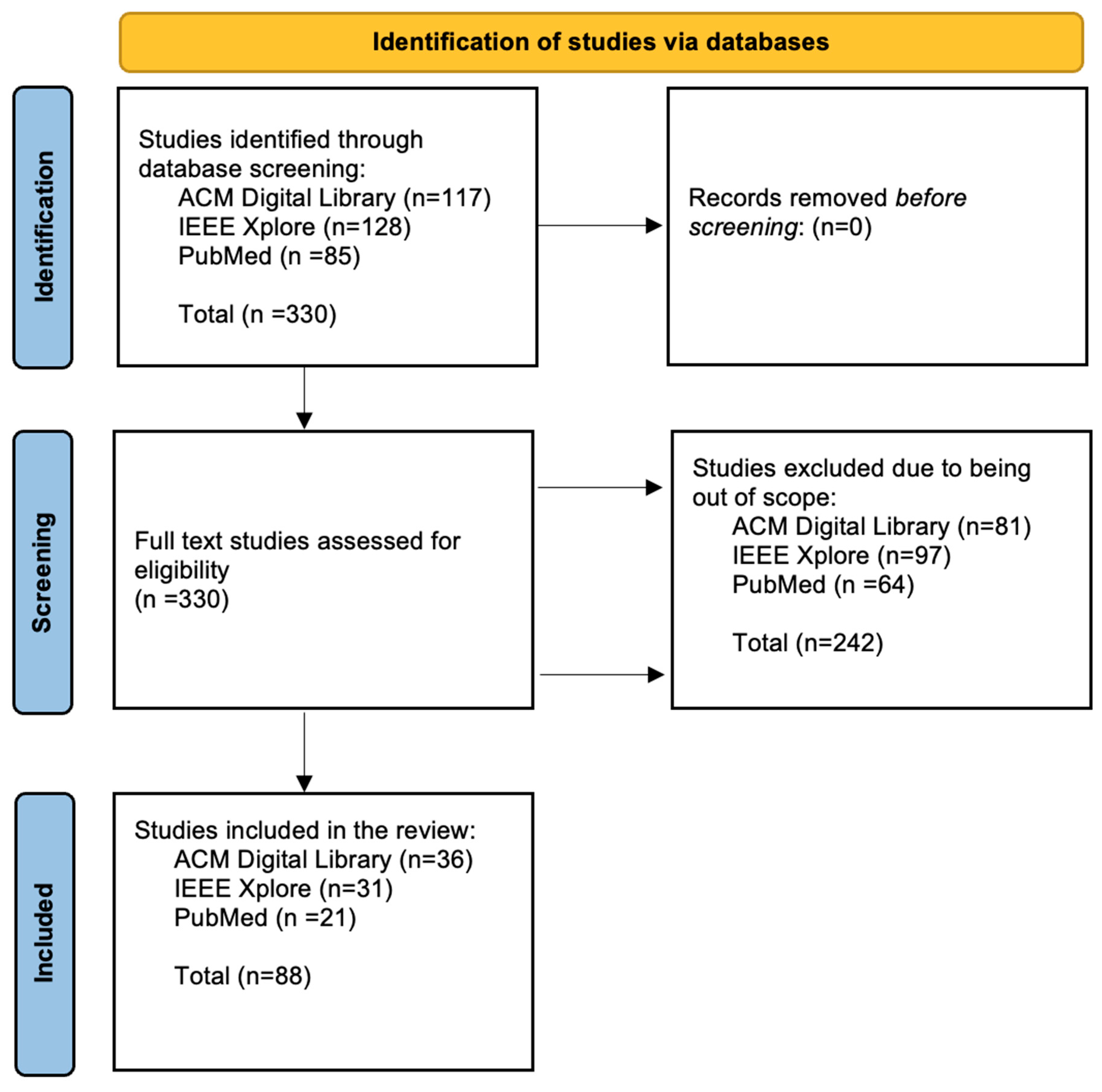
This paper utilises a systematic literature review informed by the PRISMA [11] flow chart (Figure 1). The database search was conducted in July 2024. The study focuses on research spanning the last decade, with the oldest paper being published in 2015, to synthesise contemporary insights. Additionally, a McKinsey report [12] denotes a shift in the popularity of predictive machine learning in commercial contexts across various industries, further informing the scope of papers considered in the study. Three databases, including ACM Digital Library, IEEE Xplore, and PubMed, were used to identify such papers.
Table 2 lists the keywords used in searching these databases. Although the core structure of the queries remained the same, focusing on visualisation, prediction, modelling, evaluation, and communication, adjustments were made to suit each database. Specifically, IEEE Xplore allowed for a more detailed query and included a fourth layer to refine results due to a high initial hit count. PubMed and ACM Digital Library required simpler phrasing, and in some cases, the use of wildcards within quotation marks was avoided to match the database’s formatting rules. These changes were made to balance the relevance of the results while maintaining consistency across the search.
In particular, the goal of the search was to systematically identify the studies that examine how machine learning model outputs are visually represented, communicated and evaluated. Thus, the database queries were constructed around four blocks as follows.
  • Visualisations and display, including keywords “visuali*”, “dashboard”, or “visual* information” in the title;
  • Predictive or statistical modelling, including keywords “predict*”, “forecast*”, “statistical*”, “model*”, or “machine learning” in the abstract;
  • Model evaluation and performance, including keywords “model* result”, “accura*”, “precep*”, “uncert*”, “doubt*”, or “effective*” in the abstract;
  • Communication and interpretability, including keywords “communic*”, “interpret*”, “explain*”, “comprehens*”, “communication effective*”, or “visuali* asses*” in the abstract.
The Boolean AND operator was applied across these blocks so that the retrieved articles intersected all four dimensions, e.g., rather than having generic visualisation studies that are irrelevant to predictive models. The final keyword combinations used in each database were refined iteratively through multiple rounds of testing to ensure we sufficiently covered the relevant topics while avoiding going beyond our scope. These refinements were tailored to each database, taking into account their nature and characteristics, and thus slightly different search criteria were applied. For example, we used slightly broader keywords to include more relevant articles from ACM Digital Library. Despite these minor syntactic differences, we maintained the consistent conceptual scope across all databases. These searches resulted in a total of 330 papers being included for screening.
During screening, we read the full text of the articles and further filtered them according to the following inclusion criteria:
(i)
The paper must utilise a machine learning model to derive predictions. No restriction was placed in respect to model complexity.
(ii)
Visualisations must focus on presenting either the machine learning model or the outputs (i.e., predictions of the model). Papers only presenting descriptive visualisations were eliminated.
(iii)
The paper is written in English.
(iv)
The full text of the paper is available online.
After the screening, 88 articles were included in this review.

2.1. Key Terms & Definitions

Table 3 lists the key terms and definitions commonly used in this paper.

2.2. Data Extraction and Synthesis

Across the 88 unique studies reviewed, healthcare emerges as the most dominant domain, featuring in 21 studies—nearly one-quarter of the corpus. This aligns with the fact that 85 out of 330 studies were obtained from PubMed, a biomedical literature database. Other represented domains include business and retail, geospatial and environmental science, education, finance, and transport systems. These domains shape the kinds of predictive tasks being tackled, from risk stratification and diagnosis in healthcare to stock forecasting, student performance prediction, and traffic congestion estimation in other fields. In terms of predictive models, classification algorithms (n = 14) and neural networks (n = 13) are the most frequently used, particularly in domains where the outcomes are categorical or image based. For instance, healthcare studies often rely on neural networks (e.g., CNNs) for medical image analysis or risk classification, where high-dimensional data and diagnostic precision are critical. Conversely, business and education domains lean more on general classification models or decision trees to support interpretable, actionable insights for end-users. This alignment is logical, as domains dealing with high uncertainty and complex signals (e.g., clinical imaging, time series) benefit from deep learning, while domains requiring transparency, explainability, and stakeholder engagement gravitate toward models, like decision trees or ensemble classifiers. The choice of model reflects not only data characteristics but also the needs of the domain’s end-users.
Moreover, visualisation evaluation remains inconsistent, with only 38% of studies conducting explicit assessments of how predictive outputs are perceived and understood. When evaluations are conducted, they often rely on usability testing, qualitative interviews, or comparative benchmarks. However, many studies still neglect key factors such as uncertainty communication, audience diversity, and contextual decision-making needs. These omissions are especially notable in domains like finance and business, where decisions may be high stakes but require clear, fast interpretation by non-experts. In contrast, healthcare visualisations more frequently engage expert users and explore decision-critical scenarios, yet still often struggle to represent uncertainty, confidence intervals, or risk ranges in a user-friendly way. Common challenges include overly technical representations (e.g., complex plots aimed at data scientists rather than decision-makers), lack of interaction to explore predictions, and limited tailoring to cognitive load or user expertise. These issues often reflect the tension between model complexity and interpretability. Domains that prioritise explainability, such as education or public health, tend to favour simpler models and visuals but rarely evaluate them systematically. Meanwhile, fields like AI- or image-based diagnostics push visual complexity without always ensuring user comprehension. Together, these trends highlight a need for more audience-aware, domain-sensitive, and evaluation-driven design practices for predictive visualisation.

3. Findings and Implications

3.1. RQ1: What Visual Representations Are Employed to Communicate Their Outputs or Mechanisms?

This section explores and contextualises how both predictions of models and their results are visually represented. Section 3.1.1 examines visualisations designed to communicate results within specific context-driven use cases, while Section 3.1.2 reviews visualisations that aim to represent the mechanics of machine learning to communicate the rationale behind predictions.

3.1.1. Visualising Predictive Model Results

Predictive model results are often presented alongside additional information, such as model parameters, performance metrics, and explanatory visualisations of data. Due to the sheer volume of information presented, interactive mechanisms, which require user input, have been implemented to simplify complex data. These tools improve understanding by actively encouraging engagement through data exploration. Notable implementations of these techniques in the corpus are broadly categorised and reviewed as follows.
Visualising Temporal Predictions
It has long been established in the broader visualisation literature that temporal predictive visualisations show how forecasts develop over time, highlight divergences between predicted and actual values, and situate these patterns within the wider decision or analytical context [13,14]. The familiar two-dimensional line charts, which plot time on the x-axis and predicted values on the y-axis, provide a visually economical means of inferring direction, rate of change at a glance, and compare trajectories to historical data, despite being limited in explaining model behaviour, outliers, or anomalies, as noted from the broader literature [15].
Within the corpus we reviewed, predictive models ranging from statistical approaches, such as ARIMA [16] and exponential smoothing [17], to deep learning architectures, like LSTM [18,19], and domain-specific frameworks, such as Prophet for demand forecasting [20], express outputs through these line chart representations. This approach is also extended using temporal decomposition [21] to display data in hierarchical layers—for instance, visualising data into day-of-week and hour-of-day panels. Such design introduces a categorical frame to expose periodic risk patterns, at a more granular level. Granularity is a key determinant of interpretability in event-driven domains like traffic or crime forecasting, as highlighted from wider visualisation [22]. Zhuo et al. [17] also employed time-series projections but anchor them to contextual decision variables (e.g., police mobility), integrating temporal forecasts within a narrative, presenting an example of coupling temporal prediction with prescriptive visualisation. Table 4 summarises these studies.
Visualising Spatio-Temporal Predictions

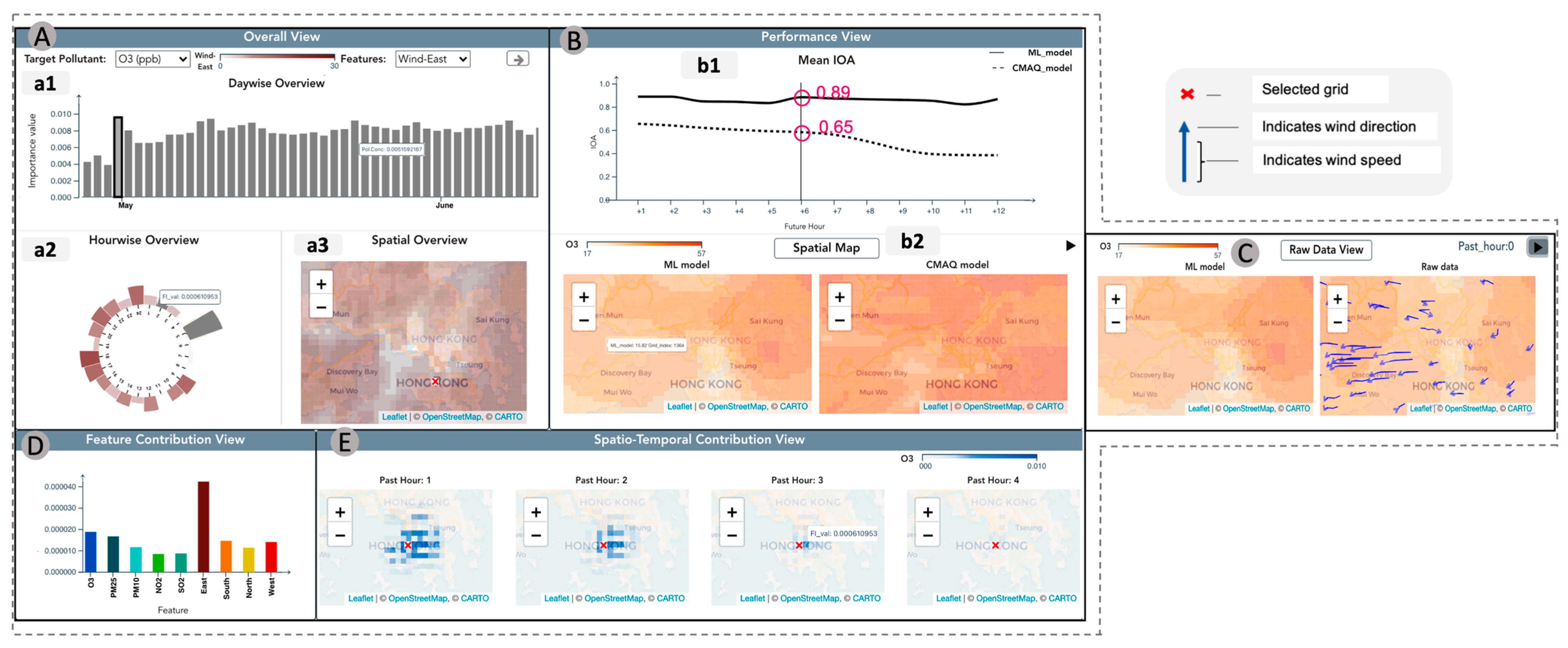
When predictive models extend across both space and time, visualisations must capture dimensions of continuity (time) and locality (space) continuously. The wider visualisation literature [23] emphasised the utility of linking outputs with maps, as well as highlighted evolving methods with a strong focus granularity and interpretability [24]. One category of studies in the corpus focuses on identifying “where” the prediction may occur, enabled by pattern localisation techniques to visualise predicated intensity through space, typically through heatmaps or grids. In the corpus, the AQX system [25], illustrated in Figure 2, employs a multi-view dashboard combining grid-based heatmaps, line plots, and animated wind-trajectory overlays to contextualise ConvLSTM forecasts. Here, spatial maps are not just output displays but mechanisms for model verification as well, helping experts reconcile machine learning feature contributions with physical domain knowledge. A similar study [26] used XLM-RoBERTa to predict crime probabilities, visualised in a heatmap augmented with pins for incident likelihoods, supporting intuitive hotspot detection. Both studies demonstrate contextual coupling, where spatial predictions directly inform or challenge domain reasoning. Li et al. [27] advanced this direction by dynamically modulating heatmap intensity according to fuzzy confidence scores, introducing uncertainty as an interpretive cue rather than background noise.
Another category focuses on the “when-where” interactions, building upon localisation by revealing how spatial patterns change over time. TA-Dash [28] dashboard achieves this through layer-based overlays, which merge predicted and observed congestion using coloured network lines on maps. To mediate visualisation complexity, they included a temporal slider and multi-layer comparison interface in the dashboard to transform dense predictive outputs into a narrative of periodic event impacts. This is further extended to map-based representations [29] by adding 3D bar charts and trajectory lines that visualise not just spatial density but the evolution of crime over time as well, enabling both macro and micro exploration of prediction outputs within the same interface. These designs enable temporal reasoning through visual motion (i.e., users perceive continuity, causality, and cycles directly), as discussed in the wider literature [30].
In contrast to map-based approaches, IL-VIS [31] reinterprets spatio-temporal visualisation through incremental dimensionality reduction. Their interface projects longitudinal data into evolving 2D trajectories that preserve temporal progression without explicit time axes. The technique captures temporal continuity implicitly rather than geographically, making it particularly valuable for multivariate time series [30]. The study presents a means for time-aware visual reasoning, where the objective is not to predict future states numerically but to reveal how data trajectories unfold, diverge, or converge across periods.
Table 5 summarises the studies. Collectively, these studies illustrate a shift from static cartography to decision-centred spatio-temporal analytics. As predictive systems evolve, studies indicate the emphasis moves from merely visualising where and when events may occur toward enabling users to probe why and how modelled outcomes unfold. The interfaces studied above are largely custom-built tools that thoughtfully overlay additional information, such as meta-data and traditional line charts that are not necessarily part of the predictive outputs, to add context to the user. In parallel, a common caveat that arises is that the additional context may distract users from the predictions. Studies in visual analytics [32] emphasise that overly fine-grained representations, while precise, can obscure broader patterns and increase cognitive load, whereas overly aggregated views risk masking localised anomalies and reducing actionability. These systems improve contextual exploration but introduce recurring interpretability and cognitive load trade-offs discussed throughout later sections.
Table 4. Summary of studies on visualising temporal predictive model results (Section Visualising Temporal Predictions).
StudyDomain/ContextPredictive Models UsedVisual Representation
Ali & Reddy [33]Medical—COVID-19 forecastingARIMA; LSTMTime-series line charts (PowerBI & Python)
Zhuo & Libed [17] Crime-Crime prediction & optimisationARIMA; exponential smoothing; Linear Trend; Random Walk; regressionLine graphs; forecast charts in Excel; decision-oriented visuals
Mallikarjunaiah et al. [18]Finance—Time-tradable assets/stocksLinear regression; Polynomial; SVR; tree regression; LSTMMulti-line feature plots; moving-average graphs
Singh & Anjum [19]Finance—Stock forecastingRegression; SVM; ARIMA; LSTMTime-series lines; candlestick charts
Kirtane et al. [20]Business—E-Commerce Logistics OptimisationDecision tree, Random Forest, KNN, SVM, ANN, Prophet forecastingForecast curves + PowerBI dashboards
Feng et al. [21]Traffic—UK traffic accident predictionProphet; LSTMPowerBI supply chain dashboard, including KPI tiles, geo-maps, delivery-status plots, customer-segment panels
Table 5. Summary of studies on visualising spatio-temporal predictive model results (Section Visualising Spatio-Temporal Predictions).
CategoryStudyDomain/ContextPredictive Models UsedVisual Representation
“Where” the prediction occursPalaniyappan et al. [25]Environmental—Air quality forecastingConvLSTMAQX multi-view dashboard; grid heatmaps; spatial map view; animated wind-trajectory overlays; temporal feature-contribution plots
Pongpaichet et al. [26]Crime monitoringXLM-RoBERTa classifier; meta-data extraction modelsCAMELON interactive map; heatmaps with pins; temporal trend charts; Criminometer index
Li et al. [27]Traffic—Congestion predictionLSTM-SPRVM + fuzzy evaluationDataV dashboard; congestion-level heatmaps; colour-coded road-status displays
“When-where” the prediction occursTempelmeier et al. [28]Traffic—Event-impact traffic forecastingEvent-impact models; structural dependency detectionTA-Dash interactive map; layer overlays; coloured congestion lines; temporal slider
Morshed et al. [29]Crime—Trajectory predictionLSTM trajectory modelKepler.js map; 3D bar charts; trajectory lines; time controls
TrajectoryMalepathirana et al. [31]AbstractIncremental dimensionality reduction (SONG-based)IL-VIS 2D projection trajectories; incremental snapshots; evolving visual timelines
Animated Interfaces for Predictions
In the wider visualisation literature, animated interfaces are a distinct visualisation method that are valued for their ability to make dynamic processes visible and engaging. By depicting movement directly, they allow users to perceive evolution, flow, and transformation in ways that static charts cannot easily convey [13,14,34]. In the reviewed literature with predictive contexts, such as weather systems, wildfire spread, or ocean dynamics, animation helps visualise change as it unfolds, offering an intuitively continuous representation of time. Castrejon et al. [35] animated both 2D and 3D visualisations to show changes in wildfire risk over the span of a decade. Their design communicates broad environmental dynamics, such as growth, contraction, and cyclical recurrence, creating a narrative impression of change. However, this storytelling strength comes with analytical trade-offs. When motion is continuous and unpaused, small fluctuations or local anomalies become difficult to detect. Without user control or stable reference frames, animation’s persuasive quality can mask quantitative detail, as highlighted in the wider literature [13,36].
On the other hand, SalienTime [37] identifies and highlights the most informative or perceptually significant moments within a changing dataset through animations. Their framework employed autoencoders and dynamic programming to identify the most informative time steps within large geospatial datasets. Instead of showing every moment, the system generates condensed sequences that highlight only meaningful transitions. This approach turned animation into a tool for temporal summarisation, balancing fluidity with interpretive clarity. By aligning playback to salient change, the visualisation reduces cognitive demand while preserving a sense of progression.
A complementary yet distinct use of animation appears in SeaViz [33], a web-based platform visualising real-time oceanographic data, such as wave patterns and current flows. Here, animation functions as a way of representing continuous motion that directly corresponds to the phenomenon being modelled. Animated vector paths and moving field lines communicate directionality and velocity intuitively, helping users perceive spatial continuity in fluid systems. However, the immersive quality introduces its own challenges. When every element is in motion, the user’s visual attention fragments, and precise comparison of magnitudes becomes difficult. SeaViz [33] mitigates this partly through interactive sliders and filtering controls, but its interpretability still depends heavily on user pacing and familiarity with the interface.
Overall, empirical evidence from the wider visualisation literature [38] has also shown that animations come at a cost. Consistent with broader findings on predictive visualisation, animation improves temporal continuity but may reduce precise analytical comparison. Consequently, the effectiveness of animation depends less on motion itself than on how temporal information is structured, summarised, and controlled.
Visualising Probabilistic Events
Traditional methods of visualising probability in predictive modelling typically use approaches, such as probability density functions (PDFs), cumulative distribution functions (CDFs), and histograms. Recent studies demonstrate a methodological shift from depicting probability as a static distribution toward representing it as a relational and dynamic phenomenon that evolves across events, systems, or causal structures, as evidenced in within the corpus and outside [39].
In the reviewed literature, Guo et al. [40] leveraged Time-Aware Recurrent Neural Networks (TRNNs) to predict probabilistic event sequences such as consumer behaviour in digital marketing. Sankey diagrams are then used to visualise these predictions, where node sizes and link widths are proportional to event probabilities, effectively showing the most likely paths and potential alternatives. The chart transforms numerical probability into narrative flow, allowing users to visually trace how likely outcomes diverge or converge across time. Supplementary circular glyphs are used to display the most probable event at the centre with less likely outcomes in outer rings, aiding in quick interpretation of uncertainty. Kayongo et al. [41] extended this logic from sequence to causality. Their ViSRE dashboard embeds probabilistic predictions within a Directed Acyclic Graph (DAG) linking cloud system metrics through causal dependencies. The dynamic node glyphs display both observed and predicted values, while colour and transparency suggest confidence. The structure enables engineers to see how probability propagates through the system (for example, how server load anomalies escalate into outage risk), thus extending visualisation beyond event prediction into interpretive causality.
Overall, these visualisations promote intuitive pattern tracing and comparative reasoning by enabling users to judge underlying trends in ambiguous data and predictions, aligning with other studies [42,43]. However, in both studies, narrative driven visualisations may also oversimplify probability by emphasising dominant flows and suppressing minor but meaningful alternatives [44]. Collectively, the value of these visualisations lies in their ability to make probability explorable and relational rather than statistical and distributive [43].
Interactivity to Control Information Being Visualised
As predictive systems grow in scale and complexity, interactivity has become essential for not only exploration but also for controlling the granularity of information displayed [45]. Modern visual analytics interfaces enable users to determine what is shown, how it is compared, and at what level of abstraction. A common approach used across the literature is selective filtering. Users can filter prediction results by algorithm, dataset, or feature subset, revealing how different model architectures influence outcomes. Such selective control reduces cognitive overload by allowing analysts to focus on meaningful contrasts rather than scanning entire result matrices [46,47].
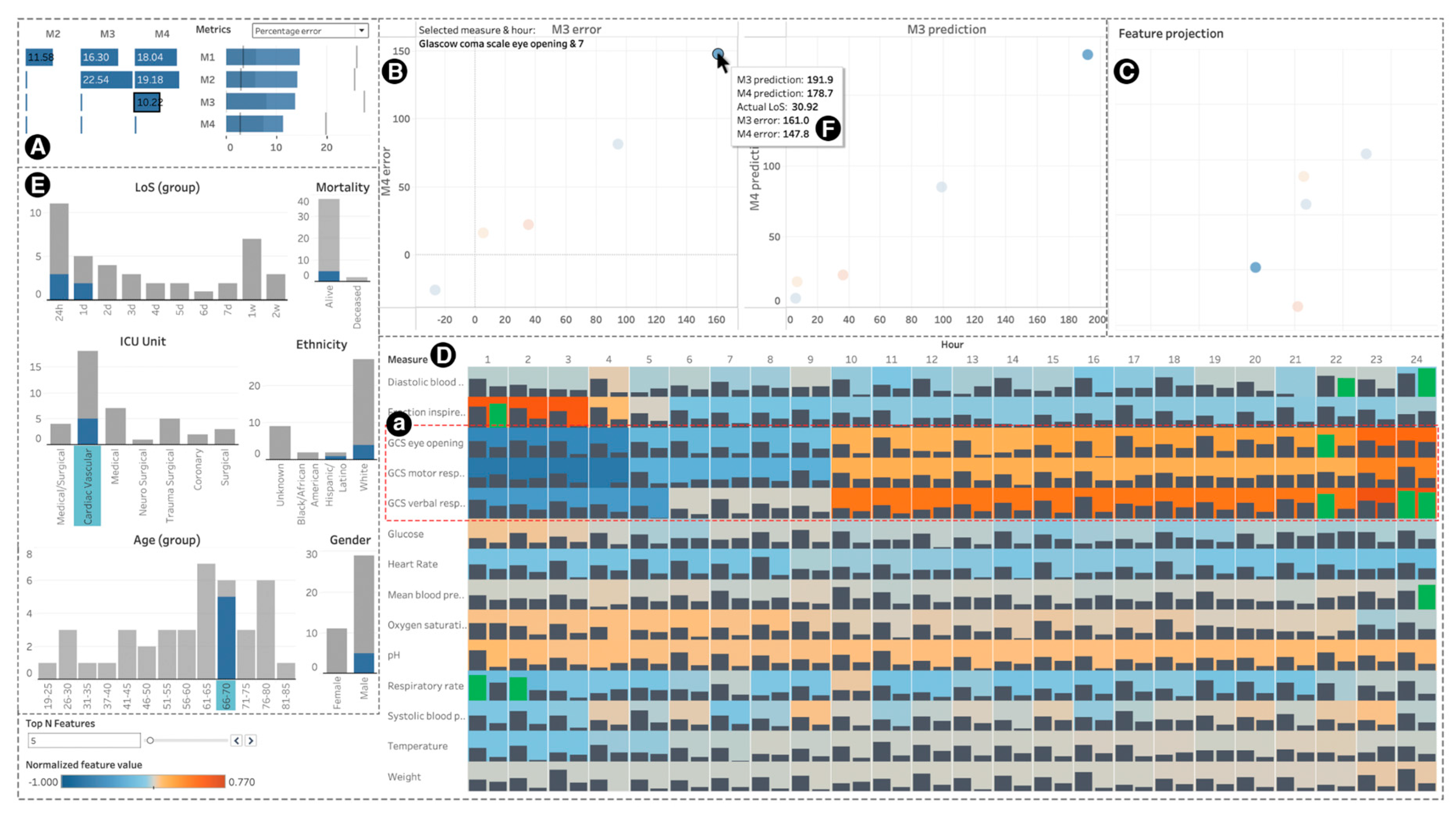
In our reviewed literature, Visualisation for Model Sensemaking and Selection (VMS) [48], illustrated in Figure 3, integrates performance, instance-level, and feature-level analysis into a single interactive dashboard. However, the sophisticated interface and visual outputs demand technical proficiency to efficiently navigate and comprehend results. On the other hand, the LieVis [49] system adopts a simplified approach to similar ends. LieVis allows users to compare models, such as BERT, LSTM, and Random Forest, through accessible visual horizontal bar charts and modular feature displays. Dropdown menus serve as the primary interactivity control, making LieVis [49] approachable for non-experts who need condensed high-level insights. While such systems are designed to simplify and promote accessibility, low visual granularity restricts deeper diagnostic analysis of model behaviour.
Interactivity controls also extend control mechanics, beyond filtering, to the manipulation of model inputs and environmental parameters. Culligan et al. [50] and Diana et al. [51] presented educational dashboards with purposefully limited interactions. Their slider- and filter-based controls permit teachers to focus on specific learners or assignments rather than entire cohorts, turning prediction into actionable, personalised views. These interfaces visualise model outputs as a part of dynamic feedback loops, thus turning predictions into experimentation. For example, Visualisation Engine and Analyzer for PreSS# (VEAP) [50] outputs a distinctive “traffic light” interface. It uses colour-coded indicators (green, amber, red) to provide an immediate visual shorthand for success likelihood, abstracting underlying complex probabilities into intuitive categories and thus, risk confusing users.
Similarly, in clinical contexts, medical dashboards [52] let practitioners alter patient parameters (e.g., vital signs, lab results) to simulate hypothetical treatments, while financial dashboards [53] enable simulation for long-term investment strategies, visualising cash flow forecasts that update interactively as variables, such as capital, time horizon, or cost change. In both visualisations, interactivity supports decision-making, in which users can visually test alternative scenarios before acting. The exploration of simulations promises potential in enhancing trust and understanding between technical and non-technical user groups, as explored in wider HCI research [54,55].
Other studies [20,53] introduce interactive simulation and filter-driven exploration, enabling users to adjust parameters, zoom into intervals, and observe recalculated outcomes in real time. These systems transform visualisation from mere representations into analytical interfaces. Users no longer only interpret the future and instead participate in constructing it. This interactivity supports sensemaking through manipulation [56,57], a process known to enhance comprehension of temporal relationships and uncertainty exploration.
Table 6 summarises the reviewed studies. Overall, the reviewed literature demonstrates that well-designed interactivity empowers users to manage complexity by transferring cognitive responsibility from the system to the user. It serves as a bridge between model output and human understanding. However, as pointed out in broader visualisation research, while interactive elements in these studies are poised to enhance comprehension, users are likely to confuse correlation with manipulative causation [58,59]. Dynamic exploration inevitably introduces potential comprehension bias, such as designs with real-time responsiveness, may cause misinterpretation of sensitivity and thus, a warped perception of uncertainty [54]. The emerging consensus across studies suggests that the most effective predictive visualisations aim to achieve a balance between user controls and constraints, allowing users to filter and manipulate information without losing analytical coherence. Furthermore, Table 7 and Table 8, which summarise subsequent sections, are also presented below for ease of cross-table comparison.

3.1.2. Visualising Predictive Model Mechanisms

A persistent challenge in predictive visualisation is representing models to translate their complexity to promote human reasoning. Machine learning techniques have been implemented in domains where the primary goal of the model is to predict unknown outcomes based on known data. In many of these cases, visually representing results of the prediction models is as important as understanding the underlying mechanisms behind a model’s decisions [71], particularly in human-centric domains, such as healthcare and business. This is important because users of such visualisations, unlike experts in their respective fields, may not be familiar with the data science techniques underlying the models. Revealing how the models themselves operate helps bridge the gap between complex model mechanics and the practical need for result interpretation.
Visualising Model Structures
Across the corpus, one theme is how tree-based predictive models visualise splits decisions, allowing users to identify borderline cases, and to judge threshold stability. Traditionally, decision trees are visualised in 2D spaces, with node-link diagrams presented in hierarchical layouts [72]. More recent works highlight this as the standard baseline, emphasising the tree’s appeal for interpretability in practice [73,74].
On the other hand, in our corpus, 3D approaches are utilised in the case of genomics [60] and diabetes [61] predictions, enabling users to trace specific branches to visually explore where the model sits in feature space. In both cases, healthcare professionals benefit from enhanced interpretability. When constrained with a depth-limited focus, filtering, and small multiples (e.g., per-child 3D histograms), 3D approaches can sharpen local inspection without collapsing the overview. However, without such constraints, 3D introduces occlusion and cognitive load, risking misplaced confidence and missed metrics-concerns, as explicitly raised by Beauxis-Aussalet & Hardman [75].
Shifted Paired Coordinates for Decision Trees (SPC-DT) [62] introduced a complementary 2D alternative. Their approach maps each branch to paired attribute axes in a 2D Cartesian space. By showing point density near split thresholds and revealing attribute relationships along paths, SPC-DT expresses borderline regions and over-/under-generalisation that standard tree diagrams tend to hide. In contrast, where 3D aids local spatial sensemaking, SPC-DT emphasises threshold reasoning and case tracing with lower visual overhead. It is designed to reveal threshold behaviour and borderline regions that are not visible in standard node-link tree diagrams. Thus, medical experts can identify borderline cases and refine decision boundaries to improve patient diagnostic evaluation. This approach aligns with Doshi-Velez & Kim’s [76] call for application-grounded interpretability, where visual reasoning supports expert judgement while maintaining cognitive accessibility. Li et al. [63] extended this principle through nomogram-based representations that translate regression outputs into clinically interpretable risk charts, bridging statistical reasoning with decision support. However, such simplifications risk producing an illusion of transparency when non-linear dependencies are hidden [77]. Table 7 summarises the reviewed literature above.
Visualising Black-Box Models
When the predictive model structure cannot be explicitly shown, the underlying model behaviour and logic can be abstracted in visualisation. RuleMatrix [64] introduces an interpretability tool that transforms black-box models into structured, rule-based explanations. It extracts IF–THEN rules that approximate how the model arrives at decisions, visually mapping them in a matrix format. This enables users to explore feature contributions and decision-making logic, providing a level of interpretability absent in traditional accuracy-based visualisations [78]. Complementing their approach, Bafna et al. [65] provided text-based summaries of model outputs within an interactive analytics dashboard, offering human-readable interpretations of predictive results even when the underlying model remains opaque. These designs align with cognitive models of causal reasoning, but their post hoc nature raises concerns highlighted by broader work, as visual coherence does not always equal functional accuracy [78].
Other innovations to improve deep learning methods’ interpretability through black-box abstraction include Fisher Information Networks [66] (FINs). Their work illustrates how FINs create a low-dimensional representation (latent space) to map patients’ mammograms classified using CNNs according to their similarities, enabling a ‘patient-like-me’ analysis. FIN visualisations provide clear separations between patient groups, helping to differentiate between malignant and benign cases. The visualisations facilitate understanding of how the CNN model groups patients with similar mammographic features. As the complexity of machine learning models increases, novel visualisation approaches help to enhance understanding and build trust among multiple parties, including domain experts, such as healthcare professionals, as well as non-experts, such as patients. As explained above, abstraction techniques can in fact invert their purpose, replacing one black box with another. Effective implementations therefore pair visualisations with interpretive guidelines that are designed specifically with the user’s level of domain knowledge and technical ability in mind.
Moreover, some studies attempt to transform abstract model parameters into concrete decision cues, allowing users to reason about sensitivity and impact. Dong and Kaundal [67] demonstrate cues through a business-oriented system for Fast-Moving Consumer Goods (FMCG) promotion modelling, integrating neural networks with Bayesian optimisation. Their 3D bubble plots plot parameter weight (bubble size) and effect direction (colour), visualising how discounts and cross-product promotions shaped profitability. While 3D bubble plots have been very commonly used, their contribution lies in improving the communicative clarity by abstracting the parameter weight and thus enhancing inference to non-technical users. In this case, business users can see which specific variables drive outcomes without grasping neural computation. This principle is further extended into the molecular domain [68], where in deepHPI [68], node-link graphs visualise protein interactions derived from deep models. These interfaces allow scientists to cross-reference model predictions with known biological pathways. Here, abstracting the models supports exploratory analysis by domain experts who can trace relationships through visual connections. Both studies suggest a wider trend toward visualising learned model features back to domain concepts. Despite such innovations, these mappings also risk creating an illusion of causality, as weight magnitude or visual prominence may not equate to true predictive influence.
While Dong and Kaundal [67] visualised what drives predictions, other studies instead visualise how predictions emerge. NeuralVis [69] maps neural architectures into interactive 2D and 3D networks, allowing engineers to navigate the “flow” of activations across layers. Garcia et al. [70] built on this transparency ideal for Recurrent Neural Networks (RNNs) by using t-distributed stochastic neighbour embedding (t-SNE) to plot hidden states as evolving trajectories over time. This type of visualisation is valuable for tasks like sentiment analysis, where understanding how an RNN builds its prediction step by step can significantly enhance the explainability and trustworthiness of the model. Both approaches externalise the model’s internal logic, turning abstract numerical processes into visual motion. Inevitably, limitations of these visualisations resonate with concerns around the misrepresentations of spatial relationships and information loss, resulting in visually persuasive albeit distorted insights [55,79]. Additionally, the high information density (thousands of nodes and edges) introduces cognitive strain, a recurring theme in the literature. Table 8 summarises these black-box model visualisations for ease of comparison.

3.2. RQ2: How Are Model Performance and Predictive Uncertainty Represented Visually, and How Do These Representations Shape User Interpretation and Validation?

Model performance visualisation plays a crucial role in assessing the effectiveness of predictive models, particularly in contexts where interpretability is key to user validation. This section explores the various techniques used to represent model performance, comparing approaches to visualising inter-model (Section 3.2.1) and intra-model (Section 3.2.2) metrics, and highlights how different visualisations enhance or hinder user comprehension. Additionally, we consider the impact of uncertainty representation and the role of visualisation in influencing trust and decision-making (Section 3.2.3).

3.2.1. Visualising Inter-Model Performance Metrics

Visualising model performance across multiple competing ones remains central to user validation and model selection. Traditional model performance evaluations [80] tend to rely on rather scalar metrics, such as AUC (Area Under the Curve), ROC (Receiver Operating Characteristic), and F1 score. In our corpus, line graphs remain the most common format for communicating these results, such as in Wang et al. [81] and Han et al. [82], where accuracy and loss trajectories across epochs effectively highlight convergence and model stability. While these visualisations focus on ranking models and simplifying decision making for non-technical audiences, they abstract multi-dimensional behaviour into single lines, thus masking deviations in inter-model performance across more granular variables, such as subgroups or time windows. A notable improvement of visualising model performance dynamically is in DiVA [83], which integrates F1 score trend curves across iterations, allowing users to inspect how performance metrics fluctuate or stabilise over successive iterations across models. While this adds a longitudinal layer, effective for iterative model comparison, they also require users to possess a high level of interpretive literacy across both their domains and statistics.
Beyond line graphs, other comparative visualisations, such as bar charts [18] and violin plots [82], are frequently used to compare model performance and aid inference. Violin plots, in particular, help chart variance and distributional shape, which are helpful in diagnosing instability and overfitting. He and Shaposhnik [84] highlight that multiple models often achieve near-identical accuracy, thus making conflicting predictions across subregions of the feature space. These differences are not captured in comparative visualisation, as established by the Rashomon Set [85]. In addressing these challenges, He and Shaposhnik [84] proposed a set of contemporary techniques to better represent model trade-offs and inter-model similarities. Visual Model Landscapes (VMLs) use scatterplots and dendrograms to position models in a reduced dimensional space, offering insights into how models behave relative to one another. Visual Confusion Matrices (VCMs) integrate density plots into traditional confusion matrices, allowing users to identify areas of agreement and disagreement between models more effectively. Lastly, Visual Comparative Matrices (VCXs) use heatmaps to contrast models across metrics, such as true positive rates, revealing performance variations across different data clusters. Collectively, these interfaces highlight a growing emphasis on performance visualisation, beyond champion-model selection, toward a more interpretive approach to understanding how models differ [86,87].
Interestingly, certain studies in the cohort [16,88] report performance metrics solely as numerical tables, without any accompanying visualisations. While tables offer precise numeric values and serve well for exact lookup, they may inhibit pattern recognition or trend spotting. This is especially the case for audiences less familiar with statistical metrics. Empirical work shows that while comprehension accuracy may be comparable between tables and graphs, analysis speed is slower when using tables alone [8,89].

3.2.2. Visualising Intra-Model Performance Metrics

Intra-model performance visualisation focuses on diagnosing how a single predictive model performs across its internal structure (e.g., how it classifies different classes or adapts to feature-space variability). Confusion matrices are one of the most commonly used representations, which are often enhanced by heatmaps to indicate relative accuracy or error intensities [81,90]. Varying colour intensities help users rapidly spot regions of high accuracy or significant misclassification. However, this visual form introduces perceptual and cognitive challenges, especially when the dataset is high-dimensional, imbalanced, or when misclassification patterns are subtle, as highlighted in the wider visualisation literature [75,91].
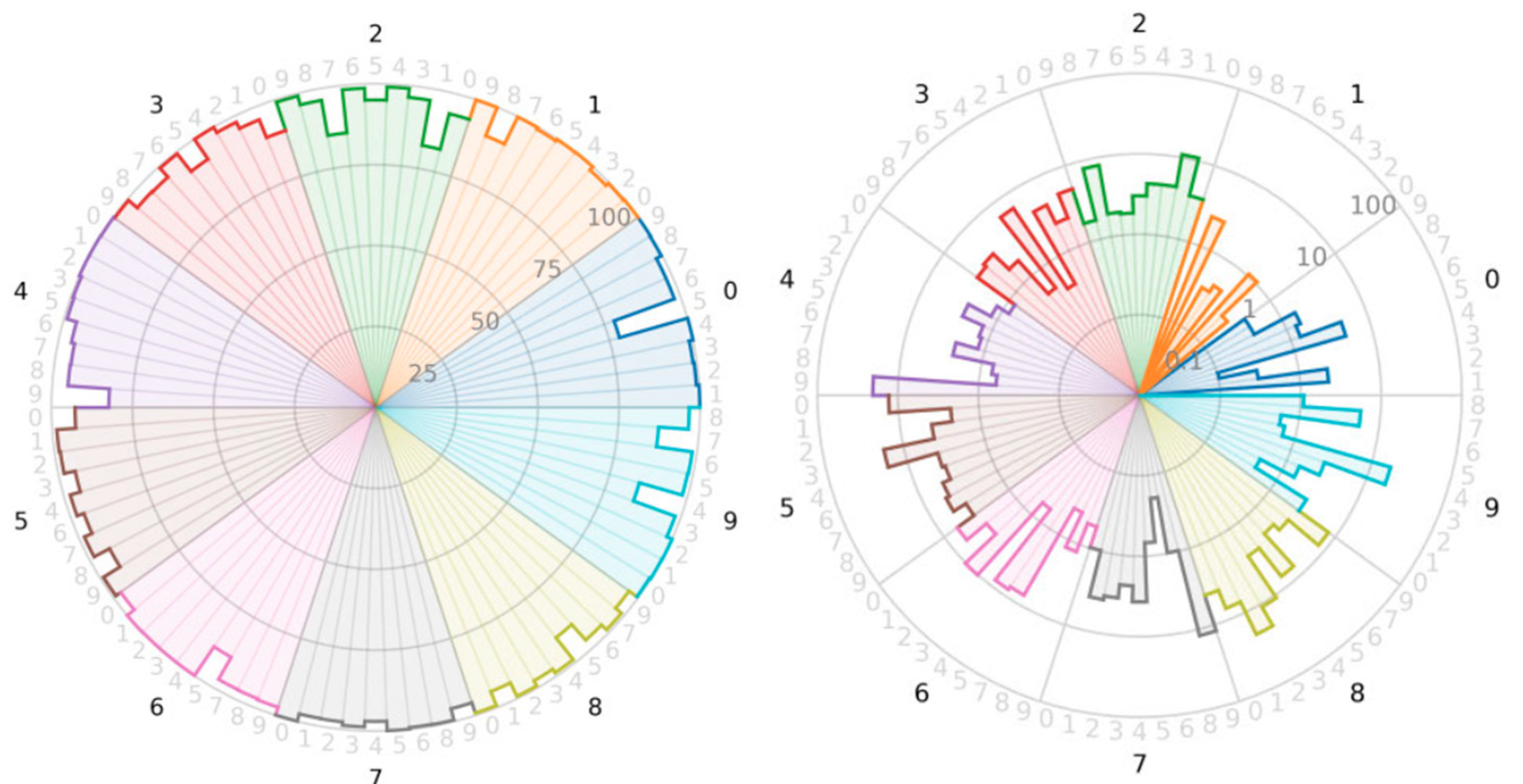
In response to the interpretive and perceptual challenges inherent in colour-encoded confusion matrices, contemporary visualisation techniques in the corpus, such as Luque et al.’s [92] confusion star and confusion gear (Figure 4), propose geometric alternatives that enhance clarity without relying on colour intensity. Both visualisations reconceptualise the confusion matrix as a metric-linked geometric structure, transforming numerical values into proportional shapes that express performance through area rather than hue. Specifically, the confusion star highlights misclassification errors, where larger enclosed areas indicate poorer performance, while the confusion gear maps larger areas to higher accuracy, visually rewarding correct classifications. The additional dimensions leveraging spatial mapping allow users to perceive relative performance through visual magnitude instead of computational interpretation, a critical shift for improving comprehension in complex, multi-class models. These visualisations are particularly beneficial for multi-class classification tasks, as they improve readability and help users quickly identify performance disparities across different classes. Furthermore, the area enclosed by these shapes is directly proportional to standard classification metrics, such as error rate and accuracy, making them useful for tracking model improvements over time. By shifting from colour-dependent heatmaps to shape-based visual encoding, these methods provide a more interpretable and accessible means of understanding classification performance, particularly in contexts where traditional confusion matrices become difficult to decipher due to class imbalance or high dimensionality, as highlighted in broader research [75,87,91]. While Luque et al. [92] did not focus on a real-world application, their visualisation techniques have the potential to be highly beneficial in areas such as medical diagnostics, fraud detection, and complex image classification tasks, where clear and intuitive representation of classification performance is critical.

3.2.3. Visualising Feature Importance

Feature importance visualisation resides within the broader domain of interpretable machine learning where attribute abstraction has been identified as a critical mechanism [76,77]. A significant number of studies in the corpus explore intra-model explainability by focusing on visualising feature importance, which helps users understand which variables influence model predictions the most, fostering transparency and trust in decision-making. Traditional representations including radar charts [93] and bar graphs [94], which are particularly effective in low-dimensional models, where users can clearly interpret how individual features drive predictions, as pointed out in the literature [95,96]. However, they rely on linear comparability (i.e., they assume features contribute additively and consistently across models). As He et al. [48] noted, the simplicity can lead to stability illusions, where identical bars imply equal influence even when underlying model mechanics differ, resonating with broader work highlighted previously [85]. Wang et al.’s [97] approach attempted to partially resolve this by introducing box-plot comparisons of feature distributions across ensemble models, exposing variance rather than absolute dominance. Despite this, as model architectures become increasingly sophisticated, and sometimes decentralised, such as in federated learning [93], visualising feature importance through static visualisations struggles to effectively communicate accurate representations. For instance, the same variable may appear to be weighted equally despite a contextual contribution shift [98].
Shapley-based feature-importance visualisations extend this line of work and are being increasingly used, particularly in high-stakes domains like medicine where understanding model decisions is critical, to make individual model predictions more interpretable and clinically meaningful [76,99]. Chun et al. [100] demonstrated this through SHAP-based visualisations of brain network connectivity in classifying major depressive disorder, where feature-level attributions expose clinically relevant neural pathways. Their work illustrates SHAP’s strength in mapping abstract model parameters onto domain concepts, enabling human validation of algorithmic logic [101,102]. In conjunction with SHAP summary plots, SHAP waterfall plots [103] offer a complementary view by showing how individual features cumulatively influence a single prediction, though they can also be overlaid to anatomical diagrams [100]. The waterfall structure uniquely conveys the directional and cumulative effect of each variable, effectively illustrating how individual clinical factors shift prediction probability from an expected baseline to the final output. Stepwise reasoning closely mirrors clinical diagnostic logic, allowing practitioners to validate machine learning predictions and decisions against domain intuition [104]. This enhances transparency by visually breaking down which clinical variables most contribute to an outcome, vastly improving explainability of models to patients as well. However, Lu et al. [103] also argued that plots can oversimplify non-linear or interaction effects, highlighting a need to balance sensemaking and technical transparency as well.
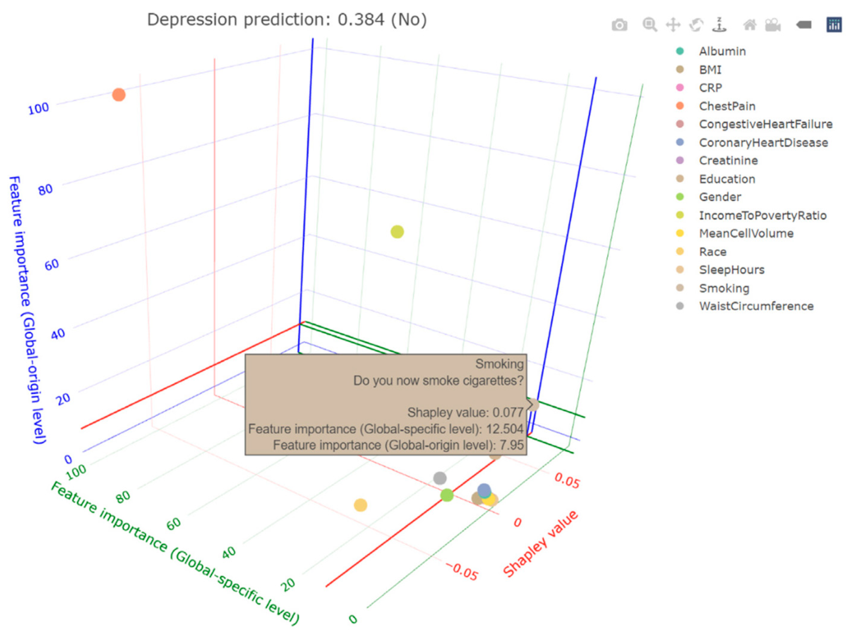
While waterfall plots primarily enhance local interpretability at the individual prediction level, later studies have expanded this approach to achieve spatial and multi-scale explainability. Radiomic Feature Maps [105] advanced interpretability in MRI scans, using SHAP values to explain how texture and shape features contribute to model predictions. By aligning statistical attribution with anatomical regions, this approach grounds model reasoning by presenting information more intuitively and thus bridging the gap between numeric abstraction and clinical validation. Building on this, Kopitar et al. [106] proposed a hybrid feature-importance visualisation approach that combines global and local Shapley explanations, contrasting population-level (global-origin) and individual case-specific (global-specific) feature contributions, as illustrated in Figure 5. The dual-layer approach is particularly beneficial in mental health diagnostics, where understanding feature influence at both scales is necessary for personalised treatment planning. Implementation of interactivity elements, such as controls for variables [83], further help users understand features interacting across spatial contexts, such as agriculture. Despite these advancements, challenges remain. Fritz et al. [107] highlighted the cognitive burden of SHAP-based explanations, noting that clinicians may struggle with their probabilistic nature, especially when they expect feature contributions to sum to 100% rather than being patient-specific weighted values [76,95,96].

3.2.4. Visualising Prediction Uncertainty

Across predictive visualisation research, a recurring theme is the challenge of representing probabilistic uncertainty in forms that users can both interpret and act upon, especially in the case of non-technical users [39,56,57,108].
Representing Uncertainty as Visual Elements
Chart-based risk displays are represented in various ways, with much of the literature exploring how comprehension of uncertainty is shaped by various factors beyond visual design. In postpartum depression prediction tools [109], gradient number line charts and segmented displays improved comprehension over raw numeric scores but also influenced perceived control and willingness to act. Similarly, PROACT [110] presents a temporal area chart designed to help prostate cancer patients explore ten-year survival probabilities. Although the interface effectively conveyed probabilistic ranges and time-based outcomes, users’ post-diagnostic anxiety constrained comprehension, suggesting that interface did not overcome emotional or cognitive overload. Gupta and Basit [111] extend this by integrating comparative patient markers, showing how contextual elements strengthen comprehension and agency but risk normalising severe outcomes when poorly scaled. Such studies demonstrate how visualising uncertainty drives comprehension of model outputs. Although the literature points out that static visualisations offer clear advantages over purely numerical or tabular data, their effectiveness is shaped by how the uncertainty is framed within the display and by users’ cognitive and emotional contexts.
Figure 5. Hybrid feature-importance visualisation (adapted from Kopitar et al. [112]).
Analytics 05 00024 g005
In addition, colour remains one of the most pervasive channels for communicating predictive uncertainty, given its strong perceptual salience and cultural associations with risk and safety, aligned with the wider literature [39,56]. Across the corpus, colour serves as a rapid, intuitive cue for visualising confidence levels, enabling users to interpret probabilistic information without processing numerical values. This is especially useful within healthcare settings. Tsai et al. [52] utilised visual representation of risks (e.g., colour-coded bed numbers and risk circles), which allow for rapid identification of high-risk patients. Similarly, Fritz et al. [107] found that the same colour metaphors, when integrated into surgical risk dashboards, enhanced clinicians’ ability to contextualise probabilities against traditional interfaces. Both studies suggest that colour acts as a behavioural signal rather than a mere statistical output.
Complementary work in patient-facing interfaces explores how colour influences engagement and self-efficacy. Desai et al. [109,112] compared metaphor-based designs, such as traffic lights and gradient number lines, for diabetes and postpartum depression prediction tools, showing that colour-based feedback improved user recall and, perhaps more importantly, motivation to act, particularly among non-expert audiences. Gupta and Basit [111] further supported this, showing that colour-encoded forecasts increased user trust and perceived personalisation compared with text-only designs. Beyond medical contexts, colour is also implemented in 3D space, such as in automated vehicle interfaces [113], which use colour gradients to visualise the uncertainty of predicted trajectories. Their results show that hue-based cues most effectively conveyed uncertainty and improved situation awareness, but also elevated user anxiety levels when risks were visually highlighted, as also seen in Blair et al.’s [108] work. The study demonstrates that while colour strengthens perception of uncertainty, it may distort perceived safety and trust if over-emphasised. Collectively, these findings indicate that colour plays a pivotal role in evoking emotional resonance, thus directly impacting how predictive risk is internalised and acted upon, aligning with more empirical work [56,108].
Interactivity to Explore Uncertainty
To improve the interpretability of predictive uncertainty, contemporary research has increasingly employed interactive, user-centred methods that let users explore confidence, variability, and outcome sensitivity in real time through interactive interfaces [57]. First, diagnostic visualisations, including quantile dot plots [114] and ScatterUQ [115], allow users to explore uncertainty directly through discrete points rather than abstract percentages and adjustable confidence filters. These visualisations help users to perceive probabilities more intuitively and thus enhancing interpretability of the models. Second, more prescriptive visualisation position interactivity within decision-support contexts. Dynamic financial simulations [53] enable users to visualise outcome sensitivity in real time, improving comprehension while simultaneously making decision confidence more hesitant. Similarly, ensemble-based interfaces [116] improved awareness of model variability, while interestingly reducing user adherence to automated recommendations, an issue raised in wider work [39,117]. Overall, these results suggest that interactivity is not a universal remedy for uncertainty exploration through visualisation, but that they must be contextually adapted to account for both user expertise and task urgency [56]. The corpus suggests that greater transparency in uncertainty representation encourages critical thinking but may also lead to decision-making hesitation—a critical factor that needs to be considered carefully to optimise utility.

3.3. RQ3: What Evaluation Approaches and Metrics Have Been Used to Assess the Effectiveness of Visualisations of Machine Learning Outputs?

This section addresses how predictive visualisations have been evaluated beyond measuring technical performance, shifting the focus toward how users interpret, trust, and act upon model outputs. Understanding the communicative effectiveness of these tools requires investigating not only what is shown, but how users engage with and respond to the visual information provided. The section is organised into three core areas. Section 3.3.1 examines the mediums and methods employed in evaluation, including interviews, surveys, user studies, and co-design, highlighting the range of approaches used to capture user feedback. Section 3.3.2 explores the metrics and criteria by which effectiveness is assessed, such as usability, interpretability, decision support, and trust, and how these are operationalised through both qualitative and quantitative means. Section 3.3.3 considers the role of participants, with attention to the importance of diversity in expertise, demographics, and context, as well as how participant inclusion (or absence) influences the relevance and validity of evaluation findings. Together, these themes offer a comprehensive view of how predictive visualisations are tested for communicative success and practical utility, reflecting a growing shift toward user-centred evaluation in model interpretation.

3.3.1. Evaluation Approaches

Interviews
Interviews were one of the most common qualitative evaluation methods found in the systematic literature review. Several studies [25,37,93] employed semi-structured interviews with domain experts to understand how users interacted with predictive visualisation systems. These interviews often involved participants exploring the system and reflecting on its usefulness, particularly in helping them verify or apply their domain knowledge to the model’s outputs. This format allowed for nuanced insight into usability and interpretability from the perspective of professionals who may not necessarily have a machine learning (ML) background. Interviews were also used to evaluate system utility in real-world contexts. Culligan et al. [50] interviewed schoolteachers to assess how a student success dashboard influenced classroom decision-making. These one-on-one sessions highlighted practical considerations and informed interface refinement. Across studies, interviews proved particularly effective in surfacing subtle concerns around system design and communication, especially when participants had varying levels of technical expertise. Despite this, Kaur et al. [59] raised concerns about a false sense of interpretability, as users expressed confidence in comprehension despite not aligning with the model’s intended inference. The literature also broadly aligns with Doshi-Velez & Kim [76], who point out the consequences of assessing subjective clarity over measuring application-grounded decision improvement.
Focus Groups
In addition to individual interviews, several studies utilise focus groups to capture group-based reflections. Focus groups allow researchers to gather verbal feedback from multiple users simultaneously, which can prompt deeper discussion and help clarify shared patterns of understanding or confusion. Shared reasoning is crucial, as noted by Meyer & Dykes [118], who highlight the need for collective critical reasoning for effective visualisation evaluation. For instance, focus groups were used to evaluate visualisations intended for diabetes management [112], with populations characterised by low literacy and numeracy skills. The group setting proved valuable for uncovering design shortcomings and guiding modifications to improve accessibility and comprehension. Similarly, Fritz et al. [107] combined focus groups with cognitive interviews to expand on mental processes and think-aloud protocols to collect layered user feedback. This triangulated approach helped ensure that both collective and individual perspectives were considered in assessing system effectiveness. Both studies show that focus groups can reveal accessibility and interpretability gaps that might be invisible in isolated testing which are particularly useful when visual literacy is uneven across participants. This also aligns with the observation from the existing literature [59] that interpretability tools are often understood collaboratively rather than individually, reinforcing the importance of distributed comprehension in evaluating predictive systems.
Open-Ended Surveys
While often quantitative in nature, surveys frequently included open-text questions that elicited qualitative feedback. These hybrid instruments are well-suited for large-scale evaluations and offer scalability without losing the richness of textual responses. Rony et al. [119] used open-ended survey items to gather feedback on the clarity and helpfulness of textual explanations, enabling researchers to trace misunderstandings of confidence intervals or uncertainty cues that quantitative scores alone could not expose. Kay et al. [114] embedded interpretative tasks within surveys, and participants had to decide whether they had time to get coffee based on a visualisation of bus arrival times, indirectly assessing how well the visual communicated urgency and timing. This approach allowed researchers to measure understanding without presuming it, as highlighted by work on evaluating uncertainty perception [120]. Surveys also allow researchers to reach a broad participant base. Online surveys [121,122] were used to gather feedback from over 1000 and 2000 participants, offering insights into the generalisability of visualisation approaches. These studies highlight that surveys, when designed with mixed formats, can efficiently gather diverse user perspectives across broad demographics, a trend particularly common in public-facing visualisations.
Controlled User Studies
Many studies incorporated task-based evaluations in controlled settings, often pairing them with interviews or surveys to enable systematic comparison. Tasks typically required participants to perform specific actions using visualisations, such as identifying important features, comparing models, or interpreting predictions. These tasks were followed by probing interviews or questionnaires to gather deeper insights into user experiences. Zhang et al. [69] asked participants to complete a set of tasks before being interviewed, allowing researchers to connect performance outcomes with user perceptions. Similarly, combining task-based studies [40] with a structured survey allowed researchers to probe how users engaged with the visualisation. Task-based evaluations are particularly valuable when researchers aim to measure comprehension, usability, and interpretive consistency across visual formats [123,124]. Other studies [48,93] conducted direct observational studies that helped identify usability issues, such as moments when users hesitate, misclick, or misinterpret model predictions and confidence. Chen et al. [37] achieved the same by adopting screen recordings to capture such implicit user behaviour that users may not have articulated in interviews. The corpus also includes studies that employed randomised experiments. This approach may involve presenting various configurations of an interface to participants to determine which one performs the best [119]. Experiments were also sometimes carried out online [116]. As with surveys, they can also be utilised in large-scale contexts [122].
Iterative Feedback and Co-Design Approaches
Several studies employed iterative evaluation processes, such as co-design sessions and follow-up group discussions, to support the continuous refinement of predictive visualisation tools. These approaches often spanned different stages of development, from early concept generation to post-deployment reflection. Co-design sessions were used with expert users to collaboratively shape and improve their systems [93,125]. These sessions were followed by group-based evaluations, which offered feedback on both usability and communication effectiveness. This participatory design loop helps embed domain knowledge directly into interfaces, addressing the gap between model intent and human interpretability noted in the broader co-design papers [126].
Qu et al. [60] consulted domain experts at earlier stages in the process to shape their understanding of genomic visualisation requirements across different devices (e.g., tablets, AR/VR). However, without follow-up evaluation of the final system, the practical impact of those insights remained uncertain, aligning with Peters et al. [127], who argued for continuous and interactive evaluation. Similarly, pilot testing [128] in online classroom environments highlighted subtle issues, such as cognitive fatigue and interface clutter, that short, lab-based evaluations often miss. Guo et al. [40] also highlighted the importance of evaluation at the latter stages of a project to further understand the rationale behind participants initial results. Despite being a time-intensive process, studies in the corpus indicate that iterative co-design yields the most communicatively effective visualisations when evaluation is designed to be an ongoing, collaborative negotiation [126].

3.3.2. Metrics and Evaluation Criteria

Evaluating the effectiveness of predictive visualisations hinges largely on how well users understand and interact with the information presented. Across the reviewed studies, comprehensibility, usability, decision support, trust, and contextual suitability emerged as central dimensions, evaluated through a mix of subjective scales, task-based metrics, and qualitative feedback.
Comprehensibility and Cognitive Load
Comprehensibility is arguably the most fundamental communication goal of predictive visualisations. Likert-scale questions [119] were used to explore how participants rated their understanding of visualisations and how many insights they could derive from each design. Explicitly counting the number of insights provided a practical metric to compare different configurations, even if it did not always account for the depth or quality of interpretation. Similarly, Kay et al. [114] embedded decision-making tasks within a visualisation (e.g., estimating time to grab coffee before a bus arrived), allowing user comprehension to be indirectly measured through behaviour. These task-based proxies are especially useful when participants may not be able to self-assess understanding reliably. Interestingly, self-reported metrics can reflect the perceived ease of information rather than genuine comprehension [129].
Cognitive load, closely related to interpretability, was assessed using more structured instruments like NASA-TLX [113]. The scale, which includes questions such as “How much mental and perceptual activity was required?”, enabled a more granular understanding of the mental effort required by users to interpret predictive visuals. In these cases, interpretability was not assumed from user success alone but inferred through mental demand. Some studies [125] extended this by examining whether adding conventional trend formats (e.g., line or bar graphs) improved user comprehension. This aligns with findings by Binns et al. [130], who showed that clearer or more familiar explanation formats can increase user satisfaction even when they do not significantly improve the soundness of users’ reasoning. These design variations were compared through user feedback, highlighting that visual conventions still play a critical role in facilitating understanding even within advanced predictive interfaces. Taken together, these studies show that no single measure (i.e., user ratings, task accuracy, or cognitive load) can fully capture comprehension. Using several methods together makes it easier to tell the difference between surface-level ease and genuine understanding.
Usability and Efficiency
Usability was frequently measured through both objective and subjective means. Task completion time [26,119] was a common metric where participants’ speed in completing visual tasks (e.g., ranking predictions or comparing outputs) was used to gauge efficiency and intuitiveness. However, as noted by some researchers [124,131], shorter times do not necessarily equate to better comprehension. In some cases, longer interaction may reflect deeper engagement rather than poor usability. Subjectively, the System Usability Scale (SUS) was used [83,132] to assess perceived usability through Likert questionnaires. While SUS is a popular tool for general usability benchmarking, it does not directly assess how effectively a visualisation communicates predictive logic or builds user confidence in the results. Its subjective nature also means that prior exposure to similar systems may influence ratings. The visualisation evaluation literature [124] cautions that subjective usability scores often confuse aesthetics or familiarity of an interface with analytical effectiveness, leading to distorted feedback. Studies also explored adjacent constructs like utility, or the perceived usefulness of a visualisation. As such, these metrics were often assessed qualitatively [25,41]. These studies discuss utility as part of interview feedback, yet few studies offered a quantifiable metric for usefulness as distinct from usability. Across the corpus, task-time measures and subjective ratings emerge as limited indicators of deeper comprehension, becoming more informative only when combined with complementary measures [101].
Decision Support
Some studies directly evaluated how predictive visualisations support decision-making, but these varied widely in how they interpreted “support.” In applied settings, decision support was often assessed through the appropriateness or confidence of users’ choices. Culligan et al. [50] assessed how teachers used a predictive dashboard to identify students in need of support. Similarly, Dong et al. [67] evaluated how retail decision-makers used visualisations to improve promotion strategies. In both cases, utility was inferred through user feedback on how the system supported their decision process. In more controlled contexts, decision support was sometimes inferred through task correctness or outcome improvement. Participant performance [119] was also compared across different interface configurations, providing insight into which visuals helped users make more accurate or faster decisions. The measures in these studies remain rather subjective and have established limitations in the wider literature [120,131]. Subjective confidence fails to fully reflect actual decision quality. More holistic strategies are uncommon in our corpus despite recommendations [101] that decision-support evaluation should combine human- and system-factor evidence to capture how users genuinely reason with visual tools.
Trust and Confidence
In predictive visualisation, effectively communicating uncertainty is key to establishing trust, especially in domains where decisions rely on probabilistic outputs. Over time, evaluation methods have shifted from basic confidence ratings to more contextual and behavioural metrics that better reflect how users engage with uncertain information. Kay et al. [114] observed real-world decisions (e.g., whether participants would catch a bus) based on predictive arrival time displays to operationalise trust. Such behavioural measures tend to be more reliable than self-report when assessing how people use uncertain information, a pattern also identified by Buçinca et al. [131], who showed that subjective trust ratings or “proxy tasks” rarely predict actual reliance or decision quality. Subsequently, Colley et al. [113] combined trust-related affective scales with NASA-TLX, reflecting an understanding that trust encompasses emotional comfort and mental workload. This aligns with findings [39] that uncertainty visualisations can introduce cognitive and perceptual burdens, sometimes prompting users to rely on overly simplified interpretations of uncertainty, which complicates the evaluation of trust.
Several studies in the corpus focus on trust calibration, where the key evaluative question extends beyond “how much do users trust?” to “do users rely appropriately?”. “Forecast alignment” [116] was used to quantify the extent to which participants adjusted their own time-series predictions after viewing model outputs. This metric captures over-reliance and under-reliance, providing a behavioural signal of whether uncertainty visualisation supports appropriate reliance rather than blind acceptance. In clinical settings, several studies [133,134,135,136,137,138] approached trust indirectly by evaluating the credibility of visual explanations rather than trust itself. These CAM-based and attention-based radiology papers assessed whether heatmaps or saliency overlays highlighted diagnostically meaningful regions, often using expert judgement or quantitative metrics such as localisation overlap or pixel-flipping robustness. Although these studies do not measure trust or calibrated reliance directly, they do explore the implications of whether a model’s reasoning appears clinically plausible. This matters because uncertainty and explanation formats can carry perceptual and cognitive burdens that influence how users interpret model evidence [39].
Other studies capture calibration indirectly through belief-based proxy measures. Hofman et al. [122], for instance, asked participants to express “willingness-to-pay” or “probability-of-superiority” judgements after viewing uncertainty visualisations. These proxies reveal how visual uncertainty influences perceived benefit or confidence in comparative outcomes, mirroring long-standing findings in the automation trust literature [139], suggesting that people often adjust their reliance on a system based on perceived benefits and comparative outcome expectations rather than on direct error reporting. Palaniyappan et al. [25] provide a contrasting expert-focused view: trust was evaluated through iterative verification of model explanations against domain knowledge. Here, calibration appears as a process, with trust emerging through cycles of checking and reconciliation rather than single-shot scores. This approach aligns closely with the notion of “explanatory debugging” [140], where users calibrate trust through repeated inspection and refinement of their understanding of system behaviour.

3.3.3. The Role of Participants

Participant Diversity
A key rationale for participant diversity lies in aligning visualisations with both domain-specific reasoning and general communication needs. Fritz et al. [107] included clinicians across experience levels to evaluate a dashboard for anaesthesiology decision-making, revealing different expectations around information timing and granularity. This illustrated how expertise shapes not only interpretation but the very criteria by which visualisations are judged—an effect well-established in VIS research, where expert mental models differ substantially from novice ones [141]. Similarly, Szymanski et al. [125] integrate occupational therapists, behavioural specialists, and policymakers to guide interface development for a health intervention tool. The co-design approach ensured that feedback spanned both operational usability and broader behaviour change messaging. Demographic considerations are equally crucial. He et al. [48] reported a median participant age of 26.5, meaning most feedback likely came from early-career professionals. Such mismatches highlight the risk of sampling bias, which can compromise evaluation validity when domain expertise is central to interpreting model outputs.
In contrast, some studies restrict their participants. Colley et al. [113] deliberately restricted their sample to U.S. drivers with varied driving experience to reduce cultural biases in interpreting semi-automated vehicle predictions. Desai et al. [112] limited their sample to immigrant women with low literacy and numeracy, a deliberate design aligned with the tool’s intended population. They demonstrated that while diversity is beneficial when interfaces have broad audiences, targeted sampling is essential when visualisations are designed for highly specific user groups whose cognitive or cultural frames differ from general populations [141]. On the other hand, the benefits of encouraging a wider range of participants from different perspectives are also clear. Combining [26] government staff, police officers, and students when evaluating a crime prediction dashboard enabled comparison across institutional and technical perspectives. Tian et al. [93] took a similar approach by involving engineers, business analysts, and project managers to ensure their tool addressed both algorithmic interpretability and practical concerns, such as cost. Even within “expert” groups, varying institutional backgrounds (e.g., academic vs. industrial) [37] exposed hidden assumptions and fostered more robust insights. Across the corpus, a clear implication is that evaluations of predictive visualisation are shaped just as much by who participates as well as by the techniques being assessed.
Number of Participants
The number of users involved in testing varied according to purpose. From a methodological standpoint, sample size is closely linked to the evaluative goals. Qualitative studies with domain experts [37,93] often work with small samples (e.g., n = 5–20), prioritising depth over scale. These small-scale studies provide high-context feedback on interpretability but may lack generalisability [124]. Conversely, other studies [113,121] reached thousands of participants using platforms like Mechanical Turk to validate visualisations in large-scale, low-stakes scenarios. These offer breadth but are often limited to surface-level insights, especially when tasks are de-contextualised from real-world use [124].
Mechanisms Without Human Participants
When direct involvement of human participants was not feasible, some studies employed simulation-based evaluations or hypothetical use scenarios. For instance, Büßemeyer et al. [53] explored how a hypothetical family might interact with a financial planning dashboard, while Tempelmeier et al. [28] presented traffic prediction scenarios without involving end-users. Historical data were also used to simulate interactions. Diana et al. [51] evaluated whether a student risk prediction dashboard could correctly flag at-risk students based on past performance data. Similarly, simulated driving footage [113] was used to test user interpretation in the context of autonomous vehicles. These approaches offer controlled, low-cost ways of probing system behaviour, but they can only approximate real user reasoning or decision-making [124]. Lastly, benchmarking is also useful for comparing systems as a whole to competitors when testing with human participants is not possible. One study [128] explored similar offerings from well-established commercial entities, such as pre-existing dashboard solutions from Microsoft, while others [90,142] compared their novel interpretable visualisation to traditional metrics, such as LIME, SHAP, Grand-CAM, and confusion matrices. However, these studies focused more on overall model performance rather than on visualisations specifically. Despite strong technical demonstrations, they do not validate how well users understand or trust what they see, pointing to a need for more user-centred design as pointed out in more empirical work [124].

3.4. RQ4: What Challenges Arise When Designing and Deploying Visualisations for Communicating Predictive Model Outputs in Data Analytics Workflows?

This section synthesises six key challenge areas that arise across visualisation techniques in predictive modelling, including the balance between information and user comprehension (Section 3.4.1), visualisation model complexity (Section 3.4.2), scalability (Section 3.4.3), transparency (Section 3.4.4), privacy (Section 3.4.5), and technical challenges (Section 3.4.6). These challenges are often well-recognised in the wider visualisation literature, and in this work, we specifically focus on how these challenges have been studied in the context of visualising predictive model outputs.

3.4.1. Balancing Information with Comprehension

Across the corpus, visualisation techniques designed to communicate predictive models frequently introduce new challenges related to complexity and user accessibility. As visual systems aim to make models more interpretable, they often generate interfaces with high information density, dynamic interactions, and multiple views. These additions, while motivated by transparency and explainability, can inadvertently contribute to user confusion, delayed decision-making, or misinterpretation, particularly when used by non-expert audiences—a domain-agnostic pattern established in the surrounding work [129,143].
A recurring issue is visual clutter, which is closely linked to cognitive overload. In dashboard-based systems, users are often presented with multiple simultaneous visualisations (i.e., main predictive outputs alongside performance metrics and uncertainty displays) without clear guidance on how to prioritise them. Kirtane et al. [20] observed that users may not know which chart to focus on in time-sensitive contexts, while Chen et al. [37] similarly found that multi-panel feature visualisations exceeded the interpretive capacity of novices. Taken together, these studies indicate that comprehension issues arise not simply from the presence of “too many visuals” but from insufficient structuring of visuals to establish a hierarchy across them. This mirrors Krause et al. [143], who pointed out that predictive outputs become harder to interpret when they are visually equivalent, as users cannot easily distinguish which cues are primary and which are contextual.
At the other end of the spectrum, over-simplified visuals can omit key interpretive information. Reducing performance visualisations to minimal formats [125] can undermine decision quality by failing to communicate uncertainty, trade-offs, or counterfactual scenarios. In other words, simplification, despite reducing cognitive load [131], can create a false sense of understanding [129]. Effective design therefore does not depend merely on the absolute quantity of information provided but on the principled organisation of information in ways that promote accurate, timely, and transparent decision-making.
Interactivity also poses accessibility risks. Studies [26,48] have demonstrated that poorly designed user controls, especially those lacking intuitive navigation or textual scaffolding, can disrupt comprehension and increase decision latency. Without tooltips, progressive disclosure, or semantic cues, users may struggle to understand model behaviour, especially in high-stakes contexts. Empirical evidence [72] similarly shows that even modest interaction delays from inefficiently designed controls significantly increase task completion times and reduce the efficiency of visual exploration. Colour use across the corpus also impacted accessibility. In dense interfaces (e.g., latent space plots, layered maps), non-discriminative colour palettes or unclear legends contribute to misinterpretation. Such ambiguous colour mappings significantly increase user misinterpretation rates [144].
One approach is to use virtual reality [145] to present predictive models in immersive 3D space. While this adds depth and interactivity, users experienced difficulty navigating dense 3D layers and interpreting spatial orientation, highlighting key challenges around scale, depth cues, and variable isolation. These limitations suggest that without careful design, 3D visualisation can hinder rather than support comprehension in complex predictive systems. Recent VR-based model visualisation studies have reported similar issues, with users experiencing disorientation and higher cognitive load when spatial structures are unclear [145]. Survey work in immersive analytics also shows that dense 3D scenes increase perceptual and navigational effort, particularly when depth cues are weak or overlapping structures obscure key information [146]. Few systems adopt adaptive or role-sensitive visual encoding, despite evidence that designs tailored to cognitive profiles significantly improves comprehension. Ultimately, such studies indicate that visual complexity must be managed beyond aesthetic simplicity, aligning an appropriate level of cognitive engagement with user tasks. Effective predictive visualisation depends on reducing friction in decision-making by strategically clarifying what is being predicted, how confident the model is, and why the user should trust the result.

3.4.2. Visualising Model Complexity

Across the reviewed literature, a consistent challenge is the difficulty of representing increasingly complex predictive models in a way that supports human understanding. As models evolve to incorporate deeper architectures, ensemble structures, or distributed learning environments, their internal logic becomes harder to communicate, especially through static or traditional visual forms, requiring abstraction to reduce cognitive load [147]. One common issue is that visualisation tools often attempt to match the complexity of the model itself, resulting in outputs that are as difficult to interpret as the model they aim to clarify [67,69]. This is particularly evident in visualisations involving 3D structures, latent layers, or probabilistic components, where users are required to decode multi-dimensional or abstract representations. This reflects a trade-off where interpretability is prioritised over model fidelity, suggesting abstraction can be a viable strategy for high-dimensional systems.
In several cases [148,149], the interpretive burden is pushed onto the user without sufficient guidance. Even with relatively interpretable models, such as decision trees or rule-based systems, complexity re-emerges when visualisations attempt to scale up or accommodate large feature spaces [48,150]. In these cases, the layout, density, and visual layering of the outputs often work against legibility, making it difficult for users to trace meaningful logic through the interface. This challenge is compounded in spatio-temporal or multi-view visualisations, where layered data structures, feature overlays, and timelines add additional visual dimensions [25,151,152]. Overlapping contours, trajectories, and contextual cues frequently lead to visual interference, especially when users are expected to track change or make decisions in real time [29,153]. Importantly, complexity is not only a property of the model but also of the system architecture itself. Even a simple regression [93] model is embedded in a federated learning framework that introduces opacity through data fragmentation and encryption. This supports both verification and contextualisation without overwhelming the end-user. Together, these studies demonstrate that model complexity often exceeds the expressive limits of conventional visualisation. Rather than directly mirroring model depth or structure, effective visualisation requires abstraction strategies and that use of meta-data [154] that preserve interpretability, even if it means omitting technical detail in favour of communicative clarity.

3.4.3. Tackling Scalability

Scalability remains a persistent challenge in predictive visualisation, especially in domains dealing with large, high-dimensional, or spatio-temporal data. While many systems offer compelling visual metaphors or interaction models, they often falter when applied to growing datasets, multiple model outputs, or real-time decision environments. The literature suggests that scalability concerns manifest not only in computational terms but also through interface congestion, representational overload, and system adaptability. A key tension is the fit between visualisation architecture and data granularity. Systems like SalienTime [37] address the balance by combining latent-space compression with user-driven dynamic programming, enabling scalable time-step selection across vast geospatial timelines. This approach reduces memory and interaction costs without sacrificing salience. However, such solutions rely heavily on pre-computation and intelligent summarisation, which may not generalise easily across domains. By contrast, AQX [25] adopts a multi-view architecture to support domain verification tasks in air quality forecasting. While highly expressive, its reliance on coordinated views and spatial-temporal overlays risks visual saturation as data grows, especially without adaptive filtering. A similar risk appears in the visualisation of RNN hidden states [70], where layered projection views are effective for small sequences but become cluttered in longer or deeper models. This pattern aligns with findings from Andrienko et al. [23], who showed that even when systems use multiple coordinated views and integrated analysis tools, their visual clarity breaks down as the number of time series or the length of the time period being examined increases.
Tool selection plays a significant role in scalability success or failure. Educational tools, such as Gephi and ProM [150], struggle with layout overheads in larger learning cohorts, where network complexity outpaces the visualisation’s spatial logic. Timeline-based [119] tools for crisis response have shown promise but do not benchmark for performance beyond small-scale prototypes. This highlights a broader pattern, where promising tools are often validated on static or constrained datasets instead of dynamic, real-world environments. Wider work [155] has noted that achieving real-time visual interaction becomes significantly harder at scale, as large datasets introduce latency that breaks fluent analysis, implying that system evaluations rarely reflect real-world data volumes. Moreover, model complexity compounds the challenge. In federated systems like VFLens [93], maintaining model interpretability across distributed, high-dimensional sources introduces communication and visual fusion bottlenecks. Scalability here is not just about data throughput but the cognitive scalability of the visual logic. These studies show that scalability is not an afterthought—it is foundational to visualisation effectiveness. Without intentional design to handle increasing data, model variety, and usage contexts, even well-crafted visualisations risk collapse under scale.

3.4.4. Ensuring Transparency

A key challenge across predictive visualisation studies lies in achieving transparency that is both cognitively and contextually meaningful. While many systems claim to support interpretability through visual overlays or explanation methods, several fall short in aligning model logic with user understanding. Firstly, transparency is often reduced to surface-level cues, such as saliency maps or feature importance bars. Dong et al. [67] visualised neuron activations affecting business outcomes using interactive 3D bubble charts. While this approach exposed internal model structure, it lacked intuitive mappings to actionable insights for business users, thus limiting its explanatory power. Lipton [156] highlighted the disconnect when noting that post hoc visuals may appear explanatory but do not necessarily reveal how the model actually reasoned. This reflects a broader challenge where transparency does not guarantee interpretability, especially when domain users cannot follow the underlying logic.
Secondly, several systems assume that exposing algorithmic components, such as latent features or model scores, suffices for transparency. Chen et al. [37] and He et al. [48] provided technically rich interfaces through low-level model mechanics. However, as SalienTime [37] demonstrates, users are required to interpret latent spaces and optimise selections based on unseen structural metrics, which may obscure rather than reveal the model’s behaviour. This mirrors the authors’ arguments in [76] that interpretability depends on presenting information in terms that humans can readily understand rather than simply abstracting the internal mechanics of a model. They further argued that the type of explanation needed varies by task, meaning that generic or overly technical interfaces cannot satisfy the interpretive needs of diverse users. Even when visual tools attempt to communicate model behaviour more directly, usability remains a limiting factor. VMS [48] allows multi-level model comparison, but its dense interface and reliance on SHAP values can overwhelm users unfamiliar with statistical nuance. By contrast, Szymanski et al. [125] adopted a user-centred strategy, showing that data-centric explanations focused on user needs rather than algorithm internals enhanced clarity and trust. Their simplified counterfactuals and feature bars, iteratively co-designed with health experts, provided accessible context without sacrificing depth. Overall, these approaches suggest that transparency in predictive visualisation is most effective when abstract model components are translated into domain-relevant narratives rather than merely displayed.

3.4.5. Protecting Privacy

One major theme is the trade-off between completeness and confidentiality. In federated learning environments, such as VFLens [93], privacy is structurally preserved by hiding external features across collaborating parties. However, this same mechanism makes it difficult for users to understand how predictions were generated, limiting their ability to interpret results holistically. A broader issue at play here is that visualisations may technically be “safe” but lack explanatory power due to hidden inputs, especially when the omitted features are significant predictors. This dynamic reflects the notion [157] of contextual integrity, which emphasises that privacy is preserved not merely by suppressing data but by maintaining the contextual signals that give information its meaning. Several studies have also raised concerns about privacy-driven data abstraction reducing contextual richness. Some studies [26,29] anonymised spatial and demographic data to protect identities in crime dashboards, but this often blunts the interpretive utility of the visualisation, especially in place-based analysis where precise location matters. Similarly, in clinical settings [48,107], removing identifiable patient information ensures compliance, but it can disconnect users from the narrative logic behind a prediction, especially when contextual cues are crucial for risk interpretation. Crucially, privacy is not just a data-level constraint but a visual design challenge. Even abstract latent-space representations [158] of sensitive samples can carry re-identification risks when linked to specific outcomes or pathologies. Across the reviewed studies, privacy mechanisms are rarely integrated into the visual logic itself. They tend to be applied as constraints limiting what can be shown rather than shaping how insight is communicated. These patterns suggest that privacy, while necessary, often undermines the communicative transparency of predictive visualisation, especially when there is no intentional design strategy to bridge the resulting gaps.

3.4.6. Technical Challenges

Other external factors may also indirectly impact the overall effectiveness of the visualisation. For instance, robust computational infrastructure is critical when real-time visualisations are involved. Wang et al. [81] noted the need for high-performance processing and sufficient bandwidth to support large-scale data from multiple sensors in real time. However, not all organisations may have access to the financial resources required to handle large-scale data streams. This presents a significant barrier to the broader adoption of real-time visualisations, particularly in resource-constrained settings. Beyond raw computational power, maintaining responsiveness during interactive analysis poses further technical barriers. Fekete & Primet [159] suggested that interactive interfaces must remain within relatively low latency bounds to prevent user disengagement, such as below 0.1 s for continuous manipulation and under 10 s for focused analysis. SeaVizKit [33] illustrates that ensuring visualisations remain responsive and accurate is a technical challenge, one which can be addressed through caching and modular design. This is particularly useful when visualisations are deployed on mobile apps and web apps for portability while preserving real-time updates. Additionally, leveraging WebGPU technology [132] and hosting interfaces remotely [160,161] enable tools to be more viable in lightweight environments. Despite recommendations [33], ensuring scalability and responsiveness across different platforms, such as operating systems and different hardware, remains a challenge. Poor data quality [128] remains a critical issue in ensuring the accuracy of visualisations. In high-stakes scenarios, such as predicting wildfire spread [35,151], the consequences of noisy or incomplete data are particularly severe. While data cleaning techniques and redundancy in sensor networks can improve data quality, these approaches also introduce additional computational overhead, which may impact the system’s responsiveness and real-time capabilities. Striking a balance between data accuracy and computational efficiency is an ongoing challenge.

4. Discussion and Recommendations

In this section, we summarise our findings of each research question and provide recommendations for future explorations.

4.1. Visualisation of Predictive Models and Results (RQ1)

4.1.1. Embracing 3D Interactive Visualisations

As seen in Section Visualising Black-Box Models, many of the studies examined use complex models [67,68] and, subsequently, visual outputs. This is particularly true for multi-dimensional data, where maximising comprehension is especially challenging. Three-dimensional interactive visualisations can offer spatial depth for revealing feature interactions [143]. By extending predictive outputs into spatial depth, this allow users to perceive relationships between parameters, uncover latent patterns, and interpret feature interplay in ways that 2D charts may struggle to. However, these gains come at the cost of interpretive stability.
While these representations may impose cognitive overload, especially with non-technical users unfamiliar with navigating 3D space, this can be mitigated by incorporating 2D toggle options to allow users to switch between formats, enhancing accessibility. These 2D alternatives could serve as simplified and complementary representations, enabling users to capture key information without requiring 3D interaction, while the 3D ones offer greater details for in-depth exploration. Moreover, animations can further enhance clarity by revealing change over time, which is crucial in domains such as finance, patient monitoring, and climate modelling, where rapid state shifts require users to detect subtle trends. The corpus also highlights a growing trend in visualisations leveraging evolving hardware, such as 3D outputs being rendered using virtual/augmented reality, further enhancing comprehension when compared to traditional displays [143].

4.1.2. Dynamic Overlays

Across the reviewed literature, interfaces displaying multiple concurrent insights face the challenge of directing user attention without overwhelming perception. Real-time overlays [39,45] and motion cues can improve situational awareness, but they may also amplify cognitive load when every element competes for focus. These observations align with older work [38], who critiqued that while animations are effective for storytelling and engagement, they may be significantly less accurate and slower for analysis due to the high cognitive demands of users continuously tracking movement. Therefore, while dynamically providing visual cues helps streamline user attention, this can be combined with delayed/gradual animations to reduce cognitive strain. Such methods enhance situational awareness, particularly in real-time interfaces. To further aid decision-making under pressure, visual cues such as blinking highlights, motion trails, or colour transitions could be incorporated to signal urgency or notable deviations in prediction results. Embedding these elements supports agile responses in high-stakes contexts like emergency planning, fraud detection, and intensive care.

4.1.3. Implementing Granularity and Depth Control

Visualisations should allow users to adjust the level of detail displayed based on their needs, skills, or objectives [48,53]. Layered exploration, such as progressive drill-downs or “focus to context” layouts, gives users a pathway from high-level summaries to nuanced feature-level analysis. This approach supports a variety of user profiles, from executives seeking quick insights to analysts performing deep dives, supporting other frameworks [162] for scalable visual analytics. On the other hand, excessive manual control could potentially distract users and impose additional cognitive burden. A solution proposed in the corpus is implementing “auto-granularity” (automatic switching of time intervals, spatial resolutions, or data groupings as users zoom or scroll), so that users are not burdened with constant manual adjustments. Moreover, placing snapshot summaries or simplified indicators alongside detailed visual panels reinforces understanding without requiring users to hold complex patterns in working memory. Coupled with annotations or story panels, this design could support interpretation and encourage comprehension across a range of user types and attention spans.

4.1.4. Design a User Centric Experience

Across both predictive and interpretive visualisations, one of the most consistent success factors is user contextualisation. Tools like NeuralVis [69] and RuleMatrix [64] succeed because they integrate domain contexts directly into their visual grammar. This supports “application-grounded interpretability” [76], where the interface speaks the language of the end-user. Designers should therefore integrate progressive disclosure [163], where basic information is displayed first, followed by more complex layers revealed on user request. Tooltips, guided tours, and contextual prompts serve to build literacy without overwhelming users at the outset. Additionally, dialogue-based support systems, such as those powered by large language models (LLMs) [164], could further enhance comprehension by offering explanations, elaborating visual elements, or answering questions in natural language. These systems hold promise in settings where users lack both domain knowledge and data science expertise, such as patients interpreting medical risks or investors reviewing predictive financial trends [55]. It is particularly helpful in “what-if” scenarios that enable users to simulate changes to inputs and observe predicted outcomes dynamically. Interactive exploration of this kind not only builds user confidence but also encourages deeper engagement with model outputs, aligning well with the call for transparent and adaptable visualisation tools in machine learning. Despite this, as Barredo et al. [77] cautioned, transparency is not synonymous with understanding, as these contexts can still introduce bias.

4.1.5. Caution in Designing Interactivity Elements

While interactivity enhances exploration and understanding, its design must be approached with caution. Overloading users with too many controls, sliders, dropdowns, or toggles can lead to confusion or misinterpretation, particularly among non-experts [45]. Poorly bounded interactivity often leads users to infer causal agency where only correlation exists [58]. This effect is particularly pronounced in exploratory systems. Effective interfaces should therefore prioritise intuitive, purposeful interactivity, with clear labels, logical groupings, and progressive disclosure of options. Tooltips, guided prompts, and hover-based hints are essential for supporting first-time users without overwhelming them. Moreover, interactivity should align with the user’s goals and context [76]. For high-stakes environments, like healthcare or finance, designers must consider cognitive load, decision urgency, and risk of misinformed exploration. Incorporating undo–redo features, default presets, and safe testing environments can help mitigate these risks. Where systems are complex, offering onboarding tutorials or optional training ensures that interactivity enhances (rather than obstructs) user comprehension. When executed correctly, interactivity mechanisms additionally allow users to better understand model mechanics, identify potential biases or areas of sensitivity and thus make more informed decisions.

4.1.6. Exploring Future Directions

Lastly, trends in visualisations are inevitably shaped by new model mechanics. Emerging techniques, such as latent-space mappings [62,66], provide compelling opportunities to expand into scenarios that are not only domain-specific but also context-adaptive. Broader applicability could be achieved by creating adaptable templates that map onto industry-specific use cases. Current representations of probabilistic events still lean heavily on static methods, such as PDFs, CDFs, and histograms, which, while useful, often fall short in conveying uncertainty and causality in dynamic, intuitive ways. Recent innovations, such as Sankey diagrams, circular glyphs, and causal-node graphs, offer more narrative, multi-layered presentations of probable futures and visually track the evolution of possible outcomes while highlighting interdependencies. Looking ahead, there is value in developing “plug-and-play” visual modules for mainstream platforms, such as Tableau, Power BI, and Python libraries using Model Context Protocol (MCP) [164]. These would allow wider application of cutting-edge visualisation research without requiring full-stack development expertise. Future work should explore how such modules could integrate with explainability frameworks (e.g., SHAP, LIME), thereby offering interpretable, accessible and modular visual explanations for predictive systems [165].

4.2. Visualisation of Model Performance (RQ2)

4.2.1. Tabular Representation for Precision

While numeric tables are often critiqued for impeding pattern recognition, they remain indispensable for verification tasks requiring precision, such as auditing, compliance, or threshold validation [8,89]. In practice, tables complement rather than compete with graphical displays. When both precision and interpretability are needed, dual representation could be a useful option, with exact values provided in tables and visual summaries highlighting trends and deviations. This hybrid design responds to Section 3.2.1, reinforcing trust by allowing users to verify what they see quantitatively, particularly in cases of mixed user groups with different backgrounds and levels of statistical expertise (e.g., users in leadership positions and statistical analysts in the same business setting).

4.2.2. Shifting from Champion-Model Selection to Interpretive Sensemaking

The reviewed literature reveals a strong reliance on traditional inter-model performance visualisations, such as ROC curves, line graphs, and violin plots. These methods support clear and quick comparison across models. They do, however, often fall short when models perform very similarly or when key trade-offs, such as subgroups or feature interactions, are not explicitly visualised. The limitation here is the privilege of comparison over comprehension [86,87]. This limitation is particularly relevant in cases where decision-makers, such as clinicians or policymakers, must choose between models with similar accuracy but differing sensitivity or precision. Such oversimplification could potentially create a false perception of model robustness, particularly in domains such as medicine or policy, where stability and fairness across subpopulations are critical.
Several studies highlight that models with comparable accuracy may in fact differ significantly in logic—a phenomenon formalised by the Rashomon effect [85]. Compared to conventional comparative plots, such as violin charts, bar charts, and line plots, as well as newer approaches, such as Visual Model Landscapes and Comparative Matrices [84], shift from numerical ranking to relational reasoning by mapping models into a reduced dimensional similarity space. Mapping enables users to observe clusters of models that “think alike” rather than merely perform alike. Despite their interpretative potential, both the study [84] and wider work [87] have pointed out that recent advances, while promising, remain abstract and rarely visualise model mechanisms or practical implications. As seen in the literature, the resulting ambiguity is especially problematic for non-technical users, or those lacking sufficient domain context to translate such interpretations into informed decisions. Therefore, there is much scope for visualisations to evolve from a leaderboard interface to a diagnostic workspace.

4.2.3. Prioritising Interpretability over Metric Density

From a design perspective, effective model performance visualisation must strike a balance between comparability and comprehensibility. Future improvements should incorporate linked multi-view systems and reliability plots, coupling high-level accuracy curves with subplots showing class-, region-, or time-specific deviations. Such layered views preserve accessibility while grounding apparent stability in its contextual variability [80]. An approach commonly employed by the studies in the corpus is progressive disclosure [163], offering a simple primary view with optional deeper layers (e.g., uncertainty bands, scenario toggles) for users who seek more detail in a structured, drill-down manner. Progressive disclosure maintains accessibility while supporting expert scrutiny. Additional enhancements, such as contextual cues (e.g., marking performance thresholds, such as cut-offs for acceptable error or critical boundary conditions), further help align model selection with domain expectations. Such modifications enhance the comparative value already present [166], although this emphasises the danger of prompting users to over-focus on what is presented. The literature suggests that prioritising interpretability stems from shifting focus from presenting more data to supporting better reasoning.

4.2.4. Bridging Diagnostic Depth and Cognitive Accessibility in Intra-Model Performance Visualisation

Intra-model performance visualisation sits at the intersection of diagnostic precision and cognitive accessibility. Despite this, current approaches often struggle to balance both. Confusion matrices, feature-importance charts, and SHAP-based explanations remain central to understanding model internals, but as models become more complex, these methods risk overwhelming users through visual density and interpretive ambiguity. The literature consistently highlights that interpretability must extend beyond transparency to support meaningful human reasoning [76,77]. While innovations such as the confusion star and confusion gear attempt to simplify these visuals using geometric representations, thereby improving interpretability without losing detail, they still require user inference training. Similarly, SHAP-based approaches, which add explanatory value, can become complex when used without clear contextual framing or when feature attributions vary unpredictably across models. Based on these observations, one area of enhancement is clarifying the scope of explanation. For instance, distinguishing between global trends and local case-specific outputs through layout or interface design. Another is incorporating interactive exploration of misclassifications, which builds on the idea seen in tools like RuleMatrix. Additionally, introducing variability indicators (e.g., showing the stability of feature importance across folds or cohorts) may help users assess the reliability of model signals, particularly in sensitive domains.

4.2.5. Instilling Confidence Through Better Uncertainty Design

The literature explored in Section Representing Uncertainty as Visual Elements shows strong support for visualising uncertainty, especially in decision-critical contexts such as healthcare, finance and autonomous systems. In these studies, colour emerges as a double-edged tool in uncertainty communication. As seen in the corpus [52,107], colour accelerates recognition and promotes intuitive engagement, transforming numerical abstraction into perceptual cues for risk. However, excessive use of hue saturation can overemphasise risk, amplify anxiety, and distort perceived safety [108,109,112,113]. A design implication here is to stabilise colour semantics, using carefully calibrated palettes or sequential tones that reflect uncertainty magnitude without exaggerating danger [56,108]. The corpus also explores the implications of combining other visual cues, including combining colour with textual summaries, numerical risk ranges and directional indicators. Such work demonstrates that implementing interfaces in a user-centric manner (optimising for level of knowledge, purpose of communication, etc.) and providing the necessary training to users shows promise for better transparency. Across the literature reviewed, visualising uncertainty is not only about improving comprehension but also about managing confidence and emotion. Future research ought to evaluate how visual metaphors, animation speed, and interactivity pacing affect user trust, anxiety, and calibration. Emotionally intelligent visualisation may hold the key to making predictive uncertainty actionable without overwhelming users.

4.2.6. Interactivity to Aid Agency Through Uncertainty

Interactive exploration is increasingly used to enhance users’ validation control in the context of the user’s ability to understand, test, and refine their mental model of prediction reliability. Interactivity allows users to probe uncertainty dynamically through sliders, scenario filters, and confidence thresholds [53,114]. These mechanisms help drive a deeper understanding of model sensitivity, helping users appreciate how small parameter changes alter predictions. On the other hand, excessive interactivity can fragment comprehension or induce hesitation, particularly when uncertainty appears to expand rather than clarify decision space [116,167]. Future design therefore should ensure that interactivity supports interpretation, and not experimentation purely for its own sake. Guided interactivity using embedded contextual explanations, adaptive tooltips, and anchored thresholds can help orient users without diluting agency. For non-expert audiences, interactive components should be bound to meaningful ranges (e.g., “typical,” “high-risk,” or “outlier” zones) that correspond to practical decision categories rather than abstract probability intervals. Rather than visualising probabilities in isolation, designs should focus on what that uncertainty means for the user’s next step. Therefore, effective uncertainty visualisation requires a balance of clarity, restraint and context.

4.3. Approaches to Evaluate Visualisations (RQ3)

4.3.1. Integrate Multi-Method Evaluations

To enhance the robustness of visualisation evaluations, employing a combination of qualitative and quantitative methods is critical. A multi-method approach, such as using controlled user studies followed by interviews and focus groups, can provide richer, more comprehensive insights into user experiences. This dual-layer evaluation is important given persistent discrepancies between subjective impressions and actual reasoning performance, where users frequently claim to understand an explanation that they cannot reliably act upon [59]. Mixed-methods evaluations also mitigate the biases inherent in singular approaches, such as the subjective skew of surveys or the limited scope of interviews, creating a balanced and reliable assessment of communication effectiveness [124]. Although resource-intensive, combining methods helps refine interfaces. The approach can be extended by embedding multi-phase feedback loops across a visualisation’s life cycle, allowing insights to be gathered before deployment, during use and after real-world integration. A longitudinal view supports the identification of breakdowns that only emerge over time, particularly in uncertainty comprehension where users’ strategies evolve beyond initial training or first impressions [120].
In scenarios where human participant studies are not feasible, using simulated data and benchmarking against established tools can still yield valuable insights. Simulations help assess visualisation performance under controlled conditions and allow for broad comparisons with industry standards. However, these simulations should replicate realistic user scenarios, incorporating decision-making trade-offs or potential edge cases to uncover communicative blind spots that static benchmarking might miss. Overall, to strengthen validity further, evaluations should combine qualitative reflection with observable task performance to align what users report with how they actually reason, an approach demonstrated in high-stakes settings [131] but still insufficiently adopted across the studies reviewed, where interpretability is often assumed rather than empirically verified.

4.3.2. Use Nuanced Evaluation Metrics

As discussed in Section Usability and Efficiency, while model performance metrics are generally objectively quantifiable, visualisations themselves are not as straightforward. Common usability metrics such as task completion time and the System Usability Scale (SUS) help assess the intuitiveness and reliability of a visualisation. However, because these measures tend to capture surface-level usability rather than deeper reasoning, evaluations should integrate additional, conceptually aligned metrics that reflect how users make sense of predictive information [124]. Future research may benefit from adopting pre-established scales such as NASA-TLX for cognitive load, combined with comprehension checks, interpretive prompts, or short reflection tasks that assess how well users internalise what the model communicates. While task-centric measures, such as completion time can validate efficiency, they should be complemented by comprehension-based questions and reflection tasks to probe whether users understand what the model communicates. This combination helps differentiate between visual fluency and genuine comprehension, addressing common gaps where users report confidence without demonstrating accurate reasoning [59]. The approach ensures that evaluations measure not only speed but also the depth of understanding.
Proxy metrics can also be used to capture subtle interpretability issues, such as confidence misalignment (e.g., “How certain were you of this decision?”) or knowledge recall after delayed intervals. To strengthen these measures, behavioural indicators, such as comprehension error detection, decision rationale, and mechanisms to detect over reliance patterns, should be incorporated, as subjective confidence or preference ratings alone rarely predict actual decision quality [131]. Integrating such behavioural metrics ensures that evaluations reflect how users act, not only how they feel, creating a more reliable understanding of interpretive performance. Additionally, although assessment is limited in current work, research suggests a growing need for measuring trust and confidence levels, which are crucial for understanding how users engage with predictive visualisations under real-world conditions. Trust calibration, measuring whether users rely too much or too little on predictions, should be integrated using behavioural proxies and scenario-based validation tasks.

4.3.3. Ensure User Diversity

To capture a wide range of user needs and challenges, evaluations must prioritise participant diversity. This includes a mix of expertise levels, demographics and professional backgrounds, ensuring that visualisations are versatile and effective across different user groups. Much of the literature reviewed rely on narrow samples that do not fully reflect intended user populations, risking misleading generalisations and masking accessibility barriers, as also highlighted in wider HCI work [141]. User studies that combine technical and non-technical participants can uncover unique pain points and preferences, enabling designs that support both detailed analyses and high-level summaries.
However, achieving sufficient diversity, especially with small testing pools, can be difficult. To address this, future work could consider collaborative studies that pool participants across multiple organisations or research institutions, leveraging their varied user bases for broader insights. Additionally, stratified sampling strategies—structured around role, experience level, and context of use—can ensure balanced representation even with limited numbers. Remote testing platforms can further extend reach to a wider demographic. Crucially, diversity should also encompass user roles within shared environments (e.g., clinician versus patient, analyst versus manager) to reflect communication asymmetries. The most effective evaluations [93,107] combine collective discussion with individual verification, enabling diverse reasoning styles to surface without sacrificing methodological robustness. Overall, evaluations of predictive visualisation are shaped as much by who participates as by the methods applied. Ensuring alignment between participant expertise, domain norms, and real-world context is essential for producing credible and transferable findings and for designing tools that serve genuinely diverse users.

4.3.4. Implement Training Prior to Evaluation

It is evident throughout the papers reviewed that enhancing integrating targeted training programmes is essential for improving the communication effectiveness of predictive visualisations. Additionally, user feedback should inform tailored training sessions and comprehensive documentation that address common challenges. Islam et al. [10]. highlight the preparedness of participants and a need for structured onboarding. By curating training materials based on real user feedback, organisations can bridge knowledge gaps, making complex visualisations more approachable for non-experts and reinforcing confidence among expert users. In fact, evaluating visualisations after initial standardised training, ensures consistent user feedback, enabling clearer identification of visualisation strengths and weaknesses from a unified perspective.
To maximise impact, training methods may include interactive workshops, embedded tutorials, and modular, self-paced lessons that cater to different expertise levels. Onboarding flows and interactive tooltips embedded directly in the interface can offer ongoing, in-context guidance without disrupting the user’s workflow. This is particularly important in uncertainty communication, where users’ interpretive strategies evolve over time, making pre-evaluation familiarisation essential for generating stable and comparable insights [120]. Incorporating hands-on practice with guided prompts reinforces familiarity and confidence, helping users apply their knowledge in practical scenarios. Ultimately, training should be viewed not as an optional add-on but as a core component of any visualisation system intended for diverse or non-specialist audiences. Establishing a consistent cognitive starting point reduces noise in evaluation results, supports fairer comparisons across visualisation designs, thus enabling researchers to distinguish genuine design weaknesses from gaps in user understanding.

4.4. Challenges in Visualising Predictive Models (RQ4)

4.4.1. Balancing Information Density

Predictive visualisations often combine primary machine learning outputs with supplementary performance metrics, such as ROC curves and F1 scores. However, when too many charts and evaluation indicators are displayed at once, users, especially those unfamiliar with technical metrics, may experience cognitive overload and struggle to focus on key findings. Simplifying these dashboards without compromising necessary insights is essential to enhance accessibility for non-expert users. A “progressive disclosure” approach, where complex metrics are gradually revealed, can help users build comprehension incrementally, supported by interactive tutorials or step-by-step guidance. To further support varied expertise levels, visualisations should offer role-sensitive interfaces, displaying simplified summaries for general users and full detail for domain specialists. Providing user-customisable complexity thresholds enables accessibility for non-experts without sacrificing detail for advanced users. For example, using simplified “snapshot” views that highlight only essential data patterns, or selectively hiding non-critical layers during urgent decision-making, helps retain focus without overwhelming the user. Visual hierarchy principles, such as grouping related charts, prioritising elements via contrast or layout, and clearly distinguishing primary predictions from contextual data, also reduce the interpretive burden. These principles also extend to interactive controls, which, when poorly designed, can increase cognitive strain, require unnecessary interaction time and detract from efficient communication. To balance user comprehension with detailed insights, visualisations should ideally be designed to adjust complexity. While these measures might seem straightforward, achieving optimal information density while avoiding over-stimulation requires deliberate consideration of cognitive capacity, time sensitivity, user goals, and the interpretive purpose of the visualisation itself. When interfaces have the appropriate mechanisms to adjust complexity to match the user’s needs, they maintain accessibility for novices while still offering depth for experts.

4.4.2. Ensuring Privacy Where Necessary

Section 3.4.4 and Section 3.4.5 discuss a delicate balance between privacy and transparency in predictive visualisations. While anonymisation and feature masking are critical for protecting sensitive data, these measures can also obscure important context-information such as location, identity, or demographic characteristics that are crucial for interpreting model outputs. Reduction in interpretation can weaken user understanding, particularly in domains such as health, finance, or public safety, where local detail informs action. One practical solution is the implementation of tiered access models, where the granularity of visualisation adjusts based on user role or permissions. This allows expert users (e.g., clinicians, analysts) to access sensitive insights while presenting summarised data to public-facing stakeholders. However, interface-level indicators should make it clear when data has been intentionally omitted or blurred for privacy reasons—for instance, through placeholder icons, transparency overlays, or annotations explaining missing detail. Such measures improve clarity and reduce false confidence in what is being shown. Designers must also consider privacy-aware visual metaphors, such as heatmaps with aggregated zones, instead of precise points that protect identity while still conveying meaningful patterns. Where data abstraction is used, visual cues should reflect the reduced certainty, helping users interpret results with appropriate caution. Finally, evaluating these approaches should go beyond compliance. Designers should assess how privacy constraints impact user comprehension and decision quality, and audit whether the visualisations remain trustworthy and actionable across different user groups. By aligning visual design with privacy principles, systems can support ethical, secure, and effective model interpretation, without creating blind spots in communication.

4.4.3. Refining Transparency

To promote transparency, designers must go beyond simply exposing model components and instead focus on making model reasoning interpretable. Visualisations should clarify why a prediction was made, not just how. Clarity can be achieved through contrastive explanations (e.g., “why X instead of Y?”), counterfactual displays (e.g., “what would have changed the outcome?”) and visually structured narratives that map input to output through intuitive steps. These approaches allow users to follow the decision logic without needing technical background. Embedding explainable AI elements, such as feature importance indicators, simplified rule-based summaries, or output drivers, can help users understand model behaviour. It is important to note, however, that when integrating AI elements, particularly those involving NLP-based technologies, users should be clearly informed about their use and the associated risks. Transparency in such cases includes disclosing model limitations, potential biases, and the scope of automated interpretation to ensure informed engagement. In this vein, transparency is not just about showing more-it is about communicating clearly what the user needs to know, including where uncertainty exists, or information has been withheld. This requires careful visual distinction between system logic, data input, and inferred outcomes. Finally, transparency should be iteratively validated, not assumed. Designers should assess whether users correctly interpret model outputs, adjust their trust appropriately, and understand the model’s limitations. By embedding these principles into interface design, visualisations can build interpretability that is not only technical, but genuinely communicative.

4.4.4. Working Around Technical Challenges

Technical limitations, such as insufficient processing power and data quality issues, (e.g., GPU memory, latency, missing values), often hinder the adoption of high-quality visualisations. Adopting modular interface designs and data caching strategies enhances rendering efficiency and improves cross-platform responsiveness, particularly in resource-constrained environments. Visualisations intended for mobile or low-bandwidth settings should be optimised through lightweight components and deferred rendering logic. High-priority applications benefit from tiered data processing pipelines, where essential metrics update in real-time while lower-priority elements refresh less frequently. This approach balances accuracy and computational efficiency, ensuring core insights are maintained even under system strain. Proactively integrating data validation techniques, such as error-checking algorithms and redundancy in sensor networks, also improves data quality, reducing the risk of unreliable predictions in critical contexts. Interfaces should reflect data reliability visually, such as through faded indicators, warning icons, or opacity changes when inputs are incomplete or uncertain. Cloud-based solutions offer scalable infrastructure, providing affordable alternatives for organisations with limited on-site resources and supporting the demands of large-scale data processing. However, reliance on cloud computing requires fallback modes for offline or degraded use, especially in time-sensitive environments. Finally, systems should be tested not only under ideal conditions but also under stress scenarios (e.g., high user load, delayed input streams) to evaluate robustness and avoid misleading visual outputs when performance is compromised.

4.5. Emerging Directions

The themes and recommendations identified in this review align closely with several emerging directions in the field. We briefly highlight recent key developments that further reinforce and contextualise our findings.

4.5.1. LLMs for Visualisation Generation

Consistent with our recommendations in Section 4.1.6 to explore new model mechanics for authoring predictive visualisations, recent work has examined how large language models (LLMs) are reshaping visualisation workflows. Brossier et al. [164] provide a comprehensive state-of-the-art survey of LLM-enabled interaction with visualisation, systematically examining how LLMs are being integrated across tasks, including natural language querying, automated chart generation, and visio-verbal interaction. These developments suggest that LLMs increasingly act as intermediaries between ML model outputs and end-user interfaces, which further motivates the evaluation frameworks and design principles discussed in this review.

4.5.2. Uncertainty Communication in Predictive Systems

Aligning with the evidence synthesised in Section 3.2.4 and Section 4.2.5, Leffrang and Müller [167] demonstrate through a controlled experiment that the choice of uncertainty visualisation format, specifically prediction intervals versus ensemble plots, has measurable effects on user confidence and forecast utilisation. This finding reinforces our recommendation for evidence-based, standardised approaches to uncertainty design in predictive systems.

4.5.3. Visualisation for XAI and Feature Attribution

Recent work on explainability-oriented visualisations echoes key findings from this review. Silva et al. [165] developed and evaluated Explainalytics, an interactive visual analytics system for comparing and selecting feature attribution-based ML explanation methods. A within-subject user study (n = 10) demonstrated a reduced cognitive workload and improved usability compared to a baseline, illustrating the continued importance of evaluation-grounded design in ML explanation visualisations and the themes of cognitive accessibility, as discussed in Section 4.2.4.
Collectively, these developments validate the recommendations made in this review and point to a rapidly evolving landscape that warrants continued systematic investigation.

5. Conclusions

While this review strives to make practical recommendations based on academic insights, it also paves the way for future research by acknowledging limitations. Such limitations can be classed into three overarching dimensions.
1. Database and Scope Limitations: The studies included in this review were retrieved from three major academic databases. While these sources captured a substantial body of the relevant literature, this selection may have influenced the distribution of domains represented within the corpus. Other domains (for example, public policy), where academic publications may not necessarily be available to report on the latest implementation and evaluation of predictive model outputs, were comparatively underrepresented, which may limit the broader generalisability of some findings and recommendations. Additionally, due to practical and resource constraints at the time of conducting the review, the study scope did not extend to a wider range of databases or publication sources. Future work could therefore incorporate additional databases and repositories to provide a broader and more diverse reflection of predictive visualisation research, particularly in rapidly evolving areas, such as large language models (LLMs), generative AI, and explainable AI visualisation.
2. Literature Screening: Another limitation arises from the nature of the reviewed studies themselves. Not all included papers were primarily intended as contributions to predictive visualisation research. While many introduced novel visual interfaces or model representations, fewer systematically evaluated how predictive outputs were interpreted, how users interacted with them, or what challenges emerged during use. As a result, user-centred evaluation remains inconsistent across the literature. Future research would benefit from stronger emphasis on longitudinal deployments, multi-stage evaluations, and more rigorous assessment of how predictive visualisations support understanding, trust, and real-world decision-making.
While this review focuses on academic research, it recognises that emerging works and valuable complementary insights also exist beyond the academic community, particularly in grey literature, preprints, and practitioner-led innovations. These materials were excluded to maintain the focus of our work, and future work could systematically include and assess them to broaden the understanding of emerging practices and bridge academic and applied perspectives.
3. Contextual Limitations: Additionally, the review synthesises studies across a wide range of domains, user groups, and technical contexts. While this enabled broader cross-domain comparisons, it also limited deeper analysis of how predictive visualisations differ between technical and non-technical audiences. Future work could therefore examine visualisation approaches tailored specifically to distinct user expertise levels, including domain experts, data scientists, operational decision-makers, and public-facing audiences. It would also be valuable to apply stricter screening criteria that prioritise studies explicitly focused on predictive-output visualisation and user evaluation. Emphasising stronger study designs, longitudinal deployments, multi-stage evaluations, and more diverse participant groups could support more rigorous and comparable findings across the field.
In conclusion, the use of visualisation to understand predictive models is becoming increasingly prominent in data analytics as innovations in data visualisation and machine learning advance. By systematically synthesising recent cross-domain advances and evaluation practices, we reveal how predictive models’ outputs and performances are currently represented in temporal, spatio-temporal, and event-based settings. We also identify common strategies for presenting model validation, calibration, and uncertainty, as well as the wide range of evaluation approaches on effectiveness. We found that there are persistent gaps through rigorous and comparable evaluation, as well as challenges in supporting diverse user goals and expertise levels. Building on these insights, we outline recommendations and future research directions to guide the design and evaluation of predictive visualisations in the field, with particular attention to improving uncertainty communication, strengthening evaluation rigour and comparability, and adopting evaluation methods that better reflect operational data analytics practice.

Author Contributions

Conceptualization, S.M. (Shevyn Marshall), G.N., A.M.Y., H.K.-H.C., D.T., R.S. and S.M. (Suvodeep Mazumdar); methodology, S.M. (Shevyn Marshall), G.N., A.M.Y., H.K.-H.C. and S.M. (Suvodeep Mazumdar); writing—original draft preparation, S.M. (Shevyn Marshall), G.N., A.M.Y., H.K.-H.C., D.T., R.S. and S.M. (Suvodeep Mazumdar); writing—review and editing, S.M. (Shevyn Marshall), G.N., A.M.Y., H.K.-H.C. and S.M. (Suvodeep Mazumdar) All authors have read and agreed to the published version of the manuscript.

Funding

This research was funded by University of Sheffield’s Regional Innovation Support Programme, grant number 187215.

Data Availability Statement

No new data were created or analyzed in this study.

Acknowledgments

For the purpose of open access, the author has applied a Creative Commons Attribution (CC BY) licence to any Author Accepted Manuscript version arising.

Conflicts of Interest

Authors Dash Tabor and Rahul Sinha were employed by the Tubr, Sheffield. The remaining authors declare that the research was conducted in the absence of any commercial or financial relationships that could be construed as a potential conflict of interest. The Tubr, Sheffield had no role in the design of the study; in the collection, analyses, or interpretation of data; in the writing of the manuscript, or in the decision to publish the results.

References

  1. Qin, X.; Luo, Y.; Tang, N.; Li, G. Making Data Visualization More Efficient and Effective: A Survey. VLDB J. 2020, 29, 93–117. [Google Scholar] [CrossRef]
  2. Lu, Y.; Garcia, R.; Hansen, B.; Gleicher, M.; Maciejewski, R. The State-of-the-Art in Predictive Visual Analytics. Comput. Graph. Forum 2017, 36, 539–562. [Google Scholar] [CrossRef]
  3. Shakeel, H.M.; Iram, S.; Al-Aqrabi, H.; Alsboui, T.; Hill, R. A Comprehensive State-of-the-Art Survey on Data Visualization Tools: Research Developments, Challenges and Future Domain Specific Visualization Framework. IEEE Access 2022, 10, 96581–96601. [Google Scholar] [CrossRef]
  4. Namoun, A.; Alshanqiti, A. Predicting Student Performance Using Data Mining and Learning Analytics Techniques: A Systematic Literature Review. Appl. Sci. 2020, 11, 237. [Google Scholar] [CrossRef]
  5. Mauludina, M.A.; Mulyani, S.; Winarningsih, S.; Susanto, H. The Role of Data Visualization in Auditing: A Systematic Literature Review. Cogent Bus. Manag. 2024, 11, 2358168. [Google Scholar] [CrossRef]
  6. Clarinval, A.; Dumas, B. Intra-City Traffic Data Visualization: A Systematic Literature Review. IEEE Trans. Intell. Transp. Syst. 2022, 23, 6298–6315. [Google Scholar] [CrossRef]
  7. Perin, C.; Vuillemot, R.; Stolper, C.D.; Stasko, J.T.; Wood, J.; Carpendale, S. State of the Art of Sports Data Visualization. Comput. Graph. Forum 2018, 37, 663–686. [Google Scholar] [CrossRef]
  8. Eberhard, K. The Effects of Visualization on Judgment and Decision-Making: A Systematic Literature Review. Manag. Rev. Q. 2023, 73, 167–214. [Google Scholar] [CrossRef]
  9. Alhadad, S.S.J. Visualizing Data to Support Judgement, Inference, and Decision Making in Learning Analytics: Insights from Cognitive Psychology and Visualization Science. J. Learn. Anal. 2018, 5, 60–85. [Google Scholar] [CrossRef]
  10. Islam, M.R.; Akter, S.; Islam, L.; Razzak, I.; Wang, X.; Xu, G. Strategies for Evaluating Visual Analytics Systems: A Systematic Review and New Perspectives. Inf. Vis. 2024, 23, 84–101. [Google Scholar] [CrossRef]
  11. Page, M.J.; McKenzie, J.E.; Bossuyt, P.M.; Boutron, I.; Hoffmann, T.C.; Mulrow, C.D.; Shamseer, L.; Tetzlaff, J.M.; Akl, E.A.; Brennan, S.E.; et al. The PRISMA 2020 Statement: An Updated Guideline for Reporting Systematic Reviews. BMJ 2021, 372, n71. [Google Scholar] [CrossRef] [PubMed]
  12. McKinsey & Company. Technology Trends Outlook 2024; McKinsey Global Institute: New York, NY, USA, 2024. [Google Scholar]
  13. Fisher, D. Animation for Visualization: Opportunities and Drawbacks; O’Reilly Media, Inc.: Sebastopol, CA, USA, 2010; Volume 19. [Google Scholar]
  14. Aysolmaz, B.; Reijers, H.A. Animation as a Dynamic Visualization Technique for Improving Process Model Comprehension. Inf. Manag. 2021, 58, 103478. [Google Scholar] [CrossRef]
  15. Weber, M.; Alexa, M.; Muller, W. Visualizing Time-Series on Spirals. In Proceedings of the IEEE Symposium on Information Visualization, 2001. INFOVIS 2001; IEEE: New York, NY, USA, 2001; pp. 7–13. [Google Scholar]
  16. Ali, P.T.; Reddy, A.K. Australian COVID-19 Data Visualisation and Forecast Modelling Performance Analysis. In Proceedings of the 2021 IEEE Asia-Pacific Conference on Computer Science and Data Engineering (CSDE); IEEE: New York, NY, USA, 2021; pp. 1–6. [Google Scholar]
  17. Zhuo, E.R.; Libed, J. Prediction, Visualization, and Optimization of Resources Using Time-Series Forecasting Models and Simplex Linear Programming. In Proceedings of the 2020 2nd Asia Pacific Information Technology Conference; ACM: New York, NY, USA, 2020; pp. 136–142. [Google Scholar]
  18. Mallikarjunaiah, N.; Jain, R.S.; Vinay, K.R.; Navada, S.S.; Pramod, T.C. Data Visualisation of Time Tradable Assets Using Machine Learning. In Proceedings of the 2023 International Conference on Network, Multimedia and Information Technology (NMITCON); IEEE: New York, NY, USA, 2023; pp. 1–6. [Google Scholar]
  19. Singh, A.; Anjum, M. Intelligent Visualization and Forecasting of Stocks Using Machine Learning. In Proceedings of the 2024 11th International Conference on Reliability, Infocom Technologies and Optimization (Trends and Future Directions) (ICRITO); IEEE: New York, NY, USA, 2024; pp. 1–5. [Google Scholar]
  20. Kirtane, A.; Tiwari, A.; Lalwani, Y.; Sood, J.; Pasha, A.; Hisham, M. Supply Chain Visualization and Optimization Using Machine Learning. In Proceedings of the 2024 IEEE 9th International Conference for Convergence in Technology (I2CT); IEEE: New York, NY, USA, 2024; pp. 1–7. [Google Scholar]
  21. Feng, M.; Zheng, J.; Ren, J.; Liu, Y. Towards Big Data Analytics and Mining for UK Traffic Accident Analysis, Visualization & Prediction. In Proceedings of the 2020 12th International Conference on Machine Learning and Computing; ACM: New York, NY, USA, 2020; pp. 225–229. [Google Scholar]
  22. Neufeld, D. Visualization Methods for Periodic Time Series Data. In Proceedings of the LWDA’21, Munich, Germany, 1–3 September 2021; pp. 163–172. [Google Scholar]
  23. Andrienko, N.; Andrienko, G.; Gatalsky, P. Exploratory Spatio-Temporal Visualization: An Analytical Review. J. Vis. Lang. Comput. 2003, 14, 503–541. [Google Scholar] [CrossRef]
  24. Rojat, T.; Puget, R.; Filliat, D.; Ser, J.D.; Gelin, R.; Díaz-Rodríguez, N. Explainable Artificial Intelligence (XAI) on TimeSeries Data: A Survey. arXiv 2021, arXiv:2104.00950. [Google Scholar]
  25. Palaniyappan Velumani, R.; Xia, M.; Han, J.; Wang, C.; Lau, A.K.; Qu, H. AQX: Explaining Air Quality Forecast for Verifying Domain Knowledge Using Feature Importance Visualization. In Proceedings of the 27th International Conference on Intelligent User Interfaces; ACM: New York, NY, USA, 2022; pp. 720–733. [Google Scholar]
  26. Pongpaichet, S.; Sukosit, B.; Duangtanawat, C.; Jamjongdamrongkit, J.; Mahacharoensuk, C.; Matangkarat, K.; Singhajan, P.; Noraset, T.; Tuarob, S. CAMELON: A System for Crime Metadata Extraction and Spatiotemporal Visualization From Online News Articles. IEEE Access 2024, 12, 22778–22802. [Google Scholar] [CrossRef]
  27. Li, L.; Lin, H.; Wan, J.; Ma, Z.; Wang, H. MF-TCPV: A Machine Learning and Fuzzy Comprehensive Evaluation-Based Framework for Traffic Congestion Prediction and Visualization. IEEE Access 2020, 8, 227113–227125. [Google Scholar] [CrossRef]
  28. Tempelmeier, N.; Sander, A.; Feuerhake, U.; Löhdefink, M.; Demidova, E. TA-Dash: An Interactive Dashboard for Spatial-Temporal Traffic Analytics—Demo Paper. arXiv 2020, arXiv:2008.00002. [Google Scholar]
  29. Morshed, A.; Forkan, A.R.M.; Tsai, P.-W.; Jayaraman, P.P.; Sellis, T.; Georgakopoulos, D.; Moser, I.; Ranjan, R. VisCrimePredict: A System for Crime Trajectory Prediction and Visualisation from Heterogeneous Data Sources. In Proceedings of the 34th ACM/SIGAPP Symposium on Applied Computing; ACM: New York, NY, USA, 2019; pp. 1099–1106. [Google Scholar]
  30. Klasen, V.; Bogucka, E.P.; Meng, L.; Krisp, J.M. How We See Time—The Evolution and Current State of Visualizations of Temporal Data. Int. J. Cartogr. 2023, 9, 392–409. [Google Scholar] [CrossRef]
  31. Malepathirana, T.; Senanayake, D.; Gautam, V.; Engel, M.; Balez, R.; Lovelace, M.D.; Sundaram, G.; Heng, B.; Chow, S.; Marquis, C.; et al. Visualization of Incrementally Learned Projection Trajectories for Longitudinal Data. Sci. Rep. 2024, 14, 13558. [Google Scholar] [CrossRef] [PubMed]
  32. Munzner, T. Visualization Analysis & Design; AK Peters visualization series; CRC Press: Boca Raton, FL, USA; London, UK; New York, NY, USA, 2015; ISBN 978-1-4665-0891-0. [Google Scholar]
  33. Ali, W.H.; Lermusiaux, P.F.J.; Mirhi, M.H.; Gupta, A.; Kulkarni, C.S.; Foucart, C.; Doshi, M.M.; Subramani, D.N.; Mirabito, C.; Haley, P.J. SeaVizKit: Interactive Maps for Ocean Visualization. In Proceedings of the OCEANS 2019 MTS/IEEE SEATTLE; IEEE: New York, NY, USA, 2019; pp. 1–10. [Google Scholar]
  34. Wiebels, K.; Moreau, D. Dynamic Data Visualizations to Enhance Insight and Communication Across the Life Cycle of a Scientific Project. Adv. Methods Pract. Psychol. Sci. 2023, 6, 25152459231160103. [Google Scholar] [CrossRef]
  35. Castrejon, D.J.; Wang, C.; Osmak, D.; Kukadiya, B.; Liu, L.; Giraldo, M.; Jiang, X. Machine Learning-Based California Wildfire Risk Prediction and Visualization. In Proceedings of the 2023 International Conference on Machine Learning and Applications (ICMLA); IEEE: New York, NY, USA, 2023; pp. 1212–1217. [Google Scholar]
  36. Huth, F.; Blascheck, T.; Koch, S.; Ertl, T. Studies and Design Considerations for Animated Transitions between Small-Scale Visualizations. J. Vis. 2023, 26, 1421–1443. [Google Scholar] [CrossRef]
  37. Chen, J.; Huang, H.; Ye, H.; Peng, Z.; Li, C.; Wang, C. SalienTime: User-Driven Selection of Salient Time Steps for Large-Scale Geospatial Data Visualization. In Proceedings of the CHI Conference on Human Factors in Computing Systems; ACM: New York, NY, USA, 2024; pp. 1–19. [Google Scholar]
  38. Robertson, G.; Fernandez, R.; Fisher, D.; Lee, B.; Stasko, J. Effectiveness of Animation in Trend Visualization. IEEE Trans. Vis. Comput. Graph. 2008, 14, 1325–1332. [Google Scholar] [CrossRef] [PubMed]
  39. Padilla, L.M.; Kay, M.; Hullman, J. Uncertainty Visualization. In Computational Statistics in Data Science; John Wiley & Sons: Hoboken, NJ, USA, 2022; pp. 405–421. [Google Scholar]
  40. Guo, S.; Du, F.; Malik, S.; Koh, E.; Kim, S.; Liu, Z.; Kim, D.; Zha, H.; Cao, N. Visualizing Uncertainty and Alternatives in Event Sequence Predictions. In Proceedings of the 2019 CHI Conference on Human Factors in Computing Systems; ACM: New York, NY, USA, 2019; pp. 1–12. [Google Scholar]
  41. Kayongo, P.; Hoffswell, J.; Saini, S.; Garg, S.; Koh, E.; Wang, H.; Jacobs, T. ViSRE: A Unified Visual Analysis Dashboard for Proactive Cloud Outage Management. In Proceedings of the 2022 Working Conference on Software Visualization (VISSOFT); IEEE: New York, NY, USA, 2022; pp. 5–16. [Google Scholar]
  42. Kale, A.; Nguyen, F.; Kay, M.; Hullman, J. Hypothetical Outcome Plots Help Untrained Observers Judge Trends in Ambiguous Data. IEEE Trans. Vis. Comput. Graph. 2019, 25, 892–902. [Google Scholar] [CrossRef] [PubMed]
  43. Padilla, L.M.K.; Powell, M.; Kay, M.; Hullman, J. Uncertain About Uncertainty: How Qualitative Expressions of Forecaster Confidence Impact Decision-Making with Uncertainty Visualizations. Front. Psychol. 2021, 11, 579267. [Google Scholar] [CrossRef] [PubMed]
  44. Correll, M.; Gleicher, M. Error Bars Considered Harmful: Exploring Alternate Encodings for Mean and Error. IEEE Trans. Vis. Comput. Graph. 2014, 20, 2142–2151. [Google Scholar] [CrossRef] [PubMed]
  45. Sacha, D.; Sedlmair, M.; Zhang, L.; Lee, J.A.; Peltonen, J.; Weiskopf, D.; North, S.C.; Keim, D.A. What You See Is What You Can Change: Human-Centered Machine Learning by Interactive Visualization. Neurocomputing 2017, 268, 164–175. [Google Scholar] [CrossRef]
  46. Zhang, Q. The Impact of Interactive Data Visualization on Decision-Making in Business Intelligence. Adv. Econ. Manag. Polit. Sci. 2024, 87, 166–171. [Google Scholar] [CrossRef]
  47. Tsurukawa, J.; Al-Sada, M.; Nakajima, T. Filtering Visual Information for Reducing Visual Cognitive Load. In Proceedings of the 2015 ACM International Joint Conference on Pervasive and Ubiquitous Computing and Proceedings of the 2015 ACM International Symposium on Wearable Computers—UbiComp ’15; ACM Press: New York, NY, USA, 2015; pp. 33–36. [Google Scholar]
  48. He, C.; Raj, V.; Moen, H.; Gröhn, T.; Wang, C.; Peltonen, L.-M.; Koivusalo, S.; Marttinen, P.; Jacucci, G. VMS: Interactive Visualization to Support the Sensemaking and Selection of Predictive Models. In Proceedings of the 29th International Conference on Intelligent User Interfaces; ACM: New York, NY, USA, 2024; pp. 229–244. [Google Scholar]
  49. Prome, S.A.; Rafiqul Islam, M.; Asirvatham, D.; Hossain Sakib, M.K.; Ari Ragavan, N. LieVis: A Visual Interactive Dashboard for Lie Detection Using Machine Learning and Deep Learning Techniques. In Proceedings of the 2023 26th International Conference on Computer and Information Technology (ICCIT); IEEE: New York, NY, USA, 2023; pp. 1–6. [Google Scholar]
  50. Culligan, N.; Quille, K.; Bergin, S. VEAP: A Visualisation Engine and Analyzer for preSS#. In Proceedings of the 16th Koli Calling International Conference on Computing Education Research; ACM: New York, NY, USA, 2016; pp. 130–134. [Google Scholar]
  51. Diana, N.; Eagle, M.; Stamper, J.; Grover, S.; Bienkowski, M.; Basu, S. An Instructor Dashboard for Real-Time Analytics in Interactive Programming Assignments. In Proceedings of the Seventh International Learning Analytics & Knowledge Conference; ACM: New York, NY, USA, 2017; pp. 272–279. [Google Scholar]
  52. Tsai, W.-C.; Liu, C.-F.; Lin, H.-J.; Hsu, C.-C.; Ma, Y.-S.; Chen, C.-J.; Huang, C.-C.; Chen, C.-C. Design and Implementation of a Comprehensive AI Dashboard for Real-Time Prediction of Adverse Prognosis of ED Patients. Healthcare 2022, 10, 1498. [Google Scholar] [CrossRef] [PubMed]
  53. Büßemeyer, M.; Limberger, D.; Scheibel, W.; Döllner, J. Interactive Simulation and Visualization ofLong-Term, ETF-Based Investment Strategies. In Proceedings of the 14th International Symposium on Visual Information Communication and Interaction; ACM: New York, NY, USA, 2021; pp. 1–5. [Google Scholar]
  54. Fisher, B.; Green, T.M.; Arias-Hernández, R. Visual Analytics as a Translational Cognitive Science. Top. Cogn. Sci. 2011, 3, 609–625. [Google Scholar] [CrossRef] [PubMed]
  55. Hohman, F.; Head, A.; Caruana, R.; DeLine, R.; Drucker, S.M. Gamut: A Design Probe to Understand How Data Scientists Understand Machine Learning Models. In Proceedings of the 2019 CHI Conference on Human Factors in Computing Systems; ACM: New York, NY, USA, 2019; pp. 1–13. [Google Scholar]
  56. Joslyn, S.; Savelli, S. Visualizing Uncertainty for Non-Expert End Users: The Challenge of the Deterministic Construal Error. Front. Comput. Sci. 2021, 2, 590232. [Google Scholar] [CrossRef]
  57. Kamal, A.; Dhakal, P.; Javaid, A.Y.; Devabhaktuni, V.K.; Kaur, D.; Zaientz, J.; Marinier, R. Recent Advances and Challenges in Uncertainty Visualization: A Survey. J. Vis. 2021, 24, 861–890. [Google Scholar] [CrossRef]
  58. Kale, A.; Wu, Y.; Hullman, J. Causal Support: Modeling Causal Inferences with Visualizations. arXiv 2021, arXiv:2107.13485. [Google Scholar] [CrossRef]
  59. Kaur, H.; Nori, H.; Jenkins, S.; Caruana, R.; Wallach, H.; Wortman Vaughan, J. Interpreting Interpretability: Understanding Data Scientists’ Use of Interpretability Tools for Machine Learning. In Proceedings of the 2020 CHI Conference on Human Factors in Computing Systems; ACM: New York, NY, USA, 2020; pp. 1–14. [Google Scholar]
  60. Qu, Z.; Zhou, Y.; Nguyen, Q.V.; Catchpoole, D.R. Using Visualization to Illustrate Machine Learning Models for Genomic Data. In Proceedings of the Australasian Computer Science Week Multiconference; ACM: New York, NY, USA, 2019; pp. 1–8. [Google Scholar]
  61. Mrva, J.; Neupauer, S.; Hudec, L.; Sevcech, J.; Kapec, P. Decision Support in Medical Data Using 3D Decision Tree Visualisation. In Proceedings of the 2019 E-Health and Bioengineering Conference (EHB); IEEE: New York, NY, USA, 2019; pp. 1–4. [Google Scholar]
  62. Worland, A.; Wagle, S.; Kovalerchuk, B. Visualization of Decision Trees Based on General Line Coordinates to Support Explainable Models. In Proceedings of the 2022 26th International Conference Information Visualisation (IV); IEEE: New York, NY, USA, 2022; pp. 351–358. [Google Scholar]
  63. Li, W.; Jin, G.; Wu, H.; Wu, R.; Xu, C.; Wang, B.; Liu, Q.; Hu, Z.; Wang, H.; Dong, S.; et al. Interpretable Clinical Visualization Model for Prediction of Prognosis in Osteosarcoma: A Large Cohort Data Study. Front. Oncol. 2022, 12, 945362. [Google Scholar] [CrossRef] [PubMed]
  64. Ming, Y.; Qu, H.; Bertini, E. RuleMatrix: Visualizing and Understanding Classifiers with Rules. IEEE Trans. Vis. Comput. Graph. 2019, 25, 342–352. [Google Scholar] [CrossRef] [PubMed]
  65. Bafna, A.; Parkhe, A.; Iyer, A.; Halbe, A. A Novel Approach to Data Visualization by Supporting Ad-Hoc Query and Predictive Analysis: (An Intelligent Data Analyzer and Visualizer). In Proceedings of the 2019 International Conference on Intelligent Computing and Control Systems (ICCS); IEEE: New York, NY, USA, 2019; pp. 113–119. [Google Scholar]
  66. Ortega-Martorell, S.; Riley, P.; Olier, I.; Raidou, R.G.; Casana-Eslava, R.; Rea, M.; Shen, L.; Lisboa, P.J.G.; Palmieri, C. Breast Cancer Patient Characterisation and Visualisation Using Deep Learning and Fisher Information Networks. Sci. Rep. 2022, 12, 14004. [Google Scholar] [CrossRef] [PubMed]
  67. Dong, X.; Huang, W.; Wang, J. Business-Centric Modelling and Visualization for Retail Promotion. In Proceedings of the 2024 International Conference on Information Technology, Data Science, and Optimization; ACM: New York, NY, USA, 2024; pp. 32–35. [Google Scholar]
  68. Kaundal, R.; Loaiza, C.D.; Duhan, N.; Flann, N. deepHPI: A Comprehensive Deep Learning Platform for Accurate Prediction and Visualization of Host–Pathogen Protein–Protein Interactions. Brief. Bioinform. 2022, 23, bbac125. [Google Scholar] [CrossRef] [PubMed]
  69. Zhang, X.; Yin, Z.; Feng, Y.; Shi, Q.; Liu, J.; Chen, Z. NeuralVis: Visualizing and Interpreting Deep Learning Models. In Proceedings of the 2019 34th IEEE/ACM International Conference on Automated Software Engineering (ASE); IEEE: New York, NY, USA, 2019; pp. 1106–1109. [Google Scholar]
  70. Garcia, R.; Weiskopf, D. Inner-Process Visualization of Hidden States in Recurrent Neural Networks. In Proceedings of the 13th International Symposium on Visual Information Communication and Interaction; ACM: New York, NY, USA, 2020; pp. 1–5. [Google Scholar]
  71. Ghosh, S.; Tino, P.; Bunte, K. Visualisation and Knowledge Discovery from Interpretable Models. In Proceedings of the 2020 International Joint Conference on Neural Networks (IJCNN); IEEE: New York, NY, USA, 2020; pp. 1–8. [Google Scholar]
  72. Liu, Y.; Salvendy, G. Design and Evaluation of Visualization Support to Facilitate Decision Trees Classification. Int. J. Hum.-Comput. Stud. 2007, 65, 95–110. [Google Scholar] [CrossRef]
  73. Costa, V.G.; Pedreira, C.E. Recent Advances in Decision Trees: An Updated Survey. Artif. Intell. Rev. 2023, 56, 4765–4800. [Google Scholar] [CrossRef]
  74. Abdulqader, H.A.; Abdulazeez, A.M. A Review on Decision Tree Algorithm in Healthcare Applications. Indones. J. Comput. Sci. 2024, 13, 3863–3881. [Google Scholar] [CrossRef]
  75. Beauxis-Aussalet, E.; Hardman, L. Simplifying the Visualization of Confusion Matrix. In Proceedings of the 26th Benelux Conference on Artificial Intelligence (BNAIC), Nijmegen, The Netherlands, 6–7 November 2014. [Google Scholar]
  76. Doshi-Velez, F.; Kim, B. Towards A Rigorous Science of Interpretable Machine Learning. arXiv 2017, arXiv:1702.08608. [Google Scholar]
  77. Barredo Arrieta, A.; Díaz-Rodríguez, N.; Del Ser, J.; Bennetot, A.; Tabik, S.; Barbado, A.; Garcia, S.; Gil-Lopez, S.; Molina, D.; Benjamins, R.; et al. Explainable Artificial Intelligence (XAI): Concepts, Taxonomies, Opportunities and Challenges toward Responsible AI. Inf. Fusion 2020, 58, 82–115. [Google Scholar] [CrossRef]
  78. Hassija, V.; Chamola, V.; Mahapatra, A.; Singal, A.; Goel, D.; Huang, K.; Scardapane, S.; Spinelli, I.; Mahmud, M.; Hussain, A. Interpreting Black-Box Models: A Review on Explainable Artificial Intelligence. Cogn. Comput. 2024, 16, 45–74. [Google Scholar] [CrossRef]
  79. Ribeiro, M.T.; Singh, S.; Guestrin, C. “Why Should I Trust You?”: Explaining the Predictions of Any Classifier. In Proceedings of the 22nd ACM SIGKDD International Conference on Knowledge Discovery and Data Mining; ACM: New York, NY, USA, 2016; pp. 1135–1144. [Google Scholar]
  80. Huang, C.; Li, S.-X.; Caraballo, C.; Masoudi, F.A.; Rumsfeld, J.S.; Spertus, J.A.; Normand, S.-L.T.; Mortazavi, B.J.; Krumholz, H.M. Performance Metrics for the Comparative Analysis of Clinical Risk Prediction Models Employing Machine Learning. Circ. Cardiovasc. Qual. Outcomes 2021, 14, e007526. [Google Scholar] [CrossRef] [PubMed]
  81. Wang, H.; Shang, X.; Liu, Z.; Li, Z.; Zhang, Y.; Yang, Y. Research on Three-Dimensional Visualization Monitoring and Fault Diagnosis Method of Laser Cleaning Equipment. In Proceedings of the 2024 5th International Seminar on Artificial Intelligence, Networking and Information Technology (AINIT); IEEE: New York, NY, USA, 2024; pp. 2204–2207. [Google Scholar]
  82. Han, M.; Li, J.; Sane, S.; Gupta, S.; Wang, B.; Petruzza, S.; Johnson, C.R. Interactive Visualization of Time-Varying Flow Fields Using Particle Tracing Neural Networks. In Proceedings of the 2024 IEEE 17th Pacific Visualization Conference (PacificVis); IEEE: New York, NY, USA, 2024; pp. 52–61. [Google Scholar]
  83. Sehnan, D.; Goel, V.; Masud, S.; Jain, C.; Goyal, V.; Chakraborty, T. DiVA: A Scalable, Interactive and Customizable Visual Analytics Platform for Information Diffusion on Large Networks. ACM Trans. Knowl. Discov. Data 2023, 17, 1–33. [Google Scholar] [CrossRef]
  84. He, Z.; Shaposhnik, Y. Visualizing the Implicit Model Selection Tradeoff. J. Artif. Int. Res. 2023, 76, 829–881. [Google Scholar] [CrossRef]
  85. Xin, R.; Zhong, C.; Chen, Z.; Takagi, T.; Seltzer, M.; Rudin, C. Exploring the Whole Rashomon Set of Sparse Decision Trees. Adv. Neural Inf. Process. Syst. 2022, 35, 14071–14084. [Google Scholar] [CrossRef] [PubMed]
  86. Wang, J.; Wang, L.; Zheng, Y.; Yeh, C.-C.M.; Jain, S.; Zhang, W. Learning-From-Disagreement: A Model Comparison and Visual Analytics Framework. arXiv 2022, arXiv:2201.07849. [Google Scholar]
  87. Wang, J.; Liu, S.; Zhang, W. Visual Analytics for Machine Learning: A Data Perspective Survey. IEEE Trans. Vis. Comput. Graph. 2024, 30, 7637–7656. [Google Scholar] [CrossRef] [PubMed]
  88. Vyas, R.; As, R. Seasonal Sales Prediction and Visualization for Walmart Retail Chain Using Time Series and Regression Analysis: A Comparative Study. In Proceedings of the 2022 International Conference on Smart Technologies and Systems for Next Generation Computing (ICSTSN); IEEE: New York, NY, USA, 2022; pp. 1–6. [Google Scholar]
  89. Saket, B.; Endert, A.; Demiralp, C. Task-Based Effectiveness of Basic Visualizations. arXiv 2018, arXiv:1709.0854. [Google Scholar] [CrossRef]
  90. Sharma, P.; Katiyar, K. Enhancing Air Quality Long Short Term Memory Networks for Predictive Analysis: Insights and Visualization-Driven Analysis. In Proceedings of the 2024 International Conference on Communication, Computer Sciences and Engineering (IC3SE); IEEE: New York, NY, USA, 2024; pp. 750–753. [Google Scholar]
  91. Shen, H.; Jin, H.; Cabrera, Á.A.; Perer, A.; Zhu, H.; Hong, J.I. Designing Alternative Representations of Confusion Matrices to Support Non-Expert Public Understanding of Algorithm Performance. Proc. ACM Hum.-Comput. Interact. 2020, 4, 1–22. [Google Scholar] [CrossRef]
  92. Luque, A.; Mazzoleni, M.; Carrasco, A.; Ferramosca, A. Visualizing Classification Results: Confusion Star and Confusion Gear. IEEE Access 2022, 10, 1659–1677. [Google Scholar] [CrossRef]
  93. Tian, Y.; Wang, H.; Xie, L.; Ma, X.; Li, Q. VFLens: Co-Design the Modeling Process for Efficient Vertical Federated Learning via Visualization. In Proceedings of the Tenth International Symposium of Chinese CHI; ACM: New York, NY, USA, 2022; pp. 1–14. [Google Scholar]
  94. Manibalan, B.; Jothi, J.A.A. Airline Customer Reviews Analysis and Booking Completion Prediction Using Data Visualization and Machine Learning for British Airways. In Proceedings of the 2024 International Conference on Emerging Technologies in Computer Science for Interdisciplinary Applications (ICETCS); IEEE: New York, NY, USA, 2024; pp. 1–6. [Google Scholar]
  95. Covert, I.C.; Lundberg, S.; Lee, S.-I. Understanding Global Feature Contributions with Additive Importance Measures. Adv. Neural Inf. Process. Syst. 2022, 33, 17212–17223. [Google Scholar]
  96. Bilodeau, B.; Jaques, N.; Koh, P.W.; Kim, B. Impossibility Theorems for Feature Attribution. Proc. Natl. Acad. Sci. USA 2024, 121, e2304406120. [Google Scholar] [CrossRef] [PubMed]
  97. Wang, L.; Zhang, H.; Lei, K.; Yang, T.; Zhang, J.; Cui, Z.; Fu, R.; Yu, H.; Zhao, B.; Wang, X. A Novel Forest Dynamic Growth Visualization Method by Incorporating Spatial Structural Parameters Based on Convolutional Neural Network. IEEE J. Sel. Top. Appl. Earth Obs. Remote Sens. 2024, 17, 3471–3488. [Google Scholar] [CrossRef]
  98. Ghorbani, A.; Berenbaum, D.; Ivgi, M.; Dafna, Y.; Zou, J.Y. Beyond Importance Scores: Interpreting Tabular ML by Visualizing Feature Semantics. Information 2021, 13, 15. [Google Scholar] [CrossRef]
  99. Zytek, A.; Liu, D.; Vaithianathan, R.; Veeramachaneni, K. Sibyl: Understanding and Addressing the Usability Challenges of Machine Learning In High-Stakes Decision Making. arXiv 2021, arXiv:2103.02071. [Google Scholar]
  100. Chun, J.Y.; Sendi, M.S.E.; Sui, J.; Zhi, D.; Calhoun, V.D. Visualizing Functional Network Connectivity Difference between Healthy Control and Major Depressive Disorder Using an Explainable Machine-Learning Method. In Proceedings of the 2020 42nd Annual International Conference of the IEEE Engineering in Medicine & Biology Society (EMBC); IEEE: New York, NY, USA, 2020; pp. 1424–1427. [Google Scholar]
  101. Islam, S.R.; Eberle, W.; Ghafoor, S.K.; Ahmed, M. Explainable Artificial Intelligence Approaches: A Survey. arXiv 2021, arXiv:2101.09429. [Google Scholar]
  102. Nguyen, H.T.T.; Cao, H.Q. Evaluation of Explainable Artificial Intelligence: SHAP, LIME, and CAM. In Proceedings of the FPT AI Conference, Hanoi, Vietnam, 6–7 May 2021; pp. 1–16. [Google Scholar]
  103. Lu, W.; Zhao, L.; Wang, S.; Zhang, H.; Jiang, K.; Ji, J.; Chen, S.; Wang, C.; Wei, C.; Zhou, R.; et al. Explainable and Visualizable Machine Learning Models to Predict Biochemical Recurrence of Prostate Cancer. Clin. Transl. Oncol. 2024, 26, 2369–2379. [Google Scholar] [CrossRef] [PubMed]
  104. Ponce-Bobadilla, A.V.; Schmitt, V.; Maier, C.S.; Mensing, S.; Stodtmann, S. Practical Guide to SHAP Analysis: Explaining Supervised Machine Learning Model Predictions in Drug Development. Clin. Transl. Sci. 2024, 17, e70056. [Google Scholar] [CrossRef] [PubMed]
  105. Severn, C.; Suresh, K.; Görg, C.; Choi, Y.S.; Jain, R.; Ghosh, D. A Pipeline for the Implementation and Visualization of Explainable Machine Learning for Medical Imaging Using Radiomics Features. Sensors 2022, 22, 5205. [Google Scholar] [CrossRef] [PubMed]
  106. Kopitar, L.; Kokol, P.; Stiglic, G. Hybrid Visualization-Based Framework for Depressive State Detection and Characterization of Atypical Patients. J. Biomed. Inform. 2023, 147, 104535. [Google Scholar] [CrossRef] [PubMed]
  107. Fritz, B.A.; Pugazenthi, S.; Budelier, T.P.; Tellor Pennington, B.R.; King, C.R.; Avidan, M.S.; Abraham, J. User-Centered Design of a Machine Learning Dashboard for Prediction of Postoperative Complications. Anesth. Analg. 2024, 138, 804–813. [Google Scholar] [CrossRef] [PubMed]
  108. Blair, C.; Wang, X.; Perin, C. Quantifying Emotional Responses to Immutable Data Characteristics and Designer Choices in Data Visualizations. arXiv 2024, arXiv:2407.18427. [Google Scholar]
  109. Desai, P.M.; Harkins, S.; Rahman, S.; Kumar, S.; Hermann, A.; Joly, R.; Zhang, Y.; Pathak, J.; Kim, J.; D’Angelo, D.; et al. Visualizing Machine Learning-Based Predictions of Postpartum Depression Risk for Lay Audiences. J. Am. Med. Inform. Assoc. 2024, 31, 289–297. [Google Scholar] [CrossRef] [PubMed]
  110. Hakone, A.; Harrison, L.; Ottley, A.; Winters, N.; Gutheil, C.; Han, P.K.J.; Chang, R. PROACT: Iterative Design of a Patient-Centered Visualization for Effective Prostate Cancer Health Risk Communication. IEEE Trans. Vis. Comput. Graph. 2017, 23, 601–610. [Google Scholar] [CrossRef] [PubMed]
  111. Gupta, A.; Basit, N. Empowering Diabetes Patients by Providing Machine Learning-Driven Predictions and Personalized Visualization Results. In Proceedings of the 2022 IEEE 16th International Conference on Application of Information and Communication Technologies (AICT); IEEE: New York, NY, USA, 2022; pp. 1–5. [Google Scholar]
  112. Desai, P.M.; Levine, M.E.; Albers, D.J.; Mamykina, L. Pictures Worth a Thousand Words: Reflections on Visualizing Personal Blood Glucose Forecasts for Individuals with Type 2 Diabetes. In Proceedings of the 2018 CHI Conference on Human Factors in Computing Systems; ACM: New York, NY, USA, 2018; pp. 1–13. [Google Scholar]
  113. Colley, M.; Speidel, O.; Strohbeck, J.; Rixen, J.O.; Belz, J.H.; Rukzio, E. Effects of Uncertain Trajectory Prediction Visualization in Highly Automated Vehicles on Trust, Situation Awareness, and Cognitive Load. Proc. ACM Interact. Mob. Wearable Ubiquitous Technol. 2023, 7, 1–23. [Google Scholar] [CrossRef]
  114. Kay, M.; Kola, T.; Hullman, J.R.; Munson, S.A. When (Ish) Is My Bus?: User-Centered Visualizations of Uncertainty in Everyday, Mobile Predictive Systems. In Proceedings of the 2016 CHI Conference on Human Factors in Computing Systems; ACM: New York, NY, USA, 2016; pp. 5092–5103. [Google Scholar]
  115. Li, H.X.; Jorgensen, S.; Holodnak, J.; Wollaber, A.B. ScatterUQ: Interactive Uncertainty Visualizations for Multiclass Deep Learning Problems. In Proceedings of the 2023 IEEE Visualization and Visual Analytics (VIS); IEEE: New York, NY, USA, 2023; pp. 246–250. [Google Scholar]
  116. Leffrang, D.; Muller, O. Should I Follow This Model? The Effect of Uncertainty Visualization on the Acceptance of Time Series Forecasts. In Proceedings of the 2021 IEEE Workshop on TRust and EXpertise in Visual Analytics (TREX); IEEE: New York, NY, USA, 2021; pp. 20–26. [Google Scholar]
  117. Molnar, S.; Laurence-Chasen, J.D.; Duan, Y.; Bessac, J.; Potter, K. Uncertainty Visualization Challenges in Decision Systems with Ensemble Data & Surrogate Models. In Proceedings of the 2024 IEEE Workshop on Uncertainty Visualization: Applications, Techniques, Software, and Decision Frameworks; IEEE: New York, NY, USA, 2024; pp. 12–16. [Google Scholar]
  118. Dykes, J.; Meyer, M. Reflection On Reflection In Design Study. arXiv 2018, arXiv:1809.09417. [Google Scholar] [CrossRef]
  119. Rony, M.M.U.; Du, F.; Rossi, R.; Hoffswell, J.; Chhaya, N.; Burhanuddin, I.; Koh, E. Augmenting Visualizations with Predictive and Investigative Insights to Facilitate Decision Making. In Proceedings of the Companion Proceedings of the ACM Web Conference 2023; ACM: New York, NY, USA, 2023; pp. 77–81. [Google Scholar]
  120. Hullman, J.; Qiao, X.; Correll, M.; Kale, A.; Kay, M. In Pursuit of Error: A Survey of Uncertainty Visualization Evaluation. IEEE Trans. Vis. Comput. Graph. 2019, 25, 903–913. [Google Scholar] [CrossRef] [PubMed]
  121. Wright, A.P.; Shaikh, O.; Park, H.; Epperson, W.; Ahmed, M.; Pinel, S.; Chau, D.H.; Yang, D. RECAST: Enabling User Recourse and Interpretability of Toxicity Detection Models with Interactive Visualization. Proc. ACM Hum.-Comput. Interact. 2021, 5, 1–26. [Google Scholar] [CrossRef]
  122. Hofman, J.M.; Goldstein, D.G.; Hullman, J. How Visualizing Inferential Uncertainty Can Mislead Readers About Treatment Effects in Scientific Results. In Proceedings of the 2020 CHI Conference on Human Factors in Computing Systems; ACM: New York, NY, USA, 2020; pp. 1–12. [Google Scholar]
  123. Rind, A.; Aigner, W.; Wagner, M.; Miksch, S.; Lammarsch, T. User Tasks for Evaluation: Untangling the Terminology throughout Visualization Design and Development. In Proceedings of the Fifth Workshop on Beyond Time and Errors: Novel Evaluation Methods for Visualization; ACM: New York, NY, USA, 2014; pp. 9–15. [Google Scholar]
  124. Lam, H.; Bertini, E.; Isenberg, P.; Plaisant, C.; Carpendale, S. Empirical Studies in Information Visualization: Seven Scenarios. IEEE Trans. Vis. Comput. Graph. 2012, 18, 1520–1536. [Google Scholar] [CrossRef] [PubMed]
  125. Szymanski, M.; Vanden Abeele, V.; Verbert, K. Designing and Evaluating Explanations for a Predictive Health Dashboard: A User-Centred Case Study. In Proceedings of the Extended Abstracts of the CHI Conference on Human Factors in Computing Systems; ACM: New York, NY, USA, 2024; pp. 1–8. [Google Scholar]
  126. Dörk, M.; Müller, B.; Stange, J.-E.; Herseni, J.; Dittrich, K. Co-Designing Visualizations for Information Seeking and Knowledge Management. Open Inf. Sci. 2020, 4, 217–235. [Google Scholar] [CrossRef]
  127. Peters, S.; Guccione, L.; Francis, J.; Best, S.; Tavender, E.; Curran, J.; Davies, K.; Rowe, S.; Palmer, V.J.; Klaic, M. Evaluation of Research Co-Design in Health: A Systematic Overview of Reviews and Development of a Framework. Implement. Sci. 2024, 19, 63. [Google Scholar] [CrossRef] [PubMed]
  128. Ganesan, P.; Kumar Jagatheesaperumal, S.; Gobhinath, I.; Venkatraman, V.; Gaftandzhieva, S.N.; Doneva, R.Z. Deep Learning-Based Interactive Dashboard for Enhancing Online Classroom Experience Through Student Emotion Analysis. IEEE Access 2024, 12, 91140–91153. [Google Scholar] [CrossRef]
  129. Poursabzi-Sangdeh, F.; Goldstein, D.G.; Hofman, J.M.; Wortman Vaughan, J.W.; Wallach, H. Manipulating and Measuring Model Interpretability. In Proceedings of the 2021 CHI Conference on Human Factors in Computing Systems; ACM: New York, NY, USA, 2021; pp. 1–52. [Google Scholar]
  130. Binns, R.; Van Kleek, M.; Veale, M.; Lyngs, U.; Zhao, J.; Shadbolt, N. “It’s Reducing a Human Being to a Percentage”: Perceptions of Justice in Algorithmic Decisions. In Proceedings of the 2018 CHI Conference on Human Factors in Computing Systems; ACM: New York, NY, USA, 2018; pp. 1–14. [Google Scholar]
  131. Buçinca, Z.; Lin, P.; Gajos, K.Z.; Glassman, E.L. Proxy Tasks and Subjective Measures Can Be Misleading in Evaluating Explainable AI Systems. In Proceedings of the 25th International Conference on Intelligent User Interfaces; ACM: New York, NY, USA, 2020; pp. 454–464. [Google Scholar]
  132. Chen, J.F.; Hsu, F.R. Discovery of the Characteristics of the Cubic Othello Chessboard and Its Implementation of Visualization Expert System. In Proceedings of the 2024 International Conference on Information Technology, Data Science, and Optimization; ACM: New York, NY, USA, 2024; pp. 1–5. [Google Scholar]
  133. Sritharan, N.; Gnanavel, N.; Inparaj, P.; Meedeniya, D.; Yogarajah, P. EnsembleCAM: Unified Visualization for Explainable Cervical Cancer Identification. In Proceedings of the 2024 International Research Conference on Smart Computing and Systems Engineering (SCSE); IEEE: New York, NY, USA, 2024; pp. 1–6. [Google Scholar]
  134. Madan, S.; Diwakar, A.; Gandhi, T.; Chaudhury, S. Unboxing the Blackbox—Visualizing the Model on Hand Radiographs in Skeletal Bone Age Assessment. In Proceedings of the 2020 IEEE 17th India Council International Conference (INDICON); IEEE: New York, NY, USA, 2020; pp. 1–6. [Google Scholar]
  135. Rahman, M.F.; Tseng, T.-L.; Pokojovy, M.; McCaffrey, P.; Walser, E.; Moen, S.; Vo, A.; Ho, J.C. Machine-Learning-Enabled Diagnostics with Improved Visualization of Disease Lesions in Chest X-Ray Images. Diagnostics 2024, 14, 1699. [Google Scholar] [CrossRef] [PubMed]
  136. Devnath, L.; Fan, Z.; Luo, S.; Summons, P.; Wang, D. Detection and Visualisation of Pneumoconiosis Using an Ensemble of Multi-Dimensional Deep Features Learned from Chest X-Rays. Int. J. Environ. Res. Public. Health 2022, 19, 11193. [Google Scholar] [CrossRef] [PubMed]
  137. Hamza, A.; Attique Khan, M.; Wang, S.-H.; Alhaisoni, M.; Alharbi, M.; Hussein, H.S.; Alshazly, H.; Kim, Y.J.; Cha, J. COVID-19 Classification Using Chest X-Ray Images Based on Fusion-Assisted Deep Bayesian Optimization and Grad-CAM Visualization. Front. Public Health 2022, 10, 1046296. [Google Scholar] [CrossRef] [PubMed]
  138. Saednia, K.; Jalalifar, A.; Ebrahimi, S.; Sadeghi-Naini, A. An Attention-Guided Deep Neural Network for Annotating Abnormalities in Chest X-Ray Images: Visualization of Network Decision Basis. In Proceedings of the 2020 42nd Annual International Conference of the IEEE Engineering in Medicine & Biology Society (EMBC); IEEE: New York, NY, USA, 2020; pp. 1258–1261. [Google Scholar]
  139. Dzindolet, M.T.; Peterson, S.A.; Pomranky, R.A.; Pierce, L.G.; Beck, H.P. The Role of Trust in Automation Reliance. Int. J. Hum.-Comput. Stud. 2003, 58, 697–718. [Google Scholar] [CrossRef]
  140. Kulesza, T.; Burnett, M.; Wong, W.-K.; Stumpf, S. Principles of Explanatory Debugging to Personalize Interactive Machine Learning. In Proceedings of the 20th International Conference on Intelligent User Interfaces; ACM: New York, NY, USA, 2015; pp. 126–137. [Google Scholar]
  141. Burns, A.; Lee, C.; Chawla, R.; Peck, E.; Mahyar, N. Who Do We Mean When We Talk About Visualization Novices? In Proceedings of the 2023 CHI Conference on Human Factors in Computing Systems; ACM: New York, NY, USA, 2023; pp. 1–16. [Google Scholar]
  142. Shi, P.; Gangopadhyay, A.; Yu, P. LIVE: A Local Interpretable Model-Agnostic Visualizations and Explanations. In Proceedings of the 2022 IEEE 10th International Conference on Healthcare Informatics (ICHI); IEEE: New York, NY, USA, 2022; pp. 245–254. [Google Scholar]
  143. Krause, J.; Perer, A.; Ng, K. Interacting with Predictions: Visual Inspection of Black-Box Machine Learning Models. In Proceedings of the 2016 CHI Conference on Human Factors in Computing Systems; ACM: New York, NY, USA, 2016; pp. 5686–5697. [Google Scholar]
  144. Ayed, C.B.; Halili, S.; Tan, Y.; Grubb, A.M. Toward Internationalization and Accessibility of Color-Based Goal Model Interpretation. In Proceedings of the 16th International iStar Workshop (iStar 2023), Hannover, Germany, 3–4 September 2023. [Google Scholar]
  145. Inkarbekov, M.; Monahan, R.; Pearlmutter, B.A. Visualization of AI Systems in Virtual Reality: A Comprehensive Review. Int. J. Adv. Comput. Sci. Appl. 2023, 14, 29–46. [Google Scholar] [CrossRef]
  146. Zhang, Y.; Wang, Z.; Zhang, J.; Shan, G.; Tian, D. A Survey of Immersive Visualization: Focus on Perception and Interaction. Vis. Inform. 2023, 7, 22–35. [Google Scholar] [CrossRef]
  147. Tory, M.; Moller, T. Human Factors in Visualization Research. IEEE Trans. Vis. Comput. Graph. 2004, 10, 72–84. [Google Scholar] [CrossRef] [PubMed]
  148. Wei, Y.; Wang, Z.; Qiao, X. Rice Disease Recognition and Feature Visualization Using a Convolutional Neural Network. In Proceedings of the 2022 11th International Conference on Computing and Pattern Recognition; ACM: New York, NY, USA, 2022; pp. 20–25. [Google Scholar]
  149. Qiao, Y.; Jing, Y.; Zhang, H.; He, Z.; Zhang, K.; Wang, X.S. BlinkViz: Fast and Scalable Approximate Visualization on Very Large Datasets Using Neural-Enhanced Mixed Sum-Product Networks. In Proceedings of the ACM Web Conference 2023; ACM: New York, NY, USA, 2023; pp. 1734–1742. [Google Scholar]
  150. Siafis, V.; Rangoussi, M. Educational Data Mining-Based Visualization and Early Prediction of Student Performance: A Synergistic Approach. In Proceedings of the 26th Pan-Hellenic Conference on Informatics; ACM: New York, NY, USA, 2022; pp. 246–253. [Google Scholar]
  151. Pearse, S.; Decastro, A.; Juliano, T. Visualizing Megafires: How AI Can Be Used to Drive Wildfire Simulations with Better Predictive Skill. In Proceedings of the Practice and Experience in Advanced Research Computing; ACM: New York, NY, USA, 2023; pp. 422–423. [Google Scholar]
  152. Zhang, C.; Wu, D. Applying Deep Learning for Decoding of EEG and BFV about Ischemic Stroke Patients and Visualization. In Proceedings of the 2020 12th International Conference on Machine Learning and Computing; ACM: New York, NY, USA, 2020; pp. 89–95. [Google Scholar]
  153. So, C. Understanding the Prediction Mechanism of Sentiments by XAI Visualization. In Proceedings of the 4th International Conference on Natural Language Processing and Information Retrieval; ACM: New York, NY, USA, 2020; pp. 75–80. [Google Scholar]
  154. Panda, K.; King, R.; Maack, J.; Satkauskas, I.; Potter, K. Visualization of Multi-Fidelity Approximations of Stochastic Economic Dispatch. In Proceedings of the Twelfth ACM International Conference on Future Energy Systems; ACM: New York, NY, USA, 2021; pp. 372–376. [Google Scholar]
  155. Heer, J.; Shneiderman, B. Interactive Dynamics for Visual Analysis. Queue 2012, 10, 30–55. [Google Scholar] [CrossRef]
  156. Lipton, Z.C. The Mythos of Model Interpretability. Queue 2018, 16, 31–57. [Google Scholar] [CrossRef]
  157. Nissenbaum, H. Privacy as Contextual Integrity. Wash. Law Rev. 2004, 79, 119. [Google Scholar]
  158. Dehkharghanian, T.; Mu, Y.; Ross, C.; Sur, M.; Tizhoosh, H.R.; Campbell, C.J.V. Cell Projection Plots: A Novel Visualization of Bone Marrow Aspirate Cytology. J. Pathol. Inform. 2023, 14, 100334. [Google Scholar] [CrossRef] [PubMed]
  159. Fekete, J.-D.; Primet, R. Progressive Analytics: A Computation Paradigm for Exploratory Data Analysis. arXiv 2016, arXiv:1607.05162. [Google Scholar] [CrossRef]
  160. Chen, Z.; Liu, X.; Zhao, P.; Li, C.; Wang, Y.; Li, F.; Akutsu, T.; Bain, C.; Gasser, R.B.; Li, J.; et al. iFeatureOmega: An Integrative Platform for Engineering, Visualization and Analysis of Features from Molecular Sequences, Structural and Ligand Data Sets. Nucleic Acids Res. 2022, 50, W434–W447. [Google Scholar] [CrossRef] [PubMed]
  161. Chen, Z.; Zhao, P.; Li, C.; Li, F.; Xiang, D.; Chen, Y.-Z.; Akutsu, T.; Daly, R.J.; Webb, G.I.; Zhao, Q.; et al. iLearnPlus: A Comprehensive and Automated Machine-Learning Platform for Nucleic Acid and Protein Sequence Analysis, Prediction and Visualization. Nucleic Acids Res. 2021, 49, e60. [Google Scholar] [CrossRef] [PubMed]
  162. Choo, J.; Liu, S. Visual Analytics for Explainable Deep Learning. IEEE Comput. Graph. Appl. 2018, 38, 84–92. [Google Scholar] [CrossRef] [PubMed]
  163. Myakala, P.K.; Bura, C.; Juma, R. Interactive Data Dashboards: Design Principles, Best Practices, and Applications. Preprint 2024, 1–18. [Google Scholar]
  164. Brossier, M.; Isenberg, T.; Schönborn, K.; Unger, J.; Romero, M.; Björklund, J.; Ynnerman, A.; Besançon, L. State of the Art of LLM-Enabled Interaction with Visualization. arXiv 2026, arXiv:2601.14943. [Google Scholar]
  165. Silva, P.; Ortigossa, E.; Turakhia, D.; Silva, C.; Gustavo, L. A Visualization-Driven Decision Support System for Selecting Feature Attribution Methods. Inf. Syst. 2026, 138, 102661. [Google Scholar] [CrossRef]
  166. LYi, S.; Jo, J.; Seo, J. Comparative Layouts Revisited: Design Space, Guidelines, and Future Directions. IEEE Trans. Vis. Comput. Graph. 2021, 27, 1525–1535. [Google Scholar] [CrossRef] [PubMed]
  167. Leffrang, D.; Müller, O. Visualizing Uncertainty in Time Series Forecasts: The Impact of Uncertainty Visualization on Users’ Confidence, Algorithmic Advice Utilization, and Forecasting Performance. J. Forecast. 2025, 44, 1235–1246. [Google Scholar] [CrossRef]
Figure 1. PRISMA flow chart.
Analytics 05 00024 g001
Figure 2. AQX displaying multiple coordinated views, including animated wind trajectories (b2) (adapted from Palaniyappan et al. [25]). we have attempted to include visual examples throughout the manuscript where possible to better illustrate the discussed visualisation approaches; however, a significant number of the reviewed systems are not open access, and many figures are subject to publisher copyright restrictions.
Analytics 05 00024 g002
Figure 3. VMS interactive model comparison dashboard (adapted from He et al. [48]).
Analytics 05 00024 g003
Figure 4. Confusion star (Left) and confusion gear (Right) (adapted from Luque et al. [92]).
Analytics 05 00024 g004
Table 1. Scope of research questions.
RQ1What visual representations are employed to communicate their outputs or mechanisms?
RQ2How are model performance and predictive uncertainty represented visually, and how do these representations shape user interpretation and validation?
RQ3What evaluation approaches and metrics have been used to assess the effectiveness of visualisations of machine learning outputs?
RQ4What challenges arise when designing and deploying visualisations for communicating predictive model outputs in data analytics workflows?
Table 2. Overview of search queries used.
DatabaseTitleAbstract
ACM Digital Library
(117)
visuali*
OR
dashboard OR
visual* information
(predict* OR forecast* OR statistical* OR model*)
AND
(model* result OR accura* OR precep* OR
uncert* OR doubt* OR effective*)
IEEE Xplore (128)“visuali*”
OR
“dashboard”
(“predic* model*” OR “forecast* model*” OR “statistical* model*” OR “machine learning”)
AND
(“model* result” OR “accura*” OR “precep*” OR “uncert*” OR “doubt*” OR “effective*” OR “eval*”)
AND
(“communic*” OR “interpret*” OR “explain*” OR
“comprehens*” OR “communication effective*” OR “visuali* asses*”)
PubMed
(85)
“visuali*”
OR
“dashboard” OR
“visual* information”
(“predic* model*” OR “forecast* model*” OR “statistical* model*” OR “machine learning” OR “data model*”)
AND
(“model* result” OR “accura*” OR “precep*” OR “uncert*” OR “doubt*” OR “effective*” OR “eval*”)
AND
(“communic*” OR “interpret*” OR “explain*” OR “comprehens*” OR “communication effective*” or “visuali* asses*”)
* is the wlidcard symbol which matches any number of characters.
Table 3. List of key terms, definitions referenced in this paper.
TermsDefinitions
Predictive ModelA statistical or machine learning model used to forecast or estimate future outcomes based on input data.
Domain ExpertA user with specialised knowledge in a specific application area (e.g., healthcare, education, finance) who often evaluates or interprets predictive outputs in real-world settings. The user may not necessarily be familiar with data science concepts.
Technical
User
A user with data science or engineering expertise, typically capable of understanding model internals and advanced metrics.
Data VisualisationThe graphical representation of data to aid understanding. In this context, it includes dashboards, interfaces, charts, and visual encodings of machine learning outputs.
Uncertainty VisualisationTechniques used to communicate model confidence, prediction intervals, or probabilistic outcomes to users, such as shaded confidence bands, error bars, or density plots.
ExplainabilityThe extent to which a model or its output can be understood by a human. Visual explainability often includes feature attributions, saliency maps, or decision paths.
Table 6. Summary of studies on interactive visualisations (Section Interactivity to Control Information being Visualised).
StudyDomain/ContextPredictive Models UsedVisual RepresentationInteractive Controls
He et al. [48]Healthcare—ICU length of stay predictionMultiple ML & DL models (MLP, Random Forest, XGBoost, others) Visualisation for Model Sensemaking and Selection (VMS)—multi-view dashboard; performance bars, similarity matrix, scatterplots, UMAP projection, and feature-value/importance matrixAdjustable feature values (via HWS); real-time updating; scenario simulation of prognosis by changing patient parameters
Prome et al. [49]Lie detectionBERT, LSTM, Random Forest LieVis; which consists of horizontal bar chartsModel-selection dropdowns; navigable panels; switching between model outputs
Culligan et al. [50]Education—Student performance predictionBayesian predictive modelVisualisation Engine and Analyzer for PreSS (VEAP), including “traffic-light” interface (green/amber/red), class scatterplots, cohort views, and student-level panelsFilters for cohorts; drill-down to student level; scenario-based inspection
Diana et al. [51]Education—Real-time programming analyticsRidge regressionInstructor Real-Time Analytics Dashboard, with classroom map display, timeline visualisation, and predicted score panelsTime-scrubber playback slider; student selection; filtering by performance or progression
Tsai et al. [52]Medical—Clinical prognosis for patientsMultiple ML & DL prognostic models (MLP, RF, XGBoost, etc.)AI Prognostic Dashboard, showing real-time risk indicators, patient lists, and disease-specific prognostic panelsPatient parameters (vital signs, lab results)
Büßemeyer et al. [53]Finance—Long-term ETF investment simulationLinear regression-based price model; simulation engineInteractive web tool (etf-vis.net); stacked area chart, cash flow bar chart, and confidence-band overlayForm-fill configuration; parameter sliders (investment, ETF choice); real-time recalculation of forecasts
Kirtane et al. [20]Business—E-commerce logistics optimisationDecision tree, Random Forest, KNN, SVM, ANN, Prophet for time-series forecastingPowerBI supply chain dashboard, including KPI charts, sales maps, delivery-status plots, and customer-segment viewsInteractive sliders and filters; geographic map filtering; category selection; drill-down into sales/benefit metrics
Table 7. Summary of studies on visualising model structure (Section Visualising Model Structures).
StudyDomain/ContextPredictive Models UsedVisual Representation
Qu et al. [60]Medical—Genomics predictionsID3 decision tree3D similarity space scatterplot + decision tree plot
Mrva et al. [61]Medical—Diabetes predictionsDecision tree (classification)3D decision tree visualisation on circular plane; 3D histograms for child nodes
Worland et al. [62]Varied—General ML interpretability (breast cancer, iris, wine datasets)Decision tree (ID3 and other DTs)SPC-DT: Shifted Paired Coordinates for Decision Trees (2D paired-coordinate graphs showing thresholds, density, flows)
Li et al. [63]Medical—osteosarcoma prognosisMultivariate Cox models; LASSO; full subset regressionNomogram; web calculator; decision tree
Table 8. Summary of studies on visualising black-box models (Section Visualising Black-Box Models).
StudyDomain/ContextPredictive Models UsedVisual RepresentationVisualisation Content
Ming et al. [64]AbstractMixedRuleMatrixIF–THEN rules organised in a matrix; feature rule alignment; coloured conditions showing rule satisfaction
Bafna et al. [65]Business—Ad hoc querying & predictive analyticsMLlib models (classification, regression, clustering) selected dynamicallyIntelligent data analyser and visualiser (custom BI dashboard)Automatically generated bar charts, pie charts, and line graphs; results of predictive models; natural language query outputs
Ortega-Martorell et al. [66]Medical—Breast cancerCNNsFisher Information Networks (FINs)Low-dimensional representation (latent space) of patients’ mammograms
Dong and Kaundal [67]Business—FMCG promotion modellingNeural networks with Bayesian optimisation3D bubble plotsParameter weight (bubble size) and effect direction (colour)
Kaundal et al. [68]Medical—Host–pathogen biologyDeep learning for protein–protein interaction predictiondeepHPI node-link graphsProtein–protein interaction networks; enriched host–pathogen relationships; pathway-level cross-referencing
Zhang et al. [69]AbstractCNNs / DNNsNeuralVis; interactive 2D and 3D networksNeural architecture graphs; activation flows; neuron-level visualisation; layer-wise transformations
Garcia et al. [70] AbstractRNNs; hidden-state trajectory modelsHidden-state t-SNE trajectory visualisationsHidden-state t-SNE trajectory visualisation; evolving 2D curves showing hidden-state changes over time; colour-coded sequence steps
Disclaimer/Publisher’s Note: The statements, opinions and data contained in all publications are solely those of the individual author(s) and contributor(s) and not of MDPI and/or the editor(s). MDPI and/or the editor(s) disclaim responsibility for any injury to people or property resulting from any ideas, methods, instructions or products referred to in the content.