4.1.3. Results
As first evaluation, we want to confirm that our strategy effectively reduces vehicle crowding compared to the QoE-driven approach. Furthermore, we assess its alignment with a QoS-driven approach, which serves as our benchmark for achieving optimal system benefits. While the distribution of CI values provides an intuitive overview, it doesn’t allow for a direct comparison of vehicle routes, which is essential for a detailed and insightful analysis. Therefore, we’ve opted for a more robust, statistics-based analysis. Our simulation is deterministic, meaning each vehicle follows the same sequence of stops at the same times across different simulated scenarios. However, we cannot directly compare the CI at individual stops between scenarios, even with paired observations. These data points lack the statistical independence required for valid comparisons; crowding at one stop can influence the CI at all subsequent stops, creating a chain of dependency. To overcome this, we aggregate the data for each vehicle’s entire trip to obtain paired and independent values. We chose the median as the aggregation measure for two key reasons:
It is a robust measure that is not skewed by extreme values. Unlike the mean, the median is unaffected by such outliers, providing a more stable and representative measure of a trip’s overall congestion.
By using the median, we transform the dependent observations from a single trip into one independent data point. This single value represents the trip’s overall performance, allowing us to confidently compare these independent trip medians and perform a statistically valid assessment of different strategies. This method ensures a robust and accurate evaluation by using data points that are truly independent.
To determine which approach, j or k, performs better, we use a specialized score, , which is fundamentally based on two measures: the p-value () and the effect size (). These are derived from applying the Wilcoxon signed-rank test to our data. The Wilcoxon signed-rank test is a non-parametric statistical test used to compare two related samples to assess whether their population mean ranks differ.
Within this framework, the p-value reports the statistical significance of the observed difference for a two-strategy comparison, assessing whether an outcome is likely due to chance. Specifically, let s be a sample; we employ a “less than” alternative hypothesis when examining the difference between j and k approaches ().
This means our primary aim is to discover if the approach
j consistently yields lower crowding on a vehicle trip compared to approach
k. However, a low
p-value, while indicating statistical significance (
), does not inherently convey the practical importance or magnitude of the observed difference. For this, we integrate the effect size
, which serves as a quantitative measure of the magnitude or strength of the observed phenomenon. This allows us to discern if a reduction in crowding is substantial enough to represent a tangible benefit to passengers, rather than being a negligible or practically irrelevant change. To compute an effect size for the Wilcoxon signed-rank test, the rank-biserial correlation [
41] is employed. This measure is calculated as the difference between the sum of the favorable ranks (
, corresponding to negative ranks in our “less than” alternative, where
j performs better) and the sum of the unfavorable ranks (
, corresponding to positive ranks where
k performs better), normalized by the total sum of ranks
for
N non-zero differences. Thus, the effect size is computed as:
The value of
is bounded between −1 and 1, with its sign indicating the direction of the effect. To ensure that only statistically significant and meaningfully directed effects contribute to our overall comparison, we define a gating factor
:
Here, a positive effect size () combined with a low p-value () signifies that approach j performs significantly better than k. Conversely, if a negative effect size () is observed with a high p-value (, which is equivalent to 1 minus the significance level), it suggests that approach k significantly outperforms j. In all other scenarios, is set to 0, filtering out non-significant or ambiguous outcomes.
To provide a single, comprehensive score representing the overall performance comparison we propose the following score
:
The score, which represents the effect size of our Wilcoxon test, ranges from −1 to 1 and is only considered when statistically significant. This overall score thus represents the average statistically significant and practically meaningful effect of approach j compared to approach k across the entire fleet. The score is computed for each distinct pair of approaches ().
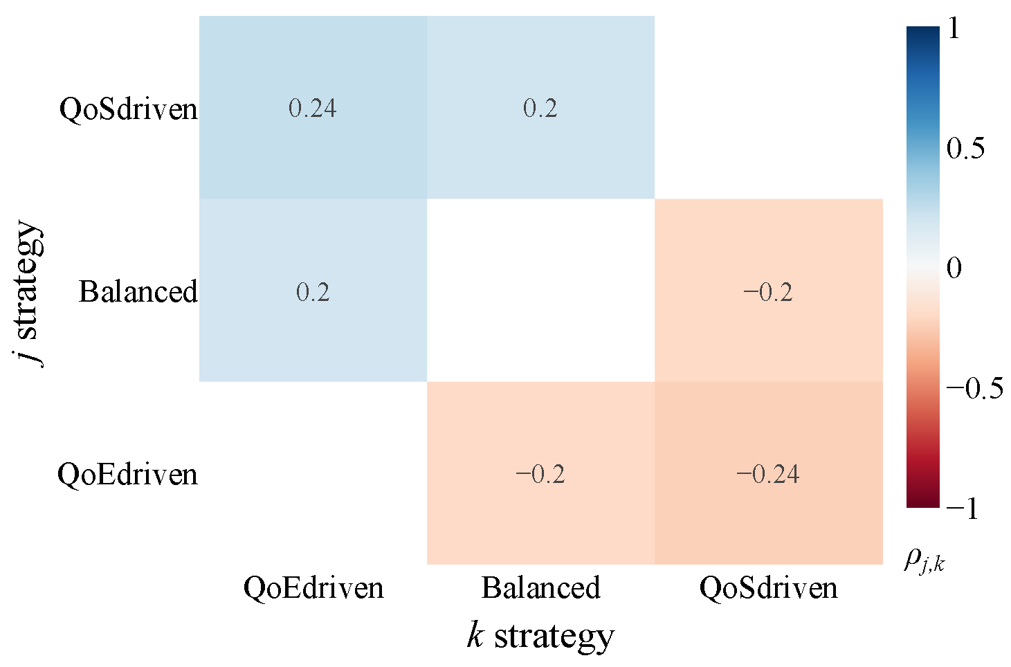
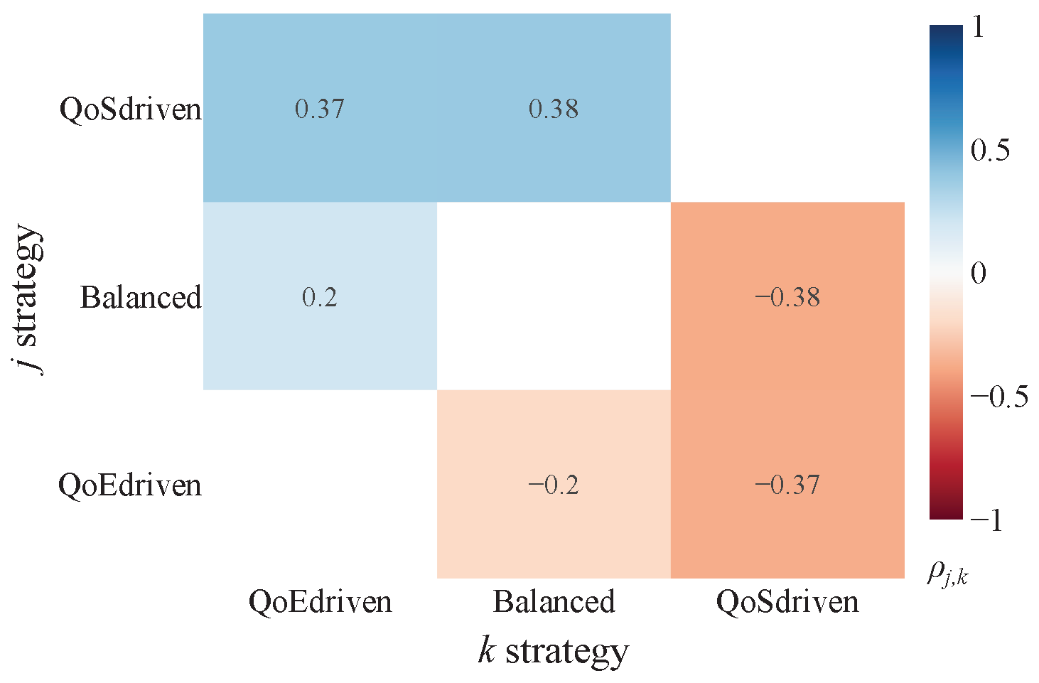
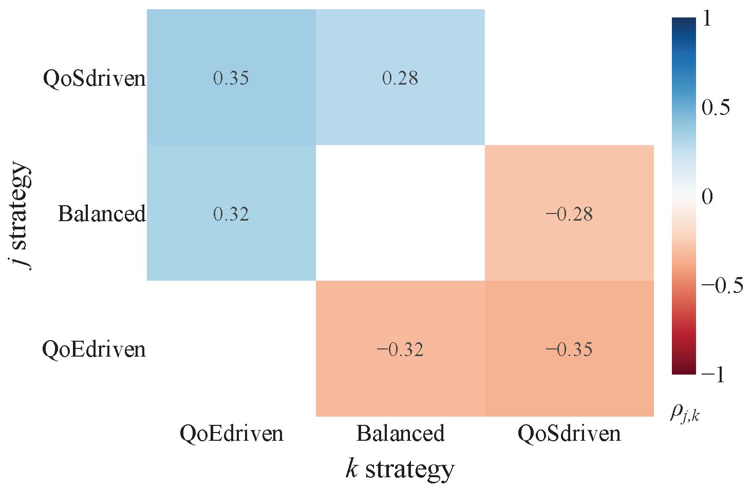
These scores are subsequently visualized using heatmaps for intuitive interpretation. The color gradient within these heatmaps directly indicates the comparative performance: bluer regions (tending towards +1) signify that approach j significantly and substantially reduces crowding compared to approach k, while redder regions (tending towards −1) indicate that approach j significantly increases it. The intensity of the color further reflects improvements or worsenings. Thus, the sign of immediately clarifies which approach yields a more favorable (lower CI) outcome.
The findings reveal that prioritizing crowding as a key metric in generating suggestions leads to a positive reduction in infrastructure stress. Unsurprisingly, the QoS-driven strategy exerts a considerable influence on the results when contrasted with the Balance approach, which, by its nature, seeks a middle ground across different considerations. This beneficial effect is most strongly observed with Tram (
Figure 8b) systems, displaying the most marked improvements. The impact is also satisfactory for Metro lines (
Figure 8a). However, no definitive conclusions can be drawn for buses (
Figure 8c). This disparity could be attributed to the higher demand for metro services among the user base considered. Comparing
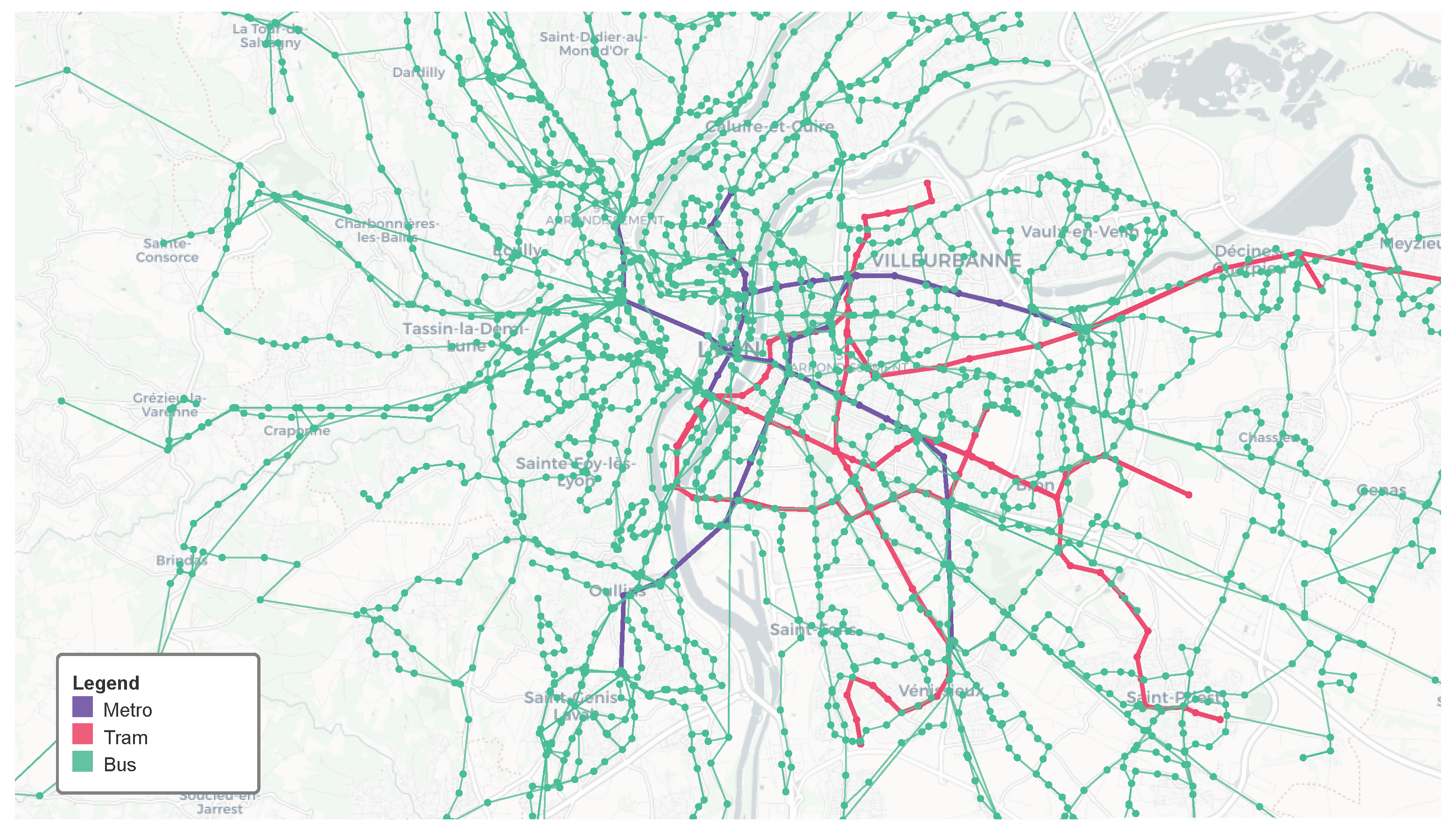
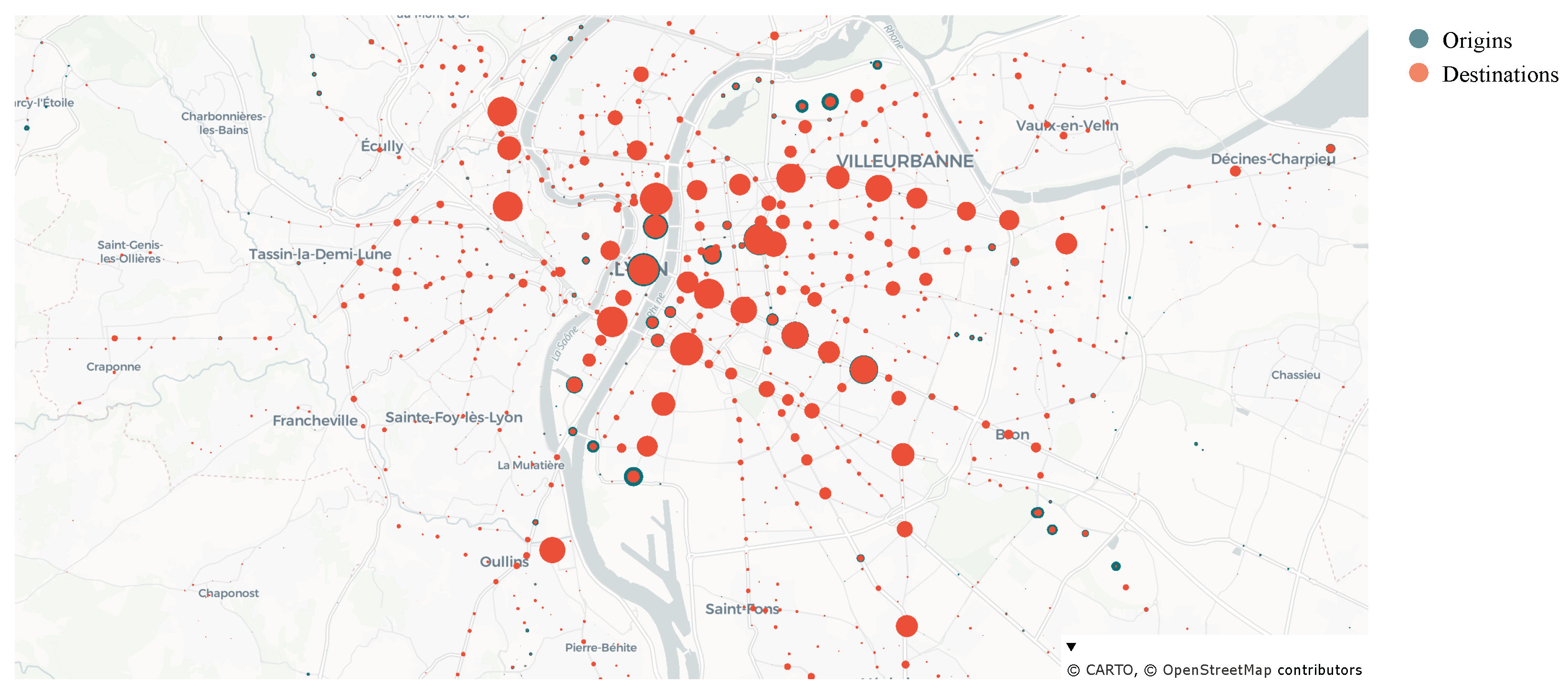
Figure 4 and
Figure 7, we can observe that the origins and destinations are predominantly concentrated around tram and metro stops. Additionally, while the bus network boasts a substantial number of lines, offering extensive urban and suburban coverage, this capacity is not fully utilized by the considered demand in our simulation. To delve deeper into this specific situation, we conducted further analysis, as detailed in the subsequent section. Correspondingly, the QoE-driven strategy consistently shows a higher crowding level.
To assess the model’s distributive equity, a subgroup analysis was conducted by filtering the network nodes based on their location in either urban or suburban areas. The Wilcoxon test was applied to the data for each subgroup to compare performance across distinct contexts. The findings showed that the results of the subgroup analysis were consistent across both user groups, indicating that the model’s optimization does not disproportionately favor urban users over suburban users. Furthermore, a lower level of stress was consistently observed for buses, which can likely be attributed to the limited demand for this specific mode of transport in the network studied. A full discussion of this analysis, including detailed numerical findings, is provided in the Discussion section.
4.1.4. Discussion
First, we tried to explain the varying outcomes across vehicle classes. To test our hypothesis about the high number of bus lines compared to service requests, we calculated the average boardings per vehicle class,
. Let
c represent the vehicle class and
t denote the time bin. We define
as the set of available vehicles for class
c in time bin
t. Furthermore, let
be the total number of boardings and
be the count of available vehicles for class
c in time bin
t. To calculate
, we first counted the boardings within each 2-min time bin. Then, we divided that sum by the number of available vehicles for that class at that specific moment.
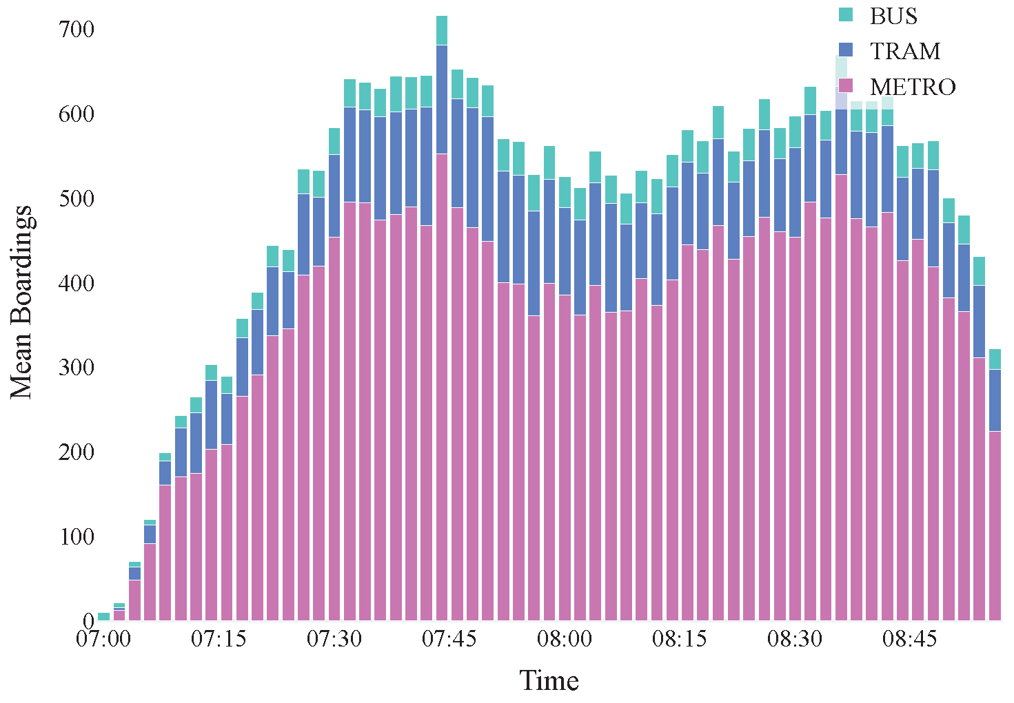
As illustrated with the stacked bar plot in
Figure 9,
Figure 10 and
Figure 11, the mean requests for buses are consistently low across all strategies when compared to metro and tram requests.This phenomenon is likely due to the vast bus network, with over 280 lines offering highly localized service across the urban area, resulting in many buses in circulation.
In addition to understanding the effects of various strategies on critical travel criteria, we evaluated their pros and cons. Given the inherent unpredictability of unfinished journeys, the analysis was limited to completed trips.
We extracted the following criteria for each users’ trip:
Travel Times, the total time spent by a user from origin to destination, including in-vehicle time, waiting times, and possible reroutings.
Failed Boarding Attempts, the number of times a user could not board due to capacity limits. In such cases, the user either waits for the next vehicle or is replanned on an alternative route.
Line Changes, the number of user switches between different lines during their journey, depending on the number of different vehicles taken.
Total Waiting Time, the cumulative waiting time incurred when a passenger’s journey is interrupted and re-calculated due to a vehicle being overcrowded, excluding any initial waiting time caused solely by the service timetable.
Mean Station Preference. To account for the dynamic nature of path suggestions within the simulation (where a user’s journey might be interrupted and rerouted), the Mean Station Preference metric is defined as the average BI values at each line transition along a user’s actual path. It provides an insight into the average appreciation level across the sub-paths actually traversed by the user.
To ensure consistency and rigor, we applied the same scoring methodology as previously defined, utilizing a Wilcoxon signed-rank test to compare the metrics for two paired approaches. Its application is valid because the samples used are independent. Specifically, each sample represents the metric’s value for a single trip, and trips are inherently independent of one another. From this test, we extracted the p-value () and the effect size () for each pairwise comparison. Given that we conducted a total of 5 comparisons, we applied the Bonferroni correction to adjust the significance level and control the Type I error rate (false positives) resulting from multiple tests. The Bonferroni correction is a statistical method that lowers the significance threshold for each individual test within an analysis involving multiple comparisons. If an analysis includes m comparisons, the original significance level is divided by the number of comparisons. This results in a new, more stringent significance level, , which a p-value must meet to be considered significant. In our case, the original significance level was . Having conducted 5 comparisons, the new, corrected significance level is . Therefore, a p-value must be less than or equal to 0.01 to be considered statistically significant after the Bonferroni correction. We then calculated the gating factor with Bonferroni correction. The final score is a simplified metric, calculated as the direct product of and the effect size, . The score ranges between −1 and 1, with the sign indicating the direction of the difference. A positive value indicates that the first approach performed better, while a negative value suggests the superiority of the second approach. This clear metric enables a consistent and immediate interpretation of the comparison across all our analyses.
Heatmaps interpretation (
Figure 12,
Figure 13,
Figure 14,
Figure 15 and
Figure 16) aligns with the one proposed in the previous section, with blue/red colors meaning that the distribution underlying the approach
j is stochastically smaller/greater than
k. Practically,
j-sample yields smaller/greater values for the metric compared than
k. A user may wish for a shorter path, no failed boarding attempts, few line changes, short waiting time, but high station preference.
In traffic theory, Wardrop’s First Principle (or user equilibrium) [
42] describes a state where every individual user chooses their path based on what they perceive as the fastest or most convenient for themselves, given current traffic conditions. In this “egoistic” equilibrium, no single user can reduce travel time by unilaterally changing their route. Conversely, Wardrop’s Second Principle defines the system optimum, representing the allocation of traffic that minimizes the total travel time for everyone in the network. Our analysis of the heatmap results distinctly reveals a fundamental trade-off between individual (user-centric) and collective (system-centric) optimization, directly analogous to these two well-known concepts.
The QoE-driven strategy, inherently designed to minimize individual travel times and the number of line changes as explicitly included in its scoring criteria, prioritizes user utility. This approach directly mirrors the egoistic optimization behavior characteristic, where each user selects the optimal path for their journey. Consequently, this strategy achieves the lowest individual travel times and the fewest line changes, indicating straightforward routing. This strategy naturally guides users through habitual nodes. However, this user-centric prioritization precipitates a significant collective cost, manifesting as the highest number of failed boarding attempts and the longest waiting times for the system. This outcome precisely illustrates the “Price of Anarchy,” where individually optimal choices lead to a sub-optimal global state due to over-utilization of shared resources. Conversely, the QoS-driven strategy operates with a clear focus on system optimum, aiming to enhance overall network efficiency. This strategy effectively reduces crowding, yielding the lowest waiting times for users and ensuring more reliable boarding with less delay at stops. The system-level benefit is coupled with the highest travel times and the most frequent line changes for individual users. The strategy necessitates individual users taking less direct or less preferred paths, thereby deviating from their individual optimum to contribute to the collective good. Among these opposing priorities, the Balanced strategy emerges as a robust compromise, leveraging the capabilities of the BeT system. While it is slower than QoE-driven in terms of travel times and experiences moderate waiting times, it achieves the fewest failed boarding attempts, reducing frustration. It also presents a middle ground for leading users for line changes, being more direct than QoS-driven but involving more transfers than QoE-driven. This intermediate characteristic also extends to preserving user habits, where the Balanced strategy effectively positions itself between QoE-driven and QoS-driven. This balanced approach successfully navigates the trade-off, mitigating severe crowding points and offering a smoother boarding experience without excessively compromising individual travel efficiency.
To evaluate the model’s distributive equity, we performed a subgroup analysis on the network nodes, categorizing them as either urban or suburban. To assess this, we repeated the Wilcoxon test by filtering nodes into urban and suburban areas, allowing us to compare system performance in distinct geographic contexts. We also replicated the QoE-metric analysis by focusing on users departing from these areas. The findings showed that the results of the subgroup analysis were consistent across both user groups, indicating that the model’s optimization does not disproportionately favor urban users over suburban users. Minor variations in the effect sizes (eg., waiting time) are attributable to intrinsic structural differences between the two contexts, such as longer average trip distances and fewer transfer alternatives in suburban areas, rather than to any systematic bias in the model’s optimization process. All the results of the urban vs suburban analysis are summarized in
Table 9 and
Table 10.
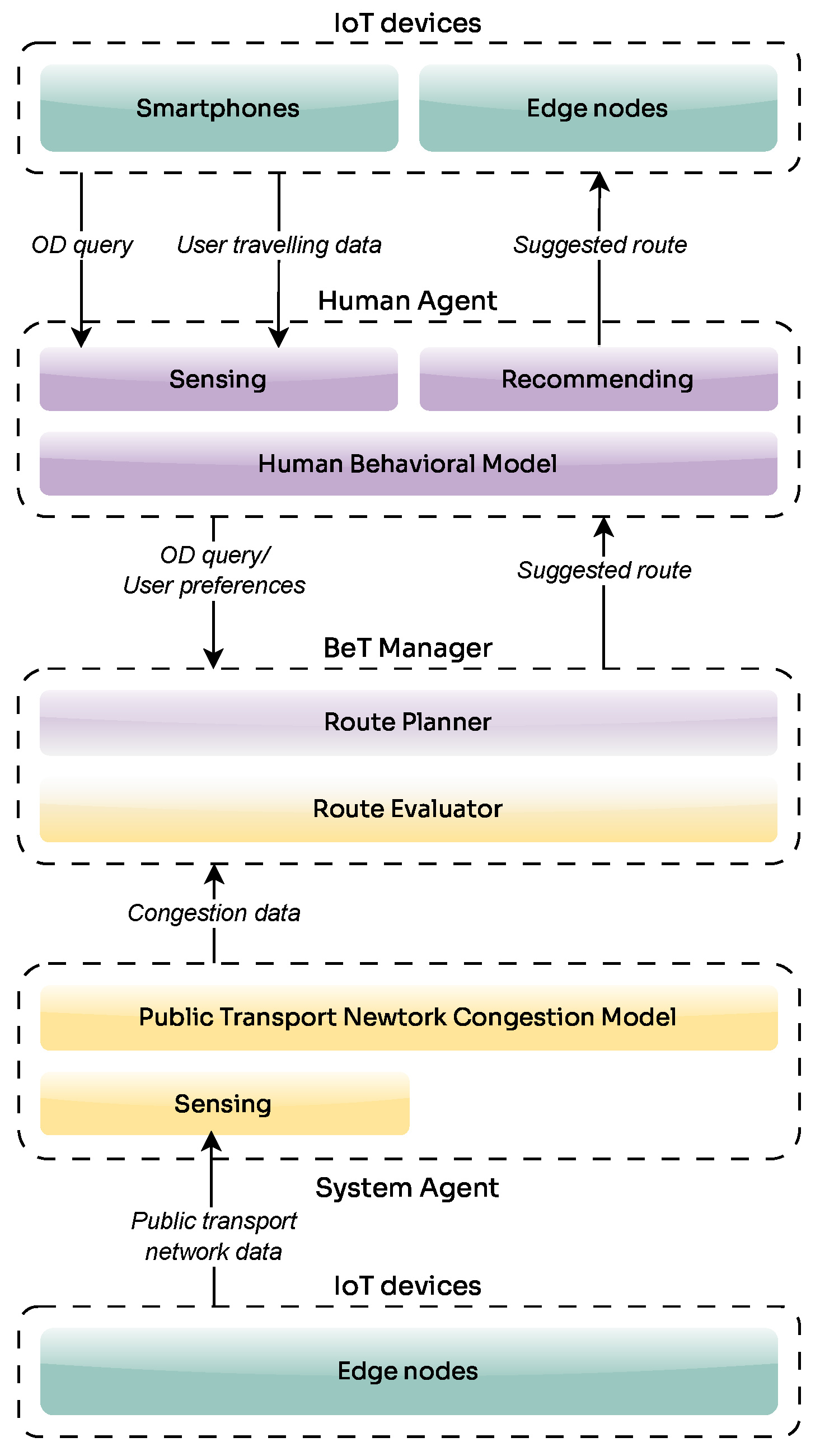
The results of our experiments show that the balanced strategy achieves a more efficient distribution of demand while preserving user satisfaction. From an urban transport planning perspective, this translates into concrete support for operators. By redistributing demand across alternative routes and exploiting the multimodal nature of the transport system, the approach enables a better load balance across the network, reducing the risk of overload on critical lines. This, in turn, can directly inform scheduling adjustments and fleet allocation. In addition, the ability to generate congestion-aware recommendations highlights where additional capacity may be required, such as increasing service frequency or deploying larger vehicles, thus providing actionable insights for more resilient and adaptive public transport management. Importantly, by incorporating the BeT paradigm and related architecture, the system not only generates indicators for planners but also provides a structured way to automatically support decision making, balancing QoE and QoS in public transportation systems.
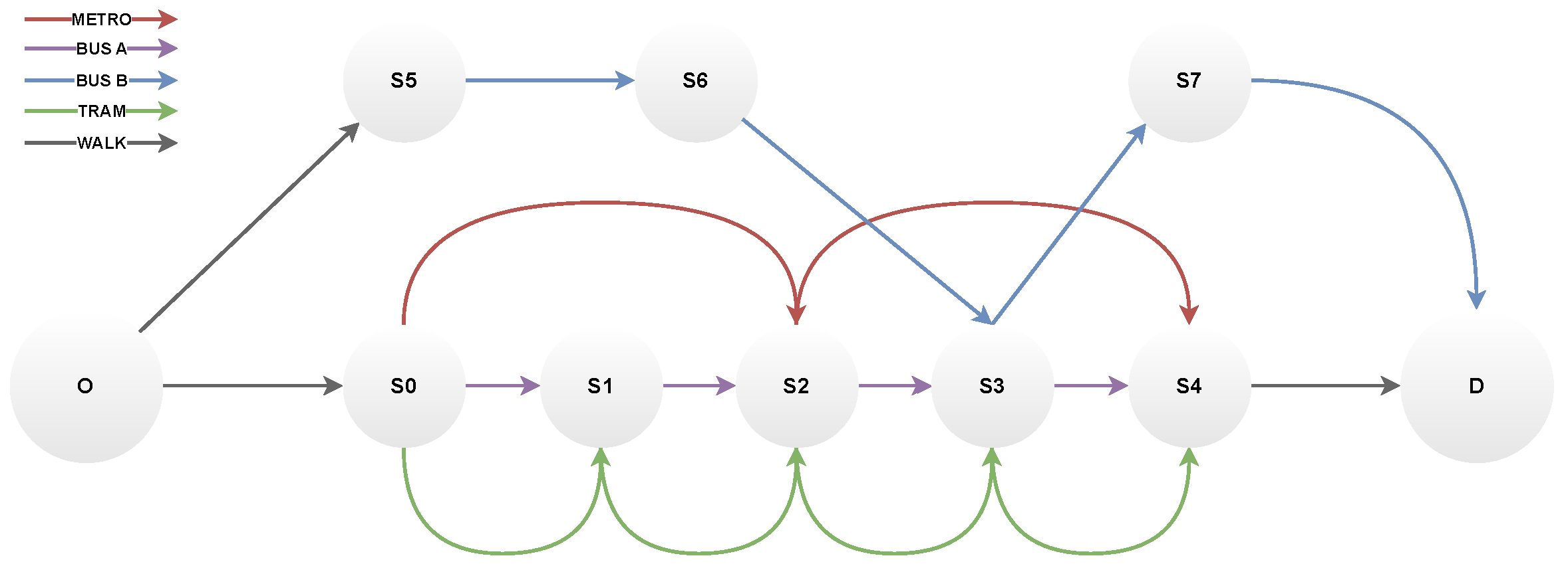
To thoroughly assess the resilience and effectiveness of our proposed system, we introduced a severe stress condition, referred to as a shock scenario, into the transportation network, simulating a critical infrastructure failure that significantly impacts user flow and system operations. Rather than applying this scenario to the full-scale Lyon network, which would have introduced excessive complexity and limited interpretability, we designed a smaller, controlled public transport graph that preserves the key structural properties of an urban public transport network (multiple intersecting lines, transfer nodes, and temporal demand peaks). The smaller graph (
G) was shown in
Figure 17. This network has two bus lines (A and B), one tram line, and one metro line. Buses and trams run less frequently than the metro, and have lower capacity (see
Table 11).
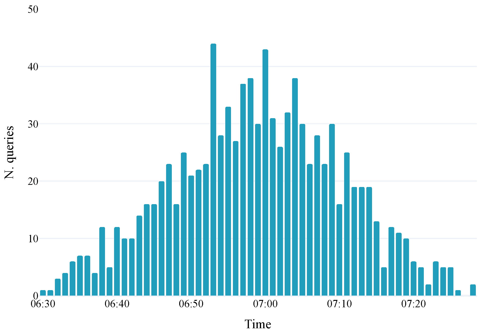
The simulation runs from 6:30 to 8:00 a.m., with departures following a Gaussian distribution peaking at 7:00 a.m. (see
Figure 18). The earliest departures occur at 6:30, while the latest is at 7:30, allowing sufficient time to observe the movement of later departures within the system. The simulation step is 1 min. Users depart randomly from one of the nodes of
G, and arrive at the destination node, D. The objective was not to reproduce realistic demand diversity, but to observe how the strategies react to a sudden interruption under tightly constrained conditions. Currently, 1000 users are injected into the network, with some preferring the bus and others preferring the metro. However, both are willing to take the tram as a second choice. We created a validation dataset to develop a statistical behavior model, assigning a set number of validations to each 5-min time slot. Bus-preferring users validated their trips twice at each bus station and once at each tram station, while metro-preferring users validated twice at each metro station and once at each tram station. The crowding model relies on a moving average approach, while the behavioral model is statistical, as described in
Section 3.2. It is derived by dividing the number of validations at each node by the total. Crowding is predicted by employing a moving average model by analyzing a past window of 5 min.
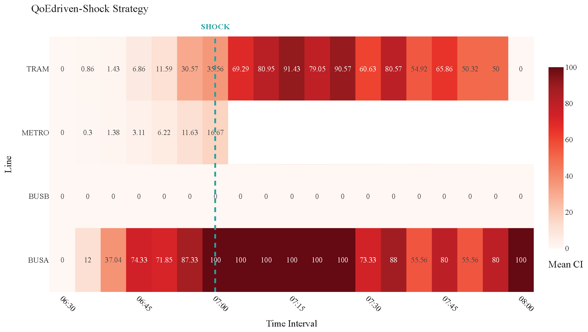
The shock is implemented by completely removing the Metro line from service starting from 7:00 a.m. This specific timing was deliberately chosen because, as established in the baseline analysis, the demand distribution is Gaussian, with the peak departure rate occurring precisely at 7:00 a.m., thus ensuring that the maximum number of users are immediately displaced, forcing a rapid re-evaluation of routes and intensifying the stress on alternative services (Bus and Tram). Furthermore, the removal of the Metro line is the most impactful single-point failure, as it is the most frequent, and highest-capacity service, providing a stringent test of the system’s ability to re-route demand effectively under heavy pressure. To study the system’s adaptive capabilities during this failure, we compare the performance under two distinct operational strategies: the Balanced-Shock Scenario and the QoE-Shock Scenario.
As shown in
Figure 19 and
Figure 20, although vehicles appear more crowded overall, this reflects better multimodal utilization. The Balanced strategy redistributed demand across all available modes, allowing 874 passengers to reach their destination, compared to only 687 under the QoE-driven configuration. Moreover, in the Balanced scenario, the tram and Bus A were either less crowded or remained at full capacity for shorter periods, indicating a more even temporal load distribution. This proactive redistribution prevented persistent overload and allowed a greater share of users to complete their trips. The analysis of median user criteria (
Table 12) further confirms comparable travel times between strategies, with the Balanced scenario showing slightly shorter median travel times, and identical values for waiting time, line changes, mean station preference, and failed boarding attempts (as defined in
Section 4.1.4). Going deeper into these two scenarios, the median times spent by each user pausing for the vehicles arrival were calculated, obtaining 1317 s for QoE and 780 s for Balanced, resulting in shorter times in the proposed approach. While the user experience (QoE) remains consistent, the Balanced approach achieves this with higher throughput.
Overall, these findings suggest that, even under extreme demand conditions and infrastructure shock, the Balanced strategy enhances resilience and service continuity by dynamically distributing users across modes and mitigating persistent overcrowding.
