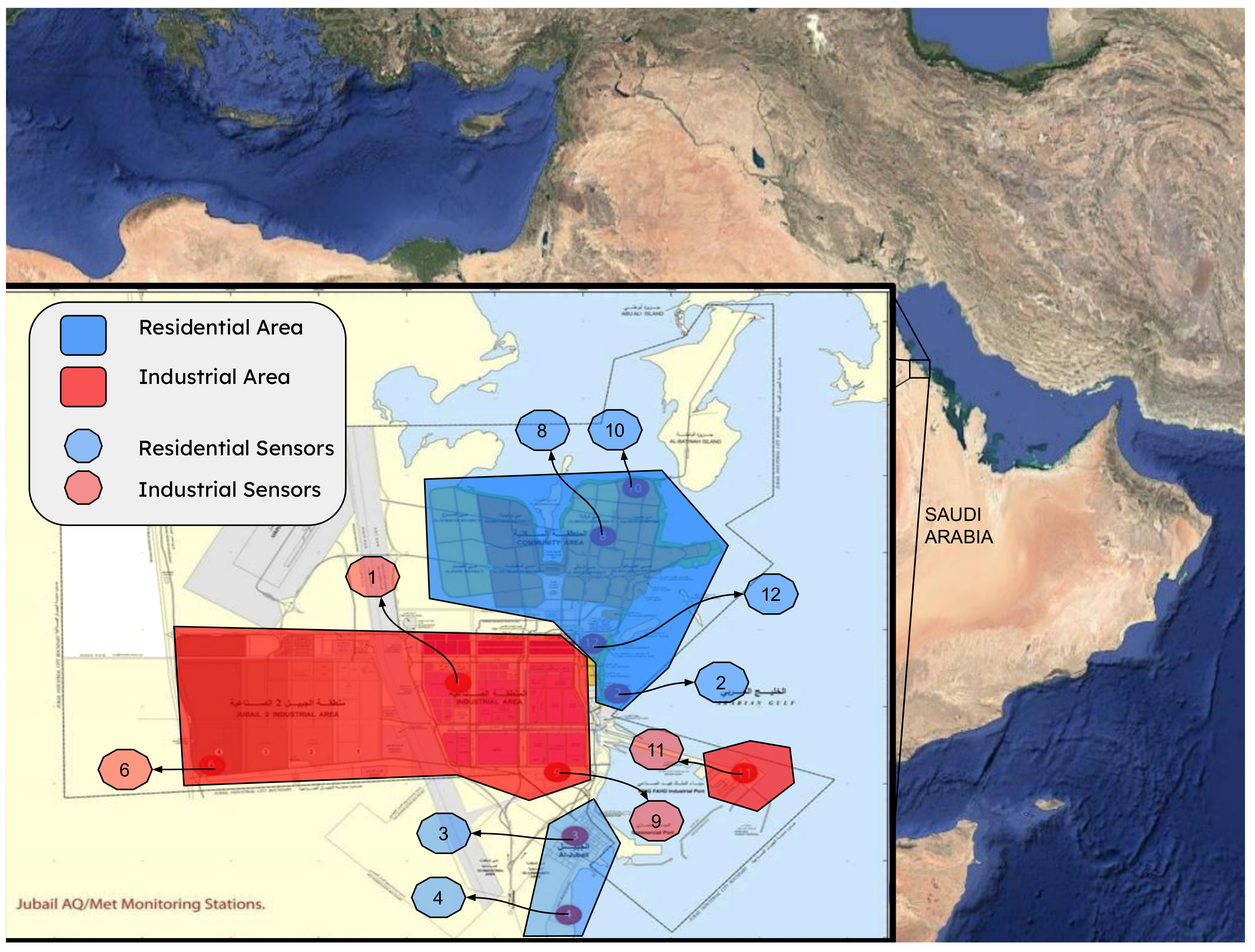
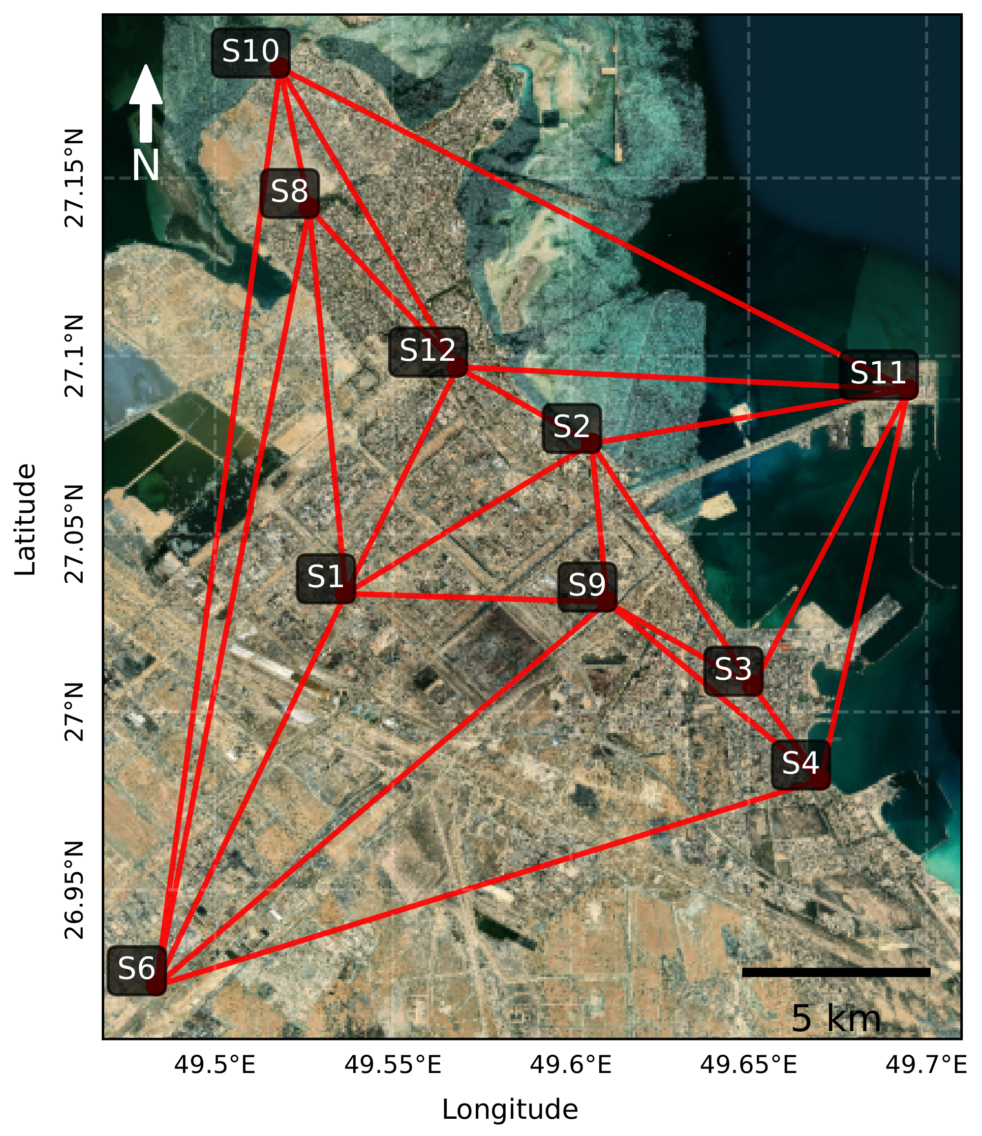
Figure 1.
Location of the ten air quality monitoring sensors in Jubail Industrial City. Red markers indicate sensors in industrial zones; blue markers are in residential areas.
Figure 1.
Location of the ten air quality monitoring sensors in Jubail Industrial City. Red markers indicate sensors in industrial zones; blue markers are in residential areas.
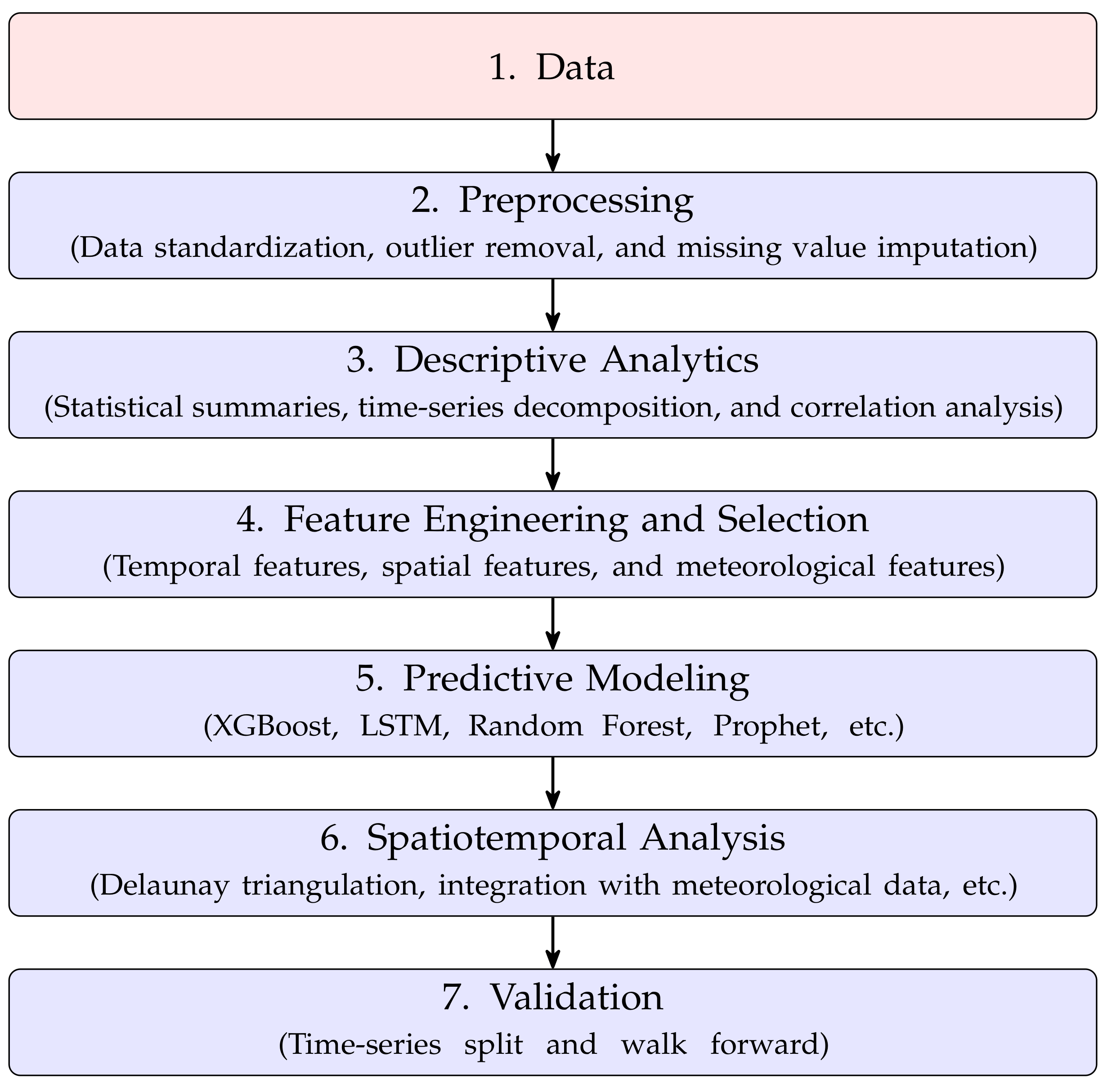
Figure 2.
Visual representation of the structured analytical framework employed in this study, outlining the sequential steps from data collection to validation.
Figure 2.
Visual representation of the structured analytical framework employed in this study, outlining the sequential steps from data collection to validation.
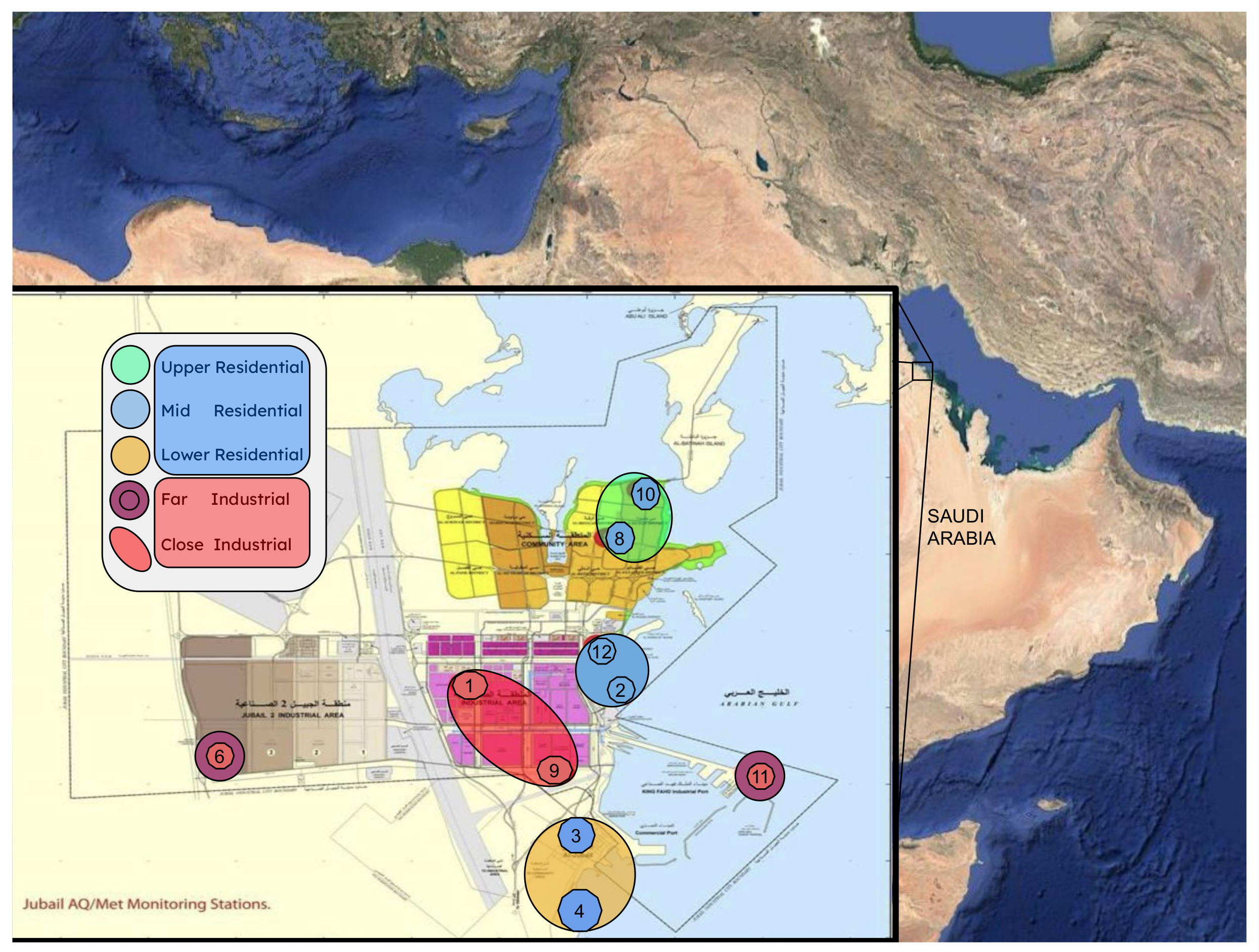
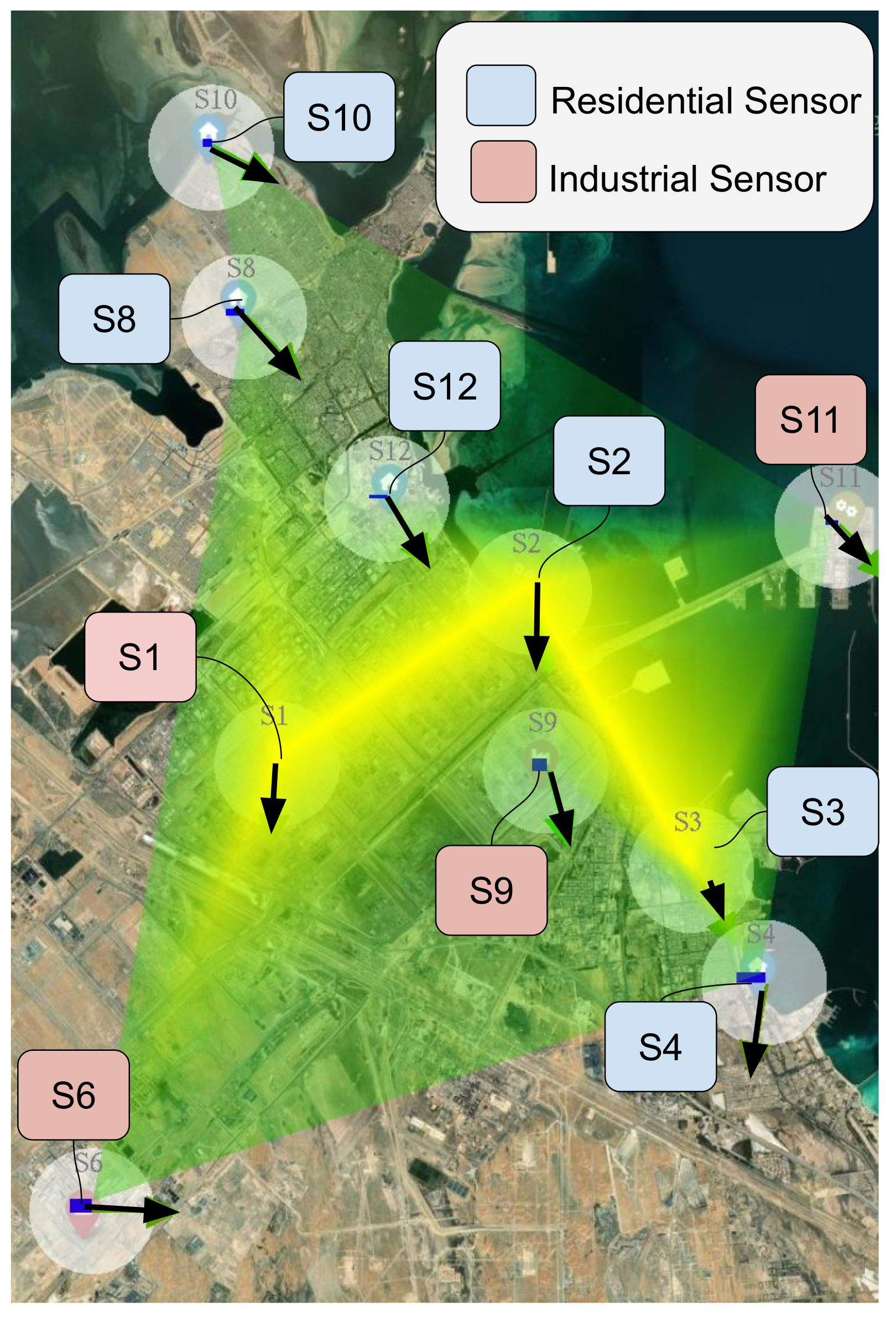
Figure 3.
Map showing the sensor groups with respect the residential and industrial zones.
Figure 3.
Map showing the sensor groups with respect the residential and industrial zones.
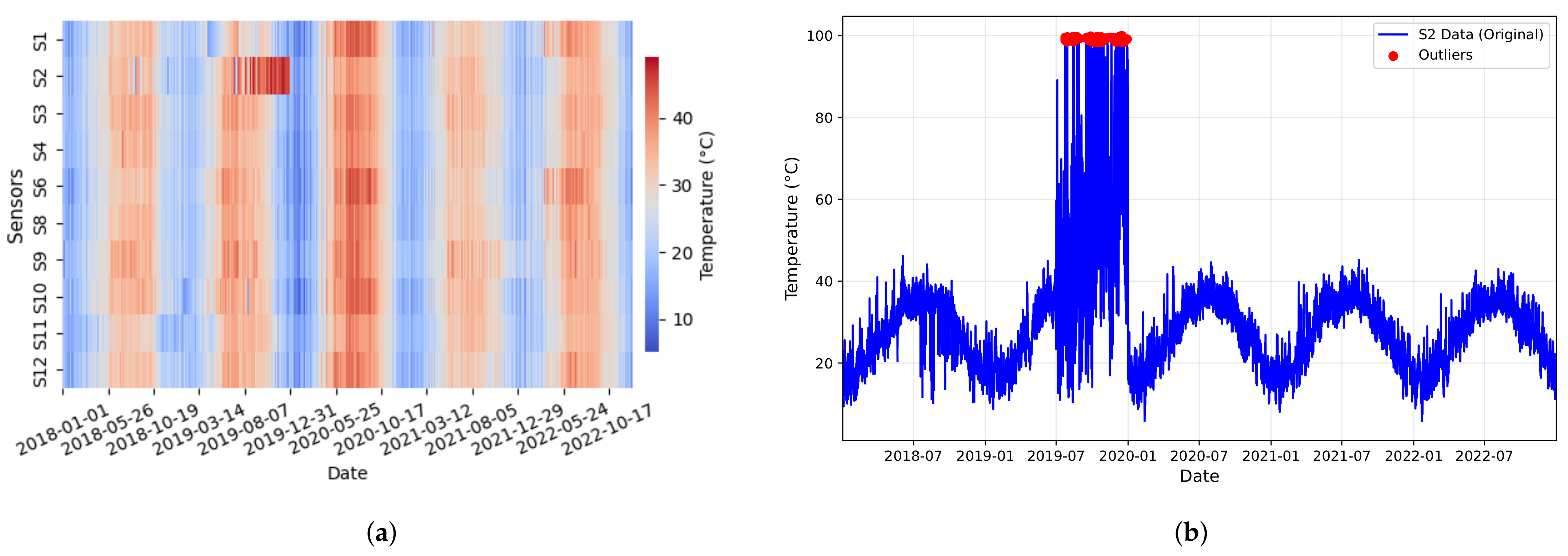
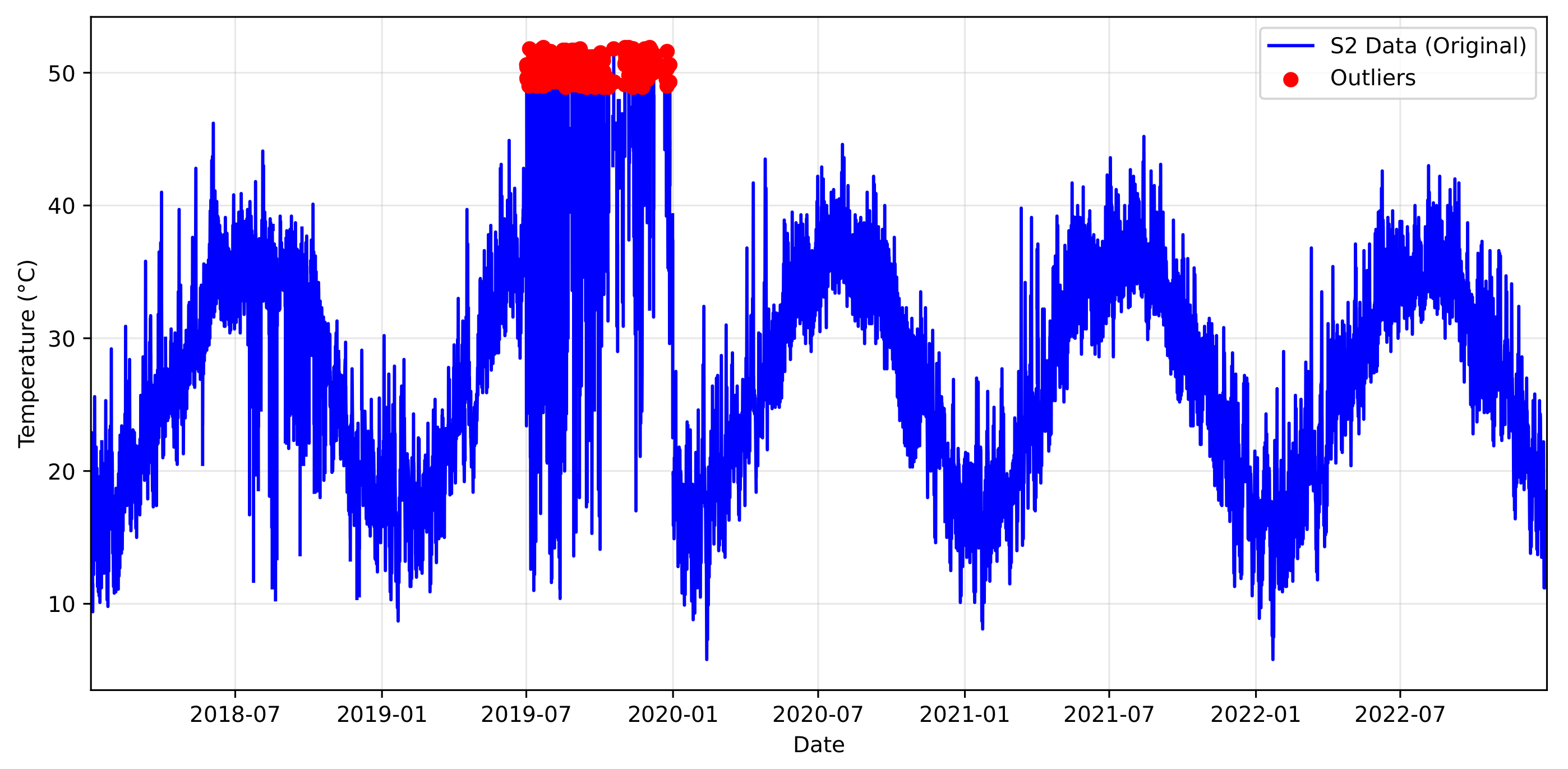
Figure 4.
Temperature outliers in sensor S2 (2018–2022) data. (a) Raw temperature readings with erroneous measurements above 52 °C in 2019; (b) the annual trend with a significant outlier at 100 °C.
Figure 4.
Temperature outliers in sensor S2 (2018–2022) data. (a) Raw temperature readings with erroneous measurements above 52 °C in 2019; (b) the annual trend with a significant outlier at 100 °C.
Figure 5.
Time-series plots of CO concentrations across all ten sensors in Jubail Industrial City. (a) Before outlier removal; (b) after outlier handling. The plots show the period from January 2020 to December 2020, illustrating the removal of erroneous high values and the resulting improvement in data consistency. Note the clarity of the pattern after deleting the outlier in (b).
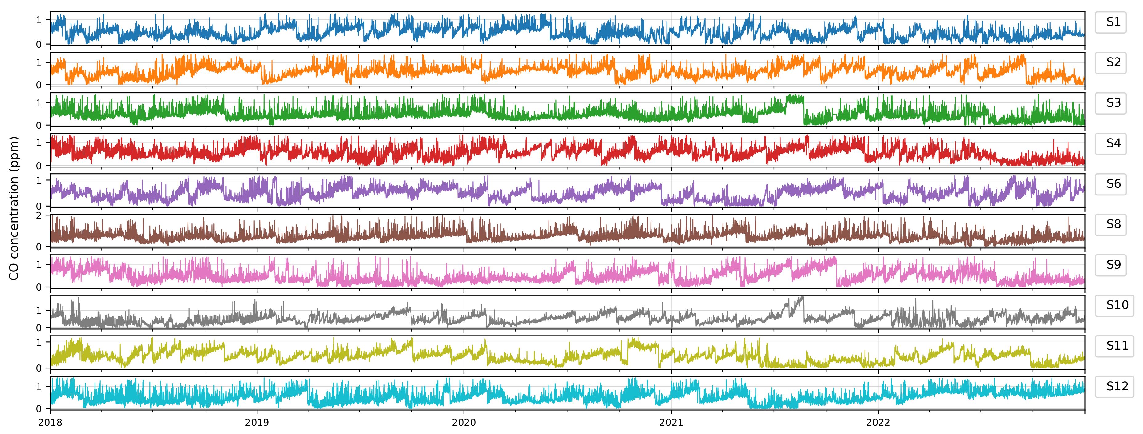
Figure 6.
Time-series plots of CO concentrations across all ten sensors in Jubail Industrial City after outlier handling. The plots show the period from January 2018 to December 2022, illustrating the removal of erroneous high values and the resulting improvement in data consistency.
Figure 6.
Time-series plots of CO concentrations across all ten sensors in Jubail Industrial City after outlier handling. The plots show the period from January 2018 to December 2022, illustrating the removal of erroneous high values and the resulting improvement in data consistency.
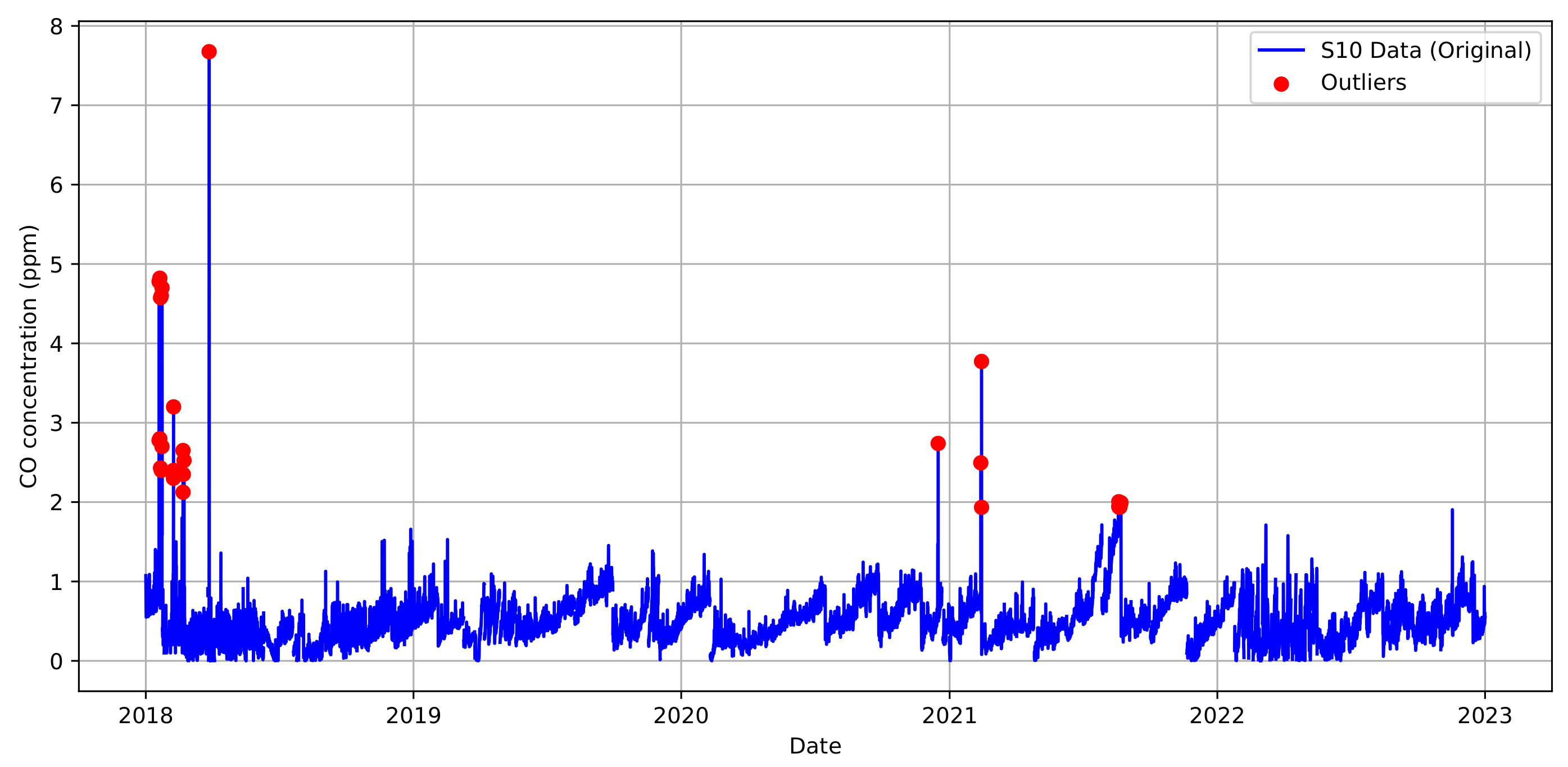
Figure 7.
Outlier and anomaly detection for CO in the sensor 10 dataset (2018-2022).
Figure 7.
Outlier and anomaly detection for CO in the sensor 10 dataset (2018-2022).
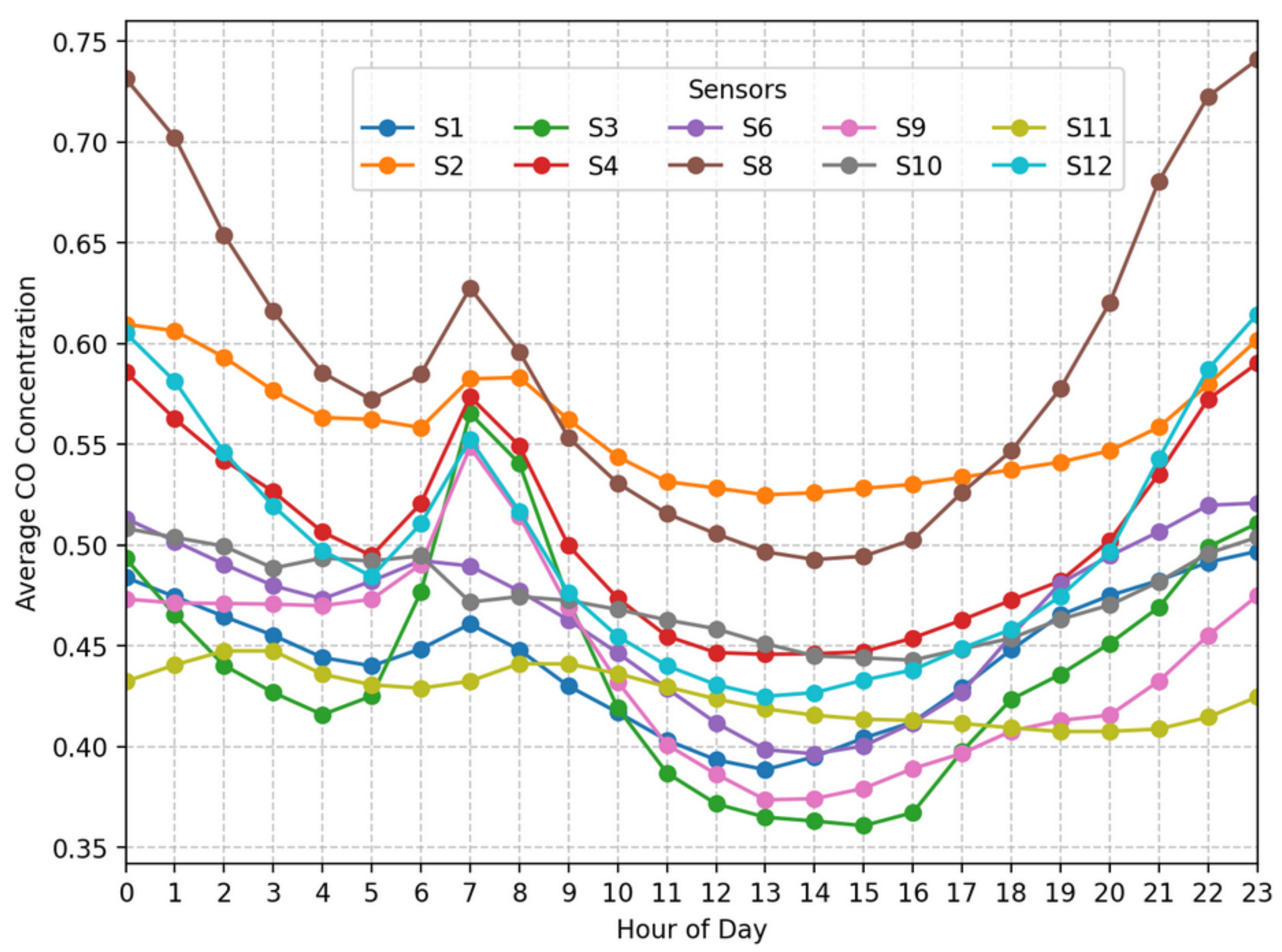
Figure 8.
Time-series plots of average CO concentrations (ppm) for all sensors by hour of the day.
Figure 8.
Time-series plots of average CO concentrations (ppm) for all sensors by hour of the day.
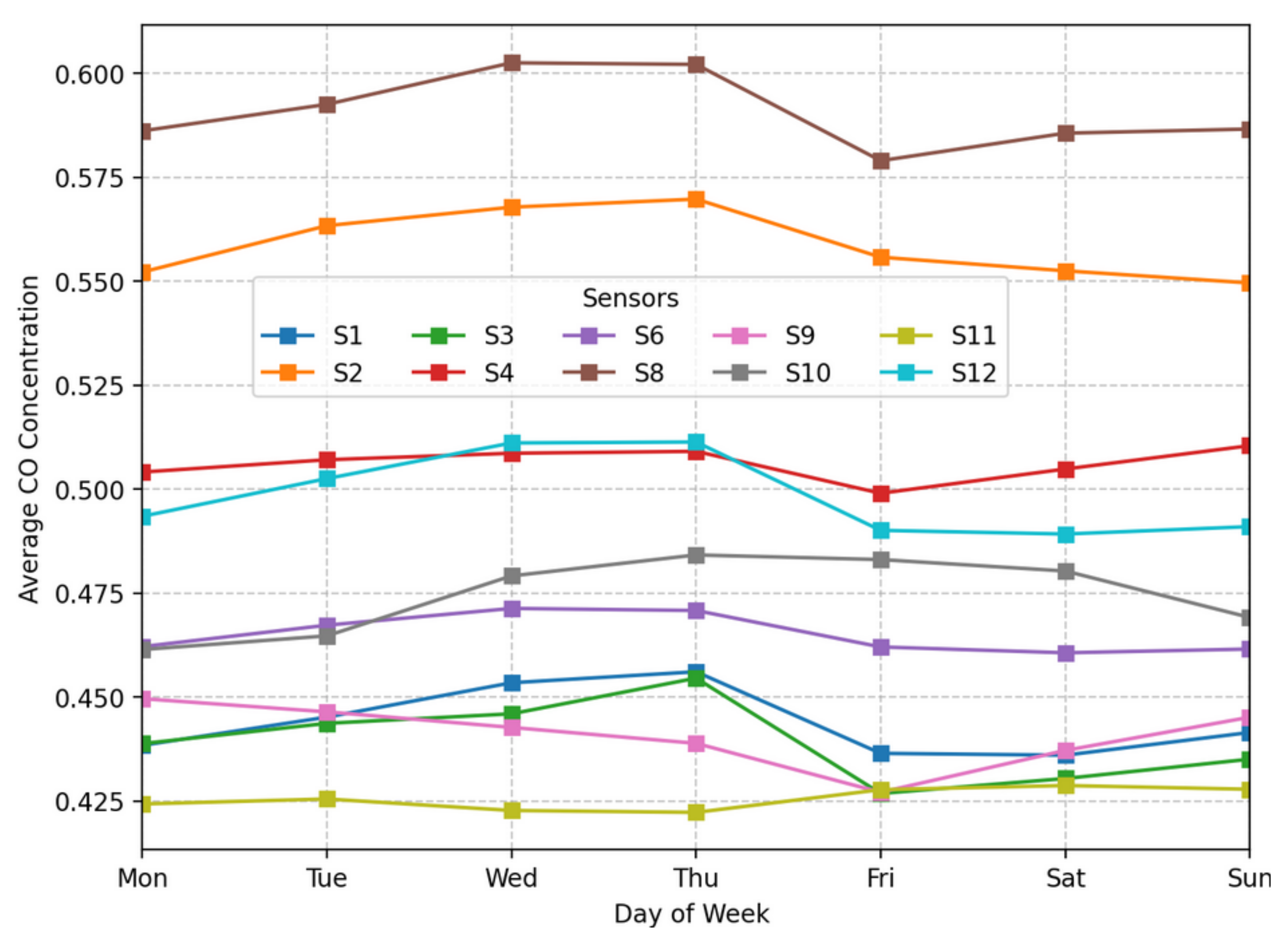
Figure 9.
Time-series plots of average CO concentrations (ppm) for all sensors by day of the week.
Figure 9.
Time-series plots of average CO concentrations (ppm) for all sensors by day of the week.
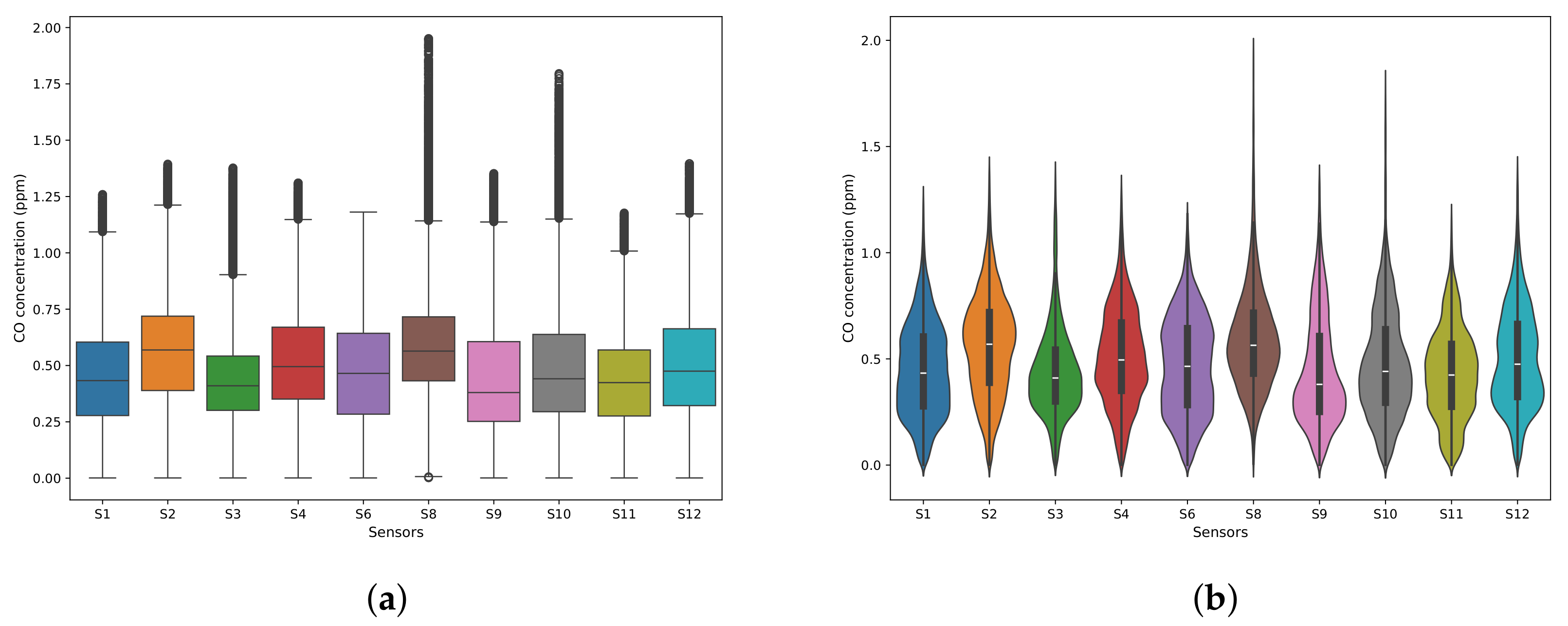
Figure 10.
Distribution of CO concentrations (ppm) across all ten sensors after outlier handling. The box plots (a) show the interquartile range and outliers, while the violin plots (b) show the density distribution.
Figure 10.
Distribution of CO concentrations (ppm) across all ten sensors after outlier handling. The box plots (a) show the interquartile range and outliers, while the violin plots (b) show the density distribution.
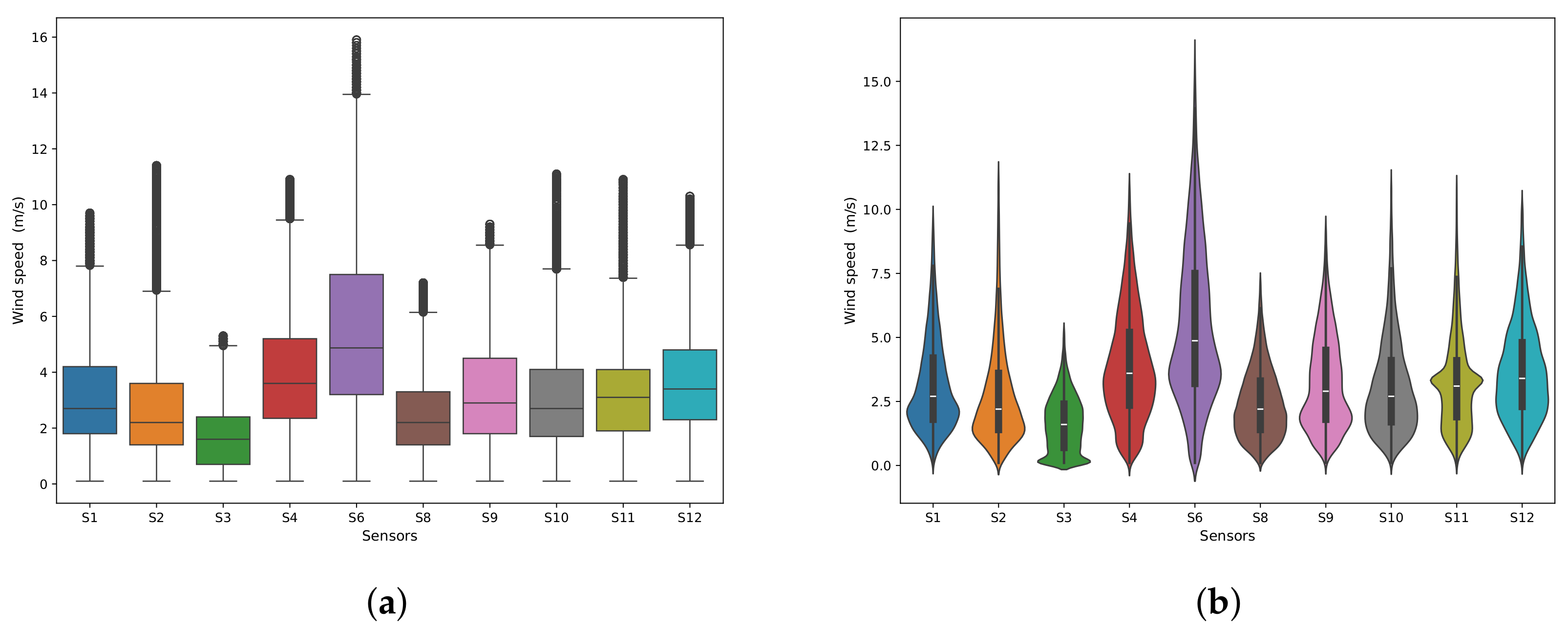
Figure 11.
Distribution of wind speed (m/s) across all ten sensors after outlier handling. The box plots (a) show the interquartile, while the violin plots (b) show the density distribution.
Figure 11.
Distribution of wind speed (m/s) across all ten sensors after outlier handling. The box plots (a) show the interquartile, while the violin plots (b) show the density distribution.
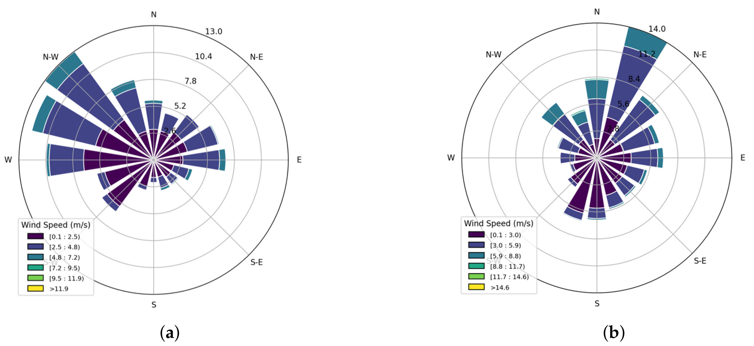
Figure 12.
Wind rose diagrams showing wind direction and speed (m/s). (a) Sensor S8; (b) sensor S9.
Figure 12.
Wind rose diagrams showing wind direction and speed (m/s). (a) Sensor S8; (b) sensor S9.
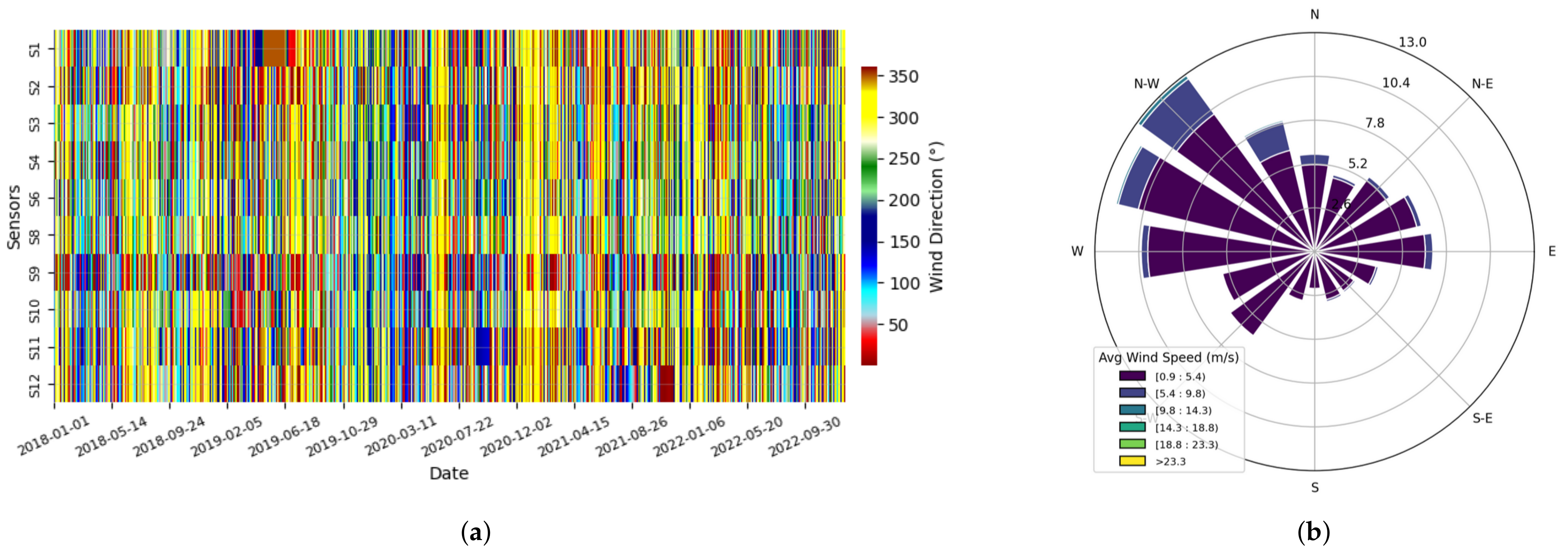
Figure 13.
The wind rose diagram shows that NW is the most frequent wind direction with the highest speed. (a) Heat map showing the frequency distribution of wind directions across all sensors. Sensor S9 shows different behavior than other sensors. (b) Wind rose diagram showing wind direction and speed (ppm) (average of all sensors).
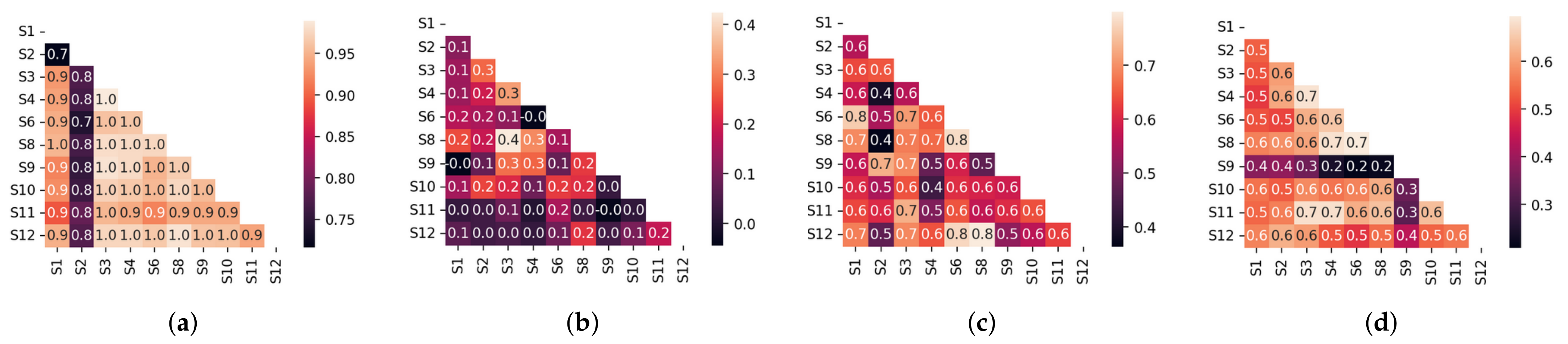
Figure 14.
Correlation matrices for (a) temperature, (b) CO concentrations, (c) wind speed, and (d) wind direction across all sensors (S1–S12). Each heat map illustrates pairwise Pearson correlation coefficients. Darker blue indicates stronger positive correlation, darker red indicates stronger negative correlation, and lighter colors indicate weaker correlation.
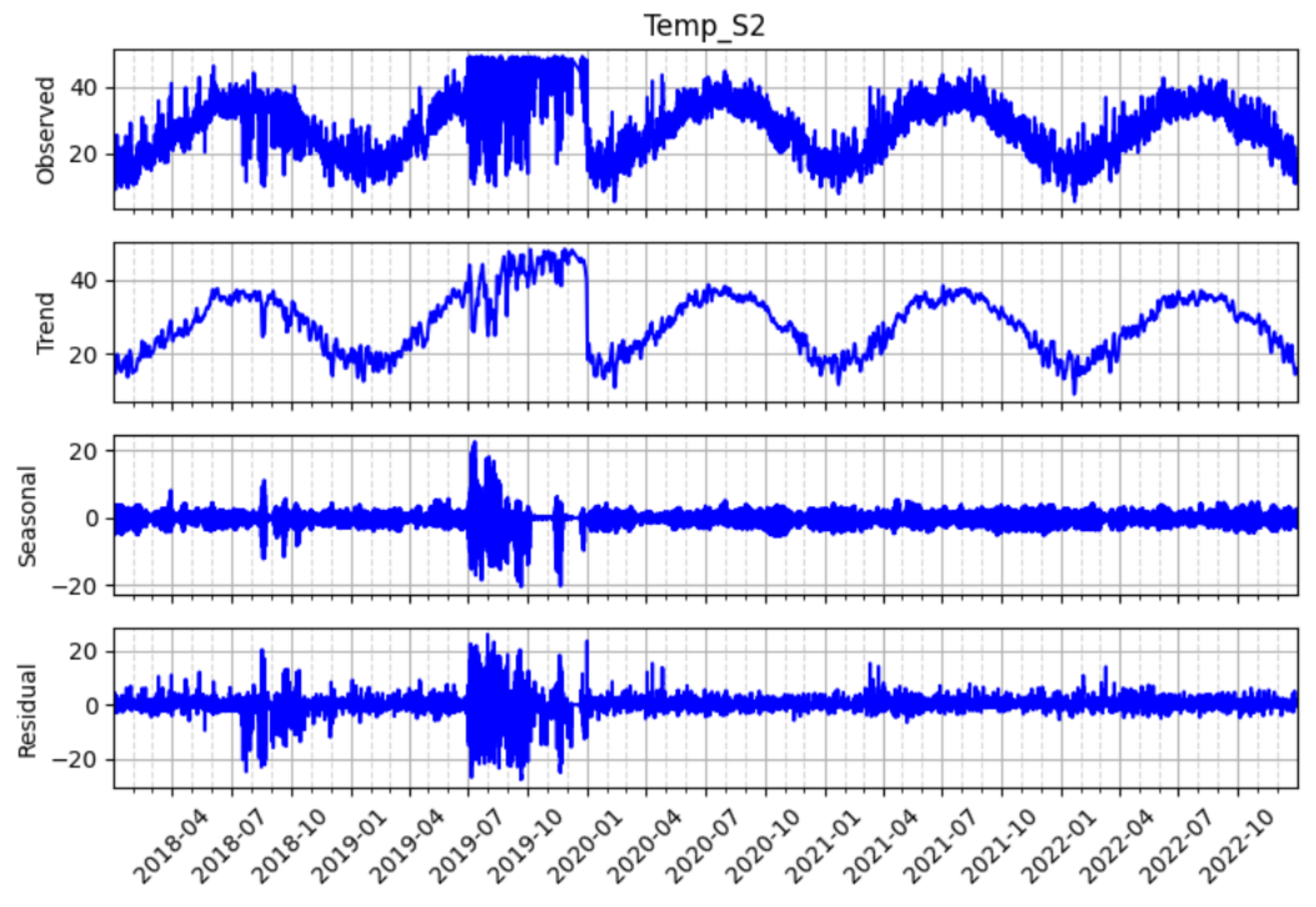
Figure 15.
STL decomposition of temperature readings at sensor S2, showing the original time series (Temp_S2), trend, seasonal, and residual components.
Figure 15.
STL decomposition of temperature readings at sensor S2, showing the original time series (Temp_S2), trend, seasonal, and residual components.
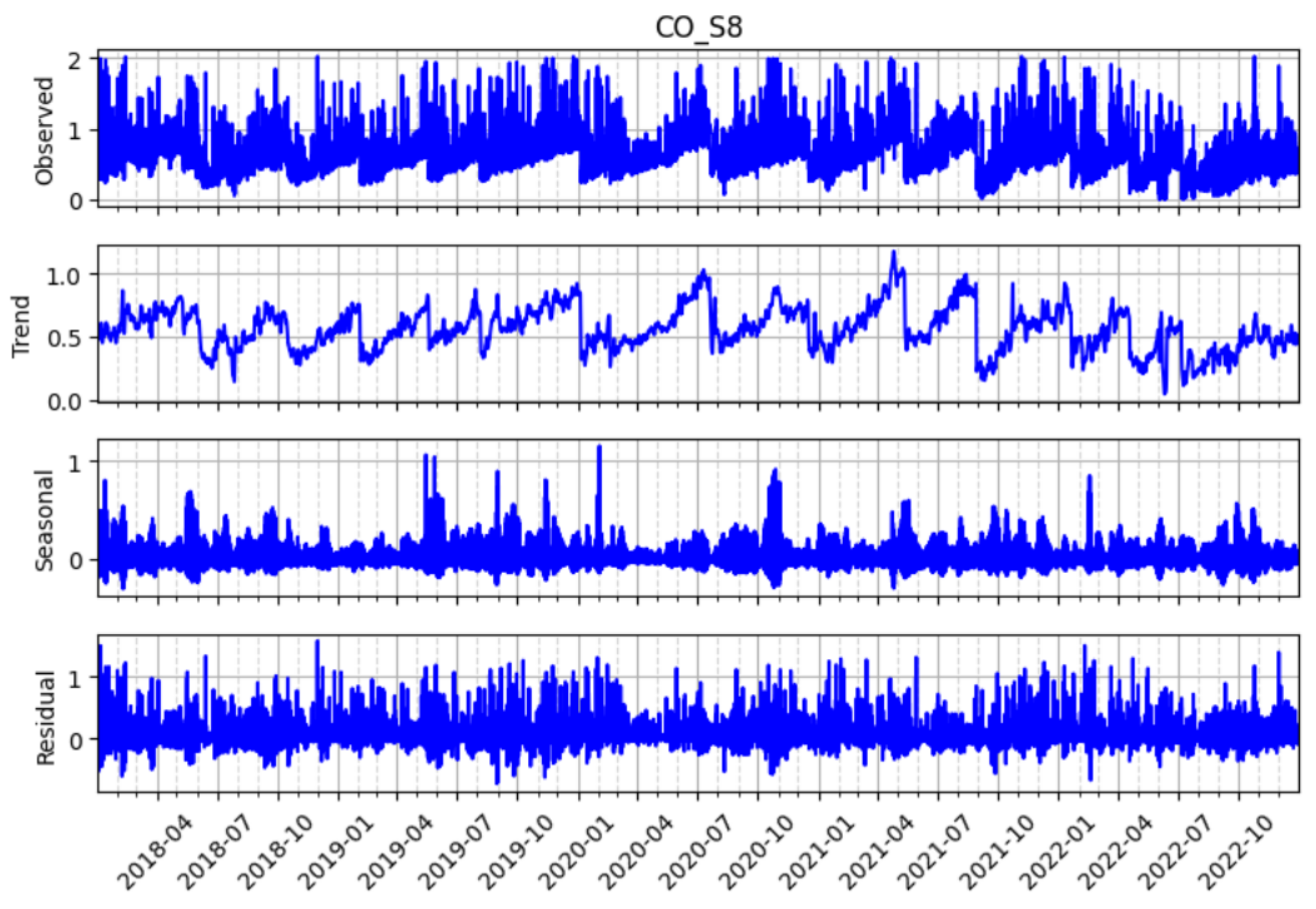
Figure 16.
STL decomposition of carbon monoxide (CO) readings at sensor S8 which, showing the original time series as well as its trend, seasonal, and residual components.
Figure 16.
STL decomposition of carbon monoxide (CO) readings at sensor S8 which, showing the original time series as well as its trend, seasonal, and residual components.
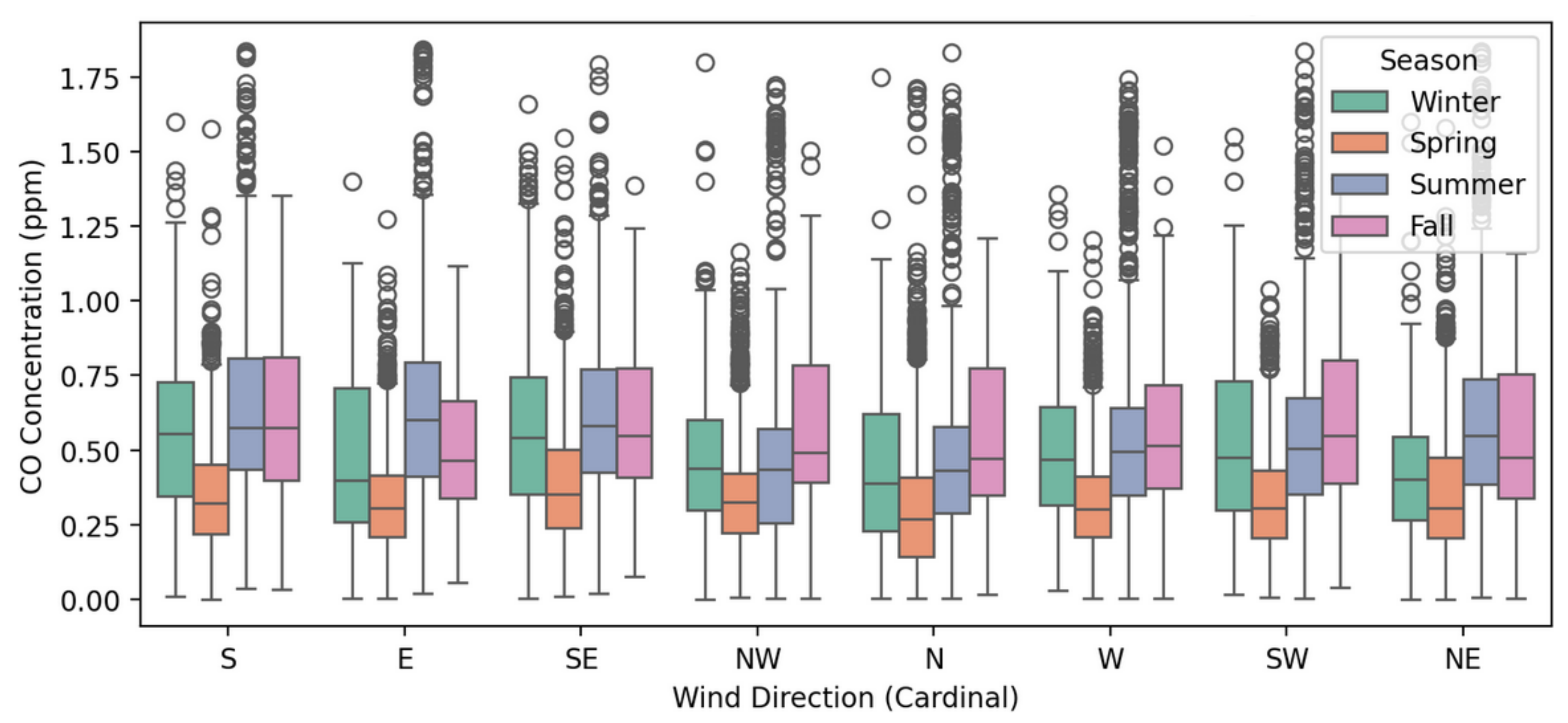
Figure 17.
Box plot of CO concentration (ppm) versus wind direction, categorized by season, for sensor 10. Each group shows the distribution of CO levels for a specific wind direction and season.
Figure 17.
Box plot of CO concentration (ppm) versus wind direction, categorized by season, for sensor 10. Each group shows the distribution of CO levels for a specific wind direction and season.
Figure 18.
Delaunay triangulation and spatial interpolation of CO monitoring stations across Jubail.
Figure 18.
Delaunay triangulation and spatial interpolation of CO monitoring stations across Jubail.
Figure 19.
Identified CO hotspots based on visualization and interpolated values exceeding the 95th percentile.
Figure 19.
Identified CO hotspots based on visualization and interpolated values exceeding the 95th percentile.
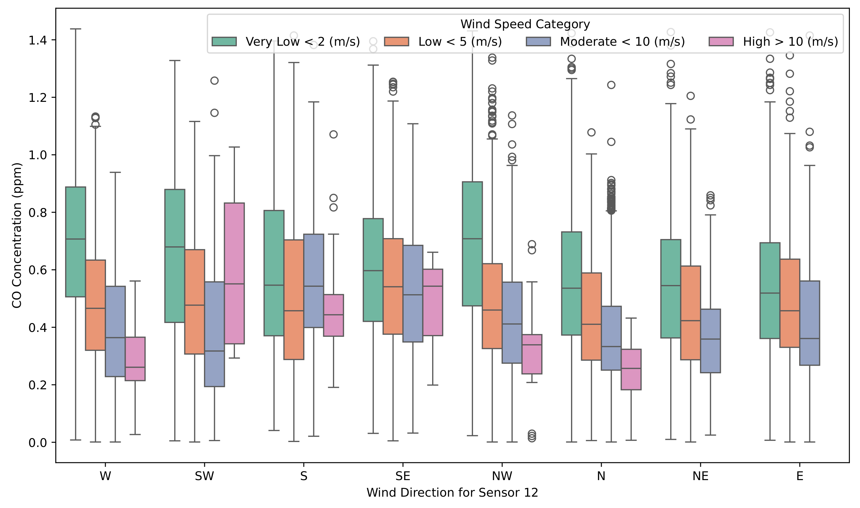
Figure 20.
CO concentrations at sensor 12 categorized by wind direction (i.e., where the wind came from) and wind speed. The box plots illustrate variations in pollutant concentrations with directional influences and wind speed intensity.
Figure 20.
CO concentrations at sensor 12 categorized by wind direction (i.e., where the wind came from) and wind speed. The box plots illustrate variations in pollutant concentrations with directional influences and wind speed intensity.
Figure 21.
CO concentrations at sensor 10 categorized by wind speed and temperature conditions. The box plots highlight interactions between wind speed and temperature categories influencing local CO levels.
Figure 21.
CO concentrations at sensor 10 categorized by wind speed and temperature conditions. The box plots highlight interactions between wind speed and temperature categories influencing local CO levels.
Figure 22.
Temperature readings at sensor S2 in 2019 after initial outlier removal, highlighting the remaining anomalous temperature pattern during the second half of the year.
Figure 22.
Temperature readings at sensor S2 in 2019 after initial outlier removal, highlighting the remaining anomalous temperature pattern during the second half of the year.
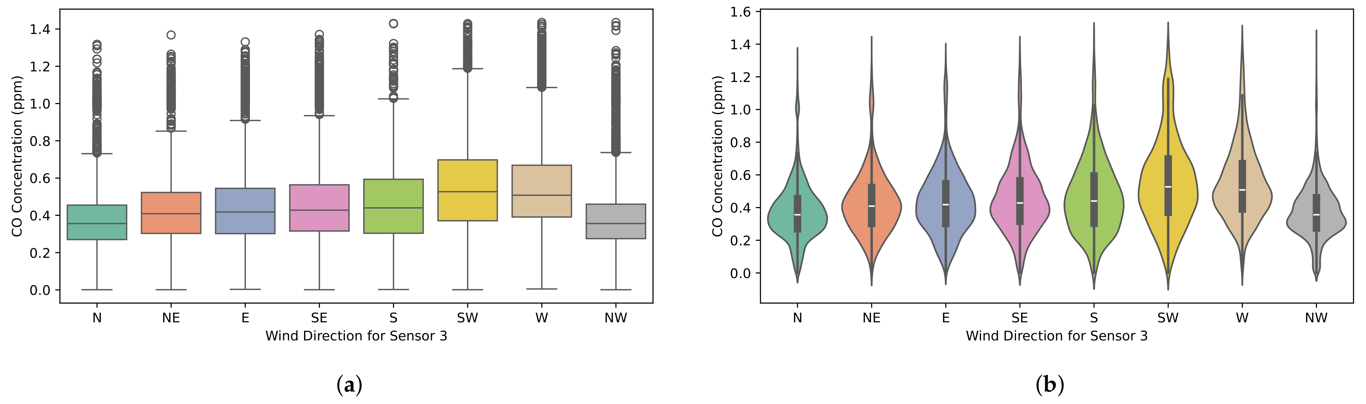
Figure 23.
Distribution of CO concentrations at sensor S3, grouped by wind direction. The plots show that NW winds are associated with the lowest CO concentrations, contrary to expectations based solely on wind direction and sensor location relative to the industrial area. (a) Box plot; (b) violin plot.
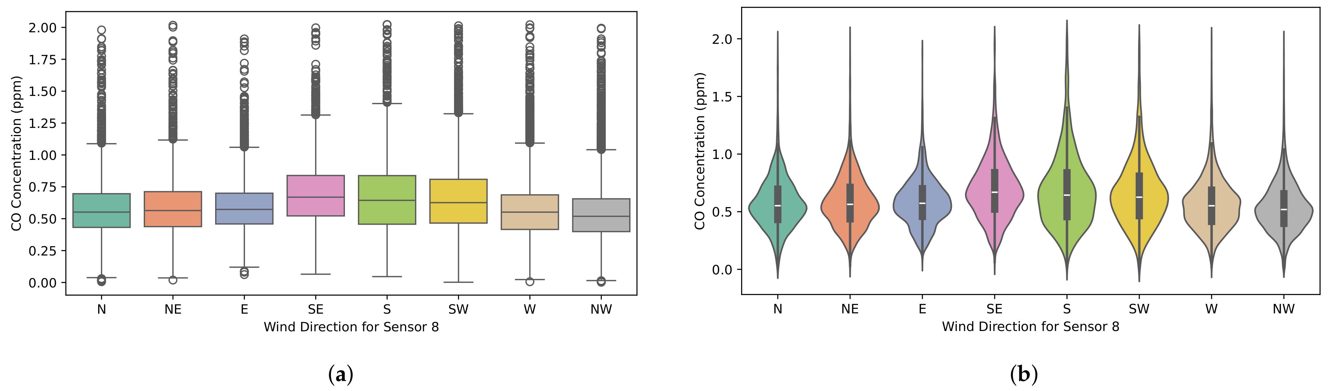
Figure 24.
Distribution of CO concentrations at sensor S8, grouped by wind direction. The plots show that the highest CO concentrations are associated with winds from the SW, S, and SE. (a) Box plot; (b) violin plot.
Figure 24.
Distribution of CO concentrations at sensor S8, grouped by wind direction. The plots show that the highest CO concentrations are associated with winds from the SW, S, and SE. (a) Box plot; (b) violin plot.
Table 1.
Summary of engineered features, categorized by type, with representative examples and their purpose in enhancing model performance and interpretability for the air pollution dataset.
Table 1.
Summary of engineered features, categorized by type, with representative examples and their purpose in enhancing model performance and interpretability for the air pollution dataset.
| Category | Key Features | Purpose |
|---|
| Temporal | Hour, Day of Week, Month (cyclically encoded), | Capture daily, weekly, and seasonal cycles; |
| | Time of Day (8-category and 4-category), | model short-term fluctuations and |
| | Rolling Mean/Median/Std (various windows), | longer-term trends; and identify |
| | Lagged CO/Temp/WindSpeed, Delta, | anomalous spikes/shifts. |
| | Percentage Change | |
| | | |
| Spatial | Residential/Industrial Group Mean/Std, | Capture pollution variations based on |
| | Upper/Mid/Lower Residential Group Mean/Std, | land use and proximity to industrial |
| | Close/Far Industrial Group Mean/Std, | sources, represent local environmental |
| | CO S1-Si Difference/Ratio/Percentage Difference | conditions, and quantify spatial gradients. |
| | | |
| Meteorological | Wind Direction (sine/cosine encoded) | Represent cyclical wind direction accurately. |
Table 2.
Distance in kilometers between the sensors in the monitoring stations.
Table 2.
Distance in kilometers between the sensors in the monitoring stations.
| Sensor | S1 | S2 | S3 | S4 | S6 | S8 | S9 | S10 | S11 |
|---|
| S2 | 8.3 | | | | | | | | |
| S3 | 11.71 | 8.82 | | | | | | | |
| S4 | 14.45 | 12.3 | 3.48 | | | | | | |
| S6 | 13.33 | 20.83 | 19.08 | 19.59 | | | | | |
| S8 | 12.08 | 10.75 | 19.37 | 22.83 | 24.65 | | | | |
| S9 | 7.28 | 4.97 | 4.84 | 8.14 | 17.36 | 14.82 | | | |
| S10 | 16.53 | 14.58 | 23.38 | 26.85 | 28.88 | 4.47 | 19 | | |
| S11 | 16.91 | 8.97 | 10.22 | 12.43 | 28.02 | 17.6 | 10.69 | 20.16 | |
| S12 | 7.74 | 4.43 | 12.93 | 16.39 | 21.07 | 6.45 | 8.44 | 10.57 | 12.56 |
Table 3.
Summary of predictive models, their validation strategies, and types. The Type column identifies the underlying approach: machine learning, deep learning, statistical (traditional time-series forecasting), or hybrid (combining multiple methodologies).
Table 3.
Summary of predictive models, their validation strategies, and types. The Type column identifies the underlying approach: machine learning, deep learning, statistical (traditional time-series forecasting), or hybrid (combining multiple methodologies).
| Model | | Key Strength | Validation Method | Type |
|---|
| XGBoost | [30] | Non-linear, high-dimensional data | TimeSeriesSplit CV | Machine Learning |
| Prophet | [31] | Seasonality and trends | Walk-Forward Validation | Statistical |
| Random Forest | [6] | Robust ensemble predictions | TimeSeriesSplit CV | Machine Learning |
| LSTM | [7] | Long-term dependencies | Walk-Forward Validation | Deep Learning |
| Darts | [32] | Multi-method comparison | Walk-Forward Validation | Hybrid |
| CatBoost | [33] | Handling categorical features | TimeSeriesSplit CV | Machine Learning |
Table 4.
Statistical summary of CO concentrations before outlier treatment (ppm).
Table 4.
Statistical summary of CO concentrations before outlier treatment (ppm).
| | Mean | Median | Std. Dev. | Min | 5th Perc. | 25th Perc. | 75th Perc. | 95th Perc. | Max |
|---|
| S1 | 0.460 | 0.447 | 0.240 | 0.000 | 0.099 | 0.282 | 0.617 | 0.863 | 4.930 |
| S2 | 0.554 | 0.556 | 0.244 | 0.000 | 0.176 | 0.385 | 0.707 | 0.945 | 4.412 |
| S3 | 0.429 | 0.397 | 0.222 | 0.000 | 0.135 | 0.287 | 0.532 | 0.821 | 3.536 |
| S4 | 0.505 | 0.490 | 0.236 | 0.000 | 0.140 | 0.345 | 0.661 | 0.888 | 6.849 |
| S6 | 0.468 | 0.467 | 0.235 | 0.000 | 0.097 | 0.284 | 0.645 | 0.839 | 3.491 |
| S8 | 0.584 | 0.555 | 0.259 | 0.000 | 0.240 | 0.418 | 0.707 | 1.011 | 5.189 |
| S9 | 0.441 | 0.383 | 0.260 | 0.000 | 0.105 | 0.254 | 0.593 | 0.913 | 5.086 |
| S10 | 0.466 | 0.428 | 0.275 | 0.000 | 0.093 | 0.279 | 0.621 | 0.914 | 7.675 |
| S11 | 0.422 | 0.419 | 0.220 | 0.000 | 0.074 | 0.265 | 0.564 | 0.794 | 3.547 |
| S12 | 0.492 | 0.460 | 0.249 | 0.000 | 0.142 | 0.312 | 0.651 | 0.907 | 6.770 |
Table 5.
Statistical summary of CO concentrations after outlier treatment (ppm).
Table 5.
Statistical summary of CO concentrations after outlier treatment (ppm).
| | Mean | Median | Std. Dev. | Min | 5th Perc. | 25th Perc. | 75th Perc. | 95th Perc. | Max |
|---|
| S1 | 0.444 | 0.429 | 0.223 | 0.001 | 0.099 | 0.272 | 0.601 | 0.825 | 1.319 |
| S2 | 0.559 | 0.568 | 0.239 | 0.001 | 0.171 | 0.385 | 0.718 | 0.951 | 1.471 |
| S3 | 0.439 | 0.410 | 0.211 | 0.001 | 0.147 | 0.300 | 0.543 | 0.827 | 1.435 |
| S4 | 0.506 | 0.491 | 0.230 | 0.001 | 0.139 | 0.345 | 0.668 | 0.891 | 1.351 |
| S6 | 0.465 | 0.462 | 0.232 | 0.001 | 0.100 | 0.279 | 0.641 | 0.838 | 1.212 |
| S8 | 0.591 | 0.563 | 0.244 | 0.002 | 0.255 | 0.431 | 0.716 | 1.010 | 2.023 |
| S9 | 0.441 | 0.380 | 0.255 | 0.001 | 0.101 | 0.251 | 0.607 | 0.922 | 1.382 |
| S10 | 0.475 | 0.437 | 0.262 | 0.001 | 0.104 | 0.289 | 0.635 | 0.922 | 1.841 |
| S11 | 0.426 | 0.421 | 0.215 | 0.001 | 0.076 | 0.270 | 0.568 | 0.799 | 1.234 |
| S12 | 0.498 | 0.472 | 0.237 | 0.001 | 0.148 | 0.320 | 0.661 | 0.905 | 1.438 |
Table 6.
Statistical summary of temperature before outlier treatment (°C).
Table 6.
Statistical summary of temperature before outlier treatment (°C).
| | Mean | Median | Std. Dev. | Min | 5th Perc. | 25th Perc. | 75th Perc. | 95th Perc. | Max |
|---|
| S1 | 27.3 | 27.3 | 8.7 | 5.6 | 13.7 | 20.3 | 33.9 | 41.7 | 50.0 |
| S2 | 29.6 | 28.1 | 13.3 | 5.8 | 15.1 | 20.9 | 34.4 | 54.2 | 100.0 |
| S3 | 28.1 | 28.5 | 7.7 | 7.2 | 16.0 | 21.4 | 34.8 | 39.5 | 48.6 |
| S4 | 27.2 | 27.6 | 7.6 | 5.6 | 14.9 | 20.8 | 33.7 | 38.4 | 47.2 |
| S6 | 27.8 | 27.9 | 8.9 | 5.2 | 13.6 | 20.5 | 34.5 | 42.2 | 49.7 |
| S8 | 27.4 | 27.8 | 8.1 | 6.0 | 14.5 | 20.7 | 33.9 | 40.2 | 48.4 |
| S9 | 28.4 | 28.4 | 7.9 | 5.7 | 16.2 | 21.6 | 35.1 | 40.5 | 48.0 |
| S10 | 27.9 | 28.5 | 8.3 | 6.1 | 14.6 | 20.8 | 34.7 | 40.6 | 51.5 |
| S11 | 26.7 | 27.0 | 7.1 | 8.0 | 15.9 | 20.4 | 33.1 | 37.1 | 45.3 |
| S12 | 27.3 | 27.8 | 8.1 | 5.4 | 14.3 | 20.7 | 33.9 | 39.7 | 48.0 |
Table 7.
Statistical summary of temperature after outlier treatment (°C).
Table 7.
Statistical summary of temperature after outlier treatment (°C).
| | Mean | Median | Std. Dev. | Min | 5th Perc. | 25th Perc. | 75th Perc. | 95th Perc. | Max |
|---|
| S1 | 27.5 | 27.5 | 8.5 | 5.6 | 14.0 | 20.7 | 34.0 | 41.7 | 45.7 |
| S2 | 28.3 | 28.6 | 8.5 | 5.8 | 15.3 | 21.2 | 34.8 | 43.8 | 49.0 |
| S3 | 28.4 | 28.8 | 7.7 | 7.2 | 16.2 | 21.7 | 35.0 | 39.6 | 48.6 |
| S4 | 27.5 | 28.1 | 7.6 | 5.6 | 15.1 | 21.1 | 34.0 | 38.6 | 47.2 |
| S6 | 28.1 | 28.3 | 8.9 | 5.2 | 13.7 | 20.8 | 34.8 | 42.5 | 46.1 |
| S8 | 27.8 | 28.2 | 8.1 | 6.0 | 14.7 | 21.1 | 34.2 | 40.3 | 48.4 |
| S9 | 28.7 | 29.0 | 7.9 | 5.7 | 16.5 | 21.9 | 35.3 | 40.7 | 48.0 |
| S10 | 28.1 | 28.9 | 8.4 | 6.1 | 14.5 | 20.8 | 34.9 | 40.8 | 45.4 |
| S11 | 26.9 | 27.2 | 7.2 | 8.0 | 15.8 | 20.5 | 33.3 | 37.3 | 45.3 |
| S12 | 27.6 | 28.1 | 8.0 | 5.4 | 14.5 | 21.1 | 34.0 | 39.7 | 47.1 |
Table 8.
Statistical summary of wind speed before outlier treatment (m/s).
Table 8.
Statistical summary of wind speed before outlier treatment (m/s).
| | Mean | Median | Std. Dev. | Min | 5th Perc. | 25th Perc. | 75th Perc. | 95th Perc. | Max |
|---|
| S1 | 3.2 | 2.7 | 1.8 | 0.1 | 0.9 | 1.8 | 4.2 | 6.7 | 11.8 |
| S2 | 2.9 | 2.3 | 2.1 | 0.1 | 0.6 | 1.4 | 3.8 | 7.2 | 14.6 |
| S3 | 1.7 | 1.6 | 1.1 | 0.0 | 0.1 | 0.7 | 2.4 | 3.6 | 9.4 |
| S4 | 3.8 | 3.5 | 2.1 | 0.1 | 0.8 | 2.2 | 5.1 | 7.7 | 17.5 |
| S6 | 5.4 | 4.9 | 3.1 | 0.1 | 1.0 | 3.2 | 7.5 | 11.1 | 19.7 |
| S8 | 2.4 | 2.1 | 1.3 | 0.1 | 0.6 | 1.3 | 3.2 | 4.9 | 11.9 |
| S9 | 3.3 | 3.0 | 1.9 | 0.1 | 0.8 | 1.8 | 4.7 | 6.7 | 14.6 |
| S10 | 3.2 | 2.7 | 2.0 | 0.1 | 0.8 | 1.7 | 4.2 | 7.0 | 19.2 |
| S11 | 3.4 | 3.3 | 1.8 | 0.1 | 0.9 | 2.1 | 4.3 | 7.0 | 13.6 |
| S12 | 3.6 | 3.4 | 1.9 | 0.1 | 1.0 | 2.2 | 4.8 | 7.1 | 16.0 |
Table 9.
Statistical summary of wind speed after outlier treatment (m/s).
Table 9.
Statistical summary of wind speed after outlier treatment (m/s).
| | Mean | Median | Std. Dev. | Min | 5th Perc. | 25th Perc. | 75th Perc. | 95th Perc. | Max |
|---|
| S1 | 3.2 | 2.7 | 1.8 | 0.1 | 0.9 | 1.8 | 4.2 | 6.7 | 11.8 |
| S2 | 2.8 | 2.2 | 2.0 | 0.1 | 0.6 | 1.4 | 3.6 | 6.7 | 14.6 |
| S3 | 1.6 | 1.6 | 1.1 | 0.1 | 0.1 | 0.7 | 2.4 | 3.6 | 7.4 |
| S4 | 3.9 | 3.6 | 2.1 | 0.1 | 0.8 | 2.3 | 5.2 | 7.8 | 17.5 |
| S6 | 5.5 | 4.8 | 3.1 | 0.1 | 1.1 | 3.2 | 7.5 | 11.1 | 19.7 |
| S8 | 2.4 | 2.2 | 1.4 | 0.1 | 0.6 | 1.4 | 3.3 | 5.0 | 11.9 |
| S9 | 3.2 | 2.9 | 1.8 | 0.1 | 0.8 | 1.8 | 4.5 | 6.6 | 14.6 |
| S10 | 3.1 | 2.7 | 1.9 | 0.1 | 0.8 | 1.7 | 4.1 | 6.9 | 19.2 |
| S11 | 3.2 | 3.1 | 1.8 | 0.1 | 0.8 | 1.8 | 4.1 | 6.7 | 13.6 |
| S12 | 3.6 | 3.4 | 1.9 | 0.1 | 1.1 | 2.2 | 4.8 | 7.1 | 16.0 |
Table 10.
Percentage of variance explained by the seasonal component in STL decomposition.
Table 10.
Percentage of variance explained by the seasonal component in STL decomposition.
| Sensor | Temperature (%) | Wind Speed (%) | Wind Direction (%) | CO (%) |
|---|
| S1 | 18.33 | 47.64 | 43.36 | 3.93 |
| S2 | 5.84 | 22.22 | 36.38 | 4.28 |
| S3 | 7.91 | 30.44 | 25.44 | 10.90 |
| S4 | 11.08 | 31.78 | 23.47 | 7.24 |
| S6 | 18.44 | 41.46 | 25.38 | 6.16 |
| S8 | 12.80 | 35.68 | 26.67 | 12.67 |
| S9 | 8.87 | 28.15 | 44.38 | 4.93 |
| S10 | 8.59 | 18.75 | 31.30 | 3.16 |
| S11 | 4.73 | 18.26 | 22.17 | 1.80 |
| S12 | 12.14 | 36.13 | 27.19 | 9.77 |
Table 11.
Top 10 features selected by XGBoost for CO_S1 prediction.
Table 11.
Top 10 features selected by XGBoost for CO_S1 prediction.
| Feature Name | Score |
|---|
| CO_S1_rolling_mean_3h | 0.589457 |
| CO_S1_rolling_median_3h | 0.242463 |
| CO_S1_ratio_12h | 0.016252 |
| CO_S1_ratio_6h | 0.013871 |
| CO_S1_rolling_max_3h | 0.013100 |
| CO_S1_diff_3h | 0.012692 |
| CO_S1_diff_median_3h | 0.011670 |
| CO_S1_rolling_min_3h | 0.010572 |
| CO_S1_pct_diff_S4 | 0.010533 |
| CO_S1_ratio_3h | 0.010505 |
Table 12.
Performance comparison of forecasting models.
Table 12.
Performance comparison of forecasting models.
| Model | RMSE (ppm) | MSE (ppm2) | MAE (ppm) | MAPE % | |
|---|
| XGBoost | 0.0371 | 0.0015 | 0.0155 | 22.60 | 0.9665 |
| Prophet | 0.0392 | 0.0015 | 0.0239 | 9.64 | 0.9335 |
| Random Forest | 0.0535 | 0.0029 | 0.0353 | 16.44 | 0.9310 |
| LSTM | 0.0559 | 0.0031 | 0.0342 | 9.49 | 0.9319 |
| Darts (NBEATS) | 0.0553 | 0.0031 | 0.0328 | 16.25 | 0.9031 |
| CatBoost | 0.0394 | 0.0016 | 0.0257 | 19.44 | 0.9508 |


