
Considerations for Categorizing and Visualizing Numerical Information: A Case Study of Fire Occurrence Prediction Models in the Province of Ontario, Canada

 , , , and
Abstract
:1. Introduction
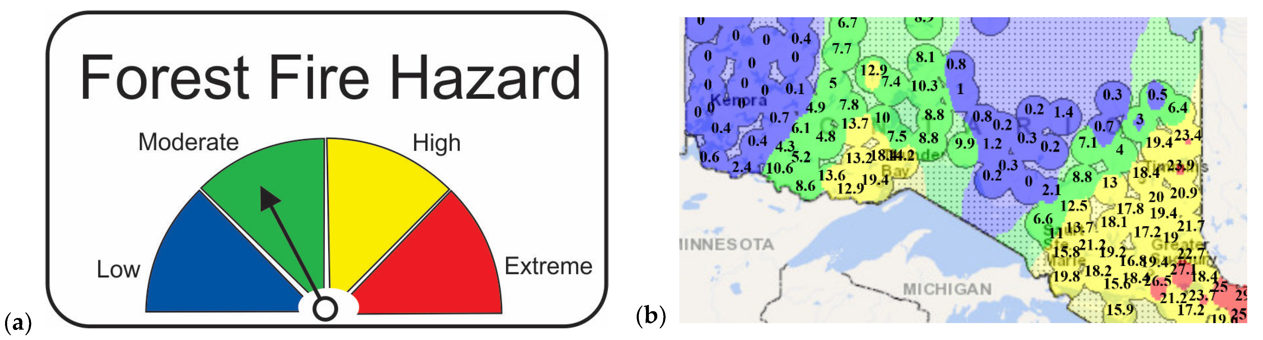
Overview of Selected Historical Categorization and Colouring Schemes
2. Methods
- Understanding and scoping the data
- Understanding the decision-making uses of the information
- Specifying the design goals and requirements
- Designing the categorization and visualization scheme
- Evaluating and revising the scheme
2.1. Step 1: Understanding and Scoping the Data
- Units, including any scaling and transformations
- Data storage type (for example, 64-bit floating point, signed long integer, string) and associated considerations (for example, storing a scaled real value as an integer, which truncates the precision)
- The data’s range or anticipated range if using a static scale for all future maps
- The frequency distribution of historical data
- ○
- It may or may not be useful to have more categories where there was a lot of data, and it may or may not be pointless to have multiple categories where there was little or no data (see examples in Section 2.2).
- The data’s precision of measurement and storage and the data’s accuracy of measurement or estimation
- ○
- The stored precision may not correspond with the accuracy. Measured data such as weather observations have low precision (for example, to 0.1 °C), but calculated data such as FWI System values should be calculated and may be stored with full machine precision (~16 decimal digits), which is well beyond the accuracy of typical fire management data.
- If the data are generated by a model, then the model’s meaning, structure, assumptions, limitations, precision and accuracy
2.2. Step 2: Understanding the Decision-Making Uses of the Information
2.3. Step 3: Specifying the Design Goals and Requirements
- Regarding the complete and accurate display of information:
- ○
- Are the magnitudes shown with the original or reduced precision?
- ○
- Are the magnitudes undistorted or distorted by categorization, scale nonlinearity or truncation?
- ○
- Are the relative magnitudes evident by the colouring without or with referral to the legend?
- Regarding the quick and easy understanding of information:
- ○
- Can the colouring be easily matched to the legend’s magnitude numbers?
- ○
- Does the colouring draw attention and convey a suitable psychological meaning for the degree of alarm?
- ○
- What is the overall ease of understanding?
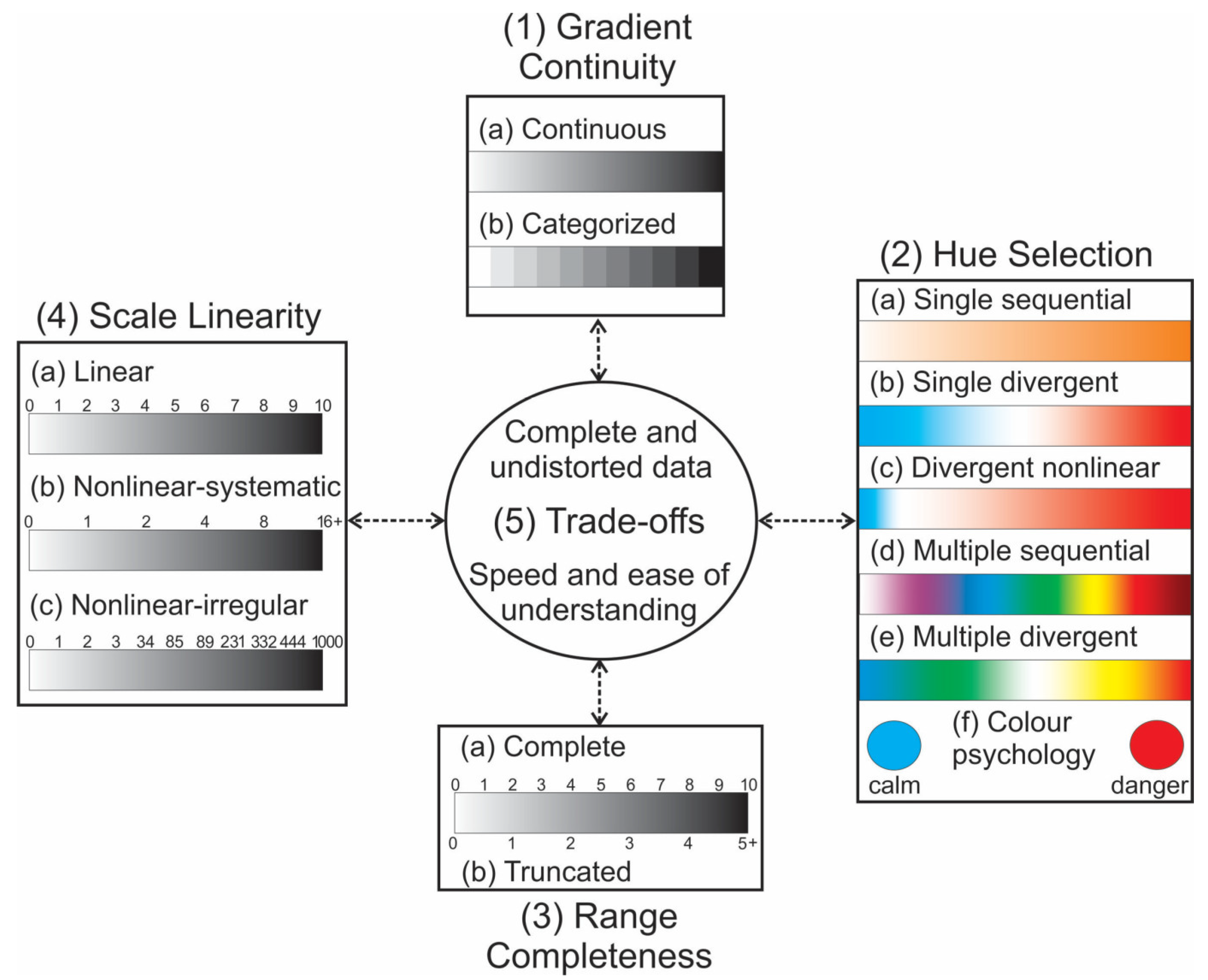
2.4. Step 4: Designing the Categorization and Visualization Scheme
- Gradient continuity: whether to use the original values unaltered or categorized
- Hue selection: the number and choice of colours and design of gradients
- Range completeness: whether to show the full range or truncate the top or bottom of the range
- Scale linearity: whether to have a linear or nonlinear scale or progression of category boundaries, and whether to have colour gradients that are linearly or nonlinearly proportional to the data magnitudes
2.4.1. Gradient Continuity
2.4.2. Hue Selection
2.4.3. Range Completeness and Scale Linearity
- Numeric scale: whether to have a linear (part 4a) or nonlinear numeric scale (parts 4b and 4c) or progression of category boundaries (if applicable)
- For categorized gradient continuity, a nonlinear scale is used to vary the resolution over the range
- Colour gradient: whether to have colour gradients that are linearly or nonlinearly proportional to the data magnitudes
- For categorized gradient continuity, a nonlinear colour gradient is used to communicate the varying meaning or importance of the information over the range
2.4.4. The Design Process
2.5. Step 5: Evaluating and Revising the Scheme
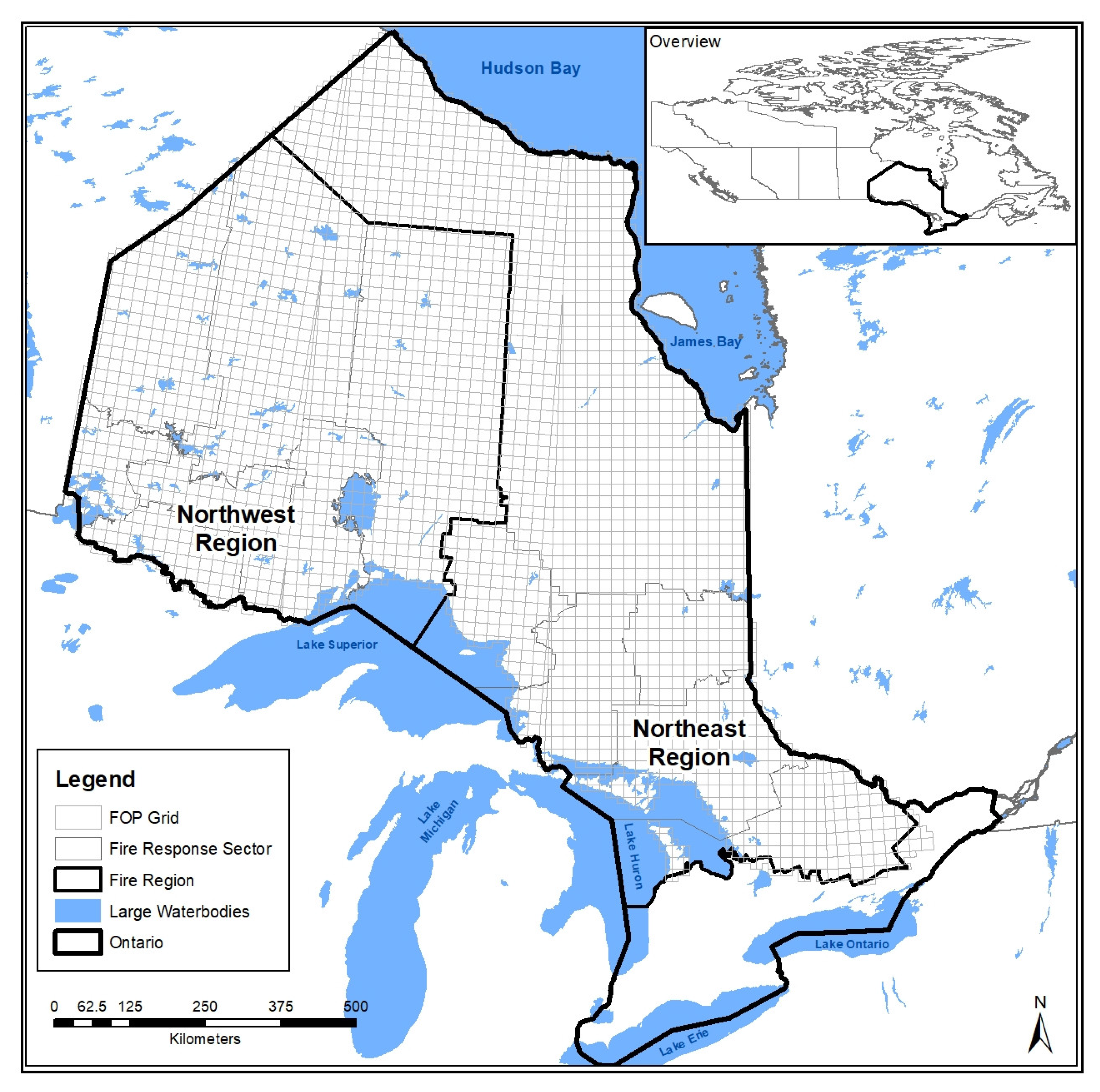
3. Case Study: Designing the Scheme for Ontario’s FOP Models
3.1. Case Study—Step 1: Understanding and Scoping the Data
3.2. Case Study—Step 2: Understanding the Decision-Making Uses of the Information
- Prevention: for example, escalated and targeted messaging, temporary fire bans; made by the Province, Regions and Sectors
- Preparedness: types, numbers, locations and readiness alert levels of firefighting resources (crews, helicopters, airtankers and engines); made by the Regions and Sectors
- Detection: numbers, routes and times of aerial detection patrols described in [39]; made by the Regions, jointly
- Dispatch: different resources may be sent now if more threatening fires are anticipated later; made by the Regions and Sectors
- Inter-provincial and international resource sharing; made by the Province and Regions
3.3. Case Study—Step 3: Specifying the Design Goals and Requirements
- There is a need for both maps and numeric subtotals and totals of fire occurrence by cause and location (i.e., Sectors, Regions, Province)
- All the maps need to use the same categories and colours for FOP magnitudes
- The FOP models’ output is the expected or average occurrence, but the actual occurrence varies around the average, so an indication of the variability is needed.
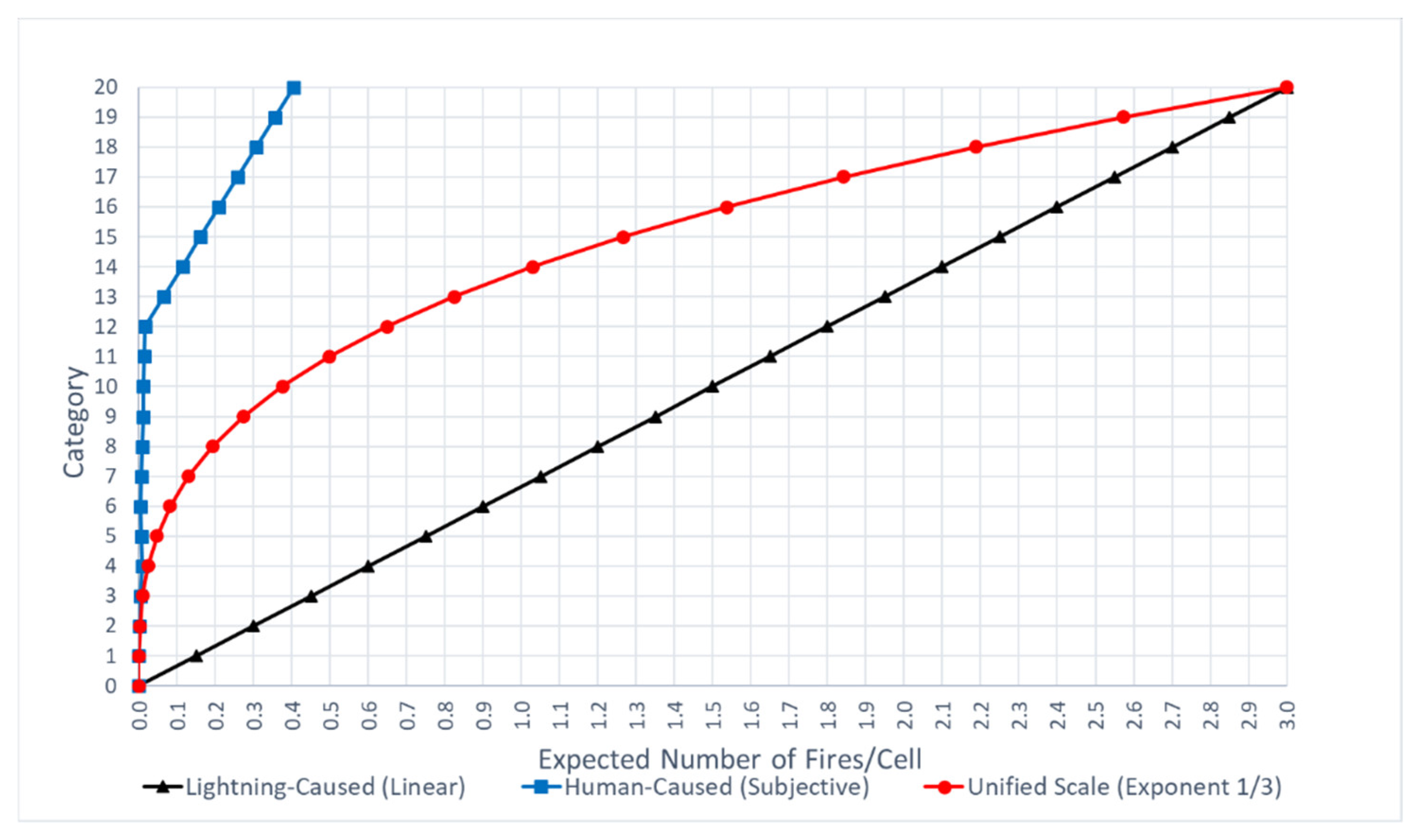
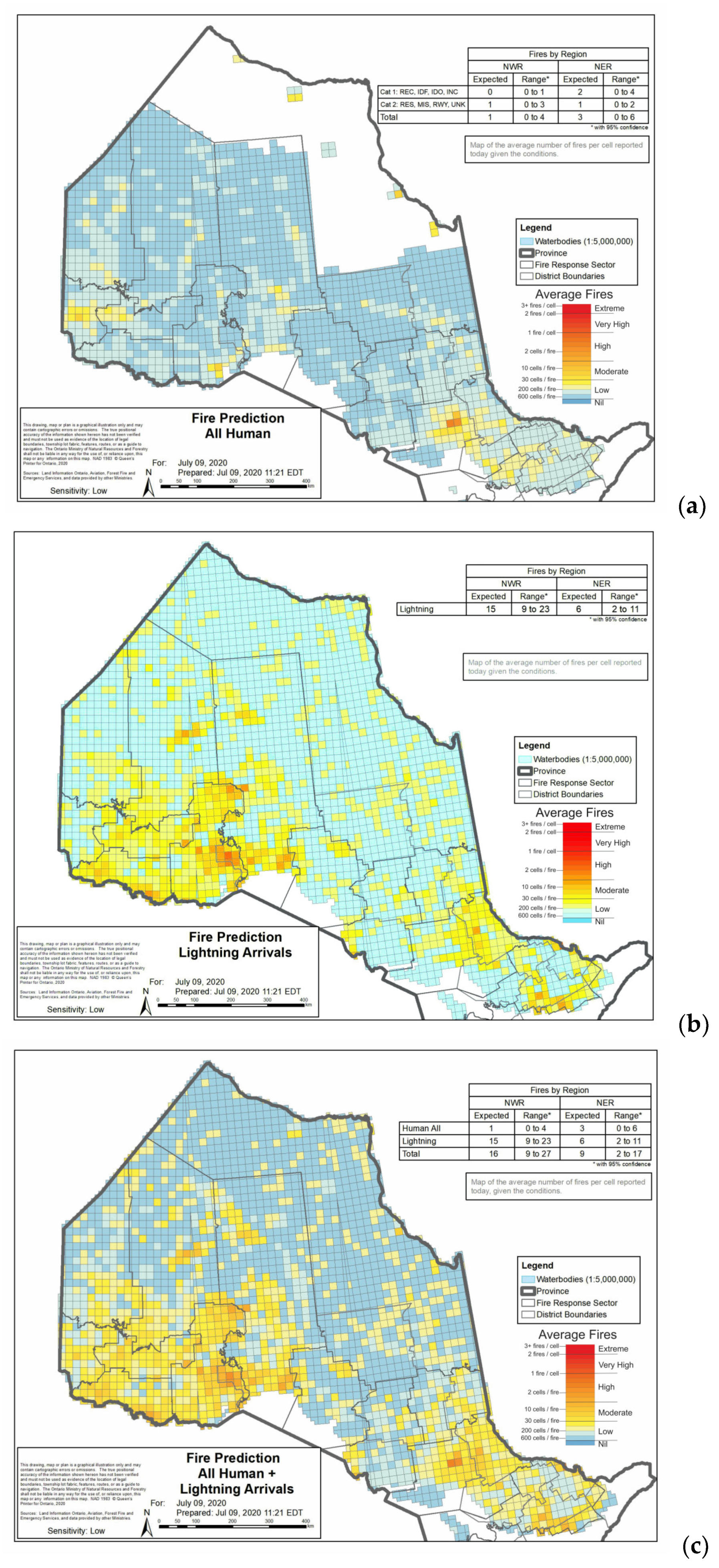
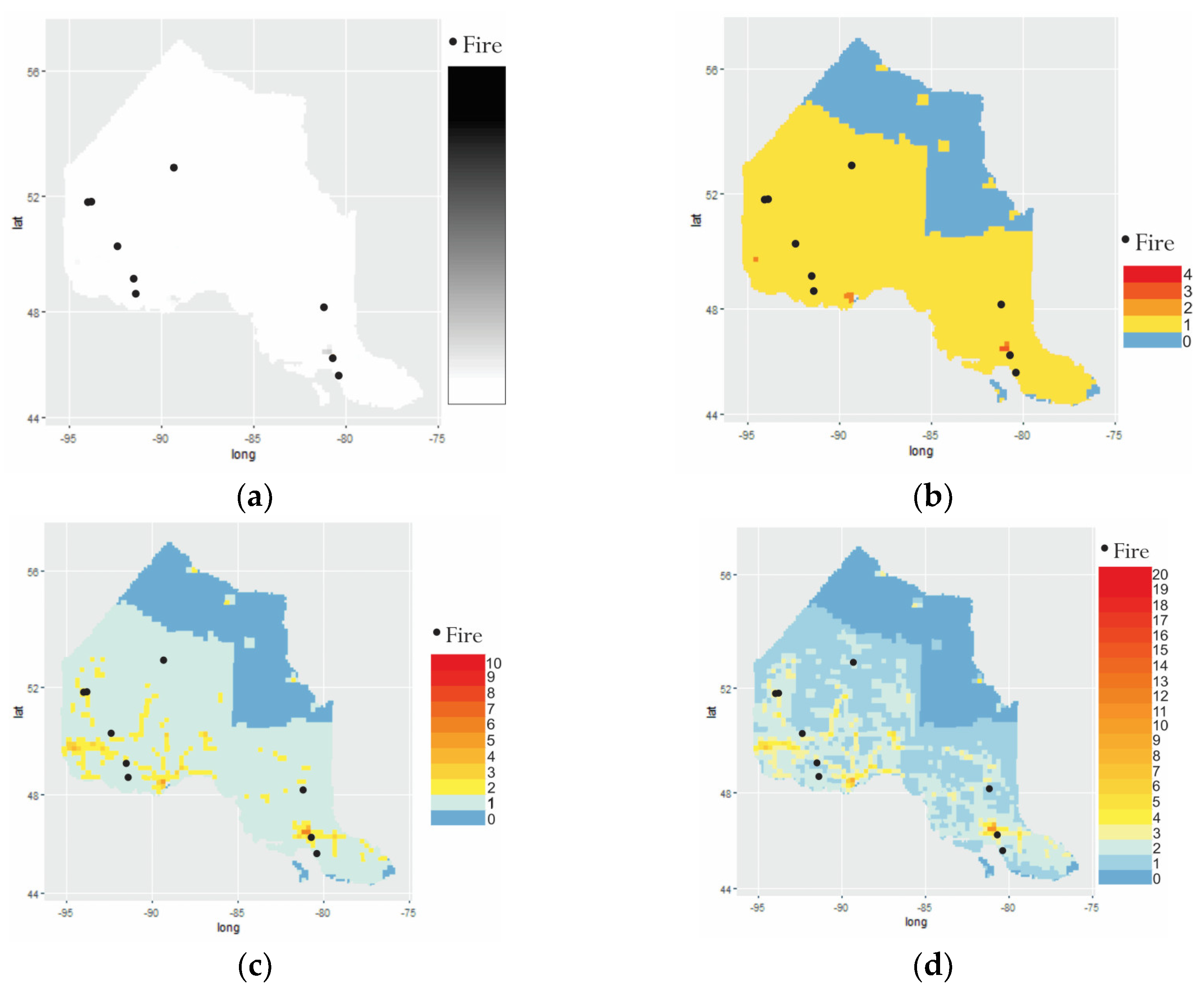
3.4. Case Study—Step 4: Designing the Categorization and Visualization Scheme
3.5. Case Study—Step 4: Results of the Design Process
3.6. Case Study—Step 5: Evaluating and Revising the Scheme
4. Discussion
Supplementary Materials
Author Contributions
Funding
Acknowledgments
Conflicts of Interest
References
- Woolford, D.G.; Martell, D.L.; McFayden, C.B.; Evens, J.; Stacey, A.; Wotton, B.M.; Boychuk, D. The Development and Implementation of a Human-Caused Wildland Fire Occurrence Prediction System for the Province of Ontario, Canada. Can. J. For. Res. 2021, 51, 303–325. [Google Scholar] [CrossRef]
- Johnston, L.M.; Wang, X.; Erni, S.; Taylor, S.W.; McFayden, C.B.; Oliver, J.A.; Stockdale, C.; Christianson, A.; Boulanger, Y.; Gauthier, S.; et al. Wildland Fire Risk Research in Canada. Environ. Rev. 2020, 28, 164–186. [Google Scholar] [CrossRef]
- Wotton, B.M.; Martell, D.L. A Lightning Fire Occurrence Model for Ontario. Can. J. For. Res. 2005, 35, 1389–1401. [Google Scholar] [CrossRef]
- Stocks, B.J.; Lynham, T.J.; Lawson, B.D.; Alexander, M.E.; Van Wagner, C.E.; McAlpine, R.S.; Dubé, D.E. The Canadian Forest Fire Danger Rating System: An Overview. For. Chron. 1989, 65, 450–457. [Google Scholar] [CrossRef]
- Van Wagner, C.E. Development and Structure of the Canadian Forest Fire Weather Index System; Forestry Technical Report; Canada Communication Group Publication: Ottawa, ON, Canada, 1987; ISBN 9780662151982. [Google Scholar]
- Forestry Canada Fire Danger Group. Development and Structure of the Canadian Forest Fire Behavior Prediction System; Information Report ST-X-3; Forestry Canada, Science and Sustainable Development Directorate: Ottawa, ON, Canada, 1992; ISBN 9780662198123.
- Stocks, B.J. Wildfires and the Fire Weather Index System in Ontario; Information Report O-X-213; Canadian Forestry Service, Great Lakes Forestry Centre: Sault Ste. Marie, ON, Canada, 1974.
- Taylor, S.W.; Alexander, M.E. Science, Technology, and Human Factors in Fire Danger Rating: The Canadian Experience. Int. J. Wildland Fire 2006, 15, 121. [Google Scholar] [CrossRef]
- Hanes, C.; Wotton, B.M.; McFayden, C.; Jurko, N. An Approach for Defining Physically Based Fire Weather Index System Classes for Ontario. Natural Resources Canada; Information Report GLC-X-30; Canadian Forest Service: Sault Ste. Marie, ON, Canada, 2021; in press.
- KiiI, A.D.; Lieskovsky, R.J.; Grigel, J.E. Fire Hazard Classification for Prince Albert National Park, Saskatchewan; Environ; Information Report NOR·X·S8; Environment Canada, Forestry Service, Northern Forest Research Centre: Edmonton, AB, Canada, 1973. [Google Scholar]
- Kiil, A.D.; Miyagawa, R.S.; Quintilio, D. Calibration and Performance of the CANADIAN Fire Weather Index in Alberta; Information Report NOR-X-173; Environment Canada, Canadian Forestry Service, Northern Forest Research Centre: Edmonton, AB, Canada, 1977. [Google Scholar]
- Alexander, M.E. Proposed Revision of Fire Danger Class Criteria for Forest and Rural Areas in New Zealand, 2nd ed.; National Rural Fire Authority: Wellington, New Zealand; Scion Rural Fire Research Group: Christchurch, New Zealand, 2008; 63p. [Google Scholar]
- De Groot, W.J.; Field, R.D.; Brady, M.A.; Roswintiarti, O.; Mohamad, M. Development of the Indonesian and Malaysian Fire Danger Rating Systems. Mitig. Adapt. Strat. Glob. Chang. 2007, 12, 165. [Google Scholar] [CrossRef] [Green Version]
- Flannigan, M.D.; Wotton, B.M. A Study of Interpolation Methods for Forest Fire Danger Rating in Canada. Can. J. For. Res. 1989, 19, 1059–1066. [Google Scholar] [CrossRef]
- Ontario Forest Fire Information Map. Available online: https://www.lioapplications.lrc.gov.on.ca/ForestFireInformationMap/index.html?viewer=FFIM.FFIM (accessed on 17 June 2021).
- Byram, G.M. Combustion of Forest Fuels. In Forest Fire: Control and Use; Davis, K.P., Ed.; McGraw-Hill: New York, NY, USA, 1959; pp. 61–89. [Google Scholar]
- Alexander, M.E.; De Groot, W.J. Fire Behavior in Jack Pine Stands as Related to the Canadian Forest Fire Weather Index (FWI) System; Poster with Text; Canadian Forest Service, Northern Forestry Centre: Edmonton, AB, Canada, 1988.
- Taylor, S.W.; Pike, R.G.; Alexander, M.E. Field Guide to the Canadian Forest Fire Behavior Prediction (FBP) System; Natural Resources Canada, Canadian Forest Service, Northern Forestry Centre and British Columbia Ministry of Forests, Research Branch: Victoria, BC, Canada, 1996.
- Taylor, S.W.; Alexander, M.E. A Field Guide to the Canadian Forest Fire Behavior Prediction (FBP) System, 3rd ed.; Natural Resources Canada, Canadian Forest Service, Northern Forestry Centre: Edmonton, AB, Canada, 2018.
- Pravossoudovitch, K.; Cury, F.; Young, S.G.; Elliot, A.J. Is Red the Colour of Danger? Testing an Implicit Red–Danger Association. Ergonomics 2014, 57, 503–510. [Google Scholar] [CrossRef]
- Kaya, N.; Epps, H.H. Relationship between Color and Emotion: A Study of College Students. Coll. Stud. J. 2004, 38, 396. [Google Scholar]
- Hirsch, K.; Martell, D. A Review of Initial Attack Fire Crew Productivity and Effectiveness. Int. J. Wildland Fire 1996, 6, 199. [Google Scholar] [CrossRef]
- Alberta Wildfire, Danger Forecast, Headfire Intensity. Available online: https://wildfire.alberta.ca/files/ahfi.gif (accessed on 17 June 2021).
- Canadian Wildland Fire Information System Fire Behaviour Maps. Available online: https://cwfis.cfs.nrcan.gc.ca/maps/fb (accessed on 17 June 2021).
- BC Wildfire PSTA Head Fire Intensity. Available online: https://catalogue.data.gov.bc.ca/dataset/bc-wildfire-psta-head-fire-intensity (accessed on 9 September 2020).
- Evans, I.S. The Selection of Class Intervals. Trans. Inst. Br. Geogr. 1977, 2, 98–124. [Google Scholar] [CrossRef]
- Beverly, J.L.; McLoughlin, N. Burn Probability Simulation and Subsequent Wildland Fire Activity in Alberta, Canada—Implications for Risk Assessment and Strategic Planning. For. Ecol. Manag. 2019, 451, 117490. [Google Scholar] [CrossRef]
- Martell, D. The Development and Implementation of Forest and Wildland fire Management Decision Support Systems: Reflections on Past Practices and Emerging Needs and Challenges. Math. Comput. For. Nat. Resour. Sci. 2011, 3, 18. [Google Scholar]
- Noble, P.; Paveglio, T.B. Exploring Adoption of the Wildland Fire Decision Support System: End User Perspectives. J. For. 2020, 118, 154–171. [Google Scholar] [CrossRef]
- Hanes, C.C.; Jain, P.; Flannigan, M.D.; Fortin, V.; Roy, G. Evaluation of the Canadian Precipitation Analysis (CaPA) to Improve Forest Fire Danger Rating. Int. J. Wildland Fire 2017, 26, 509. [Google Scholar] [CrossRef]
- Jenny, B.; Kelso, N.V. Color Design for the Color Vision Impaired. Cartogr. Perspect. 2007, 61–67. [Google Scholar] [CrossRef]
- Harrower, M.; Brewer, C.A. ColorBrewer.org: An Online Tool for Selecting Colour Schemes for Maps. Cartogr. J. 2003, 40, 27–37. [Google Scholar] [CrossRef]
- Zeileis, A.; Hornik, K.; Murrell, P. Escaping RGBland: Selecting Colors for Statistical Graphics. Comput. Stat. Data Anal. 2009, 53, 3259–3270. [Google Scholar] [CrossRef] [Green Version]
- The R Project for Statistical Computing. Available online: https://www.r-project.org/ (accessed on 28 August 2020).
- inlmisc: Miscellaneous Functions for the USGS INL Project Office. Available online: https://cran.r-project.org/web/packages/inlmisc/index.html (accessed on 4 September 2020).
- TOL Color Schemes. Available online: https://waterdata.usgs.gov/blog/tolcolors/ (accessed on 4 September 2020).
- Jenks, G.F.; Caspall, F.C. Error on Choroplethic Maps: Definition, Measurement, ReductioN. Ann. Assoc. Am. Geogr. 1971, 61, 217–244. [Google Scholar] [CrossRef]
- Geospatial Analysis 6th Edition, 2020 Update. Available online: https://www.spatialanalysisonline.com/HTML/index.html (accessed on 4 June 2021).
- McFayden, C.B.; Woolford, D.G.; Stacey, A.; Boychuk, D.; Johnston, J.M.; Wheatley, M.J.; Martell, D. L Risk Assessment for Wildland Fire Aerial Detection Patrol Route Planning in Ontario, Canada. Int. J. Wildland Fire. 2020, 29, 28–41. [Google Scholar] [CrossRef]
- McFayden, C.B.; Boychuk, D.; Woolford, D.G.; Wheatley, M.J.; Johnston, L. Impacts of Wildland Fire Effects on Resources and Assets through Expert Elicitation to Support Fire Response Decisions. Int. J. Wildland Fire 2019, 28, 885–900. [Google Scholar] [CrossRef]
- McFayden, C.; Boychuk, D.; Stacey, A.; Woolford, D.G.; McLarty, D.; Leonard, D.; Evens, J.; Johnston, D.; McAlpine, R.S. Daily Spatial Response Objective and Speed Weight Indicators to Assist in Daily Wildland Fire Preparedness Planning for ONTARIO, Canada. (in prep)
- Albert-Green, A.; Braun, W.J.; Martell, D.L.; Woolford, D.G. Visualization Tools for Assessing the Markov Property: Sojourn Times in the Forest Fire Weather Index in Ontario. Environmetrics 2014, 25, 417–430. [Google Scholar] [CrossRef]


| Class | Colour | FFMC | DMC | DC | ISI | BUI | FWI |
|---|---|---|---|---|---|---|---|
| Low | 0–80 | 0–15 | 0–140 | 0–2.2 | 0–20 | 0–3 | |
| Moderate | 81–86 | 16–30 | 141–240 | 2.3–5.0 | 12–36 | 4–10 | |
| High | 87–90 | 31–50 | 241–340 | 5.1–10.0 | 37–60 | 11–22 | |
| Extreme | ≥91 | ≥51 | ≥340 | ≥10 | ≥61 | ≥23 |
| Intensity Class (IC) | Range (kW/m) 1 | Ontario Map | Alberta Map [23] | Field Guide 2 [19] | National Map [24] | BC 90th Percentile Map 3 [25] | |
|---|---|---|---|---|---|---|---|
| IC 1 | <10 | <1 k | |||||
| IC 2 | 10–500 | <1 k | |||||
| IC 3 | 500–2 k | <1 k | 1 k–2 k | ||||
| IC 4 | 2 k–4 k | ||||||
| IC 5 | 4 k–10 k | >4 k | 4 k–6 k | 6 k–10 k | |||
| IC 6 | >10 k | 10 k–30 k | 10 k–18 k | ||||
| 7 | >30 k | 18 k–30 k | |||||
| 8 | 30 k–60 k | ||||||
| 9 | 60 k–100 k | ||||||
| 10 | >100 k | ||||||
| Design Option | Alternative | Description |
|---|---|---|
| 1. Gradient continuity | Continuous | No categorization; the percentage of grey saturation is proportional to the datum magnitude |
| 2. Hue selection | Single sequential | Achromatic gradient of white through greys to black; no chromatic psychological colour associations |
| 3. Range completeness | Complete | Full range of data magnitude is shown; no truncation or aggregation at the top or bottom |
| 4. Scale linearity | Linear | No distortion; the percentage of grey saturation equals the datum’s position within its range |
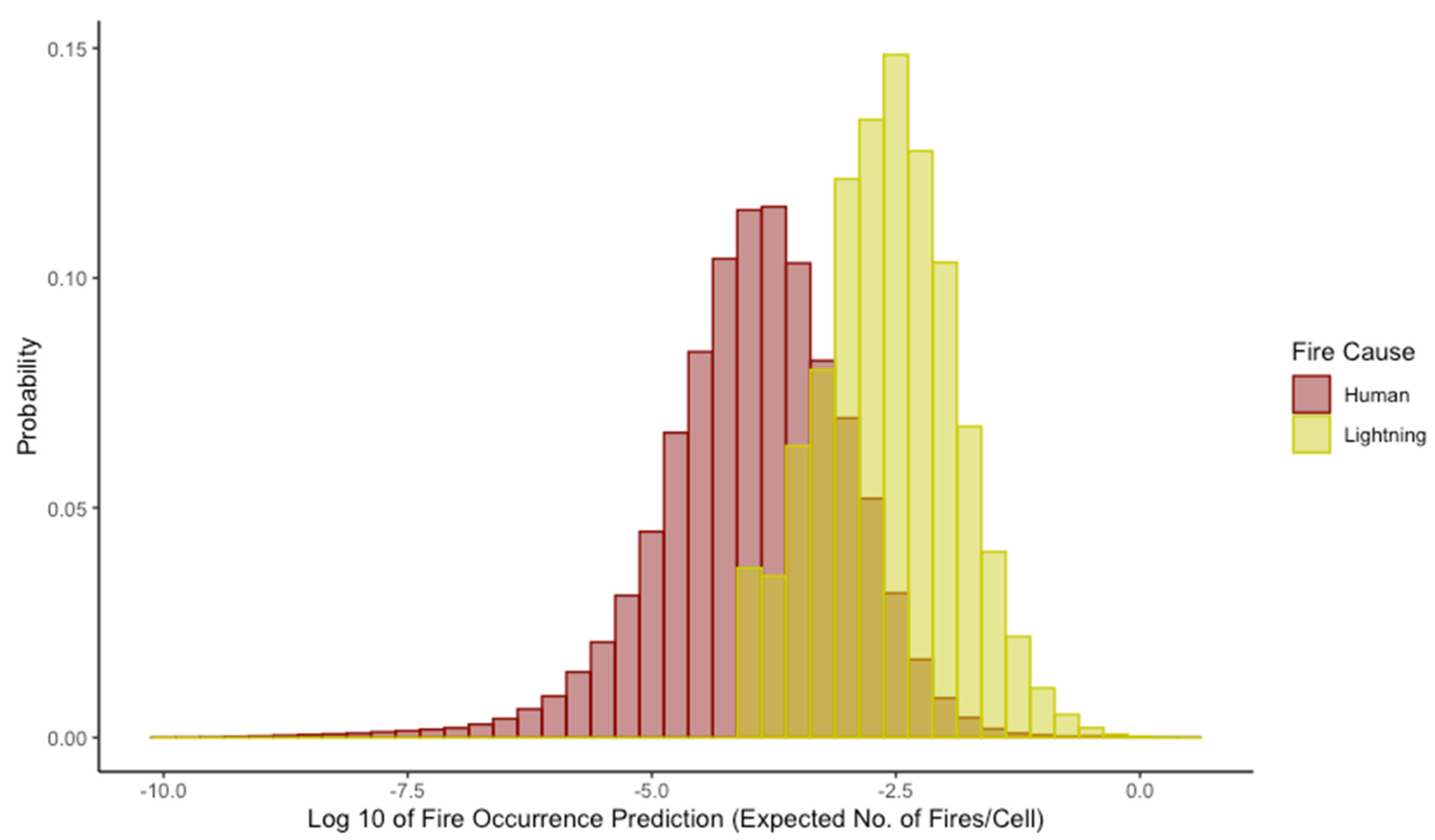
| Number of Observations | First Quartile | Median | Mean | Third Quartile | Maximum | |
|---|---|---|---|---|---|---|
| Human | 607,383 | 0.00003 | 0.00013 | 0.00107 | 0.00048 | 1.37168 |
| Lightning | 1,026,860 | 0.00090 | 0.00260 | 0.00955 | 0.00750 | 3.89129 |
| Goal | Attribute | Alternative for Design Options | |||
|---|---|---|---|---|---|
| More Categories | More Truncation at High end | More Nonlinearity | More Hues | ||
| Complete and accurate information | More resolution at low end | Better | Better | Better | No effect |
| More resolution at high end | Better | Better in range | Worse | No effect | |
| NONE beyond truncation | |||||
| Accurate, Undistorted | Better | Better in range | Worse | No effect | |
| ABSENT beyond truncation | |||||
| Fast and easy to understand | Need to refer to legend | Worse | No effect in range | Worse | Worse |
| Ease of matching legend | Worse | Better | Worse | Better | |
| Attention drawn to important data | No effect | No effect in range | No effect | Better | |
| ABSENT beyond truncation | |||||
| Has suitable psychological meaning | No effect | No effect | No effect | Better if using colour psychology | |
| Category Number | Category Upper Bound of Expected Number | Colour | Adjective Category | Map Legend | |
|---|---|---|---|---|---|
| (Fires/Cell) | (Cells/Fire) | ||||
| 20 | ≥3.00 | ≤0.333 | Extreme | 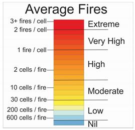 | |
| 19 | 2.57 | 0.389 | |||
| 18 | 2.19 | 0.457 | Very High | ||
| 17 | 1.84 | 0.543 | |||
| 16 | 1.54 | 0.651 | |||
| 15 | 1.27 | 0.790 | |||
| 14 | 1.03 | 0.972 | High | ||
| 13 | 0.824 | 1.21 | |||
| 12 | 0.648 | 1.54 | |||
| 11 | 0.499 | 2.00 | |||
| 10 | 0.375 | 2.67 | |||
| 9 | 0.273 | 3.66 | |||
| 8 | 0.192 | 5.21 | Moderate | ||
| 7 | 0.129 | 7.77 | |||
| 6 | 8.10 × 10⁻² | 12.3 | |||
| 5 | 4.69 × 10⁻² | 21.3 | |||
| 4 | 2.40 × 10⁻² | 41.7 | Low | ||
| 3 | 1.01 × 10⁻² | 98.8 | |||
| 2 | 3.00 × 10⁻³ | 333 | Very Low | ||
| 1 | 3.75 × 10⁻⁴ | 2670 | |||
| 0 | 0 | ∞ | Nil | ||
Publisher’s Note: MDPI stays neutral with regard to jurisdictional claims in published maps and institutional affiliations. |
© 2021 by the authors. Licensee MDPI, Basel, Switzerland. This article is an open access article distributed under the terms and conditions of the Creative Commons Attribution (CC BY) license (https://creativecommons.org/licenses/by/4.0/).
Share and Cite
Boychuk, D.; McFayden, C.B.; Woolford, D.G.; Wotton, M.; Stacey, A.; Evens, J.; Hanes, C.C.; Wheatley, M. Considerations for Categorizing and Visualizing Numerical Information: A Case Study of Fire Occurrence Prediction Models in the Province of Ontario, Canada. Fire 2021, 4, 50. https://doi.org/10.3390/fire4030050
Boychuk D, McFayden CB, Woolford DG, Wotton M, Stacey A, Evens J, Hanes CC, Wheatley M. Considerations for Categorizing and Visualizing Numerical Information: A Case Study of Fire Occurrence Prediction Models in the Province of Ontario, Canada. Fire. 2021; 4(3):50. https://doi.org/10.3390/fire4030050
Chicago/Turabian StyleBoychuk, Den, Colin B. McFayden, Douglas G. Woolford, Mike Wotton, Aaron Stacey, Jordan Evens, Chelene C. Hanes, and Melanie Wheatley. 2021. "Considerations for Categorizing and Visualizing Numerical Information: A Case Study of Fire Occurrence Prediction Models in the Province of Ontario, Canada" Fire 4, no. 3: 50. https://doi.org/10.3390/fire4030050
APA StyleBoychuk, D., McFayden, C. B., Woolford, D. G., Wotton, M., Stacey, A., Evens, J., Hanes, C. C., & Wheatley, M. (2021). Considerations for Categorizing and Visualizing Numerical Information: A Case Study of Fire Occurrence Prediction Models in the Province of Ontario, Canada. Fire, 4(3), 50. https://doi.org/10.3390/fire4030050