1. Introduction
The COVID-19 pandemic caused major disruptions to urban activity and travel patterns, several of the behavioral shifts that emerged during the pandemic—most notably the widespread move to remote and hybrid work—appear to be lasting rather than being temporary [
1,
2,
3]. These shifts have implications for travel demand and urban mobility that go beyond the pandemic period itself. Comparing daily activity patterns before and after the pandemic is therefore important: it tells us whether cities went back to how things were or whether a new behavioral baseline has emerged that transportation planning needs to accommodate. By looking at citywide mobility survey data from 2019 and 2022, we analyze which aspects of daily behavior shifted, who was affected, and how persistent these changes are. Activity-based travel demand models are based on travel being a derived demand and people travel to participate in activities at different places and times [
4,
5,
6]. A key difficulty in these models is that daily activity patterns vary widely across the population and also change from day to day for the same person [
7,
8,
9].
It is evident that multi-day travel can better capture and predict activity patterns, and that looking at a single day can result in misleading insights [
7,
8]. Bhat and Koppelman [
10] reviewed time-use research in transportation and found that how people spend their discretionary time depends on their social and demographic background and also differs by day of the week. These studies made a clear case for collecting data over multiple days. ALBATROSS model [
11] used decision-tree rules learned from observed behavior to simulate daily schedules under spatial, temporal, and social constraints. However, these models used deterministic logic and were not designed to compare observed activity sequences across large populations.
By borrowing the sequence alignment method from bioinformatics transportation modelers, researchers found a way to compare multiple dimensions of activity patterns at once, by slicing the day into several time slots and using letters representing activities performed by individuals [
12]. The Levenshtein (edit) distance measures how different two strings (activity chains in case of travel behavior analysis) are by counting the minimum insertions, deletions, or substitutions needed to turn one string into the other [
13,
14,
15]. With these distances in hand, clustering methods such as affinity propagation,
k-means, hierarchical clustering, and density-based approaches have been used to find common types of daily patterns in travel diary data [
13,
16,
17,
18]. Allahviranloo and Recker [
12] applied pattern recognition to personal travel behavior and showed that this data-driven classification can uncover behavioral groups that trip-based summaries miss.
With more mobility data now available, researchers have added richer features and probabilistic models to these frameworks. Dimensionality reduction methods such as PCA,
t-SNE, and UMAP have been used to project high-dimensional travel data into low-dimensional spaces for visualization and clustering [
19,
20]. Gaussian Mixture Models (GMMs) are particularly useful in these reduced spaces because they give membership probabilities rather than hard labels, which better reflects the mixed nature of daily activity schedules [
21,
22]. Similarly, Sun and Axhausen [
23] used probabilistic tensor factorization on transit smart-card data to extract mobility patterns along time-of-day, passenger-type, and spatial dimensions, showing that probabilistic methods can capture mobility structure without forcing people into rigid categories. To analyze the difference in activity patterns across different regions, Allahviranloo and Aissaoui [
24] compared time-use across several metropolitan areas in Northern America and found that differences in land use, transit, and demographics lead to distinct population-level activity patterns. This highlights the need for context-specific modeling and motivates our focus on one city observed at two points in time, where the change in context comes not from geography but from the pandemic. Due to significance of pandemic on mobility, several scientists have looked at post-pandemic mobility through the lens of activity participation and daily schedule structure. Su et al. [
25] showed that analyzing both motifs and sequences reveals clear differences between telecommuters and regular commuters—about 20% of telecommuters stay home all day on a workday, compared to only 8% of regular commuters, and those who do travel tend to make more trips and follow more complex schedules. Rafiq et al. [
26] studied the early pandemic period using an aggregate structural regression model and found that working from home reduced workplace visits, non-work activities tied to work travel, and total miles traveled. Other studies confirm that telework and hybrid work continue to reshape commute choices and raise equity concerns [
1,
3]. On the methods side, activity-based modeling has moved toward more data-driven approaches, including neural network scheduling frameworks [
27], inverse reinforcement learning for sequential activity decisions [
28], and hybrid machine-learning extensions of traditional demand models [
29]. Bhuiyan and Habib [
30] showed that bioinspired sequence alignment with Levenshtein distance can extract representative weekly activity patterns from single-day diaries, while Haghighi and Miller [
31] reviewed week-long activity-based modeling and identified the lack of scalable probabilistic frameworks for multi-day pattern recognition as a key gap. These developments motivate a framework that represents activity sequences probabilistically while testing whether post-pandemic changes persist.
Despite this progress, several gaps still remain to be closed and we try to address some of those in this paper. First, most clustering studies use single-day data and hard cluster assignments, which cannot represent days that mix multiple activity types. Multi-week diary studies [
32,
33] show that while work and school are stable from day to day, discretionary activities vary a lot, making single-label assignments even less suitable. Second, predicting activity patterns for missing survey days—a common problem in multi-day diaries—has received little attention, especially under constraints that guarantee valid probability distributions. Third, the COVID-19 pandemic disrupted urban mobility on a massive scale [
34,
35,
36], with drops in transit ridership, shifts to cars and walking, and the rise of remote work [
37,
38,
39]. In New York City, subway ridership fell by over 90% during the initial lockdown and recovered unevenly across boroughs and demographic groups [
40]. Most of this literature focused on aggregate ridership or mode share. Few studies have examined how the full structure of daily activity patterns—the sequence, timing, and mix of activities—changed at the person level, or whether those changes persisted beyond the peak phases of the pandemic [
19,
36]. We address this last gap by comparing the 2019 and 2022 waves of the New York City Citywide Mobility Survey [
41,
42]. The comparison follows a before-and-after design: 2019 is the last full pre-pandemic year, with no COVID-19 effects, and serves as the behavioral baseline. The 2022 wave was collected more than two years after the initial lockdowns, by which point emergency-phase disruptions (stay-at-home orders, school closures, service shutdowns) had ended. Any behavioral differences that remain at that point can reasonably be attributed to lasting structural shifts rather than temporary crisis responses. This timing lets us test whether changes in daily activity patterns persisted beyond the acute phase of the pandemic or whether the city went back to its 2019 routines.
This paper develops a probabilistic framework for classifying, imputing, and reconstructing multi-day activity patterns from incomplete travel diary data. We apply it to produce a demographically disaggregated comparison of daily activity structures in New York City before (2019) and after (2022) the COVID-19 pandemic, using the Citywide Mobility Survey data. New York City is a useful setting because it is one of the most transit-dependent cities in the world, with diverse populations and neighborhoods. The availability of multi-day survey data from both periods allows a direct comparison of activity patterns.
The paper is organized around three research questions: (a) How can we effectively impute missing data in multi-day activity diaries while maintaining the probabilistic and multi-pattern nature of daily human behavior? (b) Did the structure of daily activity patterns in NYC (timing, sequence and mix of activities) change between 2019 and 2022, and do these changes indicate a persistent shift toward more home-centered routines? (c) Do the observed changes differ across demographic groups (income, education, gender, age) in ways relevant to transportation planning? Aligned with these questions, the contributions of this paper are threefold:
Filling in incomplete survey data. In both surveys, fewer than one-third of participants provided data for all seven days. Instead of dropping these respondents or treating each day separately, we build a sequential prediction model that reconstructs activity profiles for every participant using their observed days and demographic attributes. This produces a complete multi-day dataset that keeps day-to-day dependencies within each person.
Soft (probabilistic) clustering with constrained prediction. We fit a K-component GMM to the embedded activity-chain space and keep the full probability vector for every observed day, rather than assigning one hard label. To make sure predicted vectors for missing days are valid probability distributions (non-negative, summing to one), we use a constrained Lagrangian regression model with penalty terms. This soft membership captures the mixed nature of daily activity patterns better than hard clustering.
Reconstructing population-level time-use from predicted memberships. We turn each person’s predicted probability vector into a daily activity profile by taking a weighted average of cluster-representative activity chains (encoded as one-hot matrices over 38 half-hour time slots and 11 activity types). Aggregating across people gives population-level time-use distributions with a Mean Absolute Error of about 5–6% compared to observed data.
The remainder of this paper is organized as follows.
Section 2 describes the Citywide Mobility Survey data and participant demographics for both years.
Section 3 details the methodology, covering activity chain construction, GMM soft clustering, and the constrained Lagrangian prediction model.
Section 4 presents results on cluster structures and time-use patterns. We discuss the application and policy implications in
Section 5, followed by conclusions in
Section 6.
2. Data
This study uses the New York City Citywide Mobility Survey, an annual survey that records travel behavior, daily routines, and recreational activities over multiple days for a representative sample of residents [
43]. Each respondent reports trip-level records—origin, destination, mode, purpose, departure and arrival times—along with household and demographic information (age, gender, education, income, etc.) [
44]. The 2019 data were collected22 May to 30 June 2019; the 2022 data 28 September to 17 November 2022. The CMS uses address-based sampling, drawing a random sample of residential addresses across 10 survey zones covering all five boroughs [
41,
42]. In 2019 the survey had 3346 respondents; in 2022, 2966 were recruited through address-based sampling (86%) and re-invitations of 2019 participants (14%). The CMS reports provide unweighted and weighted sample profiles benchmarked against the American Community Survey [
41,
42].
Respondents could participate via a seven-day smartphone travel diary, a one-day online survey, or a one-day phone interview. Because the imputation framework (
Section 3) requires multiple days per person, we keep only smartphone diary participants. For gender, responses coded ‘Other’ or ‘Prefer not to answer’ were retained as separate categories. For education, invalid or missing responses were dropped, while explicit ‘Prefer not to answer’ responses were kept. Records missing other demographic variables were excluded (the number of such cases was small). The final analytic sample has 12,513 person-day records in 2019 and 13,060 in 2022.
Throughout this paper, day 1 through day 7 refer to the order in which a participant reported survey days (participation order), not calendar weekdays.
Table 1 summarizes participant demographics. The bottom panel shows how many days each respondent completed. In 2019, 36.3% of respondents completed only one day and 12.5% completed all seven; in 2022, 30.7% completed one day and 15.1% completed all seven. This high rate of partial completion motivates the imputation framework discussed in
Section 3.
3. Methodology
Our method has three stages: (1) encode each survey day as an activity chain, (2) fit a Gaussian Mixture Model to find recurring daily patterns, and (3) predict soft-cluster membership vectors for missing survey days using a Lagrangian-constrained optimization. Activity-chain encoding preserves the order and timing of daily activities, so each person’s day is treated as a complete schedule rather than a set of disconnected trips. Levenshtein distance and UMAP embedding let us compare and visualize these sequences while keeping differences in timing and activity ordering intact. This encoding has already been used to compare activity patterns across different metropolitan and to generate time use patterns regions [
24] showing that it works with different survey instruments and urban contexts. On top of this established encoding [
16], the present paper introduces a GMM soft-clustering layer that gives membership probabilities rather than hard labels—better suited to the mixed nature of daily schedules. The constrained prediction model then allows incomplete multi-day diaries to be kept by imputing missing days while ensuring that the predicted vectors remain valid probability distributions. The encoding layer is proven across regions; the probabilistic clustering and imputation layers introduced here do not depend on any city-specific data structure. Recent studies support this modularity: Ji et al. [
45] applied UMAP-based clustering to driver mobility across six US metro areas; Bhuiyan and Habib [
30] used Levenshtein-based alignment with hierarchical clustering on multi-day sequences; Purbohadi et al. [
46] combined UMAP with density-based clustering on large transit fare-collection data; and Haghighi and Miller [
31] reviewed multi-day activity modeling and flagged scalability and transferability as open challenges. The main scalability bottleneck is the pairwise Levenshtein distance matrix, which is
. For our dataset (∼13,000 chains) this is fine, but scaling to millions of records requires adaptation—for instance, fitting the pipeline on a representative subsample and then projecting new observations into the learned UMAP space via its transform method, or using approximate nearest-neighbor algorithms to bring the computation down to
. The prediction model itself is a single linear layer and scales trivially.
3.1. Activity Chain Construction
We convert raw trip records into standardized activity chains following [
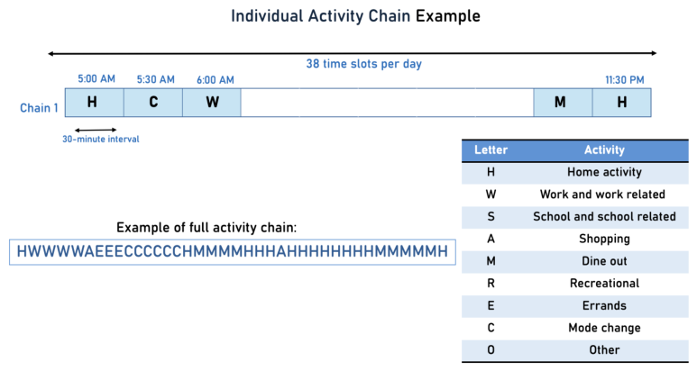
16]. Each day’s activities are encoded with 11 categories: H (in-home), W (work), S (school), A (escort), M (shopping), L (meal), R (social/recreation), E (errands), C (mode change), N (overnight), and O (other). The day is divided into 30 min intervals from 5:00 AM to 11:30 PM, giving 38 time slots. If more than one activity falls into a slot, the one with the longest duration is kept. Each person who was surveyed over multiple days gets a separate chain for each day. For example, someone surveyed for three days has three chains. We use the term activity chain (or simply chain to mean this single-day record. Records that do not produce exactly 38 valid time slots after this process are excluded; any person-day with incomplete within-day coverage or missing trip-time fields is removed.
Figure 1 shows an example.
3.2. Dimensionality Reduction and Distance Computation
Each activity chain is treated as a character string. We compute the Levenshtein (edit) distance for every pair of chains [
47]. This distance counts the minimum number of insertions, deletions, or substitutions needed to turn one string into another and is widely used for comparing activity sequences [
13,
14,
15]. The result is an
symmetric distance matrix, where
N is the total number of chains.
This distance matrix is too high-dimensional for direct clustering. Methods like MDS and
t-SNE have been used in the literature, but they can lose local structure at scale or be sensitive to parameter choices. We use UMAP (Uniform Manifold Approximation and Projection) [
20], which preserves both local and global structure well [
48]. UMAP works in two steps. First, it builds a weighted neighbor graph. For each point
, it finds nearest neighbors from the distance matrix and sets the probability that
treats
as a neighbor to:
where
is the pairwise distance,
is the distance to the nearest neighbor of
, and
controls the neighborhood size. Since
is not symmetric, edge weights are symmetrized as
. Second, UMAP finds a two-dimensional layout by minimizing the cross-entropy between the high- and low-dimensional graph weights, producing a Euclidean embedding suitable for GMM clustering. We apply UMAP directly to the precomputed Levenshtein distance matrix (
metric=‘precomputed’), with
n_neighbors ,
min_dist , and two output dimensions. A fixed random seed of 42 is used for reproducibility.
3.3. Gaussian Mixture Model (GMM)
We cluster the UMAP-embedded points with a Gaussian Mixture Model (GMM) with
K components. The GMM models the data as a weighted sum of multivariate normal distributions:
where
is the mixing weight of cluster
k,
is its mean, and
is its covariance matrix. For each chain
i, the model returns the posterior probability of
which describes how strongly chain
i belongs to cluster
k. These posteriors are the basis of the soft-clustering representation described next. For each cluster, we also extract a representative chain—the observed chain whose embedding is closest to the cluster mean.
We estimate the GMM parameters (
,
,
) using the Expectation–Maximization (EM) algorithm in
scikit-learn. The mixing weight
is the prior probability that a random observation belongs to cluster
k, with
. Larger clusters get a larger
. The EM algorithm alternates between two steps: the E-step computes
given current parameters, and the M-step updates
,
, and
to better fit the data. This repeats until the parameters converge. We fit the GMM with full covariance matrices and
components; the choice of
K is discussed in
Section 4. The model is fit with five random initializations and up to 300 EM iterations, with the highest-likelihood solution retained. The fitted model produces both hard cluster labels and soft probability vectors for each activity chain.
3.4. Soft Clustering
Hard clustering assigns each day to one cluster. But in practice, many days mix different types of activities. For example, a person may work in the morning, run errands in the afternoon, and stay home in the evening. Hard clustering would label this day as just “work” or just “home,” losing the mixed nature of the schedule. Soft clustering instead represents each day as a probability distribution over all clusters.
From the fitted GMM, each observed chain gets a
K-dimensional probability vector
as in (
3). Each element gives the probability that the chain belongs to a given cluster, and the elements sum to one. So, each participant’s seven-day survey becomes a sequence of seven probability vectors instead of seven labels.
Figure 2 shows an example.
3.5. Constrained Lagrangian Prediction Model
The predicted probability vector for each person-day must satisfy two constraints: it must sum to one, and all elements must be non-negative. We use a constrained regression model that outputs a
K-dimensional vector and is trained with penalty terms that push the output toward a valid probability distribution. The model is:
where
is the predicted probability vector for the target day,
is the intercept,
L is the set of lag days (e.g., days 1, 2, 3),
are learned weights for the observed probability vectors
of previous days,
contains demographic variables (age, gender, education, income, household size), and
maps demographics to cluster probabilities. The loss function has three parts: (i) Mean Squared Error (MSE) between predicted and observed vectors, (ii) a penalty if the
K outputs do not sum to one, and (iii) a penalty for any negative prediction:
The model is implemented in PyTorch 2.11.10 as a single linear layer and trained by an optimizer with a learning rate of
,
weight regularization of
, and 100 outer optimization steps. The multipliers
and
are set to large values so that the model treats these constraints as near-hard requirements. Input features are standardized using the training set and then transformed using the same scaler for the test set. We split respondents 80/20 into training and test sets at the person level rather than the row level, so the same respondent never appears in both sets.
3.6. Time-Use Reconstruction
To connect the model output to transportation planning, we reconstruct population-level time-use patterns from the predicted cluster memberships. For each of the
K clusters, we take the medoid chain and convert it into a one-hot matrix of size
(30 min time slots by 11 activity types). For person
i on day
d, the predicted activity profile is a weighted combination of these cluster representatives:
where
is person
i’s predicted probability of belonging to cluster
k on day
d (from the Lagrangian model) and
is the one-hot representative pattern for cluster
k. The resulting
matrix
gives the predicted activity share at each time slot. Averaging across all individuals produces population-level time-use distributions that can be compared to observed data.
4. Results
This section evaluates the framework as an integrated pipeline. The final output—reconstructed population-level time-use schedules—serves as an end-to-end validation because errors at any upstream stage (encoding, embedding, clustering, or prediction) propagate through to the reconstruction. We report three complementary metrics: (1) test-set RMSE for the prediction stage; (2) comparison with hard-clustering baselines, which justifies the soft-clustering design; and (3) time-use reconstruction MAE, which captures the cumulative error of all stages by comparing predicted and observed population-level activity distributions.
4.1. Statistical Analysis of Activity Patterns
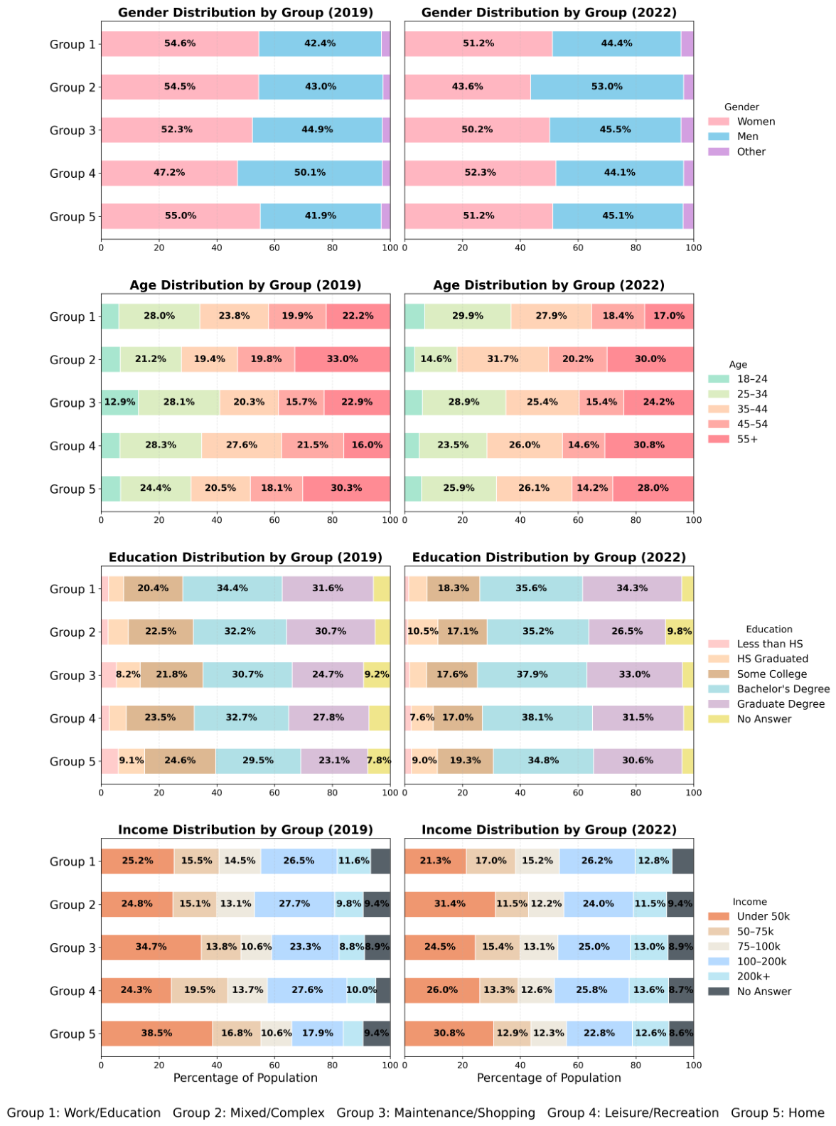
To illustrate how the pandemic affects different segments of the population, the activity profiles for each year are analyzed across five activity categories: Home, Work/Education, Maintenance/Shopping, Leisure, and Mixed/Complex. Distributions are then computed across gender, age, education, and income levels, as shown in
Figure 3.
The biggest shift is among high-income respondents; the share of Home-category respondents earning $100k+ rises noticeably between 2019 and 2022, while the under-$50k share drops, indicating that home-anchored days became more common among higher-income respondents. Lower-income groups (under $50k) remain in Work/Education and Maintenance/Shopping, reflecting continued in-person employment and errands.
Education shows a similar pattern where respondents with a Bachelor’s degree or higher move into the Home category by 2022 more than other groups. For gender, both men and women show lower Work/Education shares, but women’s Home share reaches 56.1% versus 42.4% for men. Among age groups, adults 65 and older have the highest Home share (nearly 40%), while 18–44-year-olds have the highest share of Work/Education activity.
These patterns point to possible mechanisms behind the shifts we observe. Higher-income and college-educated respondents are likely overrepresented in professional and financial jobs where remote and hybrid arrangements became feasible [
1]; the growth of these groups in the Home category between 2019 and 2022 may reflect this fact. Lower-income respondents, by contrast, are probably more concentrated in service, retail, and care jobs that require physical presence—which would explain their continued appearance in the Work/Education and Maintenance/Shopping categories. A similar argument can be made for education; people with bachelor’s or graduate degrees are more likely to hold jobs that can be reorganized around flexible schedules, while those with less education may face more rigid workplace and travel requirements. We cannot confirm these mechanisms with the survey data alone, but the patterns are consistent with what one would expect given the occupational makeup of these groups.
4.2. Activity Chain Analysis
To choose the number of clusters, we first used the Elbow Method and the Davies–Bouldin Index. These suggest 7 clusters for 2019 and 4 for 2022. However, 4 or 7 groups are too few to represent the range of daily behavior across 11 activities and 38 time slots. The medoids at these counts are too generic—for example, one is mostly “work” and another mostly “home”—and the RMSE for probability predictions is high. After an exhaustive testing process, we find that 20 clusters give enough variety to capture diverse daily routines without overfitting. This choice produces lower RMSE, and the 20 medoids for each year are distinct, confirming that choice of 20 clusters is appropriate for our analysis.
Table 2 and
Table 3 list the medoid activity chains derived from the 20-cluster GMM solutions for the 2019 and 2022 datasets, as well as a short description of the activity chain, respectively.
In 2019 and 2022, the 20 clusters fall into four broad behavioral families: home-anchored days with little or no out-of-home activity, traditional commuter days with a sustained work block, discretionary days dominated by shopping, recreation, meals, or escort activity, and structured non-work days such as school. The distribution across these families differs by year. In 2019, traditional commuter and discretionary days together account for 60% of person-days, with home-anchored days coming in second. In 2022, there is a shift; home-anchored days alone account for over 40% of person-days, and traditional commuter clusters shrink in both size and number. The GMM clusters represent meaningful daily activity pattern types and the post-pandemic shift reflects a change in the overall mix of daily routines rather than a change in individual cluster sizes.
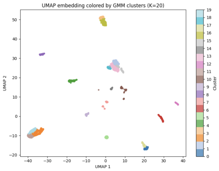
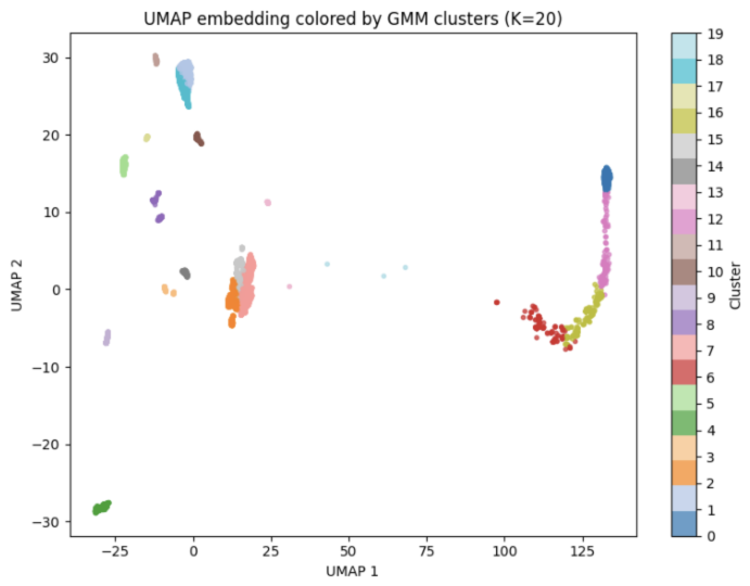
We apply the GMM pipeline to both years. UMAP plots of the 20-cluster solutions are shown in
Figure 4 and
Figure 5. In 2019, data points spread broadly across the 20 clusters, showing more variety in daily routines. In 2022, points cluster more tightly around a few dominant groups, suggesting that daily activities became less varied and more home-centered after the pandemic.
4.3. Borough-Level Demographic Patterns
To examine whether these demographic patterns differ across boroughs, we link each person-day to its home borough using the CMS survey zones.
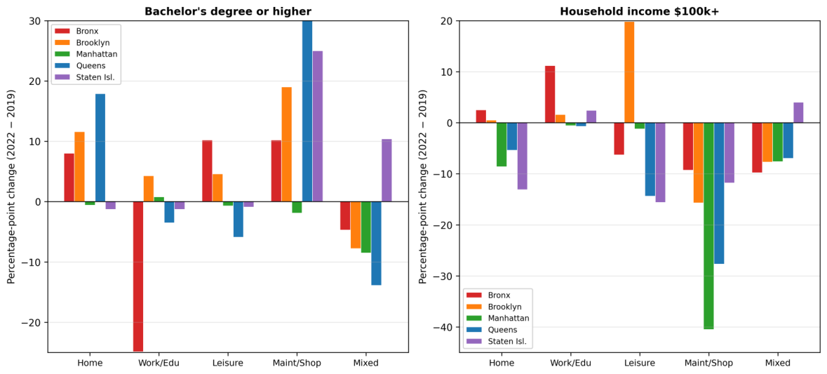
Figure 6 shows the percentage-point change between 2019 and 2022 in the share of person-days held by higher-education (Bachelor’s+) and higher-income (
$100k+) respondents, by borough and activity category.
Table 4 shows that the borough distribution is stable between 2019 and 2022, with Queens the largest share and Staten Island the smallest. The city-wide shift toward home-anchored patterns is uneven across boroughs. Brooklyn and Queens show the clearest movement: in both, the under-
$50k share within the Home-Anchored category declined while the
$100k–
$200k and
$200k+ shares rose (the
$100k–
$200k Home-Anchored share in Queens went from 21.3% to 30.7%). Manhattan shows smaller income movements; the Bronx the least change. Staten Island has declines in middle-income tiers and a slight rise in
$200k+.
Education tells a consistent story. In Brooklyn, Queens, and Manhattan, the Bachelor’s+ share grew within Home-Anchored while lower-education shares declined. Staten Island is similar (about a 9-point increase in the Bachelor’s share). The Bronx is the only borough where lower-education tiers grew within Home-Anchored. Overall, the post-pandemic shift toward home-anchored days is concentrated among higher-income and more-educated residents in boroughs with larger professional workforces (Brooklyn, Queens, Manhattan), while the Bronx’s slower change is consistent with a workforce where more jobs require physical presence.
4.4. Soft Clustering Prediction with Lagrangian
Constraints
A hard-clustering baseline (
Section 4.5) shows that predicting a single label gives much lower accuracy, which is why we use the probabilistic approach. We apply the Lagrangian model (
4) and (
5) to predict each target day’s probability vector from preceding days.
Table 5 and
Table 6 show test-set RMSE for different input day combinations in 2019 and 2022. Each row is a set of input days; each column is the target day (day 3 through day 7). We test all consecutive sequences: every 2-day pair, every 3-day block, and so on up to the full 6-day history. Any input sequence can predict any later day. Dashes mark cases where the input overlaps the target. For example, predicting day 7 in 2019 (
Table 5) with Days 5 and 6 gives RMSE 0.2050, while using all six days gives 0.1978. Longer histories generally improve accuracy.
We also tested non-sequential input combinations—for instance using the day 2 and day 4 pattern to predict the pattern for day 6—but the difference is minimal. For 2022, the best non-sequential combination for day 7 gives RMSE 0.170, versus 0.172 for the sequential one. Since this gap is negligible, sequential days are enough for accurate predictions. They are also more practical, since planners usually work with continuous data-collection windows.
4.5. Benchmarking the Model Output Against Other ML Models
We compare our model against machine learning methods of Random Forest and Neural Network classifiers trained with hard cluster labels (
). These models receive the same inputs—previous days and demographics—and predict a single cluster label for the missing day.
Table 7 shows that accuracy with hard clustering on 20 clusters is very low (16–36%). This is because daily routines often mix multiple activity types, so forcing a single label means the model gets penalized even when its second-best guess is reasonable. The soft-clustering approach (
Table 5 and
Table 6) achieves RMSE values around 0.20, for year 2019, and as low as 0.17, for year 2022, confirming the superiority of our proposed GMM-based soft clustering approach.
4.6. Time-Use Reconstruction Results
To check how well the soft-clustering predictions work in practice, we reconstruct time-use schedules using (
6). Each person’s predicted probability vector for day 7 is combined with the cluster medoid patterns to get a predicted activity matrix (time slots by activities). We average these across the population. The same procedure on the observed day 7 chains gives the observed matrix.
Table 8 and
Table 9 compare predicted and observed shares at the hourly level. Each cell shows Predicted% (Observed%), with blue shading for the absolute error, and darker blue refers to a larger gap.
The 2019 reconstruction (
Table 8) has mostly small errors. The largest gaps are around midday in the Home column (12–16% predicted vs. 26–32% observed between 11:00 and 14:00), with moderate errors in Escort and Errands. The 2022 reconstruction (
Table 9) has larger gaps of 15–25 percentage points in the Home column, and over-predicts Mode Change and Overnight in the afternoon and evening.
The tables also show how the pandemic changed time-use. In 2019, the Work share peaks near 30% between 09:00 and 14:00 and the Home share drops to 26–32% at midday. In 2022, Work is lower (peaking near 27%) and Home stays higher all day (37–46% between 11:00 and 16:00), reflecting more remote and hybrid work after the pandemic. The model captures these shifts in both years.
Table 10 pulls together the headline numbers from the three evaluation stages. The soft-cluster RMSE values come from the full six-day input row of
Table 5 and
Table 6; the hard-clustering accuracy is the best day 7 result for Random Forest or Neural Network from
Table 7; and the time-use MAE is the mean absolute difference between predicted and observed cells in
Table 8 and
Table 9, averaged across 19 h and 11 activity types. The soft-clustering model achieves test-set RMSE of 0.198 (2019) and 0.173 (2022) on day 7 prediction using the full six-day history, versus hard-clustering baselines that top out at 36% accuracy. The predicted memberships reconstruct population time-use with MAE of 2.44% (2019) and 5.44% (2022). The 2022 error is higher, mainly because of the transition-heavy clusters, but the framework still captures the overall shape of daily time-use in both years.
5. Applications and Policy Implications
The framework can scale to large urban analytics tasks. It compresses each person’s daily activities into a fixed-length probability vector. Aggregating these vectors across a population gives a picture of how the city spends its time across different activity patterns.
The clustering representation also supports tracking changes in urban behavior over time. Our 2019-to-2022 comparison shows not just changes in travel volumes but shifts in how people organize their days: different temporal profiles, different spatial patterns, and different recovery paths for different demographic groups. These results can help policymakers target interventions to specific groups and areas. The time-use reconstruction has direct applications for transportation planning. By combining predicted cluster memberships with 30 min activity distributions, planners can estimate demand by area and demographic group. For example, applying this to MTA ridership data could give zone-level demand forecasts by time of day and population segment. Instead of assuming one peak period for everyone, the model shows when and where different groups generate demand, which can inform pricing and service frequency decisions.
The borough-level breakdowns in
Section 4 (
Table 4 and
Figure 6) show how the same model produces distinct demographic profiles for each borough, which can inform borough-specific planning rather than treating the city as one unit. Brooklyn and Queens, where higher-income and college-educated residents shifted most toward home-based days, may benefit from midday service additions and flexible fare structures in neighborhoods where hybrid-work travel is now more common. Manhattan still has the highest concentration of degree holders across activity categories, so off-peak service investments remain relevant there. The Bronx shows the smallest income shift and higher shares of lower-education and lower-income residents in both Home-Anchored and Work/Education categories—useful context for ensuring reliable peak and off-peak service on routes that serve in-person jobs.
More broadly, the results suggest that the old model of planning around a single morning and evening peak no longer fits the city as well as it once did. The growth of home-anchored days among professional workers means that midday and off-peak travel is no longer just discretionary—it increasingly includes work-related trips by people on hybrid schedules. At the same time, traditional peak demand has not disappeared; it has just become more concentrated among lower-income workers who have fewer alternatives. This creates a service-design tension: agencies need to spread capacity more evenly across the day without cutting peak service for riders who still depend on it. The framework developed here can help quantify that tension by showing, for each borough and demographic group, how many person-days fall into each activity family and when those days generate travel demand. That kind of granularity is hard to get from aggregate ridership counts alone.
There are also equity implications. If fare structures or service cuts are designed around the assumption that midday riders are discretionary, they will disproportionately affect hybrid workers who now travel at those times out of necessity. Conversely, if peak-hour investments are reduced because aggregate ridership is down, the burden falls on in-person workers—disproportionately lower-income and less-educated—who cannot shift their schedules. The demographic disaggregation in this framework makes these trade-offs visible before decisions are made, rather than after.
6. Conclusions
This paper set out to do two things: build a method that can handle incomplete multi-day travel diaries without throwing away the richness of daily activity patterns, and use that method to ask whether the pandemic left a lasting mark on how New Yorkers organize their days.
On the empirical side, the answer is clear. The pandemic did not just reduce travel—it reorganized daily life, and the reorganization stuck. By 2022, home-anchored days had become the dominant pattern in the data, overtaking the commuter and discretionary days that dominated in 2019. This was not a uniform shift. Higher-income and college-educated residents moved toward home-based routines in large numbers, consistent with jobs that allow remote or hybrid work. Lower-income residents, concentrated in jobs that require showing up, continued commuting at roughly the same rates. Women shifted toward home-based schedules more than men. Older adults spent even more time at home than before. The borough-level analysis shows that these shifts are not uniformly distributed across New York City: Brooklyn and Queens show the clearest movement of higher-income and college-educated residents toward home-anchored days, while the Bronx shows the smallest compositional change, consistent with a workforce that has remained more reliant on in-person employment.
What makes these findings useful for planning is that they go beyond aggregate numbers. Knowing that ridership is down 20% is one thing; knowing that the drop is concentrated among professional workers who now travel at different times, while service workers still need the same peak-hour trains, is something planners can act on. The framework gives that level of detail.
On the methods side, three design choices matter. First, soft clustering keeps the mixed nature of daily behavior intact. A day that is 60% commute-like and 30% errand-like gets represented that way, not forced into one bin. This is what makes the time-use reconstruction possible—hard labels cannot support it. Second, the constrained Lagrangian loss function guarantees that every predicted vector is a valid probability distribution without needing post-hoc corrections. This sounds like a technical detail, but it matters at scale: when you are generating predictions for tens of thousands of person-days, you cannot afford to hand-fix outputs that violate basic constraints. Third, the sequential imputation turns sparse diary data into complete multi-day profiles. In both survey waves, fewer than a third of respondents completed all seven days. Without imputation, any analysis of weekly patterns would be limited to that small subset. With it, we can use the full sample.
The 20-dimensional probability vector that comes out of this pipeline is a compact but informative summary of someone’s day. It is small enough to store at scale, detailed enough to reconstruct realistic hourly schedules, and abstract enough to protect individual privacy. Once calibrated on survey data, the same model could be applied to passive data sources—smart cards, phone traces, ride-hailing records—to monitor behavioral shifts city-wide without requiring everyone to fill out a travel diary. Applied across years, it becomes a way to detect when and how populations change the way they spend their time.
Several limitations should be noted. The study covers one city; applying the framework to cities with different transit systems, labor markets, and demographics would test whether the findings generalize or reflect New York’s specific conditions. The data lack fine-grained spatial information, so we cannot tie patterns to specific corridors, stations, or neighborhoods—only to boroughs. Each survey wave is a cross-section, not a panel. We are comparing two populations at two points in time, not tracking the same individuals. This means we can describe what changed in aggregate, but we cannot say with certainty that specific individuals changed their behavior. Finally, the survey was collected in specific months (May–June for 2019, September–November for 2022), which introduces seasonal differences that we cannot fully separate from pandemic effects.
Future work could go in several directions. The most immediate is combining the survey-calibrated GMM with passive mobility data to test whether the model scales from thousands of respondents to millions of residents. If the cluster structure learned from surveys holds up when applied to smart-card or phone-trace data, it would open up near-real-time monitoring of activity patterns at the city level. A second direction is adding spatial resolution—mode choice, origin-destination pairs, and land-use characteristics—so that the framework can support corridor-level planning, not just city-wide or borough-level analysis. Third, applying the approach to multiple cities would allow standardized comparisons of how different populations organize their time and how they responded to the same disruption. Cities with different transit dependency, industry mix, and housing patterns likely experienced different reshufflings of daily routines, and a common methodological framework would make those comparisons meaningful.