“Seeing What’s Left”: The Effect of Position of Transparent Windows on Product Evaluation


Abstract
1. Introduction
1.1. The Effects of Vertical Position
1.2. The Effects of Horizontal Position
1.3. Comparing the Effects of Vertical and Horizontal Position
1.4. Research Aims
2. Materials and Methods
2.1. Participants
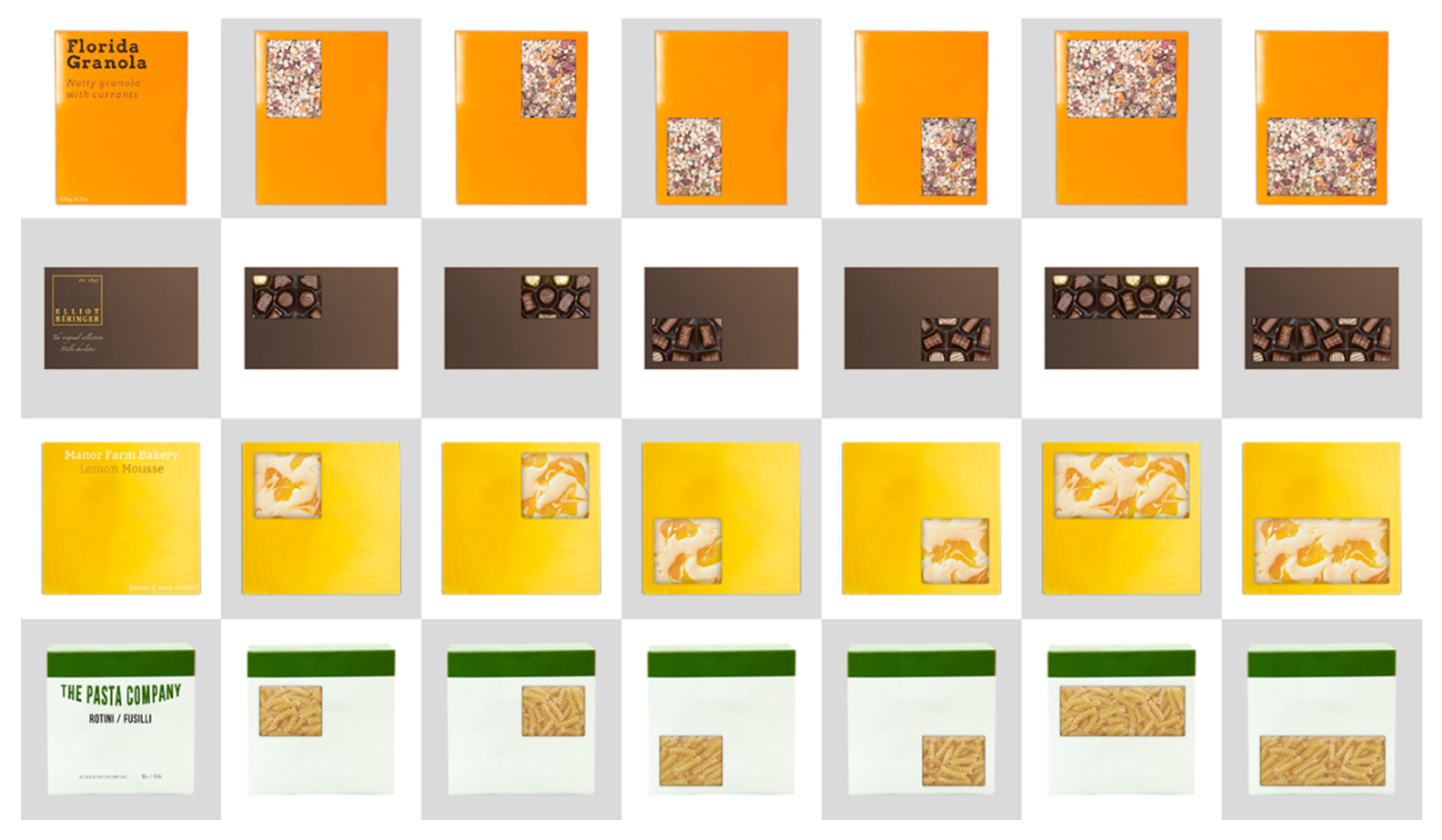
2.2. Stimuli
2.3. Design
2.4. Procedure
2.5. Data Analysis
3. Results
3.1. Descriptive Statistics
3.2. Inferential Statistics
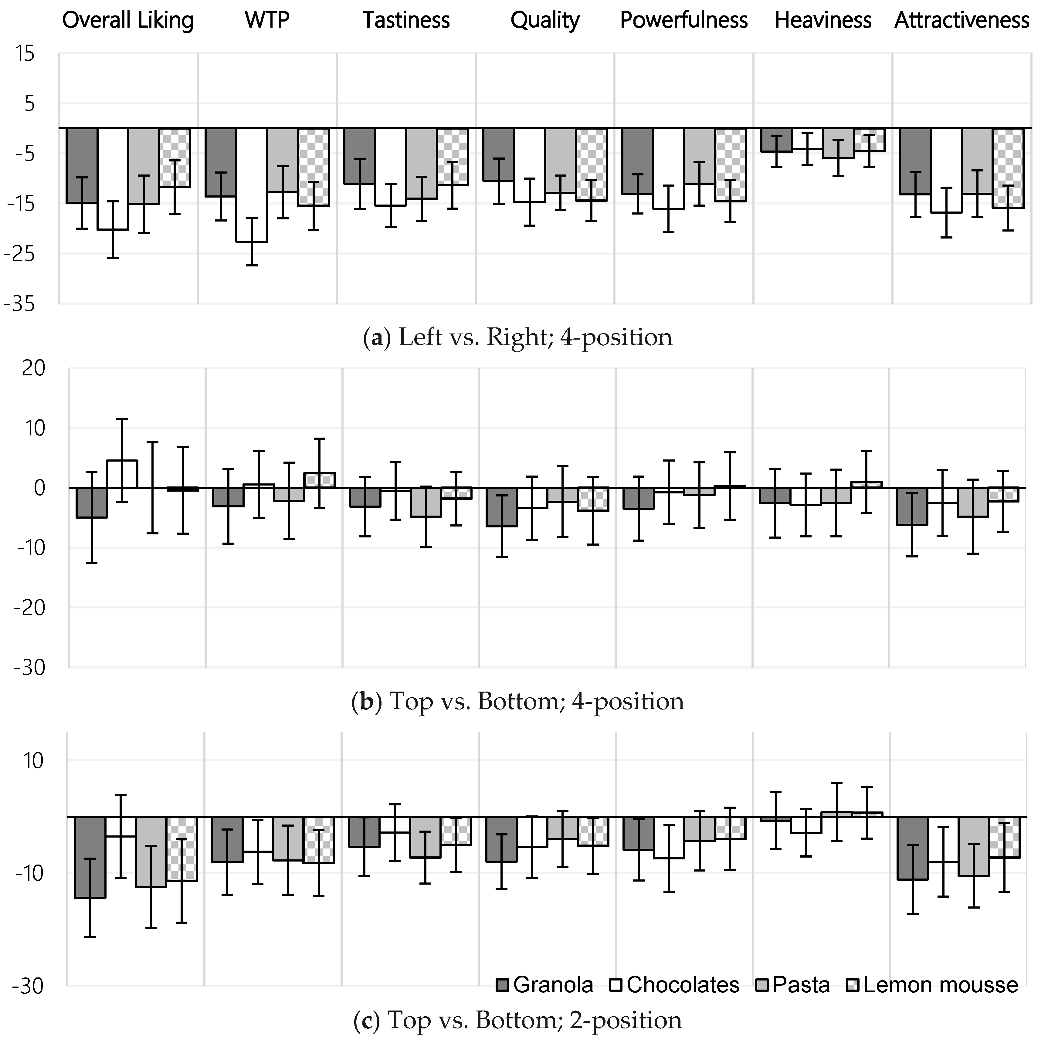
3.2.1. Expected Heaviness
3.2.2. Perceived Brand Power
3.2.3. Other Measures
3.2.4. Effect Sizes
4. Discussion and Conclusions
4.1. Limitations
4.2. Recommendations
4.3. Concluding Remarks
Author Contributions
Funding
Conflicts of Interest
Appendix A

| Top-Right (b) vs. Top-Left (a) | Top-Right (b) vs. Bottom-Left (c) | Bottom-Right (d) vs. Top-Left (a) | Bottom-Right (d) vs. Bottom-Left (c) | |
|---|---|---|---|---|
| Granola | ||||
| Overall liking | 0.33 | - | 0.39 | 0.50 |
| WTP | 0.32 | - | 0.39 | 0.41 |
| Tastiness | 0.35 | - | 0.38 | 0.39 |
| Quality | - | - | 0.47 | 0.50 |
| Powerfulness | 0.55 | - | 0.45 | 0.48 |
| Heaviness | - | - | - | - |
| Attractiveness | 0.50 | - | 0.50 | 0.45 |
| Chocolates | ||||
| Overall liking | - | 0.52 | - | 0.72 |
| WTP | 0.68 | 0.55 | 0.61 | 0.74 |
| Tastiness | 0.53 | 0.40 | 0.45 | 0.43 |
| Quality | 0.46 | - | 0.51 | 0.52 |
| Powerfulness | 0.54 | - | 0.45 | 0.53 |
| Heaviness | - | - | - | - |
| Attractiveness | 0.52 | - | 0.50 | 0.57 |
| Pasta | ||||
| Overall liking | - | - | - | 0.60 |
| WTP | - | - | - | 0.42 |
| Tastiness | 0.43 | - | 0.55 | 0.52 |
| Quality | 0.36 | - | 0.41 | 0.67 |
| Powerfulness | - | - | - | 0.44 |
| Heaviness | - | - | - | - |
| Attractiveness | 0.32 | - | 0.45 | 0.59 |
| Lemon mousse | ||||
| Overall liking | - | - | - | - |
| WTP | 0.57 | 0.46 | - | 0.36 |
| Tastiness | 0.46 | - | 0.39 | - |
| Quality | 0.62 | - | 0.50 | 0.37 |
| Powerfulness | 0.58 | 0.40 | - | 0.47 |
| Heaviness | - | - | - | - |
| Attractiveness | 0.59 | 0.40 | 0.48 | 0.39 |
References
- Food Marketing Institute. Supermarket Facts. Available online: https://www.fmi.org/our-research/supermarket-facts (accessed on 16 July 2018).
- Spence, C. Multisensory packaging design: Colour, shape, texture, sound, and smell. In Integrating the Packaging and Product Experience in Food and Beverages; Elsevier: Oxford, UK, 2016; pp. 1–22. [Google Scholar]
- Stoll, M.; Baecke, S.; Kenning, P. What they see is what they get? An fMRI-study on neural correlates of attractive packaging. J. Consum. Behav. 2008, 7, 342–359. [Google Scholar] [CrossRef]
- Velasco, C.; Salgado-Montejo, A.; Marmolejo-Ramos, F.; Spence, C. Predictive packaging design: Tasting shapes, typefaces, names, and sounds. Food Qual. Prefer. 2014, 34, 88–95. [Google Scholar] [CrossRef]
- Vilnai-Yavetz, I.; Koren, R. Cutting through the clutter: Purchase intentions as a function of packaging instrumentality, aesthetics, and symbolism. Int. Rev. Retail Distrib. Consum. Res. 2013, 23, 394–417. [Google Scholar] [CrossRef]
- Argo, J.J.; White, K. When do consumers eat more? The role of appearance self-esteem and food packaging cues. J. Mark. 2012, 76, 67–80. [Google Scholar] [CrossRef]
- Deng, X.; Srinivasan, R. When do transparent packages increase (or decrease) food consumption? J. Mark. 2013, 77, 104–117. [Google Scholar] [CrossRef]
- Batra, R.; Strecher, V.J.; Keller, P.A. Leveraging Consumer Psychology for Effective Health Communications: The Obesity Challenge: The Obesity Challenge; Routledge: Armonk, NY, USA, 2011. [Google Scholar]
- Bialkova, S.; van Trijp, H. What determines consumer attention to nutrition labels? Food Qual. Prefer. 2010, 21, 1042–1051. [Google Scholar] [CrossRef]
- Bower, J.A.; Saadat, M.A.; Whitten, C. Effect of liking, information and consumer characteristics on purchase intention and willingness to pay more for a fat spread with a proven health benefit. Food Qual. Prefer. 2003, 14, 65–74. [Google Scholar] [CrossRef]
- Deng, X.; Kahn, B.E. Is your product on the right side? The “location effect” on perceived product heaviness and package evaluation. J. Mark. Res. 2009, 46, 725–738. [Google Scholar] [CrossRef]
- Van Rompay, T.J.L.; van Fransen, M.L.; Borgelink, B.G.D. Light as a feather: Effects of packaging imagery on sensory product impressions and brand evaluation. Mark. Lett. 2014, 25, 397–407. [Google Scholar] [CrossRef]
- Dong, R.; Gleim, M.R. High or low: The impact of brand logo location on consumers product perceptions. Food Qual. Prefer. 2018, 69, 28–35. [Google Scholar] [CrossRef]
- Fenko, A.; de Vries, R.; van Rompay, T. How strong is your coffee? The influence of visual metaphors and textual claims on consumers’ flavor perception and product evaluation. Front. Psychol. 2018, 9, 53. [Google Scholar] [CrossRef] [PubMed]
- Machiels, C.J.A.; Orth, U.R. Verticality in product labels and shelves as a metaphorical cue to quality. J. Retail. Consum. Serv. 2017, 37, 195–203. [Google Scholar] [CrossRef]
- Sundar, A.; Noseworthy, T.J. Place the logo high or low? Using conceptual metaphors of power in packaging design. J. Mark. 2014, 78, 138–151. [Google Scholar] [CrossRef]
- Festila, A.; Chrysochou, P. Health Is up, Indulgence Down: Effects of the Vertical Location of Food Product Claims on Consumer Response. Available online: http://acrwebsite.org/volumes/1022039/volumes/v44/NA-44 (accessed on 16 July 2018).
- Thomas, S.; Gierl, H. High and light, dark and heavy? Using metaphoric associations to affect perceptions of the nutritional content of food products. In Advances in Advertising Research VIII; Springer Gabler: Wiesbaden, Germany, 2017; pp. 123–137. [Google Scholar]
- Westerman, S.J.; Sutherland, E.J.; Gardner, P.H.; Baig, N.; Critchley, C.; Hickey, C.; Solway, A.; Zervos, Z. The design of consumer packaging: Effects of manipulations of shape, orientation, and alignment of graphical forms on consumers’ assessments. Food Qual. Prefer. 2013, 27, 8–17. [Google Scholar] [CrossRef]
- Velasco, C.; Adams, C.; Petit, O.; Spence, C. On the localization of tastes and tasty products in 2D space. Food Qual. Prefer. 2018, 71, 438–446. [Google Scholar] [CrossRef]
- Giessner, S.R.; Ryan, M.K.; Schubert, T.W.; van Quaquebeke, N. The power of pictures: Vertical picture angles in power pictures. Media Psychol. 2011, 14, 442–464. [Google Scholar] [CrossRef]
- Judge, T.A.; Cable, D.M. The effect of physical height on workplace success and income: Preliminary test of a theoretical model. J. Appl. Psychol. 2004, 89, 428–441. [Google Scholar] [CrossRef] [PubMed]
- Cian, L. Verticality and conceptual metaphors: A systematic review. J. Assoc. Consum. Res. 2017, 2, 444–459. [Google Scholar] [CrossRef]
- Lakoff, G.; Mark, J. Metaphors We Live by; University of Chicago Press: Chicago, IL, USA, 1980. [Google Scholar]
- Lakoff, G.; Mark, J. Philosophy in the Flesh: The Embodied Mind and its Challenge to Western Thought; Basic Books: New York, NY, USA, 1999. [Google Scholar]
- Schubert, T.W. Your highness: Vertical positions as perceptual symbols of power. J. Personal. Soc. Psychol. 2015, 89, 1–21. [Google Scholar] [CrossRef] [PubMed]
- Rettie, R.; Brewer, C. The verbal and visual components of package design. J. Pro. Brand Manag. 2013, 9, 56–70. [Google Scholar] [CrossRef]
- Hellige, J.B. Hemispheric Asymmetry: What’s Right and What’s Left; Harvard University Press: Cambridge, MA, USA, 2001. [Google Scholar]
- Janiszewski, C. The influence of print advertisement organization on affect toward a brand name. J. Consum. Res. 1990, 17, 53–65. [Google Scholar] [CrossRef]
- Deroy, O.; Fernandez-Prieto, I.; Navarra, J.; Spence, C. Unravelling the paradox of spatial pitch. In Spatial Biases in Perception and Cognition; Cambridge University Press: Cambridge, UK, 2018; pp. 77–93. [Google Scholar]
- Simmonds, G.; Spence, C. Thinking inside the box: How seeing products on, or through, the packaging influences consumer perceptions and purchase behaviour. Food Qual. Prefer. 2017, 62, 340–351. [Google Scholar] [CrossRef]
- Simmonds, G.; Woods, A.T.; Spence, C. ‘Show me the goods’: Assessing the effectiveness of transparent packaging vs. product imagery on product evaluation. Food Qual. Prefer. 2018, 63, 18–27. [Google Scholar] [CrossRef]
- Chandran, S.; Batra, R.K.; Lawrence, B. Is seeing believing? Consumer responses to opacity of product packaging. Available online: http://www.acrwebsite.org/volumes/14463/volumes/v36/NA-36 (accessed on 16 July 2018).
- Prolific Academic Prolific. Available online: https://prolific.ac (accessed on 10 September 2018).
- Woods, A.T.; Velasco, C.; Levitan, C.A.; Wan, X.; Spence, C. Conducting perception research over the internet: A tutorial review. Peer J. 2015, 3, e1058. [Google Scholar] [CrossRef] [PubMed]
- Haxe Foundation (2018). Haxe. Available online: https://haxe.org/ (accessed on 10 September 2018).
- Woods, A.T.; n.d. Xperiment. Available online: http://xpt.cloud (accessed on 10 September 2018).
- Van Doorn, G.; Woods, A.; Levitan, C.A.; Wan, X.; Velasco, C.; Bernal-Torres, C.; Spence, C. Does the shape of a cup influence coffee taste expectations? A cross-cultural, online study. Food Qual. Prefer. 2017, 56, 201–211. [Google Scholar] [CrossRef]
- Hochberg, Y. A sharper Bonferroni procedure for multiple tests of significance. Biometrika 1988, 75, 800–802. [Google Scholar] [CrossRef]
- Huang, Y.; Hsu, J.C. Hochberg’s step-up method: Cutting corners off Holm’s step-down method. Biometrika 2007, 94, 965–975. [Google Scholar] [CrossRef]
- Armstrong, R.A. When to use the Bonferroni correction. Ophthalmic Physiol. Optic. 2014, 34, 502–508. [Google Scholar] [CrossRef] [PubMed]
- Ludbrook, J. Multiple comparison procedures updated. Clin. Exp. Pharmacol. Physiol. 1988, 25, 1032–1037. [Google Scholar] [CrossRef]
- Pallant, J. SPSS Survival Manual: A Step by Step Guide to Data Analysis Using SPSS; Open University Press: Maidenhead, UK, 2007. [Google Scholar]
- Sullivan, G.M.; Feinn, R. Using effect size—Or why the P value is not enough. J. Grad. Med. Educat. 2012, 4, 279–282. [Google Scholar] [CrossRef] [PubMed]
- Nakagawa, S.; Cuthill, I.C. Effect size, confidence interval and statistical significance: A practical guide for biologists. Biol. Rev. 2007, 82, 591–605. [Google Scholar] [CrossRef] [PubMed]
- Simmonds, G.; Woods, A.T.; Spence, C. ‘Seeing What’s Left’: The effect of Transparent Window Position on Product Evaluation. Available online: https://doi.org/10.17632/vpj5kfyzs8.1 (accessed on 16 July 2018).
- Simmons, J.P.; Nelson, L.D.; Simonsohn, U. False-positive psychology: Undisclosed flexibility in data collection and analysis allows presenting anything as significant. Psychol. Sci. 2011, 22, 1359–1366. [Google Scholar] [CrossRef] [PubMed]
- Stebbins, R.A. Exploratory Research in the Social Sciences; Sage: Thousand Oaks, CA, USA, 2001. [Google Scholar]
- Wagenmakers, E.J.; Wetzels, R.; Borsboom, D.; van der Maas, H.L.J.; Kievit, R.A. An agenda for purely confirmatory research. Perspect. Psychol. Sci. 2012, 7, 632–638. [Google Scholar] [CrossRef] [PubMed]
- International Food Information Council Foundation. New Research: Evaluating Online Grocery Shopping Trends. Available online: https://www.foodinsight.org/evaluating-online-shopping-trends-consumer-research-grocery-food-health-diet (accessed on 5 March 2018).
- Omar, O.E. UK consumers’ adoption of the internet for grocery shopping. AU J. Manag. 2005, 3, 11–18. [Google Scholar]
- Seitz, C.; Pokrivčák, J.; Tóth, M.; Plevný, M. Online grocery retailing in Germany: An explorative analysis. J. Bus. Econ. Manag. 2017, 18, 1243–1263. [Google Scholar] [CrossRef]
- The Institute of Grocery Distribution.UK Food and Grocery Forecast to Grow by 15% by 2022. Available online: https://www.igd.com/about-us/media/press-releases/press-release/t/igd-uk-food-and-grocery-forecast-to-grow-by-15-by-2022/i/16927 (accessed on 16 June 2017).
- UK Government. Food Labelling and Packaging. Available online: https://www.gov.uk/food-labelling-and-packaging (accessed on 16 July 2018).


| Position | Basic Shape | Imagery | Logo | Transparent Window |
|---|---|---|---|---|
| Top-left | - | He (A), OL (A); He (D), PI(0.60) (D) | - | - |
| Top-centre | - | He (A), OL (A); PI (E), In (E) | Po (C), PI (C), Po(0.35) (F) | - |
| Top-right | - | He (D), PI (D) | - | - |
| Middle-left | OL (B) | He (A), OL (A) | - | - |
| Middle-centre | - | - | - | - |
| Middle-right | OL(0.17) (B) | He (A), OL (A) | - | - |
| Bottom-left | - | He (D), PI (D) | - | - |
| Bottom-centre | - | He (A), OL (A); PI(0.65) (E), In(0.40) (E) | Po (C), PI (C), Po (F) | - |
| Bottom-right | - | He (A), OL (A); He(0.50) (D), PI (D) | - | - |
| Top-Left (TL) | Top-Right (TR) | Bottom-Left (BL) | Bottom-Right (BR) | |||||
|---|---|---|---|---|---|---|---|---|
| M | SD | M | SD | M | SD | M | SD | |
| Granola | ||||||||
| Overall liking | 43.2 | 31.1 | 56.2 TL | 29.6 | 46.3 | 27.0 | 63.1 TL, BL | 29.4 |
| WTP | 47.0 | 27.6 | 57.3 TL | 29.8 | 46.8 | 25.0 | 63.7 TL, BL | 27.2 |
| Tastiness | 47.3 | 28.1 | 58.0 TL | 29.0 | 50.0 | 27.9 | 61.6 TL, BL | 27.4 |
| Quality | 48.8 | 25.3 | 57.2 | 28.3 | 53.1 | 25.8 | 65.7 TL, BL | 23.4 |
| Powerfulness | 41.6 | 26.3 | 56.0 TL | 28.6 | 46.4 | 26.3 | 58.2 TL, BL | 26.6 |
| Heaviness | 47.0 | 24.8 | 52.5 | 28.2 | 50.4 | 24.1 | 54.3 | 26.1 |
| Attractiveness | 37.4 | 27.4 | 51.6 TL | 30.7 | 44.6 | 25.7 | 56.8 TL, BL | 29.6 |
| Chocolates | ||||||||
| Overall liking | 49.5 | 32.1 | 63.2 BL | 31.3 | 38.4 | 29.5 | 65.2 BL | 27.8 |
| WTP | 46.1 | 27.6 | 68.5 TL, BL | 27.3 | 45.3 | 27.9 | 68.2 TL, BL | 23.5 |
| Tastiness | 58.2 | 28.7 | 73.9 TL, BL | 23.4 | 59.0 | 29.0 | 74.1 TL, BL | 25.7 |
| Quality | 54.3 | 26.7 | 67.8 TL | 26.5 | 56.4 | 29.9 | 72.5 TL, BL | 23.6 |
| Powerfulness | 48.7 | 25.6 | 63.3 TL | 25.3 | 48.0 | 26.9 | 65.6 TL, BL | 26.5 |
| Heaviness | 39.9 | 27.8 | 42.2 | 27.3 | 41.0 | 25.8 | 46.9 | 28.9 |
| Attractiveness | 46.7 | 28.3 | 61.6 TL | 28.3 | 47.3 | 28.0 | 66.1 TL, BL | 29.0 |
| Pasta | ||||||||
| Overall liking | 49.3 | 29.6 | 56.9 | 32.4 | 41.8 | 30.5 | 64.5 BL | 28.6 |
| WTP | 50.7 | 29.1 | 62.0 | 26.6 | 51.4 | 30.1 | 65.7 BL | 27.0 |
| Tastiness | 50.4 | 28.0 | 62.5 TL | 26.7 | 53.2 | 29.6 | 69.3 TL, BL | 25.1 |
| Quality | 50.5 | 26.9 | 59.9 TL | 25.1 | 49.3 | 27.0 | 65.7 TL, BL | 25.2 |
| Powerfulness | 44.1 | 24.6 | 52.5 | 27.3 | 42.6 | 26.1 | 56.5 BL | 27.6 |
| Heaviness | 42.6 | 26.8 | 49.3 | 27.3 | 45.9 | 26.9 | 51.0 | 26.7 |
| Attractiveness | 40.5 | 28.2 | 50.0 TL | 30.1 | 41.8 | 28.6 | 58.4 TL, BL | 29.3 |
| Lemon mousse | ||||||||
| Overall liking | 46.1 | 27.7 | 59.5 | 32.1 | 48.2 | 28.2 | 58.3 | 32.1 |
| WTP | 47.7 | 24.9 | 65.4 TL, BL | 26.7 | 47.4 | 26.3 | 60.7 BL | 29.7 |
| Tastiness | 51.9 | 27.6 | 67.6 TL | 27.4 | 58.1 | 28.4 | 65.1 TL | 27.1 |
| Quality | 47.4 | 27.8 | 65.8 TL | 25.6 | 55.2 | 26.6 | 65.7 TL, BL | 26.3 |
| Powerfulness | 46.6 | 26.3 | 63.5 TL, BL | 26.0 | 48.6 | 24.1 | 60.9 BL | 24.8 |
| Heaviness | 42.2 | 26.1 | 49.4 | 29.3 | 43.9 | 25.4 | 45.7 | 27.0 |
| Attractiveness | 43.5 | 29.3 | 62.6 TL, BL | 28.6 | 49.0 | 27.5 | 61.7 TL, BL | 28.4 |
| Top | Bottom | |||||||
|---|---|---|---|---|---|---|---|---|
| M | SD | M | SD | z | r | p | Sig. | |
| Granola | ||||||||
| Overall liking | 47.4 | 28.0 | 61.8 * | 25.8 | −3.76 | −0.25 | 0.0002 | Yes |
| WTP | 50.3 | 27.8 | 58.3 | 28.0 | −2.64 | −0.18 | 0.0083 | No |
| Tastiness | 51.9 | 27.9 | 57.2 | 29.0 | −2.13 | −0.14 | 0.0328 | No |
| Quality | 54.0 | 24.3 | 62.0 * | 25.3 | −3.63 | −0.24 | 0.0003 | Yes |
| Powerfulness | 48.9 | 25.1 | 54.8 | 25.7 | −2.73 | −0.18 | 0.0064 | No |
| Heaviness | 56.5 | 23.3 | 57.2 | 25.7 | −0.36 | −0.02 | 0.7217 | No |
| Attractiveness | 46.4 | 26.6 | 57.5 * | 26.9 | −3.63 | −0.24 | 0.0003 | Yes |
| Chocolates | ||||||||
| Overall liking | 59.8 | 27.5 | 63.3 | 27.3 | −1.01 | −0.07 | 0.3126 | No |
| WTP | 58.8 | 27.4 | 65.0 | 27.1 | −2.41 | −0.16 | 0.0161 | No |
| Tastiness | 68.5 | 25.5 | 71.3 | 24.3 | −0.78 | −0.05 | 0.4381 | No |
| Quality | 65.1 | 25.8 | 70.5 | 23.7 | −2.13 | −0.14 | 0.0333 | No |
| Powerfulness | 56.0 | 25.5 | 63.4 | 26.2 | −2.22 | −0.15 | 0.0263 | No |
| Heaviness | 45.1 | 26.4 | 48.0 | 28.0 | −1.70 | −0.11 | 0.0884 | No |
| Attractiveness | 59.2 | 25.6 | 67.2 | 26.2 | −2.57 | −0.17 | 0.0103 | No |
| Pasta | ||||||||
| Overall liking | 50.4 | 27.1 | 62.9 * | 26.4 | −3.26 | −0.22 | 0.0011 | Yes |
| WTP | 56.7 | 26.3 | 64.4 * | 25.5 | −3.26 | −0.22 | 0.0011 | Yes |
| Tastiness | 55.3 | 25.5 | 62.5 * | 24.5 | −3.13 | −0.21 | 0.0017 | Yes |
| Quality | 58.3 | 24.9 | 62.2 | 24.3 | −2.05 | −0.14 | 0.0407 | No |
| Powerfulness | 49.9 | 25.1 | 54.2 | 26.6 | −1.94 | −0.13 | 0.0523 | No |
| Heaviness | 53.0 | 26.2 | 52.1 | 25.9 | −0.81 | −0.05 | 0.4166 | No |
| Attractiveness | 45.5 | 25.9 | 56.0 * | 30.4 | −3.57 | −0.24 | 0.0004 | Yes |
| Lemon mousse | ||||||||
| Overall liking | 49.7 | 27.6 | 61.1 | 26.6 | −3.00 | −0.20 | 0.0027 | No |
| WTP | 54.6 | 27.6 | 62.8 | 26.1 | −2.81 | −0.19 | 0.0050 | No |
| Tastiness | 63.3 | 26.8 | 68.3 | 24.2 | −1.91 | −0.13 | 0.0557 | No |
| Quality | 61.4 | 25.1 | 66.6 | 24.3 | −2.15 | −0.14 | 0.0317 | No |
| Powerfulness | 56.1 | 25.1 | 60.1 | 24.8 | −1.10 | −0.07 | 0.2705 | No |
| Heaviness | 47.8 | 25.8 | 47.1 | 26.4 | −0.36 | −0.02 | 0.7155 | No |
| Attractiveness | 56.6 | 26.3 | 63.8 | 25.3 | −2.33 | −0.16 | 0.0198 | No |
© 2018 by the authors. Licensee MDPI, Basel, Switzerland. This article is an open access article distributed under the terms and conditions of the Creative Commons Attribution (CC BY) license (http://creativecommons.org/licenses/by/4.0/).
Share and Cite
Simmonds, G.; Woods, A.T.; Spence, C. “Seeing What’s Left”: The Effect of Position of Transparent Windows on Product Evaluation. Foods 2018, 7, 151. https://doi.org/10.3390/foods7090151
Simmonds G, Woods AT, Spence C. “Seeing What’s Left”: The Effect of Position of Transparent Windows on Product Evaluation. Foods. 2018; 7(9):151. https://doi.org/10.3390/foods7090151
Chicago/Turabian StyleSimmonds, Gregory, Andy T. Woods, and Charles Spence. 2018. "“Seeing What’s Left”: The Effect of Position of Transparent Windows on Product Evaluation" Foods 7, no. 9: 151. https://doi.org/10.3390/foods7090151
APA StyleSimmonds, G., Woods, A. T., & Spence, C. (2018). “Seeing What’s Left”: The Effect of Position of Transparent Windows on Product Evaluation. Foods, 7(9), 151. https://doi.org/10.3390/foods7090151