Abstract
Cities are becoming smarter by incorporating hardware technology, software systems, and network infrastructure that provide Information Technology (IT) systems with real-time awareness of the real world. What makes a “smart city” functional is the combined use of advanced infrastructure technologies to deliver its core services to the public in a remarkably efficient manner. City dashboards have drawn increasing interest from both city operators and citizens. Dashboards can gather, visualize, analyze, and inform regional performance to support the sustainable development of smart cities. They provide useful tools for evaluating and facilitating urban infrastructure components and services. This work proposes an interactive web-based data visualization and data analytics toolkit supported by big data aggregation tools. The system proposed is a cloud-based prototype that supports visualization and real-time monitoring of city trends while processing and displaying large data sets on a standard web browser. However, it is capable of supporting online analysis processing by answering analytical queries and producing graphics from multiple resources. The aim of this platform is to improve communication between users and urban service providers and to give citizens an overall view of the city’s state. The conceptual framework and architecture of the proposed platform are explored, highlighting design challenges and providing insight into the development of smart cities. Moreover, results and the potential statistical analysis of important city services offered by the system are introduced. Finally, we present some challenges and opportunities identified through the development of the city data platform.
1. Introduction
A smart city is an innovative city that integrates information and communication technologies (ICTs) directly into a strategic approach to sustainable development and improvement in the quality of residents’ lives, efficiency of urban operations and public and private services, while at the same time ensuring that it meets the desires of existing and future generations with regards to economic, social, environmental as well as cultural aspects [1]. During the last three decades, policies, technology, and services linked to smart cities have been urbanized rapidly. Urbanization obviously has its own challenges, including tracking and measuring smart city performance, collecting and analyzing city information with geographic location, processing big data, and uncovering hidden patterns and trends in urban regions for the decision-makers and for the city managers [2]. The citizens are always the central part of every smart city activity. The improvement in living standards of the citizens and social cohesion has been a continuous process during the last decades and is still taking place. The plan is to apply integrated and sustainable solutions, create cleaner and nicer environment, better living conditions, and improve the day-to-day business for citizens [3,4].
For a city to be smarter, the use of emerging appropriate Internet-of-Things (IoT) technologies is needed, not only to gather city data but also to provide services to the public for analytics and other applications in a remarkably efficient manner [5]. Designing and integrating systems that can make analysis for generating meaningful information for citizens is an influential prerequisite.
A brief discussion on some of the smart city projects implemented and used around the world is given in the following: The Chinese IoT market is expected to increase by 13.3% over the next five years. With huge investments, companies, such as Alibaba, Huawei, Lenovo, and Xiaomi, are targeting the IoT market [6]. Smart sensors in South Korea reduced building costs by one third by monitoring water and electricity use [7]. There are a number of strong achievements that indicate a substantial impact in the Triangulum city districts. The expected impacts in the domain of energy are reported as a reduction in carbon emissions, increasing use of renewables, lowering energy bills, increasing energy efficiency, and providing at least 75% of the remaining energy demand (electricity, heating, cooling) with renewable energy sources. While in the domain of mobility, the expected impacts are lowering carbon emissions, increasing utilization levels of electric vehicles and charging infrastructure (e-cars, e-bikes, e-buses) in the districts significantly [8]. Barcelona has developed a new bus network based on data analysis of the most regular traffic flows in the city, utilizing primarily longitudinal, horizontal, and diagonal routes with a variety of interchanges [9]. The convergence of various smart city innovations can also be seen by implementing smart traffic lights in Barcelona. The city of Amsterdam claims reduced traffic, saved energy, and improved public safety through the Amsterdam smart city initiative [10]. The main purpose of the IoT-based smart city framework is to bridge end devices to public sector applications by means of communication protocols and the cloud computing mechanism. Therefore, visualizations have been widely used to outline and describe datasets as they effectively expose and communicate the structure, patterns, and trends of data and interconnections between them. City dashboards utilize visual analytics that incorporate interactive graphics (e.g., gauges, bar charts, and graphs), mapping components, 3D models, and enhanced landscapes to display information on city performance, structure, patterns, and trends [11,12,13]. Key data on city resources relating to urban services and infrastructure, transport, energy, security, health, water, society, economy, environment, population, and many other components are displayed on a single screen, updated as new data are fed into the database. In addition, it can be interacted with (e.g., data selection, filtering and querying data, zooming in/out, data visualization in a number of ways) [14]. Such actions are principally beneficial for making sense of very large datasets, revealing context, clusters, gaps, and outliers that may persist unseen. Furthermore, data mining and statistical modeling, such as prediction, simulation, and optimization, can be carried out and outputted via visual interfaces [13]. Analytical dashboards have demonstrated to be more widespread in scope, and the principal is to discover the details behind patterns and results. In most analytical dashboards, indicators are involved in the monitoring and visualizing the performance of the smart city. An indicator is a measurement or a set of measures to evaluate the performance of certain business objectives. Indicators are mapped to uncover patterns by visualization, mapping, and analytic result validation [15,16]. Because of the geospatial nature and complexity of urban development and management since the early 1990s, the usage of mutually urban indicators and city dashboard projects has attracted significant attention from academia, industry, and government [14].
Today, the amount of directly and indirectly produced data on a daily basis in cities is heterogeneous and high, and therefore, end-users simply need to understand it [17,18,19]. Consequently, city dashboards supported by big data aggregation tools can be used to visualize and monitor city trends and mine them. The city dashboards should be able to display real-time data and the most important information necessary to achieve one or more objectives in various ways within 24/7, 24 hours a day, seven days a week [20]. They should be capable of supporting online analysis processing (OLAP) by answering the analytical queries and producing graphics from the combination of data extracted from various resources (database, files, application programming interface (API), etc.) suitable for different applications, such as health, civil protection, police, and industry. By reviewing the literature and state-of-the-art, we have selected some operative city dashboards in some cities. We investigated styles and layouts from existing dashboards, as described in the following.
The iPad visualization wall was proposed to be built around the control room concept and to display the citywide data gathered via the TALISMAN City Dashboard in an interactive way [21,22]. It was a single one-page dashboard followed by the row–column layout pattern. Guo et al. proposed a geo-visual analytic platform incorporating and exploiting well-known visualization techniques of multivariate visualization of spatiotemporal details [23]. Wood et al. [24] explored the use of mashup tools in data visualization and found some key issues with this method. Mashups are generated through the fusion of existing software technology for quick prototyping of different techniques. Slingsby et al. also used the mashup strategy to merge object clouds and tag maps and test them on the applet Yahoo and Google Earth feature chart [25]. An interactive web-based dashboard [26] has been designed and developed to monitor and track trawl vessel activities based on the data gathered from various data sources. Andrienko et al. [27] discussed many online visualization applications focused on java applets along three visualization themes: visualization of instant occurrences, visualization of physical activity, and visualization of evolving thematic data. The research community has come up with a range of creative and real-time smart city solutions towards sustainability during the recent past. Nevertheless, the majority of the proposed research belongs to experimental and analytical lab-based testbed categories. Turning a testbed scenario into the real world is a laborious and difficult process, as testbed constraints, i.e., restricted scalability, lack of user experience, limits on usability, and lack of flexibility, prevent the practical implementation [28].
The proposed dashboard prototype in this paper has been developed for the Triangulum EU lighthouse project funded by the European Union [29] with the overall objective of demonstrating, disseminating, and replicating solutions and frameworks for Europe’s future smart cities. The main goal of the Triangulum project is to demonstrate how technologies from the energy, buildings, mobility, and ICT sectors within one district lead to a significant reduction in energy demand and local CO2 emissions, while, at the same time, enhance quality of life, delivering efficient and clean mobility to residents and local workers and providing the basis for economic growth and development. Cross-sectoral smart city modules are being demonstrated in Manchester, Eindhoven, and Stavanger to provide a testbed for new business models, technologies, and strategies of citizen engagement. The proposed city dashboard is a cloud-based framework mostly concerned with collecting, storing, and managing large quantities of heterogeneous data from multiple resources, including sensors data and data generated during service delivery and then displaying them in an easy manner. The researchers at Stavanger University (UiS) have developed an architecture consisting of different layers that transmit data using a standard Transmission Control Protocol/Internet Protocol (TCP/IP) connection to servers processing. The servers themselves have a non-relational database used to store and retrieve big sensor data. The outcome is a data visualization platform that produces meaningful results for policymakers, tourists, and citizens to get access to information and learn more about the existing city-states. It also offers a data analytic toolkit to the end-users to navigate, drill down into data, visualize, and make sense of multiple levels of interconnected data without requiring specialized analytics expertise. The aim of the platform is to improve communication between users and urban service providers and give citizens an overall view of the city’s situation.
This paper introduces: (1) a generic architecture for smart city performance; (2) a hierarchical data collection framework; (3) system design followed by features and characteristics; (4) real-world implementation and visualization of several city services. The paper is then structured as follows. Section 2 briefly outlines the literature review to the evolution of city dashboards and the city dashboards state of the art. Then, Section 3 presents the architecture and design considerations of the proposed Triangulum City Dashboard. Section 4 describes the datasets and the results. The technologies used in the development of the porotype is introduced in Section 5. The summary of findings is stated in Section 6. The paper ends with a conclusion in Section 7.
2. Related Work
For several years, online city visualization and dashboards have been a subject of interest to researchers. Digital dashboards first appeared at the beginning of the 1990s. They were primarily used to provide a summary of important information using graphical components. Later on, online data processing (OLAP), maps-based data visualization, knowledge extraction by statistical models, key performance indicators (KPIs), and other information and communication technologies (ICTs) increased the needs of geospatial dashboards more and more [30]. Consequently, geospatial dashboards were introduced by the CompStat model and CitiStat project. New York City released its crime dashboard based on CompStat model in 1994 [31,32] that could use a GIS to track crime, identify statistical patterns, and map them, while Baltimore city launched the CitiStat project in 1999 [33] that was a GIS-based approach to city management and city performance monitoring. CitiStat-inspired DCStat in 2005, Maryland’s StateStat in 2007, and NYCStat in 2008 [34,35] was developed in the context of geospatial dashboards. The more sophisticated geospatial dashboards with efficient modules of analysis have been developed over the last decade. Several cities, such as Open Michigan MiFuture in Michigan in 2011, London City Dashboard in 2012, The Amsterdam City Dashboard in 2014, and Dublin Dashboard in 2014, have developed an urban dashboard to track city efficiency by handling greater complexity and real-time data. An analytical model is also an important part of a dashboard. The interactive analytical model for measuring smart cities has merged with fine granularity, integrated simulation, and interactivity. Analytical dashboards provide fine-grained statistics by offering both macro and micro views of the data, i.e., details and factors driving the metrics [36]. Furthermore, map-based visualization supports both static and real-time data, for example, progressive energy consumption in a histogram to show the indictor changes over time. The transition from simple graphical displays to rich context-based representations gives greater visibility and insights into the trends and patterns behind the data [37,38]. In addition, analytical models switched from a descriptive view to an interactive display [39]. In addition, predictive analytical models have been also developed but there still are challenges due to data inconsistencies, security, privacy, and data accessibility [40].
The architecture of the interface and the visual perception system play an important role in presenting the data effectively. Different city dashboards have advocated different interactive methods and styles in information visualization design. We explored different graphical user interface (GUI) design patterns and styles from existing geospatial city dashboards reviewed in the literature. There are typically two dashboard GUI templates, including the one-page style and drill-down style. Single one-page dashboard design allows users to see all the indicators at once.
Several studies have supported the single one-page style. The London City Dashboard, Bandung dashboard, and Iowa dashboard are examples of the same layout [41,42]. On the other side, the drill-down model is designed to extract details more thoroughly. These types of dashboards generally present more key indicators and cannot be displayed on one page. Sources of this sort of dashboard are the Dublin, Skopje, and Alaska dashboards. However, different layout patterns can be used to represent information visualization, for example, row–column selection, menu type, and filter design. The row–column pattern displays indicators as row and columns into a single grid, while the menu pattern divides the layout into two sections; the menu area and the indicator space. The filter style offers filtering data and information for advanced analyses. The screenshots of CityDashboard London designed with one-page style and row–column pattern, Skopje dashboard, drill-down with menu, and Dublin Dashboard based on drill-down style with menu are shown in Figure 1.
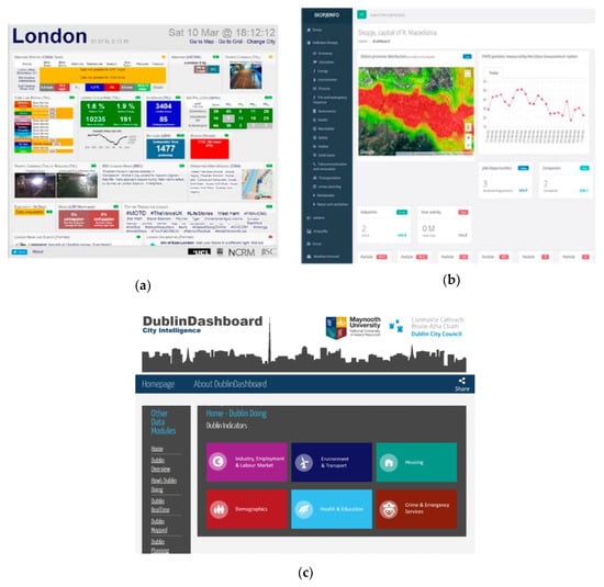
Figure 1.
Screenshots of some example dashboards. (a) London CityDashboard, one page with row, (b) Skopje dashboard, drill-down with menu, (c) Dublin dashboard, drill-down with the menu.
City Dashboard [43] for the major UK cities shows weather, environmental, transportation, and energy demand primarily in a single screen website, with numerical values in color-coded boxes for ease of view. The proposed Edmonton Citizen Dashboard [44] is a part of the city’s open data project. The dashboard integrates data from various official sources and in which it simplifies key performance indicators (KPIs), interaction design, and information selection criteria. It is structured over six city services: transportation, livability, environment, urban form, economy, and finance. IBM Intelligent Operations Center for Smart Cities (IOS) [45] proposed a platform that is geared towards city managers, and as such, it aims to be a comprehensive tool that allows for multiple levels and tools for data analysis, along with its integration with urban operations. Typically, city dashboards have been used in two different application patterns to track smart city performance: (1) city-level dashboard platforms, which provide a holistic view of city performance, (2) analytical dashboards that are suitable to measure and analyze certain aspects of city performance, such as energy, public transportation, social, etc. The London CityDashboard and the Dublin dashboard are two instances of dashboard applications at the city level. These dashboards will quickly transfer up-to-date information on the rundown to city managers and residents. Several studies have also demonstrated the drawbacks in some dashboard architectures discussed in the literature. Few have highlighted a balance between complexity and media design [46]. Some of these weaknesses are summarized and investigated in [47]. Considering these drawbacks leads to successful and effective system design.
3. System Architecture and Design Considerations
System architecture, system design, key indicators, and visualization are seen as important key technologies in the development of the dashboards. Furthermore, we have also considered numerous necessary attributes while designing and structuring the Triangulum city dashboard and data analytics platform. Scalability and modularity refer to the capability of adding or deleting a component or sub-system without influencing the functionality and availability of the platform. The platform must be allowed to evolve independently with no or reduced impact on the rest of the architecture. An open coded project refers to utilizing open-source technologies that can communicate with each other without requiring the development of custom communication modules or modifying open-source projects. User-friendly refers to presenting and visualizing the data in an easy to understand way, mainly using key performance indicators and aggregated data. Portability refers to the access of the datasets and city performance indicators KPI data that aid tremendously in understanding city results.
In this section, we will describe methodological/technological details about the architecture, data, and models behind our system.
3.1. Overview of the Proposed Architecture
The proposed data visualization platform comprises a three-tier architecture, namely, data layer, application and analysis layer, and presentation layer. The following paragraphs describe the outline and functionalities of each layer of the proposed architecture.
The workflow of the proposed architecture is bottom-up in design. Starting with data collection framework, application and data processing, and visualization. Sensors, devices, smart meters, vehicles, and actuators build the bottom level of each smart city architecture. The bottom level generates and exchanges data, among others that are linked within the network. Many communication technologies facilitate data collection and sharing in support of real-time data communication. With the assistance of data filtration and data analysis, aggregated data are moved to the middle layer to assess valuable data from captured raw data. Valuable data will be classified and processed before transferring them to the presentation layer. The presentation and visualization layer is responsible for displaying important impact indicators for the citizens and city operators. The utmost aim of the proposed work is to improve communication between users and urban service providers and to give citizens an overall view of the city’s state by real-time monitoring of city trends while processing and displaying large data sets on a standard web browser. However, it is capable of supporting online analysis processing by answering analytical queries and producing graphics from multiple resources. The workflow and the main components of the proposed architecture are presented in Figure 2.
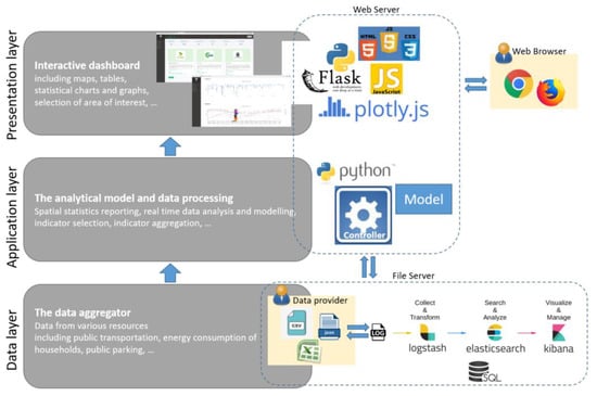
Figure 2.
Conceptual three-tier architecture of the Triangulum City Dashboard.
3.1.1. Data Layer
Data is the most important feature in smart city applications [48]. All smart cities aim to enhance the quality of service (QoS) of urban services, such as intelligent private and public transportation, energy management, healthcare, etc. The progress of QoS depends on the widespread city data collection process that collects data associated with every single public service. Therefore, data collection has become a tedious and highly challenging task in the development of smart cities. Sensors are commonly used for city data collection purposes due to efficient and cost-effective operation. Accordingly, the data layer of the smart city architecture organizes many sensors to cover the whole city [49]. The deployed sensor network collects data from the environment and smart objects. It is worth observing that data types acquired by sensors are different in context, i.e., mobile devices, vehicles, household appliances, etc. Data generated from sensors can be either unstructured or semi-structured. In the proposed architecture, semi-structured data are represented by JavaScript object notation (JSON) that adheres to representational state transfer (REST). Afterward, the collected data is transferred to the application layer for processing. Data layering is the core of the proposed architecture and it is comprised of the hierarchically decomposable components of the system. The entire system designated the cloud data platform, and contains the data collection framework. The data collection framework contains data acquisition units, data ingestion, data storage, and data access.
Researchers at University of Stavanger (UiS) developed a data collection framework consisting of a flexible and general set of components to handle data sources with diverse data models and formats, as well as unknown volume and velocity [50]. The focus of this paper is to describe and present the proposed porotype of the online data visualization and city dashboard and will not go through the technical details of the cloud data platform and the technologies employed in the cloud backend. Figure 3 shows the overall view of the entire data collection system that can be briefly described as follows:

Figure 3.
Data collection system.
Data Acquisition: The first challenge of this fundamental part of the architecture is to provide advanced data acquisition facilities that need highly efficient and effective techniques primarily responsible for sensing data in different fields [48]. We collected and stored data from a variety of external data sources across the lighthouse cities in the Triangulum project at the cloud data platform (CDP) infrastructure built in the Center for IP-based Service Innovation (CIPSI) at the University of Stavanger. CIPSI owns a data center that provides a physically secure data center where the computers, network equipment, source software, and data storage media are located. It has 20 high capacity CPU cores and an open cloud platform, distributed storage, and high-speed software-defined networking. Additionally, there are available racks, so this computational power can be scaled up as required. UiS brings together all the critical capabilities of a complete data integration, data quality, and data governance solution into a single unified cloud-based platform. The University of Stavanger ensures that its cloud data platform solutions work together to be truly General Data Protection Regulation (GDPR) compliant.
Some of Triangulum data providers offer data via some APIs. APIs typically return data in XML/JSON and CSV. Hence, the data collector needs to have a configuration for each acquisition process. Each data source may not only have a unique data model. In this regard, each new data source requires a separate adaptor subcomponent to undertake the transfer of the data from the data source according to the particular protocol or interface that the data provider offers. Therefore, the technical personnel at the data provider were requested to submit a “Data Intake Form” created in Google Docs so that the researchers at UiS could develop an adaptor for the specific data source [50]. As is demonstrated in Figure 4, once the adaptor is developed and instantiated as a running service on the cloud data platform, the data will be transferred on an automated, ongoing basis (regularly or irregularly) from the data provider to the cloud data platform. While the data is ingested and preprocessed by Logstash, it will be indexed and stored in an Elasticsearch cluster and can be accessed via the Elasticsearch API to data analysis tools. It can also be accessed by Kibana, in particular, for exploratory data analysis for administrative management.

Figure 4.
Data acquisition pipeline.
Data Ingestion: Data ingestion is the process of preprocessing the data before storage, which can save a great amount of time and effort compared to manipulating and harmonizing data sets only after the act of collecting data, typically called data munging. Necessary transformations may include inserting, combining, or omitting certain data fields. Logstash is a distributed computing technology for parsing, filtering, and transforming incoming data before writing the data to storage. The researchers at UiS used Logstash for the data ingestion component of the data collection framework [50].
Data Storage: A highly flexible data storage approach was found in the implementation of the UiS platform to facilitate data analysis, and in particular, exploratory data analysis due to the inherent unfamiliarity of the data sources [50]. The chosen technology for this data storage component was Elasticsearch, another part of the Elastic stack that is also available under an Apache 2.0 license. Elasticserach is a NoSQL repository, and it stores semi-structured data gathered from the smart city data providers in JSON files.
Internal Data Access and Monitoring: The Elasticsearch API is a RESTful API that provides access to the collected data, as well as cluster status information. The API can be accessed with CLI, scripts (e.g., Python scripts), and Kibana. The researchers at UiS used Kibana which offers a flexible and user-friendly graphical user interface (GUI) to visualize and explore the data stored on an Elasticsearch cluster [50].
3.1.2. Application Layer
The application layer and data management layer are the central layer of the proposed architecture that connects the data layer to the presentation layer. It is responsible for organizing data and controls the functionality of the application by performing detailed processing. The application layer performs major data processing functions, including sampling, filtering, and evaluating. This layer includes various analysis models for the indicators, which is the foundation of the city dashboard and ultimately.
3.1.3. Presentation Layer
The presentation layer bridges the infrastructure of smart cities with urban citizens by integrating users and municipal operations. This layer is the graphic user interface for the users, displays information relating to the services.
3.2. System Description
Although there are a few existing systems that exploit such data visualization framework, they restrict user interactions to a minimum and do not provide any way of navigation along the data set attributes. The work we present provides user interactions to control the visualization and to navigate along the data. We present a data visualization platform referred to as the “Triangulum City Dashboard” module that was specifically developed for the Triangulum EU lighthouse project. This module has the purpose of providing a consistent view of the current values for city key indicators. It comes with two principal components: the “Dashboard” and the “Data Analytic Toolkit”. The dashboard offers a top-level view of all incoming real-time and static data generated by the city sensors and other sources inclusive of weather, transportation, electricity demand, etc.
On the other side, the data analytic toolkit as self-service analytics provides user interactions to control the visualization and to navigate alongside the data. The layout used in the design of the Triangulum City Dashboard is based on the drill-down style having both menu and filtering patterns, see Figure 5a. We do this by providing the user a way to narrow down the visualization to various time resolutions, such as weekday, month, and year. In this section, we describe each module, while the following sections provide a description of the technology and data used to develop the analytical platform. The Triangulum City Dashboard is a web-based application that runs on a web page and consists of several modules along with dashboard, data analytics toolkit, data tabular presentation, and map, which can be viewed in Figure 5b–f. The dashboard is designed with a role-based system. Hence, when loaded, the web page grants the user a login page. The platform then affords the user with a drill-down layout alongside menu items and filtering patterns. On the main page, the user receives the right of access to the different city dashboards and datasets based on the access defined on every module and submodule in the database. In the dashboard module, the overview of the demonstrated key indicators is displayed to the user. In the data analytics toolkit, which relies on the type of data, the user can choose a time resolution from one of weekday, month or year. A JSON file corresponding to that timeframe is then loaded from the server and the appropriate statistics set are displayed on the existing graphs. Several real-time interactive maps for the Triangulum City Dashboard are created. These show real-time environment-related data on an interactive map. Real-time data have a high update frequency, often within seconds or minutes. The data are published via an application programming interface (API). The APIs return a JSON file that is downloaded and locally stored as well. This will speed up the processing and provide the opportunity for future analysis of the data. While each file is machine-readable, explicit processing and parsing are required in the controller logic to retrieve the data and render it onto the real-time maps and charts of the dashboard. In either case, the design of the program must be viewed as flexible and proactive. It is, in fact, intended to be open for further future implementation.
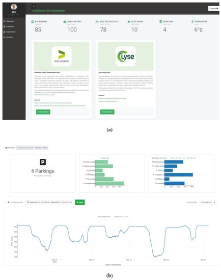
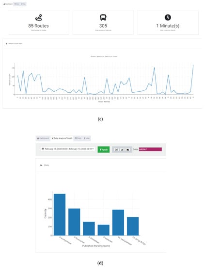
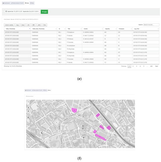
Figure 5.
Sample screenshots of the Triangulum City Dashboard. (a) The main page, drill-down layout with menu, (b) Parking management dashboard, (c) Energy consumption management dashboard, (d) Data analytic toolkit, (e) Tabular data presentation, (f) Integrated maps.
3.3. Dashboard Functionality
As highlighted in the previous section, to make use of smart city data, users need to be able to easily manipulate and analyze dynamic, heterogeneous streamed data with different types. Some of the data manipulation techniques and data streams analysis are currently available in the proposed dashboard including:
- (1)
- Filtering: The selection of instances using criteria such as dates, hours.
- (2)
- Aggregation: This is achieved by combining different data point values into a single, more valuable measure, such as grouping the energy consumed by the households into daily groups and taking the mean of each house.
- (3)
- Time series analysis: The dashboard allows the user to perform simple time series analysis, which is useful to model observations over time and look for trends, seasonality, and other cyclic patterns and to help future values to be forecast.
- (4)
- Visualization: The line graph and scatter plots are simple ways of presenting time-series statistics, with each data value or time reflecting the y-axis or x-axis.
4. Dataset Information, Results, and Challenges
We started the development of our dashboard from a technical point of view of the data and an analysis of the potential queries and questions on the data. We then utilized recent developments in databases and web-based systems to implement the dashboard.
4.1. Urban Dataset
Data are essential components of the dashboard. In general, dashboards are designed to quantify impact indicators based on data collected by processing and displaying quantitative data. The database includes data and metadata from many different sources (sensors, geographic information system (GIS) and network data, external services, etc.) given in Figure 6. Some of the units themselves have already adopted high-tech to monitor the data and key indicators, such as Kolumbus agency. However, all the units have their own monitoring systems to control their own information and status. The main types of data includes public transportation provided by Stavanger Kolumbus agency, energy consumption of the households in Stavanger region provided by Lyse, real-time parking vacancy information located in Eindhoven provided by VialisTraffic, and many other types of data.
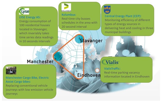
Figure 6.
Sources of urban data.
4.1.1. Public Transport Data
Bus transport data obtained from Kolumbus has been analyzed to obtain the traffic flow in Stavanger and the surrounding region in Rogaland County. It is real-time open data [51], which is standardized with the Service Interface for Real Time Information (SIRI) protocol [52]. The dataset contains bus schedules data for almost 186 buses between the Rogaland county bus stop points and 85 routes. The dataset consists of data that were obtained in every one minute periodically. The Kolumbus data describes GPS coordinates together with timestamps, as well as the location of the tracked bus with respect to the bus route or line the bus is operating at the time. This data also includes which bus stop the bus is currently approaching. The integrated map in the dashboard provides users the possibility of finding the buses traveling during a selected period, see Figure 7.
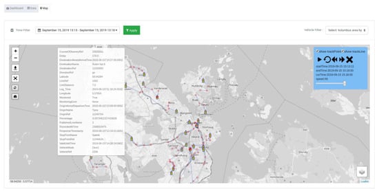
Figure 7.
All busses traveling in the area.
4.1.2. Parking Management
Data on road traffic pollution plays a crucial role in handling smart transport. Parking management, on the one hand, is a tedious task for the city municipality. On the other side, it is particularly difficult for local residents to find parking spaces available inside city areas. The smart parking component in the Triangulum project is responsible for managing parking lot data in real-time and notifying urban residents of available parking spaces. Citizens will be able to find a convenient parking spot without any time-consuming searches due to the benefits of smart parking networks. The platform analyzed five parking data in different locations in Eindhoven to display citizen available parking spaces by simply accessing the sub-component through the dashboard. The dataset contained parking coordinates, name, Unix time-stamp, capacity, and free space. The map integrated into the dashboard depicts the location of all the parking with the possibility of finding the number of available spaces by hovering on each parking located on the map. Each parking location may peak at different times of the day or different days of the week. The dashboard is able to display a number of potential analyses based on the weekdays, weekends, daytime. As an example, Figure 8 and Figure 9 show the hourly and daily parking lot availability for one of the parking places during the selected period. As it is observed, work trip parking demand is impacted by compressed working time, weekends, and holidays.
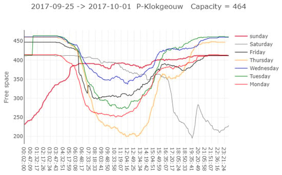
Figure 8.
Hourly parking lot availability.
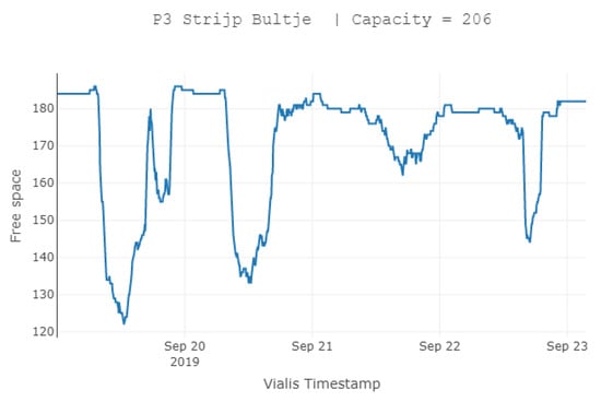
Figure 9.
Parking lot availability for a selected period.
4.1.3. Household Energy Consumption
Over the Triangulum project, smart meters have been installed around the Stavanger region. This platform uses collected data on the energy consumption of 56 houses. The power data is extracted from smart meters installed in the buildings, which recorded the consumption every 10 s from February 2017 to April 2018. Each record in this dataset is composed of two values: Unix time-stamp and power consumption data in Watts. Yearly consumption of the 56 households in 2017 can be seen in Figure 10. Furthermore, the data analytic toolkit offers extensive yearly analysis, daily, and hourly analysis of each house. For example, Figure 11 analyzes the hourly energy consumption of the house with label “gw_0” on January 2, 2018. Peak load or on-peak are terminologies used in energy demand management describing a period in which electrical power is expected to be consumed at a slightly higher than average supply level over a sustained period. As it is obvious, peak hours for the mentioned house are considered to be between 5 and 7 in the morning and are significantly increased during the evening.
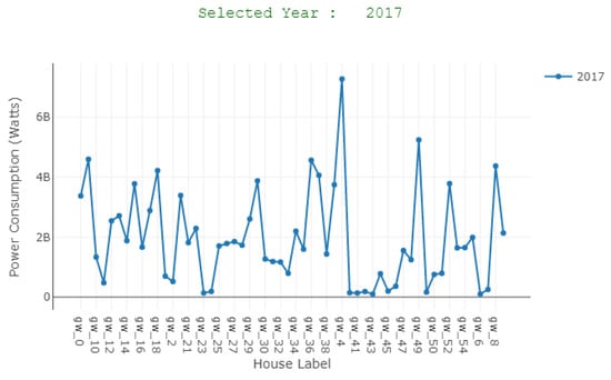
Figure 10.
Energy consumption of all the households in 2017.
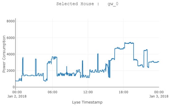
Figure 11.
Hourly energy consumption of house labeled “gw_0”.
4.1.4. Central Energy Plant (CEP)
Stavanger municipality needed to renovate its old power plant, installed in 1970. To be able to meet the Triangulum target, the municipality developed a new central energy plant (CEP) for heating and cooling, with 75% energy from renewable sources, located in the basement of an existing municipality building. The new CEP was fully part of Triangulum funding. The purpose of the energy plant was to demonstrate innovative use of local renewable energy sources other than fossil energy and hydropower, to make the solution relevant for replication in Norway and other European cities. The dataset contains device name, location, usage in (kWh), hour of consumption, and date of 31 installed smart devices shown in Figure 12. Several statistical analysis can be done through the offered data analytics toolkit. For example, Figure 13 shows the monthly usage of the devices. It is possible to include or exclude any devices from the plot.
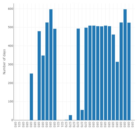
Figure 12.
Distribution of whole data samples in terms of day.
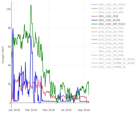
Figure 13.
Monthly energy usage of the selected devices.
4.1.5. Electric Assist Cargo Bikes
A total of four cargo bikes were procured through Triangulum. However, the fleet is made up of 12 cargo bikes in total. Since it was not possible to separate the tracking data for the four Triangulum procured bikes, the data has been presented as totals and as a proportion of 4/12. Due to teething issues with the telematics, the data was not available from the deployment date of June 2016. There were also some gaps in the data available. Therefore, data were provided from March 2017 when the full set of data was available, with January–February 2018 extrapolated. The dataset contains the complete journeys for each bike, reporting the distance and timestamp.
4.2. Scope of the Data and Access
The user queries datasets to gain an overview of the entire dataset. The query should address questions for different purposes by filtering out uninteresting data, requesting a value for an item or group of data, and discovering relationships among data. A second constraint relates to the access and whether the produced data are eligible for re-use. All types of data used within city dashboards have been relatively difficult to access until recently. The generation and use of personally identifiable information in big data, including those generated by smart city technologies [53,54,55], has been a subject of much concern. Access to data for public use was a significant issue in the building of the Triangulum City Dashboard. There are often security and privacy issues related to data analysis even when data is available. Furthermore, all the sensitive data have been anonymized by the data providers’ side in our platform. In cases where the dashboard is made available to the public, the underlying data may not be fully open to access for reuse, only being presented for viewing/analysis.
The main challenges encountered while implementing the system were the following: (i) different data resolution; (ii) large heterogeneity of data type (transportation, energy consumption, real-time parking vacancy, etc.), (iii) data quality heterogeneity (gaps in data due to technical issues in sensors), (iv) legal restrictions regarding data to be posted on the Web (due to privacy and security concerns), and (v) structure of data varying greatly (text files, csv files, JSON). Many of these data are recurrently generated, indicating that they can be monitored and tracked over time/space and are, therefore, called ‘indicator data’. Combining various data categories into a high-resolution visualization platform can provide a more reliable birds-eye view of the city. By showing citizen reports side-by-side with operations and sensing data, it elevates these concerns to the level of other KPIs. So, using Python scripts, different statistics are obtained from the data records. The process is repeated over different time resolutions, i.e., all data entries corresponding to a particular weekday, month or year are pooled together and the related statistics are gathered. This is the data specific component of the entire design and it is possible to use the method to simulate any other data set by changing such scripts accordingly. The statistics that are collected over all the time resolutions are saved independently and made available to a web server in JSON format.
5. Technologies
The Triangulum City Dashboard and data analytics toolkit are used to quantify impact indicators based on data collected. The impact indicators were developed in discussions with local partners and were programmatically calculated from available data relevant to the respective modules. The dashboard comprises two different parts: a service that gathers data from different websites through APIs, and on top of that, a website consisting of three views (retrieving map data from a CSV-based API, module-based viewing, and grid viewing data from an HTML-based API). In this section, we briefly describe the technologies used in the development of the online visualization platform that uses modern web frameworks. On the server side, the following extensive technologies have been utilized and not limited to: Python, Logstash, Elasticsearch, Apache Web Server, Kibana. On the front-end side, various Python packages and modern web frameworks including Flask, jQuery, and Plotly, have been used in the development of the online visualization dashboard to efficiently visualize large-scale data on a web browser. Indeed, Python shows interesting characteristics for data extraction and massive processing of statistical raster data. Since Structured Query Language (SQL) queries are not permitted on Elasticsearch, we used SQL Representational state transfer (REST) API to build live, infographic-style presentations on our dashboard. A key technical issue is the browser-based Python Flask framework, which offers the ability to view, query, and render the analysis of big data. Data are transferred from the server to the browser in JSON format. The end-user works with a web page consisting of bar charts, line charts, interactive table data representation and a map focused on the locality of the data. The graphs are presented using Plotly charts. In addition, we gave the opportunity of exporting data to Excel, CSV, PDF, and JSON format while displaying the data on the data tables Content Delivery Network (CDN) plugin. The user can also filter the visibility of columns.
Client-side JavaScript Scripting: The JavaScript language is used to gain access to programmable objects in a client computational environment, typically a web browser. It is defined as an object-oriented, dynamically and prototype-based scripting language. JavaScript is used mainly as a client-side language implemented within a web browser to provide power-driven user interfaces.
Python: is a programming language that supports functional, interactive object-oriented and imperative programming styles. We used python to compose the data source plugins and adaptors, to read the data sources and to produce various statistics related to the data at different time resolutions.
Flask: is an open-source web framework written in Python developed with a small core and a concept that is easy to extend. It offers many features, tools, libraries, and technologies that allowed us to build a web application. We used Flask to develop the front-end web application.
Plotly: is an open-source visualization library for R, Python, and JavaScript. We used Plotly to build an interactive visualization with some well-known charts.
Leaflet: is an open-source mapping tool with the ability to integrate data in a variety of formats. Color ramps are used to indicate the status of some features. Icons are moreover used on the map to distinguish different types of features.
6. Summary of Findings
Unexpectedly, there is very little research focused on different aspects of city dashboards and it is still unclear to what extent they live up to their “promises”. Research is, therefore, needed to advance our knowledge about how they are constructed in practice regarding the functional and visual features, whether they are used effectively, and what their effects are on decision-making and performance management. While building flexible dashboards can provide a short-term solution, further research could offer stronger theory-driven guidance to dashboard designers and decision support systems. Regardless of the potential interest, we do consider the difficulties and challenges in undertaking such an effort.
A common example can be the validity of the analysis drawn from a dashboard. If there is little veracity in the data used in a dashboard, then the analysis presented has little validity. There are other key issues with every dataset, such as data quality and how clean, accurate, and reliable the data are. Another limitation concerns data access and whether the data are available for re-use. In some cases, this is because the data is used under license or because the data is personal and cannot be used for public access. There has also been a lot of concern about the use of personally identifiable information. However, the city dashboards usually display anonymous data or that concerns an object rather than people. Ideally, these concerns should be minimized through well-designed and tested processes of data generation and handling and be documented so that others who use the data are aware of any issues. Therefore, it is important to study how city dashboards are used and to study whether their use is fair, equitable, or prejudiced and how any issues could be addressed.
7. Conclusions
This paper has introduced an interactive cloud-based visualization system named Triangulum City Dashboard. It is a prototype system that integrates open source technologies with modern web frameworks consisting of sensors, server, application, and communication protocol. This can be considered as a tool that is supposed to display the summary information of a city in a single view to help citizen tracking and analyzing what is happening to the city. All this information not only gives a general picture of the current state of all systems that make up the city but also allows analyzing and discovering trends and behaviors that are repeated over time, which can predict future incidents and formulate solutions before that they arise. The approach taken in this study has been fully documented. We have described the functionality of the dashboard and demonstrated the data and tools available. The availability of urban data is a key feature in any urban dashboard. Hence, we performed a large data analysis prior to creating the Triangulum City Dashboard to assess the quantity and quality of the databases accessible for cities. This is the first step towards any smart city dashboard project. Triangulum City Dashboard pulls real-time and static data from a variety of urban systems. This platform was applied to visualize five datasets in the domain of energy and mobility including transportation data, electricity consumption, cargo e-bikes, parking vacancies, and energy produced from the new renewable plant. It offers a data analytic toolkit to the end-users to navigate, drill down into data, visualize and making sense of multiple levels of interconnected data without requiring specialized analytics expertise. Analysis of existing applications integrated into the Triangulum City Dashboard with the results was carried out alongside the data audit. The appropriate open source and technologies are selected and used in the development of the dashboard. The prototype of the Triangulum City Dashboard was released to the internal network at the University of Stavanger in September 2019. The aim of the platform was to improve communication between users and urban service providers and give citizens an overall view of the city’s situation. By using extensible and affordable smart solutions and open source technologies, the approach taken by the Triangulum City Dashboard can be replicated by others to produce an urban dashboard without significant development or maintenance costs. The architecture allows new data sources and new applications to be added. Further analytical and intelligent tools can also be added to the system, such as prediction or decision-making system support. In brief, the proposed smart dashboard prototype is robust enough that it can provide various use case scenarios for different smart cities. It is extremely beneficial to public administration when it comes to managing the city, as it provides a view of all the data it collects from different sources and makes a much more educated decision-making process, which will be converted into much more positive results for the resident.
Author Contributions
Regardless of the listed order of the authors, all authors contributed equally by participating in discussions, writing sections, revising corresponding sections, and providing revision comments on the entire paper. All authors have read and agreed to the published version of the manuscript.
Funding
This research received no external funding.
Acknowledgments
This work was part of the Triangulum EU-project (grant No. 646578). We thank all the project partners and data providers for their assistance in providing us data.
Conflicts of Interest
The authors declare no conflicts of interest.
References
- Hollands, R.G. Will the real smart city please stand up? Intelligent, progressive or entrepreneurial? City 2008, 12, 303–320. [Google Scholar] [CrossRef]
- Miola, A.; Schiltz, F. Measuring sustainable development goals performance: How to monitor policy action in the 2030 Agenda implementation? Ecolog. Econ. 2019, 164, 106373. [Google Scholar] [CrossRef] [PubMed]
- Farmanbar, M.; Parham, K.; Arild, Ø.; Rong, C. A Widespread Review of Smart Grids Towards Smart Cities. Energies 2019, 12, 4484. [Google Scholar] [CrossRef]
- Dameri, R.P. Urban Smart Dashboard. Measuring Smart City Performance. In Smart City Implementation; Springer: Cham, Switzerland, 2017; pp. 67–84. [Google Scholar]
- Martins, P.; Albuquerque, D.; Wanzeller, C.; Caldeira, F.; Tomé, P.; Sá, F. CityAction a Smart-City Platform Architecture. In Advances in Information and Communication; Springer: Cham, Switzerland, 2020; pp. 217–236. [Google Scholar]
- Smart City–Wikipedia. Available online: https://en.wikipedia.org/wiki/Smart_city#cite_note-106 (accessed on 17 February 2020).
- Intelligent Community Forum (ICF). Available online: https://web.archive.org/web/20110722103131/https://www.intelligentcommunity.org/index.php?submenu=Awards&src=gendocs&ref=ICF_Awards&category=Events&link=ICF_Awards (accessed on 17 February 2020).
- Triangulum (Eindhoven, Manchester, Stavanger, Leipzig, Sabadell, Prague, and Tianjin—European Countries and China) Indian Cities 4 Green Growth. Available online: http://icities4greengrowth.in/casestudy/triangulum-eindhoven-manchester-stavanger-leipzig-sabadell-prague-and-tianjin-european (accessed on 17 February 2020).
- Barcelona Ciutat Digital. Available online: https://ajuntament.barcelona.cat/digital/ca. (accessed on 17 February 2020).
- Projects—Amsterdam Smart City. Available online: https://amsterdamsmartcity.com/projects (accessed on 17 February 2020).
- Kitchin, R. Urban Data and City Dashboards: Six Key Issues; Maynooth University: Maynooth, Ireland, 2016. [Google Scholar]
- Batty, M. A perspective on city dashboards. Reg. Stud. Reg. Sci. 2015, 2, 29–32. [Google Scholar] [CrossRef]
- Thomas, J.J.; Cook, K.A. A visual analytics agenda. IEEE Comput. Grap. Appl. 2006, 26, 10–13. [Google Scholar] [CrossRef]
- Jing, C.; Du, M.; Li, S.; Liu, S. Geospatial Dashboards for Monitoring Smart City Performance. Sustainability 2019, 11, 5648. [Google Scholar] [CrossRef]
- Yigitbasioglu, O.M.; Velcu, O. A review of dashboards in performance management: Implications for design and research. Int. J. Account. Inf. Syst. 2012, 13, 41–59. [Google Scholar] [CrossRef]
- Balsas, C.J.L. Measuring the livability of an urban centre: An exploratory study of key performance indicators. Plan. Pract. Res. 2004, 19, 101–110. [Google Scholar] [CrossRef]
- Brar, G.S.; Rani, S.; Chopra, V.; Malhotra, R.; Song, H.; Ahmed, S.H. Energy Efficient Direction-Based PDORP Routing Protocol for WSN. IEEE Access 2016, 4, 3182–3194. [Google Scholar] [CrossRef]
- Silva, B.N.; Khan, M.; Han, K. Internet of Things: A Comprehensive Review of Enabling Technologies, Architecture, and Challenges. IETE Tech. Rev. 2018, 35, 205–220. [Google Scholar] [CrossRef]
- Jin, J.; Gubbi, J.; Marusic, S.; Palaniswami, M. An Information Framework for Creating a Smart City Through Internet of Things. IEEE Internet Things J. 2014, 1, 112–121. [Google Scholar] [CrossRef]
- Ramakrishna, A.; Chang, Y.-H.; Maheswaran, R. An Interactive Web Based Spatio-Temporal Visualization System. In Advances in Visual Computing; Springer: Berlin, Germany, 2013; pp. 673–680. [Google Scholar]
- Gray, S.; Milton, R.; Hudson-Smith, A. Visualizing real-time data with an interactive iPad video wall. MethodsNews 2013, 7. [Google Scholar]
- CityDashboard: London. Available online: http://citydashboard.org/london/ (accessed on 13 February 2020).
- Guo, D.; Chen, J.; MacEachren, A.M.; Liao, K. A Visualization System for Space-Time and Multivariate Patterns (VIS-STAMP). IEEE Trans. Visual. Comput. Graph. 2006, 12, 1461–1474. [Google Scholar] [CrossRef]
- Wood, J.; Dykes, J.; Slingsby, A.; Clarke, K. Interactive Visual Exploration of a Large Spatio-temporal Dataset: Reflections on a Geovisualization Mashup. IEEE Trans. Visual. Comput. Graph. 2007, 13, 1176–1183. [Google Scholar] [CrossRef] [PubMed]
- Slingsby, A.; Dykes, J.; Wood, J.; Clarke, K. Interactive Tag Maps and Tag Clouds for the Multiscale Exploration of Large Spatio-temporal Datasets. In Proceedings of the 2007 11th International Conference Information Visualization (IV ’07), Zurich, Switzerland, 4–6 July 2007; pp. 497–504. [Google Scholar] [CrossRef]
- Farmanbar, M.; Palanisamy, A.; Høydal, A.B.; Keprate, A.; Haug, G. A web based solution to track trawl vessel activities over pipelines in Norwegian Continental Shelf. IOP Conf. Ser. Mater. Sci. Eng. 2019, 700, 012037. [Google Scholar] [CrossRef]
- Andrienko, N.; Andrienko, G.; Gatalsky, P. Visualization of spatio-temporal information in the Internet. In Proceedings of the 11th International Workshop on Database and Expert Systems Applications, London, UK, 4–8 September 2000. [Google Scholar]
- Silva, B.N.; Khan, M.; Han, K. Towards sustainable smart cities: A review of trends, architectures, components, and open challenges in smart cities. Sustain. Cities Soc. 2018, 38, 697–713. [Google Scholar] [CrossRef]
- Triangulum | The Three Point Project Triangulum Is One of Currently Nine European Smart Cities and Communities Lighthouse Projects, Set to Demonstrate, Disseminate and Replicate Solutions and Frameworks for Europe’s Future Smart Cites. Available online: https://www.triangulum-project.eu/ (accessed on 26 January 2020).
- Pestana, G. A Spatial Dashboard: Analyzing business performance measurements using the spatio-temporal context. In Proceedings of the 17th International Conference on Database and Expert Systems Applications, Krakow, Poland, 4–8 September 2006; p. 12. [Google Scholar]
- Walsh, W.F. Compstat: An analysis of an emerging police managerial paradigm. Policing 2001, 24, 347–362. [Google Scholar] [CrossRef]
- Dabney, D. Observations Regarding Key Operational Realities in a Compstat Model of Policing. Justice Quarterly 2010, 27, 28–51. [Google Scholar] [CrossRef]
- Gullino, S. Urban regeneration and democratization of information access: CitiStat experience in Baltimore. J. Environ. Manag. 2009, 90, 2012–2019. [Google Scholar] [CrossRef]
- Mattern, S. History of the Urban Dashboard. Places J. 2015. [Google Scholar] [CrossRef]
- Behn, R.D. What All Mayors Would Like to Know About Baltimore’s CitiStat Performance Strategy; IBM Center for the Business of Government: Washington, DC, USA; p. 61.
- Mattern, S. Urban Dashboards. In Understanding Spatial Media; SAGE Publications Ltd: London, UK, 2017; pp. 74–83. [Google Scholar]
- Nuradiansyah, A.; Budi, I. Development of Geospatial Dashboard with Analytic Hierarchy Processing for the Expansion of Branch Office Location. In Proceedings of the 2nd International Workshop on Semantic Technologies (IWOST2), Bangkok, Thailand, 2–3 November 2015. [Google Scholar]
- Aguirre, S.; Valdivia, R.; Álvarez, M.N.; Yáñez, R.C. Development of a Geobi solution for the observation and analysis of census information in Chile. Interciencia 2014, 39, 688–696. [Google Scholar]
- Al-Hajj, S.; Pike, I.; Fisher, B. Interactive Dashboards: Using Visual Analytics for knowledge Transfer and Decision Support. In Proceedings of the 2013 Workshop on Visual Analytics in Healthcare, Washington, DC, USA, 16 November 2013. [Google Scholar]
- Kitchin, R.; Lauriault, T.P.; McArdle, G. Knowing and governing cities through urban indicators, city benchmarking and real-time dashboards. Reg. Stud. Reg. Sci. 2015, 2, 6–28. [Google Scholar] [CrossRef]
- McArdle, G.; Kitchin, R. The Dublin dashboard: Design and development of a real-time analytical urban dashboard. ISPRS Ann. Photogramm. Remote Sens. Spatial Inf. Sci. 2016, IV-4/W1, 19–25. [Google Scholar] [CrossRef]
- Suakanto, S.; Supangkat, S.; Suhardi, S.; Saragih, R. Smart city dashboard for integrating various data of sensor networks. In Proceedings of the International Conference on ICT for Smart Society, Jakarta, Indonesia, 13–14 June 2013. [Google Scholar]
- CityDashboard. Available online: http://oobrien.com/2012/04/citydashboard/ (accessed on 23 April 2012).
- Open Data: City of Edmonton. Available online: http://www.edmonton.ca/city_government/initiatives_in-novation/open-data.aspx (accessed on 7 February 2020).
- Smarter Cities Software. Available online: http://www-03.ibm.com/software/products/nl/intelligent-operations-center (accessed on 25 June 2008).
- Few, S. Information Dashboard Design: The Effective Visual Communication of Data; O’Reilly Media: Boston, MA, USA, 2006. [Google Scholar]
- Rahman, A. Designing a Dashboard as Geo-Visual Exploration Tool for Origin-Destination Data; The University of Twente: Enschede, The Netherlands; p. 73.
- Wenge, R.; Zhang, X.; Dave, C.; Chao, L.; Hao, S. Smart city architecture: A technology guide for implementation and design challenges. China Commun. 2014, 11, 56–69. [Google Scholar] [CrossRef]
- Sanchez, L.; Muñoz, L.; Galache, J.A.; Sotres, P.; Santana, J.R.; Gutierrez, V.; Ramdhany, R.; Gluhak, A.; Krco, S.; Theodoridis, E.; et al. SmartSantander: IoT experimentation over a smart city testbed. Comput. Netw. 2014, 61, 217–238. [Google Scholar] [CrossRef]
- Linjordet, T.; TaheriMonfared, A.; Minde, J.; Wolf, R.; Mehdipourpirbazari, A.; Saadallah, N.; Esteves, R.; Barzideh, F.; Farmanbar, M. UiS Triangulum Implementation Report, D2.2 Cloud Data Platform and Subtask 5.4.2 Data analytics Toolkit; University of Stavanger: Stavanger, Norway, 2018. [Google Scholar]
- Kolumbus Real Time Open Data—Datasett—Åpne data Stavangerregionen. Available online: https://open.stavanger.kommune.no/dataset/kolumbus-real-time-open-data (accessed on 13 February 2020).
- Service Interface for Real-time Information—Kolumbus AS. Available online: https://www.kolumbus.no/siri/ (accessed on 13 February 2020).
- Kitchin, R. The ethics of smart cities and urban science. Phil. Trans. R. Soc. A 2016, 374, 20160115. [Google Scholar] [CrossRef]
- Mcardle, G.; Kitchin, R. Improving the Veracity of Open and Real-Time Urban Data. Built Eviron. 2016, 42, 457–473. [Google Scholar] [CrossRef]
- Kitchin, R.; Maalsen, S.; McArdle, G. The praxis and politics of building urban dashboards. Geoforum 2016, 77, 93–101. [Google Scholar] [CrossRef]
© 2020 by the authors. Licensee MDPI, Basel, Switzerland. This article is an open access article distributed under the terms and conditions of the Creative Commons Attribution (CC BY) license (http://creativecommons.org/licenses/by/4.0/).