Article

The Online Vaccine Debate: Study of a Visual Analytics System

INSIGHT Lab, Middlesex College, Western University, London, ON N6A 3K7, Canada
*
Authors to whom correspondence should be addressed.
Informatics 2020, 7(1), 3; https://doi.org/10.3390/informatics7010003
Submission received: 22 November 2019 / Revised: 20 January 2020 / Accepted: 21 January 2020 / Published: 23 January 2020
(This article belongs to the Section Health Informatics)

Abstract

:
Online debates, specifically the ones about public health issues (e.g., vaccines, medications, and nutrition), occur frequently and intensely, and are having an impact on our world. Many public health topics are debated online, one of which is the efficacy and morality of vaccines. When people examine such online debates, they encounter numerous and conflicting sources of information. This information forms the basis upon which people take a position on such debates. This has profound implications for public health. It necessitates a need for public health stakeholders to be able to examine online debates quickly and effectively. They should be able to easily perform sense-making tasks on the vast amount of online information, such as sentiments, online presence, focus, or geographic locations. In this paper, we report the results of a user study of a visual analytic system (VAS), and whether and how this VAS can help with such sense-making tasks. Specifically, we report a usability evaluation of VINCENT (VIsual aNalytiCs systEm for investigating the online vacciNe debaTe), a VAS previously described. To help the reader, we briefly discuss VINCENT’s design in this paper as well. VINCENT integrates webometrics, natural language processing, data visualization, and human-data interaction. In the reported study, we gave users tasks requiring them to make sense of the online vaccine debate. Thirty-four participants were asked to perform these tasks by investigating data from 37 vaccine-focused websites. Half the participants were given access to the system, while the other half were not. Selected study participants from both groups were subsequently asked to be interviewed by the study administrator. Examples of questions and issues discussed with interviewees were: how they went about completing specific tasks, what they meant by some of the feedback they provided, and how they would have performed on the tasks if they had been placed in the other group. Overall, we found that VINCENT was a highly valuable resource for users, helping them make sense of the online vaccine debate much more effectively and faster than those without the system (e.g., users were able to compare websites similarities, identify emotional tone of websites, and locate websites with a specific focus). In this paper, we also identify a few issues that should be taken into consideration when developing VASes for online public health debates.

1. Introduction

Online debates, specifically the ones about public health issues (e.g., vaccines, medications, and nutrition), occur frequently and intensely, and are having an impact on our world [1,2,3,4]. Many public health topics are debated online, one of which is the efficacy and morality of vaccines [5,6]. When people examine such online debates, they encounter numerous and conflicting sources of information [7]. This information forms the basis upon which people take a position on such debates. This has profound implications for public health. It necessitates a need for public health stakeholders to be able to examine online debates quickly and effectively. They should be able to easily perform sense-making tasks on the vast amount of online information, such as sentiments, online presence, focus, or geographic locations. Sense-making is an activity in which a user gradually develops a mental model of an information space (e.g., an online debate) about which they have insufficient knowledge [8,9]. A sense-making activity is usually comprised of a set of tasks, some of which include: scanning the information space, selecting relevance of items, and examining them in greater detail [10]. Visual analytic systems (VASes) can help with these sense-making tasks.
VASes are powerful tools that make it possible for users to quickly make sense of complex information presented to them. Made up of three components (data analytics, data visualizations, and human-data interaction), these systems can help users see data in ways that have never before been convenient or, in some cases, possible. For example, VASes enable users to interact with and examine data using methods such as box plots, word clouds, multi-dimensional maps, and stem-leaf plots in a variety of applications such as disaster management [11], social media reviews [12], or salesforce analysis [13].
VINCENT (VIsual aNalytiCs systEm for investigating the online vacciNe debaTe) is a VAS designed to help users investigate the online vaccine debate quickly and effectively [1]. It was developed by integrating data analytics (webometrics and natural language processing), data visualizations (scatterplot, bar chart, word cloud, geographic map), and human-data interaction (filtering, drilling). The system allows users to quickly see and assess websites’ online presence, geographic location, focus, and emotion in the text. It is unique in that no other systems have been developed that provides this capability for online public health debates.
In this paper, we report the results of a user study of VINCENT. We gave 34 users tasks that required them to make sense of the online vaccine debate. The users were asked to complete these tasks based on data from 37 vaccine-focused websites (Appendix A). The research question this study examines is as follows:
-
Does VINCENT help users in making sense of the online vaccine debate? Or in other words, do people who use the system:
Outperform people without such a system?
Find it easier performing analytical and linguistic tasks (e.g., comparing websites similarities, identifying emotional tone of websites, and locating websites with a specific focus) than people without such a system?
Have more confidence in their performance—i.e., belief that they found the correct answer—on the tasks than people without such a system?
Additionally, based on user feedback from this study, we will identify a few issues that should be taken into consideration when developing VASes for online public health debates. The remainder of this paper is organized as follows. Section 2 discusses the background of online public health debates and VASes. Section 3 describes the methodology of this study. Section 4 is a summary of the performance results from this study and the response to VINCENT. Finally, Section 5 is a discussion of the conclusions, limitations, and future research.

2. Background

This section discusses the background concepts and terminologies used in this paper. Firstly, a description of online public health debates, more specifically the online vaccine debate, will be provided. This is followed with a discussion about VASes, including why they are important, what their components are, and the means by which they can help users perform tasks.

2.1. Online Public Health Debates

Topics related to public health are often discussed and debated online, specifically on the general web and social media. Examples of such topics include vaccination [5,6], nutrition [3,14], recreational drug use [15], and complementary/alternate medicine use [16]. While the implications vary in of these online debates, the underlying methods and mechanisms for transmitting and sharing information have similarities and are inherently interconnected. As previously stated, “The connective power of the Internet brings together those previously considered on the fringe. Members of marginalized groups … can easily and uncritically interact with like-minded individuals online … [these] groups have harnessed postmodern ideologies and by combining them with Web 2.0 and social media, are able to effectively spread their messages” [5]. As our society has become more connected through the increased use of and access to the Internet, our online public discourse has developed varied ideas about a wide range of health practices, both based in evidence and not.
The online vaccine debate is an example of one of these debates and is an important issue ripe for investigation. As a result of the recent increase in the outbreaks of diseases, such as measles and whooping cough, the anti-vaccination movement is considered by some experts to be an emerging public health problem [17,18]. For example, the World Health Organization listed the rise of the anti-vaccination campaign as a top ten health emergency of 2019 [19]. There are many reasons for the persistence of anti-vaccine views, despite the medical community’s unified support of immunization. Increasingly polarized political views and an erosion of trust in scientific findings have produced an environment in which the rejection of scientific conclusions has become more prevalent and accepted among segments of the population [20]. As well, the rise in accessibility to, and widespread use of, the Internet has played a role in amplifying the voice of the anti-vaccination movement [5,6]. Additionally, as communication technologies have evolved, the public’s attention cycles have become more rapid and driven by the increased information flows [21]. All these factors impact the online vaccine debate as they together lead to people to a less in-depth understanding of these important issues.
The extreme polarization of the vaccine debate is generating a clear divide between anti-vaccine and pro-vaccine groups, as has been revealed through both qualitative classification of inlinks [7] and quantitative co-link analysis [22]. This divide is having harmful effects on the health of the general population. As has been stated, “Providers and policymakers must begin to recognize the jagged, context-dependent, equifinal nature of how parents sort through vaccination-related information or account for their vaccination decisions in order to reverse declining vaccination rates” [23]. Some of the specific themes that have galvanized in this polarized debate include those related to autism and vaccines, government conspiracies, and technological developments [24].

2.2. Visual Analytics Systems (VASes)

People are often victims of information overload in today’s big data environment. It is easy to get lost in and overwhelmed by the voluminous quantity of data. As a result, people struggle to decipher meaning from this sea of data [25]. VASes that combine human insight with powerful data analytics, data visualizations, and human-data interaction, can alleviate some of these difficulties. Such systems enable potential stakeholders to make sense of data in new ways. By analogy, “Just like the microscope, invented many centuries ago, allowed people to view and measure matter like never before, (visual) analytics is the modern equivalent to the microscope” [26]. VASes allow users to see into the data in ways that have never before been possible.
VASes can help users with a variety of cognitive tasks [27]. In particular, these systems can be valuable when performing sense-making tasks [28,29]. The primary challenges that go along with sense-making tasks are that the relevant information needed is not always easily accessible, stored in the proper format, or located in the proper locations [30]. In spite of these challenges, people still need to have the ability to rapidly compare and contrast information [31] for which VASes can be particularly useful [32]. While there has been previous studies as to the utility of these systems in healthcare and public health settings, such research has been fairly limited up to this point, and further investigation is warranted [33,34,35].
VASes are composed of three integrated components: an analytics engine, data visualizations, and human-data interactions [27,36]. The analytics engine pre-processes, stores, transforms, and analyzes the data of interest [37]. Examples of data analytics techniques that can be integrated into the analytics engine include webometrics and natural language processing (NLP). Data visualizations in VASes involve the visual representations of the information derived from the analytics engine. Visualizations extend the capabilities of individuals to complete tasks by allowing them to analyze data in ways that would be difficult or impossible to do otherwise [36,38]. For instance, a scatterplot can be utilized to visually represent coordinates of entities, which helps the user determine, rapidly, the proximity between data points of interest. Human–data interaction is integrated into VASes to allow the user to control the data they access and the means by which the data is processed. Interaction in VASes supports users through distributing the workload between the user and the system during their exploration and analysis of the data [27,39,40]. Specific examples of the numerous human-data interactions that can be incorporated into VASes include filtering, annotating and drilling of data [9], with each interaction supporting different epistemic actions on information by the user.

3. Methodology

Our study took place between 25 March and 11 April 2019 at a university in Canada. The study was designed to have two sections: the sense-making session and the interview session. The sense-making session consisted of four parts: demographics questionnaire, familiarization period, goal-directed tasks, and post-tasks questionnaire. Select participants from the sense-making session were asked to take part in the interview session, which occurred 2–7 days after the sense-making session and lasted 30 min.
Recruitment took place at the university. In order to be selected, potential participants had to be: at least 18 years of age, currently enrolled as a student at the university, and able to operate a mouse/trackpad and keyboard without any assistance. In total, there were 34 participants for the sense-making session and 12 were selected for the interview session. Once participants gave formal consent for participating in the study, they were randomly assigned to either the treatment group or the control group. The treatment group was provided VINCENT to complete the tasks. VINCENT incorporated data from a set of 37 vaccine focused websites (discussed in detail in Section 3.1). The very same set of 37 websites were provided to the control group, who only had the use of a web browser and the websites bookmarked in the browser. The list of 37 vaccine websites (Appendix A) was created based on a list produced for a study on the feasibility of co-link analysis for vaccine websites which included a total of 62 websites [13]. Websites from that previous study could be included in VINCENT if they had a central focus on the vaccine debate and a minimum of 200 inlinking domains. The reduction from the original list was primarily due to the elimination of websites that were more minor, websites that had increased their scope beyond just vaccination, and websites that had gone obsolete or merged with another website to form a new website.

3.1. VINCENT: Treatment Instrument

VINCENT and its components have been discussed in explicit detail in a previous paper [1]. We provide a brief overview of the system to help with understanding this study.
VINCENT (Figure 1) is a VAS that allows users to examine and make sense of data from a set of 37 vaccine-focused websites (listed in Appendix A). These websites range in their positions on vaccines, topics of focus about vaccines, geographic location, and sentiments towards the efficacy and morality of vaccines, both specific ones and vaccines in general. While numerous VASes have been developed and studied previously, VINCENT is novel in that it integrates webometrics (i.e., co-link analysis), NLP (i.e., text-based emotion analysis), data visualization, and human-data interaction [1]. The system is made up of four components: the online presence map, the word cloud, the map of website locations, and the emotion bar charts.
Webometrics is the “quantitative study of web-related phenomena” [41]. To this end, we have used 2 types of webometrics data: inlinks and geographic locations. Inlinks are hyperlinks directed from an external source to the source of interest (e.g., website A can have an inlink from another website, website B) [42]. The inlink data was collected using the MOZ Link Explorer tool (https://www.moz.com/link-explorer). Inlink data was used to demonstrate the online presence of the websites. Inlinks were analyzed in two ways: total inlink counts for each website (individual online presence), and a co-link analysis of the shared inlinks between websites (shared online presence). The co-link analysis was conducted using a similar methodology to, and a computer program developed for, a previous study [22]. Geographic location data was collected using two methods. First, it was done by examining the sites themselves. Many of the websites had personal information that usually came from an “about us” or “contact us” page. For those that did not indicate on their website a location, WHOIS registration data was collected. For each of the various collected locations, latitude and longitude coordinates were generated to plot each website on the map of website locations.
NLP is a vast area of research that focuses on using computational methods to understand human language content [43]. To this end, we used two types of NLP techniques for website text analysis: term frequency and text-based emotion detection. The word frequency data was collected using InSpyder’s InSite 5 (https://www.inspyder.com/products/InSite). With this software, we obtained a CSV export file containing a list of all the words on each website, along with the frequency of those word occurrences. We then created a stop-words list that we used to remove erroneous words and only kept un-common words related to the vaccine debate. Text-based emotion analysis was completed using IBM’s Natural Language Understanding (NLU) Application Programming Interface (API). With this tool, a user can input text or a URL of a webpage of interest and specify target phrases. The NLU API returns scores for the level of emotion detected for those phrases. The presence of five different emotions (joy, fear, anger, sadness, and disgust) can be analyzed by the tool, which is an overrepresentation of negative emotions [44]. For VINCENT, we did not want to bias our data by over-representing negative emotions. Consequently, the data was cleaned by merging the scores of the 4 negative emotions into one and the labels were changed to reflect a binary of positive emotions (joy) and negative emotions (fear, anger, sadness, and disgust). The vaccines that were examined included: flu, MMR, measles, chickenpox, whooping cough, HPV, polio, hepatitis B, and meningitis.
The interactive data visualizations were developed using the Tableau software (https://www.tableau.com/). The online presence map (top left of Figure 1) is a representation of the inlink data analyzed from each website. Online presence is the online attention that a website receives and inlinks can help with its measurement. The scatterplot of the websites was generated using Multi-Dimensional Scaling (MDS) of a co-link analysis of the inlinks. This scatterplot (i.e., online presence map) displays each website in proximity to one another based on their shared online presence. Websites that are plotted closer together share more online presence, while those plotted farther away share less. As well, each website’s individual online presence was encoded using the size of the circle on the map. The larger a circle, the more inlinks and, therefore, the larger online presence it has.
The map of website locations (middle right of Figure 1) displays a representation of the locations of each website on a world map. Similar to the online presence map, the map of website locations uses circles to encode each website. Differing from the online presence map, the circles were all sized equally to help the user see the location of each website, and to avoid confusion with excessive overlapping and occlusion of the circles. For both maps (website locations and online presence), users can select a single website or multiple websites, and it brushes the data throughout the system.
The word cloud (top right of Figure 1) is a representation of the 25 most common, yet unique, words that are related to the vaccine debate from each website or group of websites. Words are sized based on the frequency of their appearance on the website or group of websites. The user can control which word cloud is displayed by using the website selector (top middle of Figure 1).
Finally, the emotion bar chart (bottom of Figure 1) represents the positive and negative emotions found in websites’ text towards specific vaccines and vaccines in general. The two bar charts represent the negative (red) and positive (green) emotions detected by the NLU API. Each bar is composed of several rectangles that individually refer to specific websites. The width of each of these individual rectangles represents the degree of detected emotion on that specific website. The wider the rectangle, the more emotional the text is when discussing the selected vaccine. The bar charts change in response to the data that is chosen on the vaccine selector (bottom right of Figure 1).

3.2. Sense-Making Session

People who responded to recruitment were asked to meet for the sense-making session. This session took 45–60 min to complete.

3.2.1. Demographics Questionnaire

The first component of the sense-making session was a demographics questionnaire. Each participant responded to questions that asked about their age, education, personal position on vaccines, and familiarity with a variety of topics related to the study (i.e., visual interfaces, the vaccine debate, and vaccine science).
In total, there were 34 participants in the study (17 treatment and 17 control). The mean age of the participants was 24.7 years (standard deviation of 3.9) for the treatment group and 23.1 years (standard deviation of 5.0) for the control group. All participants were university students ranging in their studies from undergraduate to PhD and coming from a variety of different backgrounds and disciplines.
Participants were asked to rank their familiarity with some related topics to the study, ranging from “not familiar” to “very familiar”. With regard to familiarity with visual interfaces, the vaccine debate, and vaccine science, both groups, on average, responded that they were somewhat familiar. Participants were also asked to rate their vaccine stance, between “strongly anti-vaccine” and “strongly pro-vaccine”. The control group had three participants respond “neither pro- or anti-vaccine” while the treatment group had one. The rest of the participants were all either somewhat or strongly pro-vaccine. No participant in this study was anti-vaccine.

3.2.2. Familiarization Period

After participants had finished the demographics questionnaire, they were given a 10 min familiarization period before starting the tasks. The familiarization period varied depending on the group to which a participant was assigned. Both groups had the same computer set-up, but different software were available to them.
The control group had ten minutes to familiarize themselves with the websites in the study as well as the layout/functionality of the computer. A web browser window was open and the participants were shown how to access the bookmarks tab consisting of the 37 webpages. They could look through as many webpages as they wanted, were able to open new tabs or windows, or click on hyperlinks to get further information from the webpages.
For the treatment group, the familiarization period was divided into two halves. First, the participants were asked to watch a five-minute video introducing them to VINCENT. This video explained what the system’s visualizations represented as well as discussed and demonstrated the various interactions that were built into the system. It did not provide any information about the tasks they were going to perform, ensuring there was no initial advantage for the treatment group over the control group. After watching the introductory video, participants were given another five minutes to use the system freely and familiarize themselves with its functionality.

3.2.3. Tasks

Following the familiarization period, participants were asked to complete ten tasks. They were given 30 min to complete the tasks (Appendix B), all of which required them to investigate the online vaccine debate as it was presented by the set of 37 websites. These tasks required participants to make sense of various elements of the set of websites, including online presence, shared online presence, geographic location, focus, emotion towards specific vaccines or vaccines in general, and/or a mixture of these. After completing each task, participants were asked to assess how easy the task was, ranging from 1 (very difficult) to 7 (very easy).
All participants were given two pieces of supplementary printed materials: a list of the 37 websites in the study (Appendix A) and a list of definitions for some of the terms that came up in the tasks such as similarity, focus, or online presence (Appendix C). Participants were informed of how much time remained at 15 min and 25 min. Once the 30 min were up, they were allowed to finish responding to a question if it had been started.

3.2.4. Post-Task Questionnaire

Once participants had finished the tasks, or the thirty minutes were up, the final section of the sense-making session was a post-task questionnaire (Appendix D and Appendix E). This questionnaire varied depending on the group in which the participant had been placed. For the control group, participants were asked to assess their confidence in the responses they had given and the easiness of completing all the given tasks (Appendix D). They were also given an opportunity to openly comment on their experiences in the sense-making session. The treatment group was asked the same questions as the control group, but also, was asked about their ability to understand each of the different data visualizations in VINCENT as well as to connect and control the information from the various the visualizations (Appendix E).

3.3. Interview Session

The interview sessions were held after the sense-making sessions had been completed. VINCENT was made available for reference during these interviews. The responses from the interviews were analyzed after the study was completed, and the responses were used to help triangulate the results from the sense-making session.
Of the participants that agreed to the interview session during the post-task questionnaire, twelve were selected. These twelve participants were selected in an attempt to reflect the wide range of results that were observed. To this end, three participants were selected from each of the following sub-groups: treatment group users who performed well (participants 6, 9, and 26), treatment group users who performed poorly (participants 5, 20, 32), control group users who performed well (participants 3, 12, 23), and control group users who performed poorly (participants 2, 4, 8).
Participants were asked several questions about their opinions and experiences (Appendix F). They were asked, in a general sense, how they went about completing the tasks, to explain in more detail specific responses they had given, and to compare their experience to what their experience would have been had they been part of the other group. During the interview, the control group was shown the video introducing the system so they could have a basis for some of the comparative questions. The treatment group was not shown the video again, but the system was available to reference during the interview.

4. Results

This section reports the results of the experimental study. The results will consist of the following two sub-sections: (1) performance results, which includes statistical analysis of the results, comparing how the treatment group performed on the tasks as compared to the control group; and (2) response to VINCENT, which includes the participants’ feelings towards completing the tasks. All participants’ comments reported in this section are verbatim.
To statistically evaluate the quantitative results, we have used two tests: Mann–Whitney U and Chi-square. Mann–Whitney U tests are used to compare differences between ordinal/continuous variables of two independent groups that have non-normally distributed data. For this study, we used Mann–Whitney U tests to examine if there were significant differences between the two groups with regard to the number of completed tasks, the performance scores on the tasks, and the perceived easiness of and confidence in performing the tasks. Chi-square tests, on the other hand, are used to compare the distribution of nominal variables for independent groups. For this study, we used Chi-square tests to examine if there were significant differences between the two groups with regard to tasks/subtasks that had binary (right or wrong) results. It is important to note that not every participant able to complete all 10 tasks. Therefore, we have reported in the results tables the sample size, reflecting how many of the 17 participants in each group completed the task.

4.1. Performance Results

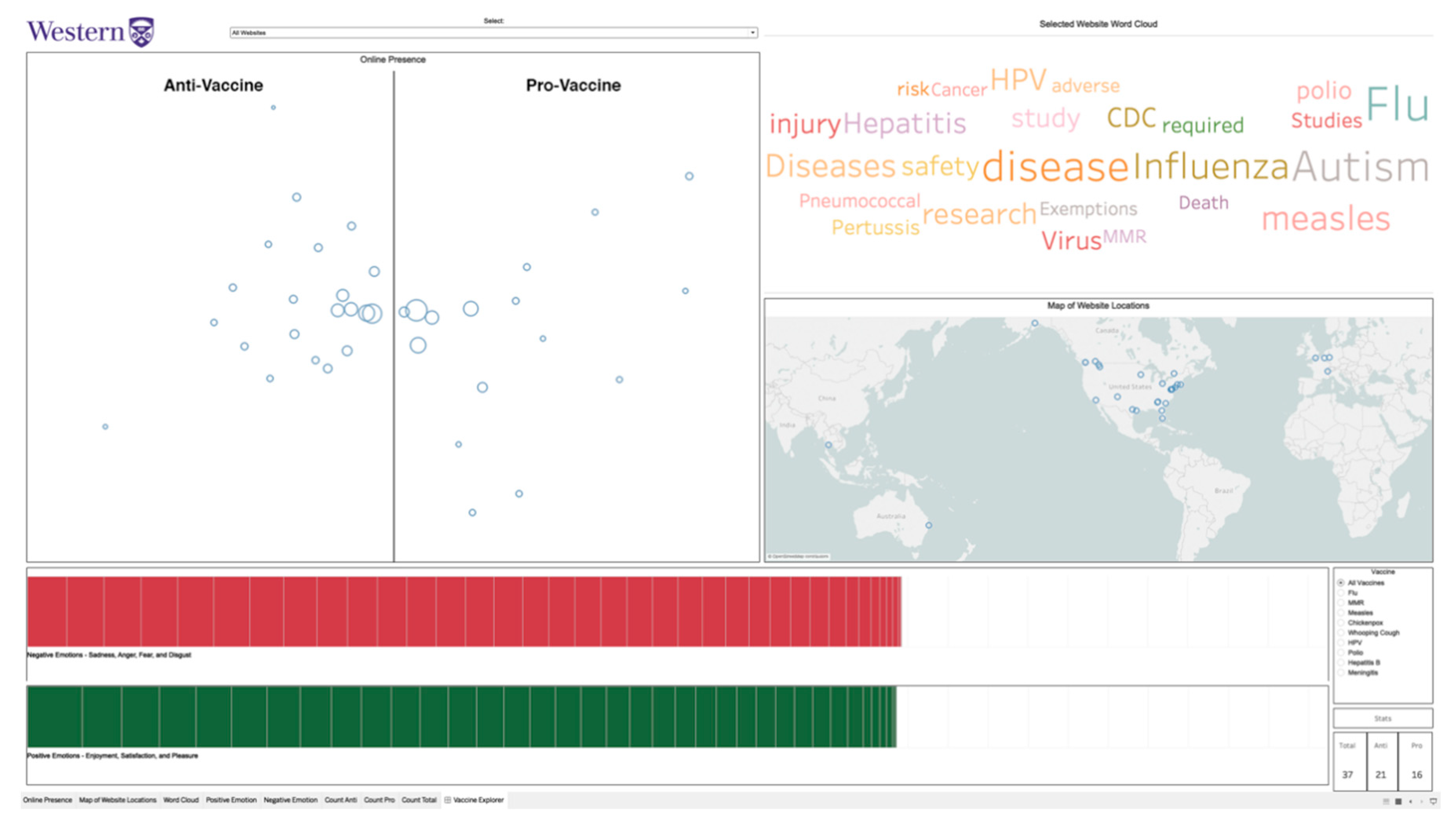
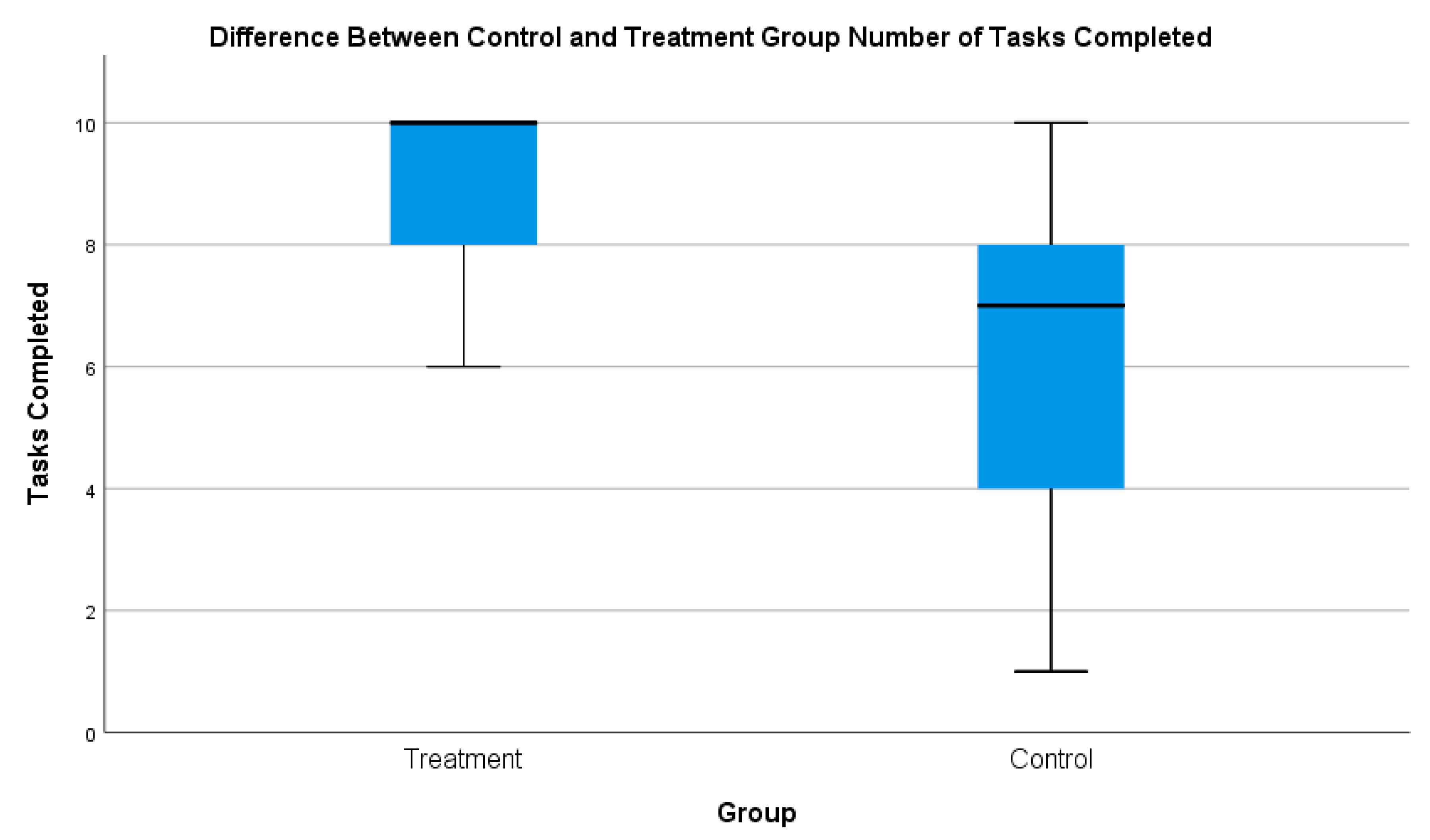
The control group was included to determine by comparison whether VINCENT influenced participants’ ability to investigate the online vaccine debate. With regard to completing the tasks, at a descriptive level, the treatment group was able to complete far more than the control group (see Figure 2). The mean number of completed tasks for the treatment group was 8.9/10, while for the control group it was 6.7/10.
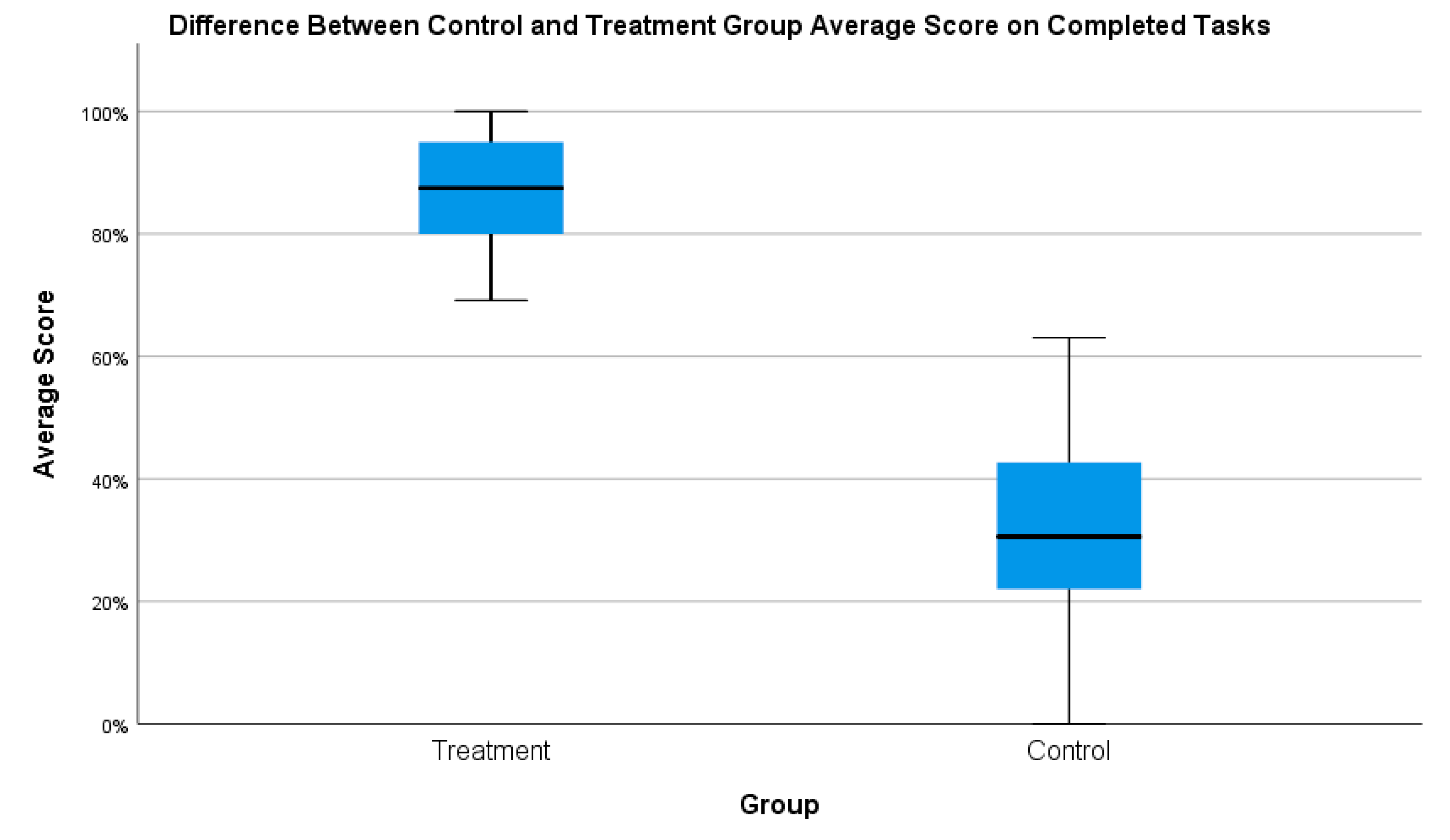
With regard to the average score (for only the completed tasks), at a descriptive level, the treatment group greatly outperformed the control group (see Figure 3). Every participant in the treatment group outperformed every participant in the control group.
When comparing the results of the two groups using the Mann–Whitney U test, a significant difference was observed. Table 1 presents the overall statistical analysis of the two groups. Overall, the treatment group was able to complete significantly more tasks and, on the tasks they did complete, were significantly more effective than the control group.
In Section 4.1.1 and Section 4.1.2, we discuss the results from the webometrics-based tasks, which helped users assess the websites’ online presence (Table 2) and geographic locations (Table 3). Tasks that utilized primarily online presence included Tasks 1, 2, and 4, while tasks that utilized primarily geographic locations included Tasks 3 and 10. Then, in Section 4.1.3 and Section 4.1.4, we discuss the results from the NLP-based tasks, which helped users assess websites’ focus (Table 4) and emotion in the website text when discussing specific vaccines or vaccines in general (Table 5). Tasks that utilized primarily focus included Tasks 5 and 6 while tasks that utilized primarily emotion included Tasks 7–9.

4.1.1. Online Presence

In Task 1, we asked participants to identify whether the set had more pro- or anti-vaccine websites, and then specifically how many websites of each vaccine position there were. To complete this task with VINCENT, participants could either highlight all the websites on the online presence map and check for the number of websites that were pro- or anti-vaccine, or otherwise manually count the number of circles on each side of the online presence map. The treatment group was significantly more effective at the task. For Task 1.1, all of the treatment group was able to correctly identify that there were more anti-vaccine websites, while only six participants in the control group managed to get it correct. The results were similar for Task 1.2, which asked participants to identify the specific number of websites in each vaccine position. In total, 14 of 17 treatment participants were able to correctly identify the exact number of websites for each position, while three of 17 control participants could.
In Task 2, we asked participants to identify both the anti- and pro-vaccine website with the most online presence. To complete this task with VINCENT, users needed to look at the online presence map, identify the biggest circle on the pro- and anti-vaccine side, hover over it and record the website’s name. The treatment group was significantly more effective than the control group. Every treatment group participant got both Task 2 subtasks correct, while for the control group it was almost the opposite; all but one participant answered all components of the task incorrectly.
In Task 4, participants were asked to give a similarity rating for three pairs of websites. To complete this task with VINCENT participants needed to use multiple different visualizations (online presence map and word cloud). For each pair, they had to see what the two website vaccine positions were, check how far apart they were on the online presence map, and compare their word clouds. The treatment group was significantly more effective at this task than the control group.

4.1.2. Geographic Locations

In Task 3, participants searched for the websites that were located outside of North America and needed to identify their country of origin and vaccine position. With VINCENT, users needed to go to the map of website locations, highlight all the websites that were not located in North America, and then record their name, vaccine position, and country of origin. The treatment group was significantly more effective at the task finding the correct websites, locations, and vaccine position with a mean accuracy of 95% while the control group had a mean accuracy of 44%.
In Task 10, participants had to identify which of the four specified locations presented to them had the highest concentration of each vaccine position. With VINCENT, users needed to highlight the websites in each of the four areas on the map, keep track of how many pro- or anti-vaccine websites there were in each area, and then select the area had the highest concentration of each vaccine position. The treatment group was significantly more effective than the control group, although both groups still fared poorly on the task with the treatment group’s accuracy at just over 50% while the control group’s accuracy was just under 25%.

4.1.3. Focus

In Task 5, participants were given four words that were under focus on the vaccine websites. They had to identify if there was a stronger focus on the specified word amongst the pro-vaccine websites or the anti-vaccine websites. With VINCENT, users had to use the website selector to select the anti- and then pro-vaccine word clouds. For each word cloud, they needed to check to see if the given word was there, and if so, record it. The treatment group was significantly more effective at the task than the control group.
In Task 6, participants were given three websites and asked to evaluate the strength of focus on “autism” as strong, weak, or none. With VINCENT, participants needed to use the website selector to select each of the three websites and then scan the word cloud for “autism”. Based on the size of the word (or if it appeared in the word cloud), the user needed to give it a focus rating. The treatment group was more effective than the control as a whole, but only a marginally significant difference was detected between the results of the two groups. It is worth noting that the treatment group was significantly more effective at Task 6.3, which presented the participants with a website that did not have any focus on autism.

4.1.4. Website Text Emotion

In Task 7, participants had to look at the four websites and determine which had stronger negative than positive emotions associated with the HPV vaccine. For this task, the treatment group needed to use the website selector to choose the website, use the vaccine selector and choose “HPV vaccine”, and then compare the highlighted bars of the emotion bar chart with each other. The treatment group was slightly more effective than the control group on this task, but there was no significant difference observed. The subtasks reflected this result, except for Task 7.4 where the treatment group was significantly more effective than the control group. This is an interesting example (vaccines.gov) because it is a pro-vaccine government website which did advocate for and promote the HPV vaccine. However, it also discussed things like the side effects of the vaccine and the people that should not get the vaccine, which is the reason for the higher negative emotion score.
In Task 8, participants had to find the specific website with the strongest positive emotion towards the polio vaccine. With VINCENT, users needed to use the vaccine selector to choose the polio vaccine, and then go to the positive emotion bar on the emotion bar chart, hover over the largest rectangle, and record the name of the website. The treatment group was significantly more effective than the control group on this task. Every treatment group participant responded correctly to this task, while every control group participant responded incorrectly.
In Task 9, participants had to determine which vaccine had the strongest negative emotions associated with it from the anti-vaccine websites. With VINCENT, users needed to use the vaccine selector to choose the identified vaccines and compare the sizes of the negative emotion bars on the emotion bar chart. The treatment group was significantly more effective than the control group on this task.

4.2. Response to VINCENT

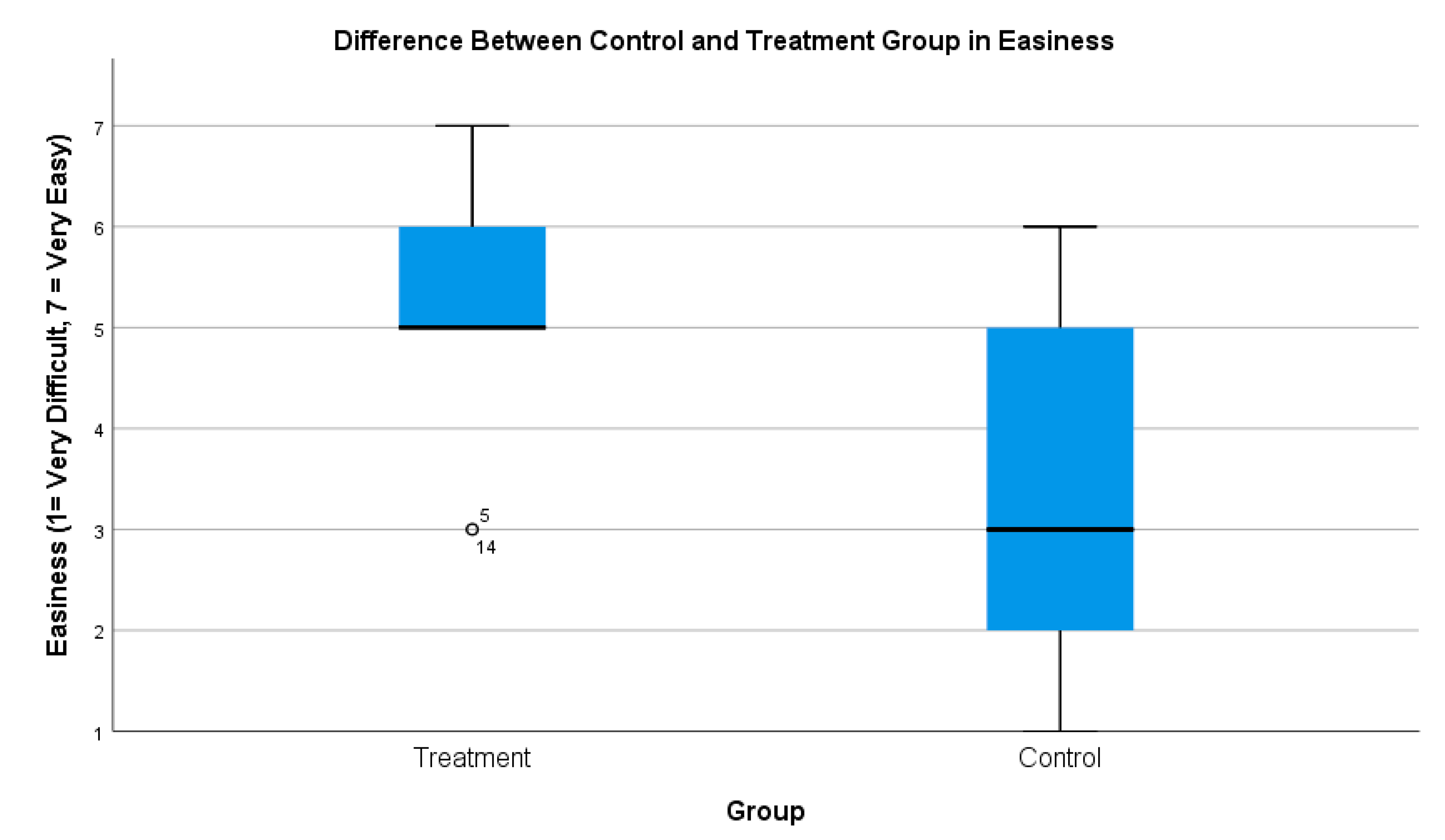
Overall, the treatment group responded much more positively to the tasks than the control group. At a descriptive level, the treatment group found the tasks much easier to complete (see Figure 4). The median response for how easy they found the tasks was, for the treatment group, easy, while for the control group it was somewhat difficult.
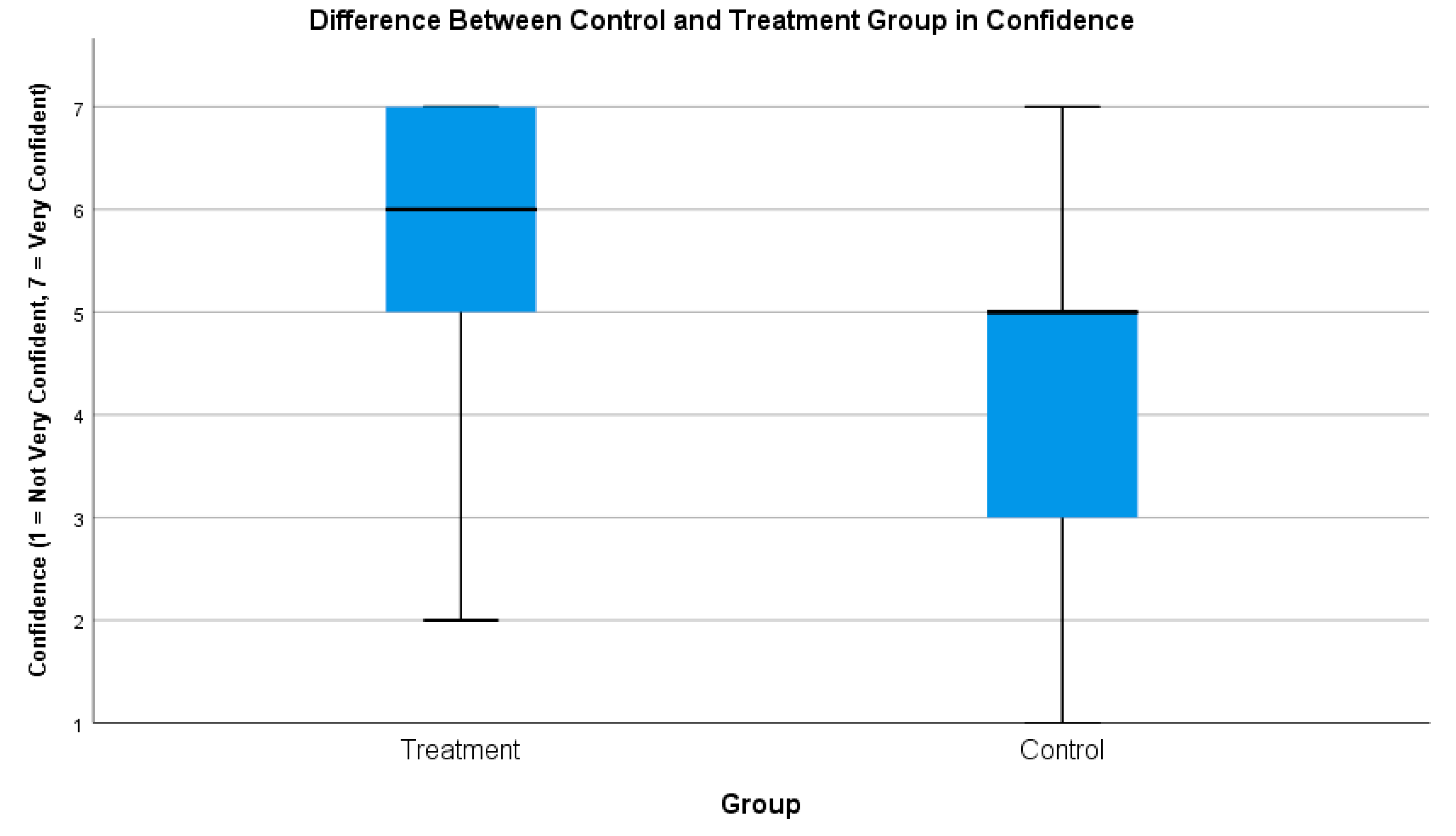
As well, at a descriptive level, the treatment group was much more confident in their responses (see Figure 5). The majority of responses from the treatment group ranged from extremely confident to somewhat confident, while for the control group, the majority of responses were somewhat confident to somewhat not confident.
Integrating the webometrics and NLP components made sense to the treatment group, as they responded that they found it easy to connect the information across multiple visualizations. This further indicates that the system was usable both overall and not just with regard to the various components of the system, as will be described subsequently.
The treatment group found most of the tasks to be straightforward with the use of VINCENT. They had to identify what the task was asking them to find, search the VAS for the corresponding information, analyze the information (if required), and develop/identify the appropriate response. It was challenging when the system did not match their mental model of how the interaction should work or if the task required them to go beyond simply finding the information in the system and required them to evaluate the information presented to them in further detail.
Comparing the two groups’ responses to the tasks, a significant difference was observed (Table 6). The treatment group found the tasks to be much easier to complete and were much more confident in their responses than the control group.
Two main observations were identified from the interview sessions that helped explain, in a general sense, these responses. First, the amount of time they had to complete the tasks was an important factor. VINCENT helped the participants deal with the vast amount of information quickly. Using the system, the treatment group could easily and rapidly find the information they needed to complete the tasks while the control group, on the contrary, found it very time consuming to go through the websites and get the information they needed.
Participant 8: “I didn’t have enough time … if it was 10 websites, obviously, I would have done way better than 37 websites. I would have been able to look over them all in depth. However, 37 websites were a lot and I had to look through every single one”
Participant 12: “I just found it pretty challenging overall just because the amount of websites I was given and the fact that I had to analyze them beyond just the first page or the domain”
Participant 2: “The tasks that required me to go through all the websites and determine are they pro-vaccine or anti-vaccine (among other things) … it was super hard.”
Second, VINCENT made it easier (and in some cases, possible) for participants to analyze and evaluate the information required to complete the tasks. The system offloaded much of the analysis and allowed the treatment group to visualize the data from the websites in ways that helped them to easily see patterns and make judgments about the data. One treatment group participant highlighted this sentiment.
Participant 9: “I was confident (in my responses) because … I would read the question and straight after I looked at the visualization … (and would) find what I was looking for. The terminology of the question was right there in the visualization. So, it was not like I had to do any further research. (The task) asked something, I clicked it, I hovered, I did some maneuvering around and navigating around the visualization and it was right there. Nothing was hidden, everything was just there.”
We will discuss the response to the various components of VINCENT in the following sub-sections. In Section 4.2.1 and Section 4.2.2, we discuss the user response to the system with regard to the webometrics-based tasks, which helped users assess websites’ online presence (Table 7) and geographic location (Table 8). These included Tasks 1, 2, 3, 4, and 10. In Section 4.2.3 and Section 4.2.4, we discuss the user response to the system with regard to the NLP-based tasks, which helped users assess websites’ focus (Table 9) and website text emotion when discussing specific vaccines or vaccines in general (Table 10). These included Tasks 5–9.

4.2.1. Online Presence

The treatment group found Task 1 to be significantly easier to complete than the control group. The treatment group quickly understood how to read the online presence map to get the information they needed. The control group did poorly on this task, with the majority responding incorrectly that the set of websites had more pro-vaccine than anti-vaccine websites. To complete this task, the control group had to find ways to investigate the set of websites quickly and effectively. The control group cited several reasons they struggled to do this, including that there were too many websites they had to assess, and they could not find appropriate identifying factors or indicators of what makes a website pro-vaccine or anti-vaccine.
Participant 8: “I would determine if they were pro- or not pro- by their layout or their about section … It was kind of hard to keep track of every website within the time frame.”
Participant 12: “The first task, I found pretty challenging because there were over 30 websites and the titles themselves, some of them didn’t really give away whether they were pro- or anti-vaccine. So, I had to basically click through all of them and then, even on the cover page, I was sometimes not even sure. Then so I would have to explore the website and that took a really long time.”
Participant 12: “Sometimes it was clear from the outside what the bias was, for instance the title of the webpage often communicated what the stance was, but that can be misleading. The quality of the webpage, a lot of the anti-vaccine websites looked like they were hastily put together whereas the pro-vaccine websites were usually government organizations and often times that was a hint, but ultimately it is the words that count.”
After seeing VINCENT, the control group discussed how the system would have helped them complete the task and saw how their original perceptions were inaccurate. As well, the treatment group discussed how they felt they would have fared on the task without the system. Some factors they observed that made the task more difficult for the control group included: pre-existing biases, difficulty quickly judging websites, and the juxtaposition of the websites effecting their determination of the website’s stance (i.e., a very anti-vaccine website next to a somewhat anti-vaccine website made the latter appear less anti-vaccine).
Participant 8: “So, I thought (Australian Vaccination-Risks Network) was pro-vaccination but really it is anti-vaccination, I didn’t get the whole vibe or the whole message of it being anti-vaccination … I guess I just didn’t go as in depth as other websites … This system would have helped since it not only marked it as anti-vaccination but I could see (for example) what negative emotions it had”
Participant 20: “I don’t think I’d make as objective a decision (without the system) on which websites are anti- or pro- as with (the) system, but also going back to back one website may seem more pro- or anti-vaccine because it was just after another type of website. If I had looked at a really anti-vaccine website and then looked at another anti-vaccine website but it was more mild, I may have personally put it in pro-vaccine category because of my own personal experience.”
Participant 26: “(Without the tool I would look at) how I trusted the name of the website … I know what government websites would be called, I know I can trust them in general, and I would put it as a pro-vaccine website … whereas something like Vaxxter, I’d be instantly questionable and think it’s anti-vaccine … it’s not a real word, its playing on catchphrasiness and that is a common thing with dubious websites, but then there is one, at the same time, called GAVI vaccine alliance … which if you were to ask me right of the bat if its pro- or anti, I’d say its anti- … but … I actually found out its a pro- one, so (my assumptions) don’t (always) work.”
The treatment group found Task 2 to be significantly easier than the control group as well. The treatment group was quickly able to understand that the size of the circles reflected online presence of each website and were quickly and easily able to identify the two websites of interest. The control group struggled with the task and found it more difficult to complete. The difficulty was due to the control group not identifying successful ways to judge online presence quickly. They tended to depend on superficial aspects of the website in an attempt to make these determinations, including the look of the website, the content, or the amount of built in interaction.
Participant 2: “Online presence for me was the quality of the content and representation … If I’m going through a website that has nothing in it and is just 1 page, that is for me, I don’t think that is going to have much attention or online presence than a website that has a blog and different authors write in it and it is, for example, interactive, you can go and comment and different posts etc. …”
Participant 8: “If I were a mother, I would choose websites that were the most family related. So, in that sense, I would choose those ones as the ones that had the strongest online presence
The treatment group found Task 4 to be slightly easier than the control. However, no significant difference was observed between the two groups’ results. This was a task that required going beyond just finding information on VINCENT, requiring participants to compare and analyze the information. Some participants in the treatment group highlighted the reasons they felt the task was challenging even with VINCENT, ranging from uncertainty on how to read the online presence map as well as being distracted by the amount of information they needed to assess and report.
Participant 6: “The horizontal axis on the (online presence map) I roughly interpret as the farther left it is the more anti-vaccine it is, the farther right it is the more pro-vaccine it is … But I don’t know what the vertical axis is telling but it seems like it is a really useful amount of real estate. If it has the opportunity to tell me something, that’d be fantastic … Because I was putting myself in a mental state of ‘what does the vertical axis mean’, that took a lot of time for me to figure out what I thought was going on”
Participant 9: “I wish I could keep both Xs on the map to help with compare and contrast”
Participant 5: “I didn’t feel super confident about this because I think I went off in too much detail talking about all the differences and maybe the negative and positive emotions thing tripped me up…”
Participant 20: “Because there is so much information here, I wrote -as you can see here- a lot. And I feel like for me it was more difficult because I wanted to write more and there wasn’t enough time to do so.”
The control group found Task 4 easier to complete than they had found Tasks 1 or 2. An important reason they found this comparatively easier to the previous tasks was that instead of looking through all of the websites, this task only required them to focus on and compare two websites at a time. In the eyes of the control group, this was much more manageable and gave them an opportunity to look more closely at the information they had to assess.
Participant 3: “To me it was an easy task to complete in terms of the other tasks because I was only comparing 2 websites at a time”
Participant 12: “With the specific websites, I was prompted to look at one aspect of them and since it was only about 2 at a time it was easier to remember what I looked at on the first website and then compare that to the next one versus (looking at all the website). I had already forgotten what I looked at 2 websites ago and since I wasn’t looking for anything specific it was sort of overall the feel of the website, that was a lot harder”

4.2.2. Geographic Locations

The treatment group found Task 3 significantly easier to complete than the control group. With VINCENT, participants understood how the map worked and how to locate the websites to uncover the information. Participants reinforced this finding in the interviews, explaining how the map made sense to them and that it was easy for them to see and evaluate the information.
Participant 26: “There are visual spaces in the app that are definitely more approachable … For example, the (geographic) map, most people have a mental model of how a map works, so they see the map and they see locations dotted on a map and they can easily approach this and get instant context”
Participant 3: “I would have (felt it was) the easiest and had the highest confidence (in my response with the system) because even just seeing here, you can see there are 6 countries and I would immediately be able to get the information I needed.”
The control group struggled to find the information they needed. A common strategy was to look to see if there was any indication about the geographic location from the name of the website or the top-level domain (e.g., .uk, .au). One participant (participant 2) had a computer science background and mentioned how they used these skills to help do this task, specifically using WHOIS to help locate the websites. But even this method was only somewhat effective, as they were limited in time and could only search the websites that they suspected of being located outside of North America.
Participant 2: “One task … (asked me to determine) which country is this website coming from. So, in order to do that, I looked up some of the websites from WHOIS. Some of the websites didn’t include their address or postal code in their about page or any other page, so I had to look up online to see from which country is this website coming from.”
Participant 8: “I looked at the URL. I think .com is North America, so there are some that are .eu or .uk so I thought those would be Europe our United Kingdom. So that is what I put as the answer … This question would have been easier (with the system) with the system because the map shows where the website is located.”
Participant 3: “For example, looking at the locations, the best I could do was try and look at the ending of the URL, the domain, and then go to that website and see if I could find out anything about where it was from.”
The treatment group also found Task 10 to be significantly easier to complete than the control group. In general, the treatment group seemed to understand what they were looking for and how to interact with the system to get that information. One aspect of this task that both the treatment and control groups identified having difficulty understanding was some of the geographic terminology used. “Midwestern USA” specifically seemed to cause confusion amongst participants. Some participants expressed their confusion about what this area meant. Participants said they would have benefited from having geographic regional labels added to the map to help them keep track of and identify the various regions.
Participant 20: “I would have kind of recognized western North America is here, eastern North America is here, Europe, but Midwestern USA, I don’t know what that means … If you had those questions and the labels were on the map (it would have helped)”
Participant 9: “I felt like the majority of the websites I was looking at fell in both (Midwest and Western USA) so I couldn’t specify which one”
One treatment group participant highlighted why VINCENT was useful for this task or any other task that required examining groups of websites by their geographic locations. With the system, the user can quickly put websites together based on geography and see if any relationships exist between this and vaccine position, focus, or emotions regarding vaccines.
Participant 6: “I think of geographical terms … so I want to know what these clusters of websites have in common because of their geographical proximities and simply by highlighting them there happens to be in the pacific northwest a strong anti-vaccine tendency at least from the sample we have available, which is interesting to me”

4.2.3. Focus

The treatment group found Task 5 to be significantly easier to complete than the control group. For the control group, this task required participants to have completed a general overview of both groups of websites. However, some participants in the control group expressed that they relied primarily on their previous knowledge of the vaccine debate to connect which words they thought were more likely to be pro- or anti-vaccine focused. For example, in Task 5.1 (the only one that did not have a significant difference in results between the two groups), participants had to determine whether the word “cancer” had a stronger focus in the anti- or pro-vaccine group. One control group participant explained how they applied their knowledge of the vaccine debate to the complete Task 5.
Participant 12: “This (task required) skimming through some of the main websites, but also a huge part of it was also my previous knowledge on the pro- & anti-vaccine-debate and making assumptions whether these websites would have more focus on these various issues … I would say this question was a lot of assuming, because I know that mumps, that is something you can prevent with vaccines, so I would assume pro-vaccine, and same with virus. But cancer … (is something) that people that don’t believe in vaccines (would say) causes, so I would just assume that they would talk about those on anti-vaccine websites and talk about the dangers here”
The treatment group also found Task 6 to be significantly easier to complete than the control group. For the treatment group, the task required them to make judgments on the words in the word clouds. If the word showed up and was large, it was an indication that it had a strong focus. If the word showed up but was small, then it was an indication that it had a weak focus. If the word did not show up at all, it was none. The treatment group expressed that identifying the strong focus or no focus words was easier than identifying weak focus words, as some had difficulty analyzing and evaluating the smaller words in the word cloud. This was reflected in the results for Sub-Task 5.1, which required them to evaluate a smaller word. It was the task with which the treatment group fared the worst.
Participant 5: “I was able to easily differentiate between the ones that were like used the most but I think I found it somewhat difficult … that I was not able to tell the difference between the smaller words”
The control group had to make the assessments by reading through the websites. Again, this was challenging given the amount of content and time that they had. Participants would use strategies such as relying on their previous knowledge, going to about pages or using search features to find the words on the website.
Participant 3: “One of the hardest questions was about the focus of the website. I found that hard because I could only look at so many words for each website, and typically I would just look at the homepage of those websites and see if any of those words popped out at me.”
Participant 12: “I went on each website and I used the search tool and I just searched the word “Autism” and saw how many hits came up … and just going through the homepage, usually a lot of the anti- ones will have autism on their first page because that is like the main problem people have with vaccines … but the main strategy for me was using the search button on the websites”
Participant 3: “Using this tool would have been much easier because I can see the world autism right there and I would be able to … choose the websites and see if it comes up. So, it comes up and I was very wrong (about my previous answer), which shows it wasn’t as easy as I thought it was”
Participant 23: “Typically the sites would have something on the front page that would give relevant information out—stories you could click on and read more about. If in those it mentioned something like mumps or Gardasil vaccine, then that would be an indication of a strong focus … when looking at a page I would find what they focus on by looking at what they immediately present.”

4.2.4. Website Text Emotion

The treatment group found Tasks 7, 8 and 9 to be significantly easier to complete than the control group. They found that it was easy to read the emotion bar charts and make comparisons between the positive and negative emotions, identify a specific website’s emotion towards a vaccine, or assess the emotion of a sub-group of websites. One control group participant highlighted the reason VINCENT made these tasks dealing with emotion easier, especially considering what the task would have been like without the VAS.
Participant 9: “I don’t think it would be easy (to evaluate emotion) at all without the system because nobody writes on a website “I feel strongly negatively about XYZ” it’s never there. You really need to read through and, again, what you determine might not be at all what they are trying to say, so I wouldn’t be able to confidently answer this. And the visualization is perfect. It tells you right there”
While the treatment group found the tasks easy to complete, especially compared to the control groups’ experience, there was some confusion using VINCENT’s emotion bar charts as noted in the excerpts below. These included difficulty with differentiating each section of the bar chart from one another or a need to highlight corresponding negative and positive emotions simultaneously. These difficulties shed light on why the performance scores of the treatment group on Task 7 were only slightly more effective than the control group.
Participant 5: “I was having difficulties differentiating the smaller ones to the right. Maybe it’s the color?”
Participant 32 “If I hover on this one, it would be nice if the relative one hovered as well so I can compare very easily”

5. Discussion and Conclusions

This section discusses the conclusions of this study. We will first discuss the overall conclusions in Section 5.1. We will follow this with a discussion about conclusions specifically with regard to the various components of the system in Section 5.2 (webometrics) and Section 5.3 (NLP). Next, in Section 5.4, we will go over the considerations that for developing future VASes for online public health debates. Finally, in Section 5.5 and Section 5.6, we will discuss the limitations of the study and future research accordingly.

5.1. Overall

Overall, the study found that VINCENT was a valuable resource for users when making sense of the online vaccine debate. Participants who used the system were more effective at the prescribed tasks, found the tasks easier, and were more confident in their responses than those who did not use the system. By integrating webometrics, NLP, data visualization, and human-data interaction, the system enabled users to make sense of the presented data quickly and effectively. Some participants in the treatment group highlighted the general importance of the system in their ability to complete the tasks.
Participant 32: “The tasks were very easy to answer with the visualization … it was very easy to find the required information”
Participant 20: “I thought it was really neat to see the different results on screen at the same time. The location, the emotional affects, where the websites sat pro- or anti-vaccine, and the word bank, it gave you so much information at the same time and it kind of allows you to more easily draw a conclusion about a website being able to see it all at once rather than having to research this, sit down and figure it out—(I) wouldn’t make the same conclusions or draw it all together at once on my own.”
The amount of information, its complexity, and the amount of time participants had to assess it were the important factors identified to explain why the treatment group was more effective at the tasks than the control group. VINCENT made it easy to quickly make sense of the data in the vaccine debate. One participant highlighted this, explaining how they found the system useful and fun.
Participant 9: “There are a lot of sources out there, and you really can’t go through all of them. The way you have them put all together in one visualization where I can see everything, it just looks very helpful. It’s not something I would do research on my own, but it was fun to navigate with it.”
The treatment group understood how to interact with the system to get the information they needed. They also saw the potential for VINCENT to help them explore this information space further and more accurately than they could on their own. One control group participant discussed this idea after seeing the system for the first time.
Participant 12: “I think if I had that system, I definitely would have been more confident in my answers. I definitely would have been able to complete them faster and I wouldn’t be so uncertain about almost everything I put on the questions and probably felt more confident in them. Overall, I think the system definitely lays it out for you in a really simple manner so that all that information is accessible to you within the click of a button vs. having to do it manually and go through all the websites and make your own judgement”

5.2. Webometrics

The webometrics components of VINCENT (maps of geographic location and online presence) were extremely valuable resources for participants to complete the online presence and geographic location tasks. The treatment group was much more effective at identifying the website vaccine position than the control group. The latter struggled to assess quickly the information on the websites and to make surface level judgments about those websites. Further, the control group would frequently misjudge an anti-vaccine website as pro-vaccine, a finding worthy of further investigation.
The implications for this finding alone indicate that unaided by the system, people can struggle to make sense of the overall message that vaccine websites are presenting to them. For example, a website may advocate for parental vaccine choice; we found that participants could misinterpret this as an indication that the website is pro-vaccine. The system was necessary for completing such a task because it showed, supported by an analysis of inlinks, how much shared online presence the websites had with one another, and therefore provided further insights into whether websites were actually pro- or anti-vaccine. The users could then corroborate the findings by looking at the websites’ emotion or focus data.
It was interesting to note that some participants who were interviewed, both from the treatment group and control group, felt confident that they were or would be able to accurately perform Task 1 with or without the system, as the excerpts below demonstrate.
Participant 3: “I think what I meant by it was easy was that it was easy once I was looking at the website to determine if it was pro- or anti-vaccine. But it wasn’t completely easy because there were so many to go through”
Participant 5: “For websites, it would have been a lot longer a process. I probably would have used the paper you gave me and just counted them pro- and anti-, but it would have been more lengthy. I still think I would have felt just as confident because I’m literate and I can see what is going on, but it would have been much longer of a process but just as confident”
Participant 9: “Without the system, it would have been easy but time consuming … I’d also be confident—100% with the system and 90% without”
Participant 8: “It wasn’t a hard task to do, just very time consuming and required putting some thought into it.”
In other words, some participants were not aware of how poorly they did or would do on Task 1 without VINCENT, further demonstrating how beneficial the system was in helping the user make sense of the debate. There is often ambiguity and a lack of clarity about what the information from these websites is trying to convey, which takes more effort to uncover.
The information displayed by the online presence map was very clear to users, as demonstrated by their ability to perform these tasks accurately. One issue that caused confusion, however, was the meaning and interpretation of the axes. The coordinates of the websites on the scatterplot were generated using MDS, which plots the data points with regard to their similarity to one another. With MDS, the proximities of the data points are more important than their location independently on the axes. These axes are not always well defined, and it is up to the reader of the map to discern their meaning from the scatterplot. In this case, the researchers could not infer exactly what the y-axis was reflective of and therefore did not indicate it on the map. In order to limit confusion, it would be important to further explain this in the instructional video.
The map of website locations was clear to the users, as they were able to navigate it accurately and easily. However, many users were not familiar with some of the specific geographic terms of the task. Further geographic information should be provided in the system, and it should not be assumed that these geographic areas are common knowledge. Color coding the areas so the user can see them clearly or adding the areas to the information box are possible solutions.

5.3. NLP

The NLP components of VINCENT (the emotion bar chart and word cloud) were also extremely valuable for users. The treatment group was able to properly interact with the emotions bar chart and get the information they needed. Some users mentioned, however, that they found it somewhat confusing to use and were unsure if they properly understood the generated information. Comparing a single website’s positive and negative emotion regarding a vaccine, for example, was impeded because the bars did not line up on top of each other. Some participants in the treatment group highlighted why they struggled to use the emotion bar chart, citing reasons like: difficulty activating the emotion bar chart correctly or struggling to compare the positive and negative emotions of a single website.
Participant 6: “The (emotion analysis) on the bottom. I didn’t know quite how to read that. When I select an individual website from the main interface here, I didn’t quite understand how the changes work.”
Participant 26: “(The emotion panel) is very powerful as long as it is activated correctly, and that was one of my issues—I didn’t know how to properly activate it. But it is powerful itself”
Participant 6: “I think I may have looked at (the task) too quickly. Since the bars aren’t lining up (it was difficult to assess) ….”
The activation of the word cloud was straightforward for users. Some mentioned, however, that assessing the size of the smaller words in the word cloud was challenging. As the words got smaller, it was more difficult to differentiate the words from one another or determine if the size of one word was bigger or smaller than another. The word cloud could either be expanded to take up more space on the display so that the sizes of the words are easier to differentiate, or another method of visualizing word frequency could be considered.

5.4. Considerations for Developing VASes for Online Public Health Debates

The study suggests that several considerations should go into developing future VASes for online public health debates. These considerations include: find ways to reduce the users’ effort in evaluating the data, plan around users’ mental models to determine how the VASes interactions should work, and include more supporting information for users to accurately assess the data in the VAS.
When developing these systems, careful consideration must be given to the difficulty users have evaluating information. It is important to reduce the analysis effort required to use the system by adopting well-thought-out design and additional data analytics methods. We found that for tasks requiring participants to analyze data in depth and go beyond simply locating specific pieces of information in the system, the treatment group’s performance was poorer than on tasks that required the users to conduct less in-depth analysis. For example, in Task 7 (one in which treatment group did not significantly outperform the control group), participants were asked to evaluate if various websites had stronger positive or negative emotions with regard to the HPV vaccine. While the treatment group was generally able to locate on the emotion bar charts the appropriate information needed for this task, and subsequently connect the pieces of information together, making the proper judgment with regard to exactly how much the bars differed was challenging. Implementing ways for users to automatically compare this data would limit the potential to misunderstand the charts and information presented.
Development of these systems requires careful consideration of previous mental models of users. Adopting strategies that meet these models to avoid confusion is important. While many of VINCENT’s design features did this well, some aspects of the system did not match these mental models. For example, users could interact with the system to select websites directly on the visualizations or select specific websites via a drop-down website selector tool. Participants were, at times, confused by these interactions because they split the selection process into two separate interactions (this was a limitation of the tool used to develop VINCENT). Integrating all of the selection options together would have made the system more usable for participants. Furthermore, participants mentioned that they expected that using the website selector tool, they could select more than one website at a time (specifically for the comparison tasks). Creating systems that function more intuitively for users would reduce the time and effort it takes users to learn how to use the VAS and do the tasks required of them.
It is important that these systems convey information with enough supporting information for users to properly perform sense-making tasks. For example, in Task 10, participants were asked to evaluate the concentration of pro- and anti-vaccine websites according to several specified geographic regions. Some of these regions (specifically “Midwestern USA”) were not clear to the users. Supporting information must be included in these systems so that the users are not limited in their ability to perform tasks.

5.5. Limitations

There were several limitations to this study. First, the amount of time which we could reasonably ask of participants was limited. Participants from both groups mentioned in the interviews and the post-task questionnaires that time was a factor in their ability to complete the tasks. Had participants had additional time, the results could have been affected. However, it was clear that when under a time constraint, VINCENT enabled participants to complete more tasks.
As well, participants in this study were required to be university students in Canada, which limited the diversity of the population of the study. Testing the system on and against users with more knowledge and experience with the public health issue of interest may have yielded different results then what we found in our study.
The tools used to design the visualizations and interactions of VINCENT limited the functionality and, subsequently, the effectiveness of the system. The separated selector system (highlighting a website or selecting it from the dropdown menu), filtering of the emotion bar charts, and the inabilit to select more than one website at a time from the dropdown list were all mentioned as setbacks for the treatment group during this research. Developing a system from scratch or using another visualization development tool (like D3.js) may have alleviated some of these design limitations. There are currently no visual analytics systems that examine online public health debates. As a result, it is difficult to compare the tool developed here to other existing research.
Finally, the tools and data used for the data analytics of VINCENT also carried limitations. For example, the online presence map relied on domain-level inlinks from MOZ’s Link Explorer. Further analysis using different levels of inlinks (site or page level) could improve the data analytics. For geographic location data, we would rely on WHOIS registration data if we could not find location information on the websites. While this was a useful tool for identifying locations, it can also be misleading if the website is registered in one location but is hosted or aimed at an audience in another location Furthermore, the NLU API was used as the method of analyzing website text. This out of box text-based emotion analysis was useful for this study, but more reliable results could potentially be achieved using a customized NLP tool that had been trained on the text of the domain of interest. For example, BioBERT is an NLP tool that has been trained on large-scale biomedical corpora and could be useful for these types of public health related tasks [45].

5.6. Future Research

This study found that VINCENT was a valuable resource for users investigating the online vaccine debate, a noted public health issue of our time. Further research is needed to examine how systems like this can be applied in other areas of debate, both within public health and in other domains. Those with a vested interest in making sense of public health topics, for example cannabis or alternative health practices, as well as topics from other domains (e.g., academia, business, or politics) could benefit from the development of similar systems.
Furthermore, future research should look at using alternate methods of data analytics, data visualizations and human-data interactions to those utilized in this study. Social media could also be an important medium for further analysis of online public health debates. As well, social network analyses for examining and visualizing shared online presence in place of MDS, used here, could result in more effective user performance on the sense-making tasks. By examining alternate methods for developing VASes for online public health debates, future systems can be developed with a clearer understanding of which methods are best for users who need to make sense of online public health debates.

Author Contributions

Both authors contributed to the conceptualization, methodology, writing, and editing of this paper. As well, both authors contributed to the design of the tool and the experiments. A.N. implemented the tool, performed the experiments, and analyzed the data. K.S. supervised the study. All authors have read and agreed to the published version of the manuscript.

Funding

This research received no external funding.

Conflicts of Interest

The authors declare no conflict of interest.

Abbreviations

VASVisual analytics system
MDSMulti-dimensional scaling
NLPNatural language processing
NLUNatural language understanding
APIApplication Programming Interface
VINCENTVIsual aNalytiCs systEm for investigating the online vacciNe debaTe

Appendix A. List of Websites

NameDomain
Adult Vaccinationhttp://www.adultvaccination.org/
Age of Autismhttp://www.ageofautism.com/
Australian Vaccination-risks Networkhttp://avn.org.au/
Experimental Vaccineshttp://experimentalvaccines.org/
Families Fighting Fluhttp://www.familiesfightingflu.org/
Gavi The Vaccine Alliancehttp://www.gavi.org/
History of Vaccineshttp://www.historyofvaccines.org/
Immunization Action Coalitionhttp://www.immunize.org/
Immunize BChttp://www.immunizebc.ca/
Immunize Canadahttp://immunize.ca
Institute for Vaccine Safetyhttp://www.vaccinesafety.edu/
National Vaccine Information Centerhttp://www.nvic.org/
Parents Requesting Open Vaccine Educationhttp://vaccineinfo.net/
Prevent Childhood Influenzahttp://www.preventchildhoodinfluenza.org/
Sabin Vaccine Institutehttp://www.sabin.org/
Safe Mindshttp://www.safeminds.org/
SaneVaxhttp://sanevax.org/
Shots of Preventionhttp://shotofprevention.com/
The Immunization Partnershiphttp://www.immunizeusa.org/
The Informed Parenthttp://www.informedparent.co.uk/
The Thinking Moms Revolutionhttp://thinkingmomsrevolution.com/
Think Twice Global Vaccine Institutehttp://thinktwice.com/
Vaccinate Your Familyhttps://www.vaccinateyourfamily.org/
Vaccination Information Networkhttp://www.vaccinationinformationnetwork.com/
Vaccination Liberationhttp://vaclib.org/
Vaccination Newshttp://www.vaccinationnews.org/
Vaccine Choice Canadahttp://vaccinechoicecanada.com
Vaccine Injury Help Centerhttp://www.vaccineinjuryhelpcenter.com/
Vaccine Injury Infohttp://www.vaccineinjury.info/
Vaccine Liberation Armyhttp://vaccineliberationarmy.com/
Vaccine Resistance Movementhttp://vaccineresistancemovement.org/
Vaccine Truthhttp://vaccinetruth.org/
Vaccines Todayhttp://www.vaccinestoday.eu/
Vaccines.govhttp://www.vaccines.gov/
Vaxxterhttp://vaxxter.com
Voices for Vaccineshttp://www.voicesforvaccines.org/
World Association for Vaccine Educationhttp://novaccine.com/

Appendix B. Tasks

Task 1.1 Looking at all given websites, how are the pro-vaccine and anti-vaccine websites distributed?
  • More pro-vaccine websites
  • More anti-vaccine websites
  • Equal pro- and anti-vaccine websites
Task 1.2 How many of each vaccine position are there?
Post-Task 1 I found the previous task easy to complete.
  • Strongly Agree
  • Agree
  • Somewhat agree
  • Neither agree nor disagree
  • Somewhat disagree
  • Disagree
  • Strongly disagree
Task 2.1 Looking at the pro-vaccine websites, identify the website with the strongest Presence.
Task 2.2 Looking at the anti-vaccine websites, identify the website with the strongest Presence.
Post-Task 2 I found the previous task easy to complete.
  • Strongly Agree
  • Agree
  • Somewhat agree
  • Neither agree nor disagree
  • Somewhat disagree
  • Disagree
  • Strongly disagree
Task 3.1 Identify and list the name of every website located outside of North America.
Task 3.2 For each of these websites, identify the country in which the website is located.
Task 3.3 For each of these websites, identify the vaccine position it takes.
Post-Task 3 I found the previous task easy to complete.
  • Strongly Agree
  • Agree
  • Somewhat agree
  • Neither agree nor disagree
  • Somewhat disagree
  • Disagree
  • Strongly disagree
Task 4 Given the following 4 pairs of websites, compare and assign a Similarity rating. Explain each response.
4.1 Vaccination Liberation and Age of Autism
4.2 Prevent Childhood Influenza and Sabin Vaccine Institute
4.3 Institute for Vaccine Safety and World Association for Vaccine Education
4.4 Think Twice Global Vaccine Institute and Vaccination Liberation
Post-Task 4 I found the previous task easy to complete.
  • Strongly Agree
  • Agree
  • Somewhat agree
  • Neither agree nor disagree
  • Somewhat disagree
  • Disagree
  • Strongly disagree
Task 5 Identify if each of the following 4 words have a strong Focus amongst: (1) the pro-vaccine websites or (2) the anti-vaccine websites.
5.1 Cancer
5.2 Pregnancy
5.3 Mumps
5.4 Virus
Post-Task 5 I found the previous task easy to complete.
  • Strongly Agree
  • Agree
  • Somewhat agree
  • Neither agree nor disagree
  • Somewhat disagree
  • Disagree
  • Strongly disagree
Task 6 Identify if the following websites’ Focus on autism should be regarded as: (1) strong; (2) weak or (3) none.
6.1 Shots of Prevention
6.2 The Thinking Mom’s Revolution
6.3 Families Fighting the Flu
Post-Task 6 I found the previous task easy to complete.
  • Strongly Agree
  • Agree
  • Somewhat agree
  • Neither agree nor disagree
  • Somewhat disagree
  • Disagree
  • Strongly disagree
Task 7 With regard to the HPV vaccine, identify the websites that have stronger negative than positive Emotion (i.e., are more negative about the HPV vaccine than positive).
  • Vaccination News
  • Vaxxter
  • Voices for Vaccines
  • Vaccines.gov
Post-Task 7 I found the previous task easy to complete.
  • Strongly Agree
  • Agree
  • Somewhat agree
  • Neither agree nor disagree
  • Somewhat disagree
  • Disagree
  • Strongly disagree
Task 8 Looking at the Polio vaccine, identify which website has the strongest positive Emotion. Explain your response.
Post-Task 8 I found the previous task easy to complete.
  • Strongly Agree
  • Agree
  • Somewhat agree
  • Neither agree nor disagree
  • Somewhat disagree
  • Disagree
  • Strongly disagree
Task 9 Looking at the anti-vaccine websites, identify which of the following vaccines has the strongest negative Emotion. Explain your response.
  • HPV
  • Flu
  • Polio
  • Measles
Post-Task 9 I found the previous task easy to complete.
  • Strongly Agree
  • Agree
  • Somewhat agree
  • Neither agree nor disagree
  • Somewhat disagree
  • Disagree
  • Strongly disagree
Task 10.1 Identify which of the following areas has the highest concentration of pro-vaccine websites.
  • Western North America
  • North Eastern North America
  • Europe
  • Midwestern USA
Task 10.2 Identify which of the following areas has the highest concentration of anti-vaccine websites.
  • Western North America
  • North Eastern North America
  • Europe
  • Midwestern USA
Post-Task 10 I found the previous task easy to complete.
  • Strongly Agree
  • Agree
  • Somewhat agree
  • Neither agree nor disagree
  • Somewhat disagree
  • Disagree
  • Strongly disagree

Appendix C. Defined Terms

Emotion—The feelings and attitudes that are connected to specified words/phrases found on a website. Values include:
  • Positive Emotion—Emotions that encompass feelings such as joy, enjoyment, satisfaction, and pleasure. Can be invoked by a sense of well-being, inner peace, love, safety, or contentment. This emotion ranges from weakest positive to strongest positive.
  • Negative Emotion—Emotions that encompass feelings such as sadness, anger, fear, and disgust. Can be invoked by a sense of conflict, injustice, betrayal, danger, loss, and disadvantage. This emotion ranges from weakest negative to strongest negative.
Focus—The topics that are discussed on a website. Examples of some values include: autism, diseases, research or injury. Values range from weak focus to strong focus.
Online Presence—The online attention that a website receives. Values for this range from weakest presence to strongest presence.
Shared Online Presence—The degree to which multiple websites have online attention directed to them from the same sources. Values for this range from weak shared online presence to strong shared online presence.
Similarity—The degree of closeness of websites with regard to their vaccine position, shared online presence, and focus. Values include:
  • None—Websites that have different vaccine positions.
  • Low—Websites that have the same vaccine position, but differ in focus and/or shared online presence.
  • High—Websites that have the same vaccine position, shared focus and online presence.
Vaccine Position—The view a website takes on vaccines. Values include:
  • Anti-Vaccine—Discouraging people from vaccinating, advocating for the right to choose not to vaccinate, and/or linking vaccinations to other health issues.
  • Pro-Vaccine—Encouraging people to vaccinate, spreading scientific information about vaccinations, and/or refuting false claims made by anti-vaccination groups.

Appendix D. No System Post-Tasks Questionnaire

  • I was confident about the answers I provided for the given tasks.
    • Strongly Agree
    • Agree
    • Somewhat agree
    • Neither agree nor disagree
    • Somewhat disagree
    • Disagree
    • Strongly disagree
  • I found it easy to complete all the given tasks.
    • Strongly Agree
    • Agree
    • Somewhat agree
    • Neither agree nor disagree
    • Somewhat disagree
    • Disagree
    • Strongly disagree
  • Any additional comments about your experience completing these tasks.
  • Would you like to participate in an interview session? Your answer determines whether you might be asked, not whether you will be asked.
    • Yes, I want to be an interview candidate. I realize that I may not be invited.
    • Do not contact me at all about the interview session.

Appendix E. System Post-Tasks Questionnaire

  • I was confident about the answers I provided for the given tasks.
    • Strongly Agree
    • Agree
    • Somewhat agree
    • Neither agree nor disagree
    • Somewhat disagree
    • Disagree
    • Strongly disagree
  • I found it easy to complete all the given tasks.
    • Strongly Agree
    • Agree
    • Somewhat agree
    • Neither agree nor disagree
    • Somewhat disagree
    • Disagree
    • Strongly disagree
  • I was able to clearly understand and evaluate the various individual website’s online presence using the Online Presence map.
    • Strongly Agree
    • Agree
    • Somewhat agree
    • Neither agree nor disagree
    • Somewhat disagree
    • Disagree
    • Strongly disagree
  • I was able to clearly understand and evaluate the shared online presence of multiple websites using the Online Presence map.
    • Strongly Agree
    • Agree
    • Somewhat agree
    • Neither agree nor disagree
    • Somewhat disagree
    • Disagree
    • Strongly disagree
  • I was able to clearly understand and evaluate the focus of individual websites and groups of websites using the Word Cloud.
    • Strongly Agree
    • Agree
    • Somewhat agree
    • Neither agree nor disagree
    • Somewhat disagree
    • Disagree
    • Strongly disagree
  • I was able to clearly understand and evaluate the geographic dispersion of the various websites on the Map of Website Locations.
    • Strongly Agree
    • Agree
    • Somewhat agree
    • Neither agree nor disagree
    • Somewhat disagree
    • Disagree
    • Strongly disagree
  • I was able to clearly understand and evaluate the distribution of emotion that several websites collectively had towards various vaccines.
    • Strongly Agree
    • Agree
    • Somewhat agree
    • Neither agree nor disagree
    • Somewhat disagree
    • Disagree
    • Strongly disagree
  • I was able to clearly understand and evaluate the distribution of emotion that a single website had towards various vaccines.
    • Strongly Agree
    • Agree
    • Somewhat agree
    • Neither agree nor disagree
    • Somewhat disagree
    • Disagree
    • Strongly disagree
  • I found it easy to connect the information across the various visualizations together.
    • Strongly Agree
    • Agree
    • Somewhat agree
    • Neither agree nor disagree
    • Somewhat disagree
    • Disagree
    • Strongly disagree
  • I found it easy to control the visualizations to see what I wanted to know.
    • Strongly Agree
    • Agree
    • Somewhat agree
    • Neither agree nor disagree
    • Somewhat disagree
    • Disagree
    • Strongly disagree
  • I found it helpful to have the various types of information integrated into one system that I controlled.
    • Strongly Agree
    • Agree
    • Somewhat agree
    • Neither agree nor disagree
    • Somewhat disagree
    • Disagree
    • Strongly disagree
  • What did you find worked well within the system?
  • What did you find confusing within the system?
  • Any additional comments about the visualizations and system?
    Would you like to participate in an interview session? Your answer determines whether you might be asked, not whether you will be asked.
    • Yes, I want to be an interview candidate. I realize that I may not be invited.
    • Do not contact me at all about the interview session.

Appendix F. Interview Questions

Interview Questions—Review of Tasks
[Note: For each participant who engages in an interview, his/her task responses and post-task questionnaire will be examined and certain responses will be chosen as desirable for gathering further information. Those responses will be used below.]
  • How did you go about completing the tasks?
  • On the questionnaire you said <response>. Could you explain this in more detail?
Interview Questions—Control Group Participants
[Note: I will be spending 5 min showing the control group the introduction video to OVE. After the video, the interview questions will re-commence. The system will be available for us to look at and use as during the discussion.]
  • What are your initial thoughts about this visual analytics system?
  • How would your approach to completing the tasks have been different if you had had the system to use?
  • Your previous response to [insert various tasks] easiness was [insert their responses]. How do you think you would have felt using the system? Could you elaborate?
  • Do you have any other comments or questions about the system?
Interview Questions—Treatment Group Participants
[Note: The system will be available for us to use as during the discussion.]
  • After seeing the system again, what are your initial thoughts about it?
  • How would your approach to completing the tasks have been different if you had not had the system to use?
  • Your previous response to [insert various tasks] easiness was [insert their responses]. How do you think you would have felt without using the system? Could you elaborate?
  • Do you have any other comments or questions about the system?
Interview Questions—Final
  • Do you have any other comments you would like to make?

References

  1. Ninkov, A.; Sedig, K. VINCENT: A visual analytics system for investigating the online vaccine debate. Online J. Public Health Inform. 2019, 11. [Google Scholar] [CrossRef] [PubMed] [Green Version]
  2. Morphett, K.; Herron, L.; Gartner, C. Protectors or puritans? Responses to media articles about the health effects of e-cigarettes. Addict. Res. Theory 2019, 1–8. [Google Scholar] [CrossRef]
  3. Velardo, S. The nuances of health literacy, nutrition literacy, and food literacy. J. Nutr. Educ. Behav. 2015, 47, 385–389. [Google Scholar] [CrossRef]
  4. Kickbusch, I. Health literacy: Engaging in a political debate. Int. J. Public Health 2009, 54, 131–132. [Google Scholar] [CrossRef]
  5. Kata, A. Anti-vaccine activists, Web 2.0, and the postmodern paradigm—An overview of tactics and tropes used online by the anti-vaccination movement. Vaccine 2012, 30, 3778–3789. [Google Scholar] [CrossRef] [PubMed]
  6. Kata, A. A postmodern Pandora’s box: Anti-vaccination misinformation on the Internet. Vaccine 2010, 28, 1709–1716. [Google Scholar] [CrossRef]
  7. Ninkov, A.; Vaughan, L. A webometric analysis of the online vaccination debate. J. Assoc. Inf. Sci. Technol. 2017, 68, 1285–1294. [Google Scholar] [CrossRef]
  8. Klein, G.; Moon, B.; Hoffman, R.R. Making sense of sensemaking 1: Alternative perspectives. IEEE Intell. Syst. 2006, 21, 70–73. [Google Scholar] [CrossRef]
  9. Sedig, K.; Parsons, P. Interaction design for complex cognitive activities with visual representations: A pattern-based approach. AIS Trans. Hum. Comput. Interact. 2013, 5, 84–113. [Google Scholar] [CrossRef] [Green Version]
  10. Pirolli, P.; Card, S. The sensemaking process and leverage points for analyst technology as identified through cognitive task analysis. In Proceedings of the International Conference on Intelligence Analysis, McLean, VA, USA, 2–4 May 2005; Volume 5, pp. 2–4. [Google Scholar]
  11. Ragini, J.R.; Anand, P.M.R.; Bhaskar, V. Big data analytics for disaster response and recovery through sentiment analysis. Int. J. Inf. Manag. 2018, 42, 13–24. [Google Scholar] [CrossRef]
  12. Chang, Y.-C.; Ku, C.-H.; Chen, C.-H. Social media analytics: Extracting and visualizing Hilton hotel ratings and reviews from TripAdvisor. Int. J. Inf. Manag. 2019, 48, 263–279. [Google Scholar] [CrossRef]
  13. Varshney, K.R.; Rasmussen, J.C.; Mojsilović, A.; Singh, M.; DiMicco, J.M. Interactive visual salesforce analytics. In Proceedings of the Internation Conference on Information Systems, Orlando, FL, USA, 16–19 December 2012; Volume 2, pp. 981–994. [Google Scholar]
  14. Kovacs, B.E.; Gillison, F.B.; Barnett, J.C. Is children’s weight a public health or a private family issue? A qualitative analysis of online discussion about National Child Measurement Programme feedback in England. BMC Public Health 2018, 18, 1295. [Google Scholar] [CrossRef] [PubMed] [Green Version]
  15. Bilgrei, O.R. From herbal highs to the heroin of cannabis: Exploring the evolving discourse on synthetic cannabinoid use in a Norwegian Internet drug forum. Int. J. Drug Policy 2016, 29, 1–8. [Google Scholar] [CrossRef] [PubMed] [Green Version]
  16. Zhang, S.; Qiu, L.; Chen, F.; Zhang, W.; Yu, Y.; Elhadad, N. We make choices we think are going to save us: Debate and stance identification for online breast cancer CAM discussions. In Proceedings of the 26th International Conference on World Wide Web Companion; International World Wide Web Conferences Steering Committee, Perth, WA, Australia, 3–7 April 2017; pp. 1073–1081. [Google Scholar]
  17. Mavragani, A.; Ochoa, G. The internet and the anti-vaccine movement: Tracking the 2017 EU measles outbreak. Big Data Cogn. Comput. 2018, 2, 2. [Google Scholar] [CrossRef] [Green Version]
  18. Dubé, E.; Vivion, M.; MacDonald, N.E. Vaccine hesitancy, vaccine refusal and the anti-vaccine movement: Influence, impact and implications. Expert Rev. Vaccines 2015, 14, 99–117. [Google Scholar] [CrossRef] [PubMed]
  19. Who. Int Ten Health Issues WHO Will Tackle This Year. Available online: https://www.who.int/emergencies/ten-threats-to-global-health-in-2019 (accessed on 12 February 2019).
  20. Lewandowsky, S.; Oberauer, K. Motivated rejection of science. Curr. Dir. Psychol. Sci. 2016, 25, 217–222. [Google Scholar] [CrossRef] [Green Version]
  21. Lorenz-Spreen, P.; Mønsted, B.M.; Hövel, P.; Lehmann, S. Accelerating dynamics of collective attention. Nat. Commun. 2019, 10, 1759. [Google Scholar] [CrossRef] [Green Version]
  22. Vaughan, L.; Ninkov, A. A new approach to web co-link analysis. J. Assoc. Inf. Sci. Technol. 2018, 69, 820–831. [Google Scholar] [CrossRef]
  23. Brunson, E.K.; Sobo, E.J. Framing Childhood Vaccination in the United States: Getting Past Polarization in the Public Discourse. Hum. Organ. 2017, 76, 38–47. [Google Scholar] [CrossRef]
  24. Mitra, T.; Counts, S.; Pennebaker, J.W. Understanding Anti-Vaccination Attitudes in Social Media. In Proceedings of the Tenth International AAAI Conference on Web and Social Media ICWSM, Cologne, Germany, 17–20 May 2016; pp. 269–278. [Google Scholar]
  25. Keim, D.; Andrienko, G.; Fekete, J.D.; Görg, C.; Kohlhammer, J.; Melançon, G. Visual analytics: Definition, process, and challenges. In Proceedings of the Lecture Notes in Computer Science (including subseries Lecture Notes in Artificial Intelligence and Lecture Notes in Bioinformatics), 11 April 2008; Volume 4950, pp. 154–175. [Google Scholar]
  26. Börner, K. Atlas of Knowledge: Anyone Can Map; MIT Press: Cambridge, MA, USA, 2015; p. 224. ISBN 0262028816. [Google Scholar]
  27. Sedig, K.; Parsons, P. Design of Visualizations for Human-Information Interaction: A Pattern-Based Framework. Synth. Lect. Vis. 2016, 4, 1–185. [Google Scholar] [CrossRef]
  28. Fekete, J.-D.; Jankun-Kelly, T.J.; Tory, M.; Xu, K. Provenance and Logging for Sense Making (Dagstuhl Seminar 18462). Dagstuhl Reports. 2019, 8, 35–62. [Google Scholar]
  29. Hohman, F.M.; Kahng, M.; Pienta, R.; Chau, D.H. Visual analytics in deep learning: An interrogative survey for the next frontiers. IEEE Trans. Vis. Comput. Graph. 2018, 25, 2674–2693. [Google Scholar] [CrossRef] [PubMed]
  30. Marshall, C.C.; Bly, S. Saving and using encountered information: Implications for electronic periodicals. In Proceedings of the Sigchi Conference on Human Factors in Computing Systems, Portland, OR, USA, 2–7 April 2005; pp. 111–120. [Google Scholar]
  31. Keel, P.E. EWall: A visual analytics environment for collaborative sense-making. Inf. Vis. 2007, 6, 48–63. [Google Scholar] [CrossRef]
  32. Nguyen, P.H.; Xu, K.; Wheat, A.; Wong, B.L.W.; Attfield, S.; Fields, B. Sensepath: Understanding the sensemaking process through analytic provenance. IEEE Trans. Vis. Comput. Graph. 2015, 22, 41–50. [Google Scholar] [CrossRef] [PubMed] [Green Version]
  33. Rind, A.; Wagner, M.; Aigner, W. Towards a Structural Framework for Explicit Domain Knowledge in Visual Analytics. arXiv 2019, arXiv:1908.07752. [Google Scholar]
  34. Caban, J.J.; Gotz, D. Visual analytics in healthcare—Opportunities and research challenges. J. Am. Med. Inform. Assoc. 2015, 22, 260–262. [Google Scholar] [CrossRef] [Green Version]
  35. Chen, M.; Ebert, D.S. An ontological framework for supporting the design and evaluation of visual analytics systems. In Computer Graphics Forum; Wiley Online Library: Hoboken, NJ, USA, 2019; Volume 38, pp. 131–144. [Google Scholar]
  36. Sedig, K.; Parsons, P.; Babanski, A. Towards a Characterization of Interactivity in Visual Analytics. JMPT 2012, 3, 12–28. [Google Scholar]
  37. Han, J.; Pei, J.; Kamber, M. Data Mining: Concepts and Techniques; Elsevier: Amsterdam, The Netherlands, 2011; ISBN 0123814804. [Google Scholar]
  38. Shneiderman, B.; Plaisant, C.; Hesse, B.W. Improving healthcare with interactive visualization. Computer 2013, 46, 58–66. [Google Scholar] [CrossRef]
  39. Salomon, G. No distribution without individuals’ cognition: A dynamic interactional view. In Distributed Cognitions: Psychological and Educational Considerations; Salomon, G., Perkins, D., Eds.; Cambridge University Press: New York, NY, USA, 1993; pp. 111–138. ISBN 0521574234. [Google Scholar]
  40. Liu, Z.; Nersessian, N.; Stasko, J. Distributed cognition as a theoretical framework for information visualization. IEEE Trans. Vis. Comput. Graph. 2008, 14, 1173–1180. [Google Scholar]
  41. Thelwall, M.; Vaughan, L.; Björneborn, L. Webometrics. Ann. Rev. Inf. Sci. Technol. 2005, 39, 81–135. [Google Scholar] [CrossRef]
  42. Björneborn, L.; Ingwersen, P. Toward a basic framework for webometrics. J. Am. Soc. Inf. Sci. Technol. 2004, 55, 1216–1227. [Google Scholar] [CrossRef]
  43. Hirschberg, J.; Manning, C.D. Advances in natural language processing. Sciencenat 2015, 349, 261–266. [Google Scholar] [CrossRef] [PubMed]
  44. Grimes, S. Sentiment, Emotion, Attitude, and Personality, via Natural Language Processing. Available online: https://www.ibm.com/blogs/watson/2016/07/sentiment-emotion-attitude-personality-via-natural-language-processing/ (accessed on 20 January 2019).
  45. Lee, J.; Yoon, W.; Kim, S.; Kim, D.; Kim, S.; So, C.H.; Kang, J. Biobert: Pre-trained biomedical language representation model for biomedical text mining. arXiv 2019, arXiv:1901.08746. [Google Scholar] [CrossRef] [PubMed]
Figure 1. Screenshot of VINCENT. Top left: online presence map. Top right: word cloud. Middle right: map of website locations. Bottom: emotion bar chart.
Informatics 07 00003 g001
Figure 2. Boxplot of tasks completed.
Informatics 07 00003 g002
Figure 3. Boxplot of average score.
Informatics 07 00003 g003
Figure 4. Box plot of easiness.
Informatics 07 00003 g004
Figure 5. Box plot of confidence.
Informatics 07 00003 g005
Table 1. Overall achievement results.
GroupMean Number of Completed TasksMean Percent Score on Tasks Completed
Treatment8.987%
Treatment Sample Size1717
Control6.733%
Control Sample Size1717
MWU72.000.00
Significancep = 0.010p < 0.000
Table 2. Online presence tasks.
GroupTask 1.1Task 1.2Task 2.1Task 2.2Task 2 Mean (/2)Task 4.1Task 4.2Task 4.3Task 4 Mean (/3)
Treatment Correct1714171721514142.5
Treatment Sample Size171717171717171717
Control Correct63/17010.077651.1
Control Sample Size171717171715151515
MWUN/AN/AN/AN/A0.00N/AN/AN/A47.00
Significancep < 0.000p < 0.000p < 0.000p < 0.000p < 0.000p = 0.011p = 0.014p = 0.005p = 0.001
Sig. TestChi-Squared (CS)CSCSCSMann-Whitney U (MW)CSCSCSMW
Table 3. Websites’ locations tasks.
GroupTask 3 MeanTask 10.1Task 10.2Task 10 Mean (/2)
Treatment Correct95%741.2
Treatment Sample Size17999
Control Correct44%200.4
Control Sample Size15555
MWU8.00N/AN/A7.00
Significancep < 0.000p = 0.158p = 0.078p = 0.015
Sig. TestMWCSCSMW
Table 4. Word frequency tasks.
GroupTask 5.1Task 5.2Task 5.3Task 5.4Task 5 Mean (/4)Task 6.1Task 6.2Task 6.3Task 6 Mean (/3)
Treatment Correct141417143.51015152.4
Treatment Sample Size171717171717171717
Control Correct84821.86961.8
Control Sample Size121212121212121212
MWUN/AN/AN/AN/A32.00N/AN/AN/A62.00
Significancep = 0.331p = 0.007p = 0.010p < 0.000p = 0.001p = 0.638p = 0.353p = 0.023p = 0.057
Sig. TestCSCSCSCSMWCSCSCSMW
Table 5. Text-based emotion analysis tasks.
GroupTask 7.1Task 7.2 Task 7.3Task 7.4Task 7 Mean (/4)Task 8Task 9
Treatment Correct1191292.71311
Treatment Sample Size15151515151312
Control Correct871012.403
Control Sample Size111111111167
MWUN/AN/AN/AN/A62.00N/AN/A
Significancep = 0.973p = 0.851p = 0.446p = 0.008p = 0.270p < 0.000p < 0.000
Sig. TestCSCSCSCSMWCSCS
Table 6. Overall easiness of and confidence in response to tasks.
GroupMean Easiness Completing All TasksMean Confidence in Responses to All Tasks
Treatment5.45.8
Treatment Sample Size1717
Control3.24.4
Control Sample Size1717
MWU38.5063.00
Significancep < 0.000p = 0.004
Table 7. Online presence tasks easiness.
GroupTask 1Task 2Task 4
Treatment6.56.55.2
Treatment Sample Size171717
Control4.23.94.5
Control Sample Size171715
MWU40.0014.0087.50
Significancep < 0.000p < 0.000p = 0.196
Table 8. Geographic location tasks easiness.
GroupTask 3Task 10
Treatment5.55.9
Treatment Sample Size179
Control3.04.0
Control Sample Size155
MWU36.507.00
Significancep < 0.000p = 0.033
Table 9. Focus tasks easiness.
GroupTask 5Task 6
Treatment6.56.5
Treatment Sample Size1717
Control4.23.9
Control Sample Size1212
MWU69.029.5
Significancep < 0.000p < 0.000
Table 10. Website text emotion tasks easiness.
GroupTask 7Task 8Task 9
Treatment6.16.55.8
Treatment Sample Size151312
Control4.33.83.0
Control Sample Size1167
MWU42.5016.5015.50
Significancep = 0.031p = 0.007p < 0.000

