4.2.1. Numerical Approach
Equation (24) indicates a transcendental equation, the solution of which is non-trivial. To estimate the existence of the function’s extremum, we first simulate an approximate numerical solution for Equation (24).
Table 1 presents selected values of
from the defined domain
. These values are established as a finite arithmetic progression
for
. The range of parameters, as well as the value of parameter
, can be adjusted as required using a spreadsheet processor (e.g., MS Office Excel or GeoGebra Spreadsheet).
The values in the column for suggest that the function is increasing over the given interval and, on first approximation, that it exhibits a nearly linear character (thus without the expected extrema).
Since this involves the calculation of discrete values, only a change in the sign within the values for the column for and —respectively, and —indicates a local extremum at a point on the subintervals.
By further refining the boundaries of the interval
or the step value
, the value of
can be approximated with the desired precision, as shown in
Table 2.
We observe sign change in the values in the column for between and , and for , it represents the local maximum .
As demonstrated in
Table 1 and
Table 2, successive numerical calculations allow for the estimation of critical points and the approximation of the sought extrema with a predefined level of accuracy.
Using a spreadsheet is an effective method for obtaining output values quickly and efficiently; however, this approach may become cumbersome if the formulae—such as the second derivative of the function —are highly complex.
On the other hand, detecting potential inflection points through numerical calculations can be problematic (as seen in
Table 3 for
).
For the reasons outlined above, in this article, a graphical approach is prioritized. The plot of a function—and, more specifically, the plots of its derivatives—provides an immediate overview of the function’s behavior, facilitates the rapid identification of extrema, and enables efficient experimentation with various parameters.
The graphical approach offers the advantage of configurable software settings (e.g., in GeoGebra), allowing for output precision of up to 15 decimal places.
4.2.2. Graphical Approach
Another reason for selecting the software GeoGebra is its functionality, which allows for a comprehensive approach to solving mathematical problems. The software features an Algebra View, a Command Line, a Spreadsheet for data processing, and a Graphics View (two graphics windows). These individual perspectives are dynamically interconnected, meaning that data is shared and updated across all environments simultaneously. Next, we set the values for to a precision of five decimal places.
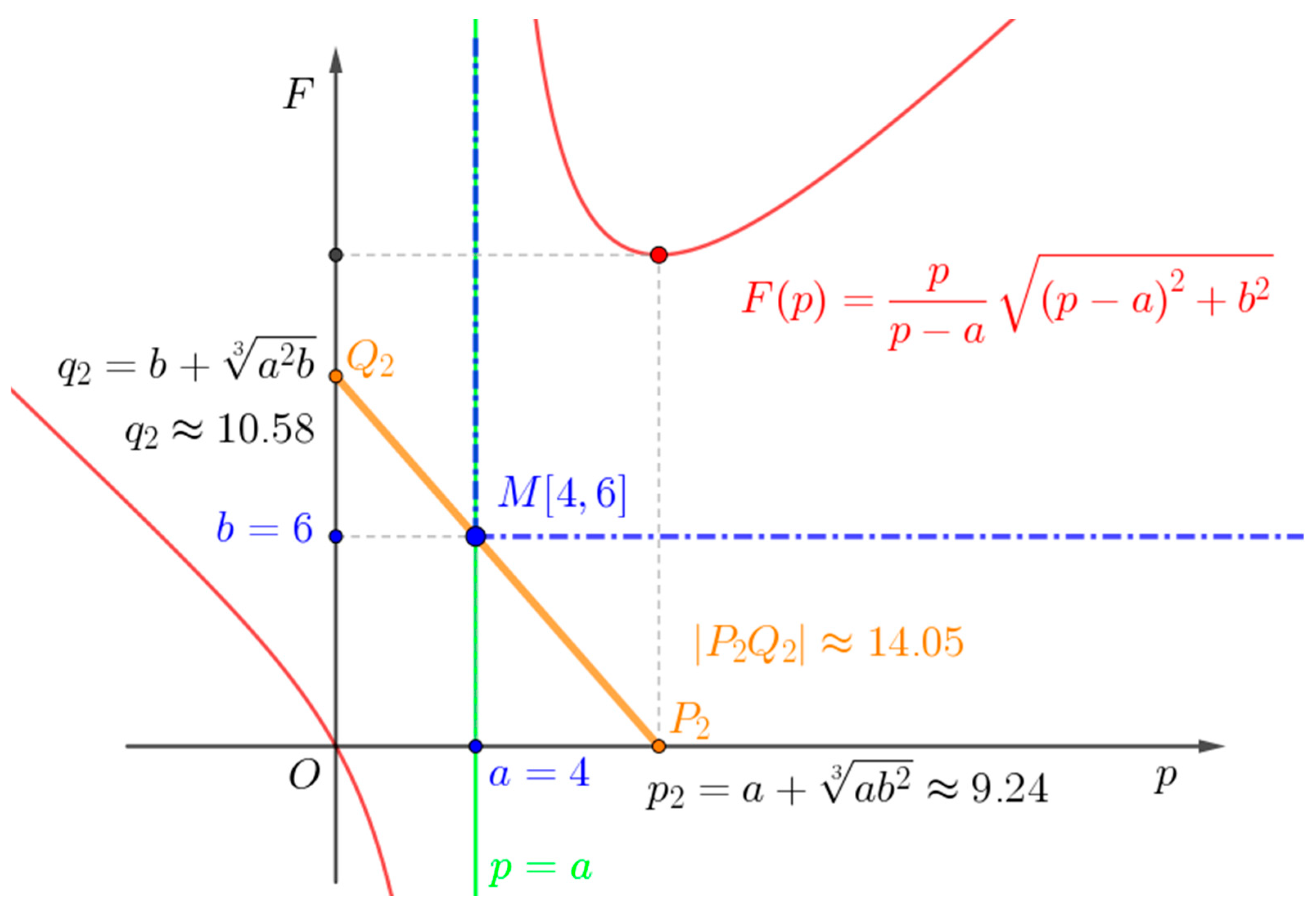
We will find an approximate solution of the transcendental equation using GeoGebra.
We label
and
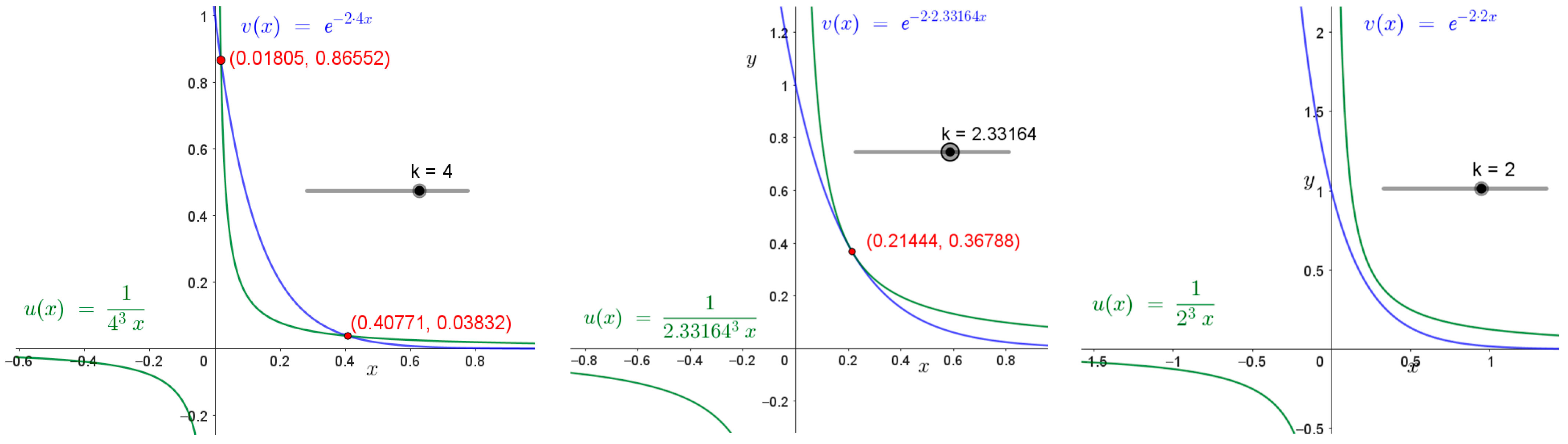
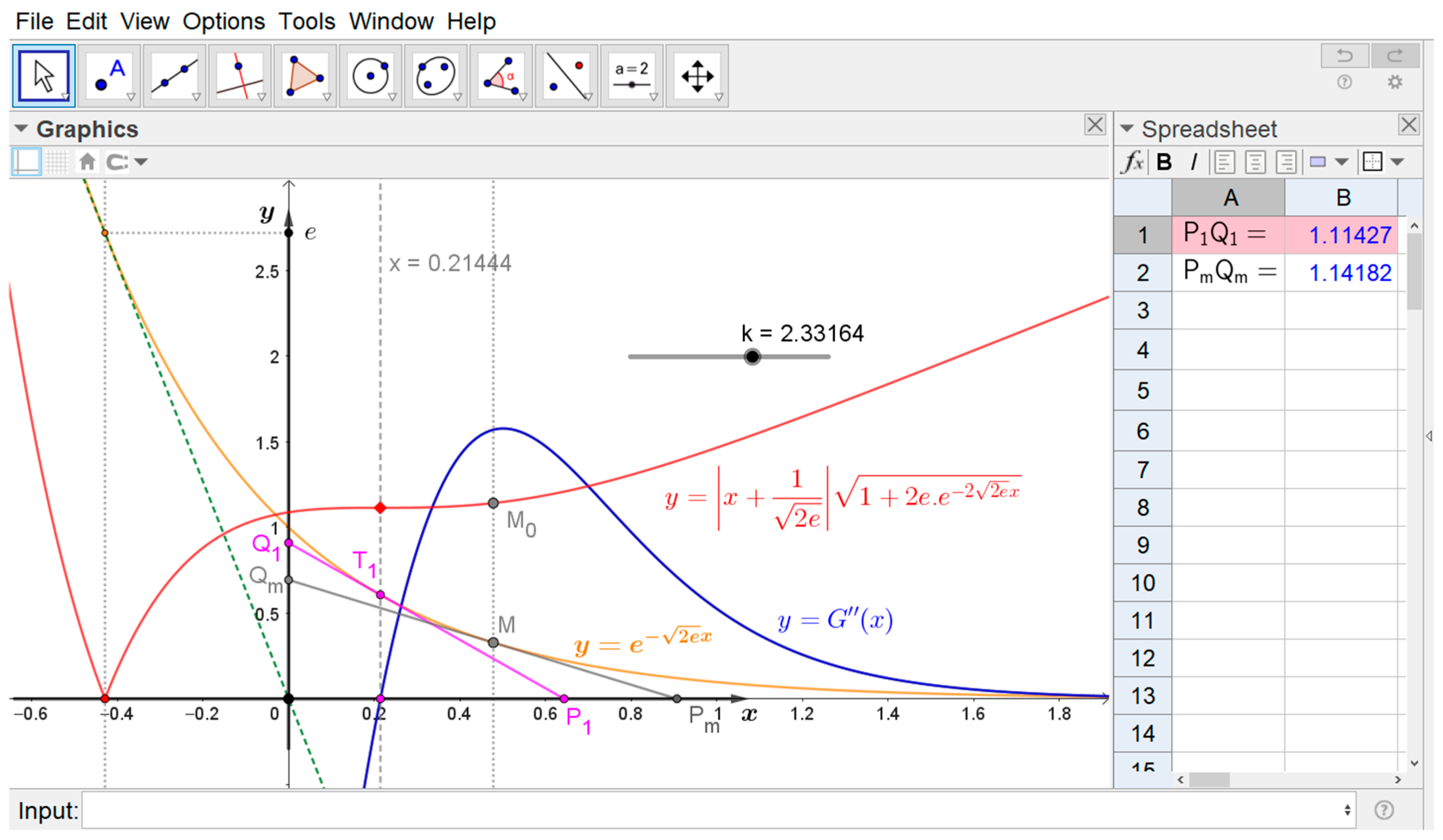
and we draw the graphs of these parametric functions in GeoGebra. The existence of intersection points depends on the parameter
(see
Figure 6).
To find the solution for
in the transcendental equation
we can use a special function known as the Lambert
-function.
The Lambert W-function is defined in the real domain
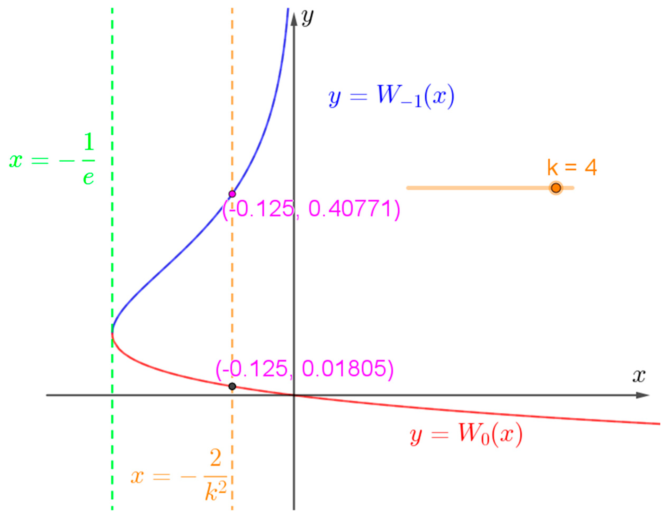
, and its graph is divided into two branches
and
[
4]. In
Figure 7, we use the graph of the Lambert W-function as the inverse function to
.
We adjust the equation in the following form:
The Lambert
-function has a real solution if
and the number of the real solutions depends on the value of the parameter
:
- (a)
Real solutions if ;
- (b)
If
is such that , then there are no real solutions.
We evaluate:
- (a)
If
, then and ;
- (b)
If , then .
Substituting
in Formula (18) yields
This function is non-negative for
and
. This implies that by using Formula (19), we have the second derivative of the function
in a simpler form:
Formula (27) will be applied using the second derivative test. If the function has a local maximum at Conversely, if the function has a local minimum at .
In these cases, we have no exact values of the critical points —respectively, —and the second derivative test only indicates the extrema approximately. We calculate the following:
- (a)
is and ;
- (b)
is .
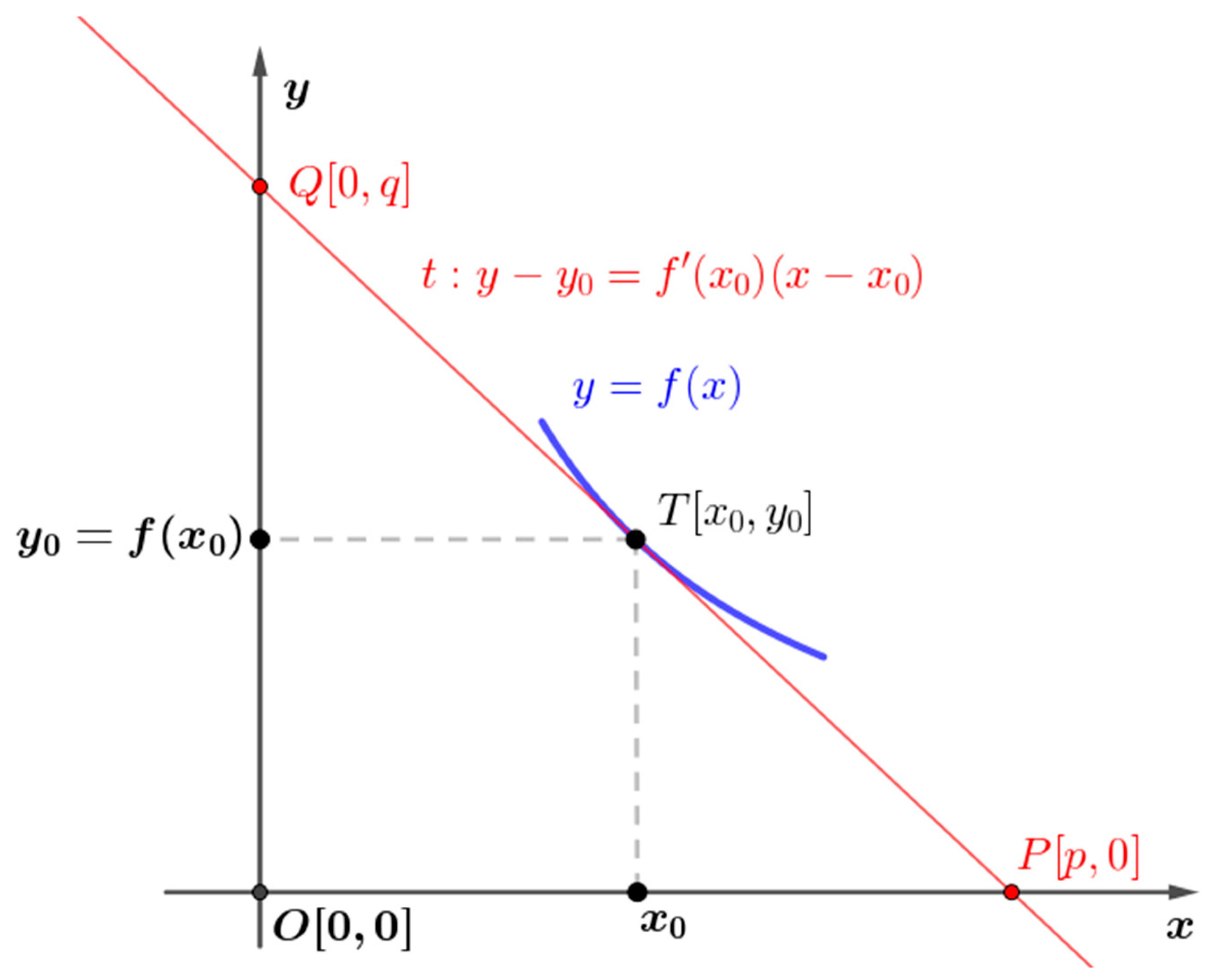
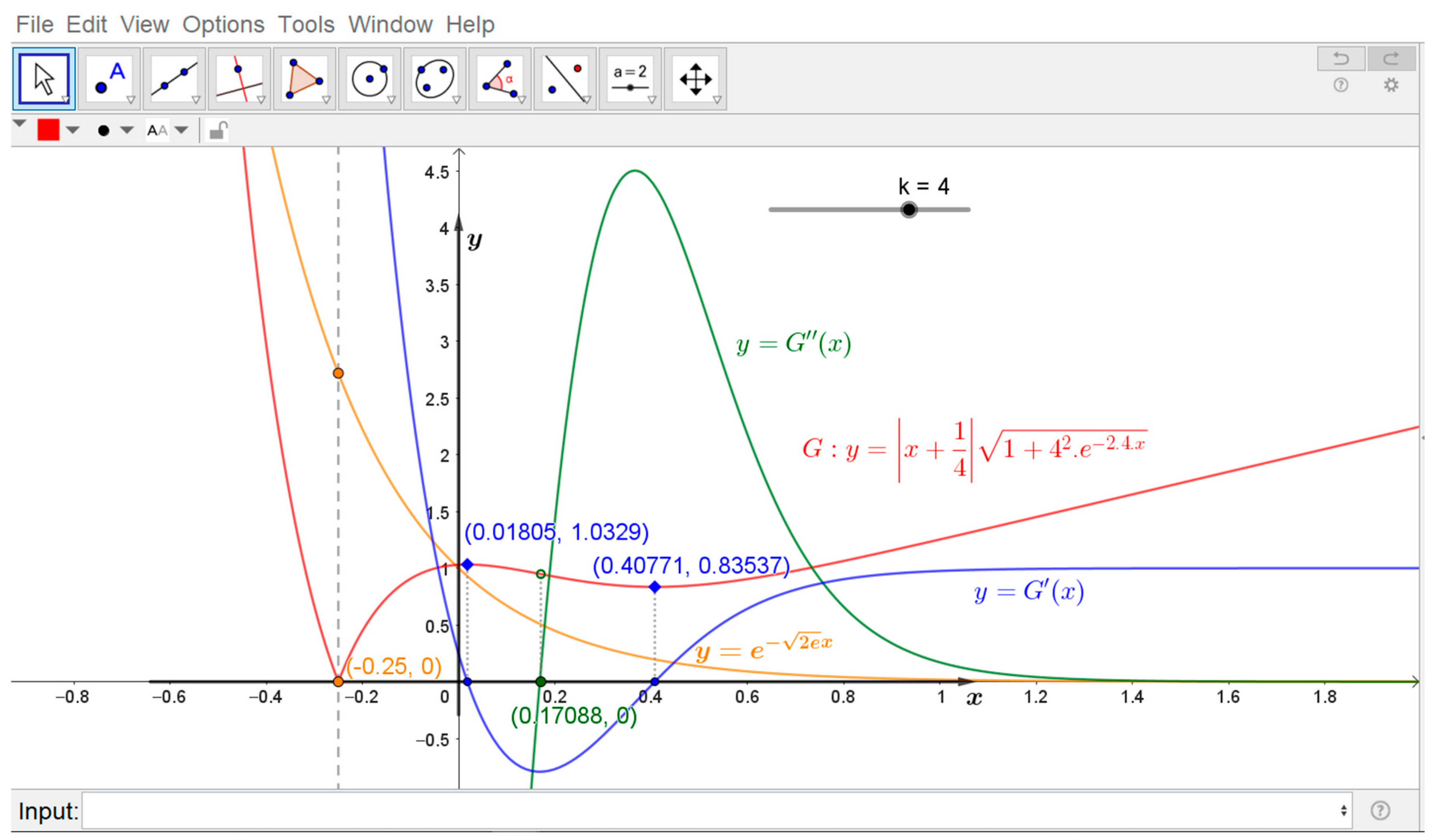
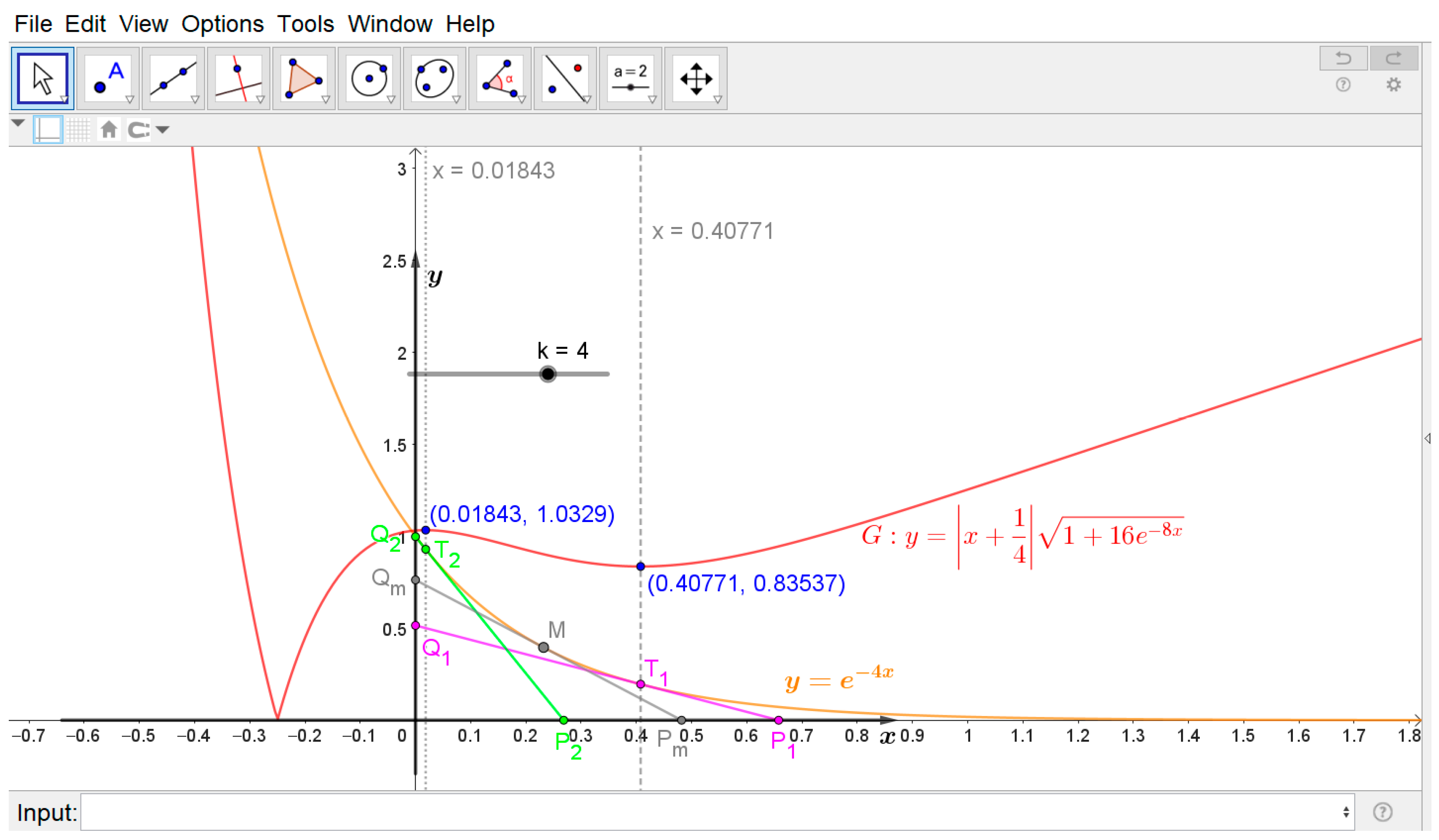
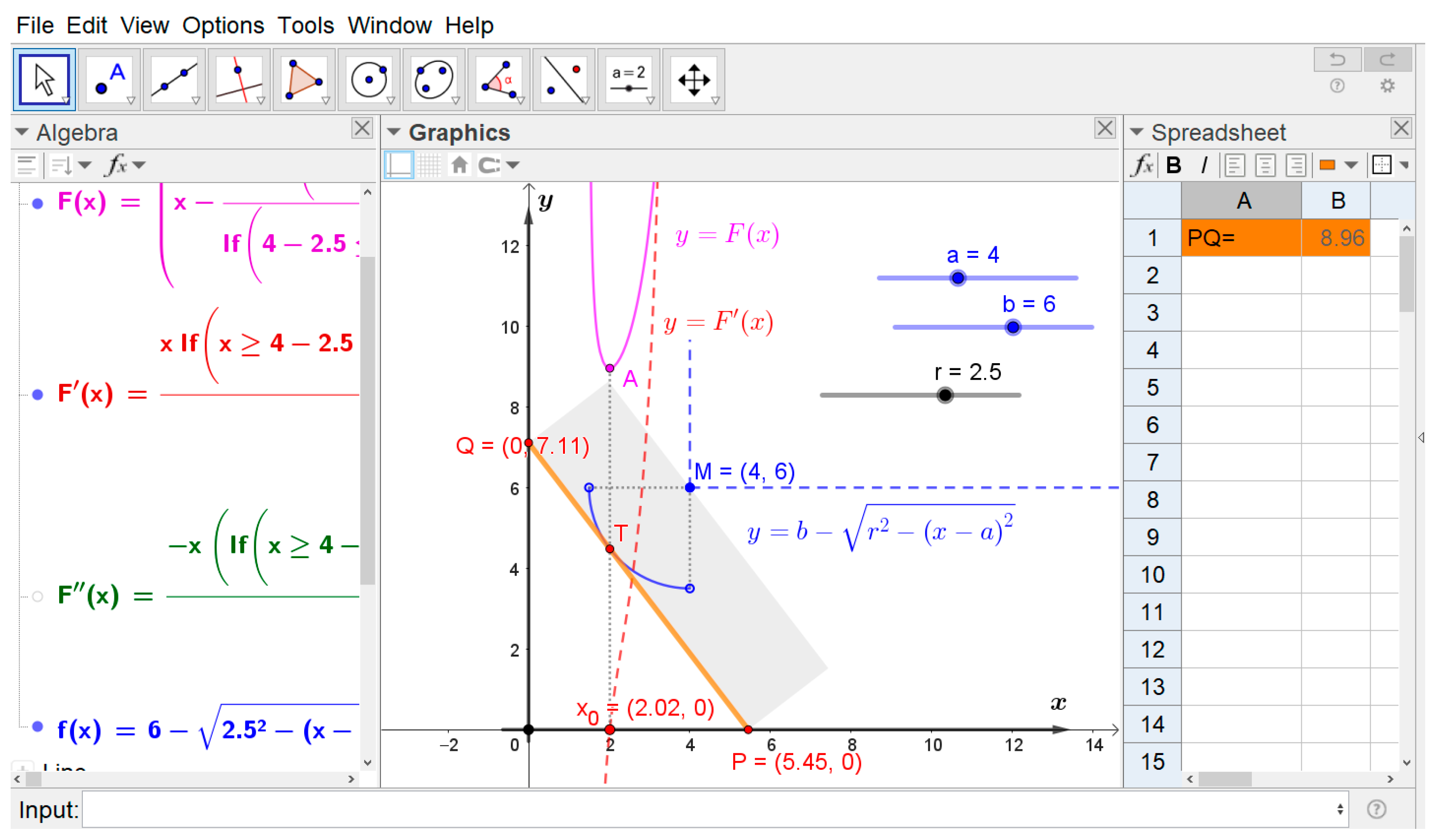
If we use the commands “Derivative(<Function>, <Variable>,<Number>),” the concept can be visualized graphically (see
Figure 8).
Using GeoGebra software, we set a slider , and we construct the corresponding segments , These segments lie on the tangent lines to the graph of the given function at the points and Furthermore, we choose an arbitrary point on the graph of the function , and we construct a corresponding segment .
By dynamically varying the point
along the graph, we visually compare the corresponding values, which provides visual verification of the extremal solution (see
Figure 9).
4.2.3. Brief Analysis of the Graphical Model
Subsequently, we utilized MS Office Excel to perform an analysis of the solution. The percentage value
is calculated as
where reference value
is obtained through the graphical method. The results are presented in
Table 4.
The sensitivity analysis results presented in
Table 4 demonstrate a high degree of consistency between the numerical and graphical solutions. The relative deviation initiates at
and subsequently exhibits a linear increase with a very low gradient, remaining below the
threshold across all observations.
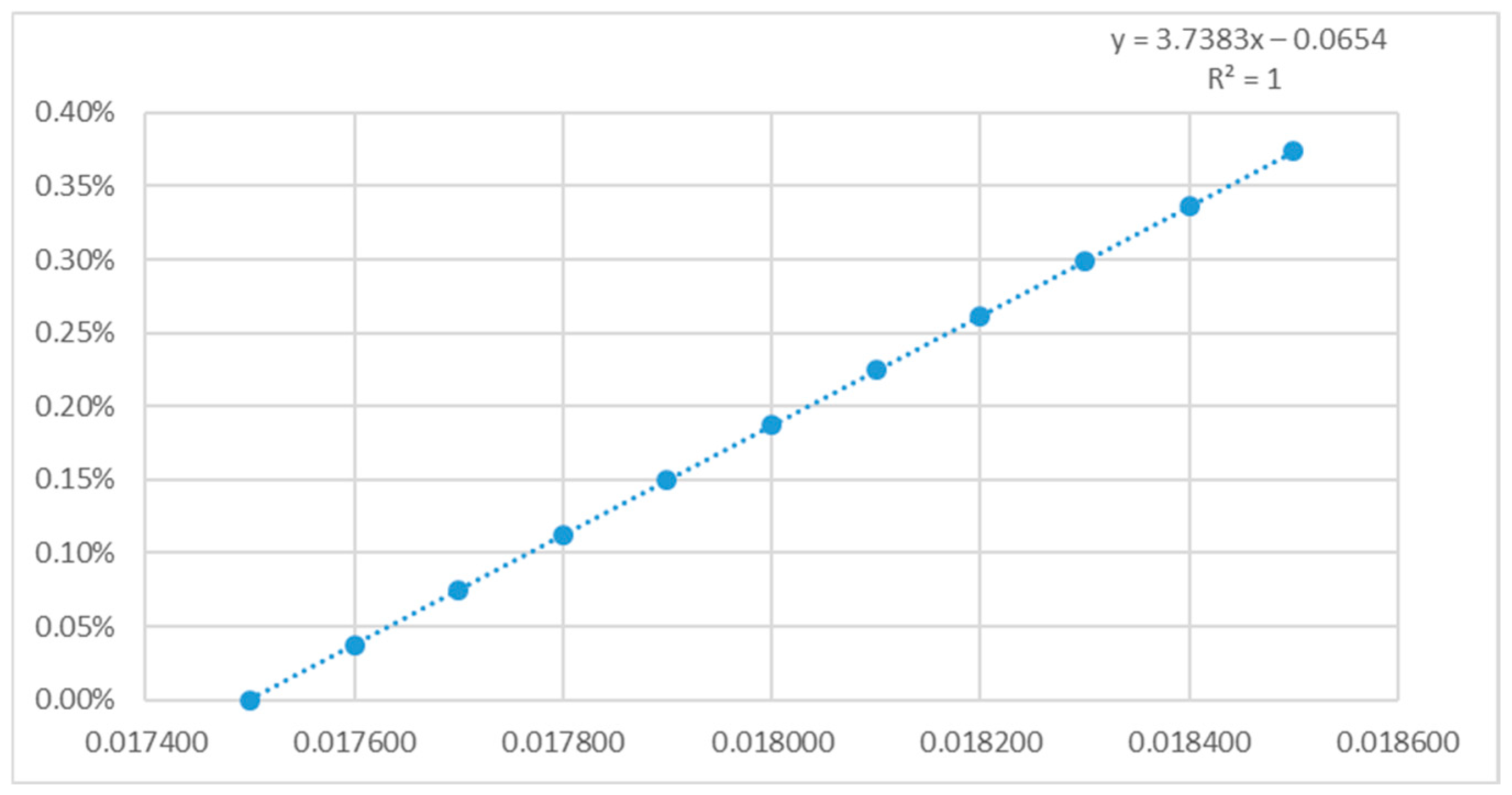
The degree of linearity between and is used to assess the stability of the numerical solution within the given interval. The regression line is of the form .
The regression equation , characterized by correlation coefficient and coefficient of determination , demonstrates a functional identity between the numerical datasets.
The residual standard deviation
This means that the model is suitable for predicting
values at specified values of
, and the proposed spreadsheet model perfectly replicates the graphical reference system without any statistical variance (see
Figure 10).
An analogous situation for , and , is observed for the extremum at the point , where the reference value is . The equation of the regression line is , characterized by correlation coefficient and coefficient of determination .
If we set ), for , and use the reference value , then we can calculate the equation of regression line in the form of (also with and
A high correlation indicates a strong agreement between the datasets. This can be verified experimentally by setting the calculations in both MS Excel and GeoGebra to 10 decimal places.
Using the commands Sequence(<Expression>, <Variable>, <Start Value>, <End Value>), we calculate the sequences of values for , i = 1, 2,…, n, and , which are then transferred to the Spreadsheet using the FillColumn(<Column>, <List>) command. We leave it to the reader to verify that the datasets match in every single output.
Using GeoGebra, we perform a sensitivity analysis on the parameter in the critical points.
Consider Equation (18) with the function Using a slider, we set with a step increment of . We conduct a sensitivity analysis of the critical point that represents the local minimum of the function
On the graph of we construct a point . The point is a critical point at which the graph of the function actually intersects the -axis.
We import the coordinate data of point into the Spreadsheet environment using commands, while the value of the slider changes from down to
We define the sensitivity index
as follows:
for
By analogy, we define the sensitivity index
as follows:
and after defining the input parameters, the output values are calculated by Geogebra Classic 5.2.907.0-d.
The sensitivity indices are classified according to a three-level sensitivity scale: low (below 10%); moderate (10–20%); and high (above 20%) [
5].
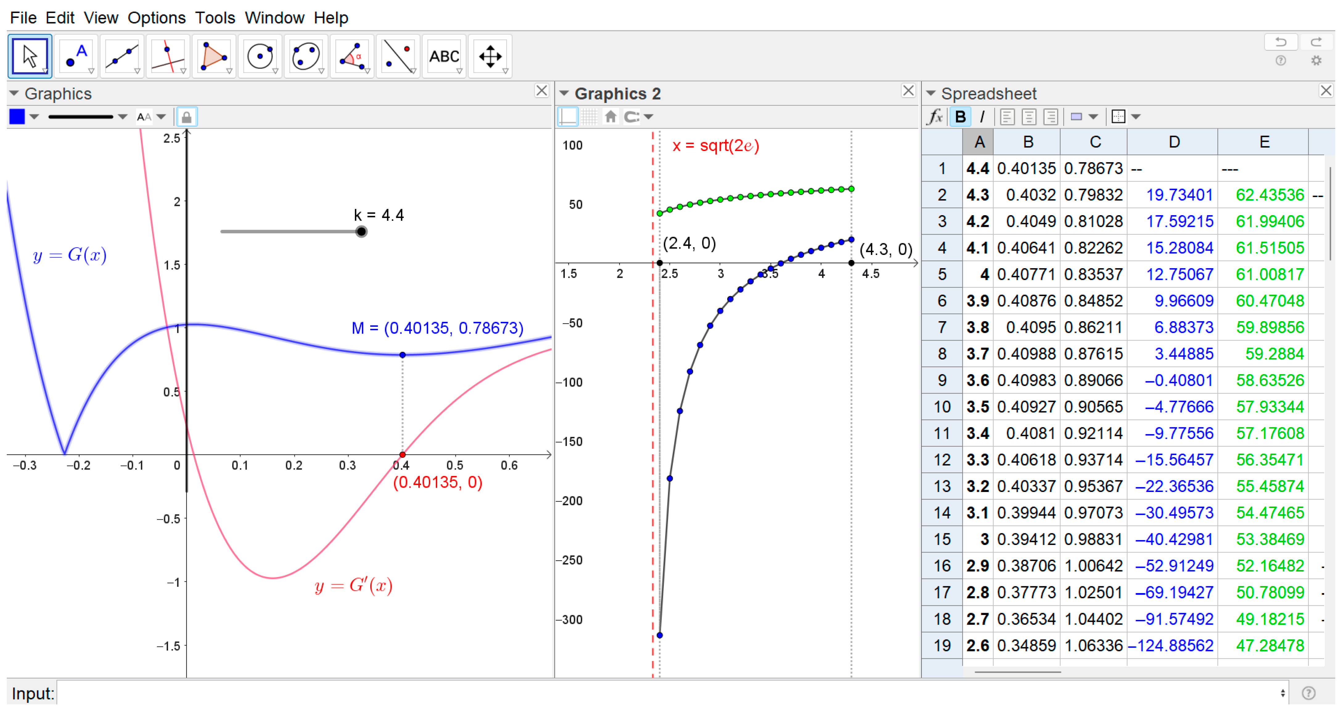
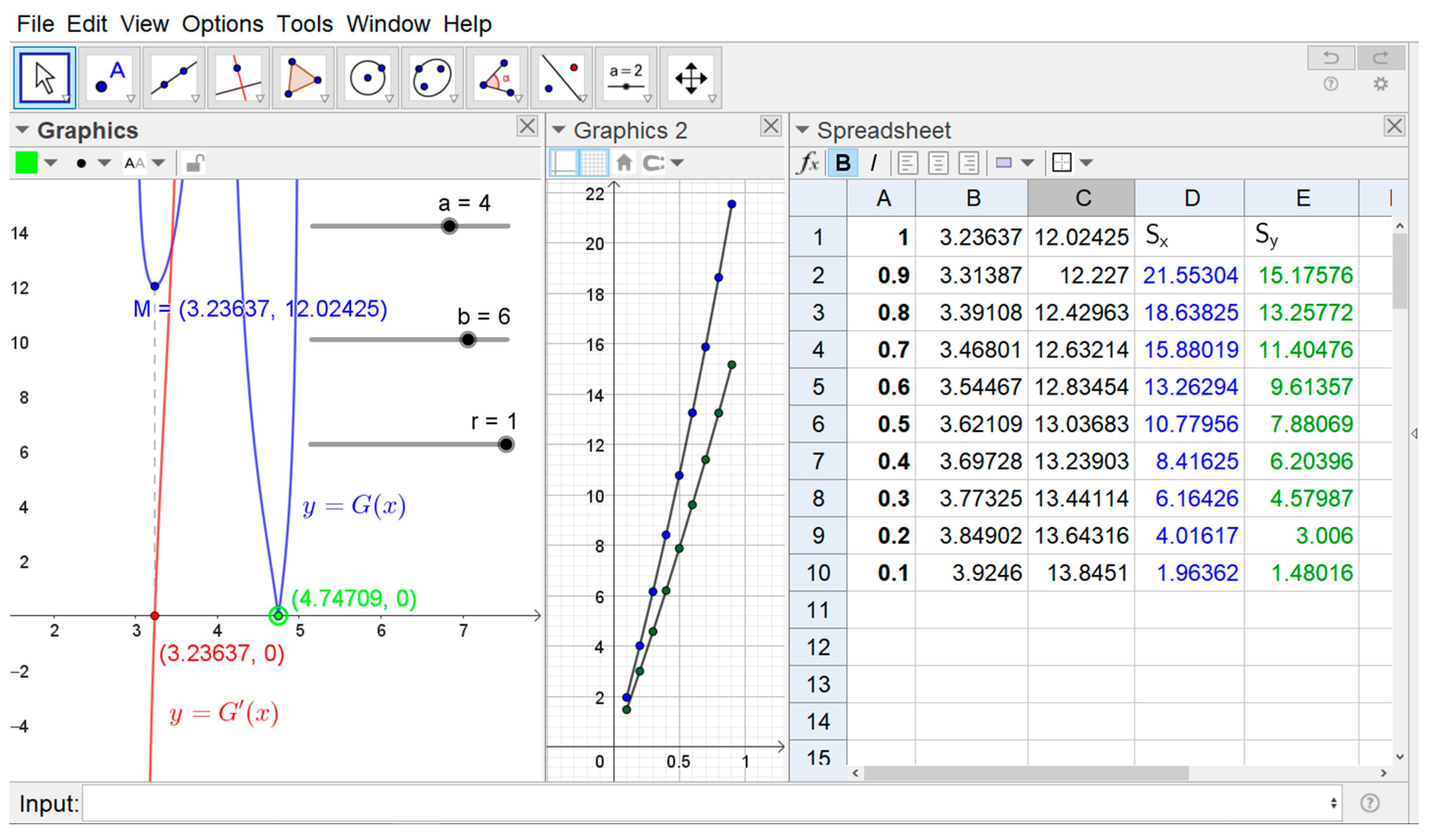
The sensitivity index exhibits a decreasing trend across the observations, and it holds true that the mean (after excluding the outliers and ), the median −7.28%, and the standard deviation if the range is from to .
These characteristics indicate a high-to-extreme level of sensitivity, dominated by strong negative responses and substantial variability.
As the value of (the condition for the existence of an extremum), the model becomes highly sensitive, and the value of significantly impacts the critical point .
Regarding the sensitivity index , the model exhibits low sensitivity to change, ranging from to , with a mean median 56.77%, and a standard deviation .
These characteristics indicate a high but stable level of sensitivity, with an average change of 1.05% between two consecutive values.
The data were processed using GeoGebra commands Mean(<LISTofRawData>), Median(<LISTofRawData>), SD(<LISTofRawData>) and finally graphically illustrated in the Graphics 2 view (see
Figure 11).
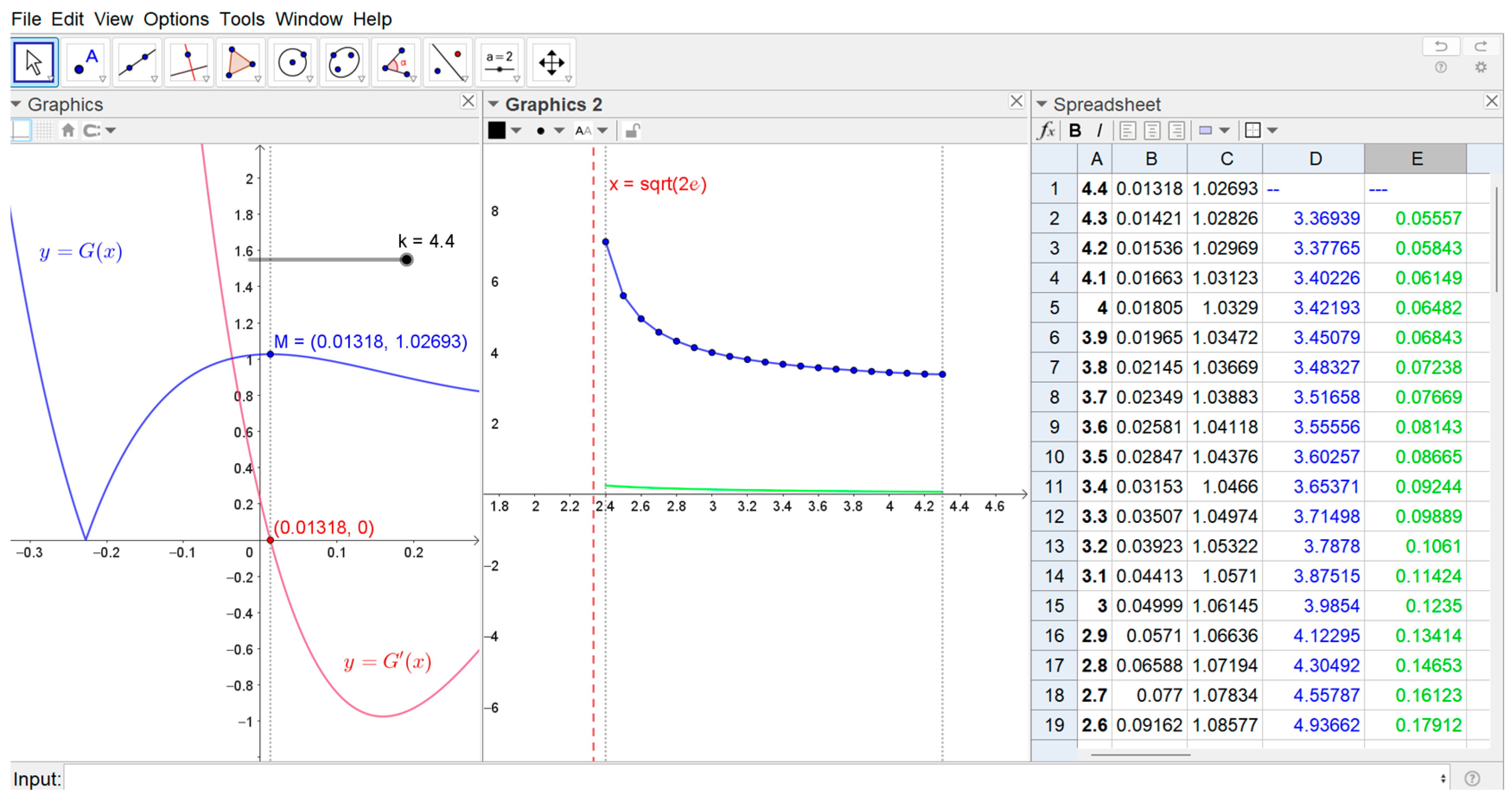
One can perform a similar analysis for the critical point
correspondig to the local maximum of the given function
(see
Figure 12).
Remark 3. Due to the significant difference in index values and in the interest of comparing the sensitivity of both indices, we do not display the corresponding indices as percentages in the Graphics 2 window.
The analysis of the sensitivity index indicates a high level of sensitivity, with the mean ≈ 394.10% and the median 368.41%. The standard deviation for the range is from to , which indicates a high-to-extreme level of sensitivity, with an average change of 20.75% between two consecutive values.
As the value of (the condition for the existence of an extremum), the model becomes highly sensitive, and the value significantly impacts the value of the critical point .
As for the sensitivity index , in a range from 5.55% to 23.34%, we observe the mean and the median 9.57%. and there is an average change of 1.05% between two consecutive values.
The values indicate moderate model sensitivity, and small changes in the input lead to relatively small but still significant changes in the output.
The standard deviation indicates that individual values differ only slightly from the mean, meaning that the model responds relatively consistently to different inputs with y values. This is not an extremely sensitive system; rather, it is a stable one with moderate variations (see
Figure 12, window Graphics 2).