3.1. GIS Analytics
The application domain is the Gangnam District of Seoul. We set the study region of the framework to
, and we use a single distance metric
throughout all stages, instantiated in practice as the shortest-path metric induced by the pedestrian–road network
so that distances reflect walk times and barriers rather than straight lines. Gangnam’s land incorporates corridors along Teheran–ro, high-street retail near Gangnam Boulevard, entertainment clusters in Apgujeong and Cheongdam, and multiple subway interchanges induce marked spatiotemporal variation in footfall. We represent this with a non-negative pedestrian density field
over a representative horizon
(e.g., one day). Administrative boundaries for
G were obtained as polygonal census layers and ingested into a GeoPandas workflow. To ensure geometric consistency across heterogeneous sources, all layers were reprojected to the common geographic CRS EPSG:4326 (WGS84) for integration with web data, and then to EPSG:5186 (Korea 2000/Central Belt) for all computations that require metric accuracy. All geoprocessing and network analyses were performed in Python (v3.11.11) using GeoPandas (v1.0.1) for spatial data handling, OSMnx (v2.0.2) for extracting the pedestrian network from OpenStreetMap, Shapely (v2.1.0) for geometric operations (e.g., buffering and distance), and Folium (v0.19.5) for interactive map visualization.
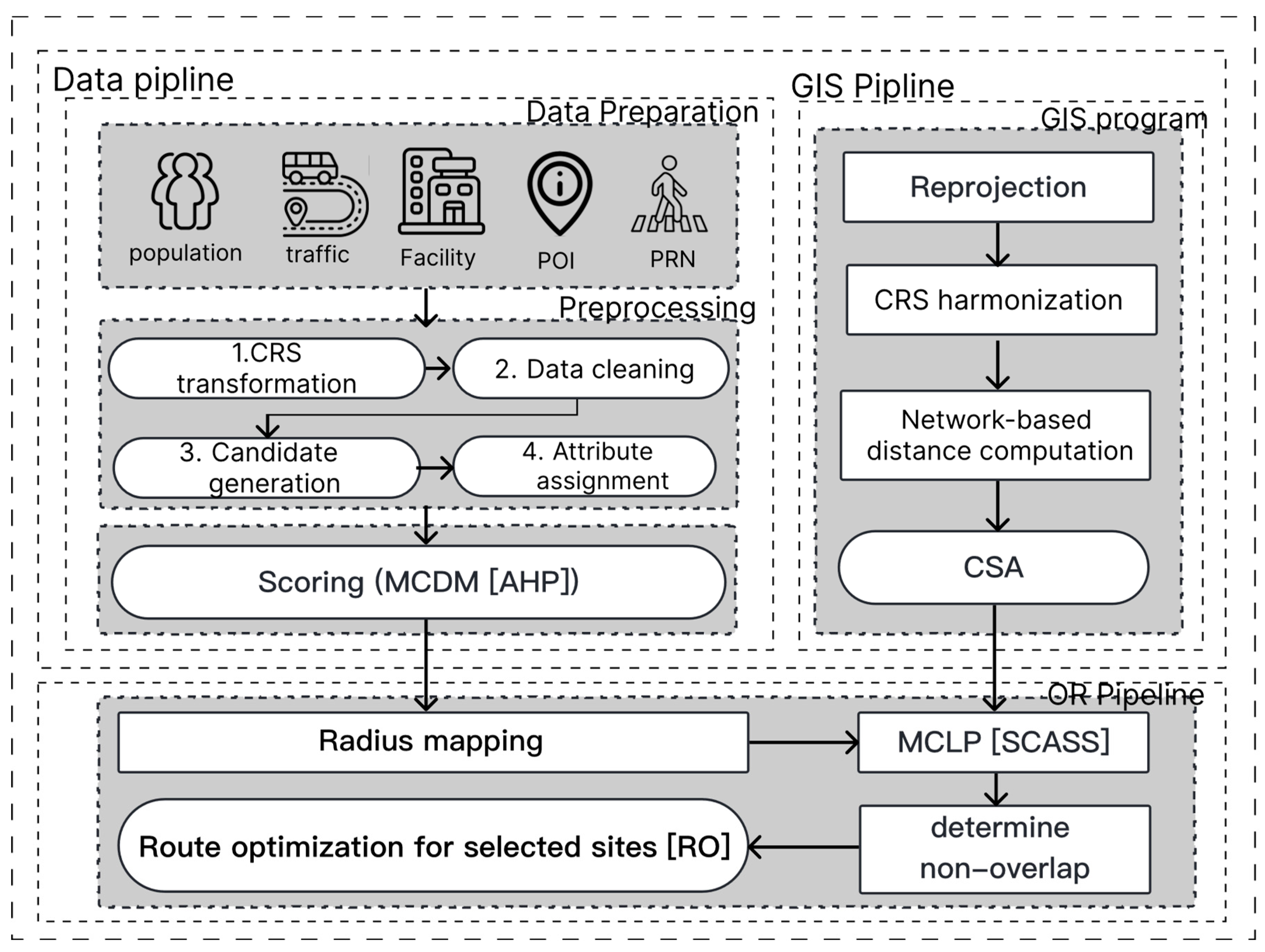
Table 1 summarizes the GIS integration for the Gangnam case. It shows each spatial layer, how we prepare it, and how it is used in the model.
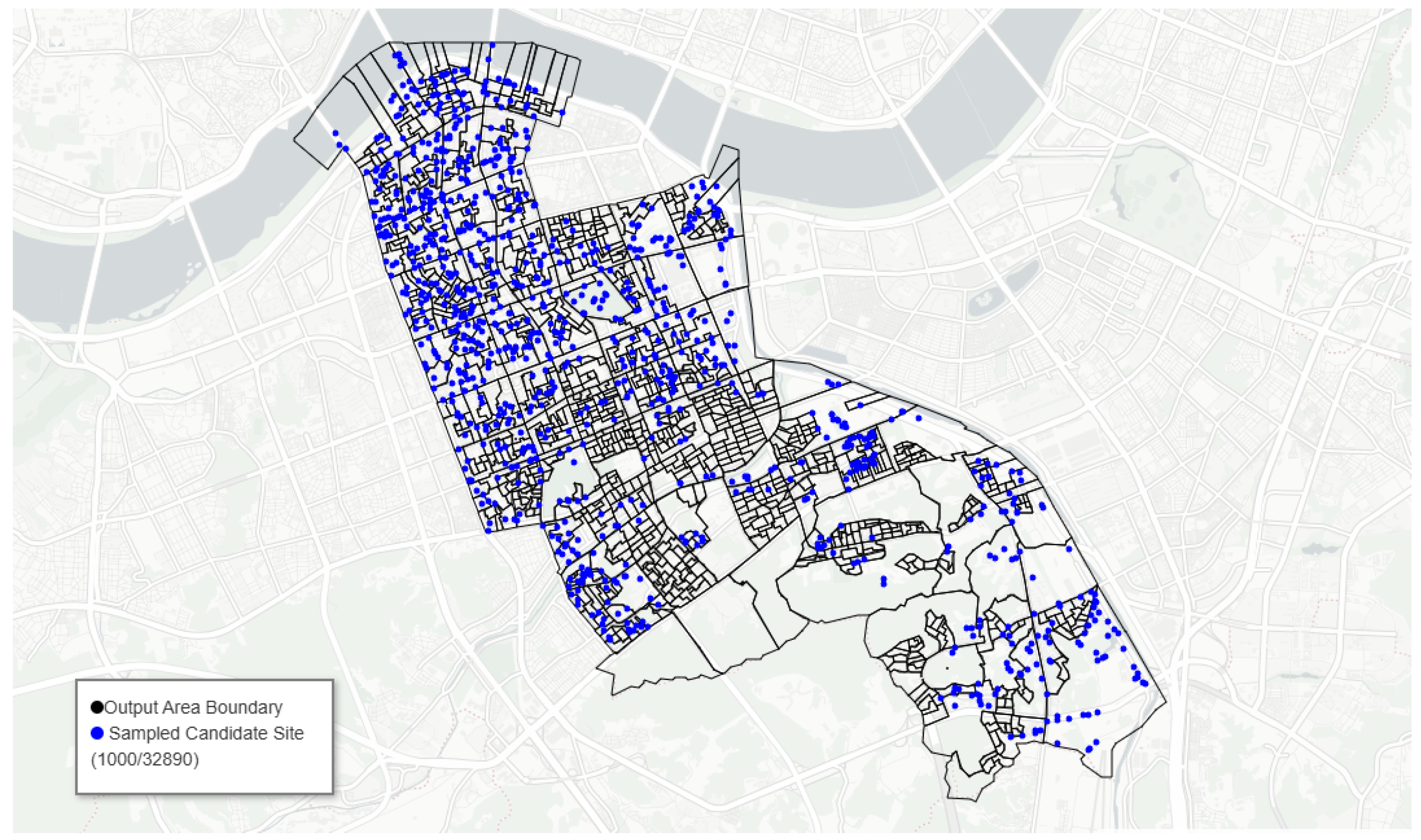
Candidate facility sites are drawn from the walkable subgraph of OpenStreetMap within
G. We extracted footways, pedestrian paths, sidewalks, and low-speed residential links using OSMnx, simplified the network to retain unique traversable edges, and then sampled points along these edges at a fixed network spacing
m. The result is a finite candidate set
with
points for feasible bin locations. Each
inherits attributes from intersecting administrative polygons via spatial join (e.g., sub-district codes) and is snapped to the nearest network node to avoid topological artifacts when computing
. As shown in
Figure 3, a random sample of candidate waste bin sites illustrates the spatial spread of the full feasible set across the walkable network. Blue points depict a random subset of 1000 candidates drawn from the full set of
network-anchored sites (black lines: pedestrian–road network; grey polygons: output-area boundaries). The sample visualizes coverage of feasible placements prior to scoring and selection.
3.2. Data Analytics: Demand Criteria and Feature Construction
Waste bin demand is driven by cumulative exposure to pedestrians and by proximity to attractors such as transit nodes or retail frontages. To support coverage modeling and validation, we also assemble a demand representation that is consistent with the framework’s notation. Let
denote a set of demand nodes at which pedestrian exposure and ancillary variables are tabulated; in practice,
U may consist of network vertices in
inside
G or centroids of census micro-polygons. All exogenous point datasets (e.g., transit stops and points of interest) are cleaned, deduplicated within a tolerance in EPSG:5186, and converted to GeoDataFrame for nearest-neighbor and kernel computations. Where a dataset is temporally indexed, we aggregate to representative daily means so that demand scores represent a typical day on the planning horizon. The dense sampling of the pedestrian network at
m yields
feasible bin locations, allowing the adaptive radii
to respond to fine-scale variation in the built environment. Distances used in all subsequent computations—spatial-exclusion checks
and routing costs
—are evaluated with the same network metric
d on
.
Table 2 summarizes the data analytics used in the Gangnam district case, which lists each variable category, how the data are sourced and preprocessed, and how they enter the model as criteria scores
or routing inputs.
In connection with open data acquisition provided by the Seoul Open Data platform, first,
Table 3 summarizes the demographic datasets integrated into the GD-ARISE pipeline for the Gangnam district case study. The datasets include Seoul’s living-population estimates for domestic and foreign residents, and each living-population dataset represents the estimated number of people present in a specific location and time, derived by combining administrative records (resident registry, transport, business, and building databases) with KT (Korea Telecom) big data. The census-block boundary layer (EPSG:5186) provides the spatial framework for aggregating and visualizing these population estimates. Together, these layers constitute the demographic foundation for quantifying spatial patterns of pedestrian exposure and population density within the GD-ARISE framework.
Table 4 summarizes the transit-related GIS layers integrated into the GD-ARISE pipeline to represent multimodal accessibility across Gangnam District. The datasets include bus stop locations and subway entrance coordinates, each obtained from verified public sources and re-projected to a unified coordinate reference system (EPSG:5186) for geometric consistency. The bus stop layer provides detailed node attributes, such as stop IDs, names, and coordinates, while the subway entrance layer contains manually extracted latitude–longitude pairs for all access points within the study area. Together, these layers constitute the transit node component of criterion
, serving as the spatial foundation for the proximity-based accessibility analysis in subsequent stages of the GD-ARISE framework. In addition,
Table 5 details the source datasets and preprocessing for the waste-related POIs criterion
.
Now, we discretize G by sampling at the spatial resolution to obtain a candidate set of feasible bin sites , and, independently, a demand lattice . The criterion collection is expressed for waste bin siting, with observable correlates of litter pressure and disposal opportunity, in a manner that matches the demand formulation. A floating population is treated as a direct, site-specific magnitude: block-level counts from the observation period are averaged to obtain a mean daily exposure and then spatially joined to both J and U. When a candidate point or demand node falls within overlapping administrative polygons, the exposure is taken as the mean of the overlapping values, which yields well-defined raw measurements for the population criterion and preserves mass under areal interpolation. Public transit proximity is encoded via proximity to bus stops and subway exits. After loading both datasets and projecting to EPSG:5186, we compute for each the shortest path distance along to the nearest stop and to the nearest exit. Local waste generation potential is represented by proximity to POIs that tend to generate street litter, such as convenience stores, cafés, food trucks, and public parks. Each POI set is harmonized into a single layer with subtype weights that sum to one within the criterion.
As shown in
Figure 4, population scores are highly right-skewed, indicating many low-exposure segments and a small fraction of hotspots that dominate the upper tail. Most candidates have low values, with a long tail and few very high-exposure locations created by concentrated corridors. A floating population
is a direct site-specific magnitude derived from block-level daily counts aggregated over the observation period. Let
denote the mean daily floating population assigned to site
j via areal interpolation from its containing (or overlapping) census blocks. To place
on a unit scale while preserving ranks, we apply the benefit of min–max normalization over all candidates,
which yields
and encodes relative pedestrian exposure.
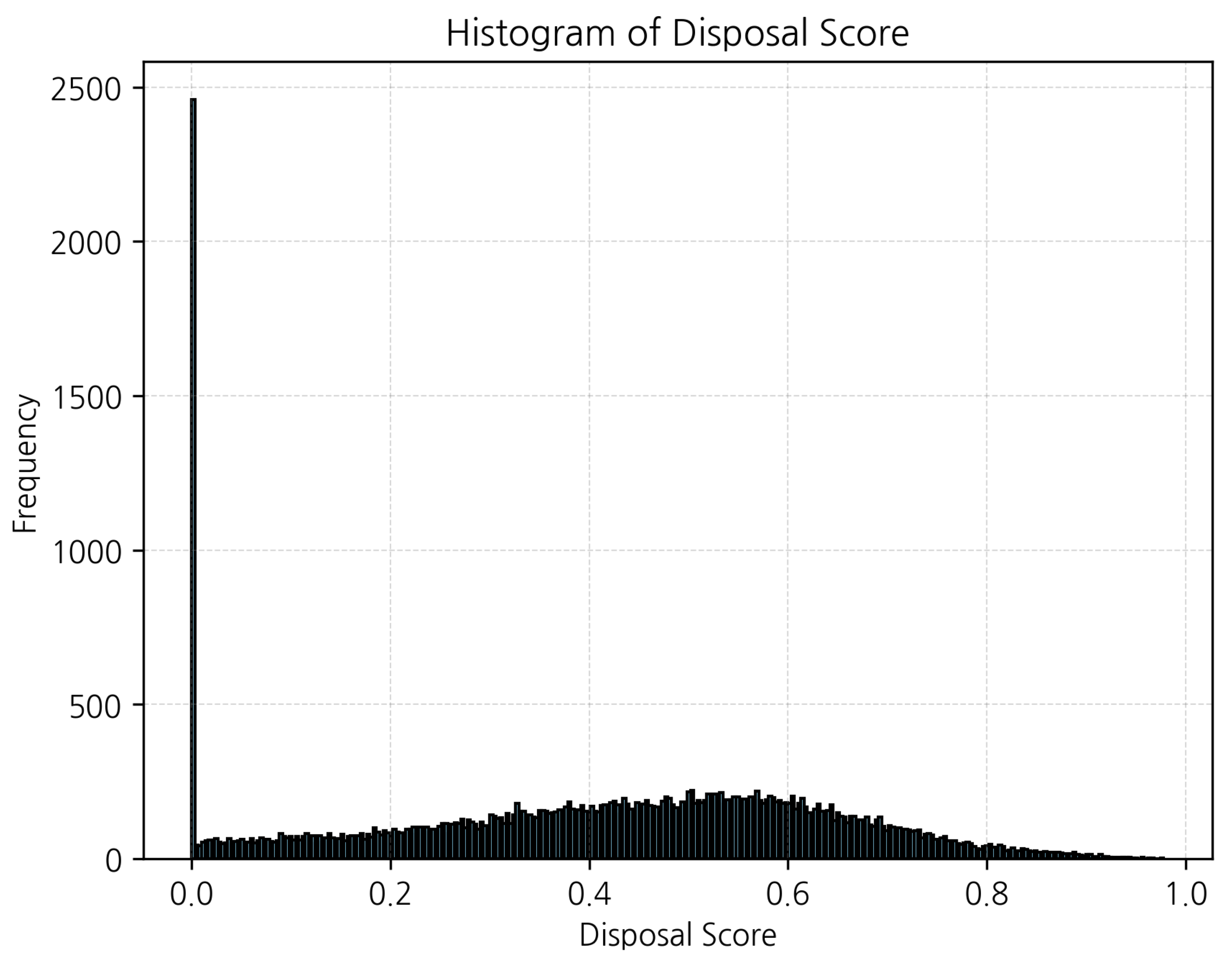
As shown in
Figure 5, disposal scores are mostly moderate with a broad mode around the mid-range, plus a spike at zero for candidates far from transit. The distribution is broadly spread with a mid-range mode and a mass at zero reflecting locations beyond the 300 m influence of both bus stops and subway exits. Transit proximate disposal opportunity
is modeled as proximity to the nearest bus stop and the nearest subway exit, recognizing that on–off flows around stations correlate with both waste generation and appropriate placement of receptacles. Let
and
denote the network distances from
j to the nearest bus stop and the nearest subway exit, respectively. A convex combination of linear distance decay kernels with a common maximum influence range
m produces a unit-interval score
which reflects the stronger baseline frequency of bus stops relative to subway exits, while allowing both to contribute when they are nearby.
As shown in
Figure 6, shop proximity scores exhibit two masses: a spike at zero for sites with no nearby POIs and a broad peak around 0.5–0.6 where multiple POIs lie within walking range. The spike at zero reflects POI-sparse areas; the main peak indicates neighborhoods with several POIs inside the decay radius. Waste source proximity
aggregates the influence of POIs associated with street litter. Let
index convenience stores, cafés, food trucks, and parks, and let
denote the network distance from
j to the nearest POI of subtype
k. Subtype weights
encode relative propensities for waste exposure and satisfy
. Using the same 300 m influence range, we set
so that co-location near multiple waste-related attractors increases the score while contributions taper linearly to zero at 300 m.
The empirical distributions of the component scores and the composite reveal substantial spatial heterogeneity across Gangnam’s pedestrian network and inform the subsequent radius mapping. The floating population score spans and is right-skewed, with a mean of , a standard deviation of , and a 75th percentile of , reflecting concentrated corridors of high exposure. The transit disposal score ranges over and is more uniform, with a mean of , a standard deviation of , and a median of , consistent with the dense but heterogeneous distribution of bus stops and subway exits. The POI proximity score is generally small, with a maximum of , a mean of , a standard deviation of , and a 75th percentile of , indicating that only a minority of network points lie within short walks of multiple waste-generating attractors.
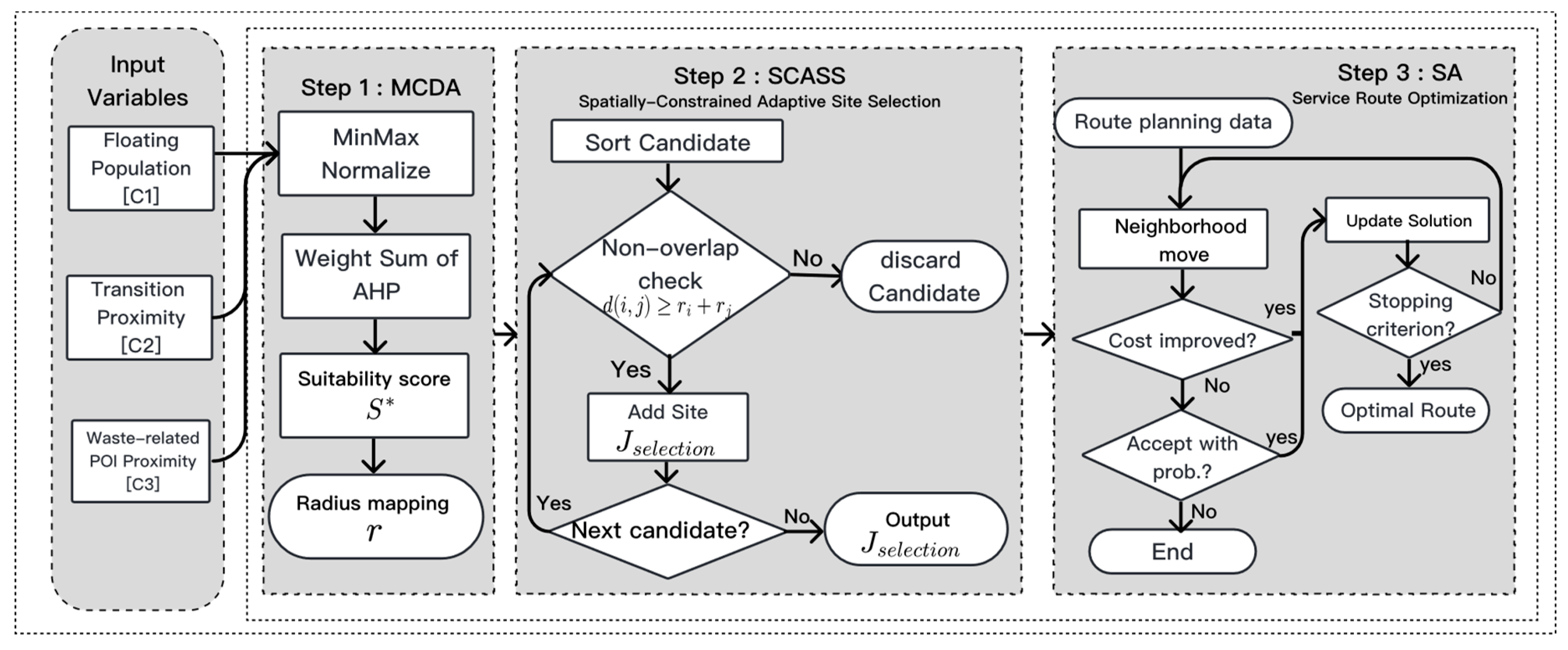
We specify three criteria
that capture complementary drivers of litter pressure and disposal opportunity:
encodes floating population intensity,
captures transit-proximate disposal likelihood, and
reflects proximity to waste-generating points of interest (POIs). For each
and criterion
, a raw, non-negative measurement
is constructed and mapped to a unit-interval score
via a monotone transformation
so that larger values consistently indicate greater suitability for siting a bin at
j. With the criterion scores in hand, the relative importance of population exposure, transit opportunity, and POI proximity is computed via the AHP. To clarify the AHP elicitation, we provide the pairwise comparison scale and the exact questions used for expert judgments. AHP pairwise comparison scale used for expert elicitation.
| Scale | Definition |
| 1 | Equally important |
| 3 | Slightly more important |
| 5 | Moderately more important |
| 7 | Strongly more important |
| 9 | Absolutely more important |
| 2, 4, 6, 8 | Intermediate between adjacent judgments |
| Reciprocals | Inverse when criterion B is preferred over A |
Pairwise comparison questions used for expert elicitation were as follows:
- Q1.
How much more important is distance to waste-source facilities (cafés, convenience stores) than floating population? Answer: (population is moderately more important than shop).
- Q2.
How much more important is disposal likelihood near transit stops (bus, subway) than floating population? Answer: (population is moderately more important than disposal).
- Q3.
How much more important is disposal likelihood near transit stops than waste-source proximity? Answer: 3 (disposal is slightly more important than shop).
Two municipal officers completed the elicitation independently. Their responses were aggregated into the following pairwise comparison matrix:
This matrix indicates that population was judged substantially more important than both disposal likelihood and shop proximity, and that disposal likelihood was moderately more important than shop proximity. Using the normalized average method on
A, we obtain the AHP weights,
reported to four decimal places. The composite suitability at site
j is the convex combination given by
which, by construction, lies in
and is strictly increasing in each constituent score. This
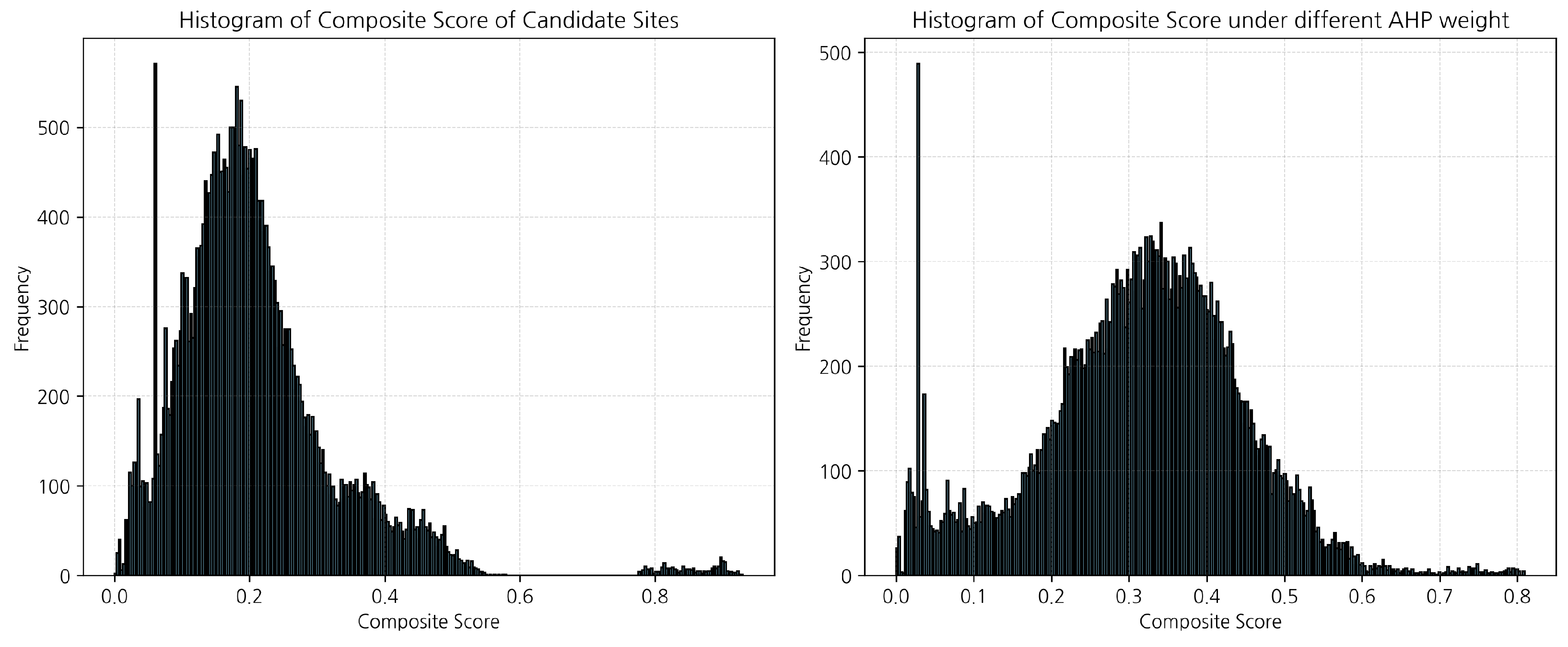
serves as the demand score output used downstream to assign adaptive radii and to prioritize candidates during siting. Aggregation by the AHP weights produces a composite
that remains right-skewed, with a mean of
, a standard deviation of
, a median of
, a maximum of
, and a 75th percentile of
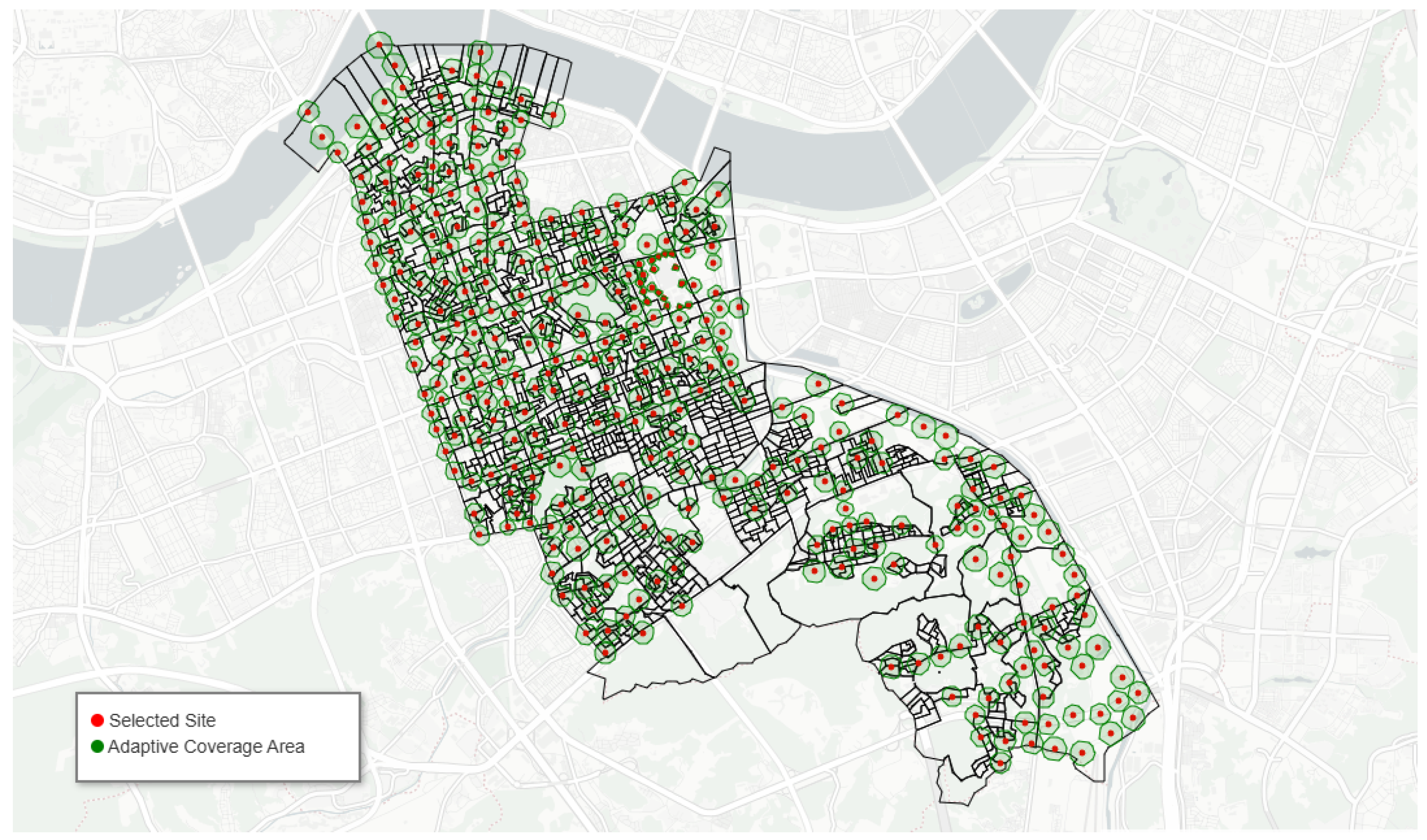
. Under the adaptive radius map
, these statistics translate into smaller service radii in the highest-scoring corridors and larger radii in peripheral or residential areas, ensuring fine spatial granularity where litter pressure is greatest while preserving baseline access elsewhere. All distances entering the kernels are evaluated with the same network metric
d as used in the siting and routing stages, maintaining geometric consistency across the full GD-ARISE pipeline.
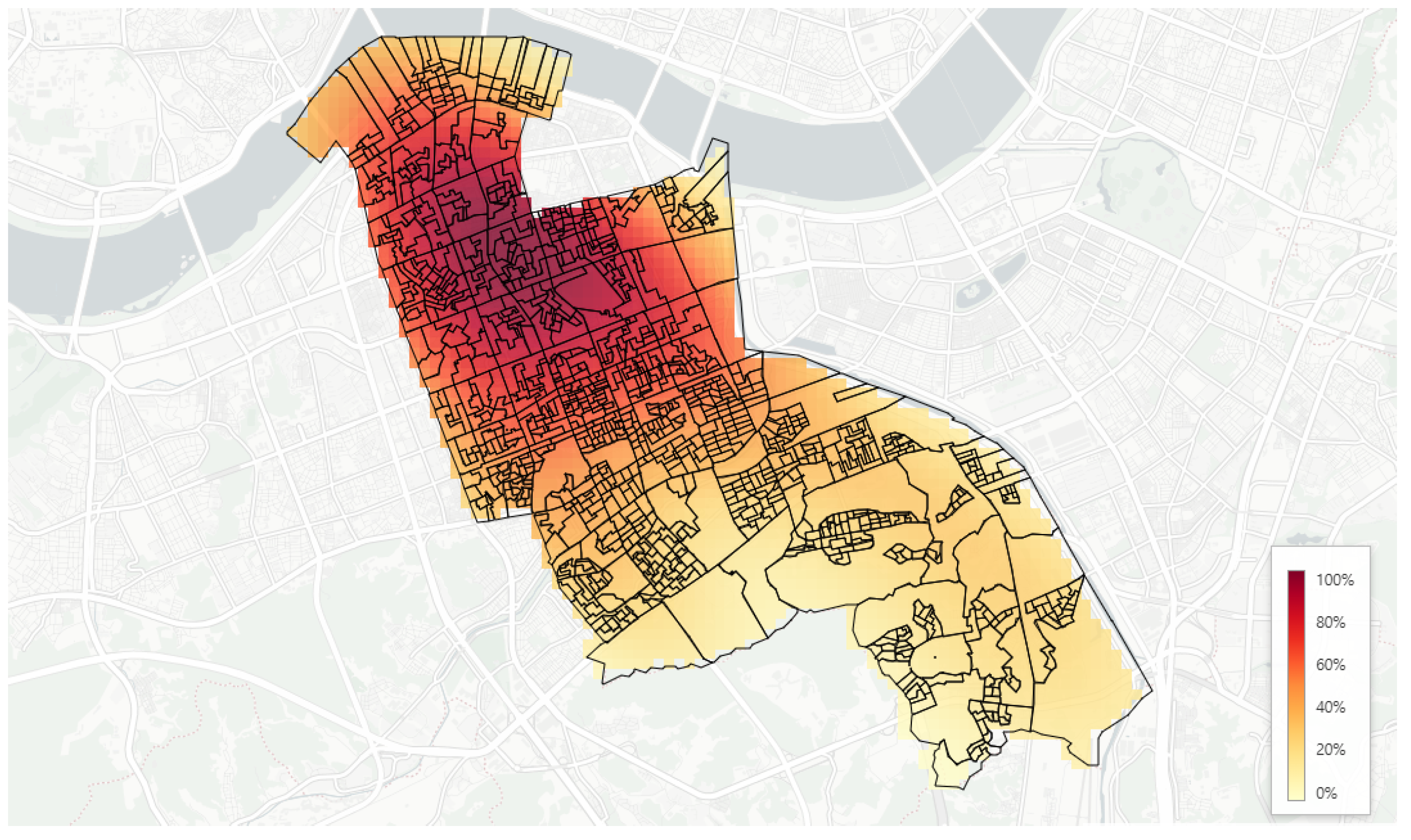
Figure 7 shows a heatmap for the composite demand surface that is highly clustered with the highest percentiles concentrated along the northern–central corridors and decreasing toward the periphery. Colors show percentile ranks from low (light) to high (dark); road segments and administrative polygons are overlaid for reference. The surface reveals pronounced high-demand bands in the northern–central corridors, tapering toward the southeast and peripheral areas.
3.4. Collection Route Optimization: Samsung 1–dong
To instantiate routing optimization on a concrete sub-area, we focus on Samsung 1–dong within Gangnam and route a single collection vehicle to visit the
waste–bin sites that were previously selected there. The depot is fixed at
= (37.50867° N, 127.086466° E), and we retain the notation of the main framework by labeling the selected bins
and defining the node set
with
. Consistent with the end-to-end pipeline, inter-node travel costs are evaluated using the same distance metric
d induced by the pedestrian–road network
restricted to the Samsung 1–dong extent. Because all bins must be serviced exactly once and, for this small cluster, a single vehicle is sufficient, we solve the capacitated vehicle routing model in the special case
and
, which reduces to a traveling salesman problem on the node set
V. A route is represented by a closed walk
with
and
. Its network cost is
and the optimization objective is to find
that minimizes
.
As shown in
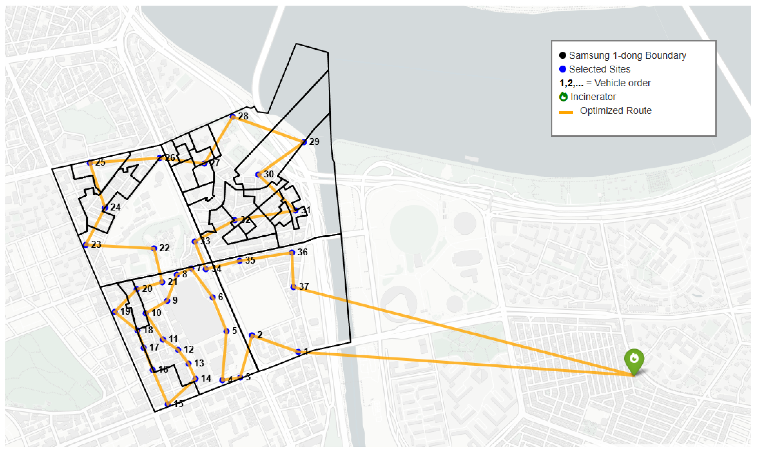
Figure 9, simulated annealing produces a single depot-to-depot tour that visits all selected Samsung 1–dong sites in sequence on the same network used for siting. The green marker denotes the depot; blue points mark the 37 selected sites labeled in visit order; orange lines depict the annealed tour; the black polygon outlines the Samsung 1–dong boundary. The route is the outcome of simulated annealing, evaluated using the network metric consistent with location selection. The resulting annealed tour visits each of the 37 Samsung 1–dong bins exactly once and returns to the depot. Because the encoding, acceptance logic, and termination criteria conform exactly to the routing specification, this Samsung 1–dong case demonstrates that the GD-ARISE pipeline maintains geometric consistency from demand scoring through siting to routing, and that the final routing layer can be solved to high quality with modest computation even when distances respect real network impedances rather than idealized straight lines.
For the computation of the simulated annealing (SA) algorithm, the parameters of the number of nodes in the route (
n), the number of iterations per temperature stage (
M), the initial temperature (
), the stopping temperature (
), and the cooling rate (
,
) are considered, so that the total number of temperature stages (
) and the time complexity (
) are respectively computed as
and
. For the single vehicle case, the parameters were set to
,
,
,
, and
, yielding
and
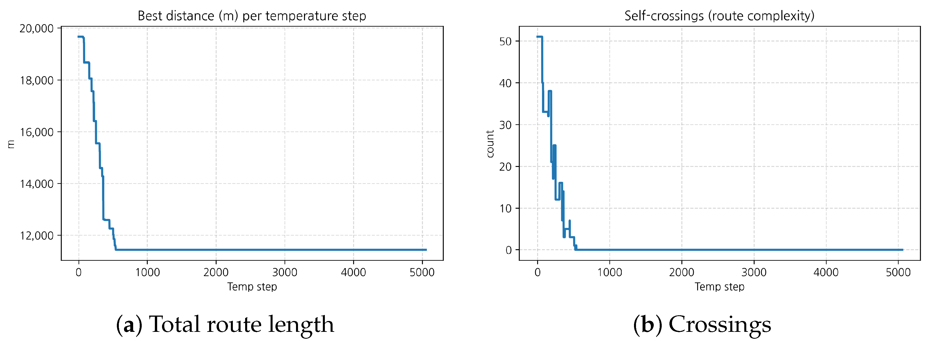
. The optimized SA route resulted in a total travel distance of approximately
, with a mean leg distance of about
. The self-intersection count was none, and the tortuosity was
times the straight round-trip length from the depot.
Figure 10 shows the total route length decreased sharply before about 1000 steps, from approximately
to
, and then stabilized.
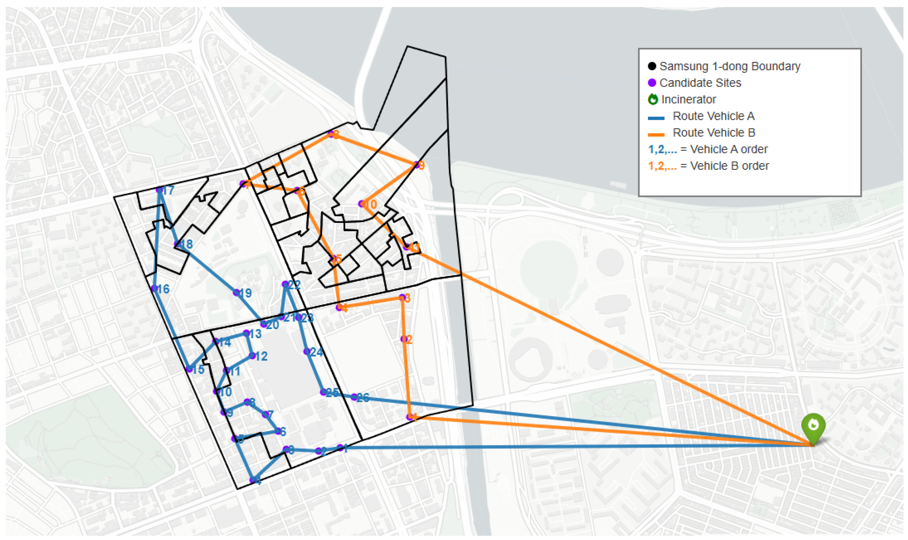
For the two-vehicle case, instead of one long tour (TSP), the route can first be divided into two subroutes, each optimized independently by SA. The sites were partitioned via the K-means clustering method to minimize overlap between vehicle coverages and to balance total travel distances, among many other alternative clustering methods. As shown in
Figure 11, K-means clustering partitioned the candidate sites between the two vehicles, and inspection of the routes confirms that the two vehicles divided the four census blocks in Samsung 1–dong, with each vehicle traversing two blocks. This process results in two single depot-to-depot tours assigned to the two vehicles, each visiting all trash bins in Samsung 1–dong in sequence, as in the single vehicle case. The green marker denotes the depot; purple points mark the 37 selected sites; the blue lines depict the annealed tour of the 26 selected sites visited by Vehicle A, labeled in visit order; the orange lines depict the annealed tour of the 11 selected sites visited by Vehicle B, labeled in visit order; the black polygon outlines the Samsung 1–dong boundary.
After clustering, Vehicle A was assigned nodes and Vehicle B was assigned nodes, excluding the depot. All other SA parameters were kept identical to the single-vehicle case, except for n. The estimated number of operations was for Vehicle A, and for Vehicle B. When the two vehicles divided the candidate sites for collection, the total travel distance of both vehicles combined was approximately , which is longer than the single-vehicle distance of about . However, the individual travel burdens were reduced, with Vehicle A and Vehicle B traveling approximately and , respectively. Each vehicle’s route had a mean leg distance of approximately and , tortuosity values of and , and a self-intersection count of zero for both.
Figure 12 shows the total route lengths of both vehicles decreased rapidly during the early temperature steps, with Vehicle A dropping from approximately
to
and Vehicle B from about
to
within the first 1000 steps, after which both stabilized. The number of crossings followed a similar trend, falling from roughly 30 and 0 at the beginning to nearly zero within 1000 steps for Vehicle A and Vehicle B, respectively.
