Article

People with Learning Disabilities and Smartphones: Testing the Usability of a Touch-Screen Interface

Department of Information Studies, University College London, Gower Street, London WC1E 6BT, UK
*
Author to whom correspondence should be addressed.
Educ. Sci. 2019, 9(4), 263; https://doi.org/10.3390/educsci9040263
Submission received: 17 September 2019 / Revised: 17 October 2019 / Accepted: 20 October 2019 / Published: 27 October 2019
(This article belongs to the Special Issue The Academic Approach to Education)

Abstract

:
Mobile phone technology is becoming ubiquitous. However, a number of unique usability challenges are still unresolved, including small screen size, device orientation changes, and an array of interaction methods (tap, flick, pinch, etc.) These challenges may be particularly acute for people with learning disabilities. This study examined the usability of touchscreen interactions, the difficulties, and possible solutions. An app was developed in which (12) participants accessed Google Maps and manipulated it to find various London Underground station locations. Text input (a password), tap, swipe, and pinch were required, and their usage was analysed. Many participants were successful in finding the required information. However, many difficulties arose, including misunderstandings of the labelling (a live ‘Welcome’ button was not tapped, whereas a short list of instructions was erroneously seen as a menu and so erroneously tapped to access each step in the process) and an over-sensitive zoom feature. Three categories of error were formulated from the findings: affordance, user, and functionality. Recommendations are offered, such as using more appropriate ‘signage’ for link buttons (affordance); manipulating the zoom feature using + and - buttons rather than a ‘pinch’, which requires two fingered dexterity (functionality); and more formal training and familiarity (user).

1. Introduction

As Dekelver et al. [1] state, ‘(ICT skills) are becoming a gateway to today’s world of education, entertainment, business and social life. People not possessing the(se) skills ... are likely to be excluded from the information society. … This is especially true for people with intellectual [learning] disabilities’ (p. 283). This is no minor problem; Mencap, a leading UK learning disability charity, calculated (using data from Public Health England and the Office for National Statistics) that there are 1.4 million people with a learning disability in the UK [2].
One area of ICT rapidly becoming the ‘gateway’ described by Dekelver et al. [1] is the ‘smartphone’—a mobile phone that typically has a touchscreen interface, Internet access, and an operating system capable of running downloaded applications or apps [3]. Statistica [4] reports that in 2017, 96% of UK aged 16–34 years old owned a smartphone. According to data analytics company ‘Newzoo’ [5], the UK also has the highest overall smartphone penetration at 82% (followed by Holland and Sweden), although China and India have the most users, albeit due to their high populations. The use of smartphones by people with learning disabilities in the UK is significantly lower at 62%, and 10% of the cohort report being limited or prevented from using devices due to their disability [6]. Indeed, work by the writer [7] has highlighted barriers imposed by carers, support workers, and others, generally over concerns around vulnerability.
Despite the widespread usage of this technology, there are unique usability challenges with mobiles, even amongst people who do not have any cognitive impairment. These include small screen size, different display resolutions, device orientation changes, and an array of touchscreen (rather than mouse and curser) interaction methods, and various ‘unlock’ mechanisms such as fingerprint recognition and shape forming by joining dots [8]. A recent model of Human–Computer Interaction, the FLM (Finger-stroke Level Model) [9] lists ‘tapping’, ‘sliding’ (dragging an icon or element across the screen—often termed as ‘swiping’ [10]), and ‘flicking’ as specific ‘operators’ used on a touchscreen. Lee et al. [11] add ‘pinch’ also—a two-finger movement to zoom. However, despite the fundamental differences outlined above inherent to mobile devices, and the challenges they present, very little work has been undertaken on how people with learning disabilities interact with this form of technology, the difficulties they may have, and how these may be obviated.
Of course, everyone may face problems in using the technology. However, these may be different according to a number of personal characteristics, including physical and cognitive deficits (e.g., [12,13]). Rowland [14] attempted to categorise the problems encountered by individuals with learning disabilities that may impact upon their use of information and communications technology, and found four areas of concern:
  • Perception and processing: ‘An individual’s ability to identify (i.e., perceive) and integrate information presented in different media into meaningful chunks’;
  • Memory: The app icons may be difficult to remember, especially as some (the icon for photos, for example) are merely abstract patterns (Rocha et al. [15,16]);
  • Problem-solving: Rowland [14] gives the example of a broken link presenting a problem people need to solve;
  • Attention span: ‘Distractions such as scrolling text and blinking icons’ are features that are not conducive to people with low attention spans and can make the electronic environment difficult to negotiate.
Brown and Lawton [17], in their paper on designing web pages for cognitively disabled people, add language skills and motor control as possible barriers. Finally, the hugely influential World Wide Web Consortium (W3C) mentions ‘problems with executive function’ such as ‘sequencing’ [18]. Smartphone apps often require a sequence of remembered (rather than prompted) actions: a fingerprint to ‘enter’ the device, the negotiation of more than one ‘home’ screen to find an app, and then the internal sequence of whatever app is being used. Sometimes this is added to by the need to access a public wi-fi system (requiring the user to pull down a taskbar, find the wi-fi icon, look for the active services from a list, etc.)
Jiwnani [19] outlines other specific difficulties that may be faced by cognitively disabled people using information technology, including:
  • An inability to use the mouse or other input device (although mobiles tend to be ‘touchscreen’, motor difficulties and small screen sizes may still be problematic);
  • Understanding complex screen layouts (on a mobile device these might be a ‘home screen’ replete with icons);
  • Auditory output being confusing or difficult to understand;
  • Problems if required to rely solely on textual labels [15] and, indeed, with regard to pictorial representations too, as the author’s own work has shown (e.g., [20,21]).
There is as yet no extensive body of work examining usability or any aspect of mobile technology use by the cohort. This is because of differences in studies with regard to:
  • Participant cohort;
  • Device type;
  • Area of interest;
  • Methodology.
Participant cohort: Participants have been described as having:
  • Mild to moderate intellectual disabilities [22];
  • Cognitive disabilities [23];
  • Intellectual disabilities [24];
  • Down Syndrome, with an undefined degree of learning disability [25];
  • Mild communication or cognitive limitation [26].
Device type: These have included:
  • iPads [25];
  • ‘Electronic tablet’ (plus participants’ own devices) [26];
  • ‘Mobile phones’ [23];
  • ‘Smartphones’ [27].
Adding more complication is the fact that mobile (and other!) technology advances so rapidly that studies undertaken more than a few years ago no longer apply. For example, Dawe’s [23] study of ‘mobile phones’ which, although acknowledging features such as cameras, discussed only calling and texting.
Area of interest: There is an extremely wide variation in research focus, even when considering only the ‘usability’ aspect of devices. These include
  • Examining ‘global’ usage (i.e., different functionalities within a device):
    In a naturalistic day-to-day basis ([23], as mentioned);
    To facilitate a particular activity (e.g., [24]);
    As a suite of particular tasks [22,25];
  • Assessing the efficacy of particular apps (e.g., [28]).
Methodology: These have included:
  • Formal usability tests [22];
  • Metrics comparing PC versus mobile rendering of pages [29];
  • Qualitative interviews [23];
  • Case study ethnographic approaches [24].
Given the diversity outlined above, the following represents only an indicative summary of research findings. Beginning with formal usability testing, Kumin et al. [25] explored touchscreen displays and virtual keyboards on a tablet computer with adults with Down Syndrome. Participants performed a series of tasks including typing a URL, finding contacts, retrieving information, and sending an email. Results showed that ‘some’ (p. 136) participants had problems with the touchscreen (as it was very sensitive) and often accidentally tapped and therefore activated unwanted icons, or closed applications in the middle of a task. Participants also had problems with icons, partly because they were unfamiliar with them, and partly because they were ‘small, often unrecognizable … and often cryptic’ (p. 137). Problems with remembering passwords were also noted, echoing the literature discussing generally problems faced by those with learning disabilities which mentions short-term memory [14,18].
Rocha, Bessa, and Cabral [22] assessed the efficacy of an iPad by formal usability testing. They formulated tasks testing ‘selection’, ‘manipulation’, and ‘insertion’ in people with ‘intellectual disabilities’ (ID). Twenty adults participated in the study. Participants were required to carry out tasks including adding colour (by selecting and dragging) and manipulating ‘pieces’ of a puzzle. Difficulties were noted regarding the pressure needed to perform a selection. Fewer participants had difficulties in dragging, but those who did lost their piece ‘many times’. Some participants ‘had difficulties positioning the hand on the iPad’ (p. 4).
Results were compared to earlier findings where a keyboard and mouse were used. Here, participants had many difficulties with the keyboard but not with the touchscreen. The difficulties consisted of continuously clicking on a key and frequently confusing the right/left mouse buttons—problems noted by the present writer with a similar cohort [30]. Task time was substantially quicker on the touchscreen. This ‘because with the physical keyboard [people] have to divide their attention [between] … the keyboard … and monitor’ (p. 5). There is an element of visual–motor coordination here, in coordinating the gaze between the keyboard and monitor and the physical actions required to input text and control the curser.
Some usability testing of particular applications (‘apps’) has also been undertaken. For example, Auger et al. [26] examined two mobile ‘apps’ designed to aid shopping tasks for people with ‘mild communication or cognitive limitations’ (p. 12777). Participants found much of the vocabulary difficult (e.g., “multi-level access”, “threshold” …) but they liked large text and buttons, both for ‘easier reading’ and aesthetically, and ‘when there was a limited number of steps to obtain desired information’ (pp. 12786–12787).
Other workaround mobile technology for learning disabilities has not looked exclusively at usability, although that aspect has formed part of such studies. Dawe [23], for example, ‘conducted … interviews with five families to understand the current patterns of remote communication among young adults with cognitive disabilities and their parental caregivers, and the role that remote communication played in increasing independence and safety’ (p. 179). The interview schedule did not appear to include anything on usability. Nevertheless, the authors report various usability issues that arose during the study. Difficulties included negotiating confusing menus (thus making access to features such as the address book and voicemail difficult), using small keypads and ‘the fine manual dexterity required to plug in the charger’ (p. 183).
In sum, tentative findings from existing research suggest that touchscreens present problems of size and sensitivity [25], remembering passwords, and finding search boxes. A virtual keyboard is easier to manipulate than a physical one [22]. Surprisingly, very little research appears to have been undertaken on on-screen manipulation—tapping, swiping, or pinching [10]—although Rocha, Bessa, and Cabral [22] examined tasks requiring participants to drag and select (tap). Few suggestions as to how devices could be made easier emanate from this literature—larger ‘buttons’ (virtual, one assumes), a simplified interface [23], more training [25], and simpler vocabulary [26] being prominent. More research is clearly needed in both the touch element of data and command input.

2. Materials and Methods

2.1. Materials

An app (‘Find My Tube!’) was developed, which required users to practice almost all actions necessary in using mobile devices as outlined above, namely: tap, swipe (or ‘slide’), and pinch. In addition, participants were required to recognise icons and links, and read and enter text.
The app (using the Google Maps facility) was designed to show the location, on a map, of various well-known attractions in London (Big Ben, the London Eye, etc.) In addition to seeing its location, participants had to find the nearest station (shown by the traditional circular London Underground sign). Table 1 shows the sequence of tasks undertaken. Overall, the actions and skills necessary were as follows:
  • One word was needed to log in. Participants were asked to provide their own name in a ‘Username’ field. In fact, this was a ‘dummy’ login, as the ‘login’ button accessed the contents without any text being entered.
  • Three ‘taps’ were required (to enter the app, to choose a location, and to exit) and one pinch activation (zooming, to access more of the map).
  • Two icons had to be recognized—the now traditional ‘red balloon’ location icon on Google Maps (familiar to users and designed, with its pointed base on the particular location, to be intuitive) and the standard London Underground icon.
Although attempting to include a comprehensive suite of actions, the app was designed to obviate any cognitive problems outlined above. Thus, each step was prompted (with ‘login’, ‘choose item’, and ‘done’, for example). There were no distracting animations, audio, or abstract icons, and the screens were as plain as possible.

2.2. Participants

Participants were adults, ranging from 18 to 57 years (see Table 2, and Appendix A), which gives details at the level of the individual) who were considered to have ‘mild’ learning disabilities at the institutions from where they were recruited—Functional Skills’ departments at Further Education colleges, adult day centres, voluntary groups (e.g., Mencap), etc. around London and Hertfordshire. To enable supporter/gatekeepers (i.e., tutors, carers etc.) to identify potential participants, a participant profile was drawn up using criteria provided from the Moser report [31] on adult literacy in England. In addition to being considered as having ‘learning disabilities’ by the recruiting supporters, participants were sought who had a basic ‘Entry’ level of literacy (as determined by their supporters). Literacy skills for this cohort include the capacity to read and understand simple text—up to three sentences or one paragraph, follow simple instructions, and use a simple list.
This recruitment method is very common where seeking medical diagnoses might be considered too intrusive. For example, Ho et al. [32], in an exploration of how to gain informed consent, described participants as being ‘recruited from a supporting organisation who provide services to people with intellectual disability. Potential candidates who fulfil the inclusion criteria are identified by the employees of the organisation who work closely with them’ (p. 93). Similarly, McKenzie et al. [33], in an examination of positive behavioural support, describe how staff at participating organisations ‘approached individuals who they thought might be interested’. Participants were requested who were ‘aged 18 or over and had intellectual disability; … displayed CB [Challenging Behaviour]; [and] were able to give informed consent’ (p. 3). Interestingly, ‘information about the level of intellectual disability of the participants was not available’.
Returning to the present study, those who chose to participate either had their own smartphone or were familiar with a ‘standard’ smartphone interface, although this was not a specific criterion. None had been given formal training in using their devices.
Others were encouraged and reassured that prior help and demonstrations would be offered. Indeed, an initial aim was to compare the performances of prior users with novices, to explore differences in understanding, error-types, queries, etc. However, dislike of, or unfamiliarity with, the technology and working with someone different all conspired against participation. Similarly, people who had lower or no literacy skills were not excluded from the full research programme exploring the impact of mobile devices more generally.
For the work reported here, 12 people were recruited, with their age and genders as shown in Table 2.
This sample may seem small, although in the field of web usability between three and ten testers or evaluators are considered adequate [34]. Internet usability ‘guru’ Jacob Nielsen [35,36] recommends the use of between only three and five evaluators. He argues that ‘Testing with five people lets you find almost as many usability problems as you’d [sic.] find using many more test participants … your user research should be qualitative—that is, aimed at collecting [design] insights … not numbers’ [36]. No control group was required for this study, as it simply tested participants’ ability to undertake standard interactions with the technology, and not test an experimental design against some traditional (control) method. In fact, the use of ‘controls’ is not a normal practice in usability and, indeed, the comprehensive ‘Handbook of Usability Testing’ [37] actively eschews this approach, as it is not designed to elicit qualitative information on design issues or how they can be obviated.

2.3. Procedure

Potential participants at each location knew each other and the ‘gatekeeper’ (as their tutor, carer, or support worker). Those who were interested in the project had been identified earlier by the gatekeeper, who facilitated the sessions. They were briefed in a group by the researcher about the project at least seven days before the actual research sessions and signed an accessible consent form (which, of course, allowed for the opportunity to withdraw at any time, although no-one who signed did so).
During the sessions themselves the same procedure was adopted on each occasion, in particular at the app usability sessions, where the same instructions and same steps were undertaken at each stage. This included a two-stage prompting system: first, after a delay or question by the participant, an instruction (e.g., ‘tap where it says “welcome”’). If that did not elicit the required action a demonstration was given (see Manley, et al. [38] for a discussion on stages of prompting, and, in particular, the ‘system of least prompts’, as used with people with learning disabilities).
Before the actual session, however, a poster showing different objects such as a camera, video recorder, pocket calculator, map, and CD player was shown to each group as an introduction. Participants identified the objects and were asked what they have in common. At least one person in each group was able to correctly identify that each was part of the functionality of a ‘smartphone’ (whereupon the writer joked that had he been told, when he was younger, that his typewriter, camera, video recorder, etc. would all fit into his shirt pocket, he would have considered the idea completely crazy!). This huge variety of features and functionality was used to emphasise the importance of such devices, and of being able to successfully negotiate them. The actual project was then explained, with participants being invited to take part in a discussion around use their experiences with and views on mobile phone technology. The app was shown, for those willing to ‘try it out’.
For the actual sessions, four small groups (4, 2, 2, and 4 people, respectively) were shown the app again. The researcher demonstrated each stage, making sure both that he ‘swiped’ up on the screen that required this to show each of the attractions and ‘pinched’ appropriately to zoom out on the map screen. The attractions, or landmarks, were all named on-screen (see Table 1) but the names were reiterated by the researcher, who also asked if anyone had been to each place. By the end of this introductory session, participants all appeared to be aware of the name and some basic details of each attraction. Before doing the test, however, they were engaged in the conversation around the use, benefits, and difficulties of mobile technology, as introduced in the earlier briefing. The short time-lapse between being shown the app and actually using it was to avoid participants being able to interact with the app ‘by rote’, rather than by reason or intuition, its functionality being too fresh in the mind.
Those agreeing to test the app (all 12 asked) were given the researcher’s (Android) phone and shown the app icon to tap to reveal the login screen. They were asked to enter their first name and tap ‘login’. Using simpler terminology such as ‘Name’ for ‘Username’ and ‘Done’ or ‘Go’ instead of ‘Login’ was considered, but it was decided to use standard ‘web’ or ‘computing’ expressions instead, as these would be more likely to be encountered.
From the login screen, participants then selected and activated (tapped) an attraction from the gallery. As shown in Table 1, the attractions consisted of (coloured) same-sized photos, in a 2 × 3 grid, where the bottom two photos were only partially visible and, thus, required ‘swiping’ to be seen in their entirety. Once activated (‘tapped’) a map appeared showing the location of the attraction. Participants examined this to find first its location and then the nearest London Underground station (zooming out to undertake the latter task if necessary). They then tapped ‘Done’. This routed users back to the page with the attraction choices displayed again.
Note that, for present purposes, the earlier discussions around the use of smartphones were simply to put the activity into context and to provide a time-lapse between the app demonstration and its testing. They did not form part of the present study (although data accrued from these will be reported later, as part of the full programme of research).

2.4. Data Analysis

As the activity required very short, discrete actions (tapping, swiping etc.) it was not felt necessary to record the time taken, either on the individual actions or on the overall activity. Instead, of interest were:
  • Overall understanding of the app: determined by any prompts required, queries, and task completion;
  • Understanding of the actions required at each stage (i.e., for each screen): determined as above;
  • Execution of the actions: determined by the accuracy of actions and system response;
  • Data relating to each of these areas were recorded in real-time, in note form, by the researcher.
During the (two) occasions in which a supporter witnessed the session, notes were corroborated by them. Although they were quantified (see Table 3), of more importance were the issues elicited, even if only by one participant. Just for the record, the full study, in which much interview data was accrued, used the technique of ’framework’ analysis [39]. This approach comprises of a series of interconnected stages that enable the researcher to move back and forth across the data until a coherent account emerges [40]. It is similar to ‘thematic analysis’ [41], although in the framework approach the process of data analysis and the linkage between the stages of the analysis are more transparent [42].

3. Results

The summary of results below (Table 3) shows the particular areas of the process participants found difficult. We derived three distinct difficulty types from the literature on usability [37,43,44] and our own analysis of the problems—affordance, user, or functionality. We classify ‘affordance’ difficulties as those that involve the appearance of a digital artefact not signalling its use case well enough [45]; ‘functionality’ difficulties as those that signal their function as one thing but upon interaction (touch, swipe, pinch, etc.) do not behave as expected; and ‘user’ difficulties as those that are truly participant-specific and not uniformly applicable across the participant base.
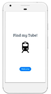
Participants showed reasonable understanding of the activity overall. The ‘Welcome’ link on the opening screen proved slightly confusing, with three participants (Andrew, Charles, and Lenny) not immediately tapping the link. Although it could be argued that there was high affordance in terms of its depiction as a button and (therefore) a link, the word itself did not seem to symbolise the idea of ‘entering’ a location, despite the common connotation of ‘welcome’ with ‘come in’. Two participants, Andrew and Charles (who did not have smartphones of their own), asked if they should tap ‘welcome’, and the third, Lenny, made no movement (and did not ask) until the researcher used the first prompt method of explaining. The instructions were enough, however, to allow him to proceed. More positively, the button size (an issue for Auger et al. [26]) did not cause any problems. No participants failed to tap the correct area, although there were instances of the screen failing to respond first time.
The login screen proved problematic for three participants (Andrew, Ibrahim, and Jane). Two of these did not know how to enter text (including Andrew again, and Jane). Andrew (who, as documented in the Appendix A, did not have use of a smartphone) was able to do so when the process had been explained, Jane required the next stage of prompting—a demonstration. She then was able to continue, although the small keypad caused her to enter the wrong letter twice, demonstrating a slight difficulty with motor control, exacerbated by holding the device (rather than it being on a stable surface—an aspect apparently not addressed in the literature before).
The third participant, Ibrahim, had an altogether more difficult problem. Although told that the password was ‘the first four letters of your name’ and that the idea was for him to write it, he insisted that the researcher did so, turning away and shielding his eyes from the screen with his hand. When gently asked why he did not want to perform the action, he declined to comment. The app was situated on the researcher’s phone, so it is likely that this gave it a proprietary quality in Ibrahim’s mind, which suggested that he should not be privy to the password. Interestingly, Ibrahim was the participant flagged as having behavioural difficulties, so it might be that he was trying to be particularly prudent during the session.
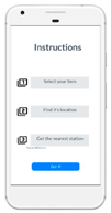
The following screen (number 3), displaying the app instructions, proved the least intuitive. Interestingly, this presented the opposite problem to that of the ‘Welcome’ page. Three of the first four participants (Andrew, Charles, and Deborah) incorrectly interpreted the step-by-step instructions as being a list of hyperlinks and tapped the first instruction expecting it to lead to another page. This was despite the fact that it was designed to not look like traditionally styled hyperlinks (blue and bold, or other contrasting text standing out from other content) [44]. Nevertheless, having the instructions in a bullet-style list containing few words, with each entry enclosed in a rectangle, may have been too reminiscent of a menu list. Also, the first instruction was titled ‘Choose your item’, so it may have been logical to assume that the items were visible with a tap (in fact, one had to read all the instructions and then tap ‘Got it!’). The behaviour of participants, in tapping items on this list, appears to be caused by the priority that the appearance (the styling around the text) of the instructions took over their labels (the text for the instructions) when considered in terms of visceral affordances (how the senses interpret the design [46]).
Reformatting the page was considered to obviate these problems, but as the app was demonstrated and explained prior to each session, it was felt that the only real purpose an instruction page would serve would be to test reading (and issues related in particular to reading on a small screen). Whilst this would have been instructive, the aim of the research was to examine screen manipulation, achievable without including lines of text to absorb. Thus, after the fourth trial it was removed from the interface.
The ‘Choose item’ screen (screen 4), which presented six photos of London attractions from which participants could choose, presented only one major obstacle, and only for two participants (Deborah and George). Both asked what to do and were able to proceed when told. However, few participants appeared to actually consider their choices. For the first sessions, choices were not recorded. However, when it became clear that the visible (and especially the top two) photos were being given preference, they were recorded as data. The eight participants whose choices were noted undertook a total of 18 iterations—fewer than required for a rigorous statistical analysis, but enough to accrue indicative findings.
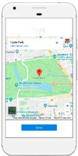
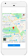
The final screen, containing Google Maps with the chosen location centred (and indicated by a red ‘balloon arrow’) proved the most difficult to manipulate. The problem here was the requirement to use two fingers to zoom. This proved problematic in itself, for several reasons:
  • Most participants seemed not familiar with the ‘two-finger’ action requirement and found it difficult, reflecting problems Rocha, Bessa, and Cabral [22] documented with their activity requiring dragging (although it is not clear from their paper whether two fingers were required to do this).
  • The map was very sensitive, causing it to zoom or move too much. In addressing the task, the station symbol was often found where the map had zoomed out so much that the name of the station did not appear. Kumin et al.’s [25] study also reported problems of sensitivity, although in their case, the touch screen itself was to blame, not a particular app.
Three people (Henry, Jane, and Khan) initially attempted to move the map with their thumbs, which they had been using on all the previous screens, and had been fairly adept at doing so. Requiring both, simultaneously, however, was far too difficult. All three readjusted to use their fingers and successfully completed the task.
The other problem on this screen was the error message, ‘Use two fingers to move the map’, which appeared (dimming the map itself) whenever an action was attempted with just one finger. Rather than helping, this simply caused confusion and irritation.

4. Discussion

This section explores the general lessons that can be elicited from the disparate results outlined above. One way to attempt a global interpretation of results of this experiment is to differentiate between a user’s general beliefs and attitudes regarding technology, and a specific perception to a particular application [47]. In the case of our participants, how they approached the system-specific tasks—especially in the face of difficulty or negative feedback, for example, at the hands of the error message in the map, or the unexpected navigation screen—might be indicative of their a priori attitude towards digital or mobile use in general. Only with encouragement from the researcher and with successful iterations were the participants enabled to develop an application-specific opinion and comfort level that allowed for greater ease of use. Due to the fact that universally accepted mobile-native affordances were used throughout this app, such as the text and appearance of the buttons, the map functionality, and user interface touch/swipe movement patterns, one can infer that either the specific participant group may have not had as much exposure to standardised mobile digital experiences as others, and/or that their intrinsic motivation levels for interacting with mobile applications was predisposed to waning in the face of negative feedback.
Despite differences in layout, design and input mechanisms, one result was similar to prior work undertaken on web interfaces. The propensity to choose the top two photos when deciding on which attraction to locate, reflects work undertaken by the author on web site design and usability on static devices, where he developed the idea of ‘serial access’ [20,21]. This can be defined as the practice of linearly absorbing each unit of information, without skipping any phrases or words that may be irrelevant and without looking beyond the immediate content encountered. Such behaviour leads to content being so absorbed from left to right and top to bottom. Interestingly, in the mobile environment, the easiest content with which to interact for people using their thumb to interact may not be at the top, but on the right of the screen (for right-handed people). Nevertheless, results showed that the top two photos were by far the most chosen, representing 10 out of 18 iterations. Indeed, the photo on the right (The London Eye) was chosen 6 times—30% of all iterations. At the other end of the scale, those photos only visible (or fully visible) on swiping were only chosen twice, and then only in third iterations, tentative indications that the reluctance to scroll identified in the author’s prior work [48] is in evidence in a mobile environment, despite the fact that the swipe action required may be easier than using either a mouse or arrow keys. We classified this as an affordance difficulty due to the fact that there was no visible indicator (such as an arrow pointing down) to indicate a downward swipe. However, the photos themselves were not strictly controlled variables and may have played a part in the selection (for example the natural visual attractiveness of the London Eye).
There were also other limitations to the study. First, the lack of prior research on which to build is a constant limitation where innovative technology is an area of interest. By the time the research cycle of finding a topic, obtaining funding, carrying out the study, writing up, and publishing has been undertaken, the technology will have moved on and other areas appearing for study. For example, the author’s PhD on website design for people with learning disabilities, completed only five years ago [20,21,45], is unlikely to be replicated or built upon, as the world of IT is now mobile and dominated by apps rather than by web pages on large screens. This is, indeed, one reason we decided to create an app which tested interactions likely to be used over a long period of time (tap, swipe, etc.).
Second, as with the studies by McKenzie et al. [32] and Ho et al. [33] cited earlier, the study relied on gatekeepers to interpret a given participant profile. Archibald and Munce [49] describe how gatekeepers may limit access to potential participants to those of their choice, such as those likely to have ‘an above average understanding of the [research] instead of participants with a more typical profile’ (p. 35). Participants had varied experience with technology, although in a way this could be seen as a strength, permitting a wider spectrum of user behaviour to be observed.
A longer time-lapse between app demonstration and the usability test may have elicited more usability issues, as the participants would not have been able to rely on memory so much. However, this heightened possibility for errors may not have been justified purely in terms of participant wellbeing.
Finally, it is worth considering performance in global terms, with regard to age, gender and prior experience. The sample, of course, was too small to undertake any quantitative analysis, so the following observations are simply indicative of what may be prevalent on a large scale. With regard to prior experience, this certainly helped, although in the case of Khan and Henry, experience was actually a handicap in one task, as they were too used to only using one thumb to negotiate the touch screen. Farid, reported to be on his smartphone ‘all the time’, had no problems with any of the tasks. On the other hand, Lenny and Ibraham, who were not big users of smartphones, both had problems, as did Charles who did not use a smartphone (although was adept at certain activities on a laptop).
Considering age (again with the proviso that it was a small sample), the two youngest participants (Eve and Khan) both appeared to be adept with the technology, despite using it for less time than the others. Charles, in his 50s, did not use a smartphone, but reported some limited but regular use of a laptop—for YouTube and game playing. These two examples, then, do indicate, in microcosm, an age difference in use. However, Henry and Farid, both in their 30s displayed much knowledge, perhaps raising the question as to the age at which people may be considered ‘digital natives’! It is worth noting that in both parallel work by the writer concerning smartphones [7] and other work on information technology and the same cohort [20,21,30] has shown that the major factors in usage and ability are support, exposure, and general literary skills rather than age. It is possible that these factors play out differently by gender (e.g., are males exposed to the technology more by the people who support them?). In the present study, with this small sample, there were no discernible differences.

5. Conclusions

To conclude, it can be said that there are various signalling mechanisms can be built into the appearance and functionality of mobile applications to enable optimal usability for individuals with mild learning disabilities. Problems encountered with two-finger pinching (to zoom) and dragging, and attempts to move the map using the thumb, clearly indicate that preferred functionality is exhibited consistently in instinctive behavioural patterns. The + and − zoom features on Google Maps when opened on a larger (e.g., laptop) screen could be incorporated in a mobile device (the symbols could still be relatively large if they are overlaid onto the map surface). Results suggested that the ‘tap’ functionality was not problematic in itself, only the signalling to it, so this more familiar interaction mode should be used wherever possible; tapping a zoom plus sign instead of having to pinch is the perfect example. As mentioned, aspects of signalling could be incorporated such as, in this case, less ambiguous labels and an indication (via an arrow) of content ‘below’ the screen.
Mobile device behaviour is, of course, a learned habit that is developed through the course of interacting with a particular application (such as the identification of blue buttons as links in this case) and so greater familiarity and use would help. The wider research within which this study sits has shown that formal instruction by the carers and other supporters of the cohort is generally minimal, for several reasons, but partly because supporters themselves are not adept with the technology and/or do not see the value for the cohort they support [50]. It is worth adding, for educationalists and app designers, that particularly for individuals with learning disabilities, the more visceral the affordance, the higher its usability appears to be, especially with regard to digital/mobile-native applications. Thus, a combination of better design and education is required.

Author Contributions

P.W. devised the research, carried out the fieldwork and wrote-up the results. S.S. created and developed the app and also contributed to the analysis – in particular formulating errors into ‘user’, ‘functionality’ and ‘affordance’ categories. Both authors wrote the literature review.

Funding

This research was funded by The British Academy of Arts and Humanities, grant number pf160147.

Acknowledgments

The study reported here is part of a programme of research being generously funded by The British Academy of Arts and Humanities as a Post-doctoral Fellowship awarded to the first author, who would also like to thank his steering group, Barrie Gunter, Andrew MacFarlane, Mina Vasalou, Rob Miller and, latterly, Elizabeth Shepherd, for their invaluable help and advice throughout the project. He is most grateful too, of course, to all the participants and supporters at the various sites where the research was undertaken.

Conflicts of Interest

The authors declare no conflict of interest.

Appendix A

Table A1. Participant details.
Participant AliasAgeGenderAffiliation/LocationGroupNotes
Andrew20–29MNational charity1Andrew did not have his own smartphone but had an iPad. He played games on this, accessed YouTube, and surfed the Web.
Brian30–39MNational charity1Brian had a slight visual impairment. He had a smartphone, which he sued for making calls, texting, and taking photographs. It had been configured for him to show large icons and text.
Charles50–59MNational charity1Charles did not have his own smartphone but reported being familiar with them through friends. He used a laptop, mainly for YouTube and game playing.
Deborah30–39FNational charity1Appeared to have the least exposure to mobile technology. Only used her phone (although it was ‘smart’) for voice calls and appeared not to realise much of the potential or functionality.
Eve18–19FLocal charity 2Used her smartphone extensively. In addition to traditional calls and texts, she used WhatsApp and Facebook Messenger, accessed YouTube and the Web, and sent photos via social media. Self-taught, along with her friends. Has had a phone for 2 years, but quickly became immersed.
Farid30–39MLocal charity2Reported to be on his smartphone ‘all the time’, using WhatsApp, Facebook Messenger, Instagram, the web, and listening to music. Has used a smartphone ‘for years’ (he could not provide a firm number)
George40–49MSelf-advocacy group3‘Self-taught’ in ICT, albeit receiving much help from relatives and from peers. Smartphone use centred on calls, texts, and YouTube. Has had a smartphone for one year
Henry30–39MSelf-advocacy group3Very knowledgeable about computing, discussing servers and firewalls accurately and demonstrating much ‘app’ usage on his phone. Had much exposure through his brother, who is an IT specialist, and has had a smartphone for ‘around 6 years’.
Ibrahim20–29MEducational institution 4Classified as having behavioural difficulties—maybe a reason why he tried to not do anything wrong as evidenced by his reluctance to use what he thought was someone else’s password. Had a smartphone but was currently barred from using/carrying it for accumulating a large bill. Reported using only voice, text, and camera.
Jane20–29FEducational institution 4Needed much help. Had a smartphone (has had one for 2 years) and reported using WhatsApp, YouTube, and playing games, but disappointed that the ICT course he was doing did not include a mobile element.
Khan18–19MEducational institution 4Had a smartphone for his 18th birthday (three months earlier) but said he was familiar with them anyway through his friends. Set himself up immediately with Messenger and uses the Web a lot, especially to browse news about football.
Lenny20–29FEducational institution 4Has a smartphone but said he did not use it much. Apart from calls, his main activity is playing games. He does not have any chat app on his phone.
Notes: Group 1 and Group 4 participants were attending a basic computer skills course at the time of the study at this charity, although (as confirmed by the course instructors) this did not include content on using smartphones.

References

  1. Dekelver, J.; Kultsova, M.; Shabalina, O.; Borblik, J.; Pidoprigora, A.; Romanenko, R. Design of mobile applications for people with intellectual disabilities. In Proceedings of the Creativity in Intelligent Technologies and Data Science Conference (CIT&DS 2015), Volgograd, Russia, 15–17 September 2015; Kravets, A., Ed.; Springer: Cham, Switzerland, 2015; pp. 823–836. [Google Scholar]
  2. Mencap. How Common is Learning Disability? Available online: https://www.mencap.org.uk/learning-disability-explained/research-and-statistics/how-common-learning-disability (accessed on 17 October 2019).
  3. Oxford Living Dictionaries Definition of smartphone. In English Oxford Living Dictionaries; Oxford University Press: Oxford, UK, 2018; Available online: https://en.oxforddictionaries.com/definition/smartphone (accessed on 3 September 2018).
  4. Statistica. UK: Smartphone Ownership by Age from 2012–2018. Available online: https://www.statista.com/statistics/271851/smartphone-owners-in-the-united-kingdom-uk-by-age/ (accessed on 17 September 2018).
  5. Newzoo.com Top 50 Countries/Markets by Smartphone Users and Penetration. Available online: https://newzoo.com/insights/rankings/top-50-countries-by-smartphone-penetration-and-users/ (accessed on 2 May 2019).
  6. OFCOM (Office of Communications). Disabled Users Access to and Use of Communication Devices and Services—Research Summary: Learning Disability. Available online: https://www.ofcom.org.uk/__data/assets/pdf_file/0026/132965/Research-summary-learning-disability.pdf (accessed on 17 October 2019).
  7. Williams, P. Smartphones and people with learning disabilities: Self-reported barriers to effective usage. In Proceedings of the International Academic Conference on Teaching, Learning and E-learning in Budapest (IAC-TLEl), Budapest, Hungary, 15–16 March 2016; Czech Institute of Academic Education: Prague, Czech; pp. 7–11. [Google Scholar]
  8. Nayebi, F.; Desharnais, J.M.; Abran, A. The state of the art of mobile application usability evaluation. In Proceedings of the 25th IEEE Canadian Conference on Electrical and Computer Engineering (IEEE CD: 978-1-4673-6/12), Montreal, QC, Canada, 29 April–2 May 2012; pp. 1–4. [Google Scholar]
  9. Song, K.; Kim, J.; Cho, Y.H.; Lee, A.; Ryu, H.; Choi, J.W.; Lee, Y.J. The fingerstroke-level model strikes back: A modified keystroke-level model in developing a gaming ui for 4g networks. In CHI’13 Extended Abstracts on Human Factors in Computing Systems; ACM: New York, NY, USA, 2013; pp. 2359–2362. [Google Scholar]
  10. Stößel, C.; Blessing, L. Tap, swipe & pinch: Designing suitable multi-touch gestures for older users. In Proceedings of the 11th International DESIGN Conference, Dubrovnik, Croatia, 17–20 May 2010; Design Society: Dubrovnik, Croatia, 2010; pp. 463–472. [Google Scholar]
  11. Lee, A.; Song, K.; Ryu, H.; Kim, J.; Kwon, G.H. Fingerstroke time estimates for touchscreen-based mobile gaming interaction. Hum. Mov. Sci. 2015, 44, 211–244. [Google Scholar] [CrossRef] [PubMed]
  12. Lvseike, H.; Brønnick, K. Feasibility of the iPad as a hub for smart house technology in the elderly; Effects of cognition, self-efficacy, and technology experience. J. Multidiscip. Healthc. 2012, 5, 299–306. [Google Scholar] [CrossRef] [PubMed]
  13. Crow, K. Four Types of Disabilities: Their Impact on Online Learning. TechTrends 2008, 52, 51–55. [Google Scholar]
  14. Rowland, C. Cognitive Disabilities Part 2: Conceptualising Design Considerations. Available online: http://www.webaim.org/techniques/articles/conceptualize/ (accessed on 16 June 2018).
  15. Rocha, T.; Bessa, M.; Gonçalves, M.; Cabral, L.; Godinho, F.; Peres, E.; Reis, M.C.; Magalhães, L.; Chalmers, A. The Recognition of Web Pages’ Hyperlinks by People with Intellectual Disabilities: An Evaluation Study. J. Appl. Res. Intellect. Disabil. 2012, 25, 542–552. [Google Scholar] [CrossRef] [PubMed]
  16. Rocha, T.; Bessa, M.; Bastardo, R.; Magalhães, L. Image-type representation: A preliminary study on preferences of users with intellectual disabilities. Int. J. Hum. Comput. Stud. 2018, 110, 1–11. [Google Scholar] [CrossRef] [Green Version]
  17. Brown, D.; Lawton, J. Design Guidelines and Issues for Web Site Production for Use by People with a Learning Disability. Available online: http://www.learningdisabilities.org.uk/html/content/webdesign.pdf (accessed on 13 March 2019).
  18. W3C (World Wide Web Consortium). Cognitive Accessibility User Research. Available online: https://w3c.github.io/coga/user-research/#intellectual-disability (accessed on 10 September 2018).
  19. Jiwnani, K. Designing for Users with Cognitive Disabilities. Available online: http://www.otal.umd.edu/uupractice/cognition/ (accessed on 9 August 2017).
  20. Williams, P.; Hennig, C. The effect of web page menu orientation on retrieving information by people with Learning Disabilities. JASIST 2015, 66, 674–683. [Google Scholar] [CrossRef]
  21. Williams, P.; Hennig, C. Optimising website designs for people with learning disabilities. JORSEN 2015, 15, 25–36. [Google Scholar]
  22. Rocha, T.; Bessa, M.; Cabral, L. Performing universal tasks using a mini iPad: Usability assessment per people with intellectual disabilities. In Proceedings of the XVII International Conference on Human Computer Interaction, Salamanca, Spain, 13–16 September 2016; pp. 1–6. [Google Scholar]
  23. Dawe, M. Understanding mobile phone requirements for young adults with cognitive disabilities. In Proceedings of the 9th International ACM SIGACCESS Conference on Computers and Accessibility (Assets ′07), Tempe, AZ, USA, 15–17 October 2007; ACM: New York, NY, USA, 2007; pp. 179–186. [Google Scholar]
  24. Cumming, T.M.; Strnadová, I.; Knox, M.; Parmenter, T. Mobile technology in inclusive research: Tools of empowerment. Disabil. Soc. 2014, 29, 1–14. [Google Scholar] [CrossRef]
  25. Kumin, L.; Lazar, J.; Feng, J.; Ekedebe, N. A Usability Evaluation of Workplace-Related Tasks on a Multi-Touch Tablet Computer by Adults with Down Syndrome. J. Usability Stud. 2012, 7, 118–142. [Google Scholar]
  26. Auger, C.; Leduc, E.; Labbé, D.; Guay, C.; Fillion, B.; Bottari, C.; Swaine, B. Mobile applications for participation at the shopping mall: Content analysis and usability for persons with physical disabilities and communication or cognitive limitations, International. J. Environ. Res. Public Health 2014, 11, 12777–12794. [Google Scholar] [CrossRef]
  27. Pérez-Cruzado, D.; Cuesta-Vargas, A.I. Improving Adherence Physical Activity with a Smartphone Application Based on Adults with Intellectual Disabilities (APPCOID). BMC Public Health 2013, 13, 1173. [Google Scholar]
  28. Landeros-Dugourd, E. Quasi-Experimental Study: Dcog and Travel Autonomy for Young Adults with Cognitive Disabilities. Ph.D. Thesis, Capella University, Minneapolis, MN, USA, 2011. [Google Scholar]
  29. Hoehl, J.; Lewis, C. Mobile web on the desktop: Simpler web browsing. In Proceedings of the 13th International ACM SIGACCESS Conference on Computers and Accessibility, Halifax, NS, Canada, 13–15 October 2008; ACM: New York, NY, USA, 2011; pp. 263–264. [Google Scholar]
  30. Williams, P.; Nicholas, D. Testing the usability of information technology applications with learners with special educational needs (SEN). J. Res. Spéc. Educ. Needs 2006, 6, 31–41. [Google Scholar] [CrossRef]
  31. Moser, C. A Fresh Start—Improving Literacy and Numeracy; HMSO: London, UK, 1999. [Google Scholar]
  32. Ho, P.; Downs, J.; Bulsara, C.; Patman, S.; Hill, A. Addressing challenges in gaining informed consent for a research study investigating falls in people with intellectual disability. Br. J. Learn. Disabil. 2018, 46, 92–100. [Google Scholar] [CrossRef] [Green Version]
  33. McKenzie, K.; Whelan, K.J.; Mayer, C.; McNall, A.; Noone, S.; Chaplin, J. “I feel like just a normal person now”: An exploration of the perceptions of people with intellectual disabilities about what is important in the provision of positive behavioural support. Br. J. Learn. Disabil. 2018, 46, 241–249. [Google Scholar] [CrossRef]
  34. George, C.A. User-Centred Library Websites: Usability Evaluation Methods; Chandos: Oxford, UK, 2008. [Google Scholar]
  35. Nielsen, J. Report from a 1994 Web Usability Study. Available online: https://www.nngroup.com/articles/1994-web-usability-report/ (accessed on 5 May 2018).
  36. Nielsen, J. How Many Test Users in a Usability Study? Available online: https://www.nngroup.com/articles/how-many-test-users/ (accessed on 18 June 2018).
  37. Rubin, J.; Chisnell, D. Handbook of Usability Testing: How to Plan, Design, and Conduct Effective Tests; Wiley: Indianapolis, IN, USA, 2008. [Google Scholar]
  38. Manley, K.; Collins, B.C.; Stenhoff, D.M.; Kleinert, H. Using a system of least prompts procedure to teach telephone skills to elementary students with cognitive disabilities. J. Behav. Educ. 2008, 17, 221–236. [Google Scholar] [CrossRef]
  39. Richie, J.; Spencer, L. Qualitative data analysis for applied policy research. In Analysing Qualitative Data; Bryman, A., Burgess, R.G., Eds.; Routledge: London, UK, 1994; pp. 173–194. [Google Scholar]
  40. Ritchie, J.; Lewis, J. Qualitative Research Practice; Sage Publications: London, UK, 2003. [Google Scholar]
  41. Braun, V.; Clarke, V. Using thematic analysis in psychology. Qual. Res. Psychol. 2006, 3, 77–101. [Google Scholar] [CrossRef] [Green Version]
  42. Pope, C.; Ziebland, S.; Mays, N. Qualitative research in healthcare: Analysing qualitative data. Br. Med. J. 2006, 320, 114–116. [Google Scholar] [CrossRef]
  43. Norman, D. The Design of Everyday Things: Revised and Expanded Edition; Basic Books: New York, NY, USA, 2013. [Google Scholar]
  44. Nielsen, J.; Budiu, R. Mobile Usability; New Riders: Berkeley, CA, USA, 2013. [Google Scholar]
  45. Pettit, N. What Are Affordances in Web Design? Available online: http://blog.teamtreehouse.com/affordances-web-design (accessed on 4 January 2018).
  46. Lidwell, W.; Holden, K.; Butler, J. Universal Principles of Design; Rockport Publishers: Beverly, MA, USA, 2007. [Google Scholar]
  47. Venkatesh, V. Determinants of perceived ease of use: Integrating control, intrinsic motivation, and emotion into the technology acceptance model. Inf. Syst. Res. 2000, 11, 342–365. [Google Scholar] [CrossRef]
  48. Williams, P.; Hanson-Baldauf, D. Testing a web information portal for people with learning disabilities. J. Res. Spéc. Educ. Needs 2010, 10, 42–51. [Google Scholar] [CrossRef]
  49. Archibald, M.; Munce, S. Challenges and Strategies in the Recruitment of Participants for Qualitative Research. Univ. Alta. Health Sci. J. 2015, 11, 34–37. [Google Scholar]
  50. Williams, P. Facebook use by people with learning disabilities: The case for facilitated, guided autonomy. New Trends Issues Proc. Humanit. Soc. Sci. 2019, 6, 99–108. [Google Scholar] [CrossRef]
Table 1. Tasks and task sequence.
ScreenTaskAction/Skill RequiredDevice ReactionInterface
1Activate the ‘Welcome’ buttonRecognise and tap the button Opens login page on tap Education 09 00263 i001
2Log in (1)
Log in (2)
Enter text (the participant’s name)
Tap ‘login’ button
Displays introduction page Education 09 00263 i002
3Introduction pageRead instructions Education 09 00263 i003
4Activate gallery page
Examine options
Tap ‘Go’ button on introduction page
Swipe screen (to view all options)
Displays gallery
Displays elements originally below screen level
Education 09 00263 i004
5Choose place to go from the gallery
Examine map
Tap on image
Find attraction location (by recognising the words and the red ‘balloon’)
Opens map of location Education 09 00263 i005
5Find name of tube station
Exit app
Pinch (zoom out) on map
Recognise name and London Underground icon.
Tap ‘Done’ button
Zooms out to display tube station name(s)
App disappears
Education 09 00263 i006
Table 2. Age ranges and genders of participants.
Age Range.No.Genders
18–1921 male 1 female
20–2942m 2f
30–3943m 1f
40–4911m
50–5911m
Table 3. Results.
Table 3. Results.
ScreenActionClassification of DifficultyParticipants Affected
1Did not tap ‘Welcome’ buttonAffordance3
2Log in (did not enter text)Affordance2
2Log in (reluctance to log in)User1
3Thought ‘Instructions’ page was a list of hyperlinksAffordance3 (of 4)
4Choose location (failed to swipe)Affordance6 (of 8)
5Google Maps—tried using only one fingerFunctionality6
5Google Maps—screen zoomed too muchFunctionality4
5Google Maps—needed help with underground icon recognitionUser3
5Tap not activating Functionality3