Article

The Influence of Format Readability on Children’s Reading Speed and Comprehension

Department of Industrial Engineering and Management Systems, University of Central Florida, Orlando, FL 32816, USA
*
Author to whom correspondence should be addressed.
Educ. Sci. 2024, 14(8), 854; https://doi.org/10.3390/educsci14080854
Submission received: 19 April 2024 / Revised: 26 July 2024 / Accepted: 28 July 2024 / Published: 7 August 2024
(This article belongs to the Section Technology Enhanced Education)

Abstract

:
Background: Format readability, including font and spacing, impacts reading metrics in adults, but will the research generalize to children? We examined how eight fonts (four serif and four sans serif) and three-character spacing variations influenced children’s reading comprehension and reading speed. Methods: Fifty-one students in third–fifth grade read 11 narrative text passages on a computer and answered comprehension questions. Passages were randomized in terms of order. First, the font in which the text of each passage was presented was manipulated. Then passages were presented in three spacing manipulations (narrow, normal, and wide). Results: A linear mixed effects model demonstrated that, on a group-level, passages presented in Roboto and Arial font were read significantly faster (words-per-minute) than other fonts. On the individual level, students experienced significant boosts in reading speed (words-per-minute) between their best and worst fitting font, and spacing. A chi-square test showed no one font or spacing setting that was most likely to be a students’ font fit or clash. For reading comprehension, no speed–comprehension tradeoff was observed. Conclusions: Changes to text format at the group and individual level may yield boosts in reading speed for students, without negatively impacting reading comprehension.

1. Introduction

In a 2022 report from the National Center for Education Statistics, only 33% of fourth graders and 31% of eighth graders [1] were reading at proficient levels in the United States. Fueled by the COVID-19 pandemic, reading achievement gaps have been further widened for children in the U.S since 2019 [2], and worldwide the situation has been called ‘nearly insurmountable’ [3], particularly for minority children who come from disadvantaged backgrounds [4]. Increases in the use of technology offer an opportunity to create a more engaging and accessible learning environment for young readers to achieve greater outcomes. One affordance that is being studied by a growing community of readability researchers, and that can effectively support readers, is format readability [5,6,7,8,9,10]. Readability refers to the degree to which a reader can understand a written text and can depend upon both its semantic content and visual presentation. In this study, we place focus on visual presentation, which we refer to as format readability and which is separable from content readability, which includes the difficulty (grade) level or topic of a text. Format readability refers to how the typographical features of text, including aspects such as font and spacing, impact reading metrics, which in this work include comprehension and speed. Early format readability research with adults and children show significant gains in reading speed when reading in optimal formats which are a ‘fit’ for the individual, as compared to formats which are least optimal, or a ‘clash’ [5,9]. Advances in educational technology development for K-12 classrooms mean that children are reading on digital displays more than ever before, but improved format readability of digital text has been mostly overlooked as a feature that can support learning, and format readability research with children lags behind promising research with adult populations. The primary purpose of this study was to determine how format readability influences child reading performance by adapting testing methods from an assessment previously used with adults and to determine the best methods for assessing the impact of format readability in child populations.

1.1. Format Readability Research

1.1.1. Format Readability in Adults

Format readability is a relatively new construct, supported by research showing that matching typography to individual needs leads to large performance gains in reading speed, while comprehension remains constant. This effect is independent of content readability and instead rooted in individual differences in visual function [5,9,10,11]. For example, matching an individual to a font that fits their needs, from among common fonts, leads to an average 35% change in reading speed, with stable comprehension as compared to a reader’s least optimal font [10].
The benefits of providing larger font types for older adults and the vision-impaired have been long understood. However, this recent psychophysical work instead controls for the effects of font size and content level to reveal effect size performance differences for individuation of size-normalized fonts and spacing. Format readability gains can be also achieved through spacing and line length, but font is the largest effect size manipulation [12].
Font familiarity and preference do not significantly impact format readability, and adult readers are not metacognitively able to identify formats that will serve them well [8]. Rather, the present literature tests each participant with a range of common formats in a diagnostic manner roughly analogous to a vision test and relies upon objective performance rather than subjective judgement. This diagnostic process is time consuming, and, in the case of fonts, this means that participants are tested only on the most commonly available. It is unlikely that ‘font affinity’ exists, or that there are truly ‘Times New Roman’ people. Rather, it seems more likely that aspects of each font act as affordances addressing individual differences in visual function.
Exploration of mechanism in format readability is the goal of a growing body of format readability researchers. Work is underway to identify the constituent underpinnings of individual font ‘fits’ and ‘clashes’, as well as appropriate metrics to measure their impact. Already, a helpfully nomothetic speed-for-comprehension tradeoff in reading has been characterized in adult populations [10]. Large individual differences in the degree to which letter and word identification is impaired by surrounding clutter from other letters, a phenomenon known as visual crowding, provides additional clues [13,14,15,16]. These findings have inspired early theoretical models. Specifically, it is presently hypothesized that many typographic aspects of information design impact aggregate information density and that increased information density is beneficial up until an individual threshold is exceeded. At that point, aggregate speed-for-comprehension falls off rapidly. Certain clusters (age, learning disabilities, visual impairments, etc.) within the population may find certain aspects of typographic design (such as letter or line spacing or font width, for example) more or less helpful in this overall information density function, and, as such, factors such as clinical conditions, operational conditions, and age likely exert mediating and moderating effects. Likewise, certain fonts may cluster in terms of the features they provide to clusters of readers. To test these assumptions, an assessment was needed to manipulate such features. Rather than relying on subjective judgment of format needs, the current literature conducts comprehensive format testing on participants akin to a vision test, The Assessment for Readability Format—Adults (ARF-A) [9]. In the ARF-A, readers are presented with short passages, which they read silently, and answer comprehension questions. The format of the passages varies across each passage, testing both fonts and then spacing. More details about the design of this assessment are described in the Method section. Diagnostic tests also appear to be necessary, as font familiarity and reader preference do not significantly affect format readability [8]. Past research on format readability typically engaged a restricted selection of common fixed fonts (usually between eight and 16) and separately modified other typographical settings such as spacing. This strategy can pinpoint a preferable font from a given set, but it may also fail to fully exploit a reader’s potential, leaving room for possible improvements with untested fonts.
For young readers, the opportunity to optimize reading performance without the need for time and resource-intensive interventions could also have significant impact. However, format readability in children is less well studied relative to the adult-facing literature. The ARF-A was adapted for early pilot work with children to create The Assessment for Readability Format-Children (ARF-C).

1.1.2. Format Readability Research in Children

The use of technology has become a part of everyday life for children both at home, in the classroom, and, for many children, well before they even begin kindergarten [17]. While the overall content and strategies taught in various educational platforms are of utmost importance, it is also crucial to consider how the design of technology may either hinder or enhance both the development of reading skills and, ultimately, learning outcomes [17].
In general, format readability research with children is lacking [5] and it is not fully understood how typographical format features can enhance digital reading for children. Research with printed books or materials has demonstrated that reading performance can be enhanced by increasing the size of the font, word spacing, or alignment [18,19] However, in this study, we focus on digital text rather than printed text for two reasons: an increase in the use of digital technology in these grade levels [20,21,22,23,24] and the ease in which we can more easily manipulate and test the formatting of digital text.
Katzir and colleagues [25] tested the impact of font size, letter spacing, and line length in second and fifth grade students. They found that second graders had lower reading comprehension, with decreasing font size and length. For fifth graders, only smaller font sizes resulted in increased reading comprehension. The results of this 2013 study suggest the importance of evaluating how format readability impacts comprehension across multiple grade levels to better understand differences in which typographical features such as font or spacing have greater effects on reading performance. Wilkins and colleagues [26] also found that larger font sizes increased reading speed; further, they found that familiarity with fonts was beneficial, discovering that fonts used in texts students accessed more regularly also impacted reading speed. While these studies contribute very interesting findings, it is important to consider other features beyond just font size.
In a recent notable study, Sheppard et al. [7] found that reading with optimal formats for students in kindergarten up through eighth grade significantly boosted reading performance. Testing of individuated formats based on character width and letter spacing was performed within both a word-level task and a passage task. They observed gains in mean accuracy of up to 15% on the word task. For the passage task, gains of up to 29 words read per minute and 20% greater accuracy were found. Boosts to comprehension were also observed for older students who read with wider letter spacing. A stability analysis revealed that, for 58% of the sample, students maintained their personal best font variation when tested a second time on the same day. The authors concluded that subtle changes to text formatting can have large impacts for enhancing reading performance in children. However, students only read two passages in two format variations, thus limiting the conclusions that can be drawn.
In another recent study, Medved and colleagues [27] found an effect of letter shapes on children’s reading speed (fluency) and enjoyment. Eight typefaces were tested in a sample of university students and students in fourth to sixth grade. Typefaces that had rounder letter shapes resulted in faster reading speed and a more pleasant reading experience, but no effect was found for comprehension. While these results are indeed promising, the study only included 15 students, making it difficult to draw conclusions for how these results may generalize to a larger population.
Research on typeface design with children has not reached a consensus on which visual attributes are the most impactful for early readers in regard to font, line and character spacing, or text size [28]. Some studies support that increased letter spacing improves word recognition and reading performance, particularly for students with dyslexia [29,30]; however, these studies are extremely limited. Research on legibility, although also very limited, also points towards the importance of format individuation [9,19]. Legibility refers to the extent to which text can be properly identified. In one study with young children, not being able to enlarge text on digital devices made them less motivated to read certain books out of a digital library, which emphasizes the importance of considering how customizable readability features can improve digital reading experiences in the design of educational technology for children [31]. Individualized format readability features may optimize learning opportunities by reducing information overload and improving accessibility and legibility, thereby increasing one’s ability to read digital text more fluently and to successfully comprehend the text.
Previous research supports the connection between reading and visual crowding, with a more profound link among dyslexic readers [32]. Visual crowding refers to the difficulty or failure to identify items surrounded by clutter (i.e., many items) [33,34]. These studies [32,33] found that crowding is correlated with reading skills in non-dyslexic and dyslexic child and adult readers. Joo et al. [32] concluded that there is a connection between individuals’ crowding severity and the effectiveness of text spacing manipulations, also finding that some dyslexic readers benefit from increased letter, word, and line spacing. Spacing is a perceptual parameter that has been found to affect reading performance [33,35,36]. Increased text spacing alleviates crowding and may increase reading speed in child and adult readers with and without dyslexia. Performance benefits on reading aloud and lexical decision tasks have been observed with increased text spacing, furthering the efficacy of spacing manipulations [32]. While crowding is only one factor contributing to reading-related impairments and difficulties [34], understanding the implications of text spacing manipulations on factors such as crowding contributes to our ability to design personalized format readability interventions. Work from Marinus and colleagues [37] examined the effect on reading with a font developed for dyslexic readers, Dyslexie. It was found that increases in reading performance were due to letter and word spacing rather than features of the font itself. However, this study only compared Dyslexie and Arial, thus it is still unknown how other fonts and spacing may affect reading in children (typical and non-typical readers) and whether there are differences for children with varying levels of reading ability.
Taken together, these studies highlight that readability features such as font, font size, and spacing may significantly boost reading speed and comprehension for children; however, results are mixed on which features may have the greatest impact. Further, most of these studies focus on the typographical aspects that had the greatest effect for the sample as a whole, and we argue that, much like an eyeglass prescription, students may differ in the formatting in which best supports their reading. Thus, we aim to build upon this promising, but limited, foundation in this present study.

1.2. Conceptual Framework

We ground our conceptual theory (Figure 1) in the Simple View of Reading (SVR [38]), which posits that there are two major components to successful reading comprehension: the product of word recognition—decoding and fluency (reading speed)—and language/listening comprehension—comprised of vocabulary, oral language, comprehension monitoring, and background knowledge. Also included in the word recognition process are reading accuracy (words read correctly) and prosody (intonation). Although these factors are not captured in the current experiment (students reading silently rather than aloud), they might also be positively impacted by improved format readability. We conjecture that enhanced format readability may increase both the speed and accuracy in which a reader can identify and decode a word or connected text, thereby also potentially supporting stronger reading comprehension. We also acknowledge the potential direct effect of format on reading comprehension, as found in previous research [7,25]. However, it is important to note that increased reading speed (words read per minute) does not necessarily always equate to higher reading comprehension and that there is a speed–comprehension trade-off that must be considered [10,39,40], Thus, while improved readability features may support increased reading speed, it is crucial to examine the threshold in which speed negatively impacts reading comprehension. Further, given known differences in typical reading rates [41,42], this threshold likely differs based on age as well as an individual’s baseline reading skill level.
Content readability is also included in our conceptual theory and is defined as features such as the difficulty (grade) level or topic of the text, and it has also been found to effect reading comprehension [43]. Likewise, content readability could impact word recognition and language comprehension. If the content readability (text difficulty) is at a level above a child’s language comprehension skills, fluent reading and successfully comprehending a text may be more challenging [43,44,45]. Considering factors beyond just one’s baseline reading skills, such as the difficulty level of a text or other environmental factors, including format, can influence fluency and reading comprehension [43,46]. Katzir and colleagues [25] suggest that perceptual features (typography) of text should be considered. Taken together with a growing body of research [7,9,10,25,26,27] that has demonstrated that text format influences reading skills, such as reading speed and comprehension, more research is needed in order to understand the specific features of format and the effect to which they effect reading skills.
Children enter the classroom with varying levels of literacy skills, which may influence their reading comprehension [47]. While students’ baseline literacy skills and features of content readability, such as the difficulty level and topic of a text, directly impact reading comprehension, format readability is an additional component that may affect reading comprehension, likely as a moderator via word recognition. We posit that improved format readability features, such as font and spacing, may support better reading comprehension beyond the contribution of baseline literacy skills and content readability features; further, students may have individual formatting needs, and so understanding both group-level effects and individual differences is crucial.

1.3. Study Aims

To date, early findings support the potential for significant impact on both reading speed and some potential to support better reading comprehension. This research moves away from a one-size-fits-all approach to technology design and points towards the need for creating a more flexible and customizable digital environment to enhance each person’s ability to process and comprehend information more efficiently. Improved format readability has the potential to be implemented with a click of a button, instantly enhancing the readability of the text, thereby increasing reading performance without the need for time and cost intensive interventions from schools. However, research in this area is limited and it is not clear which or how specific features of a text format influence the reading performance of children. In order to assess the impact of font and spacing on reading performance, we aimed to adapt the design of adult version readability assessment, the ARF-A, for use with younger populations (ARF-C) to determine whether results seen in adult populations [8,9,10] would replicate with elementary-aged students, considering effects at both the group and individual level.
The following questions guided this novel research to determine whether format readability gains seen in adult populations generalize to children:
Research Question 1: What is the effect of font and spacing on reading speed (words per minute)?
Research Question 2: Is there a speed–comprehension tradeoff for students’ best fitting font and spacing variations? In other words, is comprehension performance significantly lower for passages in which a student has the highest WPM?
To answer these questions, we examined gains in reading speed (words per minute) for students in grades 3–5 by adapting the adult format readability assessment, the ARF-A, for use with children. We also assessed the impact of font and spacing on reading comprehension and to determine whether there is a speed–comprehension trade-off on passages in which children had the highest average words per minute to determine whether higher reading speeds were associated with lower reading comprehension performance.

2. Method

2.1. Participants

Students (N = 51) and teachers were recruited voluntarily from two school districts in Florida via backpack mail or were emailed study information from their teachers. One classroom of students was recruited from a private school and the remaining teachers and students were recruited from a public school district. In both districts, the research team met with administrative staff, who then recruited teachers to participate. Participating teachers sent home information about the study for all students in their classrooms. Teacher and student participation was voluntary. There were 8 teachers in this study. Students were 71% White, 10% Hispanic, 9% Black, 6% Multiracial, and 4% Asian. The sample was almost evenly split amongst males (51%) and females (49%). Students ranged in age from 8 years to 11 years old. The average age was 9 years, 2 months old (SD = 0.913). There were no reported visual impairments. Across both the public school and private school, only 1 student was an English language learner. Students qualifying for a free or reduced-price lunch comprised 11% of the sample. Finally, none of the students were reported to have a learning disability or other learning impairment. The study was reviewed and approved by the Institutional Review Board (IRB) at the University of Central Florida.

2.2. Measures

The Assessment of Readability Format- Children (ARF-C). The design of the ARF-C was adapted from the adult version of the readability test, the ARF-A. In both versions of the test, participants read short passages on various topics and answer comprehension questions. The passages vary in the font and spacing in which they are displayed as participants navigate through the test. To develop the ARF-C, we replaced the adult-leveled passages with new passages that were written at the 3rd–5th grade reading level and wrote new comprehension questions. The ARF-C contained 12 total passages, including one training passage at the beginning of the test and 11 test passages, 8 for testing font, and 3 for testing spacing. Each passage was approximately 300 words (±10% to ensure passages had a logical ending and did not end mid-sentence) split evenly amongst 4 separate screens (75 words per screen). The difficulty level for each passage was determined using the Lexile analyzer tool [48]. Given the range of ages in the sample, the passage set ranged in Lexile from 410 L to 1200 L grade level. Sample passages can be seen in the Supplementary Materials. The comprehension questions were structured as multiple-choice questions with four possible answer choices. The questions developed include recall questions (who, what, when, why, where) and inferencing questions, with the last question asking students to identify the option that best describes the main idea of the passage. Passages were sourced from open-source narrative books on Project Gutenberg. A breakdown of each passage, the Lexile level, and topic are provided in Table 1.
In the ARF-C, passages were randomized in two ways: 1. the order in which the passages are presented and 2. the font/spacing that the passages are presented in. For example, Child A may see Passage 8 first, presented in Poppins font, while Child B may see Passage 8 as their fifth passage, presented in Georgia font. This design is intended to eliminate both order effects and to reduce potential passage effects on reading speed. The fonts tested were 4 serif fonts (Merriweather, Times, Georgia, and Source Serif Pro) and 4 sans-serif fonts (Open Sans, Poppins, Arial, and Roboto). Serif fonts are fonts that have strokes or small lines, sometimes referred to as “little feet”, at the end of the main strokes of the letter. Sans serif fonts do not include this feature. These fonts were chosen based on our previous work with adults [9]. Wallace and his colleagues conducted an extensive analysis to identify the most common fonts used in PDFs, newsprint, and the web. The selection criterion in this study was based on this analysis, featuring some of the most used fonts across digital platforms which are available across different types of devices. Fonts were presented at a size of 16 pixels. This size is above the critical minimum print size in the normally sighted population required for an individual to read at their average speed [49]. For spacing, we tested normal (0.0 em), wide (0.05 em), and narrow (−0.05 em) character spacings. In typography, an em is a unit equal to a specified point size. These levels were chosen based on the extensive literature in vision sciences, providing a range of spacing parameters while retaining legibility [50]. The child reads each passage silently to themselves and then is presented with three comprehension questions following each passage. Two primary variables are produced from the ARF-C that were utilized in the analyses: 1. Words Read Per Minute (WPM). WPMs were calculated for each passage chunk and were then averaged across the 4 screens to create an average WPM per passage. 2. Comprehension Total, which represents the total number of comprehension questions answered correctly and the total percentage correct out of the items attempted. The ARF-C takes approximately 35 min to administer. The passage in which the child had the greatest WPM was determined to be their “best fitting font”. The passage in which the child had the least WPM was determined to be their “worst fitting font” or rather a font “clash” for their individual needs. McDonald’s Omega on the comprehension questions was 0.79, indicating adequate reliability.
In its current form, the ARF-C contains one passage per font and one passage per spacing manipulations for a total of 11 test items, with one training item at the beginning of the tests. The first test is the fastest font test. Once the student completes the fastest font test, the system chooses the best font, as determined by reading speed (words read per minute, WPM) and speed rank (described below), then moves to the spacing test. Font manipulations are randomized within the passages for the fastest font test for each user to reduce passage effects, and all passages in this test are with normal character spacing. The spacing test takes the font which won out according to the font portion of the test and displays all three spacing passages in that font in the spacing test. For child passages, each passage is approximately 300 words. After each passage was presented, students were also asked to indicate their level of familiarity with the passage on a 5-point Likert scale, with 1 representing no familiarity and 5 indicating the highest level of familiarity. From the data logs produced by the ARF-C, we obtain the words read per minute (WPM) across each passage screen, as well as the mean WPM per passage, comprehension (total and percentage correct out of questions attempted), and the font and spacing setting in which students had the greatest words read per minute.
MAP Growth Reading. The NWEA MAP Growth Reading assessments provide insight into the growth of literacy skills through assessments of vocabulary and comprehension at the 2nd–5th Grade level. The reading test asks students to read literary and informational texts and answer questions. Skills measured in the test include drawing conclusions, vocabulary, summarization, and using context clues. NWEA calculates MAP Growth Reading assessment scores using the Rasch unIT scale (RIT), a scale that measures in equal intervals, using individual item difficulty scores to measures growth in literacy skills independently of grade level [51]. A student’s RIT score provides an accurate measurement of their academic growth over time and serves as a benchmark of their academic skill level. The MAP Growth Reading assessment was administered by the public school district outside of the current study three times a year, and the district shared the winter test scores to be used in the analysis. We note that these data were collected only for students in which their parent provided additional consent for us to obtain from the district; thus, these scores were included in analyses for 34 of the 51 students.

2.3. Procedure

Students completed the ARF-C on Chromebooks in their classrooms in the spring of the school year. Each child completed the test independently in approximately 30 min, with their teacher overseeing that participating students remained on task to complete the assessment. Teachers arranged to have all participating students complete the testing at the same time. The teachers were also asked to go through the assessment and to provide feedback on the ARF-C via an online exit survey at the end of the study. Students’ MAP Growth Reading RIT scores were obtained from the winter testing timepoint in the school year from the school district.

2.4. Data Analysis

We employed a mixed methods approach in our analyses to determine the impact of font and spacing on students’ reading speed (words read per minute, WPM) on the ARF-C and to assess whether there was a speed–accuracy tradeoff for comprehension. It was of interest to look at how format impacted speed at the group level to assess whether certain fonts or spacing were better for the overall group. We also aimed to test how format influenced reading speed at the individual level and determine whether students made significant gains in speed. At the group level, we employed linear mixed models to test the effect of font and spacing on reading speed. Passages were also entered into the models to control for potential passage effects, also controlling for average reading speed across the ARF-C. To examine individual differences, we ran paired sample t-tests to assess whether students made significant gains in reading speed for font and spacing. Chi-square goodness of fit tests were run to determine whether specific fonts and spacings were more likely to be a student’s font or spacing fit or clash. Multivariable regression models were also run to examine whether specific factors (grade level, baseline reading scores from the RIT MAP Growth test) predicted larger or smaller reading speed gains (difference) between students’ font and spacing fit and clash, as well as to test the relation between comprehension performance on the ARF-C and the RIT MAP Growth test (baseline reading level). A linear regression model was also run to test for the effect of familiarity with the passages on reading speed and comprehension. Finally, for the passage which had the highest WPM, a multivariable regression model was run to test for a speed–accuracy trade-off for comprehension.

3. Results

Descriptive data on students’ ARF-C performance can be found in Table 2. All data analyses were conducted in SPSS version 28 [52]. Overall, the mean words read per minute (WPM) on the passage in which students had the highest WPM was 243 words per minute. The average WPM on the passage with the lowest WPM was 142 words per minute. Average WPM across the entire ARF-C assessment was 170 words per minute, which is aligned with average silent reading rates in this age range [41,42]. Mean WPMs across the font items of the ARF-C was 181 words per minute and 202 words per minute on the spacing items. The average score on the comprehension questions across the entire test was 65%.

3.1. Research Question 1: What Is the Influence of Font and Spacing on Reading Speed (WPM)?

We first wanted to examine the influence of the fonts tested on the ARF-C on overall reading speed on the group level. A linear mixed effect model was run with a random intercept for students to account for repeated measures. Reading speed (WPM) was entered as the dependent variable, with font variation entered as an independent variable. We also controlled for average reading WPMs across the ARF-C test. Passages were also added as an independent factor to assess possible passage effects on speed. Mean WPMs for each font tested and each passage are presented in Table 3.
There was a significant effect of both Arial and Roboto on the reading speed for students in which both fonts had higher mean WPMs across the sample (Table 4). Additionally, while we also observed an effect for two passages in which two passages were read significantly faster compared to the other passages presented, the effect of these fonts on reading speed held.
To determine whether individual students experienced a significant boost in speed between their fastest passage and their slowest passage, we ran a paired samples t-test, which was significant (t(50) = 9.513, p ≤ 0.001). Significant gains in WPM were observed between the fastest and slowest WPMs. The average WPM difference between students’ best fitting font and their font clash was 101 words per minute. We then wanted to assess whether students’ fastest WPM was influenced by other ARF-C factors.
While passages were randomized in the order in which they appeared in the ARF-C, we examined whether students’ fastest and slowest passage fell more frequently in the first half of the font test (first four passages) or the second half of the font test (last four passages) to see if there were any patterns in students’ reading speed across all eight of the font items. The sample was split, with 48% of students’ fastest passage occurring in the first half of the test and 52% in the second half of the test. To determine if there was an effect of order as it related to the passages with the greatest WPMs (first half or second half), a dummy variable was created (one if the fastest passage fell within the first half of the test). The dummy coded variable for the order of the fastest WPM was added as an independent factor in a linear regression model, with the students’ fastest WPM entered as the dependent variable. We observed a significant effect of the order for students whose fastest passage occurred in the second half of the ARF-C test (R2 = 0.134, F(1,49) = 7.44, p = 0.009). For students with the highest WPMs, their fastest passage fell within the second half of the test, indicating that students with the highest WPMs in the sample may have sped up their reading as they proceeded through the test.
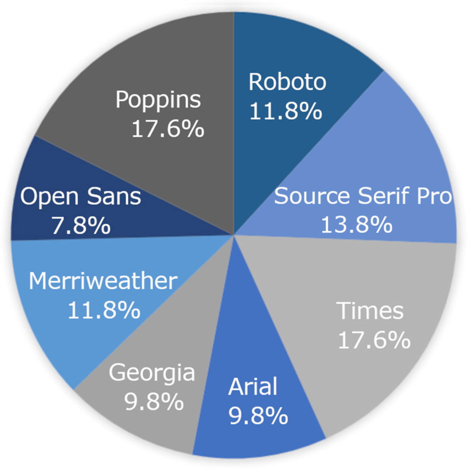
Chi-square goodness of fit tests were run to evaluate whether a specific font was more likely to be the students’ font fits and clash. Although Roboto was the fastest font on the group level and was the fastest font at the individual child level (Figure 2), there was no one font that was associated with being students’ best fitting font (p = 0.226) or students’ font clash (p = 0.809) (Figure 3).
Finally, a multivariable regression model was run to examine whether specific factors predicted larger or smaller gains (difference) between students’ best fitting font and their font clash. The WPM difference between students’ fastest and slowest WPMs was entered as the dependent variable. Grade level, RIT Scores on the MAP Growth Reading assessment, average WPM across the entire ARF-C, and overall comprehension were added as independent variables. Only students’ average WPM predicted WPM gains between students’ highest and lowest WPMs on the font test, such that students with higher average WPMs had a greater difference between their fastest and slowest WPMs (Table 5).

Spacing

As described in the Method section, the first eight passages of the ARF-C were designed to determine students’ best fitting font. The last three passages of the test were displayed in students’ best fitting font, with each of the three passages being displayed with the three different spacing variations (narrow, normal, wide). The sample was reduced to 36 participants for all spacing analyses due to some errors within our logs with spacing WPMs for some kids, as well as five children who did not complete all of the spacing passages. To determine how spacing variations influenced reading speed on a group-level, we ran a linear mixed model with reading speed (WPM) as the dependent variable. Students were entered as a random intercept to account for repeated measures. Spacing variation (narrow, normal, and wide), font, and passage were entered as independent factors. Results indicated there was no universally optimal spacing setting that the was most beneficial for students’ reading speed at the group-level, nor were there significant effects of font or passage on students’ mean WPM on the spacing passages.
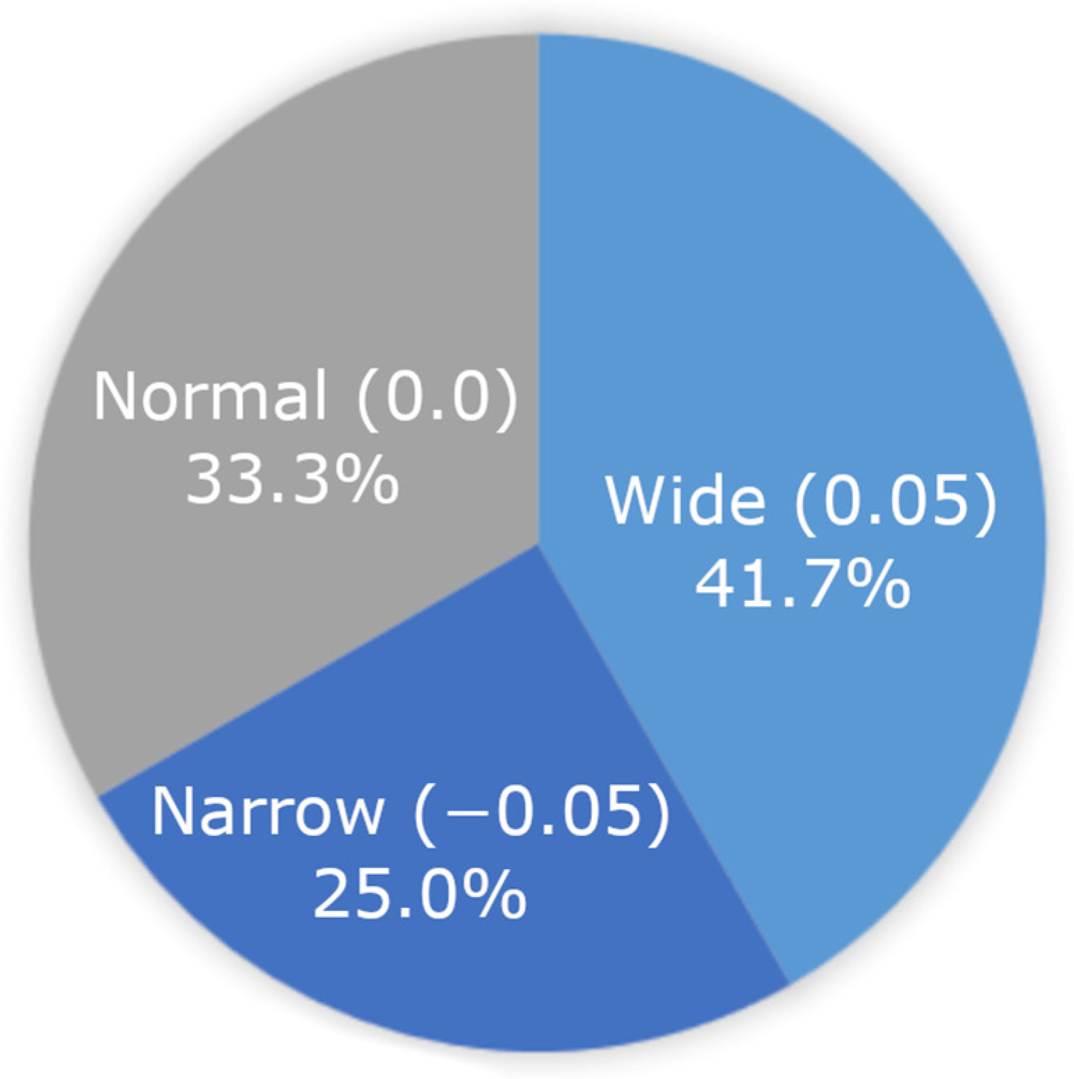
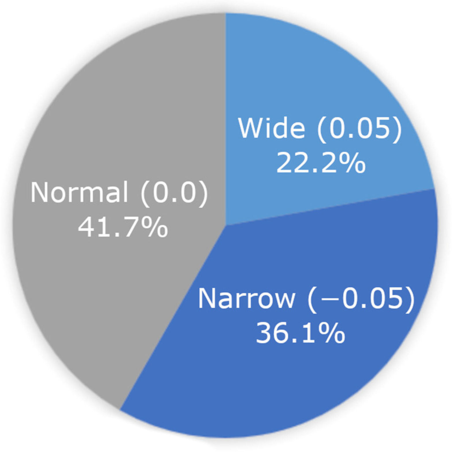
While there was not an optimal spacing variation at the group-level, we then looked at whether students benefitted from different spacing variations on the individual level. Reading speed WPM between students’ spacing fit and clash variation was significantly different, as revealed by a paired samples t-test (t(38) = 7.017, p ≤ 0.001). The mean WPM difference between students’ highest and lowest spacing variations was 82 words per minute. Chi-square goodness of fit tests were run for students’ spacing fits and clashes. No spacing variation was found to be more likely to be associated with being students’ spacing fit (p = 0.472) or spacing clash (p = 0.338) variation for reading speed. Variations in spacing fits and clashes can be seen in Figure 4 and Figure 5.
A multivariable regression model was run to evaluate predictors of reading speed (WPM) differences between students’ spacing fits and clashes. A WPM spacing difference variable was created to capture the difference between students’ best spacing WPM and worst spacing WPM. This variable was entered as the dependent variable with the following independent predictors: RIT Score from the MAP Growth Reading assessment, mean WPM across the entire ARF-C test, grade level, and overall comprehension percentage scores. None of these factors were found to predict greater gains in WPM between students’ spacing fits and clashes.
The mean WPMs across the font items of the ARF-C was 181 words per minute and 202 words per minute on the spacing items. A paired samples t-test was performed to compare mean WPMs between the font and spacing passages. There was a significant difference in mean WPMs between the font passages (M = 172.523, SD = 62.562) and the spacing passages (M = 201.867, SD = 77.366), such that mean WPMs for the spacing passages were greater for the last three passages on the VRL (t(35) = 3.187, p = 0.003). This finding aligns with the effect that was found for students’ fastest passages falling in the second half of the assessment.
Finally, we also tested whether higher levels of familiarity with the topic of each passage were associated with higher reading speeds and reading comprehension. A total score was calculated for familiarity and was entered into two linear regression models. The first model predicted whether higher levels of familiarity were associated with a higher average reading speed. A second model was run to test whether more familiarity was associated with higher comprehension performance. Neither model was significant, thus higher levels of familiarity with the passages did not predict faster reading speeds (R2 = 0.003, F(1,49) = 0.107, p =0.745) or comprehension performance on the ARF-C (R2 = 0.009, F(1,49) = 0.358, p = 0.553).

3.2. Research Question 2: Is There a Speed–Comprehension Tradeoff for Students’ Best Fitting Font and Spacing Variations? In Other Words, Is Comprehension Performance Significantly Lower for Passages in Which a Student Has the Highest WPM?

While best fitting font (font fit) is determined by speed (WPM) in the current version of the ARF-C, we also wanted to consider the role of comprehension. First, we wanted to assess predictors of overall reading comprehension on the ARF-C test as a whole (both font and spacing items). The students’ overall comprehension percentage score was added as a dependent variable in a multivariable regression model. Grade level, MAP Growth Reading RIT scores of students’ baseline reading skills, and average reading speed were entered as independent factors. While grade and average WPM were not significant, students’ RIT reading scores significantly predicted overall comprehension. Higher RIT scores on the MAP Growth Reading assessment were associated with higher comprehension performance on the ARF-C (Table 6).
Since speed (WPM) was a determining factor of a students’ “best-fitting” font, it was of interest to look for evidence of a speed–comprehension trade-off on the passage in which students had the greatest WPMs. A linear regression model was run with students’ comprehension scores on the fastest passage (percentages of performance across three multiple-choice questions for the passage in which they had the highest WPM) and WPM on the fastest WPM passage. Comprehension scores did not influence fastest WPMs, indicating that there was no speed–comprehension trade-off on students’ fastest passage (R2 = −0.019, F(1, 49) = 0.063, p = 0.803). For spacing passages, on the individual-level, a paired samples t-test demonstrated no significant difference between students’ comprehension on their spacing fits and clashes (p > 0.359).

4. Discussion

In the present study, we examined how eight commonly used fonts and three spacing formats influenced reading speed and comprehension both at the group level and the individual level for students in 3rd–5th grade. On the group level, the mean reading speed (WPM) was significantly higher for students when passages were presented in Roboto and Arial fonts. While we did also observe a passage effect, the effect of these fonts predicted faster reading speed above the effect of the passages. While one of the passages was at a higher Lexile level (Passage 5), the other passage (Passage 7) was in the middle of the 3rd–5th grade range. For individual students, no one font (serif or sans serif) was significantly more likely to be a student’s font fit. These findings indicate that, although some fonts (or features of these fonts such as the weight or width of the font) may be more beneficial for supporting reading speed on a group level, these fonts will not necessarily be best for every student on an individual level and point towards a need for the individuation of formatting. The effect of font on reading speed found in the current study replicates results observed in format readability studies that utilized the adult version of the readability assessment, the ARF-A, with adult populations [8,10].
Although we did not observe an effect of spacing on reading speed at the group level, when looking at individual differences, we found students had significant gains in reading speed for spacing. Further, there was not one spacing format that was more likely to be individual students’ spacing fit. Presently spacing is provided at the same value to all students in a classroom, but these data suggests that the majority of students might benefit from more, or less, spacing. Similar to findings from the Sheppard et al. [7] study, on the individual level, students had significant gains in reading speed when reading a passage displayed in their best fitting spacing setting. However, we interpret the spacing results in the current study with caution. In relation to speed, we observed a significant pattern for students who had the highest WPMs as they moved into the second half of the test. We note that this effect was observed just considering the font items of the test (the first eight passages) and it was not until the end of the test (the last three passages) when students completed the spacing portion of the test. Overall, students’ mean WPMs were significantly higher on the last three passages (spacing passages) of the VRL compared to the first eight passages (font passages), which indicates that students read more quickly as they approached the end of the assessment. Some averages were also above silent reading fluency norms [42]. Taken together, this pattern of reading speed across the current version of the ARF-C reflects the need for future research to consider testing spacing either earlier in the test or to run a study solely focused on spacing only to obtain more accurate data on how spacing influences reading speed and comprehension. Speed may have been impacted by multiple factors, including waning attention, engagement, interest in the topics of the passages, etc. Future work might aim to find better ways to measure engagement and attention within the test. These findings may suggest an important consideration for measuring reading speed in tasks where reading speed particularly matters. For example, performance on computerized standardized and formative assessments of oral and silent reading fluency may be impacted simply by changing the font and/or spacing of the text.
Considering other factors of performance, such as reading comprehension, in determining students’ font and spacing fits and clashes may also be useful, as comprehension is pivotal for learning. For comprehension, we did not find evidence of a speed–comprehension tradeoff in the present study. In a large sample of adults, some evidence may suggest that font can moderate the relation between speed and comprehension, thereby reducing the speed–accuracy tradeoff [10]. However, both the direct and indirect effect format may have on reading comprehension is critical. Comprehension was also not considered in determining individual students’ format fits and clashes. Sheppard et al. [7], for example, determined students’ best fitting formats by first ranking reading comprehension performance and then speed, and they found a significant impact of wider spacing on students’ reading comprehension. However, other studies have found that the effect of format only impacted reading speed and had no effect on comprehension [27]. These mixed results indicate that specific format settings, such as font, font size [25,26], or spacing, may have differential effects on reading skills. It is also possible that it is not just one feature alone that is most optimal for a student, but rather that it is a particular combination of format adjustments that are more beneficial. Understanding how format influences reading at the group level is useful for making decisions like how to best format a test or webpage for students, However, these results also demonstrate the need to consider moving away from a one-size-fits all approach to provide students with the ability to reformat text on a page to personalize their digital learning environment.
Importantly, considerations for the potential effect of content readability in addition to format readability cannot be underscored. As described in our Format Readability Conceptual Framework Model, text-level features, such as the grade level or topic of a text, can impact both reading speed and comprehension [43,44,45]. In order to most accurately determine the influence of format readability, controlling for potential passage effects is important. In the current study, we did find an effect on speed with two passages, but we also found that the font effect persisted; however, this may not always be the case. When possible, using content and questions sourced from validated tests or passage sets may help reduce these effects. As our framework model also considers language comprehension, background knowledge can also affect reading comprehension [53]. Since we used narrative passages in this study, familiarity was used as an indicator of background knowledge. Higher levels of familiarity did not predict faster reading speed or comprehension in the ARF-C.
Finally, teachers were asked to provide feedback on the ARF-C. Only three teachers returned the survey; however, all reported that they felt the passages were appropriately leveled for their students, but also commented that they felt more interesting topics could have been chosen. One teacher suggested that shorter and/or fewer passages be used for elementary grade levels. This feedback is well aligned with the results of the study, particularly in the pattern that students sped up their reading at the end of the test as perhaps they began to lose interest or attention.

4.1. Limitations

Designing a reliable and valid diagnostic assessment to match students to their best format is a long-term goal of this work. Much more research will be needed to test the best methods for the design of such a task, especially one that can be taken in a timely manner in the classroom. We were constrained in this way in terms of the number of passages we could ask students to realistically read and to answer comprehension questions. With only one passage per format manipulation, and given that passage effects were observed, testing each format multiple times per test may be useful as it can allow for one to rule out the effects of passage, such as the Lexile level or topic, more reliably.
One other limitation of this study was the smaller sample size and the lack of diversity in the schools that agreed to participate. Larger and more diverse sample sizes are needed to understand how format readability can optimize reading performance for students. Further, it may be of interest to examine how format readability influences reading performance across different age ranges. In a study with students in kindergarten up to eighth grade, Sheppard et al. [7] found that younger children benefited more from increased letter-spacing compared to older students.

4.2. Implications for Future Research

As the goal of this study was to replicate format readability work conducted with adult readers [8,9], we tested eight common fonts. However, each font has inherent features, such as the weight or width of the lettering. It was not possible to disentangle such features in this initial study. Future work might consider the use of variable typography. Variable fonts, such as the freely available Roboto Flex, allow the form of letters to be mathematically parameterized along different axes, allowing for a wide range of appearances from a single font file.
Results in the current study indicated that the testing methods previously used in results could potentially work for younger populations; however, future readability research, particularly with younger students, should consider having students read aloud as opposed to silent reading, as we did observe some students with higher than average reading speeds. Oral reading would provide more accurate data on reading speed (words read per minute) and, importantly, the accuracy of words read and prosody. Although the correlation between silent and oral reading is more studied in adults compared to children, there is evidence that silent and oral reading in children is also highly correlated [54]. Van den Boer and colleagues showed that the underlying mechanism of silent reading is largely similar to oral reading, though silent reading rates may be faster compared to oral reading.
Importantly, more longitudinal work is needed to understand the stability of format recommendations over time. Further, given the limited sample and initial study design, we were not able to test our theoretical framework model. Future work should aim to examine whether format readability moderates the relation between word recognition (decoding, fluency, accuracy, and prosody) and reading comprehension. Eye-tracking may also provide useful insights into how format influences reading behaviors.
Passages utilized in this study were sourced from open-source narrative texts. Although there was no grade or age effect, and the passages fell within the third–fifth grade Lexile range, overall comprehension was 65%, which indicated that, overall, passages and comprehension questions may have been particularly challenging for some students in the sample. We aimed to use narrative passages over informational texts in this experiment to reduce the complexity of information students needed to retain (such as dates) since, unlike many standardized assessments of reading comprehension skills, in the current version of the ARF-C, the questions did not appear on the same page as the text, nor were students able to navigate back and forth between the questions and the passage. Like with the development of a new measure, future work should also include full item analysis to ensure the passages and comprehension questions are at an appropriate difficulty level to reduce potential passage effects.
It will also be useful to consider the contribution of other factors aside from reading speed and comprehension alone. Factors such as engagement, motivation, and comfort may also be impacted by personalized format readability. While familiarity did not predict higher reading speed and comprehension in this study, it would be important to control for if students are reading potentially familiar narrative texts or expository texts on various topics, such as science or social studies, in which background knowledge might impact performance. Although format readability research with adults found that font preference was not associated with higher reading speed [8], different findings may exist for children, and these factors may be more likely to influence reading comprehension, which was not used to identify best “fit” in the current study. Collecting additional data on use of computers or other electronic devices may also be useful, as results could vary for students with varying levels of digital literacy and computer-use. Finally, it may also be of interest to examine the impact of format readability on math performance considering performance on word problems, readability of data presented in charts and graphs, etc. [55].

5. Conclusions

This study provides a new and important foundation of understanding as to how format readability impacts reading performance in young readers in grades 3–5. Findings suggested that reading speed was significantly impacted both at the group level and at the level of the individual child while maintaining reading comprehension. Importantly, no one format was more likely to be the best or worst fit for an individual child for both font and spacing, pointing toward a potential need for format individuation and moving away from a one-size-fits all approach. These findings in children replicated findings previously seen in adults, in that changes in font significantly impacted reading speed with no loss to comprehension. However, much more research will be needed to better understand the underpinnings of the specific aspects of font, spacing, and other typographical features that may have the greatest impact. In sum, this work suggests that simple changes to the format of digital text, such as the font and spacing, may enhance reading speed. Individuation of format readability is simple to implement in the digital medium, making it an inexpensive intervention as compared to individuation of content readability. This research presents important implications for building more supportive educational technology platforms for students to improve reading outcomes.

Supplementary Materials

The following supporting information can be downloaded at: https://www.mdpi.com/article/10.3390/educsci14080854/s1, File S1: Sample Passages and Questions.

Author Contributions

Conceptualization, S.L.D. and B.D.S.; Methodology, S.L.D., N.A. and B.D.S.; Software, B.D.S.; Validation, S.L.D. and B.D.S.; Formal Analysis, S.L.D.; Investigation, S.L.D. and A.E.G.; Resources, S.L.D. and B.D.S.; Data Curation, S.L.D., A.E.G. and N.A.; Writing—Original Draft Preparation, S.L.D., N.A., A.E.G. and B.D.S.; Writing—Review & Editing, S.L.D., N.A. and A.E.G.; Visualization, S.L.D., N.A. and A.E.G.; Supervision, S.L.D. and B.D.S.; Project Administration, S.L.D. and B.D.S.; Funding Acquisition, S.L.D. and B.D.S. All authors have read and agreed to the published version of the manuscript.

Funding

This research was supported by The Readability Consortium and from gift funds provided by Adobe, Inc.

Institutional Review Board Statement

This study was reviewed and approved by the Human Research Protections program (IRB) at the University of Central Florida (Study 3856 approved on 3 March 2022).

Informed Consent Statement

Informed parental consent and child assent was collected for all participants.

Data Availability Statement

The data presented in this study are available upon request from the corresponding author due to privacy and ethical protections which may require additional human subject approval for secondary analysis.

Conflicts of Interest

The authors declare no conflict of interest.

References

  1. NAEP Reading: National Achievement-Level Results. Available online: https://www.nationsreportcard.gov/reading/nation/achievement/?grade=8 (accessed on 3 November 2022).
  2. Goldstein, D. It’s ‘Alarming’: Children Are Severely Behind in Reading. The New York Times. 8 March 2022. Available online: https://www.nytimes.com/2022/03/08/us/pandemic-schools-reading-crisis.html (accessed on 4 November 2022).
  3. COVID:19 Scale of Education Loss ‘Nearly Insurmountable’, Warns UNICEF. Available online: https://www.unicef.org/eap/press-releases/covid19-scale-education-loss-nearly-insurmountable-warns-unicef (accessed on 4 November 2022).
  4. Lewis, K.; Kuhfeld, M.; Ruzek, E.; McEachin, A. Learning during COVID-19: Reading and Math Achievement in the 2020-21 School Year. Available online: https://www.nwea.org/uploads/2021/07/Learning-during-COVID-19-Reading-and-math-achievement-in-the-2020-2021-school-year.research-brief-1.pdf (accessed on 8 August 2022).
  5. Beier, S.; Berlow, S.; Boucaud, E.; Bylinskii, Z.; Cai, T.; Cohn, J.; Crowley, K.; Day, S.L.; Dingler, T.; Dobres, J.; et al. Readability Research: An Interdisciplinary Approach. Found. Trends Hum. Comput. Interact. 2022, 16, 85. [Google Scholar] [CrossRef]
  6. Day, S.L.; Giroux, A.E.; Wallace, S.; Treitman, R.; Crowley, K.; Jordan, M.; Sawyer, B.D. The Effect of Font Formats on Reading Speed and Comprehension in Grades 3–5 2022. In Proceedings of the Society for the Scientific Study of Reading (SSSR) Annual Conference, Newport Beach, CA, USA, 13–16 July 2022. [Google Scholar]
  7. Sheppard, S.M.; Nobles, S.L.; Palma, A.; Kajfez, S.; Jordan, M.; Crowley, K.; Beier, S. One Font Doesn’t Fit All: The Influence of Digital Text Personalization on Comprehension in Child and Adolescent Readers. Educ. Sci. 2023, 13, 864. [Google Scholar] [CrossRef]
  8. Wallace, S.; Treitman, R.; Kumawat, N.; Arpin, K.; Huang, J.; Sawyer, B.; Bylinskii, Z. Individual Differences in Font Preference & Effectiveness as Applied to Interlude Reading in the Digital Age. J. Vis. 2020, 20, 412. [Google Scholar] [CrossRef]
  9. Wallace, S.; Treitman, R.; Kumawat, N.; Arpin, K.; Huang, J.; Sawyer, B.; Bylinskii, Z. Towards Readability Individuation: The Right Changes to Text Format Make Large Impacts on Reading Speed. J. Vis. 2020, 20, 17. [Google Scholar]
  10. Wallace, S.; Dobres, J.; Sawyer, B.D. Considering the Speed and Comprehension Trade-Off in Reading Mediated by Typography. J. Vis. 2021, 21, 2249. [Google Scholar] [CrossRef]
  11. Bylinskii, Z.; Dobres, J.; Kerr, B.; Berlow, S.; Treitman, R.; Kumawat, N.; Sawyer, B.D. Towards Individuated Reading Experiences: Different Fonts Increase Reading Speed for Different Individuals; Association for Computing Machinery: New York, NY, USA, 2022. [Google Scholar]
  12. Cai, T.; Wallace, S.; Rezvanian, T.; Dobres, J.; Kerr, B.; Berlow, S.; Huang, J.; Sawyer, B.D.; Bylinskii, Z. Personalized Font Recommendations: Combining ML and Typographic Guidelines to Optimize Readability. In Proceedings of the Designing Interactive Systems Conference, Virtual, 13–17 June 2022; Association for Computing Machinery: New York, NY, USA, 2022; pp. 1–25. [Google Scholar] [CrossRef]
  13. Ball, R.V.; Miller, D.B.; Wallace, S.; Macias, K.C.; Ibrahim, M.; Gonzaga, E.R.; Karasik, O.; Rohlsen-Neal, D.R.; Barrientos, S.; Ross, E.A.; et al. Optimizing Electronic Health Records through Readability. Proc. Int. Symp. Hum. Factors Ergon. Health Care 2021, 10, 65–70. [Google Scholar] [CrossRef]
  14. Petrov, Y.; Meleshkevich, O. Asymmetries and Idiosyncractic Hot Spots in Crowding. Vis. Res. 2011, 51, 1117–1123. [Google Scholar] [CrossRef] [PubMed]
  15. Sawyer, B.D.; Wolfe, B.; Dobres, J.; Chahine, N.; Mehler, B.; Reimer, B. Glanceable, Legible Typography over Complex Backgrounds. Ergonomics 2020, 63, 864–883. [Google Scholar] [CrossRef] [PubMed]
  16. Whitney, D.; Levi, D. Visual Crowding: A Fundamental Limit on Conscious Perception and Object Recognition. Trends Cogn. Sci. 2011, 15, 160–168. [Google Scholar] [CrossRef]
  17. Yang, X.; Kuo, L.-J.; Ji, X.; McTigue, E. A Critical Examination of the Relationship among Research, Theory, and Practice: Technology and Reading Instruction. Comput. Educ. 2018, 125, 62–73. [Google Scholar] [CrossRef]
  18. Hughes, L.; Wilkins, A. Reading at a Distance: Implications for the Design of Text in Children’s Big Books. Br. J. Educ. Psychol. 2002, 72, 213–226. [Google Scholar] [CrossRef] [PubMed]
  19. Lonsdale, M.d.S.; Dyson, M.C.; Reynolds, L. Reading in Examination-Type Situations: The Effects of Text Layout on Performance. J. Res. Read. 2006, 29, 433–453. [Google Scholar] [CrossRef]
  20. Barreto, D.; Orey, M. Trends and Issues in Learning, Design, and Technology. In Educational Media and Technology Yearbook; Springer: Berlin/Heidelberg, Germany, 2013; Volume 37, pp. 3–7. [Google Scholar]
  21. Harper, B.; Milman, N.B. One-to-One Technology in K–12 Classrooms: A Review of the Literature From 2004 through 2014. J. Res. Technol. Educ. 2016, 48, 129–142. [Google Scholar] [CrossRef]
  22. Leneway, R. Transforming K-12 Classrooms with Digital Technology: A Look at What Works. In Information and Technology Literacy: Concepts, Methodologies, Tools, and Application; IGI Global: Hershey, PA, USA, 2017; Volume 3, pp. 1506–1530. [Google Scholar]
  23. Massey, D.D. Unbounded Reading: Why Online Learning for K-12 Students Should Be a Literacy Issue. In Blended Learning: Concepts, Methodologies, Tools, and Applications; IGI Global: Hershey, PA, USA, 2016; Volume 4, pp. 1989–2008. [Google Scholar]
  24. Rice, M.F.; Ortiz, K.R. Evaluating Digital Instructional Materials for K-12 Online and Blended Learning. TechTrends 2021, 65, 977–992. [Google Scholar] [CrossRef] [PubMed]
  25. Katzir, T.; Hershko, S.; Halamish, V. The Effect of Font Size on Reading Comprehension on Second and Fifth Grade Children: Bigger Is not always Better. PLoS ONE 2013, 8, e74061. [Google Scholar] [CrossRef] [PubMed]
  26. Wilkins, A.; Cleave, R.; Grayson, N.; Wilson, L. Typography for Children May Be Inappropriately Designed. J. Res. Read. 2009, 32, 402–412. [Google Scholar] [CrossRef]
  27. Medved, T.; Podlesek, A.; Možina, K. Influence of Letter Shape on Readers’ Emotional Experience, Reading Fluency, and Text Comprehension and Memorisation. Front. Psychol. 2023, 14, 1107839. [Google Scholar] [CrossRef] [PubMed]
  28. Barzillai, M.; Thomson, J.; Schroeder, S.; van den Broek, P. Learning to Read in a Digital World; John Benjamins Publishing Company: Amsterdam, The Netherlands, 2018. [Google Scholar]
  29. Perea, M.; Panadero, V.; Moret-Tatay, C.; Gómez, P. The Effects of Inter-Letter Spacing in Visual-Word Recognition: Evidence with Young Normal Readers and Developmental Dyslexics. Learn. Instr. 2012, 22, 420–430. [Google Scholar] [CrossRef]
  30. Duranovic, M.; Senka, S.; Babic-Gavric, B. Influence of Increased Letter Spacing and Font Type on the Reading Ability of Dyslexic Children. Ann. Dyslexia 2018, 68, 218–228. [Google Scholar] [CrossRef]
  31. Reuter, K. Assessing Aesthetic Relevance: Children’s Book Selection in a Digital Library. J. Am. Soc. Inf. Sci. Technol. 2007, 58, 1745–1763. [Google Scholar] [CrossRef]
  32. Joo, S.J.; White, A.L.; Strodtman, D.J.; Yeatman, J.D. Optimizing Text for an Individual’s Visual System: The Contribution of Visual Crowding to Reading Difficulties. Cortex 2018, 103, 291–301. [Google Scholar] [CrossRef] [PubMed]
  33. Galliussi, J.; Perondi, L.; Chia, G.; Gerbino, W.; Bernardis, P. Inter-Letter Spacing, Inter-Word Spacing, and Font with Dyslexia-Friendly Features: Testing Text Readability in People with and without Dyslexia. Ann. Dyslexia 2020, 70, 141–152. [Google Scholar] [CrossRef] [PubMed]
  34. Shechter, A.; Yashar, A. Mixture Model Investigation of the Inner–Outer Asymmetry in Visual Crowding Reveals a Heavier Weight towards the Visual Periphery. Sci. Rep. 2021, 11, 2116. [Google Scholar] [CrossRef] [PubMed]
  35. Franzen, L.; Stark, Z.; Johnson, A.P. Individuals with Dyslexia Use a Different Visual Sampling Strategy to Read Text. Sci. Rep. 2021, 11, 6449. [Google Scholar] [CrossRef]
  36. Yeatman, J.D.; White, A.L. Reading: The Confluence of Vision and Language. Annu. Rev. Vis. Sci. 2021, 7, 487–517. [Google Scholar] [CrossRef] [PubMed]
  37. Marinus, E.; Mostard, M.; Segers, E.; Schubert, T.M.; Madelaine, A.; Wheldall, K. A Special Font for People with Dyslexia: Does It Work and, If so, Why? Dyslexia 2016, 22, 233–244. [Google Scholar] [CrossRef] [PubMed]
  38. Gough, P.B.; Tunmer, W.E. Decoding, Reading, and Reading Disability. Remedial Spec. Educ. 1986, 7, 6–10. [Google Scholar] [CrossRef]
  39. Just, M.; Carpenter, P.A. A Theory of Reading: From Eye Fixations to Comprehension. Psychol. Rev. 1980, 87, 329. [Google Scholar] [CrossRef] [PubMed]
  40. Rayner, K.; Schotter, E.R.; Masson, M.E.J.; Potter, M.C.; Treiman, R. So Much to Read, So Little Time: How Do We Read, and Can Speed Reading Help? Psychol. Sci. Public Interest 2016, 17, 4–34. [Google Scholar] [CrossRef]
  41. Hayden, E.; Hiebert, E.H.; Trainin, G. Patterns of Silent Reading Rate and Comprehension as a Function of Developmental Status, Genre, and Text Position. Read. Psychol. 2019, 40, 731–767. [Google Scholar] [CrossRef]
  42. Spichtig, A.N.; Hiebert, E.H.; Vorstius, C.; Pascoe, J.P.; David Pearson, P.; Radach, R. The Decline of Comprehension-Based Silent Reading Efficiency in the United States: A Comparison of Current Data with Performance in 1960. Read. Res. Q. 2016, 51, 239–259. [Google Scholar] [CrossRef]
  43. Francis, D.J.; Kulesz, P.A.; Benoit, J.S. Extending the Simple View of Reading to Account for Variation Within Readers and Across Texts: The Complete View of Reading (CVRi). Remedial Spec. Educ. 2018, 39, 274–288. [Google Scholar] [CrossRef] [PubMed]
  44. Spencer, M.; Gilmour, A.F.; Miller, A.C.; Emerson, A.M.; Saha, N.M.; Cutting, L.E. Understanding the Influence of Text Complexity and Question Type on Reading Outcomes. Read. Writ. 2019, 32, 603–637. [Google Scholar] [CrossRef]
  45. Amendum, S.J.; Conradi, K.; Hiebert, E. Does Text Complexity Matter in the Elementary Grades? A Research Synthesis of Text Difficulty and Elementary Students’ Reading Fluency and Comprehension. Educ. Psychol. Rev. 2018, 30, 121–151. [Google Scholar] [CrossRef]
  46. Abadiano, H.R.; Turner, J. The RAND Report: Reading for Understanding: Toward an R&D Program in Reading Comprehension. N. Engl. Read. Assoc. J. 2003, 39, 74–79. [Google Scholar]
  47. Connor, C.M.; Day, S.L.; Phillips, B.; Sparapani, N.; Ingebrand, S.W.; McLean, L.; Barrus, A.; Kaschak, M.P. Reciprocal Effects of Self-Regulation, Semantic Knowledge, and Reading Comprehension in Early Elementary School. Child Dev. 2016, 87, 1813–1824. [Google Scholar] [CrossRef]
  48. Stenner, A.J. Measuring Reading Comprehension with the Lexile Framework. In Explanatory Models, Unit Standards, and Personalized Learning in Educational Measurement; Fisher, W.P., Massengill, P.J., Eds.; Springer: Singapore, 2022; pp. 63–88. [Google Scholar]
  49. Legge, G.E. Psychophysics of Reading in Normal and Low Vision; Lawrence Erlbaum: Mahwah, NJ, USA, 2007. [Google Scholar]
  50. Chung, S.T. The Effect of Letter Spacing on Reading Speed in Central and Peripheral Vision. Investig. Ophthalmol. Vis. Sci. 2002, 43, 1270–1276. [Google Scholar]
  51. TestPrep-Online. NWEA MAP Test Scores. TestPrep-Online. Available online: https://www.testprep-online.com/map-scores (accessed on 1 April 2024).
  52. IBM Corp. IBM SPSS Statistics for Windows, version 28.0. Released 2021. IBM Corp.: Armonk, NY, USA, 2021.
  53. Smith, R.; Snow, P.; Serry, T.; Hammond, L. The Role of Background Knowledge in Reading Comprehension: A Critical Review. Read. Psychol. 2021, 42, 214–240. [Google Scholar] [CrossRef]
  54. Van Den Boer, M.; Van Bergen, E.; De Jong, P.F. Underlying Skills of Oral and Silent Reading. J. Exp. Child Psychol. 2014, 128, 138–151. [Google Scholar] [CrossRef] [PubMed]
  55. Azzarello, C.B.; Miller, D.B.; Sawyer, B.D.; Lewis, J.E. Format Readability Enhancing in Basic Mathematical Operations. Proc. Hum. Factors Ergon. Soc. Annu. Meet. 2023, 67, 2248–2251. [Google Scholar] [CrossRef]
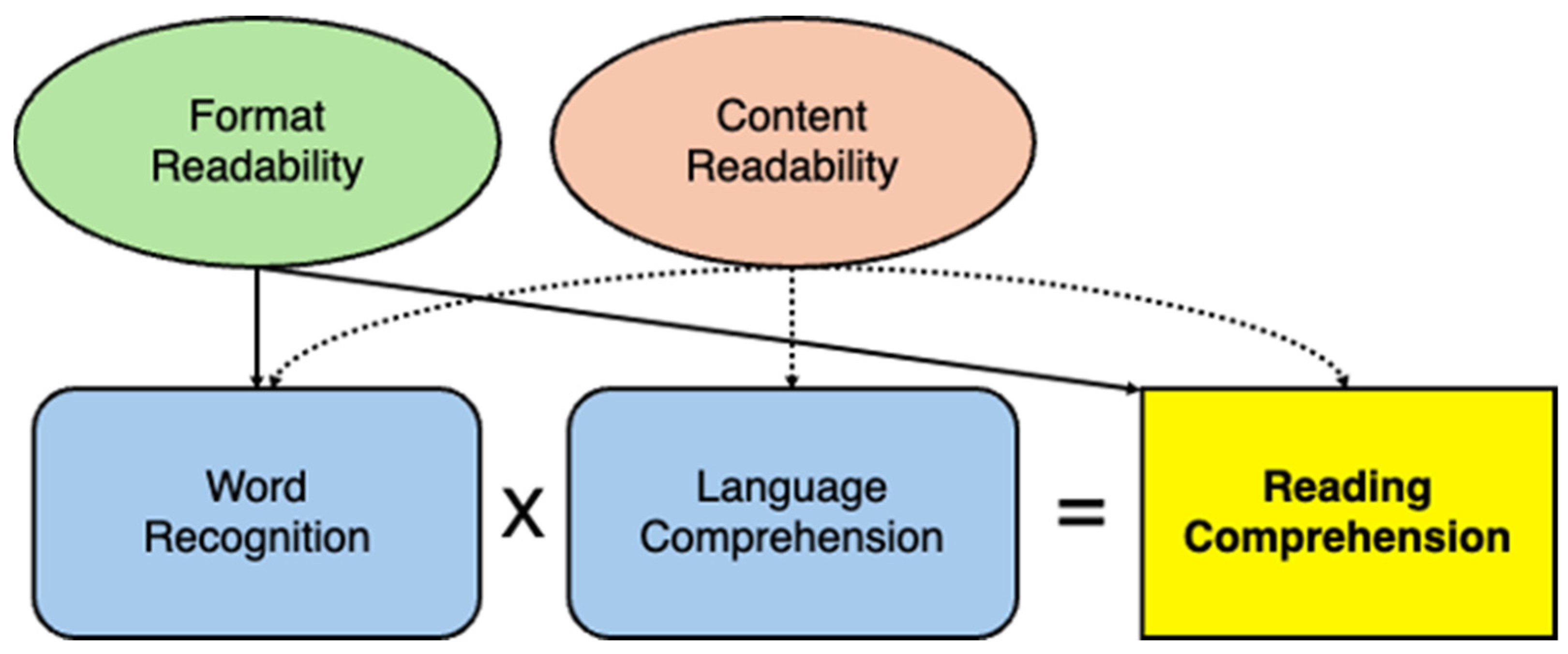
Figure 1. Theoretical framework model describing how format and content readability influence reading comprehension.
Education 14 00854 g001
Figure 2. Font fit (highest WPM) at the individual child level. No one font was found to be the best fitting font for individual students.
Education 14 00854 g002
Figure 3. Font clash (lowest WPM) at the individual child level. No one font was found to be a font clash for individual students.
Education 14 00854 g003
Figure 4. Spacing fit (fastest WPM) at the individual child level. No one spacing variation was most likely to be the best fit for students.
Education 14 00854 g004
Figure 5. Spacing clash (slowest WPM) at the individual child level. No one spacing variation was more likely to be a worst fit (clash) for students.
Education 14 00854 g005
Table 1. Passage Lexile Range and Wordcount on the ARF-C.
Passage IDLexile RangeWord CountTitle
01010 L–1200 L297The Adventures of Kintaro, The Golden Boy
11010 L–1200 L299White Fang
2410 L–600 L294The Story of Doctor Dolittle
3610 L–800 L300The Secret Garden
4810 L–1000 L301Grimms’ Fairy Tales: 12 Princesses
51010 L–1200 L300The Farmer and the Badger
6810 L–1000 L303The Tale of Cuffy Bear
7610 L–800 L301Raggedy Ann
8610 L–800 L299Peter Pan
10810 L–1000 L299The Secret Garden
11810 L–1000 L301Peter Pan
Table 2. Descriptive Data.
Min.Max. MSD
Fastest Font Words Per Minute81.75497.75243.19102.76
Font Clash Words Per Minute51.50268.25142.1851.60
Comprehension % Font Fit0.001.000.610.32
Comprehension % Font Clash 0.001.000.650.28
ARF-C Comprehension Total %0.270.930.650.14
WPM Difference between Fastest and Slowest Font23.75345.00101.0075.82
Fastest Spacing WPM106.75490.25243.7999.50
Slowest Spacing WPM56.00352.50161.6366.22
Full ARF-C WPM 18.50311.80170.1278.81
Font Passages Only WPM68.16340.64181.1663.16
Spacing Passages Only WPM89.08401.58201.8677.36
Table 3. Mean Words Per Minute (WPM) for Font, Spacing, and Passage.
Font/SpacingMean WPMSDPassageMean WPMSD
Georgia176.17166.4720178.29378.018
Poppins178.73578.7711185.53888.887
Times182.48580.2862155.76558.569
Arial185.12767.0043184.14176.322
Merriweather173.19668.2824170.68166.433
Roboto194.65086.2045198.82473.662
Open Sans182.29984.6516174.48561.096
Source Serif Pro172.25963.2497207.36184.957
Narrow Spacing204.22988.1868180.93167.681
Normal Spacing197.90395.08410181.63176.932
Wide Spacing203.46582.92411169.58378.737
Table 4. Linear Mixed Effects Model for the Effect of Font on Reading Speed (WPM).
ParameterEstimateStd. Errordftp-Value
Intercept99.53015.411184.2026.458<0.001
Georgia2.4896.048329.8240.4120.682
Poppins7.0547.545329.9020.9350.353
Times New Roman12.1088.067331.9261.5010.137
Arial16.7927.445329.7522.2550.027
Merriweather1.3507.478329.6210.1800.857
Roboto23.28110.486329.6302.2200.030
Open Sans7.6268.337329.6560.9150.363
Source Serif Pro−2.3638.623329.818−0.2740.784
Passage 05.0029.204332.1190.5440.587
Passage 11.0628.864332.9500.1200.905
Passage 21.0459.258332.2300.1130.910
Passage 316.0108.614331.6071.8590.064
Passage 410.1458.921333.9281.1370.256
Passage 529.2589.214332.6183.1750.002
Passage 6−0.0869.159332.368−0.0090.993
Passage 741.3958.718332.4904.748<0.001
Passage 812.3208.783332.4791.4030.162
Passage 1013.8438.416331.6561.6450.101
Passage 11−7.4149.043332.221−0.7380.461
Average WPM Across ARF-C0.3200.059124.9155.438<0.001
Table 5. Multivariable Regression Model of Predictors on Students’ WPM Gains on the ARF-C Font Test.
EstimateStd. Errortp-Value
(Constant)98.49211.6058.487<0.001
Grade Level−13.80415.675−0.8810.386
MAP Growth RIT Score−0.2791.201−0.2320.818
Average WPM ARF-C0.5230.1194.408<0.001
ARF-C Total Comprehension %−59.43597.372−0.610.546
Note. R2 = 0.468.
Table 6. Multivariable Regression Model of Predictors on Total Comprehension % on the ARF-C.
EstimateSEtp-Value
(Constant)0.6480.02229.79<0.001
MAP Growth RIT Score0.0070.0023.98<0.001
Mean ARF-C WPM001.3210.196
Grade−0.0430.028−1.5010.144
Disclaimer/Publisher’s Note: The statements, opinions and data contained in all publications are solely those of the individual author(s) and contributor(s) and not of MDPI and/or the editor(s). MDPI and/or the editor(s) disclaim responsibility for any injury to people or property resulting from any ideas, methods, instructions or products referred to in the content.