1. Introduction
Extreme weather events are expected to further increase in frequency and intensity as a result of global warming [
1]. Flooding, in particular, is recognised as one of the most common and destructive natural disasters, resulting in health and security impacts and causing more than USD 40 billion annually in damage worldwide [
2,
3]. The effort to rapidly and accurately detect floods is crucial to reduce impacts on humans, the environment, and infrastructure. Real-time monitoring with tide and river gauges is extensively used to detect fluvial flooding caused by consistent rain or snow melt, and coastal floods caused by storm surges related to, e.g., tropical cyclones or typhoons. However, extreme weather events, including heavy precipitation and storms, as well as rising sea levels aggravate the early detection of pluvial and fluvial floods. Thus, there is an urgent need for novel methods and techniques to support the early detection of flood events and local impacts, as well as to increase awareness of the situational conditions during such events.
As a response to this need and due to the nature of such extreme events where the collection and communication of relevant first-hand information is a key challenge [
4], researchers have been exploring the potential of volunteered geographic information (VGI) and citizen science [
5,
6]. By means of social media platforms, such as Twitter, citizens are contributing, often in real-time, with observations and information on local impacts and can, thus, provide volunteered up-to-date information to support the early detection and response during extreme events. Such information is often both temporally and geographically referenced, making it extremely relevant for gaining localised input and understanding the situation in affected areas during extreme weather events. In fact, social media has become an increasingly important source of information for disaster event detection and monitoring [
7,
8].
Researchers have been exploring the use of natural language processing (NLP) and machine learning to automatically detect disaster events from social media [
9,
10,
11]. Most proposed approaches, however, focus mainly on the algorithmic detection of the events and not on the visualization and exploration of the identified events and their surrounding data. With the work presented in this paper, we address this gap by combining machine learning algorithms for text classification with interactive visualization techniques and aim to contribute to the improvement and assessment of weather warnings. We contribute a visual analytics (VA) pipeline for the identification and flexible exploration of extreme weather events, in particular floods, from Twitter data. We tested and assessed the performance of four classification algorithms (two classic and two neural network-based) for detecting flood-relevant tweets, and we introduce a VA interface for the exploration of their spatial, temporal, and attribute characteristics. This VA pipeline could facilitate the exploration of contextual real-time data during extreme weather events, but also support the validation of issued warnings to improve the precision of weather warning systems. Enabling site-specific evaluations of events might further support the assessment and implementation of adaptation measures.
The remainder of this paper is structured as follows.
Section 2 outlines the scope and objective of this work.
Section 3 provides a short overview of related work.
Section 4 describes the characteristics of the data used in this study.
Section 5 outlines the VA pipeline proposed and details its composing parts: text classification (
Section 5.1), location extraction (
Section 5.2), and interactive visualization (
Section 5.3). In
Section 6, a use case is provided, exemplifying our proposed pipeline and visualization interface. A discussion of the proposed approach and its limitations is included in
Section 7; finally, conclusions and future work are outlined in
Section 8.
3. Related Work
This work is concerned with a visual analytics pipeline for the identification and exploration of extreme weather events from social media text entries. As such, we provide a short overview of relevant research work in closely related fields; text analytics for event identification from social media, interactive visualization, and visual analytics of social media events.
Over the past decade, a considerable body of work has focused on the potential of using VGI and social media for detection and monitoring of disaster and/or extreme weather events. Zook et al. [
14] were amongst the first to make use of VGI and crowdsourcing for disaster relief during the Haiti earthquake in 2010. They used crowdsourcing platforms to collect text-based geo-tagged reports from victims, organise rapid responses across agencies, and identify locations where relief actions were needed.
Several approaches have been proposed for detecting high-impact disaster events from Twitter data. Tweet4act, for example, seeks to detect and classify crisis-related messages into pre-incident, during-incident, and post-incident classes [
15]. The Twitter Earthquake Detector extracts a tweet-frequency time-series and uses a short-term-average over long-term-average (STA/LTA) algorithm for detecting earthquake events [
16]. Sakaki et al. proposed an event detection and classification system, Toretter, which was able to detect earthquakes and announce them faster than the Japan Meteorological Agency [
9]. The first system that focused on helping victims during flooding disasters based on their Twitter data was developed by Singh et al. [
10]. Barker et al. [
17] proposed a national-scale Twitter data mining pipeline for detecting flooding events and improving situational awareness across Great Britain. Their system uses location filtering to collect tweets from at-risk areas and employs a classification approach based on logistic regression to detect flooding events. Overall, the above-mentioned approaches have mainly used keyword or location filtering in combination with classical NLP and text mining approaches for identifying the events. Moreover, if they use any visualization for displaying the identified events, it is in the form of static map representations showing their location and/or density distribution. Following the example of these works, we also experimented with classical NLP approaches for detecting flooding events; however, we attempted to compensate for the representation shortcomings of previous work by applying more sophisticated interactive visualization techniques for the exploration of the identified events.
In more recent years, methods have appeared to make use of more sophisticated machine learning approaches. One of the most elaborate systems for automatic flood event detection from Twitter data is the Global Flood Monitor (GFM) developed by de Bruijn et al. [
18]. The GFM system detects flood events by continuously scraping and analysing tweets in 11 languages based on a set of pre-defined keywords and classifies them using a transfer learning-based algorithm. A simple visualization interface is available for displaying the identified events, historic and real-time, as area overlays on a map, and a time slider makes it possible to explore events over time. Clicking on a detected event area pops up a panel displaying all the relevant tweets. Feng and Sester [
11] used location filtering for collecting Twitter data for a geographic area of interest, in this case, Western Europe, and employed a deep learning solution for tweet classification followed by spatiotemporal clustering for flood event extraction. Similar to the GFM system, simple visual representations are used for exploring the detected flood events, such as maps with the identified events (clustered tweets) displayed using markers, and choropleth maps for displaying tweet frequency per region over a given time period.
These approaches pave the way for employing modern classification approaches, based on deep and transfer learning, for disaster event detection and improving the accuracy of detection results. However, these systems provided only limited functionality for visualizing, interactively exploring, and better understanding the detected events. The available functionality is almost exclusively limited to separate (often static) representations of the locations and density of the detected disaster events on a map. In our work, we draw inspiration from this research and apply neural network-based approaches for tweet classification. To address the existing visualization limitations, we further propose the integration of these approaches into a visual analytics system for improving the interaction, exploration, and understanding of the identified results.
Visual analytics (VA) is defined as the science of analytical reasoning facilitated by interactive visual interfaces [
12] and aims to tightly integrate the interpretation and decision-making skills of humans and the computational power of algorithms [
13]. So far, a number of visual analytics systems have been proposed that focus on the visualization and exploration of crisis events from social media data. SensePlace2 [
19] was amongst the first web-based geovisual analytics systems proposed for identifying and analysing Twitter data to support situational awareness during crises. The work focuses on a place–time–entity conceptual framework, which, based on a user-formulated keyword query, identifies relevant tweets, extracts their time and geographical references, and logs the frequencies of the identified tweets. An interactive visual interface is created for allowing a user to identify and explore events of interest in multiple coordinated views providing geographic, temporal, and thematic overview and detail. A similar visual analytics system, Twitinfo [
20], allows a user to define events by specifying keyword queries, extracts tweets matching this query, and creates event timelines, i.e., time series based on the frequency of these tweets over time. The tweets, event timelines, and additional related metadata are then displayed in a visual interface composed of multiple linked views allowing a user to interactively explore different aspects of the data. Along similar lines, Chae et al. [
21] proposed an interactive visual analytics approach for spatiotemporal microblog data analysis aimed at improving emergency management, disaster preparedness, and evacuation planning. In addition, their system implements a topic modelling approach for extracting and following topics from the microblog texts. Cerutti et al. [
22] proposed an approach for the identification of disaster-affected areas from Twitter data based on data mining and exploratory visualization. This approach also uses keyword-based filtering for extracting relevant tweets and analyses their spatiotemporal characteristics for identifying disaster events. In contrast to the previous mainly algorithmic approaches to event identification, all of these systems, while providing sophisticated methods for the flexible exploration of spatial, temporal, and contextual/attribute characteristics of social media data, use mostly simple keyword-based filtering for the identification of relevant data for exploration. In doing so, they rely entirely on the human user to both accurately define an appropriate query and to assess and discard irrelevant posts, which may be creating a false impression of the situation. In this paper, we combine and balance the algorithmic classification approaches reviewed previously and the visualization-driven approaches described.
This short review of the related work makes it apparent that most approaches that aim to identify crisis/disaster events from social media data either focus on the automatic classification and algorithmic extraction of events and lack in the exploration of results, or concentrate on user-driven identification of events through visual analyses with the risk of inaccurate detection and overloading the human user. Our work aims to bridge this gap by proposing a visual analytics pipeline, combining NLP and interactive visualization, for the identification and exploration of extreme weather events from social media text entries, in particular from Twitter data.
4. Data Acquisition and Characterisation
The approach proposed in this paper builds on the use of Twitter data for the identification and exploration of flooding events. Collecting and manually labelling data sets was out of the scope of our work, and we have, therefore, used publicly available Twitter data sets on the topic of crisis events and flooding.
Two data sets were used for this study, one obtained from the CrisisLex.org repository containing crisis-related social media data [
23], and one from Harvard Dataverse data repository (
https://dataverse.harvard.edu, accessed on 30 June 2022). The first data set, CrisisLexT6 (
https://crisislex.org/data-collections.html#CrisisLexT6, accessed on 30 June 2022), is composed of labelled tweets. A subset of it was used for training the different text classification models. The second data set, Flood Tweet IDs [
18], includes unlabelled tweets and was used for testing the proposed pipeline.
As the Twitter API’s terms of service does not allow making large amounts of raw Twitter data available online, the data sets were dehydrated, such that each tweet was only represented by its tweet ID. The tool Twarc (
https://scholarslab.github.io/learn-twarc/, accessed on 30 June 2022) was used to rehydrate the data sets with the current content on Twitter. As a result, two comprehensive data sets were obtained as JSON objects with root-level attributes as well as child objects, all described in the Twitter Developer Platform’s data dictionary (
https://developer.twitter.com/en/docs/twitter-api/v1/data-dictionary/object-model/tweet, accessed on 30 June 2022).
The attributes user_name and user_location were extracted from the user object whereas place_name, place_type, and place_bounding_box were extracted from the place object. Together with the attribute geo, these were used in the process of obtaining geographic locations of the tweets. As the attribute retweet_count was not always reflecting the exact count, it was redefined as the number of duplicated tweet texts when the initial retweet indicator RT was ignored. The retweeted variable was set to True if it was the first tweet posted in a series of duplicate tweets, and if something else, it was set to False. The attribute original_tweet_id was defined as the tweet ID of the first tweet in the series of duplicate tweets. Lastly, we added attributes for the hashtags present in the tweets as well as for the hyperlink to a tweet.
4.1. Labelled Data
The first data set we used, CrisisLexT6, is a collection of labelled English tweets across six large crisis events in 2012 and 2013. We selected all the flood events included in the data set collection: the January–February 2014 flood event in Queensland, Australia, and the June–July 2013 flood event in Alberta, Canada. The tweets in this data set were collected using both location filtering by being geotagged with geographic coordinates inside affected areas, and keyword filtering with the following keywords related to the flood events [
23].
Alberta floods: alberta flood, #abflood, alberta floods, #yycflood,
#yycfloods, #yycflooding, canada flood, alberta flooding, canada flooding
Queensland floods: #qldflood, #bigwet, queensland flood, australia flood
The tweets were labelled through crowdsourcing according to relatedness being either on-topic or off-topic. After the rehydration, the data set contained 12,770 tweets, of which 57% were labelled as relevant for the flood event in question.
4.2. Unlabelled Data
The unlabelled data from the Harvard Dataverse were collected by de Bruijn et al. [
18] to build the Global Flood Monitor. The data set contained the tweet IDs of 87,641,357 tweets in 11 languages posted between 29 July 2014 and 20 November 2018. These were collected only using keyword filtering based on a list of keywords related to floods in each of the languages. We rehydrated a subset of 251,018 English tweets from 2016 to 2018 to use for testing our approach and exemplifying it in the use case of this paper.
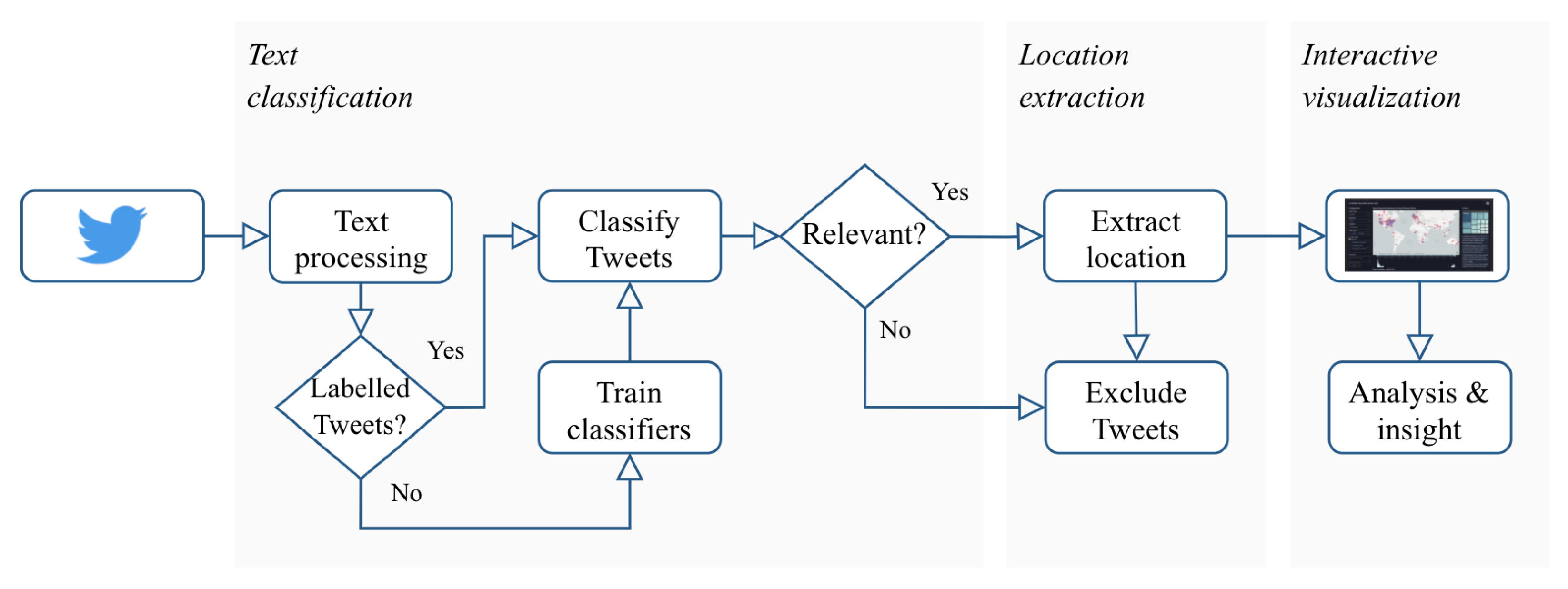
5. Visual Analytics Pipeline
In this work, we propose a visual analytics (VA) pipeline to enable the identification and visual exploration of extreme flood events from Twitter data. The pipeline includes three main steps (
Figure 1):
Text classification for identifying whether a tweet is related to a flooding event (
Section 5.1).
Location extraction for assigning geographic references to the flood-related tweets (
Section 5.2).
Interactive visualization for exploring the spatiotemporal characteristics of the georeferenced flood-related tweets and reasoning around the occurrence of flooding events (
Section 5.3).
The steps of the proposed VA pipeline are described in detail in the following sections.
5.1. Text Classification
The first step of the proposed VA pipeline is concerned with classifying a set of Twitter data as relevant to flooding or not. As mentioned in
Section 4 we used publicly available data sets in our work, but Twitter data could be collected via the Twitter API using a combination of keyword, location, and/or temporal filtering. Following the initial data collection, we experimented with four machine learning algorithms for this classification step, two classic supervised learning algorithms, one deep learning, and one transfer learning. We used a subset of the CrisisLexT6 data set of labelled tweets that focused on flooding, as described in
Section 4.1, for training the algorithms.
After excluding duplicates caused by retweets, the data set was balanced with 51.5% of the tweets belonging to the relevant class (i.e., flooding). The data set was partitioned such that 80% of it was used for training and 20% for testing. As described in
Section 4.1, the data collection process followed for creating this data set was based on the use of explicit keywords for a set of crisis events [
23]. This means that these keywords were, unavoidably, present in a large number of tweets presenting a risk of biasing the model to strongly associate flooding with these specific crisis events. To overcome such bias, in this work, three different model variants were created and utilised. The first variant,
original tweets, included no transformation of the tweet texts. In the two other variants, the tweet text was transformed to increase the classifiers’ ability to generalise to unseen tweets. A model variant,
remove keywords, was created where all occurrences of keywords specifically related to the particular flood events in Alberta and Queensland were removed from the text to avoid overfitting. A third variant of the model,
replace places, was created where all locations mentioned more than 0.5% of the size of the data set were replaced with the word ‘place’.
Prior to the classification, the tweet text was pre-processed using the Python library scikit-learn [
24] by performing tokenisation and lemmatisation as well as removing special characters, punctuation, numbers, URLs, @mentions, and stopwords. A new attribute was defined as a list of tokens for each tweet. These tokens were then converted to numerical values or vectors that could be used as input features to the classification models. Different encoding methods were used for the different classification algorithms, which are described in the following sections.
5.1.1. Classic Algorithms
Two classic supervised machine learning algorithms were employed as baseline models for the binary classification of the tweets as flood-relevant or not. The first one was the simple but effective algorithm logistic regression and the second one was the flexible ensemble learning method, random forest [
25].
Both classifiers were implemented using the Python library scikit-learn [
24]. The tweets were represented numerically using term frequency–inverse document frequency (TF-IDF) [
26] encoding. The method is intended to reflect how important a token is, based on both how frequent it is in the tweets and how rare it is overall in the collection of tweets. scikit-learn’s ‘TfidfVectorizer’ was used to convert each token to a feature index in the TF-IDF matrix, calculated as
where
N is the total number of tweets,
is the occurrences of token
i in tweet
j, and
is the number of tweets containing token
i.
The logistic regression classifier represents each token with weights and the linear combination of the input features is passed through the sigmoid function , which assigns a probability of each tweet being relevant. As the classification task is binary, a threshold of 0.5 then classifies the tweets as either relevant or non-relevant.
The random forest fits a number of decision tree classifiers, each trained with random sub-samples of the input features. The classification is made by averaging the predictions of the individual trees to increase the performance and avoid overfitting. The nodes in the trees are chosen to look for the optimum split of the features based on the Gini impurity criteria [
27]. We chose to train 100 decision trees; since the classifier primarily was tested to establish a performance baseline, the only parameter tuning performed was varying the maximum depth of the trees, where a depth of 11 was ultimately selected.
Two example branches from a decision tree in the
remove keyword model variant are seen in
Figure 2. To the left, the decision node is split into two leaf nodes based on whether the word ‘rescued’ is included in the tweet. If the TF-IDF score is above 0.191, which is only the case if the word is included in the tweet, then it is classified as relevant. To the right, the word ‘flooded’ instead determines the split. Hence, the examples show that the tree has learned that the words ‘rescued’ and ‘flooded’ are typical for flood-relevant tweets.
5.1.2. Deep Learning
The subfield of machine learning concerned with artificial neural networks has demonstrated good results when it comes to the accuracy of text classifiers [
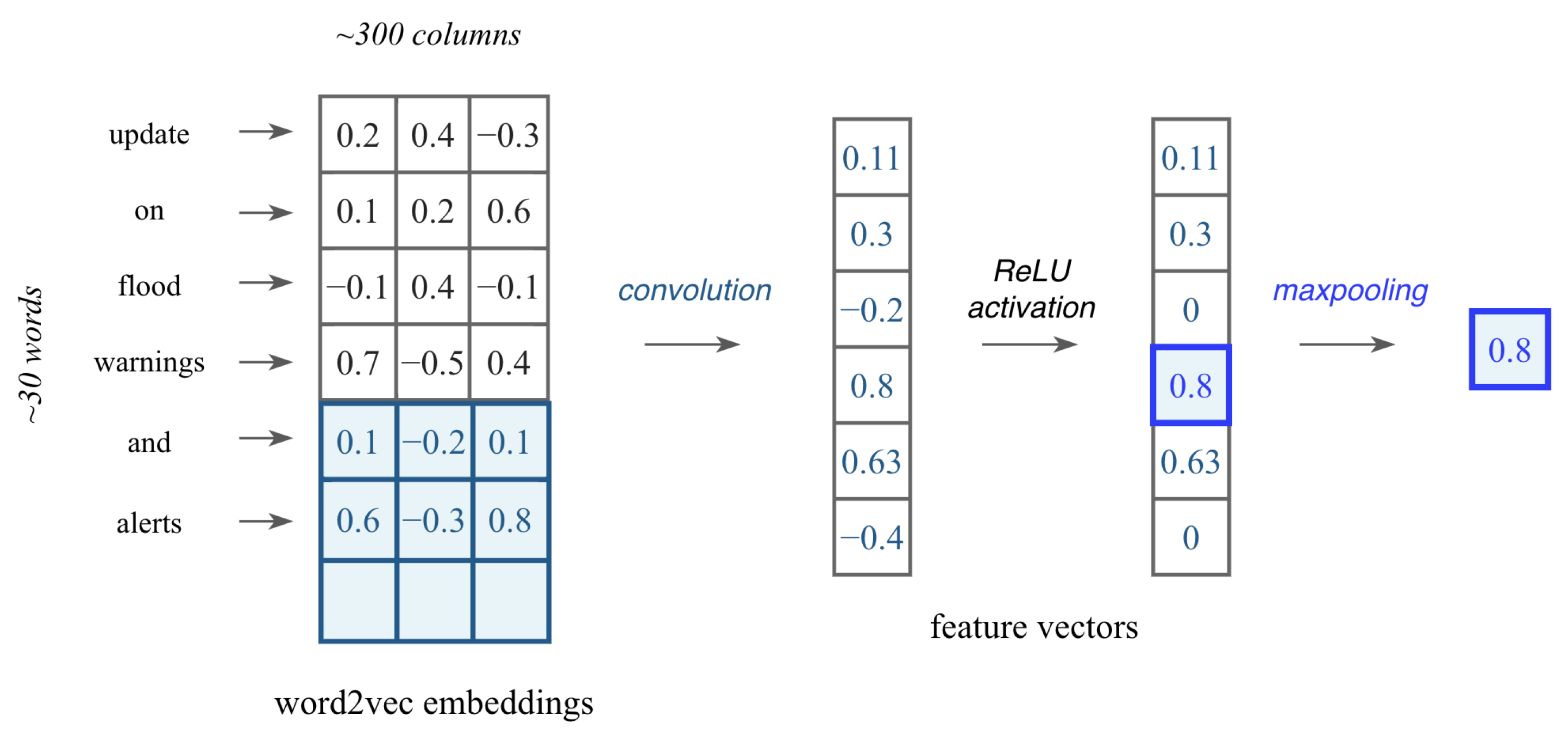
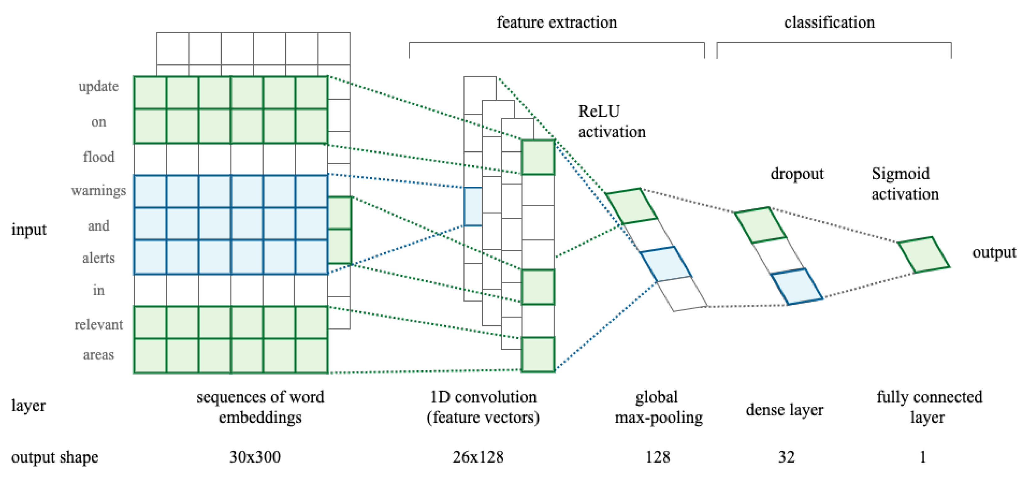
28]. In this work, we developed a Convolutional Neural Network (CNN), which is typically used for image tasks. However, we hypothesized that the appearance of certain phrases or n-grams within the tweet could indicate whether it was relevant. When applied to text classification, the CNN performs a window-based feature extraction where the convolutional kernel captures patterns in the word sequences, such as sentiments or grammatical functions. Building the CNN consisted of the following five main operations; (1) embedding, (2) convolution, (3) non-linearity using a ReLU function, (4) pooling, and (5) classification through fully connected layers.
An alternative to using TF-IDF encoding is to leverage word embeddings learned elsewhere which are pre-trained on large amounts of data [
29]. The Gensim library [
30] was utilised to obtain a Word2Vec [
31] model trained on 100 billion words from Google News representing the words with 300 features. The 1D convolutional kernel slides over embeddings for multiple words to obtain an output value that captures the semantics of that phrase. We considered five words or 5-grams at once. An example of how the convolution produces a feature vector is presented in
Figure 3. The ReLU activation function
then transforms each feature vector and the max pooling layer finds the most important features through the maximum value.
The output layer uses the sigmoid function to transform the inputs into probabilities and the tweet is then classified as relevant or not.
The Python library Keras (
https://keras.io/, accessed on 30 June 2022) was used to implement the CNN architecture as presented in
Figure 4. The Adam optimiser was used to train the network over 10 epochs using 64 as the batch size and binary cross-entropy as the loss function.
5.1.3. Transfer Learning
Transfer learning involves using a pre-trained model on a new problem in order to take advantage of the knowledge gained from a previous task. It recently improved the state-of-the-art for a variety of NLP tasks [
32] as whole models carefully designed by experts can be utilized. We applied the Universal Language Model Fine-tuning (ULMFiT) technique [
33] as it is effective for smaller data sets as in our case. The ULMFiT model was trained with modules from the fastai library (
https://docs.fast.ai/, accessed on 10 November 2022).
ULMFiT consists of three main steps (1) pre-training of a general language model, (2) fine-tuning the language model on a target task, and (3) fine-tuning the classifier on the target task. A language model is first constructed by training on the data set WikiText-103 [
34] to ensure long-term dependencies are learned. Then, the language model is adapted to the data used in our specific classification task using discriminative fine-tuning with slanted triangular learning rates. Lastly, the classifier is fine-tuned through gradual unfreezing [
33]. The Softmax activation function
ultimately outputs the probability of a tweet belonging to each of the two classes.
5.1.4. Evaluation of Classifiers
The classifiers were tested with a 20% subset of the labelled CrisisLexT6 data set. The performances of the text classifiers were evaluated through different measures based on the confusion matrix counting the true and false positives as well as true and false negatives. The measure of accuracy was used as it simply represents the number of correct predictions from all predictions. The precision was used to measure how many of the tweets classified as relevant were actually relevant, whereas recall and sensitivity were used to measure how many relevant tweets the classifier correctly predicted from all of the relevant tweets in the data. The F1 score represents the harmonic mean of both precision and recall [
35].
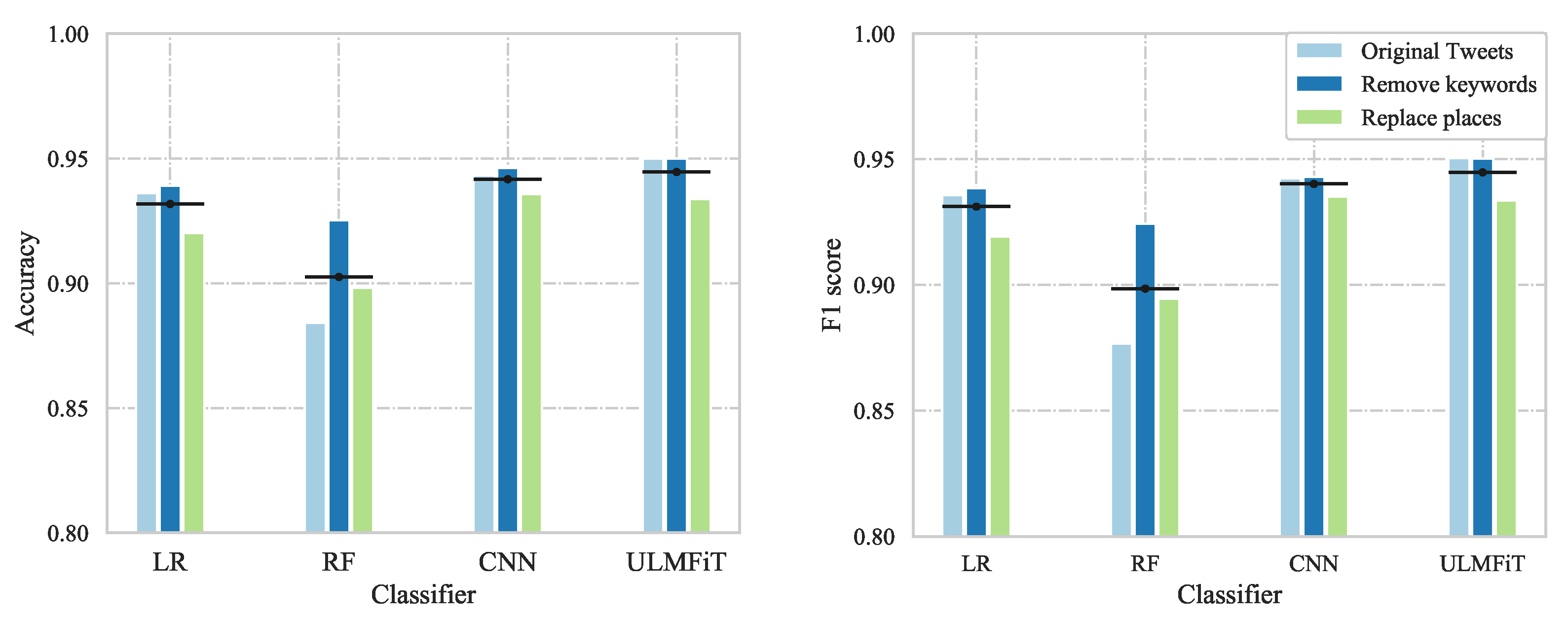
The accuracy and F1 score for the text classifiers using the three different model variants are visualised in
Figure 5.
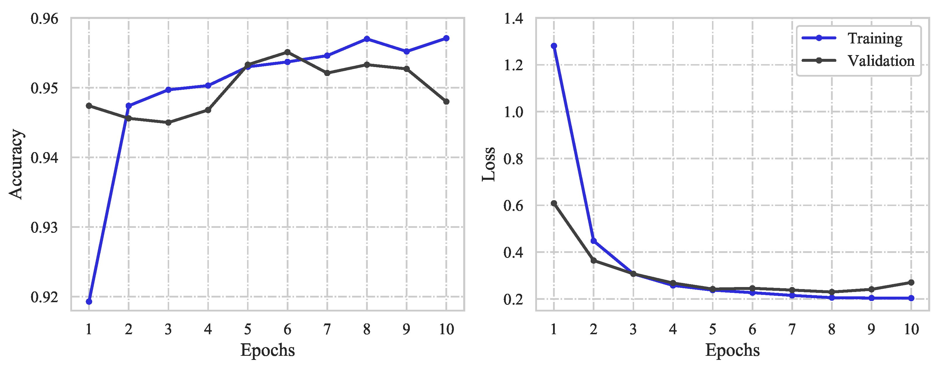
For both classic ML algorithms, the
remove keywords model variant performed the best with an accuracy of 93.9% using logistic regression and 92.5% using random forest. The same model variant excelled for the deep learning approach where the accuracy and loss obtained using the CNN with this model variant are presented in
Figure 6.
The loss functions on the right-hand side illustrate that the optimal performance was obtained after 4–5 epochs before the network started to overfit the training data. The accuracy after retraining the CNN over 5 epochs resulted in 94.6% for the variant with keywords removed. With the use of transfer learning through ULMFiT, both the variant with original tweets and with keywords removed obtained a promising accuracy of 95.0%.
An overview of all the performance measures for the different classifiers can be seen in
Table 1 for the
original tweets model variant and
Table 2 for the
remove keywords model variant.
The models trained using transfer learning through ULMFiT achieved the best results, closely followed by the CNN deep learning model, showing that the use of word embeddings to represent the textual input improved the model’s ability to differentiate between tweets that are relevant and non-relevant to flooding.
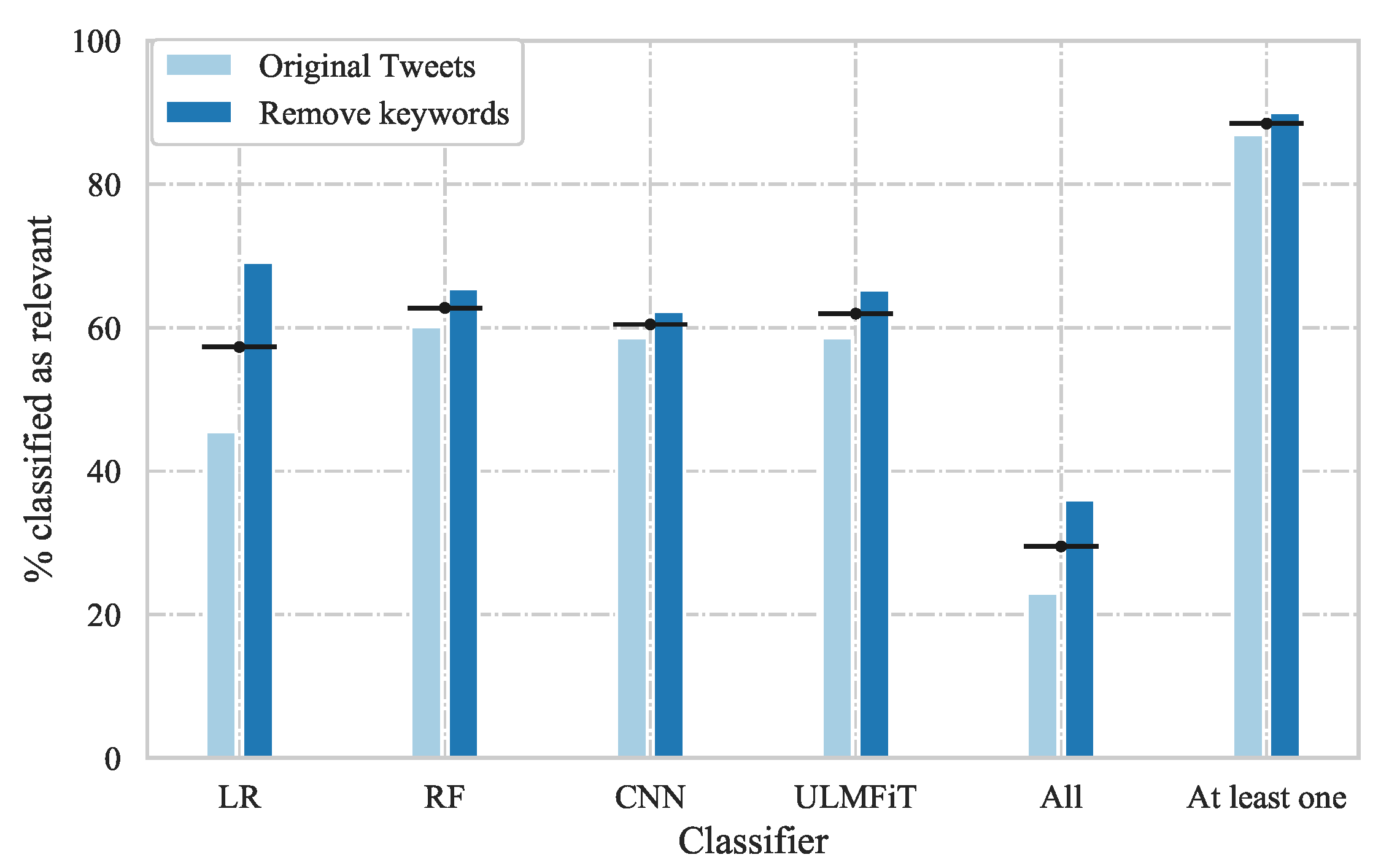
To evaluate our VA pipeline further, the text classifiers for the two best-performing model variants (
original tweets and
remove keywords) were also evaluated on the unlabelled data set. The number of tweets and the percentage of tweets classified as relevant by each classifier, by all classifiers, and by at least one classifier, are presented in
Table 3 for the years 2016–2018 and in total. The table is accompanied by
Figure 7, which shows the values in a bar chart for visual comparison.
From
Figure 7, it can be seen that around 90% of the tweets were classified as relevant by at least one of the classifiers, whereas only 20–40% were classified as relevant by all classifiers. This demonstrates that there are differences in the way individual tweets are classified and implies that the same tweets are not necessarily classified as relevant by the individual classifiers, which raises questions regarding the reliability of their predictions.
5.2. Location Extraction
As only a limited number of tweets are explicitly geotagged, we extract location information from the tweets to enable geospatial exploration and analysis of potential flood events. Locations were extracted from the tweets in four different ways, resulting in four location types: (1) geotagged coordinates, (2) geotagged place, (3) geoparsed from the tweet, and (4) registered user location.
Geotagged coordinates refer to tweets being already explicitly geotagged with the exact coordinates, i.e., the most reliable location. If the attribute geo was not available, the center coordinates of the area from the place_bounding_box were used instead and referred to as the geotagged place. The area could be a country, city, admin, neighborhood, or point of interest (poi) that the tweet was associated with, making the obtained location less precise.
For tweets without geotagged information, we used
geoparsing of the tweet texts through toponym recognition and then toponym resolution. All entities within the tweet with geographic references were found using the NLP python library spaCy (
https://spacy.io/, accessed on 30 June 2022) for the named entity recognition (NER). If more than one location was found, the spatial distance amongst these was calculated and only the two closest locations were kept for each tweet. The locations were considered too ambiguous if the shortest distance was longer than a certain threshold. Hence, no location could be related to the tweet. If the distance was shorter than the threshold, one location was randomly chosen. A threshold for the appropriate distances for two locations to describe the same event was set to 1500 km, corresponding to the approximate distance from east to west of Queensland. If a location could not be found through geoparsing, we utilised the registered origin of users in their profiles, i.e., the
registered user location. These locations were considered the least reliable location extraction approach as the registered locations were not necessarily real or related to the tweets.
Geographic coordinates for the geoparsed locations or user locations were obtained using the GeoPy (
https://geopy.readthedocs.io/, accessed on 30 June 2022) geolocator. To decrease the computation time, we created a look-up table with the coordinates of the unique locations appearing more than a certain number of times. The threshold was determined as the median of the distribution of the number of unique mentions of the location, with locations only mentioned once excluded. The look-up table was used to obtain coordinates for the geoparsed locations and user locations related to the individual tweets. Lastly, some tweets could not be related to a location at all and could not be visualised in the interactive interface.
To evaluate this part of the VA pipeline, the location extraction algorithm was applied to unlabelled tweets that were classified as relevant to flood events by at least one of the classifiers. Hence, locations were found for 59.17% of the tweets.
Table 4 shows the number of tweets found relevant by at least one classifier together with their distribution between the four location types, over the years 2016–2018 and in total.
As expected, only about 5% of the tweets were located based on the explicit geotag. Despite the different levels of trust put in the location types, it is shown that by using geoparsing, fewer flood-relevant tweets will be discarded.
5.3. Interactive Visualization
The third step of the proposed VA pipeline, following the classification of and location extraction from the collected Twitter data, is concerned with the visualization of the data to enable the identification, exploration, and assessment of flooding events. In particular, the goals of this visualization step are to:
- G1
Enable the identification of flooding events;
- G2
Allow the exploration of the event’s context and severity;
- G3
Make it possible to observe and assess the flooding event over time.
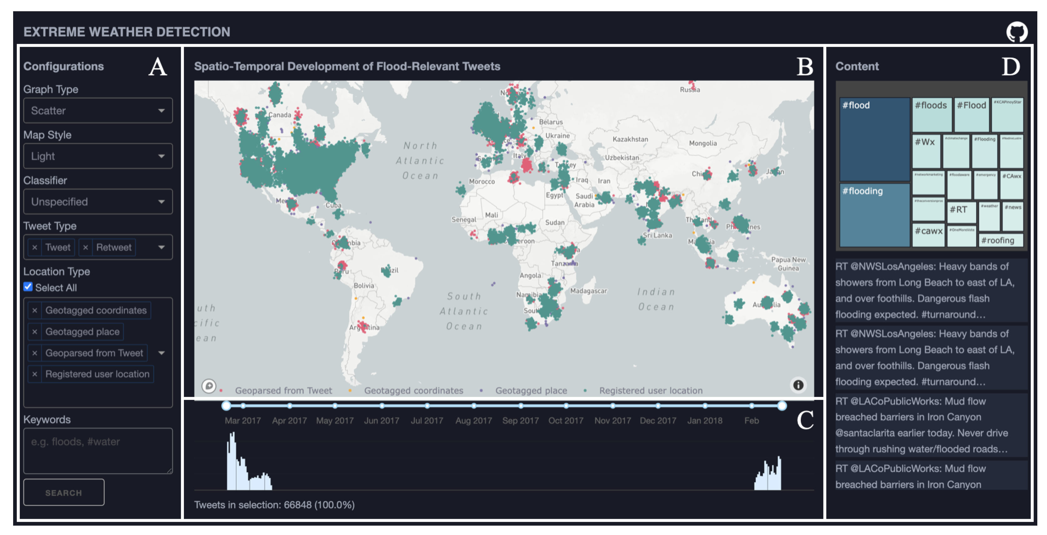
To meet these goals, a web-based visualization interface was designed for facilitating visual exploration of spatial, temporal, and textual characteristics of flood-related tweets. The visualization interface is composed of four linked views, as illustrated in
Figure 8: a control panel
Figure 8A, a map view
Figure 8B, a temporal view
Figure 8C, and a textual context view
Figure 8D.
5.3.1. Control Panel
A control panel is placed to the left of the interface (
Figure 8A), which allows a user to configure the representations and apply filters. Choices are available to adjust the
type and
style of the map view. The displayed data can be filtered depending on the
type of classification used to retrieve the relevant (flood-related) tweets. The default option is ‘unspecified’, which corresponds to tweets that were classified as flood-relevant by at least one of the four implemented models introduced in
Section 5.1. Alternatively, the user can specify one of the available classification models. Other filtering options available are
Twitter type, which allows a user to choose whether to display only original tweets or to also include retweets, and
location type, which provides the option of selecting between the different geoparsing techniques used to add georeferencing to the data. Finally, a search option is available to filter the displayed tweets on any keyword or hashtag.
5.3.2. Map View
The main view of the interface is the map view (
Figure 8B), which displays the spatial distribution of the georeferenced flood-related tweets. Two
map types are available in the interface: (1) a scatter map displaying the spatial distribution of the tweets on the map, and (2) a hexbin map displaying their density distribution per predefined areas.
In the scatter map, each individual geo-referenced tweet is displayed as a dot (scatter point) and is coloured by type of location (i.e., the geoparsing approach used to assess the location). Displaying the data in this manner enables separability by the position of the points when zooming in, giving focus to the individual tweet positions. Mouse-hovering is enabled to provide details on demand for each tweet.
A challenge of the scatter map is that large amounts of points can be overlapping in the same regions. Moreover, since the locations of the tweets are estimated (using different geoparsing approaches) many of the tweets were assigned identical locations. This increases the amount of overlap and can give a false impression regarding the number of tweets at each location. Even, rendering the dots with a high level of transparency underrepresents the number of tweets present at each location. To reduce this effect, Gaussian noise was added to tweets with assigned identical coordinates. For the
n identical points, noise was added by drawing
n sample points from a multivariate normal distribution
where the random variable
contains the updated points. The mean of the noise is the original point itself
, where
is the latitude and
is the longitude. The variance
was chosen based on visual inspection of the resulting noise added to the points.
In addition to the scatter map and in order to better account for the density distribution of the displayed tweets, an annotated hexbin map is available (
Figure 9). This map type aggregates the tweets into hexagon bins coloured based on the number of data points in each. Upon hovering, the exact number of tweets in each bin is displayed in a popup.
5.3.3. Temporal View
The bottom view of the interface combines a timeline slider for filtering by time periods and a histogram showing the temporal distribution of the flood-relevant tweets (
Figure 8C). By default, tweets are binned per day in the histogram. Upon hovering the number of tweet per temporal bin are displayed in a popup. The temporal histogram enables the identification of time periods with a large number of tweets, i.e., peaks, and allows a user to select them for closer exploration.
5.3.4. Textual Context View
To the right of the interface, a treemap is included displaying the most frequent hashtags in the tweets and a scrollable table displaying the original tweets and enabling inspection of their content (
Figure 8D). This view provides additional contextual information regarding the currently explored tweets.
5.3.5. Interaction and Usage
All the views composing the visualization interface are linked and selections and filtering in one will be reflected in all of the others.
A user can start the exploration by specifying the desired configuration settings in the control panel. The corresponding geo-referenced flood-related tweets will be displayed. Spatial concentrations can be identified on the map view and explored closer by selecting and zooming into regions of interest. The temporal and textual context views will be updated accordingly. Similarly, temporal concentrations are identified as peaks in the histogram. These too can be put in focus by selecting and zooming in. The map and textual context views will be updated accordingly.
Flooding events are identified in the interface as increased spatial and temporal concentrations of tweets (G1). By zooming into spatial and temporal areas of interest, details concerning the distribution of the data can be explored in the map view, and contextual information regarding their content in the textual context view. Doing so gives indications regarding the status and severity of the currently explored flooding event (G2). The evolution of a flooding event can be explored by defining a temporal range in the time slider and successively filtering the tweets by time. This way changes in the spatial distribution and the content of the tweets can be explored over time (G3).
6. Use Case Scenario
To exemplify our proposed VA pipeline for flood event identification and exploration, we applied it to a set of unlabelled Twitter data, different from the data used for training. Particularly, we used a subset of English tweets related to flood events during 2017–2018 taken from the Global Flood Monitor data set by de Bruijn [
18] as described in
Section 4.2. By default, all data are included that were successfully assigned a geographic location using any of the available geoparsing methods and were classified as flood events by at least one classifier (i.e., the
Unspecified classifier option is chosen). To verify the observations made through the VA prototype interface, the identified events were compared to real historical records of flood events in the same period.
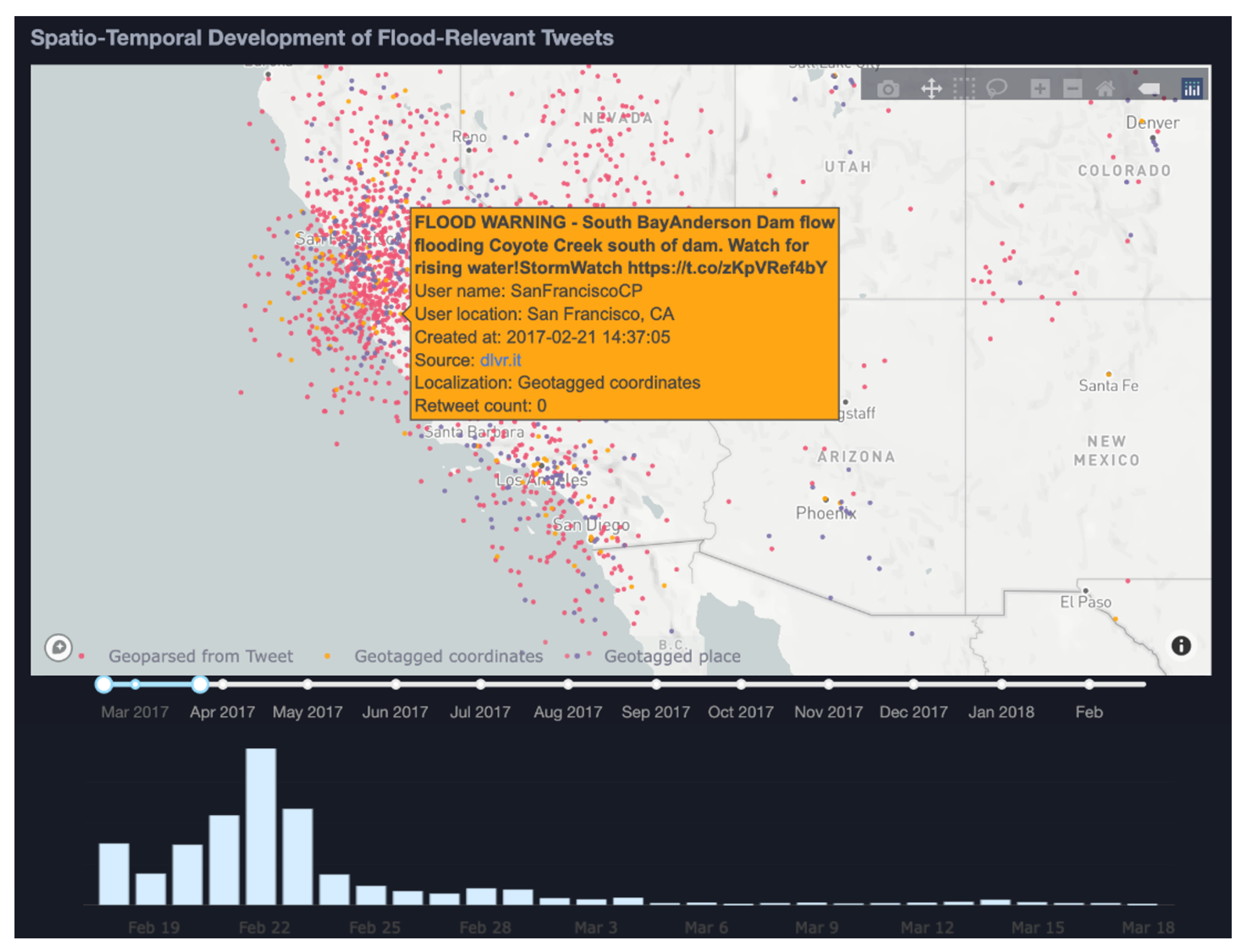
Figure 8 shows an initial overview after importing the data subset into our VA interface. The figure displays 66,848 tweets in total as dots on a map with no filtering applied. The temporal histogram shows peaks signifying high flood-related tweeting activity and the most frequent hashtags displayed are visible in the treemap.
The displayed tweets in the map view are colour-coded by the type of location (i.e., geotagged coordinates, geotagged place, geoparsed location, registered user). The figure shows that events with location-type registered user locations are the most prominent. This location type, however, can be considered the least reliable spatial reference, hence, these tweets are filtered out. Doing this yields 14,282, i.e., 21.4%, relevant tweets, and the regions in the world with a large number of tweets can be detected.
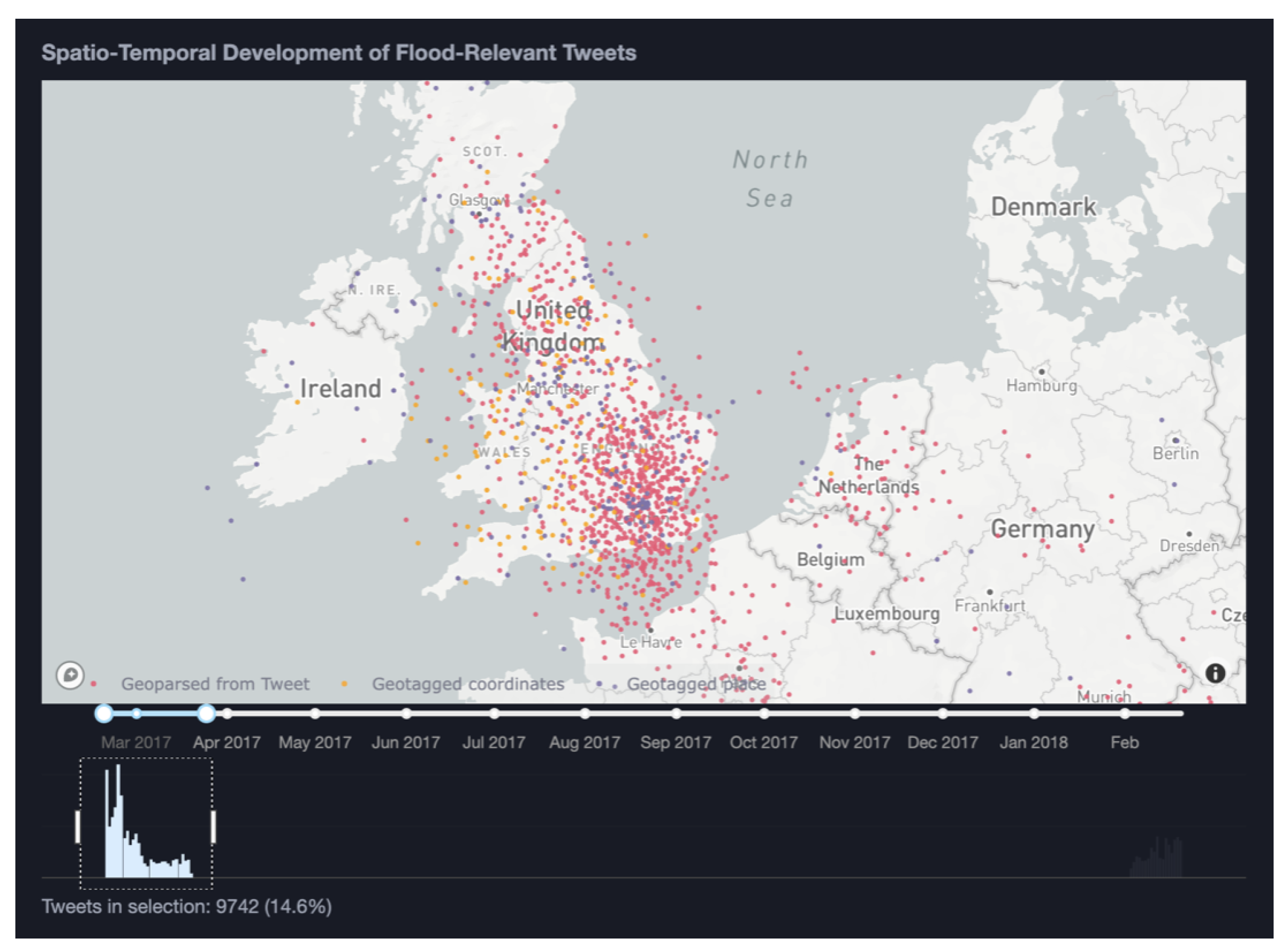
6.1. Storm Doris
In the temporal histogram (
Figure 8C), two distinct peaks are visible, one in February/March 2017 and one in February 2018. We select the first peak in February/March 2017 using the time slider. This results in the number of tweets being narrowed down to 9742, i.e., 14.6%. Next, we continue our exploration by focusing on a spatial area of interest. We focus our attention on the only significant European event visible on the map which is in the UK (
Figure 10).
Having narrowed our exploration to a certain time period and spatial area of interest, we can explore further contextual aspects of the data in the treemap and tweet table. As all views in the VA interface are linked, selecting a group of tweets on the map, the hashtag content of the treemap and the tweet table are updated. Hovering over the individual tweets displays details on demand. These details include the username, user location, creation time, source, location time, and retweet count. Exploring the textual content of the data subset of interest in this manner reveals that a frequent hashtag used in this area and time period is ‘#stormdoris’ indicating that our pipeline and VA interface have allowed us to successfully identify a flooding event potentially caused by a storm. These indications are further confirmed when scrolling through the tweet text in the tweet table.
To further investigate this storm event and its consequences, the term ‘doris’ is used to search the entire set of explored tweets (without filtering). The search results in 141 matched tweets, 109 of which are located in the UK. Inspecting the histogram in
Figure 11 displays a clear peak on 23 February, indicating that the storm and resulting flood might have been intense on this particular day.
The table of individual tweets reveals that eyewitnesses seemed highly affected by the event stating ‘no WiFi, no electric, no heating’. Several of the tweets are also retweets from the Guardian asking “Are you affected by Storm Doris and flooding in the UK?”.
6.2. Coyote Creek Flood
Continued exploration in a similar manner of the same data allowed us to also detect another significant event in California, USA, as follows.
We zoom out to a world scale again and we changed our filtering options to not consider retweets, and only use the tweets classified as floods by the ULMFiT approach (instead of an unspecified approach, such as the previous). In doing so, we pinpoint on a global scale a high spike of generated tweets relating to flooding events occurring in California and in particular in the Coyote Creek basin.
Zooming and panning to the California state boundaries on the map (
Figure 12) and applying a spatial filter over the area showing a higher concentration of data allows us to direct our exploration on a focused subset of tweets. Hovering over points on the map allows us to obtain details regarding specific entries (tweets).
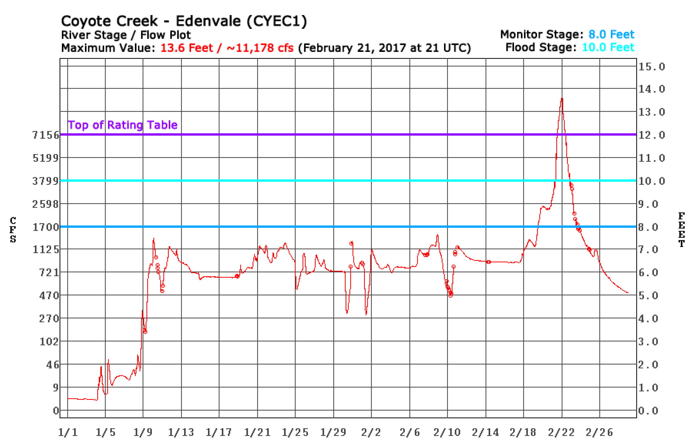
The histogram below the map shows the temporal density distribution of the tweets and gives indications of the timeline of the event. Here, we see tweet entries increasing from February 18, reaching a high peak on 22 February, and then following a decreasing curve after that. This behaviour indicates that the flooding event reached its highest impact on 22 February. Comparing this timeline with the hydrograph for Coyote Creek (
https://www.cnrfc.noaa.gov/images/storm_summaries/janfeb2017/hydrographs/CYEC1_hydro.png, accessed on 10 November 2022) during that period confirms our assumption, the river level successively increased reaching its highest level on 22 February (
Figure 13).
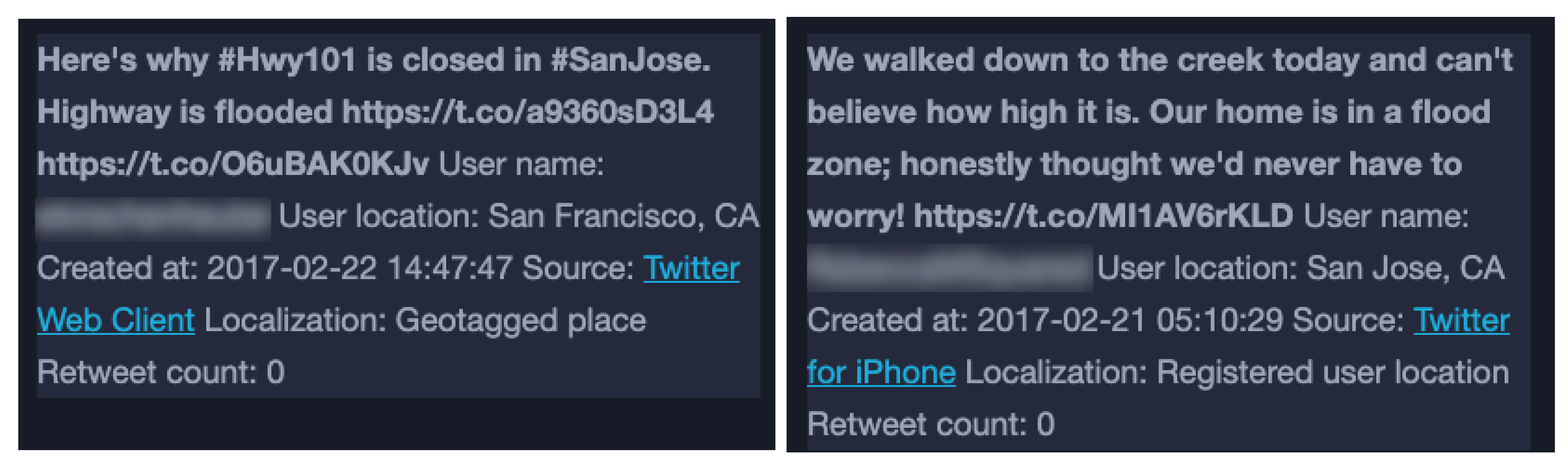
The treemap view of hashtags and the tweet table view allow us to successively obtain more contextual details regarding the extent and gravity of the event. Removing the retweets has narrowed the explored data to include more useful tweets that described possible impacts in the region and detect what was the media situation before, during, and after the flooding occurred. Examples of selected tweets can be seen in
Figure 14.
Due to location inaccuracies in the explored data, which are caused by the low number of geotagged data entries and the method for geoparsing, it is not possible to detect and explore the precise locations where flood impacts have occurred by only interacting with the map view of our interface. However, interaction with the treemap and tweets view makes it possible to detect additional relevant flood information concerning the event from text entries mentioning specific local impacts and deviations (as seen in
Figure 14).
These two example explorations show the potential of the proposed pipeline and tool for the identification of flooding events and their spatiotemporal–contextual exploration.
7. Discussion
All classification models that we applied performed comparably in terms of predicting tweets as flood relevant, with the best performance reached for the
remove keywords model variant with the
original tweets variant performing very similarly, as seen in
Section 5.1.4. What needs to be noted, however, is that the high performance of the
original tweets variant is not representative. The reason for this is that, as mentioned in
Section 5.1, the performance of the classification models was evaluated with a subset of the CrisisLexT6 data set [
23], which was also used for training; 80% of the data were used for training and 20% for testing. Due to this, the
original tweets model variant developed bias to certain specific keywords that were used for querying the tweets during data collection. As such, keywords, such as ’yyc’ and ’Queensland’, became very likely indicative of a tweet being flood-relevant and since these words were also present in the test data, a deceptively high performance was obtained during this testing. This problem became apparent further when comparing the predictions made for the unlabelled tweets by the models of the
original tweets variant compared to the models trained on the
remove keywords tweets. The logistic regression model, for example, for the
original tweets variant only classified 51% of the unlabelled English tweets in 2016 as flood relevant compared to 73% for the
remove keywords variant. Thus, more than 20% of the tweets potentially related to a flood event were excluded when classifying with the
original tweets variant. Consequently, we can conclude that the
remove keywords variant provides a less biased and more representative classification.
Moreover, in terms of accuracy, all classification models that we applied performed comparably with accuracy measured between 92 and 95%. The ULMFiT transfer learning model achieved the best result of 95.0% accuracy, closely followed by the CNN deep learning model with 94.6% accuracy. For the classic algorithms, the results demonstrated accuracies of 93.9% and 92.5% for the logistic regression and random forest models respectively. Thus, the use of word embeddings to represent the textual input seemed to improve the models’ ability to differentiate between tweets that are relevant and non-relevant to flood events. Accuracy, in general, is not always the best performance indication when predicting relevant classes, especially for imbalanced data sets [
35]. The training data used in this work was balanced with a 51/49 split making the high accuracy more reliable. Moreover, the F1 score was also between 92 and 95%, which indicated that no further improvements were required. If these measures were not as high, the performance could have improved by including more training data, tuning the model parameters, or using an ensemble technique to combine multiple weaker models to obtain better results.
There can be different reasons for the text classifiers achieving so high scores on the performance measures. One reason could be the specific nature of this narrow task. Another likely reason could be our choice of data for training and evaluating the classifiers. While the labelled training data set was collected using a combination of keyword and location filtering, employing a single filtering approach might have led to a more focused classification task.
The advantage of location filtering is that the tweets using flood-related words out of context are reduced. Some tweets collected this way will also be completely out of scope and unrelated to flooding. This makes it easier for the classifier to separate the relevant from non-relevant tweets based on single words, and consequently, more complex methods incorporating semantics are not needed. The training data for this project included such tweets that were completely out of context, which can then be a reason why using a CNN or ULMFiT did not outperform the classic models by significant measures. If the data are instead collected only through keyword filtering, there is an increased need for more complex models that can understand different meanings of flood-related terms. In such cases, models that use word embeddings to represent the relations between words to better capture semantics are more applicable.
As becomes apparent, both filtering approaches used for data collection have clear limitations. Location filtering includes only the few tweets that are geotagged, whereas keyword filtering often results in many redundant tweets and false positive results. There is, thus, a trade-off depending on whether the aim of the data collection is to obtain as much data as possible to identify all potential events or to focus on ensuring that the collected tweets are actually describing a sought event. To address both challenges, the location extraction algorithm was constructed to compensate for the drawbacks of keyword filtering and incorporate different levels of location certainty. Interestingly, through exploration of the unlabelled Twitter data in the visualization interface, it became apparent that even though only 5% of the tweets were explicitly geotagged, the estimated locations were typically placed in the exact same areas as the geotagged tweets. This provides some evidence that even tweets that were not explicitly geotagged can still provide important location information. Hence, only using location filtering could prevent the collection of many potentially relevant and informative tweets.
Another position-related aspect of Twitter data that requires consideration concerns the correlation between population density and data volume in an area and how this can bias the representation of an event. Low densities of data do not necessarily mean low-impact events as sparsely populated areas risk having fewer reports on events. Similarly, high densities of data can give the impression of higher impacts and urgency than actuality due to a large number of reports. Approaches to balance the data are interesting to investigate in order to avoid such a biased view of events, as are representations of the uncertainty of the presented data in order to inform the viewer of potential ambiguities.
The proposed visual analytic pipeline and visual interface were exemplified through an interactive progressive exploration use case of a subset of English flood-related tweets. In this use case, we identified and explored two independent flood events in the data using the available functionality. In a few steps, we could easily detect flood events by filtering and navigating through several data points, assessing the content on a regional level. This use case provides promising initial results as to the potential of using such an approach for discovering relevant events and exploring their spatial, temporal, and contextual characteristics.
The proposed pipeline and prototype system aim to complement existing monitoring systems with place-specific data volunteered by citizens, which can provide extended perspectives on local impacts beyond the fixed location of sensors during ongoing flooding events. They further have the potential to support the analysis of past events, contributing to climate and climate adaptation research. The flexible, interactive exploration of the occurrence, timing, and spatial extent of extreme weather events can, for example, enable researchers and analysts to (1) obtain an overview of historic events, (2) identify and compare events of similar scale and spatiotemporal characteristics, and (3) formulate hypotheses for further analysis. Furthermore, VGI can provide details on local impacts, such as information on the conditions of local infrastructure or specific responses, facilitating the assessment of existing climate adaptation measures, and guiding the implementation of new measures. Finally, weather warning systems could be enhanced by enabling the validation of issued warnings, and the identification and exploration of impacts in areas where no warnings were issued.
Overall, the proposed pipeline and prototype system could support the future exploration of flood event data for a broader spatial and temporal scope, and enable a first evaluation with stakeholders that could be the potential users of such a system. Such evaluations are envisioned to support the functional adjustment of the system and the assessment of its usability and effectiveness to support flood risk management.
8. Conclusions
To conclude, this paper presented a visual analytics pipeline for the detection and exploration of flood events from Twitter data. The proposed pipeline consists of three main steps following data collection: (1) text classification, (2) location extraction, and (3) interactive visualization.
Four different text classification models were applied and compared in this work; two classic ones (random forest, logistic regression), one deep learning-based model (CNN), and one transfer learning-based one (ULMFiT). For training and testing the classification models, a data set of tweets labelled for two specific flood events was used [
23]. For subsequent evaluation and demonstration of the pipeline, another data set was used, which consisted of unlabelled English tweets collected using flood-related keywords [
18]. To extract and assign location information to tweets, an algorithm was constructed to relate tweets to a location with successive levels of reliability; based on explicit geotagged coordinates if available, through geoparsing of tweet texts or as a last option through the registered user location. Finally, an interactive visual interface was developed to provide a spatial, temporal, and contextual exploration and analysis of the tweets detected as flood-relevant by the classifiers. The VA pipeline and interface were exemplified through a use case using unlabelled tweets.
The VA pipeline proposed in this study shows promising potential for the identification and interactive exploration of flooding events through Twitter text data and has a number of practical implications. It opens up for real-time monitoring of events and could thus potentially provide support during ongoing events. The approach does not aim to replace existing real-time monitoring networks but rather complements these with localised data collected by citizens. The pipeline can also support an ex-post analysis to evaluate the impacts of earlier events, and to improve capacity building and implementation of adaptive measures to prevent or reduce future impacts of extreme flood events. Allowing a spatially explicit visual exploration of the event data further provides a novel perspective on local events and the place-specific impacts such events can have, as well as extends insights into the context and temporal features of flood events. There are, however, several further improvements that would be of relevance to address in future work. First, the enhancement of the pipeline to also consider volunteered image data for the detection of flooding events is a subsequent step. Presenting images of local impacts, with precautions to ensure GDPR compliance as a part of the exploration in the visual interface, could enhance situation awareness and quickly convey impressions from eye witnesses potentially worth a thousand words. Moreover, including additional data sources, such as meteorological data in terms of, e.g., rainfall records or areas prone to flood events, could improve the pipeline further [
17]. De Bruijn et al. [
36], for example, proposed a multilingual multimodal neural network that could effectively use both textual and hydrological information for flood detection. In addition to incorporating multiple information sources, several classification models could be combined into a hybrid model as this would leverage the benefits from individual models as well as increase the efficiency and accuracy of the results. Another relevant future step of this work is to perform a more systematic evaluation of the visual interface involving potential end-users, to optimise the usability and effectiveness of the interface. Finally, the use of Twitter data for flood detection is attainable and useful and has the potential to supplement traditional monitoring and risk management systems.


 ,
, 


