Article

Digital Data Literacy in an Economic World: Geo-Spatial Data Literacy Aspects

Geomatics Group, Institute of Geography, Faculty of Geosciences, Ruhr University Bochum, D-44870 Bochum, Germany
ISPRS Int. J. Geo-Inf. 2020, 9(6), 373; https://doi.org/10.3390/ijgi9060373
Submission received: 14 May 2020 / Revised: 27 May 2020 / Accepted: 5 June 2020 / Published: 6 June 2020
(This article belongs to the Special Issue Spationomy—Spatial Exploration of Economic Data)

Abstract

:
Data literacy is an essential skill for today’s digital way of life, to be able to judge the reliability of different data presented, for instance in news and media or in business processes. Geo-Spatial data are a specific kind of data and influence most of our daily decisions. In school one learns how to critically read and reflect texts and literature. So one is literate in the case of textual data. For other data, and especially geo-spatial data, one seems to be less skilled. This contribution is supposed to open one’s eyes to understand the origin of geo-spatial data sets, their specific nature and how to gain geo-spatial data sets with specific focus on economic applications. In addition to that, how the selection of geo-spatial data and the processing of geo-spatial data can influence the decision-making of people in thematic fields such as economy and business is discussed. The overall goal is to make people of disciplines other than those that are geo-related aware of the characteristics and possible ways of manipulation of maps and geo-spatial products as well as of the power of geo-spatial data and map products in their specific thematic field of operation.

1. Introduction

Today´s digital way of life needs geo-spatial information for profound business decisions and to be able to judge the reliability of different data presented, for instance, in news and media related to business processes. Geo-spatial data are a specific kind of data and users need specific data literacy skills to effectively work with them. Thus, this paper aims to give economy and business-related people insight into the world of geospatial information extraction and presentation.
Nowadays, digital data are available almost everywhere, e.g., on mobile devices, and strongly influence our daily life, e.g., with location-based services [1]. One can access digital data of any type everywhere with mobile digital devices, to be immediately up to date or to access specific internet-based services. Especially in news and media reporting on the economy and business issues, one is confronted with various types of data and their graphical representation in charts, graphs, maps, etc. [2]. Geo-spatial data (e.g., maps) are a specific kind of data that could be used to manipulate peoples’ opinions. Due to their enormous influence on one´s decisions—in logistics [3], for instance—one needs skills to judge the different types of data for their information content and reliability. In addition to that, one should also be aware and literate to transform economic data into a geo-spatial context, to analyze those thematic data sets and present results in a proper manner.

2. SPATIONOMY—Spatial Exploration of Economic Data

The application of geo-spatial data is no longer a specialized discipline of geographers, geo-information experts, cartographers and related fields. Especially in business and economics, one can find many examples where the geo-spatial domain is linked together with economic data and associated analysis. For example, [4] evaluated the development of CO2 emissions and selected economic indicators within the European Union. In this context, [5] investigated the environmental efficiency due to the reduction in CO2 emissions of the carbon tax for the energy industry in selected European countries. Another successful application in the field of economy and business is the geo-spatial analysis of site allocation for new factories, logistic hubs and distribution centers or shops [6]. One element in the analysis is the land price which, for example, [7] analyzed for the city of Olomouc in the Czech Republic. For the characterization of potential customer groups and their living environment, one could use the findings of [8]. They used a fuzzy inference system to delimit rural and urban municipalities based on a set of indicators that are able to characterize the municipalities in detail.
Aerial or satellite images are a specific type of data for economic analysis, since one can capture those data on demand to analyze specific situations or to identify changes in the environment that influence economic decisions. One of the major characteristics of image data is that they are unadulterated snap shots of geo-spatial situations of a given date and time. So, comparisons of different dates offer the chance to find out changes with time. For example, [9] analyzed the land cover changes for the city of Bochum between 1985 and 2010. In [10], a case study related to change detection in a forested area is described. Due to a storm event (Kyrill) in Germany, a lot of trees were suddenly destroyed and that had an economic impact on the forest industry [11]. Normally, trees are harvested after decades and it is a planned business. Due to the storm, many trees were hit and actually most of those trees were not ready for harvest. This also had implications on the price and on the future harvest plans.
If one compares the examples given above, one could recognize different levels of scale. On a so-called small scale (with less spatial details) suitable for national or even continental studies, one can list the emission studies mentioned above. For those studies, mostly spatially small-scaled data are available and therefore determine the scale of the study. Another level of scale refers to regional levels with intermediate scales. As an example, one could name the spatial distribution of individual economic statistics variables. With spatial representation, one gets a distribution pattern within a region—for instance, for specific indicators. This could help us to understand differences in the economic performance of regions and help regional planners to improve less developed regions. The finest scale level is the so-called large scale (with a lot of spatial details) on a spatial macro level. This could be the analysis of customer distributions in a certain area or the reachability of shops. In addition to that, one could identify missing locations of shops by conducting a location-allocation analysis. Furthermore, one could also plan the location for a company or a shop or analyze the spatial arrangement of competing companies to optimize the shop locations.
In addition to the use of ubiquitous available geo-spatial information, all of us generate geo-spatial data—especially with mobile devices such as fitness trackers, smart watches or smart phones. The GPS gives our location and our habits offer new sets of user-generated data—so-called volunteered geographic information (VGI) (e.g., [12,13]). One can actively contribute to VGI with participation in projects such as OpenStreetMap, or with store ratings in Google Maps. Other VGI can consist of fitness data, social media communication (see [14]) or other rather personal data sets that are not provided actively from a person. Those data sets can be accessed by simple scripts to download the georeferenced data. Since the user of the digital mobile devices does not actively provide those data with permission (as does a customer who provides his/her ZIP-code to the cashier) the term non-volunteered geographic information (NVGI) could be much more appropriate to describe the origin of this type of big user-generated data. However, one does not know if the user implicitly agreed to the use of those data by clicking (but not reading) the terms of use of social media accounts and similar web-based portals. Those data sets could be of high value for economic purposes; for instance, if one understands the habits and needs of people in a certain region, one can react properly to them with business solutions.

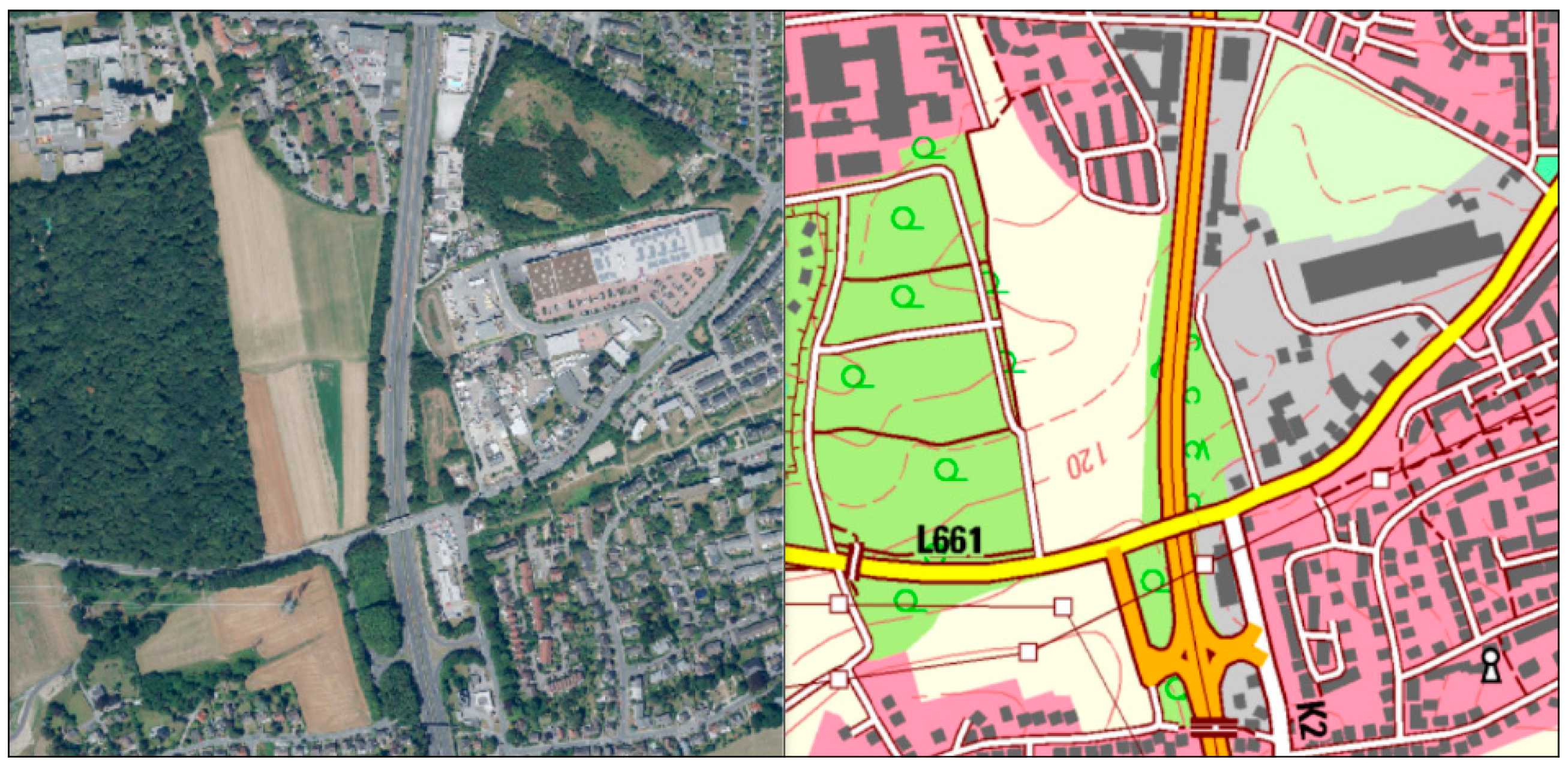
3. Examples of Geo-Spatial Data

Geo-spatial data are composed of descriptive/thematic content (attributes characterizing a spatial entity) and spatial components (e.g., coordinates/coordinate system and geometry). Due to their source and nature, one can distinguish two different data models representing objects of the real world: raster data and vector data [15,16]. While raster data represent real world objects by a number of raster cells with a certain cell size, vector data represent the same objects by points, lines or polygons.
Figure 1 shows simple vector data of the state of North-Rhine Westphalia (NRW) in Germany. It is a simple polygon structure that represents the borderline of the state, and in Figure 2 another vector representation is shown with sub-polygons representing cities and counties in NRW. It is very common to use vector data for such maps. In Figure 3, the topography around the city of Dortmund (Germany) is displayed in vector format as well. In this case, single point height measurements are interpolated to a classified vector map that covers the entire area. Please be aware that the interpolation method could affect the resulting polygons.
One form of raster data are image data, which for instance could be aerial or satellite images. Those are not based on ground measurements but instead they represent measurements of the reflected electromagnetic energy from the land surface. Sensors on flying platforms such as air planes, helicopters, drones or unmanned aerial systems (UAS), and satellites capture the reflected electromagnetic energy in different individual wavelengths and store the images on board. For further information on earth observation or so-called remote sensing, refer to [19,20,21]. An example of earth observation data is given in Figure 4, showing a false-color representation of parts of the city of Dortmund (Germany) in a cost-free Sentinel-2 satellite image with 10-m spatial resolution.
While many ‘traditional’ statistical data are captured or generated in certain time intervals such as once per year or once per month, image data mostly have more flexibility. The platforms that carry the sensor system can start at any time and acquire images on demand. The only exceptions are satellite images that follow the time interval of the fixed satellite orbit. Depending on the system, it can take a few days to get another image of the same location. During the last few years, satellite constellations with identical imaging systems on the same orbit reduce the revisit rate as well as systems that are able to tilt the sensor to the side. For instance, Sentinel-2 images can be acquired every 5 days due to a constellation with two identical satellites in one orbit. Other systems can reduce the revisit time to one day with constellations and/or tilting options. The short revisit times underline that one can get up-to-date information on almost every location on our planet using images. This could give new insight in economic processes and influence decisions.
A fairly new type of data capture is crowd mapping, that uses the mobile data of citizens. This can be a more or less spontaneous data acquisition of limited time and limited location depending on the type of data one is looking for. This created a new field of research called citizen science that is based on such user-generated data (e.g., [23]). As described in a previous section of this article, many mobile devices can deliver such mass data by offering coordinates for the location of the data´s origin paired with semantic data. Depending on the type of data, one can assert that such data are highly up to date, are geo-referenced, and give many more individual data points compared to traditional measuring networks (e.g., for temperature). On the other side, such measurements with rather unprofessional equipment such as smart phones lack the data quality of official measuring stations with high tech equipment. However, with clever data integration techniques, those rather inaccurate mass data can be used together with the sparse professional data to densify the sparse high-quality measurements. Another aspect is that mobile data (e.g., from social networks) give insight in the people´s behavior and their habits [14]. One can search for specific spatial patterns of household consumption habits (singles, couples, young family with children, employees, retired, etc.) and perhaps optimize the living environment for those according to their identified needs. This could be interesting for city planning as well as for public services, medical services, and another services planning. It can help to optimize the location of those services and simultaneously decrease public expenditure. The above-described mass data of many individuals and their mobile devices are considered to be volunteered geographic information (VGI); however, the user of the mobile devices does not even know that the data could be used elsewhere.

4. Data Literacy with Special Focus on Geo-Spatial Data

The cartographer Monmonier became famous for his publication titled “How to Lie with Maps” [24]. This provoking title aims to make map users aware of the power of cartographers while creating maps. There are many options to influence the information content and the appearance of a map and its readability, e.g., by choosing colors, line styles, text styles, symbol styles or its scale.
This paper addresses different examples of spatially related data, including (socio-)economic data. It is intended to raise the reader´s awareness against the influencing factors, that can distort the information content of geo-spatial data in an economic and business context. In the following sub-sections, one finds a comprehensive list of major influencing factors.

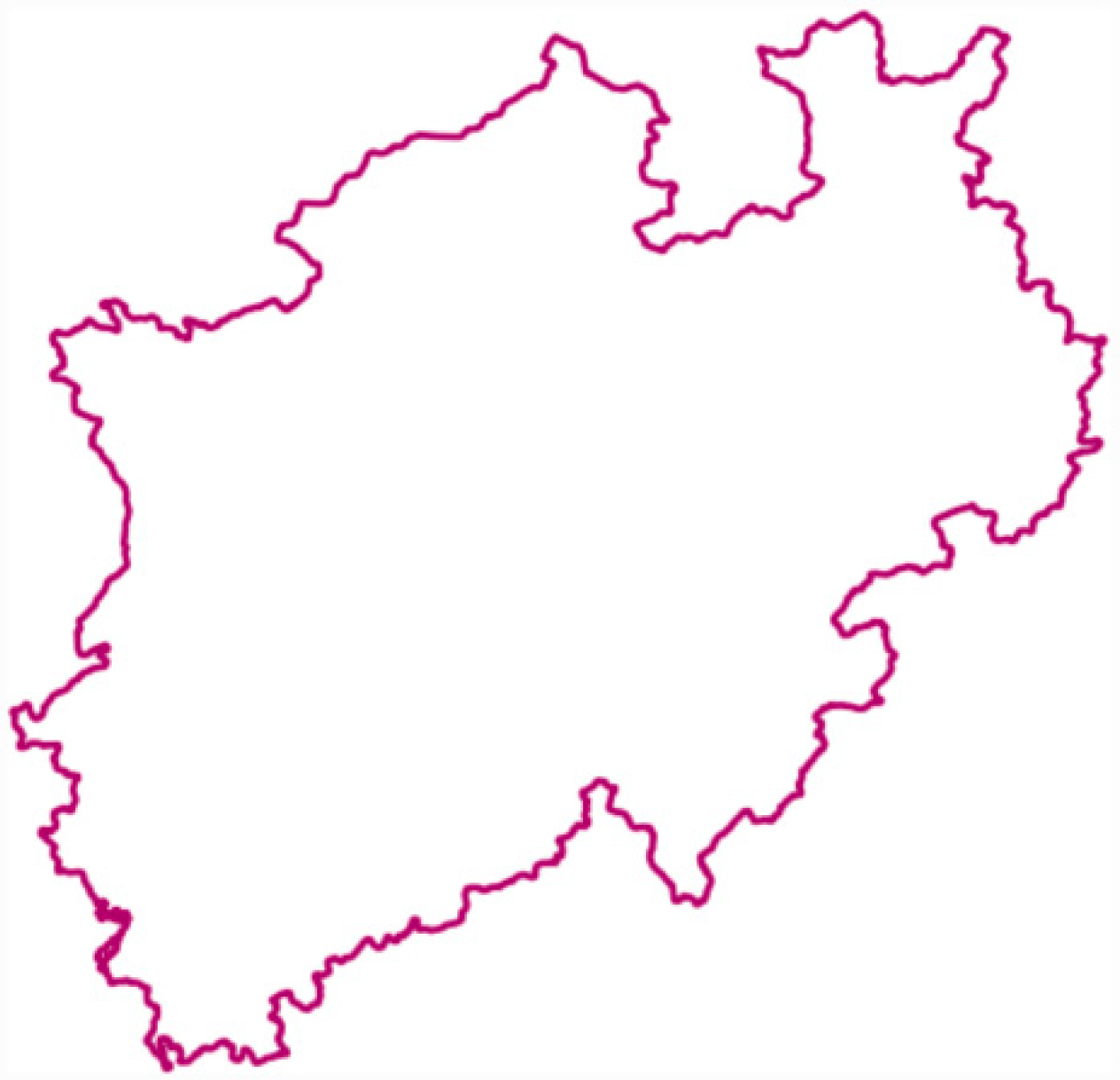
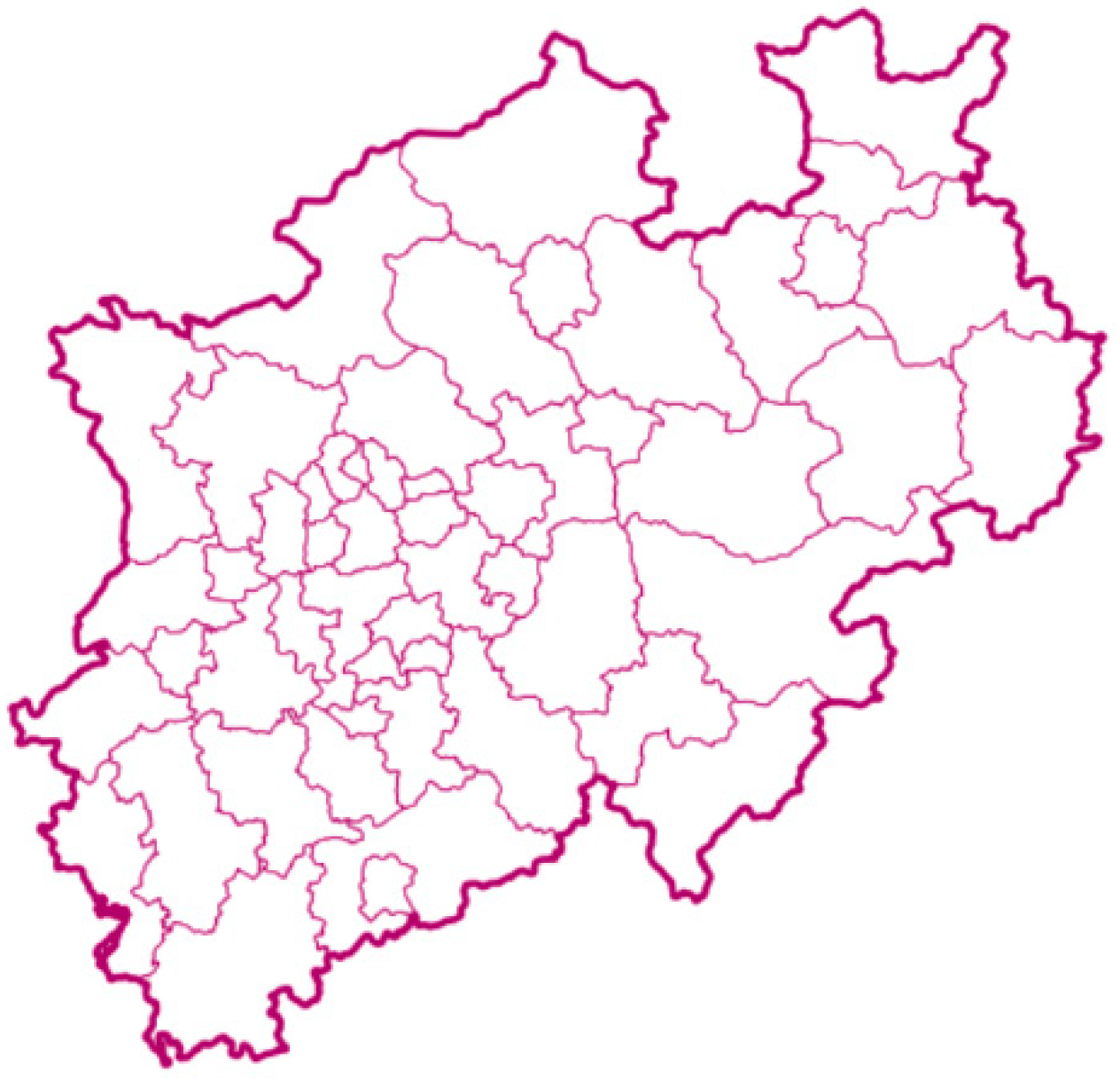
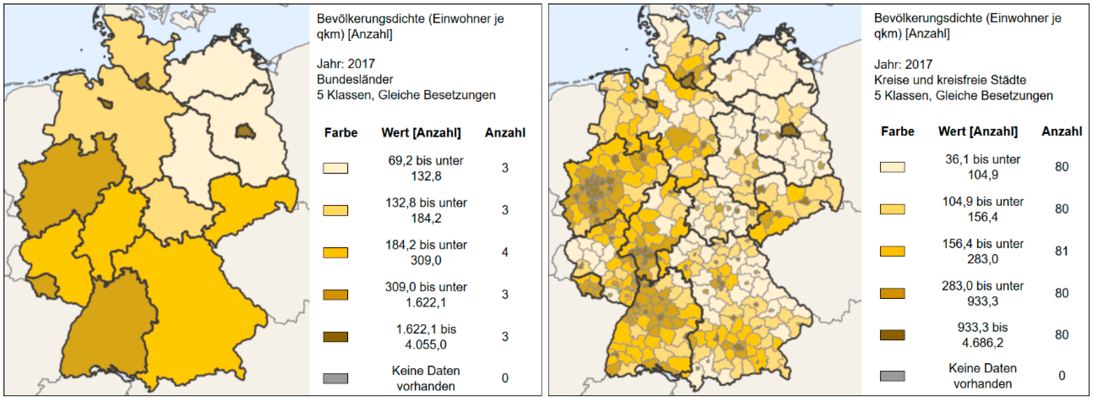
4.1. Level of Generalization

To display real world objects with their coordinates in map representations, one needs some abstraction and simplification of the complex real world. Cartographers generalize the complexity of the real world and create models for a reduced map content. There is a great variety of those techniques; one thing all of them have in common: the cartographer is able to influence the resulting content of the map product, irrespective of whether the type of map is rather hematic/choropleth or topographic. For instance, cartographers use aerial images to create and update topographic maps. The aerial image is a pictorial representation of the real world and is full of information. The cartographer selects only that information from this image by a legend that was created according to the mapping needs for a topographical map (see Figure 5. For instance, details from agriculture are not needed in a topographical map and therefore are not mapped from the image that contained such information as well. This is an example of how a map legend or nomenclature specifies the resulting map content: missing objects in the legend are missing in the resulting map.

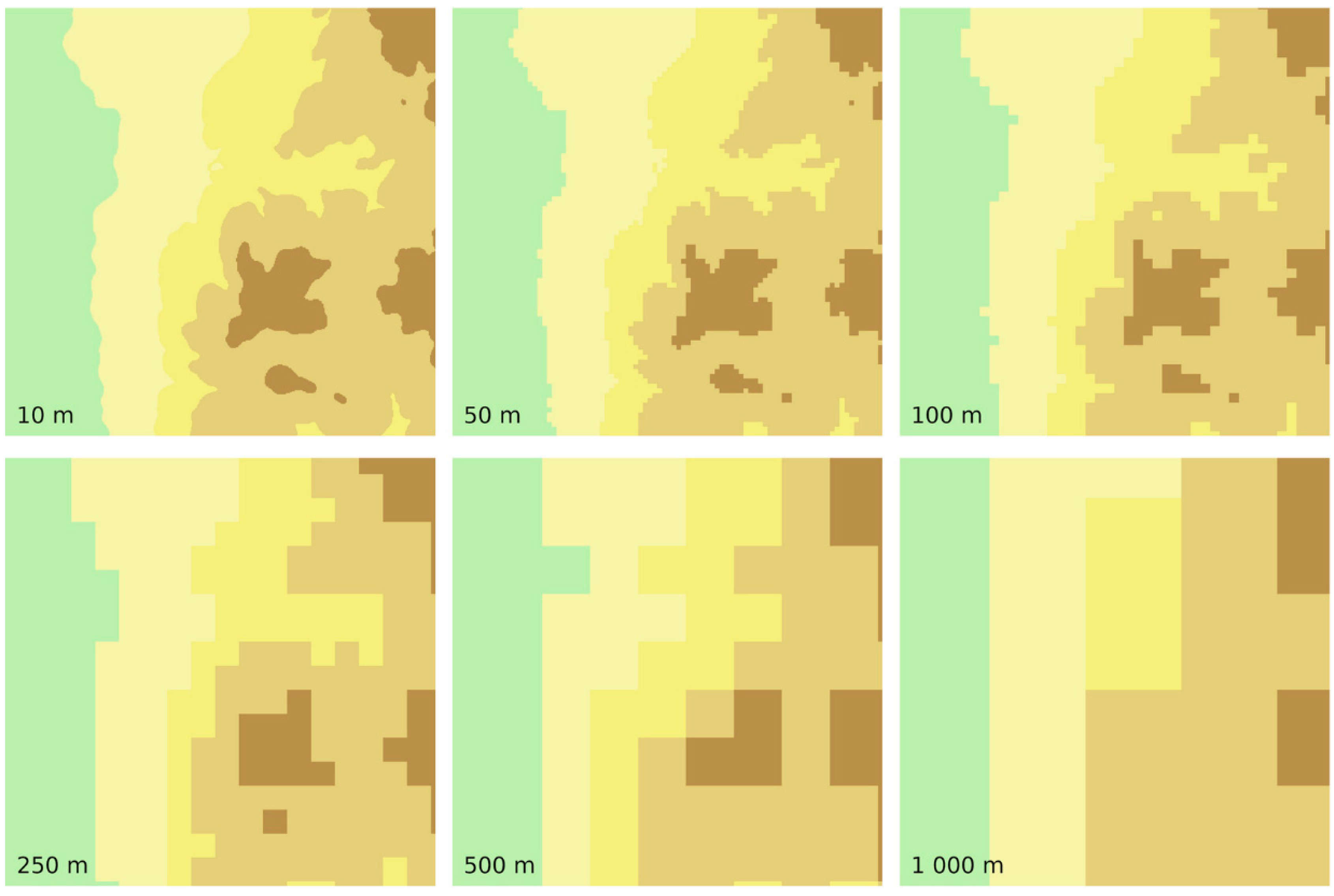
4.2. Raster Cell Size
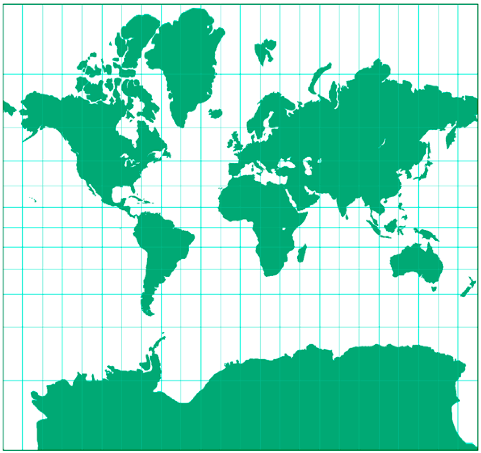
For raster data, one has to watch the raster cell size, since it affects the accuracy of the data capture and the information content of the data set. Height information is also very often represented in raster cells of the same size (Figure 6). Such digital elevation models basically display the same information, like vector maps but in a different data format. Furthermore, the raster cell data can be interpolated or classified to display certain height ranges with colors. It is worth noting that per raster cell only one averaged raster cell value is stored. With lower raster resolution, resulting in large raster cells, spatial information could get lost and lead to misinterpretation.

4.3. Map Projection

A map projection is needed to transform the real world of our 3D globe to a flat 2D map representation. Since map projections are a simplified representation of the true environment, they cause distortions in distance, direction and/or area. For the visualization of global phenomena, very often one finds the Mercator projection (Figure 7) used for the base map. The disadvantage of this projection is the scale distortion towards the higher latitudes and the resulting misleading appearance of areas. For instance, Greenland appears in about the same size as the African continent. In reality, Africa is about 14 times larger. Furthermore, Russia seems to be four times as large as USA. In reality, Russia is only twice the area of the USA.
The problem for such global maps is that they can be overcome with other projections, e.g., the Equal Earth projection (Figure 8), which considers the areal complexity and distortion to the north/south and allows the relative comparison of areas. Of course, there are many other projections available to properly visualize the earth´s surface in different scales. For comparisons of geographical features, one should use maps with the same projection so to not have the distortion errors due to different projections that could result in misleading interpretations.

4.4. Scale or Level of Detail

Scale is always connected with spatial resolution or level of detail in a study using geo-spatial data. For small scale maps, a map generalization process is required to reduce the semantic details, since too much semantic detail makes the map unreadable. In addition to that, it makes a difference if a data set is used on a coarse (e.g., small scale) administrative level (such as countries or states within a country) or a finer (e.g., large scale) spatial differentiation (such as city or county border lines). The spatial aggregation influences the information content of map products. In Figure 9, one can compare the population density by administrative levels of different hierarchy: on the administrative level of states and on the finer administrative level of cities and counties. Please note the different legends (same colors but different value ranges) due to different regional scale of the geo-spatial reference layer. In the state the population density per km² is much lower due to smoothing effects compared to the county layer, where one can much better identify regional hot spots.

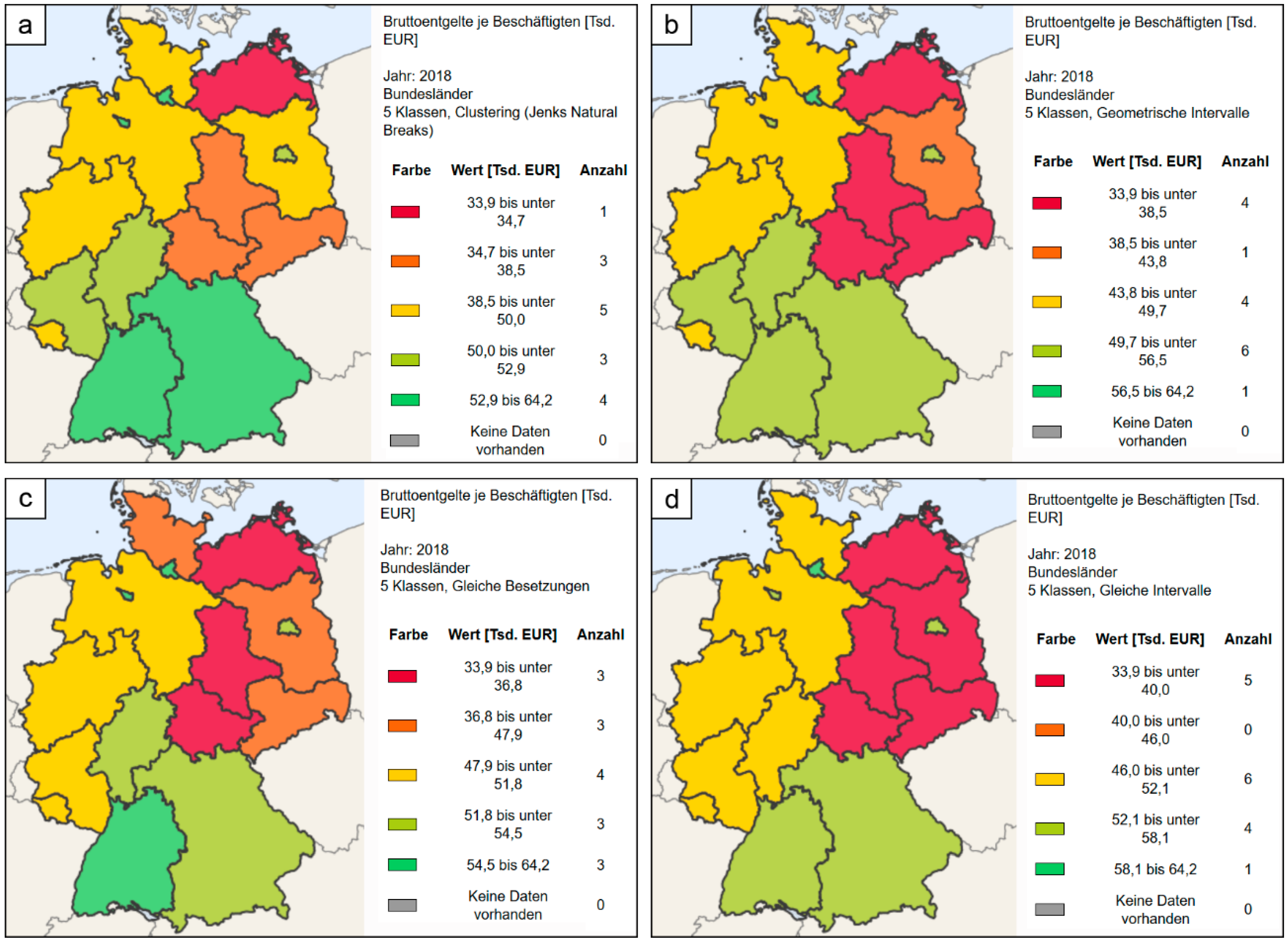
4.5. Classification Method of Thematic Maps

For thematic maps a cartographer or geo-information expert has many options to influence the appearance of the resulting map. Among those options are the number of thematic classes, the class limits, the classification method to define those classes and the color scheme applied (and its associations at the map readers side). Referring to the number of classes, too many classes could lead to a resulting map that looks complex and eventually confusing to the map reader. On the other hand, too few classes could result in a map that is oversimplified and could eventually hide information [29]. As a rule of thumb for an effective classification, one can define approximately 4–6 classes. To illustrate such effects please refer to Figure 10, where one can compare four different maps. All are based on identical data, and all are prepared with the same color scheme in the same number of classes. Thus, this is ideal to find out the influence of the classification method on the resulting thematic or choropleth map. Depending on the method used, one gets different maps although the underlying data are identical. By reading the four maps, a map user could come to different interpretations of the same data used for different map appearances. In Figure 10a, values are classified based on Jenks Natural Breaks, where the value range is different from class to class and one gets the impression that the gross income per state is best in the small states and in the south (green signature). In addition to that, a gradient from south to north and from west to east identifies states with decreasing gross income per capita. In Figure 10b, the value ranges differ from Figure 10a due to another classification method called Geometric Interval. This results in another frequency per class and that again results in another spatial arrangement of classes. Here one gets the impression that Germany basically consists of three groups of states with similar gross income per capita. One can separate the southern part and divide the north into basically two parts. In Figure 10c, the classification method Quantiles tries to create preferably classes of the same frequency. This results in a rather heterogeneous pattern of gross income per capita per state in Germany. In Figure 10d, the classification method Equal Intervals uses the same value range per class. This allows precise comparisons since the value range is stable. One can see that there is basically a rich southern part, a rather poor north eastern part and an intermediate north western part. In between this pattern, one can observe the small states, that show a positive deviation from the ‘big picture’. A map user should be aware of effects like that and try to find out how other thematic maps were prepared. It is recommended to use Equal Intervals for classification to allow proper comparisons. However, [29] discusses this topic more in detail referring to specific characteristics of the input data, since “a well-constructed choropleth increases the interpretability of any given map” ([29], p. 161).

4.6. Map Design

Map design is the art of adequately communicate the results of a spatial analysis to the map reader. This is connected to the readability of maps (e.g., colors, symbology, map layout, fonts etc.) and could also affect the intuitive interpretation of a map (e.g., cultural color semantics). By doing so, one has to be careful not to distort information by the selected map design while creating maps. “[…] a strong working knowledge of cartographic rules will not only assist in the avoidance of potential misrepresentation of spatial information, but also enhance one’s ability to identify these indiscretions in other cartographers’ creations”. ([29], p. 210). In [24], cartographic principles are discussed and how maps can be used and misused is illustrated. In [24,29], one finds elaborate descriptions of the intricacies of color use, symbol selection and map design as well as layout issues.

4.7. Point Data Capture and Interpolation Issues

Sometimes one has to capture data in the field since no other suitable data are available for a certain project. If one is interested in specific traffic data or air pollution parameters, one could easily imagine that those need to be captured on demand. One has to define measuring rules and find adequate locations for the measurements. The resulting point measurements are stored and could be analyzed with GIS routines. For the project team and further users of their data or map product, it is essential to select a validated measuring methodology and to validate the measuring location to be representative. For point data, one always has to keep in mind that the measuring location could be unsuitable. If this is the case, it affects not only the data capture but all follow-up products (e.g., interpolation results).
Point data are then interpolated to come to a spatial representation of the point measurements. The applied interpolation method affects the resulting appearance of a map product, depending on the used method. For instance, one could create Thiessen polygons, calculate Triangular Irregular Networks (TIN), or apply geo-statistical kriging methods. Whatever is used, it transforms point data into areal representations that try to represent the data at its best. Examples could be height interpolations, temperature interpolations, air pollution interpolations, etc.

4.8. Semantic Reliability of Thematic Maps

Remote sensing images are also a source of thematic data. Automated image processing routines offer many computational options to extract thematic information from image data sets. Very often one aims at a thematic map of a certain area for a specific task. To extract suitable thematic information from images, one needs to decide for an appropriate image acquisition system in terms of spatial, spectral and temporal resolution. This means that for this decision one has to clarify the scale (or pixel size), the number and type of wavelengths as well as the repetition rate for a follow-up image. In addition to that one has also to decide on the acquisition date which implies seasonal effects (e.g., from vegetation cover) and one has to propose and describe a mostly hierarchically structured nomenclature or legend that defines which content has to be extracted from the image. All these decisions influence the resulting thematic map and its semantic accuracy.
Regarding the semantic accuracy, it is worth mentioning that satellite images are raster data of a certain cell size. This implies that not always the land cover representing one picture element or pixel is unique. One pixel could also consist of more than one land cover type. As a result, those mixed pixels do not allow a clear definition of the land cover, which implies semantic inaccuracies. A clear 100% correct land cover classification therefore is not achievable.
Another point is the nomenclature or legend that defines which land cover classes are to be extracted. If the defined classes are too conceptional, then no method will be able to extract them. Thus, the definition of a nomenclature for information extraction from image data needs to be adapted to the data type and its characteristics.

5. Conclusions

This contribution was supposed to open one´s eyes to understand the origin of geo-spatial data sets, their specific nature and how to gain geo-spatial data sets with specific focus on economic applications. In addition to that, it was discussed how the selection of geo-spatial data and the processing of geo-spatial data influences the decision-making of people in thematic fields such as economy and business.
This article presented many examples to characterize geo-spatial data and the many options to influence resulting (map) products. The selection of suitable image data for a classification task, especially, as well as the selection of a suitable classification approach, can strongly influence the final product for an end user of another profession. Furthermore, the processing of thematic data is a process with a lot of influencing challenges. The number of classes, the classification method and the color scheme can affect the displayed map content strongly.
The major problem for the ‘end-user’ is that one gets final products like maps and one cannot obviously ‘see’ how the product was prepared from data. A solution could be that end users ask for meta data that describe data sets and maps. If those are prepared properly, processing steps are described and could be identified by the user. This helps to judge the quality of the product.
Please be aware that maps and other geo-spatial products could be manipulated for specific political and/or business purposes. One is still able to lie with maps—please consider different interests. The overall goal of this contribution was to make people of other disciplines than geo-related, aware of the characteristics and possible ways of manipulation of maps and geo-spatial products as well as of the power of geo-spatial data and map products in their specific thematic field of operation. It is intended to help those readers to become more spatially literate people.

Funding

This research received no external funding.

Acknowledgments

This paper is supportedby the project no. 2019-1-CZ01-KA203-061374 Spatial and economic science in higher education - addressing the playful potential of simulation games (Spationomy 2.0) funded by the European Union within the Erasmus+ program. The support is highly appreciated.

Conflicts of Interest

The author declares no conflict of interest.

References

  1. Donner, J.; Tellez, C.A. Mobile banking and economic development: Linking adoption, impact, and use. Asian J. Commun. 2008, 18, 318–332. [Google Scholar] [CrossRef]
  2. Westlund, O. Mobile news: A review and model of journalism in an age of mobile media. Digit. Journal. 2013, 1, 6–26. [Google Scholar] [CrossRef]
  3. Gürder, F.; Yılmaz, Y. Geographic Information Systems In Strategic Decision Making In Logistics Companies. Int. J. Bus. Soc. Res. 2012, 2, 76–86. [Google Scholar] [CrossRef]
  4. Pászto, V.; Zimmermannová, J. Relation of economic and environmental indicators to the European Union Emission Trading System: A spatial analysis. GeoScape 2019, 13, 1–15. [Google Scholar] [CrossRef] [Green Version]
  5. Hájek, M.; Zimmermannová, J.; Helman, K.; Rozenský, L. Analysis of carbon tax efficiency in energy industries of selected EU countries. Energy Policy 2019, 134. [Google Scholar] [CrossRef]
  6. Moos, N. Application—Site Analysis Furniture Store. In SPATIONOMY— Spatial Exploration of Economic Data and Methods of Interdiscyplinary Analytics; Pászto, V., Jürgens, C., Tominc, P., Burian, J., Eds.; Springer: Cham, Switzerland, 2020; pp. 257–269. [Google Scholar] [CrossRef] [Green Version]
  7. Burian, J.; Macků, K.; Zimmermannová, J.; Kočvarová, B. Spatio-temporal changes and dependencies of land prices: A case study of the city of Olomouc. Sustainability 2018, 10, 4831. [Google Scholar] [CrossRef] [Green Version]
  8. Pászto, P.; Brychtová, A.; Tuček, P.; Marek, L.; Burian, J. Using a fuzzy inference system to delimit rural and urban municipalities in the Czech Republic in 2010. J. Maps 2015, 11, 231–239. [Google Scholar] [CrossRef]
  9. Henits, L.; Jürgens, C.; Mucsi, L. Seasonal multitemporal land-cover classification and change detection analysis of Bochum, Germany, using multitemporal Landsat TM data. Int. J. Remote Sens. 2016, 37, 3439–3454. [Google Scholar] [CrossRef]
  10. Mensik, M. Business and Finance. In SPATIONOMY—Spatial Exploration of Economic Data and Methods of Interdiscyplinary Analytics; Pászto, V., Jürgens, C., Tominc, P., Burian, J., Eds.; Springer: Cham, Switzerland, 2020; pp. 149–171. [Google Scholar] [CrossRef] [Green Version]
  11. Landesbetrieb Wald und Holz. Available online: https://www.wald-und-holz.nrw.de/wald-in-nrw/wald-und-klima/kyrill-und-seine-folgen-in-nrw (accessed on 14 May 2020).
  12. Elwood, S. Volunteered geographic information: Key questions, concepts and methods to guide emerging research and practice. GeoJournal 2008, 72, 133–135. [Google Scholar] [CrossRef]
  13. Haklay, M. Citizen Science and Volunteered Geographic Information: Overview and Typology of Participation. In Crowdsourcing Geographic Knowledge: Volunteered Geographic Information (VGI) in Theory and Practice; Sui, D., Elwood, S., Goodchild, M., Eds.; Springer: Dordrecht, The Netherlands, 2013; pp. 105–122. [Google Scholar] [CrossRef]
  14. Paszto, V.; Darena, F.; Marek, L.; Fuskova, D. Spatial Analyses of Twitter Data—Case Studies. Geoinformatics 2014, 1, 785–792. [Google Scholar] [CrossRef]
  15. Pászto, V.; Redecker, A.; Macků, K.; Jürgens, C.; Moos, N. Data Sources. In SPATIONOMY—Spatial Exploration of Economic Data and Methods of Interdiscyplinary Analytics; Pászto, V., Jürgens, C., Tominc, P., Burian, J., Eds.; Springer: Cham, Switzerland, 2020; pp. 3–38. [Google Scholar] [CrossRef] [Green Version]
  16. Longley, P.A.; Goodchild, M.F.; Maguire, D.J.; Rhind, D.W. Geographic Information Science and Systems, 4th ed.; Wiley: New York, NY, USA, 2015. [Google Scholar]
  17. GEOportal.NRW. Available online: www.geoportal.nrw (accessed on 28 April 2020).
  18. Nordrhein-Westfalen. Available online: De-be.topographic-map.com/maps/7j2l/Nordrhein-Westfalen/ (accessed on 28 April 2020).
  19. Jürgens, C. Earth Observation Data. In SPATIONOMY—Spatial Exploration of Economic Data and Methods of Interdiscyplinary Analytics; Pászto, V., Jürgens, C., Tominc, P., Burian, J., Eds.; Springer: Cham, Switzerland, 2020; pp. 30–38. [Google Scholar] [CrossRef] [Green Version]
  20. Albertz, J. Einführung in die Fernerkundung: Grundlagen der Interpretation von Luft- und Satellitenbildern, 5th ed.; Wissenschaftliche Buchgesellschaft: Darmstadt, Germany, 2016. [Google Scholar]
  21. Lillesand, T.M.; Kiefer, R.W.; Chipman, J. Remote Sensing and Image Interpretation, 7th ed.; Wiley: New York, NY, USA, 2015. [Google Scholar]
  22. ESA Copernicus open access hub. Available online: Scihub.copernicus.eu (accessed on 20 April 2020).
  23. Kullenberg, C.; Kasperowski, D. What Is Citizen Science? A Scientometric Meta-Analysis. PLoS ONE 2016, 11, e0147152. [Google Scholar] [CrossRef] [PubMed] [Green Version]
  24. Monmonier, M. How to Lie with Maps. Am. Stat. 1996, 51. [Google Scholar] [CrossRef]
  25. Redecker, A.; Burian, J.; Moos, N.; Macku, K. Spatial Analysis in Geomatics. In SPATIONOMY—Spatial Exploration of Economic Data and Methods of Interdiscyplinary Analytics; Pászto, V., Jürgens, C., Tominc, P., Burian, J., Eds.; Springer: Cham, Switzerland, 2020; pp. 65–92. [Google Scholar] [CrossRef] [Green Version]
  26. Kartenprojektionen vergleichen. Available online: Kartenprojektionen.de/single-view/mercator-84 (accessed on 22 April 2020).
  27. Kartenprojektionen vergleichen. Available online: kartenprojektionen.de/single-view/equalearth (accessed on 22 April 2020).
  28. Regionalatlas Deutschland. Available online: https://www-genesis.destatis.de/gis/genView?GenMLURL=https://www-genesis.destatis.de/regatlas/AI002-1.xml&CONTEXT=REGATLAS01 (accessed on 20 April 2020).
  29. Campbell, J.E.; Shin, M. Essentials of Geographic Information Systems; Saylor Academy: Washington, DC, USA, 2011; Available online: https://digitalcommons.liberty.edu/textbooks/2 (accessed on 28 April 2020).
Figure 1. Simple vector data of the state of North-Rhine Westphalia (NRW) in Germany [17].
Ijgi 09 00373 g001
Figure 2. Simple vector data of the state of North-Rhine Westphalia (NRW) in Germany with sub-polygons representing cities and counties [17].
Ijgi 09 00373 g002
Figure 3. Topography around the city of Dortmund (Germany) displayed in vector format [18].
Ijgi 09 00373 g003
Figure 4. False-color Sentinel-2 satellite image of a part of the city of Dortmund (Germany) acquired on July 24, 2019. The colors red, green blue correspond to the Sentinel-2 wavelengths of band 8 (near infrared), band 4 (red) and band 3 (green) [22].
Ijgi 09 00373 g004
Figure 5. Aerial photograph and resulting topographical map [17].
Ijgi 09 00373 g005
Figure 6. Digital elevation model in raster format with different cell sizes [25] (p. 70).
Ijgi 09 00373 g006
Figure 7. The Mercator projection is a cylindrical map projection with straight and perpendicular meridians and parallels. It preserves the angles at all latitudes and therefore it is widely used for navigation purposes. A resulting disadvantage is the linear scale distortion towards the higher latitudes and the resulting misleading appearance of areas [26] (By Tobias Jung [CC BY-SA 4.0 (http://creativecommons.org/licenses/by-sa/4.0)], via kartenprojektionen.de).
Ijgi 09 00373 g007
Figure 8. The Equal Earth Projection is an equal area pseudo-cylindrical map projection that is able to preserve the relative size of areas independently of their latitude [27] (By Tobias Jung [CC BY-SA 4.0 (http://creativecommons.org/licenses/by-sa/4.0)], via kartenprojektionen.de).
Ijgi 09 00373 g008
Figure 9. Thematic map of population density (people per km²) 2017 in Germany based on states (left) and counties (right) [28] (Data licence Germany – destatis – Version 2.0) (Legend shows color, value ranges and number of cases per class).
Ijgi 09 00373 g009
Figure 10. Gross income per capita in German states 2018 in six classes; classification is based (a) on natural breaks (Jenks), (b) on geometric interval, (c) on equal number of cases per class (quantiles) and (d) on equal intervals per class [28] (Data licence Germany – destatis – Version 2.0). (Legend shows color, value ranges and number of cases per class).
Ijgi 09 00373 g010

