1. Introduction
Monitoring the dynamics of people gatherings with the aid of unmanned aerial vehicle (UAV) technology opens up new possibilities for visualizing space [
1]. The analysis of spatial behaviors of participants on the basis of previously prepared visualizations is of crucial importance to organizers of open-air events. That is why the authors of the present study decided to focus on the scientific bases of creating images illustrating an event’s participants’ spatial behaviors [
2]. The issue is topical given the current increase in the use of UAVs, widely known as drones, for the purpose of recording the course of events and gatherings. The final product in such cases takes the form of a video or camera images. One of the uses of such images for analytical purposes is crowd monitoring [
3]. The popularity of UAV use to gather information has even led to the launch of an Internet project called Dronestagram, which allows its users to share their georeferenced drone-taken images [
4]. Raster images taken from a bird’s-eye-view perspective have become the basis for cartographic visualization, which calls for a special methodological approach to the principles of map design and mapping techniques [
5,
6]. The optimal method for presenting changes in spatial phenomena over time is by means of animated maps [
7], whose most important elements include a frame of cartographic content, title, scale, legend or temporal legend, and scale bar, but also additional interactive tools, multimedia, special effects, and interactions, which all help to enrich the map [
8].
The present study mostly touches upon the issue of how to properly present stable and mobile objects at open-air events, which are, according to the researchers, of key significance in perceiving spatio-temporal relations [
9]. A stable spatial object is understood as a reference object of great functional importance to an event’s participants; a mobile object on a map, on the other hand, is simply a single participant of the event in question. The line or frame delimiting the cartographic content is thought to stabilize the whole cartographic image [
10]. In the case of a mass event’s area being delimited with a line, it might additionally affect the perception of changes on the animated map to a significant degree. The key role in multimedia cartography is the preparation of a map that is as simple as possible for interpretation [
11]. In the context of the studies undertaken here, emphasis was placed on the conception and construction of maps in order to communicate spatial results efficiently mostly according to cartographic design principles [
12].
Another important issue is the choice of a research method that will allow experts in cartography and geomatics to express their subjective opinions on the usefulness of the designed visualizations [
13]. However, the effectiveness of a visualization for drawing conclusions can also be measured objectively by means of questions answered by the participants [
14,
15]. A study using questionnaires with three alternative map variants was previously conducted to test the influence of the proper design of a tourist map on the changing preferences of its users [
16]. The tourist preferences of the students were juxtaposed with three variants of graphical design, all representing the same topographic content. The results obtained clearly illustrated the great potential of map design to influence a tourist map user in terms of their choice of tourist objects and routes.
Yet another problem to be dealt with in the present study is the choice of a proper way to represent people. The most natural option would probably be the dot variant, as, logically, it uses one dot to represent a single person [
17]. However, what might be problematic in this case is the very small size of dots and their merging/overlapping, which makes the analysis more complicated [
7]. When one creates visualizations based on photographs, there is a need for a special design of cartographic signs to be superimposed onto the image from the camera, which is associated with the use of graphical variables [
18]. The authors of the present article also wanted to draw the reader’s attention to the issue of the cartographic representation of the distances between a mass event’s participants, which in this case meant distinguishing the various possible types of interpersonal distance, e.g., intimate distance, personal distance, social distance, or public distance [
19].
The main aim of the study in hand was to assess the possible variants for visualizing topographic references (stable objects) and UAV-recorded people gatherings (mobile objects) in animations based on three types of map. The authors wanted to find the answer to the following questions:
How do experts in cartography and geomatics subjectively assess the usefulness of the following three types of animated presentation: an orthophoto, a dot distribution map, and a buffer map?
What is the objective effectiveness of those three methods of visualization for analyzing spatio-temporal relations during an open-air event?
How important is it in animated map design to graphically highlight the objects serving as points of interest to the participants and, therefore, treated as orientation points?
Which elements of an map are, according to experts, unnecessary, and which are needed?
2. Methodology
In order to accomplish the set goals, the authors conducted the study in the following stages:
Deciding on how to graphically visualize a single person;
Elaborating the map contents for the three animations and delimiting the borders of the event’s area with a line on each of them;
Designing the layout of the animated map;
Preparing three online questionnaires;
Conducting the questionnaires among the experts;
Analyzing the responses obtained, and comparing the subjective expert opinions with the objective results of the completed tasks; and
Assessing the effectiveness of the three visualizations.
2.1. Graphically Visualize a Single Person
The animated maps used in the study were created based on eight selected photographs taken with a drone between 18:00 and 21:00. Those raster images were obtained at the “Geographer’s Picnic”, an event held next to the building of
Collegium Geographicum at the Adam Mickiewicz University in Poznan, Poland. The event was hosted in an area of approximately 3500 m
2 and attended by 900 students. A key requirement for creating the visualizations was to define three different ways to present the basic mobile object, i.e., a single person.
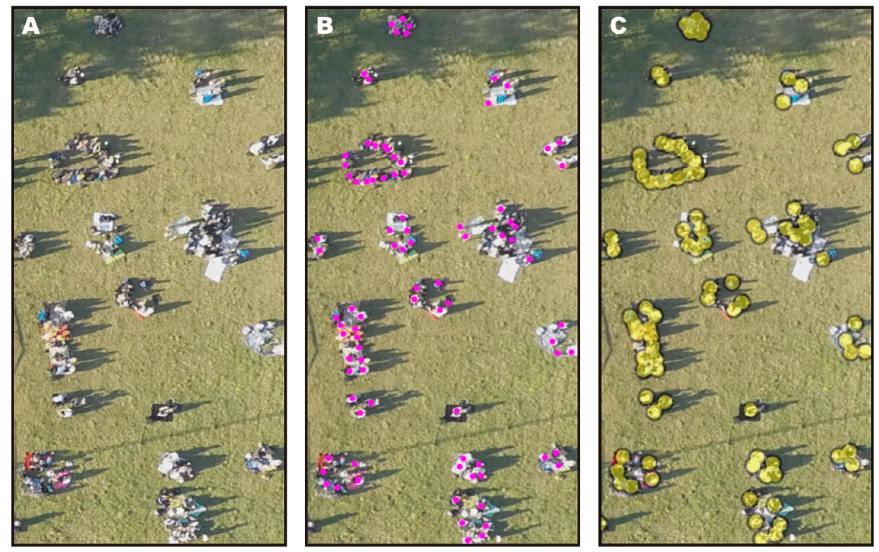
Figure 1 shows three possible graphical variants for representing a single person and a gathering of people on an orthophoto, a dot distribution map, and a buffer map. The orthophoto presents a low-level aerial image of the event’s area as seen from above, in a parallel projection. In this case, a person is visualized as a set of pixels (
Figure 1a). Distinguishing people from other objects is made easier thanks to the shadows cast by them. The shadows also help the reader to correctly identify the number of people standing in close proximity. On a dot distribution map, one person is represented by one dot (
Figure 1b). In this case, one needs to interpret the orthophoto and the oblique photos first before one can determine the exact location of a person. The determinant of their location is the position of their head/the axis of their body.
The buffer map, in its turn, reflects the distances between the event’s participants, which might correspond to the relations between them. This refers to the notion of so-called social distances. According to Hall [
19], the personal distance zone can be further broken down into a close phase (45–75 cm) and a far phase (75–120 cm). Taking into consideration the likelihood of witnessing buffers of people forming at the event, the authors decided to surround every dot with a 60-cm “buffer” (counting from the center of the dot), i.e., a single person was represented by a circle with a diameter of 120 cm (
Figure 1c).
2.2. The Map Contents and the Line Delimiting the Event’s Venue
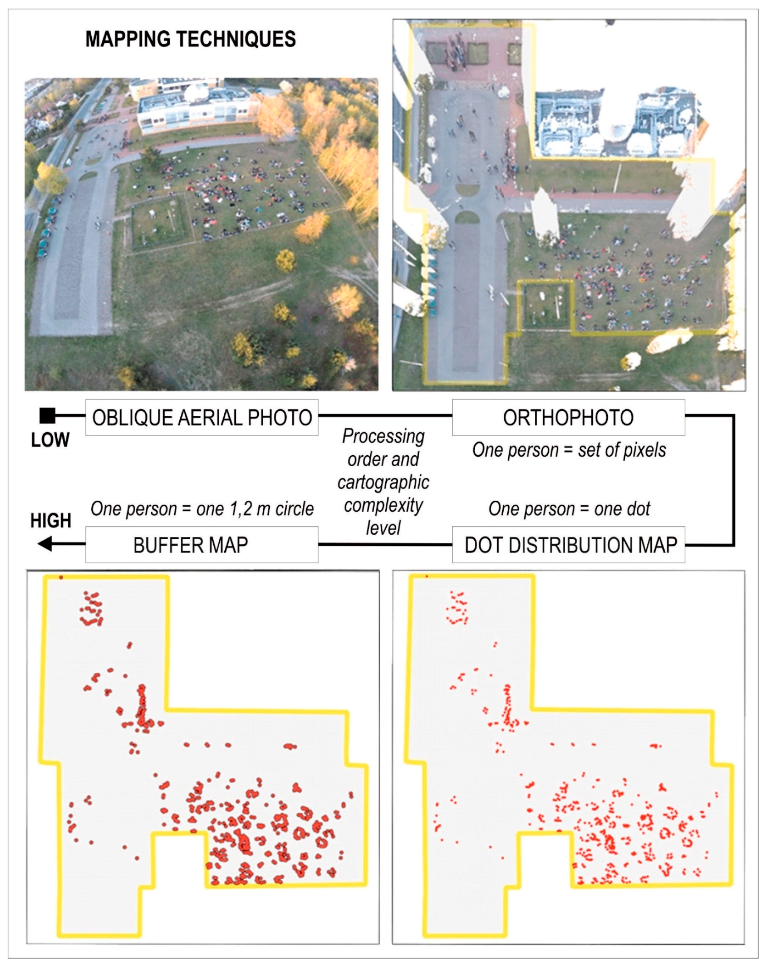
Figure 2 shows four ways of visualizing the participants in and the venue for an open-air event. They vary in how much the original information was processed and how a single person was represented. An oblique low-level aerial image was the basis for creating the orthophoto, which then served as the basis for the dot distribution map, the latter finally being the basis for the buffer map.
Eight othophotos were created in Agisoft PhotoScan on the basis of oblique photos taken from the air, from various perspectives, with an unmanned aerial vehicle (the four-motor drone). The photos used in the study were taken every 20 min on average (subsequent states registered at the following time intervals: 23, 19, 21, 18, 14, 26, and 21 min). The drone was a platform for a professional sports camera, with a focal length of 3 mm, taking photos with a resolution of 12 megapixels. The wide-angle lens the camera was equipped with caused a distinctive ‘spherical’ distortion of the image in the oblique photos (
Figure 2), resulting in the so-called fish-eye effect. The photographs were registered on an EPSG 2177 coordinate system on the basis of ground control reference points, using professional photogrammetric software.
In order to represent the location of people in the dot method, it was necessary to set the right size and color for the dots. Red was chosen due to its capacity to attract the reader’s attention and the great contrast relative to the background. The size was set to be as large as possible without overlapping, corresponding approximately to the size of participants’ heads on the orthophoto (
Figure 2).
The buffer map was produced on the basis of the points in the vector layer in the QGIS application, where buffer zones with a radius of 60 cm were generated. The aggregation tool was used, which made it possible to merge the buffers and, thus, obtain a cluster for groups of people located in closest proximity.
An important step for the latter analyses of the course of the event and the behavior of participants was enriching the map with stable objects of spatial reference. The yellow lines on
Figure 2 (in the case of the orthophoto, with additional transparency applied) delimit the area that served as the venue of the event; they constitute an important reference element and also improve the map’s layout graphically, making it more balanced.
2.3. Designing the Layout of the Animated Map
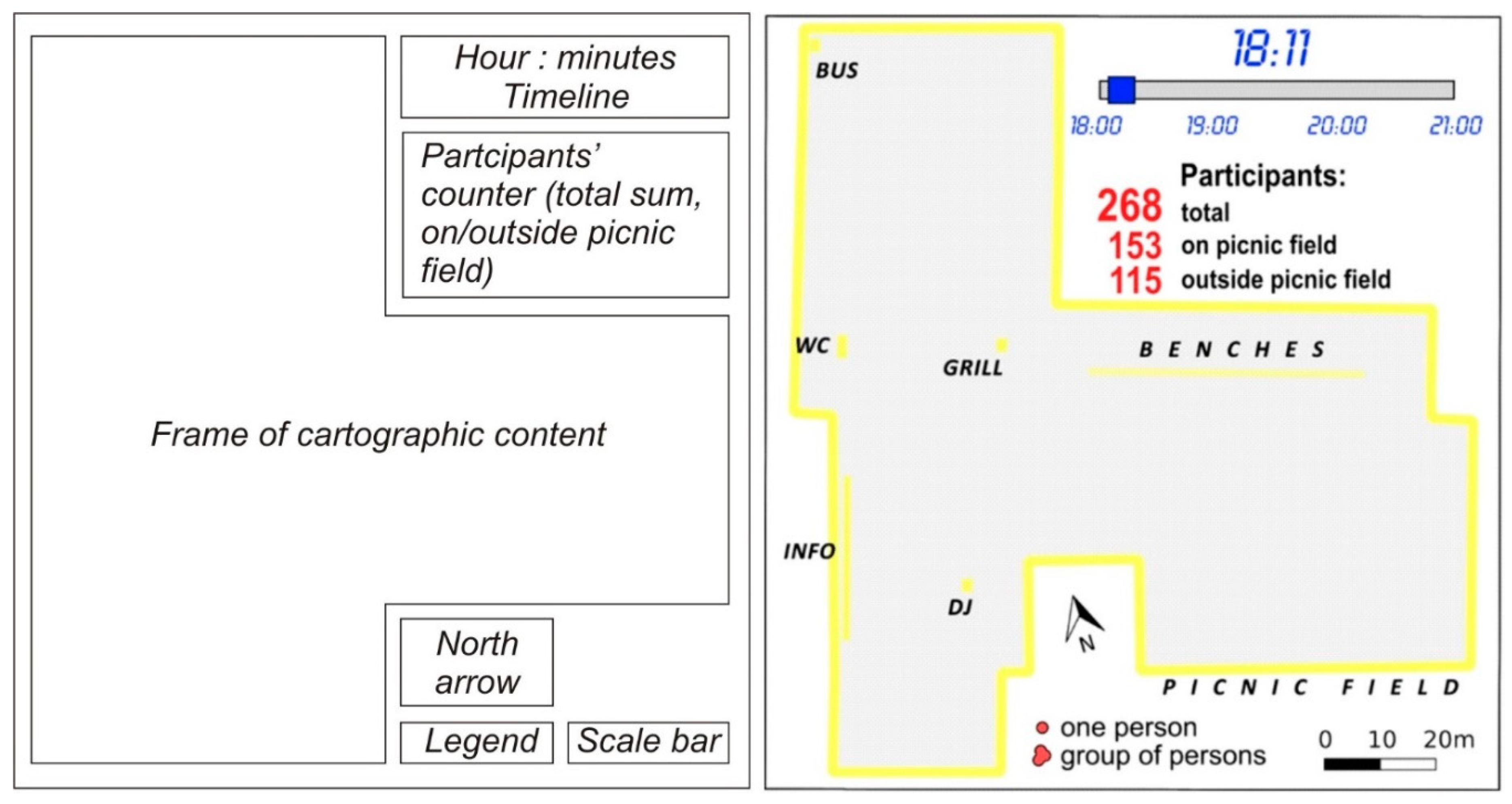
Figure 3 shows the general layout of the animated map, including its basic elements and a template designed on the basis of this layout, listing all the graphical and descriptive elements used for each of the mapping methods. The template reflected the shape of the event’s venue, while the choice and distribution of the individual elements resulted from the nature of the experimental questions. The template included the following elements: a timeline; the time (the hour and the minutes); the total number of participants; the number of participants on the picnic field; the number of participants outside the picnic field; a legend showing the graphical representation of a single person and a group; a scale bar; and a north arrow. What was crucial for the study was highlighting the stable objects in yellow: grill, DJ (Disc Jockey), bus stop, toilet, benches, information points, and picnic field, as well as highlighting the line delimiting the event venue, which became the main linear stable object. The stable objects were accompanied by text labels.
Stable objects for topographical reference were marked on the visualizations in such a way as to facilitate their perception, and their geometry was adjusted to fit the spatial perception and memorization abilities of the viewer. In this way, four point objects were placed on the map: grill, bus stop, DJ, and toilet, and two linear objects: information points (an array of stalls provided by the event organizers) and benches. Those six objects were all represented in a similar way—as rectangles with a yellow outline, corresponding to the outline of the represented object, and accompanied by labels in the form of black text. The label for the picnic field was placed below the mapped area so that it would not obscure the cartographic content or inhibit the perception of changes in the location or number of mobile objects, i.e., participants of the event.
2.4. Preparing Three Online Questionnaires
In accordance with the authors’ intention to compare the subjective opinions of experts with their objective answers to the experimental questions, the questionnaire was split into two parts. The objective questions were phrased in such a way as to enable an assessment (on the basis of the number of correct responses) of the three methods of visualization in terms of their effectiveness for showing spatial relations between the distribution of the event’s participants and the distinctive objects located in the event’s area. They also made it possible to determine the dynamics of the growth in the number of participants over time. The animation produced in Photoscape consisted of eight frames showing the course of the event over the successive hours and it was saved in the .gif format, in a variant ensuring constant repetition of the sequence of images (
Figure 4).
The five objective questions, together with the possible variants of answers to be chosen by the subjects, were as follows:
QUESTION A: When was the event attended by the highest number of people?
Possible answers: 18:11, 18:34, 18:53, 19:14, 19:32, 19:46, 20:12, 20:33
QUESTION B: When was the toilet queue the longest?
Possible answers: 18:11, 18:34, 18:53, 19:14, 19:32, 19:46, 20:12, 20:33
QUESTION C: Which part of the picnic field was the most crowded?
Possible answers: Middle and left; middle and right; middle and lower; middle and upper.
QUESTION D: Up till 19:00, the most frequent size of a group of participants on the picnic field was: (possible variants) 3–10 Persons, 8–12 Persons, 10–18 Persons, 16–22 Persons, 20–32 Persons
QUESTION E: After 19.30, the most frequent size of a group of participants on the picnic field was: (possible variants) 3–10 Persons, 8–12 Persons, 10–18 Persons, 16–22 Persons, 20–32 Persons
In the second part, the participant made a subjective decision, picking one of several possible answers on the basis of unanimated views of three juxtaposed maps illustrating the situation at 18:34 (
Figure 4). The three tasks, and their possible answer variants, were as follows:
TASK I: Please assess those three visualizations in terms of their usefulness for analyzing spatial relations. Possible answers: insufficient, weak, good, very good.
TASK II: Please estimate how effective for analyzing spatial relations it is for the visualization to include distinctive objects (e.g., toilet, grill, DJ, etc.) and a line delimiting the event’s venue. Possible answers: distracting, not important, of marginal importance, important, necessary.
TASK III: Please point out the elements which are unnecessary in the visualization. Multiple answers allowed. Possible answers: (1) timeline, (2) time: hour: minutes, (3) total number of participants, (4) participants outside the picnic field, 5) participants on the picnic field, (6) distinctive objects (toilet, grill, DJ, etc.), (7) labels of the distinctive objects, (8) scale bar, (9) north arrow, (10) the line delimiting the event’s venue, (11) legend showing the signs representing a single person and a group of people.
2.5. Conducting a Questionnaire among Experts
The online questionnaires were prepared and conducted. Each of the three Internet surveys included one animated map, on the basis of which the participants had to answer the experimental questions (
Figure 4). The questionnaires on a website were completed by 42 foreign experts on cartography and geomatics from West European universities (academic teachers conducting classes and scientific research in the field of cartography, geomatics, and geoinformation) and specialists from professional offices producing cartographic visualizations (academic cartographers, cartographers–geomatics experts [
20]). As people unfamiliar with the area of research, they formed a group of objective respondents. The participants completed the survey anonymously, with no time limit imposed, and did not receive any payment. In addition, each of the questionnaires in the subjective part of the questions contained all three visualization methods, so that respondents could make their subjective assessment.
2.6. Objective Tasks and Subjective Opinions
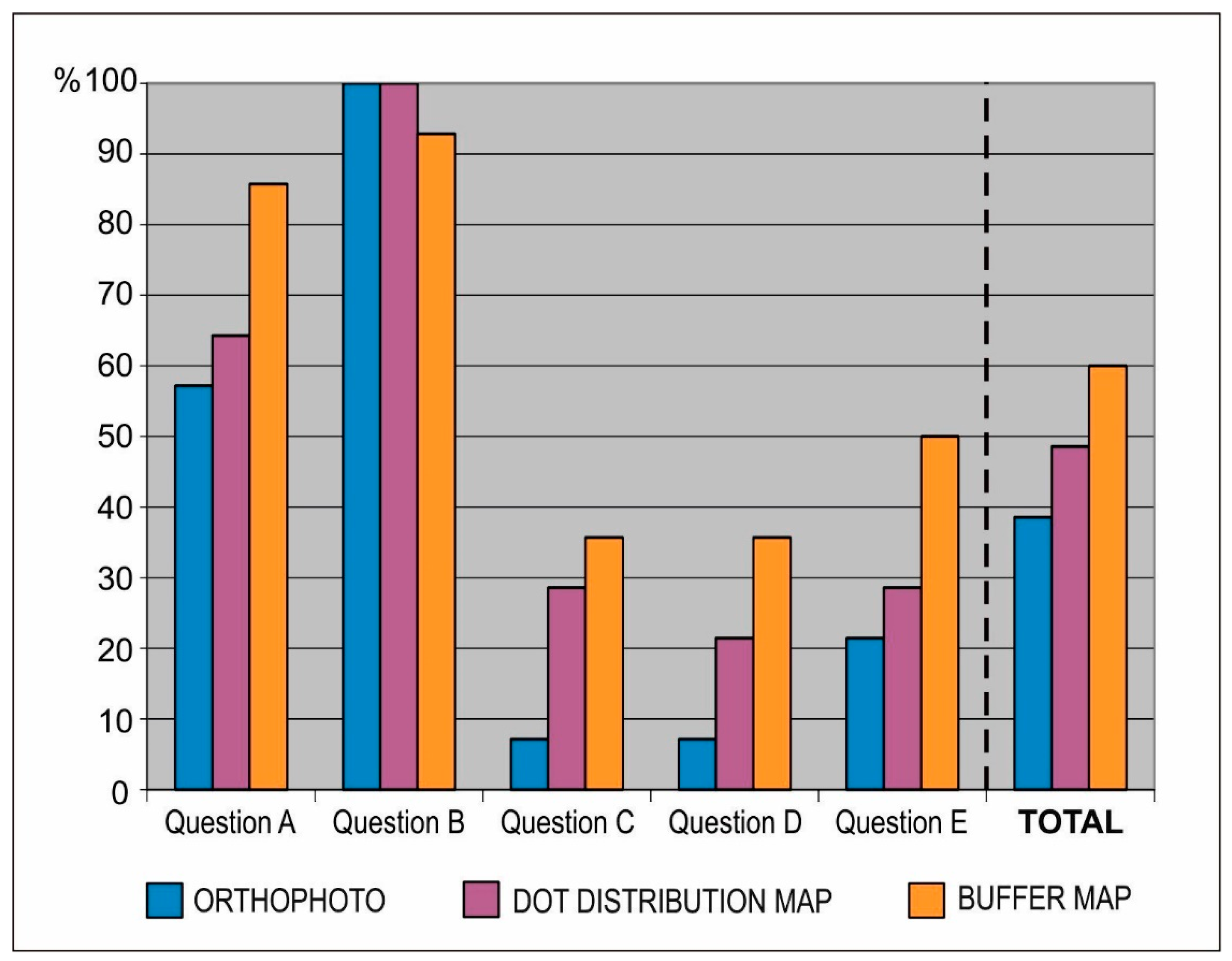
The juxtaposition of the answers to the objective questions as shown in
Figure 5 mostly reflects differences in interpreting the dynamics behind the changing numbers and clustering of people during the event. The very good accuracy obtained for the question regarding the total number of participants might partly have resulted from the duplicate information—the number of people was not only shown graphically on the map, but also as a number next to the map. When one takes into account the analysis of the map content alone, better results were obtained for the buffer map. It is immediately visible that all three visualizations were effective enough to enable the accurate perception of the queue to the toilet—this object was located quite far from the others, which made it stand out on each of the visualizations. Each visualization also clearly shows the significant rise in the number or people standing one behind the other when the event was drawing to an end.
Clearly, the effectiveness was lower in the case of interpreting the information about the group size and groups’ distribution on the picnic field (questions C, D, and E). In those cases, the buffer map yielded better results than the dot distribution map, and much better results than the orthophoto.
The animation involving the buffer map clearly turned out to be the most effective one for communicating the information about the course of the event (60% of correct responses). It was followed by the dot distribution map animation, which yielded close to 50% accuracy. Most difficulties in terms of the right interpretation were experienced by participants while dealing with the orthophoto (less than 40% of correct answers), and it was especially problematic in the tasks regarding the participants’ distribution on the picnic field and the estimation of the group size.
The request for subjective opinions followed in the second part of the survey so that the experts, having already provided their answers to the objective questions, could draw on their familiarity with the mapping method.
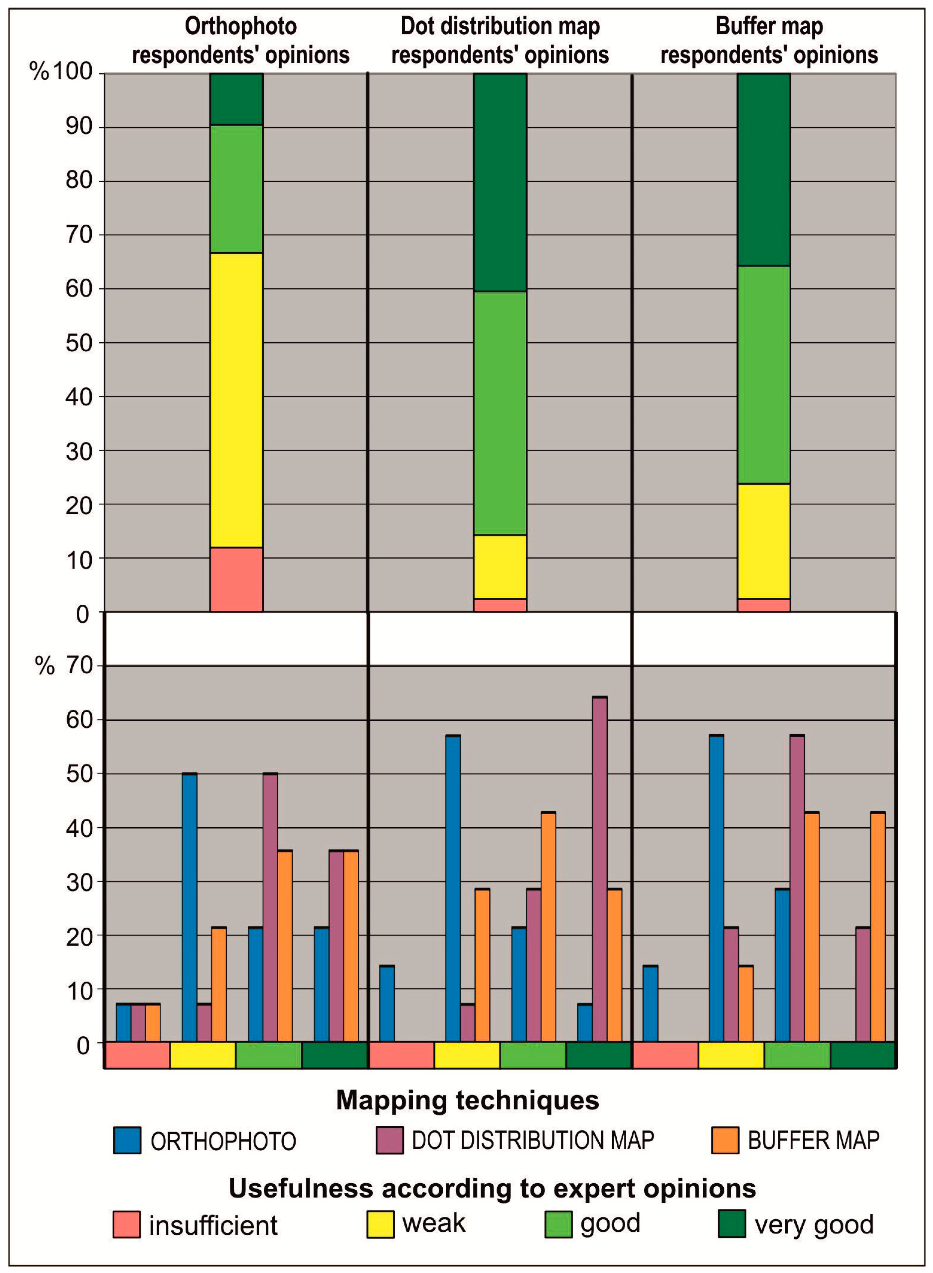
Figure 6 showcases two charts. The three columns in the upper chart illustrate the opinions of all 42 experimental subjects regarding each of the visualizations. In this case, it is worth pointing out the difference between the subjective opinions of experts, who ranked the dot distribution map the highest, and the answers to the objective part of the questionnaire, which shows the buffer map to be the most effective.
The results obtained for the same question, but classified according to the three variants of the questionnaire, are shown in the lower chart in
Figure 6. Regardless of the variant of the tested visualization method, the highest number of respondents (50% and greater) assessed the orthophoto as the least useful. This result was also reflected in the results of the objective part of the survey as shown in
Figure 5. None of the respondents using the dot distribution map or the buffer map animations considered those methods to be ineffective. The users of the dot distribution map ranked this method higher than the buffer map, just as the buffer map users preferred their method to the dot distribution map. Experts answering the objective questions on the basis of the orthophoto assessed it as the least effective, but still ranked it higher than the respondents working with the dot distribution map and buffer map animations.
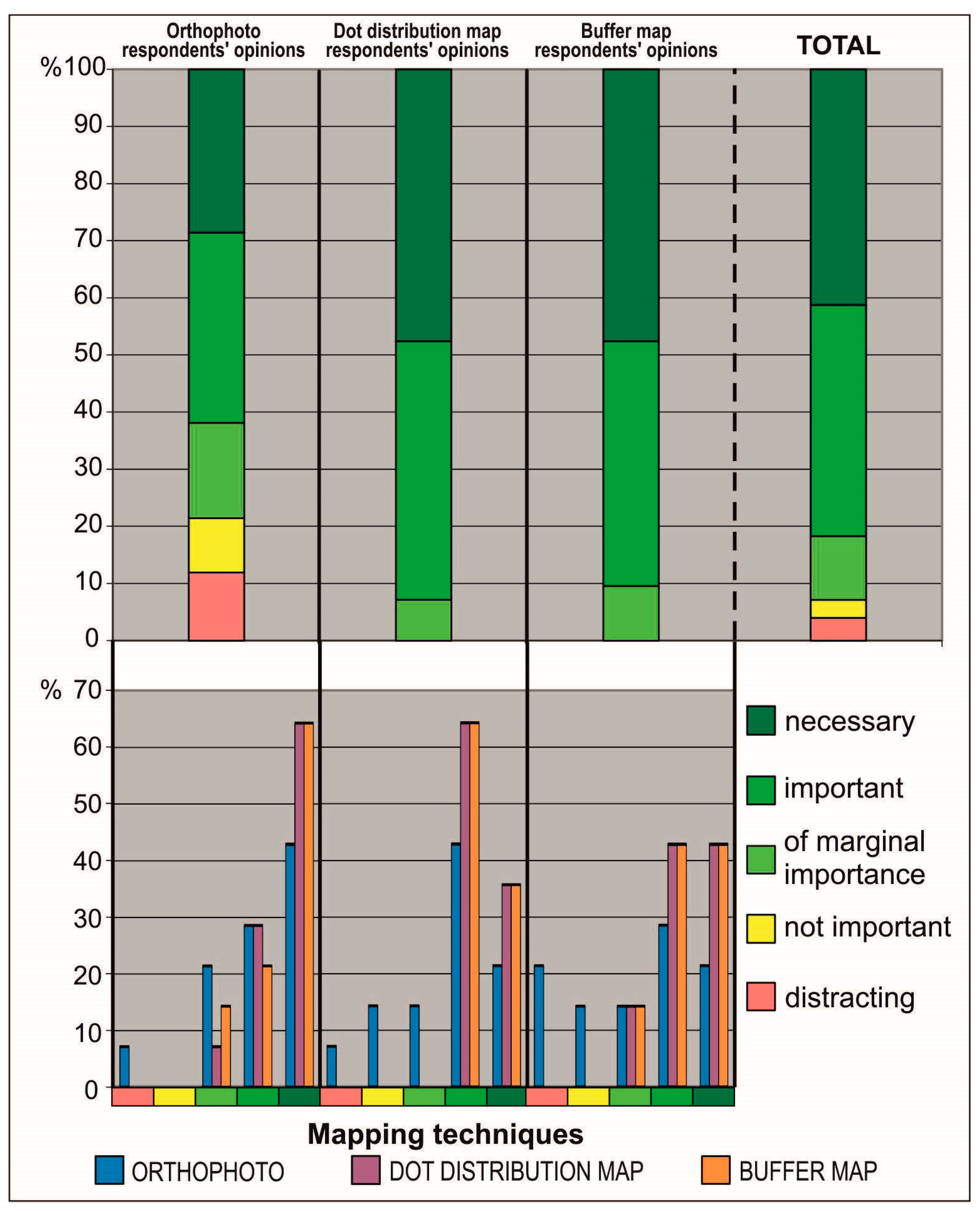
As far as the expert opinions are concerned, placing stable objects and the venue borders on all three visualizations was generally considered to be important or even necessary (
Figure 7). While for the dot distribution map and the buffer map none of the respondents chose the answers ‘distracting’ or ‘not important’, more than 20% of the experts assessed stable objects in those ways. Such subjective opinions might result from the fact that the orthophoto already features a lot of colors and adding even more graphical elements might seem unnecessary or even chaotic, as they partly obscure the raster image. However, placing several stable objects on a specially chosen gray background on a dot distribution map or a buffer map did not inhibit its readability or obscure any other graphical elements.
A detailed analysis of the respondents’ answers to the second question broken down into questionnaire variants yields the conclusion that the respondents’ opinions were the most varied in the case of the orthophoto (bar charts in the lower part of
Figure 7). For the buffer map and the dot distribution map, respondents agreed to a higher extent, consistently choosing only the three highest levels of usefulness. Interestingly, the participants working with the dot distribution map animation were the most consistent in attaching a great significance to placing stable objects and the venue borders on the dot distribution map and the buffer map, although they differed in their opinions regarding the importance of those objects on the raster map.
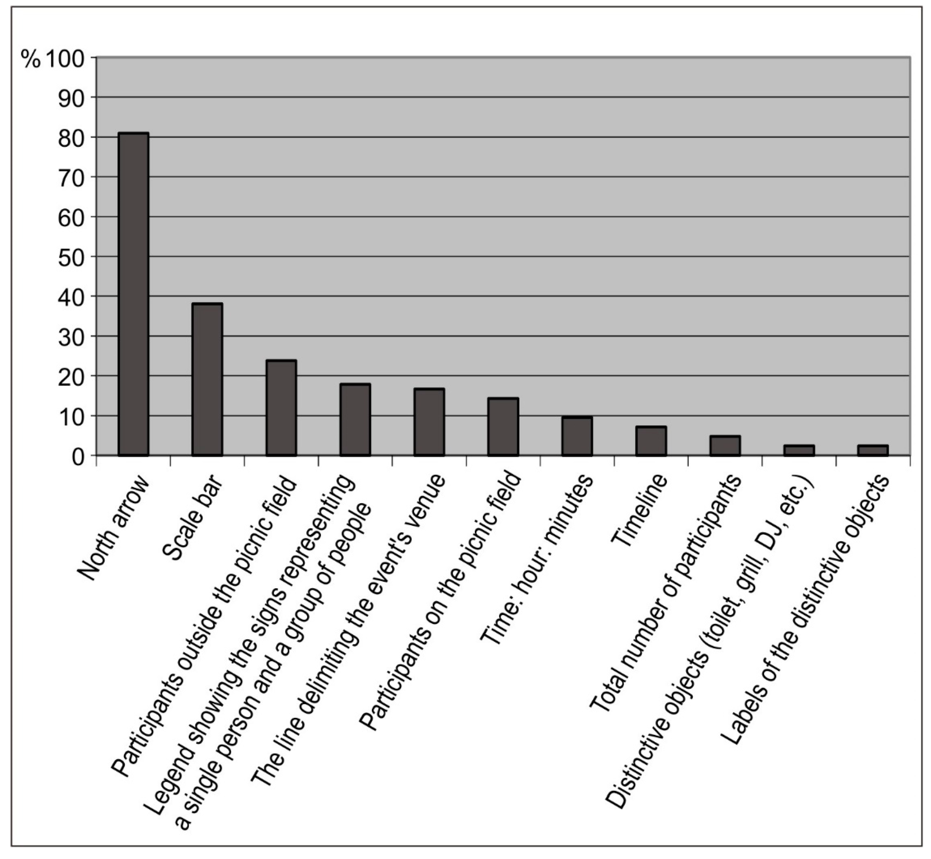
The respondents had varying opinions on the effectiveness of the particular elements of visualizations for the analyses (
Figure 8). It must be noted, however, that the experts generally approved of the overall design of the animated map, as only one of its elements was deemed to be unnecessary by them; i.e., the north arrow (80%). The second least useful element was the scale bar (40%). All of the other elements, in the respondents’ opinion, should be included on an animated map. Only slightly above 2% (1 person out of all 42 respondents) thought it unnecessary to include the distinctive objects; the same result was recorded for the labels of those objects. This confirms the results already obtained in Question B. Interestingly, though, the border of the venue was not that consistently ranked as important—about 20% of the respondents thought it unnecessary. When it comes to the elements not constituting parts of the map as such, the respondents attached less importance to the information about the number of participants outside the picnic field than to the number of participants on the field. This was probably caused by the question, in which the subjects were asked to estimate the ratio, and for that they needed to estimate the number of people on the picnic field.
3. Conclusions
The results obtained here are part of wider considerations about user-centered design for interactive maps in the context of the search for simple and effective design principles [
21]. The results also point out changes in the application of traditional cartographic design principles by experts in multimedia cartography going beyond interactive multimedia products on the Internet [
22]. The authors of this study drew attention to designing the map layout and functionality for animated visualizations in three ways to transform more and more drone images. A handful of tips obtained here may be relevant for users of dynamic developed web applications with the raw spatial data that most often require cartographic presentation [
23,
24].
The primary aim of the study was accomplished by proposing three alternative methods of visualization, whose effectiveness for analyzing the course of an open-air event was investigated with the participation of experts in cartography and geomatics. What was of key significance to the obtained results was the juxtaposition of objective answers with subjective opinions [
25], which allowed for a more informed formulation of conclusions regarding the effectiveness of the three different visualizations created on the basis of drone-taken photographs.
The animation employing the buffer map, i.e., the one in which the original information was processed the most and the personal distances were represented, objectively turned out to be the most effective one in terms of analyzing the dynamics of the spatial relations among people gathering at an open-air event attended by approximately 1000 people in an area of about 0.5 ha. The dot distribution map, which was subjectively assessed by experts as better, turned out to be slightly less effective than the buffer map. The results of both the objective and the subjective experiment, however, confirmed that the orthophoto had the lowest effectiveness.
All three methods were found to be highly effective for analyzing the successive (linear) growth in the number of participants near an object placed far away from big groups (the queue to the toilet). Questions regarding the dynamics of spatial relations were the most difficult ones for the respondents to answer. Those were the questions about the crowdedness of the particular parts of the picnic field and the number of participants forming buffers in particular time intervals. This data could be obtained only by analyzing the map, and the results show such relations to be relatively difficult to interpret. It is thus necessary to search for methods to facilitate this process and make it more effective. It is worth mentioning that the user of a particular animation tended to express a more favorable opinion of the method that he/she had come to know on a frame-by-frame basis than about a method he/she had seen only on one stationary frame.
The tested animations do not exhaust all possible types of land use or lighting conditions, but provide a good starting point for further research and testing methods in other environments. In the case of lighting conditions, variable light intensity was taken into account because the experiment covered hours from afternoon to evening, with artificial lighting visible in the later images. The color of clothes undoubtedly affects the degree of difficulty in noticing the participants of the picnic on the orthophoto map and we have added such information in the text. However, it seems that, even assuming that everyone would wear red jackets, the effectiveness of the orthophoto map and other methods would not be the same. This is because this method still requires users to interpret which set of pixels is a person, whereas in the case of dot and buffer maps, this burden has been completed by the creator of the visualization.
The idea behind the experiment was to examine the effectiveness of methods for subsequent transformations—from the simplest orthophoto method requiring the user to interpret the image more thoroughly, through the dot distribution map showing the distribution of picnic participants, to the buffer map suggesting relationships between participants. Stable objects appeared on all visualizations, while the buffer and dot distribution map method removed the orthophoto background (foundation), which could distract the user unnecessarily. Probably, in this case, the effect would be better than if the orthophotomap was used alone, but worse in relation to, e.g., the dot distribution map method. The orthophotomap was only an intermediate stage characterized by a large number of details and a very low degree of information processing, and recognizing such elements as a grill, toilet, or DJ spot without indicating them with the help of symbolized stable objects would be much more difficult for a user who did not participate in the event.
Because we invited experts in cartography and geomatics from outside Poland to participate in the survey, it was done online, and we were unable to use the eyetracking method [
26]. We also assumed that one animation iteration may be insufficient due to the need to focus on a moving image—a different level of concentration at the initial frames of the animation and another when replaying the same animation, but with a different question. The ability to concentrate may be different for different people and also depends on external factors that we were not able to control by conducting a distance study, which is why there was no time restriction on completing the task. Expert opinion was important to us, so for this reason the amount of time was unlimited, in order that respondents could learn about the method and form an opinion about it. More important to us was how much information from a given type of method could be read correctly and whether the subjective indications of the respondents in the second part of the survey follow their correct answers to objective questions.
Experts were in favor of minimizing the number of map elements, even at the cost of breaching traditional cartographic principles, as in the case of not including on the animated map a scale bar or a north arrow for non-north-oriented maps [
27]. The study results pointed to the great importance of the graphic enhancement of the objects serving as points of interest for the event’s participants and being thus treated as reference objects while analyzing the course of the event. There are many graphical ways to delimit an area in a raster file without distracting but instead focusing on the area needed; an example is the boundary of Greece (
https://tinyurl.com/y2z65qvp), which is presented in such a way that the area seems to be lifted, whereas it is only a properly symbolized line [
28]. This conclusion was also backed by the expert opinions. Those elements and their labels were assessed as being among the most needed components of the animation. In view of the above, the authors concluded that the search for alternative means of presentation is of key significance in improving the effectiveness of visualizations, which can be methodically confirmed by expert opinions. However, it is advisable to turn to further, objective, user-focused research in order to verify this effectiveness.


