Article

Visualisation of Spatial Data Uncertainty. A Case Study of a Database of Topographic Objects

by
Marek Ślusarski
* and
Magdalena Jurkiewicz
Department of Land Surveying, Faculty of Environmental Engineering and Land Surveying, University of Agriculture in Krakow (Poland), 31-120 Kraków, Poland
*
Author to whom correspondence should be addressed.
ISPRS Int. J. Geo-Inf. 2020, 9(1), 16; https://doi.org/10.3390/ijgi9010016
Submission received: 13 November 2019 / Revised: 18 December 2019 / Accepted: 23 December 2019 / Published: 31 December 2019

Abstract

:
The Database of Topographic Objects (DTO) is the official database of Poland for collecting and providing spatial data with the detail level of a topographic map. Polish national DTOs manage information about the spatial location and attribute values of geographic objects. Data in the DTO are the starting point for geographic information systems (GISs) for various central and local governments as well as private institutions. Every set of spatial data based on measurement-derived data is susceptible to uncertainty. Therefore, the widespread awareness of data uncertainty is of vital importance to all GIS users. Cartographic visualisation techniques are an effective approach to informing spatial dataset users about the uncertainty of the data. The objective of the research was to define a set of methods for visualising the DTO data uncertainty using expert know-how and experience. This set contains visualisation techniques for presenting three types of uncertainty: positional, attribute, and temporal. The positional uncertainty for point objects was presented using visual variables, object fill with hue colour and lightness, and glyphs placed at map symbol positions. The positional uncertainty for linear objects was presented using linear object contours made of dotted lines and glyphs at vertices. Fill grain density and contour crispness were employed to represent the positional uncertainty for surface objects. The attribute value uncertainty and the temporal uncertainty were represented using fill grain density and fill colour value. The proposed set of the DTO uncertainty visualisation methods provides a finite array of visualisation techniques that can be tested and juxtaposed. The visualisation methods were comprehensively evaluated in a survey among experts who use spatial databases. Results of user preference analysis have demonstrated that the set of the DTO data uncertainty visualisation techniques may be applied to the full extent. The future implementation of the proposed visualisation methods in GIS databases will help data users interpret values correctly.

1. Introduction

Spatial information systems are designed to manage large amounts of information about geographical objects representing real-world phenomena. Every set of spatial data based on measured data is susceptible to uncertainty, which is expressed in many forms. Should the uncertainty be ignored, results of analyses will remain logical, but the research will yield inaccurate or even misleading results. Confidence in an information system that ignores data uncertainty is, therefore, undermined. Hence, the widespread awareness of data uncertainty will be of vital importance to all spatial information system users [1].
The issue of spatial data uncertainty has been investigated by numerous researchers who looked into it from several angles. The primary domains of interest include the impact of data uncertainty on spatial analysis results [2,3,4], informing users about data uncertainty using metadata [5,6,7], and conceptual modelling of different types of uncertainty depending on the type of the investigated problem [8,9]. Uncertainty of spatial datasets has been analysed with non-standard approaches as well. Some of them were the theory of belief functions, Bayes’ theorem of conditional probability, or fuzzy logic [10,11].
The most popular method for informing users about spatial data uncertainty today is metadata sets in the form of text files. Metadata are used mainly to empower users to assess the practical value of datasets. The benefits of access to such metadata are, nevertheless, limited because their content and form may be challenging to understand for standard users and even for geographical information system experts [12]. For this reason, text file metadata are not the most practical means of communication of spatial data uncertainty.
Cartographic visualisation techniques are another practical approach to informing spatial dataset users about the uncertainty of the data. Such techniques are particularly powerful for conveying information for large datasets. Human sight is sensitive to structures and relationships. Graphics and cartographic visualisation are natural means for reflecting the spatial structure. Visual presentation of phenomena is an effective communication tool, which can handle copious amounts of information [13].
The objective of the work was to define a set of techniques for visualising DTO uncertainty and then estimate them comprehensively using a questionnaire survey among experts who used spatial databases.

2. Materials and Methods

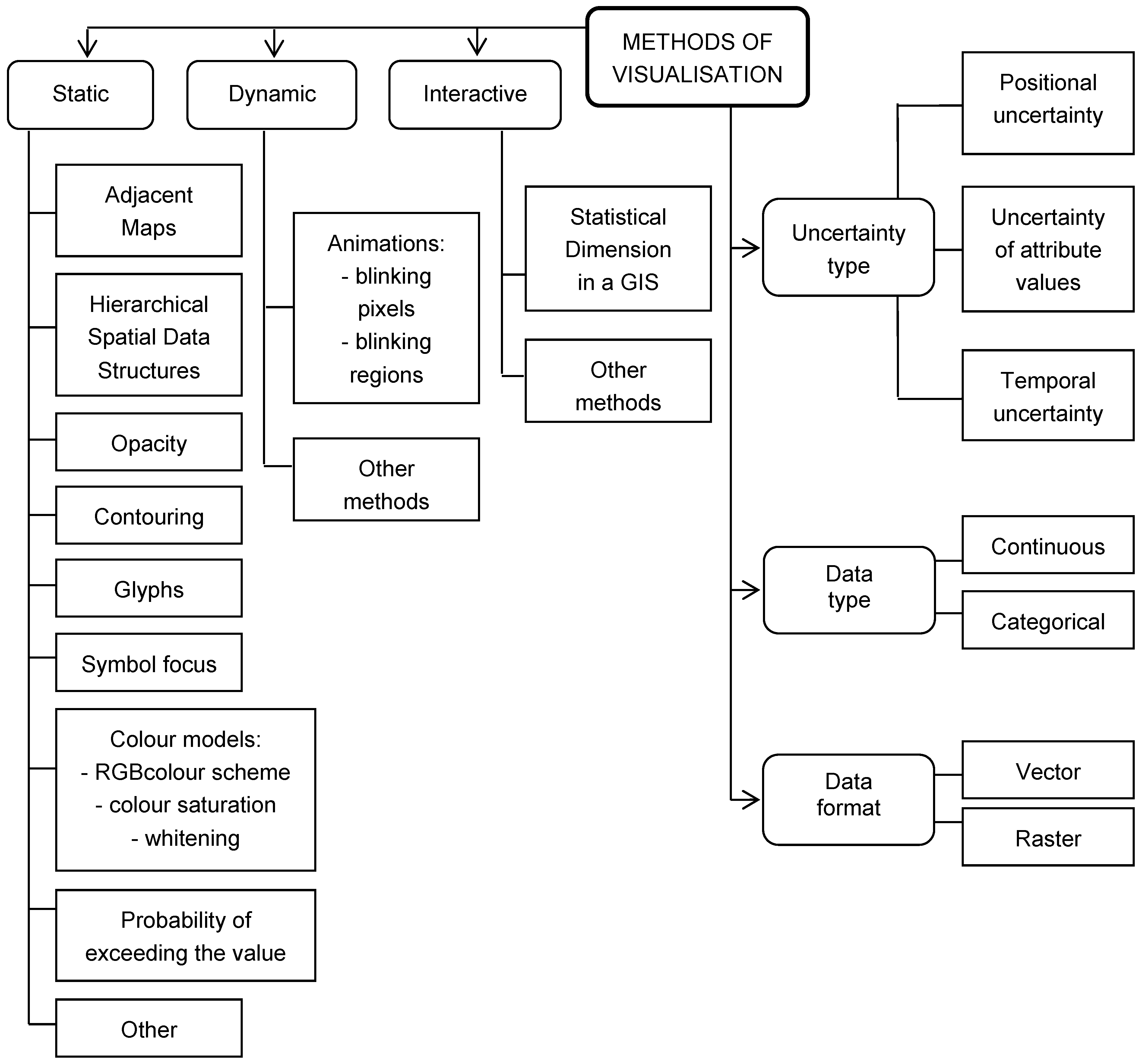
2.1. Spatial Data Uncertainty Visualisation Methods

The main requirements for spatial data quality visualisation methodology are the right selection of cartographic presentation methods and good image quality. Factors such as the scale, spatial and temporal properties, local changes in data quality, and computational performance are essential as well [14]. Data quality information is often generated and visualised using a scale for which the detail level of data uncertainty features presentation is optimised. Hence, relevant information is displayed in a specific scale and not displayed on maps in different scales.
The graphic variables employed should facilitate the presentation of information about data quality relevant to the detailed spatial and temporal position. From the standard point of view, the quality of the data set as a whole may be satisfactory with only some location deviating from the target quality. Such areas are, usually, of particular interest to users. Consequently, visual variables should attract user’s attention to these areas that feature local changes in spatial data quality. Modern cartographic visualisation techniques consume substantial computational resources to generate and display data quality information. It is, therefore, advisable to use such techniques of generating visual information that ensure adequate high-quality and fact-based presentation of uncertainty for spatial data.
The uncertainty is inherent to spatial datasets and may contribute to poor decision making. The probability of wrong decisions is much smaller when the user understands the distribution of the uncertainty of the data they use. Hence, some empirical studies have been focused on devising an effective method of uncertainty visualisation for over a dozen years. MacEachren [15] proposed three types of uncertainty visualisation methods: adjacent maps, bivariate maps, and dynamic representation.
The adjacent maps method involves two separate maps showing investigated spatial phenomena and relevant data uncertainty. The bivariate map technique involves the presentation of data and uncertainty on a single map using two different graphic variables to represent the phenomena. Dynamic variables contribute visual suggestiveness, which leads to marking out of animations on the map displayed on a computer screen. The animations used to represent spatial data uncertainty are blinking, rotation, and pulses [15].
Components responsible for spatial data quality, namely completeness, consistency, and accuracy, can be presented to the dataset user through graphic variables, also referred to as visual variables. Bertin [16] proposed a taxonomy of visual variables used with geographic systems. Size, lightness, texture, shape, orientation, and colour are considered the primary variables. The revolutionary growth of computer graphics design offers dynamic variables such as synchronisation, the moment of display, order, frequency, rate of change, and duration [17].
Colour palette and saturation can be used to represent uncertainties in adjacent maps [17]. In the hierarchical data structure method, the visual variable used is the appropriately selected pattern. The uncertainty is presented as a transparent tessellation overlay, a form of tiling of a surface with polygons with no gaps or overlaps, on a map with the investigated spatial phenomenon [18]. Finer tessellation indicates areas of lesser uncertainty, while coarse tessellation represents regions with greater uncertainty.
The hue is now one of the most important visual variables used in cartographic representation because of its application potential for computer screens, tablet screens, etc., and general access to colour printed materials. Three primary hue parameters, colour, lightness, and saturation build the hue space spectrum for visualising spatial data uncertainty. In one of the methods, screen red, green, blue (RGB) hues are converted into hue saturation value (HSV), which takes into account how human sight registers images. Next, the colour is used to convey information about the spatial phenomenon of interest and saturation and lightness represent data uncertainty [19].
Pictorial symbols or glyphs can be used to represent uncertainty in an integrated way. Pang [20] demonstrated that pictorial symbols could be used to analyse the uncertainty of wind direction represented as vector fields. Glyphs were shown as arrows. The head width corresponded to angular uncertainty and the size of the vector field was described in the whole area of interest.
Data uncertainty can be conveyed through the use of contouring as well. Contour lines of various colours are used to represent various variables and their relevant uncertainties with hue intensity [20]. Likewise, the width of the contour and style of the dotted contour line may represent uncertainty. Brodlie et al. [21] describe a positional uncertainty visualisation method whereby the gap width of the contour line is directly proportional to the uncertainty.
Focus metaphors are a method for reflecting data uncertainty that is based on human cognition, focusing on fuzzy images. Uncertain data are presented out of focus, which reduces their resolution. More certain data are presented with crisp or focused images [19]. Uncertain boundaries, for example, are foggy, while boundaries that meet data quality requirements are represented using crisp contours. Another technique in this visualisation method is the use of opacity. Lesser uncertainties are perceived as less opaque images. Data with high uncertainty are unclear [22].
Computer screen animations are an effective method for presenting spatial dataset uncertainty. One such uncertainty visualisation technique is a map with animated, pulsing map symbols representing data considered uncertain [23]. The ‘blinking areas’ method involves overlaid data classes and an uncertainty layer displayed alternately [24]. In the ‘blinking pixel’ method, data are displayed using blinking pixels that keep changing their colour. The frequency of changes is proportional to the data uncertainty [25].
The application of probabilistic tools in GIS-type software facilitates the representation of the uncertainty with aggregated probability functions computed for every object in the database. Hue saturation can be used to represent selected values or probability depending on the selected quantile or threshold value [26].
Data uncertainty visualisation techniques and relevant data properties can be modelled with a formalised diagram. The data uncertainty visualisation methods model is a set of principles for describing data set uncertainty with visual variables. The model in Figure 1 links visualisation techniques to data uncertainty properties. Visualisation methods are classified into three primary categories depending on the interaction: static, dynamic, and interactive [19].
Other fundamental factors in the model are types of uncertainty and types and formats of data (Figure 1). The three basic types of uncertainty are positional, attribute, and temporal uncertainty. The positional uncertainty concerns mostly the accuracy of represented coordinates. The attribute uncertainty is the property of spatial data reflecting the correctness of values of attribute that may be of different data types. The temporal uncertainty is related to the data changing over time and expresses the currency of the data compared to the required frequency of updates [27].
In terms of spatial location, data can be continuous or categorical. Continuous data are defined for each point of the geographical space of interest such as topography. Categorical data include objects with boundaries. They are represented by points, lines, and polygons. The spatial position of geographical objects is determined using two primary data acquisition methods. The first one is field measurements, mainly land surveying, Global Navigation Satellite System (GNSS) positioning, and Light Detection and Ranging (LiDAR). The other technique is cartometric measurements on an orthophoto or analogue map or its calibrated digital image. As a result, data describing spatial objects come either in the vector or raster format [19].
The dynamic growth of spatial data uncertainty visualisation methods resulted in an authentic need to investigate the usability of visualisation techniques. Evans [28] investigated the effectiveness of two methods of data uncertainty visualisation, adjacent maps, and blinking areas. Sixty-six participants of the survey were both beginner and expert GIS users. The study did not demonstrate any significant differences in interpreting uncertainty visualisations in the two groups. Cliburn et al. [29] looked into the practical value of three visualisation methods: hue saturation, symbol crispness, and glyphs. The study involved informal conversations with GIS experts, researchers, or public administration officers. The participants assessed the first two methods consistently but were of different opinions regarding the latter uncertainty visualisation technique.
Kardos et al. [24] conducted online surveys concerning nine visualisation techniques. The participants assessed the visual appeal, the time necessary to understand the phenomena correctly, and the general effectiveness. According to the tests, attribute value uncertainty should be represented using blinking areas. Another study on the usability of uncertainty visualisation methods focused on the selection of the best techniques for four user groups depending on what they used spatial data for: GIS, statistics, decision support, and urban planning [30]. Four methods were analysed in terms of performance and user preferences i.e., adjacent maps, contouring, glyphs, and error bars. According to the survey, the best data uncertainty visualisation method for all four domains was contour maps.

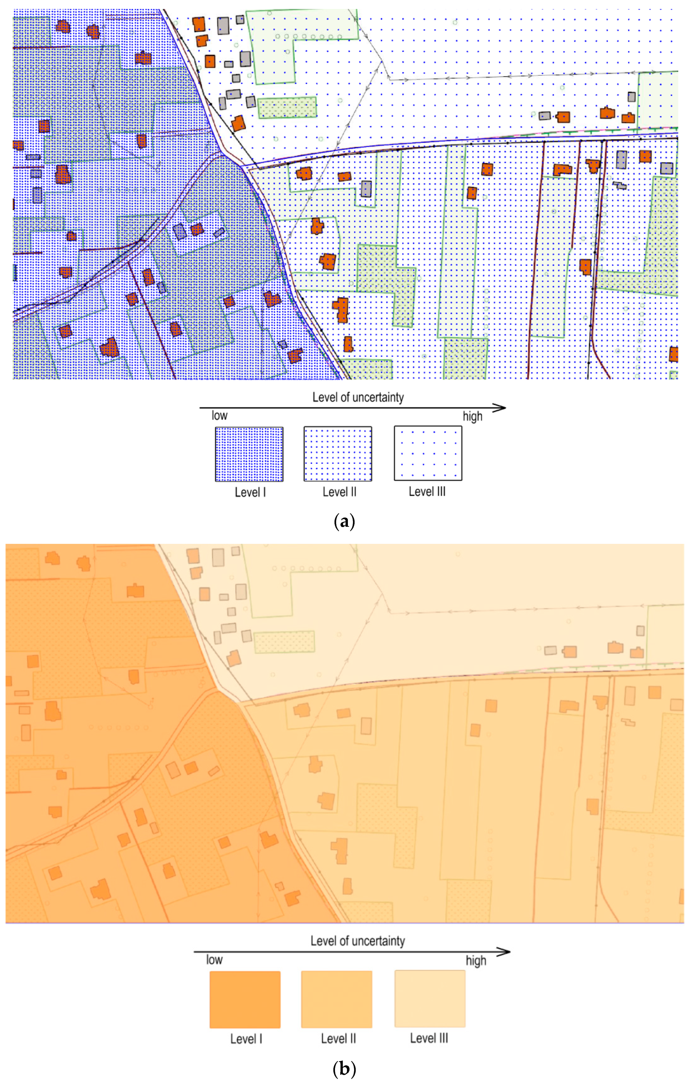
2.2. Data Uncertainty Visualisation in the Database of Topographic Objects (DTO)

The Database of Topographic Objects (DTO) is the database for collecting and providing spatial data with the detail level of a topographic map in the 1:10,000 scale and lower. In Europe, national DTOs collect and provide data mainly on the hydrographic network, transport network, utilities, land cover, buildings, and structures. In the European Union (EU), the INSPIRE Directive specifies a uniform European Spatial Data Infrastructure for all member states and European Free Trade Association (EFTA) states [31,32]. Hence, official spatial databases and databases of topographic objects are organised in virtually the same way. Differences are apparent in the cartographic representation of spatial data. The primary causes of different forms of geographic object representation are different features of the geographic environment and different cartographic traditions in individual countries [33,34,35,36].
The primary objective of the Database of Topographic Objects is to ensure access to current and high-quality topographic data for specialised official spatial information systems. This way, data in the DTO are the starting point for geographic information systems (GISs) for various central and local government and private institutions. The objective can be achieved because the DTO is the primary source of information about the spatial location, characteristics, cartographic codes, and metadata of topographic objects. The information is obtained from various sources of reference data. The primary source includes central or regional public registers, resources of specialised agencies such as road authorities, and water system boards.
The Polish DTO is structured in a similar way to databases in other states in the EU. Today, the content of the DTO comprises nine classes of topographic objects: territorial subdivision units, transport network, buildings and structures, land cover, single land use areas, hydrographic network, protected areas, utilities, and other objects.
The visualisation of the DTO data uncertainty is of crucial importance for making strategic decisions and planning and design works. The visualisation is further useful for individual users of official spatial data. It is not an easy task to select visualisation methods that convey easily understandable and accurate information about uncertainty in a swift manner. The different types of uncertainty i.e., positional, attribute value, or temporal and diversity of visualisation methods i.e., static, dynamic, and interactive ones, prevent any single standard approach to the selection of visualisation techniques [37].
One of the ways uncertainty visualisation techniques can be selected is the heuristic method. The Reliability Visualisation System (RVIS) developed by MacEachren [15] is an example of a heuristic approach. RVIS uses an interactive environment offering a number of possible manipulations to convey uncertainty estimates associated with dissolved inorganic nitrogen in Chesapeake Bay [15]. With this method, spatial data users have access to multiple visualisation tools to create custom spatial data uncertainty models. Custom uncertainty models should, however, be used only by experts who understand the intricacies of the uncertainty of data in spatial databases. Manipulation of software visualisation tools by inexperienced users may lead to incorrect interpretation of data uncertainty [14]. Another approach is to provide a limited set of visualisation techniques (several for each type of uncertainty) selected using expert knowledge and experience [24]. Such a limited array of visualisation techniques facilitates precise tests and juxtaposing of the techniques.
The assessment of data uncertainty visualisation methods concerns both spatial database users and developers of dataset management software. Users look for the right tools to evaluate the reliability and usability of data in various applications. Producers, on the other hand, look for methods to improve the usability of the software they offer [14].

2.3. Research Methodology

The first stage of the research involved the determination of a set of methods for visualising DTO uncertainty following a literature analysis and authors’ experience and research on the quality of data in official spatial databases. The methods are intended for presenting three types of uncertainty: positional, attribute, and temporal uncertainty. The positional uncertainty was defined for point, linear, and surface objects using two variables: attribute value uncertainty and temporal uncertainty. The uncertainty visualisation study was founded on three primary characteristics of objects in the DTO. These types of uncertainty were selected due to the features of data in the DTO and objectives of the study regarding the possibility of the uncertainty visualisations being used by the users of the database.
Three grade levels were proposed for the applied visual variables depending on the hierarchy of importance of sources of spatial data. They are related to three levels of uncertainty of spatial data resulting from varied data sources used for the database of topographic objects.
Next, the questionnaires filled in by the 100 experts who use spatial datasets were thoroughly analysed. The respondents were researchers, public administration employees, and representatives of the private sector who worked with GIS. The researchers were PhDs with many years of academic and research experience. The public administration employees were people with experience in managing and carrying out public projects and planning jobs where GIS tools are used. The private sector was represented by designers, land surveyors, and architects.
The respondents evaluated the set of positional, attribute, and temporal uncertainty visualisation techniques devised by the authors (Figure 2, Figure 3, Figure 4 and Figure 5) in survey questionnaires, which contained four survey questions. The questions and instruction for each visualisation method are presented below.
  • How many spatial data uncertainty classes can be identified for each presented visualisation method?
  • Describe the preferred hierarchy of importance—from the most accurate objects to objects defined inaccurately.
  • Order the methods of visualisation, according to your preferences, for each technique from the most beneficial to the least beneficial one.
  • Will the information about data uncertainty represented with the evaluated visualisation techniques be useful when making decisions based on spatial datasets (yes/no)?
The objective of the research is to visually assess levels of uncertainty depending on the scale assumed for any attribute. Experts evaluated the visualisation of object uncertainty while ignorant of uncertainty values. They were asked to identify the hierarchy of uncertainty for the objects presented to them without specific values. Their responses were compared to model information from uncertainty maps. The purpose of the comparison was to assess how successful the users were at identifying the number of uncertainty classes and the hierarchy of importance of the visual variables used i.e., questions numbers 1 and 2. The assumption for the uncertainty model was that the forms of gradation of the visual variables used were directly proportional to the increase in the dataset uncertainty. For example, the size of pictorial symbols and colour value intensity are correlated with the increase in spatial data uncertainty.
The data uncertainty maps used in the survey (Figure 2, Figure 3, Figure 4 and Figure 5) did not include explanations on how to read the spatial data uncertainty correctly (as per the model). Responses to questions 1 and 2 were compared to the model using the Spearman’s rank correlation coefficient. The Spearman’s correlation coefficient can be interpreted just like the Pearson’s correlation coefficient. Drecki [14] and Kardos et al. [24] applied correlation coefficients efficiently to investigate the usability of attribute uncertainty visualisation techniques. Moreover, Drecki and Kardos assessed data uncertainty visualisation with a survey. The authors used the DTO as the object of the study based on their experience.
The Spearman’s rank correlation coefficient values (R) for the responses regarding the each uncertainty visualisation method were then used to determine scores for two categories: assessment of the number of uncertainty classes and the user-preferred hierarchy of importance. The scores in the categories were determined proportionally to the values of the correlation coefficient (R). The method of visualisation for which the calculated value of the R estimator was the greatest was assigned the score equal to the number of the analysed visualisation techniques, two points. One point was assigned to the visualisation method that had the lowest R coefficient. The scores of uncertainty visualisation techniques for individual object classes and two assessment categories are shown in columns ‘score I’ and ‘score II’ in Table 1, Table 2, Table 3 and Table 4.
The ranking scores for the ‘preferred visualisation method’ were determined proportionally to the mean values of preferences i.e., questionnaire question 3. The method for which the calculated mean value was the greatest was assigned the score equal to the number of the analysed visualisation techniques, 2 points. One point was assigned to the visualisation method that had the lowest mean value. The score for this category is shown in column ‘score III’ in Table 1, Table 2, Table 3 and Table 4.
The final ranking scores of the investigated visualisation methods were determined by summing up the scores for three estimation categories, assuming the equal weight of each assessment group (Table 1, Table 2, Table 3 and Table 4).

3. Results

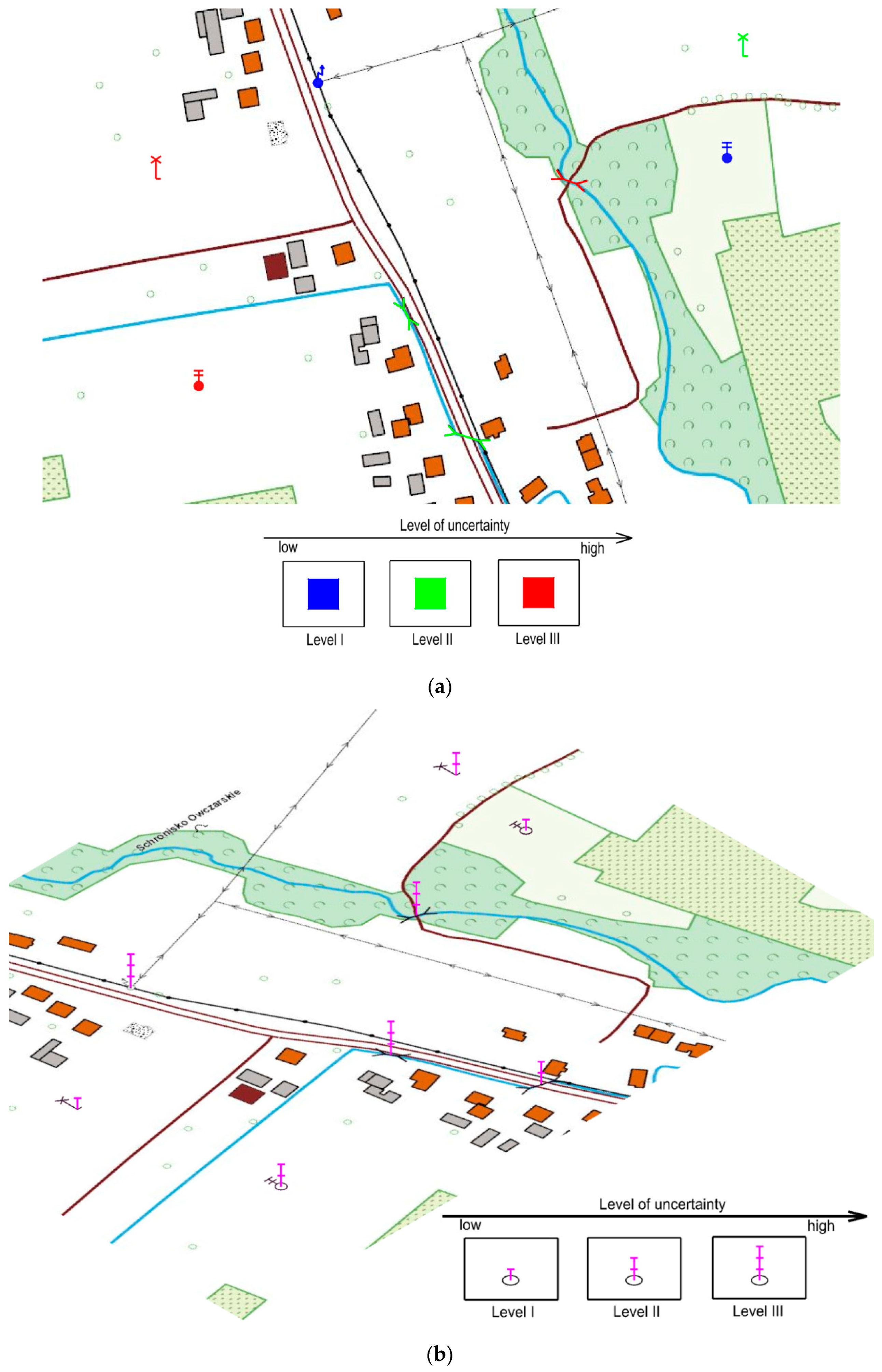
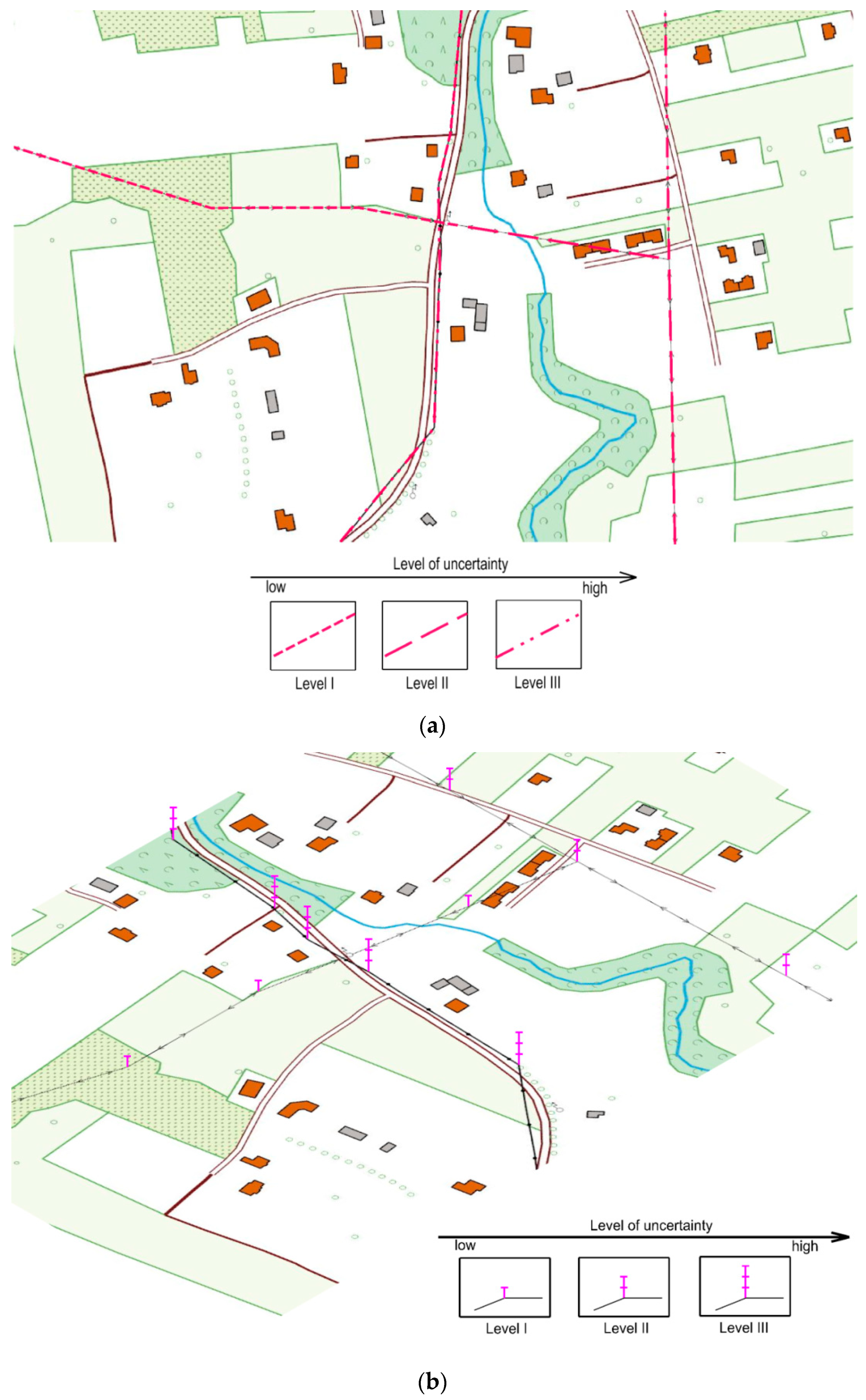
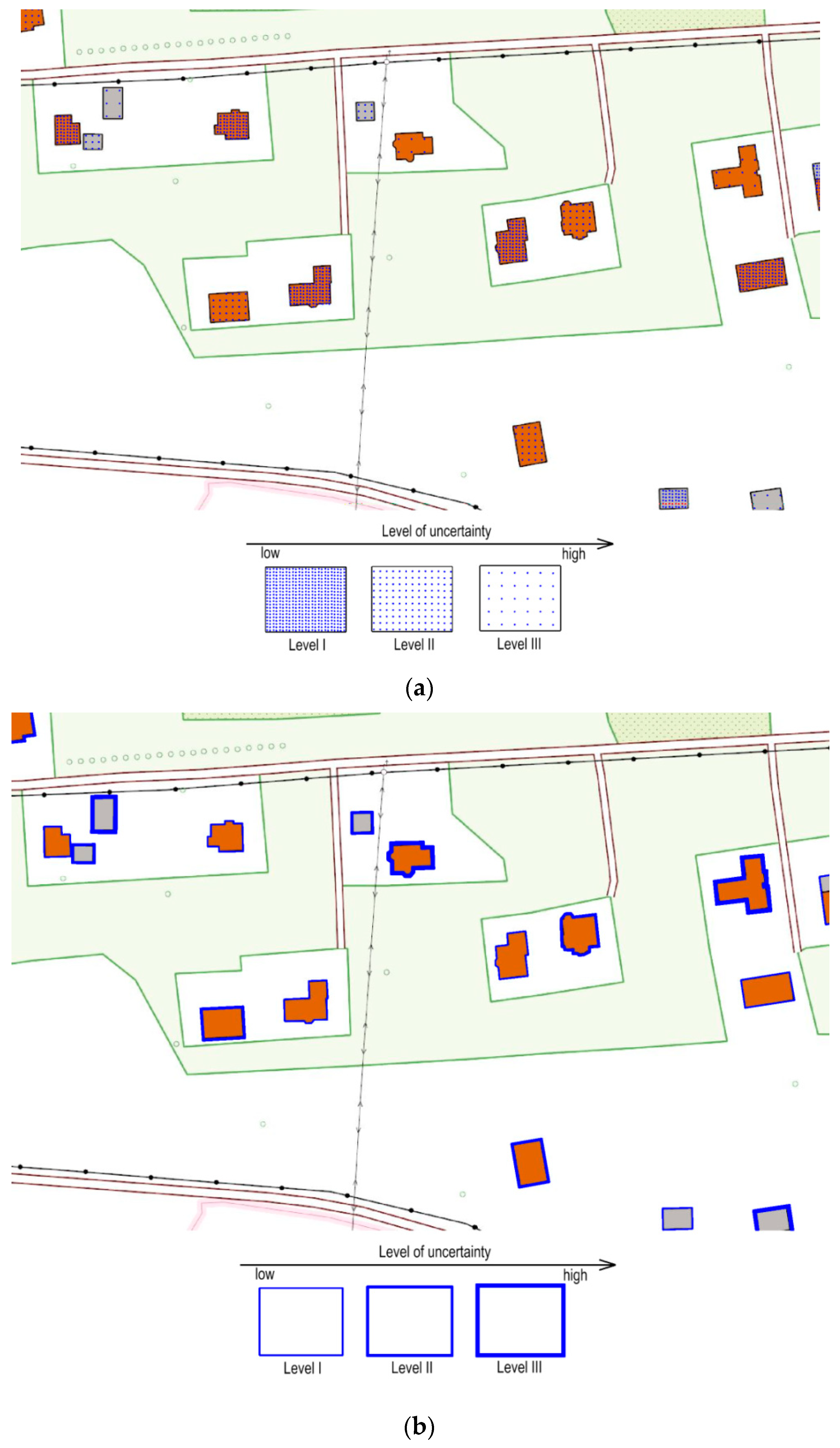
3.1. Data Uncertainty Visualisation Methods for Data in the DTO

The authors have defined a set of uncertainty visualisation methods for data in the DTO based on an analysis of reference literature and their experience and research [37,38,39] on the quality of data in official spatial databases. This set contains visualisation techniques for presenting three types of uncertainty: positional, attribute, and temporal uncertainty. The positional uncertainty was defined for point, linear, and surface objects using two variables:attribute value uncertainty and temporal uncertainty. They describe such aspects as completeness or currency of sets and are represented using two visual variables.
The forms of gradation applied to the visual variables depend on the hierarchy of importance of sources of spatial data. The uncertainty visualisations presented below in Figure 2, Figure 3, Figure 4 and Figure 5 involve three levels of spatial data uncertainty. The levels of uncertainty are related to heterogeneous data sources used for the database of topographic objects.
The positional uncertainty for point objects was represented with the following visual variables:
  • Fill hue colours and lightness (Figure 2a);
  • Glyphs placed at map symbol positions (Figure 2b).
The positional uncertainty for linear objects was represented with the following visual variables:
  • Contouring of linear objects with dotted lines (Figure 3a);
  • Glyphs placed at vertices (Figure 3b).
The positional uncertainty for the object class ‘buildings’ was represented with the following visual variables:
  • Fill grain density in line with the hierarchical data structure principle (Figure 4a);
  • Building contour crispness (Figure 4b).
Attribute value uncertainty and temporal uncertainty, for example, completeness or currency of datasets, were represented using the following visual variables:
  • Fill grain value of areas featuring different attribute value and temporal uncertainty levels. The fill grain density is in line with the hierarchical data structure principle (Figure 5a);
  • Area fill colour value proportionate to the attribute uncertainty and temporal uncertainty (Figure 5b).
The forms of gradation of the visual variables depend on the hierarchy of importance of attribute uncertainty and temporal uncertainty.

3.2. Assessment of the Proposed Methods of Data Uncertainty Visualisation

The palette of the uncertainty visualisation methods for data in the DTO proposed above is not extensive. The use of a limited number of visualisation techniques facilitates precise tests and juxtaposing of the techniques. The visualisation methods were comprehensively evaluated in a survey among experts who use spatial databases. The preference analysis was based on survey questionnaires completed by 100 respondents: researchers, designers, architects, land surveyors, and public administration officers. The share of participants from the five groups was similar. The differences did not exceed 5%.
The results of the questionnaire survey were analysed in-depth and compared to reference information. Results of the analysis are presented in tables in line with the principles in Materials and Methods (Table 1, Table 2, Table 3 and Table 4). Values of the R coefficient were calculated, and rank scores assigned. The final ranking scores were determined by summing up the scores in three estimation categories, assuming equal importance of each assessment group.
The reception of the visualisation methods of uncertainty of spatial data in the database of topographic objects proposed by the authors was generally positive, which survey question number 4 shows. The experts (96%) believed that the visualisation techniques would be useful when making decisions based on spatial datasets.

4. Discussion

The proposed set of uncertainty visualisation methods for data in the DTO was tested and compared internally by 100 experts, researchers, designers, architects, land surveyors, and public administration officers. These experts use spatial datasets in their research, designs, and decision-making. The most effective methods of visualisation were selected using three categories.
The experts scored the highest the positional uncertainty representation for point objects (Table 1) using glyphs placed at map symbol positions (Figure 2b).
For linear objects, the best results of spatial data uncertainty representation (Table 2) can be achieved using both the visualisation techniques: contouring of linear objects with dotted lines featuring various styles (Figure 3a) and glyphs placed at vertices (Figure 3b).
Based on user preferences, the most effective technique for visualising positional uncertainty for the ‘buildings’ class (Table 3) was the fill grain density in line with the hierarchical data structure principle (Figure 4a).
For spatial data regarding the representation of attribute uncertainty and temporal uncertainty, the preferences of users clearly indicated (Table 4) that the technique involving the fill colour value proportionate to the attribute uncertainty and temporal uncertainty was the best (Figure 5b).
The assessment of the data uncertainty visualisation methods demonstrated that the fill grain density technique, for attribute and temporal uncertainty, was not scored the best. The effective, high-quality, and fact-based visualisation of the uncertainty of data in the DTO for large surface areas requires high-performance computer hardware and software. Therefore, it was the lack of sufficient computer tools that resulted in the low score of the fill grain density technique.

5. Conclusions

Spatial information systems help manage large amounts of information about geographical objects that represent real-world phenomena. General awareness of the uncertainty of such data is of vital importance to all users of such systems. Uncertainty visualisation with cartographic visualisation techniques performs better for a standard user than textual data in metadata sets. This publication contains a set of methods for DTO data uncertainty visualisation. The proposed methods have been evaluated by experts in various fields who employ spatial databases in their work.
The maps with data uncertainty visualisation methods presented using IT means and analysed by the experts did not contain explanatory notes on how to read the number of data uncertainty classes correctly, according to the model proposed by the authors, or about the preferred hierarchy of importance. Results of the visualisation analysis by the experts were compared with the model using the Spearman’s rank correlation coefficient. The values of the Spearman’s rank correlation coefficient for all the analysed visualisation methods (0.86 ≤ R ≤ 0.92) exhibited a strong, positive relationship between the investigated variables. Therefore, the set of the DTO data uncertainty visualisation techniques may be applied to the full extent. The future implementation of the proposed visualisation methods in GIS databases may help data users interpret values correctly.

Author Contributions

Conceptualization, Marek Ślusarski and Magdalena Jurkiewicz; methodology, Marek Ślusarski; software, Magdalena Jurkiewicz; validation, Magdalena Jurkiewicz; formal analysis, Marek Ślusarski; investigation, Magdalena Jurkiewicz; resources, Marek Ślusarski; data curation, Magdalena Jurkiewicz; writing—original draft preparation, Marek Ślusarski; writing—review and editing, Magdalena Jurkiewicz; visualization, Magdalena Jurkiewicz; supervision, Marek Ślusarski; project administration, Marek Ślusarski. All authors have read and agreed to the published version of the manuscript.

Funding

This research received no external funding.

Conflicts of Interest

The authors declare no conflict of interest.

References

  1. Fisher, P.; Comber, A.; Wadsworth, R. Approaches to uncertainty in spatial data. In Fundamentals of Spatial Data Quality; ISTE: London, UK, 2006. [Google Scholar]
  2. Hunter, G.J.; Goodchild, M.F. Modeling the uncertainty in slope and aspect estimates derived from spatial databases. Geogr. Anal. 1997, 29, 35–49. [Google Scholar] [CrossRef]
  3. Foodie, G.M.; Atkinson, P.M. Uncertainty in Remote Sensing and GIS; John Wiley and Sons: New York, NY, USA, 2003; p. 326. [Google Scholar]
  4. Fisher, P.F.; Comber, A.J.; Wadsworth, R. Land use and land cover: Contradiction or complement? In Re-Presenting GIS; Fisher, P.F., Ed.; John Wiley and Sons: London, UK, 2005. [Google Scholar]
  5. Frank, A.U. Metamodels for Data Quality Description. In Data Quality in Geographic Information: From Error to Uncertainty; Hermès: Paris, France, 1998; pp. 15–29. [Google Scholar]
  6. Chilès, J.-P.; Delfiner, P. Geostatistics: Modeling Spatial Uncertainty. Series in Probability and Statistics; John Wiley and Sons: New York, NY, USA, 1999. [Google Scholar]
  7. Reinke, K.J.; Hunter, G.J. A theory for communicating uncertainty in spatial databases. In Spatial Data Quality; Fisher, P.F., Ed.; Taylor & Francis: London, UK, 2002; pp. 77–101. [Google Scholar]
  8. Goodchild, M.F.; Jeansoulin, R. Data Quality in Geographic Information: From Error to Uncertainty; Hermès Science Publications: Paris, France, 1998. [Google Scholar]
  9. Zhang, J.; Goodchild, M.F. Uncertainty in Geographical Information; Taylor & Francis: London, UK, 2002. [Google Scholar]
  10. Gottsegen, J.; Montello, D.; Goodchild, M.F. A comprehensive model of uncertainty in spatial data. In Spatial Accuracy Assessment Land Information Uncertainty in Natural Resources; Ann Arbor Press: Chelssea, MI, USA, 1999; pp. 175–182. [Google Scholar]
  11. Comber, A.J.; Law, A.N.R.; Lishman, J.R. A comparison of Bayes’, Dempster-Shafer and endorsement theories for managing knowledge uncertainty in the context of land cover monitoring, Computers. Environ. Urban Syst. 2004, 28, 311–327. [Google Scholar] [CrossRef]
  12. Devillers, R.; Beard, K. Communication and Use of Spatial Data Quality Information in GIS. In Fundamentals of Spatial Data Quality; ISTE: London, UK, 2006. [Google Scholar]
  13. Goodchild, M.F.; Clarke, K. Data quality in massive datasets. In Handbook of Massive Datasets; Abello, J., Pardalos, P.M., Resende, M.G.C., Eds.; Kluwer Academic Publishers: Norwell, MA, USA, 2002; pp. 643–659. [Google Scholar]
  14. Drecki, I. Visualisation of Uncertainty in Geographic Data; Shi, W., Fisher, P., Goodchild, M.F., Eds.; Spatial Data Quality; Taylor & Francis: London, UK, 2002; pp. 140–159. [Google Scholar]
  15. MacEachren, A.M. Visualizing uncertain information. Cartogr. Perspect. 1992, 13, 10–19. [Google Scholar] [CrossRef] [Green Version]
  16. Bertin, J. Graphics and Graphic Information Processing; Walter de Gruyter: Berlin, Germany; New York, NY, USA, 1981. [Google Scholar]
  17. MacEachren, A.M.; Brewer, C.A.; Pickle, L.W. Visualizing Georeferenced Data: Representing Reliability of Health Statistics. Environ. Plan. 1998, 30, 1547–1561. [Google Scholar] [CrossRef] [Green Version]
  18. Kardos, J.; Benwell, G.; Moore, A. The Visualisation of Uncertainty for Spatially Referenced Census Data Using Hierarchical Tessellations. Trans. GIS 2005, 9, 19–34. [Google Scholar] [CrossRef]
  19. MacEachren, A.M.; Robinson, A.; Hopper, S.; Gardner, S.; Murray, R.; Gahegan, M.; Hetzler, E. Visualizing Geospatial Information Uncertainty: What We Know and What We Need to Know. Cartogr. Geogr. Inf. Sci. 2005, 32, 139–160. [Google Scholar] [CrossRef] [Green Version]
  20. Pang, A. Visualizing Uncertainty in Geo-spatial Data. In Proceedings of the Workshop on the Intersections between Geospatial Information and Information Technology, Santa Cruz, CA, USA, 20 September 2001. [Google Scholar]
  21. Brodlie, K.; Osorio, R.A.; Lopes, A.A. Review of Uncertainty in Data Visualization. In Expanding the Frontiers of Visual Analytics and Visualization; Wong, P.C., Ed.; Springer: London, UK, 2012; pp. 81–109. [Google Scholar]
  22. Prassni, J.; Ropinski, T.; Hinrichs, K. Uncertainty-aware guided volume segmentation. IEEE Trans. Vis. Comput. Graph. 2010, 16, 1358–1365. [Google Scholar] [CrossRef] [PubMed] [Green Version]
  23. Ehlschlaeger, C.R.; Shortridge, A.M.; Goodchild, M.F. Visualising Spatial Data Uncertainty Using Animation. Comput. Geosci. 1997, 23, 387–395. [Google Scholar] [CrossRef]
  24. Kardos, J.; Moore, A.; Benwell, G. Expressing Attribute Uncertainty in Spatial Data Using Blinking Regions. In Proceedings of the 7th International Symposium on Spatial Accuracy Assessment in Natural Resources and Environmental Sciences, Lisbon, Portugal, 5–7 July 2006; pp. 814–824. [Google Scholar]
  25. Fisher, P. Visualizing Uncertainty in Soil Maps by Animation. Cartographica 1993, 30, 20–27. [Google Scholar] [CrossRef]
  26. Pebesma, E.J.; de Jong, K.; Briggs, D. Interactive Visualization of Uncertain Spatial and Spatio-temporal Data Under Different Scenarios: An Air Quality Example. Int. J. Geogr. Inf. Sci. 2007, 21, 515–527. [Google Scholar] [CrossRef]
  27. Fisher, P.F. Models of Uncertainty in Spatial Data. In Geographical Information Systems: Principles, Techniques, Management and Applications; Rhind, D., Ed.; John Wiley and Sons: New York, NY, USA, 1999; Volume 1, pp. 191–205. [Google Scholar]
  28. Evans, B.J. Dynamic display of spatial data reliability: Does it benefit the user? Comput. Geosci. 1997, 23, 409–422. [Google Scholar] [CrossRef]
  29. Cliburn, D.C.; Feddema, J.J.; Miller, J.R.; Slocum, T.A. Design and evaluation of a decision support system in a water balance application. Comput. Graph. 2002, 26, 931–949. [Google Scholar] [CrossRef]
  30. Senarante, H.; Gerharz, L.; Pebesma, E.J.; Schwering, A. Usability of spatio-temporal uncertainty visualisation methods. Bridging the Geographic Information Sciences. In Lecture Notes in Geoinformation and Cartography; Springer: Berlin/Heidelberg, Germany, 2012; pp. 3–23. [Google Scholar]
  31. Kalogeropoulos, K.; Stathopoulos, N.; Tsatsaris, A.; Chalkias, C. A survey of the Geoinformatics use for census purposes and the INSPIRE maturity within Statistical Institutes of EU and EFTA countries. Ann. GIS 2019, 25, 167–178. [Google Scholar]
  32. Bartha, G.; Kocsis, S. Standardization of Geographic Data: The European Inspire Directive. Eur. J. Geogr. 2011, 2, 79–89. [Google Scholar]
  33. Gallego, F.J. Validation of GIS Layers in the EU: Getting Adapted to Available Reference Data. Int. J. Digit. Earth 2011, 4, 42–57. [Google Scholar] [CrossRef]
  34. UN DESA. Handbook on Geospatial Infrastructure in Support of Census Activities. In Studies in Methods (Ser. F); European Commission: Brussels, Belgium, 2013. [Google Scholar]
  35. Gawronek, P.; Makuch, M. TLS Measurement during Static Load Testing of a Railway Bridge. Int. J. Geo-Inf. 2019, 8, 44. [Google Scholar] [CrossRef] [Green Version]
  36. Gawronek, P.; Makuch, M.; Mitka, B.; Gargula, T. Measurements of the Vertical Displacements of a Railway Bridge Using TLS Technology in the Context of the Upgrade of the Polish Railway Transport. Sensors 2019, 19, 4275. [Google Scholar] [CrossRef] [PubMed] [Green Version]
  37. Ślusarski, M. BDOT500 Database of Physical Topographic Objects−Basic qualitative analysis. Geomat. Landmanag. Landsc. 2015, 1, 69–75. [Google Scholar] [CrossRef]
  38. Ślusarski, M. Analysis of underground utility networks damage risk in the context of spatial data quality. Int. Multidiscip. Sci. GeoConf. 2016, 3, 35–42. [Google Scholar]
  39. Ślusarski, M.; Siejka, M. Model of quality of data collected in the topographic database. Int. Multidiscip. Sci. GeoConf. 2017, 17, 595–603. [Google Scholar]
Figure 1. Data uncertainty visualisation methods model.
Ijgi 09 00016 g001
Figure 2. The positional uncertainty for point objects: (a) Fill hue colours and lightness, (b) glyphs.
Ijgi 09 00016 g002
Figure 3. The positional uncertainty for linear objects: (a) contouring of linear objects with dotted lines, (b) glyphs.
Ijgi 09 00016 g003
Figure 4. Positional uncertainty for the object class ‘building’: (a) fill grain density, (b) contour crispness.
Ijgi 09 00016 g004
Figure 5. Attribute uncertainty and temporal uncertainty: (a) fill grain density, (b) fill colour value.
Ijgi 09 00016 g005
Table 1. User preferences with regard to positional uncertainty visualisation methods for point objects.
Name of the Visualisation MethodAssessment of the Number of
Data Uncertainty Classes
Preferred
Hierarchy of Importance
Preferred
Method of Visualisation
Total
Score
(I+II+III)
RScore
I
RScore
II
Mean
Value
Score
III
Fill hue colours
and lightness
0.9010.8911.413
Glyphs0.9220.9221.626
Table 2. User preferences with regard to positional uncertainty visualisation methods for linear objects.
Name of the Visualisation MethodAssessment of the Number of
Data Uncertainty Classes
Preferred
Hierarchy of Importance
Preferred
Method of Visualisation
Total
Score
(I+II+III)
RScore
I
RScore
II
Mean
Value
Score
III
Contouring of linear objects0.8610.9221.625
Glyphs0.9020.9111.414
Table 3. User preferences with regard to positional uncertainty visualisation methods for object class ‘buildings’.
Name of the Visualisation MethodAssessment of the Number of
Data Uncertainty Classes
Preferred
Hierarchy of Importance
Preferred
Method of Visualisation
Total
Score
(I+II+III)
RScore
I
RScore
II
Mean
Value
Score
III
Fill grain density0.9220.8921.726
Contour crispness 0.8610.8711.313
Table 4. User preference regarding attribute uncertainty and temporal uncertainty visualisation methods.
Name of the Visualisation MethodAssessment of the Number of
Data Uncertainty Classes
Preferred
Hierarchy of Importance
Preferred
Method of Visualisation
Total
Score
(I+II+III)
RScore
I
RScore
II
Mean
Value
Score
III
Fill grain density0.9110.9011.213
Fill colour value0.9220.9221.826

