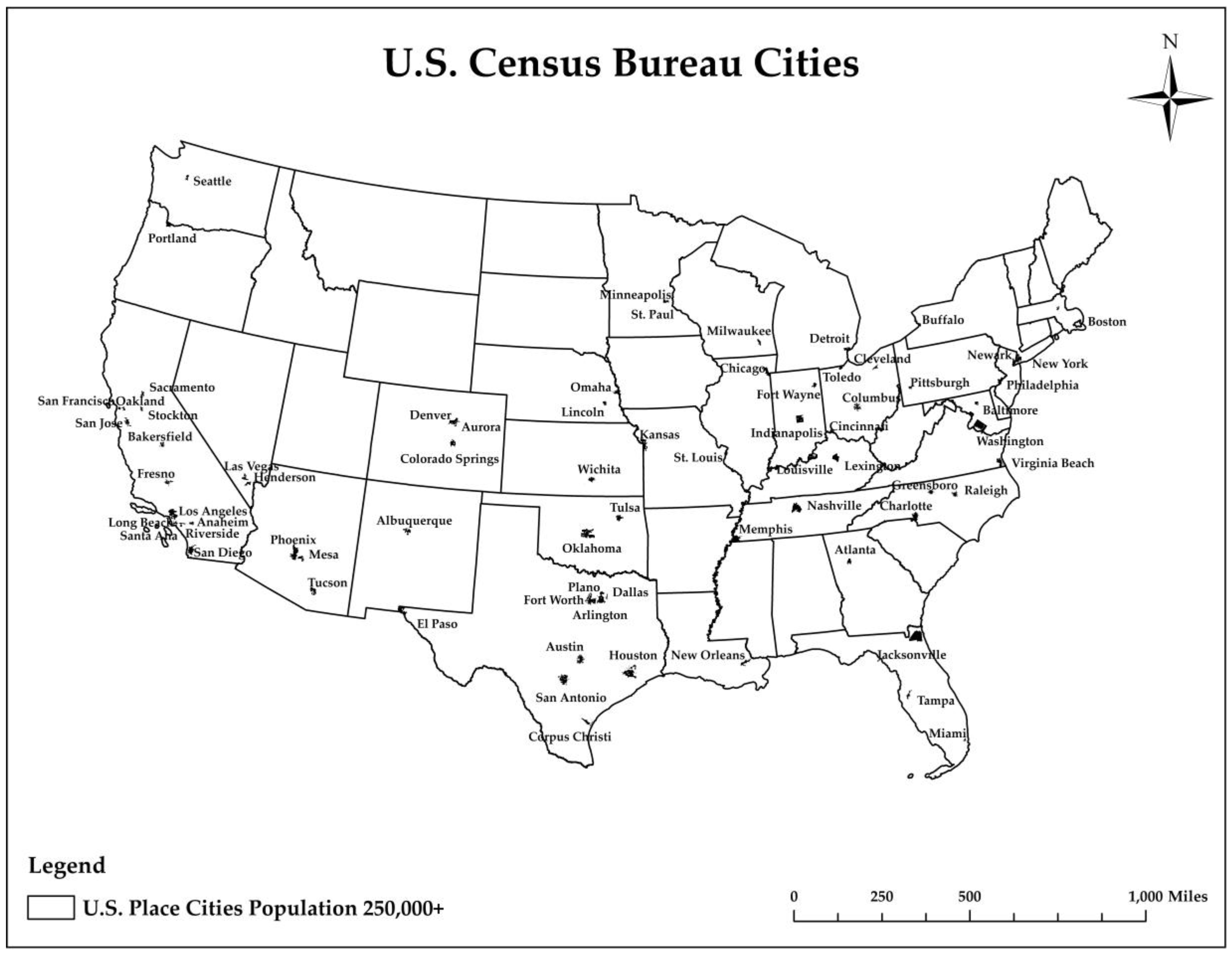
Next Article in Journal
Generative Street Addresses from Satellite Imagery
Previous Article in Journal
A Novel Approach to Site Selection: Collaborative Multi-Criteria Decision Making through Geo-Social Network (Case Study: Public Parking)
 
 
Correction published on 16 August 2018, see ISPRS Int. J. Geo-Inf. 2018, 7(8), 329.
Article

A Spatial Analysis of the Relationship between Vegetation and Poverty

1
Department of Sociology and Anthropology, Saint Louis University, St. Louis, MO 63108, USA
2
Department of Earth and Atmospheric Sciences, Saint Louis University, St. Louis, MO 63108, USA
3
Department of Geography, Virginia Tech, 220 Stanger Street, Blacksburg, VA 24061; USA
*
Author to whom correspondence should be addressed.
ISPRS Int. J. Geo-Inf. 2018, 7(3), 83; https://doi.org/10.3390/ijgi7030083
Submission received: 11 January 2018 / Revised: 5 February 2018 / Accepted: 18 February 2018 / Published: 1 March 2018

Abstract

:
The goal of this paper was to investigate poverty and inequities that are associated with vegetation. First, we performed a pixel-level linear regression on time-series and Normalized Difference Vegetation Index (NDVI) for 72 United States (U.S.) cities with a population ≥250,000 for 16 years (1990, 1991, 1995, 1996, 1997, 1998, and 2001 to 2010) using Advanced Very High Resolution Radiometer 1-kilometer (1-km). Second, from the pixel-level regression, we selected five U.S. cities (Shrinking: Chicago, Detroit, Philadelphia, and Growing: Dallas and Tucson) that were one standard deviation above the overall r-squared mean and one standard deviation below the overall r-squared mean to show cities that were different from the typical cities. Finally, we used spatial statistics to investigate the relationship between census tract level data (i.e., poverty, population, and race) and vegetation for 2010, based on the 1-km grid cells using Ordinary Least Squares Regression and Geographically Weighted Regression. Our results revealed poverty related areas were significantly correlated with positive high and/or negative high vegetation in both shrinking and growing cities. This paper makes a contribution to the academic body of knowledge on U.S. urban shrinking and growing cities by using a comparative analysis with global and local spatial statistics to understand the relationship between vegetation and socioeconomic inequality.

1. Introduction

The relationship between poverty and the spatial distribution of vegetation, particularly within shrinking and growing cities in the United States (U.S.), has not been adequately examined in the academic literature. Changing vegetation increasing over time is hypothesized to occur unevenly across the urban landscape, thereby requiring an integrated spatiotemporal approach. Vegetation change analysis is very important to urban studies for both creating a comfortable living environment and mitigating urban heat island effects under climate change. Although greening strategies are prominent in urban discussions, the link between shrinkage, its consequences, and the quality of urban ecosystems in shrinking cities has only been addressed marginally [1]. The goal of this study was to fill a gap in the academic literature to examine poverty differences and inequities that are associated with vegetation in five cities for 2010 by using spatial statistics and integrating remote sensing-derived land cover data with socioeconomic data. Global Ordinary Least Squares (OLS) regression and local level Geographically Weighted Regression (GWR) was used in this research to capture local variation and spatial relationships [2]. However, few studies have investigated ways in which this relationship may become complicated in the context of shrinking cities where low-income neighborhoods in crisis undergo abandonment and vacancy, all of which has the positive potential to drive an increase in vegetation due to clearance and natural ecosystem changes. This study addressed the following research question. What is the relationship between poverty and vegetation? Building on previous research on vegetation, our paper makes original and significant contributions to the corpus of literature on U.S. shrinking and growing cities [3,4]. First, we used a comparative analysis to study three shrinking and two growing cities that were one standard deviation above the overall r-squared mean and one standard deviation below the overall r-squared mean to show cities that were different from the typical city. Second, we used global and local spatial statistics to study the spatial relationship between vegetation and socioeconomic inequality. Finally, we employed a novel methodology to study this relationship by using 1-km grids, rather than U.S. census tracts. The findings from this research provide much needed insight on the difference between shrinking and growing cities.

1.1. Background

1.1.1. Environmental Justice–Poverty–Vegetation

Over the past two decades, the uneven accessibility of vegetation has become recognized as an Environmental justice issue as awareness of its importance to public health has been increased [5,6,7]. Environmental justice has a pivotal role in supporting sustainable communities [8]. Environmental justice is defined as the fair treatment and meaningful involvement of all people, regardless of race, color, national origin, or income with respect to the development, implementation, and enforcement of environmental laws, regulations, and policies [9].
In other words, your health should not suffer because of the environment where you live, work, play, or learn. Environmental justice scholarship in the U.S. has traditionally focused on the inequitable distribution of disamenities—vegetation and undesirable land uses, etc.—with respect to racial/ethnic minorities and economically disadvantaged groups [10,11].
There has been previous research on the relationship between distribution of urban vegetation and poverty. Within cities, vegetation is not always equitably distributed. Access is often highly stratified based on income, ethno-racial characteristics, age, gender, (dis)ability, and other axes of difference [12,13]. A variety of other studies show that racial/ethnic minorities and low-income people have less access to green space, parks, or recreational programs than those who are White or more affluent [6,14,15,16,17,18,19].
A body of research documented the positive relationship between income and vegetation [20,21,22]. A common finding is that income and level of education are positively correlated with a greater abundance [23] and a greater diversity of urban vegetation [20]. Several studies have assessed the role of social economic status (SES) in the distribution of green spaces and consistently reported that neighborhoods with higher SES levels enjoy greater accessibility to green spaces [24].
Green space at all scales—from small neighborhood parks to greenways to forests and wetlands—provides health, social, and environmental benefits for low-income and overburdened communities. Parks, community gardens, playing fields, riverfront shorelines, and wildlife refuges offer opportunities for physical activity, social engagement, and mental respite [25].

1.1.2. Previous Research

Research has shown that one of the characteristics of shrinking cities is an increase in vacant lands and abandoned properties [26]. Deng and Ma [27] recommended further research on different shrinking cities for a better understanding of how socioeconomic and ecological drivers collectively affect the emergence/dynamics of vacant land, within the urban context of population decrease and economic decline. As cities undergo political and economic transformation, opportunities for “green” urban renewal abound, especially when considering the abundance of vacant lots ripe for “greening” [28]. The most notable urban shrinking cities are Buffalo, New York; Detroit, Michigan; Cleveland, Ohio; and, Pittsburgh, Pennsylvania (industrial powerhouses in the middle of the twentieth century), which have all lost around half of their population since the year 2000.
A research study by [29] recommended using spatial statistics to analyze vegetation for shrinking cities because research is lacking on comparing shrinking and growing cities. Spatial statistics addresses spatial patterns of shrinking and growing cities [29]. To fill the gap, we experimented with a pixel level regression tool to perform trend analysis for 72 cities, analyzing correlation coefficient, standard error, and r-squared metrics against changes in vegetation phenology. This approach is similar to GWR [30,31]. However, whereas the purpose of GWR is to determine how the coefficients of explanatory variables vary in space, this approach explored how the prediction itself (e.g., some property of the landscape) changes with a single explanatory variable (e.g., time).
Remote sensing offers a practical and economical means to study vegetation cover changes, especially over large areas [32,33]. We used remote sensing data to understand and quantify the rate of change occurring in the study sites. We integrated remote sensing and census data [34] based on 1-km grid cells [35] using OLS regression and local level GWR statistical methods, which offered a richer framework for understanding detailed trends of urban growth [36,37,38].
The Normalized Difference Vegetation Index (NDVI) was developed on the fact that healthy vegetation has a low reflectance in the red wavelength portion of the electromagnetic spectrum due to absorption by chlorophyll and other pigments, and high reflectance in the Near Infrared Red (NIR) because of the internal reflectance by the mesophyll spongy tissue of a green leaf [39]. We know that vegetation can be derived from high-resolution imagery and combined with digital parcel data, which includes property boundaries for each parcel, to distinguish among vegetation [23,40]. However, high-resolution imagery is limited by cloud cover and longer re-visit time. Therefore, we used Advanced Very High Resolution Radiometer (AVHRR), which provides a time series of mostly cloud free data.
The objective of this paper was to investigate and extend analysis of the relationship between poverty and vegetation in the five selected cities, by using spatial statistics to investigate the relationship between U.S. Census Tract level data (i.e., poverty, population, and race) and vegetation from year 2010, based on the 1-km grid cells using OLS regression and GWR [35].

2. Study Area and Data

2.1. Study Area

2.1.1. Shrinking Cities

(1) Chicago, the city is navigated by the Chicago and Calumet waterways. Chicago’s broad parklands, including 3000 hectares of city parks, draw in an expected 86 million guests every year. The atmosphere of Chicago is delegated muggy mainland, with each of the four seasons particularly spoke to: wet, cool springs; to some degree sweltering, and frequently moist, summers; agreeably gentle falls; and, icy winters. Average annual precipitation in Chicago is 35.82 inches. Chicago’s climate is affected by the adjacent nearness of Lake Michigan amid each of the four seasons. According to the 2010 American Community Survey (ACS), 31.6% of the population was White (non-Hispanic white), 33.2% was Black or African American, and the poverty rate was 21% [41].
(2) Detroit is in Southeast Michigan arranged in the Midwestern U.S. also, the Great Lake locale. As for the climate, the winters are cold, with moderate snowfall and temperatures not rising above freezing on an average 44 days annually. The warm season runs from May to September. According to the 2010 American Community Survey (ACS), 7.8% of the population was White (non-Hispanic white), 82.6% was Black or African American, and the poverty rate was 34.5% [41].
(3) Philadelphia is the biggest city in the Commonwealth of Pennsylvania and the sixth most crowded city in the U.S. Regular waterways incorporate the Delaware and Schuylkill streams, the lakes in Franklin Delano Roosevelt Park, and Cobbs, Wissahickon, and Pennypack brooks. The biggest simulated waterway is the East Park Reservoir in Fairmount Park. Concerning the atmosphere, summers are regularly sweltering and moist, fall and spring are by and large gentle, and winter is respectably icy. According to the 2010 American Community Survey (ACS), 36.9% of the population was White (non-Hispanic white), 42.4% was Black or African American, and the poverty rate was 25.1% [41].
Figure 1 represents the U.S. map of cities with population greater than or equal to 250,000 in 2010.

2.1.2. Growing cities

(1) Dallas is in north Texas; it is a business and social center point of the district. It is the most crowded city in the Dallas–Fort Worth metroplex. The topography of Dallas and its surrounding area are mostly flat; the city itself lies at heights running from 450 to 550 feet (137 to 168 m). The summers in Dallas are extremely sweltering and damp. According to the 2010 American Community Survey (ACS), 28.4% of the population was White (non-Hispanic white), 24.5% was Black or African American, and the poverty rate was 22.3% [41].
(2) Tucson is located southeast of Phoenix and north of the U.S.–Mexico outskirt. Tucson positioned as the 32nd biggest city in the U.S. A noteworthy city in the Arizona Sun Corridor, Tucson is the biggest city in southern Arizona, the second biggest in the state after Phoenix. It is additionally the biggest city in the zone of the Gadsden Purchase. The atmosphere in Tucson is sweltering summers and calm winters, and is generally cooler and wetter than Phoenix on account of its higher rise. According to the 2010 American Community Survey (ACS), 48.3% of the population was White (non-Hispanic white), 4.5% was Black or African American, and the poverty rate was 21.3% [41].

2.2. Data

2.2.1. Land Cover Data

AVHRR instruments measures the reflectance of the Earth surface in five relatively wide spectral bands. We utilized AVHRR 1-km image data downloaded from USGS remote sensing phenology (RSP) [42]. This provided a phenological metric, an annual time series Maximum Normalized Difference Vegetation Index (MAXN): the highest (or peak) value in NDVI observed (clear and not contaminated by cloud or cloud shadows) in a growing season (unit less based on NDVI units). The start and end date is typically January 1 and January 3, with weekly data gaps. The MAXN metric identified the value of maximum NDVI observed in an annual growing season at each 1-km × 1-km pixel.
Temporal smoothing of NDVI data was adopted to extract phenological metrics. It does not over-generalize the time-series profile, but eliminates spurious spikes in the NDVI, while retaining sustained changes in NDVI that are representative of vegetation phenological dynamics. The weighted least-square approach for temporal smoothing [43] was adopted for the conterminous U.S. NDVI time series to eliminate anomalously low vegetation index values and reduce time shifts caused by overgeneralization of the NDVI signal.

2.2.2. Socioeconomic Data

Socioeconomic data (i.e., population, poverty, and race) were obtained from the U.S. Census Bureau, using Social Explorer [41]. We joined U.S. Census TIGER Products and shapefiles with socioeconomic data.

3. Methods

The variables used in the analysis were MAXN, poverty rate, white poverty rate, black poverty rate, percent white, and percent black from 2010 (Table 1).
We used the pixel level regression Curve Fit tool [44,45,46] an extension in ArcMap (ArcGIS) [31]. This allowed us to run regression trend analysis on 72 cities using AVHRR raster datasets for temporal analysis (1990, 1991, 1995, 1996, 1997, 1998, and 2001 to 2010).
Y = a X + b
where
  • Y = MAXN
  • a = Coefficient
  • X = Time
  • b = Intercept
The output produced r-squared, which showed overall performance of the model (Table 2 and Table 3). For the shrinking cities annotated in bold blue, the overall r-squared mean value was (0.28) and the standard deviation value was (0.08). For the growing cities annotated in bold blue, the overall r-squared mean value was (0.24), and standard deviation value was (0.09). We selected five cities (Shrinking: Chicago, Detroit, Philadelphia, and Growing: Dallas and Tucson), that were one standard deviation above the overall r-squared mean and one standard deviation below the overall r-squared mean, and to show cities that were different from the typical cities. The five cities had a low, typical, and high, 16-year series r-squared mean.

3.1. Grid Cell Approach

We obtained census tract level socioeconomic data tables from Social Explorer [41] and then we joined the data to U.S. Census TIGER shapefiles. We converted the census tract scale socioeconomic data to 1-km scale grid cell using spatial interpolation by converting census tract data for the five selected cities into 1-km grids [35]. We created blank vector polygon area(s) of the five selected cities. To make the kilometer square grid cells, we used ArcGIS 10.4.1 software. We clipped the grids to the study area. Then, we assigned our variables to the grid cell and used the intersect function to intersect the grids with the census tracts scale socioeconomic data with 1-km grid cell shapefile. Equations (2)–(4) provide the formulas we used for the interpolation.
A w = A i / A t
  • A w = Partial census tract area weight
  • A i = Individual area of each census tract
  • A t = Total area of the census tract parts
    T v = i = 1 n C t × A w
  • T v = Census tract population
  • C t = Census tract total population
  • A w = Partial census tract area weight
    G v = i = 1 n C t × A w
  • G v = Grid population
  • C t = Census tract total population
  • A w = Partial census tract area weight
The area of each piece within one grid cell was multiplied by the A w . being gridded. Then, the sum of all the values for all of the tract pieces was aggregated in the grid cell. Advantages of the grid index: (1) converting the socioeconomic data to grid cells enabled us to aggregate each variable inputted and to calculate their proportions in basis grid cells; (2) we were able to synthesis social and economic data with raster images; and (3) we avoided some potential pitfalls in bias with our statistics test related to sample size and neighbors.

3.2. Analytic Plan

To study the relationship between vegetation and poverty we will first conduct spatial autocorrelation of our key variables, we will then proceed with a LISA analysis. Our next step will be to run OLS and GWR models to evaluate distribution and variance between the dependent variable MAXN and the random socioeconomic variables (white poverty, black poverty, percent white, and percent black) for the five case study cities. In OLS we will investigate if the distributions of these random variables all have the same variance and a mean of zero. If so, then the least squares method may be the best unbiased linear estimator of the model coefficients. Although we think OLS is not necessarily the best bias estimator in that the coefficients usually lead to having small variance. Finally, we conclude our analysis with GWR to explore the local spatial relationship among the variables.

3.3. Spatial Autocorrelation (Moran’s I)

Spatial autocorrelation is a common problem in regression models. Table 4 and Table 5 provide the global Moran’s I values for the variables used in the analysis. All of the values showed positive spatial autocorrelation and significant at the p-values 0.01 (Table 4 and Table 5). The black population has the highest Moran’s I values for Chicago, Detroit, and Dallas. For Philadelphia and Tucson, the highest value was the poverty rate. It is important to note, that the black population values was essentially the same as the poverty when the numbers are rounded to two decimal points. The white population has the highest Moran’s I values for Chicago, Dallas, and Tucson. The poverty rates amongst blacks were the highest values in Chicago, Detroit, and Philadelphia. The table provided evidence that a local level analysis may be more appropriate to understand the relationship between vegetation and socioeconomic inequality in growing and shrinking cities.

3.4. LISA Analysis

Based on the global spatial autocorrelation statistics, we computed a local analysis using Local Indicators of Spatial Association (LISA) maps [47] to evaluate spatial clusters of MAXN, poverty rate, white poverty rate, black poverty rate, percent white, and percent black. The analysis was executed using the Contiguity Edges and Corners method to model the spatial relationships. The clusters in the maps were statistically significant at the 95 percent confidence level.

3.5. OLS and GWR Analysis

The residuals from OLS were spatially correlated, thus providing evidence that the OLS results were biased. Therefore, we used GWR models to remove the spatial autocorrelation in the residuals. We used the Akaike Information Criterion (AIC) to consider model complexity, thus facilitating a comparison between the overall model results from a ‘global’ OLS regression model with those from the local GWR model. Finally, we calculated local t-values generated from local GWR models:
t i = β i / S E   β i
In our analysis, we used the 90% confidence level two-tailed test t i   values 1.64   and / or = t i   values 1.64 and the 95% confidence level two-tailed test t i   values 1.96   and / or = t i   values 1.96 to test and compare the significance. In this paper, we limited our visualization of the results at the 95% confidence levels.

4. Results

4.1. Map Comparisons

The LISA maps showed clusters of similarity and dissimilarity. The maps (Figure 2, Figure 3, Figure 4, Figure 5 and Figure 6) showed some interesting patterns. We noticed where the black populations lived they were not randomly distributed throughout space and it appeared that they were concentrated in certain parts of the cities. We found similar patterns for the white population. In some of the shrinking and growing cities, poverty was right on the edge of being in the suburbs. The spatial process locally reflected similarity next to similarity. In the poverty variables, a similar type of clustering was found. Based on the LISA maps, there appears to be some correlation between positive high and/or negative high vegetation and the socioeconomic variables (poverty, white poverty, black poverty, percent white population, and percent black population) throughout the shrinking and growing cities. There seemed to be some evidence in showing the appearance of spatial relationships overlapping. The size and magnitude of that relationship varied throughout the cities. Our findings suggested that some poverty and white and black populations living in shrinking and growing cities had access to positive high vegetation areas, while others shared social inequalities to negative high vegetation areas. Using these maps as a baseline, we proceeded with our analysis using GWR models.

4.2. Model results

We tested and assessed the best OLS models (global model) and GWR (local level model) (Table 6, Table 7, Table 8, Table 9 and Table 10). In the global regression model, the four socioeconomic variables explain less than 50% of the variance in MAXN. The results for GWR models outperformed the OLS models for each city. This is an important finding suggesting that OLS models may not capture the true relationship between vegetation and socioeconomic inequality, since OLS assumes that the same spatial process over the study area.
In the five models, the global r-squared is smaller and the local r-squared is larger. Detroit had the highest r-squared (0.83), followed by Chicago (0.79) and Philadelphia (0.68). The growing cities had significantly lower r-squared values. Dallas had a value of (0.58) and Tucson had a value of (0.19). The largest range of the local coefficients for Chicago for white poverty was 6.49 (Upper Quantile-Lower Quantile coefficient values), followed by black poverty (6.10), percent white (4.03), and percent black (5.14) (Table 6). The largest range of the local coefficients for Detroit for white poverty was 9.33 (Upper Quantile-Lower Quantile coefficient values) followed by black poverty (16.99), percent white (37.63), and percent black (10.24) (Table 7). The largest range of the local coefficients for Philadelphia for white poverty was 31.43 (Upper Quantile-Lower Quantile coefficient values) followed by black poverty (24.67), percent white (14.18), and percent black (30.18) (Table 8). The largest range of the local coefficients for Dallas for white poverty was 63.75 (Upper Quantile-Lower Quantile coefficient values) followed by black poverty (50.45), percent white (27.92), and percent black (88.09) (Table 9). The largest range of the local coefficients for Tucson for white poverty was 230.60 (Upper Quantile-Lower Quantile coefficient values) followed by black poverty (204.80), percent white (47.23) and percent black (342.88) (Table 10). The black poverty rate were statistically significant in all of the shrinking cities, percent white populations were statistically significant in Dallas, and white poverty rate were statistically significant in Tucson. Percent black populations were statistically significant in Chicago and Detroit (high percentage) and Tucson (low percentage).
The results showed that GWR models improved the reliability of the relationships by reducing the spatial autocorrelations in residuals, and the GWR model was an improvement of the OLS regression model. Statistically significant positive spatial autocorrelations between the variables were found for all of the OLS regression models. Our results that are presented in the tables indicate that the relationship between vegetation and socioeconomic inequality was in fact local and fluid. We found an interesting pattern in the overall fitness of the GWR models. The model worked best for shrinking cities.

4.3. Advance Model Comparison Maps

Using the GWR tables as a baseline, we created maps to visualize the parts of the cities that had significant values. Not all of the coefficients analyzed were significant, so we calculated a t-value for each independent variable in the equation (Figure 7, Figure 8, Figure 9, Figure 10, Figure 11, Figure 12, Figure 13, Figure 14, Figure 15 and Figure 16). The colors blue and red were the significant areas for white poverty rate, black poverty rate, percent white, and percent black in the cities. The t-values maps depicted some overlap were the independent variables were statically significant, and as they converged in the same space, there relationships were spatial.

4.4. Spatial Relationships

We created several maps to visualize the spatial variation of the local r-squared values. The explanatory models were similar to each other in geographical space (Figure 17, Figure 18, Figure 19, Figure 20 and Figure 21). The range of the local r-squared value is blue (0–0.10) green (0.11–0.20), orange (0.21 to 0.30), to red (0.31 to 0.50).
The maps clearly show that the results from the OLS did not capture the true spatial dynamic in shrinking and growing cities: (1) In Chicago, there were higher residual for the variables, such as percent white, percent black, white poverty rate, and black poverty rate clusters exhibited a significant relationship and the residual were spatially autocorrelated. (2) In Detroit, there were higher residual for the variables, such as percent white, percent black, white poverty rate, and black poverty rate clusters exhibited a significant relationship and the residual were spatially autocorrelated. (3) In Philadelphia, there were higher residual for the variables, such as percent white, percent black, white poverty rate, and black poverty rate clusters exhibited a significant relationship and the residual were spatially autocorrelated. (4) In Dallas, there were higher residual for the variables, such as percent white, percent black, white poverty rate, and black poverty rate clusters exhibited a significant relationship with each other and the residual were spatially autocorrelated. Dallas also had lower residual with significant relationship for the same variable and the residuals were spatially autocorrelated. (5) In Tucson, there were lower residual for the variables such as percent white, percent black, white poverty rate, and black poverty rate clusters exhibited a significant relationship with each other and the residual were spatially autocorrelated. Tucson also had higher residual with no significant relationship for the same variable and no spatial autocorrelation. Although the pattern is stronger in shrinking cities, a similar spatial pattern can be found in growing cities as well.

5. Discussion

This study investigated and extended the analysis of the relationship between poverty and vegetation in the five selected cities, by using spatial statistics to investigate the relationship between U.S. Census Tract level data (i.e., poverty, population, and race) and vegetation from the year 2010, based on the 1-km grid cells using OLS regression and GWR.
The results of the OLS and GWR models raised some interesting questions regarding the relationship between vegetation and socioeconomic variables in the shrinking and growing cities. Results from this study concurred with the discussed literature on inequitable distribution of vegetation with respect to racial/ethnic minorities [10,11]. According to relevant research [5,6,7], the United States Environmental Protection Agency policies, intended to create equitable and sustainable communities; the lack of access to vegetation at all the scales still experience environmental injustice. (1) Black poverty rate in relationship to white poverty rate in most cities had a noticeably proportioned higher increase. (2) White poverty rate in relationship to black poverty rate had a higher increase in Chicago and Tucson. (3) There were slight differences in Tucson areas were white poverty rate is isolated from the black poverty rate spatial area. (4) During analysis in the shrinking versus growing cities, vegetation increased in shrinking cities and decreased in growing cities and vice versa.
However, our study offered new findings when compared to the existing literature. In support of improvements on environmental justice initiatives and issues on uneven accessibility of vegetation of all people regardless of race and color, data from our cluster mapping clarified the spatial aspects of both internal and external correlations for access to positive high and/or negative high vegetation with the socioeconomic variables for both urban shrinking and growing cities. The socioeconomic variables and shrinking cities had a relationship to positive high vegetation. White and Black populations in poverty had some equal access to positive high vegetation as non-poverty White and Black populations. Impoverished populations shared the same benefits of the positive high vegetation in urban areas cities.
The spatial autocorrelation results reflected each phenomenon equally. It was interesting to note that in the five cities (shrinking and growing), in some areas, white poverty and black poverty shared the same space. In addition, in the shrinking and growing cities, in some areas, percent white, and percent black populations spatially shared the same space.
Spatial statistics addressed spatial patterns of our shrinking and growing cities [29]. Temporal analysis was important in the research because of our need to detect observable change and assess how patterns and relationships changed over time. When quantifying landscape patterns using remotely sensed data, we recognized that each pixel (i.e., picture element) has a temporal and spatial context. The pixel’s temporal context refers to its past and present classification, and is often used to model landscape change [48].
In the past research, vegetation that increased and decreased over time was hypothesized to occur unevenly across the urban landscape, thereby requiring an integrated spatiotemporal approach. Analysis of spatial autocorrelation helped us to determine relationship among variables in space [49]. To evaluate the degree of similarity of observation across space, global indices of spatial autocorrelation were used [50]. We used Moran’s I, a global index of spatial autocorrelation [49,50,51,52]. While global indices like Moran’s I can measure spatial association of the entire data set, we used the local indicators for association local spatial clusters [47], which identified clusters of high (hot) and low (cold) spots across space [51,52,53].
Different types of data (quantitative and qualitative) were obtained from various sources (satellite imagery, maps, and census data) and mixed methodology (correlation, descriptive, and GWR) were used to meet the objectives of this research. Fotheringham and colleagues developed GWR into a convenient yet powerful technique that explores spatial nonstationarity and provides mappable statistics to visualize the spatial patterns of the relationships between dependent and independent variables [30].

Limitation of the Study

In our analyses of the 72 cities, we selected five cities for the study area. Future research and analyses can be accomplished on the same study area or different cities. GWR has limitations, including issues that are associated with multicollinearity, kernel bandwidth selection, and multiple hypothesis testing [54]. Some of these issues have been addressed [55,56]. Further detailed statistical analysis studies would need to be conducted to confirm the findings of this paper.

6. Conclusions

This study of the relationship between poverty and vegetation on the five selected cities using global and local regression indicated spatially varying relationships across the cities. Our specific findings: (1) A grid-cell-based spatial relationship using OLS and GWR models showed that the spatial models provided an enriched framework for understanding detailed spatial patterns of inequality. (2) The advantages of GWR over OLS (i.e., explored issues of spatial nonstationarity) were further confirmed. (3) The GWR models showed that relationship among the variables varied spatially, with highly localized relationships not evident with the global regression models. (4) The GWR method is a great tool for hot spot analysis. (5) This study suggested that poverty-related areas were significant and strongly correlated with positive high and/or negative high vegetation in shrinking cities. NDVI was highly useful in detecting the surface features of the visible areas, which are extremely beneficial for municipal planning and management. The vegetation analysis can be used as a critical tool for policy-makers and planners to formulate a plan and/or program to study the quality of vegetation in shrinking and growing cities and its relationship to socioeconomic inequality. We believe this paper will provide a framework for other researchers to build on this study to develop the literature on vegetation and socioeconomic inequality in U.S. cities and suburbs.

Acknowledgments

Author wish to acknowledge Saint Louis University’s Department of Sociology and Anthropology, Department of Earth and Atmospheric Sciences, and Department of Geography.

Author Contributions

Teddy Dawson conceived and performed the field research, analysis, and wrote the paper; J.S. Onésimo Sandoval advised research design, fieldwork, and writing; Vasit Sagan advised fieldwork and writing; Thomas Crawford assisted research design.

Conflicts of Interest

The authors declare no conflicts of interest.

References

  1. Haase, D.; Haase, A.; Rink, D. Conceptualizing the nexus between urban shrinkage and ecosystem services. Landsc. Urban Plan. 2014, 132, 159–169. [Google Scholar] [CrossRef]
  2. Lin, C.H.; Wen, T.H. Using geographically weighted regression (GWR) to explore spatial varying relationships of immature mosquitoes and human densities with the incidence of dengue. Int. J. Environ. Res. Public Health 2011, 8, 2798–2815. [Google Scholar] [CrossRef] [PubMed]
  3. Hoalst-Pullen, N.; Patterson, M.W.; Gatrell, J.D. Empty spaces: Neighbourhood change and the greening of Detroit, 1975–2005. Geocarto Int. 2011, 26, 417–434. [Google Scholar] [CrossRef]
  4. Pearsall, H.; Christman, Z. Tree lined lanes or vacant lots? Evaluating non-stationarity between urban greenness and socio-economic conditions in Philadelphia, Pennsylvania, USA at multiple scales. Appl. Geogr. 2012, 35, 257–264. [Google Scholar] [CrossRef]
  5. Dai, D. Racial/ethnic and socioeconomic disparities in urban green space accessibility: Where to intervene? Landsc. Urban Plan. 2011, 102, 234–244. [Google Scholar] [CrossRef]
  6. Jennings, V.; Johnson-Gaither, C.; Gragg, R.S. Promoting environmental justice through urban green space access: A synopsis. Environ. Justice 2012, 5, 1–7. [Google Scholar] [CrossRef]
  7. Wolch, J.R.; Byrne, J.; Newell, J.P. Urban green space, public health, and environmental justice: The challenge of making cities ‘just green enough’. Landsc. Urban Plan. 2014, 125, 234–244. [Google Scholar] [CrossRef]
  8. Lee, C. Developing the vision of environmental justice: A paradigm for achieving healthy and sustainable communities. Va. Environ. Law J. 1995, 14, 571–578. [Google Scholar]
  9. McConville, M. Creating Equitable, Healthy, and Sustainable Communities: Strategies for Advancing Smart Growth, Environmental Justice, and Equitable Development; US Environmental Protection Agency Office of Sustainable Communities and Office of Environmental: Washington, DC, USA, 2013.
  10. Bullard, R. Environmental justice in the 21st century. People of Color Environmental Groups Directory. Available online: www.ejrc.cau.edu/ejinthe21century.htm (accessed on 15 April 2006).
  11. Pulido, L. Rethinking environmental racism: White privilege and urban development in Southern California. Ann. Assoc. Am. Geogr. 2000, 90, 12–40. [Google Scholar] [CrossRef]
  12. Byrne, J.; Wolch, J.; Zhang, J. Planning for environmental justice in an urban national park. J. Environ. Plan. Manag. 2009, 52, 365–392. [Google Scholar] [CrossRef]
  13. McConnachie, M.M.; Shackleton, C.M. Public green space inequality in small towns in South Africa. Habitat Int. 2010, 34, 244–248. [Google Scholar] [CrossRef] [Green Version]
  14. Dahmann, N.; Wolch, J.; Joassart-Marcelli, P.; Reynolds, K.; Jerrett, M. The active city? Disparities in provision of urban public recreation resources. Health Place 2010, 16, 431–445. [Google Scholar] [CrossRef] [PubMed]
  15. Johnson-Gaither, C. Latino park access: Examining environmental equity in a new destination county in the South. J. Park Recreat. Adm. 2011, 29, 37–52. [Google Scholar]
  16. Landry, S.M.; Chakraborty, J. Street trees and equity: Evaluating the spatial distribution of an urban amenity. Environ. Plan. A 2009, 41, 2651–2670. [Google Scholar] [CrossRef]
  17. Leslie, E.; Cerin, E.; Kremer, P. Perceived neighborhood environment and park use as mediators of the effect of area socio-economic status on walking behaviors. J. Phys. Act. Health 2010, 7, 802–810. [Google Scholar] [CrossRef] [PubMed]
  18. Sister, C.; Wolch, J.; Wilson, J. Got green? Addressing environmental justice in park provision. GeoJournal 2010, 75, 229–248. [Google Scholar] [CrossRef]
  19. Wolch, J.; Wilson, J.P.; Fehrenbach, J. Parks and park funding in Los Angeles: An equity-mapping analysis. Urban Geogr. 2005, 26, 4–35. [Google Scholar] [CrossRef]
  20. Martin, C.A.; Warren, P.S.; Kinzig, A.P. Neighborhood socioeconomic status is a useful predictor of perennial landscape vegetation in residential neighborhoods and embedded small parks of Phoenix, AZ. Landsc. Urban Plan. 2004, 69, 355–368. [Google Scholar] [CrossRef]
  21. Grove, J.M.; Troy, A.R.; O’Neil-Dunne, J.P.; Burch, W.R.; Cadenasso, M.L.; Pickett, S.T. Characterization of households and its implications for the vegetation of urban ecosystems. Ecosystems 2006, 9, 578–597. [Google Scholar] [CrossRef]
  22. Clarke, L.W.; Jenerette, G.D.; Davila, A. The luxury of vegetation and the legacy of tree biodiversity in Los Angeles, CA. Landsc. Urban Plan. 2013, 116, 48–59. [Google Scholar] [CrossRef]
  23. Morgan Grove, J.; Cadenasso, M.L.; Burch, W.R., Jr.; Pickett, S.T.; Schwarz, K.; O’Neil-Dunne, J.; Wilson, M.; Troy, A.; Boone, C. Data and methods comparing social structure and vegetation structure of urban neighborhoods in Baltimore, Maryland. Soc. Nat. Resour. 2006, 19, 117–136. [Google Scholar] [CrossRef]
  24. Richardson, E.; Pearce, J.; Mitchell, R.; Day, P.; Kingham, S. The association between green space and cause-specific mortality in urban New Zealand: An ecological analysis of green space utility. BMC Public Health 2010, 10, 240. [Google Scholar] [CrossRef] [PubMed] [Green Version]
  25. U.S. EPA Environmental Topics. Available online: https://www.epa.gov/ (accessed on 10 June 2017).
  26. Haase, D. Shrinking cities, biodiversity and ecosystem services. In Urbanization, Biodiversity and Ecosystem Services: Challenges and Opportunities; Springer: Dordrecht, The Netherlands, 2013; pp. 253–274. [Google Scholar]
  27. Deng, C.; Ma, J. Viewing urban decay from the sky: A multi-scale analysis of residential vacancy in a shrinking US city. Landsc. Urban Plan. 2015, 141, 88–99. [Google Scholar] [CrossRef]
  28. Green, O.O.; Garmestani, A.S.; Albro, S.; Ban, N.C.; Berland, A.; Burkman, C.E.; Gardiner, M.M.; Gunderson, L.; Hopton, M.E.; Schoon, M.L.; et al. Adaptive governance to promote ecosystem services in urban green spaces. Urban Ecosyst. 2016, 19, 77–93. [Google Scholar] [CrossRef]
  29. Reis, J.P.; Silva, E.A.; Pinho, P. Spatial metrics to study urban patterns in growing and shrinking cities. Urban Geogr. 2016, 37, 246–271. [Google Scholar] [CrossRef] [Green Version]
  30. Fotheringham, A.S.; Brunsdon, C.; Charlton, M. Geographically Weighted Regression: The Analysis of Spatially Varying Relationships; John Wiley Sons: Hoboken, NJ, USA, 2003. [Google Scholar]
  31. Jager, N.R.; Fox, T.J. Curve Fit: A pixel—Level raster regression tool for mapping spatial patterns. Methods Ecol. Evol. 2013, 4, 789–792. [Google Scholar] [CrossRef]
  32. Langley, S.K.; Cheshire, H.M.; Humes, K.S. A comparison of single date and multitemporal satellite image classifications in a semi-arid grassland. J. Arid Environ. 2001, 49, 401–411. [Google Scholar] [CrossRef]
  33. Nordberg, M.L.; Evertson, J. Vegetation index differencing and linear regression for change detection in a Swedish mountain range using Landsat TM® and ETM+® imagery. Land Degrad. Dev. 2005, 16, 139–149. [Google Scholar] [CrossRef]
  34. U.S. Census Bureau, Census Data. Available online: https://www.census.gov/ (accessed on 10 June 2017).
  35. Maimaitijiang, M.; Ghulam, A.; Sandoval, J.O.; Maimaitiyiming, M. Drivers of land cover and land use changes in St. Louis metropolitan area over the past 40 years characterized by remote sensing and census population data. Int. J. Appl. Earth Obs. Geoinf. 2015, 35, 161–174. [Google Scholar] [CrossRef]
  36. Bagan, H.; Yamagata, Y. Landsat analysis of urban growth: How Tokyo became the world’s largest megacity during the last 40 years. Remote Sens. Environ. 2012, 127, 210–222. [Google Scholar] [CrossRef]
  37. Banzhaf, E.; Reyes-Paecke, S.; Müller, A.; Kindler, A. Do demographic and land-use changes contrast urban and suburban dynamics? A sophisticated reflection on Santiago de Chile. Habitat Int. 2013, 39, 179–191. [Google Scholar] [CrossRef]
  38. Martinuzzi, S.; Gould, W.A.; Gonzalez, O.M.R. Land development, land use, and urban sprawl in Puerto Rico integrating remote sensing and population census data. Landsc. Urban Plan. 2007, 79, 288–297. [Google Scholar] [CrossRef]
  39. Campbell, J.B.; Wynne, R.H. Introduction to Remote Sensing; Guilford Press: New York, NY, USA, 2011. [Google Scholar]
  40. Robbins, P.; Birkenholtz, T. Turfgrass revolution: Measuring the expansion of the American lawn. Land Use Policy 2003, 20, 181–194. [Google Scholar] [CrossRef]
  41. Social Explorer Tables. Available online: https://www.socialexplorer.com/ (accessed on 10 June 2017).
  42. USGS Phenology. Available online: https://phenology.cr.usgs.gov/ (accessed on 10 June 2017).
  43. Swets, D.L. A weighted least-squares approach to temporal smoothing of NDVI. In Proceedings of the 1999 ASPRS Annual Conference, from Image to Information, Portland, OR, USA, 17–21 May 1999; American Society for Photogrammetry and Remote Sensing: Bethesda, MD, USA, 1999. [Google Scholar]
  44. Jordan, Y.C.; Ghulam, A.; Herrmann, R.B. Floodplain ecosystem response to climate variability and Land cover and Land use change in Lower Missouri River basin. Landsc. Ecol. 2012, 27, 843–857. [Google Scholar]
  45. Ghulam, A. Monitoring Tropical Forest Degradation in Betampona Nature Reserve, Madagascar Using Multisource Remote Sensing Data Fusion. IEEE J. Sel. Topics Appl. Earth Obs. Remote Sens. 2014, 7, 4960–4971. [Google Scholar] [CrossRef]
  46. Shahabfar, A.; Ghulam, A.; Conrad, C. Understanding hydrological repartitioning and shifts in drought regimes in central and south-west Asia using MODIS derived perpendicular drought index and TRMM data. IEEE J. Sel. Topics Appl. Earth Obs. Remote Sens. 2014, 7, 983–993. [Google Scholar]
  47. Anselin, L. Local indicators of spatial association—LISA. Geogr. Anal. 1995, 27, 93–115. [Google Scholar] [CrossRef]
  48. Baker, W.L. A review of models of landscape change. Landsc. Ecol. 1989, 2, 111–133. [Google Scholar] [CrossRef]
  49. Young, S.G.; Jensen, R.R. Statistical and visual analysis of human West Nile virus infection in the United States, 1999–2008. Appl. Geogr. 2012, 34, 425–431. [Google Scholar] [CrossRef]
  50. Jackson, M.C.; Huang, L.; Xie, Q.; Tiwari, R.C. A modified version of Moran’s I. Int. J. Health Geogr. 2010, 9, 33. [Google Scholar] [CrossRef] [PubMed]
  51. Bae, Y.; Yoon, M.; Kim, E. Spatial patterns of population growth and social indicators’ change in Korea: An exploratory spatial data analysis. Int. J. Urban Sci. 2008, 12, 61–72. [Google Scholar] [CrossRef]
  52. Zhang, T.; Lin, G. A decomposition of Moran’s I for clustering detection. Comput. Stat. Data Anal. 2007, 51, 6123–6137. [Google Scholar] [CrossRef]
  53. Rossen, L.M.; Khan, D.; Warner, M. Hot spots in mortality from drug poisoning in the United States, 2007–2009. Health Place 2014, 26, 14–20. [Google Scholar] [CrossRef] [PubMed]
  54. Wheeler, D.; Páez, A. Geographically Weighted Regression. In Handbook of Applied Spatial Analysis Software Tools, Methods and Applications; Fischer, M.M., Getis, A., Eds.; Springer: Berlin, Germany, 2010. [Google Scholar]
  55. Wheeler, D.C. Diagnostic tools and a remedial method for collinearity in geographically weighted regression. Environ. Plan. A 2007, 39, 2464–2481. [Google Scholar] [CrossRef]
  56. Wheeler, D.C. Simultaneous coefficient penalization and model selection in geographically weighted regression: The geographically weighted lasso. Environ. Plan. A 2009, 41, 722–742. [Google Scholar] [CrossRef]
Figure 1. 72 United States (U.S.) cities that have a population greater than or equal to 250,000 in 2010.
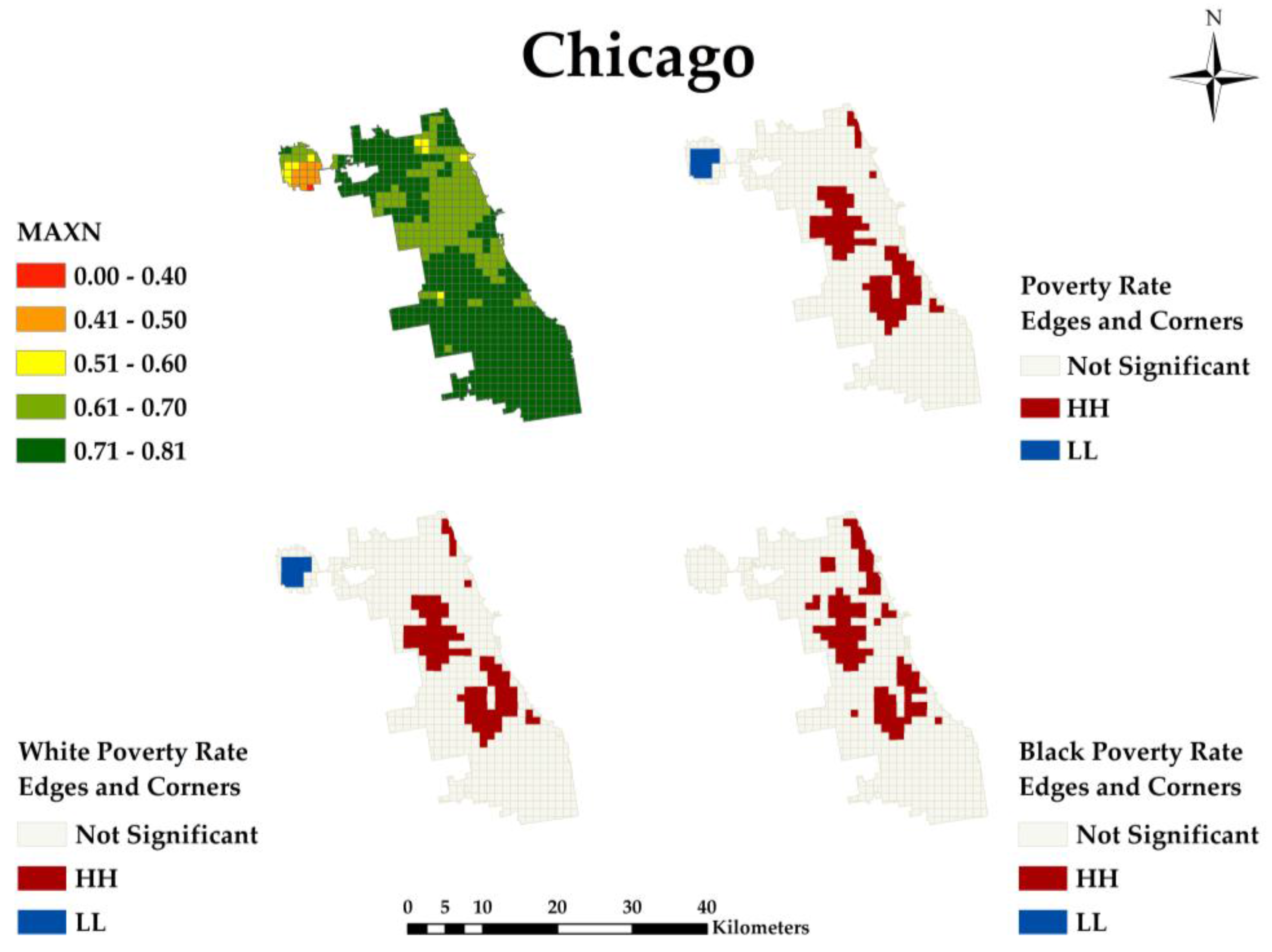
Ijgi 07 00083 g001
Figure 2. The Local Indicators of Spatial Association (LISA) maps of Chicago shrinking city: MAXN, Poverty Rate, White Poverty Rate, and Black Poverty Rate.
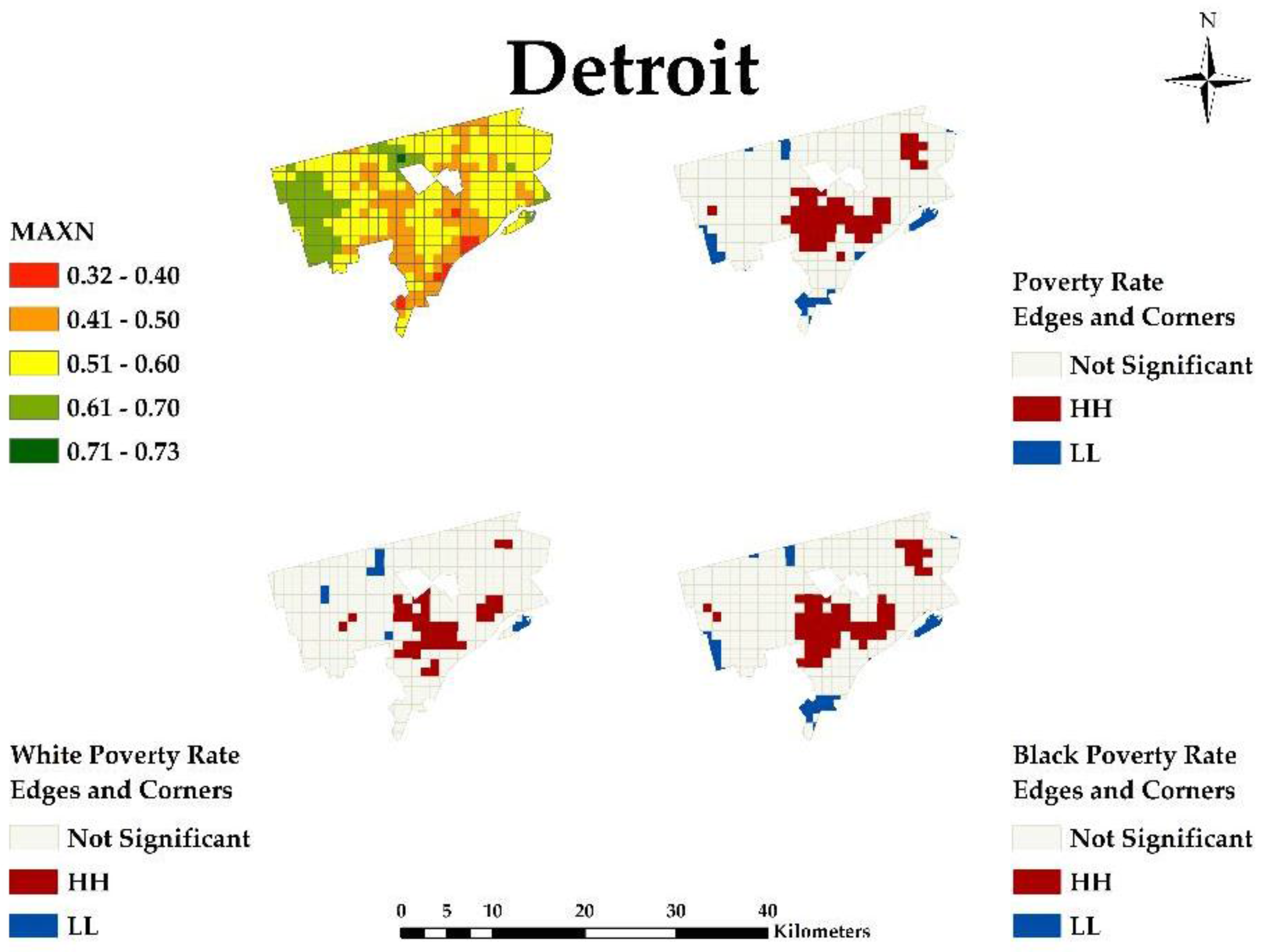
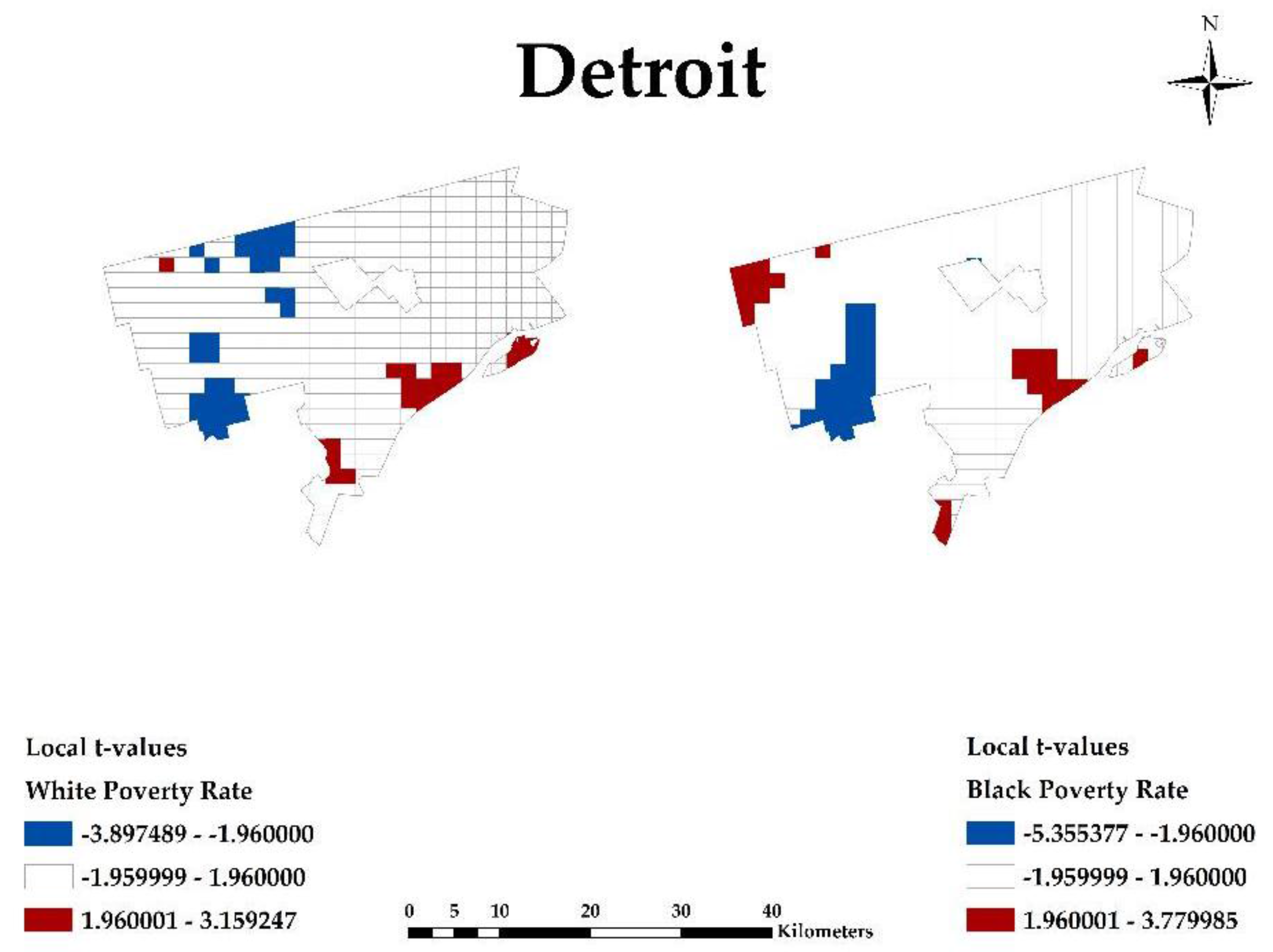
Ijgi 07 00083 g002
Figure 3. The LISA maps of Detroit shrinking city: MAXN, Poverty Rate, White Poverty Rate, and Black Poverty Rate.
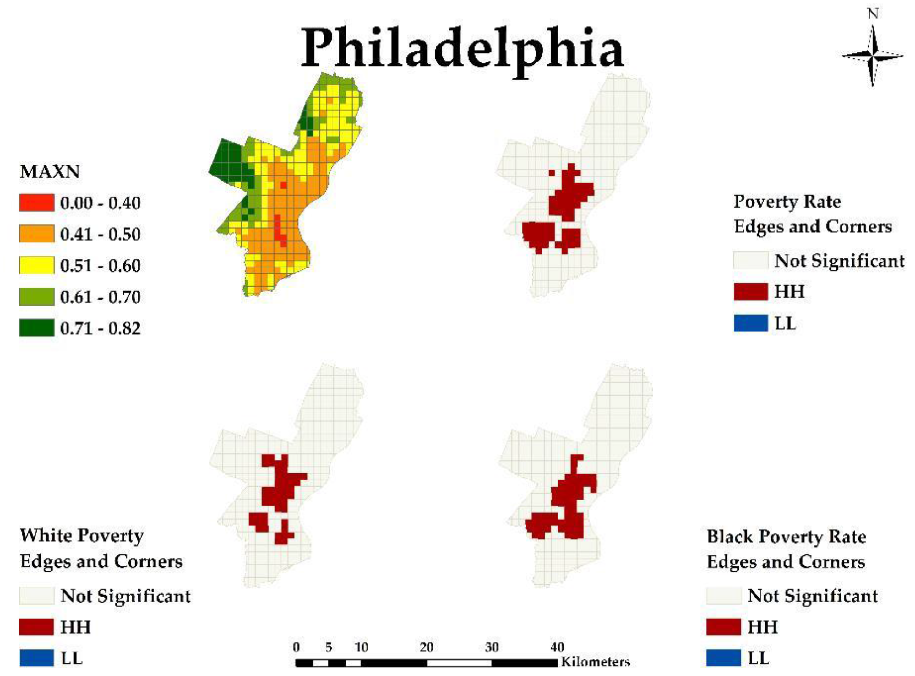
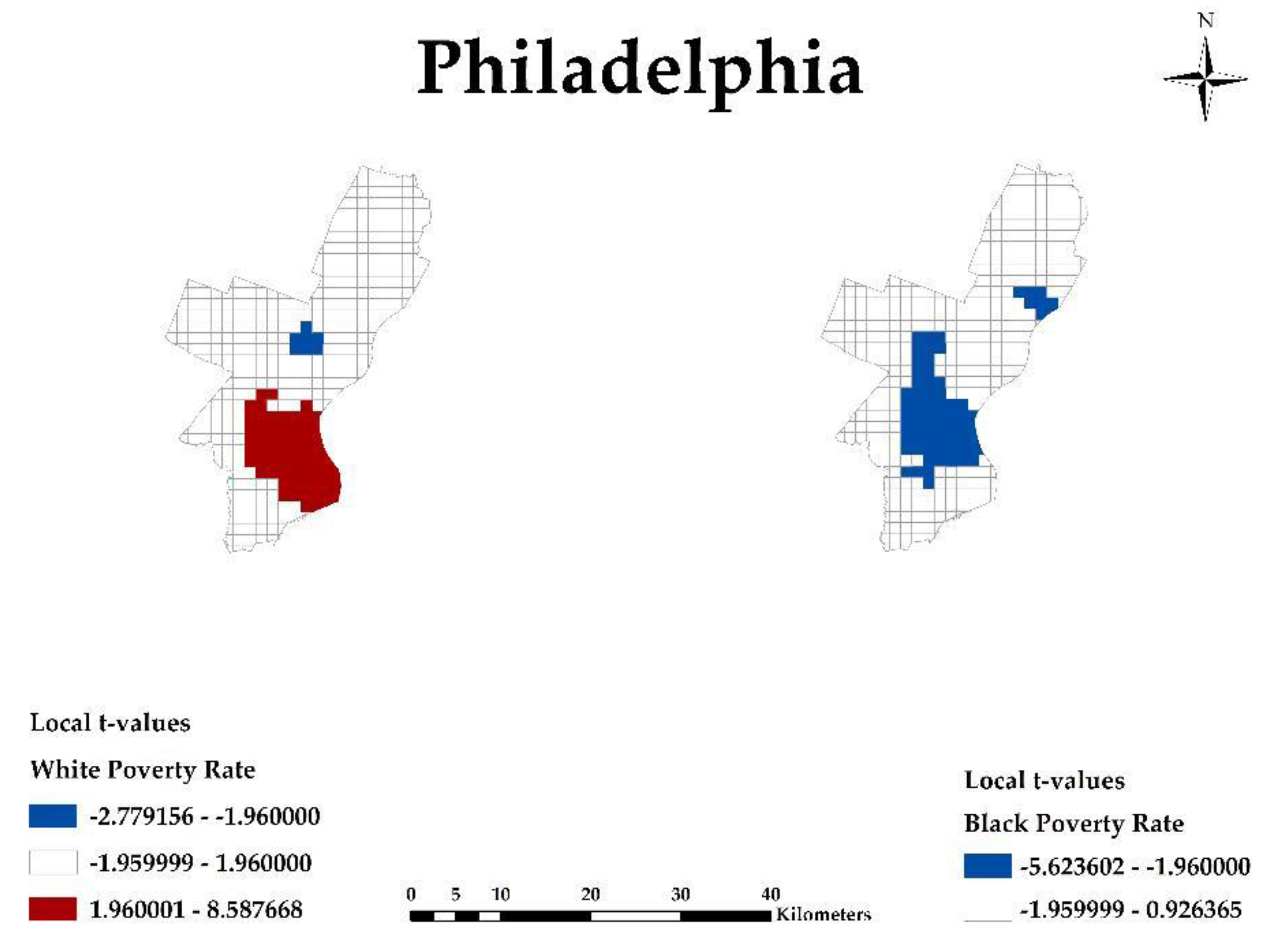
Ijgi 07 00083 g003
Figure 4. The LISA maps of Philadelphia shrinking city: MAXN, Poverty Rate, White Poverty Rate, and Black Poverty Rate.
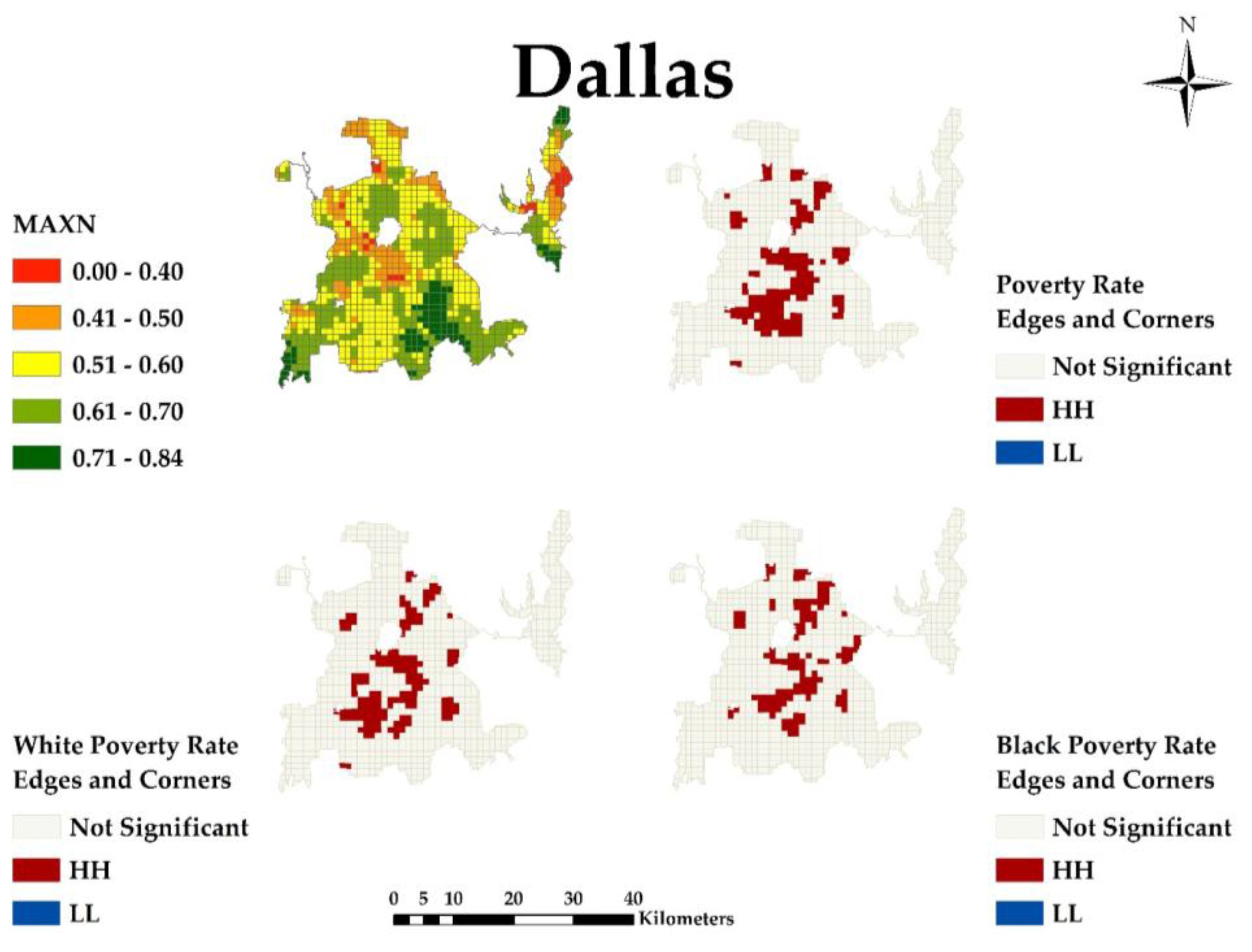
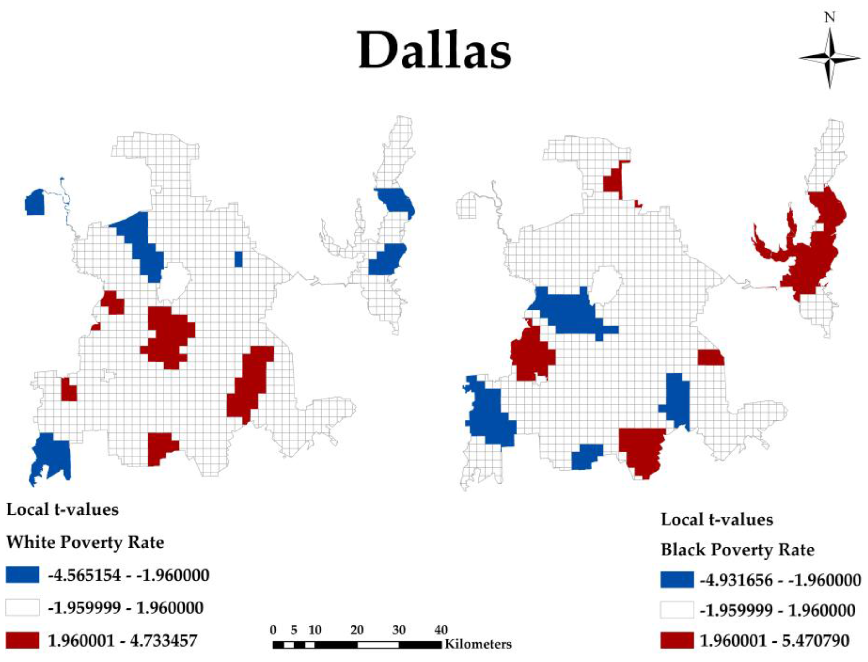
Ijgi 07 00083 g004
Figure 5. The LISA maps of Dallas growing city: MAXN, Poverty Rate, White Poverty Rate, and Black Poverty Rate.
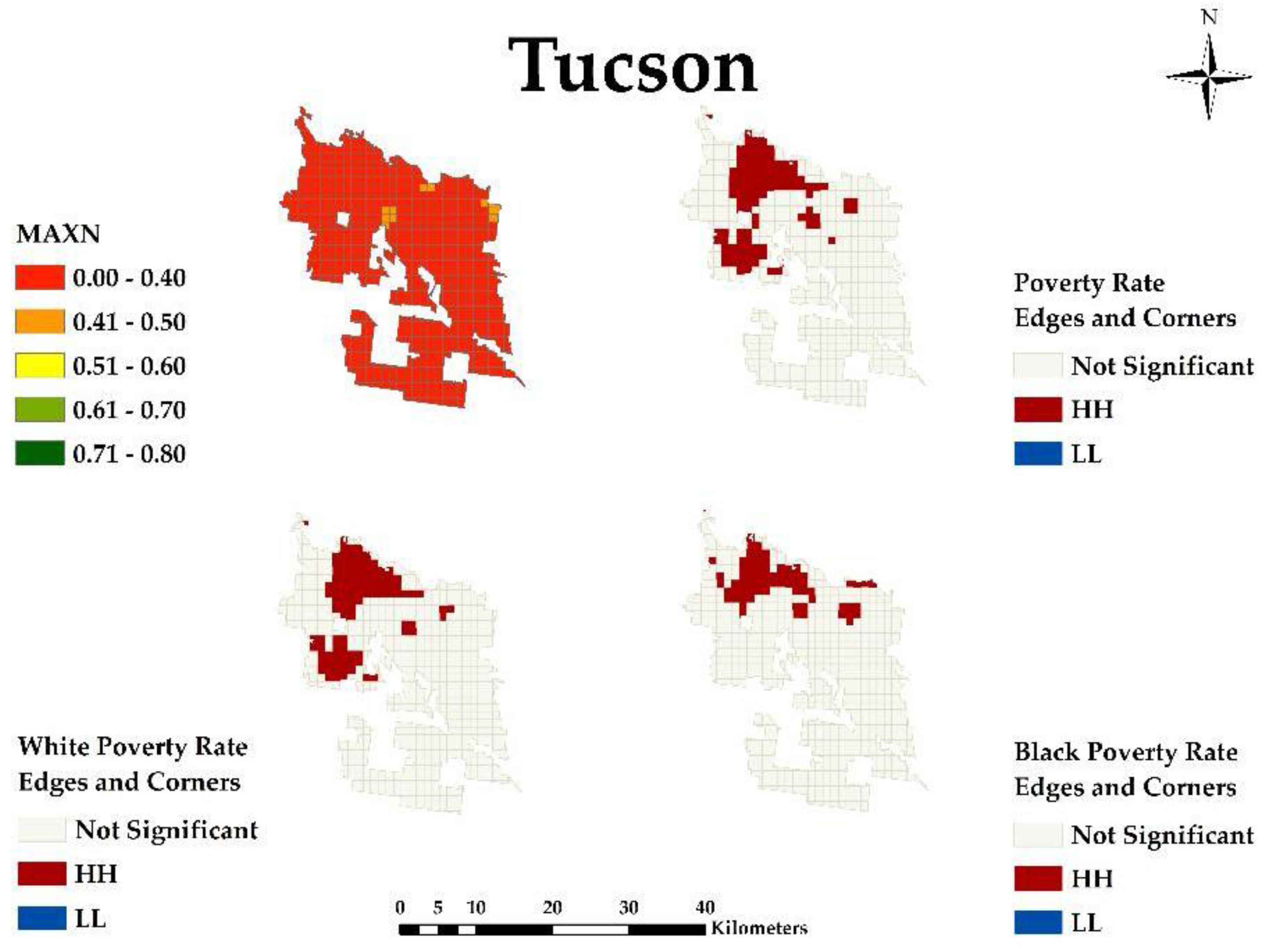
Ijgi 07 00083 g005
Figure 6. The LISA maps of Tucson growing city: MAXN, Poverty Rate, White Poverty Rate, and Black Poverty Rate.
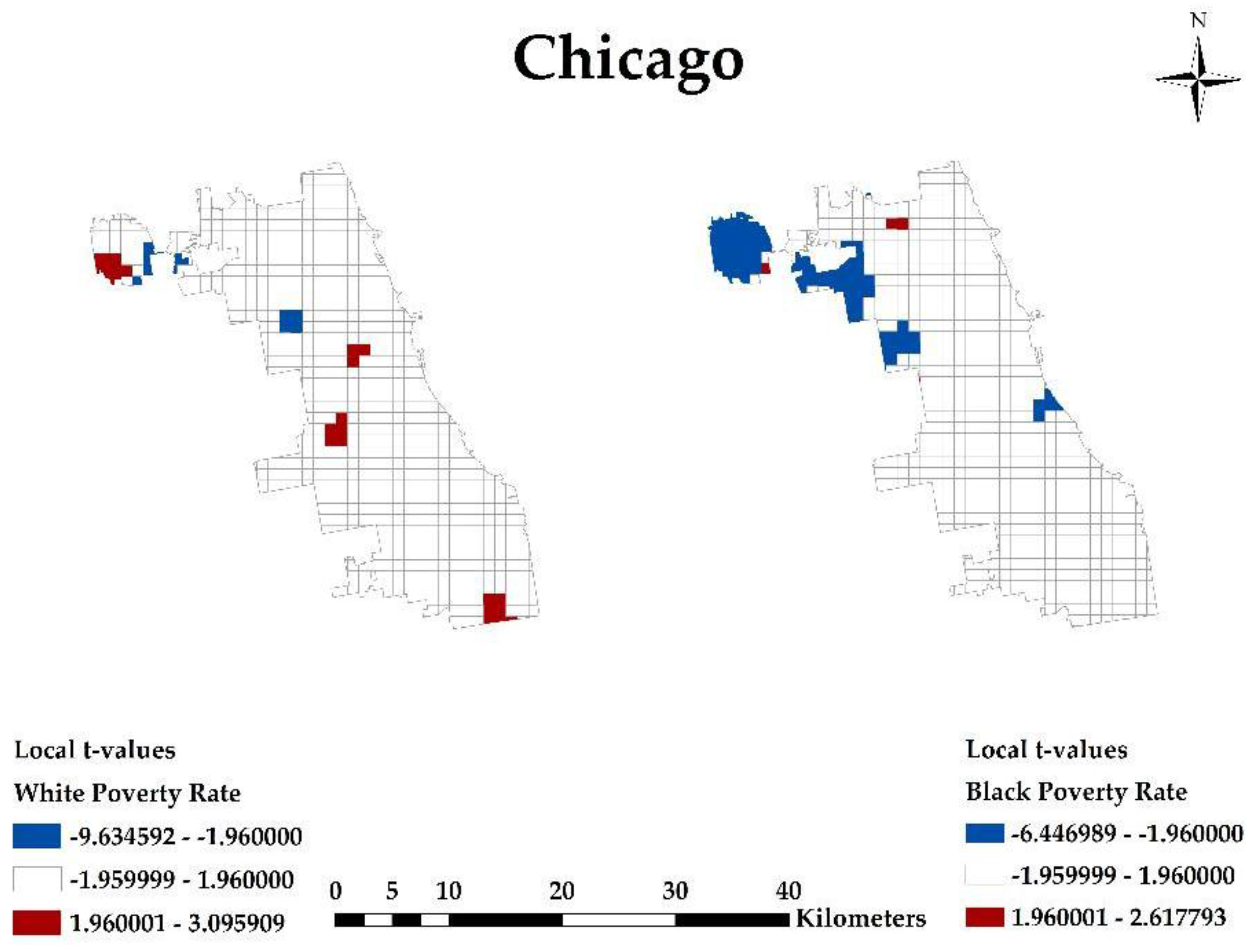
Ijgi 07 00083 g006
Figure 7. Chicago shrinking city White Poverty Rate and Black Poverty Rate: 95% two-tailed test (−1.96:1.96).
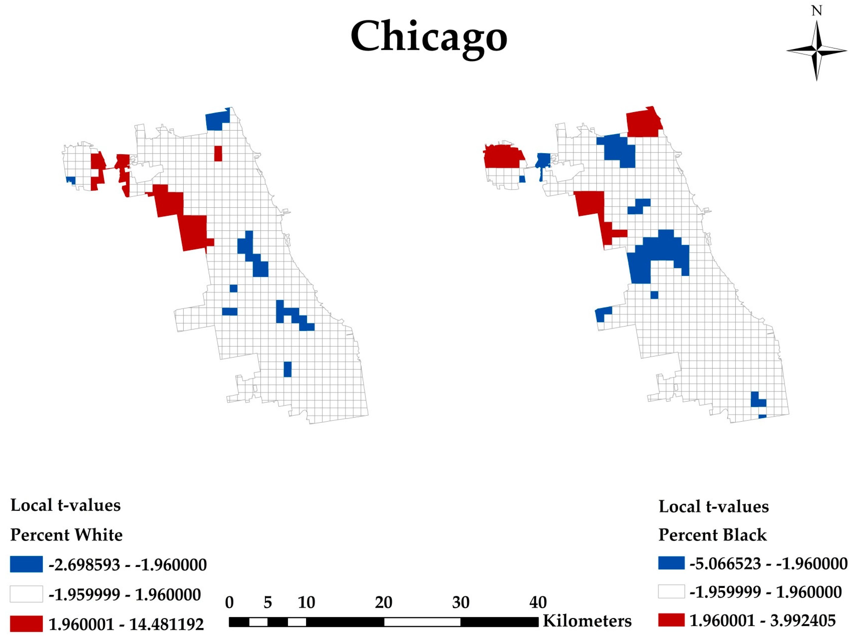
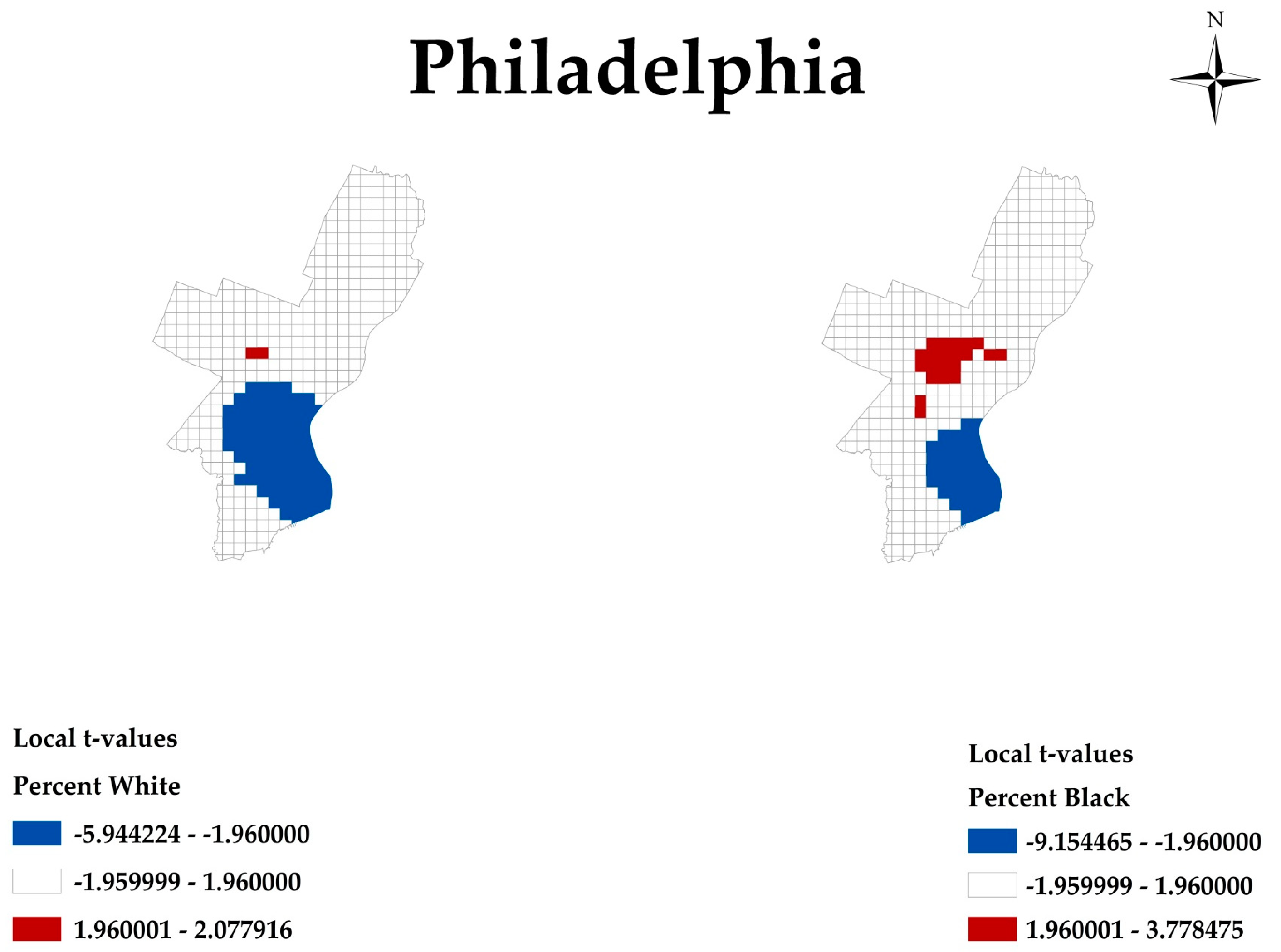
Ijgi 07 00083 g007
Figure 8. Chicago shrinking city Percent White and Percent Black: 95% two-tailed test (−1.96:1.96).
Ijgi 07 00083 g008
Figure 9. Detroit shrinking city White Poverty Rate and Black Poverty Rate: 95% two-tailed test (−1.96:1.96).
Ijgi 07 00083 g009
Figure 10. Chicago shrinking city Percent White and Percent Black: 95% two-tailed test (−1.96:1.96).
Ijgi 07 00083 g010
Figure 11. Philadelphia shrinking city White Poverty Rate and Black Poverty Rate: 95% two-tailed test (−1.96:1.96).
Ijgi 07 00083 g011
Figure 12. Philadelphia shrinking city Percent White and Percent Black: 95% two-tailed test (−1.96:1.96) for 2010.
Ijgi 07 00083 g012
Figure 13. Dallas growing city White Poverty Rate and Black Poverty Rate: 95% two-tailed test (−1.96:1.96).
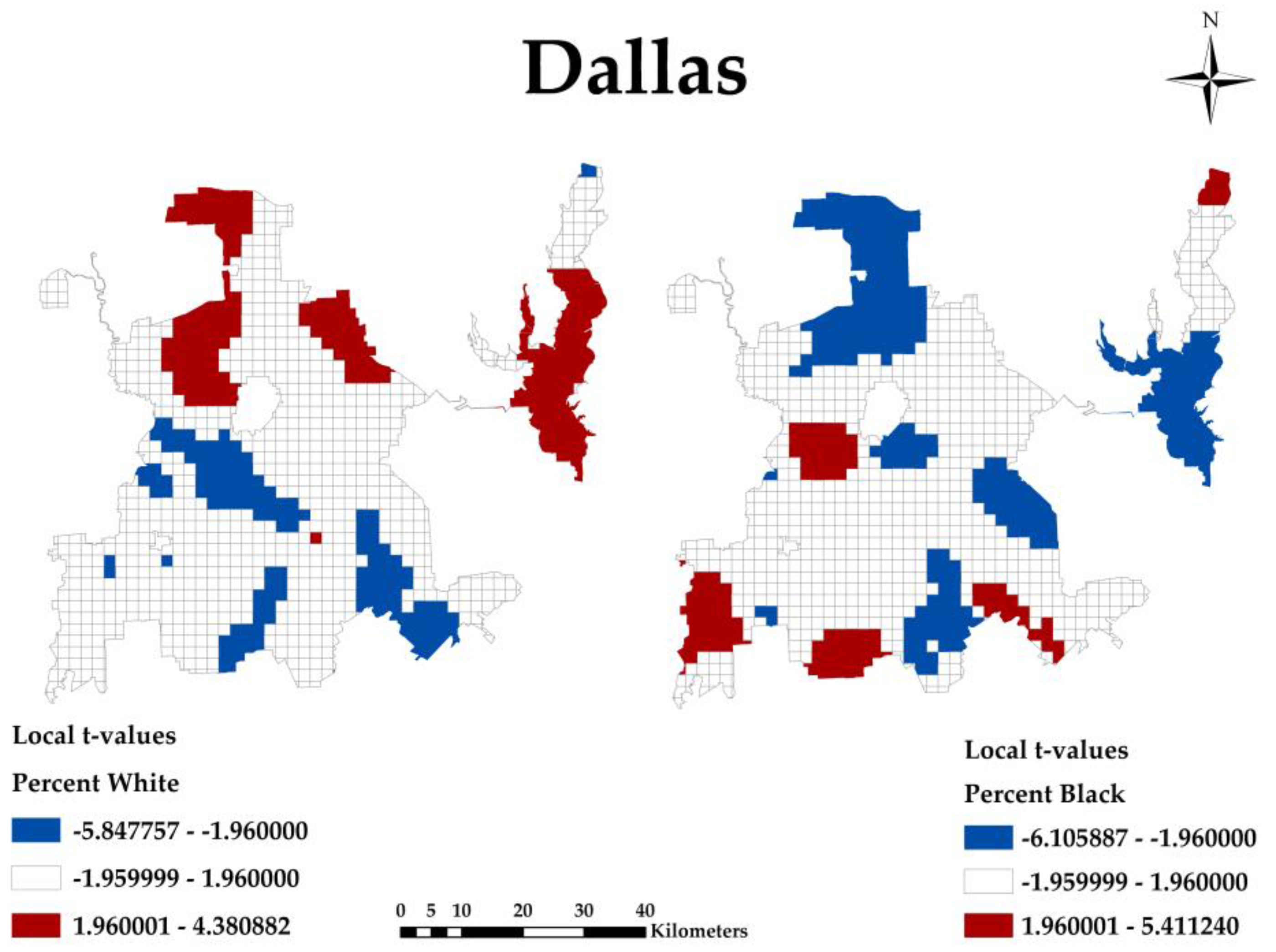
Ijgi 07 00083 g013
Figure 14. Dallas growing city Percent White and Percent Black: 95% two-tailed test (−1.96:1.96).
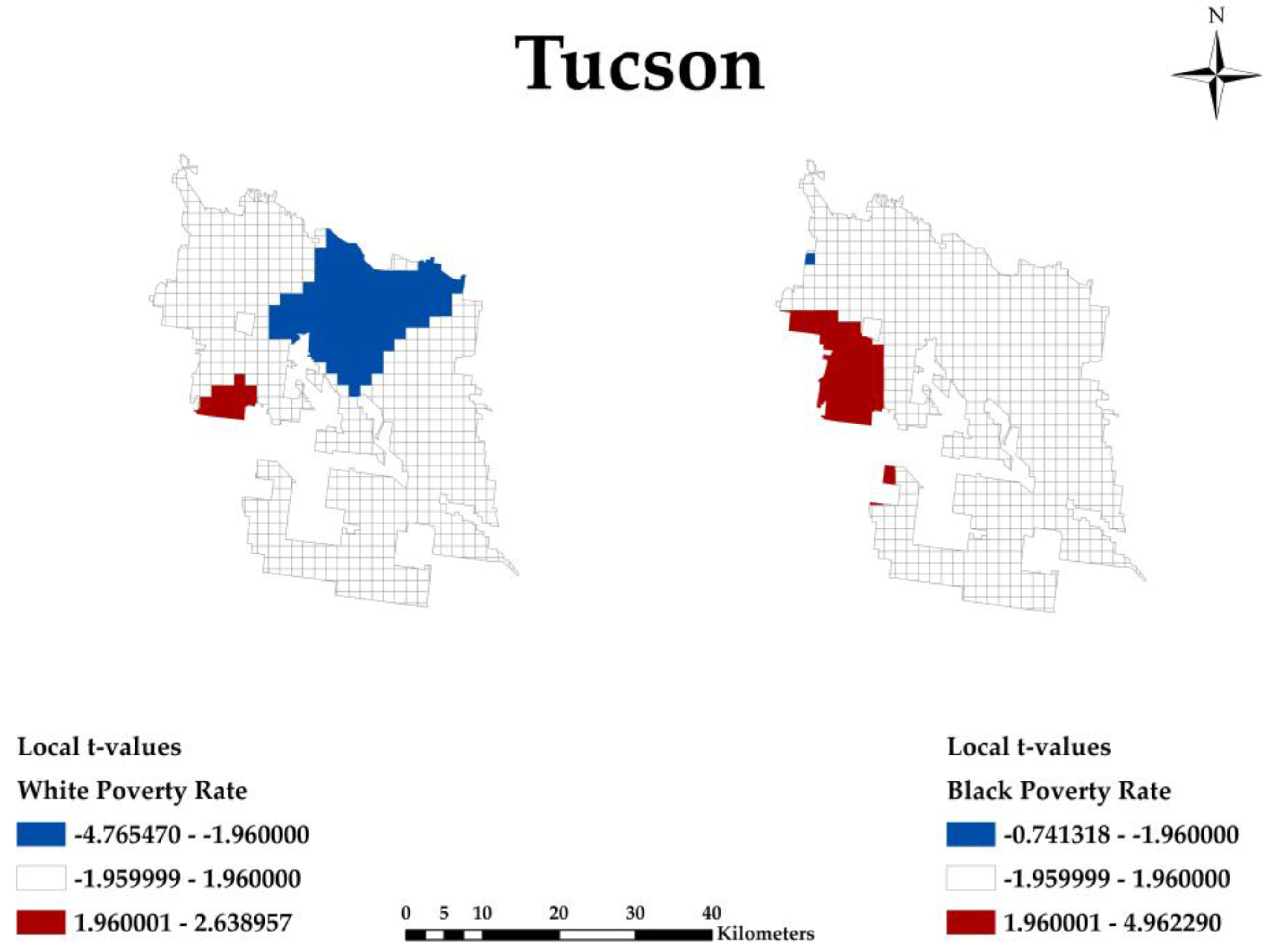
Ijgi 07 00083 g014
Figure 15. Tucson growing city White Poverty Rate and Black Poverty Rate: 95% two-tailed test (−1.96:1.96).
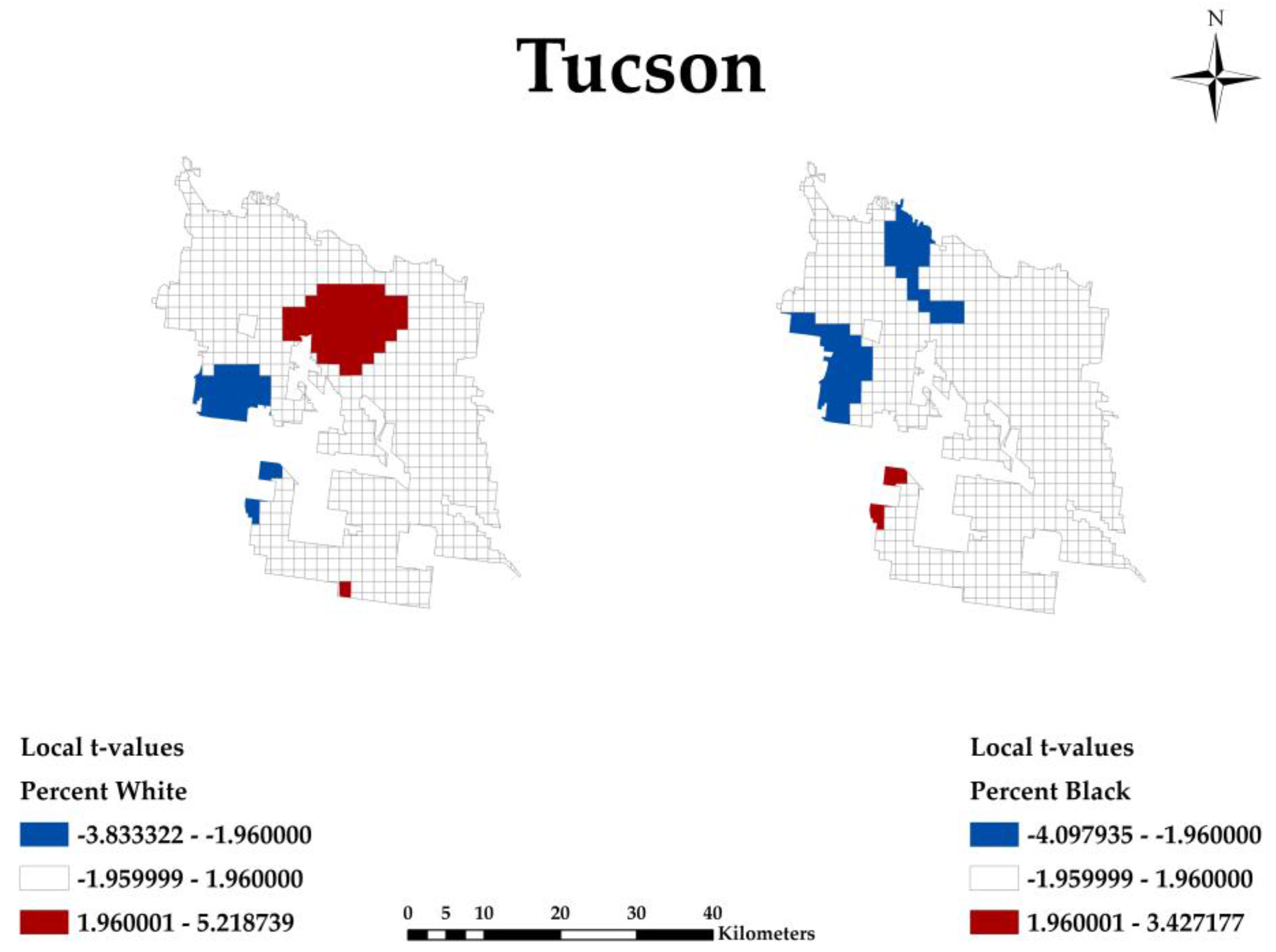
Ijgi 07 00083 g015
Figure 16. Tucson growing city Percent White and Percent Black: 95% two-tailed test (−1.96:1.96).
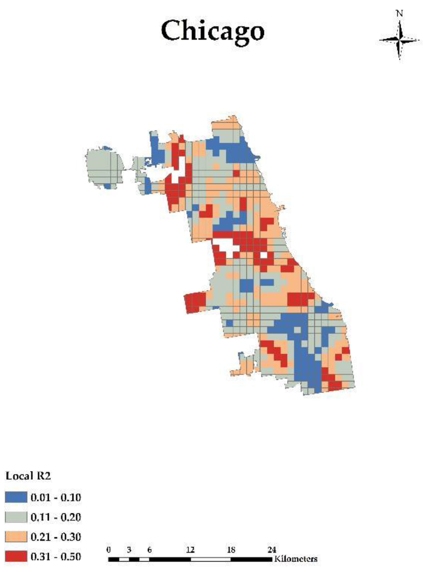
Ijgi 07 00083 g016
Figure 17. Chicago shrinking city: GWR Local r-squared.
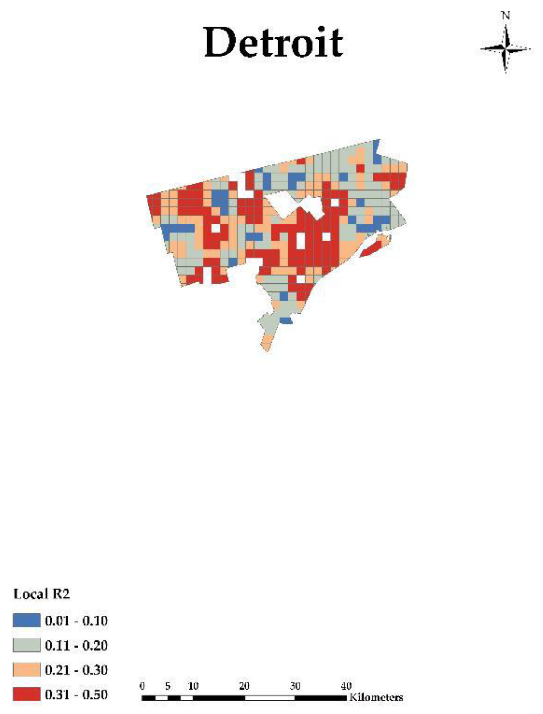
Ijgi 07 00083 g017
Figure 18. Detroit shrinking city: GWR Local r-squared.
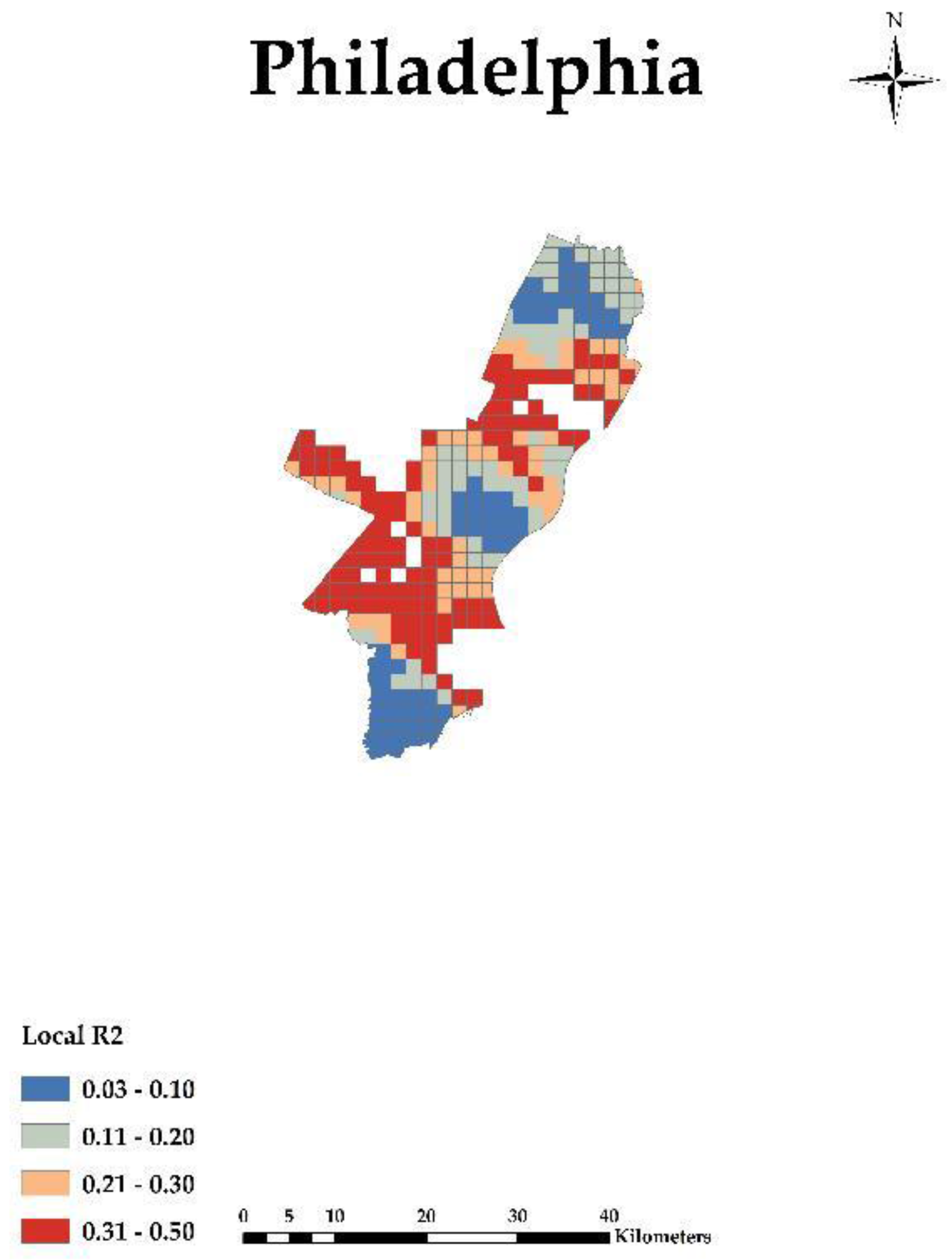
Ijgi 07 00083 g018
Figure 19. Philadelphia shrinking city: GWR Local r-squared.
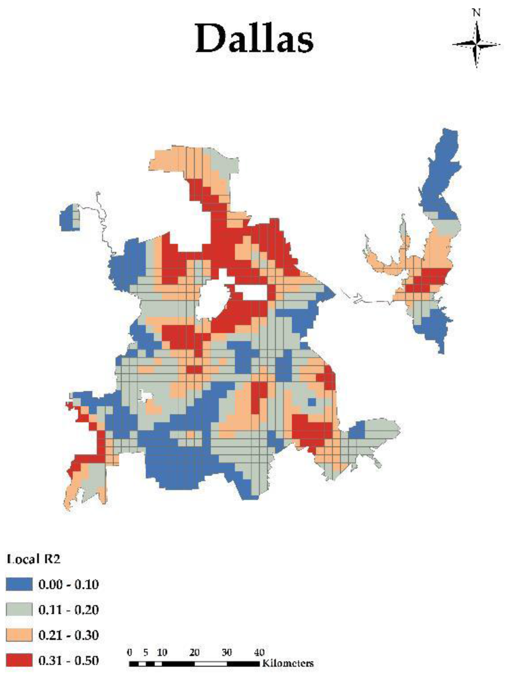
Ijgi 07 00083 g019
Figure 20. Dallas growing city: GWR Local r-squared.
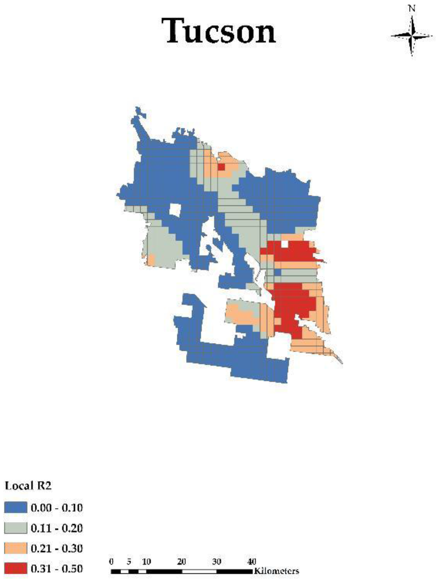
Ijgi 07 00083 g020
Figure 21. Tucson growing city: GWR Local r-squared.
Ijgi 07 00083 g021
Table 1. Descriptive Variables and Definitions.
VariablesDescription
Dependent
NDVIThe Normalized Difference Vegetation Index (NDVI) is an index of plant “greenness” or photosynthetic activity, and is one of the most commonly used vegetation indices. Vegetation indices are based on the observation that different surfaces reflect different types of light differently. Photosynthetically active vegetation, in particular, absorbs most of the red light that hits it while reflecting much of the near infrared light. Vegetation that is dead or stressed reflects more red light and less near infrared light. Likewise, non-vegetated surfaces have a much more even reflectance across the light spectrum.
MAXNThe highest (or peak) value in NDVI observed (clear and not contaminated by cloud or cloud shadows) in a growing season (unit less based on NDVI units).
Independent
PovertyLiving in a household with a total cash income below 50 percent of its poverty threshold.
White PovertyPercent White Alone Population for whom poverty status is determined.
Black PovertyPercent Black or African American Alone Population for whom poverty status is determined.
White PopulationPercent White Alone Population for whom poverty status is determined.
Black PopulationPercent Black or African American Alone Population for whom poverty status is determined.
Table 2. Regression relations of time series 16 year Maximum Normalized Difference Vegetation Index, MAXN Delta (regression coefficient for the time variable showing trend in NDVI), and descriptive statistics of r-squared for 14 Shrinking Cities. We selected three cities Chicago, Detroit, and Philadelphia that were one standard deviation above the overall r-squared mean and one standard deviation below the overall r-squared mean, to show cities that were different from the typical cities. The cities had a low, typical, and high, 16-year series r-squared mean.
Cities1990 Pop2010 PopPop Change16 Year Series MAXN MeanMAXN Delta (2010–1990)r-Squared Mean
Detroit, MI1,027,974713,777−314,197171.687570.4019
Cincinnati, OH364,040296,943−67,097182.62540.3731
Toledo, OH332,943287,208−45,735174.187550.3718
Milwaukee, WI628,088594,833−33,255174.5625110.3701
St. Louis City, MO396,685319,294−77,391169.187570.3181
Baltimore, MD736,014620,961−115,053180.6875110.3143
Pittsburgh, PA369,897305,704−64,193179.062550.2668
Washington, DC606,900601,723−5177183.12540.2564
Cleveland, OH505,616396,815−108,801174.25−20.2516
Philadelphia, PA1,585,5771,526,006−59,571182.437540.2397
Chicago, IL2,783,7262,695,598−88,128175120.2139
Oakland, CA505,616390,724−114,892173.687520.2042
Buffalo, NY328,123261,310−66,813167.937550.1962
New Orleans, LA496,938343,829−153,109184.062590.1309
Mean: (0.28), STD: (0.08)).
Table 3. Regression relations of time series 16 year MAXN, MAXN Delta (regression coefficient for the time variable showing trend in NDVI), and descriptive statistics of r-squared for 58 Growing Cities. We selected two cities Dallas and Tucson that were one standard deviation above the overall r-squared mean and one standard deviation below the overall r-squared mean, to show cities that were different from the typical cities. The cities had a low, typical, and high, 16-year series r-squared mean.
Cities1990 Pop2010 PopPop Change16 Year Series MAXN MeanMAXN Delta (2010–1990)r-Squared Mean
Lexington, KY225,366295,80370,437183.812550.4275
Indianapolis, IN731,327820,44589,118183.437560.3954
Nashville, TN510,784601,22290,43818830.3845
Kansas City, MO435,146459,78724,641184.187560.3788
Portland, OR437,319583,776146,457188.437570.3742
St. Paul, MN272,235285,06812,833173.5100.3720
Wichita, KS304,011382,36878,357175.87550.3545
Greensboro, NC183,894269,66685,772181.687530.3524
Oklahoma City, OK444,719579,999135,280178.9375100.3449
Arlington, TX261,721365,438103,717171.8125140.3409
Louisville, KY269,063597,337328,274187.62570.3395
Memphis, TN610,337646,88936,552183.7500.3258
Jacksonville, FL635,230821,784186,554185.8125120.3257
Omaha, NE335,795408,95873,163181.062570.3256
Seattle, WA516,259608,66092,401172.75130.3234
Dallas, TX1,006,8771,197,816190,939180.75110.3219
Tulsa, OK367,302391,90624,604180.812550.3200
Atlanta, GA394,017420,00325,986179.687540.3114
Raleigh, NC212,092403,892191,80018530.3103
Charlotte, NC395,934731,424335,490182.437530.3056
Virginia Beach, VA393,069437,99444,925183.812530.3014
Minneapolis, MN368,383382,57814,195172.570.2997
Fort Wayne, IN173,072253,69180,619178.437550.2970
Columbus, OH632,910787,033154,123182.0625120.2953
Stockton, CA210,943285,06874,125179.187530.2951
Sacramento, CA369,365466,48897,123176.625120.2836
Austin, TX465,622790,390324,768175.37590.2470
Fort Worth, TX447,619741,206293,587177.625100.2440
Plano, TX128,713259,841131,128167.7540.2371
Lincoln, NE191,972258,37966,407176.6875110.2353
New York, NY7,322,5648,175,133852,569182.590.2291
Houston, TX1,630,5532,099,451468,898182.62530.2245
Boston, MA574,283617,59443,311178.2510.2198
Tampa, FL280,015335,70955,694181.062530.2150
Los Angeles, CA3,485,3983,792,621307,223175.0625140.2058
Fresno, CA354,202494,665140,463167.687590.2013
San Jose, CA782,248945,942163,694179.437590.1936
Bakersfield, CA174,820347,483172,663175.62540.1921
Miami, FL358,548399,45740,909160.937540.1758
Las Vegas, NV258,295583,756325,461143.3125−10.1748
Henderson, NV64,942257,729192,787141.8125100.1723
San Antonio, TX935,9331,327,407391,474178.187520.1694
Albuquerque, NM384,736545,852161,116165.0625−30.1610
Long Beach, CA429,433462,25732,824153.9375110.1578
Phoenix, AZ983,4031,445,632462,229172.437550.1550
Newark, NJ275,221277,1401919166.62570.1518
Corpus Christi, TX257,453305,21547,762173.312580.1508
San Francisco, CA723,959805,23581,276167.520.1504
San Diego, CA1,110,5491,307,402196,853171.9375100.1428
Santa Ana, CA293,742324,52830,786149.9375100.1376
Aurora, CO222,103325,078102,975169.8125180.1352
Denver, CO467,610600,158132,548166.562580.1271
Mesa, AZ288,091439,041150,950164.375−130.1249
Tucson, AZ405,371520,116114,745150.4375−120.1124
Anaheim, CA266,406336,26569,85916590.0971
Colorado Springs, CO281,140416,427135,287171.812550.0964
Riverside, CA226,505303,87177,366167.6875160.0877
El Paso, TX515,342649,121133,779161.9375−50.0740
Mean: (0.24), STD: (0.09).
Table 4. Moran’s I for Shrinking Cities in 2010.
VariableChicagoDetroitPhiladelphia
Poverty Rate0.703 **0.520 **0.759 **
White Poverty Rate0.486 **0.331 **0.659 **
Black Poverty Rate0.623 **0.507 **0.704 **
Percent White0.775 **0.473 **0.588 **
Percent Black0.815 **0.608 **0.755 **
** Statistical significant level: p 0.01.
Table 5. Moran’s I for Growing Cities in 2010.
VariableDallasTucson
Poverty Rate0.591 **0.809 **
White Poverty Rate0.532 **0.804 **
Black Poverty Rate0.467 **0.514 **
Percent White0.688 **0.682 **
Percent Black0.740 **0.531 **
** Statistical significant level: p 0.01.
Table 6. Global and Local Parameter Estimates of the Geographically Weighted Regression Model for Chicago.
Chicago (n = 719)
MinLower QuantileMedUpper QuantileMaxOLS Coefficient (Standard Error)Range GWRRange OLS
MAXN0.400.700.740.770.81
White Poverty Rate−607.982−2.7930.1273.693382.9890.696124 (1.523800)6.493.0476
Black Poverty Rate−245.962−3.746−0.3202.358164.400−3.752281 ** (1.215239)6.102.430478
Percent White−25.380−3.089−0.5020.94589.020−0.410517 (0.485762)4.030.971524
Percent Black−699.169−3.636−0.9651.499663.4331.560251 ** (0.563758)5.141.127516
Constant50.98069.67973.84776.42179.13472.595456 ** (0.352579)6.740.705158
r-squared0.790.04
AIC3899.834727.73
OLS, ordinary least squares; GWR, geographically weighted regression; Statistical significant level: ** p 0.01.
Table 7. Global and Local Parameter Estimates of the Geographically Weighted Regression Model for Detroit.
Detroit (n = 441)
MinLower QuantileMedUpper QuantileMaxOLS Coefficient (Standard Error)Range GWRRange OLS
MAXN0.320.490.530.580.73
White Poverty Rate−28.709−5.2420.7494.08448.864−1.058978 (2.045913)9.334.091826
Black Poverty Rate−80.939−5.2114.50811.78258.737−13.263758 ** (3.121163)16.996.242326
Percent White−106.330−16.226−0.50621.405153.381−3.425044 (3.362862)37.636.725724
Percent Black−46.112−4.896−0.6925.33939.7176.375081 ** (1.418651)10.242.837302
Constant138.536148.621153.088157.869167.055153.852570 ** (0.655055)9.251.31011
r-squared0.830.09
AIC2490.852947.94
OLS, ordinary least squares; GWR, geographically weighted regression; Statistical significant level: ** p 0.01.
Table 8. Global and Local Parameter Estimates of the Geographically Weighted Regression Model for Philadelphia.
Philadelphia (n = 436)
MinLower QuantileMedUpper QuantileMaxOLS Coefficient (Standard Error)Range GWRRange OLS
MAXN0.00.430.550.630.82
White Poverty Rate−52.566−14.0353.81017.395110.9966.671161 (5.065260)31.4310.13052
Black Poverty Rate−78.564−24.478−9.4720.18926.259−39.490202 ** (5.904831)24.6711.809662
Percent White−32.731−11.911−4.9892.27136.498−8.922714 * (2.629092)14.185.258184
Percent Black−98.038−24.970−4.3485.21329.2273.968352 (2.650614)30.185.301228
Constant132.030147.926156.994165.542179.169161.704702 ** (1.401403)17.622.802806
r-squared0.680.29
AIC3649.633867.64
OLS, ordinary least squares; GWR, geographically weighted regression; Statistical significant level: ** p 0.01 and * p 0.05.
Table 9. Global and Local Parameter Estimates of the Geographically Weighted Regression Model for Dallas.
Dallas (n = 1239)
MinLower QuantileMedUpper QuantileMaxOLS Coefficient (Standard Error)Range GWRRange OLS
MAXN0.00.530.590.650.84
White Poverty Rate−1873.673−40.713−6.88623.035971.909−2.718330 (6.758746)63.7513.517492
Black Poverty Rate−803.573−10.2508.85340.1991920.889−0.438399 (4.777406)50.459.554812
Percent White−176.229−14.818−0.14213.102244.523−5.444700 ** (1.712098)27.923.424196
Percent Black−485.207−62.438−11.09025.648228.199−2.716848 (3.758888)88.097.517776
Constant141.832153.157158.332163.405176.225159.715413 ** (0.398456)10.250.796912
r-squared0.580.02
AIC8489.479305.75
OLS, ordinary least squares; GWR, geographically weighted regression; Statistical significant level: ** p 0.01.
Table 10. Global and Local Parameter Estimates of the Geographically Weighted Regression Model for Tucson.
Tucson (n = 749)
MinLower QuantileMedUpper QuantileMaxOLS Coefficient (Standard Error)Range GWRRange OLS
MAXN0.00.260.290.320.48
White Poverty Rate−811.559−224.012−79.4026.591749.417−80.683873 ** (22.888327)230.6045.776654
Black Poverty Rate−19171.213−0.34031.517204.4584314.807−20.451957 (13.799252)204.8027.598504
Percent White−327.328−12.4865.22734.7461340.84811.409682 (8.119418)47.2316.238836
Percent Black−5539.274−361.155−138.567−18.2751533.558−156.486062 * (77.096866)342.88154.193732
Constant103.383122.513127.968130.565151.461126.701526 ** (1.157176)8.052.314352
r-squared0.190.03
AIC6856.196888.68
OLS, ordinary least squares; GWR, geographically weighted regression; Statistical significant level: ** p 0.01 and * p 0.05.

