Article

A Suite of Tools for ROC Analysis of Spatial Models

by
Jean-François Mas
1,*,
Britaldo Soares Filho
2,
Robert Gilmore Pontius
3,
Michelle Farfán Gutiérrez
1 and
Hermann Rodrigues
2
1
Centro de Investigaciones en Geografía Ambiental, Universidad Nacional Autónoma de México, Antigua Carretera a Pátzcuaro 8701, Col. Ex-Hacienda de San José de La Huerta, Morelia C.P. 58190, MIC, Mexico
2
Centro de Sensoriamento Remoto, Universidade Federal de Minas Gerais, Av. Antônio Carlos 6627, Belo Horizonte-MG, 31270-901, Brazil
3
Graduate School of Geography, Clark University, 950 Main Street, Worcester, MA 01610-1477, USA
*
Author to whom correspondence should be addressed.
ISPRS Int. J. Geo-Inf. 2013, 2(3), 869-887; https://doi.org/10.3390/ijgi2030869
Submission received: 25 July 2013 / Revised: 13 August 2013 / Accepted: 29 August 2013 / Published: 10 September 2013

Abstract

:
The Receiver Operating Characteristic (ROC) is widely used for assessing the performance of classification algorithms. In GIScience, ROC has been applied to assess models aimed at predicting events, such as land use/cover change (LUCC), species distribution and disease risk. However, GIS software packages offer few statistical tests and guidance tools for ROC analysis and interpretation. This paper presents a suite of GIS tools designed to facilitate ROC curve analysis for GIS users by applying proper statistical tests and analysis procedures. The tools are freely available as models and submodels of Dinamica EGO freeware. The tools give the ROC curve, the area under the curve (AUC), partial AUC, lower and upper AUCs, the confidence interval of AUC, the density of event in probability bins and tests to evaluate the difference between the AUCs of two models. We present first the procedures and statistical tests implemented in Dinamica EGO, then the application of the tools to assess LUCC and species distribution models. Finally, we interpret and discuss the ROC-related statistics resulting from various case studies.

Graphical Abstract

1. Introduction

The Receiver Operating Characteristic (ROC) analysis allows one to assess the performance of binary classification methods with rank order or continuous output values. ROC analysis has been widely used in many domains, such as medical diagnosis [1], quantitative finance [2], bioinformatics [3] and, GIS [4,5,6].
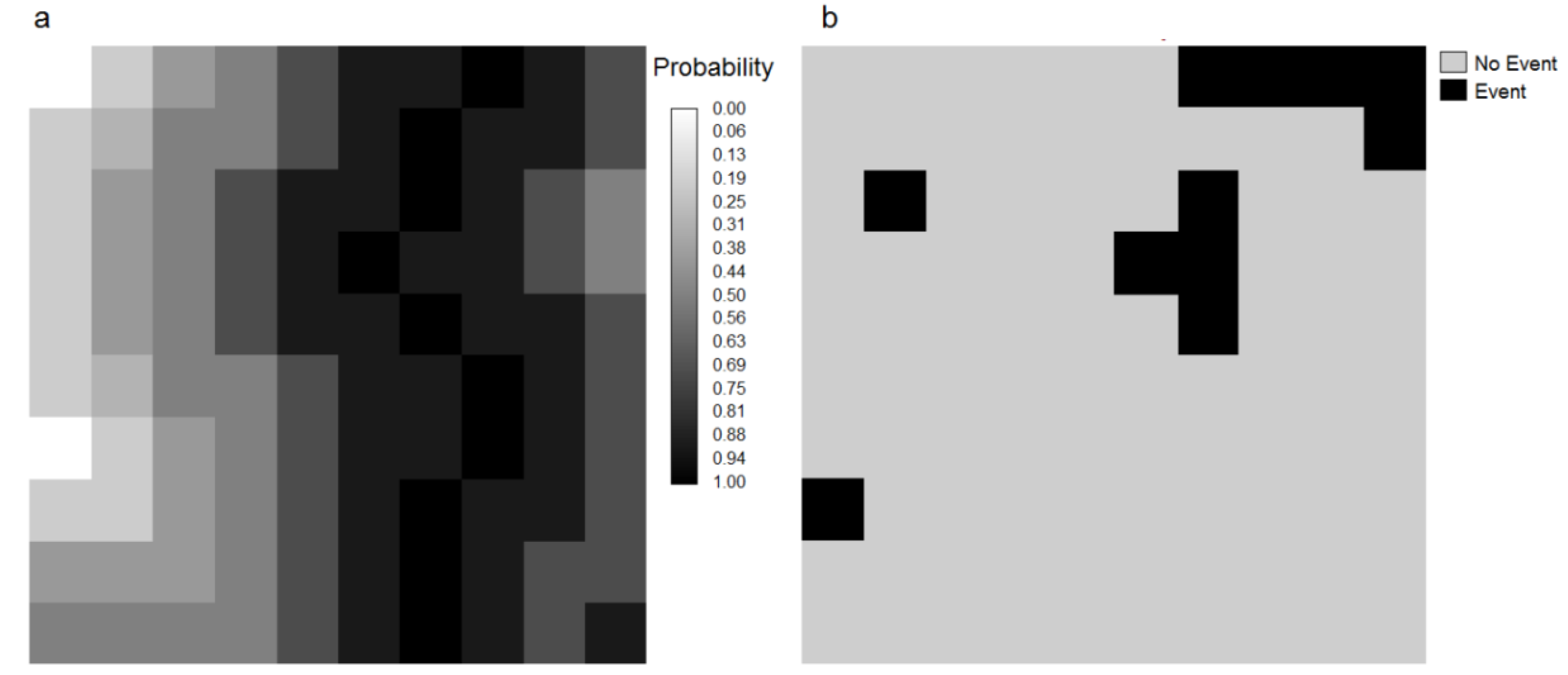
The principal applications of ROC in GIS-based studies concern the assessment of raster data models aimed at predicting land use/cover change, species distribution, disease, and disaster risks, among others. ROC analysis is applied to assess the performance of spatial models that produce a “probability” map, which presents the sequence in which the model selects grid cells to determine the occurrence of a certain event, e.g., land use change, presence of a species, landslide, wildfire, etc. We use the term “probability” although the value is not always true a probability in the statistical sense depending on the algorithm used to generate the value. The value is often referred to as suitability, propensity, transition potential, index, likelihood or score value. Although literature reports multi-class ROC analysis [7], standard ROC is mostly used for binary events, e.g., change versus no change, presence versus absence of a species. In the standard ROC approach, the predictive probability map is compared with the map of the true binary event in order to assess the spatial coincidence between the event and the probability values. A model with a high predictive power produces a map of probability in which the highly ranked probabilities coincide with the true event. ROC applies various thresholds to the probability map in order to produce a sequence of binary predicted event maps (Figure 1) and to assess the coincidence between predicted and true events as summarized by Table 1.
Figure 1. (a) Map of probability and (b) binary map of event, for 100 grid cells. Grid cells with high to medium probability (black and dark grey cells) tend to coincide with the 11 event black grid cells.
Ijgi 02 00869 g001
Table 1. Contingency table used to compute a threshold point on the ROC curve. Ht, Ft, Mt, and Ct are respectively the proportion of grid cells corresponding to hits, false alarms, misses and correct rejections (Modified from Pontius and Parmentier [6]).
Event Map1 (Event)0 (No event)Threshold Total
Threshold Map
1 (Modeled as event)HtFtHt + Ft
0 (Modeled as No event)MtCtMt + Ct
Event totalHt + MtFt + Ct1
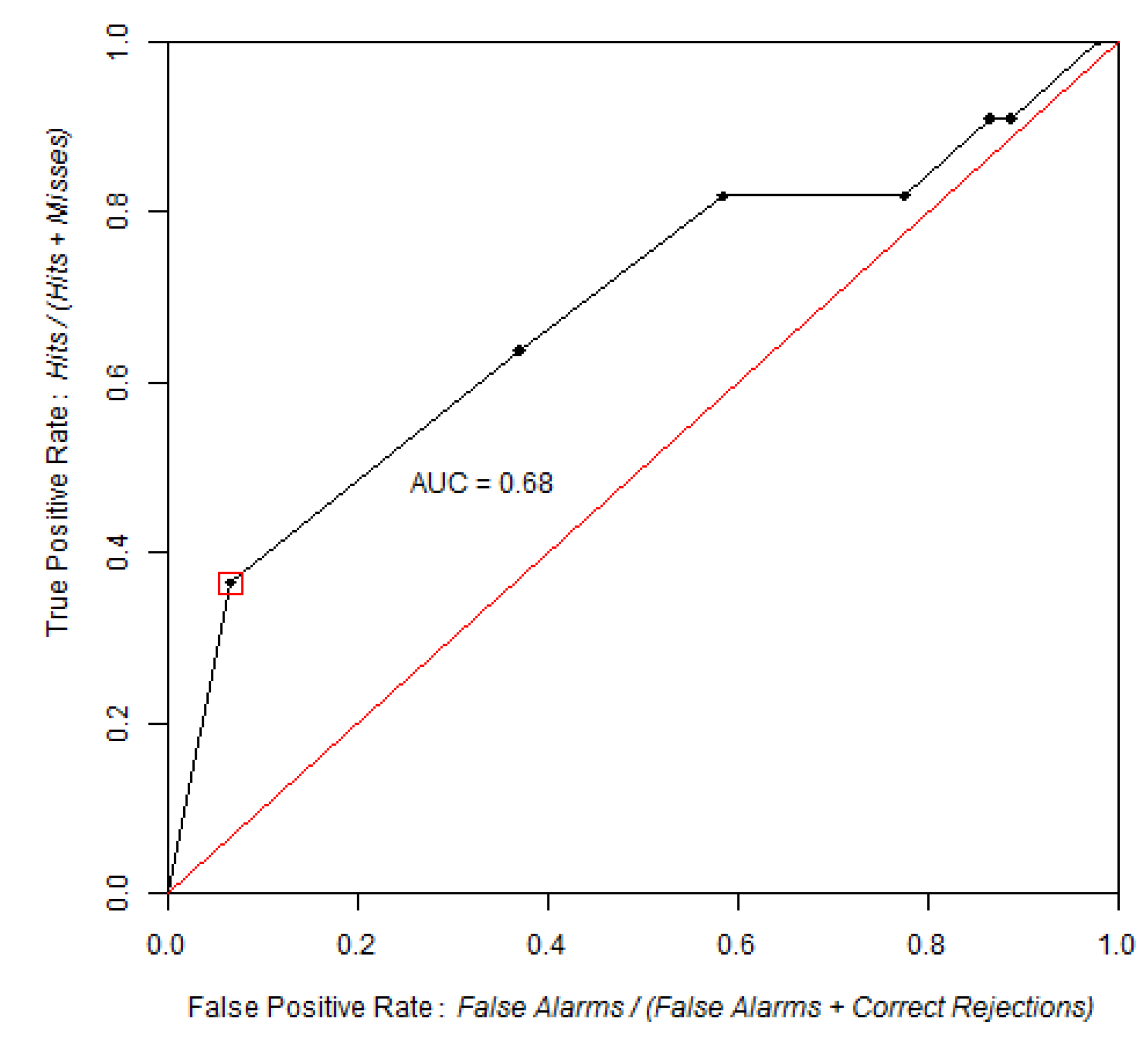
In the ROC curve, the horizontal axis represents the false positive rate (proportion of no event cells modeled as event, that is Ft/(Ft + Ct)) and the vertical axis the true positive rate (proportion of the true event cells modeled as event, that is Ht/(Ht + Mt)). A popular summary metric is the area under the curve (AUC) that connects the points obtained by the various thresholds. If the true events coincide perfectly with the higher ranked probabilities, then the Area Under the Curve (AUC) is equal to one because the curve begins at the point (0,0), goes up the horizontal axis to the point (0,1), and to the right to the point (1,1). A random probability map produces a diagonal ROC curve in which the true positive rate equals the false positive rate at all threshold points. Any probability map that has a ROC curve below the diagonal has less predictive power than a random map. In the literature, false and true positives rates are also referred as (1-specificity) and sensitivity respectively (Figure 2).
Figure 2. The ROC Curve for the maps of Figure 1. True and false positive rates are computed for each threshold applied to the probability map. To define the first point in the red square, we observe that the first bin has cells coded 1 in a threshold map that captures the 10 highest probability darkest cells. Four of them coincide with the 11 event cells, thus generates a true positive rate = 4/11. The other six cells coincide with the 89 no event cells, thus generates a false positive rate = 6/89. The next point in the ROC curve is defined taking into account all the cells above the next lower probability threshold.
Ijgi 02 00869 g002
AUC is frequently applied to compare probability maps. When the data used to construct the ROC curve are obtained by sampling, such comparison must be carried out with a proper statistical analysis. In some cases, the performance assessment should be focused on a specific portion of the ROC curve using a partial AUC. Various software packages for ROC analysis already exist. In particular, pROC is an open source package for R and S+ that contains multiple statistical tests to compare ROC curves [8]. However, these programs do not accept raster data as input and are designed for relatively small datasets, such as medical databases with typically hundreds or thousands of observations, and thus have low performance when processing hundreds of thousands of observations that are typical of raster datasets. On the other hand, GIS software offers few statistical tests and analytic tools for ROC analysis.
The tools presented in this paper are designed to facilitate ROC curve analysis for GIS users by providing several instruments for analysis and proper statistical tests for comparison. The tools allow users to produce ROC curves, identify strategic points, compute full or partial AUCs along with their confidence intervals and compare two ROC curves statistically. We implemented these tools as models and submodels of Dinamica EGO, a freeware platform for environmental modeling [9] (www.csr.ufmg.br/dinamica/).
The article is organized as follows: Section 2 introduces Dinamica EGO briefly and, Section 3 describes the implementation of the tools. Section 4 illustrates the use of these tools to assess maps obtained from two common modeling applications. Finally, Section 5 interprets and discusses the results.

2. Dinamica EGO

Dinamica EGO (hereafter Dinamica) is a platform for environmental modeling that enables the design from simple static to complex dynamic spatial models. These models can involve nested iterations, dynamic feedbacks, multi-region and multi-scale approaches, decision processes for bifurcating and joining execution pipelines, manipulation and algebraic combinations of data in several formats, such as maps, tables, matrices and constants. A series of spatial algorithms enable users to develop space-time simulations, including analysis of landscape structure, model calibration, simulation of spatial patterns of change and model validation. The software’s 64-bit native version takes advantage of multiple processor architecture and its GDAL library handles large datasets in many raster formats and virtually any cartographic projection or datum. Models, which can be defined as workflows that execute sequences of geoprocessing operations, are created by dragging and connecting data functors (data operators) in a model diagram displayed in the graphical interface. Finally, models in Dinamica EGO can be saved as submodels and stored as new functors in the functor library, thus helping users to better organize, reuse, and share models [9]. In the present study, we created a new library called “ROC Analysis” composed by seven submodels that enable a user to carry out various operations related to ROC analysis, e.g., AUC and partial AUC computing, AUC interval confidence estimation, bootstrapping and image resampling. The library is available for download at csr.ufmg.br/dinamica and http://www.ciga.unam.mx/ciga/images/proyectos/vigentes/modelos/images/ROC_tools.zip

3. Implementation of ROC Analysis for Raster Maps

To build a ROC curve, the user has to provide a probability map and an event map. For example, a deforestation probability map of a time interval and a binary map of actual deforestation during the same time interval. In other software packages, a linear scan algorithm would sort the observations (cells) by decreasing probability and then move down the list, processing one observation at a time and updating the number of true and false positives [7]. In the case of raster datasets, the number of observations (cells) is frequently too large to carry out the linear scan, so input data are simplified by grouping cells with similar probabilities into bins. There are three methods to select the slicing thresholds to define the bins. The first option is an equal probability increment method in which a slicing threshold increment of 0.1, which is the default value, produces 10 intervals and therefore 10 bins; a threshold increment of 0.2 produces five intervals and therefore five bins, etc. These intervals get the same range of probability but not necessary the same number of cells because, for example, the probability interval from 0.0 to 0.1 does not necessarily contain 10% of the cells. The second option is an equal area increment method in which the map can be reclassified using equal area bins, where each bin has approximately the same number of cells. The 10% area threshold default value produces 10 bins, each bin comprising 10% of the cells. For these first and second options, a smaller thresholding increment leads to more bins, allowing a more detailed ROC curve and more precise AUC estimation, but requires more computer time. A third option is to use strategic thresholds chosen by the user. As a following step, each threshold map of probability is overlaid with the event map in order to calculate true and false positive rates.
In the case of assessing maps from models of species distribution, the map of the event is derived from occurrence points (presence of the species) and the background (or part of it) is considered as pseudo-absence. Biological databases do not generally present evidence of absence, because a species can be present in a given region without being detected during field survey. Additionally information of absence is of dubious utility to model potential distribution, because absence of a species does not mean that the area is not suitable as a potential habitat [10]. The Dinamica tool allows users to construct the ROC curve with an alternative horizontal axis proposed by [10], who suggest that the horizontal axis show the proportion of the study area predicted present in the horizontal axis (Ht + Ft), instead of the false positive rate. In fact, this change of horizontal axis does not induce large change in the ROC curve when the number of hits is much less than the number of false alarms (Ht << Ft) and the number of presence cells (points of occurrence) is much smaller than the number of pseudo-absences (Ht + Mt << Ft + Ct), but the alternative horizontal axis can lead to additional insights concerning the ROC curve.

3.1. AUC and pAUC Estimation

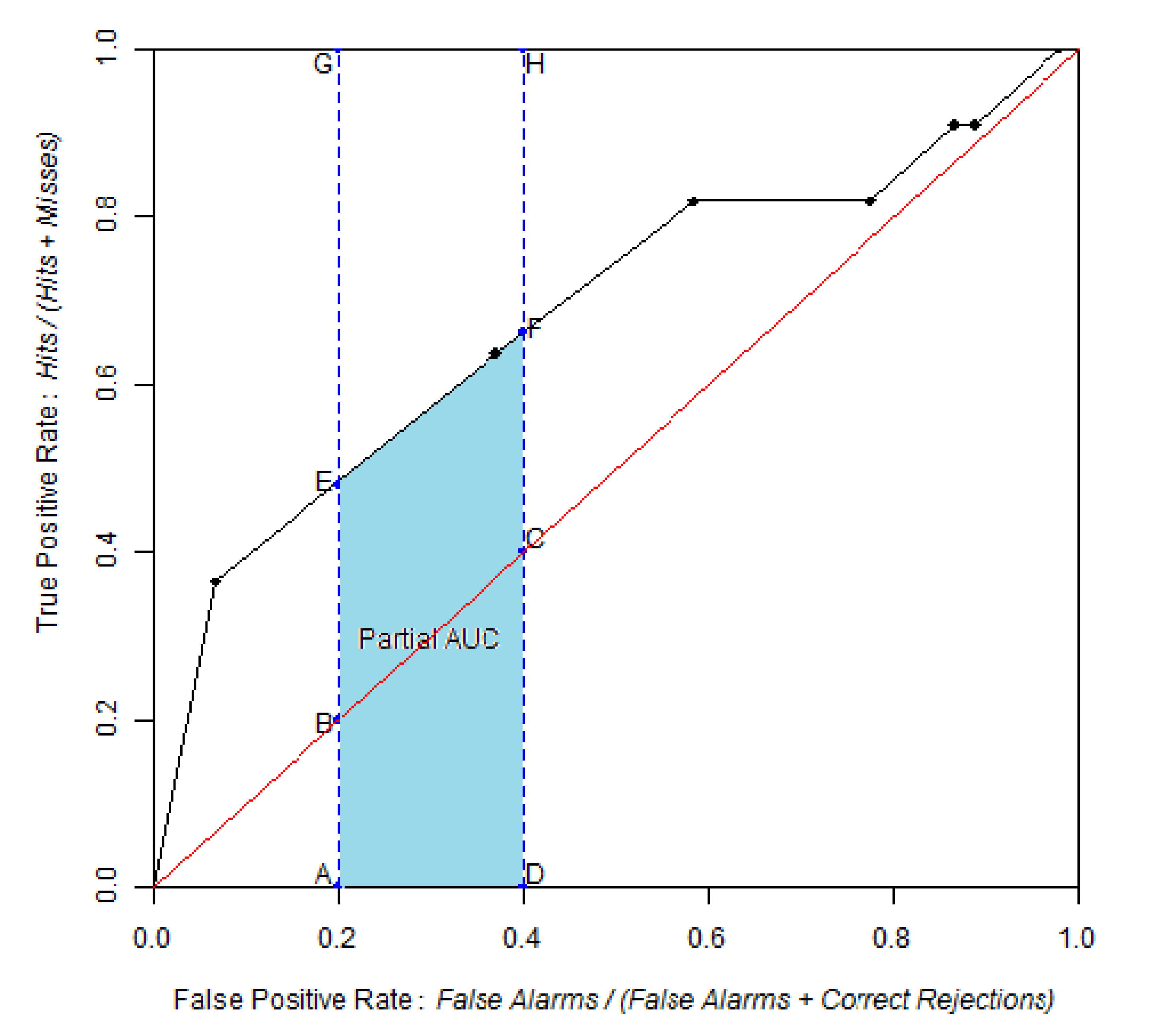
AUCs are calculated with trapezoids. In order to calculate a partial AUC (pAUC), represented by area AEFD in Figure 3, users define a range of the ROC curve to be analyzed on either the horizontal axis (False Alarms Rate) or vertical axis (True Positive Rate) (Figure 3). Trapezoids outside the partial range are ignored. If the partial range does not coincide with the threshold points, then new trapezoids are added to the curve by using linear interpolation through the points on the full ROC curve. The Dinamica tool allows an option to compute a pAUC that is standardized using Equation (1) in order to present the same interpretation as AUC, meaning AUC = 0.5 for a non-discriminant ROC curve derived from a random probability map, and AUC = 1.0 for a perfect ROC curve [8,11].
Ijgi 02 00869 i001
where pAUCs is the standardized pAUC, randomAUC is the pAUC obtained by the random model (Area ABCD) over the same range of the ROC curve, and perfectAUC is the pAUC over the same range of the perfect ROC curve (area AGHD).
Figure 3. Partial area under the curve (AUC) for a range on the horizontal axis. pAUC corresponds to the area AEFD. Its value is standardized using the pAUC of a random model (area ABCD) and a perfect model (area AGHD).
Ijgi 02 00869 g003
During the thresholding of the probability map, a single bin may contain cells with various probabilities. The trapezoidal approach ignores the variation within a bin, because the trapezoid approach uses a straight line segment to connect two consecutive points of the ROC curve. Additional thresholds that define smaller bins could refine the ROC curve, theoretically to the point that every cell is in one bin. However, this is usually not feasible due to computing constraints. If the number of bins is much less than the number of unique probability values, then there is uncertainty concerning the ROC curve and consequently the AUC that derives from how the bins are defined. For this situation, [6] proposed two additional evaluations of ROC called ROClower and ROCupper that are based on stair-stepped shape curves that lie below and above the ROC trapezoidal curve respectively. From these two additional curves, two AUC values are derived respectively called AUClower and AUCupper. Their values are useful to assess the uncertainty related to the selection of the thresholds for the probability map.

3.2. Confidence Intervals

When the AUC or pAUC are derived from a sample, confidence intervals (CIs) can be estimated by bootstrap stratified resampling. New replicated maps of probability are produced by resampling with replacement from the original probability map. The Dinamica tool uses stratification to insure that each sample has the same proportion of event cells as in the original data. ROC analysis is performed on each replicated map to calculate AUC or pAUC. Then CIs are estimated using two approaches. The first one is based on a normal distribution assumption and estimates the CI bounds using the standard deviation of the replicated AUCs and a standard normal table to obtain the probability that the AUC is observed below, above, or between certain values. The second approach is a bootstrap percentile interval method, which uses the empirical quantiles of the bootstrap replicates.
In order to carry out bootstrapping, the probability Pk for a cell to be selected k times in a bootstrapped replicate is calculated by Equation (2):
Ijgi 02 00869 i002
where Pk is the probability for a cell to be selected k times into a bootstrap replicate where n is the number of cells in the stratum to which the cell belongs.
In order to avoid computing overflow, the overflow-robust formula for computing binomial coefficients presented by [12] was modified, thus producing Equations (3a) and (3b):
If nk < k
Ijgi 02 00869 i003
else
Ijgi 02 00869 i004

3.3. Comparison of Two ROC Curves

It is often useful to compare the AUC or pAUC values between paired ROC curves. The pairs might derive from a variety of concepts. For example, a single set of data can produce two different probability maps due to two different methods of analysis. When ROC curves derive from a sample, it is important to assess whether the difference is statistically significant or whether the difference can be attributed to the variability due to sampling. For this situation, a bootstrap test was implemented according to the method of Hanley and McNeil modified by [8] based on the computing of Z using Equation (4):
Ijgi 02 00869 i005
where AUC1 and AUC2 are the two AUCs and sd (AUC2 − AUC1) is the standard deviation of the difference between the two AUCs with numerous replicates. As Z approximately represents a normal distribution, one or two-tailed p-values are computed to carry out one or two-tailed tests respectively. The same concepts apply to partial AUCs.
It can be helpful to test whether a complete population suitability map produces a significantly different AUC than a random map, taking into account the variation due to the assignment of random location in the random map. Thus, a Monte Carlo simulation can be performed by Dinamica in order to test whether the model assigns locations significantly different from random [13]. In this case, the same Z statistic is used.

3.4. Improvements in the Use and Interpretation of ROC Curves

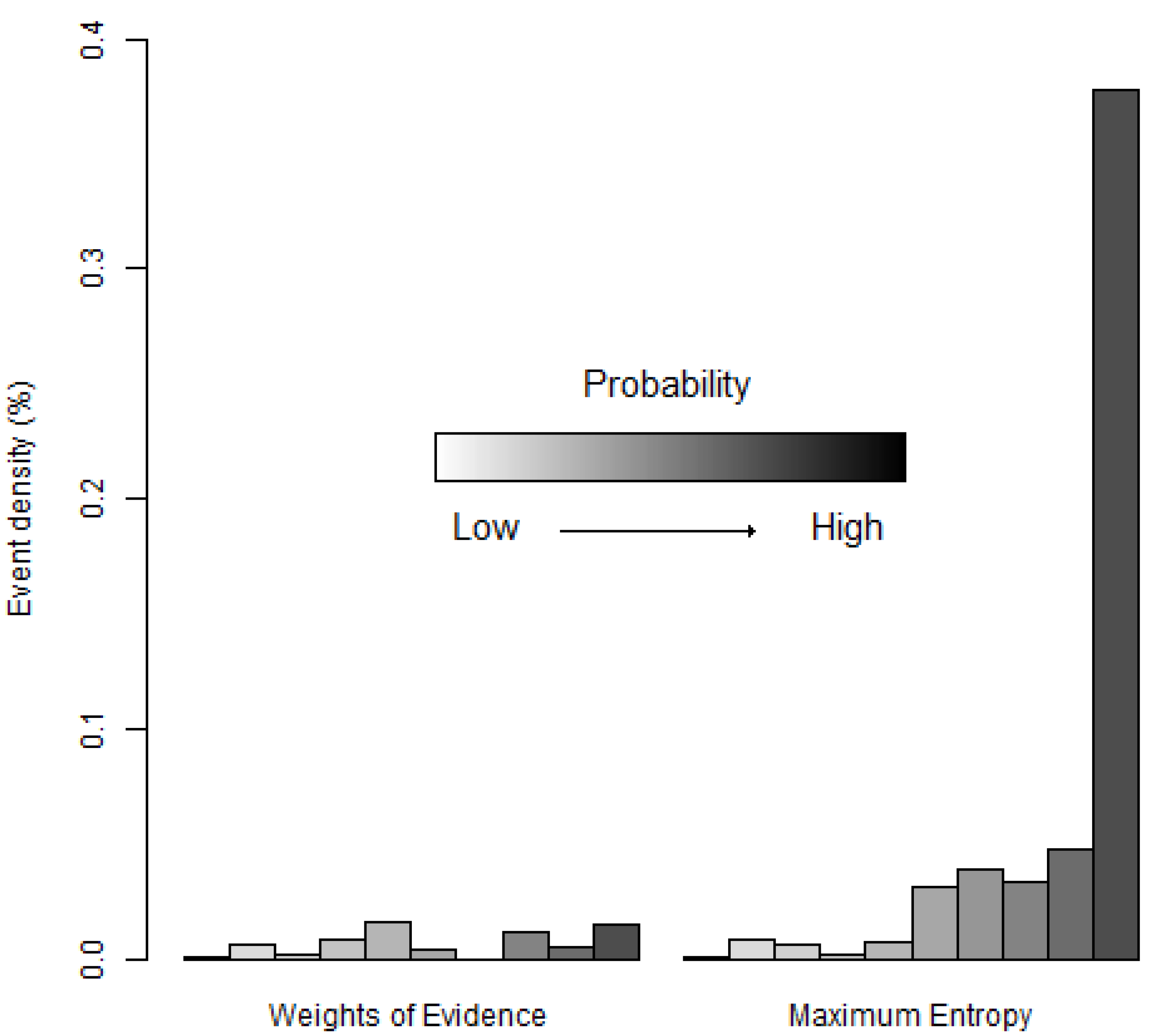
The improvements in the use of the ROC and its AUC proposed by [6] were implemented in the suite of tools. These improvements address criticisms that the AUC should not be used as a sole indicator of model performance, because AUC is a potentially misleading metric [10,14]. We designed a Dinamica model to generate the cumulative distribution function (CDF), which is a cumulative histogram of the frequency of cells as a function of the probability. Researchers can use the CDF to select particularly important thresholds for the ROC curve, such as the thresholds that capture the first quartile, the median, the third quartile of the study area and the threshold at which Ht + Mt equals Ht + Ft. In order to highlight important threshold points on the ROC curve, a tool was designed to show the threshold’s corresponding probability and the proportion of the study area that has a probability below the threshold. Finally, the density of the event occurrence in each bin of the ROC curve was computed as the ratio between the occurrence cells and the candidate cells of a given bin (Equation (5)). The result can be represented by a bar plot or a map.
Ijgi 02 00869 i006
where Dt is the density of occurrence cells in bin t, Ht and Ht + 1 are hits at threshold t and t + 1 respectively and, Mt and Mt + 1 are misses at threshold t and t + 1 respectively.

3.5. Decreasing Computing Time

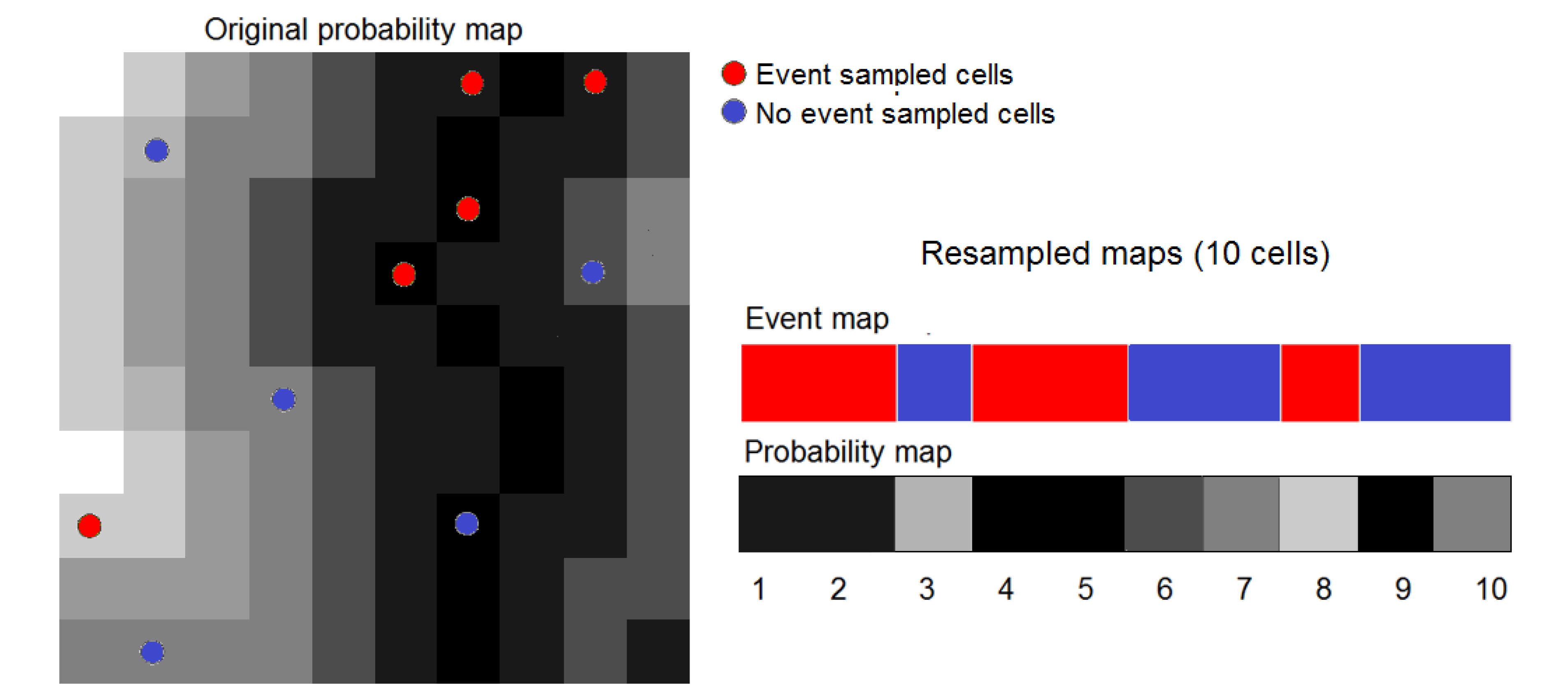
Monte Carlo and bootstrap methods involve a large number of iterations. Each iteration requires several map algebra operations of the entire maps, thus demanding substantial computing time. In order to speed up processing, we created a tool that randomly samples the probability and occurrence images in order to use less data when computing indices based on these iterative processes. Sampling is stratified in order to control sampling proportions for event and no-event cells. For example, in niche modeling, the number of pseudo-absence cells is generally much larger than presence cells, thus one should reduce only the pseudo-absence data. As a result, new maps containing lesser number of cells are produced from sampled cells for further processes. Spatial structure of original maps is not conserved. However, this does not affect the results because operations are based on cell-to-cell operations without involving neighbor-based operations. Figure 4 illustrates the resampling procedure using data of Figure 1. A random stratified sampling is used to select five cells for Event and No-event categories respectively. Then new “reduced” event and probability maps (1 × 10 cells) are built using information from these ten selected cells. Iterative processes involving a large number of iterations are carried out using these “reduced” images. We examine the effect of the resampling procedure on the accuracy of AUC in Section 4.2.
Figure 4. Sampling procedure. Original image is read line by line and selected cells are sorted into a one-line resampled map.
Ijgi 02 00869 g004

4. Applications

We applied the suite of tools to two modeling exercises. The first consists of a model of land use and land cover change (LUCC) in the Brazilian Amazon implemented using Dinamica EGO. The second is a model of the distribution of the Brown-throated three-toed sloth (Bradypus variegatus) implemented using MaxEnt [15] and Dinamica EGO [16].

4.1. Land Use/Cover Change (LUCC) Model
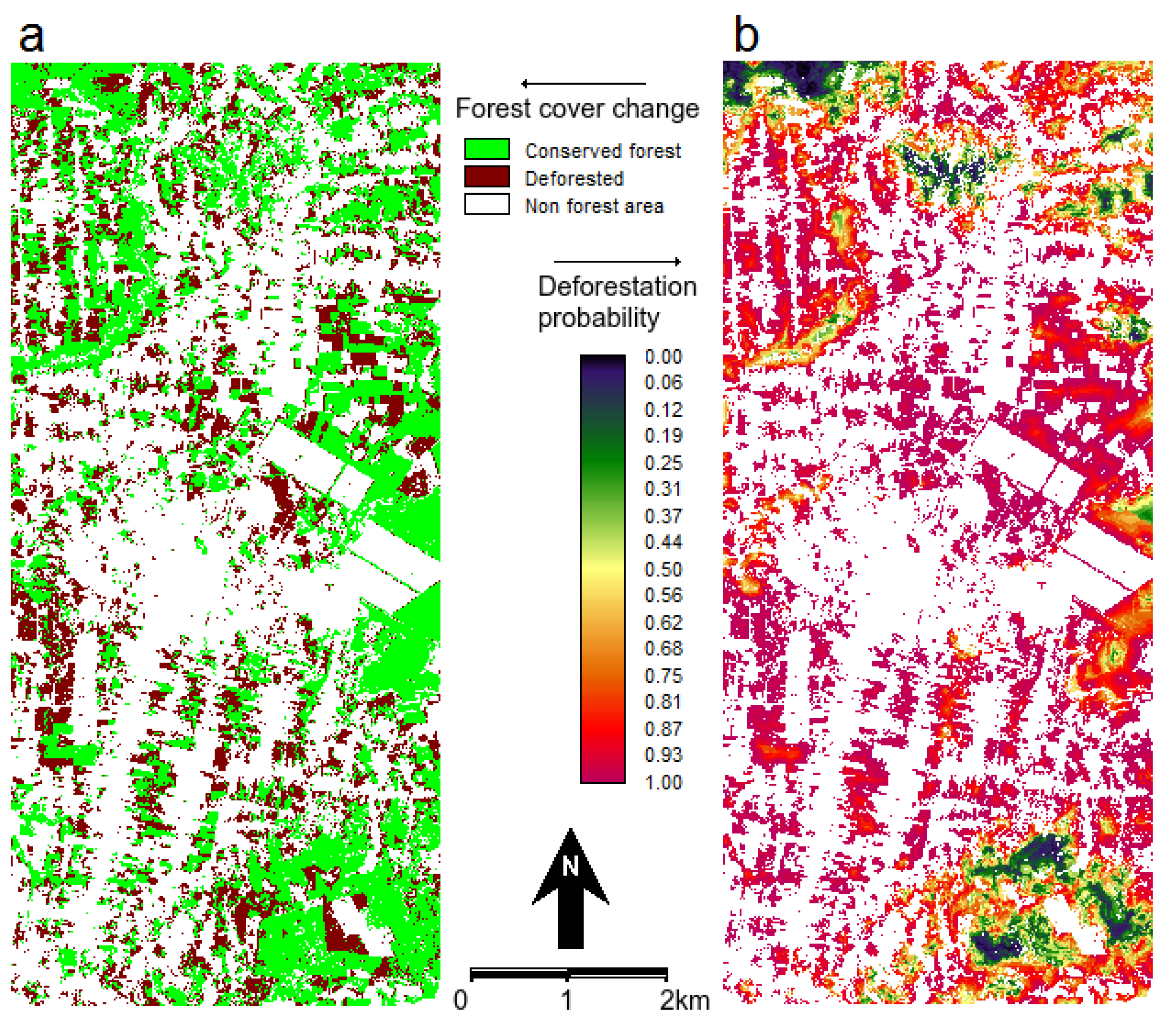
The case study data come with the installation package of Dinamica EGO. It aims at modeling the spatial patterns of deforestation in Northern Mato-Grosso, an agricultural frontier in the Brazilian Amazon. The deforestation model used Weights of Evidence (WofE) to produce a map of the probability of post-1994 deforestation (Figure 5) by using the following data layers: forest-cover of 1991, forest-cover of 1994, distance to roads, distance to forest, and slope [17]. In many LUCC models, this type of map of probability is used to produce prospective land cover maps by allocating future deforestation. The simulation procedure usually allocates the changes in areas that exhibit higher transition probabilities. In order to assess the probability map’s predictive power, we compared the map of deforestation probability via ROC analysis with the actual deforestation between 1994 and 1999 (Figure 6).
Figure 5. (a) Map of observed forest cover change during 1994–1999 and (b) probability of post-1994 deforestation. The white non forest areas at 1994 are eliminated from the analysis.
Ijgi 02 00869 g005
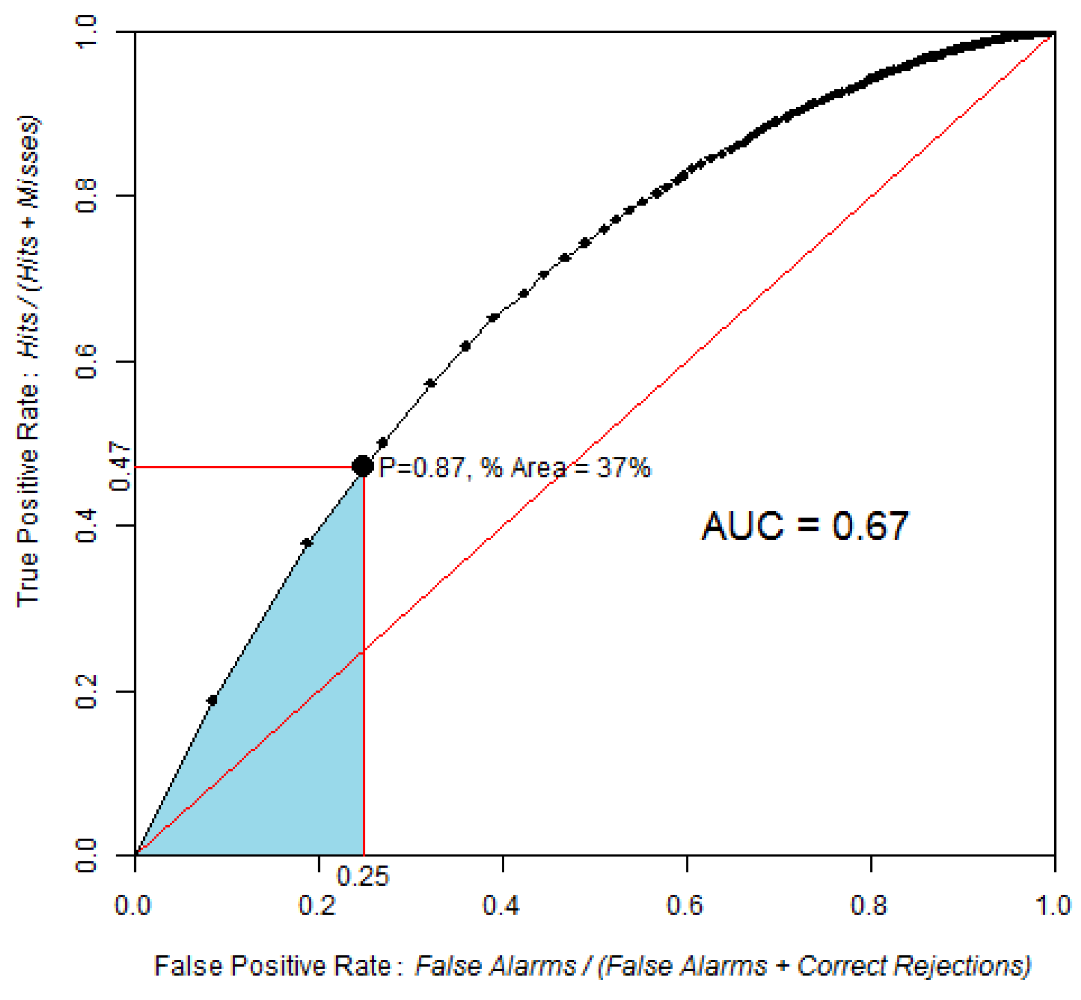
Figure 6. ROC curve obtained by comparing the probability of post-1994 deforestation map versus observed deforestation between 1994 and 1999, using 100 bins and the equal probability increment method. The point identified in the ROC curve corresponds to the area expected to be deforested during 1994–1999, assuming pre-1994 trends were to continue beyond 1994. The blue area corresponds to the partial AUC focused on high probability values, which are 0–0.25 on the False Positive Rate axis.
Ijgi 02 00869 g006
AUC is 0.67, which is significantly different from a random model. The Z test with 2000 Monte Carlo iterations was Z = 118, p-value = 5 × 10−89.
Based on the linear extrapolation of the deforestation rate observed during the calibration interval 1991–1994 (14,100 ha per year), about 37% of the 1994 forest area is expected to be cleared during 1994–1999, which corresponds to 70,500 ha of the 190,600 ha of 1994 forest. Therefore, a strategic threshold corresponds to 37% of the forested area in 1994. This point corresponds to a probability of 0.87 and is located at coordinates (0.25, 0.47) on the ROC curve. If we restrict the pAUC to the 0–0.25 interval on the false positive rate axis, then the pAUC will focus on the part of the curve where the probability map has its highest values. A normalized pAUC of 0.602 was found for this portion of the ROC curve. Stochastic models, such Dinamica, allocate some of the simulated changes in cells of low probability [18], hence the performance of the model will depend on a broader part of the ROC curve.
Evaluation of LUCC models through ROC analysis is based on the coincidence of the observed changes and the map of change probability produced by the model, without regard to the spatial allocation of the hits, misses, false alarms, and correct rejections. Additional spatial aspects can be taken into account such as the realism of the simulated landscapes patterns [18] and the match of changes within a search neighborhood [19]. In this respect, a series of map comparison metrics available in Dinamica can complement ROC evaluation [9].

4.2. Models of Species Distribution

We produced maps of potential distribution of Bradypus variegatus using the data from (available at http://www.cs.princeton.edu/~schapire/maxent/) [15] using the program package MaxEnt (Maximum Entropy approach, [15]) and the method of the Weights of Evidence (WofE), which is available in Dinamica EGO. Occurrence data were split randomly into two subsets. We trained models using the first subset, consisting of 81 occurrence plus 699,719 pseudo-absence cells. We then carried out ROC analysis using the second subset, consisting of 34 occurrence plus 651,316 pseudo-absence cells. ROC analysis was also carried out after resampling the second subset data using the procedure described in the Section 3.5. We used 100% of occurrence data (34 cells) and approximately 10% of pseudo-absence data (about 65,000 random cells). As a result, resampling enables us to process maps with 65,034 cells instead of the original maps with 1,929,504 (1,592 × 1,212) cells. This enables us to carry out bootstrapping with 2,000 replicates in a reasonable time, specifically 6 h 35 min using a desktop PC with a i7-3770k 3.50 GHz processor and 24 GB of RAM.
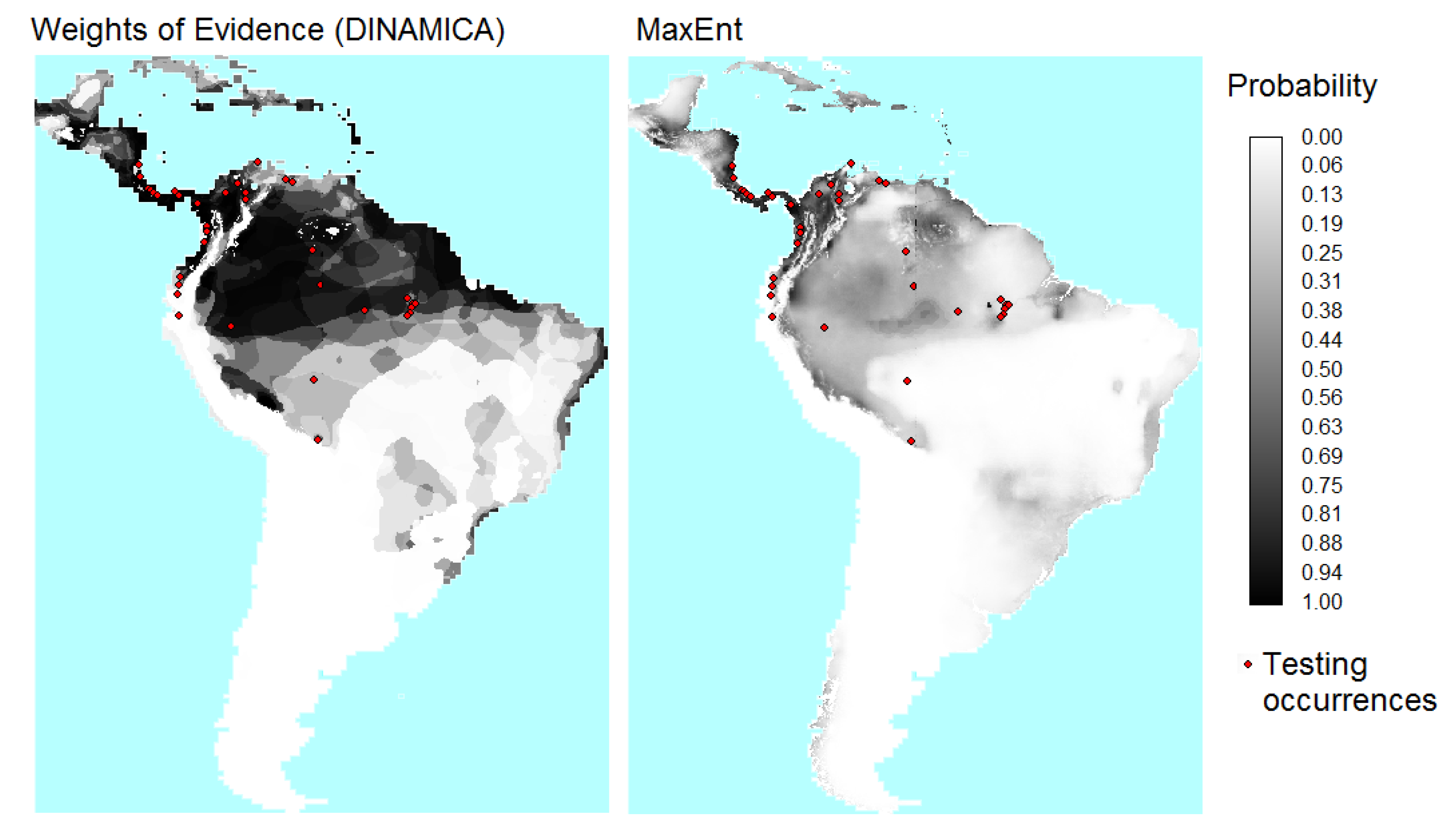
Figure 7, Figure 8 show the probability maps and cumulative distribution functions (CDFs) obtained from WofE and MaxEnt. The probability map obtained with the WofE method has less continuous values because this method used categorical maps obtained by reclassifying continuous explanatory variables. About 97% of the MaxEnt cells have probability values below 0.6, while 74% of the WofE cells have probability values below 0.6.
Figure 7. Maps of probability of presence of B. variegatus obtained by Weights of Evidence (WofE) and MaxEnt methods.
Ijgi 02 00869 g007
Figure 8. Cumulative distribution functions (CDFs) for the probability maps from WofE and MaxEnt. The vertical axis is the proportion of the candidate region that has a probability values less than or equal to the value on the horizontal axis.
Ijgi 02 00869 g008
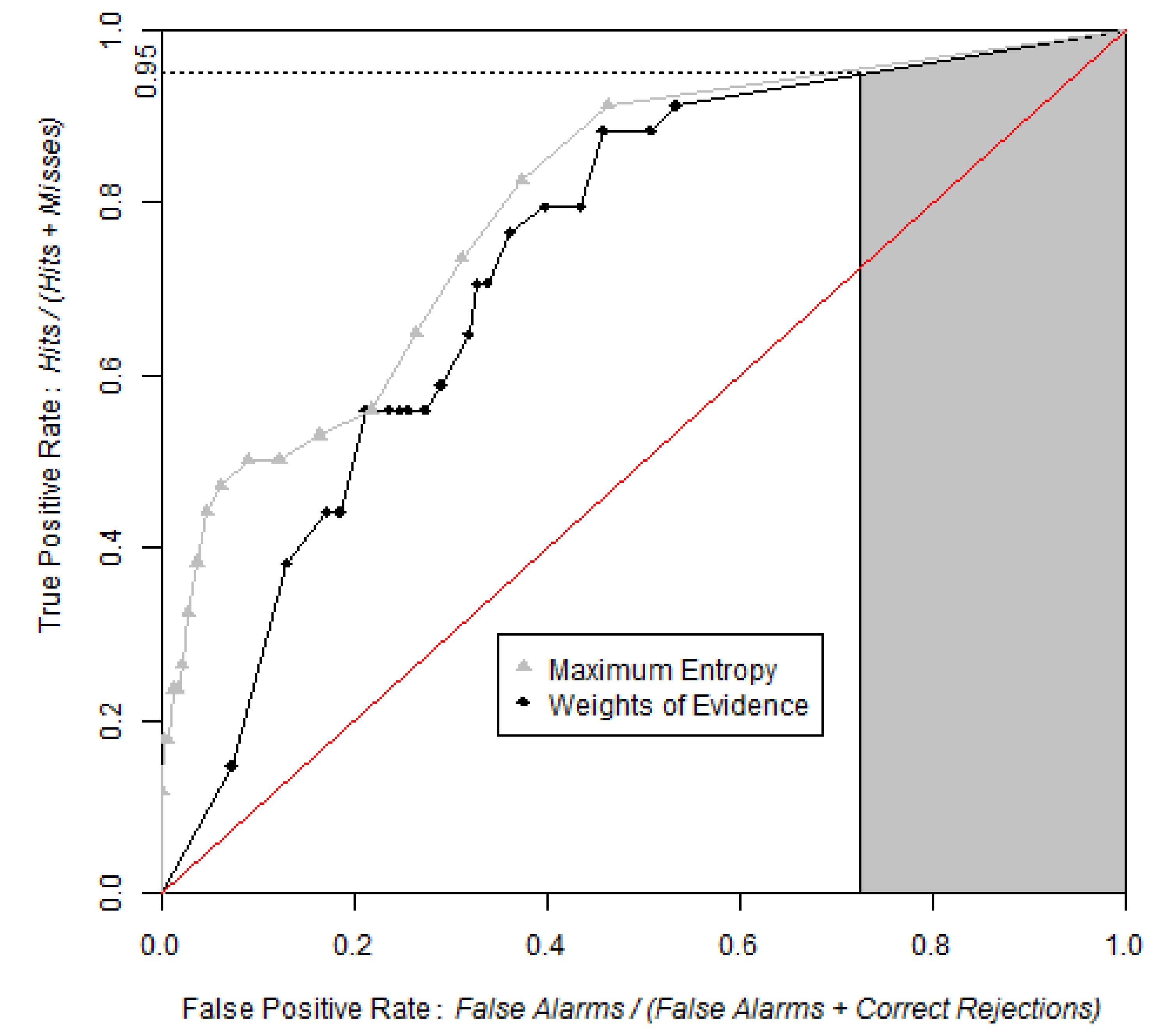
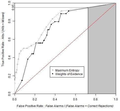
Figure 9 shows that the ROC curve from MaxEnt rises more abruptly than that of the WofE. The shape of the curve near the origin indicates that high probability areas from MaxEnt capture more presence cells than high probability areas obtained from WofE. Both curves are very close near the upper right of the ROC curve, which demonstrates that low probabilities correspond to areas where the species is absent.
The exact value of AUC obtained from the two methods was computed using the package pROC [8], which uses the linear scan algorithm described by [7]. AUC was computed as 0.7478 and 0.8110 respectively for WofE and MaxEnt. Table 2 shows the values of AUC calculated using four threshold increments for the equal probability increment method and for the equal area increment method along with the difference between these values and the exact AUC value (in % of exact value). The results obtained using 100 and 20 bins have differences of less than 2% (equal probability increment), while results based on 10 and 5 bins are less accurate estimates (error between 2% and 10% for equal probability increment). The use of resampled data does not affect the AUC estimates importantly. The method used to threshold the probability map has a larger effect than the number of bins. Both approaches led to systematic underestimation of the AUC, while the underestimation is more severe for method that uses equal area increments, for our case study (Error between 0.3% and 9.3% and between 5.9% and 24.6% for equal probability and equal area increments respectively).
Figure 9. ROC curves obtained by WofE and MaxEnt methods. Grey shaded area represents partial AUC of WofE model between 0.95 and 1 on the True Positive Rate axis. The pAUCs are similar for WofE and MaxEnt, which indicates that the probability maps are similar concerning where the relatively lower probabilities are allocated.
Ijgi 02 00869 g009
Table 2. AUC values obtained using various thresholds increments and slicing methods on entire and resampled data. Exact values of AUC are 0.7478 and 0.8110 for WofE and MaxEnt respectively. Number between parentheses is the estimate’s error expressed as the relative difference between the value and the exact value (in % of the exact value).
Equal Probability Increments
AUCBased on Entire Data Based on Resampled Data
Number of bins1002010510020105
WofE0.746
(−0.3)
0.739
(−1.2)
0.734
(−1.8)
0.709
(−5.3)
0.746
(−0.3)
0.738
(−1.3)
0.734
(−1.9)
0.709
(−5.2)
MaxEnt0.806
(−0.6)
0.800
(−1.3)
0.782
(−3.6)
0.737
(−9.2)
0.805
(−0.7)
0.800
(−1.4)
0.781
(−3.7)
0.736
(−9.3)
Equal Area Increments
AUCBased on Entire Data Based on Resampled Data
Number of bins1002010510020105
WofE0.704
(−5.9)
0.687
(−8.1)
0.665
(−11.1)
0.656
(−12.3)
0.703
(−6.0)
0.687
(−8.1)
0.665
(−11.1)
0.657
(−12.2)
MaxEnt0.71
(−11.8)
0.674
(−16.9)
0.636
(−21.5)
0.611
(−24.6)
0.715
(−11.9)
0.674
(-16.9)
0.636
(−21.6)
0.611
(−24.6)
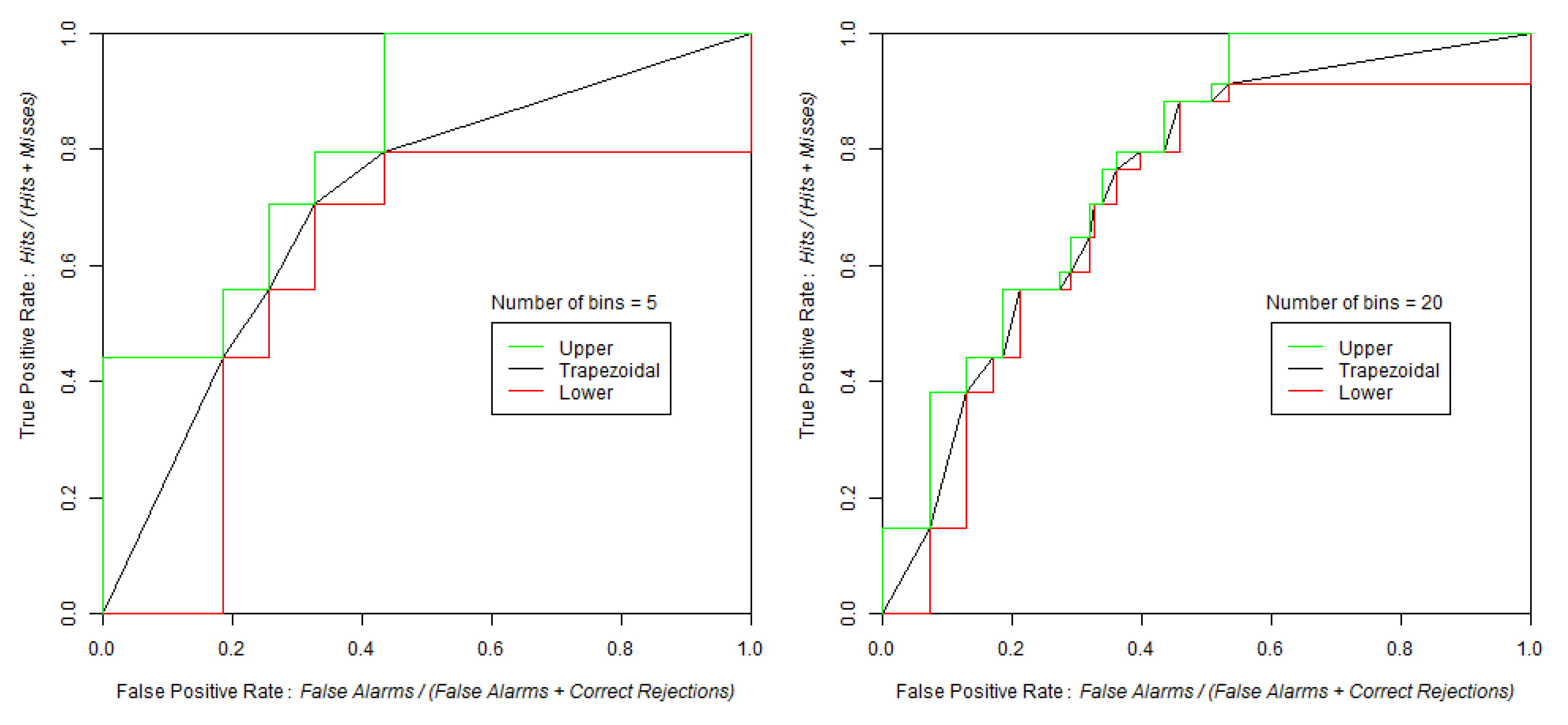
Table 3 shows AUClower and AUCupper computed with four different equal probability increments (0.01, 0.05, 0.10 and 0.20), implying four different bin sizes (100, 20, 10 and 5). We used the entire study area and the probability map from WofE. As expected, at coarse slicing increments, the uncertainty of AUC estimate is large (0.5952–0.8218 for 5 bins) and decreased considerably using narrower intervals (0.7299–0.7617 for 100 bins). The effect of the intervals used to slice the probability image can be appreciated in Figure 10.
We calculated partial AUC for the range between 0.95 and 1 on the True Positive Rate (vertical) axis as suggested by [10]. Finally, we calculated confidence intervals for AUC and pAUC through the bootstrap percentile interval method with 2,000 replicates and then tested the difference in AUC and pAUC values between the two models (Table 4).
Table 3. Values of upper, trapezoidal, and lower AUC at various numbers of bins for the equal probability increment method.
Number of Bins
10020105
AUC upper0.76170.77800.80060.8218
AUC0.74580.73850.73410.7085
AUC lower0.72990.69900.66760.5952
Figure 10. Trapezoidal, lower and upper ROC curves from the same probability map with 0.05 (Left) and 0.2 (Right) slicing increments. When the threshold increment is 0.2, the number of bins is 5.When the threshold increment is 0.05, the number of bins is 20.
Ijgi 02 00869 g010
Table 4. AUC and partial AUC values along with their confidence interval using alpha = 0.05 obtained using WofE and MaxEnt. Partial AUC was calculated between 0.95 and one in the True Positive Rate (vertical) axis, values reported are normalized.
SoftwareIndexInferior boundIndex ValueSuperior bound
WofEAUC0.66180.73820.8055
MaxEntAUC0.72310.79960.8706
WofEpAUC0.77980.90510.9979
MaxEntpAUC0.83520.91790.9990
The test used to compare the AUCs and pAUCs obtained from both models indicated that the AUC obtained from MaxEnt is significantly different from the AUC obtained from the WofE (Z = 1.73, two tailed p-value = 0.084). However there is no significant difference between the two pAUCs (Z = 0.00, two tailed p-value = 0.999). This indicates that if potential distribution maps are obtained by applying a threshold in the probability maps at a probability corresponding to a true positive rate of 0.95, then both MaxEnt and WofE will produce potential distribution maps that capture similar areas and number of occurrences points.
Another way to compare the two probability maps is assessing the density of occurrence points in each bin (Figure 11). Figure 11 shows that the high probability bins of MaxEnt have a greater density of occurrence points than the corresponding high probability bins of WofE. This is consistent with the ROC curve of MaxEnt that rises more abruptly near the origin of the ROC space than the ROC curve of WofE (Figure 9).
Figure 11. Density of species occurrence expressed as a proportion (%) in each bin (Equation (5)). Bins are ordered with lower probabilities on the left and higher probabilities on the right using the equal probability increment method.
Ijgi 02 00869 g011

5. Discussion

For large datasets, the number of observations (cells) becomes too large to run the linear scan algorithm [7]. Thus, our tool simplifies the probability map by regrouping cells into bins. Additionally, input maps were resampled in order to reduce their dimension. As shown in Table 2, some of these operations can lead to variations of AUC estimates. In our case study, the choice between the equal area versus the equal interval method had a larger impact on AUC than the number of bins and the resampling, since the equal area approach underestimated the AUC systematically. Using the equal probability method, the number of increments when sufficient (0.01 and 0.05 equivalent to 100 and 20 bins respectively) and the resampling (10% of no-occurrence) lead to error of the AUC estimate of less than 2%. These results are dependent on the particular case study and cannot be interpreted as general rules. For instance, the impact of the slicing method will depend on the distribution of probability values, which is shown by the CDF (Figure 8). The computing of AUClower and AUCupper allows one to assess the uncertainty due to the thresholding of the probability image. In addition, the estimates of AUC can be affected by factors other than computing. For example, in niche models, occurrence data are few, often obtained from a biased sample and can have errors that affect the location of the observation points or the identification of the species. In LUCC modeling, data can be affected by classification errors in the images used to monitor the changes.
The computing of the AUC’s confidence interval by bootstrapping allows one to assess the effect of the sample size on the accuracy of the AUC. However, confidence intervals do not account for possible bias of the sample. For instance, if the presence data of a species are systematically biased toward low altitude due to easier accessibility, then data sets used to train and to test the distribution map will inherit this bias. As a consequence, the computed AUC and its confidence interval could have larger AUCs than an unbiased estimate would have, because both training and assessment data would underestimate the presence of the species at higher elevation areas. Consequently, users have to be cautious with these indices when sampling is not representative of the entire population.
Despite the increased computational efficiency of our approach compared with the linear scan algorithm, some of our algorithms can still require long computing times. For example, bootstrap needs to recombine all the data and then sort the AUC values when using the bootstrap percentile interval method. This last operation is performed using a Bubble sort algorithm, which is a straight-forward but a slow sorting procedure. Therefore, if computing times are too long, then users can attempt to identify the sampling proportions and threshold increments that will speed processing. For example, in our case study using bootstrapping, AUC was calculated using the resampled data slicing with 0.05 equal probability increments, thus producing 20 bins.

6. Conclusion

The suite of tools presented in this article allows analysis and comparison of ROC curves using raster data. As shown for the two case studies, the suite allows the creation of the ROC curve, the characterization of relevant points in this curve, the computation of AUC and pAUC, two types of confidence intervals, the calculation of AUClower and AUCupper, the comparison of two paired ROC curves and the computation of event density in each probability bin. We believe that the suite will provide researchers, especially in GIS community, with the appropriate tools to interpret the output from a variety of spatial models. Given that Dinamica allows users to build their own tools, users will also be able to improve these existing ROC tools or complement them with new ones.

Acknowledgments

This research received support from grants Elaboración y Aplicación de modelos prospectivos de cambio de cobertura/uso del suelo (Programa de Apoyo a Proyectos de Investigación e Innovación Tecnológica - PAPIIT clave RR113511) and ¿Puede la modelación espacial ayudarnos a entender los procesos de cambio de cobertura/uso del suelo y de degradación ambiental? (Secretaría de Educación Pública y el Consejo Nacional de Ciencia y Tecnología-SEP-CONACyT CB-2012-01-178816) and Conselho Nacional de Desenvolvimento Científico e Tecnológico. Figures have been created using R [20]. We acknowledge two anonymous reviewers for their useful and constructive comments on a preliminary version of the manuscript.

Conflict of Interest

The authors declare no conflict of interest.

References

  1. Swets, J.A. Signal Detection Theory and ROC Analysis in Psychology and Diagnostics, 1st ed.; Lawrence Erlbaum Associates: Mahwah, NJ, USA, 1996. [Google Scholar]
  2. Satchell, S.; Xia, W. Analytic Models of the ROC Curve: Applications to Credit Rating Model Validation. In The Analytics of Risk Model Validation, 1st ed.; Christodoulakis, G., Satchell, S., Eds.; Elsevier: London, UK, 2008. [Google Scholar]
  3. Sonego, P.; Kocsor, A.; Pongor, S. ROC analysis: Applications to the classification of biological sequences and 3D structures. Brief. Bioinform. 2008, 9, 198–209. [Google Scholar] [CrossRef]
  4. Li, R.; Guan, Q.; Merchant, J. A geospatial modeling framework for assessing biofuels-related land-use and land-cover change. Agr. Ecosyst. Environ. 2012, 161, 17–26. [Google Scholar] [CrossRef]
  5. Pontius, R.G., Jr.; Batchu, K. Using the relative operating characteristic to quantify certainty in prediction of location of land cover change in India. Trans. GIS 2003, 7, 467–484. [Google Scholar]
  6. Pontius, R.G., Jr.; Parmentier, B. Recommendations for using the relative operating characteristic (ROC). Landsc. Ecol. 2013. submitted for publication. [Google Scholar]
  7. Fawcett, T. An introduction to ROC analysis. Pattern. Recogni. Lett. 2006, 27, 861–874. [Google Scholar] [CrossRef]
  8. Robin, X.; Turck, N.; Hainard, A.; Tiberti, N.; Lisacek, F.; Sanchez, J.C.; Müller, M. pROC: An open-source package for R and S+ to analyze and compare ROC curves. BMC Bioinforma. 2011, 12. [Google Scholar] [CrossRef]
  9. Soares-Filho, B.S.; Rodrigues, H.O.; Follador, M. A hybrid analytical-heuristic method for calibrating land-use change models. Environ. Model. Soft. 2013, 43, 80–87. [Google Scholar] [CrossRef]
  10. Peterson, A.T.; Papeş, M.; Soberón, J. Rethinking receiver operating characteristic analysis applications in ecological Niche modelling. Ecol. Model. 2008, 213, 63–72. [Google Scholar] [CrossRef]
  11. McClish, D.K. Analyzing a portion of the ROC curve. Med. Decis. Making 1989, 9, 190–195. [Google Scholar] [CrossRef]
  12. Santini, S. Computing the Binomial. Coefficients. 2007. Available online: http://arantxa.ii.uam.es/~ssantini/writing/notes/s667_binomial.pdf (accessed on 21 June 2013).
  13. Pontius, R.G., Jr.; Schneider, L.C. Land-cover change model validation by an ROC method for the Ipswich Watershed, Massachusetts, USA. Agr. Ecosyst. Environ. 2001, 85, 239–248. [Google Scholar] [CrossRef]
  14. Lobo, J.M.; Jiménez-Valverde, A.; Real, R. AUC: A Misleading measure of the performance of predictive distribution models. Glob. Ecol. Biogeogr. 2008, 17, 145–151. [Google Scholar] [CrossRef]
  15. Phillips, S.J.; Anderson, R.P.; Schapire, R.E. Maximum entropy modeling of species geographic distributions. Ecol. Model. 2006, 190, 231–259. [Google Scholar] [CrossRef]
  16. Mas, J.F.; Farfán, M.; Ghilen, C.; Lima, T.; Soares Filho, B. Una Comparación de dos Enfoques de Modelación de Nicho Ecológico. In Proceedings of Memorias de la XX Reunión SELPER, San Luis Potosí, México, 21–25 October 2013.
  17. Soares-Filho, B.S.; Alencar, A.; Nepstad, D.; Cerqueira, G.; Vera Diaz, M.; Rivero, S.; Solorzano, L.; Voll, E. Simulating the response of land-cover changes to road paving and governance along a major Amazon highway: The Santarém-Cuiabá Corridor. Glob. Change Biol. 2004, 10, 745–764. [Google Scholar] [CrossRef]
  18. Mas, J.F.; Pérez-Vega, A.; Clarke, K.C. Assessing simulated land use/cover maps using similarity and fragmentation indices. Ecol. Complex 2012, 11, 38–45. [Google Scholar] [CrossRef]
  19. Pontius, R.G., Jr.; Pacheco, P. Calibration and validation of a model of forest disturbance in the western Ghats, India 1920–1990. GeoJournal 2004, 61, 325–334. [Google Scholar] [CrossRef]
  20. R Development Core Team, R: A Language and Environment for Statistical Computing; R Foundation for Statistical Computing: Vienna, Austria, 2013.