1. Introduction
The art of cartography provides a large variety of thematic methods to visualize qualitative and quantitative attributes of geospatial objects and phenomena [
1]. Resulting representations of spatial data differ significantly in their multiple characteristics, including possible data type, level of aggregation, reading complexity, design difficulty, and others. There are also considerable differences in the implementation of individual visualization methods in GIS software, which is typically used for designing maps.
A number of publications focus on the fact that data visualization can be misleading [
2]. Some methods of thematic cartography are less susceptible to this (e.g., dot density maps, isopleth maps, flow maps). Conversely, with other (e.g., choropleth maps, graduated symbol maps), it is easily possible to significantly influence the user’s perception of the presented phenomena, even unintentionally. In choropleth maps or a classified graduated symbol map, the resulting appearance is affected considerably by the number of value intervals and breakpoints’ delimitations. In many cases, it is not easy to decide the appropriate number and range of intervals, while inappropriately chosen parameters could significantly affect the map reading process. Procedures and manuals provide us with recommendations and cartographic rules, resulting in correct map designs when followed. However, not all methods receive equal support in GIS software and respective tutorials.
Some methods of thematic cartography have become very popular and frequently used. This might result from their simplicity or variability, e.g., graduated charts capable of showing both quantities and qualities compressed in a single map symbol. On the contrary, some methods fell almost into oblivion. The favorite ones have typically been vigorously implemented in GIS user interfaces and tools, resulting in their easy design process [
3]. Conversely, some rarely used methods, such as dasymetric mapping [
4] and cartotypograms [
5], are very time-consuming to prepare due to the lack of support in GIS software and therefore need to be designed chiefly manually.
There is a high level of support for qualitative visualization, including advanced symbology settings, followed by software tools for designing choropleth maps, proportional symbol maps, and classified graduated symbol maps. The most commonly used GIS software also provides tools for real-time generated heat maps, flow maps, and surface visualization. There is a high level of support for choropleth maps, where data classification into intervals and applying an appropriate graduated color scheme is very intuitive and commonly supplemented by methodological explanation. Moreover, current ArcGIS Pro and possibly some other GIS software even provide the possibility of exporting legend in the bar style with labeled breakpoints instead of multiple separate fields labeled with value ranges.
However, the fact that most GIS programs offer the use of a specific method does not mean that these programs offer cartographers a “full service” for the correct creation of a map legend. Graduated symbols generally also have good support in GIS software. When exporting a legend for classified proportional symbols, it is enough to list all occurring symbol sizes in the map legend, indicating the corresponding value ranges.
Although proportional and graduated symbol maps may appear visually similar, they are based on fundamentally different algorithmic principles. Proportional symbols scale continuously according to data values, whereas graduated symbols group data into predefined classes. This distinction has major implications for symbol size and visual balance. In proportional symbol maps with a wide value range, symbols representing the smallest values may become too small to be readable, while those for the highest values may grow too large to be displayed properly. In contrast, classified graduated symbols allow the cartographer to control all symbol sizes—ensuring readability for all values (value ranges) and avoiding excessive overlap for large ones. However, this method also has its pitfalls. Usually, there is a very misleading (variable) ratio between the map symbol size and the represented amounts (e.g., a three times larger symbol representing a thousand times larger value). This shortcoming is eliminated in the method of proportional symbols by automatically calculated symbol sizes.
These differences fundamentally affect legend construction, interpretability, and user estimation. Unfortunately, many GIS platforms blur this distinction, often producing legends that look similar but are based on different logic. Regarding graduating proportional symbols, some proper value scale would be expected in the map legend to provide a possibility to decode the exact value from each symbol size. Otherwise, this method loses its main advantage. Unfortunately, an appropriate value scale is not provided by any of the most common GIS software. Solving this deficiency was the primary motivation for the creation of our online value-scale generator.
The paper first introduces the motivation for developing a proposed tool to generate value scale legends for proportional symbol maps. It then presents the design and functionality of the proposed solution. This is followed by an evaluation based on two user surveys—one focused on value estimation accuracy, the other assessing perceived usability and visual clarity. Finally, the paper offers a discussion of the practical implications, limitations, and potential areas for further development.
2. State of Art
2.1. Proportional Symbol Maps
Proportional symbol maps apply a very intuitive and easy-to-understand principle: the larger, the more. This principle is mostly applied to point symbols to represent quantity, which is expressed by the size of the symbol, while there is a direct mathematical relationship between the value of the phenomenon represented and the size of the symbol. Compared to classified graduated symbol maps (which use a specific number of symbol sizes), proportional symbol maps theoretically transfer to map readers some exact absolute phenomenon values (values not aggregated into a limited number of classes). When supported by a precise value scale, this theoretical assumption may become a practical possibility for presenting statistical data with a lossless technique, retaining the level of detail by aggregating exact values into classes with not even a theoretical way of decoding the values reversely. Proportional symbol maps may graduate single symbols, multiple symbols, or charts (pie charts, bar charts, etc.). While mostly simple geometric symbols are used for proportional symbol maps, specific shapes related semantically to the mapped phenomenon may also be used (
Figure 1).
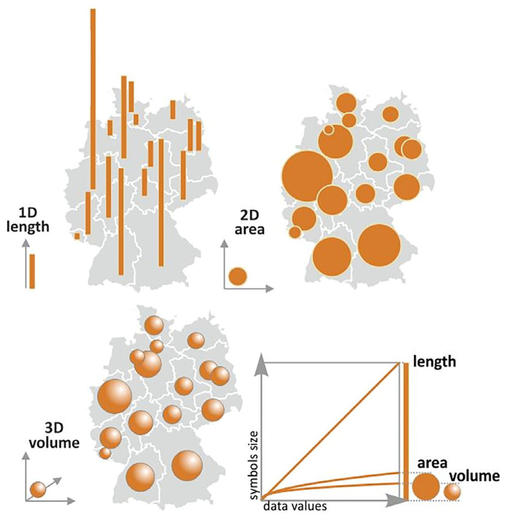
The cartographic conventions say that the difference in presented quantities should be proportional to the difference in symbol area sizes [
7]. Therefore, the dependency is linear for one-dimensional (1D) symbols graduating in one direction, e.g., columns and bars. This means a symbol presenting twice as large values as another symbol should be twice as high as the other symbol (assuming the symbols graduate in the direction of their height while their width stays constant), which may be represented by Formula (1):
Vx = attribute value X;
Vmin = minimum attribute value;
hx = height of the symbol for value X;
hmin = height of the minimum symbol (symbol for minimum attribute value).
For two-dimensional (2D) symbols graduating in two independent axes forming a 2D space, e.g., circle, square, or any planar symbol with a uniform shape, the principle is modified so that the symbol presenting twice as large values as another symbol should have twice as large area size as the other symbol. The height is therefore less than twice as long due to the use of a square root in Formula (2). This formula is entirely independent of symbol shape:
Alternatively, appearance compensation, also known as Flannery compensation, might be applied instead of mathematical scaling. Such an approach follows the results of findings of human perception research by Flannery [
8]. The calculation is then performed according to Formula (3) [
9], enlarging the larger symbols. This approach is also implemented in some of the GIS software:
To visualize three-dimensional (3D) symbols in 3D space, e.g., sphere, cube, cone, etc., the symbol volume should rise proportionally to attribute values. The cube root should then be used in Formula (4). However, the higher the symbol dimensionality, the more difficult it is for the user to estimate the respective amount visually [
10]:
Such an approach could be used in virtual reality environments or when designing real 3D thematic maps using 3D printing or other manufacturing techniques. However, this case is rare in conventional cartography compared to the previously mentioned ones. The said principle is also presented via a figure in the GIS&T Body of Knowledge, published by the University Consortium for Geographic Information Science.
Golebiowska et al. [
11] present this principle in the Proportional Symbol Maps sub-chapter (
Section 3.2, CV-11;
Figure 2). However, the authors do not address the issue of how to create the given value scales in practice.
2.2. Map Legend and Value Scales
Decoding attribute values from 1D symbols is a simple task. The only two necessary presumptions are knowing the relation between symbol height and respective attribute amount (e.g., 1 mm of height represents 50 inhabitants) and having a tool to measure symbol height, which could be an ordinary ruler for paper maps. Therefore, simple value scales may be sufficient for decoding attributes from map symbols. In
Figure 3, two different simple value scales are used for columns of different widths. Even though more advanced value scales for columns and bars are constructed to make maps even more accessible to interpret, as shown in
Figure 4. The
x-axis contains a linear sequence of attribute values, while the graph height represents proportional symbol height for respective values.
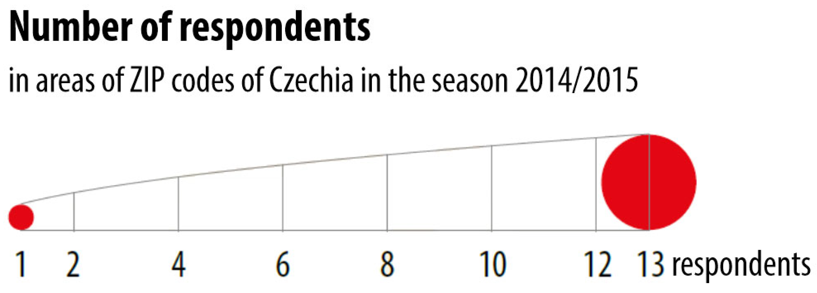
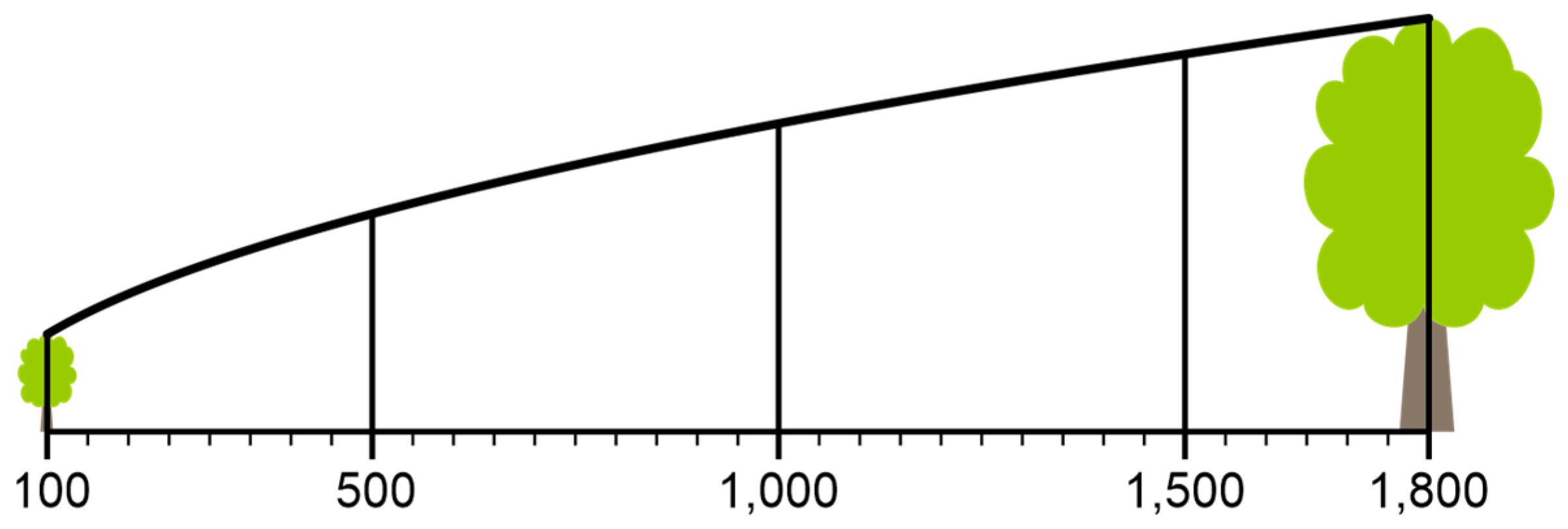
For 2D symbols, decoding becomes more challenging as there is no tool for measuring symbol areas widely distributed among potential map readers. Therefore, a value scale presenting the relation between attribute value and an easily measurable parameter, such as the symbol height, is a necessary part of the map legend. This statement, of course, applies especially to static paper maps, as in interactive web maps, feature values may be presented using a pop-up window after hovering on the respective map symbol. The value scale should consist of a graph with a linear scale ranging from the minimum to the maximum attribute values [
13] and a curve showing the respective height of map symbols for all values within the attribute value range. The minimum and maximum symbols are usually also present on both edges of the value scale for illustrative purposes, even though they are not necessary for decoding the quantity (
Figure 5).
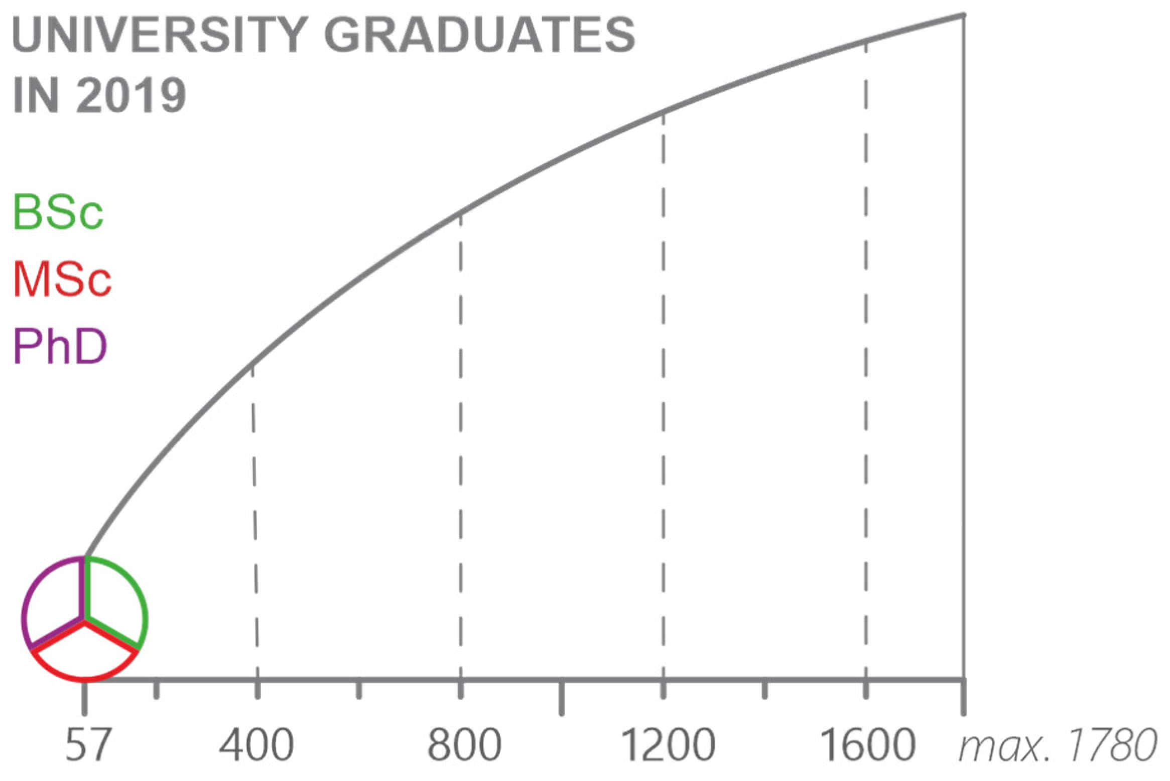
If the value scale is used for multiple symbols with diverse color fills or strokes, the universal symbols in the value scale are usually performed with grey fills or grey/black strokes, while the meaning of colors is described nearby (
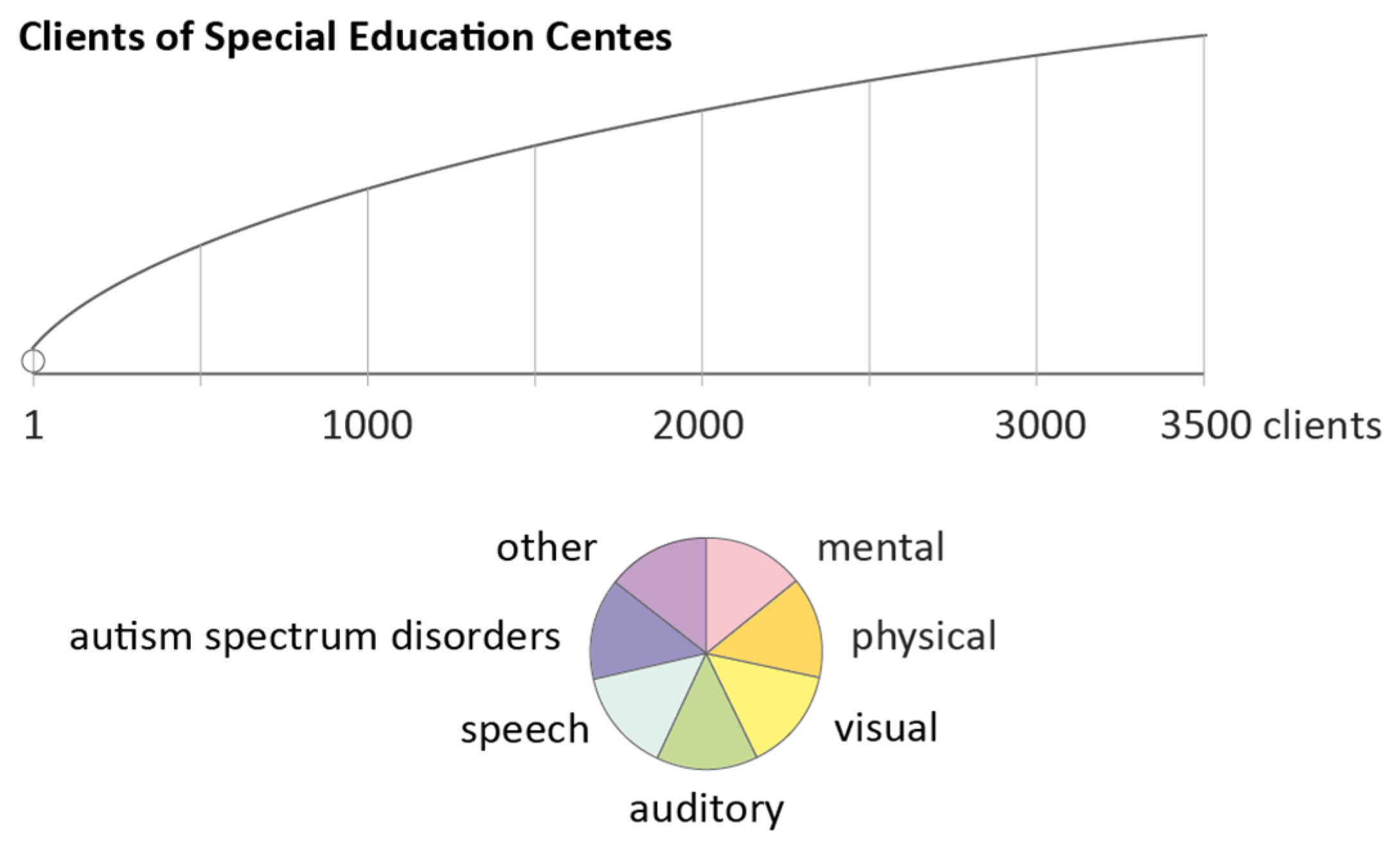
Figure 4). Similarly, for pie charts, the value scale usually contains only the circle symbol itself, whereas individual chart portions are interpreted separately (
Figure 6 and
Figure 7). Alternatively, the chart segments are distributed evenly inside the chart (
Figure 8).
Novakova [
16] analyzed the possibilities of classified graduated symbol and proportional symbol maps in multiple GIS:
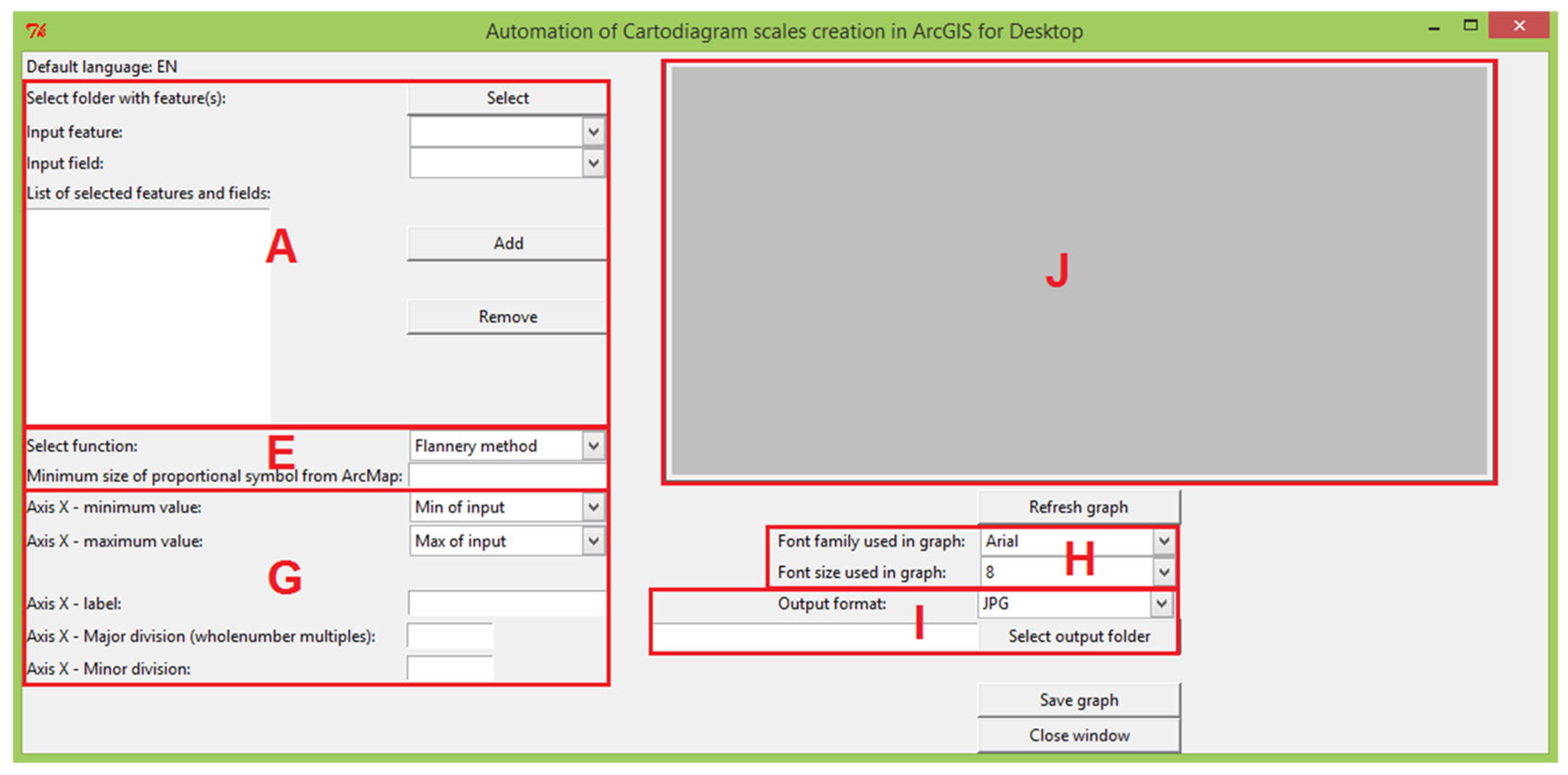
In none of the above-listed, it was possible to generate an appropriate value scale for proportional symbol maps automatically. Only RStudio provided a theoretical solution for designing an independent graph presenting the dependency curve. Nevertheless, this was not any built-in function and required scripting skills. Novakova [
16] therefore developed a tool based on the Tkinter platform, consisting of a Python script with a graphic user interface (GUI) for creating value scales (
Figure 9).
The result was provided in several raster formats (JPG, PNG, TIFF) and SVG vector files. The tool offered only core functionality, not solving collisions of labels and other graphic issues. Therefore, additional manual editing in graphic software was necessary prior to using the value scale in a map legend. Despite this fact, it was a long step forward from the manual creation of value scales. The tool was, unfortunately, no longer supported in later versions of ArcGIS for Desktop (only up to version 10.2), neither in ArcGIS Pro software nor outside the Esri platform.
It could be expected that in the span of almost eight years that have passed since the publication of the described research [
16], the situation will change. However, even current GIS software does not provide us with adequate value scale when generating map legends. As an example, when visualizing integer attribute values ranging from 6 to 224 using proportional symbols in ArcGIS Pro software (version 3.2.1), the generated legend contains only a subset of five symbol sizes, not containing even the minimum and maximum symbols nor any curve enabling to interpret precisely all possible values within the attribute range (
Figure 10). This legend style, if additionally containing minimum and maximum symbols, is considered suitable by Brewer [
17], noticing that map readers need to interpolate given symbols to estimate values in between mentally.
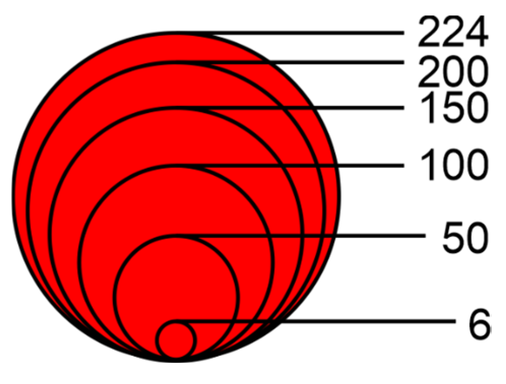
When the same dataset, ranging from 6 to 224, was visualized in QGIS (version 3.34.2), the most advanced legend achieved is presented in
Figure 11. It consists of a similar set of symbols’ subset grouped and placed slightly more intuitively one on another, containing the maximum symbol and four smaller symbols representing round values of the visualized attribute. Unfortunately, the minimum symbol and any curve for the precise decoding of other values are also missing.
The QGIS legend is close to the simplified discrete value scales described and automated by Jenny et al. [
13]. Such value scales, shown in
Figure 12, do not provide a possibility to decode values precisely, but at least give users a visually pleasant way of estimating values represented by map symbols. The practical implementation of this type of map legend may be seen in
Figure 13.
Many GIS platforms provide automatic legend generation tools for proportional symbol maps, allowing users to choose between different types and to customize certain parameters, such as the number of size classes or the layout of the legend symbols. However, even with these customization options, GIS-generated legends often fail to enable accurate decoding of the symbolized values. In some cases, the default output may even be misleading, for example, by omitting the smallest or largest symbols, or by failing to indicate the full data range clearly. When a cartographer intends to provide a precise and fully interpretable legend (that is, to support detailed value reading rather than just general orientation), the legend typically must be converted into a graphic object and manually edited. This process is time-consuming and not natively supported by most GIS platforms.
Although the theoretical foundations for constructing value scales in proportional symbol legends—typically involving mathematical formulas and the systematic plotting of symbol areas or their perceptual calibration—have been well documented in the cartographic literature over the past decades (e.g., [
1,
19,
20,
21,
22]), such practices have become increasingly rare in contemporary mapping workflows. The primary reason for this decline is the limited functional support in mainstream GIS platforms. As a result, many authors opt for simpler, automatically generated legends, even at the expense of interpretability or visual accuracy. This applies primarily in cases where the cartographer’s intent is to enable precise decoding of symbolized values. If, on the other hand, the goal is merely to convey a general impression of spatial distribution or approximate quantity, then such a detailed value scale may not be necessary.
The proposed tool addresses this gap by providing an automated method to generate legends based on value scales. Its output mirrors the historically recommended construction of proportional symbol legends and offers practical benefits. The legend format produced by the tool allows users to read much more accurate value estimates from the map—if they are willing to dedicate some attention to the interpretation. This makes the tool particularly useful in analytical or educational contexts, where decoding the symbolized quantities with precision is important.
For 2D symbols, decoding becomes more challenging when the user has to estimate the size visually, especially when a standard-size legend (with just three symbols) is used. Studies show that users often underestimate the value represented by larger circles or overestimate smaller ones. Therefore, a value scale presenting the relationship between attribute value and an easily measurable parameter, such as the symbol height or radius, is a necessary part of the map legend. Such a scale can reduce misinterpretation and support more accurate visual inference, especially when the symbol type and scaling logic are clear to the user.
2.3. Related Research
Although the construction of value scales for proportional symbol legends has rarely been the focus of recent academic research, the design of such legends remains relatively underexplored—particularly in terms of their potential to support precise value decoding.
A significant contribution in this context is the updated fourth edition of Thematic Cartography and Geovisualization [
19]. As noted in the corresponding book review [
23], the publication discusses key aspects of proportional symbol scaling—whether mathematical, perceptual, or range-graded—as well as important design considerations, such as whether legends should use nested or linear arrangements. It also examines whether symbol sizes should be based on Meihoefer’s perceptual studies or on Dent’s practical recommendations. A key contribution to the understanding of symbol size perception is the work of Flannery [
8], who proposed a perceptual correction factor to compensate for users’ tendency to underestimate larger symbols. More recent studies have further investigated how symbol size, shape, and contextual factors influence perceptual accuracy and decoding performance; however, these do not specifically address the application of such findings to the design of value scales for proportional symbol legends.
Several works in the field of cartographic communication and visual perception are also relevant to the aims of our study, as they address fundamental principles of map-based communication. Fabrikant and Lobben [
24], Gołębiowska [
25], Çöltekin et al. [
26], and other scholars have examined the cognitive and perceptual aspects of map legend design and visual interpretation. These studies emphasize that legends serve not merely as explanatory tools, but as cognitive bridges between symbolized data and user comprehension.
3. Materials and Methods
3.1. Defining Functionality
The research aims to develop an online tool that generates value scales for proportional symbol maps regardless of which platform these maps are being designed on. Tool users would only be expected to fill in the necessary parameters using an HTML web form, including the following:
Minimum symbol size (possibility to choose from multiple size units);
Symbol shape (possible to choose from the most common or import user-designed);
Symbol width (only for 1D symbols, e.g., columns);
Minimum phenomenon (attribute) value;
Maximum phenomenon (attribute) value.
The maximum symbol size is calculated by the tool. Also, another set of parameters might be updated to customize the value scale design according to preferred visual preferences:
Scalebar length;
Font size of labels (including the possibility to disable labels);
Typographic style of numbers (decimal and thousand separators);
User-defined divisions (otherwise generated automatically);
User-defined number of subdivisions (otherwise generated automatically);
Symbol stroke width;
Symbol stroke color;
Symbol fill color.
After processing the input parameters, the tool is expected to provide users with the respective generated value scale in vector file format, which could be placed directly into the map layout in GIS or finalized in other external graphic software.
3.2. Algorithmizing Processes
The core tool functionality was decided to be coded in the Python 3.10 programming language and implemented into the web interface using the Flask framework, providing a flexible and well-supported solution. Pythonanywhere web platform was used both for tool development and final deployment. The computation logic was divided into three separate Python files:
flask_app.py—elementary processing of inputs and calling diagram.py;
diagram.py—core functionality of generating and drawing value scales;
SvgData.py—processing and drawing user-defined SVG files.
The flask_app.py script checks input parameters for the correct data type and range. Even though data limitations are also secured within the web form, this condition is rechecked on the server side before running the script for safety reasons, as any intermediate user might potentially change the HTML code. In the case of severe errors in input parameters, the diagram.py script is not run, and the web application is refreshed with an adequate error message. If some minor correctable issues occur, e.g., if the minimum phenomenon value is higher than the maximum one, values are switched, the diagram.py script is performed, the respective value scale is generated, and the web application is refreshed with a warning message describing correction operations performed in order to be able to provide the result. If no issues with input parameters are detected, the diagram.py script is called and executed, and a notice of successful run is displayed in the refreshed web application. In all cases, when the tool runs successfully, vector files containing value scales are generated and stored temporarily on the server. These include an SVG (Scalable Vector Graphics) file in all cases and a PDF (Portable Document Format) file in most cases, except when the user-defined SVG symbol shape is imported. The application website is then generated with links to the resulting files, a report message, and color as parameters. In case of any error due to invalid input parameters or any other unexpected issue, a predefined SVG error icon and a PDF explanation report are sent instead.
The main functionality is algorithmized in the
diagram.py script. It uses Math and Cairo external libraries for calculations and drawing vector graphics, respectively. It also imports functions from the
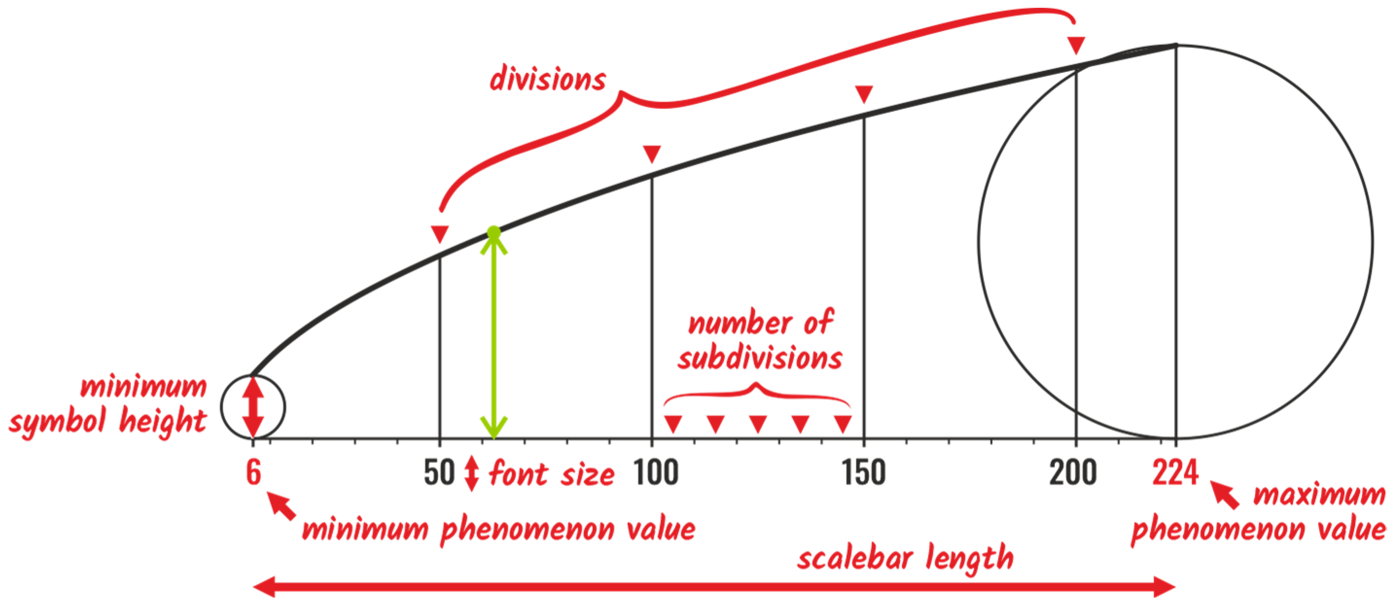
SvgData.py file. The script is split into multiple functions, solving individual operations. Initially, numerical variables are defined or converted uniformly into typographic points (pt) from other units. Afterward, divisions are either retrieved from user input or generated automatically according to minimum and maximum phenomenon values. For automatic generation, a unique recursive algorithm was designed to calculate the optimal base step (b) between vertical lines forming divisions of the value scale. The leftmost (a) and rightmost (c) divisions might become smaller as these are bordered by minimum and maximum values not always represented by round numbers forming division points, as shown in
Figure 14.
The algorithm ensures generating two to five division midpoints in addition to the division minimum and maximum points. It ensures providing intuitive round numbers using recursive behavior, no matter what order the values are in. The algorithm iterates in intervals through orders of magnitude (negative and positive) until a suitable interval is reached. Such an interval must contain the range of phenomenon values. The interval is then assigned the optimal step size. Each order of magnitude is divided into three disjoint intervals. Let the minimum phenomenon value be 6 and the maximum 224, then the intervals are as follows: (100–200], (200–500], and (500–1000] with steps 50, 100, and 200. Since the range of the phenomenon’s values is 218, the step of the second interval (100) is applied. However, the tool is limited to numbers ranging from 10
−5 to 1012, covering the vast majority of reasonable amounts used when mapping. Different units are typically used outside this scope instead of presenting large numerals or low decimal numbers. The function algorithm is presented in the subsequent code:
def get_step_iter(diff=0, lower_bound=0.00001,
upper_bound=0.00002, step=0.000005, cycle=0):
    if lower_bound <= diff <= upper_bound:
        return step, cycle
    elif cycle == 0:
        return get_step_iter(diff, upper_bound, 5 * lower_bound,
step * 2, 1)
    elif cycle == 1:
        return get_step_iter(diff, upper_bound, 5 * lower_bound,
step * 2, 2)
    else:
        return get_step_iter(diff, upper_bound, 4 * lower_bound,
step * 2.5, 0)
The function returns the base step (b) and cycle used later for the automatic generation of subdivisions. The leftmost (a) and rightmost (c) divisions are calculated in the follow-up function accordingly:
a = step - (start % step)
b = step
c = end % step
The phenomenon values of division points are later recalculated into points on the graph x-axis in the canvas coordinate system in pts. The corresponding list of division line heights is calculated using respective formulas depending on whether the value scale is being generated for a 1D (Formula (1)) or 2D (Formula (2)) symbol shape. Multiple lines of code follow, solving specific situations, overlaps, and calculations of canvas size.
The drawing part is performed separately for PDF and SVG file formats, beginning by defining the respective surface types (
cairo.PDFSurface,
cairo.SVGSurface) followed by setting surface base parameters, the sans-serif font style, and label font size defined by the user. Subsequently, individual graph parts are drawn, beginning with the minimum-size and maximum-size symbols located on both edges of the value scale. Besides the custom SVG shapes, the tool supports seven frequent geometric shapes, each drawn by a separate function. Two of the shapes are one-dimensional: column and apex (isosceles triangle), where user inputs of minimum symbol height and column width are required. Only the minimum symbol height is necessary for 2D shapes, including a circle, square, regular triangle, pentagon, hexagon, and custom shapes. Stroke and/or fill settings are applied if given by the user. Otherwise, a black stroke with transparent fill is used as the default. If the user inputs a custom SVG shape, the symbols are redrawn using specific functions imported from the
SvgData.py library. If the imported SVG shape is styled using the
<style> tag and neither stroke nor fill preferences are set by the user, the original symbol style is preserved and used in the resulting value scale (
Figure 15).
Thereafter, the x-axis of the graph is drawn. If the user asks to generate subdivisions, the subdivision points are generated according to the given number of subdivisions per division. Alternatively, if no number is given, subdivisions are generated using a series of conditions according to scale bar length and division midpoint values to provide a suitable decadic division of round phenomenon values.
Later, division lines are drawn using pre-calculated points on the
x-axis and division heights. Value label is placed centrally below each division line if there is enough space for it (
Figure 16). The algorithm detects potential label collisions except for the minimum and maximum values, which are labeled in all cases. If some of the labels are avoided due to potential collision, the user is informed by a warning message in the web application user interface. Labels follow the chosen typographic style of either the European style of decimal comma and space as a thousand separator (e.g., 12 345,67), the English style of decimal point and comma used as a thousand separator (e.g., 12,345.67), or the raw number style with decimal point and no thousand separator (e.g., 1234.56). While in PDF surface type, the Cairo library is capable of drawing glyph labels, for SVG surface, these need to be added manually by editing directly inside the SVG file code.
The last graph part being drawn is the plot line represented by a straight line in the case of 1D symbols and a curve for 2D symbols (
Figure 12). A straight line is defined only by two points on top of the minimum-size and maximum-size symbols. For the curve, a function with a float generator is used to generate the vertices of a polyline, forming its visual representation.
3.3. Designing the Web Application
The graphic user interface (GUI) of the value scale generator is designed as a web application based on HTML markup language with an input form and multiple JavaScript features for dynamic changes in the GUI. The website is of a single-page design containing blocks of designated purposes structured in the top-down order:
Header with title.
Message bar (hidden until running the tool).
Form for parameter settings:
Descriptive image (illustrating the meanings of input parameters);
Section of mandatory parameters;
Section of optional parameters (may be hidden);
Section of symbol examples (may be hidden).
Buttons for running the tool and downloading the resulting files.
Preview area.
Tool description and links to related topics.
Footer with license link.
The web application is styled in a modern dark design and aims for an intuitive and straightforward orientation. The descriptive image (
Figure 17) is placed above the input parameters section to help users understand the meanings of individual parameters. Another descriptive help is provided via small info icons activated using the hover effect. Supported symbol shapes are also illustrated by their graphic representation, designed using CSS. Grey captions distinguish optional parameters, while the mandatory ones are labeled in white. Nonrelevant inputs are hidden (e.g., column width when a 2D shape is chosen).
The inputs include numerical and text input fields, sets of radio buttons, file input for custom symbol import, and color pickers for defining stroke and fill colors. The content of input fields is limited correspondingly to script limitations to avoid sending invalid requests of out-of-range values or wrong data types. Technical cookies are used to store the last input values after each mouse moves over the “GENERATE SCALE” button. The message bar activated after sending the first request is colored green if the tool ran clearly, orange if one or more warnings were returned, or red if the tool failed to execute. A description of warnings or errors is included to provide details. Even though the tool is expected to be primarily used on personal computers or laptops, the web application features an adaptive design that is also responsible for mobile devices and tablets. Links in the bottom part of the website reference general information about proportional-symbol maps, the development blog, other cartographic tools, the tool license site, and developers’ contact details.
3.4. Debugging
After developing the tool, as well as during the development process itself, debugging and code optimizations were performed. Its purpose was to ensure the tool processed correctly, even in particular cases caused by either rare phenomenon behavior or extreme inputs given by the user. This included situations when the maximum-value symbol of the value scale overlapped the minimum-value symbol, causing the whole graph to exceed the canvas extent. Another solved case was handling the issue of some input fields being valid only for some cases, e.g., the column width parameter only used for 1D shapes. Therefore, in cases of 2D shapes, a condition had to be implemented to eliminate obtaining this value from the HTML form, as the deactivated input field was unable to provide any value. The unchecked checkbox was also supplemented by hidden inputs of the same name, providing the alternative value, preventing the script from crashing.
A challenging task was also to define the conditions and processing operations of the user-divisions input field, which could not have been limited to the numeral input style and potentially might have contained invalid characters, values out of attribute range, both integer and float numbers, given in multiple typographic formats, and with no guaranteed order. This was solved by a loop checking the input string segments split by semicolons for numerals within the range between the minimum and maximum phenomenon values. Unique values were secured by converting the list into a set data structure, and transforming the set back to a sorted list ensured the increasing order of the values. In case no numeral was found, a warning code was stored, and the
None value was assigned, resulting in switching to automatically generated divisions in the subsequent code block:
if divisions:
    try:
        user_divisions = []
        for unchecked_value in divisions.replace(",",
".").split(";"):
            if "." in unchecked_value:
                division = float(unchecked_value.strip())
            else:
                division = int(unchecked_value.strip())
⠀
            if value_min < division < value_max:
                user_divisions.append(division)
			⠀
        if user_divisions:
            user_divisions.append(value_max)
            user_divisions.append(value_min)
            user_divisions = sorted(set(user_divisions))
    except:
        user_divisions = None
        colour_code = WARNING_COLOUR
else:
    user_divisions = None
Significant effort was also devoted to lowering the computational complexity of the whole code. Even though the process does not involve any significant time-consuming operations, the aim was to provide the result in a very short time—within 2 s for most typical cases and no more than 10 s for extreme cases. Due to this request, the file size of the imported custom shape was limited to 1 MB. This limit was set to provide enough size for capturing even very complex shapes while preventing server overloading by processing larger files and intentional hacker attacks.
3.5. Value Scale Evaluation Design
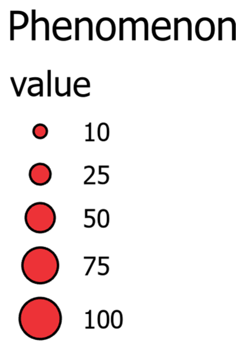
A simple experiment was designed to evaluate whether the value scales provided by the generator (abbreviated as vs. type) allow a more precise estimation of symbol values compared to two other proportional symbol legend types. The first of them is the legend type, consisting of example symbols of rounded values generated by the ArcGIS Pro software, shown in
Figure 10 (AG type). The second one contains overlapping symbols, including the minimum and maximum values (QG type) suggested by [
13]. The QG type is exportable from QGIS software. All three types were unified graphically to use the same line widths, font styles, and colors.
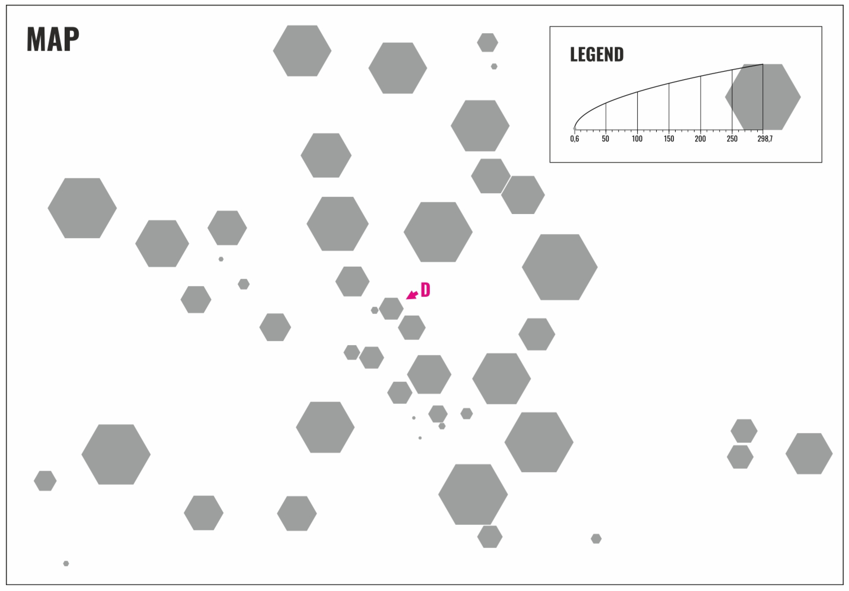
For the evaluation, three sets of 24 stimuli layouts were designed, varying in six different value ranges (values 6–2987 multiplied by 1/10, 1/5, 1, 2, 10, 20), six different symbol shapes (circle, square, triangle, hexagon, tree, house) and with one of the three legend types (VS, AG, QG). Each stimulus contained the same set of 46 symbols of different sizes, of which 24 map symbols were labeled with letters A–X (one on each stimulus, as shown in
Figure 18), and the respondents were asked to read their values using the given legend type. The three sets differed in the order of symbol shapes and value ranges used for stimuli to avoid the influence of specific combinations.
As the value scale generator is intended primarily for paper maps, the stimuli were printed and supplemented with an introductory page containing all three legend types and the same set of 46 symbols in the shape of pentagons. This page was used to introduce the task to respondents and show them all three legend types they would encounter in further stimuli. In total, 36 respondents (12 for each stimulus set) joined the experiment. All of them were collected from the target group of expert users who understand the principle of proportional symbol map visualization. The respondents were not informed about the research aim to preserve the unaffectedness of the results. The task was the same for each of the 24 stimuli: to estimate the respective symbol value as precisely as possible and write the estimated number on an answer sheet, with unlimited time and the possibility of using a ruler. The experiment was performed in a quiet room with good light conditions. It mostly took around 15–25 min to finish. During the experiment, the respondents were observed. Any kind of difficulties with specific legend types were noted. Finally, the respondents were asked to fill in two additional questions asking which legend type they had perceived as the easiest and which of them as the most difficult for estimation.
The answer sheets were then digitized into a digital sheet and processed statistically to evaluate differences in legend types, symbol shapes, etc. First, the correct value was calculated for each stimulus. Subsequently, absolute values of the differences between the correct and the user-estimated values were divided by the correct value and multiplied by 100 in order to obtain positive percentual differences in each user-estimated value. For each respondent, median values were calculated to provide common percentual differences for each of the legend types, symbol shapes, and value ranges. The median was used to minimize the influence of errors in number order, which occurred occasionally across all legend types, due to respondents’ inattention. The calculated medians of each category were then averaged using the mean across all 36 respondents. The link for the digital sheet, including the formulas and all three stimulus sets, is available within the Data availability statement.
3.6. Tool Evaluation Questionnaire Design
An online questionnaire survey was conducted to obtain the thoughts and experiences of worldwide cartography experts. The aim was not to determine the accuracy of the reading as in the above experiment, but to gather insights from cartography experts on the actual creation of proportional value scales in practice. The questionnaire has three parts: general questions on proportional value scales, questions evaluating different types of proportional value scales, and a question on the possible evaluation of the described value scale generator.
Google Forms technology was used, with the ability to divide groups of questions into sections and branching options (the ability to end the questionnaire based on a response that the respondent is not familiar with the topic being addressed). The following question types were used: multiple choice, checkboxes, multiple choice matrix with Likert scales, open-ended questions, demographic questions, and professional questions.
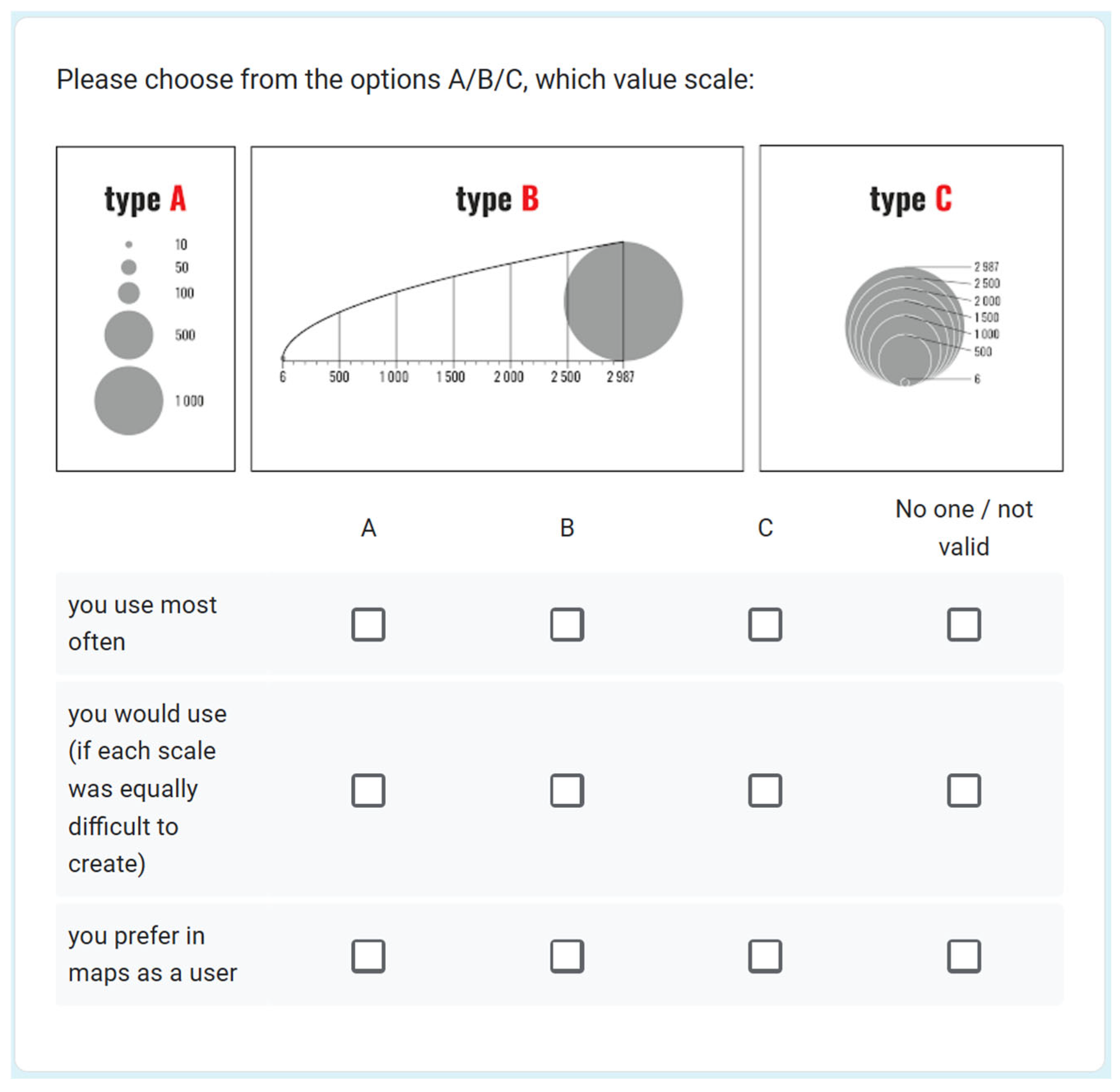
The questionnaire was anonymous, and no question was mandatory to avoid conflict with the information the respondent was unwilling to provide. After an introductory statement by the authors, there was a tie-breaker question asking whether the respondent was familiar with the topic of proportional symbol maps, followed by a general question about the respondent’s relationship to the topic addressed and quantifying how often the respondent works with value scales. If the respondent has ever edited or redesigned the default legend style, there was an open-ended question to specify the implemented approach. In the next section, the respondent was asked several questions about value scales in general (whether they are easy to use, whether it is possible to obtain accurate values, how they rate the design of the scales, the ability of software to create them automatically, and whether appropriate scales are used in the maps), followed by a section evaluating the sub-types of value scales as defined above (VS type, AG type, and QG type) against various parameters (see Results). Subsequently, the respondent rated which of these types is best in correctness, clarity, user-friendliness, and simplicity of automatic creation in GIS software. Respondents answered which program they had been using to create the scales and whether it was the same program they had used to create maps. In the final part, they had the opportunity to try the generator (a direct URL link was provided) and then evaluate it (
Figure 19). Before submitting their responses, respondents were asked about their profession, age, type of workplace, and, if applicable, a contact email to communicate the research results. Also, there was space for general comments and recommendations to the authors.
A cover letter with a URL link was sent to international contributors active in cartography, requesting further targeted dissemination to those whose responses would be relevant in the field. The email addresses were obtained from mailing lists distributed within the commissions of the International Cartographic Association (Commission on Cognitive Issues in Geographic Information Visualization, Commission on User Experience, Commission on Atlases) and from selected experts collaborating with the Department of Geoinformatics at the Faculty of Science, Palacký University Olomouc. A total of 197 primary emails (with a request to forward the message further) were sent. The questionnaire was also made available to interested cartography students (20 students). A total of 66 responses were received between 31 March 2024, and 16 April 2024. The estimated time required to complete the questionnaire was 10–15 min.
In total, 66 respondents completed the questionnaire, including 18 students and 48 worldwide cartography and GIS professionals. The results were then analyzed, open-ended questions were evaluated qualitatively, and other questions were evaluated using statistical procedures.
4. Results
The online value-scale generator has been published online [
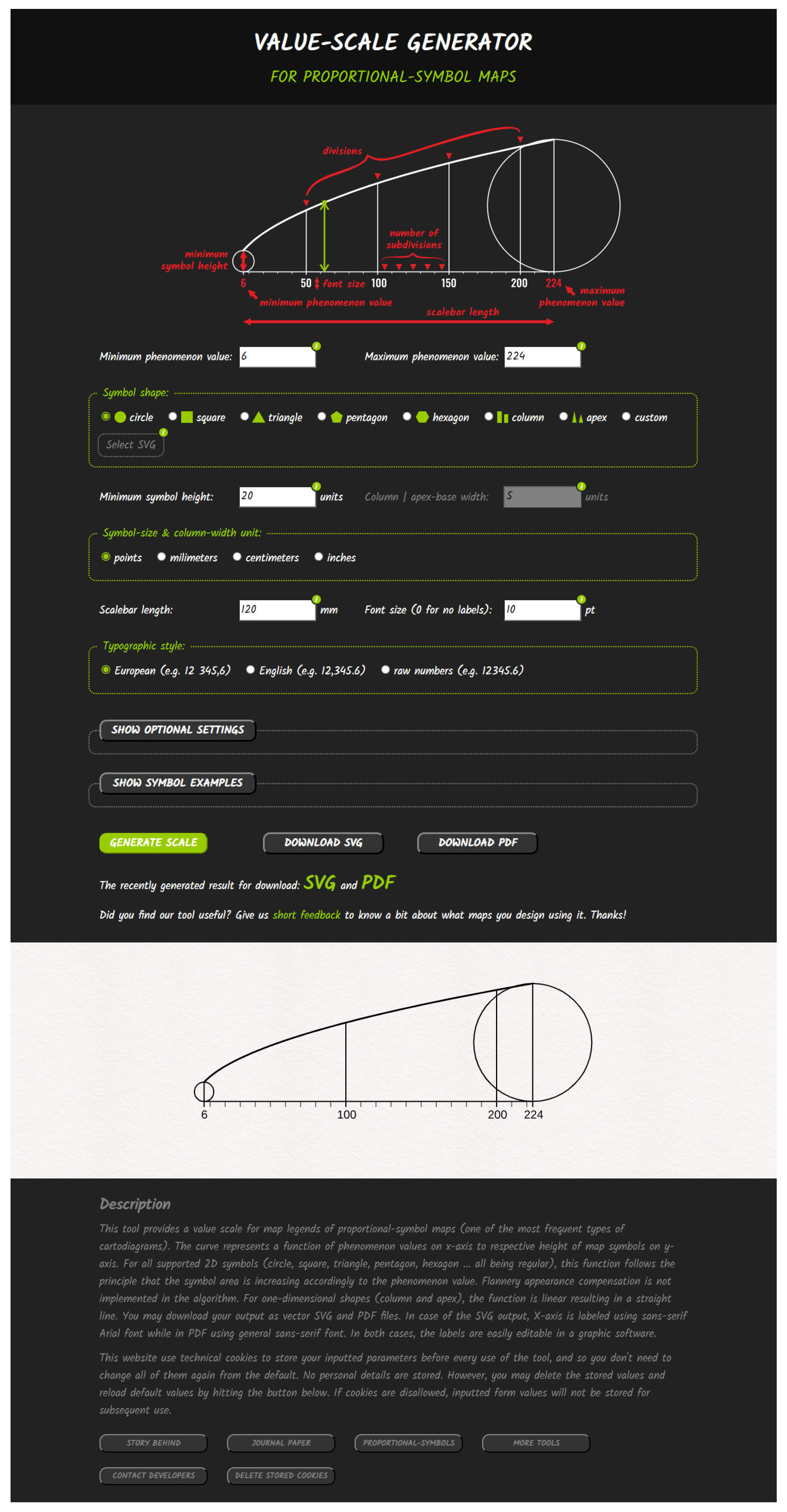
27]. It is constructed as a web application with an HTML form sending a POST request to the server, processing it, and providing the data to the Python scripts. After processing the request on the server, the website is refreshed, and dynamic fields are actualized, providing a preview and link to the generated value scale reflecting users’ preferences. The web application GUI is captured in
Figure 20 and may also be reached online at
https://radiat.pythonanywhere.com (accessed on 1 August 2025).
Several examples of more complex symbols were designed and shared on the website. They are hidden under the “SHOW EXAMPLE SYMBOLS” button by default, not to attract users’ attention primarily. Including these example symbols has several main reasons. They might be useful to be used in users’ maps. Also, they might be used to examine tool behavior or to explore their structure prior to designing their own styled SVG symbols.
The license is described on a separate website reachable from the web application’s footer link. It allows users to use the tool freely for both commercial and non-commercial purposes. Therefore, the tool is available for cartographers to design personalized value scales for map legends, for use in companies producing maps, for land surveying offices, in education, etc. However, the code modification and redistribution are permitted only with the authors’ permission. For such cases, contacts with the developer team are provided.
4.1. Value Scale Evaluation Results
The user evaluation revealed significant differences in the precision of estimated values between the three evaluated legend types. The vs. type designed using the presented online generator reached an average percentual error rate of 6.3%. For 31 of 36 respondents, it was evaluated as the most convenient legend type, while for two of them, it was perceived as the worst one. The AG legend type, consisting of several symbol sizes, reached a significantly higher error rate of 18.1%. None of the respondents marked this as the best legend type. Conversely, 25 of the respondents indicated it was the worst one for reading exact values. However, the highest error rate was calculated for the QG legend type consisting of overlapping symbols, reaching 29.5%. This type was perceived as the best by four respondents, whereas nine indicated it was the worst one. In total, 32 of the 36 respondents achieved the most precise estimation using the generated value scale, as demonstrated in
Figure 21. Another interesting finding is that 21 respondents, indicating the AG legend type was the worst, achieved a higher error rate on stimuli with the QG legend type.
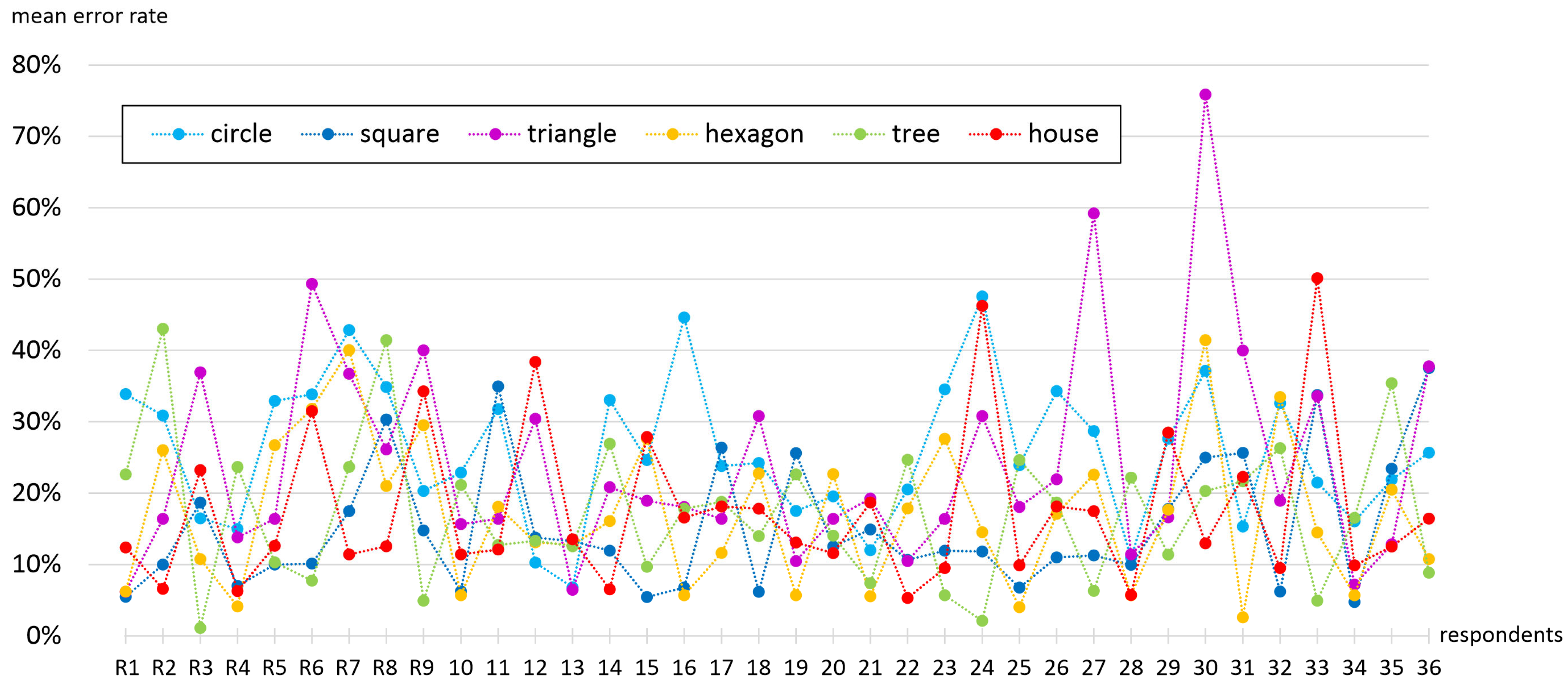
In terms of symbol shape, the highest error rate of 25.8% was surprisingly captured for circles, followed by triangles with a 24.3% error. Hexagons, the tree, and the house symbols reached similar errors of around 17%. The best estimation was observed for squares with a 15.3% average error. This finding contradicts the presumptions that simple symbols are easier to read, as in this case, the more complex shapes were interpreted more precisely than simple circles and triangles. The reason why squares achieved the best score could be caused by easily measurable sides, which are, in addition, of the same length vertically and horizontally. This might be an important property, as during the experiment, some respondents tended to measure map symbol sizes in the horizontal direction while decoding them in map legends in the vertical direction. The success rate of individual symbol shapes also differed among respondents. However, the higher mean error rate of circles and triangles is noticeable in
Figure 22.
No significant pattern was found in the ability to estimate values from different value ranges. The two lowest ranges with decimal values, as well as the highest range, were found to be interpreted more precisely (14.7–17.3% error) than the rest of the ranges (27.3–33.2% error). No specific reason for this was detected. The detailed table of results is linked in the Data Availability Statement.
4.2. Tool Evaluation Questionnaire Results
The questionnaire was evaluated separately: in the group of experts, in the test group of students from the Palacký University Olomouc (because these students could be influenced by learned practices), and in the group of all respondents. The main conclusions (listed below) are based only on the analysis of the independent expert group to maintain as much objectivity as possible.
How often do experts in cartography and GIS create value scales? 4% never, 11% very rarely, 9% rarely, 44% occasionally, 28% frequently, and 4% very frequently. Do they use the default proportional symbol map legend? 5% never, 12% very rarely, 15% rarely, 29% occasionally, 17% frequently, and 22% very frequently. While 42% often edit the legend directly in GIS software (19% frequently and 23% very frequently), more than half of respondents sometimes edit value scales in graphical software (64%), and one-fifth of respondents create an utterly custom value scale in a graphical editor frequently (14% very frequently, 7% frequently). With the ability of the GIS software to create value scales, the respondents are 7% very dissatisfied, 35% dissatisfied, 33% satisfied, 2% very satisfied, and the rest have a neutral attitude.
For the individual scale types, the experts consider the best (there was a possibility to tick more options) in the parameter “correctness” vs. type 70%, QG type 32.5%, AG type 27.5%; in the parameter “clarity”: AG type 45%, vs. type 43%, QG type 39%; in the parameter “user friendliness”: AG type 50%, QG type 34%, vs. type 29%. As map users, experts would like to see the following: AG type 44%, vs. type 38%, QG type 30%. Experts use ArcGIS Pro (83%), QGIS (43%), and other software (15%) to create proportional symbol maps.
For evaluating the presented value scale generator, most experts rate it as simplifying the creation of the value scale (70%). It is also described as easy to use by over half of the experts (59%). Over 80% of experts rate the tool as well described. Surprisingly, many of the questions evaluated did not differ much for the group of students. However, the influence of the teachers was significant in some answers; for example, in the answer on which scale is the most correct, 100% answered that the vs. type. Therefore, this group of respondents did not enter the above evaluation.
The questionnaire allowed, of course, a much more detailed analysis of the issue. As a simplified conclusion, the experts consider the vs. type the most correct. They evaluate the presented tool for its creation positively in all aspects, but at the same time, they point out that this type of value scale may be too complex for some users. Therefore, the vs. type may be the most appropriate solution for the target group of experts. However, a more straightforward expression should be considered for the general public, with the AG type being the preferred one. This might also be caused by the fact that maps mostly contain this simple legend type with no ambition to represent exact nominal phenomenon values, and so people become familiar with such scales.
Although the vs. type did not receive the highest ratings in all individual evaluation criteria—particularly in terms of user-friendliness, where the AG type was preferred—experts still considered it the most accurate and appropriate for advanced users. The high ratings for the generator tool itself (e.g., 70% stating it simplifies the process, 59% finding it easy to use) reflect a different aspect: namely, the usability of the tool to produce a technically correct value scale, rather than the readability of that legend by various user groups. Thus, the results highlight the dual nature of the vs. approach—as a precise but potentially more demanding cartographic solution.
5. Discussion
The online value scale generator provides an accessible multiplatform tool for generating appropriate map legends that give the possibility of an accurate interpretation of proportional symbol maps. Deploying the tool online outside of any GIS software provides both advantages and disadvantages. If such a tool was implemented directly in GIS software, its use would be easier as it would not require inputting the basic parameters (minimum symbol size, symbol shape, minimum and maximum phenomenon values) repetitively and importing the generated values scale into the map layout manually. On the contrary, such a GIS extension approach would require updating the code structure for new software versions. Also, the tool would then be limited only to the users of such specific GIS software, whereas it would be useless for others preferring another GIS or graphic software for designing maps.
Another discussed issue was the number of parameters provided for tool users to set. While more possible settings offer more flexibility, it also makes the user interface more complex and challenging to use. Therefore, some parameters, e.g., graph line widths and color, were hardcoded with no possibility of changing them via the tool GUI. However, they might be changed in post-processing as the value scale generator provides vector graphics that are editable in most common graphic software. In order to make the web application easy to use, the elective parameters might be hidden (and are hidden in the default view), making the GUI clear, structured, and without unnecessary visual clutter. Cookies help store inputted values so they do not need to be written repetitively during repetitive use. This input values storage is especially useful when experimenting with appropriate parameter settings or when producing a map series for an atlas.
Implementation of other calculation approaches was also considered. One of these was adding the possibility of using the Flannery appearance scaling instead of the mathematical one. Finally, the solution providing only mathematical scaling was preferred as it uses clear and logical principles. At the same time, the user perception may differ both in time and surrounding conditions, so the results of the psychological research might not be entirely valid nowadays. Lastly, a choice of using either the minimum or the maximum symbol height as an input parameter was considered. No choice with only defining the minimum symbol height was finally preferred, as determining the smallest symbol size was considered the more appropriate and correct cartographic workflow. The idea is that a cartographer needs to define the size of the smallest symbol first in order to be visible and recognizable on a map. If successful in this task, the maximum-size symbol is visible anyway.
It is also important to acknowledge several limitations of the proposed method and areas for future improvement. One of the most significant challenges lies in the spatial demands of the generated value-scale legend, especially when working with datasets exhibiting a wide value range. The substantial difference between the smallest and largest symbols may require a long x-axis to preserve readability and decoding accuracy. While a longer axis improves interpretability, it also occupies more space on the map layout, which may be problematic in compact or densely designed compositions.
Furthermore, the proposed tool is primarily suitable for static cartographic outputs, such as printed maps or PDF-based atlases, where users have the opportunity to spend time decoding the symbols. In contrast, interactive maps often allow users to access exact values by clicking or hovering over a symbol. In such environments, the proposed value-scale legend is often redundant or even confusing, especially when combined with automatic resizing during zoom operations. The tool is thus not optimized for multiscale web mapping or interactive interfaces.
From a technical perspective, future development could focus on broader GIS integration and expanding the range of configurable parameters. Currently, the tool is not directly linked to any specific GIS software, which requires manual export and insertion of legends. While this ensures compatibility across platforms, creating customized interfaces or plugins for popular GIS tools (e.g., QGIS or ArcGIS) could enhance user experience. Similarly, expanding export formats and visual customization options—such as symbol styles or color schemes—could be explored in future updates, depending on user demand.
6. Conclusions
The manuscript presents an online application that generates value scales of proportional symbol maps. It aims to provide an exact map legend for maps with proportional symbols, including simple geometric shapes, specific vector graphics, bars, and charts. Since its origins, cartography has strived to offer accurate and interpretable visualizations of geospatial phenomena. While simplified value scales may suffice for general overview maps, there are many cases where precise decoding of the mapped quantities is essential—particularly in analytical, statistical, or educational contexts.
The effectiveness of value estimation using the generated value scales was confirmed by the results of the user experiment, showing a noticeably lower error rate compared to other legend types. While the manual design of value scales is very time-consuming and GIS software does not provide their automatic generation, the presented solution intends to increase map-making job efficiency significantly. The semi-automatic tool only requires users to input several elementary data and visualization parameters while managing all other necessary calculations. It provides precise results in an easy-to-use and editable vector format. The value-scale generator is free to be used for an unlimited variety of purposes and, therefore, is open to the whole cartographic community.
The work-in-progress state of the tool was presented at the International Cartographic Conference in Cape Town [
28] and several local conferences and workshops, while this article is a comprehensive expansion of the state presented there. Discussed issues containing suggestions from other cartographers were then implemented in later phases of the tool development, as well as suggestions from beta testers coming from the geoinformatics and software development branch. The value-scale generator was already tested and used by multiple cartographers when designing thematic maps for various cartographic products. While some of them decided to import the result directly into the map layout, others used the possibility of additional visual parameter editing in external graphic software. The expert-group questionnaire revealed there are different opinions and preferences regarding the use of value scales worldwide. Nevertheless, the tool was found helpful in providing the most accurate type of legend types for proportional symbol maps. The upcoming improvements and features of the tool are not yet fixed and may evolve. Further suggestions from the map-making community will likely influence future development.

