

Hierarchical Data Visualization Based on Rectangular Cartograms

Abstract
1. Introduction
1.1. Background
1.2. Related Work
1.3. Motivation and Objectives
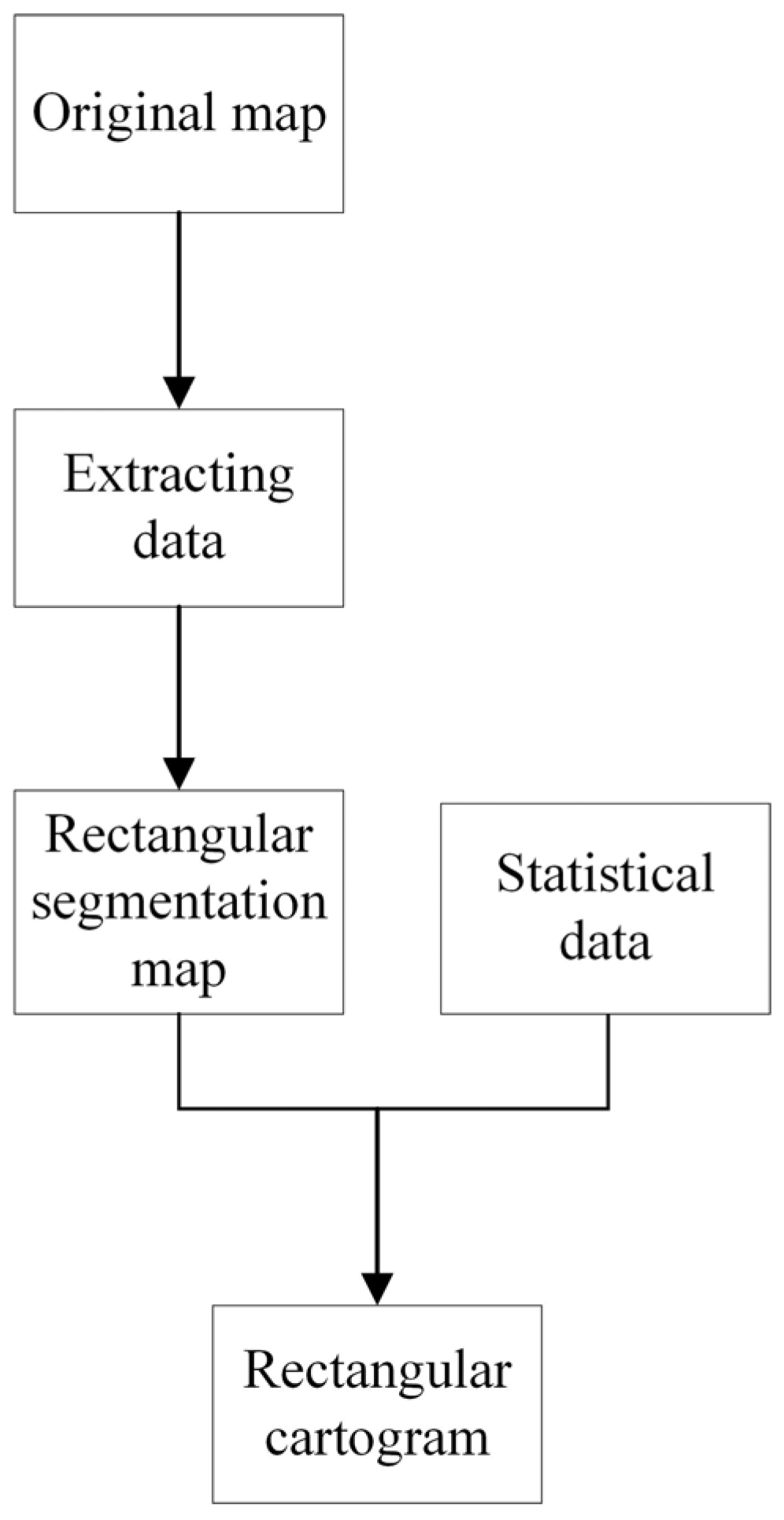
2. Rectangular Cartogram Construction Method
2.1. Problem Description
2.2. Algorithm Workflow
2.3. Construction of Rectangular Segmentation Map
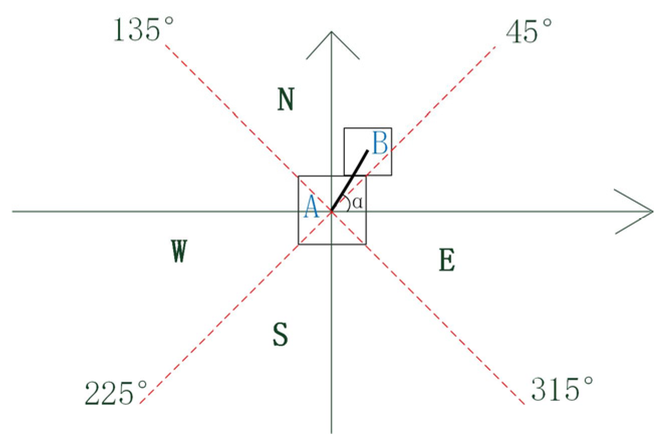
2.3.1. Calculation of Relative Orientation of Regions
2.3.2. Calculation of Edge Length of Regions
2.4. Construction of Rectangular Cartogram
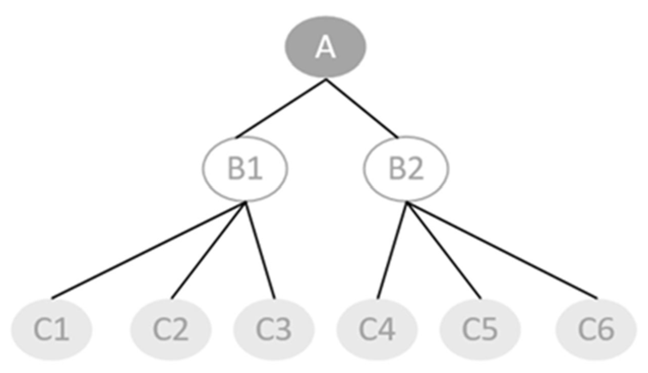
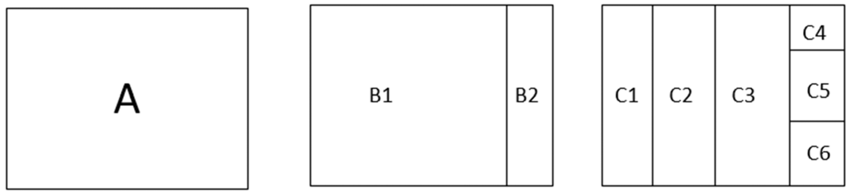
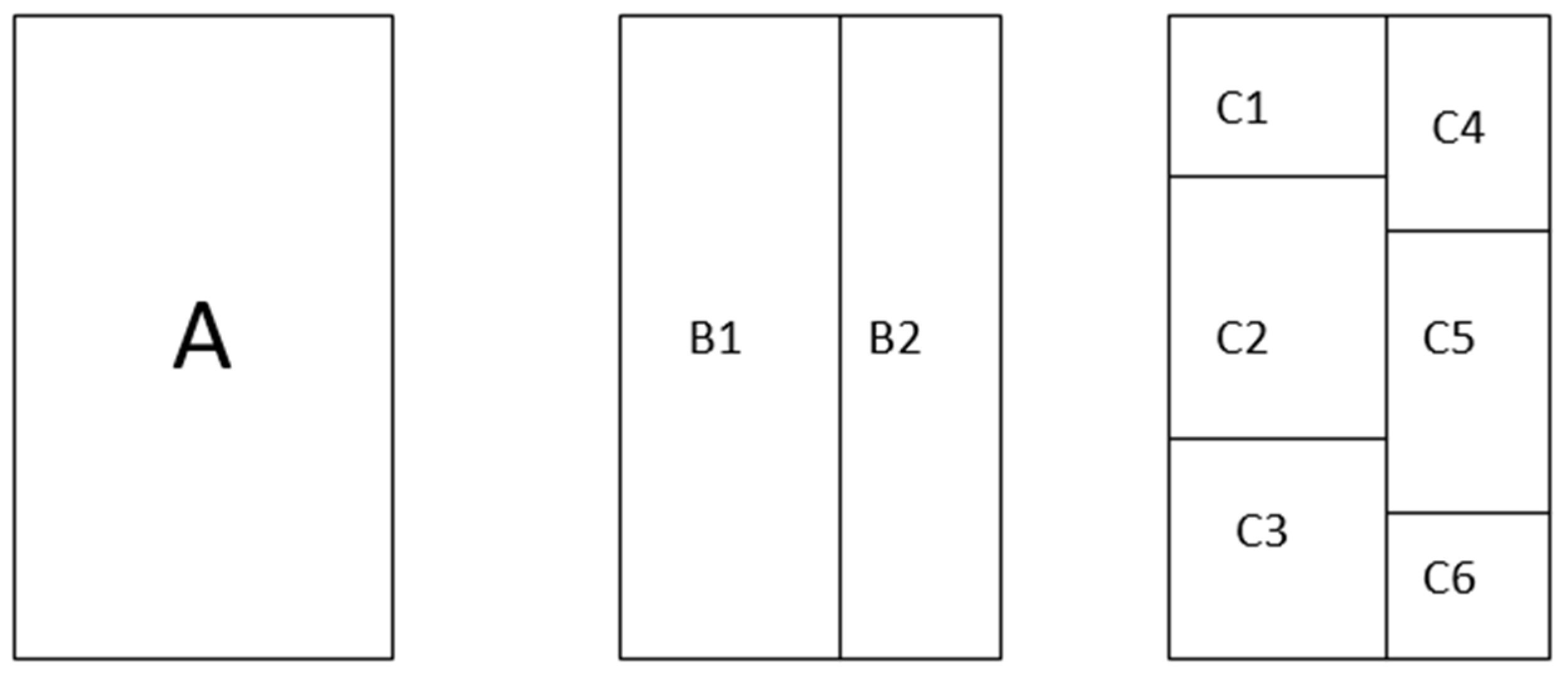
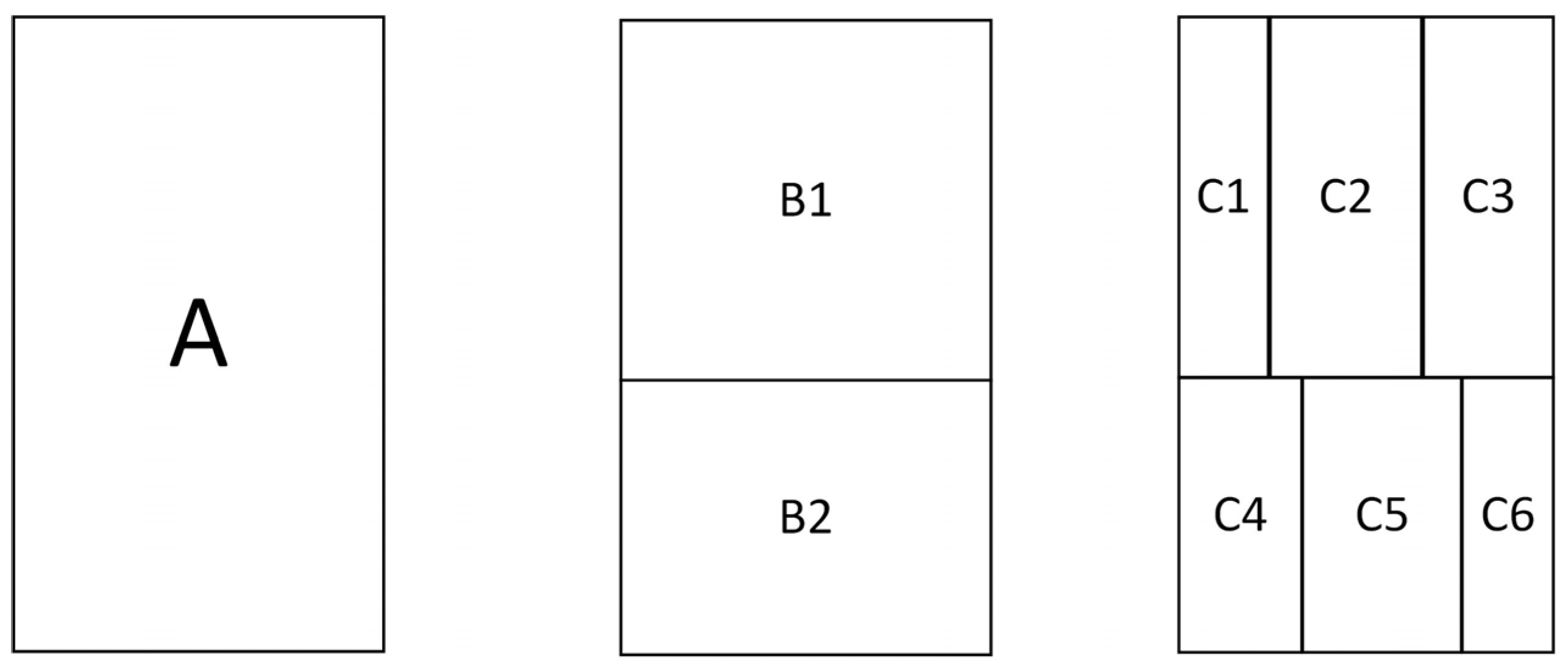
3. Algorithmic Design of Treemap Layout in Rectangular Cartograms
3.1. Treemap Layout Algorithm
3.2. Implementation of Treemap Layout in Rectangular Cartograms
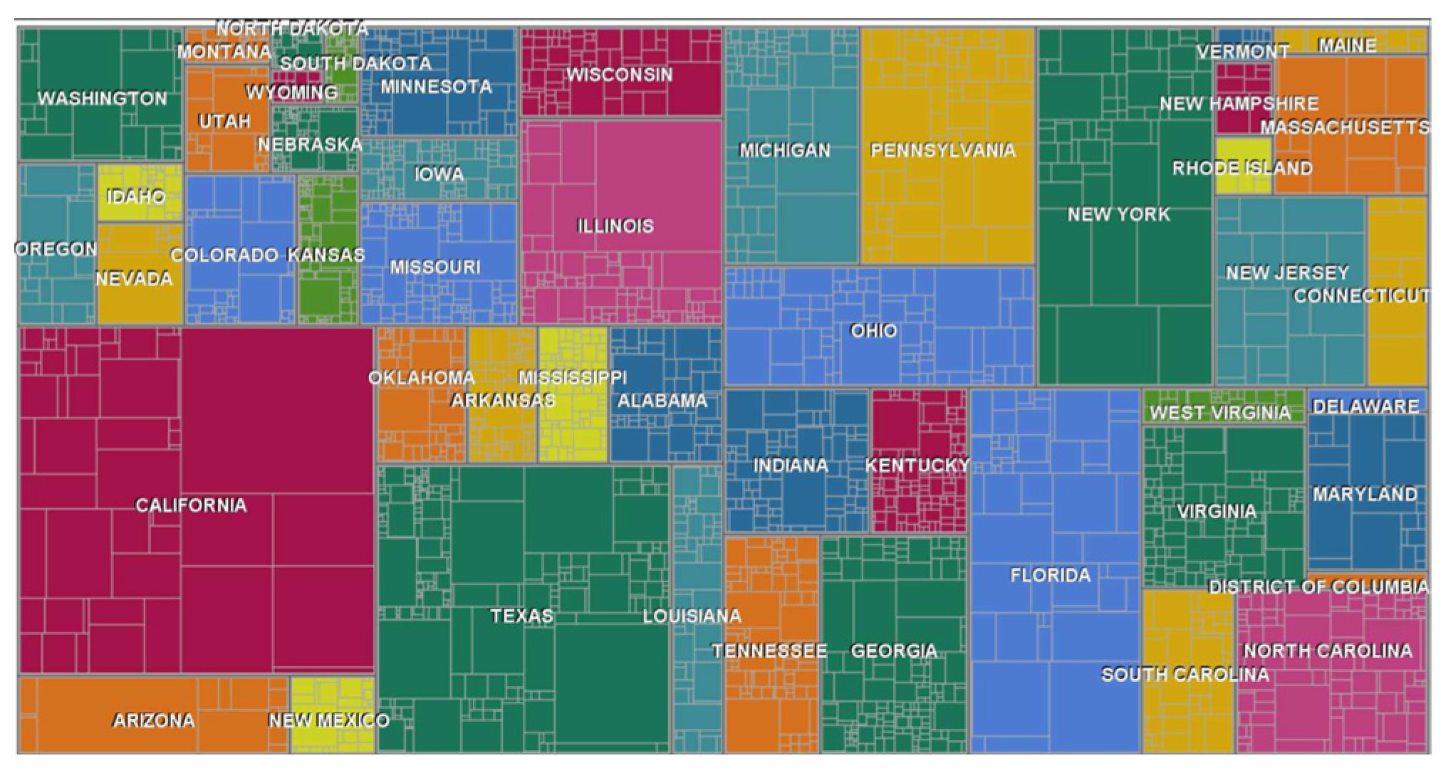
4. Visualization and Evaluation
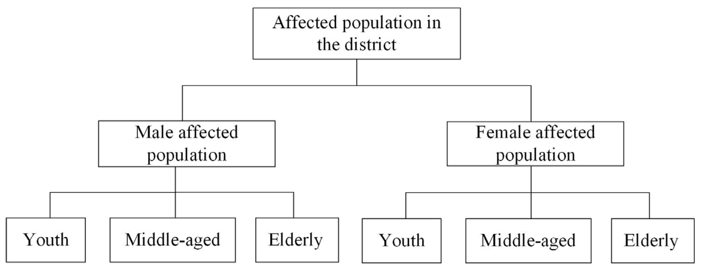
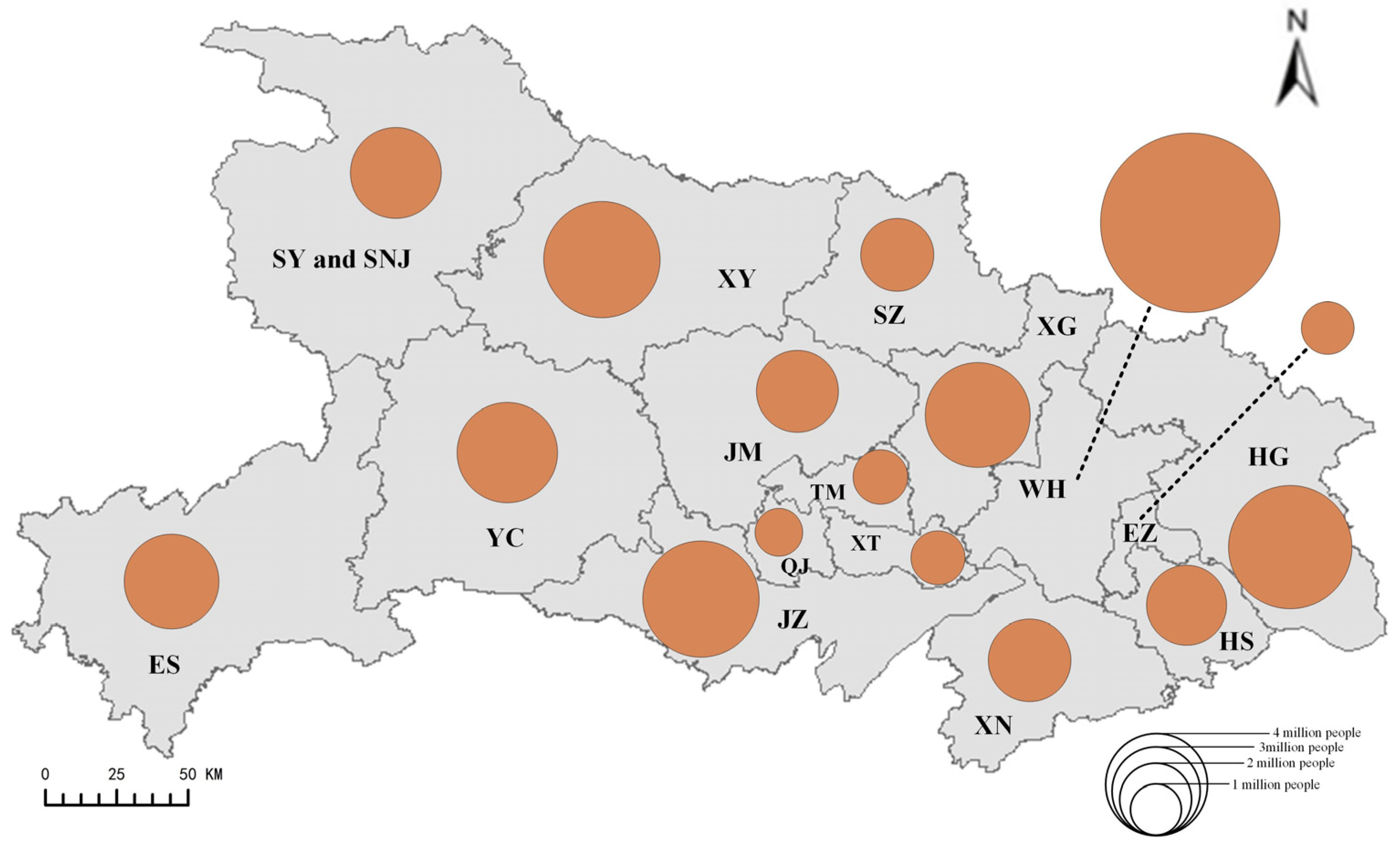
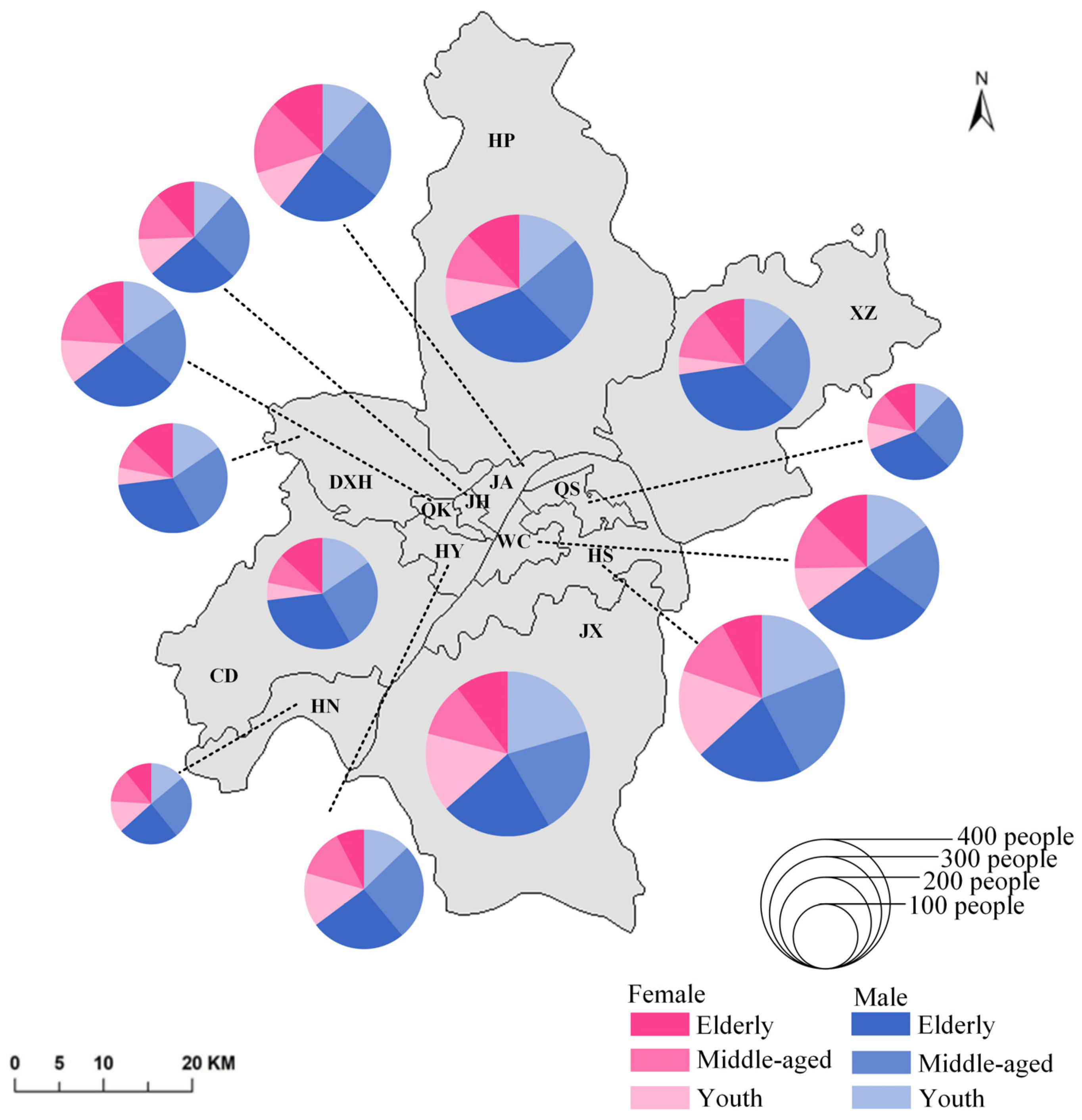
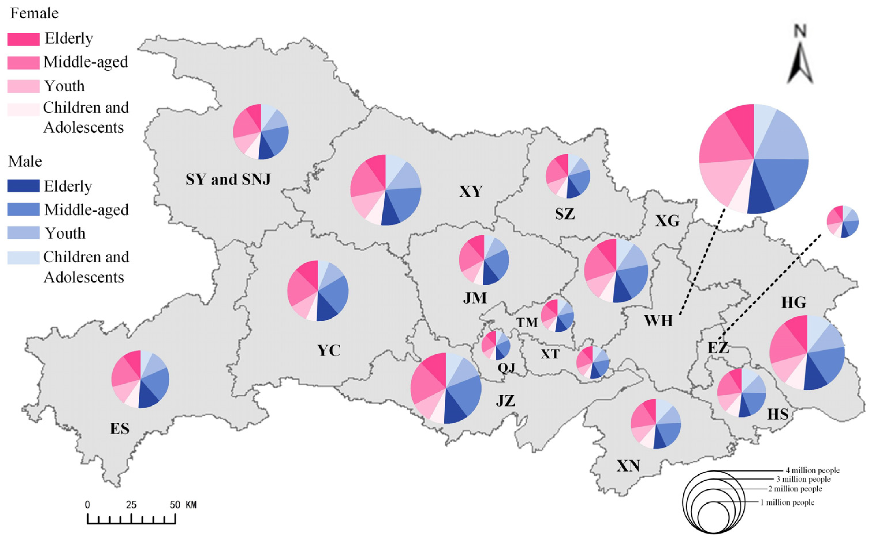
4.1. Experiment Data
4.2. Visualization Results
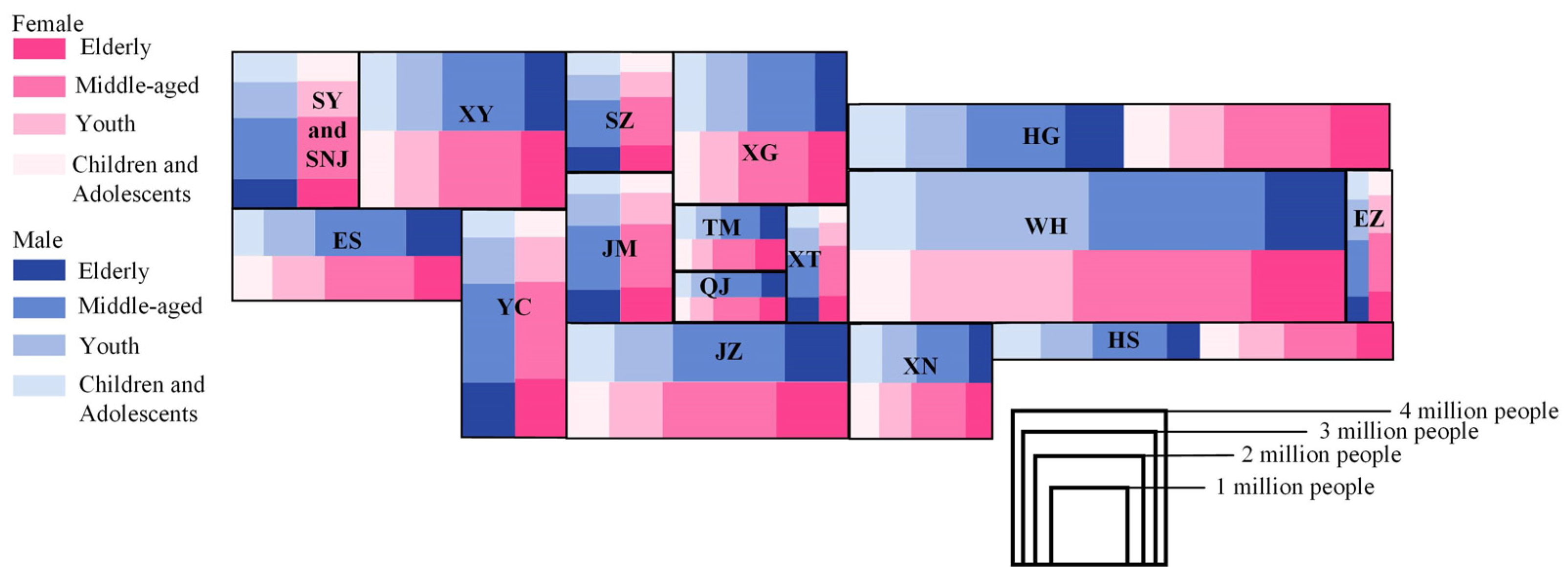
4.2.1. Single-Level Visualization Results
4.2.2. Multi-Level Visualization Results
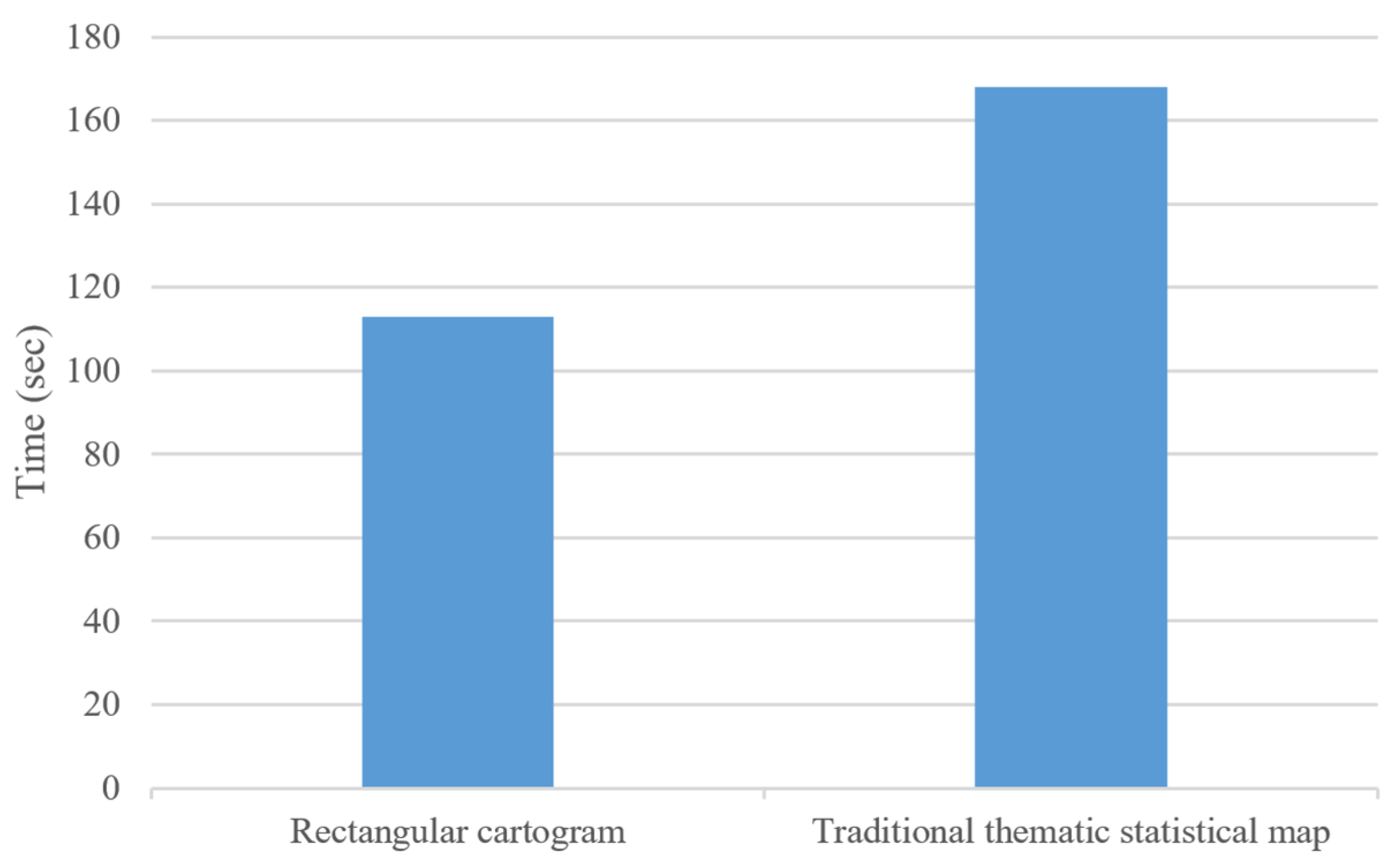
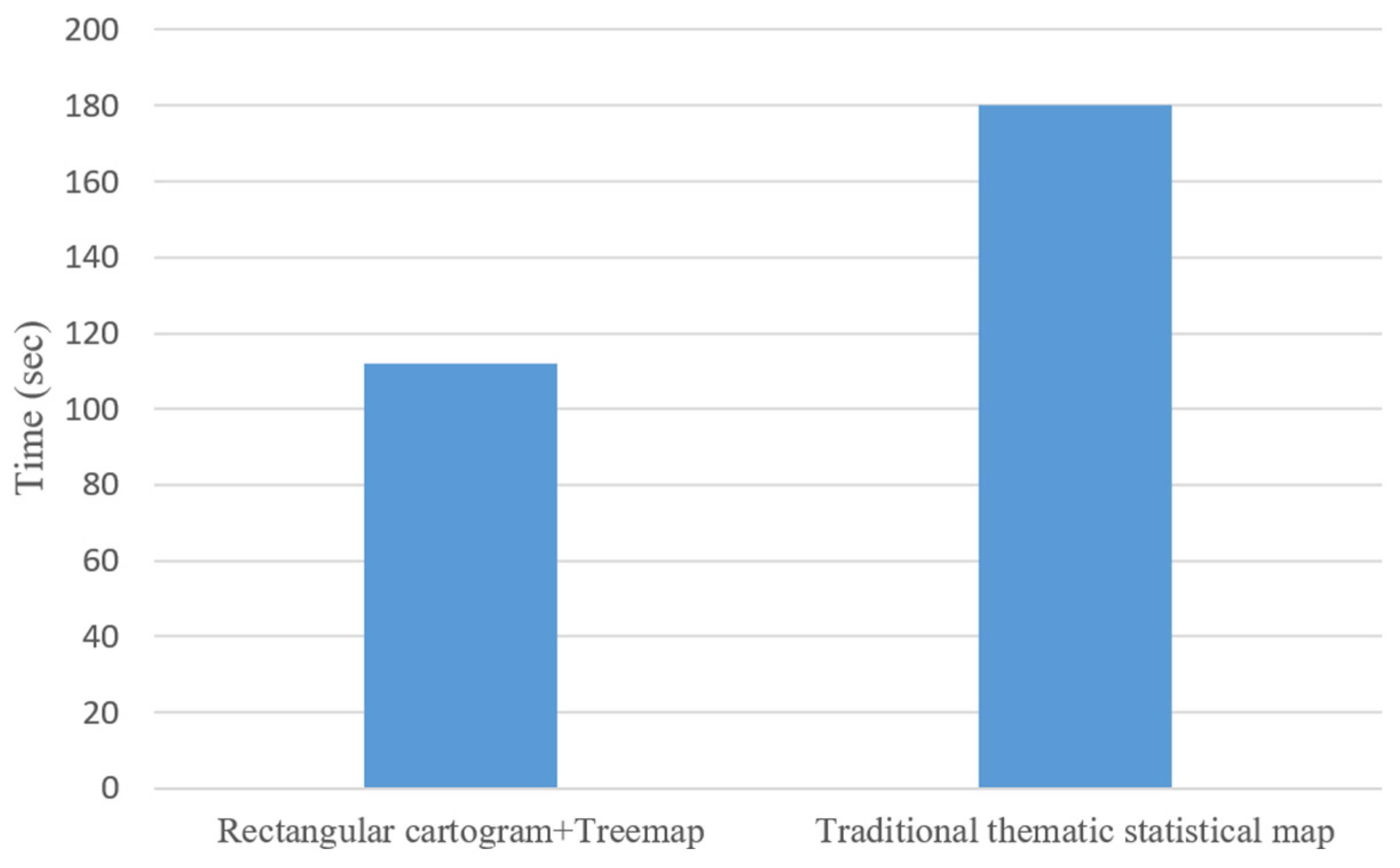
4.3. Usability Evaluation
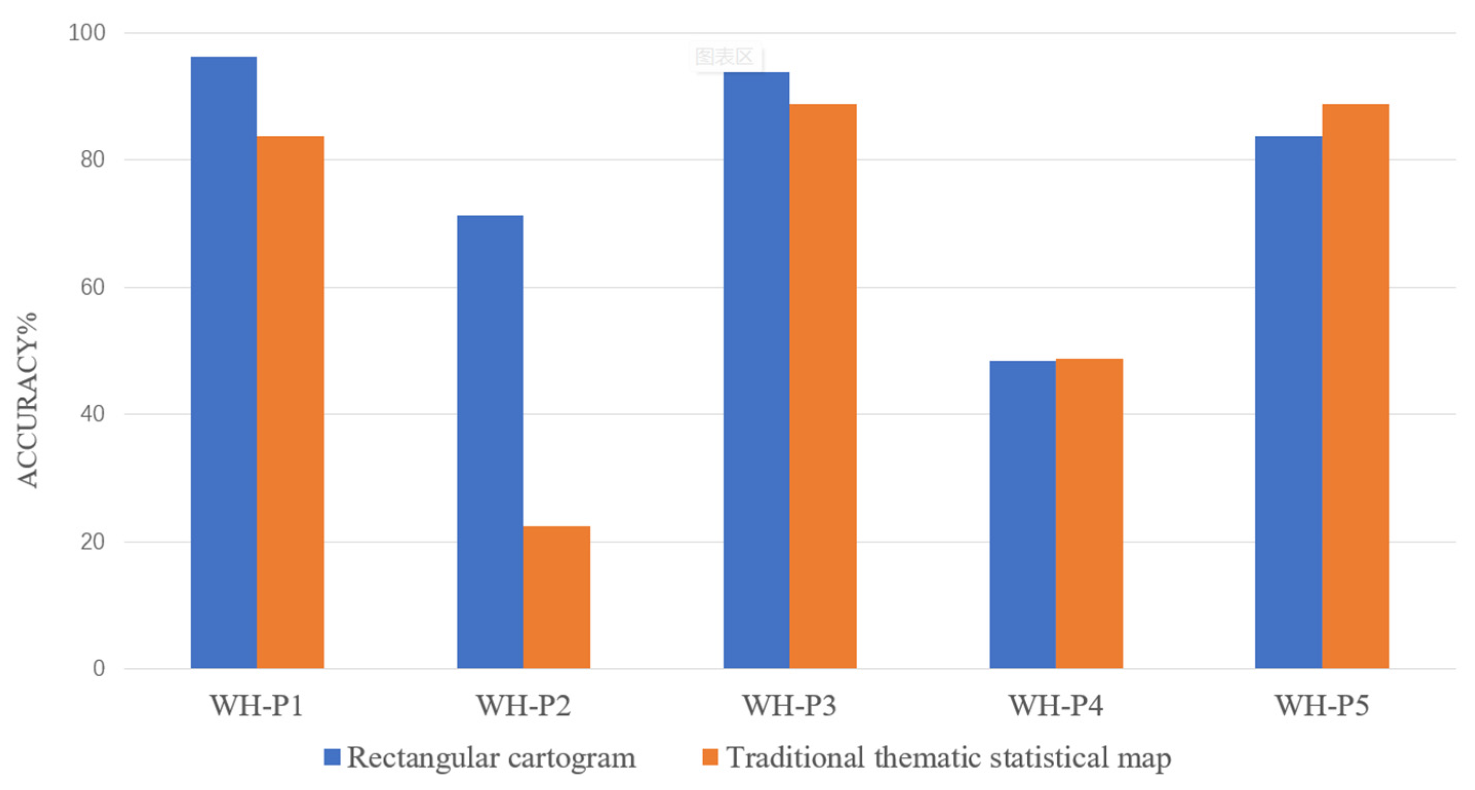
4.3.1. Evaluation Task Design
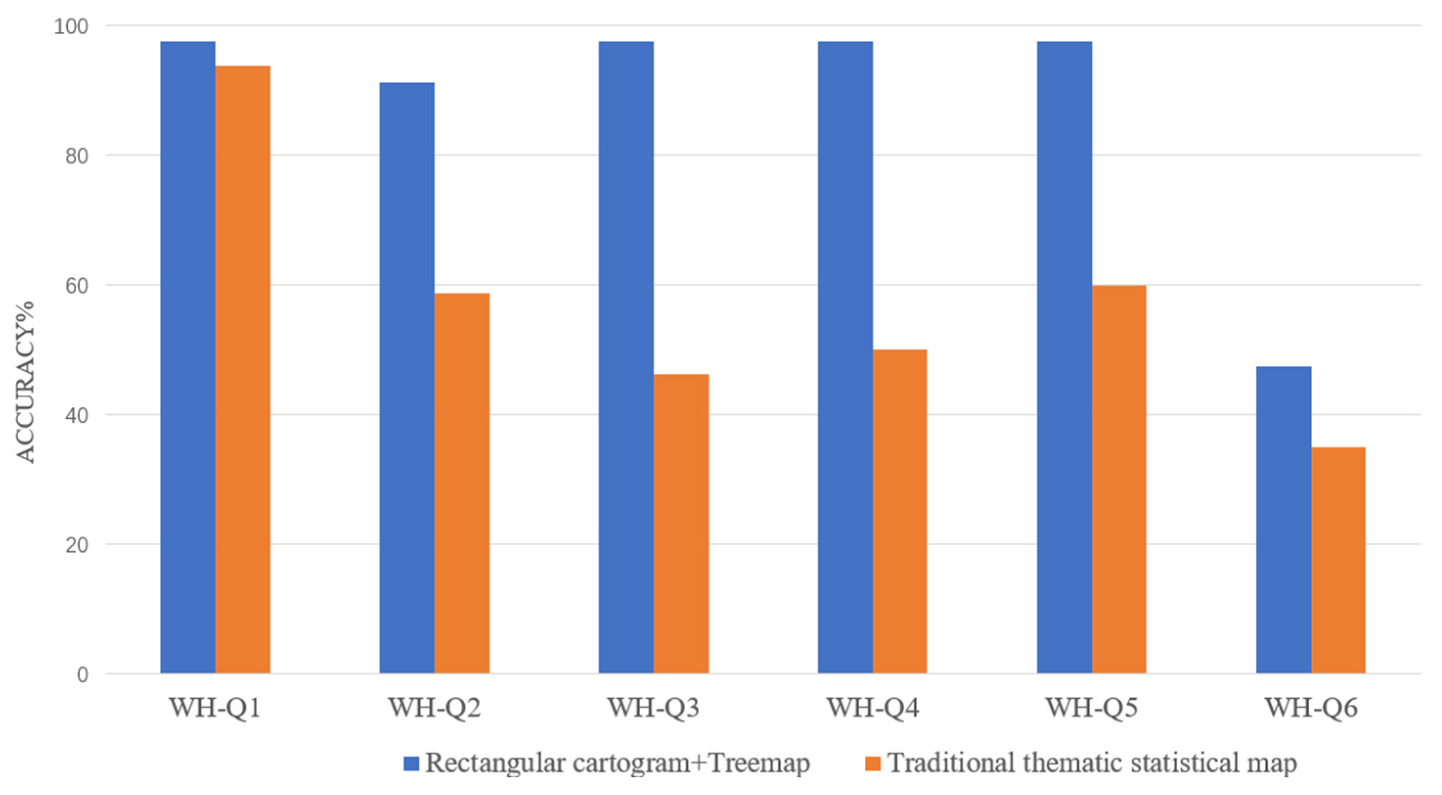
4.3.2. Evaluation of Single-Level Visualization Performance
4.3.3. Evaluation of Multi-Level Visualization Performance
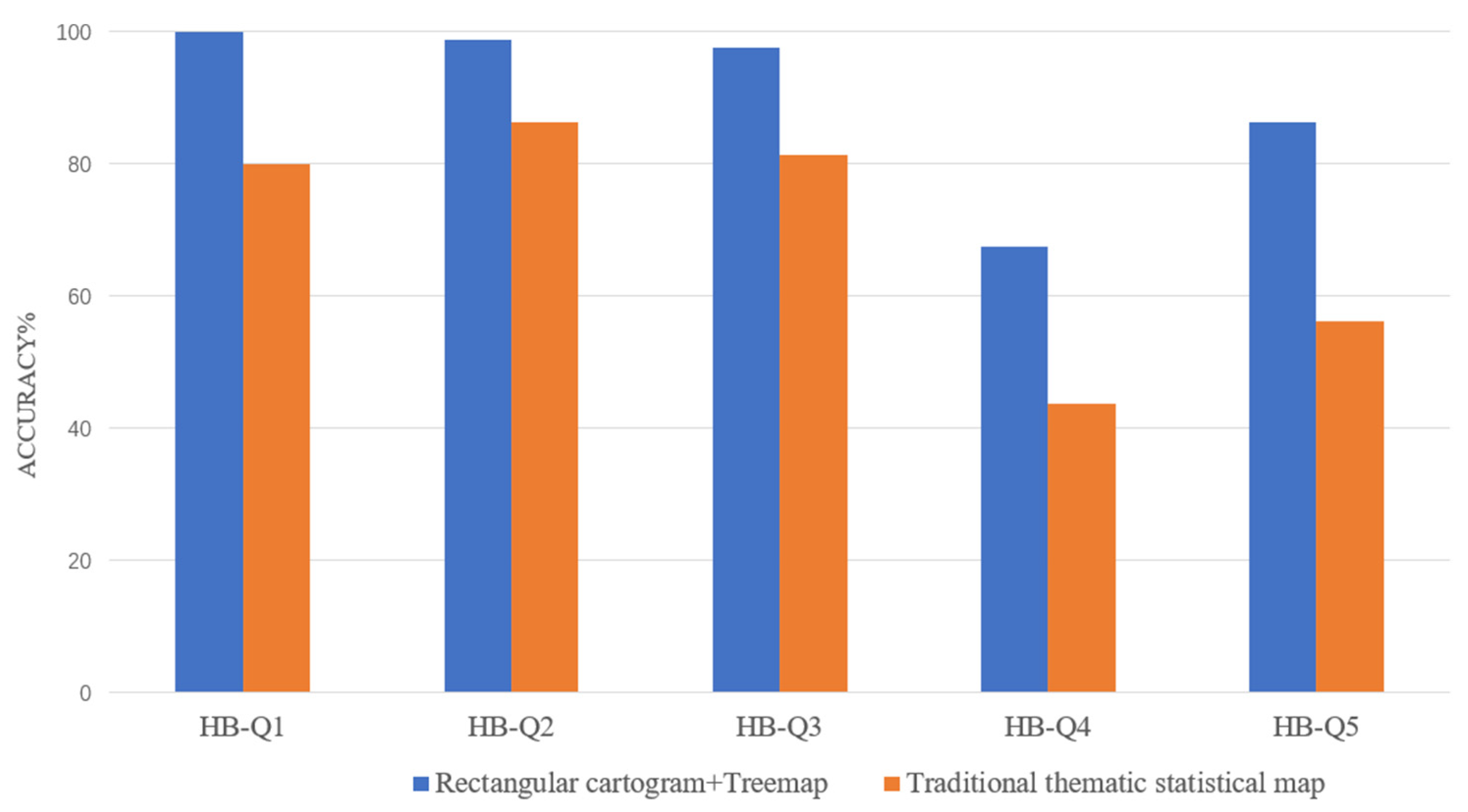
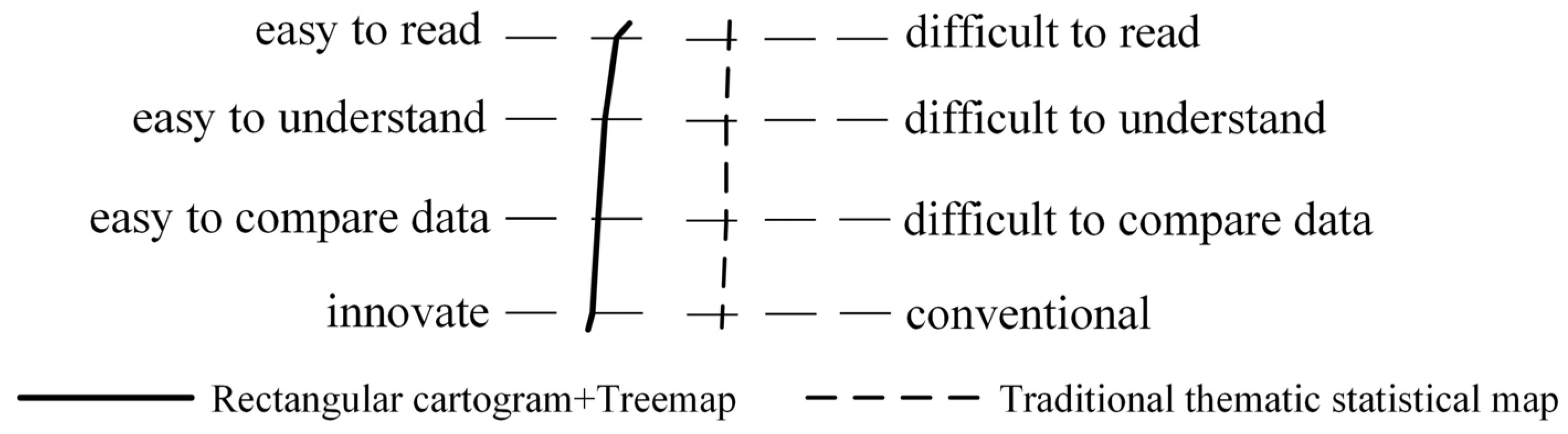
4.4. Evaluation Results
5. Discussion and Conclusions
Author Contributions
Funding
Data Availability Statement
Conflicts of Interest
References
- Zhang, X.; Yuan, X. Treemap Visualization. J. Comput.-Aided Des. Comput. Graph. 2012, 24, 1113–1124. Available online: https://www.jcad.cn/article/id/2156de54-5783-41df-b6ae-7324c6402b00 (accessed on 15 June 2024).
- Yang, Z.; Hua, Y.; Zhang, Z.; Chen, M.; Yang, F.; Zhang, L. Central-Layout Sunburst Algorithm for Hierarchical Data Visualization. J. Comput.-Aided Des. Comput. Graph. 2023, 35, 1588–1595. [Google Scholar]
- Nöllenburg, M. Geographic Visualization. In Human-Centered Visualization Environments; Lecture Notes in Computer Science; Kerren, A., Ebert, A., Meyer, J., Eds.; Springer: Berlin/Heidelberg, Germany, 2007; Volume 4417. [Google Scholar] [CrossRef]
- Ghoniem, M.; Cornil, M.; Broeksema, B.; Stefas, M.; Otiacques, B. Weighted maps: Treemap visualization of geolocated quantitative data. Vis. Data Anal. 2015, 9397, 163–177. [Google Scholar] [CrossRef]
- Wang, H.; Ni, Y.; Sun, L.; Chen, Y.; Xu, T.; Chen, X.; Su, W.; Zhou, Z. Hierarchical visualization of geographical areal data with spatial attribute association. Vis. Inform. 2021, 5, 82–91. [Google Scholar] [CrossRef]
- Ai, T.; Zhou, M.; Chen, Y. The LOD Representation and TreeMap Visualization of Attribute Information in Thematic Mapping. Acta Geod. Cartogr. Sin. 2013, 42, 453–460. [Google Scholar]
- Zhang, J.; Malik, A.; Ahlbrand, B.; Elmqvist, N.; Maciejewski, R.; Ebert, D.S. Topogroups: Context-preserving visual illustration of multi-scale spatial aggregates. In Proceedings of the 2017 CHI Conference on Human Factors in Computing Systems, Denver Colorado, CO, USA, 6–11 May 2017; pp. 2940–2951. [Google Scholar] [CrossRef]
- Chen, Y.; Lin, X.; Zhao, Y.; Sun, Y.; Zhang, X. SunMap: An Associated Hierarchical Data Visualization Method Based on Heatmap and Sunburst. J. Comput.-Aided Des. Comput. Graph. 2016, 28, 1075–1083. Available online: https://www.jcad.cn/article/id/51bd53d2-df7a-47f3-ab4a-592ed043d208 (accessed on 13 June 2024).
- Skowronnek, A. Beyond Choropleth Maps: A Review of Techniques to Visualize Quantitative Areal Geodata. 2016. Available online: https://alsino.io/static/papers/BeyondChoropleths_AlsinoSkowronnek.pdf (accessed on 13 November 2024).
- Wang, L.; Jiang, N.; Li, X.; Zhang, W. A Survey of Cartogram. J. Comput.-Aided Des. Comput. Graph. 2017, 29, 393–405. Available online: https://www.jcad.cn/en/article/id/bbdbf467-e066-4cfe-a623-536cab802455 (accessed on 10 November 2022).
- Wang, Y.; Sun, G.; Zhu, Z.; Li, T.; Liang, R. Skelemap: Skeleton-based boundary growth for efficient and automated cartogram generation. J. Vis. 2025, 28, 223–238. [Google Scholar] [CrossRef]
- Li, X.; Wang, L.; Zhang, W.; Yang, F.; Yang, Z. A visualization method of continuous area cartogram for two or multiple variables. Acta Geod. Et. Cartogr. Sin. 2019, 48, 756–766. [Google Scholar] [CrossRef]
- Raisz, E. The Rectangular Statistical Cartogram. Geogr. Rev. 1934, 24, 292–296. [Google Scholar] [CrossRef]
- Raisz, E. Rectangular Statistical cartograms of the World. J. Georg. 1936, 35, 8–10. [Google Scholar] [CrossRef]
- Dorling, D. Area Cartograms: Their Use and Creation. In The Map Reader; Dodge, M., Kitchin, R., Perkins, C., Eds.; Wiley: New York, NY, USA, 2011; pp. 252–260. [Google Scholar] [CrossRef]
- Nickel, S.; Sondag, M.; Meulemans, W.; Kobourov, S.; Peltonen, J.; Nöllenburg, M. Multicriteria Optimization for Dynamic Demers Cartograms. IEEE Trans. Vis. Comput. Graph. 2022, 28, 2376–2387. [Google Scholar] [CrossRef] [PubMed]
- Gastner, M.T.; Newman, M.E.J. Diffusion-based method for producing density-equalizing maps. Proc. Natl. Acad. Sci. USA 2004, 101, 7499–7504. [Google Scholar] [CrossRef] [PubMed]
- Olson, J.M. Noncontiguous area Cartograms. Prof. Geogr. 1976, 28, 371–380. [Google Scholar] [CrossRef]
- van Kreveld, M.; Speckmann, B. On rectangular cartograms. Comput. Geom. 2007, 37, 175–187. [Google Scholar] [CrossRef]
- Wang, W.; Jia, F. Methods of rectangular Cartogram automatic construction. Bull. Surv. Mapp. 2020, 6, 99–103. [Google Scholar]
- Jia, F.; Wang, W.; Yang, J.; Li, T.; Song, G.; Xu, Y. Effectiveness of Rectangular Cartogram for Conveying Quantitative In-formation: An Eye Tracking-Based Evaluation. ISPRS Int. J. Geo-Inf. 2023, 12, 39. [Google Scholar] [CrossRef]
- Bederson, B.B.; Shneiderman, B.; Wattenberg, M. Ordered and quantum treemaps: Making effective use of 2D space to display hierarchies. ACM Trans. Graph. 2002, 21, 833–854. [Google Scholar] [CrossRef]
- Zhao, S.; McGuffin, M.J.; Chignell, M.H. Elastic hierarchies: Combining treemaps and node-link diagrams. In Proceedings of the IEEE Symposium on Information Visualization, Minneapolis, MN, USA, 23–25 October 2005; pp. 57–64. [Google Scholar] [CrossRef]
- Limberger, D.; Scheibel, W.; Döllner, J.; Trapp, M. Visual variables and configuration of software maps. J. Vis. 2023, 26, 249–274. [Google Scholar] [CrossRef]
- Wood, J.; Dykes, J. Spatially ordered treemaps. IEEE Trans. Vis. Comput. Graph. 2008, 14, 1348–1355. [Google Scholar] [CrossRef]
- Bruls, M.; Huizing, K.; van Wijk, J.J. Squarified Treemaps. In Data Visualization 2000; Eurographics; De Leeuw, W.C., van Liere, R., Eds.; Springer: Vienna, Austria, 2000. [Google Scholar] [CrossRef]
- Tong, C.; Roberts, R.C.; Laramee, R.S.; Berridge, D.; Thayer, D. Cartographic Treemaps for Visualization of Public Healthcare Data. In Proceedings of the CGVC, Manchester, UK, 14–15 September 2017; pp. 29–42. [Google Scholar] [CrossRef]
- Buchin, K.; Eppstein, D.; Löffler, M.; Nöllenburg, M.; Silveira, R.I. Adjacency-preserving spatial treemaps. In Algorithms and Data Structures; WADS 2011; Lecture Notes in Computer Science; Dehne, F., Iacono, J., Sack, J.R., Eds.; Springer: Berlin/Heidelberg, Germany, 2011; Volume 6844. [Google Scholar] [CrossRef]
- Zhou, M.; Hu, W.; Ai, T. Multi-level thematic map visualization using the Treemap hierarchical representation mode. J. Geovis. Spat. Anal. 2020, 4, 12. [Google Scholar] [CrossRef]
- Heilmann, R.; Keim, D.A.; Panse, C.; Sips, M. RecMap: Rectangular Map Approximations. In Proceedings of the IEEE Symposium on Information Visualization, Austin, TX, USA, 10–12 October 2004; pp. 33–40. [Google Scholar] [CrossRef]
- Wang, L.; Yuan, H.; Li, X.; Lu, P.; Li, Y. A new construction method for rectangular Cartograms. ISPRS Int. J. Geo-Inf. 2025, 14, 25. [Google Scholar] [CrossRef]
- Alam, M.J.; Kobourov, S.G.; Veeramoni, S. Quantitative measures for cartogram generation techniques. Comput. Graph. Forum 2015, 34, 351–360. [Google Scholar] [CrossRef]
- Panse, C. Rectangular statistical cartograms in R: The recmap package. J. Stat. Softw. 2018, 86, 1–27. [Google Scholar] [CrossRef]
- Wang, Y.C.; Xing, Y.; Lin, F.; Seah, H.-S.; Zhang, J. OST: A heuristic-based orthogonal partitioning algorithm for dynamic hierarchical data visualization. J. Vis. 2022, 25, 875–896. [Google Scholar] [CrossRef]
- Johnson, B.; Shneiderman, B. Tree-maps: A space filling approach to the visualization of hierarchical information structures. In Proceedings of the IEEE Visualization Conference, San Diego, CA, USA, 22–25 October 1991; pp. 284–291. [Google Scholar]
- Chen, Y.; Hu, H.; Li, Z. Performance Compare and Optimization of Rectangular Treemap Layout Algorithms. J. Comput.-Aided Des. Comput. 2013, 25, 1623–1634. Available online: https://www.jcad.cn/article/id/56230c87-4670-4bb0-8114-39899674afa7 (accessed on 20 June 2024).
- Nusrat, S.; Kobourov, S. Task Taxonomy for Cartograms. In 17th Eurographics Conference on Visualization; The Eurographics Association: Cagliari, Italy, 2015; pp. 61–65. [Google Scholar] [CrossRef]
- Tanimura, S.; Kuroiwa, C.; Mizota, T. Proportional symbol mapping in R. J. Stat. Softw. 2006, 15, 1–7. [Google Scholar] [CrossRef]
- Dent, B.D. Communication Aspects of Value-by-Area Cartograms. Am. Cartogr. 1975, 2, 154–168. [Google Scholar] [CrossRef]
- Sui, D.Z.; Holt, J.B. Visualizing and Analysing Public-Health Data Using Value-by-Area Cartograms: Toward a New Synthetic Framework. Cartographica 2008, 43, 3–20. [Google Scholar] [CrossRef]
- Nusrat, S.; Kobourov, S. The state of the art in cartograms. Comput. Graph. Forum 2016, 35, 619–642. [Google Scholar] [CrossRef]


| Tasks | Question |
|---|---|
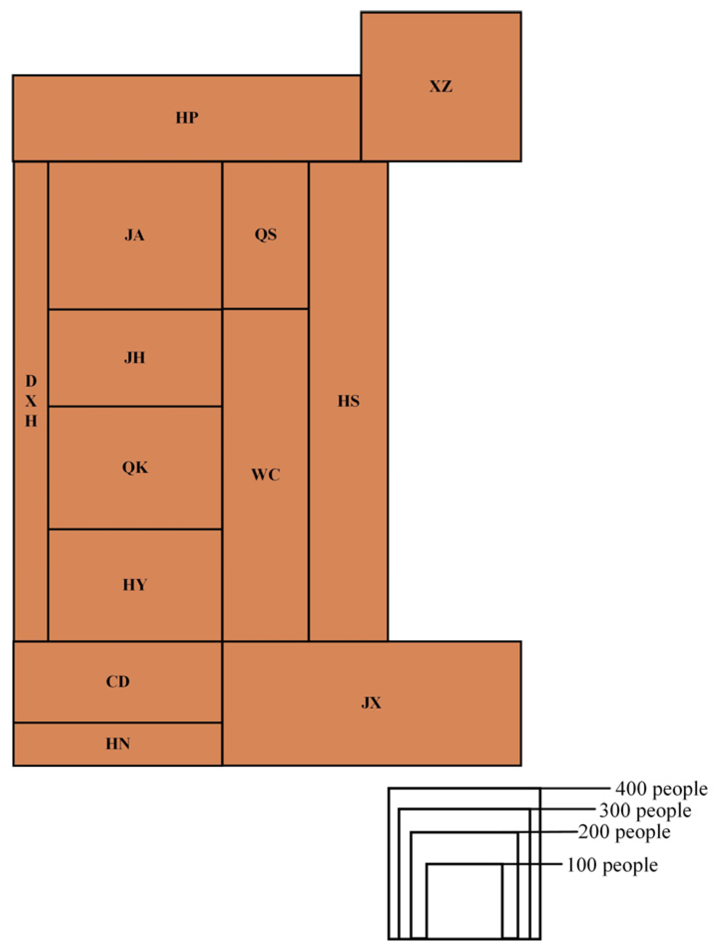
| Comparison | WH-P1 Which district has a higher number of tuberculosis patients: Jiangan (JA) district or Hanyang (HY) district? |
| Spatial localization | WH-P2 Which direction outside of Hongshan (HS) district has the highest number of tuberculosis patients? |
| Estimation | WH-P3 The number of tuberculosis patients in Jiangxia (JX) district is approximately how many times that in Hannan (HN) district? |
| Extrema identification | WH-P4 Which district has the lowest number of tuberculosis patients? |
| Estimation | WH-P5 Please select the three districts with the highest number of tuberculosis patients. |
| Tasks | Question |
|---|---|
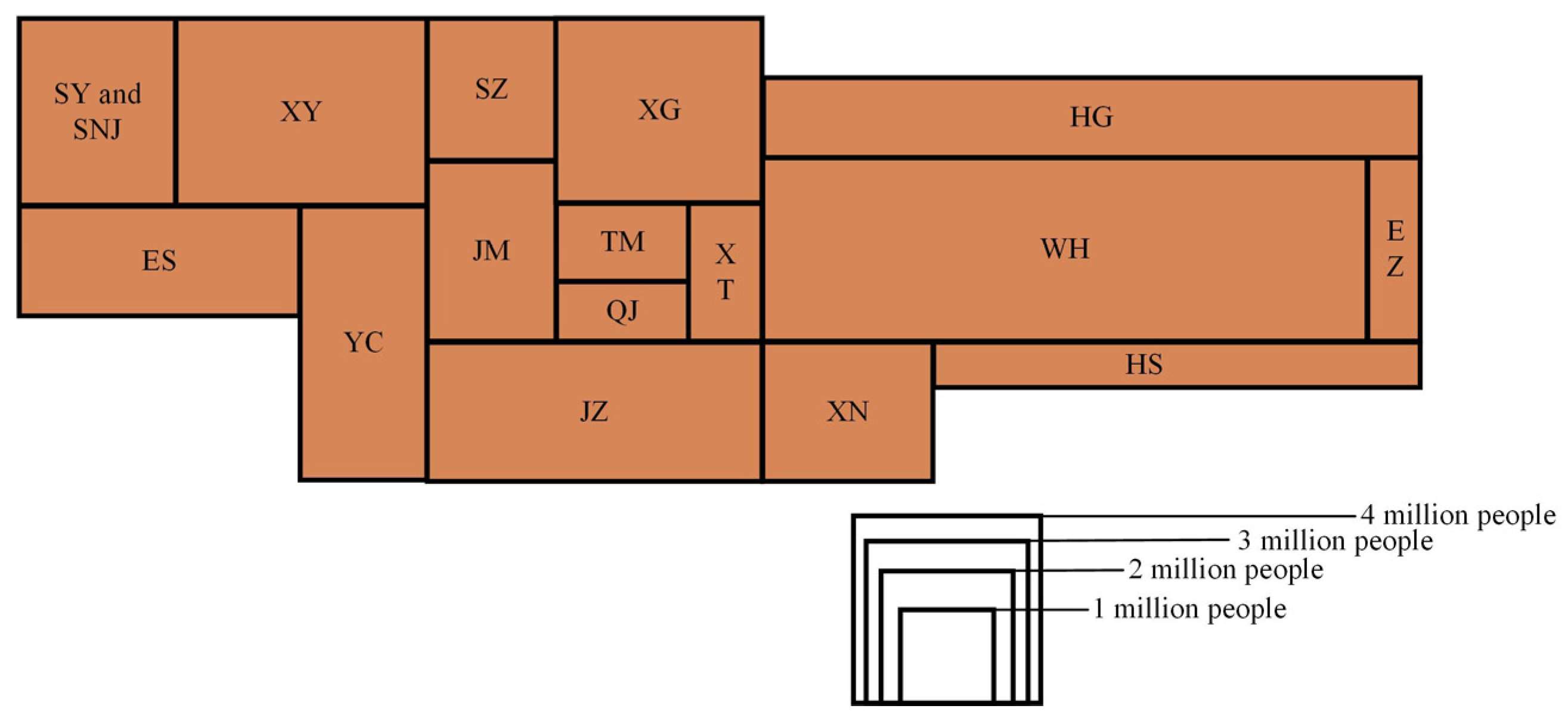
| Comparison | HB-P1 Which region has a larger population: Yichang (YC) or Jingzhou (JZ)? |
| Comparison | HB-P2 Which region has a smaller population: Enshi (ES) or Huanggang (HG)? |
| Extrema identification | HB-P3 Which city has the largest population? |
| Extrema identification | HB-P4 Which city has the smallest population? |
| Spatial localization | HB-P5 Which city is both adjacent to Yichang (YC) and located to the east of Yichang (YC)? |
| Spatial localization | HB-P6 Which of the following cities does not share a direct border with Xiaogan (XG)? |
| Estimation | HB-P7 If Wuhan (WH) has approximately 12 million people, estimate the population of Xiaogan (XG). |
| Tasks | Question |
|---|---|
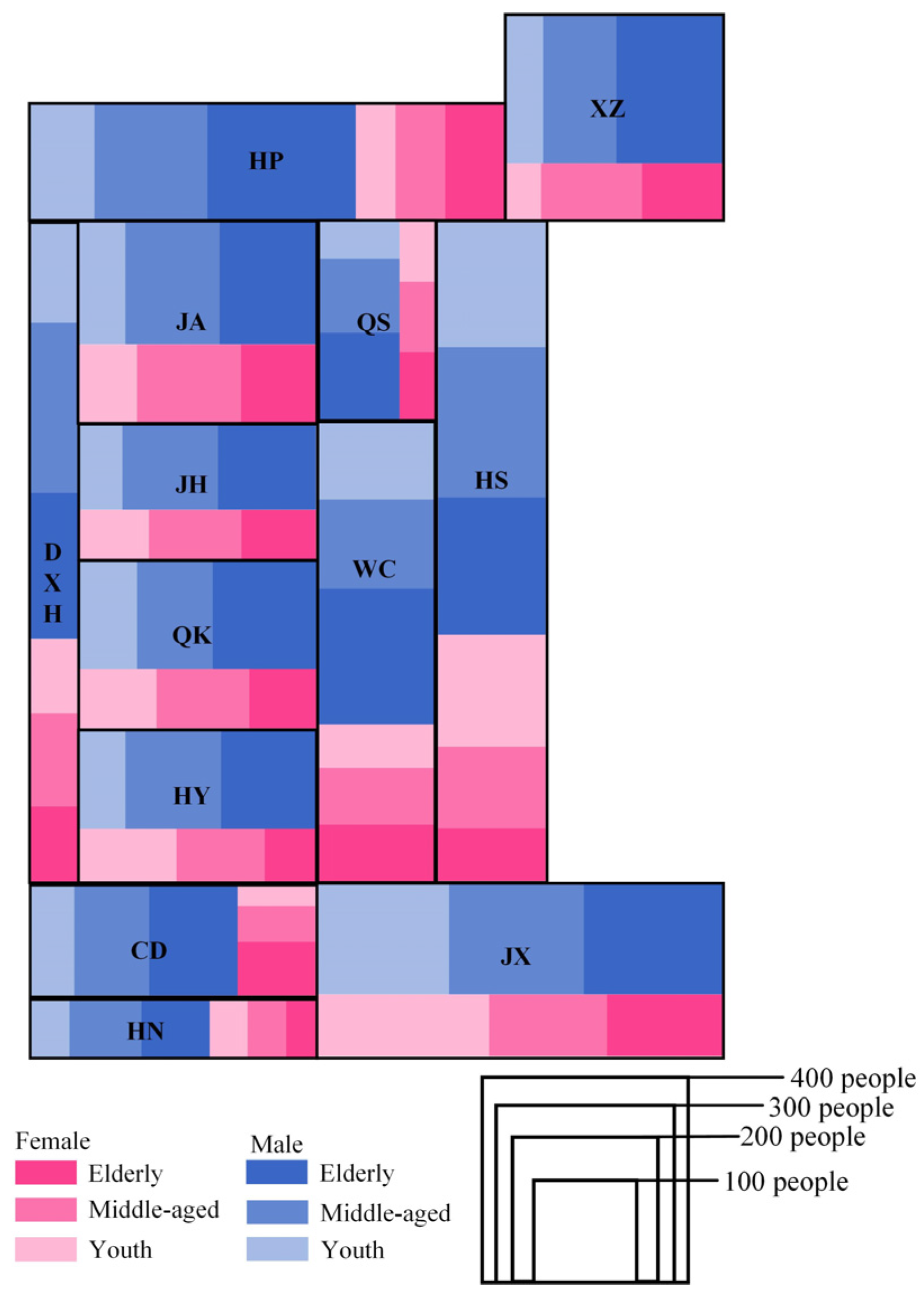
| Extrema identification | WH-Q1 In the male tuberculosis-positive population, which age group has the highest number of patients? |
| Comparison | WH-Q2 Which district has a higher number of tuberculosis patients: Jiangan (JA) district or Xinzhou (XZ) district? |
| Comparison | WH-Q3 Which district has a higher number of elderly male tuberculosis patients: Hongshan (HS) district or Dongxihu (DXH) district? |
| Comparison | WH-Q4 Which district has a higher number of middle-aged female tuberculosis patients: Caidian (CD) district or Hannan (HN) district? |
| Comparison | WH-Q5 Which district has a higher number of young female tuberculosis patients: Qiaokou (QK) district or Hanyang (HY) district? |
| Estimation | WH-Q6 In which district does the proportion of elderly male tuberculosis patients account for the largest share of the total in that district? |
| Tasks | Question |
|---|---|
| Comparison | HB-Q1 Which region has fewer elderly females: Tianmen (TM) or Qianjiang (QJ)? |
| Extrema identification | HB-Q2 Across the entire province, which age group accounts for the largest proportion of Hubei’s total population? |
| Extrema identification | HB-Q3 In the western region of Hubei Province, which area has the largest population of young and middle-aged males (youth + middle-aged)? |
| Estimation | HB-Q4 Based on the visualization, approximately what proportion of Wuhan’s (WH) total population is in the middle-aged group? |
| Estimation | HB-Q5 Based on the visualization, estimate the total male population of Xiaogan (XG). |
Disclaimer/Publisher’s Note: The statements, opinions and data contained in all publications are solely those of the individual author(s) and contributor(s) and not of MDPI and/or the editor(s). MDPI and/or the editor(s) disclaim responsibility for any injury to people or property resulting from any ideas, methods, instructions or products referred to in the content. |
© 2025 by the authors. Published by MDPI on behalf of the International Society for Photogrammetry and Remote Sensing. Licensee MDPI, Basel, Switzerland. This article is an open access article distributed under the terms and conditions of the Creative Commons Attribution (CC BY) license (https://creativecommons.org/licenses/by/4.0/).
Share and Cite
Wang, L.; Yuan, H.; Li, X.; Li, Y.; Zhang, D.; Hu, H. Hierarchical Data Visualization Based on Rectangular Cartograms. ISPRS Int. J. Geo-Inf. 2025, 14, 215. https://doi.org/10.3390/ijgi14060215
Wang L, Yuan H, Li X, Li Y, Zhang D, Hu H. Hierarchical Data Visualization Based on Rectangular Cartograms. ISPRS International Journal of Geo-Information. 2025; 14(6):215. https://doi.org/10.3390/ijgi14060215
Chicago/Turabian StyleWang, Lina, Haoxun Yuan, Xiang Li, Yaru Li, Danfei Zhang, and Haoqi Hu. 2025. "Hierarchical Data Visualization Based on Rectangular Cartograms" ISPRS International Journal of Geo-Information 14, no. 6: 215. https://doi.org/10.3390/ijgi14060215
APA StyleWang, L., Yuan, H., Li, X., Li, Y., Zhang, D., & Hu, H. (2025). Hierarchical Data Visualization Based on Rectangular Cartograms. ISPRS International Journal of Geo-Information, 14(6), 215. https://doi.org/10.3390/ijgi14060215