1. Introduction
In today’s global context, characterized by a growing trend of individuals seeking to explore urban areas outside their native countries, the role of tourist city maps is becoming increasingly pivotal in shaping their experiences. Pictograms are graphical symbols designed to communicate information through illustrative representations [
1,
2], which are usually stylized pictures that portray well-known objects in an analogical or figurative manner [
3]. Pictograms are not universally understood, and their interpretations can vary significantly due to differences in culture, lifestyle, and familiarity with the topic. Therefore, graphic designers must consider these variables to create pictograms that effectively communicate with the target audience [
4], especially in the context of tourist location-based signage solutions.
The investigation in this study is based on tourist city maps with a special focus on the interpretation of pictograms for point-of-interest (POI) that are commonly used in these maps. Tourist city maps are worthy of in-depth study as they offer a combination of aesthetic appeal and practical application in exploration for modern tourists [
5]. To facilitate the successful navigation and orientation of tourists in new destinations, the design of symbols on tourist maps must be effective. The qualities of effective design are closely related to those design types that enable easy detection and clear perception by users. As Andrade and Sluter [
6] report, visual organization on maps influences the detection of pictograms, but specific details of the pictograms’ designs can be critical for ensuring their clear perception. Their work emphasizes the importance of considering the design of pictograms to ensure effective communication, especially in the context of tourist maps with thematic information.
In the current era where accessible tourism and sustainable behavior are being promoted, it is highly recommended that those involved in the development of the tourism industry think about people with special needs [
7]. For example, one study [
8] points to the need to improve signage and the availability of information at tourist destinations to meet the needs of visitors with special dietary requirements or preferences. Accessible and well-designed signage systems could play an important role in enabling these people to travel independently [
9].
Sustainable tourism emphasizes the preservation of local cultures and authentic experiences, directly benefiting environmental conservation and meeting the specific needs of tourists. Unlike mass tourism, which often strains resources and destinations, sustainable practices support the well-being of host communities and protect natural and cultural heritage. A recent study [
10] underlines those consumers who identify themselves as sustainable show a pronounced concern for environmental and social sustainability issues. These consumers also prefer alternative forms of tourism over mass tourism, suggesting a nuanced approach to tourist engagement and the design of tourist city maps that cater to these preferences. Therefore, this study incorporated pictograms that promote environmental and social responsibility and could resonate more with tourists who value sustainability. The intention was to explore how the design and interpretation of symbols on tourist city maps can better align with the values and preferences of sustainable tourists, potentially influencing their navigation choices and overall satisfaction with the tourism experience in urban environments.
In order to offer a practical solution to common issues faced by tourists in urban explorations, tourist maps should be both informative and user-friendly [
11]. Previous research on map symbols [
12] suggests a design methodology that incorporates feedback from various demographic groups to ensure the symbols are comprehensible and accessible to all. This is especially critical for the design of city tourist maps. What differentiates city tourism from other types of tourism is a dense aggregation of varied cultural offerings in compact urban spaces, which attract a diverse range of tourists of different interests and specific needs [
13]. Despite the previous efforts in development of tourism map designs, a lack of POI pictograms in tourist maps that might be useful for the individuals with specific diets, medical needs, and environmentally friendly habits, is one of the gaps that should be filled if we aim to create a sustainability-oriented society.
The studies on tourist signage that have been conducted so far call for continuous enhancements in the field of visual communication to make public pictograms more intuitive and widely accessible [
14]. Efforts should be directed toward the creation of more universally recognizable pictograms to enhance global comprehension, irrespective of linguistic and cultural differences. Consideration must be given to the fact that public pictogram effectiveness is inherently influenced by the context in which they are used. As such, the pictogram design process necessitates a thorough evaluation of any potential constraints that might detract from their efficacy, including the demographic characteristics of target audience [
15,
16]. A study [
17] explored how ethnicity influences perceptions of graphic symbols across different groups, revealing that individuals from different cultural and linguistic backgrounds do not perceive symbols uniformly. This is in line with the results of a study [
18] which underlines the importance of pictograms in facilitating communication and navigation in diverse settings. Such findings highlight the need to design tourist city maps with universally understandable symbols that take into account the diverse backgrounds of users.
Research Questions
Previous research [
19] has underscored the complex influence of culture on the design and comprehension of symbols, highlighting the need for culturally independent symbols in diverse international settings. It suggests that symbols’ cultural dependency must be tested as part of the design process to ensure clarity and effectiveness for a global audience. An example is a study [
20] in which culture was identified as a significant predictor of symbol comprehension.
Building upon the understanding that the cultural context significantly influences users’ perceptions, a study has been conducted comparing Slovenian and Croatian interpretations of visually presented information, focusing on text legibility [
21,
22]. These studies, while shedding light on the cultural influences in text perception, point to the broader question of how these two groups understand pictograms in the context of comprehensibility, noticeability, and attractiveness of POI pictograms on tourist maps. Hence, there is a need for research that integrates these variables with the cultural context to better understand how these differences affect the interpretation of pictograms’ meaning, and potentially influence the pictograms’ design. By analyzing cultural distinctions and lifestyle characteristics, research aimed at creating more suitable POI symbol designs that will enhance user comprehension and satisfaction, addressing the specific needs of modern map users. The following research questions have been formulated:
- RQ1
Are there any differences in the comprehension of new designs for POI pictograms between Croatians and Slovenians?
- RQ2
Do their lifestyle characteristics influence the comprehension of new designs for POI pictograms?
- RQ3
Are there any differences in the evaluation of the effectiveness of new designs for POI pictograms between Croatians and Slovenians?
- RQ4
Do their lifestyle characteristics affect the evaluation of the effectiveness of new designs for POI pictograms?
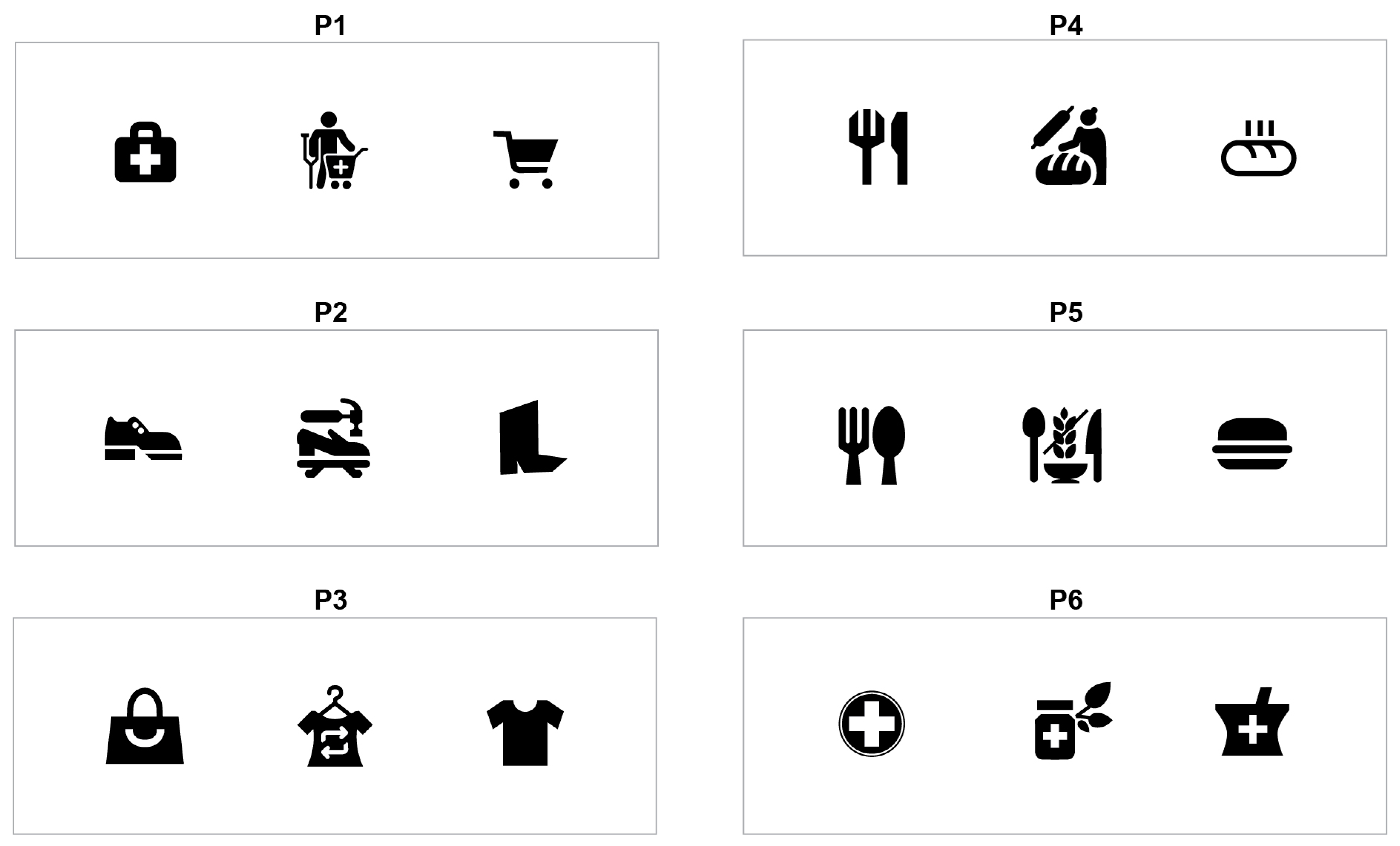
In the research questions, “new designs for POI symbols” refer to authors’ proposed designs for pictograms that have not yet been utilized in tourist city maps. Due to the lack of research-based evaluation of POI pictograms designed for tourists with specific needs in terms of dietary requirements, health-related preferences, and sustainable clothing purchases, we proposed and tested pictograms across three domains: healthcare, food, and apparel. The healthcare domain included POI pictograms for a medical supply store and an herbal pharmacy. The food domain covered POI pictograms for a gluten-free restaurant and an artisan bakery. Lastly, the apparel domain contained POI pictograms for a second-hand clothing store and a cobbler.
Given the significant impact of both the inherent qualities of design and users’ prior knowledge or experience on comprehension [
6], “lifestyle characteristics” have been incorporated into the research questions. This inclusion aims to explore how individual lifestyle factors, such as frequency of travel and service utilization behaviors, might further influence the comprehension score and perceived effectiveness of the proposed POI pictograms.
2. Materials and Methods
2.1. Pictograms’ Design System
We developed visual construction of the pictograms with modular standardized grid method, an approach suggested by Rosa [
23]. In the design of all six pictograms, three fundamental elements were employed: grid, skeleton, and modules (
Figure 1). The skeleton plays a major role in conveying the semantic aspect of the pictograms. Modules offer a method to fill out this skeleton, shaping the pictograms’ form and establishing the graphic style of the design system. The skeleton and modules acted as generating elements of the pictograms, while the grid served to organize and standardize their layout, ensuring consistency across the system [
24]. Some deviations were intentionally introduced within the modular grid components of the pictograms to enhance the clarity and recognizability of the depicted objects.
In the pictogram design process, we endeavored to preserve maximum simplicity, acknowledging that pictograms possess inherent legibility limits and require designs that remain clear when minimized [
25]. This was also in line with Dowse and Ehlers’ recommendation to, whenever possible, select imagery based on recognizable analogies while eliminating unnecessary elements like shading, texture lines, and folds in clothing [
26]. The pictograms were designed in black color, since black pictograms appear to be more effective [
27]. This color choice aligns with practices observed in other studies which included monochromatic pictogram designs [
19,
28].
2.2. Pictograms’ Themes
Figure 2 shows six pictograms that were created for the purpose of the study. They were designed for tourist maps intended for navigation both within the homeland and abroad. The pictograms were directly inspired by the categories (healthcare, food, apparel) outlined in the Introduction section, ensuring that they closely relate to the study’s main themes.
The selection of pictograms for the food domain was mostly based on [
8], which discusses the challenges faced by tourists with food allergies and preferences, emphasizing the importance of understanding these issues within the gastronomy and tourism sectors. Individuals with celiac disease or gluten sensitivity encounter significant barriers during travel, which highlights the need to create a gluten-free food POI pictogram. We also designed the pictogram for an artisan bakery as the second pictogram for the food domain, since consumers are increasingly drawn to snacks that offer a sense of authenticity and a connection to traditional baking techniques, distinguishing them from mass-produced alternatives. Artisan bakeries often use natural ingredients without additives, appealing to health-conscious consumers who are keen on cleaner eating options. Finally, purchasing artisan bakery goods can be considered as a way to contribute to the local economy and reduce environmental impact, given the smaller carbon footprint associated with locally sourced ingredients and smaller-scale production.
Visiting pharmacies and health-related stores is not usually associated with the casual needs of a typical tourist in a new city. However, tourists with specific health conditions or requirements might seek out pharmacies, medical equipment stores, or healthcare providers during their travels for emergency supplies or unplanned medical needs. This is why we designed the pictograms for a medical supply store and an herbal pharmacy. The use of herbal-based products may align with the individual dietary restrictions of tourists, such as veganism or a preference for organic products. It can also be perceived as more sustainable and less reliant on the pharmaceutical industry’s mass production processes.
The pictograms for a second-hand clothing store and a cobbler were selected due to a growing interest in sustainable apparel consumption [
29,
30]. This shift suggests a trend where consumers are increasingly valuing sustainability, leading to practices like buying used clothing and repairing footwear to extend their lifespan.
The motifs for the pictograms were selected based on two primary criteria: (1) the ability to evoke certain associations and (2) the ability to be simplified in form without sacrificing recognizability of their forms.
2.3. Data Collection
We employed an online questionnaire as an instrument for data collection. The rationale for adopting an online data collection approach was based on its ability to efficiently reach a heterogeneous participant group while preserving their anonymity, which facilitates the acquisition of responses that are more likely to be authentic. The online questionnaire approach was also used in recent academic investigations on pictograms in urban tourist areas [
31]. The study was conducted during December 2023 using Microsoft Forms. An online link to access the questionnaire was sent via e-mail using the database of contacts aggregated from all contributing authors.
2.4. Participants
The total number of participants included in the study was 138. The respondents were adults residing in Croatia (n = 87) and Slovenia (n = 51), who agreed to voluntarily participate in the study. The selection of the participants included a wider range of individuals beyond a narrowly defined target group with specific needs. By considering a wider audience, the study aimed to develop designs that are more universally accessible and appealing.
As a preliminary step, all participants provided online informed consent, ensuring their complete understanding of the anonymity guaranteed and the intended use of the collected data. The age range of the entire participant group spanned from 19 to 64 years. The age in the Croatian group ranged from 21 to 64 years (M = 40.45, SD = 14.25) and 81.60% were women. In the Slovenian group, the age ranged from 19 to 64 years (M = 36.29, SD = 16.22) and 68.63% were women.
Drawing on [
32], we included education level queries in the questionnaire to understand the distribution of education levels among our respondents. The educational background of participants was categorized as follows: For Croatian participants, 8.05% finished high school education, 37.93% completed undergraduate studies, 40.23% obtained a master’s degree, and 12.64% had achieved a doctoral degree. A total of 1.15% of Croatian participants held educational qualifications outside the specified categories. Among the Slovenian participants, 37.25% finished high school, 21.57% completed their undergraduate studies, 7.84% obtained a master’s degree, and 31.37% had a doctoral degree, and 1.96% of participants reported educational qualifications beyond the defined categories.
2.5. Questionnaire
The questionnaire started with a series of questions targeting demographic characteristics, including age, gender, educational background, and geographic location. Then, pictogram comprehension was assessed with open-comprehension testing [
33,
34]. Consistent with past research [
35], we used verbal explanations to illustrate the context. For each of the six pictograms, the participants were asked an open-ended question: “Imagine yourself as a tourist encountering this pictogram on a city map during your visit. What do you think this pictogram means? Please enter your response.” The answer was categorized correct if the participant’s interpretation aligned with the intended meaning of the pictogram [
36]. Otherwise, it was categorized as incorrect.
In the case of the pictogram for a second-hand clothing store, interpretations considered correct were “second-hand clothing”, “clothing consignment store”, and “second-hand shop”. For the pictogram representing a bakery with homemade products, interpretations that merely stated “bakery” were not considered as correct. Instead, the response was required to include an additional word emphasizing the homemade or artisan nature of the products. Regarding the gluten-free food pictogram, interpretations deemed correct included “gluten-free restaurant”, “gluten-free dishes”, and “gluten-free offerings”. For the herbal pharmacy pictogram, it was insufficient to interpret solely as “pharmacy”; the response needed to include an additional word emphasizing the herbal nature of the medicines.
The participants also provided subjective evaluations of the pictograms’ effectiveness in terms of their attractiveness and noticeability. Within navigation and signage systems, noticeability is necessary to ensure users can easily and quickly identify signs of particular interest, thereby reducing the cognitive load associated with search tasks. Attractiveness, on the other hand, is important for sustaining user interest and compliance, since aesthetically pleasing elements are more likely to enhance overall system usability. A Likert scale was used for the evaluation, facilitating a quantitative analysis of the data collected [
37]. Each pictogram was assessed individually, with participants rating the pictogram designs’ attractiveness on a 7-point scale, where 1 signified “Unattractive” and 7 was “Very attractive”. There was no time constraint for completing this evaluation. A similar 7-point scale, ranging from 1 (“Not noticeable at all”) to 7 (“Very noticeable”), was employed for assessing noticeability. In this section of the questionnaire, participants were asked to compare the visual prominence of the pictogram against other signs that could be seen in the same image, answering the question: “Compared to other pictograms visible in the image, how noticeable is this pictogram?”. Participants viewed an image where the target pictogram was centrally positioned, flanked by two other pictograms, to assess its noticeability in a comparative visual setting. The selection of these two pictograms was mostly based on a recent study [
38]. Around each pictogram, a minimum spacing that amounts to at least 70% of the pictogram’s largest dimension was maintained. The pictures of the pictograms with surroundings can be seen in
Figure 3.
The last set of questions referred to the frequency of participants’ traveling abroad, usage of digital maps, and engagement with specific services related to apparel, food, and health. The decision to include this variable was based on prior research [
39] indicating that recognition rates for visual representations may vary according to the users’ level of familiarity. The questions were as follows. The travel frequency question posed to participants was: “How often do you travel outside of Croatia/Slovenia?” offering the following response options: “Have not traveled in the last five years”, “Once or more in the last five years”, “Once a year”, “Several times a year”, and “Once a month or more frequently”. The question on city map usage was: “How often do you use city maps, e.g., Google Maps?”, offering the following response options: “Less frequently than once a month or never”, “Once, twice, or three times a month”, “Once a week”, “Several times a week”, and “Daily”. The inquiries concerning engagement with specific services related to apparel, food, and health were as follows: “How frequently do you use the services of a cobbler?”, “How often do you visit second-hand stores?”, “How frequently do you purchase bakery products?”, “How often do you eat gluten-free meals?”, and “How frequently do you buy medications?”. The question on the medical supply store was: “How frequently do you use any medical aids (orthopedic insoles, orthoses, medical braces, ergonomic seating aids, equipment and accessories for blood sugar monitoring, mobility aids, and others)?”. The participants were presented with a set of predefined response options denoting the frequency typical for each of these activities or services (see
Appendix A), allowing for a standardized assessment of their usage patterns.
2.6. Variables
The participants’ correct or incorrect responses on the comprehension tests were used as a dichotomized outcome, serving as the main dependent variable. Two additional dependent variables, the perceived pictogram noticeability and perceived pictogram attractiveness, were quantified using ordinal scale variables.
The participants’ nationality was defined as a binary categorical independent variable, segmented into two categories (Croatia or Slovenia). In this study, the variables capturing participants’ frequency of international travel, digital map usage, and engagement with apparel, food, and health-related services were collectively termed “lifestyle frequency variables”. Responses were collected on a 5-point scale across these variables, each representing a different frequency of usage for a given activity or preference. We took into consideration the dynamic nature of the pictograms’ services; consuming bakery products may occur daily, whereas utilizing cobbler services is typically less frequent. Given the intrinsic differences in the natural occurrence rates of these activities (with some inherently more frequent than others), we undertook a response scaling process to standardize the data across all variables. This was achieved by categorizing the responses into three ordinal levels: 1 (rarely), 2 (moderately), and 3 (often), with specific criteria established for each variable to guide this recategorization. This normalization procedure allowed us to ensure consistency and comparability in the analysis of variables that differ in their baseline frequencies.
For a more detailed description of these categorizations, see
Appendix A.
3. Results
3.1. Comprehension
An interpretation accuracy of 67% is the minimum criterion set by International Organization for Standardization (ISO) for pictogram comprehension to be considered acceptable [
34]. In the analysis of correct responses based on comprehension tests (
Figure 4), our results revealed that three pictograms were accurately interpreted by more than 67% of the participants in both groups. This indicates a notable disparity in the comprehension levels across the different pictograms presented. Detailed examination of the responses from the Croatian group showed a 92.05% accuracy rate for P2, a 67.05% accuracy rate for P5, and 75.00% accuracy rate for P6. In contrast, the remaining three pictograms (P1, P3, P4) did not meet the criteria specified by the ISO standard. Among Slovenian participants, the data revealed a greater number of correctly comprehended pictograms. In addition to the previously mentioned three pictograms (P2, P5, P6) that met the criteria for correct comprehension (98.04%, 80.39%, 76.47%, respectively), this group also correctly interpreted an additional pictogram for the second-hand shop P3 (74.51%). This outcome suggests a slightly higher comprehension level among this group, pointing to subtle differences in visual interpretation skills compared to the Croatian group.
This analysis was further validated by a chi-square test, which confirmed the statistical significance of the observed differences in pictogram interpretation accuracy between the groups. The chi-square statistic was
χ2 = 13.25,
p < 0.001, suggesting that there was a statistically significant difference in the distribution of correct comprehension of the pictogram for the second-hand shop (P3) between the two groups of participants (Croatian vs. Slovenian). Effect size, measured by Cramer’s V, was 0.31, and indicated a medium effect [
40]. The comparisons of the correct responses between the two groups of participants for the remaining pictograms yielded results that were not statistically significant (
Table 1).
In further analysis, the effect of participants’ frequency of traveling abroad (FreqTravel), frequency of using tourist maps (FreqMap), and frequency of using the services specific to each pictogram (FreqSpecificP1–P6) on comprehension was explored by conducting a binary logistic regression, with statistical significance assessed at p < 0.05. The results show that only two variables (FreqTravel and FreqMap) were significant predictors of the correct interpretation only for one pictogram (i.e., pictogram for a pharmacy P6). The frequency of traveling abroad (FreqTravel) was found to significantly predict the likelihood of correct interpretation, (Exp(B) = −0.616, 95% CI [0.39, 0.98], p < 0.005). The findings indicate that individuals who travel more frequently are less likely to understand the meaning of the pictogram for pharmacy, which is contrary to intuitive expectations. The frequency of using tourist maps (FreqMap) was also found to significantly predict the likelihood of correct interpretation of the pictogram for pharmacy (Exp(B) = 1.43, 95% CI [1.03, 1.98], p < 0.005). In the analysis of the remaining pictograms, no variables exhibited statistically significant result.
3.2. Perceived Noticeability and Attractiveness
The Kolmogorov–Smirnov test of normality revealed that the assumption of normality was violated (
p < 0.05), and therefore a nonparametric statistical analysis was used. The Mann–Whitney
U test revealed significant differences between Croatians and Slovenians in terms of perceived noticeability of the pictogram P1 (
U = 1456.50,
p < 0.05,
r = −0.291) and P2 (
U = 1638.5,
p < 0.05,
r = −0.221), indicating diverse noticeability evaluations across these groups (
Table 2). However, no significant differences were found for the pictograms P3, P4, P5, and P6 (all
p > 0.05), suggesting a uniform perception of noticeability across these pictograms among both groups. Regarding the differences between Croatians and Slovenians in perceived attractiveness evaluations, no statistically significant findings were detected, except in the case of P2 (
Table 3).
To test whether the participants’ lifestyle frequency variables had an effect on their ratings for the pictograms’ noticeability and attractiveness, separate tests were conducted with participants’ frequency of traveling abroad (FreqTravel), frequency of using tourist maps (FreqMap), and frequency of using the services specific to each pictogram (FreqSpecificP1–P6) as independent variables, while perceived noticeability and perceived attractiveness were used as dependent variables.
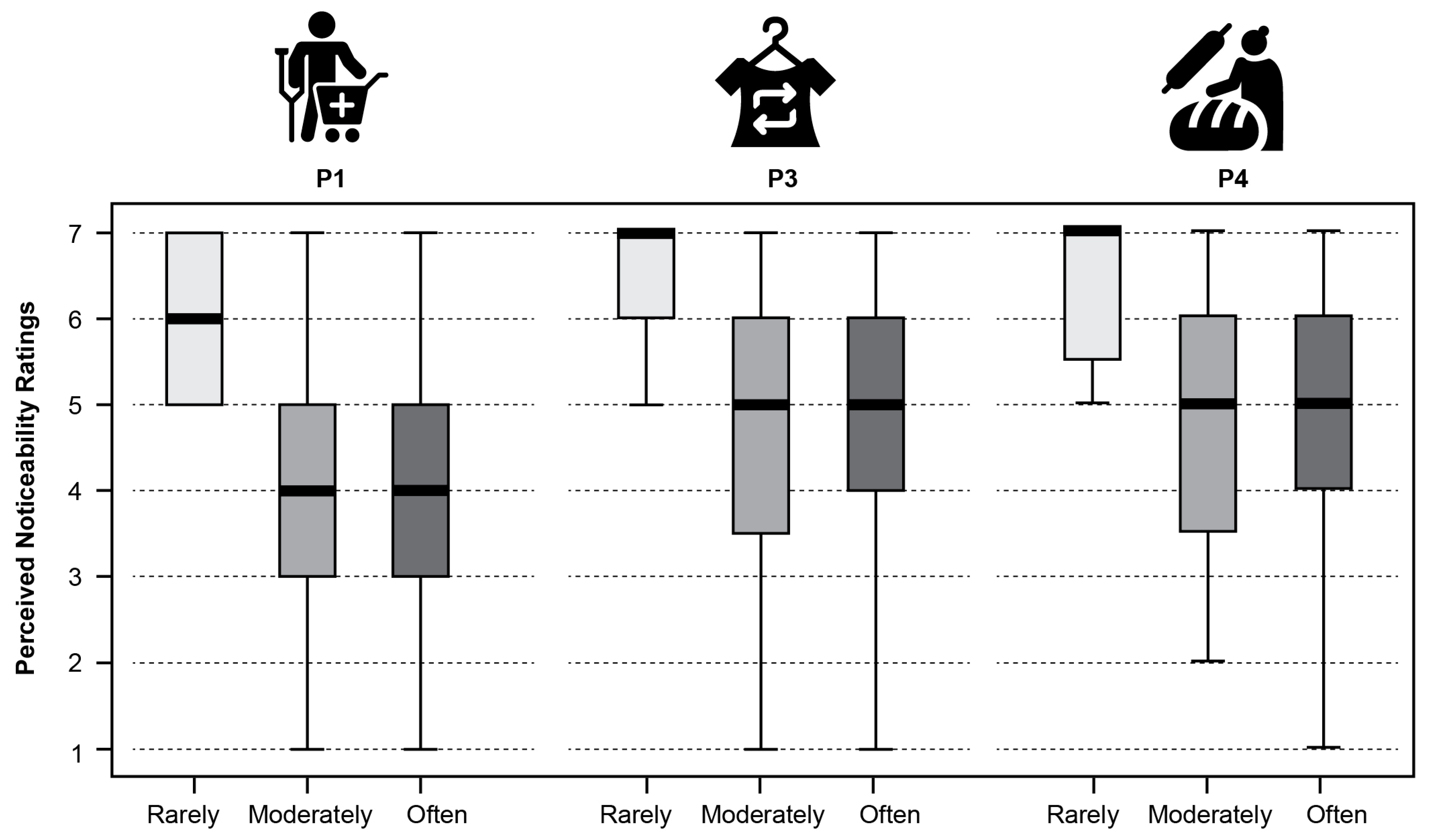
The Kruskal–Wallis test revealed that the effect of the participants’ frequency of traveling abroad (FreqTravel) on the perceived pictogram noticeability was statistically significant for P1,
χ2 (2) = 16.62,
p < 0.01, P3,
χ2 (2) = 10.13,
p < 0.05, and P4
χ2 (2) = 8.32,
p < 0.05. Additional multiple post hoc analyses were performed. The results of the Mann–Whitney
U test revealed a statistically significant difference in the perceived noticeability of pictogram P1 between those who travel abroad rarely and those whose travel frequency is moderate (
U = 1456.50,
p < 0.05,
r = −0.291) with those who travel often (
U = 100.00,
p < 0.05,
r = −0.288). A statistically significant difference in the perceived noticeability between those who travel abroad rarely and those whose travel frequency is moderate (
U = 70.50,
p < 0.05,
r = −0.229) with those who travel often (
U = 110.50,
p < 0.05,
r = −0.278) was also found for pictogram P3. Similar results were found for pictogram P4, indicating a significant difference in the perceived noticeability between the participants who travel abroad rarely and those whose travel frequency is moderate (
U = 63.50,
p < 0.05,
r = −0.244) with those who travel often (
U = 147.50,
p < 0.05,
r = −0.233).
Figure 5 illustrates the median values across these conditions.
When examining the variables related to the frequency of usage of the specific service associated with the presented pictogram, only the frequency of purchasing medical aids (FreqSpecificP1) had an impact on the perceived noticeability of the pictogram for medical supply store P1 χ2 (2) = 6.26, p < 0.05. The Mann–Whitney U test revealed a significant difference in the perceived noticeability of this pictogram between those who buy medical aids rarely and those who buy it often (U = 580.00, p < 0.05, r = −0.214).
Regarding the second dependent variable which measured the pictogram perceived attractiveness, only pictogram P5 (a gluten-free restaurant) yielded statistical significance, χ2 (2) = 7.49, p < 0.05. The Mann–Whitney U test revealed a significant difference in the attractiveness rating for this pictogram between the participants who eat gluten-free food moderately and those who eat it often (U = 1095.00, p < 0.05, r = −0.222).
4. Discussion
The objective of this study was to evaluate the effectiveness of new POI pictograms designed for tourists with specific needs (such as dietary requirements, health-related preferences, and sustainable clothing purchase) in two cultural groups. To achieve this, a comprehension test was conducted in accordance with ISO standard, subsequently accompanied by an assessment of the attractiveness and noticeability of each pictogram. Furthermore, the analysis incorporated factors related to the travel habits of the participants, as well as their frequency of using services that are specific to each pictogram.
The findings shed light on the comprehension of new designs for POI pictograms, directly addressing our first research question (RQ1) regarding the differences in pictogram interpretation between Croatian and Slovenian participants. Specifically, Slovenians showed slightly better comprehension, as they correctly interpreted one more pictogram (i.e., second-hand clothing store) than the Croatians. Among the Croatian group, three pictograms (a cobbler, a gluten-free restaurant, an herbal pharmacy) were correctly interpreted, while the remaining pictograms fell short of the ISO standards. Conversely, the Slovenian participants not only met but exceeded these standards for an additional pictogram, underscoring subtle differences in visual interpretation skills. Some parallels can be drawn with a previous Jentsch’s work [
41]. Despite minor variations, the overall understanding across diverse language groups in his study indicated that pictograms can effectively communicate essential information across cultural boundaries.
Our results further indicate that both groups of participants demonstrated a remarkably high level of accuracy (over 90%) in interpreting the pictogram for a cobbler, while the pictogram for a medical supply store was notably low in comprehension (around 10%). This high contrast in comprehension rates can be logically attributed to the universal and timeless nature of the cobbler symbol. It seems that the pictogram with a symbol for a cobbler, characterized by familiar imagery such as a shoe or repair tools, activates almost instinctive recognition that is common across different cultural backgrounds. The case with the medical supply store pictogram presents a contrary phenomenon. This pictogram may lack commonly encountered visual symbols, leading to its significantly lower comprehension rates, which can be explained by the fact that only a small percentage of our study’s participants (21%) are users of specialized medical aids. A study [
20] on interpretation of healthcare symbols within a multicultural community revealed healthcare symbols prove more challenging to understand compared to symbols used for general purposes. Furthermore, compared to the other pictograms in the study, this one represented the most complex information. Given the challenges associated with conveying highly complex concepts through pictograms, as highlighted in prior research [
37], it is plausible to assume that the creation of a pictogram for such concepts could present considerable difficulties. This is particularly true in cases where pictograms are presented without any real-world context [
33].
Regarding our second research question (RQ2), which referred to the influence of the participants’ lifestyle characteristics on the comprehension, we found that only the comprehension of pictogram for an herbal pharmacy was influenced by the participants’ personal frequency variables. Contrary to expectations, individuals who travel more frequently showed a lower likelihood of understanding this pictogram. This suggests that experience with diverse cultural environments may not always enhance comprehension of pictograms. On the other hand, the significant relationship between the frequent use of tourist maps and the correct interpretation of the pharmacy pictogram suggests that individuals who interact with various types of information aids, like maps, enhance ability to understand and interpret this pictogram. Our result is in line with a previous study on point symbols used in navigation apps [
42], which concluded that those symbols which represent frequently searched objects like pharmacies and ATMs were correctly identified by a majority. Another study [
43] also found that experience with specific symbols significantly influenced comprehension.
The remaining research questions focused on the pictograms’ effectiveness in terms of perceived attractiveness and noticeability. In the analysis of perceived attractiveness, the study found no statistically significant differences between Croatian and Slovenian participants. The exception was the pictogram for a cobbler, which achieved better evaluations by Croatians. This indicates that the aesthetic appeal of the pictograms received largely uniform evaluations across the two groups. This outcome is somewhat surprising, considering the work by other authors in the broader domain [
19] which suggested that culture can shape people’s aesthetic judgements. Our research showed this influence to be minor and only found in one particular case. Additionally, some differences between Slovenians and Croatians were found regarding the perceived noticeability of pictograms, addressing our third research question (RQ3). Slovenians considered pictograms for a cobbler and a medical supply store to be less noticeable. Therefore, to better engage Slovenian tourists, it would be beneficial to enhance the visual prominence of these particular pictograms by using more vibrant colors or larger, more distinctive shapes [
44].
Finally, our study has answered our last research question (RQ4). The analysis identified a clear pattern across three pictograms (i.e., a medical supply store, a second-hand clothing store, and an artisan bakery), showing that the frequency of travel abroad significantly influences their perceived noticeability. In contrast to those who travel moderately or often, individuals who travel rarely perceive these pictograms as more noticeable. Similarly, people who rarely purchase specific medical aids also rated the pictogram for a medical supply store as more visible. Regarding the attractiveness, only one pictogram was influenced by a single frequency variable. Participants who often use maps were more critical in evaluating the attractiveness of the pictogram for a gluten-free restaurant. This could be attributed to their higher expectations for design appeal since they might develop a refined sense for visual details, making them more sensitive to visual shapes. Indeed, this can be linked to the academic literature [
45] which emphasizes that it is possible to create maps that are both aesthetically pleasing and functionally effective by making careful stylistic choices. It appears that such a level of quality in design is today a standard expectation among modern map users.
5. Conclusions
By comparing pictogram comprehension levels, our analysis contributes to a deeper understanding of how cultural differences may influence the interpretation of location-based signage solutions. Even though the differences might appear minor, they could be relevant for designing easily comprehensible pictograms, aiming for clarity and inclusivity in communicating information across diverse audiences. This is crucial for effective tourist navigation and enhanced experience. To a certain degree, the findings of our study suggest that designers and policymakers should integrate multicultural perspectives in the development of signage to cater to a global audience.
Still, there is the need for further research to refine and expand upon our initial findings. The main limitation of our study could be the diversity and size of the participant pool, which may not fully represent the wider population’s experiences and perceptions, potentially limiting the generalizability of the findings. Another limitation might be the focus on only two cultural groups (Croatians and Slovenians), which could overlook interpretations from a broader range of cultures. Future studies could focus on a broader set of cultural contexts and incorporate a wider range of user individual variables to fully understand the global applicability of pictograms in tourist navigation.
While our study has limitations, it provided at least some adequate location-based signage solutions with a focus on the tourists with specific needs in terms of dietary requirements (i.e., the pictogram for a gluten-free restaurant), health-related preferences (i.e., the pictogram for an herbal pharmacy), and sustainable clothing decisions (i.e., the pictogram for a cobbler), which have the potential to encourage sustainable tourist behaviors. This approach not only improves the usability of pictograms but also supports sustainable tourism practices by promoting informed choices among modern tourists.


