Article

Effectiveness of Rectangular Cartogram for Conveying Quantitative Information: An Eye Tracking-Based Evaluation

School of Geospatial information, Information Engineering University, Zhengzhou 450052, China
*
Author to whom correspondence should be addressed.
ISPRS Int. J. Geo-Inf. 2023, 12(2), 39; https://doi.org/10.3390/ijgi12020039
Submission received: 22 October 2022 / Revised: 15 January 2023 / Accepted: 17 January 2023 / Published: 28 January 2023

Abstract

:
A rectangular cartogram is a kind of graphical representation that uses a rectangular area to represent the attributes of geographical objects and is widely used in the representation of statistical data such as population, economic statistics, and epidemic distribution. However, there is currently little research on the effectiveness of rectangular cartograms for conveying quantitative data. In this paper, the rectangular cartogram and unclassed choropleth map are compared to evaluate the rectangular cartogram’s effectiveness in quantity representation through task-driven eye-tracking cognitive experiments. In addition, the accuracy and efficiency of information communication and the differences in the reading processes of map readers when using the two types of maps for different tasks have been analyzed to provide references for more effective use of rectangular cartograms in the future. The main contributions of this paper are: (1) it has been proven by experiments that when completing the four tasks of locate, compare, find extreme, and estimate, the participants have higher accuracy rates with the rectangular cartogram; (2) the reading process shown by the eye tracking experiment shows that the more complex the task is, the more patient the participants would be with the rectangular cartogram, and the more pronounced the advantages of the rectangular cartogram are.

1. Introduction

A cartogram, or value-by-area map, is a representation of a map where geographic regions are modified to reflect a statistic such as population or income [1]. Rectangular cartograms are a branch of cartograms that can be traced back to the 1880s, and it was not until 1934 that Raisz [2,3] first described the rectangular cartogram. The rectangular cartogram uses a simple rectangle to represent the outer boundaries and areas with complex outlines on the map, which eliminates the differences caused by geographic boundaries, provides space for the display of data characteristics, and helps to identify the differences in thematic data. For example, Raisz [2] used a rectangular cartogram showing the land surface of the geographical divisions of the census, and the New York Times [4] shows the election results of 2006 using some nice interactive maps and rectangular cartograms.
Rectangular cartograms excel at novel expressions, high data resolution, fast difference recognition, and topological relationship expression, but it also has the disadvantages of large regional deformation, difficult identification, too many topological errors, and complex generation methods [5]. As a result, the effectiveness of the rectangular cartogram is often questioned. Currently, the research on the effectiveness evaluation of cartograms mainly falls into two categories: usability differences between cartograms and traditional maps [6,7,8], and task-oriented performances of different types of cartograms [9]. In the first category, rectangular cartograms were rarely used as research objects and thus leaving some unresolved issues in the understanding of the effectiveness of rectangular cartograms. As for the second category, Nusrat et al. [9] verified the effectiveness of four cartograms (i.e., contiguous, non-contiguous, rectangular, and Dorling cartograms) in terms of topological accuracy, geographical accuracy, and statistical accuracy, which was learned from subjective preference tests. The results revealed that the rectangular cartogram showed low geographical and statistical accuracy levels and subjective preferences. However, some of its quantity-related experiments suggested that rectangular cartograms also have some advantages. Cartograms are called precise maps [6] because thematic data are not graded. Therefore, it raises the question of whether a rectangular cartogram may better convey quantitative information in thematic data than other thematic map.
Previous research often used classed choropleth maps to evaluate cartograms’ effectiveness. However, classed choropleth maps are designed to express graded and relative data rather than absolute data, which makes them unsuitable for evaluating the effectiveness of quantitative information transmission. To remedy such shortage, Waldo Tobler [10] proposed unclassed choropleth maps to express absolute quantity. Although some controversy exists about unclassed choropleth maps, experimental studies show that they can express absolute data more accurately [11,12,13]. Therefore, this paper uses unclassed choropleth maps to reference cartograms and compares their effectiveness using eye-tracking based evaluation. In particular, we are interested in the following questions:
(1)
Would a rectangular cartogram outperform an unclassed choropleth map regarding the efficiency of quantity recognition and transmission?
(2)
Do map readers have the same reading process for the tasks involved with these two maps? If not, what are the main differences, and what map characteristics can be revealed by them?
To answer the above two questions, this paper focuses on the effectiveness of rectangular cartograms and unclassed choropleth maps in various tasks of conveying quantitative information. Therefore, our task-oriented research may deliver more actionable insights for potential uses of rectangular cartograms. At the same time, this paper employs the eye-tracking technique for the comparative study, which can reveal detailed reading behaviors and strategies of map users. Furthermore, such observations enable an understanding of the effectiveness of the two different graphical representations in quantity expression to provide a reference for better design and effective use of rectangular cartograms.

2. Related Works

2.1. Cartogram and Evaluation of Its Effectiveness

The core idea of a cartogram is to highlight specific attributes of geographical objects by simplification and deformation [1]. A rectangular cartogram is a simple continuous cartogram in the value-by-area map. It takes a rectangle as the basic unit and uses the area of the rectangle to express a specific attribute value of a geographic object.
Although there are very few studies on the effectiveness of rectangular cartograms, the studies on the effectiveness of other types of cartograms provide a valuable reference for our study. Using the pseudo cartogram as an example, Griffin [14] analyses location recognition of regional units in ordinary maps and unmarked cartograms. Dent [6] compares readers’ estimation of quantity in hierarchical circular maps and mosaic cartograms using a questionnaire, which shows that readers tend to overestimate the quantity in the hierarchical circular map while tending to underestimate it in the mosaic cartogram. Sun et al. [7] also use a questionnaire survey to compare the effectiveness of choropleth maps and contiguous cartograms when expressing population data. The results show choropleth maps are more effective in expressing population data. Zhou et al. [15] analyze the effectiveness of thematic maps and four types of cartograms in expressing GIS attribute information. The results show that the pseudo cartogram is the best, followed by the thematic map, continuous cartogram, discrete cartogram, and Dorling cartogram. Kaspar et al. [8] investigate the effectiveness of continuous cartograms and choropleth maps with a graduated circle representation method for spatial reasoning through a usability test. The results exhibit significant differences in people’s reasoning performance with different maps. In these studies, the most commonly used thematic representations are the choropleth map and proportional symbol map to compare with the rectangular cartogram.
Some scholars have used questionnaires in map evaluations by comparing users’ task completions and analyzing the characteristics of various types of cartograms regarding information transmission. Krauss [16] explores the effectiveness of discontinuous cartograms in information transmission through three evaluation tasks (from general to specific), the results of which suggest that discontinuous cartograms have a better effect in expressing overall distribution information but is not good at expressing specific information (such as numerical ratios between different regions). Sabrina Nusrat et al. evaluate the effectiveness of four types of cartograms, namely contiguous, non-contiguous, rectangular, and Dorling cartograms, by quantitative analysis through seven visualization tasks (e.g., compare, detect change, locate, recognize, find adjacency, summarize) and a survey of subjective preferences of map readers through a questionnaire [9]. Sabrina Nusrat et al. [17] also compare the differences between contiguous cartograms and Dorling cartograms in recall and recognition. These studies suggest that there was a correlation between the type of cartogram and the task for which it was intended. Moreover, careful analysis of what might be faced in different tasks and the effectiveness of different charts in different situations can lead to more convincing findings and facilitate better use of the cartograms.
Eye tracking is one of cartography’s most objective and valuable tools [18,19], mainly used to facilitate research on map design and usability evaluation [20]. For map design, eye tracking is used to derive quantitative measures of the perception of map visual variables [21], label density [22], etc. Moreover, for usability evaluation, eye tracking is used to evaluate the effectiveness of different types of maps (e.g., flow maps [23], weather network maps [24]), the effectiveness of the graphic user interface [25], the impact of particular factors on the map reading task [26], etc. These studies have had a substantial impact on map design development, often leading to a plausible cognitive understanding of map design choices. Unfortunately, very few studies have evaluated the effectiveness of cartograms using eye tracking.

2.2. Graphic-Based Quantity Perception

Quantity perception refers to a broad range of information, including discrete quantity (e.g., number) and continuous quantity (e.g., object size, area, illumination, time) [27]. Relevant studies show that the numbers used for counting in the human symbol system are generally related to size, area, brightness, and other continuous indicators [28]. If physical size and conceptual size (mental image) are coordinated, such as a large size (area) corresponding to large numbers, it will contribute to quantity perception, which is called the size coordination effect; conversely, if a large size (area) corresponds to a small number, it will reduce the efficiency of perception [29]. Moreover, psychologists have long recognized that physical size (area) and mental image are unequal, but there is a certain quantitative relationship. Stevens proposed the law of the index relationship between physical stimuli and sensory quantities. Based on this theory, Martha Teghtsoonian [30] analyzes the perception of size variables and points out that area perception is more complicated than length. Ekman et al. [31] and Crawford [32] concluded that the index of the area of a square is approximately close to 1. However, these conclusions are drawn with basic anchor shapes, and the participants report their perceptions by watching shapes with different sizes rather than reading an actual map. Moreover, most of these studies focus on the regular shapes of circles, squares, and triangles, while there is little research on rectangles.
There are very few related studies on the quantitative expression and transmission of cartograms. Only Dent [6] has compared the difference in the number of expressions between the pseudo-cartogram and the divisional pie chart method. Furthermore, although the geographical location of each unit in the pseudo-cartogram is closer to normal maps, the edge of the polygon is more complex than that of the rectangle. As a result, the conclusion reached in the research could not be directly used for rectangular cartograms.

3. Experiment

3.1. Tasks

Nusrat and Kobourov proposed ten tasks for cartogram study and analyzed each task using four indicator categories and 14 indicators [1]. The four indicator categories include goals, means, characteristics, and cardinality. Among Nusrat et al.’s ten tasks, we select locate, compare, find extremum, and identify as the basic tasks to study the quantity expression of rectangular cartograms and unclassed choropleth maps. Here, identify means a search for attributes or characteristics of a single object. In this paper, we concretize the identify into estimate task. In terms of task objectives, these four tasks cover the “query”, “exploration”, “search” and “extraction” in “goals”, but do not involve “present”. The reason is that “present” forms an overview of thematic data through integrated calculation, which is beyond the research objectives of this paper. Regarding the item “means”, these four tasks involve “data (geographic) relationships”, “navigation”, and “derive”, but not “map relationships”. The “map relationship” refers to the corresponding relationship between the same object on the cartogram and the traditional map, focusing on the correspondence between the graphics and having nothing to do with the quantitative expression. In terms of “data characteristics”, these four tasks involve both “low-level characteristics”, which could be directly observed from expression and “high-level characteristics” that need to be obtained through interference. In terms of “cardinality”, these four tasks involve observation and interference for “single”, “multiple”, and “all targets”.

3.2. Hypotheses

According to the selected tasks and the characteristics of the rectangular cartogram, this paper proposes the following four hypotheses:
  • Locate: to search for and find the location of an area within a given thematic map. From the perspective of the reading process, the Locate task requires searching the whole map to find the area matching the target. Different search strategies will affect the efficiency and accuracy of localization. For example, the regular shape of a rectangular cartogram might be helpful for users to search according to a certain plan. Therefore, we propose the first hypothesis, H1: the regular view of rectangular cartograms is more efficient than unclassed choropleth maps in finding the target in terms of locating.
  • Compare: often used to sort and evaluate [33]. Compare task requires identifying similarities or differences between attributes. Therefore, they must observe both targets simultaneously and compare them according to specific requirements. Since the simple shape of a rectangular cartogram is convenient for comparison, the second hypothesis is given as H2: the simple shape of a rectangular cartogram would be helpful for the recognition of differences.
  • Find extremum: as a common task in visualization, it requires finding extreme values and performing value ranking. Finding the extremum requires a comprehensive exploration of the data expressed in the map. According to the size coordination effect, the rectangular cartogram directly reveals the characteristic of data by its area, which is in accordance with the cognitive process and asks less of the users’ thinking process. The third hypothesis is given as H3: the rectangular cartogram can outperform the unclassed choropleth map in finding extremum.
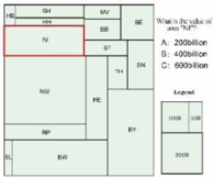
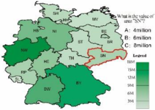
  • Estimate: estimate the value of the area shown in the red-outlined area according to the legend and select the correct answer from the given options through repeated comparison and analysis. This task aims to analyze the accuracy and applicability of statistical data expressed in thematic maps. Since the area estimation and inference are more intuitive, the fourth hypothesis is given as H4: the rectangular cartogram is more accurate and precise than the unclassed choropleth map in the thematic value estimation.

3.3. Participants

We recruited 90 participants from our institute. Of those, 74 were male and 16 were female, with ages ranging from 18 to 40. Since all participants are majoring in surveying and mapping, we impose no restrictions on their majors. After the inquiry, participants familiar with unclassed choropleth maps but not familiar with cartograms or German and Italian conditions were selected for the experiment. There were few influences caused by knowledge backgrounds. All students have undergone physical examinations before experiments, excluding color blindness, color weakness, and so on.

3.4. The Experimental Maps

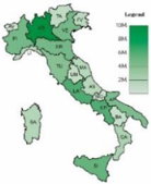
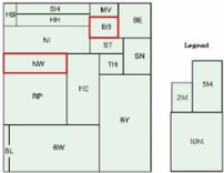
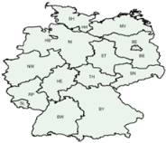
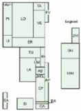
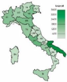
The populations and GDPs of Germany and Italy in 2016 are used as the thematic data. Thematic data is from the Wikipedia mirror site, and administrative division data is from https://www.naturalearthdata.com (accessed on 5 January 2020). Ten experimental maps are made, including five rectangular cartograms and five unclassed choropleth maps (see Table 1).
These five rectangular cartograms are designed using Wang’s algorithm [5], which automatically constructs a cartogram through an iterative optimization process. The algorithm first proposes an initial rectangular partition of the map. Then it moves the common edges in the partition iteratively to minimize the areal difference between the resulting areas and the target areas. The algorithmic process ends when the number of steps or the objective values reach the specified threshold. Finally, the areas of the rectangle in the cartogram are specified proportionally to their corresponding thematic value compared to the total sums.
The unclassed choropleth maps were made by assigning proper colors according to the thematic values. To facilitate the estimate task, we establish a linear correspondence between these two values and choose darker colors for larger thematic values. In addition, the colors are chosen carefully to provide noticeable and comfortable visual stimuli to accommodate human perceptions. Therefore, we choose CMYK color mode and a green hue, with M = 0, K = 10, and C = Y that are specified linearly according to the given thematic values. Taking the German regional population as an example, Figure 1 illustrates the corresponding relationship between the population and color of the studied administrative divisions in Germany. In the color correspondence, the value range C is set to [15, 100], which corresponds to a population of [0, 180 million] (the maximum regional population in Germany is 178 million).

3.5. Procedure

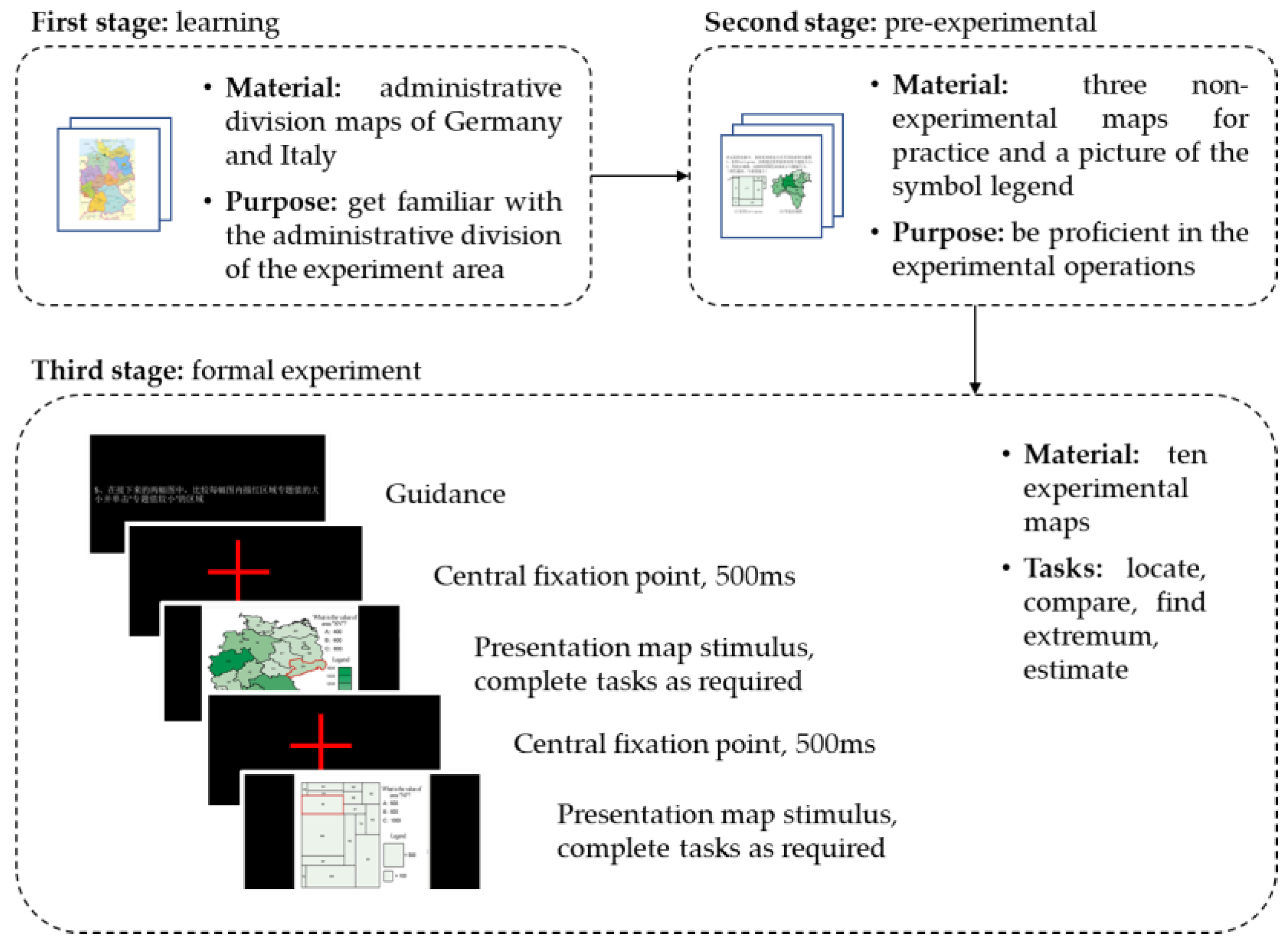
The experiment was conducted with a Tobii X320 desktop eye tracker. The Tobii Studio 2.0 software and IBM SPSS statistics 25 were used for data collection and analysis. The experiment adopted binocular tracking, the sampling rate was set to 120 Hz, and the sampling precision was 0.5. The whole experiment was carried out in our university’s library, and the experiment’s ambient lights were white LED lights. The experimental material was presented on a DELL liquid crystal display with a resolution of 1280 × 1024. The participants were asked to keep their eyes about 60 cm away from the screen while remaining within the recognition distance of the device. Figure 2 illustrates the procedure of the experiment.
The experimentation process included three stages. The first stage was learning. The participants were asked to learn the administrative division maps of the two countries to become familiar with the administrative division of the experiment area.
The second stage was pre-experimental. The primary purpose of the pre-experiment was to familiarize the participants with the experimental procedure and operation, thus eliminating the initiation effect of the eye-movement experiment. The maps used in the pre-experimental phase included one picture of the symbol legend and three map practice materials (non-experimental materials) to ensure that the participants could be proficient in the experimental operations. The pre-experimental process mainly consisted of the following steps: (1) eye calibration of the participant; (2) practicing the operations. During the pre-experimental stage, the participants were encouraged to ask as many questions as possible to understand the task better.
The third stage was the formal experiment. The formal experiment adopted the single-task control experimental design. As shown in Table 1, there were four experimental tasks corresponding to the above four hypotheses, but the number of questions to be answered in each task was different. The locate task corresponds to H1, which requires answering one question, i.e., following the cues to find the corresponding area; the compare task corresponding to H2, which requires answering two questions, i.e., selecting the area with the largest and smallest thematic value in the red-outlined area; the find extremum task corresponds to H3, which requires answering four questions, i.e., finding the largest and smallest area and the largest and smallest thematic data; the estimate task corresponds to H4, which requires answering one question, i.e., enter the estimated value for a specified area. These five sets of experimental maps made up nine sets of comparison experiments. Each group of experimental maps included two maps of the same country, but with different themes, which helped to eliminate empirical problems between the former and the latter map. For example, the German population theme and the German economic theme formed a set of comparative experiments to complete the same experimental participant. Population and economy are generally positively correlated, so the data for the two topics were different without producing changes that would affect the experimental results. The orders of maps have been changed from time to time to balance the order effect.
The participants participated in the experiment individually and watched five groups of map pictures corresponding to different experimental tasks. Each group of maps appeared randomly, and maps within the group (i.e., a rectangular cartogram or unclassed choropleth map) also appeared randomly. There would be prompt words before presenting the maps. The participants need to follow these words to find the target area and confirm immediately with a left click. The experiment process was as follows: (1) one question was displayed on the screen, and the participants clicked the mouse to switch pages after understanding; (2) map material 1 was displayed on the screen, and the participants found the target area according to the requirements of the question and clicked the left mouse button to complete the answer to this question; (3) the screen switched to the next question, and the participants repeated steps (1) and (2) until the end of the experiment.

3.6. Data Collection and Pre-Processing

All 90 participants recruited have finished experiments and produced 90 sets of experimental data. However, due to the participants’ head movement, eye fatigue, or other physiological reasons, there were some problems like low sampling rates and failures in eye-tracking device recording. Eventually, the eye movement data with a sampling rate below 60% and invalid data were eliminated, and 48 valid samples were collected.. Among them, 41 were male and seven were female; 25 were between 20–24 years old, 13 were between 25–28 years old, and 10 were over 29 years old; 11 were undergraduates, 28 were postgraduates, and nine were Ph.D. students.
The target area corresponding to the question was designated as an AOI (area of interest) on each map. The eye-tracking parameters and behavioral parameters within the AOI area were examined quantitatively. At the same time, the mouse options were counted as the results of the questionnaire. The independent variables in the experiment were the types of graphical representations, i.e., rectangular cartogram and unclassed choropleth map; the dependent variables were each eye tracking index and behavioral parameter recorded by the eye tracking device. The eye tracking index included the first entry time, total fixation duration, and visit count in each AOI; the behavioral index was the time to the first mouse click, and in some experiments, the correct rate of answering questions was also included.
Usually, the shorter the first entry time, the faster the AOI attracts visual attention; a longer total fixation duration means that it takes longer for the reader to interpret the information about this AOI and memorize it; the visit count in each AOI is used to measure the reader’s attention to the AOI [20]. In this experiment, if the first entry time is short, the AOI should have a certain degree of salience. If the total fixation duration was long, it might indicate that the participants needed a certain time or repeated thinking processes to complete the task. The greater the visit count in each AOI, the more time is needed for the participants to confirm the answers through repetition and comparison. The time to the first mouse click reflects the degree of confirmation among the participants. The shorter the time, the higher the degree of confirmation. The correct rate of answering questions reflects the cognitive results of the participants.

4. Results

4.1. Statistical Analysis

All the valid sample data was imported into statistical analysis software with an ANOVA F-test with a significance level of 0.05. The independent variables were two types of graphical representations. The five relevant measures were the participants’ time to the first mouse click, total fixation duration, visit count, first entry time, and percentage of errors. For the convenience of discussion, the statistical results are displayed visually, as shown in Table 2.
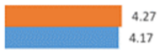
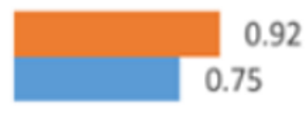
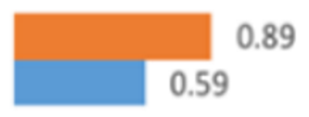
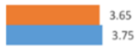
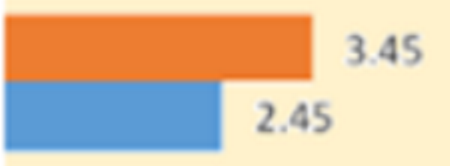
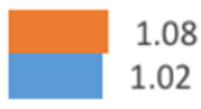
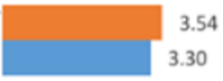
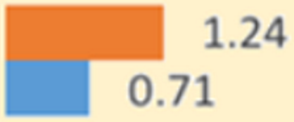
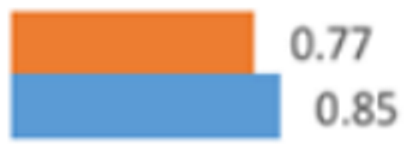
The orange and blue blocks in the table represent the average value of each indicator of the unclassed choropleth map and the rectangular cartogram, respectively. The length of the blocks for the same indicator represents the actual ratio of these two maps. The figure above the block is the average value of the indicator, while the figure below is the serial number of the map. The F-value and p-value are obtained by ANOVA. The initial hypothesis is that the type of graphical representation does not affect the above measurements. The p-value indicates significance. If p < 0.05, it means that the difference is obvious and that the graphical representation method has a significant impact on the relevant experimental data.

4.1.1. Locate Task

For the locate task, two groups of experiments were conducted, each looking for a designated area on a rectangular cartogram and unclassed choropleth map. As shown in Table 2, the unclassed choropleth maps of mouse click time, total gaze time, and gaze times for the two groups of experiments were larger than those for rectangular cartograms. An analysis of variance was performed at the time of the first mouse click. Group 1 got p = 0.744 > 0.05, and the difference was not significant; group 2 got p = 0.042 < 0.05, and the difference was significant. Therefore, the possibility that the difficulty of the two locating tasks in group 2 was different could not be ruled out. The time to the first fixation of the two groups of experiments did not have the same comparative relationship, so the merits and disadvantages of the two groups could not be judged. However, a comprehensive analysis of time to the first mouse click, visit count, and time to the first fixation reflected that although participants could quickly locate the target in the unclassed choropleth map, they still needed to click more times to confirm.

4.1.2. Compare Task

The compare task included choosing a “larger value” or “smaller value” in the red-outlined area. Since the chosen area had been marked, the time to the first fixation was not used as an analysis indicator. In the task of comparing small thematic values, as shown in Table 2, the time to a first mouse click, the total fixation duration, and the visit count of the rectangular cartogram were all less than those of the unclassed choropleth map. In addition, there were significant differences between the three indicators of the two maps. For example, the correct rate of the rectangular cartogram was 0.89, which was more significant than that of the unclassed choropleth map, which was 0.79. All these differences in indicators suggested that when reading a rectangular cartogram, participants could confirm differences quicker with fewer confirmation times and higher accuracy.
When comparing relatively large thematic values, as shown in Table 2, the data of the time to the first mouse click, total fixation duration, and visit count of the unclassed choropleth map were all better than that of a rectangular cartogram, but the differences were not huge. The accuracy rate of the rectangular cartogram was 0.96, more significant than that of the unclassed choropleth map. Although the difference in each indicator was not noticeable, it still showed that the unclassed choropleth map required less time in comparing tasks with large thematic values, which was contrary to the experimental results of comparing tasks with small thematic values. Although requiring less time, the unclassed choropleth map had a lower accuracy rate.
Based on the participants’ responses during the experiment, it was found that the participants were more careful in comparing rectangular areas on the rectangular cartogram, while they were more casual in comparing colors on the unclassed choropleth map, and always made choices based on their first feelings. Therefore, it can be inferred that the intuitiveness and comparability of rectangles make participants willing to try to obtain a more accurate answer instead of choosing randomly. At the same time, the reason why the accuracy rate of the unclassed choropleth map is low is that users sometimes subconsciously choose the larger area.

4.1.3. Find Extremum Task

The find extremum task included two experiments. One was finding the area extremum. The other was finding the thematic value extremum. In the task of finding the area extremum, as shown in Table 2, the time to the first mouse click, the total fixation duration, the visit count, and the time to the first fixation of the rectangular cartogram were all less than those of the unclassed choropleth map. According to ANOVA, the disparity of the results between the two kinds of maps in the time to the first mouse click and the total fixation duration was evident, while in the visit count and time to the first fixation it was not noticeable. It could be seen that there was no significant difference between the two types of representation in the identification of the maximum and minimum area, while there was a clear difference in the process of reading. It could be explained that for regions with irregular edges, participants usually need to simplify the shape in their minds before comparing, whereas for the comparison of rectangular areas, participants only need to measure two parameters: length and width.
In the task of finding thematic value extremum, as shown in Table 2, the time to the first mouse click and the time to the first fixation of the rectangular cartogram were all less than those of unclassed choropleth map, whereas the visit count and the total fixation duration of rectangular cartogram were more than those of unclassed choropleth map. The variance analysis results showed that there was an obvious difference between the two kinds of maps in the first time to entry and visit count, but no clear difference in the time to the first mouse click. The accuracy rates for the rectangular cartogram and unclassed choropleth map were 0.96 and 0.87, respectively. It was indicated that when using a rectangular cartogram, although participants might notice the target first, they still need repeated confirmations, increasing the overall time used. The reason for the higher error rate of the unclassed choropleth map was that the participants would subconsciously choose a larger area. The inconsistency between visual size and numerical value had a significant impact on quantitative cognition.

4.1.4. Estimate Task

In the estimate task, as shown in Table 2, the time to the first mouse click, the total fixation duration, and the visit count of the rectangular cartogram were all less than those of the unclassed choropleth map. The average time required to complete this task on an unclassed choropleth map was nearly twice that of a rectangular cartogram. The accuracy rates for the rectangular cartogram and unclassed choropleth map were 0.52 and 0.21, respectively.
The variance analysis results showed an apparent difference between the two kinds of maps in these three indicators. It can be intuitively understood that size, in particular regular shapes such as rectangles, is easier to accurately estimate the values it represents than colors, whereas colors require a range of values to be estimated with the help of legends. The difficulty of estimating values increases when there are more colors.

4.2. Eye Tracking Hotspot Analysis

Eye movement data can be used to analyze the reading process of each task. Here, we focus on analyzing the participants’ eye movement hotspots to find out the differences in the participants’ focus and process when reading the two types of maps.

4.2.1. Locate Task

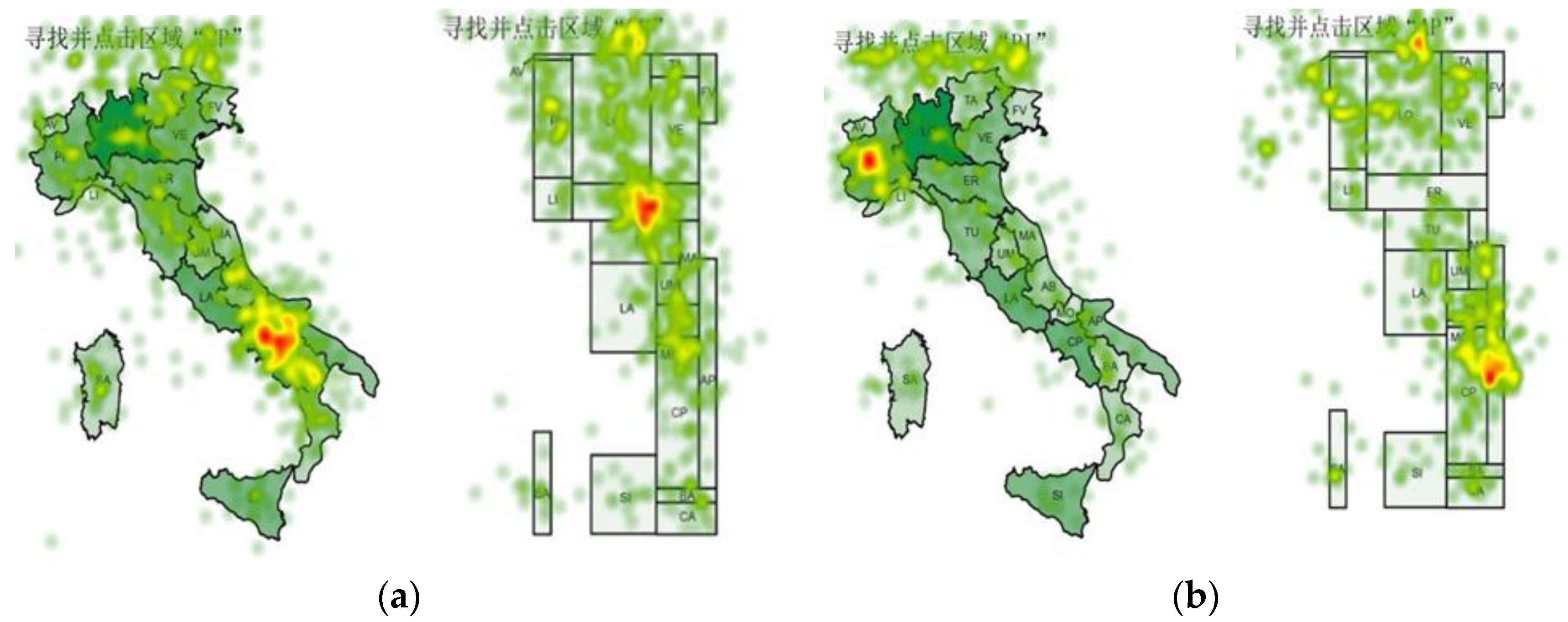
Figure 3 shows the heatmap of the fixation point of the locating task. It can be seen that each area in the figure has fixation points, and the target area and prompt annotation receive the most attention. When searching for the target, participants would scan the whole map first, then search for the target carefully and strategically and make multiple confirmations after finding the target. Comparing the target area with the prompt above the map, it is found that the attention of the target area was significantly stronger than the prompt, indicating that the participants used short-term memory to remember the target area for search and would confirm according to the content of short-term memory after locating the target.

4.2.2. Compare Task

Figure 4 shows the hotspot map of the participants when they compare the topic values in the specified area while completing the comparison task. Where (a) is the smaller value of the two regions; (b) is the larger value of the two regions.
As can be seen from Figure 4, the participants’ sights were concentrated in the red-outlined area, indicating that they were looking at the correct area and only switched their sights to other areas when reconfirming. The degree of dispersion of sight in the area with a larger thematic value was greater than that in the area with a smaller thematic value. Although the total fixation duration and visit count were higher when comparing the areas with smaller thematic values, the participants were mostly concentrated in one area. When comparing the areas with higher thematic values, although the total fixation duration and visit count were less, the participants’ attention has been distributed in both red-outlined areas. This analysis reflected that when comparing an area with a larger thematic value, the participants could make a choice based on one judgement, while they needed repeated confirmation when comparing an area with a smaller thematic value.

4.2.3. Find Extremum Task

Figure 5 shows the heatmap of the participants as they complete the task of finding the extremum value. Where (a) is to find the largest area; (b) is to find the smallest area; (c) is to find regions with the maximum thematic value; (d) is to find the region with the minimum thematic value.
Figure 5 shows that when searching the maximum area in the unclassed choropleth map, the irregularity of edges and varying shapes led to an increase in the judgment time for similar areas. In finding the smallest area, the number of regional fixation points was inversely proportional to the size of the area. The participants quickly excluded larger areas and then spent more time evaluating smaller but similar areas. Further analysis of the eye tracking indicators of finding the maximum and minimum area task suggested no obvious difference in the eye tracking indicators with the increase in task difficulty.
When selecting an area with the largest thematic value, the degree of distraction in the participants’ sight was greater than that in an area with the smallest thematic value. It is indicated that when selecting the area with the largest thematic value, the selection was made after one judgment, while the selection of an area with the smallest thematic value needed to be confirmed many times. When completing the task of finding the maximum thematic value, the participants considered all the experiment examples. After a preliminary judgment, they would select several alternative results with high possibility, and then give final decisions through further judgment among several possible results.
Further analysis of the data revealed that the difference between the eye-movement metrics of the two types of graphical representations on the selection of the minimum thematic value was greater than that of the selection of the largest area. This indicated that the difference between the two was unclear when the task was not too difficult. When the task was difficult, it would be noted that the rectangular cartogram was convenient for comparison. In finding the extremum thematic values, the difference in eye tracking indicators between the two types of representation increased with the increase in difficulty, while in finding the extremum areas, the difference in eye tracking indicators did not change significantly. The reason could be that the colors in small areas were not easy to distinguish.

4.2.4. Estimate Task

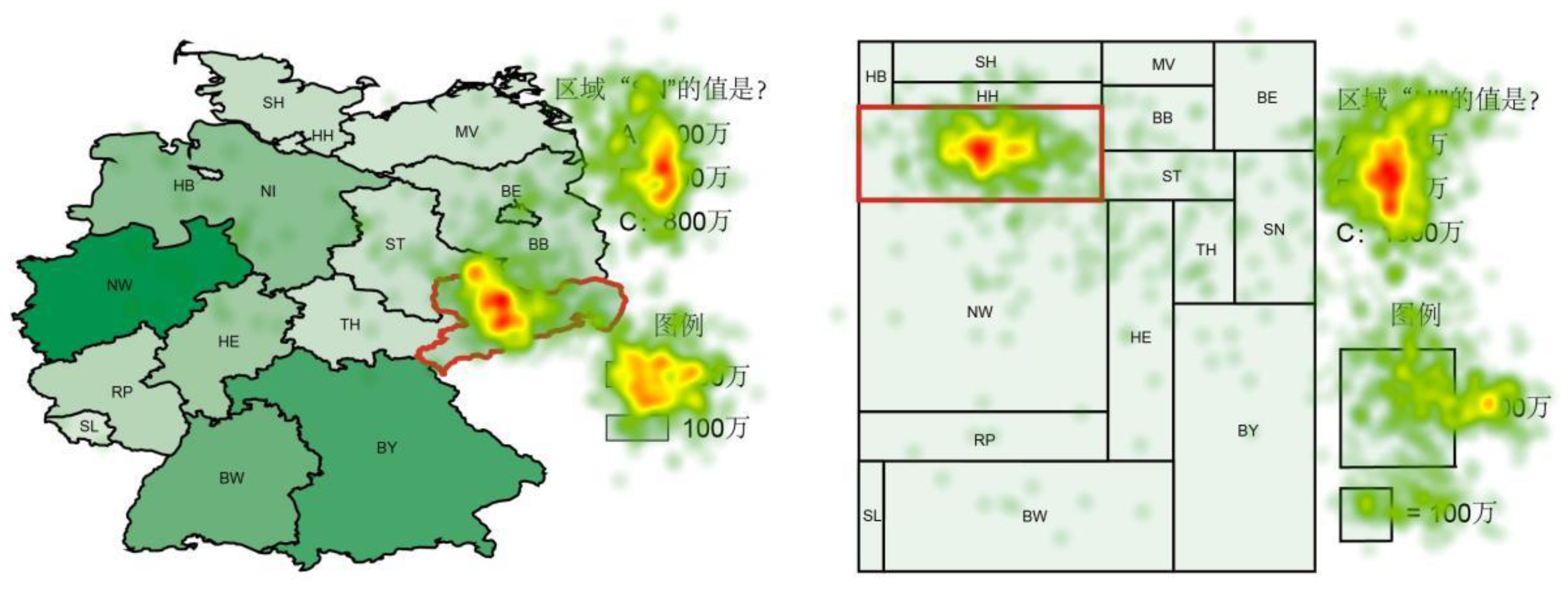
Analyzing the concentration of sight (Figure 6), it could be found that the participants’ sights were mostly concentrated in three areas: the target area, the options, and the legend. When thinking about the questions, the participants would browse the three areas back and forth and obtain correct answers through comparison.
During the experiment, some participants would subconsciously click larger areas or need to repeatedly confirm the meaning of the color representation. Male participants would be more impatient. Some participants clicked the mouse randomly or did not search for the requested area but looked for the target in the area they were looking at randomly. This phenomenon would be more obvious when dealing with graphics with irregular edges. This might be because the participants were all asked to keep their heads straight.

5. Discussion

Cartograms can represent geo-referenced data, promote visual thinking, and transform data into stories [1]. Among all types of cartogram, the rectangular cartogram is special due to the difficulty of maintaining topological relations accurately and correctly [34]. Anna Markowska argues that a rectangular cartogram is effective for map reading tasks with more details, such as estimating the thematic value of a single area [35]. This may be because the regular shape of the rectangle makes participants use the size variable more when comparing an area to a legend, and the size variable can be instrumental in guiding attention [21]. However, in a rectangular cartogram, rectangles are symbols and form the map’s layout. Therefore, completing various tasks on rectangular maps face changes in multiple cognitive cues such as width, height, area, height-width ratio, and area [36]. In this paper, we hope to draw a more convincing conclusion about numerical estimation through experiments and find other reading tasks suitable for rectangular cartograms.
Eye-tracking technology has given researchers great support in studying users’ visual perception and cognition in cartography [18,19,20]. We used eye-tracking experiments to explore the advantages and disadvantages, similarities and differences of rectangular cartograms and unclassed choropleth maps in quantitative cognition, transmission efficiency, and the reading process.

5.1. Effectiveness of Conveying Quantitative Information

The experimental results show that the participants enjoy a higher or equal accuracy rate when using a rectangular cartogram to complete the four tasks of locate, compare, find extreme, and estimate. This indicates that the rectangular cartogram has certain advantages over the unclassed choropleth map, i.e., the four hypotheses made in this paper are proved to be tenable in terms of quantitative information conveying.

5.2. Efficiency of Information Transmission

Regarding information transmission efficiency, the overall time spent on the locate, compare, find extreme, and estimate tasks with a rectangular cartogram is not always less than that of an unclassed choropleth map. In each task of locating, comparing the minimum value, finding the area extremum, and the maximum thematic value, the overall time of the rectangular cartogram is less than that of the unclassed choropleth map, while in each task of comparing the maximum value, finding the minimum thematic value, and evaluating, the overall time is more than that of the unclassed choropleth map. Combining the accuracy rate and the overall time, it can be inferred that when faced with different tasks, the participants’ perception of the quantity expressed by the rectangular cartogram is more precise, which comes at the expense of reducing the reading speed in some cases. For difficult tasks such as evaluating, the time taken by the rectangular cartogram is more than double that of the unclassed choropleth map, but the accuracy rate is also more than twice as high as that of the unclassed choropleth map. It suggests that the rectangular cartogram indeed has more cognitive clues in quantitative expression and therefore is suitable for precise quantitative cognition. As a result, participants are more willing to conduct more precise numerical perceptions and are more likely to produce ideal results.

5.3. Complexity of Cognitive Process

Regarding the cognitive process, there are significant differences between the two representations, which reflect different cognitive characteristics related to tasks. For example, in the locate task, the participants were asked to find the target in a rectangular cartogram and an unclassed choropleth map. There is no significant difference in time required for the participants to first enter the AOI between these two representations, which indicates that there is no significant difference in the time to find the target area, but there is a huge difference in the time to the first mouse click and the total fixation duration. In addition, the time required for the unclassed choropleth map is generally more than that of a rectangular cartogram. Therefore, it is suggested that a rectangular cartogram is easier for confirming the target and requires a shorter thinking process.
In comparing smaller thematic values, there are significant differences in the time to the first mouse click, total fixation duration, and visit count, revealing the advantages of a rectangular cartogram in this task.
The task of selecting an area with a larger thematic value is relatively simple due to the wide gap between the two determined areas, resulting in a noticeable difference in the three indicators. However, the difficulty in comparing smaller thematic values has been raised by the unobvious difference between areas, leading to a significant difference in the three indicators. Therefore, the rectangular cartogram is superior to the unclassed choropleth map in compare tasks.
In finding extremum, the difference between the time to first fixation and visit count is significant in selecting the area with the largest thematic value. In contrast, the difference between the time to the first mouse click is not apparent, indicating that the rectangular cartogram is more intuitive and easier to perceive since it uses the area to represent the thematic value. Its intuitive information expression makes it easy confirm. In selecting the area with the smallest thematic value, there is no significant difference between the four indicators. At the same time, the accuracy rate of a rectangular cartogram is significantly improved compared to an unclassed choropleth map, which indicates that when facing a difficult task, the participants would become impatient and make choices based on their intuition rather than knowledge.
In the experiment of estimate, there is a significant difference in the indicators of the time to the first mouse click, the total fixation duration, and the visit count, as well as the accuracy, which could explain why a rectangular cartogram is more advantageous in such an advanced task as evaluating since it only has two variables of length and width when representing small areas. Furthermore, the above analysis explained the significant difference in the cognitive process when using these two representations.

5.4. Summary

Effectiveness refers to whether a task is completed in usability engineering [11]. In the experiments of this paper, with similar accuracy rates, we found significant differences in participants’ time and cognitive processes when they completed the corresponding tasks using a rectangular cartogram or unclassed choropleth map. Therefore, we believe effectiveness should be judged from multiple perspectives to provide more references for the subsequent selection and application of the method. In this paper, we believe effectiveness should be analyzed using quantitative information conveying, information transmission efficiency, and cognitive process complexity. In Section 5.1, Section 5.2 and Section 5.3, we have explained each, and we will provide further summarization (Table 3).
Back to the two questions raised at the beginning of this paper, the research results suggest no definite answer for which is better between a rectangular cartogram and unclassed choropleth map. Moreover, we found that participants’ cognitive processes for the two types of maps were different during task completion. The more complicated the task is, the more patient the user will be with the rectangular cartogram, the higher the accuracy, and the more pronounced the advantages of a rectangular cartogram will be. This may be due to the intuition of rectangular areas in rectangular cartograms, which makes them more suitable for accurate comparative analysis. In a word, suitable methods should be selected for specific tasks and goals to improve the quantitative information conveying effectiveness.

5.5. Limitations

In this experiment, we only produced experimental maps of Germany and Italy, not of countries with many administrative divisions. Furthermore, differences in the distribution and number of national administrative divisions may result in differences in the generation of rectangular cartograms, such as layout and the number of rectangles. Therefore, more complex maps are needed to address these issues and generalize our findings. Moreover, we used the green schemes in both types of maps and did not make experimental maps of different color schemes. Whether different colors have an impact on experimental results has not been verified.

6. Conclusions

This paper systematically evaluates the effectiveness of rectangular cartograms for conveying quantitative information. Aiming at the characteristics of the rectangular cartogram conveying in expressing and conveying thematic data combined with the cognitive task of a cartogram, the hypothesis that the rectangular cartogram has advantages in locating targets, numerical comparison, finding extremum, and numerical estimation is proposed, and eye-tracking experiments are used to verify experimentally. Furthermore, studies have shown that compared with an unclassed choropleth map, a rectangular cartogram has regular, uniform shapes and simple boundaries, which facilitate the comparative analysis of quantitative information, and the higher data resolution makes search tasks more planned.
Nevertheless, the experiments conducted in this paper are not rich enough in task types, and the application methods of the rectangular cartogram and unclassed choropleth map are relatively simple. The types of experimental tasks and eye-movement indicators will be enriched to analyze the characteristics of rectangular cartogram representations and the cognitive load of users’ map reading processes more carefully in later research.

Author Contributions

Conceptualization, Fenli Jia, Jian Yang and Guomin Song; Data curation, Weiming Wang and Yeqiu Xu; Funding acquisition, Fenli Jia and Jian Yang; Methodology, Fenli Jia and Weiming Wang; Supervision, Fenli Jia and Guomin Song; Writing—original draft, Weiming Wang; Writing—review & editing, Fenli Jia, Jian Yang, Tingting Li and Guomin Song. All authors have read and agreed to the published version of the manuscript.

Funding

This research was funded by the National Natural Science Foundation of China under Grant (No. 42130112, No. 41901335, No. 41671407), China’s National Key R&D Program (No. 2017YFB0503500).

Institutional Review Board Statement

All subjects gave their informed consent for inclusion before they participated in the study. The study was conducted in accordance with the Declaration of Helsinki, and the protocol was approved by the Ethics Committee of School of Geospatial information (Project No. 42130112 of NSFC).

Data Availability Statement

The data that support the findings of this study are openly available in Zenodo at https://doi.org/10.5281/zenodo.6781212, accessed on 21 October 2022.

Acknowledgments

The authors would like to thank Mingguang Wu for his helpful discussion on the early version of this paper. We thank Shulei Zheng’s helpful discussion on the experiment design and the insightful reviews from the anonymous reviewers.

Conflicts of Interest

The author reports no potential conflict of interest.

References

  1. Nusrat, S.; Kobourov, S. Visualizing cartograms: Goals and task taxonomy. arXiv 2015. Available online: http://arxiv.org/abs/1502.07792 (accessed on 21 October 2022).
  2. Raisz, E. The Rectangular Statistical Cartogram. Geogr. Rev. 1934, 24, 292. [Google Scholar] [CrossRef]
  3. Raisz, E. Rectangular statistical cartograms of the world. J. Geogr. 1936, 35, 8–10. [Google Scholar] [CrossRef]
  4. Election 2004—NYTimes. 2004. Available online: http://www.nytimes.com/packages/html/politics/2004ELECTIONRESULTSGRAPHIC/ (accessed on 12 May 2014).
  5. Wang, W.M. Research on Automatic Construction Method and Cognitive Effects of Rectangular Cartogram; PLA Strategic Support Force Information Engineering University: Zhengzhou, China, 2021. [Google Scholar]
  6. Dent, B.D. Communication aspects of value-by-area cartograms. Am. Cartogr. 1975, 2, 154–168. [Google Scholar] [CrossRef]
  7. Sun, H.; Li, Z. Effectiveness of cartogram for the representation of spatial data. Cartogr. J. 2010, 47, 12–21. [Google Scholar] [CrossRef]
  8. Kaspar, S.; Fabrikant, S.; Freckmann, P. Empirical study of cartograms. In Proceedings of the 25th International Cartographic Conference, International Cartographic Association, Paris, France, 3–8 July 2011. [Google Scholar]
  9. Nusrat, S.; Alam, M.J.; Kobourov, S.G. Evaluating Cartogram Effectiveness. arXiv 2015, arXiv:1504.02218. [Google Scholar] [CrossRef] [Green Version]
  10. Tobler, W.R. Choropleth Maps Without Class Intervals? Geogr. Anal. 1973, 5, 262–265. [Google Scholar] [CrossRef]
  11. Arzu, Ç.; Simone, G.; Benedikt, H.; Sara, I.F. Evaluating the Effectiveness of Interactive Map Interface Designs: A Case Study with Eye Movement Analysis. Cartogr. Geogr. Inf. Sci. 2009, 36, 5–17. [Google Scholar]
  12. Peterson, M. An Evaluation of Unclassed Crossed-line Choropleth Mapping. Am. Cartogr. 1979, 6, 21–37. [Google Scholar] [CrossRef]
  13. Müller, J. Perception of Continuously Shaded Maps. Ann. Assoc. Am. Geogr. 1979, 69, 240–249. [Google Scholar] [CrossRef]
  14. Griffin, T.L.C. Recognition of areal units on topological cartograms. Am. Cartogr. 1983, 10, 17–29. [Google Scholar] [CrossRef]
  15. Zhou, J.; Zhao, C. GIS Attribute Information Visualization and Its Validity Analysis. Econ. Geogr. 2010, 30, 31–33. [Google Scholar]
  16. Krauss, M.R.D. The Relative Effectiveness of the Noncontiguous Cartogram. Doctoral Dissertation, Charlottesville. Virginia Polytechnic Institute and State University, Blacksburg, VA, USA, 1989. [Google Scholar]
  17. Nusrat, S.; Alam, J.; Kobourov, S. Recognition and recall of geographic data in cartograms. In Proceedings of the International Conference on Advanced Visual Interfaces (AVI ‘20), Association for Computing Machinery, New York, NY, USA, 28 September–2 October 2020; pp. 1–9. [Google Scholar] [CrossRef]
  18. Dong, W.H.; Liao, H.; Zhan, Z.; Liu, B.; Wang, S.K.; Yang, T.Y. New research progress of eye tracking-based map cognition in cartography since 2008. Acta Geogr. Sin. 2019, 74, 599–614. [Google Scholar] [CrossRef]
  19. Vassilios, K.; Paweł, C. Eye Tracking Research in Cartography: Looking into the Future. ISPRS Int. J. Geo-Inf. 2021, 10, 411. [Google Scholar] [CrossRef]
  20. Bing, H.; Weihua, D.; Hua, L.; Qi, Y.; Bowen, S.; Jiping, L.; Yong, W. A geospatial image based eye movement dataset for cartography and GIS. Cartogr. Geogr. Inf. Sci. 2023, 1–16. [Google Scholar] [CrossRef]
  21. Garlandini, S.; Fabrikant, S.I. Evaluating the effectiveness and efficiency of visual variables for geographic information visualization. Lecture notes in computer science [Spatial information theory, proceedings]. In Proceedings of the 9th International Conference on Spatial Information Theory, Berlin/Heidelberg, Germany, 21–25 September 2009; pp. 195–211. [Google Scholar]
  22. Liao, H.; Wang, X.Y.; Dong, W.H.; Meng, L.Q. Measuring the influence of map label density on perceived complexity: A user study using eye tracking. Cartogr. Geogr. Inf. Sci. 2019, 46, 210–227. [Google Scholar] [CrossRef]
  23. Dong, W.; Wang, S.; Chen, Y.; Meng, L. Using Eye Tracking to Evaluate the Usability of Flow Maps. ISPRS Int. J. Geo-Inf. 2018, 7, 281. [Google Scholar] [CrossRef] [Green Version]
  24. Popelka, S.; Vondrakova, A.; Hujnakova, P. Eye-tracking evaluation of weather web maps. ISPRS Int. J. Geo-Inf. 2019, 8, 256. [Google Scholar] [CrossRef] [Green Version]
  25. Horbiński, T.; Cybulski, P.; Medyńska-Gulij, B. Web map effectiveness in the responsive context of the Graphical User Interface. ISPRS Int. J. Geo-Inf. 2021, 10, 134. [Google Scholar] [CrossRef]
  26. Cybulski, P. Spatial distance and cartographic background complexity in graduated point symbol map-reading task. Cartogr. Geogr. Inf. Sci. 2020, 47, 244–260. [Google Scholar] [CrossRef]
  27. Henik, A. (Ed.) Continuous Issues in Numerical Cognition: How Many or How Much; Academic Press: Cambridge, MA, USA, 2016. [Google Scholar]
  28. Henik, A.; Gliksman, Y.; Kallai, A.; Leibovich, T. Size perception and the foundation of numerical processing. Curr. Dir. Psychol. Sci. 2017, 26, 45–51. [Google Scholar] [CrossRef]
  29. Stavy, R.; Babai, R. Discrete and continuous presentation of quantities in science and mathematics education. In Continuous Issues in Numerical Cognition; Elsevier: Amsterdam, The Netherlands, 2016; pp. 289–303. [Google Scholar]
  30. Teghtsoonian, M. The judgment of size. Am. J. Psychol. 1965, 78, 392–402. [Google Scholar] [CrossRef] [PubMed]
  31. Ekman, G.; Junge, K. Psychophysical relations in visual perception of length, area and volume. Scand. J. Psychol. 1961, 2, 1–10. [Google Scholar] [CrossRef]
  32. Crawford, P.V. The perception of graduated squares as cartographic symbols. Cartogr. J. 1973, 10, 85–88. [Google Scholar] [CrossRef]
  33. Roth, R.E. An empirically-derived taxonomy of interaction primitives for interactive cartography and geovisualization. IEEE Trans. Vis. Comput. Graph. 2013, 19, 2356–2365. [Google Scholar] [CrossRef]
  34. Tobler, W. Thirty five years of computer cartograms. Ann. Assoc. Am. Geogr. 2004, 94, 58–73. [Google Scholar] [CrossRef]
  35. Markowska, A. Cartograms—Classification and terminology. Pol. Cartogr. Rev. 2019, 51, 51–65. [Google Scholar] [CrossRef]
  36. Donald, L.K. A large rectangle delays the perception of a separate small rectangle. Percept. Psychophys. 1990, 47, 369–378. [Google Scholar]
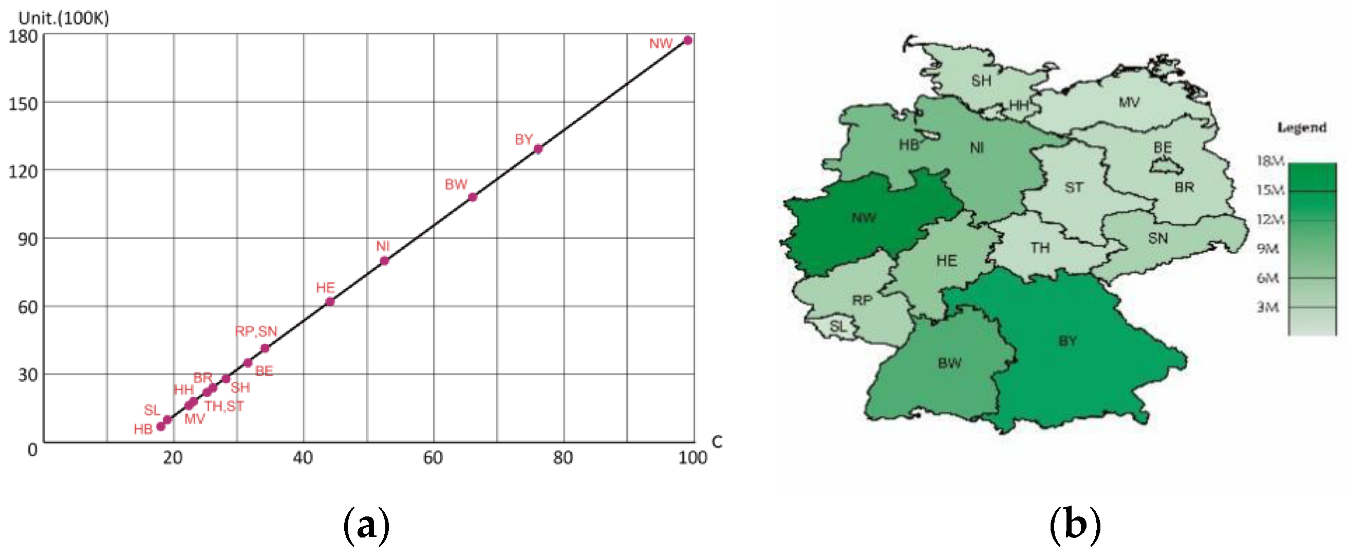
Figure 1. An example of unclassed choropleth map. (a) Linear mapping between color (horizontal axis) and population (vertical axis); (b) the unclassed choropleth map of the German regional population.
Ijgi 12 00039 g001
Figure 2. The procedure of the experiment.
Ijgi 12 00039 g002
Figure 3. The heatmap of locate tasks. (a) Group 1; (b) Group 2. The Chinese on the top instructs the subject to find and click the specified region.
Ijgi 12 00039 g003
Figure 4. The heatmap of compared tasks. (a) Select the smaller thematic value in the two regions; (b) Select the larger thematic value in the two regions.
Ijgi 12 00039 g004
Figure 5. The heatmap of find extremum tasks. (a) Finding maximum area task; (b) finding minimum area task; (c) finding maximum thematic value task; (d) finding minimum thematic value task.
Ijgi 12 00039 g005
Figure 6. The heatmap of estimate task. The Chinese texts beneath the hotspots on the right are the task descriptions and the map legends. The task descriptions (upper right) instruct the subjects to choose the correct population of the red-outlined regions, and the legends (bottom right) illustrate the color or size coding of the population in the thematic map or cartogram, respectively.
Ijgi 12 00039 g006
Table 1. Correspondence table for experiment tasks and maps.
HypothesesRectangular CartogramUnclassed Choropleth Map
H1LocateCountry: ItalyCountry: Italy
Thematic data: GDPThematic data: Population
Question: Find and click on the area “AP”Question: Find and click on the area “CP”
Ijgi 12 00039 i001Ijgi 12 00039 i002
H2CompareCountry: GermanyCountry: Germany
Thematic data: PopulationThematic data: GDP
Question: Click the red box with the smaller (larger) thematic value.Question: Click the red-outlined area with the smaller (larger) thematic value.
Ijgi 12 00039 i003Ijgi 12 00039 i004
H3Find extremumCountry: GermanyCountry: Germany
Thematic data: Administrative division areaThematic data: Administrative division
Question: Click the area with the smallest (largest) area.Question: Click the area with the smallest (largest) area.
Ijgi 12 00039 i005Ijgi 12 00039 i006
Country: ItalyCountry: Italy
Thematic data: PopulationThematic data: GDP
Question: Click the area with the smallest (largest) thematic value.Question: Click the area with the smallest (largest) thematic value.
Ijgi 12 00039 i007Ijgi 12 00039 i008
H4EstimateCountry: GermanyCountry: Germany
Thematic data: GDPThematic data: Population
Question: Estimate the thematic value of the red box according to the legend.Question: Estimate the thematic value of the red-outlined area according to the legend.
Ijgi 12 00039 i009Ijgi 12 00039 i010
Note: We add the legends to the unclassed choropleth maps in the table for clarity. However, in the experiment, to avoid interfering with task completion, we removed the legends except for the estimate experiment.
Table 2. Statistical table of eye tracking indicators and behavioral indicators.
Time to First Mouse ClickTotal Fixation DurationVisit CountFirst Entry TimeCorrect Rate
H1Locategroup1Ijgi 12 00039 i011F = 0.107
P = 0.744
Ijgi 12 00039 i012F = 5.027
P = 0.027
Ijgi 12 00039 i013F = 1.248
P = 0.267
Ijgi 12 00039 i014F = 0.544
P = 0.463
1
group2Ijgi 12 00039 i015F = 4.279
P = 0.042
Ijgi 12 00039 i016F = 11.480
P = 0.010
Ijgi 12 00039 i017F = 3.796
P = 0.055
Ijgi 12 00039 i018F = 0.837
P = 0.363
1
H2Comparelarger valueIjgi 12 00039 i019F = 0.262
P = 0.611
Ijgi 12 00039 i020F = 1.957
P = 0.166
Ijgi 12 00039 i021F = 0.230
P = 0.663
0.88
0.96
smaller valueIjgi 12 00039 i022F = 9.388
P = 0.003
Ijgi 12 00039 i023F = 7.335
P = 0.008
Ijgi 12 00039 i024F = 5.919
P = 0.017
0.79
0.89
H3Find extremummaximum areaIjgi 12 00039 i025F = 4.167
P = 0.044
Ijgi 12 00039 i026F = 4.620
P = 0.034
Ijgi 12 00039 i027F = 1.635
P = 0.204
Ijgi 12 00039 i028F = 0.106
P = 0.746
0.98
0.98
minimum areaIjgi 12 00039 i029F = 7.521
P = 0.008
Ijgi 12 00039 i030F = 5.554
P = 0.022
Ijgi 12 00039 i031F = 1.930
P = 0.170
Ijgi 12 00039 i032F = 2.586
P = 0.114
0.60
0.81
maximum thematic valueIjgi 12 00039 i033F = 0.565
P = 0.455
Ijgi 12 00039 i034F = 0.494
P = 0.484
Ijgi 12 00039 i035F = 4.410
P = 0.039
Ijgi 12 00039 i036F = 8.970
P = 0.004
0.87
0.96
minimum thematic valueIjgi 12 00039 i037F = 0.263
P = 0.610
Ijgi 12 00039 i038F = 0.135
P = 0.716
Ijgi 12 00039 i039F = 1.107
P = 0.301
Ijgi 12 00039 i040F = 0.026
P = 0.87
0.25
0.73
H4Estimatethematic valueIjgi 12 00039 i041F = 10.487
P = 0.003
Ijgi 12 00039 i042F = 17.151
P = 0.010
Ijgi 12 00039 i043F = 14.137
P = 0.001
0.21
0.52
Note: 1. Ijgi 12 00039 i044 unclassed choropleth map Ijgi 12 00039 i045 rectangular cartogram Ijgi 12 00039 i046 Indicators with clear differences. 2. The bar charts are scaled for ease of placement in a table. Bar charts are not comparable to each other.
Table 3. The effectiveness of rectangular cartogram and unclassed choropleth map from multiple perspectives.
HypothesesExperimentDifficulty of TaskMap TypeEffect of Quantitative Information ConveyingEfficiency of Information TransmissionComplexity of Cognitive Process
H1Locating the specified regioneasyunlcassed choropleth map——
rectangular cartogram——
H2choosing larger value in the red areaeasyunlcassed choropleth map
rectangular cartogram
choosing smaller value in the red areaeasyunlcassed choropleth map
rectangular cartogram
H3finding maximum areamediumunlcassed choropleth map————
rectangular cartogram————
finding minimum areahardunlcassed choropleth map
rectangular cartogram
finding maximum
thematic value
mediumunlcassed choropleth map
rectangular cartogram
finding minimum
thematic value
hardunlcassed choropleth map
rectangular cartogram
H4Estimate thematic value for the specified areahardunlcassed choropleth map
rectangular cartogram
—— There is not much difference between the two. One is better than the other.
Disclaimer/Publisher’s Note: The statements, opinions and data contained in all publications are solely those of the individual author(s) and contributor(s) and not of MDPI and/or the editor(s). MDPI and/or the editor(s) disclaim responsibility for any injury to people or property resulting from any ideas, methods, instructions or products referred to in the content.