Abstract
This article presents the results of research on users concerning six thematic maps made with various mapping techniques and related to various aspects of the activities of the Helicopter Emergency Medical Service. The aim of the survey was to determine how the respondents rank these maps in terms of the four subjective evaluation criteria, which were the graphical attractiveness of maps, the readability of maps, the usefulness and importance of information, and the complexity of information presented on the maps. The greatest discrepancies were noted for the dot map, while the flow map obtained the most consistent evaluations. To check what the respondents were guided by while building the ranking for each criterion, a catalog of factors was created, the importance of which was assessed using the Likert scale. In the case of graphical attractiveness, users attach particular importance to the arrangement of objects visible on the map. The speed of reading the information is particularly important for map readability. In the case of the usefulness and importance of the information, the map topic, important for saving health and life from the user’s point of view, was of the greatest importance, while the amount of information in the legend significantly influenced the evaluation of information complexity.
1. Introduction
Research on users is highly important when it comes to controlling the effectiveness of cartographic products and giving recommendations to create good maps [1]. Knowledge of map design is passed in the form of more or less precisely described rules [2,3,4]; it has been worked out over the years and has been formalized in classic cartography textbooks, and further research continues to expand it [4,5,6,7,8,9]. Some of those rules result from the cartographic tradition, and some are justified by empirical scientific studies, frequently carried out with the application of new and advanced research techniques [10]. Such studies may be based on professional or public users [11] and may be carried out on-site or online, mainly via online surveys whose advantage is that they may reach a wide audience.
Depending on the type of the map, rules and recommendations on map design are centered around different problems related to their design, and the testing of alternative solutions may take place with the application of different research techniques, whose choice is crucial to the results obtained, their analysis opportunities, and formulating conclusions later [12,13]. As far as thematic maps [14] are concerned, it is significant to select the mapping technique and visual variables adequate for the nature of the phenomenon demonstrated. Such studies often consist of comparing graphical solutions used for presenting the same spatial phenomena, but worked out by means of different mapping techniques [11,15,16] that consider different levels of complexity of the phenomenon [17], or in the context of specific tasks of different complexity that can be carried out based on those maps [18], and of the number of pieces of information being read [19], as well as, e.g., the role of numbers in quantitative information reading [20]. The research may include criteria of evaluation that constitute objective or subjective measurements [17].
Valuation may consist in evaluating each map separately and independently, such as in the case of rating. Rating means that different maps may receive the same notes, whereas ranking consists of arranging maps in the defined order. According to Oldendick [21], “Ranking is a question response format used when a researcher is interested in establishing some type of priority among a set of objects”. In surveys, the ranking method is applied less frequently than the rating method [22,23]. Advantages and disadvantages of rating and ranking were analyzed in detail by Rokeach [24], Alwin and Krosnick [25], Ovadia [26] or Tarka [27], among others. In rating, there is a tendency of the respondents to evaluate all objects or traits relatively high or low, which may result in the data obtained from two different respondents not being comparable with each other [27]. Ranking, as opposed to rating, is not as susceptible to the impact of the respondent’s lack of motivation, which, when it comes to rating, results in the lack of diversity in evaluation. A disadvantage of the ranking method pointed out by many authors (among others, Oldendick [21], Alwin and Krosnick [25], Hino and Imai [28], Chiusole and Stefanutti [29], Heyman and Sailors [30]) is a greater cognitive load and the effort that the respondent has to put into the evaluation, which is also associated with longer time needed to complete the task. Rating scales are easier to use, and more convenient, which determines their popularity [29,31], whereas ranking favors the diversification of results [30], while being more difficult at the same time.
Rankings can be created for a small or large number of stimuli (items) [32], which in the latter case often means that “ranking datasets often contain missing or tie rankings, which are impossible to analyze without computers”[32]. The increase in the number of stimuli increases the degree of difficulty, and sometimes it also requires reaching for solutions in which the respondent focuses only on, e.g., the three best items, in their opinion, out of many available [33,34]. In the case of rankings in which the possibility of taking an equivalent place is allowed (rankings built in a secondary manner on the basis of objective criteria, e.g., cases where the final ranking is created based on the number of points, or time, as in in sport competitions), the problem becomes which strategy to adopt to rank the equal measurements [35].
According to McCarty et al. [36], the method by which respondents rank the items before the rating provides more differentiation and lower final scores than a method with simple rating only. Similar recommendations are made by Chiusole and Stefanutti [29], whose research results suggest that “when a subject performs both tasks, ranking should come before rating”, and this makes the reliability of the responses better.
The solutions used in the graphical user interface of the online survey are not without significance for the course of the ranking creation process. Various solutions are known that allow the creation of a ranking, such as drag and drop, numeric entry, radio button, text box or select box [37,38]. The ranking method can also be used in e-mail surveys [39], although this is associated with greater difficulties for respondents and researchers.
The strategy of comparing and evaluating cartographic visualizations may also take a different form. It may consist in comparing pairs of maps (Paired Comparison Technique), but the analysis of results collected in this way may be problematic; therefore, this method is rarely used in practice [40]. The visual analogue scale may be another example of a research method that allows one to compare and evaluate maps [41]. The visual analogue scale (VAS) takes the form of a horizontal scale with opposite definitions on the opposite ends. In many studies, VAS is frequently presented as a remedy for the flaws of the Likert scale and the ranking, as well as the Paired Comparison Technique [41]. The study by Cawthon and Moere [42], related to cartographic visualization, in which respondents used such a scale to evaluate the visualization in terms of esthetics, is an example of that solution.
This research focuses on the problem of evaluation by the method of subjectively ranking several thematic maps perceived by the user in a single thematic visualization. The study is concentrated on the ranking of several cartographic visualizations related to a geographical phenomenon that is important and comprehensible to each citizen, i.e., different aspects of the activity of the Helicopter Emergency Medical Service (HEMS). The issue of formulating the criteria of subjective evaluation of a cartographic visualization of such aspects by respondents still remains to be solved. Researching factors that influence the decisions of survey participants was crucial to the analysis of the ranking results. Suggested special measurements and graphical ways of presenting results of the research were necessary for the analysis and synthesis in terms of drawing general and detailed conclusions.
The objective of the research was to study several thematic maps by means of the subjective ranking method in terms of one geographical phenomenon (here, the collection of data on different aspects of the HEMS’ activity) in the context of graphical attractiveness, map readability, usefulness and importance of information, and information complexity.
To meet the study objective, the following questions were raised:
- How often did respondents indicate particular rankings for specific thematic maps and criteria of subjective evaluation?
- What is the level of unambiguity in respondents’ answers?
- What was the final ranking of mapping techniques in terms of particular criteria, considering all rankings and importance attributed to them?
- What factors do users take into consideration in creating the ranking according to specific criteria?
- What techniques of mapping spatial data on HEMS are preferred by users?
2. Materials and Methods
To meet the objective and answer the above questions, four main research stages were adopted:
- —
- to create thematic maps (Section 2.1);
- —
- to create the procedure and carry out surveys among map users (Section 2.2);
- —
- to conduct statistical and graphical analysis of the results: users’ rankings and final ranking (Section 3.1 and Section 3.2); respondents’ motivations (Section 3.3).
2.1. Cartographical Materials
Thematic maps presenting different information about the work of the HEMS in Poland have been used as the research material. Each of six maps marked with the letters A–F has been made in a different mapping technique and presents a different set of data on the HEMS. Maps are visible in Figure 1 and in such form as they were presented to respondents during the survey.
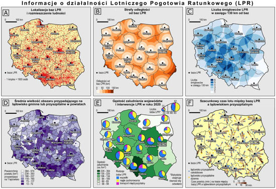
Figure 1.
Six thematic maps connected with the topic of Helicopter Emergency Medical Service evaluated in the study (Polish original spelling used in the survey; for details see Figure 2).
Six “island” thematic maps were worked out at the same scale in square frames making tiles with the gray, neutral background [25]. Above them there was the main title of the entire map composition: Information on the activities of the Polish Medical Air Rescue (PMAR). The size of the figure, along with the set of maps, was 1185 × 811 px and was adjusted in such a way as to display the entire map in the survey window in the Internet browser on screens with the most popular definition 1920 × 1080 (Full HD). Thus, it was possible to compare six maps on the screen at the same time without the necessity of scrolling the page down.
Above each frame there was the title of the phenomenon presented, whereas in empty spaces around island maps there were linear scales and map legends. Apart from the common topic centered around HEMS, the same scale and common graphical elements that repeat themselves on all maps constitute the common denominator for all the maps, making it possible to compare them. Administrative borders of separate provinces [voivodships], drawn in dark graphite, are one of those graphical elements. Locations of HEMS bases, along with the names of those bases, constitute a common reference object.
During the process of cartographic symbolization, a different color variant was selected for each map to graphically code each piece of geographical information differently [10]. The type of symbols used on a particular map determines which graphical elements are highlighted and also has an impact on the decisions made by users based on those elements [43]. What is crucial to drawing conclusions is the choice of colors and other graphic means, from classic graphical variables [44,45] as well as new visual variables [46,47,48]. The rule of using the maximum of six classes was adopted in order to ensure good communication and, at the same time, demonstrate a highly diverse level of a given phenomenon. Six maps differed in how much the legend and the title were developed, depending on the topic, and the number of text labels placed in the cartographic content of each map was identical. The most significant traits of thematic maps were collected in Figure 2. Each of the thematic maps is briefly characterized in the following paragraphs.
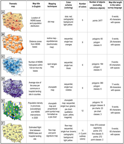
Figure 2.
Comparison of the characteristics of the six thematic maps evaluated in the study (compare with Figure 1).
Map A—a dot map—presents diverse distribution of population on the background of the administrative division of a country by provinces [voivodships] and HEMS bases’ locations. A single dot was assigned the number of 1500 people. Intensely red dots contrast with the neutral, light yellow background of cartographic content. Map A has the fewest colors out of all the maps. It has the least number of map symbols and comments in the legend, which makes it rank 6th (last) in terms of complexity of the legend.
Map B—an isoline map—equidistances (isochromatic map)—demonstrates the distances to HEMS bases that define physical (measured by the distance) accessibility of the territory of Poland to helicopters that provide emergency medical service. Map B has the shortest title out of all analyzed titles. The phenomenon presented is graphically coded by means of 6 shades of orange. The map is ranked 5th in terms of the complexity of the legend.
Map C—a spot ranges map—shows the number of HEMS helicopters available within a radius of 130 km. Construction-wise, the map is based on partially overlapping ranges of HEMS bases. Apart from the optimal range of action, the number of overlapping areas that, at the same time, indicates the number of helicopters reaching a particular region is the main focus of the map. In this case, a blue color variant has been adopted.
Map D—a choropleth map—presents the average size of the area that is assigned to a single landing site for HEMS helicopters, divided according to respective administrative units. In this case, the purple color variant has been used. Due to untypical relation, the opposite order of colors has been adopted for those relative data. The data classification of choropleth map classes was established according to the Jenks (natural breaks) method [49]. It is the map with the longest title.
Map E—a choropleth map and proportional point symbol map including pie charts—shows the density of population in provinces (the choropleth map) and the number of the Polish Medical Air Rescue’s interventions in 2020 (the proportional point symbol map), formatted as a pie chart showing three types of emergencies: accidents, sudden illnesses, and inter-hospital transfer of patients (pie chart slices distinguishing the types of categories). Proportional point symbols represent the locations of HEMS bases. The area of a given proportional symbol corresponds with the number of interventions shown by the nomogram in the legend. In this case, the units of reference on the choropleth map are maintained at the sequential single-tone green scale, whereas colors used for highlighting the categories of emergencies are sets consisting of three colors, selected from the complementary color wheel (magenta, yellow, cyan) [50]. The data classification into 6 classes of the choropleth map was made by the Jenks classification method. Map E depicts two phenomena and has the largest number of colors and the most complex legend.
Map F—a flow map and point signature map—demonstrates time distances (in 6 min intervals) from Polish Medical Air Rescue bases to the closest hospital landing fields prepared for HEMS helicopters. Lines of the flow map have a variable width that is increasing discontinuously along with the distance to the base, and a sequential color scheme in different shades of brown. The colors were achieved by means of an online app, a sequential color scheme generator [51], allowing one to create sequential color schemes with an easily definable intensity of difference between individual shades, based on the CIEDE2000 method [52]. Landing sites for HEMS helicopters are categorized according to whether they are open 24/7 (blue dots) or just during the day (yellow dots). The map has the same light yellow background as map A, which denotes the area of the country.
2.2. Procedure and Carrying out of Surveys among Map Users
The survey was carried out by the Limesurvey app and the survey form was posted on the website. The evaluation of the map within the experiment consisted of creating a map ranking by each respondent, starting with the map that would meet a given criterion best (ranking 1st) and ending with the one that meets the criterion least (ranking 6th). A classic version of ranking was adopted, in which the user has no opportunity to rank two maps ex aequo, which means that each map had to be separately included in the ranking.
Apart from learning the respondents’ subjective evaluation of six specific island maps, factors that respondents took into consideration while evaluating maps were also studied. The information was obtained at the Likert scale with five response categories. Apart from the set of questions related to possible factors, respondents had an opportunity to add their own comments. The results were analyzed with the use of a Libre Calc spreadsheet. Maps were worked out in software QGIS and Inkscape, based on the data by the Polish Medical Air Rescue available online (www.lpr.com.pl/pl/; first access date: 20 April 2021) and the spatial analyses carried out.
The research was conducted on a sample of 104 respondents (45 female, 58 male, 1 person refused to answer), students majoring in different subjects related to land surveying, cartography, and geomatics. The average age of respondents was 22. The participation in the research was voluntary and respondents received no remuneration for it. To be able to present the way the study had been conducted in a more vivid way, a scheme of the survey was prepared [17] on which the way the survey had been organized, and the order of questions (Q) along with numbers (Figure 2) are demonstrated. The online survey included 14 questions (Q1–Q14). The time for completing the survey had no limits and respondents had an opportunity to return to previous questions. Firstly, respondents were asked to fill in the questionnaire, in which they were asked about sex (Q1) and age (Q2). On the page that preceded the proper survey a short film manual (a looped gif file) was placed. It was related to the way of creating rankings and the opportunities of managing particular ranks by means of the interface of the Limesurvey application, based on an intuitive drag and drop solution [37]. It was arranged in this manner as to make sure that all respondents would be able to create a ranking correctly and exhaust all opportunities that the interface of the survey offers. Next, questions (Q3–Q14) were organized in four questions blocks connected with analyzed criteria: graphical attractiveness (GA), readability (MR), usefulness and importance of information (UI), and information complexity (IC) (Figure 2). Each block of questions contained three questions (two mandatory and one optional). The first question in each block of questions was related to the creation of the ranking of six thematic maps prepared with different mapping techniques according to a given criterion (Q3, Q6, Q9, Q12). An example command for the criterion of graphic attractiveness was as follows: “Order the maps according to their graphical (visual) attractiveness. Assign the map with the highest graphical attractiveness to the first position in the ranking (1), and the least graphically attractive map to the last position (6)”. The second question was linked to respondents defining to what extent the factors mentioned in the survey affected their choice (Q4, Q7, Q10, Q13). In the case of questions about the evaluation of the impact of different factors on the ranking arranged by each respondent, the variants of answers were constructed according to the Likert scale, with five response categories [definitely YES/rather YES/hard to say/rather NOT/definitely NOT (1)]. For each criterion, 8 sub-questions were asked. In these sub-questions, respondents were asked whether and to what extent they were guided by the certain factors when creating the ranking. The question connected with graphical attractiveness (Q4) was as follows: “Have you taken into account the following factors when assessing the graphical attractiveness of each map (visualization)?”:
- GA-1: type of mapping technique used (method of visualization of spatial data);
- GA-2: knowledge of the mapping technique (method of visualization) used;
- GA-3: originality of the graphic solution (unusual way of presenting a given topic);
- GA-4: visualization colors (color variant—type of colors used, e.g., shades of green, blue, purple, etc.);
- GA-5: the method of arranging the objects visible on the map;
- GA-6: visualization complexity (amount of graphically presented information);
- GA-7: beauty and aesthetics of visualization (harmony, information ordering, symmetry, visually pleasing reception);
- GA-8: selected graphic means (visual variables that attract attention, e.g., shape, color, orientation, color brightness, size) and their differentiation (number and variety of colors, shapes, sizes of graphic elements, etc.).
For the map readability (MR) criterion, respondents were obligated to rate following these factors (Q7):
- MR-1: speed of reading information (no need to analyze the transmitted information for a long time);
- MR-2: correct reading of the information (no need to search for it and check it on the map again);
- MR-3: clarity of visualization (graphic distinguishability of details);
- MR-4: the simplicity of the graphic solutions used (e.g., simple figures, instead of complex shapes, 2D instead of 3D);
- MR-5: getting used to a specific mapping technique (common, popular method, commonly used, experience in its use);
- MR-6: legend readability;
- MR-7: visibility of details on the screen with a given scale (100%); no need to rescale the page view;
- MR-8: overlapping of graphic elements (objects creating cartographic content).
On the other hand, for the criterion of usefulness and importance of information (UI), respondents were obligated to rate following factors (Q10):
- UI-1: interesting and absorbing topic of cartographic visualization;
- UI-2: a topic important for saving life and health from one’s own point of view (as a potential victim);
- UI-3: a topic important for saving life and health from the point of view of emergency services (as an aid in the organization of rescue);
- UI-4: location of the visualization in the figure (specified order of maps);
- UI-5: selected graphic means accentuating specific information (visual variables that attract attention);
- UI-6: type and amount of information presented on the visualization;
- UI-7: suggestiveness of the information presented (affecting the imagination, the strength of the influence of the information presented on the visualization or the way of perceiving the phenomenon);
- UI-8: new, previously unknown knowledge about the phenomenon.
In the case of the information complexity (IC) criterion, the suggested factors were as follows (Q13):
- IC-1: number of graphic elements in the cartographic content (on the map);
- IC-2: amount of information in the legend;
- IC-3: overlapping graphic elements (objects);
- IC-4: the shape and size of the elements constituting the reference for the data (e.g., borders and areas of voivodeships or counties, the size of the point objects that represent HEMS bases);
- IC-5: number and variety of visual variables used;
- IC-6: length of the title that identifies the topic of the map;
- IC-7: the number of mapping methods used within one visualization;
- IC-8: deviation of the shapes of objects from the reference elements (i.e., the location of HEMS bases and the boundaries of administrative units).
The third question allowed respondents to add their own information about other possible factors that they were led by (Q5, Q8, Q11, Q14). Questions received codes, were adjusted to the graphical representation of results, and received references to the attached scheme of the survey, presented in Figure 3.
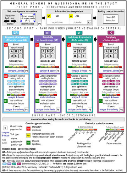
Figure 3.
Scheme of the survey—the construction of the online questionnaire used in the study.
3. Results
Figure 4 shows the results of the evaluation of six thematic maps in the graphical form. On four structural bar diagrams, the percentage of consecutive ranks assigned to particular thematic maps as a part of the analyzed criteria of subjective evaluation was demonstrated. The percentages are arranged according to the ranking. At the top of each bar diagram the highest rank (rank 1—dark green) was placed, and at the bottom the lowest rank (rank 6—red) was placed.
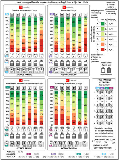
Figure 4.
Results for the rankings of thematic maps created by individual participants of the study according to the subjective evaluation criteria and the final rankings created, taking into account all positions in particular rankings and assigned weights according to the formula provided.
Under bar diagrams, the value of standard deviation (SD) that tells by what proportional value the results obtained for particular ranks deviate, on average, was placed. Smaller, gray diagrams present the final number of points for each thematic map (pts). The importance is assigned in the order that is opposite to the ranks in the ranking, i.e., the best rank (with the value of 1) is assigned the importance of 6, and the worst rank (with the value of 6) is assigned the importance of 1. The way importance was assigned was visible at the top of the figure on the right side. In such an approach, each out of the six maps may obtain between the minimum of 100 points (assuming that all respondents would rank a given map the lowest) to the maximum of 600 points (assuming that all respondents would rank a given map the highest). The final ranking of the six thematic maps (A–F) according to four evaluation criteria GA, MR, UI, IC is demonstrated in the graphics next to the diagrams.
3.1. User Rankings
In terms of the first criterion, graphical attractiveness (GA), map D was ranked highest (the choropleth map) because as much as 25% of respondents decided the map should rank first (Figure 4). Slightly fewer respondents (23%) considered map E to be the most graphically attractive. Map F ranked the lowest in that category (ranked the lowest by 37% of all answers). Considering the distribution of answers, the greatest differences between percentages obtained for particular ranks occurred for map F (SD = 12.73%), which proves that respondents were unanimous about the evaluation of that map. A smaller disproportion in the distribution of evaluations was observed for map B (SD = 9.14%), then map D (7.41%), C (5.50%) and E (4.37%). Map A had the most similar distribution of evaluations in terms of rank and the lowest value of standard deviation (2.63%), which proved that the evaluation of a dot map was not unambiguous.
When it comes to the map readability (MR) criterion, map B was ranked first (28%), and map D ranked second (27%). Visibly, the lowest result was achieved by map F, ranked last by 40% of respondents and last but one by 30% of respondents. Furthermore, map C was considered not very transparent either (ranked last according to 21% of responses and last but one according to 20% of responses). In terms of map readability, the highest unanimity occurred for map F (SD = 15.21, and the slightly lower value of standard deviation was achieved by map D (11.11%), then C (10.63%), B (9.05%), and E (6.07%). Answers were distributed most evenly for map A (standard deviation for the results achieved for particular ranks was 4.02%). That method was considered the most readable by 21% of respondents and the least readable by 20% of respondents. Opinions about the evaluation of that method were, thus, the most divided.
As far as usefulness and importance of information (UI) are concerned, map D was ranked last or last but one in the ranking (34.62% and 21.15%, respectively) whereas map F had a high percentage of responses, indicating the first and the second rank. Map D had the most diverse evaluations among all respondents (SD = 11.04%), which also means the most unambiguous evaluation. Map A received the most evenly distributed evaluations (SD = 5.43%). Other maps received the SD value of 8.08% for map C, 7.73% for map F, 6.76% for map B, and 5.63% for map E.
In terms of information complexity (IC), map E was considered to be the most complex (ranked first according to 54% of respondents and second according to 25%, which gives 78.85% in total). Map F also ranked highly (ranked first according to 21% of respondents and second according to 42% of respondents). Maps B and A were considered the most simple in terms of information complexity, ranking first by 33% of respondents and second by 23% of them. The standard deviation of map E is 19.98%, and that is the highest result obtained in the entire study, proving that respondents were strongly convinced that the level of information complexity in that map was high. The smallest differences were noted for map D in that category (SD = 7.19%).
On the graphics on the right side in Figure 3 it is visible that map D ranked first in the final ranking of graphical attractiveness (GA) (414 pts), map B received only one point less (413 pts), and map F, with a visibly smaller number of points, ranked last (240 pts). Map D turned out to be the most readable (MR) (441 pts), and map F the least readable (214 pts). In the final ranking of maps in terms of usefulness and importance of information (UI), map F ranked the highest, presenting time distances from HEMS bases to the closest hospital landing sites prepared for HEMS helicopters (405 pts). The information presented on map D (the choropleth map), related to the size of the area assigned to one local or hospital landing site, was considered the least useful and relevant (259 pts). Users decided that, as far as the criterion of information complexity (IC) was concerned, map E was the most frequently indicated thematic map (442 pts). At the same time, it was also a map in which two mapping techniques had been used and the range of the information included in the map was the widest (compare Figure 2). Map F, demonstrating time distances, in which two types of mapping techniques were also included, and the range of information presented also included qualitative data (the type of hospital landing sites), ranked second. Map C ranked third in terms of information complexity (335 pts). Map B ranked the lowest in the entire ranking (233 pts).
3.2. Multicriteria Final Ranking—Four Subjective Evaluation Criteria in Total
By combining the points obtained for all four subjective criteria, map E (1589 points) would rank first, map B would rank second (1455 pts), then map D (1438 pts), C (1318 pts), F (1302 pts), and map A would rank last (1297 pts). Figure 5 demonstrates this ranking. A comparison of the number of points obtained in each category is presented in the column diagram, whereas the total number of points obtained in four categories, along with the information about the percentage contribution of each of them in the final result, is visible on summary-structural diagrams. The maximum possible number of points to be obtained is 2100, and the minimum number 600.
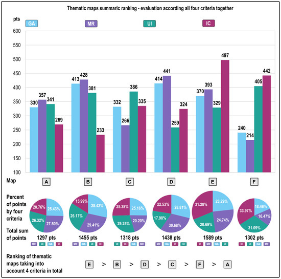
Figure 5.
Thematic maps ranking according to four subjective evaluation criteria in comparative and summary terms—total number of points and the percentage share of individual criteria in the overall result.
The best result achieved by map E was influenced by the evaluation of information complexity (31.28% of points), then by map readability (24.74%), and also by graphical attractiveness (23.29%) and information usefulness and importance (20.69%). In the case of map B, which ranked second, the overall result is as follows: 29.41% of it is readability of the map, 28.42% graphical attractiveness, 26.17% information usefulness and importance, and 15.99% information complexity. Map D, which ranked third, had the following results of particular categories that determined the overall result: 30.68%—map readability, 28.81%—graphical attractiveness, 22.53%—information complexity and 17.98%—information usefulness and importance. As far as map C was concerned, it ranked fourth, with 29.25% being the information usefulness and importance, 25.38% being information complexity, 25.16% graphical attractiveness, and 20.20% map readability. Map F, ranking fifth, achieved the following results: 33.97%—information complexity, 31.09%—information usefulness and importance, 18.46%—graphical attractiveness, and 16.47%—map readability. Map A, ranking last, obtained: 27.5% in terms of map readability, 26.32% for information usefulness and importance, 25.43% for graphical attractiveness, and 20.76% for information complexity.
3.3. Respondents’ Motivations
Figure 6 demonstrates the results related to answers to the question of what respondents were guided by when evaluating thematic maps and to what extent they considered the factors mentioned that were distinguished by means of codes (e.g., GA-1). Apart from detailed results presenting the percentages of answers for particular levels of the Likert scale, the average results were also used. Particular answers from the Likert scale were assigned importance, allowing the quantification of qualitative variables [53] (1 for the answer “Definitely not”, 2—“Rather not”, 3—“Hard to say”, 4—“Rather yes”, 5—“Definitely yes”). Calculating the average importance allowed for making it possible to draw general conclusions about the importance of the factor and create the final ranking of those factors (1 to 1.8—Definitely not, 1.9 to 2.6—“Rather not”, 2.7 to 3.4—“Hard to say”, 3.5 to 4.2—“Rather yes”, 4.3 to 5—“Definitely yes”). The factors were specified under diagrams and arranged in order from the most important to the least important, based on the average results. In the case of additional factors indicated by respondents, the following answers appeared for graphical attractiveness (GA): (1) “interesting content, theme of the map”; (2) “Maps on which there is a lot going on discourage from focusing on them. Firstly, I analyzed maps with fewer details”; (3) “easily readable”; (4) “none” and for readability of map (MR): (1) “none”. There were no extra factors for other criteria (IC and UI).
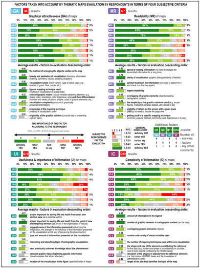
Figure 6.
Detailed and generalized (averaged) results of users’ evaluation of factors that may affect the way of assessing thematic maps in terms of graphical attractiveness (GA), map readability (MR), information usefulness and importance (UI), and information complexity (IC).
As far as graphical attractiveness (GA) for respondents was concerned, the method of arranging objects visible on the map (GA-5), with the average of 4.46, turned out to be the most relevant to respondents. The type of mapping technique used (GA-1) ranked fourth (4.33). At the same time, it was the factor that obtained the largest total number of positive votes, near 90%. Selected graphic means (GA-8) ranked fifth, with the slightly lower average (4.32). Considering the distribution of answers, it may be concluded that the impact of those five factors was relevant, in respondents’ opinion. In each case, nearly 50% of respondents selected the answer “Definitely yes”. In the case of visualization complexity (GA-6), the average result was 4.13 due to the relatively larger number of negative votes. The knowledge of the mapping technique used (GA-2) with the average of 3.88 ranked last but one. Generalizing the two last results, it is possible to conclude that they do have an impact on the manner of arranging maps according to the criterion of graphical attractiveness. The originality of the graphical solution ranked last (the average of 3.42; GA-3), which is equivalent to the result “Hard to say”.
The largest number of “Definitely yes” answers was given for the factor of map readability (MR), specifically for how fast the information was read (84%), and along with “Rather yes” answers the result was 98% (the average of 4.8). Clarity of visualization (MR-3), understood as the opportunity to distinguish between details, was a factor of map readability that ranked second, with the average of 4.74. Correct reading of the information (MR-2) with the average of 4.57 ranked third. The result for those factors may be generally defined as “Definitely yes”. Legend readability (MR-6) ranked fourth (4.20), followed by overlapping graphic elements (4.13; MR-8), simplicity of the graphic solutions used (4.12; MR-4), visibility of details on the screen with a given scale of 100% (3.78; MR-7), and getting used to a specific mapping technique (3.74; MR-5). Generally, it is reasonable to say that those factors are rather relevant in the creation of the ranking of maps according to their readability.
When it comes to usefulness and importance of information (UI), users would indicate a topic important for saving life and health from one’s own point of view (UI-2) the most often, and secondly a topic important for saving life and health from the point of view of emergency services (UI-3). In terms of selected graphic means highlighting specific information (UI-5), the average was 3.39, whereas the location of the visualization in the figure (UI-4) was 3.0, which is equivalent to “Hard to say”.
As far as information complexity (IC) was concerned, respondents would pick the “Definitely yes” answer in the case of the amount of information in the legend (the average of 4.55; IC-2), the number of graphic elements in the cartographic content (on the map), with the average of 4.49, ranked second (IC-1). Those two factors could be generalized as the “Definitely yes” answer. Overlapping graphic elements (objects) (the average of 4.22) ranked third (IC-3), then the number and variety of visual variables used (4.08; IC-5), the number of mapping techniques used within one visualization (3.86; IC-7), the shape and size of the elements constituting the reference (3.68; IC-4), the deviation of the shape of objects from reference elements (3.31; IC-8—that question may have been misunderstood), and the length of the title that identifies the theme of the map (2.42; IC-6). The last factor generally was “Rather not”, and the highest of all results “Definitely not” (34%).
4. Discussion
The study was carried out in order to examine how public users perceive such traits of cartographic visualizations as graphical attractiveness, map readability, usefulness and importance of information, and complexity of the information presented on the map in the context of specific thematic maps. Researchers can choose from different research strategies that can be adopted for comparing maps. To evaluate maps the ranking method was employed, whose potential in cartographic studies had not been used enough so far, in our opinion. The method of analyzing data becomes a significant problem in interpreting data obtained by means of this method. The result obtained by ranking is a complex result, which makes the analysis much more difficult than in the case of rating. The approach, in which instead of a single result a few partial results were achieved, may hinder their interpretation, particularly a comparison with other criteria of evaluation tested the same way. In order to draw the right conclusions from the ranking of mapping techniques, it is not enough just to look at the first and last rank but one needs to consider all the ranks. Assigning importance to particular ranks and calculating the weighted arithmetic mean results in achieving individual numeric results that allow the creation of the final ranking.
The ranking method benefits a stronger differentiation of maps according to the criteria established, and even the smallest details may determine the order adopted. It increases the accuracy of the research, as even the smallest differences need to be taken into account [25], which is actually highly desirable in terms of cartographic research. It provides a lot more than just the first impression, because the respondent is forced to make a decision. Thus, the quality of the subjective evaluation rises, at the same time increasing the cognitive load of the respondent and the effort that needs to be put in to filling in the survey [21,25]. However, the method used also has its flaws, one of them being the lack of knowledge of how big those differences are, because they can be either very small or very big between consecutive ranks. This results from the orderly character of that measurement scale [54]. The lack of opportunity to rank the compared thematic maps the same may also be a disadvantage. Subjectively, it seems that the respondent should have such an opportunity. However, if one were to consider measurable criteria, as well as the plurality and diversity of factors that may determine the evaluation, the probability of maps achieving exactly the same result seems to be very low, particularly considering the fact that already in the assumption of the research the decision has been made to embrace a diversity of mapping techniques, colors and shapes. It is also confirmed by quantitative attempts to describe the diversity of particular maps analyzed in this research. VAS, already employed in studies of cartographic visualizations, e.g., by Cawthon and Moere [42], constitutes the alternative solution.
Examining which factors affect respondents’ choices is as important as obtaining information about users’ preferences. The ranking method is conducive to gaining insight into criteria according to which it is possible to make a subjective evaluation. Respondents are forced to make an in-depth analysis, i.e., they have to dive deeper into the factors that differentiate evaluated maps in terms of the set criteria. The method makes users examine maps in more detail and analyze criteria they consider in making a decision. All the presented techniques of analyzing rankings complement one another in a way and bring factual, complex results. The employment of labels and colors, and maintaining accuracy and consistency, was truly significant to facilitate the understanding of graphical presentation of the results. The ranking method worked well for the realization of the adopted goal. It was possible to learn about priorities that respondents are guided by because the ranking was also created to analyze factors that respondents select while building the ranking.
5. Conclusions
The research also allowed the formulation of the following conclusions regarding particular mapping techniques for representing phenomena that are relevant to citizens (here, the Helicopter Emergency Medical Service). The dot map turned out to be the most problematic and, relatively, the most difficult one to evaluate by users. Opinions of respondents were the most divided on that map, and the consensus was the lowest in assigning ranks. The dot map has also received one of the lowest evaluations in terms of graphical attractiveness, usefulness and importance of information and complexity of information. Map A was, on the one hand, distinguished by great simplicity and a small number of colors used. On the other hand, it was characterized by certain discomfort of touching and overlapping dots that is a well-known flaw of this method. Such dichotomy supposedly may be the source of very diverse evaluations by respondents.
The isoline map (Isochromatic map) was the one that was judged the lowest in terms of complexity of information. At the same time, it was evaluated highly in terms of graphic attractiveness, ranking second. Map B turned out to be graphically attractive, readable and the least complex in terms of complexity of information, with usefulness evaluated high. In the ranking considering all criteria in total, map B ranked second.
The spot ranges map received highly diverse ranks in the final ranking in terms of our four criteria: it ranked second in terms of usefulness, third for complexity of information, fourth in terms of graphical attractiveness and fifth in terms of readability. However, considering all criteria, the map ranked fourth.
The choropleth map has turned out to be the most graphically attractive and readable; however, it ranked last in terms of usefulness of information. That mapping technique was, according to respondents, the most readable and attractive despite the large number of enumeration units, the unusual assignment of values, and a cool violet color. It may result from the common usage of that technique for representing statistical data. In the ranking that considers all four criteria, map D ranked third.
The choropleth map, with the proportional point symbol map including pie charts distinguishing the types of emergencies, is characterized by the greatest complexity of information and the highest resoluteness of users, ranking third in graphical attractiveness and readability and fourth in information usefulness. Map E ranked the highest in the total ranking that considered all four criteria.
The map with a flow map and point signature map has turned out to be the least graphically attractive and also the least readable and the most usable. Map F was also the most unambiguously evaluated by users, i.e., respondents would more often indicate a selected rank than other ranks. For that map, high usefulness could be related to the most sensitive piece of information to the health and life of the citizen, i.e., approximate time of the flight between the helicopter base and the hospital landing site. Considering all maps, it is possible to draw the conclusion that complexity of information was evaluated by respondents in the most unambiguous way, map readability ranked second, usefulness and importance of information ranked third, and consensus between respondents was the lowest in terms of the evaluation of graphical attractiveness.
Out of 32 factors highlighted that may have affected the process of map ranking creation (eight per each criterion), 12 of them can be considered definitely significant, the majority of them (five) being related to graphical attractiveness. The speed of reading information was the highest score achieved (criterion: map readability). When it comes to factors that matter in terms of building the ranking, 15 were identified, with the majority (five) being for the map readability criterion. For that criterion, all the predefined factors were treated as the average (answer “Definitely yes” or “Rather yes”). A factor defined as the one that did not matter that much was related to the length of the title that identified the topic of the map and it was related to the complexity of information criterion. None of the factors obtained such a low average to make a statement that it definitely did not matter in establishing the order of the maps evaluated. The authors realize that they have not exhausted the entire issue of the subjective ranking of several mapping techniques that the user can see in parallel in a single view on the computer screen. The research has shown the necessity of undertaking in-depth studies of the properties of particular thematic maps for a separate or complementary analysis of phenomena in geographic space that are relevant to the health and life of society.
Author Contributions
Conceptualization, Beata Medyńska-Gulij and Łukasz Wielebski; methodology, Łukasz Wielebski; software, Łukasz Wielebski; validation, Łukasz Wielebski and Beata Medyńska-Gulij; formal analysis, Łukasz Wielebski and Beata Medyńska-Gulij; investigation, Łukasz Wielebski; resources, Łukasz Wielebski; data curation, Łukasz Wielebski; writing—original draft preparation, Łukasz Wielebski; writing—review and editing, Beata Medyńska-Gulij; visualization, Łukasz Wielebski; supervision, Beata Medyńska-Gulij; project administration, Łukasz Wielebski. All authors have read and agreed to the published version of the manuscript.
Funding
This research received no external funding.
Institutional Review Board Statement
Not applicable.
Informed Consent Statement
Not applicable.
Data Availability Statement
Not applicable.
Conflicts of Interest
The authors declare no conflict of interest.
References
- Robinson, A.H. Elements of Cartography, 6th ed.; Wiley: New York, NY, USA; Chichester, UK, 1995; ISBN 9780471555797. [Google Scholar]
- Dent, B.D. Cartography: Thematic Map Design, 5th ed.; WCB/McGraw-Hill: Boston, MA, USA, 2007; ISBN 9780072319026. [Google Scholar]
- Medynska-Gulij, B. How the Black Line, Dash and Dot Created the Rules of Cartographic Design 400 Years Ago. Cartogr. J. 2013, 50, 356–368. [Google Scholar] [CrossRef]
- Medyńska-Gulij, B. Map compiling, map reading, and cartographic design in “Pragmatic pyramid of thematic mapping”. Quaest. Geogr. 2010, 29, 57–63. [Google Scholar] [CrossRef]
- Kraak, M.-J.; Ormeling, F. Cartography: Visualization of Geospatial Data, 4th ed.; CRC Press, Taylor & Francis Group: Boca Raton, FL, USA, 2021; ISBN 1138613959. [Google Scholar]
- Hake, G.; Grünreich, D.; Meng, L. Kartographie: Visualisierung Raum-Zeitlicher Informationen, 8th ed.; Walter de Gruyter: Berlin, Germany, 2002; ISBN 978-3-11-016404-6. [Google Scholar]
- Slocum, T.A.; McMaster, R.B.; Kessler, F.C.; Howard, H.H. Thematic Cartography and Geovisualization, 3rd ed.; Pearson Prentice Hall: Hoboken, NJ, USA, 2010; ISBN 0138010064. [Google Scholar]
- Tyner, J.A. Principles of Map Design; Guilford Press: New York, NY, USA, 2010; ISBN 978-1-60623-544-7. [Google Scholar]
- Ratajski, L. Metodyka Kartografii Społeczno-Gospodarczej, 2nd ed.; Państwowe Przedsiębiorstwo Wydawnictw Kartograficznych im. Eugeniusza Romera: Warszawa, Poland; Wrocław, Poland, 1989; ISBN 9788370000554. [Google Scholar]
- Krassanakis, V.; Cybulski, P. Eye Tracking Research in Cartography: Looking into the Future. IJGI 2021, 10, 411. [Google Scholar] [CrossRef]
- Medyńska-Gulij, B.; Wielebski, Ł.; Halik, Ł.; Smaczyński, M. Complexity Level of People Gathering Presentation on an Animated Map—Objective Effectiveness Versus Expert Opinion. IJGI 2020, 9, 117. [Google Scholar] [CrossRef]
- Cybulski, P.; Wielebski, Ł. Effectiveness of Dynamic Point Symbols in Quantitative Mapping. Cartogr. J. 2019, 56, 146–160. [Google Scholar] [CrossRef]
- Horbiński, T.; Cybulski, P.; Medyńska-Gulij, B. Graphic Design and Button Placement for Mobile Map Applications. Cartogr. J. 2020, 57, 196–208. [Google Scholar] [CrossRef]
- Forrest, D. Thematic Maps in Geography. Int. Encycl. Soc. Behav. Sci. 2015, 24, 260–267. [Google Scholar] [CrossRef]
- Forrest, D.; Medyńska-Gulij, B. Which mapping technique for population density is effective, attractive, and suggestive? Abstr. Int. Cartogr. Assoc. 2021, 3, 1. [Google Scholar] [CrossRef]
- Besançon, L.; Cooper, M.; Ynnerman, A.; Vernier, F. An Evaluation of Visualization Methods for Population Statistics Based on Choropleth Maps. arXiv 2020, arXiv:Abs/2005.00324. [Google Scholar] [CrossRef]
- Wielebski, Ł.; Medyńska-Gulij, B. Graphically supported evaluation of mapping techniques used in presenting spatial accessibility. Cartogr. Geogr. Inf. Sci. 2019, 46, 311–333. [Google Scholar] [CrossRef]
- Korycka-Skorupa, J.; Gołębiowska, I. Multivariate mapping for experienced users: Comparing extrinsic and intrinsic maps with univariate maps. Misc. Geogr. 2021, 25, 259–271. [Google Scholar] [CrossRef]
- Šašinka, Č.; Stachoň, Z.; Čeněk, J.; Šašinková, A.; Popelka, S.; Ugwitz, P.; Lacko, D. A comparison of the performance on extrinsic and intrinsic cartographic visualizations through correctness, response time and cognitive processing. PLoS ONE 2021, 16, e0250164. [Google Scholar] [CrossRef] [PubMed]
- Korycka-Skorupa, J.; Gołębiowska, I. Numbers on Thematic Maps: Helpful Simplicity or too Raw to Be Useful for Map Reading? IJGI 2020, 9, 415. [Google Scholar] [CrossRef]
- Oldendick, R.W. Ranking. Encyclopedia of Survey Research Methods; Lavrakas, P., Ed.; Sage Publications, Inc: Thousand Oaks California, CA, USA, 2008; ISBN 9781412918084. [Google Scholar]
- Moors, G.; Vriens, I.; Gelissen, J.P.T.M.; Vermunt, J.K. Two of a Kind. Similarities between Ranking and Rating Data in Measuring Values. Surv. Res. Methods 2016, 10, 15–33. [Google Scholar] [CrossRef]
- Langville, A.N.; Meyer, C.D. Who’s #1? Princeton University Press: Princeton, NJ, USA, 2012; ISBN 9781400841677. [Google Scholar]
- Rokeach, M. The Nature of Human Values; The Free Press: New York, NY, USA, 1973; ISBN 9780029267509. [Google Scholar]
- Alwin, D.F.; Krosnick, J.A. The Measurement of Values in Surveys: A Comparison of Ratings and Rankings. Public Opin. Q. 1985, 49, 535–552. [Google Scholar] [CrossRef]
- Ovadia, S. Ratings and rankings: Reconsidering the structure of values and their measurement. Int. J. Soc. Res. Methodol. 2004, 7, 403–414. [Google Scholar] [CrossRef]
- Tarka, P. Statistical choice between rating or ranking method of scaling consumers’ values. Stat. Transit. 2010, 11, 177–186. [Google Scholar]
- Hino, A.; Imai, R. Ranking and Rating: Neglected Biases in Factor Analysis of Postmaterialist Values. Int. J. Public Opin. Res. 2019, 31, 368–381. [Google Scholar] [CrossRef]
- Chiusole, D.; Stefanutti, L. Rating, ranking, or both? A joint application of two probabilistic models for the measurement of values. Test. Psychom. Methodol. Appl. Psychol. 2011, 18, 49–60. [Google Scholar]
- Heyman, J.; Sailors, J. A Respondent-friendly Method of Ranking Long Lists. Int. J. Mark. Res. 2016, 58, 693–710. [Google Scholar] [CrossRef]
- van Herk, H.; van de Velden, M. Insight into the relative merits of rating and ranking in a cross-national context using three-way correspondence analysis. Food Qual. Prefer. 2007, 18, 1096–1105. [Google Scholar] [CrossRef]
- Lee, P.H.; Yu, P.L.H. An R package for analyzing and modeling ranking data. BMC Med. Res. Methodol. 2013, 13, 269. [Google Scholar] [CrossRef] [PubMed]
- Harzing, A.-W.; Baldueza, J.; Barner-Rasmussen, W.; Barzantny, C.; Canabal, A.; Davila, A.; Espejo, A.; Ferreira, R.; Giroud, A.; Koester, K.; et al. Rating versus ranking: What is the best way to reduce response and language bias in cross-national research? Int. Bus. Rev. 2009, 18, 417–432. [Google Scholar] [CrossRef]
- Finch, H. An introduction to the analysis of ranked response data. Pract. Assess. Res. Eval. 2022, 27, 1–20. [Google Scholar] [CrossRef]
- Barwa, T.M. How Rankings Superiorly Differ Than Ratings? Int. J. Bus. Manag. Invent. 2016, 5, 9–10. [Google Scholar]
- McCarty, J.; Shrum, L.J. Measuring the Importance of Positive Constructs: A Test of Alternative Rating Procedures. Mark. Lett. 1997, 8, 239–250. [Google Scholar] [CrossRef]
- Genter, S.; Trejo, Y.G.; Nichols, E. Drag-and-Drop versus Numeric Entry Options: A Comparison of Survey Ranking Questions in Qualtrics. J. Usability Stud. 2022, 17, 117–130. [Google Scholar]
- Blasius, J. Comparing Ranking Techniques in Web Surveys. Field Methods 2012, 24, 382–398. [Google Scholar] [CrossRef]
- Smyth, J.D.; Olson, K.; Burke, A. Comparing survey ranking question formats in mail surveys. Int. J. Mark. Res. 2018, 60, 502–516. [Google Scholar] [CrossRef]
- Lavrakas, P. Paired Comparison Technique. In Encyclopedia of Survey Research Methods; Lavrakas, P., Ed.; Sage Publications, Inc.: Thousand Oaks California, CA, USA, 2008; ISBN 9781412918084. [Google Scholar]
- Hoag, J.R.; Kuo, C.-L. Ranking question designs and analysis methods. J. Med. Stat. Inform. 2016, 4, 6. [Google Scholar] [CrossRef]
- Cawthon, N.; Moere, A.V. The Effect of Aesthetic on the Usability of Data Visualization. In Proceedings of the 2007 11th International Conference Information Visualization (IV ’07), Zurich, Switzerland, 4–6 July 2007; pp. 637–648. [Google Scholar]
- Medynska-Gulij, B. The Effect of Cartographic Content on Tourist Map Users. Cartography 2003, 32, 49–54. [Google Scholar] [CrossRef]
- Medyńska-Gulij, B.; Cybulski, P. Spatio-temporal dependencies between hospital beds, physicians and health expenditure using visual variables and data classification in statistical table. Geod. Cartogr. 2016, 65, 67–80. [Google Scholar] [CrossRef]
- Bertin, J. Semiologie Graphique: Les Diagrammes, Les Réseaux, Les Cartes; The Royal Geographical Society: London, UK, 1967. [Google Scholar]
- Kraak, M.-J.; Roth, R.; Ricker, B.; Kagawa, A.; Sourd, G. Mapping for a Sustainable World; Mouton: New York, NY, USA, 2020; ISBN 9789216040468. [Google Scholar]
- Halik, Ł. The analysis of visual variables for use in the cartographic design of point symbols for mobile Augmented Reality applications. Geod. Cartogr. 2012, 61, 19–30. [Google Scholar] [CrossRef]
- Medyńska-Gulij, B. Kartografia i Geomedia, 1st ed.; Wydawnictwo Naukowe PWN: Warszawa, Poland, 2021; ISBN 8301215542. [Google Scholar]
- Całka, B. Comparing continuity and compactness of choropleth map classes. Geodesy and Cartography 2018, 67, 21–34. [Google Scholar] [CrossRef]
- Lexikon der Kartographie und Geomatik; Spektrum, Akad. Verl.: Heidelberg/Berlin, Germany, 2002; ISBN 3827410568.
- Brychtova, A.; Doležalová, J. Designing Usable Sequential Color Schemes for Geovisualizations. In Proceedings of the 1st ICA European Symposium on Cartography, Vienna, Austria, 10–12 November 2015. [Google Scholar]
- Sharma, G.; Wu, W.; Dalal, E. The CIEDE2000 color-difference formula: Implementation notes, supplementary test data, and mathematical observations. Color Res. Appl. 2005, 30, 21–30. [Google Scholar] [CrossRef]
- Kukuła, K. Propozycja budowy rankingu obiektów z wykorzystaniem cech ilościowych oraz jakościowych. Metod. Ilościowe W Bad. Ekon. 2012, 13, 5–16. [Google Scholar]
- Borsboom-van Beurden, J.A.M.; de Jong, K.; De Niet, R.; de Nijs, A.C.M.; Hagen, A.; CGM, K.G.; Verburg, P. The MAP COMPARISON KIT: Methods, Software and Applications; Rijksinstituut voor Volksgezondheid en Milieu RIVM: De Bilt, Netherlands, 2004. [Google Scholar]


Disclaimer/Publisher’s Note: The statements, opinions and data contained in all publications are solely those of the individual author(s) and contributor(s) and not of MDPI and/or the editor(s). MDPI and/or the editor(s) disclaim responsibility for any injury to people or property resulting from any ideas, methods, instructions or products referred to in the content. |
© 2023 by the authors. Licensee MDPI, Basel, Switzerland. This article is an open access article distributed under the terms and conditions of the Creative Commons Attribution (CC BY) license (https://creativecommons.org/licenses/by/4.0/).