Article

ColorWatch: Color Perceptual Spatial Tactile Interface for People with Visual Impairments

by
Muhammad Shahid Jabbar
1,
Chung-Heon Lee
1 and
Jun Dong Cho
1,2,*
1
Department of Electrical and Computer Engineering, Sungkyunkwan University, Suwon 16419, Gyeonggi-do, Korea
2
Department of Human ICT Convergence, Sungkyunkwan University, Suwon 16419, Gyeonggi-do, Korea
*
Author to whom correspondence should be addressed.
Electronics 2021, 10(5), 596; https://doi.org/10.3390/electronics10050596
Submission received: 3 February 2021 / Revised: 22 February 2021 / Accepted: 28 February 2021 / Published: 4 March 2021
(This article belongs to the Special Issue Multi-Sensory Interaction for Blind and Visually Impaired People)

Abstract

:
Tactile perception enables people with visual impairments (PVI) to engage with artworks and real-life objects at a deeper abstraction level. The development of tactile and multi-sensory assistive technologies has expanded their opportunities to appreciate visual arts. We have developed a tactile interface based on the proposed concept design under considerations of PVI tactile actuation, color perception, and learnability. The proposed interface automatically translates reference colors into spatial tactile patterns. A range of achromatic colors and six prominent basic colors with three levels of chroma and values are considered for the cross-modular association. In addition, an analog tactile color watch design has been proposed. This scheme enables PVI to explore artwork or real-life object color by identifying the reference colors through a color sensor and translating them to the tactile interface. The color identification tests using this scheme on the developed prototype exhibit good recognition accuracy. The workload assessment and usability evaluation for PVI demonstrate promising results. This suggest that the proposed scheme is appropriate for tactile color exploration.

1. Introduction

People with visual impairments (PVI) can form concepts regarding real-world object properties, including abstract conceptualization and relative differences between colors [1,2,3]. Symbolism, preferences, terminology, and other daily life concepts associate with colors by engaging psychological and aesthetic stimuli. These color associations serve a significant role in culture, faith, art, commercial branding, and everyday lifestyle. Therefore, comprehensive color information is necessary for PVI to think, consider, make actions, and cause reactions more prudently [4].
Color recognition through non-visual stimuli has been an active research area for PVI [5]. The color-sound cross modular associations convey visual color information through auditory senses. These associations code color characteristics of hue, chroma, and value through a combination of music instrument, music tone, pitch variations, etc. The auditory codings might be used for conveying color information independently, or in conjunction with tactile sense. Cho et al. [6] have studied these relationships and proposed two sound coding color melodies. They considered the tone, intensity, and pitch of melody sounds extracted from classic music to express the brightness and saturation of colors. The sound code system represented 18 chromatic and five achromatic colors with using classical music sounds played on different instruments. While using sound to depict color, tapping a relief-shaped embossed outline area transforms the color of that area into the sound of an orchestra instrument. Furthermore, the overall color composition of Van Gogh’s “The Starry Night” was expressed as a single piece of music that accounted for color using the tone, key, tempo, and pitch of the instruments. The shape can be distinguished by touching it with a hand, but the overall color composition can be conveyed as a single piece of music, thereby reducing the effort required to recognize color from that needed to touch each pattern one by one. Gilbert et al. confirmed that humans have an association mechanism that unconsciously associates a specific scent with a specific color through olfactory sense [7]. Temperature differences have also been studied to convey color information to PVI. However, as the temperature is a single modality, merely one color characteristic can be coded through temperature levels. Bartolomé et al. [8] proposed thermal stimuli to code depth of colors in visual artworks. Cavadini et al. proposed an automatic color perception system, which provides haptic feedback at three points on the palm corresponding to Red, Green, and Blue channel values of detected colors through color sensors [9]. This method uses a wearable glove, and wearing the glove can hinder everyday tasks for PVI. In addition, the RGB color system uses a combination of red, green, and blue channel numerical values to represent any arbitrary color, which does not match the human perception of colors. Researchers reflect that spatial perception, tactile perception, and linguistics engage the brain’s visual cortex. In addition, not having to process the visual stimuli makes PVIs’ performance superior for tactile tasks [10], which suggests the preference of tactile stimuli for PVI perception. The cognitive aspects of multi-sensory activation and recognition by the sense of touch are covered by Lawrence et al. [11].

1.1. Tactile Representation of Colors

Tactile color patterns (TCP) are embossed surface patterns for conveying color information through touch to PVI. TCPs might be helpful as they can be used in conjunction with other tactile modalities, like contour information or object boundaries in the artwork. They offer immediate color perception by tapping onto the artwork relief pattern, unlike audio description which needs to be triggered. TCPs as an assistive tool for visual aspects of artwork can be supplemented to the audio description; this helps shorten the audio description and improve localization of artworks’ objects information. Ramsamy-Iranah et al. [12] designed color symbols for children. The design process for the symbols was influenced by the children’s prior knowledge of shapes and links to their surroundings. For example, a small square box was associated with dark blue reflecting the blue square soap, a circle represented red as it was associated with the ‘bindi’ [13]. Yellow was represented by small dots reflecting the pollen of flowers. Since orange is a mixture of yellow and red, circles of smaller dimension were used to represent orange. Horizontal lines represented purple and curved lines were associated with green representative of bendable grass stems. Shin et al. [4] coded nine colors (pink, red, orange, yellow, green, blue, navy, purple, brown, and achromatic) using a grating orientation (a regularly spaced collection of identical, parallel, elongated elements). The texture stimuli for color were structured by matching variations of orientation to hue, width of the line to chroma, and the interval between the lines to value. The eight chromatic colors were divided into 20° angles and achromatic at 90°. Each color has nine levels of value and of chroma. Levels 1–4 used a different grating interval to represent value, levels 6–9 used a different grating width to represent chroma, and level 5 represented the pure hue. In the survey on whether or not 3D printed colors were distinguished by texture, color identification tests were performed on five visually impaired people to distinguish the direction, width, and spacing of the proposed color patterns. Adjacent color hues in this scheme are oriented at an angular distance of 20°, but research suggests that tactile accuracy for grating orientation is significantly distinguishable for 30° or 45° angle [14,15]. The Munsell color system based TCP schemes by using ideographic characters were proposed by Cho et al. [16]. They employed an experimental investigation and adaption based approach for representing wide color gamut of 29 and 53 colors shades in the basic and extended versions for three TCP schemes, respectively. Taras et al. [17] presented a color code created for viewing on braille devices. The primary colors, red, blue, and yellow, were each coded by two dots. Mixed colors, for example violet, green, orange, and brown, were coded as combinations of dots representing the primary colors. In addition, the light and dark shades were added by using the 2nd and 3rd dots in the left column of the Braille cell. In addition, color can be represented by using the spatial color wheel that expresses the angular orientation. This is another way of color information transmission. Our proposed system codes a similar number of colors compared to other color patterns. Moreover, the color wheel depicts essentially the visible spectrum of colors enclosed by a circle, and is a useful tool for describing what happens when you mix paints together, complementary color relationships, and adjacent colors.
It can be difficult for individuals with visual impairments to fully participate in the visual arts due to the lack of inclusion and assistive technologies. Their participation in the visual culture of the world and visual art is important as the inclusion opportunities improve their life quality and help them gain skills crucial to their education and employment opportunities [18]. The visual centricity of exhibitions and museums has typically been a barrier regarding visit and appreciation of PVIs [19]. However, as “The event happens as a question mark before happening as a question (Lyotard, 1989: 197),” many of these institutions are now focusing on accessibility to enhance PVIs’ experiences by incorporating assistive technologies, contextual information delivery, and multisensory experiences [20].
The TCP schemes in recent literature are mainly focused on tactile color translation for artwork, whereas the significance of colors in daily life imparts the need to convey comprehensive color information to PVI for them to participate in society more prudently. Most of these schemes present static interpretation of colors, which causes the need to arise to develop assistive technologies that can dynamically translate detected colors from real-life objects or artwork for PVI. Moreover, the usability of these tactile patterns is limited, as learnability of these tactile patterns may be required for individual TCP associations. In this paper, we propose a tool for people with visual impairment (i.e., congenital blind people who have not experienced color and the acquired blind people whose color has disappeared from memory) that can intuitively recognize and understand the three elements of color, that is, color hue, lightness, and saturation, taking advantage of the timepiece watch design.

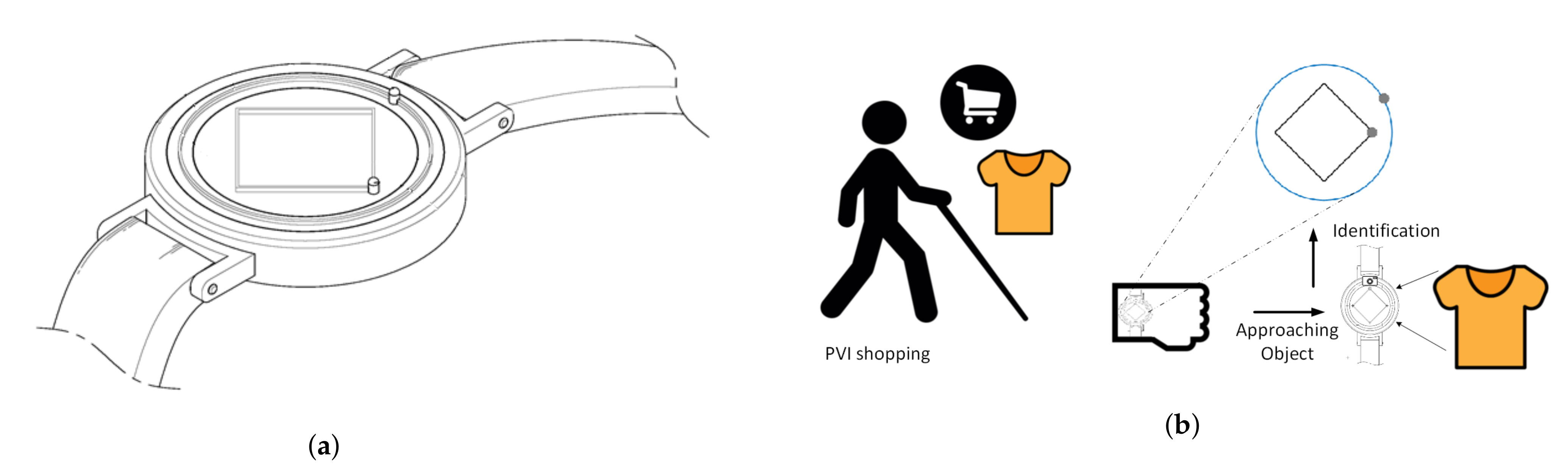
1.2. Timepiece Watches for PVI

There are many wearable wristwatches for PVI in the context of timepiece operation. Nevertheless, the common way of applying it has been using the braille interface for conveying numeric braille patterns similar to the digital watches for sighted people, since interactable hands of the traditional analog watch are fragile and prone to damage by heavy touch. The electromagnetic solenoid based cost-effective electronic braille display was proposed by Adnan et al. [21]. Tyler [22] used the 4-dot condensed braille code to introduce a design scheme of wearable timepiece wristwatch for PVI. The mechanical design was adapted to represent numeric braille cells for time and date, with time/date adjustment and alarm options. Dot watch [23] is a commercially designed smartwatch based on a similar concept which uses braille as its interface using braille coding. In addition to presenting time information by tactile stimuli, the Dot watch can be connected to a smartphone via Bluetooth to perform few basic tasks such as caller identification, and either pick or decline the call. Another design scheme consisting of a disk, a plate, an actuator, and a plurality of four pins mounted to a slide within the four respective holes was proposed for the braille timepiece wristwatch by Anderson et al. [24]. A haptic feedback scheme for a digital smartwatch display was proposed by Twyman et al. [25], which engaged side-mounted piezoelectric actuators to cause glass screen vibrations via ultrasonic frequencies. The braille literacy of PVI is on the decline, and it is projected to decrease in upcoming years, with the widespread use of smart devices. Velázquez [26] provided a comprehensive study on workload, learnability, design concept understanding, and latest advancements in wearable assistive devices for blind people and recognized low user acceptance for these devices. This led our research to investigate the durable design of the analog watch and its possible mapping with color perception for the PVI.

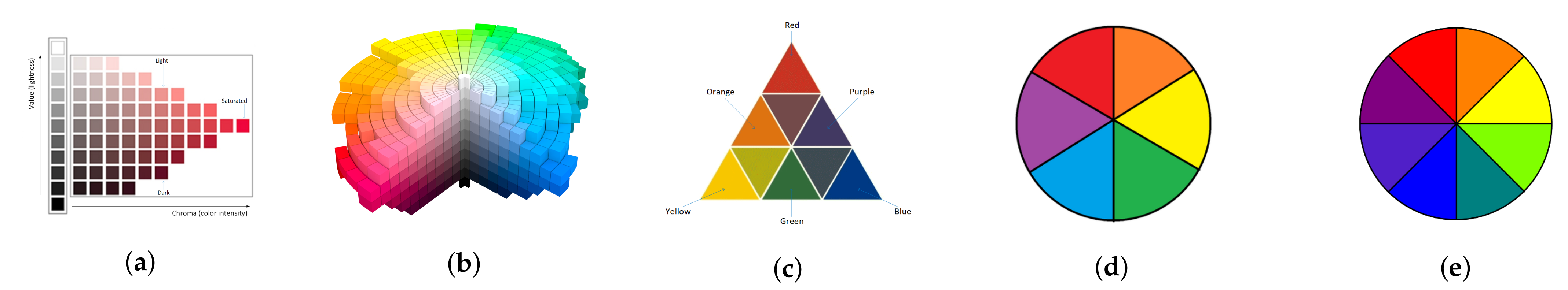
1.3. Review of the Color Systems

The Munsell color system arranges colors by accounting for the human visual response into systematic color space [27]. It considers hue, chroma, and lightness as three properties of color for color space organization as shown in Figure 1a. The hues or basic colors are arranged in a circular manner placed apart at each horizontal circle Figure 1b. Chroma or saturation of color is measured by the distance from the center of the circle to the edge. High chroma implies clearness of color or pure colors, while low chroma implies less saturated color with the lowest chroma colors being achromatic. The lightness or value of colors varies vertically where white is represented by the highest lightness and black holds the lowest lightness value.
The Goethe’s color triangle is an excellent model for color relationships and the relative differences between them, such as additive color mixing and complementary colors [28]. These differences can be interactively simulated. This model arranges colors as primary, secondary, and tertiary colors. The three vertices of triangle are associated by primary colors of red, blue, and yellow. The secondary colors orange, green, and purple are obtained by mixing primary colors on either side of them (Figure 1c). The tertiary colors are obtained by mixing primary colors adjacent to them. Goethe arranged the primary, secondary, and tertiary colors based on physical grounds, as well as for their emotional content linked with them. An American educator Josef Albers extended Goethe’s work for studying and teaching colors through an experimental way [29]. The particular arrangement of Goethe’s color triangle retains the particular emotional or psychological states as per his description. This color arrangement is also similar to the RYB color model [30]. Its warm colors are red, orange, and yellow, and its cool colors are green, blue, and purple. The three primary colors in the RYB color model are red, yellow, and blue. Mixing the primary colors causes the mixtures to absorb light wavelengths to create other colors. The three secondary colors are orange, green, and purple. Mixing the three primary colors together creates an almost black color. We have considered the color gamut for our proposed system based on these color models as shown in Figure 1d,e for simplified and extended versions of watch patterns, respectively. This primary and secondary color information is extended with the integration of color tones of light, saturated, and dark from Munsell’s color system.
Figure 1. (a) Lighted (L), saturated (S), and Dark (D) color tones for red and achromatic colors. (b) 3D representation of Munsell color system renotations with a slice cut away for visualization [31]; (c) Goethe’s Colour Triangle with primary and secondary colors; (d) color wheel for simplified watch pattern; (e) color wheel for extended watch pattern.
Electronics 10 00596 g001

1.4. Proposed System

We have investigated tactile actuation for co-centric protruding points at different angular positions in our preliminary study [32]. The swell-paper relief pattern utilized dots on the boundary of a circle and a square, with uniform angular spacing between tactile dots at 45°and 90°, respectively. The focus group experiments revealed the discernment ability for angular tactile patterns, and the learnability of colors assigned to those patterns. Based on the outcomes of the preliminary study, we propose an integrated color pattern scheme for angular tactile color translation. The color gamut codes primary colors (red, blue, and yellow) and secondary colors (orange, green, and purple) from Goethe’s color triangle. These six basic color hues are further coded into three levels of chroma and value (light, saturated, dark) as the color tone for each of the color hues. In addition, six levels of gray-scale colors ranging from white to black are included as achromatic colors from Munsell’s color system. These integrated colors are coded into an angular tactile color pictogram, wherein the orientation of the tactile dot determines the color information. Our proposed system also integrates the TCP with an analog wearable watch for PVI. The ColorWatch interface consists of two disks in distinct shapes of round and square, each with a tactile dot at their boundary, the angular position of which indicates the color hue and color tones, respectively. In contrast to related works on TCPs, the spatial tactile system automatically interprets reference color. The reference color acquired through a color sensor from artwork or real-life objects actively alters the angular position of rotatable disks, developing the tactile pattern corresponding to reference color for the appreciation of PVIs. The cross-modular association of tactile color perception considers tactile actuation, design aspects of color significance, and color placement. The proposed analog watch design with TCP integration is intuitively understandable, which makes it easily learnable for PVI. A prototype for the proposed interface has been developed and color identification tests have been performed. The results for identification and usability tests, work-load assessment, and qualitative feedback suggest that the developed scheme can be helpful for PVIs in tactile color perception.

2. Methodology

2.1. Concept Design

We propose the design of ColorWatch, which is a wearable wrist-worn analog tactile device for people with visual impairments (PVI). The concept of ColorWatch design includes two disks that can be rotated independently: one marked square disk which is on top of and smaller in size than a round disk, which functions as an hour hand in analog watches while the marked round disk functions as a minutes hand. Both disks are marked at one position each, with markers pointing to the reference positions for time. These disks and marked pointers can be touched by PVIs to convey tactile information. In addition to conventional time checking, the function of ColorWatch extends to represent object colors by the tactile interface. An integrated color sensor or smartphone camera can be used to detect color information of a reference object, which can then be wirelessly communicated to the ColorWatch. Hybrid smartwatches available in the market already exhibit wireless communication and control capabilities along with traditional watch hands. The ColorWatch design proposed a square and a round disk instead of conventional arms to enable PVIs to interact with them without external protective glass and minimizing the risk of damage or heavy touch to conventional arms. The control circuitry in ColorWatch can then direct the watch disks to point to the corresponding position associated with the detected color and color tone. A maintained contact push toggle switch can be used to toggle between timepiece and ColorWatch mode. The ColorWatch tactile design is effective for drawing less attraction to PVI, and for not being disruptive to others in contrast to talking watches. The analog disk design of ColorWatch also makes it easy to read, less fragile, and less susceptible to damage in contrast to a traditional analog watch hands. Figure 2a displays the schematic configuration and perspective view of the ColorWatch design concept, with Figure 2b outlining an application scenario for the ColorWatch. More features can theoretically be added to the ColorWatch; such as smartphone call notifications, incoming call pick and drop, and alarms through haptic feedback. The push button and mechanical dial of the ColorWatch can also hypothetically function as a tactile input method for smartphone scrolling. In this setting, PVI can wirelessly navigate smartphone features through ColorWatch dials discrete rotation, select desired options through one or two buttons or ColorWatch, and get audio feedback through smartphone speakers. However, this study focuses on the automatic spatial color translation framework for the PVI.

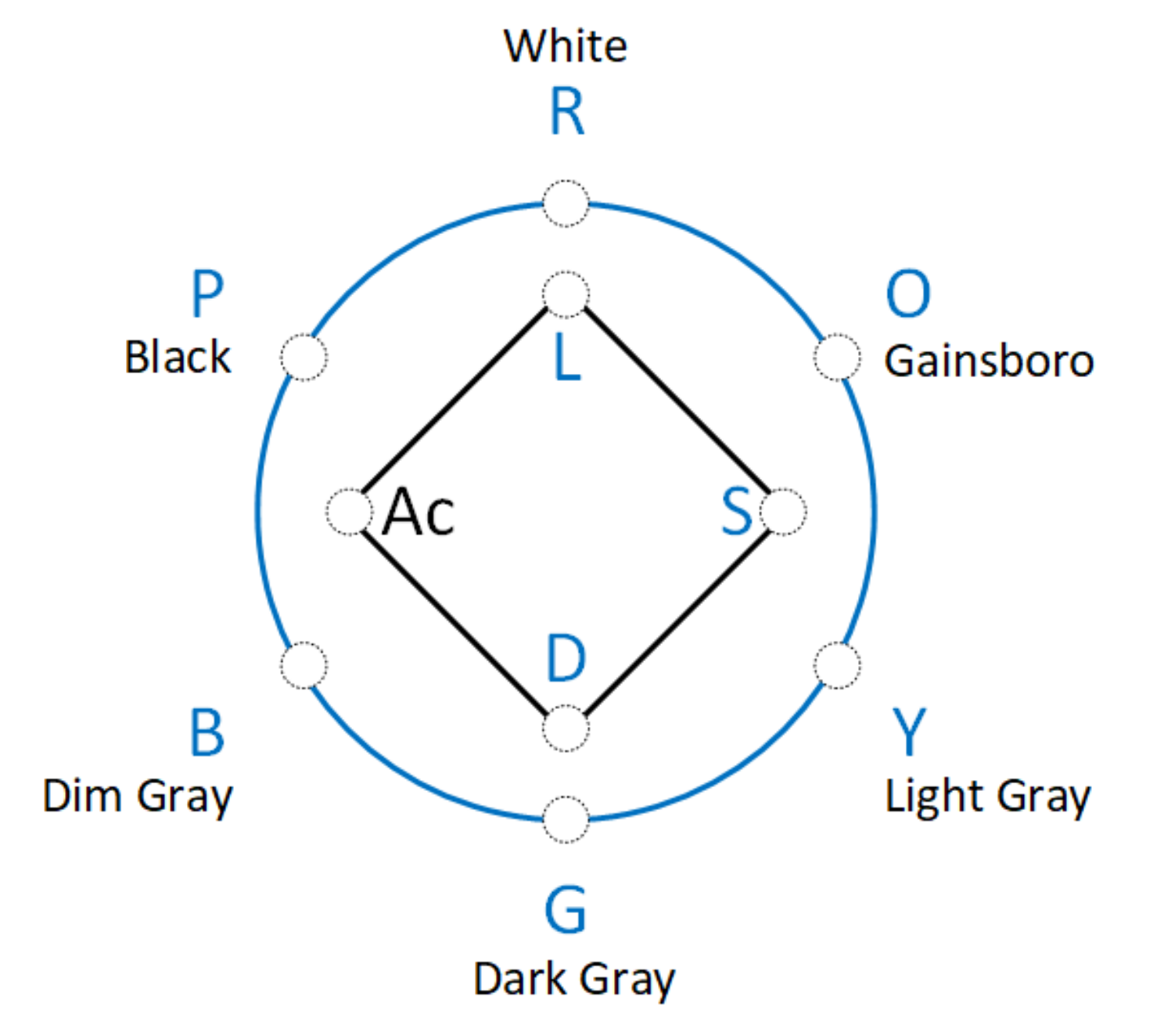
2.2. Proposed Color Selection and Tactile Representation Scheme
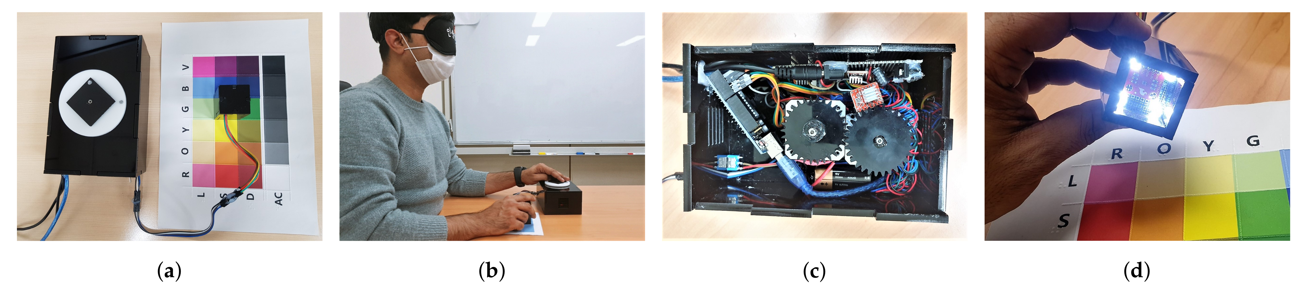
The tactile association of color proposed in this study considers six distinct hues namely red (R), orange (O), yellow (Y), green (G), blue (B), and purple (P) from Goethe’s color triangle. These hues are represented by the round disk of the prototype which dynamically points to the reference color. It can be seen from Figure 3 that complementary colors are arranged on opposite ends to each other, and mixing any two primary colors results in the secondary color between them. An emerged tactile dot of half-sphere on edge of the round disk resembling braille embossment is used as a pointer for tactile color marking. These tactile-color associations are further expanded by Munsell color systems’s three dimensions of light (L), saturated (S), and dark (D) as a color tone of each monochromatic basic color or hue from Goethe’s color triangle. The color tones are represented by the square disk of the ColorWatch design, where the emerged tactile dot at one corner points to the reference color tones, marked 90 degrees apart at 0, 90, and 180 degrees for L, S, and D, respectively. The remaining position at 270 degrees of square disk pointer is used to represent achromatic colors. When a reference to achromatic color is detected on the square disk, the round disk represents each of the achromatic colors given by White, Gainsboro, Light Gray, Dark Gray, Dim Gray, and Black (Table 1). The arrangement of these achromatic colors, and the six color-hues for monochromatic colors on round disk, depending on the color mode is provided in Table 2.
The analog clock dial design holds twelve marks separated by 30 degrees universally. These six markers for round disk and four markers for square disk can be incorporated on the analog clock design as the common factor of twelve markers. This association of perceptual colors and their tactile placement can be very convenient for learnability and ease of use of users and the user-centric design.

2.3. Materials

We have developed a large-scale hardware prototype based on the ColorWatch concept which exhibits the represented color while exploring different objects. Figure 4 displays the working principle of a large-scale prototype. The two rotating disks in the round and square shape are used to represent both levels of primary colors and color tones as shown in Figure 5a. Figure 5b provides a demonstration for the prototype in use. The hardware prototype is a 110 × 170 × 70 cm encased acrylic box that encapsulates the control electronic circuit board, two stepper motors, and their motor drivers (Figure 5c). A set of wires is extended from the box which connects the color sensor module (Figure 5d). The ISL29125 RGB color sensor is used in the color sensor module for color data acquisition. The color sensor is designed to operate in diverse luminance environments ranging from darkrooms to sunlight by rejecting IR in light sources. The color sensor has low-power and needs 56 and 0.5 μA current for operation and power-down mode, respectively. The integrated ADC of the color sensor also rejects flicker caused by artificial light sources. The 2.25–3.6 V logic levels of the color sensor need to be converted if used with a 5 V Arduino board, and a bi-directional logic level converter is used for this purpose. The color sensor is housed in an acrylic casing that limits the incoming light from the target angles only. Four LED lights have been installed into the color sensor module for providing balanced luminance for target objects. An Arduino Uno microcontroller (Arduino, Somerville, MA, USA) is used as a control unit, which takes its inputs from the color sensor module. The 16 bit RGB color values are then converted to Hue, Saturation, and Value-based color model. The color gamut of ColorWatch is calibrated on color samples and these calibration values are compared by a nearest-neighbor based algorithm for classification of any target object color and color tones. The target object color and color tones then index the corresponding angular position of motors from a lookup array. Based on the difference of current and target angular position, the required angular rotations are then conveyed to stepper motors via motor drivers.

3. Experimental Investigation

We have adopted a triangulation based method [33] by covering multiple approaches to address a research question, which offers an appropriate and reliable assessment. Based on our preliminary study for tactile-color cross-modular association, an improved solution has been proposed in the preceding section. The tactile perception large-scale prototype was developed which can produce dynamic results based on reference color. User experiments for design, methodology, and cross-modular association have been performed to evaluate usability and workload assessment, while qualitative feedback is also recorded for the proposed method and exploratory procedure.

3.1. Experiment Design

The experimental evaluation was performed in three stages; learning phase, tests, and feedback. Fifteen volunteers of ages between 19 and 29 years took part in the experimental evaluation of the ColorWatch design and prototype. The volunteers were recruited through school notice board announcement, and twelve of them were males while three were females. All of the subjects had normal vision, did not declare any associated cognitive or psychiatric disorders, and they performed the experiments after putting blindfolds on. Firstly, the test subjects were told about the ColorWatch concept, prototype function, and spatial tactile-color associations. The participants were then allowed free time to get familiarized with the prototype and its function with color identifications. All the colors and their color tones were provided as color sample cards of the size of a quarter of standard A4 size paper each. The subjects were encouraged to use a ColorWatch prototype on real-life objects during the learning phase. The color identification data during the learning phase were not recorded. However, subjects mainly tried to identify colors for table, paper, PC monitor, phone back cover, and their clothes through the tactile interface. After comparing the identifying color with their memory, some of them talked about the challenges PVI might face due to a lack of vision. It was interesting to note that many subjects tried color identifications with blindfolds put on without requirement, once they got familiarized with the prototype. The same color samples were used in the user tests for standardization of the color set for all users. After completing the learning phase, the subjects were then asked to put blindfolds on for user tests. At this point, color cards for all the twenty-four color samples in random order were provided one at a time. The subjects were asked to identify the given color by identifying the tactile pattern from the ColorWatch prototype. The primary color and color tone for the given card and the corresponding identification by each subject were carefully registered, and this procedure was repeated for all the color samples. The subjects were not provided with feedback during tactile identification tests. Finally, subjects evaluated the usability of ColorWatch, provided any remarks they had, and responded to the qualitative reasoning queries regarding their tactile following scheme and usability evaluations.

3.2. Identification Tests

As the subjects were given a random color sample, they were asked to identify the color and its tone corresponding to the cross-modular tactile pattern of ColorWatch. Time slots of fifteen minutes each for both the learning phase and color identification tests were allocated per subject, based on preliminary evaluation and improvisations from our group. To avoid prejudices from previous tests, and to make participants feel comfortable in their subjective identifications; the subjects were informed of flexible time limits. However, all the subjects completed the learning phase and identification tests within fifteen minutes for each stage. The square and the round disk could be easily distinguished from each other, in addition to the tactile embodiment on them since they are placed at distinct positions intersecting traditional clock hands. The six color-hues are located such as the complementary colors are on opposite ends from each other. Hence, it all came down for subjects to remember only three colors with their respective positioning on ColorWatch, and understanding the key idea for monochromatic and achromatic colors, and their tones. The subjects were quick to learn the pattern and reported no trouble in getting familiarized with the ColorWatch idea and its large scale prototype. During color identification tests on fifteen subjects, no feedback for their identifications was provided to them during tests, and no color sample or their identification was repeated for any case. All the identifications made were correct as shown in Table 3, except a total of three wrong identifications. The subject ’S2’ misidentified light versus dark yellow and subject ’S13’ misidentified a color tone for achromatic color, yielding the total correct identification rate at 99.17%.

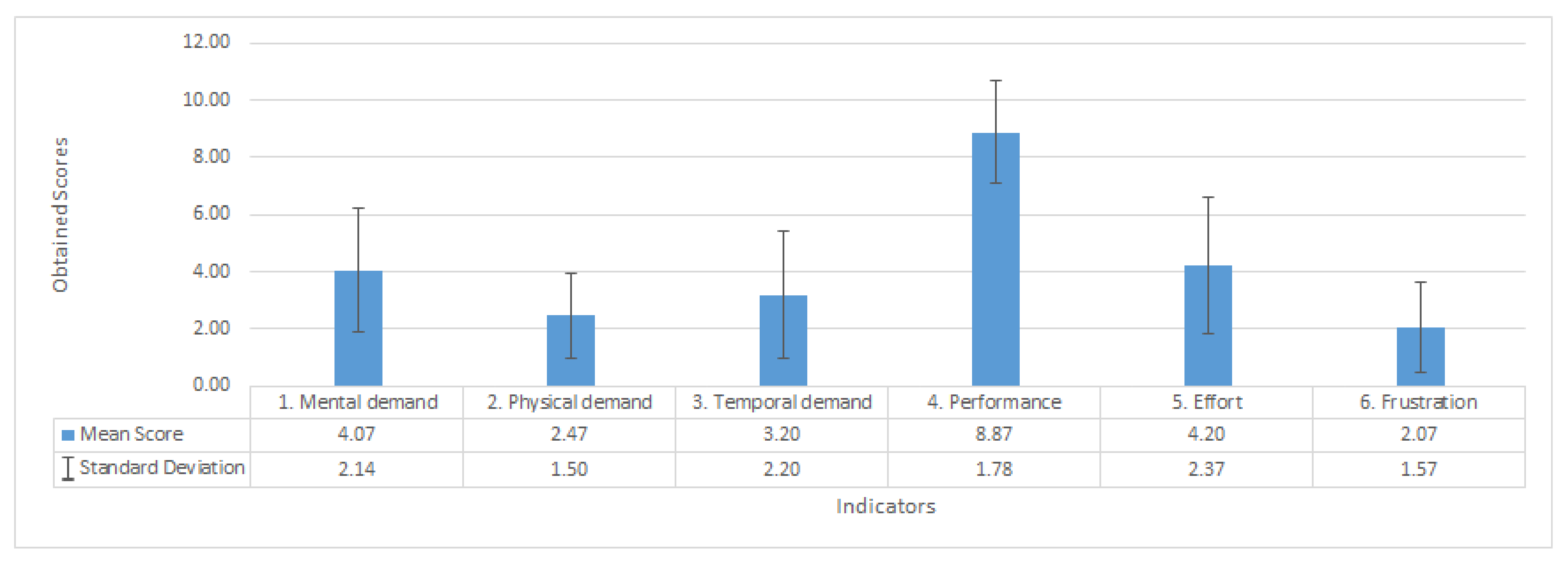
3.3. Workload Assessment
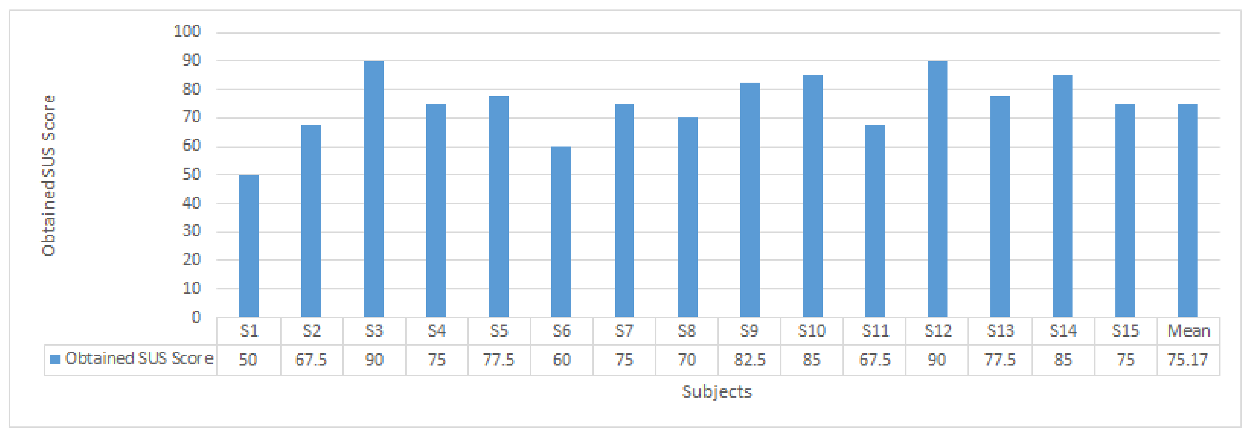
The NASA Task Load Index (NASA-TLX) is considered the gold standard for subjective workload measurement. It was developed by the Human Performance Group at NASA’s Ames Research Center and can evaluate task demands and workload of an individual performing it based on task, behavior, and subject-related scales [34]. The task-related scales are used to measure the objective demands of the task, the behavior-related scale reflects upon an individual’s subjective evaluation of the task, while the subject related scale accounts for the psychological impact on the individual. The NASA-TLX test can be applied to evaluate quantitative subjective mental workload assessment of a service, system, or task based on six indicators. The indicators and evaluated scores for subjects are shown in Table 4. The scale from 1 to 10 points is chosen for the ease and familiarity of participants, with 1 ranging from very low to 10 being very high. Typically, the measured scores for different indicators are assigned weights corresponding to their relative importance, but some studies such as [35] have used raw TLX tests. Considering the subjective nature of the task in this study, we have evaluated the raw TLX test using uniform weights for all indicators.
Figure 6 summarizes workload assessment scores for subjects under the NASA-TLX test. The indicators for mental, physical, and temporal demands, effort, and frustration all score less than the median value for the scoring range of 1–10. Most of the participants were very quick to learn the tactile interface for color translation and they requested to start the tests without consuming most of the learning phase time of fifteen minutes given to them. Given that the physical and temporal demands are very low for the proposed system, the mental demand and efforts put on by the users may vary from person to person, as it has been reflected by their respective standard deviations. The mean scores for both mental demand and effort lie in the medium-low of scoring range for the test, and less than the median for scoring range. However, few subjects suggested that it might be easier with more practice. The proposed system is promising in terms of user satisfaction as the performance indicator for user satisfaction scored highest while the frustration indicator scored lowest among all the indicators for this test.

3.4. Usability Test

System Usability Scale tests the usability of a product, service, or system using a five-question Likert scale based on responses to ten standardized questions [36]. The test questions are non-complex with responses that include strongly disagree, disagree, neutral, agree, and strongly agree, with index scores ranging from 1 to 5, respectively. The questions are given below for reference. The even and odd-numbered questions in the SUS test reflect a negative and positive attitude. During SUS score calculation, 1 is subtracted from user response for odd-numbered questions, while user response is subtracted from 5 for even-numbered questions. This scales them from 0 to 4 with 4 being the most positive response. Responses for all ten questions for each user is then added, making the sum in the range of 0 to 40. This sum is then multiplied by 2.5 to normalize the response for each user in the 0–100 range. These obtained raw SUS scores can be converted to individual percentile ranking to make relative judgement of usability by normalization or grading on the curve [37]:
I1
I think that I would like to use this service frequently.
I2
I found the service unnecessarily complex.
I3
I think the service was easy to use.
I4
I think that I would need the support of a technical person to be able to use this service.
I5
I found that the various functions in this service were well integrated.
I6
I thought there was too much inconsistency in this service.
I7
I would imagine that most people would learn to use this service very quickly.
I8
I found the service very cumbersome to use.
I9
I felt very confident using the service.
I10
I needed to learn a lot of things before I could get going with this service.
The usability test scores breakdown for all participants out of 1–5 (strongly disagree through strongly agree) are given in Table 5. Although the subjects were not accustomed to using their sense of touch instead of sense of vision for perceiving objects. However, positive indices outperform negative indices by obtaining negative scores about half the order of positive overall scores. Here, the positive and negative indices refer to odd and even-numbered questions of the SUS test which reflect the positive and negative attitude, respectively. The overall SUS score of 72.73 converts into the percentile range of 65–69% that ranks at ‘Good’ objective rating as a measure of user’s perception of the usability of system [37,38]. The individually scored SUS results are provided in Figure 7.

3.5. Subjective Reasoning

We observed the exploratory scheme for subjects during the tactile identification tests. Geometric and semantic identifications were noted whenever the subjects were able to correctly distinguish round and square disks and were able to locate and describe the tactile marker on disks, respectively. Subjects also provided feedback on the improvement of ColorWatch and whether it might be helpful for PVIs or not. They were then asked about challenges in geometric and semantic identifications. A few of them also provided ideas on helping PVI in color identifications after completion of tests.
Generally, the subjects reported the concept and its application through the rotating disks to be proper and easy. The subjective feedback from test participants was as follows;
  • The square was easier than the round disk.
  • Because it was a large prototype and could not be recognized all at once, you have to touch it several times.
  • It wasn’t difficult, but I felt confused a couple of times. However, I think there will be no problem if you use it frequently.
  • It was easy assuming that the disks were stationary.
The participants’ subjective feedback about conveying the colors through tactile associations, and the tactile perception is given below. It is stated that many of the participants deemed the color identifications through ColorWatch to be very easy or easy, hence only the critical or imperative responses are provided here:
  • It is divided into a circle and a square shape, so there was no big inconvenience.
  • It was easier to distinguish by touching than it was to memorize.
  • The Red and Green portions overlapped with the corners of the square and were not easily recognized compared to other positions.
  • The distinction between square and circle is good.
  • It seems that it was a little difficult to recognize the raised dot.
Subjects felt confident about using the tactile interpretation of color when asked about suggestions for improvements regarding tactile or any other modality as a color perception solution for PVI. The critical comments are as follows:
  • It would be helpful if the spectrum of recognizable colors widens.
  • I think it will be easier to distinguish if the outer disk is also not round but has edges or angles like the square disk.
  • Product miniaturization.
  • If voice is added, it will be helpful for recognition.
  • Vibration and temperature might also be used.
Finally, subjects’ opinion about being the ColorWatch helpful for PVIs is as follows:
  • I’m not sure if there’s a product like this, but, if there isn’t, it might help.
  • It seems to be helpful for the visually impaired in that it can select clothes suitable for TPO (Time Place Occasion) and reflect preferences for fashion.
  • It can be needed for scenarios like if someone complimented your shirt, and you associate this emotional response with the shirt color.
  • It seems to be helpful because even the visually impaired may have to recognize colors.
  • The advantage that people who do not know Braille can easily recognize the color.
  • I think it would be good to make it easier to recognize if it is less affected by ambient light.
  • I think it will help. Because there is a lot you can find out from color.
  • I think it will be helpful enough. You can quickly recognize colors.
  • It seems to be helpful in color recognition. It was placed in a circle like a color scheme to make it relevant.

4. Discussion

According to the National Federation of the Blind, braille literacy has been on the decline. Out of 1.3 million legally blind people in the USA, only 10% of them can read braille. Moreover, only 10% or blind children are learning braille, calling it “The Braille literacy crisis in America”, which limits the prospects of braille based designs [39]. The braille watches [22,23,24] can theoretically be used as a digital braille interface if combined with color sensing and color recognition systems; however, no such scheme has been presented by the developers. A summary and comparison of these have been provided in Table 6. Analog time watches with conventional rotating hands exhibit gradually altering angular orientation because the hands move continuously with passing time, whereas digital time watches numerically convey time. The continuously rotating analog watch hands provide a means to the human brain for instantaneous spatial recognition, such as the relative difference between two time-stamps and the apprehension of remaining time until an event. Situations like these for an analog watch do not strictly engage mental numeric calculations, which is conversely true for a digital watch where brief mental calculations are required for interpreting these events. In terms of human perception, it is a matter of spatial recognition versus mental numeric calculations. Likewise, a mere description of color in text or braille manner in a theoretical scenario of inclusion of color information through braille watch might not be sufficient for PVI perception as it lacks the essence of color nature, their relative relationships, and interpretation.
Related works are focused on the tactile translation of colors in artworks, which limits the usability of those schemes in daily life. They also have high learnability requirements, and cannot be used for the color perception of arbitrary objects. We have integrated perceptual color patterns with analog watch design in an intuitive arrangement. The subjects’ feedback validated the effectiveness of ColorWatch TCP as there were only a few incorrect color identifications, and almost all of the identifications were correct. The subjects were also able to understand the tactile-color association and the way they are organized on the watch design. It enabled them to quickly recall the correct related color for the detected angular position on the disk. The subjects reported the ease of tactile dot detection on the square disk in comparison with the round disk. This might be caused by a fewer number of probable positions for the tactile dot on the square disk rather than the round disk. Another possible reason for that may be the shape of the square disk which conserves its apparent tactile shape perception even after rotations at 90°, and the angular position of the tactile dot at one corner of it can be identified relative to its distinct and conserved geometry. A similar effect can be achieved for one tactile dot detection of any regular polygon shape, if the number of distinct positions or the number of fixed angle rotations it takes for one full revolution is a factor of the number of polygon vertices. The reason for the round shape of the larger disk for color hue in color perception, and the minute pointer in timepiece mode is chosen instead of a polygon shape is to help identify continuous rotations for the minute pointer in timepiece mode. Moreover, the continuous movement of round disk or minute hand can provide more precise time, instead of fixed rotations for every five minutes, for example. The color gamut of ColorWatch might be further extended to represent eight color hues, each for three levels of color tones along with eight levels of achromatic colors as shown in Figure 1e. In this way, the colors are placed at 60°angles on the color wheel, capable of presenting 32 colors. The dynamic nature of spatial color recognition for reference color and easy learnability makes it particular among TCPs from relevant research. A brief comparison for relevant works is provided in Table 7. This might help PVIs as an assistive device as the overall rating of ’Good’ is reflected by test subjects’ responses. The workload assessment test also validates it to be suitable for a broad population of potential PVI users with low learnability requirements, as indicated by below-average scores of mental demand coupled with low frustration, and higher satisfaction about performing the task correctly.
The contributions of this study are listed here:
  • The design for ColorWatch is presented which can aide PVIs in color perception, in addition to time recognition.
  • The angular tactile pattern for color is proposed with associated angular positions of tactile dot to a range of achromatic colors and basic colors with hue, value, and chroma indication.
  • The combination of colors from Goethe’s color triangle and Munsell color system has been integrated with the analog watch design interface. This interface is capable of instantly presenting automatic spatial tactile patterns for any detected reference color from the artworks as well as from real-life objects. This eliminates the need for static color translations of artwork onto tactile relief. The spatial color identification for arbitrary objects outranks the static interpretations for the artworks of existing TCPs.
  • The prototype has been developed, and the tests have been performed to investigate effectiveness in terms of accurate identification of color, workload requirements for pattern learning, and usability for color detection.
  • The color wheel depicts essentially the visible spectrum of colors enclosed by a circle, and is a useful tool for describing what happens when you mix colors, complementary color relationships, and adjacent colors. Traditional TCP requires embossed surface patterns to represent colors for each artwork. Our proposed system eliminates such embossed surface patterns, and can be used as a reconfigurable platform, providing better mobility, dissemination, and flexibility.

5. Conclusions

The development of assistive technologies for art appreciation for visually impaired people can enhance their cultural and perceptual appreciation. These opportunities result in better comprehension and accessibility at museums, exhibitions, and everyday life. These multisensory interactions may also offer enhanced usability, understanding and promote educational tools aiding synesthetic capabilities to promote creative thinking. Color associations with aspects such as symbolism, culture, and preferences play an influential role, demanding the promotion of PVIs’ color comprehension in daily life as well. Tactile color pictograms using tactile sensing attain sensational conception along with other physical properties of artwork such as contour, size, texture, geometry, and orientation. Although several TCPs have been developed, they are limited to fixed tactile color interpretation, which requires outgoing resources. We have proposed the design for ColorWatch integrating colors from Goethe’s color triangle and Munsell color system with analog wristwatch, allowing spatial color-to-tactile interpretation. We have associated achromatic and monochromatic colors with chroma and value levels to the cross-modular tactile interface. The tactile interface manifests angular positions of tactile patterns. These patterns can be transformed automatically corresponding to the reference color. The arrangement of the tactile pattern is based on intuitive learning, which is translated through analog wristwatch tactile interface. This integrated approach offers ease of learnability to provide the essence of particular emotional or psychological states. We developed a prototype and performed an identification test for proof of concept. The test results for color identification present good accuracy and validate our hypothesis. Usability tests based on system usability scale and workload assessment by NASA-TLX tests suggest that the proposed ColorWatch system can help people with visual impairments in color identification and reduce a factor that hinders their museums’ accessibility and real-life color perception. The function of ColorWatch may be expanded to represent color gamut of forty-two colors with twelve color hues based on the RYK color wheel, originally described by Issac Newton. The six additional color hues can be represented at uniform 30°angular distances, alternating between existing chromatic color hues. We shall expand experiments with subjects for balanced gender and diverse PVI vision statuses, and explore their simultaneous cognition abilities for a multisensory appreciation of artworks as a future study.

Author Contributions

Conceptualization, M.S.J. and J.D.C.; methodology, software, M.S.J.; writing—original draft preparation, M.S.J.; data curation and validation, C.-H.L.; project administration, supervision, writing—review and editing, J.D.C.; All authors have read and agreed to the submitted version of the manuscript.

Funding

This research was funded by the Science Technology and Humanity Converging Research Program of the National Research Foundation of Korea, Grant No. 2018M3C1B6061353.

Institutional Review Board Statement

The study was conducted according to the guidelines of the Declaration of Helsinki, and approved by the Institutional Review Board of Sungkyunkwan University (protocol code: 2020-11-005-001, 22 February 2021).

Informed Consent Statement

Informed consent was obtained from all subjects involved in the study.

Data Availability Statement

The data presented in this study are available within the article.

Acknowledgments

We would like to thank all volunteers for their participation and the reviewers for their insights and suggestions.

Conflicts of Interest

The authors declare no conflict of interest.

References

  1. Striem-Amit, E.; Wang, X.; Bi, Y.; Caramazza, A. Neural representation of visual concepts in people born blind. Nature communications 2018, 9, 1–12. [Google Scholar] [CrossRef] [PubMed]
  2. Bedny, M.; Caramazza, A. Perception, action, and word meanings in the human brain: The case from action verbs. Ann. N. Y. Acad. Sci. 2011, 1224, 81–95. [Google Scholar] [CrossRef] [PubMed]
  3. Cytowic, R.E. Synesthesia: A Union of the Senses; MIT Press: Cambridge, MA, USA, 2002. [Google Scholar]
  4. Shin, J.; Cho, J.; Lee, S. Please Touch Color: Tactile-Color Texture Design for The Visually Impaired. In Proceedings of the Extended Abstracts of the 2020 CHI Conference on Human Factors in Computing Systems, New York, NY, USA, 25–30 April 2020; pp. 1–7. [Google Scholar]
  5. Cho, J.D. A Study of Multi-Sensory Experience and Color Recognition in Visual Arts Appreciation of People with Visual Impairment. Electronics 2021, 10, 470. [Google Scholar] [CrossRef]
  6. Cho, J.D.; Jeong, J.; Kim, J.H.; Lee, H. Sound Coding Color to Improve Artwork Appreciation by People with Visual Impairments. Electronics 2020, 9, 1981. [Google Scholar] [CrossRef]
  7. Gilbert, A.N.; Martin, R.; Kemp, S.E. Cross-modal correspondence between vision and olfaction: The color of smells. Am. J. Psychol. 1996, 109, 335–351. [Google Scholar] [CrossRef] [PubMed]
  8. Iranzo Bartolomé, J.; Cho, J.D.; Cavazos Quero, L.; Jo, S.; Cho, G. Thermal Interaction for Improving Tactile Artwork Depth and Color-Depth Appreciation for Visually Impaired People. Electronics 2020, 9, 1939. [Google Scholar] [CrossRef]
  9. Cavadini, R.; Cerina, L.; Bracco, M.I.; Santambrogio, M.D. A wearable device for blind people to restore color perception. In Proceedings of the 2017 IEEE 3rd International Forum on Research and Technologies for Society and Industry, Modena, Italy, 11–13 September 2017; pp. 1–4. [Google Scholar]
  10. Sathian, K.; Stilla, R. Cross-modal plasticity of tactile perception in blindness. Restor. Neurol. Neurosci. 2010, 28, 271–281. [Google Scholar] [CrossRef] [PubMed]
  11. Lawrence, M.A.; Kitada, R.; Klatzky, R.L.; Lederman, S.J. Haptic roughness perception of linear gratings via bare finger or rigid probe. Perception 2007, 36, 547–557. [Google Scholar] [CrossRef] [PubMed]
  12. Ramsamy-Iranah, S.; Rosunee, S.; Kistamah, N. Application of Assistive Tactile Symbols in a ‘Tactile’ Book on colour and Shapes for Children with Visual Impairments. Int. J. Arts Sci. 2017, 10, 575–590. [Google Scholar]
  13. Bindi (Decoration). Available online: https://en.wikipedia.org/wiki/Bindi_(decoration) (accessed on 16 February 2021).
  14. Grant, A.C.; Thiagarajah, M.C.; Sathian, K. Tactile perception in blind Braille readers: A psychophysical study of acuity and hyperacuity using gratings and dot patterns. Percept. Psychophys. 2000, 62, 301–312. [Google Scholar] [CrossRef] [PubMed] [Green Version]
  15. Kitada, R.; Kito, T.; Saito, D.N.; Kochiyama, T.; Matsumura, M.; Sadato, N.; Lederman, S.J. Multisensory activation of the intraparietal area when classifying grating orientation: A functional magnetic resonance imaging study. J. Neurosci. 2006, 26, 7491–7501. [Google Scholar] [CrossRef] [PubMed]
  16. Cho, J.D.; Quero, L.C.; Bartolomé, J.I.; Lee, D.W.; Oh, U.; Lee, I. Tactile colour pictogram to improve artwork appreciation of people with visual impairments. Color Res. Appl. 2021, 46, 103–116. [Google Scholar] [CrossRef]
  17. Taras, C.; Ertl, T. Interaction with Colored Graphical Representations on Braille Devices. In Proceedings of the International Conference on Universal Access in Human-Computer Interaction, San Diego, CA, USA, 19–24 July 2009; pp. 164–173. [Google Scholar]
  18. Axel, E.; Levent, N. Art beyond sight: Guidelines for making tactile diagrams & standard tactile patterns, lines, and icons. In Art Education for the Blind; AFB Press: Arlington, VA, USA, 2003. [Google Scholar]
  19. Hetherington, K. Museums and the visually impaired: The spatial politics of access. Sociol. Rev. 2000, 48, 444–463. [Google Scholar] [CrossRef]
  20. Vaz, R.; Freitas, D.; Coelho, A. Blind and Visually Impaired Visitors’ Experiences in Museums: Increasing Accessibility through Assistive Technologies. Int. J. Incl. Mus. 2020, 13, 57–80. [Google Scholar] [CrossRef]
  21. Adnan, M.E.; Dastagir, N.M.; Jabin, J.; Chowdhury, A.M.; Islam, M.R. A cost effective electronic braille for visually impaired individuals. In Proceedings of the 2017 IEEE Region 10 Humanitarian Technology Conference (R10-HTC), New York, NY, USA, 21–23 December 2017; pp. 175–178. [Google Scholar]
  22. Tyler, K. Active Braille Timepiece & Related Methods. U.S. Patent App. 13/180,351, 17 January 2013. [Google Scholar]
  23. DOT Watch, a Braille Wearable Smartwatch. Available online: https://www.dotincorp.com/ (accessed on 20 January 2021).
  24. Anderson, N.L.; Puccinelli, J.P.; Singh, C.; Jamar, K.S.J.; Milne, T.A. Braille Watch. U.S. Patent 8,483,018, 9 July 2013. [Google Scholar]
  25. Twyman, M.; Mullenbach, J.; Shultz, C.; Colgate, J.E.; Piper, A.M. Designing wearable haptic information displays for people with vision impairments. In Proceedings of the Ninth International Conference on Tangible, Embedded, and Embodied Interaction, Stanford, CA, USA, 15–19 January 2015; pp. 341–344. [Google Scholar]
  26. Velázquez, R. Wearable assistive devices for the blind. In Wearable and Autonomous Biomedical Devices and Systems for Smart Environment; Springer: Berlin/Heidelberg, Germany, 2010; pp. 331–349. [Google Scholar]
  27. Tyler, J.E.; Hardy, A.C. An analysis of the original Munsell color system. JOSA 1940, 30, 587–590. [Google Scholar] [CrossRef]
  28. Von Goethe, J.W. Goethe’s Theory of Colours; Murray, J., Ed.; William Clowes and Sons: London, UK, 1840. [Google Scholar]
  29. Albers, J. Interaction of Color; Yale University Press: New Haven, CT, USA, 2013. [Google Scholar]
  30. RYB Color Model. Available online: https://en.wikipedia.org/wiki/RYB_color_model (accessed on 20 January 2021).
  31. Munsell Color System: Explanation. Available online: https://en.wikipedia.org/wiki/Munsell_color_system (accessed on 20 January 2021).
  32. Lee, C.H.; Jabbar, M.S.; Cho, J.D. ColorWatch: Color-Tactile Interpretation to Improve Color Perception and Accessibility for People with Visual Impairments. In Proceedings of the IEEE 2020 International Conference on Information and Communication Technology Convergence (ICTC), Jeju Island, Korea, 21–23 October 2020; pp. 1632–1637. [Google Scholar]
  33. Mackay, W.E.; Fayard, A.L. HCI, natural science and design: A framework for triangulation across disciplines. In Proceedings of the 2nd Conference on Designing Interactive Systems: Processes, Practices, Methods, and Techniques, Amsterdam, The Netherlands, 18–20 August 1997; pp. 223–234. [Google Scholar]
  34. Hart, S.G.; Staveland, L.E. Development of NASA-TLX (Task Load Index): Results of empirical and theoretical research. In Advances in Psychology; Elsevier: North Holland, The Netherlands, 1988; Volume 52, pp. 139–183. [Google Scholar]
  35. Hart, S.G. NASA-Task Load Index (NASA-TLX); 20 Years Later. In Proceedings of the Human Factors and Ergonomics Society Annual Meeting, Los Angeles, CA, USA, 16–20 October 2006; Volume 50, pp. 904–908. [Google Scholar]
  36. Brooke, J. SUS: A “quick and dirty’usability. In Usability Evaluation in Industry; Taylor & Francis: London, UK, 1996; p. 189. [Google Scholar]
  37. 5 Ways to Interpret a SUS Score. Available online: https://measuringu.com/interpret-sus-score/ (accessed on 20 January 2021).
  38. Bangor, A.; Kortum, P.; Miller, J. Determining what individual SUS scores mean: Adding an adjective rating scale. J. Usability Stud. 2009, 4, 114–123. [Google Scholar]
  39. The Braille Literacy Crisis in America: Facing the Truth, Reversing the Trend, Empowering the Blind. In Braille Monitor 52.5; The National Federation of the Blind: Baltimore, MD, USA, 2009; Volume 52.
  40. Tactile Colours: Scheme for the Tactile Representation of Colours. Available online: http://cpwstonehouse.com/tactile-colours/ (accessed on 20 January 2021).
Figure 2. Perspective view of ColorWatch design concept; (a) PVI use scenario of ColorWatch during shopping (b).
Electronics 10 00596 g002
Figure 3. ColorWatch pattern for color hues and color tones. Blue and black text represents mono-chromatic and achromatic color modes, respectively.
Electronics 10 00596 g003
Figure 4. Block diagram of the prototype’s working principle.
Electronics 10 00596 g004
Figure 5. The tactile perception and color sensor modules of prototype with a color identification training relief paper (a); a demonstration of the prototype in use (b); the internal hardware for tactile perception and color sensor modules (c,d).
Electronics 10 00596 g005
Figure 6. Workload assessment scores for NASA-TLX test question indicators.
Electronics 10 00596 g006
Figure 7. Usability test individual and mean obtained scores.
Electronics 10 00596 g007
Table 1. Colors tones or color mode according to the angle of the square disk.
Angle (Square)Color ToneColor Mode
0LightMonochromatic
90SaturatedMonochromatic
180DarkMonochromatic
270AchromaticAchromatic
Table 2. Round disk angle chroma-lightness levels for monochromatic and achromatic colors (0–180° and 270° on the square disk, respectively).
Angle (Round)Monochromatic Mode ColorAchromatic Mode Color
0RedWhite
60OrangeGainsboro
120YellowLight Gray
180GreenDark Gray
240BlueDim Gray
300PurpleBlack
Table 3. The correct identifications out of total color identifications made by fifteen subjects for ColorWatch color gamut.
Monochromatic – Achromatic ColorsLightSaturatedDarkAchromatic
Red–White15/1515/1515/1515/15
Orange–Gainsboro15/1515/1515/1515/15
Yellow–Light Gray14/1515/1514/1515/15
Green–Dark Gray15/1515/1515/1515/15
Blue–Dim Gray15/1515/1515/1514/15
Purple–Black15/1515/1515/1515/15
Correct Identifications (%)98.8910098.8998.89
Average Correct Identifications357/360 (99.17%)
Table 4. NASA-TLX test questions with subject wise score selection.
IndicatorS1S2S3S4S5S6S7S8S9S10S11S12S13S14S15
1. Mental Demand724238234146843
How much mental and perceptual activity was required? Was the task easy or demanding, simple, or complex? (memory ability of pattern, color, etc.)
2. Physical Demand612431251121323
How much physical activity was required? Was the task easy or demanding, slack or strenuous? (tactile cognition)
3. Temporal Demand731232132138732
How much time pressure did you feel due to the pace at which the tasks or task elements occurred? Was the pace slow or rapid?
4. Overall Performance8910910101091010993107
How successful were you in performing the task? How satisfied were you with your performance?
5. Effort961672153143744
How hard did you have to work (mentally and physically) to accomplish your level of performance?
6. Frustration Level631115121131113
How irritated, stressed, and annoyed versus content, relaxed, and complacent did you feel during the task?
Table 5. Usability test subject-wise selection for SUS indices.
Measured ScoresSUS Indices
I1I2I3I4I5I6I7I8I9I10
SubjectsS14324512434
S24243324342
S35252415152
S44252225341
S54145514252
S62243325432
S75252314442
S84243424342
S93251413251
S105155415251
S114243324441
S125153515153
S134231525144
S145243414151
S155133315133
Table 6. Features and comparison of tactile watches.
ProductOutput(s)ModeFeaturesWorkloadLearnability
Tyler K. [22]TimepieceNumeric 4-dot condensed braille codeTime and dateMental numeric calculationThe Braille literacy crisis
Dot Inc. [23]TimepieceNumeric 6-dot braille code interfaceSmartphone wireless connectivityMental numeric calculationThe Braille literacy crisis
Anderson N. L. et al. [24]TimepieceNumeric 4-dot condensed braille codeCaller ID and pick/drop for smartphone callsMental numeric calculationThe Braille literacy crisis
This workTimepiece & ColorperceptionAnaloginterfaceTraditional analog interface, Durable design, Color perceptionIntuitive spatial recognitionIntuitive human perceptual design for time and color representation
Table 7. The overview and comparison with relevant works on tactile color pictograms.
TCPBasic Patterns (Concepts)Number of Colors PresentedMedium
Taras et al. [17]Dots (braille)23 (6 hues + 2 levels of lightness for each hues + 5 levels of achromatic)Braille embossed surface pattern
Ramsamy-Iranah et al. [12]Polygons(children’s knowledge)14 (6 hues+ 5 other colors + 3 levels of achromatic)Embossed surface pattern
Stonehouse [40]Geometric pattern and texture (traditional conventions)11 color huesEmbossed surface pattern
Shin et al. [4]Lines, orientation, grating. The first eight colors are divided into 20° angle(rainbow shape)90 (8 hues + 4 levels of lightness and 5 levels of saturation for each hues + 9 levels of brown and achromatic)Embossed surface pattern
Cho et al. [16]Dots, lines, and curves (pictograms)Simplified: 29 (6 hues + 2 levels of lightness and 2 levels of saturation for each hue + 5 levels of achromatic)Embossed surface pattern
Extended: 53 (12 hues + 2 levels of lightness and 2 levels of saturation for each hue + 5 levels of achromatic)
This workSimplified: RYB color wheel model: six colors are divided into 60° angles in the 6 RYB color wheel (watch type)24 (6 hues + 3 levels of lightness for each hue + 6 levels of achromatic)Automatic spatial representation as assistive wearable device, Embossed surface pattern
Extended: eight colors are divided into 45° angles in the 8 RYB color wheel (watch type).32 (8 hues + 3 levels of color tones for each hue + 8 levels of achromatic)
Publisher’s Note: MDPI stays neutral with regard to jurisdictional claims in published maps and institutional affiliations.

