Article

Constructing and Visualizing High-Quality Classifier Decision Boundary Maps †

by
Francisco C. M. Rodrigues
1,2,*,
Mateus Espadoto
1,2,
Roberto Hirata, Jr.
1 and
Alexandru C. Telea
3
1
Institute of Mathematics and Statistics, University of São Paulo, São Paulo 05508-090, Brazil
2
Johann Bernoulli Institute, University of Groningen, 9747 AG Groningen, The Netherlands
3
Department of Information and Computing Sciences, Utrecht University, 3584 CS Utrecht, The Netherlands
*
Author to whom correspondence should be addressed.
This paper is an extended version of our paper published in Information Visualization Theory and Applications (IVAPP 2019).
Information 2019, 10(9), 280; https://doi.org/10.3390/info10090280
Submission received: 15 July 2019 / Revised: 5 September 2019 / Accepted: 6 September 2019 / Published: 9 September 2019
(This article belongs to the Special Issue Information Visualization Theory and Applications (IVAPP 2019))

Abstract

:
Visualizing decision boundaries of machine learning classifiers can help in classifier design, testing and fine-tuning. Decision maps are visualization techniques that overcome the key sparsity-related limitation of scatterplots for this task. To increase the trustworthiness of decision map use, we perform an extensive evaluation considering the dimensionality-reduction (DR) projection techniques underlying decision map construction. We extend the visual accuracy of decision maps by proposing additional techniques to suppress errors caused by projection distortions. Additionally, we propose ways to estimate and visually encode the distance-to-decision-boundary in decision maps, thereby enriching the conveyed information. We demonstrate our improvements and the insights that decision maps convey on several real-world datasets.

1. Introduction

Advances in machine learning (ML) enabled breakthroughs in application areas such as computer vision, natural image processing, path planning and business intelligence. However, most ML methods still work largely as black boxes, due to the lack of interpretability behind the decision functions they employ. As such methods can become very complex, as in the case of deep learning (DL) methods, practitioners and users have challenges in understanding, customizing and trusting them [1,2]. To alleviate this, recent work has focused on visually explaining how ML techniques learn and take their decisions [3,4,5,6].
One such interpretability challenge regards the so-called decision boundaries of classifiers. Formally put, let D be the sample space input for a classifier. The classifier can be seen as a function f that assigns a class label to every point in D. Understanding how f, defined by the training process, partitions D into same-class regions, separated by so-called decision boundaries, can help many tasks related to classifier design, for example, locate how training samples affect the classification of test samples close to them in D; spot areas in D that require more or have redundant, training samples; and find if the classifier technique used is too ‘stiff’ to separate complex labeled-sample distributions in D [7,8].
Visualizing complex-shaped decision boundaries embedded in a high-dimensional space D is very challenging. All existing solutions essentially project D to R 2 by some so-called projection method P so as to visualize the boundaries and/or zones. A recent method in this area [9] proposes an improvement with respect to the classical way of visualizing projections as color-coded sparse scatterplots, by creating so-called dense maps where every 2D image pixel encodes one or more high-dimensional points and their assigned labels. This way, the user effectively sees how the classifier partitions the high-dimensional space into decision zones having different labels. An earlier similar technique was proposed in Reference [10]. In contrast to that paper, we propose here to evaluate and extend the method proposed in Reference [9], due to its simpler-to-extend visualization scheme.
The quality of dense maps constructed following Reference [9] crucially depends on two factors: (a) the quality of the projection P and (b) the quality of the inverse projection P 1 . The study in Reference [11] addressed the first by studying a set of 28 projection techniques on 4 classifiers and 2 real-world datasets and outlining good combinations. Separately, aspect (b) was addressed in Reference [12] by proposing a new inverse projection technique, which we next refer to as NNInv, that is faster and more accurate than state-of-the-art ones.
Although addressing computational challenges, both these recent developments [11,12] do not further elaborate on the interpretability of decision maps. Specifically, even for good-quality direct and inverse projections, such maps can still show significant noise, visible as jagged boundaries and/or isolated salt-and-pepper islands, which are due to inherent distortions caused when mapping this high-dimensional space D to 2D. Such artifacts can further influence the way that users interpret the behavior of the studied classifiers.
In this paper, we extend the work in Reference [11] by proposing several new techniques that address the above points. First, we propose a quality metric to gauge the correctness of the direct projection and use it to selectively remove badly-projected points, while keeping the overall structure of the projection intact. This decreases the amount of noise along decision boundaries and also removes spurious small-scale islands. Secondly, we propose several ways to visualize the high-dimensional distances between samples in the 2D projection. This lets users see which areas in the data space are close(st) to decision boundaries, thus, potentially important to further study or refine, for example, by data augmentation. To obtain the best quality, we combine in our work the direct projections suggested by Reference [11] with the novel NNInv inverse projection.
Summarizing, the original contributions of Reference [11] address the following questions:
  • How do the depicted decision boundaries differ as a function of the chosen DR technique?
  • Which DR techniques are best for a trustworthy depiction of decision boundaries?
However, the work in Reference [11] is affected by several issues. First, even the best DR techniques found in the literature for depicting decision boundaries are affected by projection distortions and errors. We mitigate this problem by presenting a projection filtering technique that improves the smoothness and visual clarity of the constructed decision maps by removing poorly projected points based on a proposed quality metric. Secondly, we enrich the information conveyed by dense maps by encoding the high-dimensional distance-to-boundary at each pixel, which we in turn propose to compute by three different approximations that offer various speed-vs.-accuracy trade-offs.
The structure of this paper is as follows. Section 2 overviews related work. Section 3 presents the experimental setup used to study how dense maps depend on DR techniques and classifiers, covering a combination of 28 DR techniques and 4 classifiers. Section 4 presents and discusses our results regarding the choice of DR techniques. Section 5 introduces our new filtering technique for removing artifacts in dense maps caused by projection distortions. Section 6 introduces a new technique for highlighting data-space points close to decision boundaries based on the computation and rendering of the high-dimensional distance-to-boundary. Section 8 concludes the paper.

2. Background

2.1. Preliminaries

We first introduce a few notations. Let x = ( x 1 , , x n ) , x i R , 1 i n be a n-dimensional (nD) real-valued observation or sample and let S = { x i } , 1 i N be a dataset of N such samples. Let x j = ( x 1 j , , x N j ) , 1 j n be the jth feature vector of S. Thus, S can be seen as a table with N rows (samples) and n columns (dimensions). As outlined in Section 1, S is sampled from a particular universe or subspace, D R n , for example, the space of all images of digits [13]. A classifier for D is a function f : D C which associates to every x D a class label from a categorical domain C, for example, the digits 0 to 9. The function f is constructed via a so-called training-set S t = { ( x i , c i ) | x i D , c i C } and tested via a similar but disjoint, test set S T . Different machine learning (ML) techniques exist to construct f, some of the best known being Support Vector Machines (SVM), k-Nearest Neighbors (k-NN), Logistic Regression (LR), Random Forests (RF) and Convolutional Neural Networks (CNN) [14]. The decision zone for a label c C is then the set D Z ( c ) = { x D | f ( x = c } , with boundary D Z ( c ) . Such sets are typically compact, given the underlying so-called contiguity hypothesis usual in many ML contexts [15].
A dimensionality-reduction (DR) method or projection, is a function P : D R m , where usually m = 2 , which aims to preserve data structure. That is, if two points x D , y D are similar (by any suitable metric, for example, Euclidean distance, cosine distance or neighborhood rank), then their projections P ( x ) and P ( y ) should be close in the target 2D (image) space [16,17]. Finally, we denote by P 1 : R m D the inverse projection function.

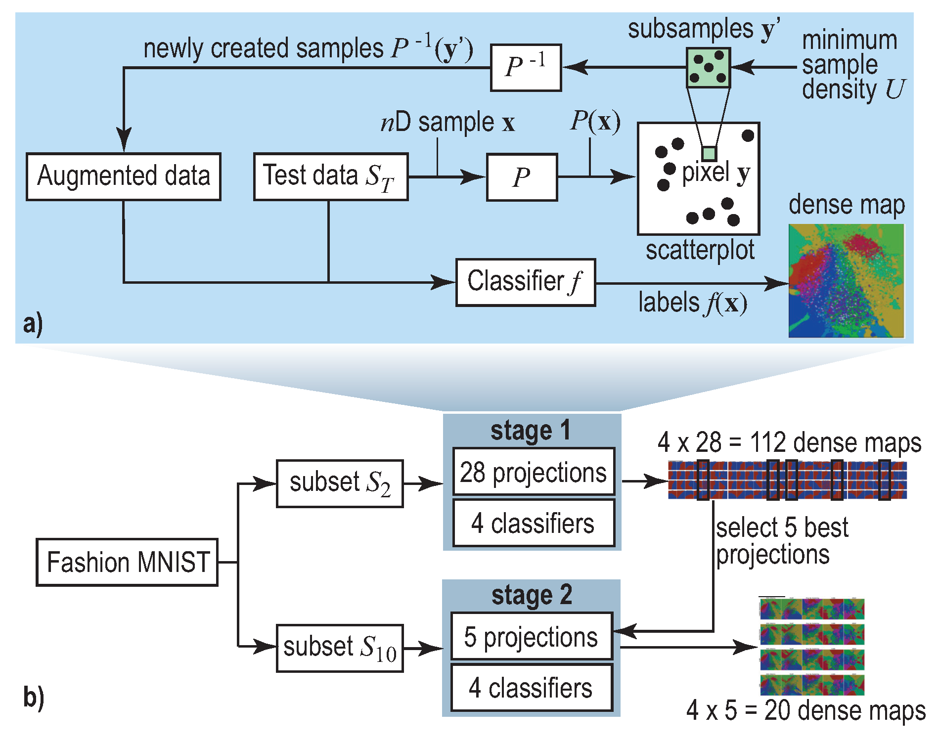
2.2. Decision Boundary Maps
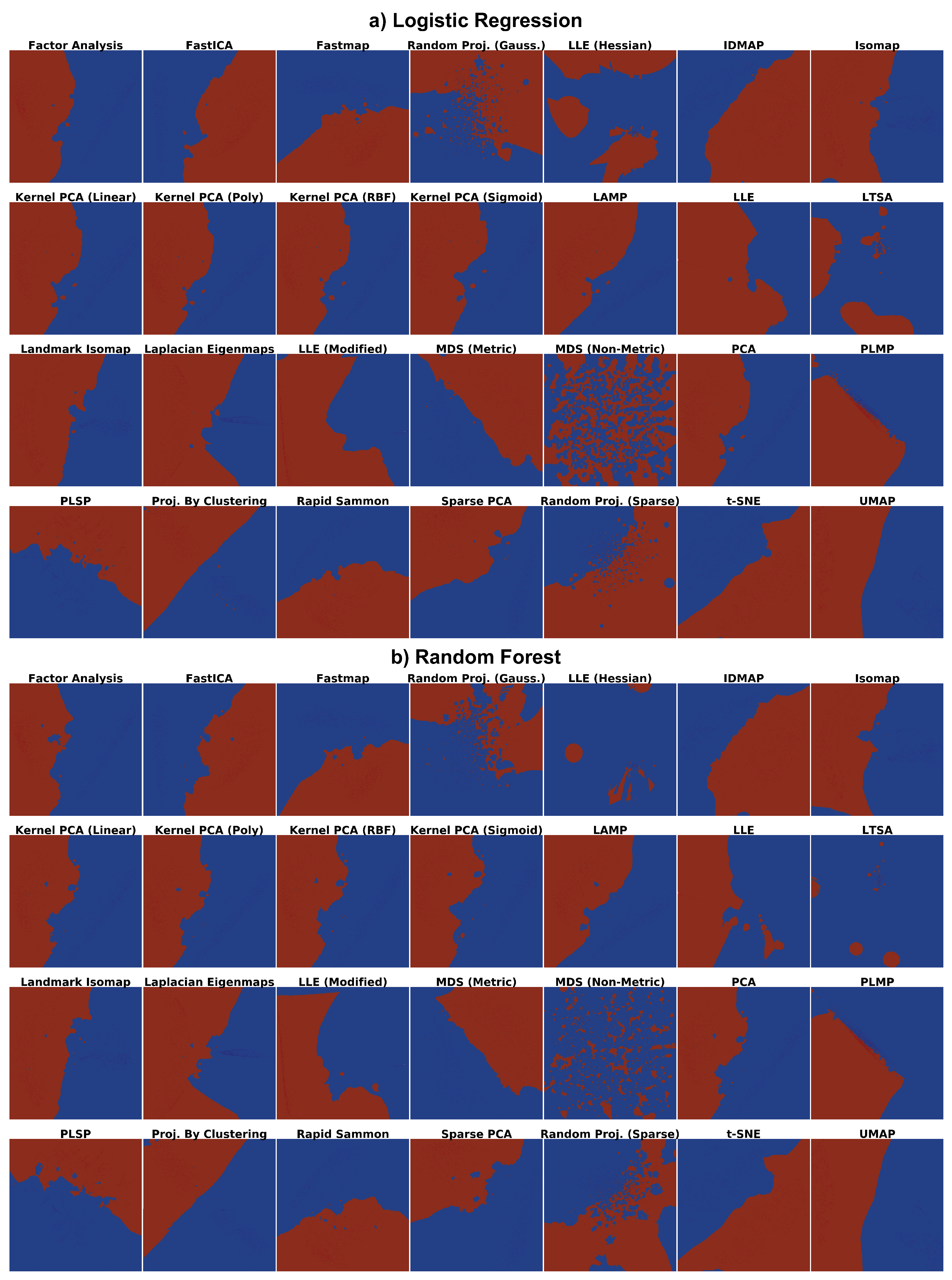
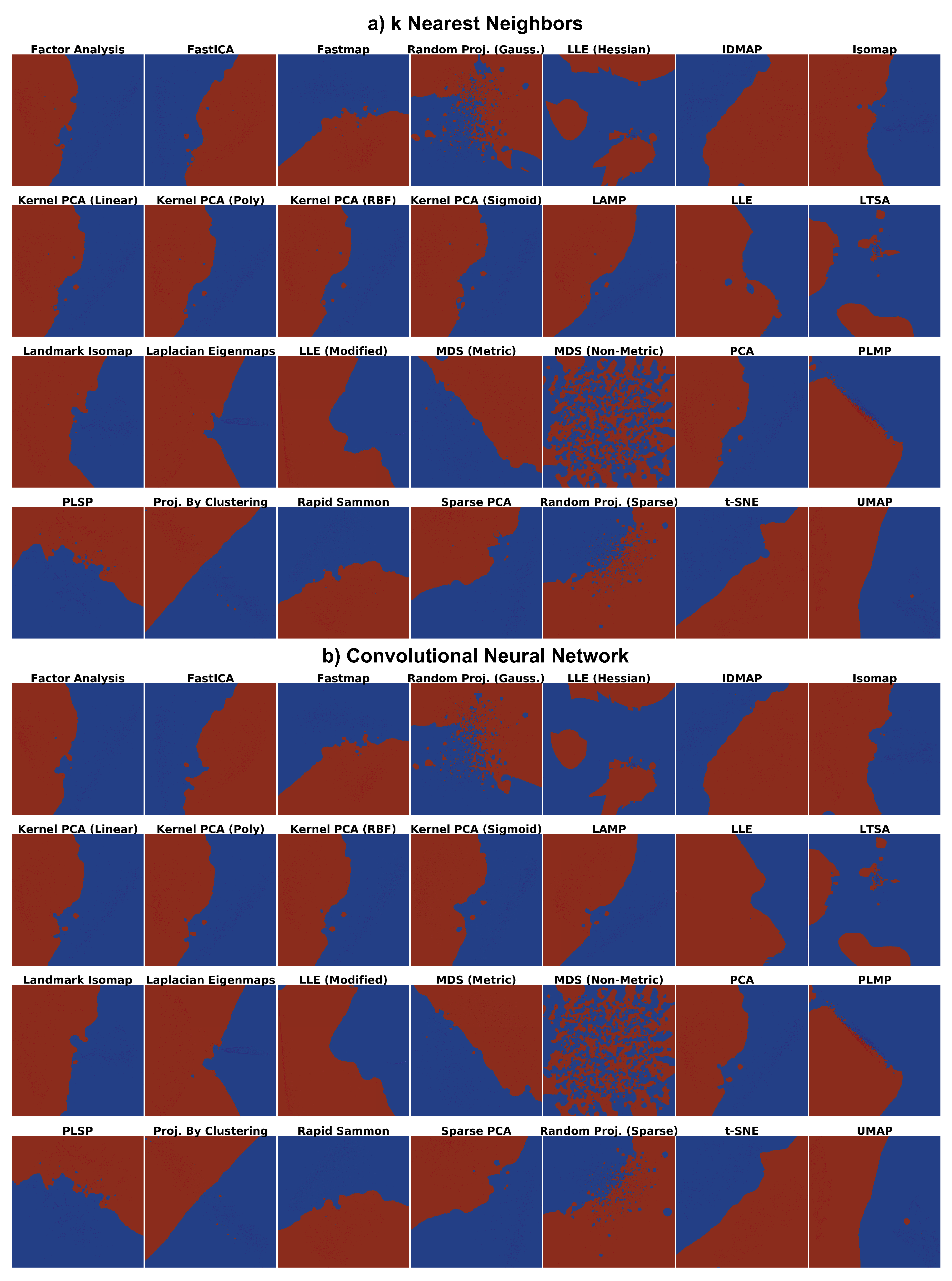
Exploring how well f was learned from S t is typically done by comparing how well the inferred labels f ( x i ) match the actual labels c i for all x i S T . To visualize these, one typically constructs a scatterplot P ( x ) | x S T of such points, color-coded by their labels. The underlying idea is that, if P preserves data structure and assuming a relatively smooth behavior of the classifier f, then decision zones will appear as same-color point clusters in the scatterplot. Conversely, differently colored ‘outlier’ points in a cluster typically indicate classification problems. While simple to construct, such scatterplots do not show how the classifier f labels the entire universe D but only a sparse sampling S T thereof. Simply put, we do not know what happens in the blank space between the scatterplot points. In particular, the decision boundaries D Z ( c ) of the classifier are not explicitly visualized, leaving the user to guessing their actual position [4].
Image-based dense maps improve upon this by coloring each pixel of the target (screen) image by the assigned label(s) of samples in D that project there [7,8]. Recently, Reference [9] proposed so-called decision-boundary maps (see also Figure 1a): For every pixel y of the target (projection) space, data samples x D are created, by gathering the scatterplot points Y = { P ( x ) } that project into y . If this yields fewer than U points, one adds to Y U | Y | synthetically created points P 1 ( y ) , where y are random points in the pixel y . Finally, the respective pixel is colored to reflect the labels f ( x Y ) with hue mapping label value and saturation label variation over Y, respectively.
Decision maps constructed by Reference [9] are independent on the classifier technique f being studied; have no complex-to-set free parameters; and effectively create dense maps where each image pixel is colored to reflect how f behaves for the nD point(s) that project there via P. Decision zones D Z ( c ) are directly visible as all image pixels showing c’s color and decision boundaries D Z ( c ) show up as pixels having different-color neighbors. Few compact zones with simple (smooth) boundaries tell that the classifier has little difficulty in taking decisions over D. Multiple disjoint same-color zones and/or zones with tortuous boundaries tell the opposite. Small-size ‘islands’ of one color embedded in large zones of different colors suggest misclassifications and/or training problems.
To compute decision maps, Reference [9] used t-Stochastic Neighbor Embedding (t-SNE) [18] and Local Affine Multidimensional Projections (LAMP) [19] to implement P and Inverse LAMP (iLAMP) [20] for P 1 , respectively. More recently, Espadoto et al. proposed a more accurate and faster to compute, implementation for P 1 , based on deep learning [12] (NNinv). It is worth noting that both NNinv and iLAMP fit P 1 from data. That is, given a set of projected points Y R 2 and their nD counterparts X R n , these methods learn a mapping P 1 : R 2 R n through an optimization process that aims to minimize a reconstruction error. The difference is in what and how is optimized for: While iLAMP generates inverse samples by returning a weighted average of nD data points based on the distances between their 2D counterparts, NNInv fits by regression a function that better suits the training data using Neural Networks. As P 1 is inferred from finite data, it can be used to invert any DR method. Hence, iLAMP and NNinv are especially useful for projection methods that do not provide an inverse mapping, for example, t-SNE. However, if desired, they can also be used for projection methods that do provide an inverse function, for example, Principal Component Analysis (PCA). A separate question is which is a suitable implementation for the direct projection P, since it is well known that different DR methods create widely different projections for the same input [21,22,23].

3. Experiment Setup

As explained in Section 2.2, the quality of a decision map depends heavily on the choice of projection technique P used. Consider, for example, a toy two-class k-NN classifier for a 3D data space D R 3 trained with a simple S t consisting of one sample of each class. We know in this case that the decision boundary should be a plane halfway the two training samples. So, a good 2D projection P should ideally render two compact half-planar decision zones. Conversely, a poor P may create several same-class zones having complex curved boundaries; if we saw such an image, we would wrongly judge the behavior of this classifier.
To study which of the many projection techniques in existence are most suitable for constructing effective decision maps, we designed and executed a two-stage experiment, as follows (see also Figure 1b).
Data: We select two different subsets of the Fashion MNIST [24], a state-of-the-art ML benchmark with clothing and accessory images, which supersedes complexity-wise the traditional MNIST dataset [13]. Both MNIST and Fashion MNIST have 70K grayscale images of 28 × 28 pixels, split into a training set ( | S t | = 60 K samples) and a test set ( | S T | = 10 K samples). The two subsets are as follows:
  • S 2 : A two-class subset (classes T-Shirt and Ankle Boot) that we hand-picked to be linearly-separable;
  • S 10 
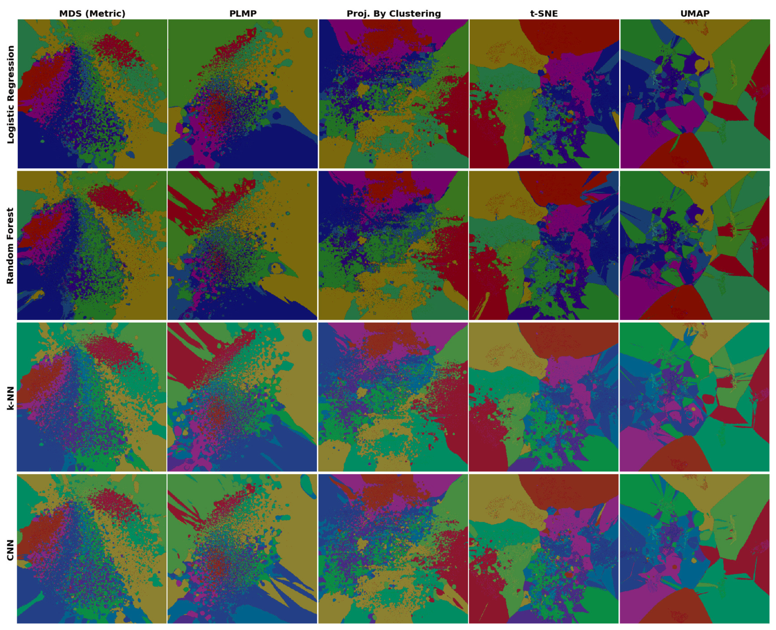
: An all-class subset (T-Shirt, Trouser, Pullover, Dress, Coat, Sandal, Shirt, Sneaker, Bag and Ankle Boot). This is a non-linearly-separable dataset.
Classifiers: We consider the same classifiers as in Reference [9]: LR, RF, k-NN (implemented in scikit-learn [25], using their toolkit’s default parameters) and CNN (implemented in keras). For CNN, we used two convolutional layers with 64 filters each and 3 × 3 kernels, followed by one 4096-element fully-connected layer, trained with the Adam optimizer [26]. These classifiers create very different decision boundaries: At one extreme, LR boundaries are linear (hyperplanes). k-NN boundaries are piecewise-linear (facets of nD convex polyhedra). RF creates typically more complex boundaries than k-NN. At the other extreme, CNN boundaries can have arbitrarily complex topologies and geometries, due to the complex decision function f coded by the deep network structure. However, CNNs are known to perform very well for classifying images like our dataset, while at the other extreme simple classifiers like LR are highly challenged by such data.
Training: The four classifiers were separately trained on the two subsets S 2 ( | S t | = 2160 samples, | S T | = 240 samples) and S 10 ( | S t | = 10 , 800 samples, | S T | = 1200 samples). We verified that the training yielded good accuracies in all cases (Table 1). This is essential to know when we next gauge the dense maps’ ability to capture a classifier behavior (see stage 1 below).
Projections:Table 2 lists the 28 selected projection techniques (P) to create dense maps as well as the parameter settings (default indicates using the standard ones the algorithms come with). As selection criteria, we considered well-known projections of high quality (following a recent survey [21]), good computational scalability, ease of use (P should come with well-documented parameter presets) and publicly available implementation.
Dense maps: We use a two-stage creation and analysis of dense maps, as follows (Figure 1b). In stage 1, for S 2 , we create dense maps using all 28 projections for all 4 classifiers, yielding a total of 112 dense maps. All maps have a 400 × 400 pixel resolution. Since S 2 is quite simple (two linearly separable classes), and since all classifiers for S 2 have very high accuracies (Table 1), the resulting maps should display (ideally) two compact zones separated by a smooth, ideally linear, boundary. We visually verify which of the 112 maps best comply with these criteria and next select the five projections (of the 28 tested ones) which realize these maps. These are shown in bold in Table 2. Next, in step 2 of the study, we create dense maps, for all 4 classifiers again but using the more complex S 10 dataset. Finally, we explore these visually to gain fine-grained insights allowing us to further comment on the dense-map suitability of these 5 hand-picked projections.

4. Analysis of Evaluation Results

We next discuss the results and insights obtained in our two-stage experiment.

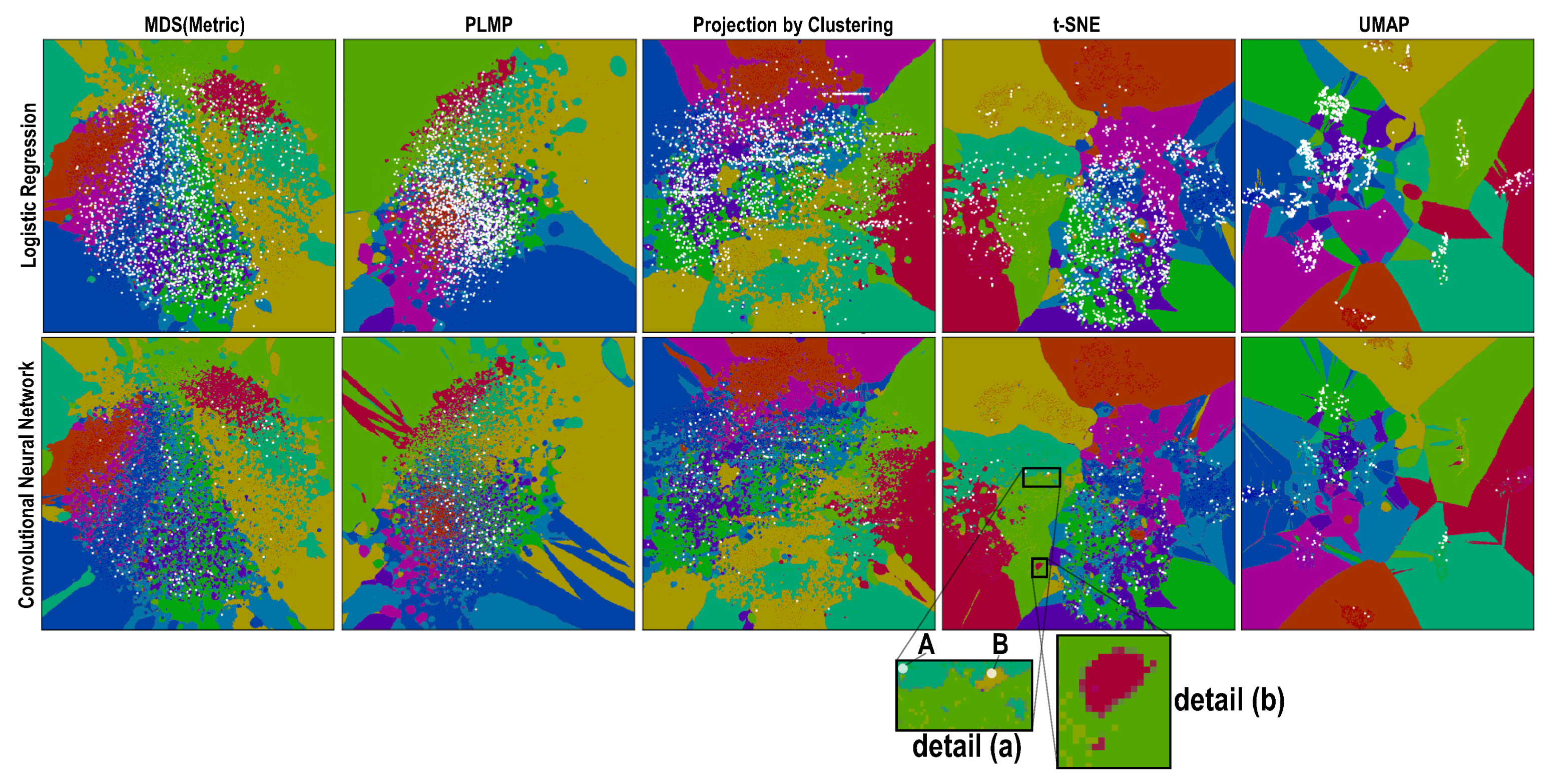
4.1. Phase 1: Picking the Best Projections

As stated in Section 3, all four tested classifiers yield almost perfect accuracy for the simple 2-class problem S 2 (Table 1). Hence, their decision boundaries are “where they should be”, that is, perfectly separating the two classes in S 2 . Moreover, since S 2 is by construction linearly separable, the dense maps constructed for these classifiers should clearly show two compact decision zones separated by a smooth, simple, boundary. We use this as a visual criterion to rank how well the tested projection techniques can achieve this. Figure 2 and Figure 3 show the dense maps for all 28 tested projections versus the four tested classifiers, where red and blue indicate pixels mapping samples classified to one of the two labels in S 2 . Interestingly, we see that even for this very simple problem not all projections perform the same. Our key observations are as follows:
Stability: The dense maps are surprisingly stable for the same projection over all four classifiers, except for LLE, LTSA, Random Projection (Gaussian) and Random Projection (Sparse). Hence, we already flag these four projections as less suitable.
Smoothness: All projections have relatively smooth boundaries, except Random Projection (Gaussian), Random Projection (Sparse) and MDS (Non-Metric). Since we expect smooth boundaries, these projections are less suitable. The projections which yield boundaries closest on average to the expected straight line are MDS, UMAP, Projection by Clustering, t-SNE and PLMP.
Compactness: Projections succeed up to widely different degrees in creating the expected two compact, genus-zero, decision zones. t-SNE, UMAP, Projection by Clustering and IDMAP do this almost perfectly. MDS (Non-Metric), the two Random Projections, LLE (Hessian) and LTSA perform the worst.
Summarizing the above, we select MDS (Metric), PLMP, Projection by Clustering, UMAP and t-SNE as the overall best projections to analyze further in phase 2, discussed next.

4.2. Phase 2: Refined Insights on Complex Data
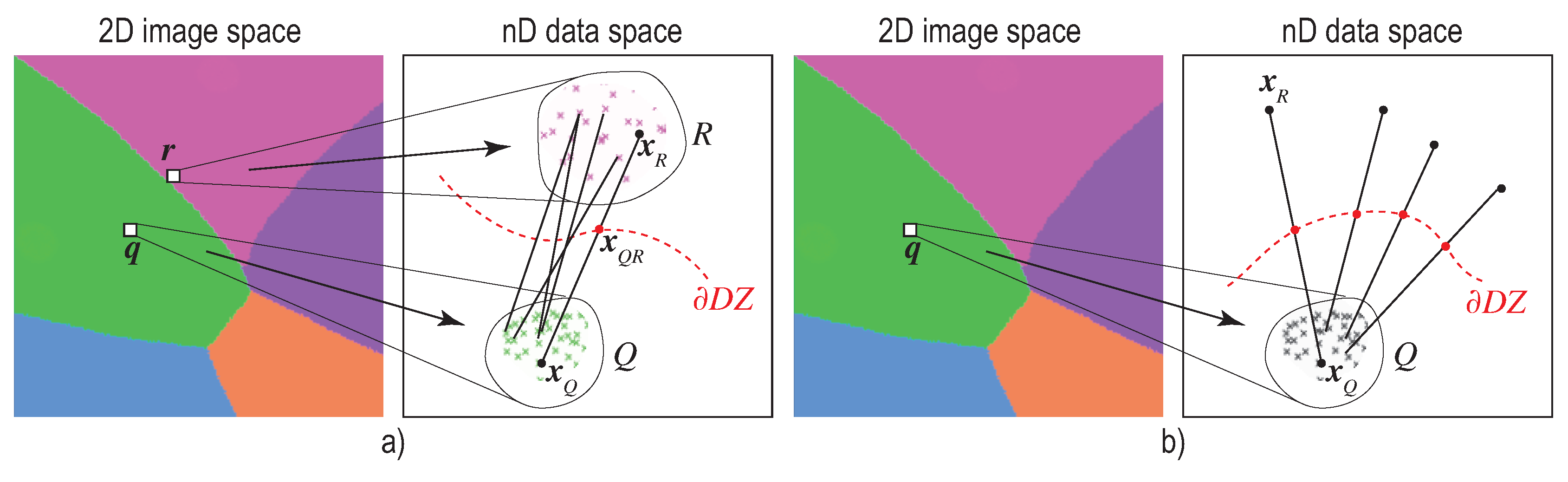
We now examine how the five projections selected in phase 1 perform on the 10-class dataset S 10 , which is a tough classification problem [24]. We already see this in the lower achieved accuracies (Table 1). Hence, we expect to have significantly more complex boundaries. Figure 4, that shows the dense maps for our 4 classifiers for the 5 selected projections, confirms this. Several interesting patterns are visible, as follows.
Overall comparison: For a given projection, the dense map patterns are quite similar over all four tested classifiers. This is correct, since the dense map is constructed based on the scatterplot created by that projection from the test set S T , which is fixed. The variations seen along columns in Figure 4 are thus precisely those capturing the differences of decision boundaries of different classifiers. We see, for instance, that LR tends to create slightly simpler boundaries than the other three classifiers. Conversely, variations along rows in Figure 4 can be purely ascribed to the projection characteristics. Techniques designed to better separate data clusters, such as t-SNE and UMAP, show more compact decision zones with simpler boundaries than MDS, PLMP and Projection by Clustering. Also, the choice of neighborhood used internally by the projection technique to estimate points in the lower dimension (2D) does not seem to play a key influence: MDS, which uses global neighborhoods, shows similar pattern-variations along classifiers to the other four projections, all of which use local neighborhoods.
Islands: The dense maps in Figure 4 show many small color islands. An island indicates that (at least) one sample was assigned a label different from the labels of samples that project close to it. In turn, this means that
(a)
the island does not actually exist in the high-dimensional space D, so the projection P did a bad job in distance preservation when mapping nD points to 2D; or
(b)
the island may exist in D, that is, there exist very similar samples that get assigned different labels. This case can be further split into
(b1)
the island actually exists in D, that is, similar points in D do indeed have different labels and the classifier did a good job capturing this; or
(b2)
the island does not exist in D, that is, the classifier misclassified points which are similar in the feature space but actually have different labels.
To understand which of these cases actually occur in Figure 4, we plot misclassified points atop the dense map as half-transparent white disks. Figure 5 shows this for the LR and CNN classifiers, all projections. Regions having many (densely packed) misclassifications show up as white areas. The insets (t-SNE dense map) exemplify how islands point to two of the above-mentioned issues: In Figure 4a, we see two very small color islands around the misclassified samples A and B. These islands indicate the extent up to which other samples, close to A or B, would also get misclassified. In contrast, the detail in Figure 4b shows a (red) island containing no white dots (misclassifications). This island either reflects a real variation of the label over similar points in D (case (b1) above) or else reflects a t-SNE projection artifact (case (a) above). To decide which of these cases actually occurs, we need additional techniques (discussed in Section 5).
Separately, we see that overall, the LR dense maps have more white dots than the CNN ones, which correlates with the lower LR accuracy (Table 1). We also see that the white points are non-uniformly spread over the dense maps by different projections. MDS and PLMP show many islands without white dots. As explained above, this either reflects densely-packed different-label points in D (case (b1)) or MDS and PLMP projection errors (case (a)). At the other extreme, t-SNE and even more so UMAP, strongly pack the white dots, which tells that misclassifications actually occur for quite similar data samples. Densely-packed white points effectively show the confusion zones, so one can use them to decide which kinds of samples need to be further added to the training set to improve accuracy.

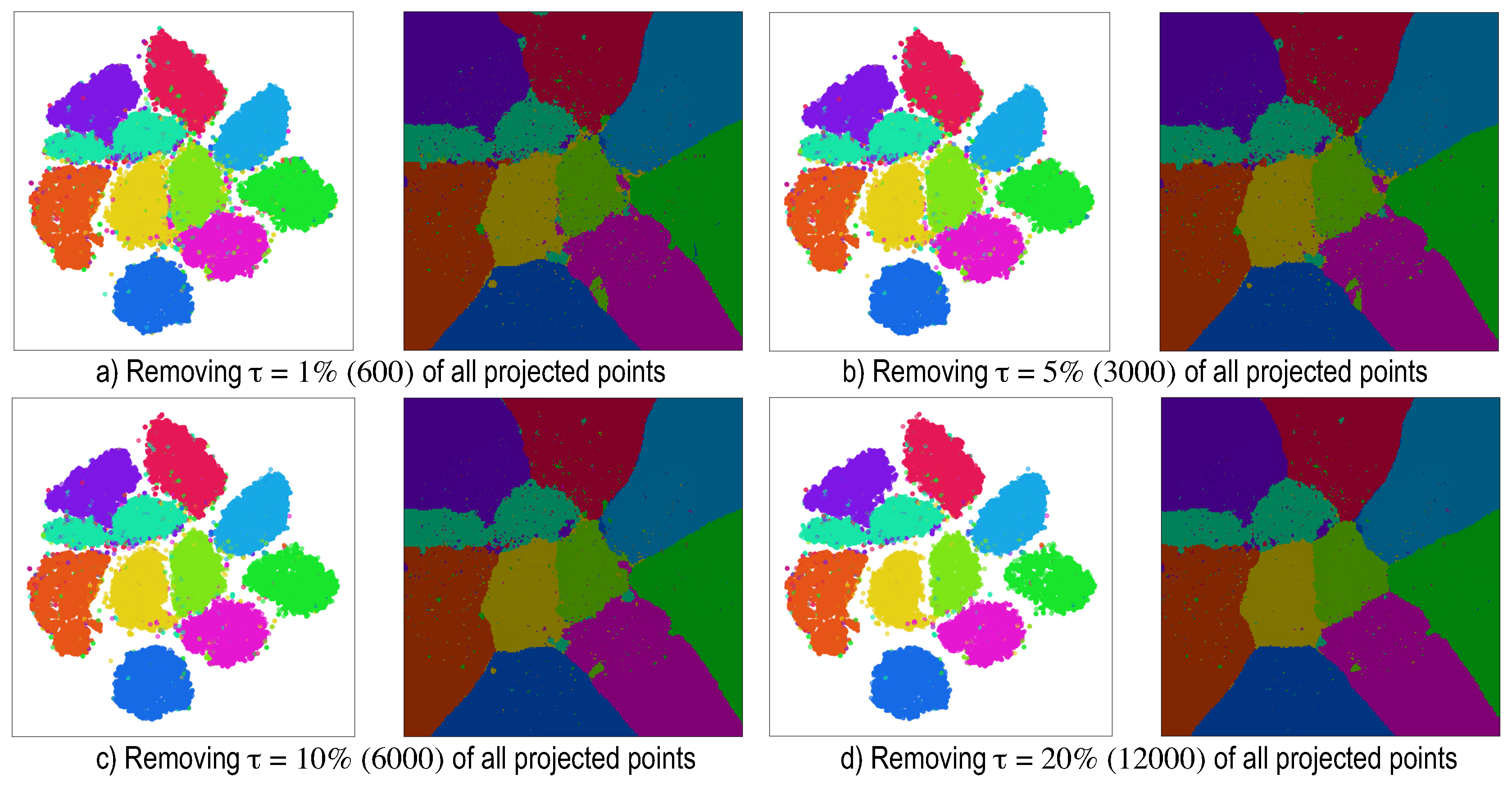
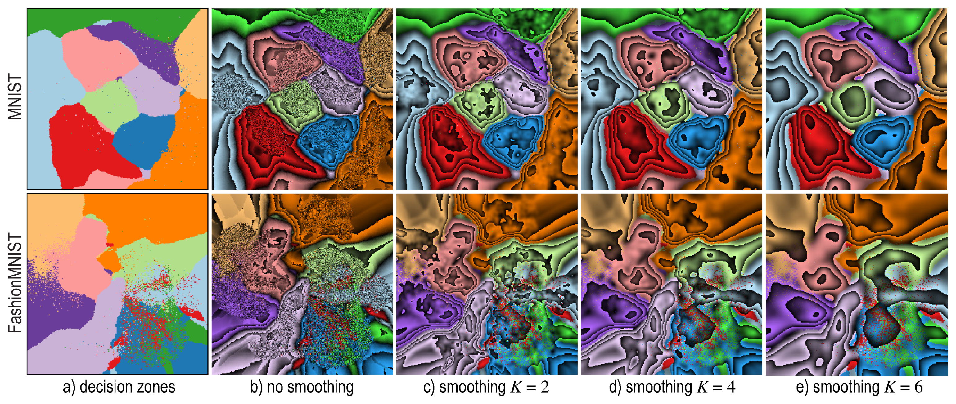
5. Dense Map Filtering

As showed in Section 4.2, dense maps exhibit patterns such as non-smooth decision boundaries and/or small islands in the decision zones (Figure 4 and Figure 5). As discussed there, such artifacts can be caused by either densely-packed different-label points in the data space D (case (b1)) or errors of the projection P (case (a)). For test data, for which we have ground-truth, we can disambiguate between these two cases—islands containing (many) misclassifications are likely due to case (b1), whereas the remaining islands are likely due to case (a).
However, using this method to interpret dense map images is suboptimal, since
  • we need to interpret such maps also in actual inference mode (after testing), when no ground-truth labels are available;
  • having to visually filter dense map artifacts like decision boundary jaggies and small islands is tedious.
Moreover, we note that such artifacts are very likely to happen anyways, even for a well-trained classifier (few misclassifications): Due to the ill-posed nature of DR, even the best performing projections P will eventually misplace points in a 2D scatterplot. This limitation is well known and discussed in several works [21,47,48,49]. The same limitations are shared by the inverse projection P 1 [12,20,50].
We propose to alleviate such artifacts by filtering the 2D scatterplot based on a quality metric that computes, locally, how well P preserves the high-dimensional data structure in D. Several such metrics exist, such as trustworthiness, continuity and normalized stress [21]; neighborhood hits [19]; false neighbors, missing neighbors [49]; and the projection precision score [51]. Given our goals of characterizing how well a nD compact neighborhood maps to a similarly-compact 2D neighborhood, we use here the Jaccard set-distance [48] between the k-nearest neighbors v k 2 ( i ) of a point in the 2 D projection and its neighbors v k n ( i ) in n D , given by
J D k ( i ) = | v k 2 ( i ) v k n ( i ) | | v k 2 ( i ) v k n ( i ) | .
The J D value of a point i ranges between zero (if none of the 2D k-nearest neighbors of point i are among its nD k-nearest neighbors, worst case) and one (if all of its 2D k-nearest neighbors are exactly the same as its nD k-nearest neighbors, best case).
Having computed the J D rank (Equation (1)), we next filter out from the projection low-ranked points and construct the dense map from the remaining points as described in Section 2.2. Setting an absolute removal threshold is however hard and moreover depends on the neighborhood size k. To explain this, Figure 6 shows the distribution of number of samples per J D k value for the MNIST dataset projected by t-SNE for four different k values. As visible, the distribution shape is relatively stable as function of k. As k increases, the distribution shifts to the right, as the likelihood that large neighborhoods coincide in 2D and nD increases—in the limit, when k equals to the total point count, J D = 1 for all points. Conversely, as k decreases, the distribution slightly shifts to the left, as the likelihood that neighbors of a point come in exactly the same order in 2D and nD is very small. Figure 6 shows a second, equally important, aspect, namely that the signal J D k has a discrete nature. Indeed, for a given k, Equation (1) can take at most k + 1 different values. Hence, for low k, J D k splits the projected points in k bins, with relatively more points per bin as when using higher k values—compare for example, the vertical axes of the images in Figure 6 for low versus high k values. In turn, this means that setting an absolute threshold to eliminate low J D k value points is hard: A too low threshold will eliminate too few points, while a slightly higher threshold may eliminate too many points. Hence, we proceed by (1) using a higher k value (roughly 10% of the dataset size) and next (2) we sort points on their J D k value and remove the τ lowest-ranked points, where τ is a user-given percentage of the total dataset size.
Figure 7 shows results for different τ values for the MNIST dataset, projected by t-SNE. Setting τ is intuitive: Small values keep more data points, including potentially wrongly-projected ones, which cause islands and boundary jaggies in the dense maps. Larger values filter the projection better, yielding smoother decision boundaries and/or fewer islands due to projection problems but show fewer data in the final image. As visible, filtering does not change overall size and shape of the depicted decision zones, which is important, as it does not affect the insights that the filtered images convey. In practice, we found that τ values in the range of 15% to 20% of the dataset size give a good balance between removing artifacts and keeping enough data to have an insightful dense map. This is the setting used next in all images in this paper.

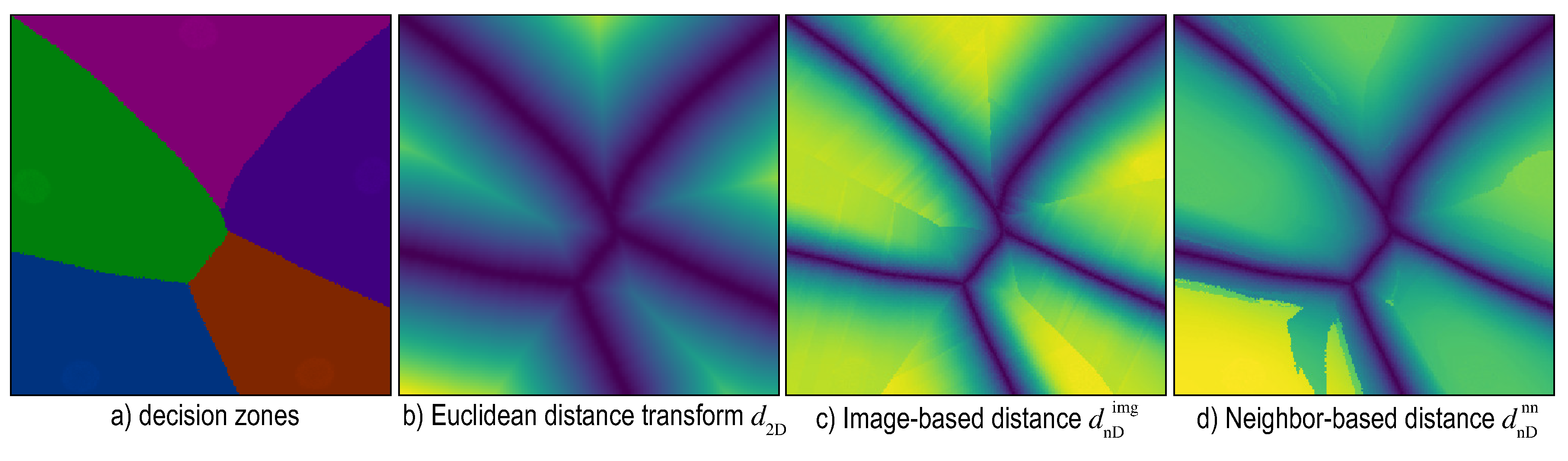
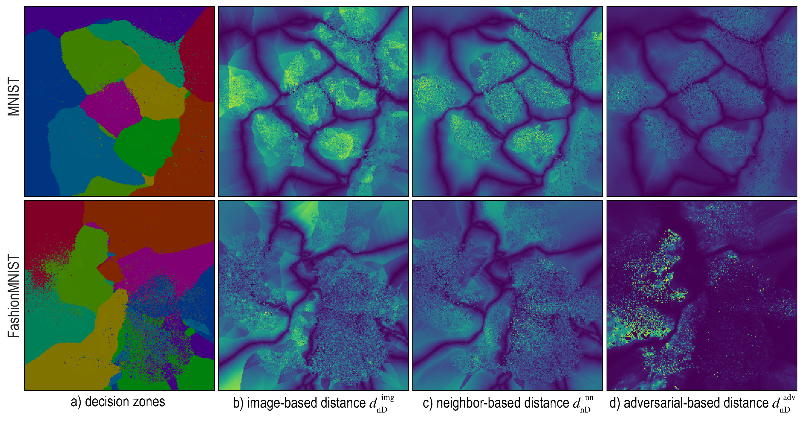
6. Distance-Enriched Dense Maps

The dense map filtering effectively removes many of the confusing small-scale islands created by projection errors, thus, creates simpler-to-inspect decision zones. As already explained, a key use-case for these is for users to see which points (in the data space D) are close, respectively far away from, the decision boundaries. The distance-to-boundary information indicates the classification confidence—so, if a classifier performs poorly, one can use this distance to infer on what kind data in D such problems occur and next alleviate this by for example, adding more training samples of that kind.
However, the decision map does not (yet) show the distance d n D ( x ) from a sample x D to its closest decision boundary D Z D in the nD space. Rather, the map shows how close the projection P ( x ) of x is to the projection P ( D Z ) of the decision boundaries. Simply put, for every pixel y having some color (label), the user can visually find the closest differently-colored pixel y . The distance
d 2 D ( y ) = min y | f ( y ) f ( y ) y y
can thus be seen as a projection of the actual nD distance d n D ( x ) we are interested in. The two distances are not the same, given the local compression and stretching caused when mapping the nD space to 2D by nonlinear projections such as t-SNE or UMAP [21,47]. Note that Equation (2) is nothing but the so-called distance transform [52] of the set of pixels that constitute the decision zone boundaries D Z .
Note that an exact computation of d n D is impossible in general, since we do not have an analytic description of D Z for typical classifiers. Hence, we next propose two classifier-independent heuristics to estimate d n D (Section 6.1 and Section 6.2) as well as a third, more exact, method and better suited for neural network classifiers, based on adversarial examples (Section 6.3). Figure 8 compares the 2D distance-to-boundary d 2 D (computed by Equation (2), implemented using the fast distance transform method in Reference [53]), with two versions of the d n D estimation we propose next, called d n D i m g and d n D n n respectively. In this figure, distances are encoded by a luminance colormap for illustration purposes. The decision zones and distance maps in Figure 8 depict a synthetic ‘Blobs’ dataset with 60K observations sampled from a Gaussian distribution with 5 different centers (clusters), each one representing samples of one class and 50 dimensions. For classification, a simple logistic regression model was used, so as to create simple-to-interpret decision boundaries, which are best as we next want to study the distance-to-boundary behavior. The same dataset was used in Reference [12] to test the quality of the NNInv inverse projection.
In Figure 8, we see that, while d 2 D and d n D are both low close to the decision boundaries and high deep in the decision zones, they have quite different local trends. For instance, points which have the same colors in Figure 8b, that is, are at the same distance-to-boundary ( d 2 D ) in 2D, can have quite different colors in Figure 8c,d, that is, have different distances d n D to the true nD decision boundaries. Hence, we cannot use d 2 D as a ‘proxy’ to assess d n D . We need to compute and show, d n D to the user so one can estimate how close (or far) from a decision boundary an actual sample is.

6.1. Image-Based Distance Estimation

For every pixel q in the dense map, we find the closest pixel r having a different label (Figure 9a). Let Q and R be the sets of nD samples in S T that map to q and r respectively via P 1 . By construction, points in Q and R have thus different labels. Hence, the nD decision boundary D Z lies somewhere between these point-sets. To estimate where, for every point pair ( x Q Q , x R R ) , we compute the point x Q R along the line segment ( x Q , x R ) D where the classifier function f changes value, that is, turns from the label f ( x Q ) to the label x R ) . For this, we use a bisection search, as we assume that f varies relatively smoothly between x Q and x R . We use a maximum number of T = 5 bisection steps, which proved to give good results in practice. We then estimate the distance of q to the closest decision boundary as the average
d n D i m g ( q ) = 1 | Q | | R | x Q Q , x R R x Q x Q R .
Although Equation (3) is simple to evaluate, it can produce noisy estimations of d n D . The main issue is that it assumes that the closest decision boundary to some point q in the 2D projection (i.e., pixel r ) corresponds, by the inverse mapping P 1 , to the closest decision boundary in nD to P 1 ( r ) .

6.2. Nearest-Neighbor Based Distance Estimation

We can improve upon the dense map-based heuristic presented in Section 6.1 by disposing of the dense map as a tool to compute d n D . Rather, we rely on searching the nD data directly for nearest-neighbor samples that have a different label, as follows (Figure 9b). For every pixel q in the dense map, let again Q be the set of nD samples that map to it via P 1 . For each x Q Q , we next find the closest data point x R Q that is classified differently than x Q and then again apply bisection to find where, along the line segment ( x Q , x R ) , the classifier f changes value. Finally, we compute d n D ( q ) by averaging all distances from x Q to the corresponding bisection points x Q R . Formally put, we compute d n D as
d n D n n ( q ) = 1 | Q | x Q Q , x R = arg min x Q | f ( x ) f ( x Q ) x x Q x Q x Q R .
Estimating d n D this way is more accurate than using Equation (3) since we do not rely on computing x R using the possibly inaccurate dense map but directly use the nD points S. We implement Equation (3) by searching for nearest neighbors in nD space using the k d -tree spatial search structure provided by scikit-learn [25].

6.3. Adversarial Based Distance Estimation

The third proposed heuristic is based on adversarial examples [2,54]. An adversarial perturbation ϵ of a data sample x can cause a trained classifier to assign a wrong label to this so-called adversarial example x + ϵ , that is, a label different from the one that it assigns to the unperturbed sample x . By definition, the minimal length ϵ of such a perturbation is the distance from x to the closest decision boundary to x . Hence, we can compute the distance-to-boundary for a dense map pixel q by first gathering again all points Q that project to q and next averaging their distances to their closest nD boundaries computed as above. This defines
d n D a d v ( q ) = 1 | Q | x Q Q min f ( x Q ) f ( x Q + ϵ ) ϵ .
Compared to the distance-to-boundary heuristics given by Equations (3) and (4), Equation (5) yields a mathematically accurate distance to boundary, within the limits of sampling the perturbation space ϵ . In practice, this demands extensive computational resources, roughly three times more than evaluating Equation (4) and 30 times more than evaluating Equation (4). Moreover, the method is not guaranteed to yield a valid adversarial perturbation for all possible samples x . Another limitation is that this approach is only suitable for classifiers f obtained through an iterative gradrient-based optimization process, such as neural networks [54].
Figure 10a shows the dense maps (a) for the MNIST (top row) and FashionMNIST (bottom row) datasets respectively. Images (b-d) show the three distance-to-boundary functions d n D i m g , d n D n n and d n D a d v given by Equations (3)–(5), respectively, visualized using the same luminance colormap as in Figure 8. Several observations follow. First, we see that the nD distances d n D roughly follow the patterns of the 2D Euclidean distances d 2 D , that is, are low close to the 2D decision boundaries and high deeper inside the decision zones. However, the nD distances are far less smoothly varying as we get farther from the 2D boundaries. This indicates precisely the stretching and compression caused by P and P 1 mentioned earlier. Secondly, we see that d n D i m g is significantly less smooth than d n D n n . This is explained by the lower accuracy of the former’s heuristic (Section 6.1). A separate problem appears for d n D a d v : For the FashionMNIST dataset, the image shown is very dark, indicating very low d n D a d v values for most pixels. Upon further investigation, we found that the neural network model trained for this case was too fragile—for almost every sample, an adversarial sample could be easily obtained. Moreover, as already mentioned, the cost of computing d n D n n is far larger than for the other two distance models. Given all above, we conclude that d n D n n offers the best balance of quality and speed and we choose next to use this distance-to-boundary model.

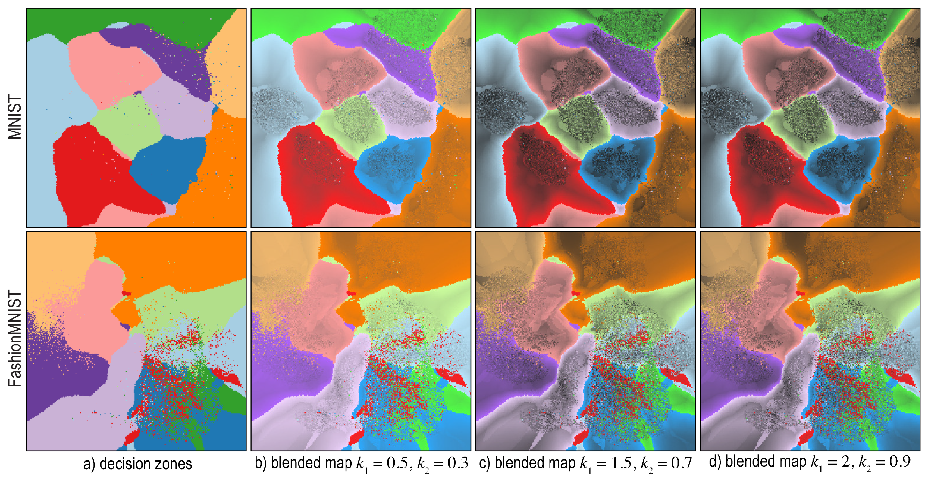
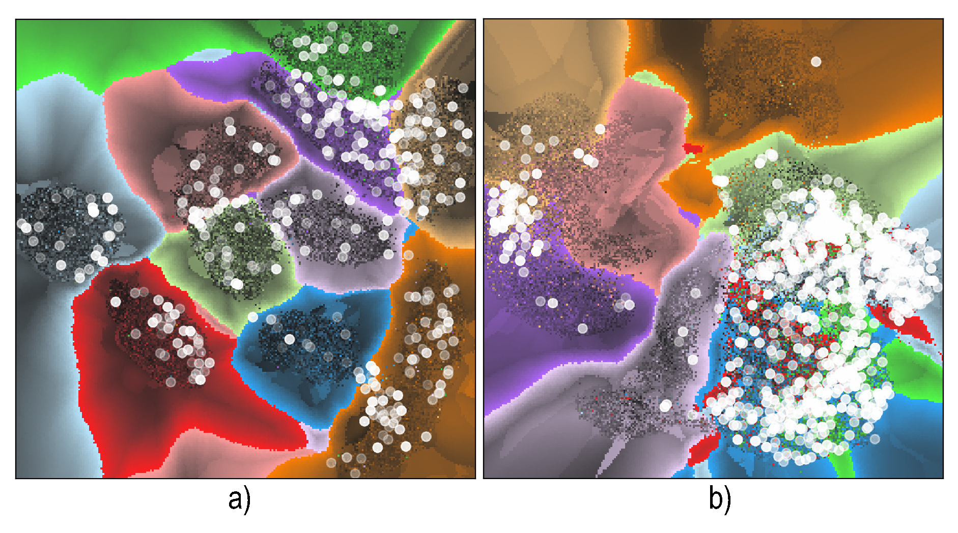
6.4. Visualizing Boundary Proximities

Visualizing the raw distance d n D by direct luminance coding (Figure 10) does not optimally help us in exploring the regions of space that are close to decision boundaries. However, these are the areas one is most interested in, since these are the regions where classifiers may work incorrectly, by definition. For this, we apply a nonlinear transformation to d n D to compress the high-value ranges and allocate more bandwidth to the low-value range. Also, we combine both decision zone information (shown by categorical colors in earlier figures) with the distance-to-boundary information in a single image. For this, we set the S (saturation) and V (value) color components of every pixel q in this image to
V ( q ) = 0.1 + 0.9 ( 1 d n D n n ( q ) / d m a x ) k 1
S ( q ) = S b a s e ( 1.0 d n D n n ( q ) / d m a x ) k 2
Here, d m a x is a normalization factor equal to the maximal value of d n D n n over the entire dense map; k 1 and k 2 are constants that control the nonlinear distance normalization; and S b a s e is the original saturation value of the categorical color used for q ’s label. The H (hue) component stays equal to the categorical-color encoding of the decision zone labels. Figure 11 shows the effect of k 1 and k 2 for the MNIST and FashionMNIST datasets. Compared to showing only the decision-zone information (Figure 11a), adding the distance information highlights (brightens) areas that are close in nD to the decision boundaries. Higher k 1 values highlight these zones more and darken areas deep in the decision zones more. Higher k 2 values strengthen this effect, as pixels close to decision boundaries become desaturated. This allows us to ensure that such pixels will be bright in the final images, no matter how dark the original categorical colors used to encode labels are.
Figure 11 is to be interpreted as follows: Dark areas indicate data samples deep inside decision zones, that is, areas where a classifier will very likely not encounter inference problems. Bright areas indicate zones close to decision boundaries, where such problems typically appear and in which one should look for misclassifications and/or add extra labeled samples to improve training. Thin bright areas tell that the nD distance varies there much more rapidly than the perceived 2D (image-space) distance, so the projection compresses distances there. These are areas on which one will typically want to zoom in, to see more details. In contrast, thick bright areas tell that the nD distance varies there slower than the perceived 2D distance, so the projection stretches distances there. Such areas normally do not require zooming to see additional details.
Figure 12 shows a different use-case for distance maps. Atop of the distance maps shown in Figure 11 ( k 1 = 2 , k 2 = 0.9 ), we now plot the misclassified points for MNIST and FashionMNIST, encoding their respective distance-to-boundary d n D in opacity. Misclassifications which are close to decision boundaries show up thus as opaque white, while those deeper in the decision zones show up half-transparent. We see now that most misclassifications occur either close to the smooth decision boundaries (MNIST) or atop of small decision-zone islands (FashionMNIST). Since islands, by definition, create decision boundaries, it follows that, in both cases, misclassifications predominantly occur close to decision boundaries. Hence, decision boundaries can serve as an indicator of areas prone to misclassifications, thus potential targets for refining the design of a classifier for example, by data annotation or augmentation.

Enridged Distance Maps

Figure 11 encodes distance-to-boundary by luminance and saturation, which are good visual variables for ordinal tasks, for example, estimating which points are closer or farther from decision boundaries. However, this encoding is less suitable for quantitative tasks, for example, estimating equal-distance points or how much farther (or closer) a given point is to its closest decision boundary than another point. We address these tasks by using enridged cushion maps [55]. For this, we first slightly smooth d n D by applying a Gaussian filter with radius K pixels. Next, we pass the filtered distance through a periodic transfer function f ( x ) = ( x m o d h ) / h and use the resulting value f ( d n D ) instead of d n D to compute S and V via Equations (6) and (7). Note that the transfer function f is only piece wise continuous and, as shown in Reference [55], requires smooth signals as input to yield visually smooth cushions. Since our high-dimensional distance d n D is not overall smooth, due to the already discussed inherent projection errors and also due to the numerical approximations used when computing it (see Section 6.1, Section 6.2 and Section 6.3), filtering is required. Besides filtering, a second difference between our approach and the original technique [55] is that we visualize directly the distance, whereas Reference [55] visualized a shaded height plot of the distance. We choose in our case to visualize the distance directly as this is faster to compute and more robust to noise—height plot shading requires normal computations which, given our inherently noisy distance estimations, can easily become unreliable.
Figure 13 shows the results for the MNIST and FashionMNIST datasets. Each apparent luminance band in the image shows points located within the same distance-to-boundary interval. Dark thin bands are analogous to contours or isolines, of the distance-to-boundary. Finally, the thickness of the bands indicate distance compression (thin bands) respectively distance stretching by the projection (thick bands). We also see how increasing the filter radius K progressively smooths the image, removing projection artifacts and making it easier to interpret.

7. Discussion

We summarize our findings and insights concerning the construction and interpretation of classifier decision maps as follows.
Novelty: While dense maps have been used earlier in high-dimensional data visualization to analyze projection quality [47,49], they have not been used for explicitly visualizing the decision zones of any classifier. Besides showing the actual decision zones by color coding, we also compute and show the actual distance-to-boundary, which highlights zones close to boundaries, where a classifier is most prone to misclassify data. The work in Reference [10] is closest to our work and, to our knowledge, the only other method (apart from ours) which aims to explicitly visualize classifier decision zones. However, several important differences between our work and that in Reference [10] exist, as follows:
  • Computation of inverse projection P 1 : In Reference [10], this is done by extending non-parametric projections P to parametric forms, by essentially modeling P as the effect of several fixed-bandwidth Gaussian interpolation kernels. This is very similar to the way iLAMP works. However, as shown in Reference [12], iLAMP is far less accurate and far slower than other inverse projection approaches such as NNinv. In our work, we let one freely choose how P 1 is implemented, regardless of P. In particular, we use the deep-learning inverse projection NNinv which is faster and more accurate than iLAMP;
  • Supervised projections P: In Reference [10], the projection P is implemented using so-called discriminative dimensionality reduction which selects a subset of the nD samples to project, rather than the entire set, so as to reduce the complexity of DR and thus make its inversion more well posed. More precisely, label information for the nD samples is used to guide the projection construction. While this, indeed, makes P easier to invert, we argue that it does not parallel the way typical practitioners work with DR in machine learning. Indeed, in most cases, one has an nD dataset and projects it fully, to reason next about how a classifier trained on that dataset will behave. Driving P by class label is, of course, possible but risky, since P next does not visualize the actual data space. Moreover, discriminative DR is quite expensive to implement ( O ( N 2 ) for N sample points). Note that our outlier filtering (Section 5) achieves roughly the same effect as discriminative DR but at a lower computational cost and with a very simple implementation;
  • Distance to boundary: In Reference [10], this quantity, which is next essential for creating dense decision boundary maps, is assumed to be given by the projection algorithm P. Quoting from Reference [10]: “We assume that the label f ( x ) is accompanied by a nonnegative real value r ( x ) R which scales with the distance from the closest class boundary.” Obviously, not all classifiers readily provide this distance. Moreover, getting hold of this information (for classifiers which provide it) implies digging into the classifier’s internals and implementation. We avoid such complications by providing ways to estimate the distance to boundary generically, that is, considering the classifier as a black box (Section 6).
  • Computational scalability: Reference [10] does not discuss the scalability of their proposal, only hinting that the complexity is squared in the number of input samples. Complexity in the resolution of the decision maps is not discussed. In contrast, we detail our complexity (see Scalability below).
Genericity: We can generically construct decision maps, including the estimation of distance-to-boundary, for datasets in any dimension and for any classifier. This makes our techniques easily usable for a wide range of applications in machine learning.
Best techniques: We evaluate the construction of dense maps using 28 direct projection techniques and 3 inverse projection techniques respectively. To limit the amount of work required to analyze hundreds of classifier-projection combinations, we designed a two-phase experiment where we pre-select the best projections (using a simple classification problem) to study next in detail. t-SNE and UMAP appear to be the best projections for constructing dense maps in terms of recognizability of decision boundaries in the produced patterns, limited errors (spurious islands) and concentration of confusion zones (misclassifications). Since UMAP has similar properties with t-SNE but is significantly faster, we label it as the optimal candidate for this task. For the inverse projection, NNInv is the technique of choice.
Replicability and extensibility: To be useful, our work on evaluating projection-based dense maps must be accessible, replicable and extensible. All involved materials and methods (projections, datasets, dense maps, classifiers, automated workflow scripts) are available online (https://mespadoto.github.io/dbm/). We intend to organically extend this repository with new instances along all above-mentioned dimensions.
Scalability: Computational scalability of our method is influenced by the complexity of the direct projection technique P and inverse projection technique P 1 ; and the number N of high-dimensional points and resolution (number of pixels R) in the decision boundary map image. Summarizing our method, we (1) use P to project N samples to 2D; (2) for each of the R pixels, we use P 1 to infer its high-dimensional sample; and (3) use the classifier f to infer the label of that sample, which we finally draw at the respective pixel. Denote the cost of projecting a single sample by C P ; the cost of inverting the projection at a single pixel by C P 1 ; and the cost of classifying a single sample by C f , respectively. Then, the cost of our entire method is N C P + R ( C P 1 + C f ) . Several insights can be drawn from this. First, our method is linear in the resolution of the decision boundary image. This is the dominant cost factor, since the number of pixels R in a typical decision map is larger than the number of samples N (see for instance the example datasets discussed in Section 3. If using a fast inverse projection P 1 such as NNinv and deep learning classifiers f, which are both pratically linear in N, the entire pipeline can be run to construct decision maps in a few seconds on a typical desktop PC.
Limitations: Constructing accurate decision maps is an even harder problem than the already difficult task of accurately projecting high-dimensional data into 2D. While our study showed that the (UMAP, NNInv) combination of direct and inverse projection techniques yields good results in terms of visually easy-to-identify decision zones, we cannot guarantee such results for any high-dimensional dataset and classifier combination. More precisely, errors caused by the direct and/or inverse projections can still manifest themselves as jaggy boundaries and/or islands present in the resulting decision maps. These errors can be decreased by further filtering wrongly projected points that lead to poor neighborhood preservation (Section 5). Also, showing the distance-to-boundary (Section 6) can highlight the presence of remaining errors.
Applications: Currently, our decision maps can only show how a classifier partitions the high-dimensional space into decision zones corresponding to its different classes. This can help the practitioner to better understand the behavior of such a classifier but not directly to improve the classifier. Recent separate work has shown that projections are effective tools for data annotation purposes, that is, creating new labeled samples for increasing the size of training sets with little human effort by visually extrapolating labels of existing samples to close unlabeled ones [56]. Our decision maps can very likely help such data annotation by informing the user how to perform this visual extrapolation so as not to cross decision boundaries. Separately, our decision maps could help in data augmentation tasks by showing which areas in the high-dimensional space are densely populated by misclassifications (Figure 12). Selecting 2D points in such areas can be used to easily generate high-dimensional samples, via the inverse projection, to augment a training set. We consider all these directions for future work.

8. Conclusions

We have presented an end-to-end pipeline for constructing decision maps for understanding the behavior of classifiers in machine learning. To this end, we have evaluated 28 well-known projections on a two-class, respectively ten-class, subset of a well-known machine learning benchmark, using four well-known classifiers. Our evaluation shows wide and to our knowledge, not yet known, differences between the behavior of the studied projections. Using a visual analytics methodology, we next refined our analysis to a small set of five high-quality projections and found that t-SNE and UMAP perform best for this task. We next proposed a filtering approach to decrease the adverse impact of inherent projection errors and thereby construct more faithful, less noisy, decision maps. Finally, we proposed to visualize the distance-to-boundary of every decision map point (computed by three different approximations we propose) and thereby augment the amount of information on classifier behavior that these maps convey.
Several future work directions are possible. First and foremost, we plan to use our decision maps to support data annotation and/or augmentation tasks to help practitioners in designing better classifiers with limited effort. Secondly, decision maps can be used to compare the behavior of different classifiers addressing the same problem. Finally, our technique can be adapted to visualize high-dimensional spatial partitioning schemes, such as n-dimensional Voronoi diagrams and thereby give more insights in the behavior of high dimensional data spaces.

Author Contributions

Conceptualization, F.C.M.R., R.H.J. and A.C.T.; Methodology, F.C.M.R., M.E., R.H.J. and A.C.T.; Writing—original draft, F.C.M.R., M.E., R.H.J. and A.C.T.; Writing—review & editing, F.C.M.R., M.E., R.H.J. and A.C.T.

Funding

This study was financed in part by the Coordenação de Aperfeiçoamento de Pessoal de Nível Superior—Brasil(CAPES)—Finance Code 001 and FAPESP (2015/24485-9, 2015/01587-0, 2015/22308-2).

Conflicts of Interest

The authors declare no conflict of interest. The funders had no role in the design of the study; in the collection, analyses, or interpretation of data; in the writing of the manuscript, or in the decision to publish the results.

References

  1. Ribeiro, M.T.; Singh, S.; Guestrin, C. Why should I trust you?: Explaining the predictions of any classifier. In Proceedings of the ACM SIGMOD KDD, San Francisco, CA, USA, 13–17 August 2016; pp. 1135–1144. [Google Scholar]
  2. Szegedy, C.; Zaremba, W.; Sutskever, I.; Bruna, J.; Erhan, D.; Goodfellow, I.; Fergus, R. Intriguing properties of neural networks. arXiv 2013, arXiv:1312.6199. [Google Scholar]
  3. Féraud, R.; Clérot, F. A methodology to explain neural network classification. Neural Netw. 2002, 15, 237–246. [Google Scholar] [CrossRef]
  4. Rauber, P.E.; Falcão, A.X.; Telea, A.C. Projections as Visual Aids for Classification System Design. Inf. Vis. 2017, 17, 282–305. [Google Scholar] [CrossRef] [PubMed]
  5. Rauber, P.E.; Fadel, S.G.; Falcao, A.X.; Telea, A.C. Visualizing the hidden activity of artificial neural networks. IEEE TVCG 2017, 23, 101–110. [Google Scholar] [CrossRef] [PubMed]
  6. Cutura, R.; Holzer, S.; Aupetit, M.; Sedlmair, M. VisCoDeR: A tool for visually comparing dimensionality reduction algorithms. In Proceedings of the ESANN Université Catholique de Louvain, Bruges, Belgium, 25–27 April 2018. [Google Scholar]
  7. Hamel, L. Visualization of Support Vector Machines with Unsupervised Learning. In Proceedings of the 2006 IEEE Symposium on Computational Intelligence and Bioinformatics and Computational Biology (CIBCB’06), Toronto, ON, Canada, 28–29 September 2006. [Google Scholar]
  8. Migut, M.A.; Worring, M.; Veenman, C.J. Visualizing multi-dimensional decision boundaries in 2D. Data Min. Knowl. Discov. 2015, 29, 273–295. [Google Scholar] [CrossRef]
  9. Rodrigues, F.C.M.; Hirata, R.; Telea, A.C. Image-based visualization of classifier decision boundaries. In Proceedings of the 2018 31st SIBGRAPI Conference on Graphics, Patterns and Images (SIBGRAPI), Paraná, Brazil, 29 October–11 November 2018; pp. 353–360. [Google Scholar]
  10. Schulz, A.; Gisbrecht, A.; Hammer, B. Using Discriminative Dimensionality Reduction to Visualize Classifiers. Neural Process. Lett. 2015, 42, 27–54. [Google Scholar] [CrossRef]
  11. Espadoto, M.; Rodrigues, F.C.M.; Telea, A.C. Visual Analytics of Multidimensional Projections for Constructing Classifier Decision Boundary Maps. In Proceedings of the IVAPP. SCITEPRESS, Prague, Czech Republic, 25–27 February 2019; pp. 132–144. [Google Scholar]
  12. Espadoto, M.; Rodrigues, F.C.M.; Hirata, N.S.T.; Hirata, R., Jr.; Telea, A.C. Deep Learning Inverse Multidimensional Projections. In Proceedings of the EuroVis Workshop on Visual Analytics (EuroVA), Porto, Portugal, 3 June 2019; The Eurographics Association: Geneva, Switzerland, 2019. [Google Scholar]
  13. LeCun, Y.; Cortes, C. MNIST Handwritten Digits Dataset. 2018. Available online: http://yann.lecun.com/exdb/mnist (accessed on 7 September 2019).
  14. Krizhevsky, A.; Sutskever, I.; Hinton, G. Imagenet Classification with Deep Convolutional Neural Networks. In Proceedings of the Advances in Neural Information Processing Systems (NIPS), Lake Tahoe, NV, USA, 3–6 December 2012; pp. 1097–1105. [Google Scholar]
  15. Manning, C.D.; Schütze, H.; Raghavan, P. Introduction to Information Retrieval; Cambridge University Press: Cambridge, UK, 2008; Volume 39. [Google Scholar]
  16. Hoffman, P.; Grinstein, G. A survey of visualizations for high-dimensional data mining. In Information Visualization in Data Mining and Knowledge Discovery; Fayyad, U., Grinstein, G., Wierse, A., Eds.; Morgan Kaufmann: Burlington, MA, USA, 2002; pp. 47–82. [Google Scholar]
  17. Liu, S.; Maljovec, D.; Wang, B.; Bremer, P.T.; Pascucci, V. Visualizing High-Dimensional Data: Advances in the Past Decade. IEEE TVCG 2015, 23, 1249–1268. [Google Scholar] [CrossRef]
  18. Van der Maaten, L.; Hinton, G. Visualizing data using t-SNE. JMLR 2008, 9, 2579–2605. [Google Scholar]
  19. Joia, P.; Coimbra, D.; Cuminato, J.A.; Paulovich, F.V.; Nonato, L.G. Local Affine Multidimensional Projection. IEEE TVCG 2011, 17, 2563–2571. [Google Scholar] [CrossRef]
  20. Amorim, E.; Brazil, E.; Daniels, J.; Joia, P.; Nonato, L.; Sousa, M. iLAMP: Exploring high-dimensional spacing through backward multidimensional projection. In Proceedings of the IEEE VAST, Seattle, WA, USA, 14–19 October 2012. [Google Scholar]
  21. Nonato, L.; Aupetit, M. Multidimensional Projection for Visual Analytics: Linking Techniques with Distortions, Tasks, and Layout Enrichment. IEEE TVCG 2018. [Google Scholar] [CrossRef]
  22. Van der Maaten, L.; Postma, E. Dimensionality Reduction: A Comparative Review; Tech. Report TiCC TR 2009-005; Tilburg University: Tilburg, The Netherlands, 2009. [Google Scholar]
  23. Sorzano, C.; Vargas, J.; Pascual-Montano, A. A survey of dimensionality reduction techniques. arXiv 2014, arXiv:1403.2877. [Google Scholar]
  24. Xiao, H.; Rasul, K.; Vollgraf, R. Fashion-MNIST: A Novel Image Dataset for Benchmarking Machine Learning Algorithms. arXiv 2017, arXiv:1708.07747v2. [Google Scholar]
  25. Pedregosa, F.; Varoquaux, G.; Gramfort, A.; Michel, V.; Thirion, B.; Grisel, O.; Blondel, M.; Prettenhofer, P.; Weiss, R.; Dubourg, V.; et al. Scikit-learn: Machine Learning in Python. J. Mach. Learn. Res. (JMLR) 2011, 12, 2825–2830. [Google Scholar]
  26. Kingma, D.P.; Ba, J. Adam: A Method for Stochastic Optimization. arXiv 2014, arXiv:1412.6980v9. [Google Scholar]
  27. Jolliffe, I.T. Principal Component Analysis and Factor Analysis. In Principal Component Analysis; Springer: Berlin, Germany, 1986; pp. 115–128. [Google Scholar]
  28. Hyvarinen, A. Fast ICA for noisy data using Gaussian moments. In Proceedings of the IEEE ISCAS, Orlando, FL, USA, 30 May–2 June 1999; Volume 5, pp. 57–61. [Google Scholar]
  29. Faloutsos, C.; Lin, K. FastMap: A fast algorithm for indexing, data-mining and visualization of traditional and multimedia datasets. ACM SIGMOD Newsl. 1995, 24, 163–174. [Google Scholar] [CrossRef]
  30. Minghim, R.; Paulovich, F.V.; Lopes, A.A. Content-based text mapping using multi-dimensional projections for exploration of document collections. In Proceedings of the SPIE. Intl. Society for Optics and Photonics, San Jose, CA, USA, 15–19 January 2006; Volume 6060. [Google Scholar]
  31. Tenenbaum, J.B.; Silva, V.D.; Langford, J.C. A global geometric framework for nonlinear dimensionality reduction. Science 2000, 290, 2319–2323. [Google Scholar] [CrossRef] [PubMed]
  32. Schölkopf, B.; Smola, A.; Müller, K. Kernel Principal Component Analysis. In International Conference on Artificial Neural Networks; Springer: Berlin, Germany, 1997; pp. 583–588. [Google Scholar]
  33. Chen, Y.; Crawford, M.; Ghosh, J. Improved nonlinear manifold learning for land cover classification via intelligent landmark selection. In Proceedings of the IEEE IGARSS, Denver, CO, USA, 31 July–4 August 2006; pp. 545–548. [Google Scholar]
  34. Belkin, M.; Niyogi, P. Laplacian Eigenmaps and Spectral Techniques for Embedding and Clustering. In Proceedings of the Advances in Neural Information Processing Systems (NIPS), Vancouver, BC, Canada, 9–14 December 2002; pp. 585–591. [Google Scholar]
  35. Roweis, S.T.; Saul, L.L.K. Nonlinear dimensionality reduction by locally linear embedding. Science 2000, 290, 2323–2326. [Google Scholar] [CrossRef]
  36. Donoho, D.L.; Grimes, C. Hessian Eigenmaps: Locally Linear Embedding techniques for high-dimensional data. Proc. Natl. Acad. Sci. USA 2003, 100, 5591–5596. [Google Scholar] [CrossRef] [PubMed]
  37. Zhang, Z.; Wang, J. MLLE: Modified Locally Linear Embedding using multiple weights. In Proceedings of the Advances in Neural Information Processing Systems (NIPS), Vancouver, BC, Canada, 3–6 December 2007; pp. 1593–1600. [Google Scholar]
  38. Zhang, Z.; Zha, H. Principal manifolds and nonlinear dimensionality reduction via tangent space alignment. SIAM J. Sci. Comput. 2004, 26, 313–338. [Google Scholar] [CrossRef]
  39. Kruskal, J.B. Multidimensional Scaling by optimizing goodness of fit to a nonmetric hypothesis. Psychometrika 1964, 29, 1–27. [Google Scholar] [CrossRef]
  40. Paulovich, F.V.; Silva, C.T.; Nonato, L.G. Two-phase mapping for projecting massive data sets. IEEE TVCG 2010, 16, 1281–1290. [Google Scholar] [CrossRef] [PubMed]
  41. Paulovich, F.V.; Eler, D.M.; Poco, J.; Botha, C.P.; Minghim, R.; Nonato, L.G. Piecewise Laplacian-based Projection for Interactive Data Exploration and Organization. Comput. Graph. Forum 2011, 30, 1091–1100. [Google Scholar] [CrossRef]
  42. Paulovich, F.V.; Minghim, R. Text map explorer: A tool to create and explore document maps. In Proceedings of the International Conference on Information Visualisation (IV), London, UK, 5–7 July 2006; pp. 245–251. [Google Scholar]
  43. Dasgupta, S. Experiments with Random Projection. In Proceedings of the of the Sixteenth Conference on Uncertainty in Artificial Intelligence, San Francisco, CA, USA, 30 June–3 July 2000; Morgan Kaufmann: Burlington, MA, USA, 2000; pp. 143–151. [Google Scholar]
  44. Pekalska, E.; de Ridder, D.; Duin, R.P.W.; Kraaijveld, M.A. A new method of generalizing Sammon mapping with application to algorithm speed-up. In Proceedings of the ASCI, Heijen, The Netherlands, 15–17 June 1999; Volume 99, pp. 221–228. [Google Scholar]
  45. Zou, H.; Hastie, T.; Tibshirani, R. Sparse Principal Component Analysis. J. Comput. Graph. Stat. 2006, 15, 265–286. [Google Scholar] [CrossRef] [Green Version]
  46. McInnes, L.; Healy, J. UMAP: Uniform Manifold Approximation and Projection for Dimension Reduction. arXiv 2018, arXiv:1802.03426v1. [Google Scholar]
  47. Aupetit, M. Visualizing distortions and recovering topology in continuous projection techniques. Neurocomputing 2007, 10, 1304–1330. [Google Scholar] [CrossRef]
  48. Martins, R.M.; Minghim, R.; Telea, A.C. Explaining Neighborhood Preservation for Multidimensional Projections. In Proceedings of the CGVC, London, UK, 16–17 September 2015; pp. 7–14. [Google Scholar]
  49. Martins, R.; Coimbra, D.; Minghim, R.; Telea, A. Visual Analysis of Dimensionality Reduction Quality for Parameterized Projections. Comput. Graph. 2014, 41, 26–42. [Google Scholar] [CrossRef]
  50. Amorim, E.; Brazil, E.V.; Mena-Chalco, J.; Velho, L.; Nonato, L.G.; Samavati, F.; Sousa, M.C. Facing the high-dimensions: Inverse projection with radial basis functions. Comput. Graph. 2015, 48, 35–47. [Google Scholar] [CrossRef]
  51. Schreck, T.; von Landesberger, T.; Bremm, S. Techniques for precision-based visual analysis of projected data. Inf. Vis. 2010, 9, 181–193. [Google Scholar] [CrossRef]
  52. Fabbri, R.; Costa, L.; Torellu, J.; Bruno, O. 2D Euclidean distance transform algorithms: A comparative survey. ACM Comput. Surv. 2008, 40, 2. [Google Scholar] [CrossRef]
  53. Cao, T.T.; Tang, K.; Mohamed, A.; Tan, T.S. Parallel Banding Algorithm to Compute Exact Distance Transform with the GPU. In Proceedings of the ACM I3D, Washington, DC, USA, 19–21 February 2010; pp. 83–90. [Google Scholar]
  54. Goodfellow, I.J.; Shlens, J.; Szegedy, C. Explaining and harnessing adversarial examples. arXiv 2014, arXiv:1412.6572. [Google Scholar]
  55. Van Wijk, J.J.; Telea, A. Enridged contour maps. In Proceedings of the IEEE Visualization 2001 (VIS’01), San Diego, CA, USA, 21–26 October 2001; pp. 69–543. [Google Scholar]
  56. Benato, B.; Telea, A.; Falcão, A. Semi-Supervised Learning with Interactive Label Propagation guided by Feature Space Projections. In Proceedings of the SIBGRAPI, Paraná, Brazil, 29 October–11 November 2018; pp. 144–152. [Google Scholar]
Figure 1. (a) Dense map construction algorithm; (b) Two-phase experiment set-up.
Information 10 00280 g001
Figure 2. Dense maps for Logistic Regression (a) and Random Forest (b) classifiers on the 2-class S 2 dataset, all 28 tested projections.
Information 10 00280 g002
Figure 3. Dense maps for k-Nearest Neighbor (k-NN) (a) and Convolutional Neural Network (CNN) (b) classifiers on the 2-class S 2 dataset, all 28 tested projections.
Information 10 00280 g003
Figure 4. Dense maps for all classifiers, 10-class dataset, five best-performing projections.
Information 10 00280 g004
Figure 5. Classification errors (white dots) shown atop of the dense maps, logistic regression (LR) and CNN classifiers.
Information 10 00280 g005
Figure 6. Histogram of J D k rank for varying values of k for MNIST dataset, t-SNE projection.
Information 10 00280 g006
Figure 7. Removing poorly projected points with low J D k ranks to filter dense map artifacts for the MNIST dataset, projected by t-SNE, inversely projected by iLAMP.
Information 10 00280 g007
Figure 8. Dense map (a) and various distance-to-boundary maps (bd) for Blobs dataset, computed using UMAP for P and NNInv for P 1 .
Information 10 00280 g008
Figure 9. Estimation of distance-to-boundary d n D i m g (a) and d n D n n (b). See Section 6.1 and Section 6.2.
Information 10 00280 g009
Figure 10. Dense map and distance maps for MNIST (top row) and FashionMNIST dataset (bottom row), with projection P set to UMAP and P 1 to NNInv respectively.
Information 10 00280 g010
Figure 11. (a) Dense map for MNIST (top row) and FashionMNIST (bottom row) datasets. (bd) Combined dense map and distance-to-boundary maps for different k 1 and k 2 values.
Information 10 00280 g011
Figure 12. Misclassifications with opacity coding distance-to-boundary for (a) MNIST and (b) FashionMNIST datasets.
Information 10 00280 g012
Figure 13. Enridged distance maps for MNIST (top row) and FashionMNIST (bottom row) datasets. Images (be) show the progressive noise-smoothing effect of the filter radius K.
Information 10 00280 g013
Table 1. Accuracy of classifiers, 2-class and 10-class problems.
Classifier Technique2-Class10-Class
Logistic Regression (LR)1.0000
Random Forest (RF)1.00000.8332
k-Nearest Neighbors (KNN)0.99920.8613
Conv. Neural Network (CNN)1.00000.9080
Table 2. Projections tested in phase 1 (Section 4.2). Projections tested in phase 2 (Section 4.2) are marked in bold.
ProjectionParameters
Factor Analysis [27]iter: 1000
Fast Independent Component Analysis (FastICA) [28]fun: exp, iter: 200
Fastmap [29]default parameters
IDMAP [30]default parameters
Isomap [31]neighbors: 7, iter: 100
Kernel PCA (Linear) [32]default parameters
Kernel PCA (Polynomial)degree: 2
Kernel PCA (RBF)default parameters
Kernel PCA (Sigmoid)default parameters
Local Affine Multidimensional Projection (LAMP) [19]iter: 100, delta: 8.0
Landmark Isomap [33]neighbors: 8
Laplacian Eigenmaps [34]default parameters
Local Linear Embedding (LLE) [35]neighbors: 7, iter: 100
LLE (Hessian) [36]neighbors: 7, iter: 100
LLE (Modified) [37]neighbors: 7, iter: 100
Local tangent space alignment (LTSA) [38]neighbors: 7, iter: 100
Multidimensional Scaling (MDS) (Metric) [39]init: 4, iter: 300
MDS (Non-Metric)init: 4, iter: 300
Principal Component Analysis (PCA) [27]default parameters
Part-Linear Multidimensional Projection (PLMP) [40]default parameters
Piecewise Least-Square Projection (PLSP) [41]default parameters
Projection By Clustering [42]default parameters
Random Projection (Gaussian) [43]default parameters
Random Projection (Sparse) [43]default parameters
Rapid Sammon [44]default parameters
Sparse PCA [45]iter: 1000
t-Stochastic Neighbor Embedding (t-SNE) [18]perplexity: 20, iter: 3000
Uniform Manifold Approximation (UMAP) [46]neighbors: 10

