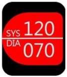
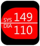
Article

Older Adults’ Usability and Emotional Reactions toward Text, Diagram, Image, and Animation Interfaces for Displaying Health Information

Department of Industrial Design, National United University, Miaoli 36003, Taiwan
*
Author to whom correspondence should be addressed.
Appl. Sci. 2019, 9(6), 1058; https://doi.org/10.3390/app9061058
Submission received: 1 February 2019 / Revised: 7 March 2019 / Accepted: 11 March 2019 / Published: 13 March 2019
(This article belongs to the Special Issue Human Health Engineering)

Abstract

:

Featured Application

Wearable devices design and personal health management.

Abstract

Technology can facilitate the provision of healthcare to older adults. Wearable devices are thus increasingly prevalent amidst perpetual component miniaturization and cost reduction. This study aimed to determine whether existing application (app) interfaces are suitable for older adults by comparing the perceived usability and emotional reactions of younger users and older users to the health information display formats of wearable interfaces. Based on the outcomes of a literature review and expert recommendations, four health display interfaces—text, diagram, image, and animation—were developed and revised. Thirty respondents in Miaoli, Taiwan, were invited to participate in a questionnaire and interviews. The collected data were analyzed and discussed to develop design recommendations. The findings of this study were as follows: (1) the diagram interface had the lowest performance; (2) the respondents preferred the animation interface, which produced strong affective valence, thereby suggesting that animation generated positive emotions, yielding a result consistent with expert views and existing design principles; and (3) older users were more accepting of the text interface than the younger users, who exhibited negative emotions toward the text interface, highlighting a significant generation gap.

1. Introduction

In an aged society, technology can facilitate the provision of healthcare to older adults [1,2,3]. The role of artificial intelligence (AI) and machine learning technologies is growing and is expected to be used across the entire healthcare ecosystem [4,5,6,7]. A majority of consumers are willing to consider AI technologies for managing their health, including monitoring heart condition (e.g., pulse, blood pressure, electrocardiography, etc.), providing customized advice for health based on their personal preferences and health records [7,8]. Furthermore, people are becoming more and more involved in managing their personal health using the internet of things (IoT) and wearable devices [9,10].
Wearable devices are becoming increasingly prevalent amidst perpetual component miniaturization and cost reduction. According to consumer data research, the healthcare wearables market is expected to reach $14.4 billion by 2022 [11,12]. These devices have enabled older users to track and manage their health information anytime, anywhere. In addition, as the voice user interfaces, such as Apple’s Siri and Amazon’s Alexa, becomes standard on wearables devices, these interactions increase ease of use for healthcare management [13,14]. In today’s market, developers are constantly launching new health management applications (apps), providing more opportunities for older adults to use health information interfaces.
Wearable devices serve as both accessories and trackers of personal information. This information can be simultaneously transferred to the wearer and relevant parties. Wearable devices must be compatible with the user and their environment. Therefore, they are complex microdevices that facilitate human–computer interaction. With the evolution and innovation of new technology for this interaction, the design of visual display for older adults’ health information was concerned in this study. Considering how older adults’ physical and mental functions deteriorate with age, questions have arisen as to whether existing app interface designs are suitable for older adults and whether the perceived usability of these app interfaces differs for younger users and older adults. Many scholars asserted that products become more acceptable to users when they are able to incite positive emotions [15,16,17]. Therefore, it is important to elucidate how visual health information interfaces incite affective valence and arouse older adults. This study analyzed the display formats of health information on wearable interfaces to determine perceived usability and emotional reactions, with the goal of improving healthcare for older adults.
A literature review and a sample analysis were performed to identify four different interface formats, namely text, diagram, image, and animation, and a questionnaire was conducted to test them. This study examined the differences in how the four interfaces are used by younger users and older adults, and highlighted the advantages and disadvantages of the interfaces. Several design suggestions are presented based on the research findings.
The objectives of this study were as follows:
1.
To analyze the display formats for visualizing health information and test the usability of these formats.
2.
To investigate users’ acceptance and comprehension of the display formats and determine the affective valence and arousal elicited by these formats.
3.
To compare the responses of younger users and older users to the different formats.
This research, however, is subject to several limitations. Providing sound feedback can enhance the user interface design. Furthermore, applying the technology of voice user interfaces to assist communication is growing as the rapid development of AI [18,19]. This research only focuses on different types of visual interfaces and regards sound/voice as a controlled variable. Therefore, as with the majority of studies, the findings of this study have to be seen in light of some limitations.

2. Literature Review

2.1. Wearable Devices and Aging

Wearable devices are defined as apparel or accessories embedded with electronic components or computers. These devices adhere comfortably to the human body and provide a variety of functions. The purpose of wearable devices is to satisfy the demand for stable, convenient, comprehensive, and hands-free electronics. Wearable devices focus on user communication, providing information in real-time. In certain situations, these devices are superior to handheld devices, such as when tracking vital signs [20,21].
A United Nations report predicted that the global elderly population in the twenty-first century will exceed the total world population in the previous century [22]. Monitoring the health conditions of older adults through wearable devices helps delay the aging process, improves quality of life, promotes independent lifestyles, minimizes hospitalization and mortality rates, and reduces healthcare cost [1,23]. To achieve these objectives, wearable devices can be coupled with wireless technologies to track vital signs and health conditions on-the-go, achieving effective information management [24].
Older adults’ physical and mental functions gradually deteriorate with age. Therefore, a specific set of design principles should be followed when designing products for older users [25,26,27,28]. Understanding the characteristics of older adults’ physical and mental functions enables designers to create products suitable for these users. In the future, wearable device designs will focus more on fashion trends, practicality, and functionality. The findings of a previous study on older adults’ perceptions of wearable computers showed that they preferred wearable devices that were concealed [3].

2.2. Information Visualization: Definition and Classification

Information visualization refers to the conversion of information into different visual formats that can be easily viewed on small interfaces. Information visualization effectively reduces the effort required to process information, helping users quickly understand large amounts of information [29,30]. One example is the Health App on Apple Watch, a wearable device launched in 2015, which uses circles and numbers to represent health information (Figure 1). Apple also introduced a new interactive mode for this device, comprising images, audio messages, haptic touch, and information sharing. Another example is the TrackMeo app for Android (Figure 2). The app, designed largely for patients with cardiovascular diseases, provides cardiovascular and health information on smart devices.
According to past conversion accuracy analyses (from concrete to abstract) [31,32], information display models can be classified into three dimensions (Table 1): information indices, images, and symbols. Each dimension contains several interface formats. Information indices comprise measuring instruments, maps, and photographs. Images can be drawings, doodles, caricatures, or metaphors. Symbols can be linguistic (text and numeric) or abstract.

2.3. Health Information Interface Formats

In this study, 60 health information display interfaces on hardware equipment (traditional and digital sphygmomanometers), digital hardware equipment, mobile devices (smartphones and tablets), and wearable devices were selected to analyze the formats of different health information interfaces. Previous studies have highlighted that information presentation and content are crucial aspects of display design and that text, graphics, images, and color serve to express informational content [33,34]. However, people’s demand for human–computer interaction has increased due to technological advancement. Animation has become a key element for enhancing design attractiveness and usability [32]. In this study, the aforementioned classifications were consolidated, and a classification comprising four formats (text, diagrams, images, and animation) was developed for subsequent analysis.
Text is a basic, easy-to-understand information display format [35,36]. Therefore, it has been used in numerous devices, including traditional hardware and wearable devices (Figure 3). Diagrams typically present statistics, allowing users to easily interpret statistical significance and variance. The diagram format is widely applied in mobile and wearable devices (Figure 4). For example, bar charts are often used to show repeated test results, allowing users to quickly track their long-term health information. Line charts can also help users interpret changes at various points in time. Images refer to small metaphoric depictions of real-world objects. These images facilitate learning and memorization (Figure 5) [33]. Animation has become a favored design element among designers. When effectively applied, it can help first-time users of an app quickly adapt to the design. Meaningful animation enhances the attractiveness of the design and guides users in operating the interface [37]. Animating health information not only improves storytelling but also makes the information interesting and affective (Figure 6).

2.4. SAM, SUS, and QUIS Scales

The Self-Assessment Manikin (SAM) was adopted in this study to measure emotion. The SAM is a pictorial assessment developed by Mehrabian and Russell to measure affective responses [38]. This semantic scale describes three emotional aspects: emotional valence, arousal, and dominance. These aspects are measured with emotional images to rate 18 different emotional states. The scope of the application of this tool is the emotional measurement used in the computer interaction procedure [38,39]. Two emotional aspects, valence and arousal, were measured and rated on a nine-point scale. Antonymous semantic adjectives were added to the left and right to help respondents interpret the pictures.
The System Usability Scale (SUS) and the Questionnaires for User Interaction Satisfaction (QUIS) were adopted in this study to measure usability. The SUS is a widely applied measuring tool proposed by John Brooke in 1986. The scale can be used to measure subjective perceptions concerning the use of product interfaces, desktop applications, and website interfaces [40,41]. These perceptions are scored on a scale of 1 to 100.
The QUIS was proposed by Chin and Norman in 1987. This scale can be used to measure users’ subjective satisfaction with specific aspects of human–computer interaction [42,43,44]. The QUIS is executed on a seven-point scale and divided into five categories: overall reaction, screen, terminology/system information, learning, and system capabilities [45]. It was modified in this study for health information display interfaces; “overall reaction” and “screen” were the only categories used.

3. Materials and Methods

A survey was conducted to determine the perceived usability of different interface formats based on the emotional reactions of younger and older respondents. Different visualization formats for health information were developed as the sample designs in the survey. A preliminary questionnaire regarding the four types of health information display interfaces was developed for the pretest. Experts were invited to test the questionnaire and provide suggestions. These suggestions were adopted to revise the samples and the questionnaire.
A total of 30 respondents were invited to participate in the formal survey, which was divided into three stages. First, the respondents provided personal information and completed a health knowledge test. Then, a portable computer was used to present the four interface samples. Each interface was presented to the respondents for 5 s, in which time they were required to interpret the health information. Thereafter, they completed the interface interpretation questionnaire. Finally, the respondents were instructed to complete the main questionnaire to measure their level of comprehension, information adequacy, preferences, affective valence and arousal (SAM), and perceived usability (SUS, QUIS) concerning the four interfaces. After the formal survey, all respondents participated in a semistructured interview.
A one-way analysis of variance (ANOVA) was performed on the data collected from the questionnaire survey and interviews to validate the relationships between the variables. A least significant difference (LSD) test and Scheffé test were adopted for post-hoc validation.

3.1. Subjects

The pretest participants were four graduate students from National United University, Taiwan (two men and two women) and older male expert. All had prior experience using smart devices, and four had prior experience using health information apps. Thirty students from National United University and their family members were recruited to participate in the formal test. All respondents completed and submitted written informed consent prior to the test. Among the participants, 13 were men (43.3%) and 17 were women (56.7%). Three were aged 20–29 years, seven were aged 30–39 years, seven were aged 40–49 years, 11 were aged 50–65 years, and two were aged over 65 years. For the statistical analysis, respondents aged between 20 and 49 years (17 respondents) were classified as younger users, and those aged 50 years and above (13 respondents) were classified as older users.

3.2. Materials

A number of studies were reviewed to analyze relevant design principles. The four design graduates from the National United University assisted the researchers in collecting 60 health information display interfaces on the market during the time of research. Then, several of these interfaces for blood pressure information were redesigned by using Adobe Illustrator and printed out on paper for the pretest. Following the pretest, an expert discussion was organized, after which the four graduate students discussed and revised the interfaces. They considered the interfacing approach, amount of information displayed, degree of abstraction, and level of dynamics, finally retaining four test samples. The pretest also showed that the respondents were biased by color. Therefore, a standard color palette was developed for all the interface samples. The samples used in the formal test were text, diagram, image, and animation interfaces. The selection process also accounted for these four interface formats presented in previous studies on display design [33,46]. Since animation has become a factor influencing users’ attention and usability perceptions in recent years [32], an animation sample was also included in the sample lineup to enhance research integrity. Animations were created using Adobe Flash. In the formal survey, the main questionnaires were on paper, and all interface samples were embedded in Adobe Flash Player and presented on a 15” portable computer.
Normal value ranges for SYS and DIA on the text interface were between 90 and 140 mmHg and 60 and 90 mmHg, respectively. A value above or below these ranges indicated abnormal blood pressure. The diagram interface also followed the preceding principles. However, values were expressed as bar charts. In the image interface, a circle denoted normal blood pressure and a cross denoted abnormal blood pressure. In the animation interface, a smiley face denoted normal blood pressure and a sad face denoted an abnormal blood pressure. The eyes and mouth repeatedly moved every one second to enhance facial expressions of emotion. The sample designs and characteristics are displayed in Table 2.

3.3. Questionnaire Design

A quantitative design was adopted to develop a three-part questionnaire (Table 3). The first part focused on respondents’ demographics (gender, age, and product experience) and health awareness. The health awareness section consisted of a health value scale and a health knowledge scale, which were revised from the questionnaire used in the Survey on Knowledge, Attitude, and Practice of Health Promotion in Taiwan [47]. The scales surveyed the respondents’ feelings toward their health, perceived value of their health, understanding of health information, and health examination knowledge (including blood pressure knowledge).
The second part tested the respondents’ interface interpretation performance. The respondents were presented with health information on one of the four interfaces for 5 s to measure the accuracy of their interpretation of the information. To facilitate statistical analysis, the respondents’ scores were converted to a five-point scale.
The third part was the main questionnaire. (1) A five-point Likert scale was adopted to measure the respondents’ comprehension, preferences, and perceived information adequacy. (2) The nine-point SAM was adopted to measure the respondents’ affective valence and arousal. (3) The five-point SUS was used to measure perceived usability. Respondents’ scores were converted to a scale of 1–100. (4) The revised seven-point QUIS (containing 11 items after revision) was adopted to measure the respondents’ interface usability satisfaction.
In addition to the formal survey, a semistructured interview was conducted to explore the explanations for the survey results. The interview consisted of three parts: (1) the respondents’ consideration in preferences (Item 3.1 in questionnaire content) towards these four types of interfaces; (2) the respondents’ suggestions to revise the interface and their reasons; and (3) the respondents’ opinions to the comprehension, adequacy, and usability towards these four types of interfaces.

4. Results and Discussion

In this study, the perceived usability and affective valence of the younger and older users concerning the four interface formats were analyzed. The variables were interpretation accuracy, comprehension, preference, affective valence and arousal (SAM), usability (SUS and QUIS), and semistructured interviews.

4.1. Subjects’ Backgrounds

Thirty subjects were recruited to participate in the formal test. The first part of the questionnaire focused on respondents’ backgrounds and health awareness. Regarding the experiences of using smart products, eight of the respondents were very experienced users, nine were experienced, 10 were inexperienced, and three were very inexperienced. Regarding various computer products, two were very experienced users, four were experienced, 11 were average, seven were inexperienced, and six were very inexperienced. Regarding health apps, one of the respondents was a frequent user, two were occasional users, 10 were infrequent users, and 17 were nonusers (Table 4). The background questionnaire showed that, regarding participants’ demand for health information, a consolidation of the data (marked “moderate” or above for this item) revealed that 90% of the respondents concerning their desire to receive health information. Regarding respondents’ willingness and usage frequency of healthcare apps, 72.5% of the respondents expressing a moderate desire to use healthcare apps; however, few respondents (3.3%) used them frequently.
Only a few younger users (2.5%) were in the habit of measuring chronic illnesses, with 97.5% expressing that they seldom did so. This was attributed to how younger users youngerly perceived themselves to be healthy. Moreover, the younger users generally led a substandard lifestyle, but showed increased awareness of blood pressure. This knowledge was attributed to successful health education.

4.2. Analysis of Interpretation Accuracy, Comprehension, Preference, and Information Adequacy

The overall means and standard deviations for interpretation accuracy, comprehension, preference, and information adequacy are tabulated in Table 5. The results of the one-way ANOVA revealed that text, diagrams, images, and animation achieved significant statistical differences (<0.05). A comparison of the interpretation accuracy, comprehension, and preference for the four interfaces is illustrated in Figure 7. The results of the post-hoc test are provided in Table 6.
Each variable is discussed individually as follows.
Interpretation accuracy: The respondents achieved the highest interpretation accuracy for the image interface, followed by the animation, text, and diagram interfaces. The ANOVA results indicated that the data achieved statistical significance. Post-hoc test results showed that the interpretation accuracy for the diagram interface was significantly lower than those for the text, image, and animation interfaces (p = 0.000 *). The other results failed to achieve statistical significance. Therefore, information interpretation accuracy is a key factor to consider when designing diagram interfaces.
Comprehension: The animation interface was the easiest for the respondents to understand, followed by the image, text, and diagram interfaces. ANOVA results indicated that the data achieved statistical significance. Post-hoc test results showed that the diagram interface achieved significant differences with the image (p = 0.005 *) and animation (p = 0.000 *) interfaces. The other results failed to achieve statistical significance. This suggests that animation and image interfaces are preferable for information presentation.
Preference: The respondents preferred the animation interface the most, followed by the text, image, and diagram interfaces. The ANOVA results indicated that the data achieved statistical significance. Post-hoc test results showed that the preferences for the animation interface were significantly greater than those for the diagrams (p = 0.002 *). These results suggest that respondents preferred animation interfaces to image interfaces.
Information Adequacy: The mean adequacy values of the four interfaces were compared to determine respondents’ perceived information adequacy. The results showed that the animation interface demonstrated the highest information adequacy, followed by the text, image, and diagram interfaces. However, these results failed to achieve statistical significance.

4.3. Affective Valence and Arousal

The SAM was adopted to measure the respondents’ affective valence and arousal concerning the four interface formats. A one-way ANOVA was used to analyze the data. The means (and standard deviations, presented in parentheses) are tabulated in Table 7.
Affective valence: A high score denoted high affective valence for health information. A review of the means showed that the respondents had the highest affective valence for the animation interface, followed by the text, image, and diagram interfaces (Figure 8). Analysis results showed that on average, respondents gave scores of less than five for the diagram interface, suggesting that they disliked it. By comparison, the other interfaces scored an average of six or higher, suggesting that the respondents found these interfaces to be more pleasing. ANOVA results indicated that the data achieved statistical significance. Post-hoc test results showed that the diagram interface scored significantly lower than the other three interfaces (p = 0.040 *, p = 0.048 *, p = 0.000 *). The results of the text, image, and animation interfaces failed to achieve significant differences (Table 8). The findings of this study indicated that diagram interfaces are less able than other interfaces to incite affective valence among users.
Arousal: The respondents displayed the most evident emotional arousal when interpreting health information on the animation interface, followed by the image, text, and diagram interfaces. The means were between 4 and 5. ANOVA results indicated that the data failed to achieve statistical significance.

4.4. Usability

SUS
The SUS was adopted to measure the respondents’ perceived usability of the four interfaces. The overall means and standard deviations are shown in Table 9. A comparison of the results is illustrated in Figure 9. The one-way ANOVA results demonstrate that the interfaces achieved significant differences (p < 0.05).
Regarding usability, the text, image, and animation interfaces received scores of over 70. The ANOVA and post-hoc test results indicated that the perceived usability of the diagram interface was significantly lower than the other interfaces (p = 0.004 *, p = 0.007 *, p = 0.000 *). The perceived usability of the text, image, and animation interfaces failed to achieve significant differences (Table 10). The findings showed that the performance of only the diagram interface was considered unacceptable.
QUIS
The items in the “overall reaction” and “screen” sections of the QUIS were used to elucidate the respondents’ satisfaction with the four interface formats. The overall means and standard deviations are tabulated in Table 11. A comparison chart is illustrated in Figure 10.
The respondents scored the “overall reaction” section greater than 4 and the “screen” section greater than 5, on average, for the text, image, and animation interfaces, suggesting that they responded positively, aside from the diagram interface. ANOVA results indicated that the data achieved statistical significance. Post-hoc test results for the “overall reaction” and “screen” sections indicate that the values for the diagram interface were significantly lower than those for the text, image, and animation interfaces. No significant differences were exhibited between the values of the text, image, and animation interfaces (Table 12). The findings indicated that diagram interface designs have poor overall reaction and screen performance.

4.5. Comparison of Younger and Older Users

Comprehension
The mean and standard deviation values concerning the younger and older respondents’ comprehension of the four interfaces are tabulated in Table 13. A comparison chart is illustrated in Figure 11.
ANOVA results indicated that the data achieved statistical significance. Post-hoc test results (Table 14) indicated that (1) the younger respondents’ comprehension of the animation interface was significantly different from that of the diagram and text interfaces (p = 0.010 * and p = 0.000 *), suggesting that they more fully understood the animation interface; (2) the older respondents’ comprehension of the diagram interface was significantly different from that of the text and animation interfaces (p = 0.010 * and p = 0.041 *), suggesting that they found it more difficult to interpret the health information on the diagram interface than that on the text or animation interfaces; and (3) a comparison of comprehension in the two groups for all four interfaces showed that the text interface achieves statistical differences (p = 0.044 *), suggesting that the older respondents were more capable of understanding the information on the text interface than the younger respondents.
SAM: Affective Valence
The means and standard deviations concerning the younger and older respondents’ affective valences of the four interfaces are tabulated in Table 15, with the standard deviations in parentheses. A comparison chart is illustrated in Figure 12.
ANOVA results indicated that the data achieved statistical significance. Post-hoc test results (Table 16) indicated that (1) the younger respondents had a higher affective valence for the animation interface than the other three interfaces (p = 0.003 *, p = 0.000 *, p = 0.041 *), suggesting that the animation interface produced the highest affective valence, consistent with general expert and design principals; (2) the older respondents had a significantly lower valence for the diagram interface than the other three interfaces (p = 0.000 *, p = 0.020 *, p = 0.001 *); and (3) a comparison of the affective valence in the two groups for all four interfaces showed that the text interface achieved significant differences (p = 0.015 *), suggesting that younger respondents had a lower affective valence for the text interface.
SUS: Usability
The means and standard deviations concerning the younger and older respondents’ perceived usability of the four interfaces are tabulated in Table 17. A comparison chart is illustrated in Figure 13.
ANOVA results indicated that the data achieved statistical significance. Post-hoc test results (Table 18) indicated that (1) the SUS scores (perceived usability) for the diagram interface were significantly lower than the other interfaces in both groups, suggesting that the diagram interfaces had the least favorable performance in terms of usability; and (2) a comparison between the two groups showed that older respondents largely perceived the text interface to have the highest usability, indicating that the older respondents’ scores for the text interface were significantly higher than those of the younger respondents (p = 0.026 *), and thereby suggesting that the two groups had different opinions on the text interface.
QUIS: Overall Reaction and Screen
The means and standard deviations of the younger and older respondents’ overall reactions to the four interfaces are tabulated in Table 19. A comparison chart is illustrated in Figure 14.
The means and standard deviations of the younger and older respondents’ comprehension of the four interfaces are tabulated in Table 20. A comparison chart is depicted in Figure 15.
ANOVA results indicated that both the “overall reaction” and “screen” sections of the QUIS achieved significance. The post-hoc test results for the Overall Reaction section are tabulated in Table 21, and those for the “screen” section are tabulated in Table 22.
According to the preceding tables, the younger respondents’ “overall reaction” results for the animation interface were significantly higher than those for the text and diagram interfaces (p = 0.007 * and p = 0.000*). Their “screen” results for the animation interface were significantly higher than those for the diagram interface (p = 0.000 *), suggesting that the younger respondents were most satisfied with the animation interface. The younger respondents’ “screen” results for the diagram interfaces were significantly lower than those for the other three interfaces (p = 0.015 *, p = 0.005 *, p = 0.000 *). Their “overall reaction” results for the diagram interface were significantly lower than those for the image and animation interfaces (p = 0.003 *, p = 0.000 *), suggesting that the younger respondents were least satisfied with the diagram interface. The older respondents’ “overall reaction” results for the diagram interface was significantly lower than the other three interfaces (p = 0.001 *, p = 0.037 *, p = 0.007 *). Their “screen” results for the diagram interface were significantly lower than those for the text and animation interfaces (p = 0.001 *, p = 0.013 *), suggesting that the older adults were dissatisfied with the diagram interface. A comparison of the results of the younger and older respondents showed that only the text interface achieved significant differences in the “overall reaction” section of the QUIS (p = 0.015 *), suggesting that the older respondents had a more positive perception of the text interface.

4.6. Summary of Unstructured Interviews

A series of unstructured interviews were conducted after the tests. The results were as follows:
Information Comprehension, Information Adequacy, and Usability
In the interviews, the respondents expressed that the animation and image interfaces provided less health information (normal and abnormal) than the other two interfaces. Less time was required to interpret the information, improving the respondents’ perceived usability. The characteristics of these interfaces are useful for users who wish to track simple health results and less suitable for users who require detailed health information and data changes. The respondents expressed that the text and diagram interfaces contained more information, but more effort was required to interpret the information (e.g., blood pressure levels and value changes), reducing their perceived usability. These interfaces were more suitable for users suffering from specific illnesses who must monitor their health on a daily basis. Therefore, interface designers should consider the content and volume of the information presented to the users to select a suitable design that can facilitate information interpretation. A simple comparison chart with summary and suggestion is depicted in Figure 16.
Younger and Older Users
The results of the post-hoc tests showed that for the younger respondents, the animation interface incited the highest affective valence (pleasure). The respondents responded positively to the image interface but negatively to the diagram interface. Interview results showed that the animation interface had excellent emotional expression, making respondents feel like they were interacting with the interface, which was enjoyable. Although the diagram interface was easier to interpret than the text interface, the respondents felt that it contained too much information, making it intimidating. They also expressed that they needed more time to interpret the information. The respondents found the animation and image interfaces to be more interesting in general than the diagram interface. These results were consistent with the statistical findings.
Furthermore, the older respondents had higher information comprehension, affective valence, and perceived usability evaluations for the text interface. Interview results suggested that the older respondents were more accustomed to the traditional text-based interfaces. The newer and more complicated interfaces were comparatively unpopular among the older respondents.

4.7. Discussion

In summary, all respondents responded poorly to the diagram interface, as reflected in the respondents’ interpretation accuracy, affective valence, SUS, and QUIS results. The pleasure, SUS, and QUIS results of the older respondents also showed that they disliked the diagram interface the most of the four interfaces. Interview results indicated that a possible reason for this was that too much information was packed into it, making it difficult to interpret the information and consequently reducing their perceived usability and increasing their negative emotions.
Most of the respondents preferred the animation interface. For the younger respondents, the comprehension aspect of the animation interface was more favorable than that of the diagram and text interfaces. The animation interfaces also incited strong affective valence in the younger respondents. QUIS results showed that the overall reaction of the younger respondents was significantly higher for the animation interface than the text or diagram interfaces. In the “screen” section, the animation interface was also higher than the diagram interface. Their results show that the animation interface was popular all-around and incited positive responses, which was consistent with expert views and extant design principals.
A comparison of the younger respondents and older respondents indicated that the older respondents scored higher in comprehension, perceived usability (SUS), and overall reaction (QUIS) than the younger respondents for the text interface. The younger respondents expressed negative emotions toward the text interface. A generation gap can be observed between the responses of the younger and older respondents.

5. Conclusions

The findings of this study showed that different interfaces produced different usability perceptions and emotions and validated that responses differed between older and younger users. In conclusion, the diagram interface underperformed compared with the other interfaces. The animation interface was popular among the respondents and generated positive emotions. The text interface was accepted by the older users but generated negative emotions among younger users. These results can serve as a reference for designing interfaces for older users.
There are two major limitations in this study that could be addressed in future research. First, as mentioned above, to avoid excessive variables, this research only focuses on the visual interface without the consideration of providing sound feedback and applying the technology of voice user interfaces. Second, diagram interfaces can convey health changes or compare data. However, the health information on such interfaces may be difficult to interpret when applied to wearable devices, inciting negative perceptions of such interfaces. In this study, the capacity issues of wearable devices were observed. Users typically desire large interfaces but are unable to accept the reduced mobility that accompanies larger interfaces.
Finally, future scholars can consider investigating the balance between information volume and display size on wearable devices. Designers can also apply the results obtained in this study, particularly those concerning the usability and affective valence of different interfaces and the special requirements of older users, as a reference for future designs.

Author Contributions

Conceptualization, Y.-M.F.; Data curation, L.C.; Formal analysis, L.C. and B.-C.C.; Funding acquisition, Y.-M.F.; Investigation, L.C. and B.-C.C.; Methodology, Y.-M.F.; Project administration, Y.-M.F.

Funding

This research was funded by the Ministry of Science and Technology of Taiwan, grant number MOST 106-2410-H-239-009-.

Conflicts of Interest

The author(s) declared no potential conflicts of interest with respect to the research, authorship, and/or publication of this article.

References

  1. Cluff, L. The Role of Technology in Long-Term Care. In The Future of Long Term Care; Binstock, R., Cluff, L., von Meerin, O., Eds.; Johns Hopkins University Press: Baltimore, MD, USA, 1996; p. 103. [Google Scholar]
  2. Faetti, T.; Paradiso, R. A Novel Wearable System for Elderly Monitoring. Adv. Sci. Technol. 2013, 85, 17–22. [Google Scholar] [CrossRef]
  3. Fang, Y.M.; Chang, C.C. Users’ Psychological Perception and Perceived Readability of Wearable Devices for Elderly People. Behav. Inf. Technol. 2016, 35, 225–232. [Google Scholar] [CrossRef]
  4. Jiang, F.; Jiang, Y.; Zhi, H.; Dong, Y.; Li, H.; Ma, S.; Wang, Y.; Dong, Q.; Shen, H.; Wang, Y. Artificial intelligence in healthcare: Past, present and future. Stroke Vasc. Neurol. 2017, 2, 230–243. [Google Scholar] [CrossRef] [PubMed]
  5. Panch, T.; Szolovits, P.; Atun, R. Artificial intelligence, machine learning and health systems. J. Glob Health 2018, 8, 1–8. [Google Scholar] [CrossRef] [PubMed]
  6. Pyrkov, T.V.; Slipensky, K.; Barg, M.; Kondrashin, A.; Zhurov, B.; Zenin, A.; Fedichev, P.O. Extracting biological age from biomedical data via deep learning: Too much of a good thing? Sci. Rep. 2018, 8, 5210. [Google Scholar] [CrossRef] [PubMed]
  7. Bharadwaj, R. Will Doctors Fear Being Replaced by AI in the Hospital Settling? Emerj Artificial Intelligence Research (formerly TechEmergence). 2019. Available online: https://www.techemergence.com/will-doctors-fear-being-replaced-by-ai-in-the-hospital-settling/ (accessed on 28 December 2018).
  8. Arnold, D.; Wilson, T. Why AI and Robotics Will Define New Health; PwC: London, UK, June 2017. [Google Scholar]
  9. Haghi, M.; Thurow, K.; Stoll, R. Wearable Devices in Medical Internet of Things: Scientific Research and Commercially Available Devices. Healthc. Inform. Res. 2017, 23, 4–15. [Google Scholar] [CrossRef] [PubMed]
  10. Metcalf, D.; Milliard, S.T.J.; Gomez, M.; Schwartz, M. Wearables and the Internet of Things for Health: Wearable, Interconnected Devices Promise More Efficient and Comprehensive Health Care. IEEE Pulse 2016, 7, 35–39. [Google Scholar] [CrossRef] [PubMed]
  11. Gartner Inc. Forecast: Wearable Electronic Devices, Worldwide; Gartner Inc.: Egham, UK, August 2017. [Google Scholar]
  12. Research and Markets Inc. Wearable Medical Devices Market by Device (Diagnostic (Heart, Pulse, BP, Sleep), Therapeutic), Application (Sport, Fitness, RPM), Type (Smartwatch, Patch), Distribution Channel (Pharmacy, Online)—Global Forecast to 2022; MarketsandMarkets Research Private Ltd.: Northbrook, IL, USA, 2018. [Google Scholar]
  13. Kulkarni, A.; Kalburgi, D.; Ghuli, P. Design of Predictive Model for Healthcare Assistance Using Voice Recognition. In Proceedings of the 2017 2nd International Conference on Computational Systems and Information Technology for Sustainable Solution (CSITSS), Bangalore, India, 21–23 December 2017; pp. 1–5. [Google Scholar]
  14. Sun, O.; Chen, J.; Magrabi, F. Using Voice-Activated Conversational Interfaces for Reporting Patient Safety Incidents: A Technical Feasibility and Pilot Usability Study. Stud. Health Technol. Inform. 2018, 252, 139–144. [Google Scholar] [PubMed]
  15. Alsaleh, D.A. A Social Model for the Consumer Acceptance of Technology Innovation; Southern Illinois University at Carbondale: Carbondale, IL, USA, 2010. [Google Scholar]
  16. Lee, W.; Xiong, L.; Hu, C. The effect of Facebook users’ arousal and valence on intention to go to the festival: Applying an extension of the technology acceptance model. Int. J. Hosp. Manag. 2012, 31, 819–827. [Google Scholar] [CrossRef]
  17. Saariluoma, P.; Cañas, J.J.; Leikas, J. Emotions, Motives, Individuals, and Cultures in Interaction. In Designing for Life; Palgrave Macmillan: London, UK, 2016. [Google Scholar]
  18. Feldman, S.S.; Yalcin, O.N.; DiPaola, S. Engagement with artificial intelligence through natural interaction models. In Proceedings of the Conference on Electronic Visualisation and the Arts, London, UK, 11–13 July 2017; pp. 296–303. [Google Scholar]
  19. Luxton, D. Artificial Intelligence in Behavioral and Mental Health Care; Academic Press: Cambridge, MA, USA, 2015. [Google Scholar]
  20. Tehrani, K.; Michael, A. Wearable Technology and Wearable Devices: Everything You Need to Know. Wearable Devices Mag. WearableDevices.com. March 2014. Available online: http://www.wearabledevices.com/what-is-a-wearable-device/ (accessed on 28 December 2018).
  21. Wu, J.; Li, H.; Lin, Z.; Zheng, H. Competition in wearable device market: The effect of network externality and product compatibility. J. Electron. Commer. Res. 2017, 17, 335–359. [Google Scholar] [CrossRef]
  22. Department of Economic and Social Affairs, United Nations Population Division. World Population Aging 1950–2050; WHO, Department of Economic and Social Affairs Population Division: Geneva, Switzerland, 2002. [Google Scholar]
  23. Upkar, V. Pervasive healthcare and wireless health monitoring. Mob. Netw. Appl. 2007, 12, 113–127. [Google Scholar]
  24. Chan, M.; Estève, D.; Fourniols, J.Y.; Escriba, C.; Campo, E. Smart wearable systems: Current status and future challenges. Artif. Intell. Med. 2012, 56, 137–156. [Google Scholar] [CrossRef] [PubMed]
  25. Morris, J.M. User interface design for older adults. Interact. Comput. 1994, 6, 373–393. [Google Scholar] [CrossRef]
  26. Kobayashi, M.; Hiyama, A.; Miura, T.; Asakawa, C.; Hirose, M.; Ifukube, T. Elderly user evaluation of mobile touchscreen interactions. In Proceedings of the Human-Computer Interaction–INTERACT, Lisbon, Portugal, 5–9 September 2011; pp. 83–99. [Google Scholar]
  27. Bai, Y.W.; Chan, C.C.; Yu, C.H. Design and implementation of a simple user interface of a smartphone for the elderly. In Proceedings of the 2014 IEEE 3rd Global Conference on Consumer Electronics (GCCE), Tokyo, Japan, 7–10 October 2014; pp. 753–754. [Google Scholar]
  28. Marcus, A. Universal, Ubiquitous, User-Interface Design for the Disabled and Elderly. In HCI and User-Experience Design; Springer: London, UK, 2015; pp. 47–52. [Google Scholar]
  29. Bederson, B.; Shneiderman, B. (Eds.) The Craft of Information Visualization: Readings and Reflections; Morgan Kaufmann: Burlington, MA, USA, 2003. [Google Scholar]
  30. Cook, K.A.; Thomas, J.J. Illuminating the path: The research and development agenda for visual analytics 2005; IEEE Computer Society: Los Alamitos, CA, USA, 2005. [Google Scholar]
  31. Pousman, Z.; Stasko, J. A taxonomy of ambient information systems: Four patterns of design. In Proceedings of the Working Conference on Advanced Visual Interfaces, Venezia, Italy, 23–26 May 2006; ACM: New York, NY, USA, 2006; pp. 67–74. [Google Scholar]
  32. Fang, Y.M.; Sun, M.S. Applying Eco-Visualisations of Different Iinterface Formats to Evoke Sustainable Behaviours towards Household Water Saving. Behav. Inf. Technol. 2016, 35, 748–757. [Google Scholar] [CrossRef]
  33. Tullis, T.S. Screen Design. In Handbook of Human-Computer Interaction, 2nd ed.; Helander, M.G., Landauer, T.K., Prabhu, P.V., Eds.; Elsevier: Amsterdam, The Netherlands, 2014; pp. 503–532. [Google Scholar]
  34. Rogers, Y.; Sharp, H.; Preece, J. Interaction Design: Beyond Human-Computer Interaction; John Wiley and Sons: Hoboken, NJ, USA, 2011. [Google Scholar]
  35. Chiang, T.; Natarajan, S.; Walker, I. A laboratory test of the efficacy of energy display interface design. Energy Build. 2012, 55, 471–480. [Google Scholar] [CrossRef]
  36. Harada, H. UI Design Textbook in Web Design for Multi-Device Era—From Aarchitecture to UX; Shoeisha Co. Ltd.: Tokyo, Japan, 2013. [Google Scholar]
  37. Google Inc. Material Design Guidelines. Available online: https://material.io (accessed on 31 August 2017).
  38. Mehrabian, A.; Russell, J.A. Approach to Environmental Psychology; The MIT Press: Cambridg, UK, 1974; pp. 8–26. [Google Scholar]
  39. Bradley, M.M.; Lang, P.J. Measuring emotion: The self-assessment manikin and the semantic differential. J. Behav. Therapy Exp. Psychiatry 1994, 25, 49–59. [Google Scholar] [CrossRef]
  40. Brooke, J. SUS: A “Quick and Dirty” Usability Scale. In Usability Evaluation in Industry; Jordan, P.W., Thomas, B., We-erdmeester, B.A., McClelland, A.L., Eds.; Taylor and Francis: London, UK, 1996; pp. 189–194. [Google Scholar]
  41. Bangor, A.; Kortum, P.T.; Miller, J.A. An empirical evaluation of the System Usability Scale (SUS). Int. J. Hum. Comput. Interact. 2008, 24, 574–594. [Google Scholar] [CrossRef]
  42. Chin, J.P.; Diehl, V.A.; Norman, K.L. Development of an instrument measuring user satisfaction of the human-computer interface. In Proceedings of the SIGCHI Conference on Human Factors in Computing Systems, Washington, DC, USA, 15–19 May 1988; ACM: New York, NY, USA, 1988; pp. 213–218. [Google Scholar]
  43. Harper, B.D.; Norman, K.L. Improving Us-er Satisfaction: The Questionnaire for User In-teraction Satisfaction. In Proceedings of the 1st Annual Mid-Atlantic Human Factors Conference, Virginia Beach, VA, USA, 25–26 February 1993; pp. 224–228. [Google Scholar]
  44. Tullis, T.S.; Stetson, J.N. A Comparison of Questionnaires for Assessing Website Usability. In Proceedings of the Usability Professionals Association (UPA) 2004 Conference, Minneapolis, MN, USA, 7–11 June 2004. [Google Scholar]
  45. Tullis, T.S.; Albert, W. Measuring the User Experience: Collecting Analyzing, and Presenting Usability; Morgan Kaufmann Publishers Inc.: San Francisco, CA, USA, 2008. [Google Scholar]
  46. Preece, J. A Guide to Usability—Human Factors in Computing; Addison Wesley: Boston, MA, USA, 1993. [Google Scholar]
  47. Bureau of Health Promotion, Department of Health, Taiwan. National Survey on Knowledge, Attitude, Practice of Health Promotion; Available from Survey Research Data Archive; Academia Sinica: Taipei, Taiwan, 2010. [Google Scholar]
Figure 1. Health App by Apple.
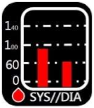
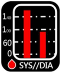
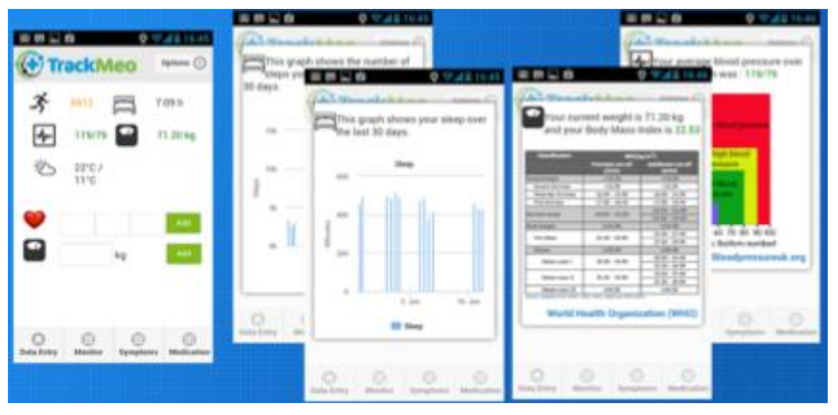
Applsci 09 01058 g001
Figure 2. TrackMeo by Google.
Applsci 09 01058 g002
Figure 3. Omron upper-arm sphygmomanometer HEM-7121 and Suunto M1 heart rate monitor.
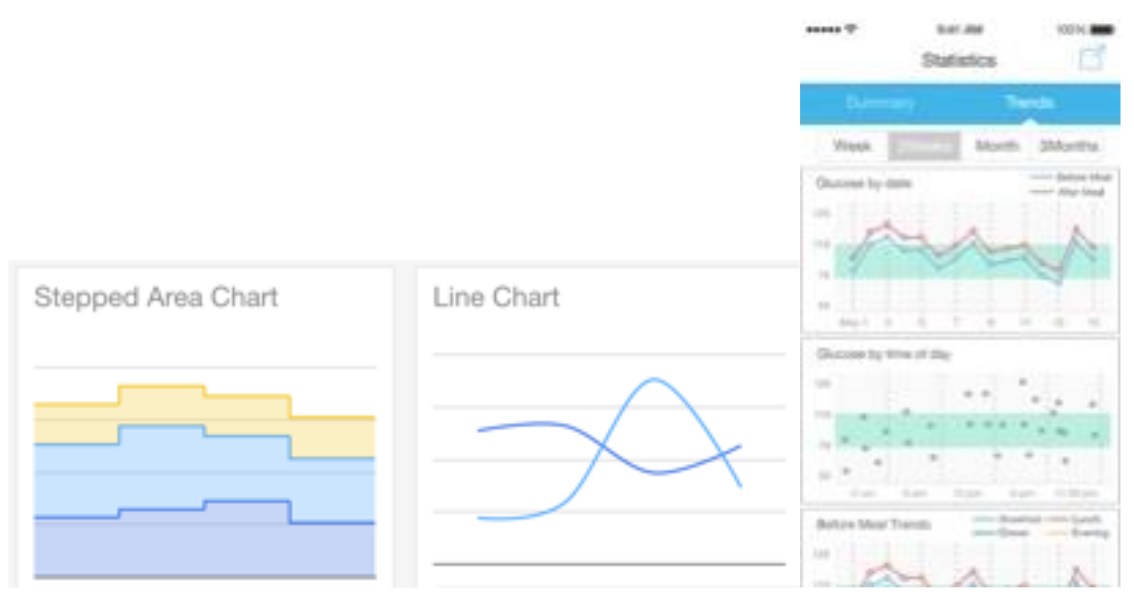
Applsci 09 01058 g003
Figure 4. Charts for Google developers and iHealth Gluco-Smart.
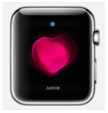
Applsci 09 01058 g004
Figure 5. Images: Apple Watch.
Applsci 09 01058 g005
Figure 6. Animation: Plant Nanny.
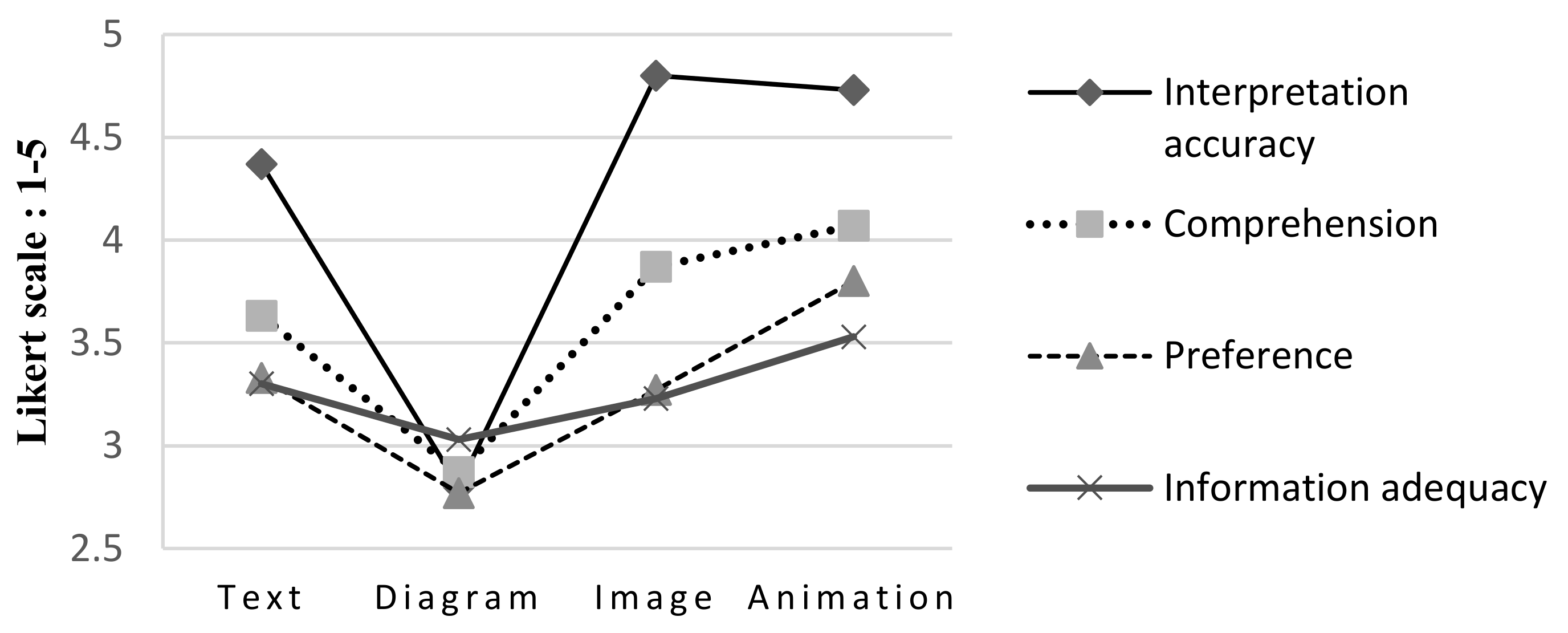
Applsci 09 01058 g006
Figure 7. Comparison of interpretation accuracy, comprehension, preference, and information adequacy (unit: points; five-point Likert scale).
Applsci 09 01058 g007
Figure 8. Comparison of affective valences (unit: points; nine-point Likert scale).
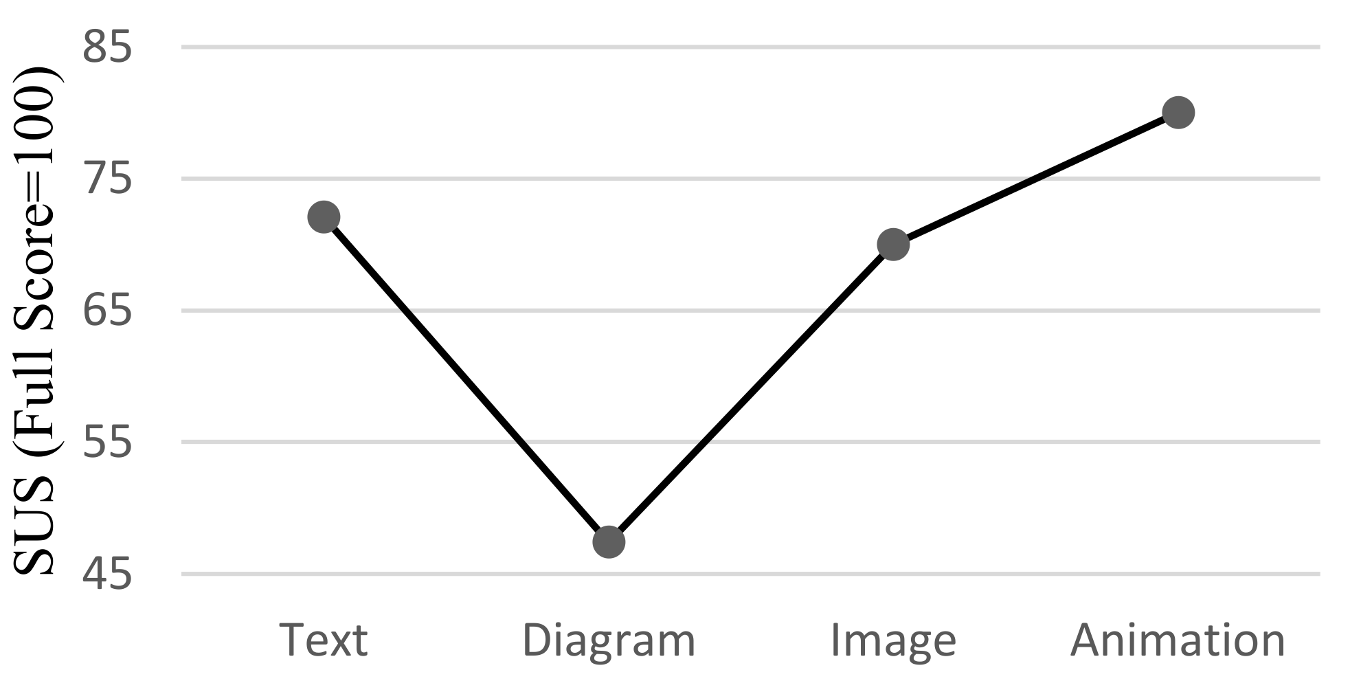
Applsci 09 01058 g008
Figure 9. Comparison of SUS results (full score = 100).
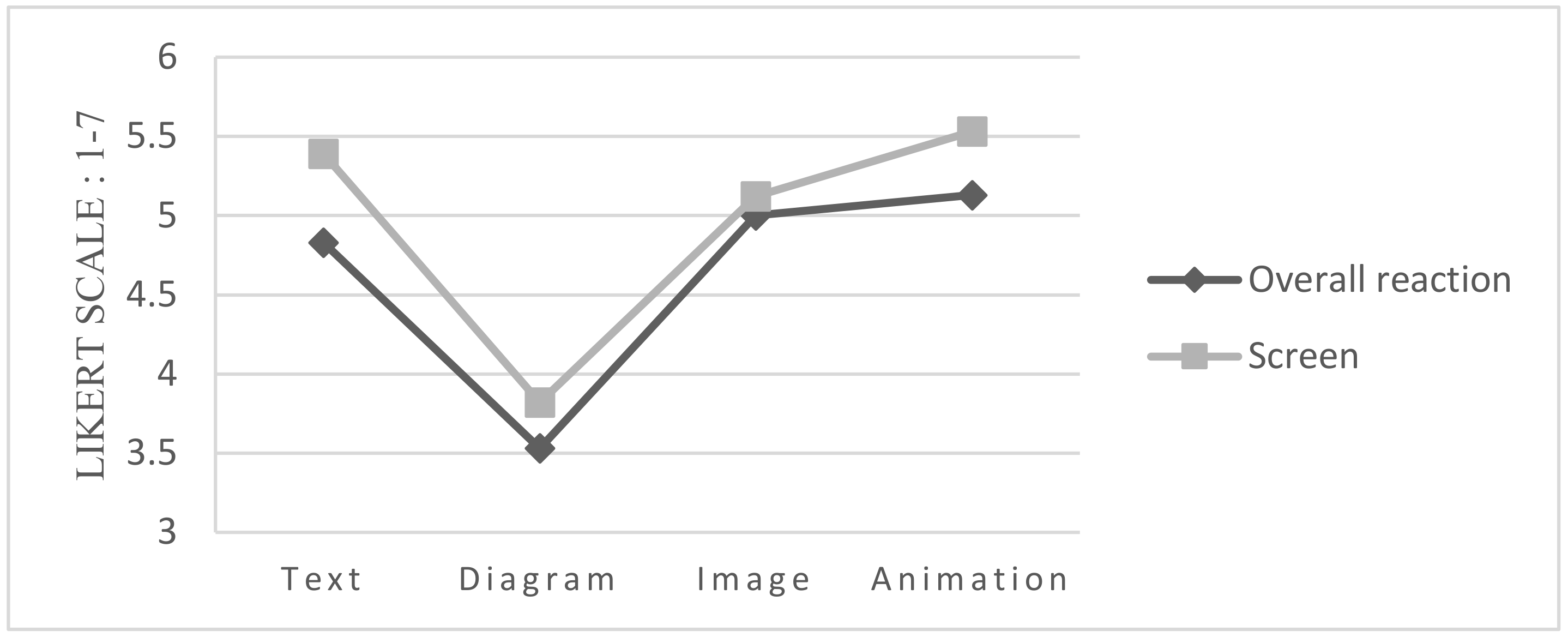
Applsci 09 01058 g009
Figure 10. Overall reaction comparison (unit: points; seven-point Likert scale).
Applsci 09 01058 g010
Figure 11. Comprehension comparison of the four interfaces.
Applsci 09 01058 g011
Figure 12. Comparison of affective valences of the four interfaces.
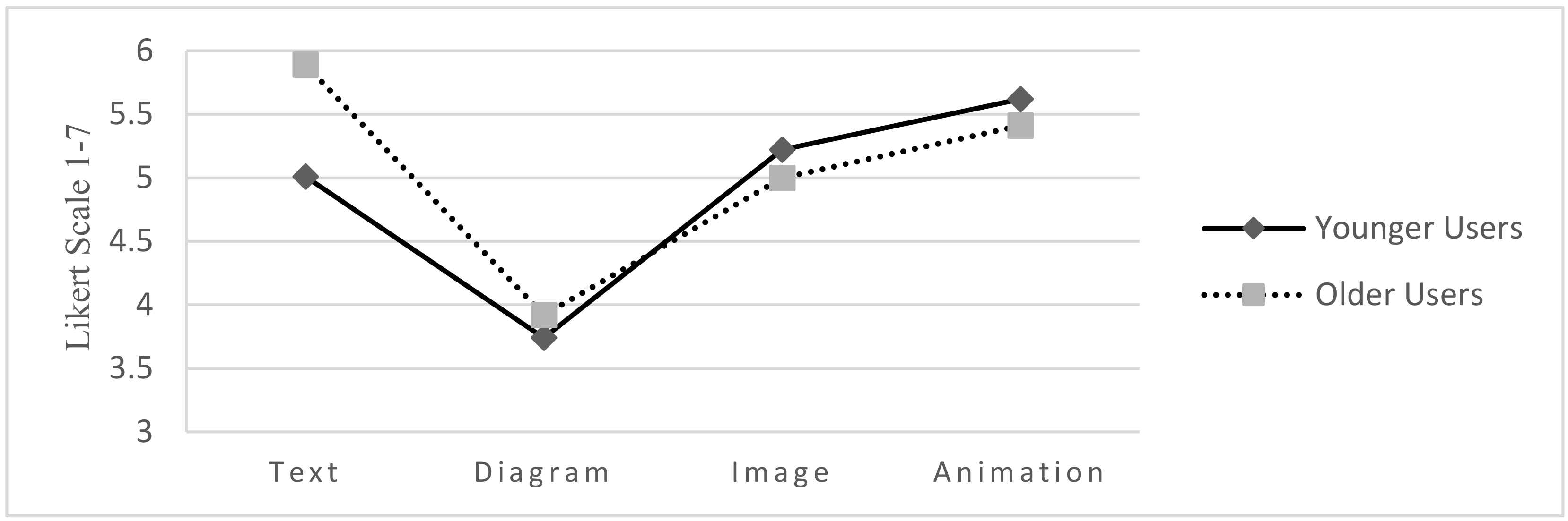
Applsci 09 01058 g012
Figure 13. Comparison of the SUS results of the younger and older users.
Applsci 09 01058 g013
Figure 14. Comparison of overall reactions to the four interfaces.
Applsci 09 01058 g014
Figure 15. Comparison of the screen results of younger and older users.
Applsci 09 01058 g015
Figure 16. Simple comparison of information comprehension, information adequacy, and usability of the four interfaces.
Applsci 09 01058 g016
Table 1. Information display dimensions and formats.
AccuracyInformation Display ModelExampleInterface Format
Concrete to abstractInformation indices Applsci 09 01058 i001Measuring instruments, maps, photographs
Images Applsci 09 01058 i002Drawings, doodles, caricatures
Metaphors
Symbols Applsci 09 01058 i003Linguistic (letters and numbers)
Abstract
Table 2. Sample design and interface characteristics.
Sample NameTextDiagramImage Animation
Healthy Applsci 09 01058 i004 Applsci 09 01058 i005 Applsci 09 01058 i006 Applsci 09 01058 i007
Unhealthy Applsci 09 01058 i008 Applsci 09 01058 i009 Applsci 09 01058 i010 Applsci 09 01058 i011
Interfacing approachText, number Diagram, bar chart Image, metaphorAnimation, personification
Information scaleRateRateTypeType
Information typeDetailed numbersData rangeStatusStatus
Level of abstractionRandomRandomRandomPortrait
Table 3. Questionnaire content.
ItemsNumber of ItemsItemsContent
1. Basic information and background12Multiple choiceRespondents’ backgrounds, health values, and health knowledge
2. Information correctness 20True or false/converted to five pointsRespondents’ accuracy in interpreting the health information
3.1. Comprehension
Preference
Information adequacy
3Five-point Likert scaleUnderstandability of the four interfaces
Respondents’ preferences
Adequacy of the content displayed
3.2. SAM2Nine-point Likert scaleRespondents’ affective valence and arousal
3.3. SUS10Five-point Likert scale/converted to 1–100 scalePerceived interface usability
3.4. QUIS11Seven-point SD scaleRespondents’ satisfaction
Table 4. Respondents’ experiences and usage frequency for relative products and apps.
Experience
ItemVery ExperiencedExperiencedAverageInexperiencedVery Inexperienced
smart products8 (26.7%)9 (30.0%)0 (0%)10 (33.3%)3 (10.0%)
computer products2 (6.7%)4 (13.3%)11 (36.7%)7 (23.3%)6 (20.0%)
Usage Frequency
ItemFrequentOccasionalInfrequentNonusers
health apps1 (3.3%)2 (6.7%)10 (33.3%)17 (56.7%)
Table 5. Average mean and standard deviation values for interpretation accuracy, comprehension, preference, and information adequacy (standard deviation in parentheses; unit: points; five-point Likert scale).
CategoryTextDiagramImageAnimation
Interpretation accuracy4.37(0.96)2.80(0.66)4.80(0.66)4.73(0.64)
Comprehension3.63(1.189)2.87(0.90)3.87(1.14)4.07((0.94)
Preference3.33(0.88)2.77(0.93)3.27(1.20)3.80(0.96)
Information adequacy3.30(0.95)3.03(1.03)3.23(1.30)3.53(1.17)
Table 6. Post-hoc test: interpretation accuracy, comprehension, and preference.
Interpretation Accuracy
SignificanceTextDiagramImageAnimation
Text 0.000 *0.1730.309
Diagram0.000 * 0.000 *0.000 *
Image0.1730.000 * 0.989
Animation0.3090.000 *0.989
Comprehension
SignificanceTextDiagramImageAnimation
Text 0.0510.8630.468
Diagram0.051 0.005 *0.000 *
Image0.8630.005 * 0.909
Animation0.4680.000 *0.909
Preference
SignificanceTextDiagramImageAnimation
Text 0.1940.9960.359
Diagram0.194 0.2980.002 *
Image0.9960.298 0.242
Animation0.3590.002 *0.242
* represents statistical difference; p < 0.05.
Table 7. Means and standard deviations for affective valence and arousal (standard deviation in parentheses; unit: points; nine-point Likert scale).
GroupTextDiagramImageAnimation
Affective valence 6.10(1.97)4.77(1.61)6.07(1.80)7.03(1.65)
Arousal 4.30(1.80)4.20(1.79)4.73(1.60)4.80(1.97)
Table 8. Post-hoc test of affective valence: significance of the four interfaces.
SignificanceTextDiagramImageAnimation
Text 0.040 *1.0000.246
Diagram0.040 * 0.048 *0.000 *
Image1.0000.048 *
Animation0.2460.000 *0.218
* represents statistical difference; p < 0.05.
Table 9. Average means and standard deviations of the four interfaces according to the SUS results (standard deviation in parentheses; full score = 100).
GroupTextDiagramImageAnimation
SUS72.1(25.28)47.7(27.60)70(23.58)80(23.55)
Table 10. Post-hoc test of usability: significance of the four interfaces.
TextDiagramImageAnimation
Text 0.004 *0.9980.672
Diagram0.004 * 0.007 *0.000 *
Image0.9980.007 * 0.561
Animation0.6720.000 *0.561
* represents statistical difference; p < 0.05.
Table 11. Average means and standard deviations according to the QUIS (standard deviation in parentheses; unit: points; seven-point Likert scale).
GroupTextDiagramImageAnimation
Overall reaction4.83(1.61)3.53(1.62)5.00(1.49)5.13(1.49)
Screen5.39(1.21)3.82(1.72)5.12(1.52)5.53(1.47)
Table 12. Post-hoc test of “overall reaction” and “screen”: significance of the four interfaces.
Overall Reaction
SignificanceTextDiagramImageAnimation
Text 0.018 *0.9820.418
Diagram0.018 * 0.005 *0.000 *
Image0.9820.005 * 0.654
Animation 0.4180.000 *0.654
Screen
Significance TextDiagramImageAnimation
Text 0.001 *0.9240.988
Diagram0.001 * 0.012 *0.000 *
Image0.9240.012 * 0.778
Animation 0.9880.000 *0.778
* represents statistical difference; p < 0.05.
Table 13. Means and standard deviations for comprehension (standard deviation in parentheses, unit: points; five-point Likert scale).
GroupTextDiagramImageAnimation
Younger users3.29(1.16)2.76(0.90)3.94(1.20)4.24(1.03)
Older users4.08(1.12)3(0.91)3.77(1.09)3.85(0.80)
Table 14. Post-hoc comparison of younger and older users’ comprehension of the four interfaces.
Younger Users Older Users
TextDiagramImageAnimationTextDiagramImageAnimation
Younger usersText 0.1410.0730.010 *0.044 *0.4450.2180.153
Diagram0.141 0.001 *0.000 *0.001 *0.5410.010 *0.006 *
Image0.0730.001 * 0.4120.7240.016 *0.6550.805
Animation0.010 *0.000 *0.412 0.6810.002 *0.2270.313
Older usersText0.044 *0.001 *0.7240.681 0.010 *0.4530.573
Diagram0.4450.5410.016 *0.002 *0.010 * 0.0620.041 *
Image0.2180.010 *0.6550.2270.4530.062 0.851
Animation0.1530.006 *0.8050.3130.5730.041 *0.851
* represents statistical difference; p < 0.05.
Table 15. Means and standard deviations for affective valence (standard deviation in parentheses, unit: points; nine-point Likert scale).
GroupTextDiagramImageAnimation
Younger Users5.41(1.77)4.94(1.39)6.00(1.90)7.24(1.64)
Older Users7(1.91)4.54(1.89)6.15(1.72)6.77(1.69)
Table 16. Post-hoc comparison of younger and older users concerning affective valences.
Younger UsersOlder Users
TextDiagramImageAnimationTextDiagramImageAnimation
Younger usersText 0.4320.3270.003 *0.015 *0.1760.2500.037
Diagrams0.432 0.0790.000 *0.002 *0.5310.0610.005 *
Images0.3270.079 0.041 *0.1220.025 *0.8110.233
Animation0.003 *0.000 *0.041 * 0.7140.000 *0.0950.469
Older usersText0.015 *0.002 *0.1220.714 0.000 *0.2180.736
Diagrams0.1760.5310.025 *0.000 *0.000 * 0.020 *0.001 *
Images0.2500.0610.8110.0950.2180.020 * 0.369
Animation0.037 *0.005 *0.2330.4690.7360.001 *0.369
* represents statistical difference; p < 0.05.
Table 17. Means and standard deviations for SUS (standard deviation in parentheses; full score = 100).
GroupTextDiagramImageAnimation
Younger Users63.23(25.25)44.41(24.67)68.38(25.10)80.08(27.78)
Older Users83.84(20.83)52.11(31.52)74.23(21.97)80.38(17.64)
Table 18. Post-hoc comparison of younger and older users’ SUS results.
Younger Users Older Users
TextDiagramImageAnimation TextDiagramImageAnimation
Younger usersText 0.029 *0.5470.050.026 *0.2270.2320.063
Diagrams0.029 * 0.006 *0.000 *0.000 *0.4020.001 *0.000 *
Images0.5470.006 * 0.1720.0940.0780.5240.192
Animation0.050.000 *0.172 0.6820.003 *0.5230.974
Older usersText0.026 *0.000 *0.0940.682 0.001 *0.3260.723
Diagrams0.2270.4020.0780.003 *0.001 * 0.025 *0.004 *
Images0.2320.001 *0.5240.5230.3260.025 * 0.529
Animation0.0630.000 *0.1920.9740.7230.004 *0.529
* represents statistical difference; p < 0.05.
Table 19. Means and standard deviations for overall reactions (standard deviation in parentheses, unit: points; seven-point Likert scale).
GroupTextDiagramImageAnimation
Younger Users4.22(1.53)3.43(1.59)5.04(1.55)5.67(1.63)
Older Users5.63(1.38)3.66(1.72)4.93(1.46)5.30(1.31)
Table 20. Means and standard deviations for screen. (standard deviation in parentheses, unit: points; seven-point Likert scale).
GroupTextDiagramImageAnimation
Younger Users5.01(1.29)3.74(1.72)5.22(1.65)5.62(1.61)
Older Users5.89(0.92)3.92(1.78)5.00(1.38)5.41(1.32)
Table 21. Post-hoc test of younger and older users’ overall reactions to the four interfaces.
Younger UsersOlder Users
TextDiagramImageAnimationTextDiagramImageAnimation
Younger usersText 0.1380.1220.007 *0.015 *0.3240.2100.059
Diagrams0.138 0.003 *0.000 *0.000 *0.6910.009 *0.001 *
Images0.1220.003 * 0.2400.3060.016 *0.8490.647
Animation0.007 *0.000 *0.240 0.9440.001 *0.2000.524
Older usersText0.015 *0.000 *0.3060.944 0.001 *0.2540.594
Diagrams0.3240.6910.016 *0.001 *0.001 * 0.037 *0.007 *
Images0.2100.009 *0.8490.2000.2540.037 * 0.542
Animation0.0590.001 *0.6470.5240.5940.007 *0.542
* represents statistical difference; p < 0.05.
Table 22. Post-hoc screen test of younger and older users.
Younger Users Older Users
TextDiagramImageAnimation TextDiagramImageAnimation
Younger usersText 0.015 *0.6780.2350.1120.0520.9860.472
Diagrams0.015 * 0.005 *0.000 *0.000 *0.7460.025 *0.003 *
Images0.6780.005 * 0.4380.2270.020 *0.6860.739
Animation0.2350.000 *0.438 0.6250.003 *0.2610.697
Older usersText0.1120.000 *0.2270.625 0.001 *0.1310.410
Diagrams0.0520.7460.020 *0.003 *0.001 * 0.0700.013 *
Images0.9860.025 *0.6860.2610.1310.070 0.489
Animation0.4720.003 *0.7390.6970.4100.013 *0.489
* represents statistical difference; p < 0.05.

