4. Methodology
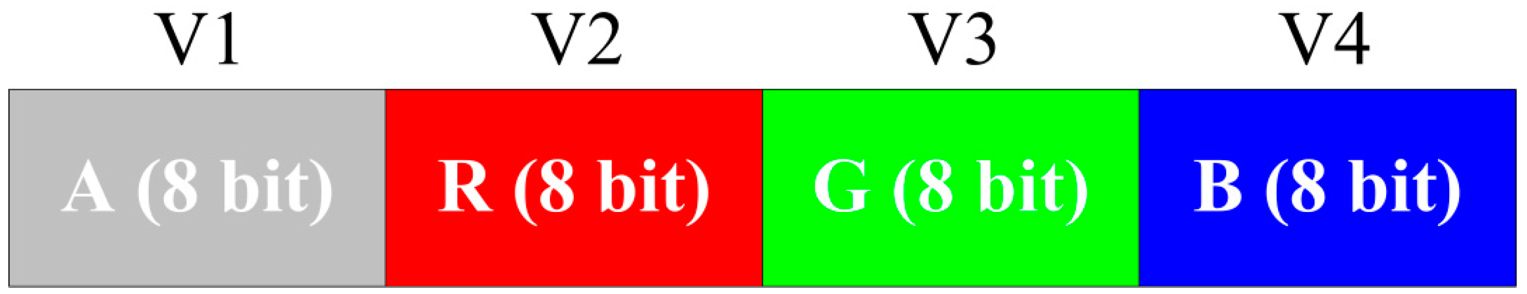
A GKU with a 24-bit bitmap, the RGB pixel format, is used for representing data points. Furthermore, it is possible to use a 32-bit bitmap with the alpha-RGB (ARGB) pixel format for representing the GKU. In both situations, a maximum of 24 bits or 32 bits can be allocated for representing a single variable against another variable.
Instead of allocating the whole bit range of a pixel to a single variable, it is possible to divide the bits among several variables.
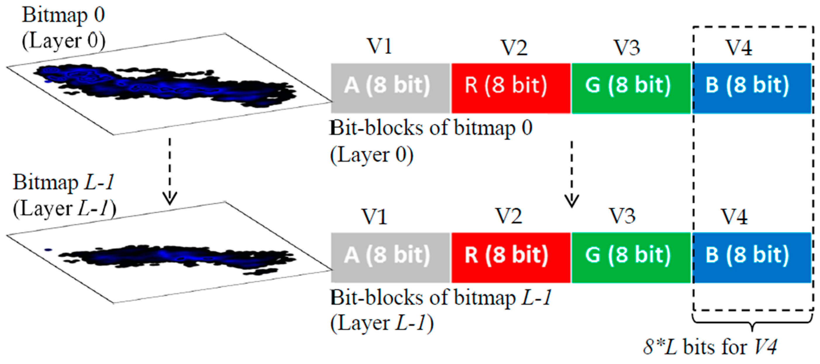
Figure 2 shows an example of the equal allocation of bits of a 32-bit bitmap with the ARGB pixel format for four variables. Furthermore, unequal allocation is possible depending on the requirements. Here, the equal allocation of bits for the variables was mainly considered.
Figure 2 elaborates on the allocation of alpha, red, green and blue portions for representing four variables, where eight bits per variable (BPV) are used. However, when the numbers of variables are high, BPV is low.
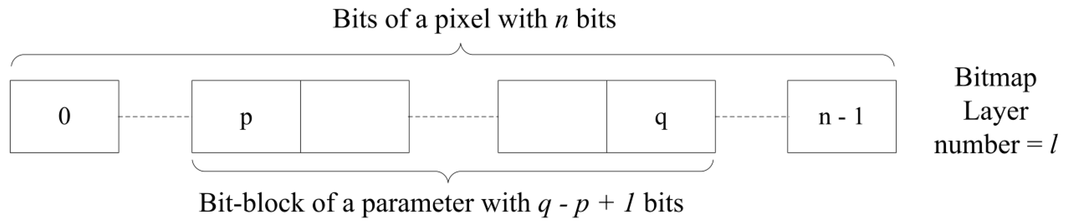
When the BPV is low, it leads to fewer numbers of overlapping data points. If BPV = 8 bits, it supports the representation of the maximum of 256 overlaps and will not allow the representation of a higher number of data points. This will discourage the usage of multiple variables in the GKU. As a solution, a multi-layer bitmap GKU is proposed, which consists of several equal-sized bitmaps (
Figure 3). In the GKU, when one block is full (e.g., blue), it is possible to use the adjacent block (green) to represent overlapping [
25]. In contrast, in a multi-layer GKU, when an allocated block is full, it uses the relevant pixel block of another bitmap of the same size (
Figure 3), which is named a layer. If the number of layers is
L and the number of bits allocated for a variable is
k, this technique provides
k ×
L bits for one variable. In the GKU, the whole bit range of a pixel is allocated for one variable, which can be considered as a horizontal array. In contrast, in the MVML-GKU concept, a single variable is a vertical array with
k ×
L bits (
Figure 3). Depending on the requirement, it is possible to decide the number of layers in the MVML-GKU.
Furthermore, each layer is numbered starting from 0, and the “place-value” is assigned for each layer according to the layer number. This assigns the same “place-value” for each bit in the relevant layer. The base of the “place-value” is in relation to the number of assigned bits for one variable, as shown in Equation (1).
where
PVl is the positional value of a bit in the layer
l,
p is the index of the starting bit of the bit block and
q is the index of the ending bit of the bit block; thus,
p = 0, 1, 2, … and
q = 0, 1, 2, …
If the
represents the color value of the variable, it corresponds to bit block [
p,
q] of the pixel
(i,
j) of the layer
l (
Figure 4). Therefore:
where
is the bit value (0 or 1) of the bit
k of the bit block of a variable of pixel
(i,
j) of the layer
l.
If the total color value in relation to a certain variable corresponding to the bit block [
p,
q] is
, then:
Substituting from Equation (1):
We reserved the last number of the bit block for representing the initial color of the bitmap. Therefore, we used (2(q−p+1) − 1)l instead of using (2(q−p+1))l as the place-value of a certain layer. For example, in the case of equal bit block allocation, if the BPV are eight, we used 255l as the place-value of the layer l instead of 256l. This will reserve the last value “255” for the initial color of the bit block. Whenever the whole pixel is considered, “white” is the initial color of the pixel and the bitmap.
In the concept of the GKU, one data point is represented by a shape that consists of more than one pixel (e.g., a circle) [
25] as a data point shape (DPS). While adding a data point, the existing color value of all of the pixels that are overlapped by the new data point need to be updated by adding the color of the newly-added data point. In a multi-variable environment, separate data points are used for each variable. It is possible to use different DPSs for different variables. However, in this paper, the usage of the same DPS (e.g., circle) for all of the variables is discussed. In every new data addition, the color increment of the intersected area needs to be updated with a previously decided value and named the “color increment” (CI) [
25]. When there is more than one variable, it is possible to use the same or different CI values for variables. In all of the DPSs, the bit block that is assigned for a certain variable is set to its initial color value while keeping all of the bits that do not belong to the considered bit block at value 1. For example, consider the situation of representing data points of four variables (V1, V2, V3 and V4) on the MVML-GKU by means of circles (radius =
r > 0), which has a 32-bit RGB pixel format. Then, in the equal bit allocation, each variable is assigned eight bits as alpha, red, green and blue, respectively. Four separate circles are used to represent V1, V2, V3 and V4 and are colored using different “shape colors” (SC) as (CI, 255, 255, 255), (255, CI, 255, 255), (255, 255, CI, 255) and (255, 255, 255, CI), respectively. Furthermore, using (CI, 0, 0, 0), (0, CI, 0, 0), (0, 0, CI, 0) and (0, 0, 0, CI) is another possible way of implementing the four different variables. If bit block [
p,
q] represents the CI of variable
P, then
P can be represented as
. Then,
represents the pixel color of pixel
of the DPS, where
is the pixel of the DPS, which coincides with the pixel
(i,
j) of the MVML-GKU.
When updating the MVML-GKU, first, the
is calculated using Equation (4), and then,
is added. Therefore:
Finally, the value
is used to update the layers of the MVML-GKU using Equation (6).
where
= 0 when
m >
LWhen using Equation (6), it updates the MVML-GKU starting from the last layer and ends with the first layer (layer 0). However, depending on the requirements, it is also possible to update the MVML-GKU starting from Layer 0 with different approaches.
Variables with different scales or different value ranges require a larger bitmap for representing the actual value ranges of the variable values. This is not peaceable, and it is necessary to transform all of the values of different variables to one scale. To accomplish the transformation, a normalization technique known as “min-max normalization” is used. Min-max normalization performs a linear transformation on the original data mapped into a new range using Equation (7) [
26,
27].
where
v’ is the transformed value of
v,
minA is the minima among all of the data points,
maxA is the maxima among all of the data points,
new_maxA is the ceiling value of the new range and
new_minA is the floor value of the new range.
If the pixel at coordinates (0, 0) of a bitmap is the origin, then
new_minA = 0. Then, Equation (7) becomes:
The width of the bitmap is used for representing the independent variable, while the height of the bitmap is used for representing multiple dependent variables. Thus, the width of the bitmap is proportional to the range of independent variables, and the height is proportional to the maximum range among the ranges of all dependent variables. If the height and the width of the bitmap is
h and
w, respectively, then:
where
RmaxD is the maximum range among the ranges of all dependent variables,
RI is the range of the independent variable,
FmaxD is the scaling factor of the dependent variable that has the maximum range among all ranges of all dependent variables and
FI is the scaling factor of the independent variable.
In the concept of the GKU, it always uses the integer part of a number for mapping on the GKU. Because of that, it is a must to scale up data that have a small range and decimal values to minimize the influence due to truncation. Selecting appropriate values for
new_maxA for Equation (8) will establish the new set of transformed data. The method of selecting a suitable value for
new_maxA is mentioned in the next paragraph. Furthermore, min-max normalization transforms the data series into a positive series, which is another requirement of the GKU. These transformation data are saved in the “GKU specific data area” as a color [
25].
With multiple variables, there are two possible ways of scaling. The first method is to scale all of the parameters using a single scaling factor (
F). This will change all of the values of the variables while keeping the original ratio between variable values. The name “absolute scaling” will refer to such a scaling technique, from now onwards. In “absolute scaling”,
new_maxA for all dependent variables is not the same, but
FiD is the same for all dependent variables, where
FiD is the scaling factor of
i-th dependent variable. The scaling factor of the variable with the height range can be considered as the common scaling factor for all of the dependent variables. Define
RiD as the range of the
i-th dependent variable, and
new_maxAi is the new maximum of the
i-th dependent variable. Then,
The second method is to scale all of the variables in a manner such that the maximum and minimum of all of the variables coincide with each other. The name “relative scaling” will refer to such scaling techniques, from now onwards. In “relative scaling”,
new_maxA for all dependent variables is the same, but
FiD is not the same for all dependent variables. “
h”, which is the previously decided height of the image, can be considered as the common value for
new_maxAi. Thus, for “relative scaling”:
Depending on the scaling method, a compatible new_maxA can be calculated using either Equation (13) or Equation (14).
To have a visually meaningful GKU, it is necessary to have a higher number of overlapping clusters. If there are adequate numbers of overlapping clusters, the GKU shows different density areas separated by automatically-generated “contour lines”. If the number of data points is smaller, it is still possible to have more overlapping using two techniques: (1) use a bigger shape as the DPS and (2) use a higher number as the CI in SC. Using either technique, it is possible to generate higher color values in pixels and to create visible clusters. However, these techniques are important only for better visualization of the clusters. The absence of visual clusters has no effect on understanding the content of the GKU.
6. Results and Discussion
The results included in this section represent different forms of the MLMV-GKU representations, which were obtained using different techniques. Furthermore, this section deliberates the methods and interpretation of the MLMV-GKUs.
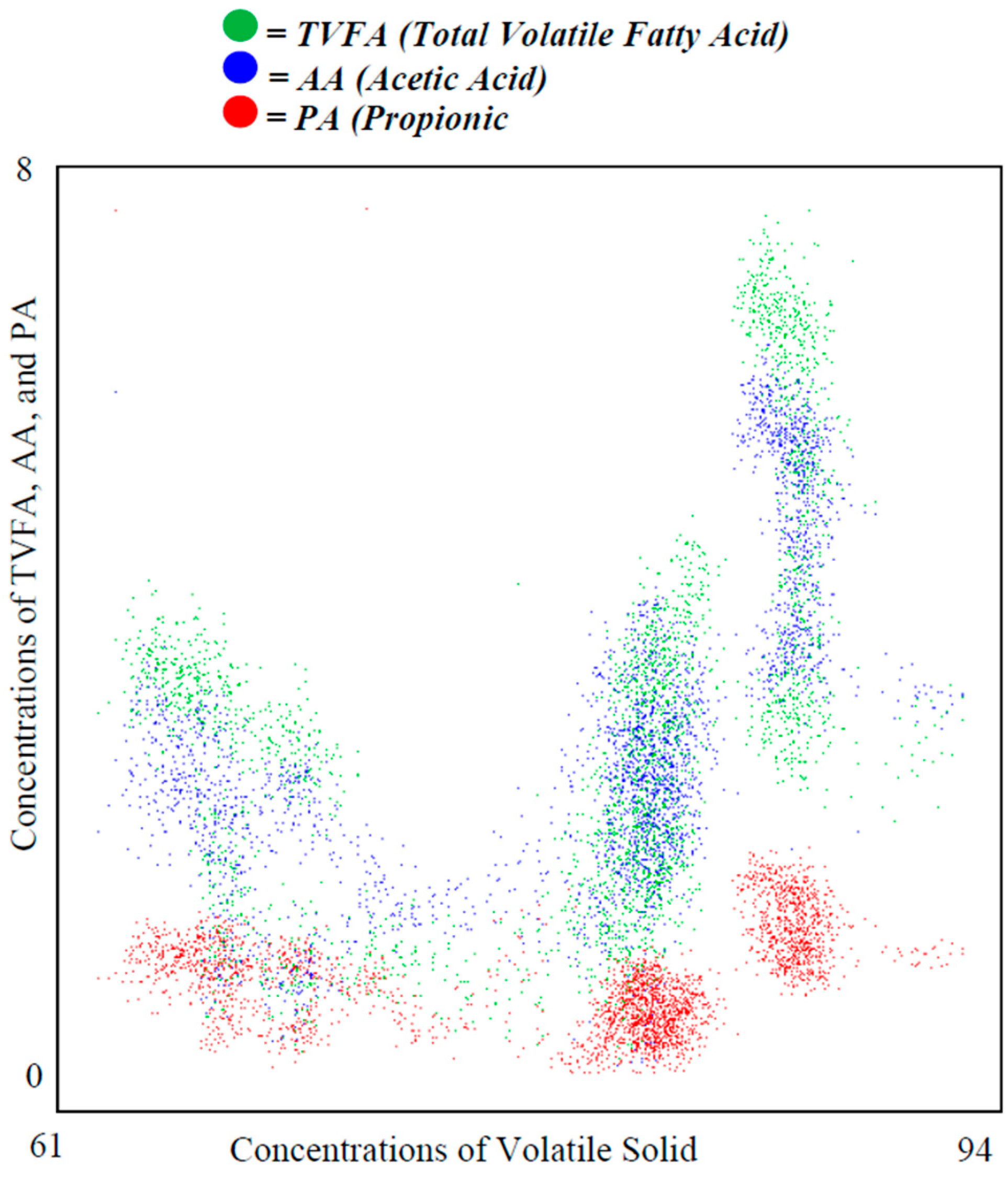
Figure 5 shows a conventional scatter plot, which presents the 2885 occurrences of three dependent variables (TVFA, AA and PA) against the independent variable (VS). Effective value ranges of TVFA, AA and PA are [0, 8], [0, 5] and [0, 5], respectively. The plot itself does not convey strong evidence on data clustering or data density. On the other hand, due to overlapping, it is difficult to identify some of the data points that may lie under other data points.
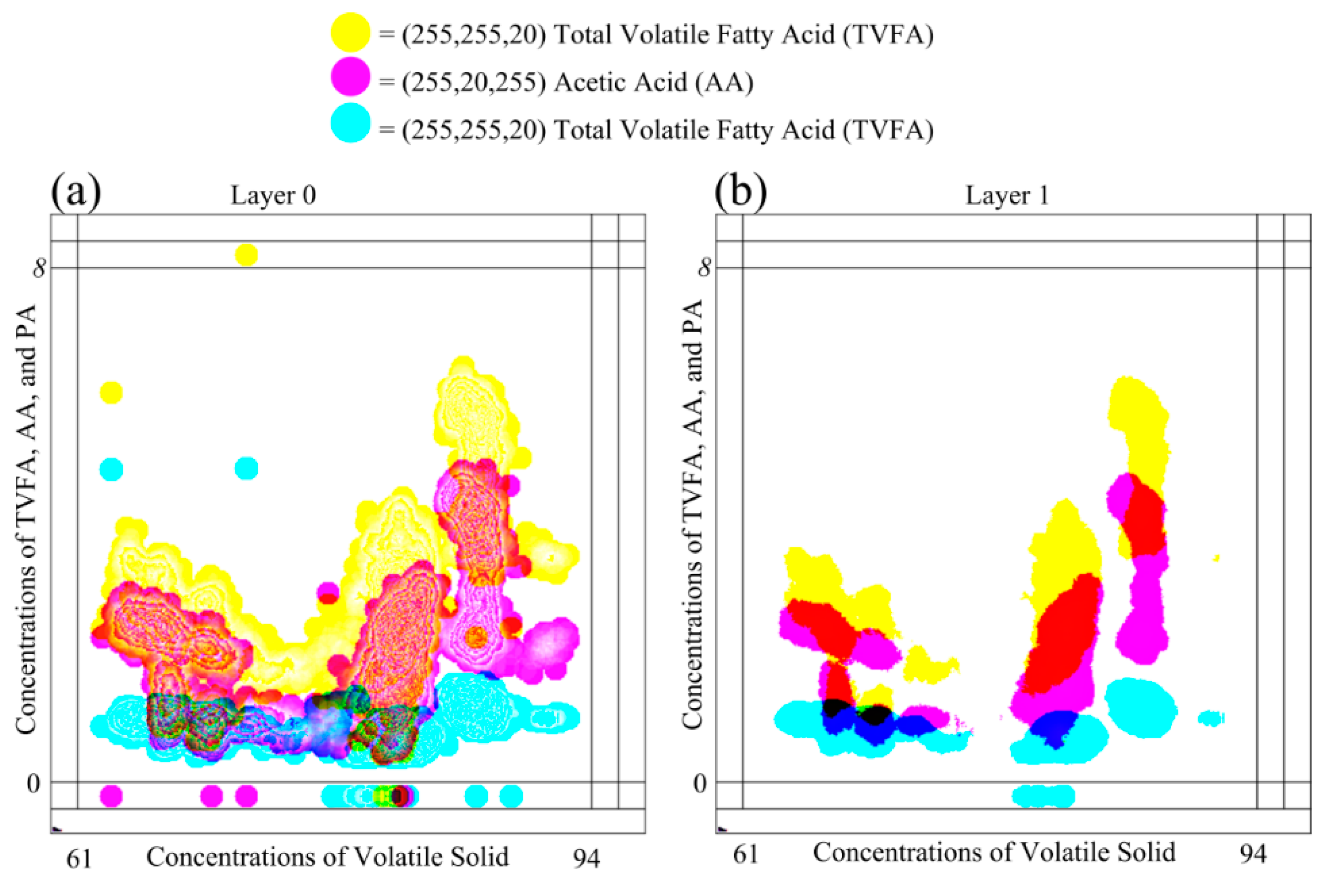
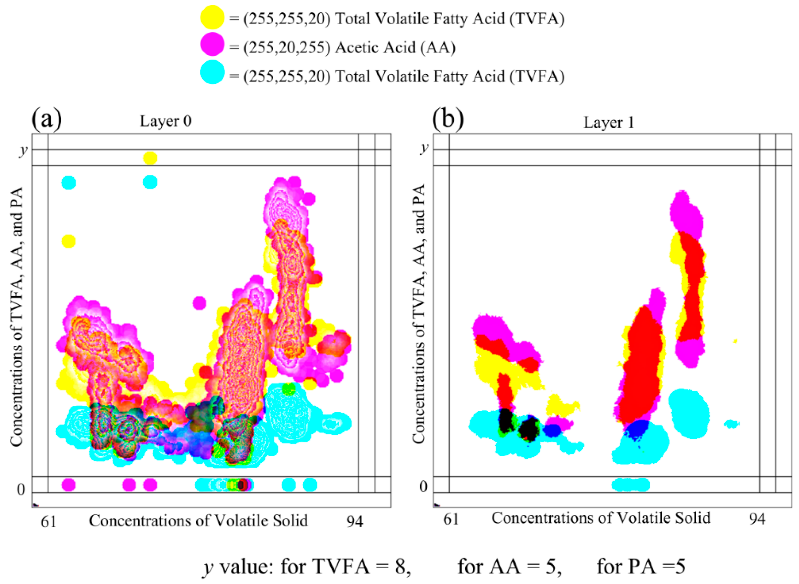
Plots in
Figure 6 show the plotting of the same dataset shown in
Figure 7, on the MLMV-GKU of two layers using “relative scaling”. The MLMV-GKU was implemented using a circle with a ten-pixel radius DPS and CI = 20. Three different RGB colors, (255, 255, 20), (255, 20, 255) and (20, 255, 255), were used for representing TVFA, AA and PA, respectively. The effective width and height of the bitmap is 400 and 400 pixels, respectively. Since “relative scaling” is used for scaling the values of variables, according to the Equation (14),
new_maxA for each dependent variable is 400 pixels. Based on this, all existing ranges of all of the variables ([0, 8], [0, 5] and [0, 5]) were transformed. In Layer 0 of
Figure 6, the formation of clusters that belong to different variables can be identified with the naked eye. This is one advantage of using the concept of the GKU, because it creates visibly dense clusters when there is an adequate amount of overlapping.
Furthermore,
Figure 6 shows a considerable amount of clusters between different variables. If there are clusters due to two or more variables, the color in the shared area is mixed and shows the clusters with a different color. With the basic knowledge of color formation theory, it is possible to identify those areas easily with the naked eye. Additionally, with image processing, it is also possible to identify these areas by analyzing the color values of pixels. When “Layer 1” is considered, there are no contour lines due to less overlapping. However, in Layer 1, clusters due to different variables can be easily identified due to the different color of the shared regions (e.g., the shared area of TVFA and AA). Furthermore, it is possible to distinguish clusters belonging to different variables. Since the place value of Layer 1 is higher than the place value of Layer 0, the presence of color in a higher layer implies the existence of higher density in the position in relation to the respective pixel. Therefore, the examination of higher layers makes higher density area identification much simpler.
Changing parameter values opens new ways of identifying new relations between different variables [
27]. This technique is used as a very efficient tool in most data mining techniques. The MLMV-GKU also supports this feature and easily seeks relations by changing the overlapping between different variables.
Figure 6 shows layers of the MLMV-GKU of the same dataset (scaled with the relative scaling technique), which is used in
Figure 7, and scaled using “absolute scaling”. The highest range among all of the dependent variables belongs to TVFA. Since
RmaxD = 8, according to Equation (12),
FiD = 50 for TVFA, AA and PA. Then, according to Equation (13),
new_maxA for TVFA, AA and PA is 400, 250 and 250, respectively.
Both layers in
Figure 7 and
Figure 6 show overlapping areas of different variables. However, due to different scaling methods, the overlapping areas belong to different variables in
Figure 7 and
Figure 6, which are not identical. This is a very useful feature when the GKU is used as a knowledge unit. When there is overlapping between variables, it is easy to identify color values of multiple parameters by analyzing a single pixel. This will reduce the overhead of computing. However, to interpret the meaning of a shared area due to one or more variables, sealing factors must be decided after properly investigating the domain requirements. Otherwise, only creating overlap areas between variables may not provide useful information.
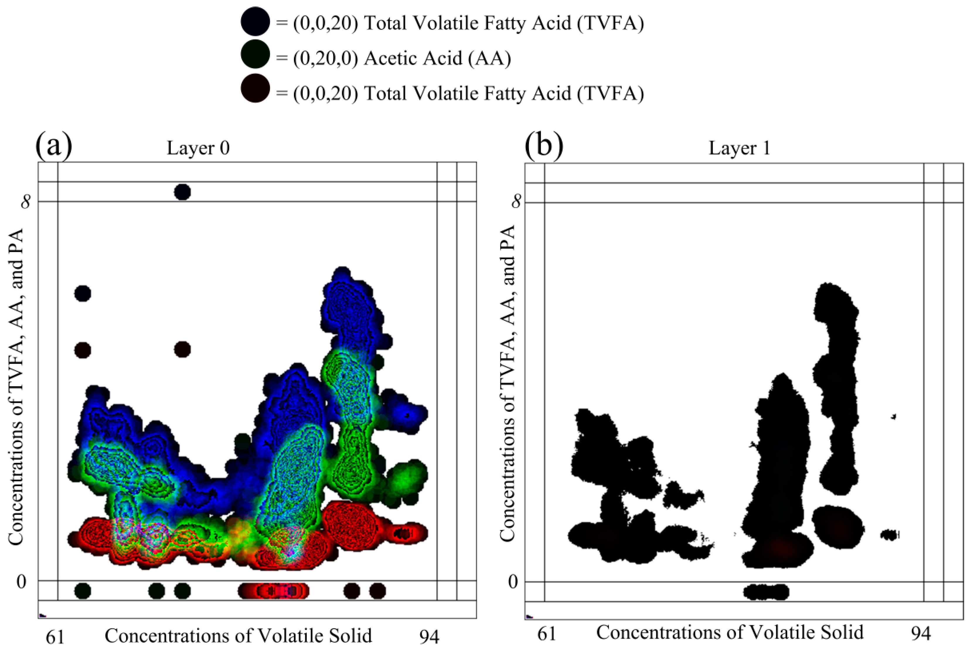
Selecting different color schemes for representing the shape color of DPSs has considerable impact on the visual representation ability of GKU. In general, there are two available color schemes for representing three dependent variables using the 24-bit RGB pixel format as (255, 255, CI), (255, CI, 255), (CI, 255, 255) and (0, 0, CI), (0, CI, 0), (CI, 0, 0). Each color in the first version is near to the white color, which is represented as (255, 255, 255), and each color in the second version is near to the black color, which is represented as (0, 0, 0).
Figure 8 elaborates the impact of using the color scheme for the color of DPSs.
Figure 8 contains the same data used in
Figure 6 with the same scaling parameters. However, (0, 0, 20), (0, 20, 0) and (20, 0, 0) were used as colors of DPSs instead of (255, 255, 20), (255, 20, 255) and (20, 255, 255). The colors (255, 255, 20), (255, 20, 255) and (20, 255, 255) are not identical and are visually identifiable. Though colors (0, 0, 20), (0, 20, 0) and (20, 0, 0) are numerically identical, they are not visually identifiable because all of these colors are equivalent to the black color. The major drawback of this scheme is that the shape colors of DPSs cannot be visually identifiable, though they are different colors. This leads to difficulties in identifying clusters visually, especially in low density areas. When examining Layer 1 of
Figure 8, this phenomenon is more visible. In Layer 1, neither clusters between different variables nor density clusters of individual variables are possible to identify. Furthermore, in Layer 0 of
Figure 8, except high density areas, all of the other areas are in black or nearly black color, and this prevents visual identification of low density areas in relation to different variables. This phenomenon can be easily identified when considering the points P
A and P
B, as shown in
Figure 8. It is not possible to distinguish between P
A and P
B visually due to the colors of the DPSs. However,
Figure 6, these two points can be easily identified. Nevertheless, in reality, all black areas contain different colors (e.g., (0, 0, 40), (0, 40, 0) and (40, 0, 0)), which is visible only to an algorithm. Thus, selection of this type of color is not a problem for identifying clusters in low density areas with a computer. As a recommendation, it is stated that the different colors close to white are the best selection for the MLMV-GKU for visually capturing clusters between different variables, as well as density clusters of individual variables.
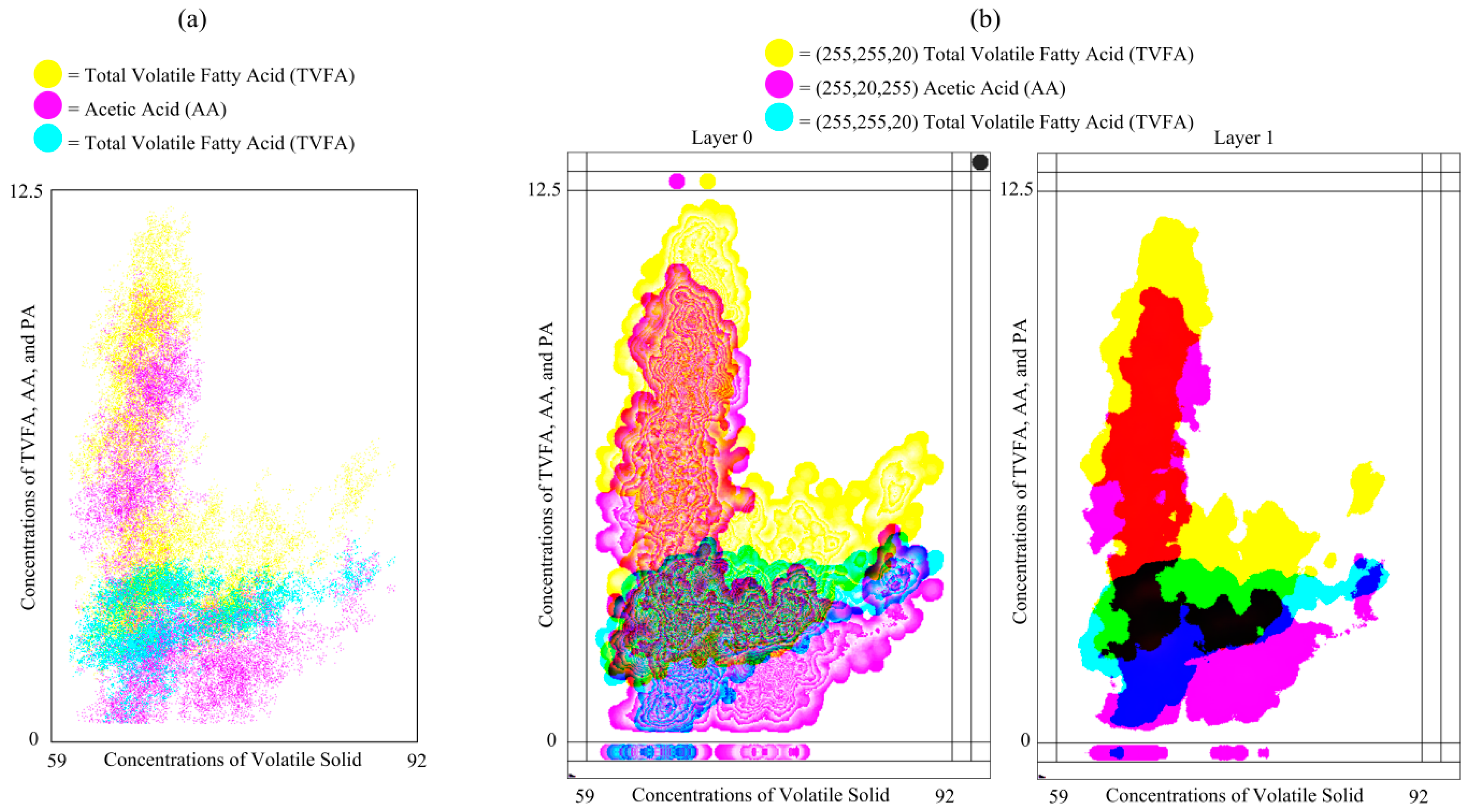
Plot (a) of
Figure 9 shows the compression of the conventional scattered plot for one independent and three dependent variables and plot (b) of
Figure 9 the MLMV-GKU of two layers for the same variables. The plots represent 21,951 data points, where the effective bitmap width and height are 400 and 625 pixels, respectively. Plots represent data in relation to three dependent variables (TVFA, AA and PA) against the concentration of volatile solids (VS). All of the data are normalized using the max-min normalization method and used 625, 550 and 225 pixels as
new_maxA for TVFA, AA and PA, respectively. In the MLMV-GKU, the initial color of each variable is (255, 255, 10), (255, 10, 255) and (10, 255, 255). A circle of a radius of 10 pixels is used as the DPS. The MLMV-GKU shows density clusters of each variable by means of automatically-generated contour lines, which can be easily identified by the naked eye. This is a special feature of the GKU, which is not possible with a scatter plot.
As mentioned in
Section 1, star coordinates directly visualize dimensions as groups in a form of high density clusters in a two-dimensional plot. It is one of the better visualization techniques. However, star coordinates suffer from cluster overlapping of clusters of variables [
17,
20]. This is the major drawback of the star coordinates. If there are no overlapping regions, star coordinates can be used to visualize high density data clusters. However, the data we used have overlapping regions and cannot be visualized using star coordinates.
The nature of the MLMV-GKU allows the usage of a higher number of layers for representing variables. Unfortunately, this will lead to problems in understanding the whole picture. This is a very common problem in understanding scatterplot matrices [
12]. To prevent this problem, it is recommended to use the maximum of four layers where the visual representation is important. Using four layers, it is possible to show 255 × 255 × 255 × 255 (more than four billion) overlaps using eight bits per variable, in the 32-bit pixel format. When using the 32-bit pixel format, basically, it is possible to show four dependent parameters against one independent parameter. This will provide space for more than 16 billion cases of overlapping (four billion × four variables) in a certain pixel coordinate of the four-layer GKU. If the width and height of the data plotting area are
w pixels and
h pixels, respectively, then it is possible to visualize the maximum of
x ×
y × 16 billion cases of overlapping in the four-layer GKU. This is a huge amount of overlapping occurrences, and none of the existing graphical visualization techniques are capable of visualizing this amount of overlapping. Although it is recommended to use a maximum of four layers, there is no mathematical restriction to using more than four layers, depending on the requirement.
The major drawback of MLMV-GKU is the influence of outliers, which leads to artificial high density areas on the GKU. Once these outliers are mixed with non-outlier values of other variables, this leads to incorrect decision making. Furthermore, due to the influence of outliers, the actual scaling cannot be achieved. P
A in
Figure 8 can be considered as an example for such an outlier. Because of the influence of this outlier, it was considered as the maximum of the dataset, even though it is an outlier. Therefore, before plotting the MLMV-GKU, it is essential to remove outliers. The other disadvantage of the MLMV-GKU is that it cannot be directly used to find the correlation between variables, though sometimes, it helps to identify some trends between variables. Nevertheless, domain-related correlation can be defined after considering individual situations. For example, in the considered domain, the concentration of TVFA is proportional to the concentration of AA [
29]. In
Figure 6, clusters in relation to TVFA and AA have nearly the same shape and reveal the domain conditions more convincingly.
Dividing the 32 bits into small portions will facilitate using more variables in the MLMV-GKU. For example, if four bits are used per variable, it will provide room for eight dependent parameters to be clustered in the 32-bit format. Then, it is necessary to increase the number of layers to accommodate the higher number of data points. As previously mentioned, this is not always a good solution, especially if the aim is to use the MLMV-GKU for visualization. Therefore, the best solution is to use pixel formats that provide a higher number of bit ranges. There are different ARGB color formats that provide up to 128 bits per color channel (total 512 bits) [
30,
31]. Nevertheless, still, the limit of eight bits per variable and four layers for the MVML-GKU can be maintained.
The GKU is itself a database and knowledge unit that can be used as the input values for an algorithm; thus all of these properties are inherited by the MLMV-GKU, as well. The meaning of the content can be altered by changing three parameters of the DPS: firstly, the type of shape; secondly, the color of the shape; and thirdly, the position of the data point in the shape. The type of shape that is used in all of the plots in this article is circular. Furthermore, it is possible to use a suitable shape (e.g., square, polygon) instead of a circle. Furthermore, using different types of DPSs for different variables, it is possible to identify/show the effect/influence of a variable on other variables in a more meaningful manner. When a circle is selected with a single color as the DPS, this implies that the effect of the data point is equally valid for all of the pixels inside the circle. However, if the color of the circle is selected in a way that the color is proportional to a certain property (e.g., distance to the data point), this can be used to represent the functional influence of a data point. In the examples shown in this article, the data points were located in the center of the circle. By applying those property changes, the meaning of the MLMV-GKU can be enhanced according to different domain requirements.
If there is a dataset scheduled to be collected for a time period of T, at a time tk (tk < T), all of the data placed on the MLMV-GKU are processed up to time tk−1. Therefore, at any time, the data in the MLMV-GKU can be used to understand the current situation with or without further processing. If further processing is required, a copy of current bitmaps can be used for processing, while the original MLMV-GKU keeps updating. Because each layer is an independent bitmap, each layer can be individually analyzed using a separate process without depending on other layers. This feature enables the MLMV-GKU to be a parallel-processing-ready technique. After analyzing, the final decision can be obtained by summarizing the results of each layer. This could reduce the total processing time to below the usual single process analysis time.


 and
and 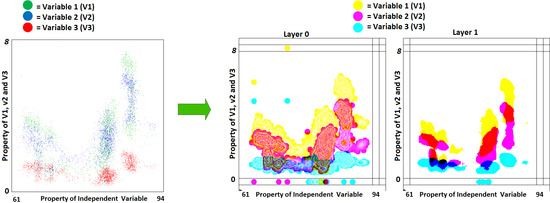