1. Introduction
A visualization speaks in the quiet language of lines and distances, while its accompanying words drift around it, stitching meaning into spaces the data leaves open. Readers may rely on text to explain charts, especially when visuals are ambiguous or complex [
1]. Even well-designed visualizations can be misleading when accompanied by deceptive interpretations [
2] that rely on cognitive shortcuts, rhetorical framing, or implied causal claims. In information-overloaded settings such as mass and social media, Deceptive Interpretations of Data Visualizations (DIDVs) can mislead public understanding of data-driven claims [
3].
In online discussions, people tend to dispute interpretations rather than raw data, especially when captions or news headlines create the impression of a causal effect without explicitly stating it [
1]. Narrative framing can emphasize some trends, reduce uncertainty, or imply causality from correlation, leading the audience towards unconscious conclusions [
2,
4].
Misinterpretations arise from deficiencies in data literacy. Correlations are very often mistaken for causal links, confounders are overlooked, or the evidential power of a chart is overestimated [
5,
6]. These errors are responsible for fallacies in reasoning found in textual misinformation and causal misattribution [
7]. Hence, combating DIDVs requires educational approaches that emphasize interpretive reasoning, rather than only visual design. This study combines dataset development, automated detection, and educational evaluation to provide a unified perspective on detecting deceptive interpretations of visual data.
Using standard statistical methods and a randomized controlled pre- and post-test experiment, we address the following research questions:
Can AI be used to effectively teach students to recognize how DIDVs can affect human interpretation?
What is the best method for teaching the recognition of DIDVs: e-learning, classroom learning, or LLM-supported education?
Hypothesis 1. Students are susceptible to DIDVs. We anticipate substantial differences between their pre-intervention responses to deceptive and non-deceptive examples, indicating limited ability to reliably detect DIDVs.
Hypothesis 2. A lesson involving guided interaction with an LLM about the presented DIDV examples is expected to substantially enhance students’ ability to identify DIDVs. We anticipate a significant increase in accuracy when comparing pre- and post-intervention responses.
Hypothesis 3. An AI-supported lesson on DIDVs is expected to be at least as effective as a traditional classroom lesson. Post-intervention accuracy will be compared between AI-taught and teacher-taught students, with the expectation of no significant differences or superior performance among the AI-taught group.
2. Related Work
Although prior studies have primarily examined misleading chart designs [
5,
6,
8,
9,
10,
11,
12,
13,
14] (e.g., truncated axes), a widespread yet underexplored problem lies in misleading statements that leverage informational fallacies during chart interpretation [
1].
2.1. From Visual Design Flaws to Interpretative Fallacies
Visual data can be misleading due to design and interpretive decisions. It often abuses perceptual biases and conventions, like scale or area encoding [
6]. Such practices may lead to vague reasoning, emphasizing the importance of tools that support critical thinking about the information presented.
Incorporating narrative with visualizations has been explored to support bidirectional sense-making between textual claims and visual evidence [
15]. However, it poses a problem when balancing subjective storytelling and objective evidence, particularly when supposedly causal claims are not obviously supported. Current approaches focus on fact grounding, offering little support for finding interpretative fallacies through narrative framing.
Narrative framing and annotation may lead to biased interpretations, despite unchanged data [
4]. Ordering, emphasis, and rhetorical framing can amplify perceived cause-and-effect links by activating cognitive and affective biases.
Visual data presented with emotional or social cues, such as
gain vs. loss or
self vs. other, can be more convincing than text alone by boosting perceived risk and causal linkages [
16]. This is a mechanism through which visual narratives affect rational causality and obfuscate alternative explanations.
Research on data storytelling suggests that causal fallacies can be introduced during exploration, curation, and presentation through selective sequencing, data choices, and framed annotations [
17]. Although this work focuses on crafting narratives, it also highlights the need to study how an audience processes these stories and to spot issues such as reverse causality or omitted variables.
People often misread data, such as treating correlation as causation, flipping cause and effect, or missing important variables [
7]. Data stories can also mislead through cues like polarizing language, sensational framing, or shaky causal claims. Together, these point to the need for tools that help people catch these reasoning errors across different topics and visual formats.
2.2. LLMs as Tools for Interpreting Visualisation Narratives
Recent work suggests that LLMs can recognize credibility cues such as bias, sensational framing, weak evidence, and misleading claims, even with minimal supervision [
18]. Moreover, even beyond standard binary classification, they can be helpful for step-by-step reasoning through prompt design, making their analysis more transparent. Such reasoning functions align well with interpreting narratives in visualizations, where causal claims often arise through a combination of visuals and explanatory text.
Broader surveys on credibility indicate that the growing role of LLMs is increasingly important for assessing trustworthiness in diverse online content [
19]. Key signals such as factual accuracy, logical fallacies, and other cues related to truthfulness often involve causal reasoning. However, most methods still focus on text, leaving multimodal settings underexplored. This gap motivates using LLMs to help interpret visual data narratives, particularly by exposing causal fallacies arising from the interplay between visual design and storytelling.
2.3. Conclusions from Related Work Review
In the experiment, we closely examined three classes of data manipulation amplified via textual commentary, resulting from the analysis of the related work review.
2.3.1. Causal Fallacies in Visual Narratives (Inference)
Misleading visuals combined with explanatory text can encourage causal misconceptions. Causality can be inferred by viewers from annotated charts even when in the absence of justification [
4], and omitted confounders can obscure relationships [
6] (e.g., diet soda and obesity without lifestyle factors). This can be described as a credibility signal: misattributing correlation as causation [
18].
2.3.2. Persuasive and Emotional Rhetoric (Sensationalism)
Narratives may use emotional priming, exaggeration, or dramatization framing to bias interpretation. Usage of loss-framed language (e.g.,
not recycling harms others) increases perceptions of causal relations [
16].
Sensationalism can be identified as a core credibility signal [
18,
19]. These are manipulations that rely on affect rather than evidence-based thinking, leading users to flawed causal conclusions.
2.3.3. Narrative Bias Reinforcement (Oversimplification)
Beyond emotional appeals, narratives may overgeneralize or selectively frame data to confirm preexisting biases. Design features can reduce scrutiny of text-visual alignment [
2]. Vague and overgeneralized claims (like political narratives over economic trends) deepen user misinterpretation [
19]. This class captures rhetorical strategies that oversimplify complexity, reinforcing bias rather than enabling critical evaluation.
3. PTDS: PlotTwist DataSet
This research required a dataset of paired samples, each consisting of a chart image and an accompanying statement (deceptive or neutral). We based our dataset on ChartCheck [
20], a structured, expert-annotated benchmark for detecting false chart descriptions. ChartCheck includes charts from Wikimedia Commons, with expert annotators labeling each description as
true or
false and providing concise rationales under consistent guidelines and adjudication.
Creating the PTDS
Data creation had two stages: generating deceptive statements for 150 ChartCheck charts, and creating 150 samples with neutral statements.
Stage 1: of the 8544 ChartCheck records, entries with label = TRUE were removed, after which duplicate records (through chart_img field) were randomly discarded until only unique records remained, yielding 1501 records. We selected 150 records with readily interpretable data and divided them into three equal groups corresponding to the manipulation types (inference, sensationalism, oversimplification), creating a new field, manip_class. Using a custom OpenAI-based app, we generated a deceptive statement for each chart, leveraging chart_img, caption, and claim fields. Deceptive statements were generated according to the following process:
A single statement is manually selected and stored in a new story field.
Data from the next record is loaded, and the process is repeated until the last record.
The final step added the new field statement_reframed, initialized to 0, and retained only chart_img and caption fields from the original ChartCheck, as others were irrelevant for this study.
To verify alignment between the generated statements and the defined manipulation classes, five experts reviewed all 150 samples each (with the help of the provided Codebook (
https://osf.io/6g2ea/files/3jt4u?view_only=0952d39b898f4191ab310623909d036c (accessed on 1 May 2026)), evaluating every claim–chart–statement set. After the analysis, they were required to choose one of four options:
inference,
sensationalism,
oversimplification or
none of the above for each sample. Samples receiving at least three of five expert judgments that coincided with the original intention were included in the final dataset. Those scoring two of five or less were rejected and subjected to a statement-reframing procedure, in which a new statement was generated using the original method. If the sample was accepted in the first round, the
statement_reframed field was left with a default value of 0 and was incremented by 1 every time the sample was not accepted in a given round. To ensure all samples were accepted, three rounds of validation were conducted; the results of each are shown in
Table 1.
Stage 2: After constructing the deceptive subset, we returned to the original label = TRUE records and identified those corresponding to the same chart images used for generating deceptive statements, this time retaining the claims deemed true by the ChartCheck authors. We again retained only the chart_img and caption fields. The claim field was relabeled as story, a story_reframed field initialized to −1 was introduced, and manip_class was added and set to neutral.
4. Automatic Detection of DIDV Classes
In this section, we present models that solve the multi-class classification problem on the PTDS. We use LLMs and supervised machine learning to train models to detect the classes of the PTDS. Each sample i comprises an image , a caption , and a statement .
4.1. Evaluation of LLMs’ Chart–Text Alignment Understanding
We examine how well different LLMs can recognize misleading interpretations of data visualizations in multiple input contexts. We compare the model performance when:
Provided only textual information ( and );
Provided textual and image information (, and );
Control condition where the correspondence between the chart and text is intentionally disrupted (, shuffled , and ).
This experimental paradigm allows us to measure not only overall classification performance but also whether the models rely primarily on large alignment between chart and text or primarily on linguistic cues in statements. Combining the three described above input conditions, we conducted a total of twelve experimental runs across four models:
GPT-5.4: a high-performance proprietary model used as a strong upper-bound baseline for the task;
GPT-5.4 mini: smaller, more efficient variant, included to assess whether similar performance can be achieved with lower-cost models;
Claude 4.6 Sonnet: a competitive proprietary model from a different provider, enabling comparison across independent model families and reducing vendor-specific bias;
LLaMA 3.3 70B: open-weight model, included to support partial reproducibility and to evaluate whether comparable results can be obtained without relying solely on fully closed, proprietary systems.
All (12) experiments followed the same evaluation protocol. For each sample in the PTDS, the model was prompted with a standardized instruction to classify the statement into one of four categories: inference, sensationalism, oversimplification, or neutral. The annotations (either a caption and a statement alone or with an additional reference to the appropriate chart image) served as input based on the condition. In the shuffled condition, a derangement procedure was applied to swap statements across samples so that no statement retained its original chart. The approach successfully scrambled the chart-text ordering while preserving the overall distribution of labels and linguistic patterns.
To increase robustness and limit output variation, we evaluated each sample three times under tightly controlled conditions, using deterministic decoding with
. The final vote for each sample was determined by majority vote over the three assessments. This approach was consistently used across all models and conditions to allow a controlled, balanced comparison of model performance. The code (including prompts) used for this experiment and raw results are available at OSF (
https://osf.io/6g2ea/overview?view_only=0952d39b898f4191ab310623909d036c (accessed on 1 May 2026)) for replication of our analysis.
As shown in
Table 2, all of the models perform well under aligned conditions (when visual information is included). The best results are obtained by GPT-5.4 mini (0.920) and GPT-5.4 (0.905), followed by LLaMA 3.3 70B (0.880), while Claude 4.6 Sonnet performs noticeably worse overall (0.751). Including visual chart information leads to only marginal gains over the text-only condition across all models, indicating that visual input contributes little to overall performance in this task, although no further statistical significance testing was conducted for these differences. This result shows that the models are effectively utilizing the additional structural information in the chart.
In the shuffled condition, performance is drastically reduced as Macro F1 scores fall to about 0.24–0.25 for all model architectures. This significant decay exemplifies the critical need to align what is displayed in a chart with the way it is expressed in text. Crucially, the uniformity of this decline across model families suggests that the task cannot be solved solely through linguistic cues (as language models are often seen as performing). It further underscores how sensitive the models are to the interaction between data and narrative.
Table 3 shows a similar trend to Macro F1 scores, supporting the conclusion that for all models, high overall accuracy is reached as long as conditions are aligned. Notably, GPT-5.4 and GPT-5.4 mini take the highest scores, reaching
, and LLaMA 3.3 70B follows with a score of
. By contrast, Claude 4.6 Sonnet still lags behind with a score of
. These results indicate that models consistently generalize well when the chart and text are correctly aligned.
The comparison between text-only, text+image, and shuffled conditions allows us to distinguish between linguistic and multimodal contributions. While strong performance in the text-only condition suggests a substantial linguistic component, the sharp decline in the shuffled setting indicates that correct chart–text alignment remains critical.
The relatively small differences between text-only and text+image conditions show that a large part of the task could be performed with just textual information. However, the slight improvements are small and likely not statistically significant, suggesting that additional chart features provide only limited complementary context. This small gain between conditions indicates that models rely primarily on textual information, with only limited use of visual input, and suggests that even with a multimodal design, recent LLMs still struggle to effectively utilize chart-specific visual information in their reasoning for this task.
The effect of the shuffle on Macro F1 is synchronous with accuracy, where a large drop of 0.28–0.31 is observable. This decrease emphasizes the need for proper chart–text alignment to complete tasks successfully. This degradation is consistent across all models, suggesting that higher performance in the aligned condition cannot be reduced to surface linguistic patterns but rather speaks to the ongoing relationship between data and its interpretation.
Table 4 shows that performance varies notably across classes. All models achieve consistently high F1 scores for Sensationalism and neutral, indicating that these categories are relatively easier to detect. Inference is also handled well across models, with only minor variation. In contrast, oversimplification is clearly the most challenging class, with substantially lower F1 scores, particularly for Claude 4.6 Sonnet. Overall, these results suggest that models are more effective at identifying emotionally charged or explicit claims than more subtle forms of misleading interpretation.
Oversimplification is more difficult to detect because it relies on omission rather than explicit distortion. Unlike sensationalism, which uses clear emotional appeals or exaggerated language, oversimplified assertions sometimes seem plausible while omitting essential context or the inherent uncertainty of a topic. This subtleness makes them harder to identify through surface-level characteristics, requiring deeper inferential reasoning to identify the missing parts. Additionally, the significant class imbalance between neutral (representing of the data) and the more subtle oversimplification error type may bias models toward clearer patterns, further reducing performance on the less explicit oversimplification class.
4.2. Two-Stage MatCha → BERT Pipeline
This approach uses a simple two-stage design that makes chart evidence explicit for a language-based classifier. First, we turn the chart image into a structured natural-language description using MatCha [
21], which is built on the Pix2Struct [
22] encoder–decoder architecture. Pix2Struct represents an image as a sequence of tokens, and MatCha adapts this process specifically for chart understanding and table-like outputs. The model reliably identifies axes, legends, numerical data, and embedded text in a wide range of chart formats.
Given a chart image, we prompt MatCha with a short header: Generate the underlying data table of the figure below and decode the output using beam search with four beams and up to 512 tokens. The result is a text description that closely reflects the graph’s underlying data and structure. For efficiency and consistency, we cache these descriptions to disk using the image identifier, thereby avoiding repeated computation across cross-validation folds and reducing variation from decoding. Throughout all experiments, the MatCha model remains frozen.
In the second stage, we combine the description of the chart with the original caption and story into a single text sequence
, where
is the MatCha-generated description. This sequence is fed into a BERT [
23] classifier, using the uncased WordPiece tokenizer and a maximum length of 512 tokens. A linear head on the
[CLS] token lets the model jointly reason over the text and chart, capturing manipulative language and inconsistencies.
To handle class imbalance, especially the ≈50% neutral class, we use inverse-frequency weights in the loss. The classifier is trained with AdamW at , weight decay , and gradient clipping at 1.0 for eight epochs with a batch size of four, using mixed precision and gradient accumulation to fit GPU memory.
4.3. DIDV Classification Results on PTDS
We evaluate MatCha → BERT on
stratified folds (200 total).
Table 5 reports macro-averaged performance (mean ± std across folds). For clarity, we briefly outline the role of each reported artifact.
Table 5 summarizes the overall level of performance and its dispersion across folds.
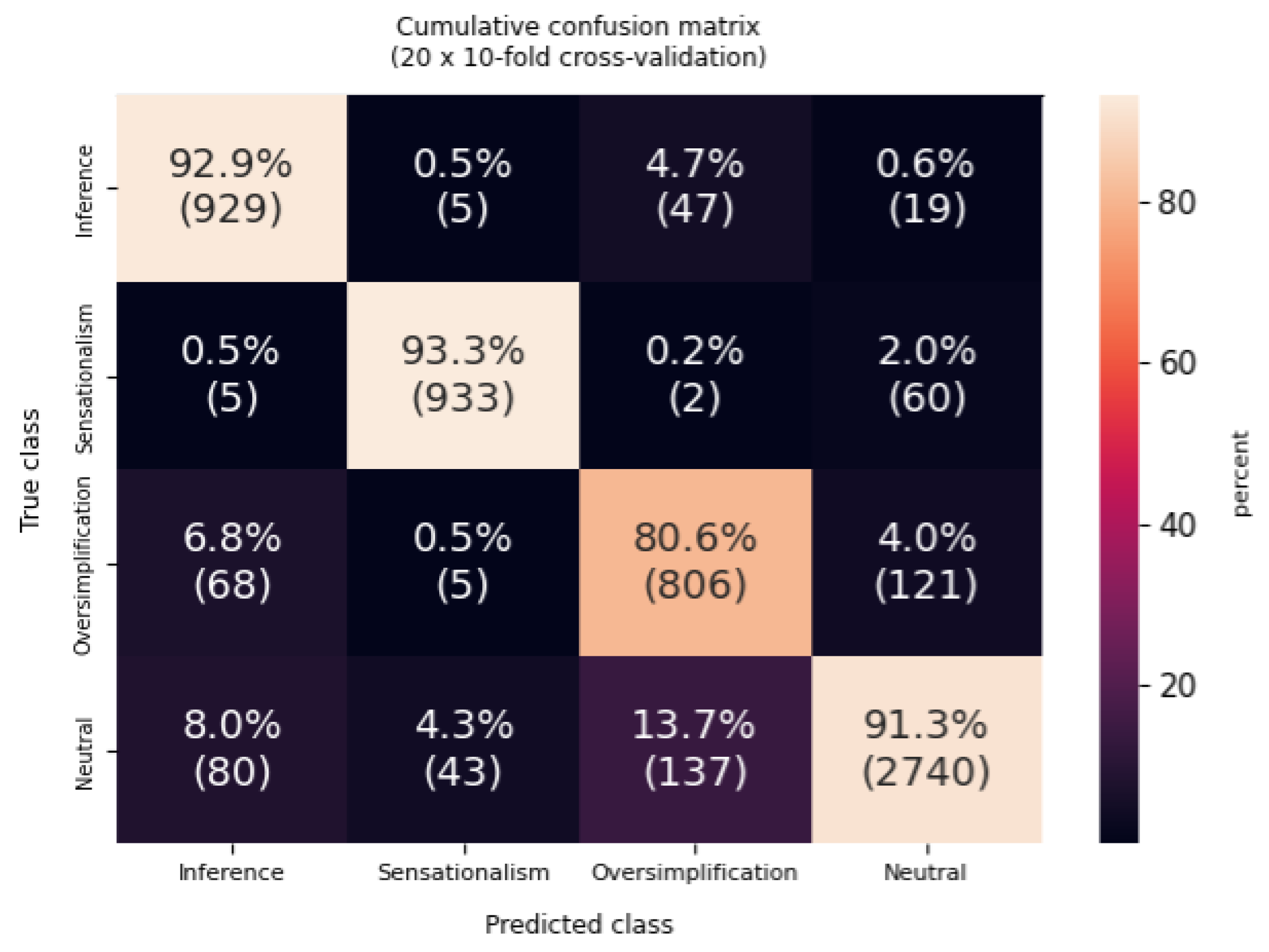
Figure 4 provides the confusion matrix, highlighting the per-class recall patterns aggregated over folds.
The proposed Matcha → BERT pipeline achieves strong performance across repeated stratified evaluations. Over 200 folds,
Table 5 shows accuracy and macro-F1 clustered around ≈0.90 and ≈0.89, respectively, with moderate fold-to-fold dispersion (
–
). Beyond the mean ± std, the fold distribution is fairly concentrated: the median accuracy is
with an interquartile range (IQR) of
, and the median macro-F1 is ≈0.893 with IQR
.
The confusion matrix (
Figure 4) supports this interpretation: the diagonal is dominant, while the remaining errors concentrate in a limited set of off-diagonal cells, consistent with a few hard-to-separate label boundaries rather than wholesale collapse to a single class. Class-weighted training stabilizes predictions against the neutral majority, with a strong accuracy–macro-F1 correlation across folds (Pearson
).
Compared to the LLM approach, the MatCha → BERT pipeline achieves a Macro F1 of approximately 0.889, providing a strong supervised baseline. In comparison, GPT-5.4 mini (0.920) and GPT-5.4 (0.905) slightly outperform this result, while LLaMA 3.3 70B reaches a comparable level (0.880), and Claude 4.6 Sonnet performs below the baseline (0.751).
These results indicate that modern LLMs can match or exceed a task-specific supervised model in a zero-shot setting. However, unlike MatCha → BERT, which explicitly grounds predictions in structured chart data, LLMs show only modest gains from image input, suggesting a stronger reliance on textual cues despite sensitivity to chart–text alignment.
5. Experimental Evaluation Method
5.1. Participants
The randomized, controlled experiment involved 192 participants from Poland and abroad. Participants were CS students aged 17 to 49 ( ), including 42 females and 150 males. Given this predominance, participants may exhibit higher baseline data literacy, which could limit variability and contribute to a ceiling effect. Participants were informed that the study focused on critical thinking abilities and involved two questionnaires, with a lesson in between. The entire experiment was anonymous. Participants could withdraw at any time, and participants were randomly assigned to one of three instructional groups.
Group 1: teacher-led (TLG) 64 participants (49 males)
Group 2: e-learning (ELG) 64 participants (51 males)
Group 3: AI-supported (AISG) 64 participants (50 males)
5.2. Materials
In this section, we describe the materials used in the study, including questionnaires, the TruthLens system, lesson designs, and metrics to assess participants’ data literacy and susceptibility to deceptive claims.
5.2.1. Questionnaires
In every group, the experiment consisted of three stages: a pre-intervention questionnaire, a lesson (one of three types), and a post-intervention questionnaire.
Pre- and post-intervention questionnaires aimed to assess the impact of each teaching method on participants’ ability to recognize how deceptive statements accompanying visual data affect their interpretation of the data, with a focus on comparing the LLM-supported method with others. The questionnaire was designed as a task-based measure grounded in PTDS samples, prioritizing alignment with the studied manipulation types rather than formal psychometric validation. Each questionnaire included nine PTDS samples, randomly selected to prevent overlap and to include 3
neutral cases and 2 cases from each of the three manipulation classes. Participants rated agreement on a five-point Likert scale (1: strong disagreement, 5: strong agreement). Three samples from the
neutral class were used to assess data literacy, as they were the most readily interpretable and non-deceptive. To avoid response bias, answers indicating higher or lower data literacy or susceptibility to manipulation could be positioned at either end of the scale. In the data cleaning process, answers were normalized so that an answer closer to 5 indicated lower data literacy, and an answer closer to 1 indicated higher data literacy. Questions were shuffled, and respondents completed the tests individually on Google Forms within 10 min, with the option to withdraw. Unique IDs ensured anonymity while allowing comparison of pre- and post-intervention results. The full text of the questionnaires, raw responses, cleaned responses, and a Scala code created for data cleaning are available at OSF (
https://osf.io/6g2ea/overview?view_only=0952d39b898f4191ab310623909d036c (accessed on 1 May 2026)) for replication of our analysis.
5.2.2. TruthLens: The Data Transparency Dialogue Hub
TruthLens 1.0.0 is a web application developed for this experiment with two modules: an e-learning platform for
ELG lessons and an interactive, LLM-based module for
ASIG lessons. Both modules used the same pre-selected deceptive
PTDS samples as the
TLG lesson. The application’s source code is available at GitHub v.1.0.0 (
https://github.com/JapaneseZgredek/TruthLens-The-Data-Transparency-Dialogue-Hub/releases/tag/1.0.0 (accessed on 1 May 2026)).The system centers on a prompt-conditioned GPT-5.4 mini model for detecting deceptive interpretations that, in
Section 4 proved itself to be reliable enough even with less detailed instruction. This choice balances reasoning capability, response speed, and cost for reliable use in interactive experiments. Recent advances in instruction-following LLMs show strong performance in identifying logical fallacies, weak evidence, and persuasive framing when guided by explicit prompts, without parameter updates [
24,
25,
26]. Our prompt (
https://osf.io/6g2ea/files/5dh2b?view_only=0952d39b898f4191ab310623909d036c (accessed on 1 May 2026)) follows prompt-engineering findings that explicit task structure, decision criteria, and explanation requirements support stable, interpretable reasoning [
27,
28,
29].
5.2.3. Lesson Plans
Lessons focused on strategies for improving participants’ ability to identify charts with deceptive statements. Each lesson used the same six examples (two from each manipulation class), randomly selected from the PTDS, with the sole constraint of avoiding overlap with pre- and post-test samples.
Each 20-min lesson took place in classrooms with 12 to 16 participants, a present (but not interfering in any way) researcher, and either an active (directly interacting, engaging, and dynamically instructing) or a passive (providing preset content, non-interactive) teacher. The objective was to improve participants’ immunity to the influence of deceptive data interpretations.
Lesson 1 (TLG) featured a traditional format, with an active teacher explaining deceptive techniques using PTDS samples (different from the pre-intervention samples) through a presentation displayed on a projector.
Lesson 2 (ELG) used TruthLens with a passive teacher, explaining deceptive techniques through text and non-interactive images.
Lesson 3 (AISG) utilized the TruthLens with a passive teacher, explaining deceptive techniques through conversation with a pre-prompted LLM and at least one additional question from the participant.
5.2.4. The Deception Score
The mean response to questions 4–9 (deceptive samples) for each participant, pre- and post-intervention, is called the deception score. A higher deception score indicates greater susceptibility to manipulation (lower data literacy). This score was used in statistical tests to verify our hypotheses.
6. Results
6.1. Pre-Intervention Results
Pre-intervention deception scores were analyzed across all participants () to assess baseline susceptibility to deceptive statements accompanying visual data. Participants exhibited relatively high deception scores (, ) compared to their responses to non-deceptive (neutral) statements (, ). Prior to hypothesis testing, the normality assumption for the difference scores was evaluated using visual inspection of Q-Q plots and was deemed satisfactory. A paired-samples t-test revealed a statistically significant difference between pre-intervention deception scores and responses to non-deceptive statements, , , two-tailed, Cohen’s , 95% CI [1.14, 1.70]. These results indicate that participants were largely susceptible to deception at pre-test, demonstrating limited ability to reliably identify manipulation prior to the intervention.
Pre-intervention deception scores were compared across the three experimental groups to verify baseline equivalence. Visual inspection of Q–Q plots of the residuals indicated approximate normality, and residuals-versus-fitted plots suggested homogeneity of variance. No violations of model assumptions were detected; therefore, a parametric one-way analysis of variance (ANOVA) was conducted. Mean pre-intervention deception scores were comparable across groups: teacher-led group (TLG; , ), e-learning group (ELG; , ), and LLM-supported group (AISG; , ). The one-way ANOVA revealed no statistically significant differences in pre-intervention deception scores among the three groups, , , , 95% CI , confirming successful group allocation.
6.2. Comparison of Pre-Intervention and Post-Intervention Results
To examine the effects of the interventions, pre- and post-intervention deception scores were compared within each experimental group. Visual inspection of Q–Q plots of the difference scores suggested deviations from normality; however, given the relatively large sample size per group (), the robustness of the paired-samples t-test to moderate normality violations, and the equivalence of results obtained using non-parametric analyses, we report parametric results for ease of interpretation.
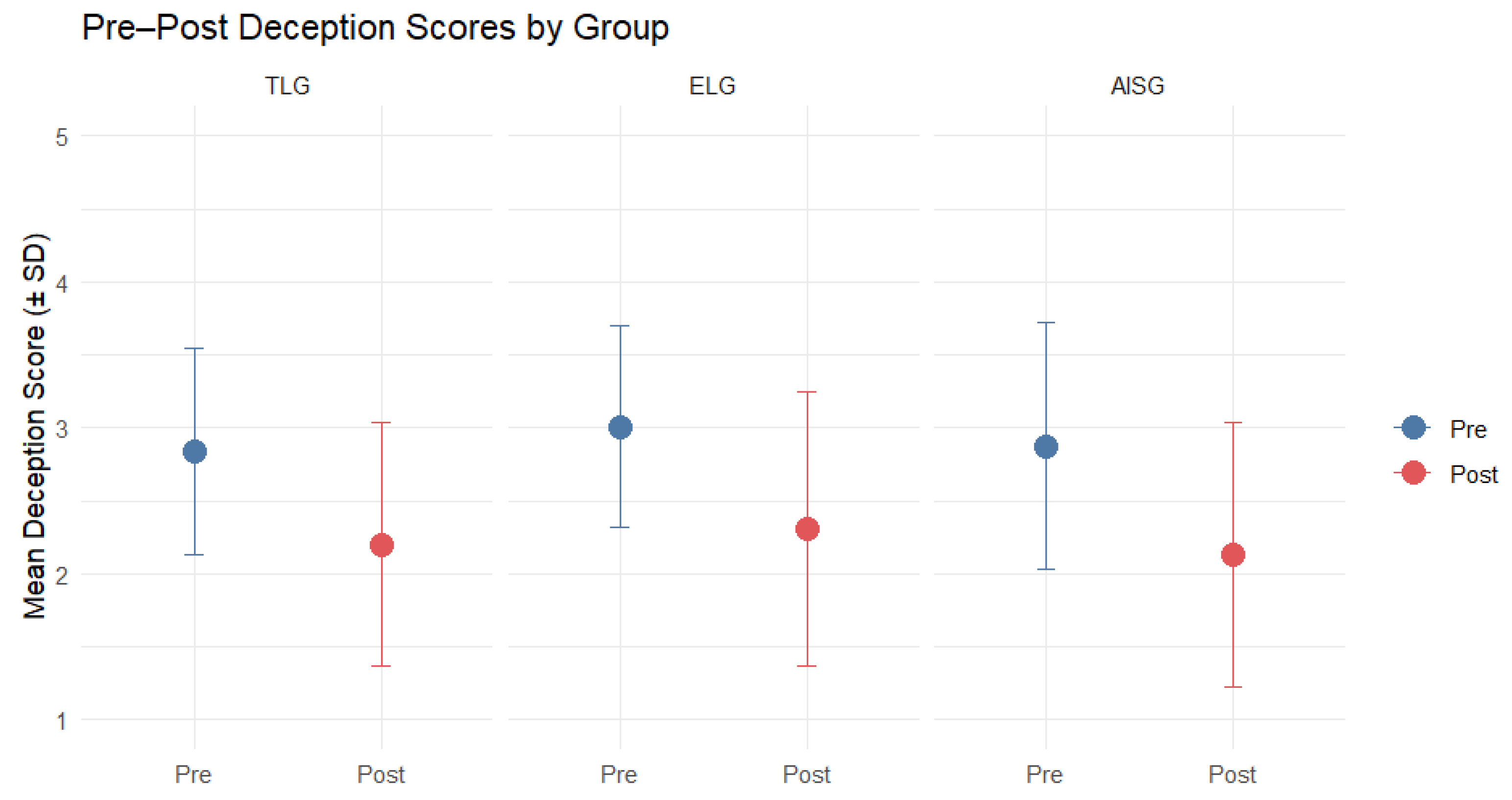
Figure 5 presents the mean deception scores and standard deviations for each experimental group at pre- and post-test. Deception scores decreased following the intervention in all three groups, indicating improved ability to recognize deceptive statements. The lowest post-intervention deception score was observed in the LLM-supported group (AISG;
,
).
Paired-samples t-tests revealed statistically significant reductions in deception scores from pre- to post-test in all groups. For the TLG, deception scores decreased significantly, , , with a large effect size (Cohen’s , 95% CI [0.49, 1.05]). Similarly, participants in the ELG showed a significant reduction in deception scores, , , accompanied by a large effect (Cohen’s , 95% CI [0.58, 1.16]). The AISG also demonstrated a significant improvement from pre-test to post-test, , , with a large effect size (Cohen’s , 95% CI [0.51, 1.08]).
These results indicate that all interventions were effective in substantially reducing participants’ susceptibility to deceptive statements, with consistently large effect sizes observed across learning conditions.
6.3. Comparison of Post-Intervention Results Between Groups
To evaluate whether post-intervention deception scores differed between learning conditions, we compared post-test deception scores across the three groups. Visual inspection of Q–Q plots suggested some deviation from normality. However, given the relatively large and equal group sizes ( per group), the robustness of the one-way ANOVA to moderate violations of normality, and the absence of other assumption violations, we report the results of the parametric analysis for ease of interpretation. To assess robustness, a non-parametric alternative was also conducted and yielded equivalent conclusions regarding statistical significance. Accordingly, only the parametric results are reported here.
Figure 5 illustrates the mean post-intervention deception scores for each group (red points). The lowest mean deception score at post-test was observed in the ASIG (
,
), followed by the TLG (
,
) and the ELG (
,
). Despite these descriptive differences, post-intervention deception scores did not differ significantly across learning groups.
A one-way ANOVA revealed no statistically significant differences in post-intervention deception scores between the three groups, , . The effect size was negligible, with (95% CI [0, 0.040]), indicating that less than 1% of the variance in post-intervention deception scores was attributable to the learning method. The findings show that no intervention outperformed the others in reducing susceptibility to deceptive statements.
7. Discussion and Limitations
This study introduced an AI-based education module designed to teach the identification of DIDVs using the PlotTwist DataSet (PTDS). In a randomized, controlled experiment with university students, we compared AI-supported instruction to traditional teacher-led and e-learning methods.
In line with Hypothesis 1, students were susceptible to manipulative statements accompanying visual data, as indicated by significant differences between their pre-intervention responses to deceptive and non-deceptive samples. This suggests a limited ability to reliably detect deceptive statements containing causal fallacies in visual narratives, persuasive and emotional rhetoric, and reinforcement of narrative bias prior to intervention. Comparing pre- and post-intervention deception scores revealed that all learning methods were effective in substantially reducing participants’ susceptibility to deceptive statements. This included the AI-based method, which supported Hypothesis 2: that a lesson involving guided interaction with an LLM about the presented manipulations can substantially enhance students’ ability to identify deceptive statements. However, we found no statistical differences between the 3 learning conditions, which partially supports Hypothesis 3, as none of the methods appeared superior to the others: the LLM-supported method did not outperform traditional or e-learning methods in terms of efficacy, however, it resulted in comparable decrements in participants’ vulnerability to deceptive interpretations. It therefore indicates that LLM-based instruction can be as effective as other accessible teaching strategies, although not yet outperforming them definitively.
We must note that the participants were mostly computer science students, who may exhibit higher data literacy than the public. This trait is most probably related to the moderately low scores in deception and the lack of variability between experimental groups. Therefore, the results might not fully reflect those of larger, more heterogeneous populations with limited experience regarding data analysis or critical evaluation of visual information.
Despite the absence of group differences, the findings suggest that exposure to an intervention, whether AI-supported, teacher-led, or e-learning, can increase awareness and caution when evaluating data and its accompanying statements, offering potential to improve critical evaluation of data interpretations. However, a further limitation is the absence of a no-intervention control group, which prevents us from fully ruling out testing or repeated-measure effects as contributors to the observed improvements. Future research should explore which learning methods are most effective for less educated or more heterogeneous samples and whether AI-supported methods offer unique advantages in accessibility, interactivity, or scalability. Overall, AI-supported interventions appear promising for reducing susceptibility to deceptive statements, but further investigation is needed to identify the contexts and populations for which they are most beneficial.
Beyond the human-subject experiment, the MatCha → BERT results indicate that explicitly translating charts into structured natural-language descriptions enables effective joint reasoning over visual data, captions, and accompanying narratives when detecting deceptive statements. At the same time, the reliance on frozen chart-to-text representations and a single model architecture may limit sensitivity to more subtle visual manipulations or domain-specific chart conventions, highlighting important directions for future work.
Additionally, we evaluated the LLM-based approach for DIDV classification and found that strong performance can be achieved across paradigms. The MatCha → BERT pipeline shows that explicitly converting charts into structured text enables effective integration of visual and textual information, while leading LLMs match or slightly exceed this performance in a zero-shot setting. Regarding the role of multimodal input, the findings indicate that its contribution is limited and that models primarily rely on textual data rather than performing elaborate visual reasoning. This also means that, despite these models being explicitly designed to handle multiple modalities, they do not make proper use of the unique visual features of charts in this task. This, in turn, highlights a mismatch between the multimodal capabilities these models are designed for and their real-world performance. Under the shuffled condition, such a difference in performance was even more pronounced. In addition, some forms of manipulation will remain a challenge regardless of the specific model. The weakened performance on oversimplification highlights a deep failure of current models. Such manipulation works by reducing context rather than sending conventional deception signals, which makes it inherently harder to detect. This challenge depicts an imminent demand for developing context-sensitive reasoning methods that can identify minor reductions in terms of information complexity.
Finally, PTDS’s relatively small and semi-synthetic nature may constrain generalizability. While it is designed to systematically capture common patterns of deceptive interpretation, its nature may limit how closely it reflects the variability and nuance of real-world misleading narratives.
8. Conclusions and Future Work
This study explores a new, previously underexplored aspect of data literacy: the detection of DIDVs. In such contexts, deception originates not from the images themselves, but from how they are described. To explore this problem, we proposed the PTDS, a carefully curated benchmark for studying these phenomena. We show that supervised and LLM-based approaches can competently classify different types of deceptive narratives.
We find that modern LLMs can achieve high performance on this task, matching and slightly outperforming a dedicated supervised MatCha → BERT pipeline even in zero-shot settings. Simultaneously, we showed, through an experimental manipulation of chart–text pair shuffling, that the model’s performance relies heavily on the alignment between visual and textual inputs. This indicates that successful predictions are not simply due to surface linguistic patterns. However, the rather modest gains from multimodal training suggest that state-of-the-art LLMs still largely rely on textual information, possibly signaling a lack of strong chart-grounded reasoning.
From an educational perspective, the randomized controlled experiment demonstrated that all instructional methods—teacher-led, e-learning, and LLM-supported—significantly improved participants’ ability to detect deceptive narratives. The comparable effectiveness of the LLM-supported condition underscores the potential of AI-based tools as scalable, interactive supports for developing critical data literacy skills.
While these findings are promising, several limitations should be noted. The PTDS dataset, while carefully curated and expert-validated, is still relatively small-scale and partly synthetic, limiting its generalizability to real-world settings. In addition, both the LLMs and the supervised models found subtle manipulation types, such as oversimplification, more difficult to detect. This indicates that sound reasoning about uncertainty, context, and alternative explanations remains an ongoing problem.
Future work should expand PTDS to include more diverse, real-world examples and explore methods that better integrate visual grounding with reasoning, such as multimodal architectures explicitly trained on chart-understanding tasks, as well as examine interaction patterns between students and LLMs, including the types of questions asked, consistency of model explanations, and potential over-reliance on AI assistance.
Another limitation is the timing of the post-intervention assessment, which was conducted immediately after the lesson and therefore does not capture long-term retention of the acquired skills. Future work should examine whether LLM-supported instruction leads to sustained improvements over time compared to traditional methods, as well as evaluate long-term learning effects, applicability across more diverse populations, and the role of interactive AI systems in fostering deeper analytical thinking. Ultimately, the goal is not only to detect deceptive interpretations automatically but also to support users in understanding, questioning, and critically engaging with data-driven narratives.
Author Contributions
K.J.M.: conceptualization, methodology, investigation, resources, data curation, project administration, formal analysis, validation, visualization, original draft preparation, writing, review and editing; led the study design, developed the PTDS dataset (including generation, validation, and annotation pipeline), designed and conducted the experiment, implemented the LLM evaluation framework, performed statistical design and interpretation, and authored the majority of the manuscript including Introduction, Related Work, PTDS, Automatic Detection (except the MatCha → BERT subsection), Experimental Method, and core Discussion and Conclusion sections. K.W.: formal analysis, visualization; conducted statistical analyses for the Results section and contributed to its writing, as well as parts of the Discussion. K.S.: methodology, validation, original draft preparation; designed and implemented the MatCha → BERT pipeline and authored the corresponding subsection. F.Z.: Software; developed the TruthLens application and its supporting infrastructure. A.W.: Conceptualization, supervision, funding acquisition, writing—review and editing; supervised the study and provided conceptual guidance and manuscript revision. All authors have read and agreed to the published version of the manuscript.
Funding
This research was supported by the EUonAIR project (number 101177370, ERASMUS-EDU-2024-EUR-UNIV-1), within the framework of the Centre of Excellence in Responsible AI in Education, co-funded by the European Commission.
Institutional Review Board Statement
This study was approved by the PJAIT Ethics Commission, decision number OKE-30-10-2025.
Informed Consent Statement
Informed consent was obtained from all subjects involved in the study.
Data Availability Statement
All links redirecting to datasets, software, and data supporting reported results are available in the appropriate sections in the body of the publication.
Acknowledgments
We sincerely thank Filip Kwiatkowski, Michal Żabicki, Maksymilian Kmiecik, and Kacper Kubat for their expert guidance in contributions to this research.
Conflicts of Interest
The authors declare no conflicts of interest.
Abbreviations
The following abbreviations are used in this manuscript:
| PTDS | PlotTwist DataSet |
| DIDV | Deceptive Interpretations of Data Visualizations |
| LLM | Large Language Model |
| AISG | AI-supported instruction group |
| TLG | Teacher-led instruction group |
| ELG | E-learning instruction group |
References
- Lisnic, M.; Lex, A.; Kogan, M. “Yeah, this graph doesn’t show that”: Analysis of Online Engagement with Misleading Data Visualizations. In CHI ’24: Proceedings of the 2024 CHI Conference on Human Factors in Computing Systems; Association for Computing Machinery: New York, NY, USA, 2024; pp. 1–14. [Google Scholar]
- Hullman, J.; Diakopoulos, N. Visualization Rhetoric: Framing Effects in Narrative Visualization. IEEE Trans. Vis. Comput. Graph. 2011, 17, 2231–2240. [Google Scholar] [CrossRef] [PubMed]
- Keyes, R. The Post-Truth Era: Dishonesty and Deception in Contemporary Life, 1st ed.; St. Martin’s Press: New York, NY, USA, 2004. [Google Scholar]
- Vasconcelos Braga, J.; Barros Pontes E Silva, T. Storytelling in data visualization: Information bias. InfoDesign-Rev. Bras. Des. Inf. 2021, 18, 53–66. [Google Scholar] [CrossRef]
- Bresciani, S.; Eppler, M.J. The Pitfalls of Visual Representations: A Review and Classification of Common Errors Made While Designing and Interpreting Visualizations. Sage Open 2015, 5, 2158244015611451. [Google Scholar] [CrossRef]
- Lo, L.Y.; Gupta, A.; Shigyo, K.; Wu, A.; Bertini, E.; Qu, H. Misinformed by Visualization: What Do We Learn from Misinformative Visualizations? Comput. Graph. Forum 2022, 41, 515–525. [Google Scholar] [CrossRef]
- Musi, E.; Reed, C. From fallacies to semi-fake news: Improving the identification of misinformation triggers across digital media. Discourse Soc. 2022, 33, 349–370. [Google Scholar] [CrossRef]
- Cairo, A. Graphics Lies, Misleading Visuals: Reflections on the Challenges and Pitfalls of Evidence-Driven Visual Communication. In New Challenges for Data Design; Bihanic, D., Ed.; Springer: London, UK, 2015; pp. 103–116. [Google Scholar]
- Hemsley, J.; Snyder, J. FIVE Dimensions of Visual Misinformation in the Emerging Media Landscape. In Misinformation and Mass Audiences; Southwell, B.G., Thorson, E.A., Sheble, L., Eds.; University of Texas Press: Austin, TX, USA, 2018; pp. 91–106. [Google Scholar]
- Huff, D. How to Lie with Statistics, A Penguin Book Mathematics; Penguin: London, UK, 1991. [Google Scholar]
- Jones, G.E. How to Lie with Charts; Sybex: San Francisco, CA, USA, 1995. [Google Scholar]
- Lauer, C.; O’Brien, S. How People Are Influenced by Deceptive Tactics in Everyday Charts and Graphs. IEEE Trans. Prof. Commun. 2020, 63, 327–340. [Google Scholar] [CrossRef]
- Szafir, D.A. The good, the bad, and the biased: Five ways visualizations can mislead (and how to fix them). Interactions 2018, 25, 26–33. [Google Scholar] [CrossRef]
- Tufte, E.R. The Visual Display of Quantitative Information, 2nd ed.; Graphics Press: Cheshire, CT, USA, 2018. [Google Scholar]
- Metoyer, R.; Zhi, Q.; Janczuk, B.; Scheirer, W. Coupling Story to Visualization: Using Textual Analysis as a Bridge Between Data and Interpretation. In IUI ’18: Proceedings of the 23rd International Conference on Intelligent User Interfaces; Association for Computing Machinery: New York, NY, USA, 2018; pp. 503–507. [Google Scholar]
- Huang, G.; Li, K.; Li, H. Show, Not Tell: The Contingency Role of Infographics Versus Text in the Differential Effects of Message Strategies on Optimistic Bias. Sci. Commun. 2019, 41, 732–760. [Google Scholar] [CrossRef]
- Lee, B.; Riche, N.H.; Isenberg, P.; Carpendale, S. More Than Telling a Story: Transforming Data into Visually Shared Stories. IEEE Comput. Graph. Appl. 2015, 35, 84–90. [Google Scholar] [CrossRef]
- Leite, J.A.; Razuvayevskaya, O.; Bontcheva, K.; Scarton, C. Weakly supervised veracity classification with LLM-predicted credibility signals. EPJ Data Sci. 2025, 14, 16. [Google Scholar] [CrossRef] [PubMed]
- Srba, I.; Razuvayevskaya, O.; Leite, J.A.; Moro, R.; Schlicht, I.B.; Tonelli, S.; García, F.M.; Lottmann, S.B.; Teyssou, D.; Porcellini, V.; et al. A Survey on Automatic Credibility Assessment Using Textual Credibility Signals in the Era of Large Language Models. ACM Trans. Intell. Syst. Technol. 2025, 17, 3770077. [Google Scholar] [CrossRef]
- Akhtar, M.; Subedi, N.; Gupta, V.; Tahmasebi, S.; Cocarascu, O.; Simperl, E. ChartCheck: Explainable Fact-Checking over Real-World Chart Images, 2023. Available online: https://aclanthology.org/2024.findings-acl.828/ (accessed on 1 May 2026).
- Liu, F.; Piccinno, F.; Krichene, S.; Pang, C.; Lee, K.; Joshi, M.; Altun, Y.; Collier, N.; Eisenschlos, J. MatCha: Enhancing Visual Language Pretraining with Math Reasoning and Chart Derendering. In Proceedings of the 61st Annual Meeting of the Association for Computational Linguistics (Volume 1: Long Papers); Association for Computational Linguistics: Toronto, ON, Canada, 2023; pp. 12756–12770. [Google Scholar]
- Lee, K.; Joshi, M.; Turc, I.; Hu, H.; Liu, F.; Eisenschlos, J.; Khandelwal, U.; Shaw, P.; Chang, M.W.; Toutanova, K. Pix2Struct: Screenshot Parsing as Pretraining for Visual Language Understanding. In Proceedings of the ICML’23—40th International Conference on Machine Learning, Honolulu, HI, USA, 23–29 July 2023. Version Number: 2. [Google Scholar]
- Devlin, J.; Chang, M.W.; Lee, K.; Toutanova, K. BERT: Pre-training of Deep Bidirectional Transformers for Language Understanding. arXiv 2018, arXiv:1810.04805. [Google Scholar]
- Sahoo, P.; Singh, A.K.; Saha, S.; Jain, V.; Mondal, S.; Chadha, A. A Systematic Survey of Prompt Engineering in Large Language Models: Techniques and Applications, 2024. Version Number: 2. Available online: https://www.researchgate.net/publication/378183279_A_Systematic_Survey_of_Prompt_Engineering_in_Large_Language_Models_Techniques_and_Applications?channel=doi&linkId=65cc7b5f1bed776ae35cfe7a&showFulltext=true (accessed on 1 May 2026).
- Vatsal, S.; Dubey, H. A Survey of Prompt Engineering Methods in Large Language Models for Different NLP Tasks, 2024. Version Number: 2. Available online: https://www.researchgate.net/publication/382363222_A_Survey_of_Prompt_Engineering_Methods_in_Large_Language_Models_for_Different_NLP_Tasks (accessed on 1 May 2026).
- Gozzi, M.; Di Maio, F. Comparative Analysis of Prompt Strategies for Large Language Models: Single-Task vs. Multitask Prompts. Electronics 2024, 13, 4712. [Google Scholar] [CrossRef]
- Chen, B.; Zhang, Z.; Langrené, N.; Zhu, S. Unleashing the potential of prompt engineering for large language models. Patterns 2025, 6, 101260. [Google Scholar] [CrossRef] [PubMed]
- Wei, J.; Wang, X.; Schuurmans, D.; Bosma, M.; Ichter, B.; Xia, F.; Chi, E.; Le, Q.; Zhou, D. Chain-of-Thought Prompting Elicits Reasoning in Large Language Models. Adv. Neural Inf. Process. Syst. 2022, 35, 24824–24837. [Google Scholar]
- Zhou, D.; Schärli, N.; Hou, L.; Wei, J.; Scales, N.; Wang, X.; Schuurmans, D.; Cui, C.; Bousquet, O.; Le, Q.; et al. Least-to-Most Prompting Enables Complex Reasoning in Large Language Models, 2022. Version Number: 3. Available online: https://openreview.net/forum?id=WZH7099tgfMandhttps://arxiv.org/abs/2205.10625 (accessed on 1 May 2026).
| Disclaimer/Publisher’s Note: The statements, opinions and data contained in all publications are solely those of the individual author(s) and contributor(s) and not of MDPI and/or the editor(s). MDPI and/or the editor(s) disclaim responsibility for any injury to people or property resulting from any ideas, methods, instructions or products referred to in the content. |




 ,
,