5.1. Extracting Discriminative and Representative Items
Regarding the 3 MFRM model, the application to the original data showed disordered thresholds for higher categories (as reported in
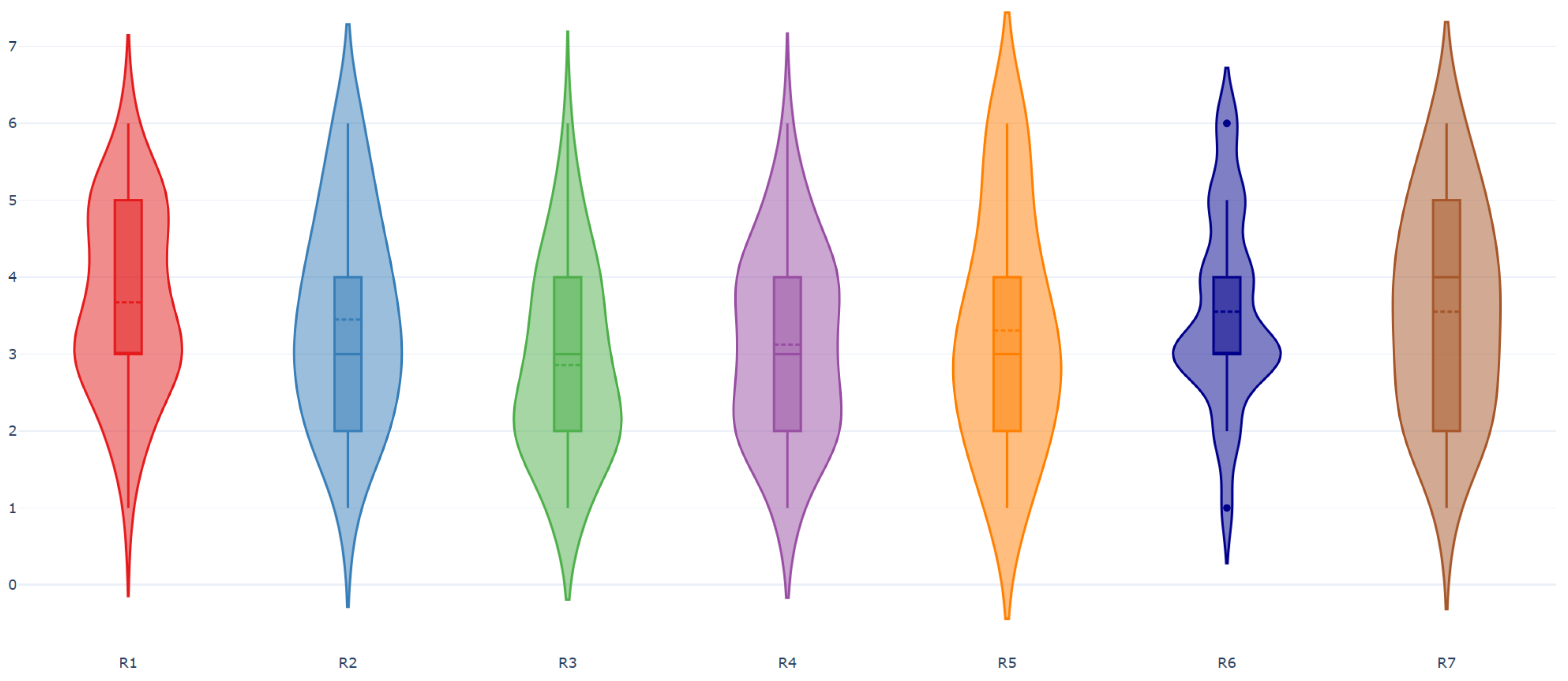
Section 4.1.2), and this suggests that the rating scale did not work properly. The original six-category rating scale, being more fine-grained than the four-category scale used in the analysis, assumes that raters are able to distinguish and consistently use the differences between categories, particularly at the extreme ends of the scale. The presence of threshold disordering between the fairly difficult and very difficult categories suggests that raters had difficulty using these two categories. A coarser rating scale, such as the four-category scale, is generally easier to apply than a six-category scale. Nevertheless, the advantages of a more fine-grained scale can be achieved only if raters are able to use it consistently, indicating that appropriate rater training may be required.
Looking at the separation reliability indices for examinees (i.e., data viz combinations), tasks, and raters, we found that
The value of R for examinees is 0.68, indicating a moderate ability of the model to distinguish data viz combinations according to their discriminability, likely due to the specific type of examinees used in this analysis. For example, the stacked area chart yielded two examinees, A1 and A2, which only differ by one item (Content);
The value of R for tasks is 0.96. This indicates that the tasks are highly distinct from each other;
The value of R for raters is 0.84 indicating substantial differences in rater severity. This finding is confirmed by the rejection of the null hypothesis of equal severity of the raters, tested by a Wald-statistic (
p-value < 0.001) [
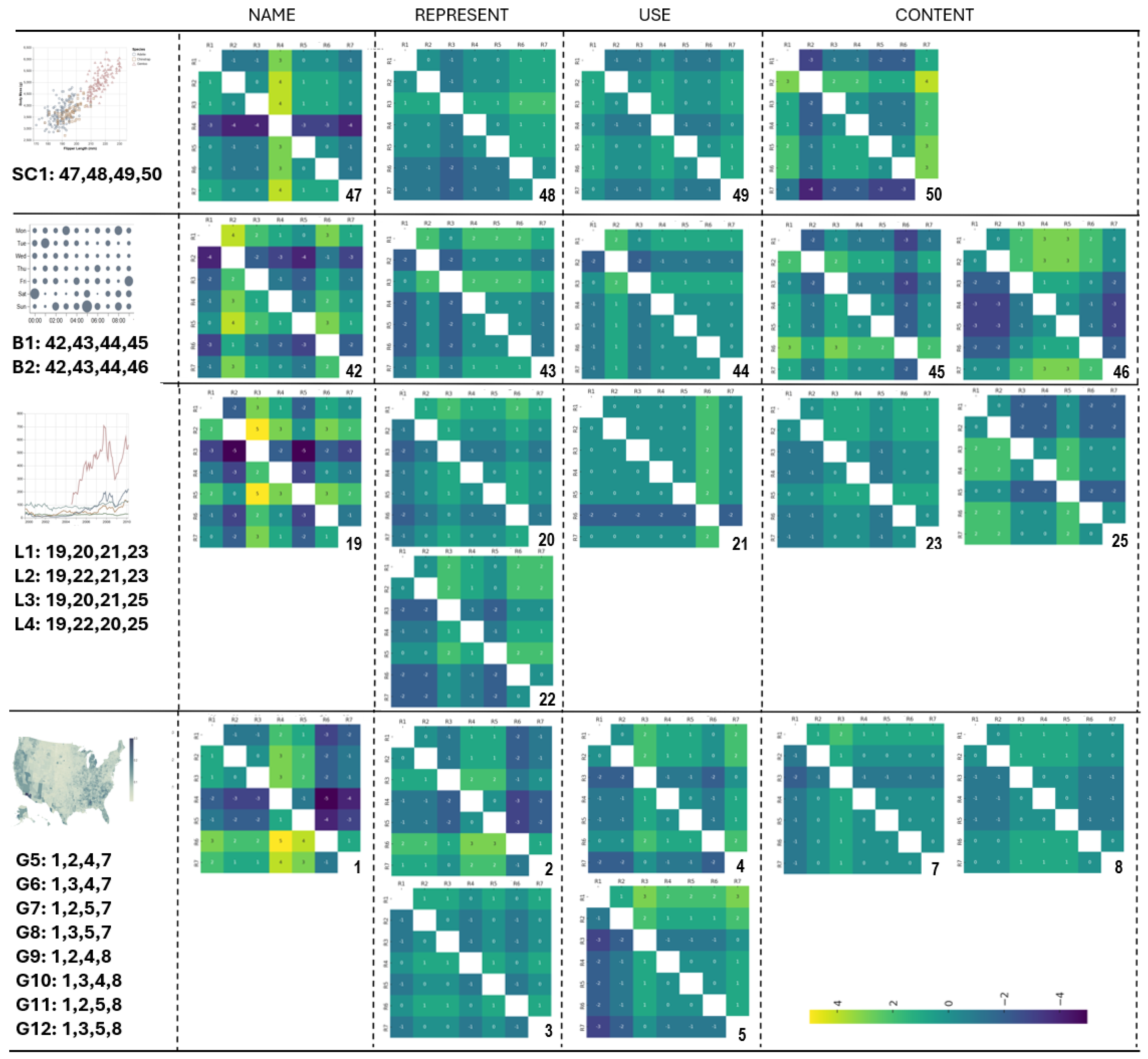
35], and by the presentation of raters’ disagreement on each item, reported in
Section 4.1.1.
Concerning the fit statistics, one of the two combinations involving the pie chart, namely P1, presented the highest values of Infit/Outfit MNSQ statistics, though still within the limits of real misfitting. Nevertheless, this finding suggests looking more carefully at P1. Its
is
, indicating a strong departure of the scores awarded by this data viz combination from the model expectation. P1 differs from P2, the other combination that still involves a pie chart, by item 35 (task
Content). As shown in
Figure 4 of
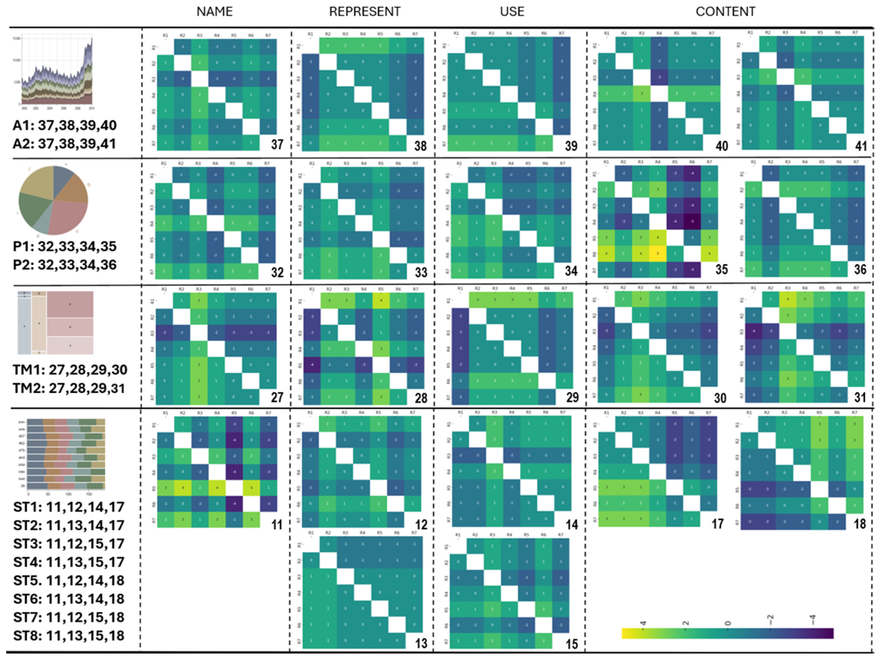
Section 4.1.1, this item exhibited a high degree of disagreement among raters, mainly R5 and R6. These two raters appeared to be the ones who gave this item the unexpected score of 4, i.e., fairly or very difficult on the original scale, instead of 1.8, i.e., middle easy, as expected by the estimated 3 MFRM.
Moreover, taking into account the
index, two other data viz combinations showed negative values: ST8, with −0.07, and ST6, with −0.06. These are two of the eight combinations involving the stacked bar chart. Two combinations, namely ST1 and ST3, had the higher
indices instead (respectively 0.74 and 0.44), and what differentiated them from ST8 and ST6 was the
Represent task (item 12 for ST1/ST3, and item 13 for ST8/ST6), as well as the
Content task (item 17 for ST1/ST3, and item 18 for ST8/ST6). Looking at the heatmap in
Figure 4, items 17 and 18 exhibited a similar degree of disagreement, while item 12 showed a slightly higher level of disagreement than item 13.
Inspection of the fit indices for the raters did not reveal any discrepancy between their observed and expected behaviour. The fit statistics for the tasks highlighted some criticality for task Name, which exhibited high values of Infit and Outfit MNSQ statistics (Infit MNSQ = 1.40; Outfit MNSQ = 1.41), although not high enough to indicate misfitting. This finding may suggest that, although the task Name is related to the data viz literacy construct, its connection appears weaker than those shown by the other three tasks.
In order to investigate whether the judgment process was fair and whether each rater kept a uniform level of severity among the examinees, we tested the significance of the examinee-by-rater interaction parameters
in Formula (
4). Our analysis did not reveal any significant parameter, allowing us to conclude that each rater maintained a uniform level of severity across the data viz combinations.
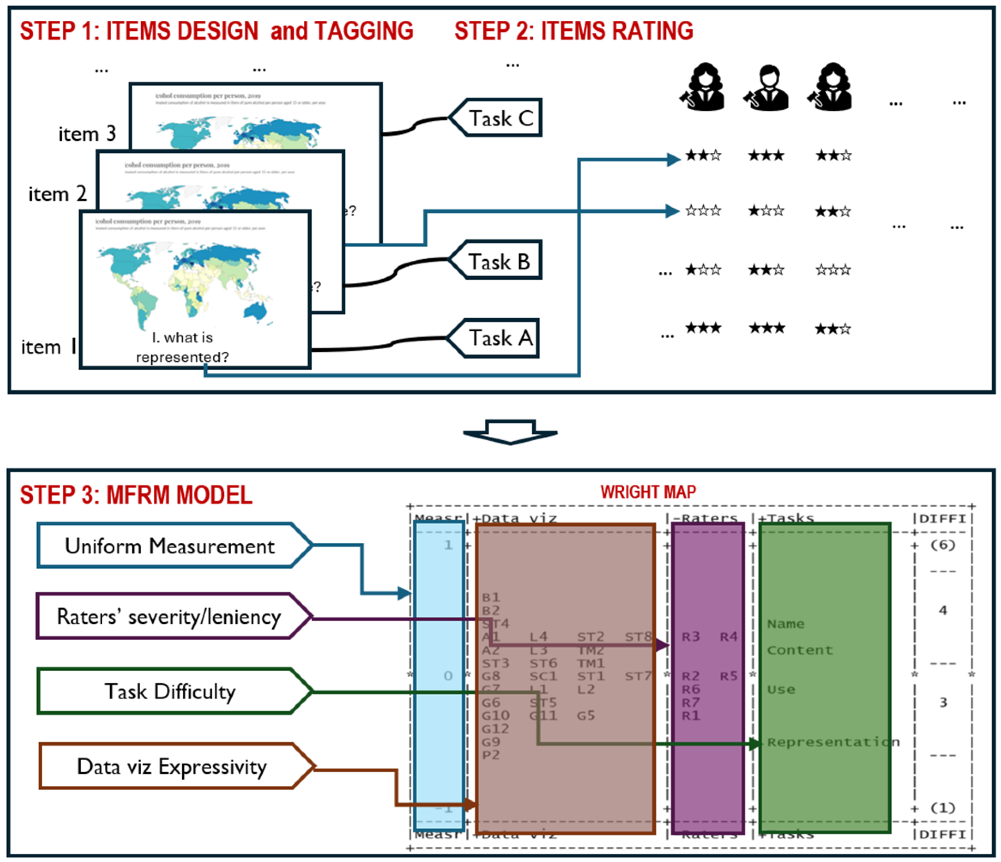
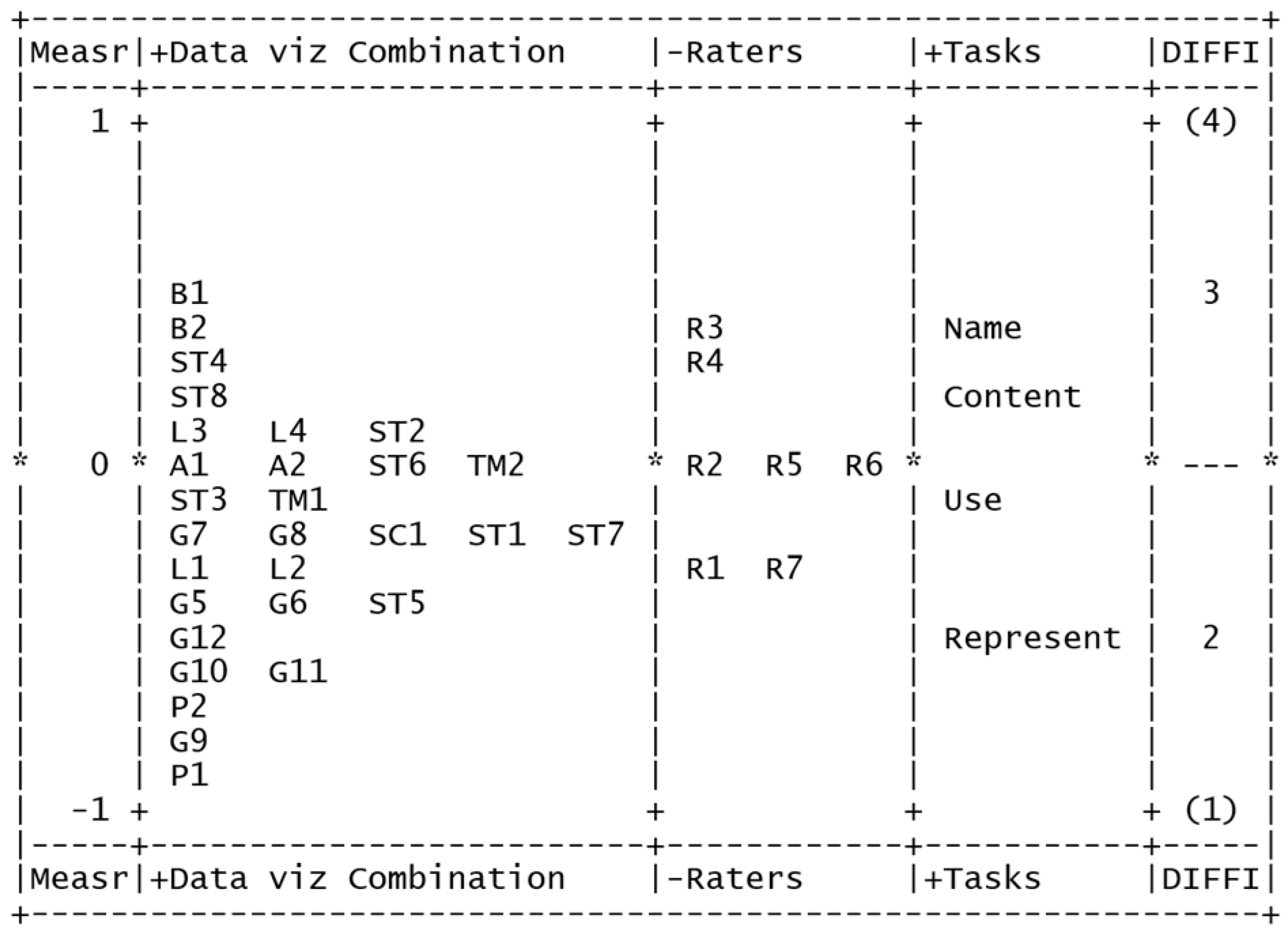
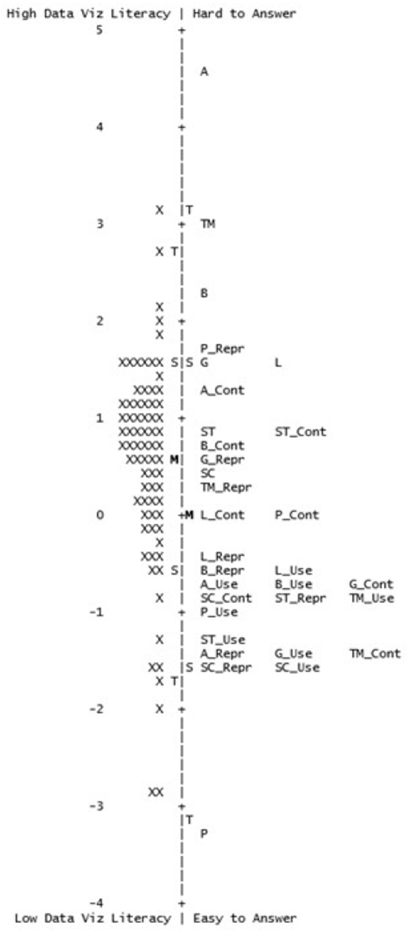
Regarding the Wright Map, bubble chart (B_ combinations) emerged as the data viz with the highest discriminability effect, with both B1 and B2 receiving the highest scores on the difficulty scale. On the other hand, pie chart (P_ combinations) appeared as the data viz that discriminated the least, given that both P1 and P2 received lower scores on the difficulty scale. This result may not be surprising; the pie chart is commonly taught in primary education level curricula, thus the kind of information that can be read from it may be the most intuitive. It is reasonable that the raters judged its tasks very easy.
Most of the eight combinations involving choropleth map (G_) appeared in the lower part of the map, suggesting that this data viz followed the easiest one. Choropleth map is a popular data viz, fairly easy to interpret and widely used for visualising geospatial data across various media, including the news.
Two combinations of L, namely L3 and L4, had a higher than average discriminability effect (−0.19), while the other two combinations, namely L1 and L2, were below this average. This kind of result may be useful when assembling a new test.
Indeed, the inspection of the 3 MFRM model allowed us to infer that both data viz discriminability and representativeness may conflict; thus, DRIVE-T may help make a decision based on a justified trade-off between the two. For example, other combinations can be selected before L, and the best discriminating L combination can be added in the end. By applying DRIVE-T, the hierarchical progression of data viz and tasks representativeness is improved, unwanted interactions are avoided, and the resulting test may be more reliable and effective.
Regarding raters, more severe ones appeared in higher positions, and less severe ones in lower positions. For identifiability reasons, the average measure of raters’ severity was constrained to be zero. Raters R2, R5, and R6 had a mean severity. R3 and R4 were the most severe raters, whereas R1 and R7 were the most lenient ones. The variability across raters was low, their measures showing a 0.68-logit spread. This may suggest that, even if there was no agreement among raters, as discussed previously, their level of severity was quite similar. From the visual inspection of the heatmaps in
Section 4.1.1, it is observable that the task causing more disagreement among raters is the one related to knowing the
Name of the data viz presented. The task related to retrieving the
Content of a data viz is showing disagreements among raters, too. The difficulty of tasks related to what a data viz
Represent(s) and how a data viz is
Use(d) are mostly agreed by all the raters. These results reflected some patterns:
Name and
Content tasks frequently produced disagreements, whereas
Use and, to some extent,
Represent had higher consistency. Raters emerged as isolated contributors to disagreement, highlighting individual interpretive differences among them. However, those of the heatmaps were only providing an explorative analysis that further supports the 3 MFRM results.
Regarding tasks, Name emerged as the most challenging task, followed by Content, Use, and Represent. This hierarchy of measures may suggest the presence of a progression level for the tasks being measured, and this hierarchy may help outline difficulty levels of an underlying construct for data viz literacy.
5.2. The Pilot Study
We note that, according to
Figure 6 and the results reported in
Section 4.1.2, the item combination selected among the ones modelled with the 3 MFRM, allowed the identification of a hierarchical progression expression of the data viz along the literacy continuum that was better reflected in the test designed to measure it.
The Rasch model used to analyse the pilot study data introduced in
Section 3.3.1, yielded a person reliability index of 0.79, sufficiently high to ensure that the questionnaire was sensitive enough to distinguish between students with high and low levels of data viz literacy. The item reliability index was 0.95, sufficiently high to ensure that the sample of students was able to confirm the item difficulty hierarchy of the questionnaire.
The highest positive Pearson correlation value was 0.37 and involved items ST and SC, whereas the highest negative Pearson correlation value was −0.41 and involved the items L_Repr and TM. As the correlation values were relatively small, and no meaningful reasons justify connections among these items, it can be concluded that the items were approximately locally independent.
The results of the assessment of the unidimensionality assumption using PCA provided support for the interpretation that the test primarily measures students’ level of data viz literacy.
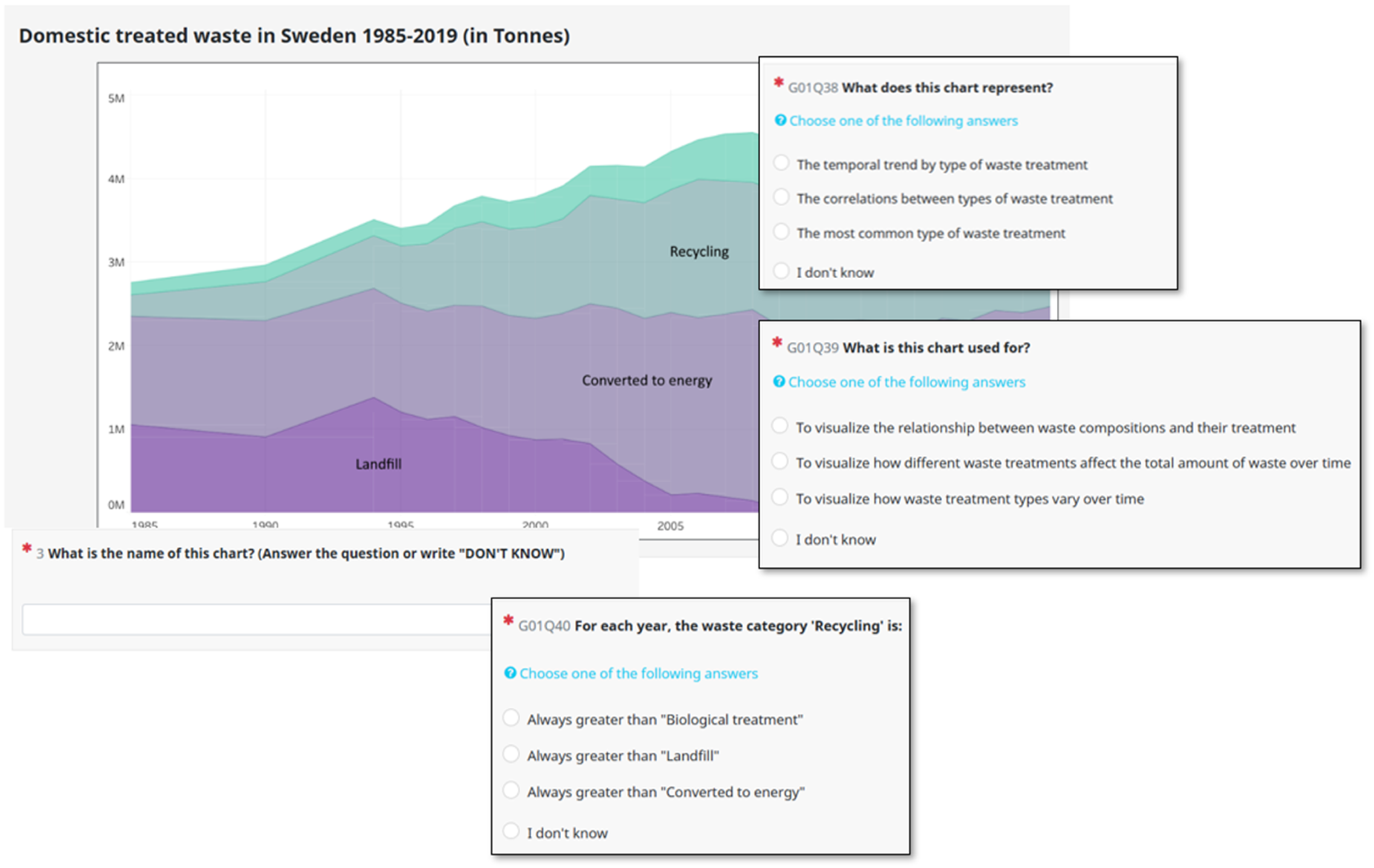
Looking at the item fit statistics, only item P_Repr showed a high value for Infit (1.41) and Outfit (2.73) MNSQ. This means that this item had criticalities and deserved a rewriting or a substitution.
Regarding the analysis of the Write Map, the easiest item was the one that asked students to indicate the name of a pie chart. As also emerged from the 3 MFRM analysis, given that the pie chart is commonly taught in primary education level curricula, this finding was not surprising. Five out of the eight items asking for the name of the data viz were located to the very upper part of the item scale, indicating that the knowledge of the name of a data viz was, in most cases, a difficult task. This result is in line with the findings from the analysis of the raters’ evaluations, where the Name task was judged to be the most difficult one.
The average level of data viz literacy observed in the sample of students was 0.51 (SD 1.1), which was greater than the average difficulty of the items (being it zero logits). This discrepancy may suggest that this group of students, on the whole, demonstrated an adequate level of data viz literacy.