1. Introduction
For decades, there has been continuous development and growing importance of IT systems and tools based on ICT networks and the public Internet network. Thanks to these systems, users have access to unlimited resources of data, information, and knowledge, as well as various methods and tools of communication, which they can use anywhere and at any time. For increasingly better functionality, accessibility, and usability, these systems enable the free combination and use of all popular forms of information transmission, such as text, image, audio, and video, most often using only one communication medium, that is, the Internet, digital media, and tools related to them.
Digital media can be defined as any type of content and form of presentation (e.g., text, graphics, audiovisual) encoded in digital form that can be stored, modified, distributed, shared, and transmitted via digital means and electronic devices. Digital media, also known as “new media” or “electronic media”, are characterized by, among other things, full digitality, virtuality, interactivity, hypertextuality, global reach, and electronic content distribution. These media use images and multimedia materials to convey information, knowledge, values, emotions, and ideas behind a message in visual form [
1,
2,
3]. Unfortunately, as many studies show, despite a very long list of benefits for Internet users, digital media are also characterized by many issues, limitations, and threats in accessing useful, good quality, and therefore valuable information. These issues are very often related to the insufficient usefulness of the provided information, which is associated with the lack or significant limitation of the recipients’ ability to achieve their intended goals, which most often involve making decisions and taking action as a result of obtaining the required data, information, and knowledge. The low level of information usefulness is primarily influenced by the inadequacy of the transmitted communication messages to the characteristics and quality criteria of information required by the recipients, which results in phenomena such as information overload, an information gap, information asymmetry, limited availability and accessibility of information, and also inadequate quality and presentation usefulness of the transmitted information [
4].
One of the most problematic aspects of using electronic media is the ubiquitous information overload, which severely limits users’ ability to understand the message and make rational decisions based on it. Information overload, also known as noise, information accumulation, or overflow, is a state in which the amount of incoming data at a specific moment in time exceeds the ability of the average person’s brain to process it, which leads to difficulties in understanding, decision-making, a general decrease in efficiency, and even information stress [
5]. The next very troublesome phenomenon that occurs most often in information media systems is the concept of an information gap, which means the deficiency, incompleteness, and insufficient availability of information in a dataset. The information gap is the difference between the information needed by the recipient to solve the problem and the information actually available in the information system, which often results from the increase in the amount of data that is difficult to process, the perceptual limitations of the recipients, and the capabilities of information senders, as well as the massive occurrence of information noise and interference, which distorts the information message [
6]. Another very serious threat that occurs too often in electronic media is information asymmetry between suppliers and recipients, which involves the possession of different information resources by both parties in relation to a specific subject of interest and automatically puts one of the parties in a more privileged position. The circumstances of having and transferring unequal information resources by message senders may in practice lead to, among others, disinformation, information deficiency, concealment of information, manipulation of information by distracting attention or ineffective decision-making by their recipients [
7]. The next frequently encountered issue in the use of electronic media is the limited access to published information and knowledge in digital form, which, by definition, should be associated with the possibility of free access, acquisition, understanding, and use of information, regardless of time and place, as well as individual physical, software, and digital limitations. The functional system availability is primarily influenced by the ability of authorized persons to access information at a specific time and in a specific form. Digital and web accessibility is influenced by elements such as adapting the content of messages to people with disabilities, adhering to guidelines and web standards, and the appropriate use of software technologies to build websites and web applications accessible to stationery and mobile devices [
8]. Yet another limitation of digital media that is particularly burdensome for users is the inadequate quality and presentation usefulness of transmitted information messages, that is, the lack or inadequacy of key qualitative features of information and the methods of their presentation to the network environment and its specificity. Information and communication messages created for the digital environment should use generally accepted principles of creating current, complete, understandable, useful, clear, and quick-to-receive messages, that is, among others, to be much shorter than their traditional counterparts, use the inverted pyramid principle in the organization of content, be adapted for browsing content instead of having to read it carefully, and combine various forms of presenting static content with multimedia materials [
3,
9,
10].
The above-described issues and limitations occurring in digital media most often concern various forms of information content, first searched for and then viewed by information recipients, who bear the greatest consequences and costs of incomplete, manipulated, and useless information. Information content is most often made available for electronic publication in the form of texts and multimedia documents, which can be viewed in a web browser, usually appearing in the form of websites, online articles, posts on social networks, digital publications and presentations, leaflets, catalogs, advertisements, etc. Standard ways of minimizing the effects of communication difficulties and limitations for Internet users include various actions that should be implemented by content broadcasters to improve information usefulness. Such activities include, among others, using an appropriate information architecture for web documents to better organize and index them, optimizing organizational structures and improving business processes to reduce the information gap, using reliable and verified information to publish content to build trust, adhering to guidelines and standards developed by the W3C organization to improve content accessibility, and striving for the highest possible quality and usefulness of digital information to achieve the intended information goals [
11].
An alternative method, expected by recipients and largely using the above solutions, to increase the understandability, usefulness, transparency, and credibility of various forms of information messages is the increasingly common use of information visualization in relation to the transmitted data, information, and knowledge. However, information visualization, which means communicating information and accelerating its understanding in the most transparent and objective way, is not only about using graphic charts, diagrams, or schemes, but above all, it is about building an appropriate narrative for visual messages in order to improve cognitive processes [
12,
13]. For this reason, recent years have seen a huge increase in the popularity and practical use of various types of visual communication and computer-mediated communication tools, understood as a set of graphic elements used to convey information, ideas, and emotions. Examples of visual communication tools commonly used—in areas such as media, marketing, art, education, or design of websites and applications—include, among others, typography, photography, illustration, film, animation, and information graphics, also known as infographics. It is just infographics, as practice shows, that have turned out to be an extremely interesting and effective tool for transmitting and enriching various types of visual messages in information media systems. An infographic is a modern, pictorial, and very attractive graphic form of transmitting information and knowledge, the purpose of which is to quickly convey information and tell stories using text content, additionally supplemented with images, graphics, illustrations, diagrams, or photographs. Its popularity and applications are growing more and more due to the fact that visual messages are processed by the human brain much faster than text messages, and they can be conveyed in a concise and understandable way to every recipient, regardless of their language, culture, or experience [
14,
15]. However, in the multitude of new features and additional functionalities of various digital tools, the most important thing is often forgotten, which is the proper design and implementation of digital media messages consisting of text and multimedia content, such as infographics, to make them fully understandable, useful, available as quickly as possible, and easily digestible for various types of recipients. Therefore, it is so important that, with the increasing use of information graphics for various purposes, research is also conducted to evaluate their aesthetics, quality, usefulness, and message effectiveness. Thanks to this, media messages and content communicated by these tools (in the form of the so-called sent messages) will be able to increasingly match the messages that actually reach the recipients (in the form of the so-called received messages) [
1,
16,
17,
18].
Due to the very small number of research works and the existing significant research gap in the broadly understood evaluation of the aspects of the value, quality, usefulness and effectiveness of infographics as visual communication tools, the author decided to explore this topic in order to show the importance that infographics have and can have as visual communication tools in various scientific areas and practical applications. Therefore, the main research objective of this article is to create and justify research assumptions for building a general (universal) model for evaluating the effectiveness of media messages, which can be freely applied to various forms of media messages currently used in electronic media (e.g., news articles, press articles, social media posts, infographics, etc.). The model for evaluating the effectiveness of media messages proposed in this article is a completely innovative, original, and proprietary idea of the author of this article, which is based on the general theory of communication and, to the best of the author’s knowledge, does not exist in this form in the generally available literature on the subject. In order to verify the applicability of the created model, the author of this article conducted research on selected information graphics as one of the forms of popular media messages. This article presents the results of the analysis and evaluation of the effectiveness of selected information graphics as visual communication tools in terms of various criteria influencing the level of effectiveness, that is, the overall quality, usefulness, and assimilation of information and knowledge, as well as ways of presenting information to end users. This study selected five examples of Polish-language infographics available free of charge on the Internet, which were characterized by various types of species and functions, concerned various topics and content, and presented information using various forms, layouts, and compositions.
3. Materials and Methods
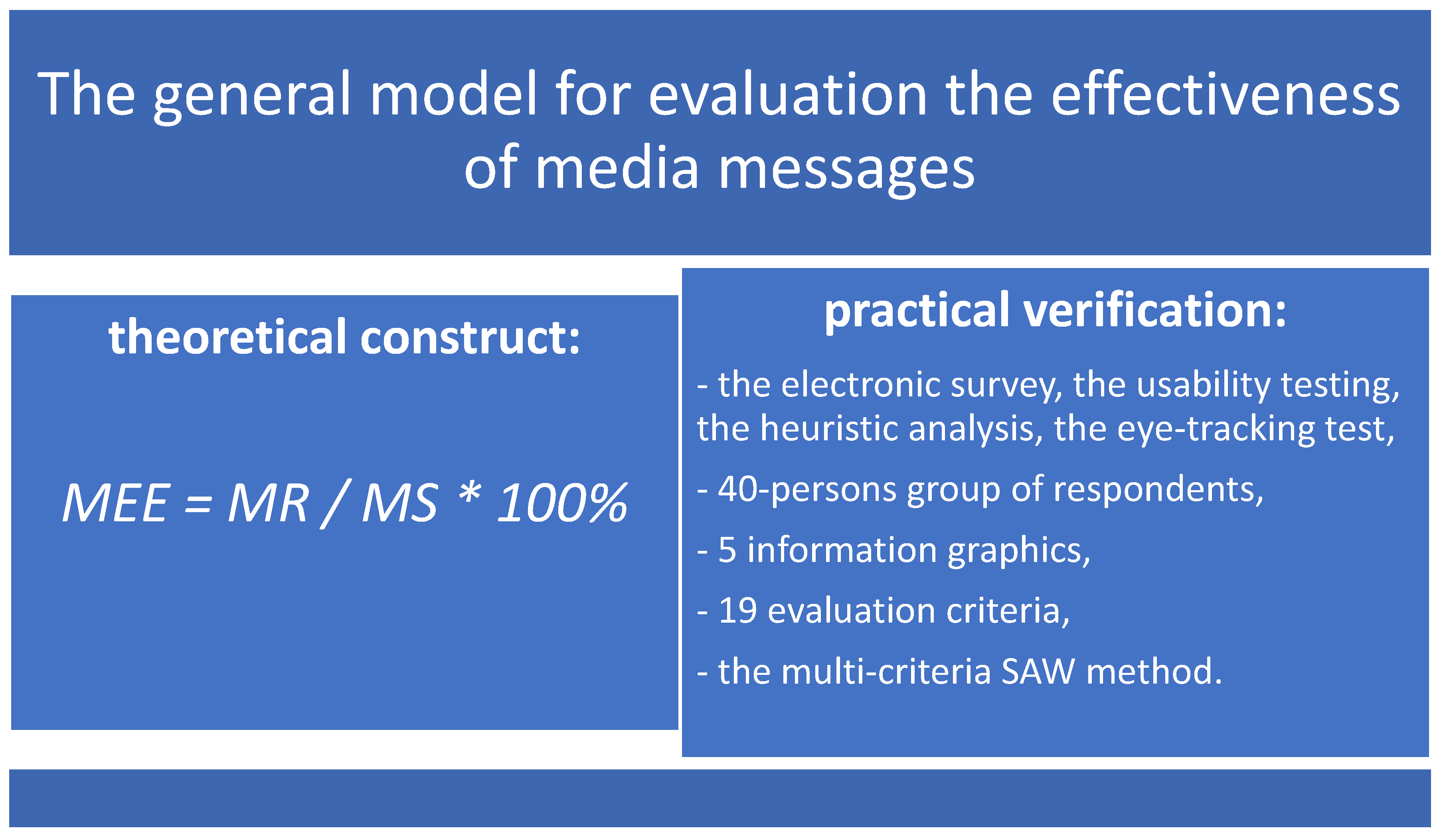
The main research objective of this article was to create and justify theoretical and research assumptions to build the model for evaluating the effectiveness of media messages and to verify the applicability of the created model empirically on selected information graphics as one of the popular forms of media messages. Therefore, after previously defining the theoretical structure of the model, the stage of model verification was started by defining the assumptions for conducting the survey on respondents and thus checking the possibility of its practical application. The object of the evaluation was information content in the form of five different information graphics, for which the scope of the evaluation included a list of 19 different criteria. The study of information content in the form of infographics was conducted on a group of selected respondents using the electronic survey (quantitative analysis) and the results of the activities, behaviors, and opinions of respondents carried out using the usability testing, additionally combined with the heuristic analysis and the eye-tracking test (qualitative analysis). The methods selected for the study were a combination of quantitative and qualitative methods, which aimed to collect quantitative data using an electronic survey based on qualitative data in the form of experiences, places of eyesight concentration, feelings, opinions, and behaviors of respondents, while viewing the content and fully interacting with the infographics. The qualitative methods used in the study, that is, usability testing and heuristic analysis, were aimed at simulating a set of recognized heuristics in the form of used criteria with the additional application of specific tasks and activities usually performed by respondents when interacting with infographics. At the same time, thanks to the connection with the online eye-tracking system, additional quantitative and qualitative data were collected on tracking the behaviors and places of eye concentration of respondents while browsing and evaluating infographics. All of the qualitative methods selected for the study were applied at one time, that is, during the research survey among respondents, which enabled a qualitative approach to the evaluation of infographics and their quantitative assessment by respondents in the survey form. Most of the qualitative data obtained in the study were transformed into the corresponding quantitative data for further analysis using the multi-criteria method. Only data on the degree of browsing the infographics in their entirety and eye concentration on the infographics were analyzed manually based on images obtained from the used eye-tracking system [
78,
79,
80]. The results obtained from the survey were analyzed using the multi-criteria SAW method (Simple Additive Weighting) in order to show the impact of infographics, as a visual communication tool, on the way recipients perceive selected aspects characterizing this tool, such as generally understood quality, usefulness, assimilation, and methods of presenting information and knowledge. The evaluation of the effectiveness of infographics focused mainly on the available information content and various forms of information presentation and visualization, such as text, text headers, text boxes, images, drawings, graphics, graphic icons, diagrams, maps, and charts. The measurement and evaluation of the effectiveness of each infographic was carried out based on the obtained results, using the created model for evaluating the effectiveness of media messages, which took into account the level of the achieved goal in relation to the intended goal. This study assumed that the level of the achieved goal is the total sum of ratings (in the form of numerical values) obtained from respondents as part of the study of all analyzed qualitative criteria for selected infographics, which is also the message received in the context of visual communication. At the same time, it was also assumed that the level of the intended goal was the maximum possible sum of ratings (in the form of numerical values) that respondents could indicate as part of the study of all analyzed qualitative criteria for selected infographics, which are also the message sent in the context of visual communication. The level of effectiveness of infographics, determined by the model and the degree of achievement of specific media message objectives, was ultimately to be demonstrated by the level of informational and cognitive gaps between the message received by the recipients and the message sent by the publishers.
The research procedure for verifying the created theoretical model in the scope of analysis and evaluation of the effectiveness of information graphics as visual communication tools using the general model for evaluating the effectiveness of media messages consisted in taking the following stages:
The selection of 5 different and representative infographics as the object of the study and the definition of the list of 19 different criteria for evaluating the infographics.
Creating the electronic survey, selecting a group of respondents as the entity of the survey, conducting the survey on respondents for selected infographics with additional use of an eye-tracking test, and collecting data using usability testing and heuristic analysis.
Preliminary data analysis using the multi-criteria SAW method, including construction of a hierarchical structure of criteria, data normalization of weight values, and final results values for each of the criteria, and determining the ranking of infographics as decision variants using the SAW method.
Main data analysis, including results from preliminary data analysis using the multi-criteria SAW method and practical application of the general model for evaluating the effectiveness of media messages.
Drawing out conclusions from the performed main data analysis and final interpretation of the obtained results.
In the first stage of the research procedure, the object of the study was selected in the form of five different Polish-language information graphics, available free of charge on the Internet media portals, with the possibility of content reading and browsing, as well as knowledge expansion. The selection of infographics as research objects was made based on the qualitative research methodology, the model of purposive sampling, and the case study method. Moreover, five infographics were selected for the study based on the representativeness of their features, sufficient diversity of design patterns used in them, sufficient possibility of comparing objects against the competition using selected evaluation criteria, and generally limited cognitive abilities of respondents to evaluate too many objects. The infographics selected for the study had informative and practical characteristics based on the following aspects: various types and perspectives of information graphics, various dominant functions of infographics, different selected topics and content, various layouts and compositions, different sizes of infographics vertically, various forms of information presentation in the information graphics, the time needed to read and browse textual and graphic content, and the length of the infographic’s total content counted in the number of screens to scroll. The common characteristics of all selected infographics were the following elements: independence from the medium of presentation and accompanying content, presentation and browsing of information entirely in the form of static content, portrait orientation, using a palette of different colors, and downloading the analyzed infographics from publicly available Internet sources. The maximum possible browsing time for each infographic by respondents was set by the author of the article for a period of 2 min in order to check the quantity and quality of information and knowledge assimilated by recipients from the surveyed information graphics. In this study, the following infographics were selected in terms of characteristics, such as title, topic, form, perspective, and function.
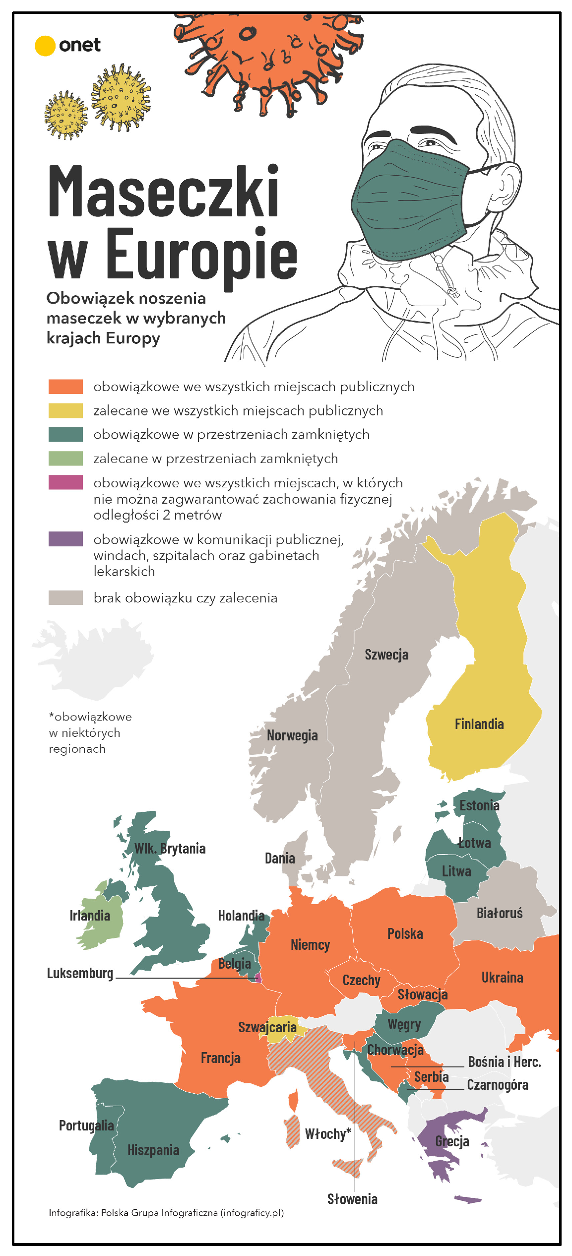
Infographic number 1. The title: “Masks in Europe”; the topic: “The obligation to wear masks in selected European countries”; the form: color map of Europe with location information; the perspective: location; the function: informative. Infographic number 1 is presented in
Figure 2 below.
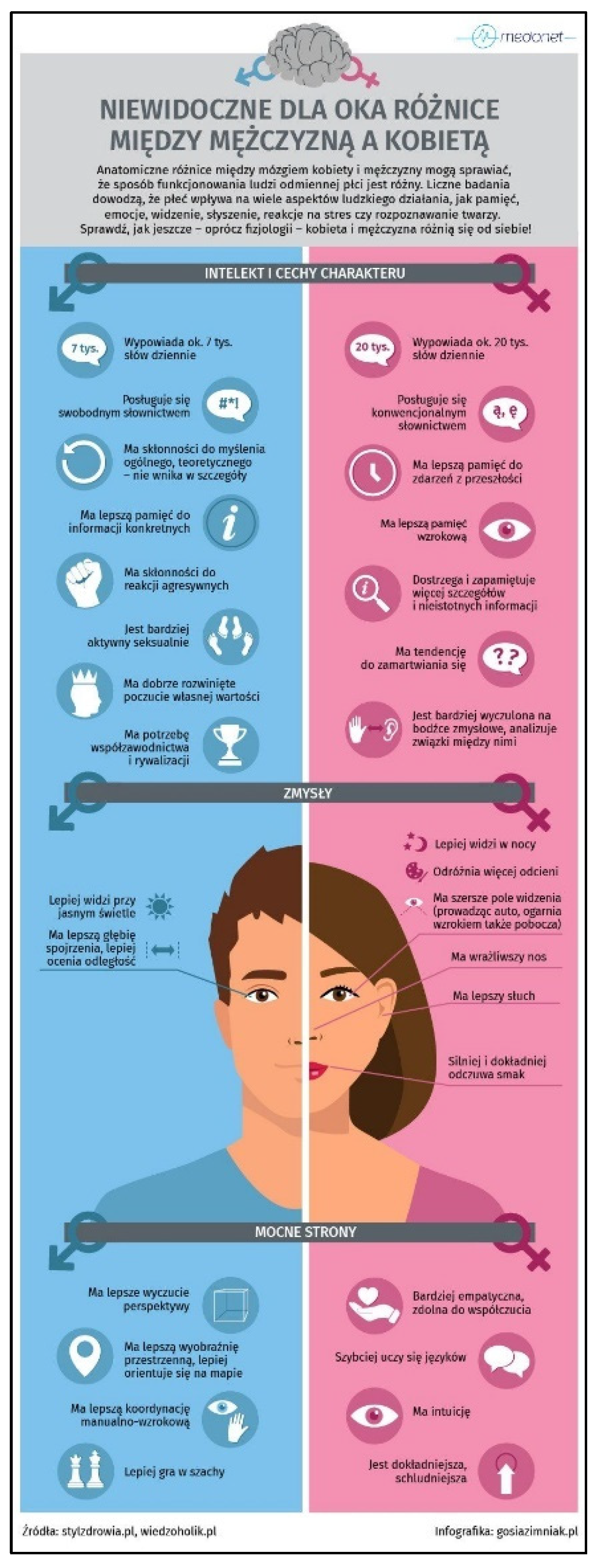
Infographic number 2. The title: “Differences between a man and a woman invisible to the eye”; the topic: “Intellect and personality traits, senses and strengths”; the form: color comparative table; the perspective: comparative; the function: informative and entertainment. Infographic number 2 is presented in
Figure 3 below.
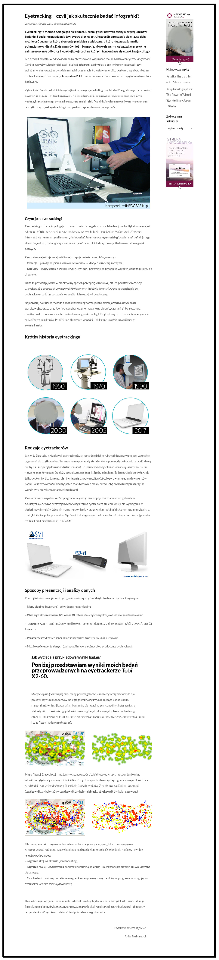
Infographic number 3. The title: “Eyetracking—how to effectively research infographics”; the topic: “A definition and history of eye-tracking, a description of the types of eye-trackers, methods of data presentation and analysis”; the form: text with elements of photographic forms; the perspective: data; the function: informative. Infographic number 3 is presented in
Figure 4 below.
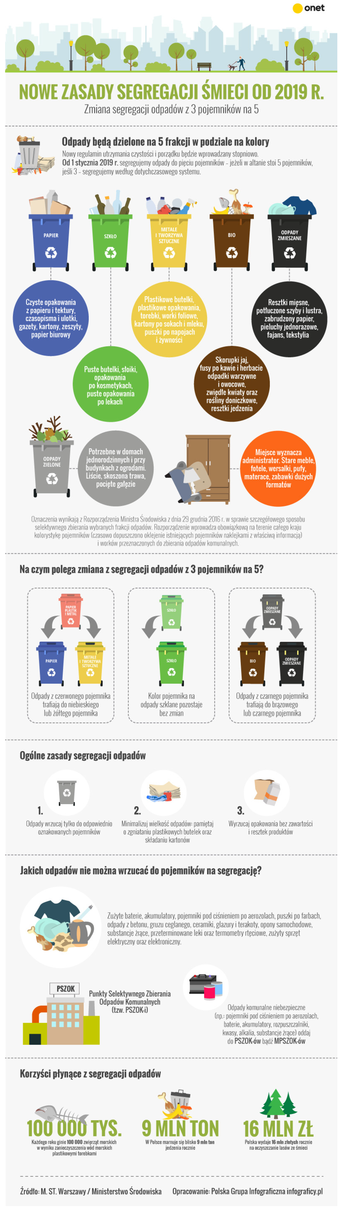
Infographic number 4. The title: “New rules for waste segregation from 2019”; the topic: “A description of the category of waste and waste segregation, a description of the principles of waste segregation and a list of waste of a specific category”; the form: collection of iconographies with description; the perspective: process; the function: informative and utility. Infographic number 4 is presented in
Figure 5 below.
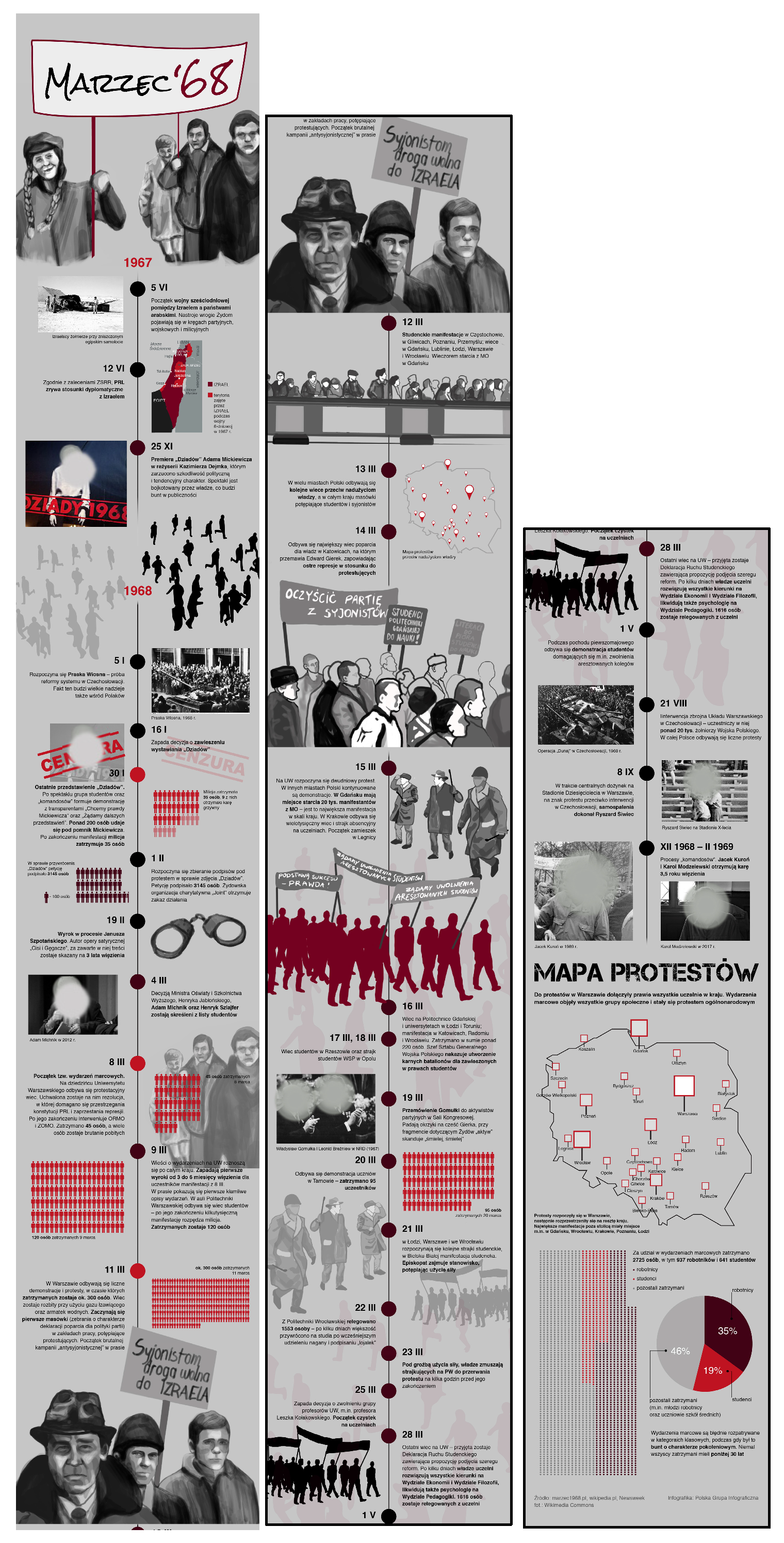
Infographic number 5. The title: “March ‘68”; the topic: “Information on the course of the March 1968 events in Poland”; the form: vertical chronological chart with description of events (set of facts); the perspective: time; the function: informative and educational. Infographic number 5 is presented in
Figure 6 below.
Figure 3.
The full graphical version of Infographic number 2. Reprinted with permission from Małgorzata Zimniak-Rucińska. Copyright 2026 [
81].
Figure 3.
The full graphical version of Infographic number 2. Reprinted with permission from Małgorzata Zimniak-Rucińska. Copyright 2026 [
81].
In the second stage of the research procedure, in order to collect data from respondents, an electronic survey was created using the free Google Forms online survey system [
82]. Additionally, the online survey system was linked with the RealEye online eye-tracking system to track the behaviors and places of eye concentration of respondents while browsing and evaluating infographics [
83]. The survey study was based on browsing and reading the information content of selected information graphics and then evaluating the selected criteria, which were presented using an internet browser application. All of the criteria were evaluated by respondents on a slightly extended Likert scale for values from 0 (lack or lowest rating) to 5 (highest rating), based on the level of satisfaction and usability fulfillment of specific qualitative, usefulness, impression, and cognitive criteria for content on selected infographics [
84].
The entity of the study survey conducted in February 2022 was a 40-person group of respondents that was selected for the study by the targeted selection method and represented people with secondary education, higher education, and higher education with a doctorate. The sample size was considered representative due to the specificity of the study related to the presentation of different information forms in electronic versions, as in the case of the websites and infographics usability evaluations. The selected group of respondents was deemed sufficient based on the Nielsen–Landauer model, which indicates that the number of usability issues identified during testing increases nonlinearly. Therefore, a sample size of just five respondents allows for the identification of approximately 85% of usability issues while maintaining optimal research costs. Furthermore, according to the principle of saturation in qualitative research, further recruitment within the same target group would lead to data redundancy (repeated results) without significantly increasing the substantive value of the analysis [
85,
86,
87]. The selection of a group of respondents as experts in a given field was made based on the qualitative research methodology and the perspective of the end user, who can be called an expert in the field of user experience due to relatively frequent contact and use of the research objects. Most of the respondents were students from some form of high school (61%), a smaller fraction graduated from higher education (33%), and the other graduated from higher education with a doctorate (6%). The vast majority of the respondents were citizens of Polish nationality (92%), and the others (8%) were citizens of other countries. All respondents represented four different age groups of people aged 18–22 years old (47%), 23–26 years old (30%), 27–35 years old (6%), and 36–45 years old (17%). Among the respondents, the majority were men (70%), and the remainder were women (30%). Interestingly, in the group of respondents, almost half (47%) had previously participated in different forms of automatic user eye-tracking tests.
Figure 4.
The full graphical version of Infographic number 3. Reprinted with permission from Institute of Infographics Sp. z o.o. Copyright 2026 [
88].
Figure 4.
The full graphical version of Infographic number 3. Reprinted with permission from Institute of Infographics Sp. z o.o. Copyright 2026 [
88].
Figure 5.
The full graphical version of Infographic number 4. Reprinted with permission from Polska Grupa Infograficzna. Copyright 2026.
Figure 5.
The full graphical version of Infographic number 4. Reprinted with permission from Polska Grupa Infograficzna. Copyright 2026.
In the third stage of the research procedure, preliminary data analysis was performed for the selected research problem. For this purpose, the SAW method was used, which is the weighted sum method and one of the simplest and most frequently used methods supporting the solution of multi-criteria decision-making problems (MCDMs). Its advantages are simplicity and intuitiveness in modeling the decision-maker’s preferences using an additive linear utility function. The aim of the SAW method is to create a ranking of the examined decision variants based on a linear combination of the weight vector and the linearly scaled decision matrix [
89,
90,
91]. The procedure in this method consists of performing a normalization operation for the weight values and criteria ratings obtained from the study in the matrices of individual decision variants. Then, the criteria present in each of the decision matrices are defined as stimulants and de-stimulants, and in the next step, weighted sum operations are performed on them for the values of the criteria corresponding to the individual variants in order to rank the analyzed decision variants from the best to the weakest. The variant with the greatest number of points is considered the best, and the variant with the least number of points is considered the weakest [
92,
93]. The way to calculate the number of points for individual decision variants
Wi is to use Formula (2) below.
where
Wi—the resulting value for the i-th decision variant,
wk—the normalized value of the weight of the k-th evaluation criterion,
rik—the normalized value of the evaluation for the i-th decision variant and the k-th evaluation criterion,
k = 1, …, n—evaluation criteria.
The application of the SAW method in the study initially consisted of building five groups of criteria, where four of them were the main criteria, and one of them was an additional criterion. The 16 main criteria concerned aspects consciously assessed by respondents in the survey and focused on the following areas: information usefulness, forms of information presentation, information assimilation, and information cognition. The 3 additional criteria concerned aspects of verifying various types of infographics in terms of possible cognitive difficulties for respondents, assessed by the author of the article, not by the respondents, and focused on the following areas: the degree of understanding the content of infographics (based on the survey results), the degree of browsing the infographics in their entirety (based on the eye-tracking test results), and the degree of eyes concentration on infographics (based on the eye-tracking test results). Additionally, in order to avoid unnecessary predominance of one group of main criteria over the others during the analysis and comparison of data, it was decided to assign, to each of the four main criteria groups, a list of criteria regarding different issues and areas with the same number of criteria per group (4), which resulted in a total of 16 different main criteria. Then, selected and thematically related main and additional criteria were assigned to each of the groups of criteria, and information about criteria with the attribute of profit (stimulant) or cost (de-stimulant) was included. As it turned out, all the selected main and additional criteria had a profit attribute, which meant that the higher the values chosen by the respondents and the more reliable the evaluations of the infographics, the higher the level of the examined phenomenon. The preliminary data analysis obtained in the study at the third stage of the research procedure consisted of a joint analysis of all selected 19 main and additional criteria, as well as the weight values assigned to these criteria. The detailed data analysis consisted of calculating the arithmetic mean value of the ratings obtained in the study for individual criteria and then normalizing the data thus obtained using a summing function combined with a stimulant formula, which constituted the basic assumptions of the research procedure for the SAW method. Similar operations consisting of calculating the arithmetic mean of the ratings and then normalizing the data thus obtained using a summing function were performed in relation to the weight values for individual criteria. The weight values were obtained from respondents, who acted as experts during the survey, using the direct rating technique. Finally, the normalized rating values for each criterion were multiplied by the corresponding normalized weight values to calculate aggregated scores for each of the analyzed decision variants [
3,
94,
95,
96]. The last part of data analysis using the SAW method was creating the ranking of evaluated decision variants, that is, determining the order of various types of information graphics from the best to the worst rated by the respondents. The calculations performed at the third stage of the research procedure were also used to determine the evaluation of the effectiveness of various types of infographics, which was carried out at the next/fourth stage of the research procedure. The detailed list of group names and criteria assigned to them within main and additional criteria is presented in
Table 1 below.
Figure 6.
The full graphical version of Infographic number 5. Reprinted with permission from Polska Grupa Infograficzna. Copyright 2026.
Figure 6.
The full graphical version of Infographic number 5. Reprinted with permission from Polska Grupa Infograficzna. Copyright 2026.
In the fourth stage of the research procedure, the main data analysis was performed for the selected research problem. For this purpose, the general model for evaluating the effectiveness of media messages was used, based on the previously described form of the model in Formula (1). The practical application of the model for evaluating the effectiveness consisted of carrying out appropriate calculations in accordance with its mathematical form and determining the effectiveness levels in percentage values, which were first performed for all the analyzed criteria and then for information graphics. Therefore, to determine the total level of the message received for the model, the final results obtained from the third stage of the research procedure were used as part of the preliminary data analysis using the SAW method for all 19 analyzed criteria. However, to determine the total level of the message sent for the model, the same calculation procedure was used as in the preliminary data analysis using the SAW method, but instead of the ratings obtained from respondents for individual criteria, the maximum possible values for all 19 analyzed criteria were used in the analysis. The final result values of the effectiveness levels for individual criteria (MC-01,…, MC-16 and AC-01,…, AC-03) and decision variants (IG-1,…, IG-5), in accordance with the research problem and the assumptions of the model for evaluating the effectiveness of media messages, are presented in
Table 1.
In the last/fifth stage of the research procedure, a final interpretation of the obtained results was performed for the selected research problem. The interpretation of data, concerning the results of the effectiveness evaluation of individual decision-making criteria within the analyzed media messages in the form of infographics, was carried out in order to draw conclusions regarding the created ranking of the examined criteria as components of each of the messages. This ranking was based on the results obtained in the fourth stage of the research procedure, and additionally, averaged values for the analyzed decision variants, in order to determine the average level of effectiveness for each of the examined criteria. As can be seen from the created ranking of criteria (the last column in
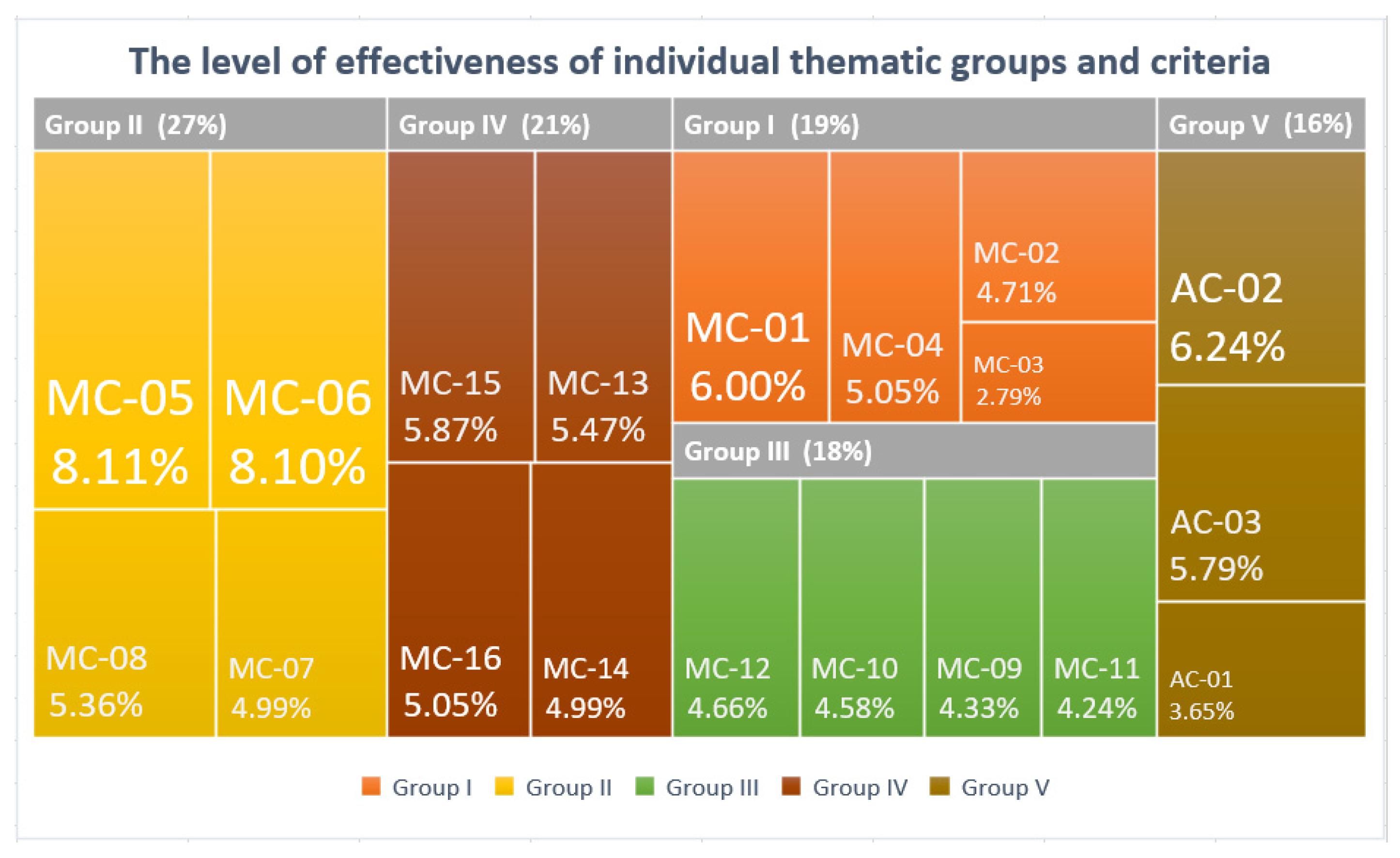
Table 1), the most effective criteria in this study turned out to be a set of the following four criteria—MC-05 (8.11%), MC-06 (8.10%), AC-02 (6.24%), and MC-01 (6.00%)—which belonged to different thematic groups of criteria (Group I, Group II, and Group V) and obtained the highest effectiveness values among all 19 criteria, respectively, at the percentage level from 8.11% to 6.00%. The next set of criteria, whose effectiveness values were at a slightly lower and very similar percentage level within 5%, was the following six criteria—MC-15 (5.87%), AC-03 (5.79%), MC-13 (5.47%), MC-08 (5.36%), MC-04 (5.05%), and MC-16 (5.05%)—which also belonged to different thematic groups of criteria (Group I, Group II, Group IV, and Group V). Another set of criteria, which, like the previous ones, belonged to different thematic groups of criteria (Group I, Group II, Group III, and Group IV), turned out to be the following seven criteria—MC-14 (4.99%), MC-07 (4.99%), MC-02 (4.71%), MC-12 (4.66%), MC-10 (4.58%), MC-09 (4.33%), and MC-11 (4.24%)—whose effectiveness values were also at a slightly lower and very similar percentage level within 4%. The least effective criteria in this study turned out to be the set of the following two criteria—AC-01 (3.65%) and MC-03 (2.79%)—which, like the previous ones, belonged to different thematic groups of criteria (Group I and Group V) and obtained the lowest effectiveness values among all 19 criteria at a percentage level below 4%. Furthermore, the summary results of the effectiveness levels of individual criteria assigned to the relevant thematic groups of criteria show that the ranking of effectiveness levels within these groups is the following: Group II (26.57%), Group IV (21.38%), Group I (18.55%), Group III (17.81%), and Group V (15.69%). As can be seen from the above interpretation, the most effective criteria in the opinion of respondents with individual results above 6%, in the study using infographics as media messages as an example, were the following four criteria: “The message attractiveness of textual and graphic content in the infographic” (MC-05), “The quality of the information presentation forms for textual and graphic content in the infographic” (MC-06), “The degree of browsing the infographics in their entirety” (AC-02), and “The message intelligibility of textual and graphic content in the infographic” (MC-01). At the same time, the most effective groups of criteria with results above 21% turned out to be the following two groups of criteria: “Aspects of forms of information presentation evaluation in the infographic’s content” (Group II) and “Aspects of information cognition evaluation in the infographic’s content” (Group IV). The above obtained results of the data analysis carried out for the selected research problem confirm the H1 hypothesis and are presented in
Figure 7.
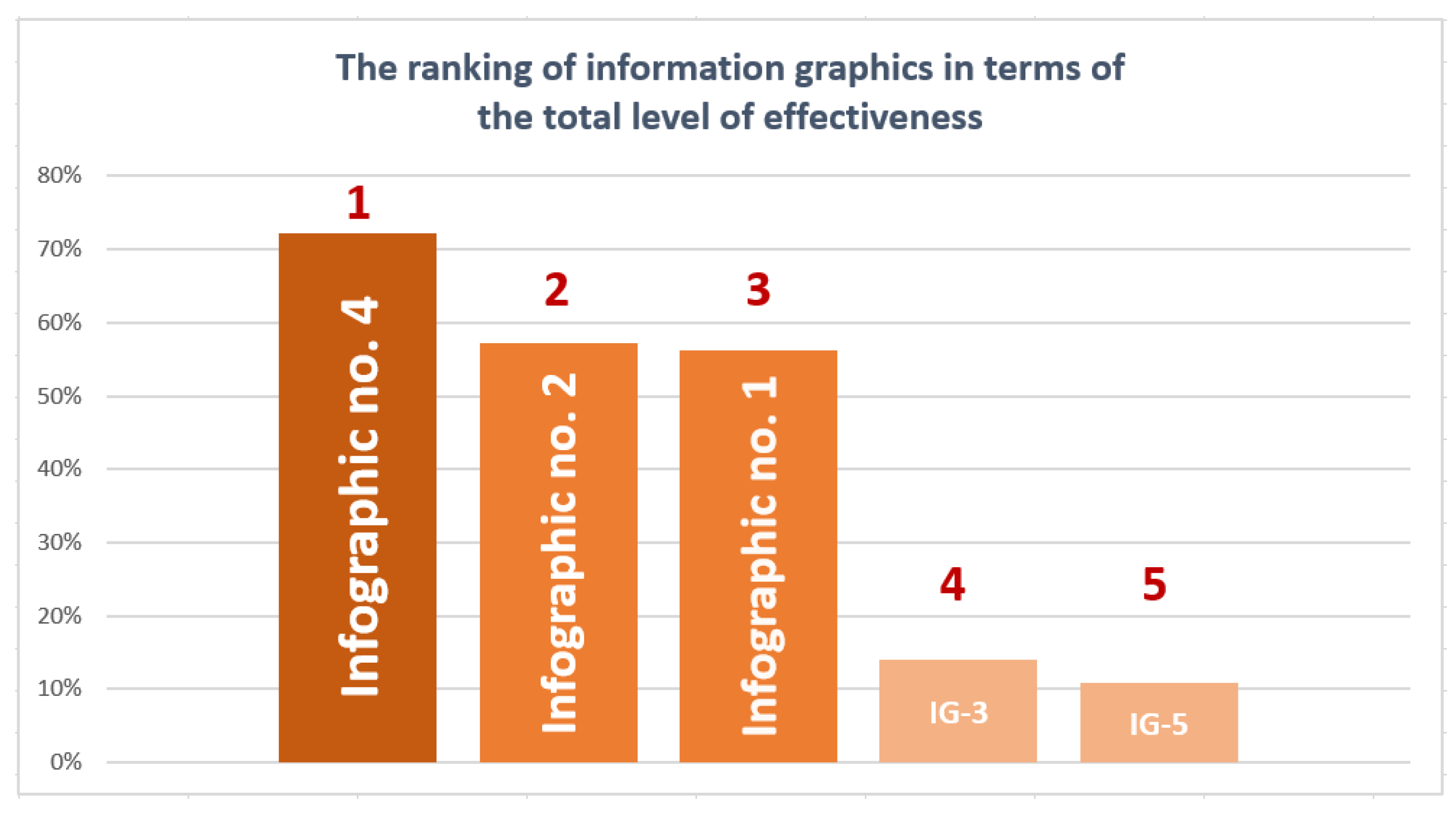
The interpretation of data, concerning the results of the effectiveness evaluation of individual decision-making variants within the analyzed media messages in the form of infographics, was carried out in order to draw conclusions regarding the created ranking of the examined variants as messages most often used for media purposes. This ranking was based on the results obtained in the fourth stage of the research procedure, that is, using the model for evaluating the effectiveness of media messages proposed in the article and the multi-criteria SAW method. According to the created ranking of information graphics (the last row in
Table 1), the first place in the ranking in terms of the total level of achieved effectiveness, and at the same time, the highest result in the study (
W4 = 72.24%), was obtained by Infographic number 4 (IG-4). Due to the above, Infographic number 4 can be used effectively for media purposes, meeting the information needs of recipients regarding the need to use waste segregation. The second place in the ranking in terms of the total level of achieved effectiveness, with a significantly lower result (
W2 = 57.20%), was obtained by Infographic number 2 (IG-2). Infographic number 2 can be effectively used for media purposes as a motivation for recipients to improve interpersonal communication between women and men. The third place in the ranking in terms of the total level of achieved effectiveness, with a result slightly lower than the previous position (
W1 = 56.31%), was obtained by Infographic number 1 (IG-1). Infographic number 1 can be effectively used for media purposes to influence the attitudes and behaviors of recipients regarding the requirements to wear masks during the pandemic. The fourth place in the ranking, with a result much lower than the previous position (
W3 = 14.00%) in terms of the total level of achieved effectiveness, was obtained by Infographic number 3 (IG-3). Infographic number 3, despite receiving low ratings, can still be used quite effectively for media purposes, as meeting the information and motivational needs of recipients regarding the possibilities of using and applying eye-tracking tools in various areas, research, and data analysis. The last/fifth place in the ranking in terms of the total level of achieved effectiveness and, at the same time, the lowest result in the study (
W5 = 10.96%), was obtained by Infographic number 5 (IG-5). Infographic number 5, despite receiving low ratings, can still be used quite effectively for media purposes, as meeting the information and social needs of recipients regarding historical facts, the scale of the impact of events, or the appropriate interpretation of reality. The above obtained results of the data analysis carried out for the selected research problem confirm the H2 hypothesis and are presented in
Figure 8.
4. Results and Discussion
The main research objective of this article was to determine the theoretical and research assumptions to build the model for evaluating the effectiveness of media messages and to practically verify the applicability of the created model on the examples of various types of information graphics as one of the popular forms of media messages. On the one hand, the proposed model contributes a new approach to evaluating the effectiveness of this type of message to existing theories, based primarily on identifying and determining the difference between the level of the message sent by the sender and the level of the message received by the recipient. The smaller this difference is, and ideally, if it approaches zero, the higher the quality of the message sent by the sender, which, at the same time, results in a higher effectiveness of the message received by the recipient. In reference to other theories, models, and methods of evaluating the effectiveness of information messages, it can be stated that, despite the considerable simplicity of the proposed model for evaluating the effectiveness, it is characterized by originality and universality in its approach to calculate the difference between the level of the message sent and the level of the message received. This is due to the fact that it is up to the decision-maker using the model to decide what factors and criteria to take into account when evaluating the effectiveness of the analyzed messages. Future applications of the model should take into account different forms of media messages, diverse groups of respondents, and the use of other research and data analysis methods. On the other hand, as it results from the main data analysis, conducted as part of the fourth stage of the research procedure in which the model for evaluating the effectiveness of media messages was used, it can be stated that the mathematical structure and the use of the original form of the model in calculations and data analysis confirmed its theoretical construction and practical applicability to evaluate the level of effectiveness of media messages in the form of information graphics. Moreover, the application of the model in combination with selected multi-criteria methods, which are characterized by solving decision-making problems consisting of a list of variants and criteria related to them, allows for the generation of results in the form of rankings that can be used both to evaluate the levels of effectiveness and to compare the results obtained for the analyzed variants and criteria [
91,
93].
The conducted research of analysis and evaluation in terms of the overall quality and effectiveness of various types of infographics as visual communication tools showed significant differences in the respondents’ perceptions of various aspects of usefulness, forms of presentation, or information assimilation contained in the analyzed infographics. The individual types of infographics selected for the study achieved the results of effectiveness levels at a very diverse level, balancing from low values ranging from 11% (IG-5) to 14% (IG-3), through average values ranging from 56% (IG-1) to 57% (IG-2), up to a high value of 72% (IG-4), for the maximum values that could be obtained. On this basis, it can be concluded that infographics that achieved medium and high effectiveness values were characterized by current and important topics for most recipients, used attractive forms of communication and presentation of information and knowledge, and also medium-sized graphics (from about 3 to 6 screens high). The infographics with the lowest effectiveness ratings apparently did not impress the audience, probably due to their much larger size to browse and the more specialized topics they presented. The infographic with the highest level of effectiveness and overall quality according to the respondents was Infographic number 4 (IG-4), which presented the selected topic in a very clear and attractive way, within a process perspective, in the form of an iconography collection with descriptions and for informational and utilitarian purposes. This may mean, on the one hand, that the features that characterize it constitute a combination of well-connected and matched graphic and substantive elements, which have a positive impact on its attractiveness, comprehensibility, and assimilation of the message by the recipients. On the other hand, it may also mean high credibility of the constructed model for evaluating the effectiveness of media messages, which confirmed the high and outstanding level of effectiveness of this infographic compared to the others. Moreover, the different types of infographics that were included in this study due to the attractiveness of the topic for respondents, the ways of content communication, the functions they performed, or used graphic layouts and compositions, made the research results current, interesting, and applicable in various practical areas. Thanks to the full implementation of the assumed research objective, it was also possible to demonstrate that the evaluated infographics are characterized by a varied level of the message quality and effectiveness among the recipients, which may result in a much more predictable level of assimilation of information and knowledge contained in the content of the infographics.
The following five quantitative and qualitative methods were used in this study: the internet survey, the usability testing, the heuristic analysis, the eye-tracking test, and the multi-criteria SAW method. This is therefore one of the first studies on the analysis and evaluation of the effectiveness of information graphics as visual communication tools used in electronic media, using a combination of various types of quantitative and qualitative methods in the process of data collection and analysis. Moreover, as described in other studies, the use of a combination of different types of methods meant that the obtained results can be considered reliable, realistic, and useful in various fields and applications [
78,
79,
80]. The research presented in this article makes a significant contribution to the existing literature on the subject, both from a methodological and methodical perspective, as there are few studies evaluating the effectiveness of media messages in the form of information graphics using several qualitative criteria and the multi-criteria method. Moreover, this article fills the research gap in the discussion on the possibility of evaluating the effectiveness of the influence of infographics on recipients and the impact of different types of infographics on their effectiveness for media applications, using multi-criteria methods instead of using only statistical methods, as is usually practiced [
70,
71,
72].
In connection with the above, it can be concluded that thanks to the construction and application of the model for evaluating the effectiveness of media messages in the study of the effectiveness of information graphics, it was possible to determine general design guidelines characterizing the most effective infographics, as well as the most effective criteria and groups of criteria. Thanks to this, on the one hand, the proposed model can be successfully used both at the design and implementation stages of media messages by appropriately applying the most effective methods and techniques of designing information messages in terms of the target audience. On the other hand, the model can be used primarily to evaluate the effectiveness of ready-made and published media messages, which makes it possible to define any assumptions, criteria, and evaluation methods, and then ways of interpreting them depending on the set goals.
5. Conclusions, Limitations, and Future Research
In conclusion, it can be clearly stated that research on the evaluation of the level of quality and effectiveness of the ways that infographics impact and interaction with recipients provides very important support in the processes of creating, implementing, and evaluating information graphics for professional, scientific, and public uses. This research may significantly influence the level of interest, user-friendliness, assimilation, and credibility of the conveyed substantive content among recipients, which can support them in making informed decisions and actions either in daily tasks or in more rare but critical situations.
Professionals and practitioners can use the results and conclusions presented in the article, which can be summarized as follows: media messages should be characterized by current and interesting topics for the recipients; designed and implemented infographics should be visually attractive, understandable in terms of content for various target groups, and not too large in size to be effective tools in marketing communication; all implications of the presented model should focus on achieving high quality and effectiveness of media messages in terms of comprehensibility, usefulness, and assimilation of information. From the perspective of creators and designers, other popular implications and recommendations for creating infographics include the following principles: concentration on the main thesis of the message; focusing on cognitive effects, not just visual ones; reducing excessive complexity that decreases effectiveness; creating a composition that draws attention and highlights key data; reducing cognitive load and visual manipulation.
Researchers and scientists can use the results and conclusions presented in this article, which can be summarized as follows: the presented research procedure and the model for evaluating the effectiveness of media messages can be applied to assess both the quality and effectiveness of infographics; this model, after appropriate adaptation, can also be applied to other types of media messages; the criteria and groups of criteria used in the infographics study are characterized by varying levels of effectiveness, which can be used for various purposes; the criteria and methods applied in the infographics study have confirmed their research and practical applicability, which can be used in other studies. From the perspective of academics, other popular implications and recommendations for the analysis and evaluation of infographics include the following conclusions: research should not be limited to a declarative assessment of attractiveness or readability, as the analysis of effectiveness should be multidimensional (e.g., cognitive, affective, behavioral, persuasive); research should analyze not only the content but also the visual parameters as independent variables; research should take into account various theoretical perspectives; audience characteristics should be controlled as moderating variables; effectiveness should be analyzed in realistic conditions and a specific environment (e.g., social media, news portals, expert reports).
Public bodies can use the results and conclusions presented in this article, which can be summarized as follows: professional, transparent, and consistent visual communication can strengthen the credibility of public institutions; high-quality and effective infographics can be used by public administrations (e.g., in health, tax, crisis communication, etc.) to perform informational and educational functions; effective infographics enable quick and clear understanding and assimilation of the message. From the perspective of public bodies, other popular implications and recommendations for creating infographics include the following principles: the use of various forms of media messages should primarily serve to increase understanding and safety of citizens; media messages should be designed in a way that is accessible to the general public due to its wide diversity (e.g., level of education, digital competences, data interpretation skills, etc.); the effectiveness of messages should be understood as increasing the understanding and competence of citizens and not only improving the image of the institution; media messages should ensure the reliability of the presented data, which is particularly important in the public sector in terms of ethical responsibility and transparency.
Further research should be conducted on the evaluation of the quality and effectiveness of various aspects of information usefulness used in information graphics towards expanding the list and diversity of analyzed and evaluated information usefulness criteria, as well as a more in-depth analysis of source and resultant data using various multi-criteria methods (e.g., AHP/ANP, SMART, TOPSIS, etc.) [
3,
9,
77,
95] and other methods of data analysis (e.g., statistical methods, multidimensional data analysis, etc.).
It may also be particularly helpful to use additional methods and tools for testing the usability of digital products (UX), supporting the collection of opinions and ratings from respondents, such as advanced electronic surveys, user interviews, recordings of user’s behaviors or click-tracking (e.g., in the case of dynamic infographics) [
10,
45]. Professional stationary eye-tracking devices would also be worth examining and comparing the obtained results, which have greater and more accurate capabilities of data recording and analysis; they could be a better solution than simple cameras for online applications.
The limitations of this study include the following aspects: a relatively small group of respondents enabling generalization to the entire population, a relatively simplified approach to determining the total level of the message sent within the model (e.g., additional dependence on the expected values in the study for the selected criteria), the lack of theoretical and practical verification of the proposed model in research on other popular forms of media messages used in electronic media (e.g., news articles) or the lack of research for other areas of application of media messages (e.g., education).