Abstract
Modern packaging must be efficient, safe, and attractively designed, while also minimizing unnecessary waste. Eco-design principles, such as material reduction, reusability, and minimal environmental impact, were central to this study. We applied these principles to the development of innovative, multipurpose gift packaging and labels, optimizing material use, eliminating unnecessary printing, and integrating sustainable features such as a structural design which requires no gluing. Alongside choosing eco-friendly materials, namely corrugated cardboard and a biodegradable paper label, eco-design guidelines in packaging and label creation were followed. Packaging of unconventional shape without printing and different versions of labels for bottles and packaging were designed. Graphic elements included on the labels are the logo, illustration, 18th Century font, and lines of varying thicknesses. To provide additional information and enhance product appeal while reducing printing, an interactive element was incorporated. In the conducted study, the respondents of a survey and focus groups evaluated the quality, price range, and visual appeal of packaging and labels. For the augmented reality application, a label with a QR code was created. A scenario and a visual story board were created, and an animation activated via the QR code was produced. The usage experience was tested by the focus groups, who provided feedback on the animation and the overall experience. This iterative process ensured that the packaging and labels met both functional and experiential expectations.
    1. Introduction
Gift packaging is more than just a practical way to protect gifts. It has a rich history and significant cultural importance, serving as a form of communication between the giver and the recipient. This practice conveys respect, goodwill, and thoughtfulness, playing a crucial role in the act of gifting by combining aesthetics, functionality, personalization, and sustainability []. Moreover, cultural differences in gifting traditions around the world have given rise to diverse markets for these products, further enhancing their accessibility and utility []. The popularity of corporate gifting is also growing, as companies aim to promote their brands and foster business relationships. Packaging plays a significant role in helping businesses increase sales, capture consumer attention, and communicate values, ideas, associations, and expectations about products, thereby aiding in brand positioning []. As of 2023, the market of gift packaging was valued at approximately USD 25.48 billion, and it is projected to reach about USD 38.93 billion by 2033, expanding at a compound annual growth rate (CAGR) of 4.33% from 2024 to 2033 []. This growth is driven mainly by the increasing popularity of corrugated cardboard gift boxes, valued for their resistance, reusability, and aesthetic appeal.
Increasing environmental awareness is simultaneously driving the demand for eco-friendly packaging solutions []. Sustainable eco-design is an approach centered on minimizing the environmental impact of products throughout their entire life cycle, encompassing design, production, use, and disposal. Key principles of eco-design include reducing energy and material consumption, reusing products or their components, upgrading used products, recycling materials (including production waste), and recovering energy [,,]. According to Azzi et al. [], sustainable packaging design should aim to completely eliminate packaging waste, reduce material usage, enable reuse or recycling at the end of the packaging’s life cycle, and return used materials as raw resources for further use.
Studies on packaging sustainability primarily focus on developing more eco-friendly packaging materials [,,,]. Paper and cardboard packaging is experiencing a revival, as consumers perceive it as a high-value and environmentally friendly material [,,]. Consumers are becoming more aware of the impact of their purchasing decisions on the environment and are demanding more sustainable options. A systematic literature review of the consumer perspective on sustainable packaging design was recently conducted by Branca et al. []. In a study by Li et al., consumers strongly recognized the usefulness and ease of use of gift packaging, with their ecological values playing a crucial role in their acceptance of green packaging [].
Eco-friendly packaging, from the consumer’s perspective, can be described as packaging which conveys environmental friendliness either explicitly or implicitly. This perception can be shaped by the packaging’s structural design as well as its iconographic, graphical, or informational elements [,]. An important aspect aside from material selection and construction of the packaging is the packaging’s graphic design. Selection of the shape, typeface, color, imagery, layout, images, and patterns conveys specific meanings to consumers and significantly influences their perception of both the brand and the product [,]. The visual information conveyed through packaging establishes a quick connection between the consumer and the brand. The positioning and alignment of graphical elements communicate the distinct meanings and characteristics of a product []. Packaging elements such as the color, typography, shape, images, and informational labels play a crucial role in shaping consumer judgment. The decorative, emotional, and symbolic aspects of packaging enhance product value by addressing key factors like utility, safety, and comfort, which fulfill consumer needs []. These elements convey diverse messages and represent the characteristics of a product, significantly shaping consumers’ perceptions of its overall value []. Furthermore, the structural aspects of packaging, such as the shape, size, color, and materials, strongly influence consumer purchase intentions [].
However, excessive decoration and printing on gift packaging often leads to the overuse of decorative elements, diverse patterns, and materials. This includes the use of complex boxes and different materials or packaging with elaborate graphic designs, which can result in higher amounts of non-recyclable waste. It is crucial that gift packaging design strikes a balance, ensuring it does not create unnecessary environmental burdens [,]. The industry is currently shifting toward simplified gift wrapping. Consumers are increasingly drawn to gift boxes with clean, straightforward designs which highlight key qualities without excessive embellishments. To align with this preference, manufacturers are adopting minimally styled yet visually appealing gift box designs to enhance their presentation [].
The innovative design approach of optimizing packaging efficiency and creating reusable or multipurpose packaging, combined with the use of eco-friendly materials, represents a significant step toward sustainable packaging. This study aimed to develop sustainable, multipurpose gift packaging which integrates an interactive label while applying eco-design principles and incorporating consumer feedback to optimize functionality and visual appeal. Utilizing sustainable plant-based materials and redesigning to minimize material usage and printing are effective strategies for creating eco-friendly labels. By ensuring that the packaging and labels align with sustainability principles, this study aimed to enhance both practical usability and consumer perception.
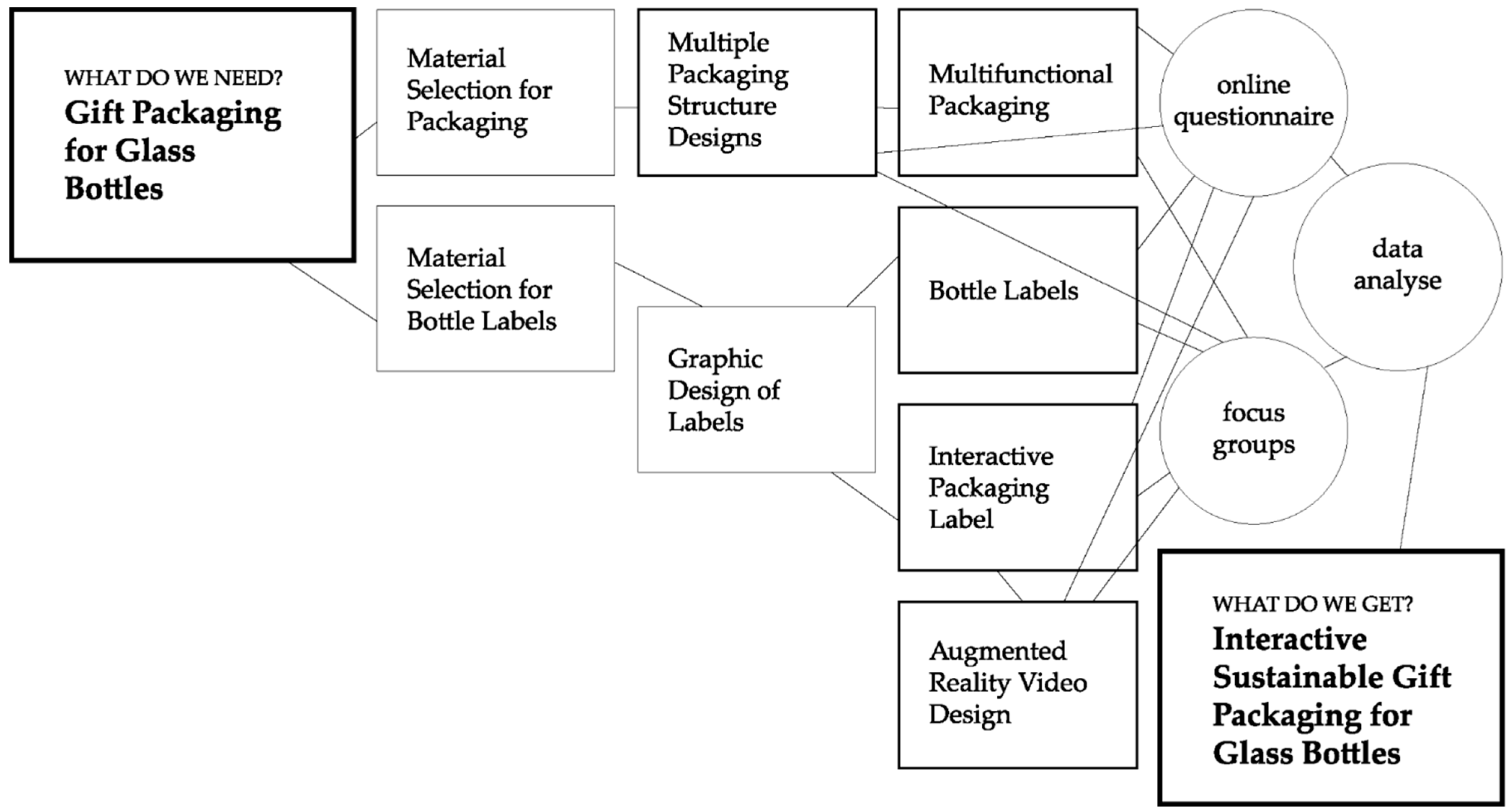
2. Materials and Methods
The research framework diagram shown in Figure 1 presents the applied research concept.
      
    
    Figure 1.
      The research framework diagram.
  
The packaging was made from single-wall E-flute corrugated cardboard, which was manufactured using layers of recycled paper. Several construction solutions were considered, differing in the shape and number of layers making up one side of the box. Structure designs were constructed by using ArtiosCAD version 12.0 software (Esko, Gent Belgium). To ensure clarity in the research, the type of product being packaged was defined beforehand. The study focused on gift packaging for glass bottles, requiring a design which provided both protection for fragile liquid products and an aesthetically appealing presentation. For both the packaging and the glass bottle, a commercial pressure-sensitive adhesives (PSA) label produced by Avery Dennison (Mentor, OH, USA) which was declared as biodegradable (a compostable PSA label) was used. The face stock of the label was one-side-coated and used wood-free FSC-certified paper with a basis weight of 80 g/m2.
The graphic design on the labels was made using Adobe Illustrator (version CC 2021), a vector graphics editor and design program (Adobe Systems, San Jose, CA, USA). For the interactive label, the artwork was turned into an AR experience using Adobe After Effects (version 17.1), a digital visual effects, motion graphics, and compositing application. The labels were printed using a Xerox Iridesse Production Press high-performance digital printer (Xerox, Norwalk, CT, USA), which employs high-performance digital xerographic printing technology. The printed labels for the bottles and packaging were cut using an A330X automatic label cutter (MomoTech, Shenzhen, China).
The survey, titled “Guidelines for Designing Interactive Sustainable Gift Packaging”, aimed to gather consumer insights on packaging and various graphic label designs. The participants evaluated various aspects of the gift packaging and label design. The importance and usability of the multipurpose functions of packaging (a box with a handle, boxes as promotion stands, and reuse of a box as a nesting house) were assessed. Assessment of the label design included the perception of the quality (whether the label conveys that the product is of high quality), price range (whether the label suggests that the product belongs to a higher price category), and visual appeal (whether the label is aesthetically pleasing). To collect data, an online questionnaire named “Sustainable Packaging” was utilized. It was structured with three sections; the first focused on the respondents’ socioeconomic backgrounds, the second examined the design of the gift packaging, and the third analyzed the label design. Furthermore, the participants evaluated the interactive packaging label applied to the box. They were asked to evaluate the quality of the animation and visual appeal, the usability and practical value of the added interactivity, and the ease of use of and overall satisfaction with the interactive label. The questionnaire comprised multiple-choice questions and a 5-point Likert scale. The target demographic consisted of Slovenian citizens, and invitations to participate were shared via email, social media, and various online communities. A total of 207 valid responses were received and analyzed, ensuring all questions were addressed.
The same questionnaire was also used in discussions with four focus groups. Focus group 1 (FG 1) included five employees from the Bled Tourist Board, with the meeting conducted in person at the company’s headquarters following prior arrangements and an introductory presentation. Focus group 2 (FG 2) consisted of five incubates from the Katapult start-up business accelerator, meeting at the accelerator’s headquarters with prior approval from management. Focus group 3 (FG 3) comprised five students, who gathered in a university classroom for the discussion. Focus group 4 (FG 4) involved five product buyers who already knew the Tr’glav brand and participated in a meeting held at a vendor’s location. Before each session, the participants were given a brief overview of the study objectives, followed by obtaining their informed consent.
To comply with GDPR regulations, all survey respondents and focus group participants remained anonymous, with no personal data or identifying information collected.
To analyze the data, descriptive statistics were used, namely the frequencies (how often each response appeared), median (middle response), and mode (most common response), for summarizing central tendencies. The Kruskal–Wallis test was used to compare rankings among groups. This non-parametric test was used to determine if there were significant differences in the evaluation of multifuctional packaging, label design for bottles, and interactive labels for packaging between focus groups.
3. Results
The structural design of the packaging followed eco-design principles to minimize environmental impact by optimizing material use, enhancing recyclability, and extending its lifecycle. The packaging was designed for multi-functional use, serving first as a protective gift box, then as a promotional stand, and later being repurposed as a nesting box for bees, reducing single-use waste. A minimalist graphic design approach was implemented by using FSC-certified biodegradable label paper, monochrome printing, and cut-out logos to significantly decrease ink consumption. Additionally, digital interactivity for sustainability was incorporated through a QR code, replacing excessive printed information with an augmented reality (AR) experience, further aligning the packaging with eco-design principles.
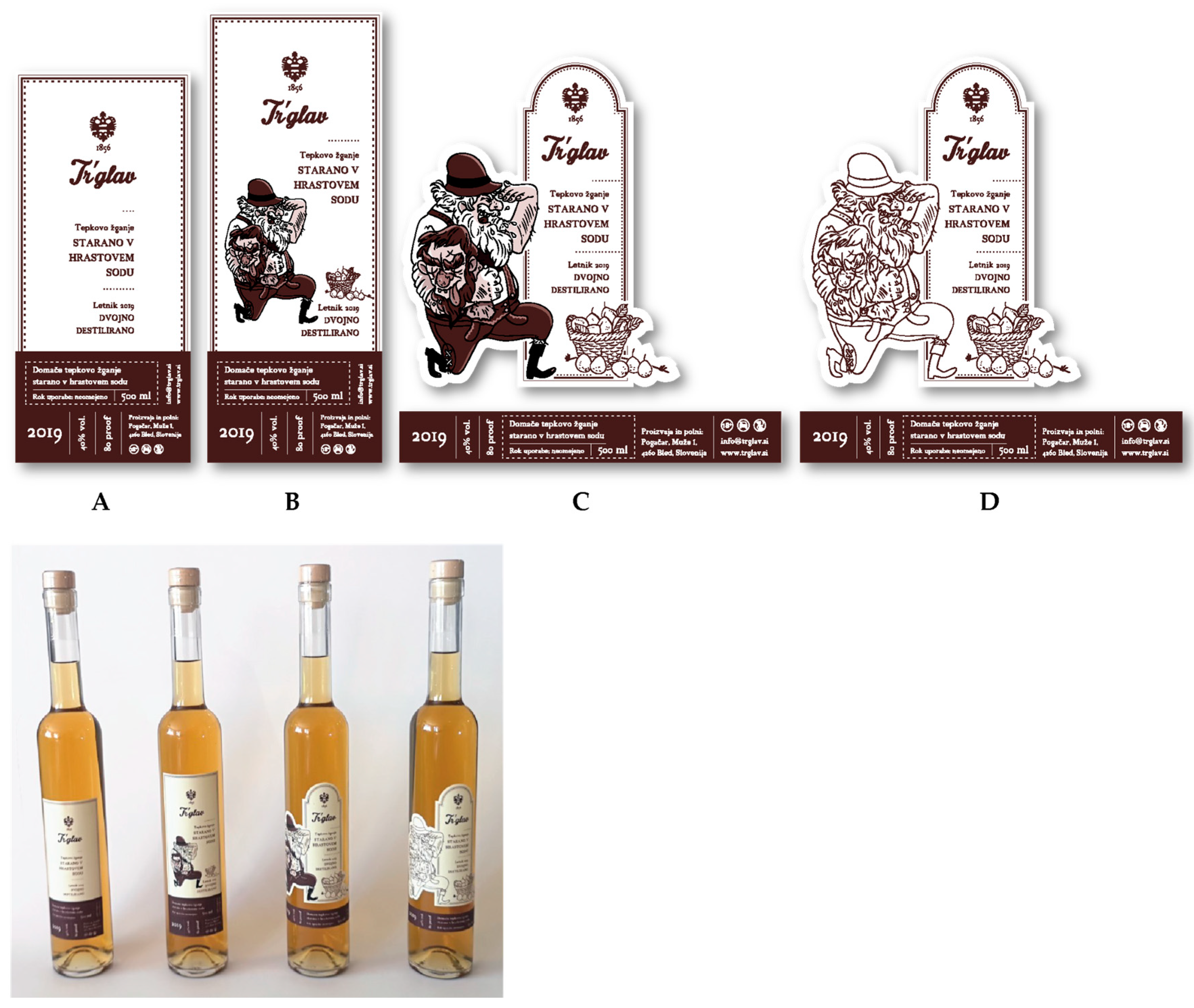
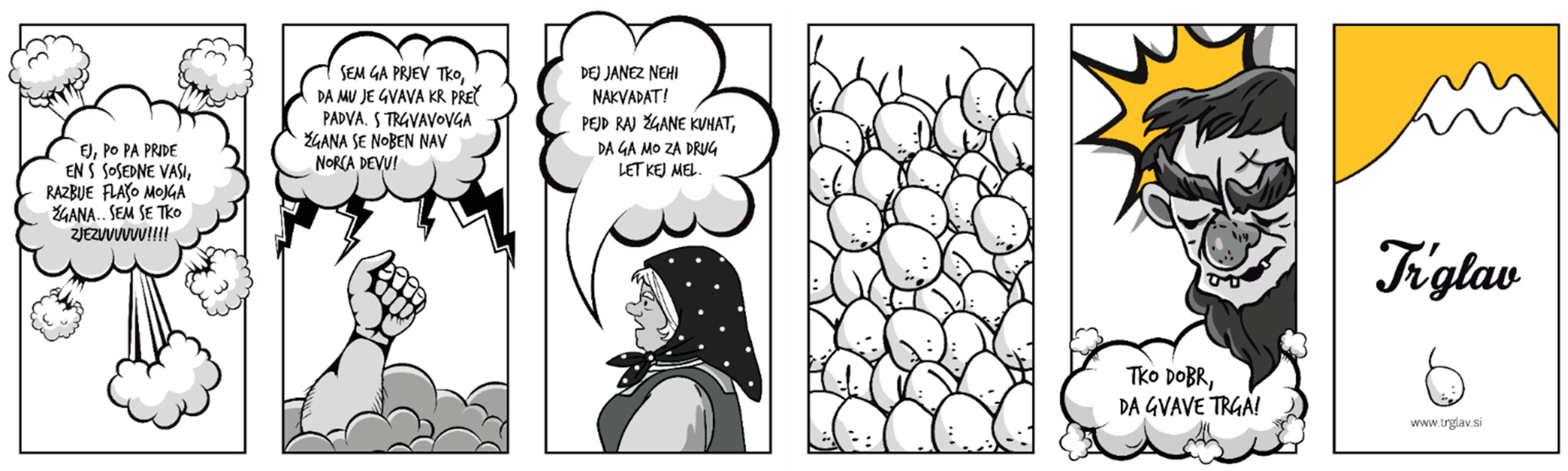
3.1. Packaging and Label Design
Implementing eco-design was the guiding principle for construction solutions in drafting multipurpose and reusable gift packaging. The basic packaging design was taken from the FEFCO box styles, specifically folder type 0427 and telescope type 0331, which were modified to strengthen the box on one side or at the bottom or top. Seven versions of the packaging were then designed in such a way that each version was upgraded [,]. The final version of the packaging was designed by drafting with parametric components from a single piece of board, which was then further developed into a more complex shape. The unconventional packaging design was achieved using structural elements of a folder-type box. The final shape of the packaging was developed through an iterative design process based on modified FEFCO 0427 and 0331 box styles to ensure durability, material efficiency, and ease of assembly. Packaging sizes were optimized for efficient material utilization, minimizing waste from the B1 format sheets while maintaining compatibility with various products such as spirits, confectionery, and specialty goods [,]. Composed of three pieces, it was an easy-to-assemble box without the need for glue. The simplification and recyclability approach eliminated lamination and adhesives, ensuring that the single-wall E-flute corrugated cardboard used was 100% recyclable. To enhance functionality, the handle was constructed from reinforced corrugated cardboard, eliminating the need for an additional gift bag. A retractable handle made from corrugated cardboard was incorporated into the basic packaging structure, as shown in Figure 2a. The gift packaging was designed to accommodate various products by simply adding different interior fitments. Additionally, modular interior fitments allowed secure placement of different product types, preserving both the aesthetics and structural integrity. By utilizing boxes of different shapes, volumes, and dimensions, an exhibition product display was created, which could also serve as a promotional stand (Figure 2b). After fulfilling its primary purpose, the packaging can be repurposed as a nesting box for solitary bees, enabling sustainable reuse. This transformation was achieved by adding perforations to the front and back sides of the packaging (Figure 2c).
      
    
    Figure 2.
      Gift packaging (a) with handle, (b) as a promotion stand, and (c) turned into a nesting box for solitary bees.
  
A total of four different bottle label designs (Figure 3) and interactive packaging labels presented in two different layouts—vertical and horizontal (Figure 4)—were developed. The label design followed eco-design principles by minimizing ink use through monochromatic printing, utilizing cut-out logo designs to reduce material consumption, and employing FSC-certified biodegradable paper. The selection of FSC-certified paper and biodegradable labels aligned with the principle of choosing materials for recyclability, ensuring sustainable material use and minimal environmental impact. More detailed descriptions of the labels can be found in previous publications [,]. These designs were created based on the existing visual identity of the Tr’glav brand while adhering to eco-design principles. Tr’glav is a premium Slovenian brand, a small, traditional, family-run distillery from Bled specializing in spirits with a long-standing heritage passed down through generations. In line with its commitment to sustainability, the brand follows an eco-design approach focused on minimizing environmental impact by utilizing locally sourced ingredients, maintaining small-scale sustainable production, and implementing economical packaging solutions. The packaging was made from fully recyclable materials, while the glass bottles could be returned and refilled, supporting a circular economy model which reduces waste and promotes resource efficiency. The commitment to eco-design extended to the bottle labels as well. The brand ensured that all labels were made from recyclable materials, adhering to strict environmental standards and avoiding any potentially harmful substances. In line with sustainable design principles, the labels were not printed over the entire surface, reducing ink consumption and maintaining a minimalist aesthetic which aligned with eco-friendly values. Additionally, the label production process was optimized to maximize material usage; formats were carefully planned to minimize waste, ensuring the most efficient use of each printing sheet. This approach further supports the brand’s dedication to reducing its environmental footprint while maintaining high-quality, sustainable packaging solutions.
      
    
    Figure 3.
      Designed bottle labels (A–D) and printed labels shown attached to the bottles.


    Figure 4.
      Graphic design of interactive packaging labels including a visual representation of a QR code (presented in two different layouts—vertical and horizontal—designed for different applications) and printed labels attached to packaging.
  
The bottle labels incorporated key elements such as the logo, an illustration, varying line thicknesses, and 18th Century typography. The complexity of the design increased progressively; label A contained only the logo and font, representing the most minimalistic approach, label B introduced an illustration (a man and a basket of fruits), and label C featured a distinctive cutout, as illustrated in Figure 3. Label D included all elements but omitted the colored portion of the illustration. The layout consisted of two main sections: the upper portion for basic product details and the lower rectangular section for mandatory information. While the labels were primarily monochrome, an alternative PANTONE 7631C color scheme (C = 70%, M = 90%, Y = 90%, K = 50%) could be used alongside black.
The interactive packaging label, featuring a QR code, was presented in two different layouts—vertical and horizontal—and designed for different possible points of attachment to the box, as shown in Figure 4. On the label, the TrashHand font was placed inside an illustrated speech bubble, while the 18th Century font was used for the website title. The TrashHand font was set at a size of 25 pt, and the 18th Century font was set to 8 pt. The colors were monochromatic, with only black being used (C = 0%, M = 0%, Y = 0%, K = 100%). Instead of being printed, the Tr’glav logo was cut out from the label, reducing ink usage. This type of label is not suitable for large-scale production or machine application due to the precision required when applying it. However, since the potential customer is a small-scale buyer, they can afford to carefully apply each label manually. Although the cut-out design slightly extends the application process, it only requires extra caution during placement.
The QR code serves as a direct link to the subpage “https://trglav.si/janez.html (accessed on 15 December 2024)” (an HTML file), which includes the display of an uploaded video on the website “https://trglav.si/ (accessed on 15 December 2024)”. The graphic layout of the elements in the animation was arranged in vector form (750 × 1334 px). For the first two scenes with warnings, the National Light (size 41 pt) and National Thin Italic (size 24 pt) fonts were used (Figure 5). In the animated sections, the font TrashHand (size 60 pt) was used. The animation was created with a 2D technique and was monochromatic (black and white). Only in the last two scenes was color added, with the values C = 3%, M = 25%, Y = 82%, and K = 0%. The elements arranged throughout the scenes included illustrations, speech bubbles, center-aligned fonts, and a logo.
      
    
    Figure 5.
      Visual presentation of the scenario of the animation.
  
3.2. Consumer Feedback
The graphical presentation in Figure 6 analyzes the multipurpose packaging’s average ratings across different product categories—“handle”, “packaging for different products”, and “nesting house”—in relation to various demographic groups, including age, education level, employment status, and average monthly income. The “handle” category evaluates both the usability of the handle (whether it is practical for carrying) and its importance (whether users consider it essential). The “packaging for different products” category assesses the usability of packaging designed for multiple products (whether this feature is practical) and the importance of versatility (whether consumers value packaging which can accommodate various items). Lastly, the “nesting house” category examines the usability of repurposing the packaging into a nesting house for solitary bees (whether users find this function practical) and the importance of reuse (whether sustainability and repurposing are considered valuable). Numerical values are given in Table A1 (Appendix A). The analysis included key statistical metrics like the average rating, median, and mode to offer detailed insights into user preferences and variability in ratings.
      
    
    Figure 6.
      The average ratings of multipurpose functions according to socioeconomic factors.
  
Generation Z and Generation Y provided the highest ratings across most categories, with averages of about 4.2–4.3. This indicates strong satisfaction among younger users. Generation X and the baby boomers generally rated products lower, especially in the “nesting house” category (averages of about 3.5–3.6), reflecting possible differing expectations or product experiences. Users with an elementary school education rated the products the highest, particularly for the “handle” category, with averages up to 4.4. High school and university graduates provided relatively lower ratings, especially for the “nesting house” category (3.0–3.3). Master’s degree holders and more-educated particpants had balanced ratings across all products, but they generally rated the “nesting house” category higher than the other two variations. Students and employed users were the ones most satisfied with the products, with average scores of 4.1–4.4. Unemployed and retired individuals provided lower ratings, particularly for the “nesting house” category, indicating possible alignment with income or usability perceptions. Users with mid-to-high income levels (EUR 1300–1800) provided the most favorable ratings across all categories. The lowest ratings came from the lowest (below EUR 800) and highest (over EUR 1800) income groups, especially for the “nesting house” category, suggesting differing value perceptions or product expectations.
The median values presented in Table A1 (Appendix A) are generally higher and consistent across product categories and demographic groups, indicating that the middle user experience was often favorable. In most cases, the median was four or five, showing that at least 50% of the respondents gave high ratings. This suggests a predominantly positive reception, even if the averages dipped slightly lower in some cases. For the “nesting house” category, the median was consistently lower (about three or four) for the older users (baby boomers) and lower-education group, pointing to less satisfaction among these segments. The mode for most categories and groups was five, indicating that the most frequent rating was the highest possible score. This reflects strong enthusiasm or a favorable bias among many users. There were exceptions, such as the “nesting house” ratings by high school-educated users, where the mode dipped to two or three, highlighting that dissatisfaction was not uncommon in specific subgroups.
As part of the survey, the participants also assessed the design of the labels, depicted in Figure 3. The average ratings from the online survey, segmented by socioeconomic factors, are illustrated in Figure 7, with specific numerical data available in Table A2 (Appendix A). The lowest recorded ratings were 2.8 for both quality (whether the label conveyed that the product was of high quality) and price range (whether the label suggested that the product belonged to a higher price category), while visual appeal (whether the label was aesthetically pleasing) received a minimum score of 2.4. In contrast, the highest scores reached 4.4 for quality and 4.6 for the price range. The coefficient of variation fluctuated between 4% and 8% for the quality assessments, 4.5% and 9% for the price range evaluations, and 5.6% and 9.5% for visual appeal. Label C emerged as the highest-rated label in terms of quality, followed by labels A and B. When considering socioeconomic demographics, Generation Z, individuals with elementary education, unemployed participants, students, and those with lower income levels consistently ranked label C as the best in terms of quality. Furthermore, label C was perceived as the most visually appealing and most expensive one, with no significant influence from socioeconomic variables on these perceptions. In contrast, label D received the lowest ratings for quality and attractiveness while still being perceived as relatively expensive. In this case as well, socioeconomic factors had no discernible impact on how the label was rated.
      
    
    Figure 7.
      The average ratings for the label design according to socioeconomic factors.
  
Generation Z showed relatively higher averages for all categories, especially visual attraction, with a strong mode of five in many cases, indicating a higher frequency of maximum ratings (Table A2 (Appendix A)). The median aligned well with this, confirming consistent positive perceptions among younger users. Generation Y had more moderate ratings, with averages around 3.5 across all categories. The median and mode often converged at three or four, showing less variation but lower enthusiasm compared with Generation Z. Generation X and the baby boomers tended to rate the categories slightly lower on average (3.0–3.4), with median and mode values of three dominating, suggesting a more neutral stance.
Elementary school education respondents rated visual attraction the highest on average (4.4) and showed a consistent mode of five, indicating strong appreciation in this area. The high school- and university-educated respondents provided more moderate scores, with medians and modes consistently hovering around three or four across all factors. Master’s degree holders and higher-educated respondents generally rated the quality and price range higher, with medians and modes at four, indicating a preference for premium features. The unemployed respondents exhibited the most polarized ratings, with high averages (4.4 for visual attraction) and a consistent mode of five. This could suggest that specific factors resonated strongly within this group. The students and employed respondents aligned closely, with averages between 3.4 and 3.8 and medians of four, showing steady but less-pronounced enthusiasm. Retired individuals tended to give lower ratings, with averages dipping to 2.8–3.5 and modes at three, indicating a generally neutral or slightly negative perception. Respondents in the lowest income bracket (up to EUR 800) rated visual attraction the highest (3.7 average, median = 4, mode = 5) but had more variation in their price range scores (mode ranging from 2 to 5). The middle income groups (e.g., EUR 800–1300) provided more moderate scores across the board, with consistent medians and modes at three or four. High-income respondents (above EUR 1800) rated categories similarly to the lower-income groups, but visual attraction received slightly lower ratings (average = 3.5, median = 4, mode = 3).
The graphical presentation presented in Figure 8 provides a breakdown of the average ratings across various socioeconomic groups, highlighting differences in perceptions of animation quality, visual appeal, usability and practical value, ease of use, and overall satisfaction with the interactive label shown in Figure 4 and Figure 5. The numerical values of the descriptive statistics are given in Table A3 (Appendix A). Generation Z tended to rate all aspects highly, with an average score of 4.3 for animation quality and 4.1 for overall satisfaction. The mode indicated consistent preference, with the highest ratings concentrated around five. Generations Y and X had more moderate evaluations, scoring slightly lower in usability and practical value compared with Generation Z. Generation X’s ratings aligned closely with Generation Y in terms of the median and mode, but they showed a slightly stronger preference for animation quality.
      
    
    Figure 8.
      The average ratings for the interactive packaging label according to socioeconomic factors.
  
Respondents with a master’s degree or higher provided consistently high scores, particularly for animation quality (4.7 average) and visual appeal (4.3). This group demonstrated a strong alignment with quality-driven features. The high school education respondents tended to rate usability and practical value lower, with an average of 2.6. This suggests a potential gap in perceived functionality or relevance for this group. Employed individuals provided balanced scores, aligning closely with the overall averages. Their ratings for visual appeal (3.7 average) and ease of use (3.5 average) indicate general satisfaction without extreme preferences. Students rated the animation quality (4.2) and ease of use (4.2) highly, suggesting a preference for user-friendly and visually engaging experiences. Respondents earning a net value of EUR 1300–1800 rated animation quality and overall satisfaction the highest (4.1 and 3.8 on average, respectively). The higher-income groups (over EUR 1800 net) showed slightly lower ratings for usability (3.1) and overall satisfaction (3.6), indicating potential disparities in expectations versus perceived value.
Across most categories, the median values indicated consistency, with scores clustering around four for all groups and dimensions. This suggests that the majority of the respondents viewed the quality of the animation, visual appeal, and other factors as favorable, even if the averages showed slight variations. The mode values were predominantly four or five across the board, which reinforced the trend of positive responses. This suggests that the most common ratings reflected high satisfaction, particularly for animation quality, visual appeal, and ease of use.
In Table 1, a comparison of the mean scores obtained for the survey respondents and focus group participants is presented. With a non-parametric statistical Kruskal–Wallis test, the rankings among the four focus groups for the parameters of multipurpose packaging, label design for the bottles, and the interactive label were compared. The variations in rankings across the focus groups were compared to identify consistency or divergence. The obtained p values are given in Table 1.
       
    
    Table 1.
    Mean scores from survey and focus groups, with results for multifunctional packaging, label design for bottles, and interactive label for packaging.
  
The focus groups rated the usability and importance of the handle and the possibility to pack different products higher than the survey respondents, suggesting that participants in the smaller groups found both multifunctionality improvements in the gift packaging more favorable. In addition, we conducted user experience testing with focus groups to evaluate the handle’s durability and comfort. The results showed that the handle never tore, demonstrating its strength and reliability. However, the participants provided feedback on its shape, suggesting that a more ergonomic design—rather than a square shape—would improve comfort and usability. The ratings for usability and importance of turning the packaging into a nesting house were similar for the survey and focus groups, reflecting lower perceptions of this feature. The ratings for usability of the handle and usability for different products were consistently high across all focus groups (FGs), with averages of 4.6 and 4.5, respectively. This indicates strong satisfaction with these aspects. FG 4 scored particularly high for usability, showing a favorable perception of practicality. Usability as a nesting house received the lowest scores overall (average 3.5), with FG 3 rating it most critically (3.0). The ratings for promotional stand usability were stronger (from 3.6 to 4.4). Across the board, the importance of the handle and packaging for different products received high scores (averages of 4.6 and 4.5), reflecting their perceived relevance to the users.
Similar to usability, the importance of the nesting house scored the lowest (3.2), indicating limited prioritization of this feature by the respondents. For both usability and the importance of different features of multipurpose packaging, the p values were greater than 0.05, suggesting no statistically significant differences in the ratings between the four focus groups. This indicates that while there were some differences in the averages, they lacked statistical significance.
The focus groups rated the quality of labels C and D higher than the survey respondents, indicating stronger preference for these compared with the broader audience. Label C stood out with the highest average score (4.4), driven by high ratings from FG 4 (5) and FG 2 (4.8). The overall lowest quality rating was for label A (3.2), with FG 4 notably scoring it poorly (2.2). The Kruskal–Wallis test for labels A and D indicated that statistically significant differences in the ratings between the four focus groups existed, whereas for labels B and C, no statistically significant differences were obtained. Label C received the highest score (4.3) for price range, showing its attractiveness to users across all FGs. FG 4 consistently rated it highly (five). Label A was scored the lowest (3.0), with FG 2 rating it most critically (2.6), suggesting that this option was less appealing. A similar range was also obtained from the survey respondents. The p values were greater than 0.05, suggesting no statistically significant differences in the ratings between the four focus groups, except for label D, where the null hypothesis could be accepted. The focus groups rated the visual attraction of labels C and D much higher, especially for option C, while visual attraction for label A was scored lower in the focus groups compared with the survey participants. Label C achieved the strongest performance (4.6), with consistent ratings across groups, while label D was rated the lowest (3.3), showing less appeal. For labels A, B, and C, the p values were greater than 0.05, suggesting no statistically significant differences in the ratings between the four focus groups, whereas for label D, the distribution of ratings varied significantly across the four focus groups.
The focus groups expressed slightly greater satisfaction with the interactive label than the survey respondents. The overall satisfaction average was 3.9, indicating general approval but with room for improvement in specific areas (e.g., FG 3). The focus groups had a more positive perception of the animation quality and rated the visual appeal slightly higher than the survey respondents. Both attributes, “animation quality” and “visual appeal”, scored well for the interactive label, with a quality of animation average of 4.2 and a visual appeal average of 3.9. FG 2 rated these particularly high (4.4 for both), reflecting a positive perception of the label’s aesthetics and design. Both groups were moderately satisfied, but the focus groups were slightly more positive. Usability and practical value scored lower overall (3.4), and both the focus groups and survey respondents were moderately satisfied, with FG 3 providing the most critical ratings (3.2). The focus groups viewed the ease of use category much more favorably than the survey respondents. Ease of use received strong ratings across the FGs (average = 4.1), with consistent satisfaction in FG 2 and FG 4. For all interactive label metrics, the p values were greater than 0.05, suggesting no statistically significant differences in the ratings between the four focus groups. This indicates that while there were some differences in the averages, they do not hold strong statistical validity.
4. Discussion
Classic gift packaging is a distinct segment of packaging, characterized by rich graphic design and an emphasis on the user experience where “more is more”. In addition to printing, it is often varnished and features special effects such as foil stamping, UV printing, and lamination. Gift packaging made of corrugated cardboard is typically laminated to achieve high-quality printing. Sustainable packaging, however, follows a fundamentally different approach, prioritizing functionality over excessive embellishment (“less is more”), focusing on recyclability, and minimizing environmental impact. From a sustainability perspective, it is preferable to avoid unnecessary added materials, such as foil, laminates, and overptinting, in gift packaging made of corrugated cardboard, as these negatively affect the recycling process.
In this study, eco-design principles served as the foundation for the packaging construction process, emphasizing multipurpose usability and material efficiency. The gift packaging was created solely from corrugated cardboard, without additional materials. To ensure sustainability and ease of use, the packaging was designed with an adhesive-free assembly process, which simplified production while maintaining durability. A key feature of the design is its ability to be repurposed; after its initial use, the packaging can transform into a nesting box for solitary bees, reinforcing a commitment to reuse. Its uniqueness lies in its unconventional shape, which was deliberately chosen to reflect brand identity, eliminating the need for excessive printing. A key factor influencing sustainable packaging adoption is consumer perception. Our findings confirmed that packaging with a distinctive shape and minimalistic approach enhances brand recognition and positively impacts consumer behavior, aligning with studies which highlighted the role of creative design in market appeal [,,,]. This study also demonstrated that sustainable packaging can function as a promotional display, as can be seen in the arrangement of different packaging shapes forming a silhouette of the Julian Alps.
Consumer feedback was essential in evaluating the effectiveness of the proposed design. By combining descriptive statistics with non-parametric tests, we gained valuable insights from Likert-scale rankings in surveys and focus groups. The findings confirmed that packaging with a unique shape is perceived as high-quality, aesthetically appealing, and practical, with added functionality significantly increasing its value. Multipurpose usability was ranked as the most important feature, followed closely by the inclusion of a handle. These results align with Holmes and Paswan’s study, which found that consumers assess packaging designs based on “ease of use” and “handling convenience” [].
However, the reuse function as a nesting box received lower ratings, particularly among older consumers, lower-income groups, and high school graduates. While the younger demographic (Generations Z and Y) responded more favorably to the multipurpose nature of the packaging, some participants expressed concerns regarding the handle’s durability, the material’s suitability for bee nesting, and the overall practicality of the design for its intended original function.
When designing packaging, it is essential to consider all of its components and additions. Packaging made from corrugated cardboard, known for being both bidegradable and recyclable, should be complemnted by labels which do not hinder these properties. Likewise, labels used on products such as bottles should ideally also be recyclable or biodegradable. In addition to selecting suitable materials, ensuring that labels are designed with sustainability principles in mind is just as crucial as it is for the packaging itself. The primary function of labels is to convey information, but they also play a significant role in product and brand recognition. In today’s visually oriented world, standout graphic elements and colors capture consumer attention. As a result, most labels are richly adorned and saturated with graphic elements, and they feature various colors. Often, they are coated or lacquered, further complicating recyclability. When designing labels, it is important to use a minimal amount of material and opt for recycled or recyclable materials. The label we used was a recyclable and biodegradable paper label with an FSC certificate. The aim in our label design was to ensure high-quality printed information and create a label with minimal printing which still stands out visually. Feedback from the survey respondents and focus groups confirmed that we succeeded in designing a label perceived as being of the highest quality, most luxurious, and visually most attractive. The results also showed that smaller, focused discussions in the focus groups yielded more positive insights, possibly due to deeper engagement with the product or concepts.
A major innovation in this study was the integration of interactive labeling to enhance sustainability while reducing material use. Interactivity was incorporated through QR codes, which allowed access to digital content, replacing the need for excessive printed information. Preparing content for augmented reality demands a thoughtful approach, including creating a clear script and producing high-quality visual animation. Aesthetics and display quality are fundamental elements which capture user attention. However, visual appeal alone is not enough. The content must also be practical, informative, and intuitive. Creating scenarios which allow users to interact and explore can further enhance the value of their experience. To better understand user needs and expectations, surveys and focus groups were conducted. The findings revealed that augmented reality is particularly popular among younger demographics and individuals with higher education experience. This highlights the importance of tailoring interactive content to these specific target groups. The content must be engaging, useful, and intuitive. Interactive packaging not only boots user engagement but also adds value to the product and strengthens the relationship with the customer. Incorporating interactive elements makes the packaging more memorable []. Although interactive packaging increased consumer engagement and added perceived value, feedback suggested that certain adjustments, particularly for visual appeal and ease of interaction, could further improve overall satisfaction. These insights confirm that combining sustainability with digital engagement is a viable direction for future packaging innovation.
5. Conclusions
This study demonstrated the potential for integrating eco-design principles with interactive labeling in sustainable, multipurpose gift packaging. The research findings highlight that consumer perceptions of functionality, usability, and environmental impact significantly influence packaging design preferences. By incorporating mono-material construction and minimalist designs, this study presented a scalable model for sustainable packaging solutions. Unlike previous studies which focused primarily on material sustainability and recyclability, this research highlighted how interactive features can enhance consumer engagement while maintaining environmental responsibility. From a practical perspective, this study’s findings can inform industry practices, guiding companies toward eco-friendly packaging solutions which enhance consumer engagement while reducing environmental impact. Implementing interactive elements in packaging could help brands differentiate their products while promoting sustainability awareness.
Furthermore, this study provides empirical data on demographic-driven packaging preferences, demonstrating that younger consumers are more receptive to digital interaction, while older consumers prioritize functional aspects such as handle durability and multipurpose usability. These insights offer valuable guidance for packaging designers and manufacturers seeking to create sustainable solutions tailored to diverse consumer groups.
However, further research is required to evaluate the long-term durability, scalability, and commercial viability of the proposed designs. Future studies should explore how interactive packaging influences purchasing behavior in real-market settings, assess the impact of alternative sustainable materials, and examine long-term consumer interaction with augmented reality-enhanced packaging. By addressing these aspects, the research would contribute to a more sustainable, consumer-oriented packaging industry, fostering innovation at the intersection of design and environmental responsibility.
Author Contributions
Conceptualization, A.P. and D.G.-S.; methodology, D.G.-S.; validation, A.P. and D.G.-S.; formal analysis, A.P.; investigation, A.P.; writing—original draft preparation, A.P.; writing—review and editing, D.G.-S.; supervision, D.G.-S.; funding acquisition, D.G.-S. All authors have read and agreed to the published version of the manuscript.
Funding
This research was funded by the Slovenian Research and Innovation Agency under Program P2-0213.
Institutional Review Board Statement
This study was conducted in accordance with the Declaration of Helsinki and approved by the Ethics Committee for Research Involving Work with Humans of the Faculty of Natural Sciences and Engineering (protocol code 5-2024, 13 January 2025).
Informed Consent Statement
Informed consent was obtained from all subjects involved in this study.
Data Availability Statement
The original data presented in this study are openly available in the RUL at “https://repozitorij.uni-lj.si/IzpisGradiva.php?id=154851&lang=eng (accessed on 17 December 2024)”.
Conflicts of Interest
The authors declare no conflicts of interest.
Appendix A
The numerical values used for generating Figure 6 (Table A1), Figure 7 (Table A2) and Figure 8 (Table A3) are listed below.
       
    
    Table A1.
    Descriptive statistics—average rating, median, and mode—of multipurpose functions according to socioeconomic factors.
  
Table A1.
    Descriptive statistics—average rating, median, and mode—of multipurpose functions according to socioeconomic factors.
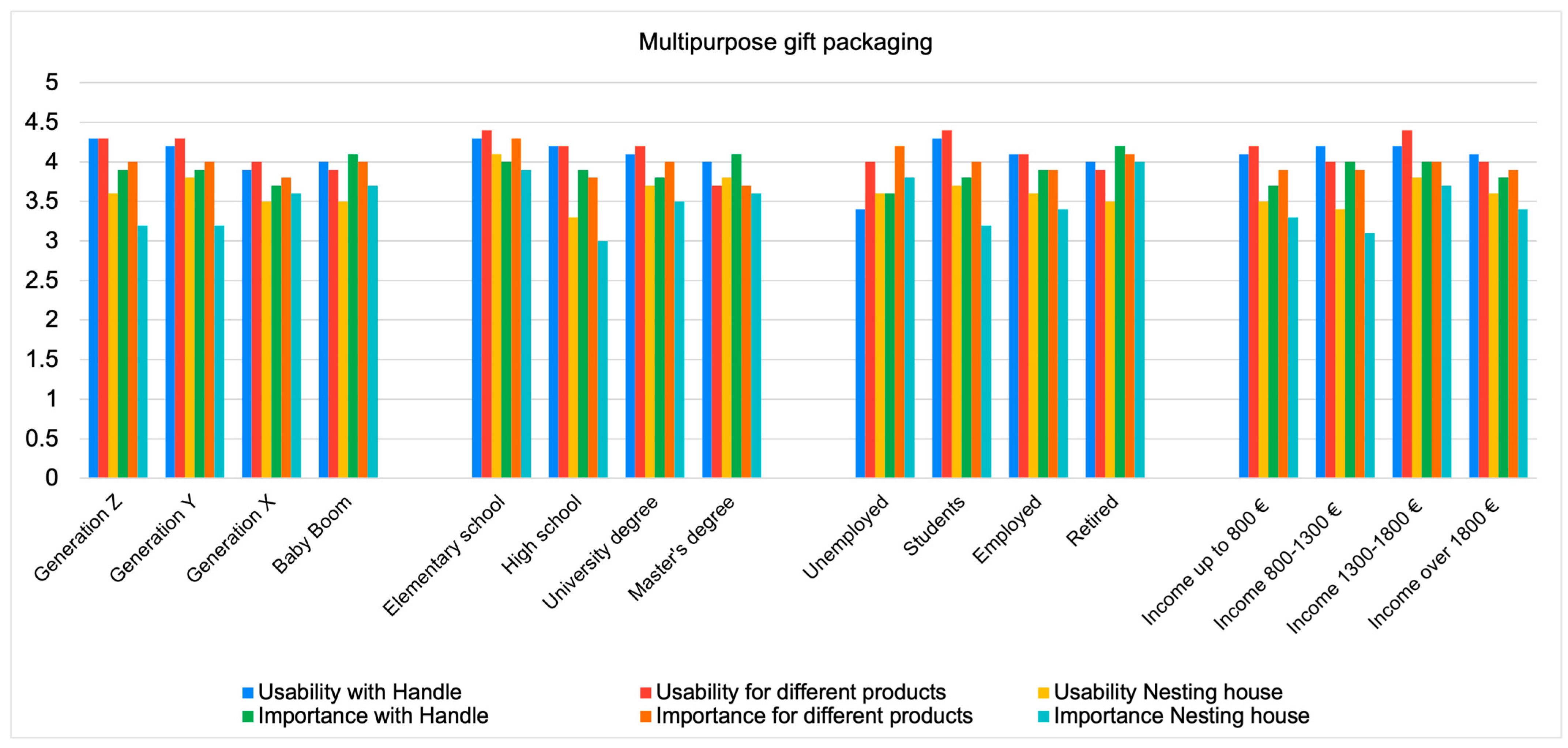
      | Usability | Importance | |||||
|---|---|---|---|---|---|---|
| Handle | For Different Products | Nesting House | Handle | For Different Products | Nesting House | |
| Average rating | 4.1 | 4.2 | 3.6 | 3.9 | 3.9 | 3.4 | 
| Standard deviation | 0.18 | 0.21 | 0.18 | 0.15 | 0.15 | 0.27 | 
| Coefficient of variation [%] | 4.5 | 5.1 | 4.9 | 3.9 | 3.7 | 7.8 | 
| Median | 4.5 | 5 | 4 | 4 | 4 | 4 | 
| Mode | 5 | 5 | 5 | 5 | 5 | 5 | 
| AGE | ||||||
| Generation Z average | 4.3 | 4.3 | 3.6 | 3.9 | 4.0 | 3.2 | 
  | 5 | 5 | 4 | 4 | 4 | 3 | 
  | 5 | 5 | 5 | 5 | 5 | 4 | 
| Generation Y average | 4.2 | 4.3 | 3.8 | 3.9 | 4.0 | 3.2 | 
  | 5 | 5 | 4 | 4 | 4 | 3 | 
  | 5 | 5 | 5 | 3 | 5 | 5 | 
| Generation X average | 3.9 | 4.0 | 3.5 | 3.7 | 3.8 | 3.6 | 
  | 4 | 4 | 4 | 4 | 4 | 4 | 
  | 5 | 5 | 5 | 5 | 5 | 5 | 
| Baby boomer average | 4.0 | 3.9 | 3.5 | 4.1 | 4.0 | 3.7 | 
  | 4 | 4 | 3 | 4 | 4 | 4 | 
  | 5 | 5 | 3 | 5 | 5 | 4 | 
| EDUCATION | ||||||
| Elementary school average | 4.3 | 4.4 | 4.1 | 4.0 | 4.3 | 3.9 | 
  | 5 | 4 | 4 | 4 | 5 | 4 | 
  | 5 | 4 | 4 | 5 | 5 | 3 | 
| High school average | 4.2 | 4.2 | 3.3 | 3.9 | 3.8 | 3.0 | 
  | 5 | 5 | 3 | 4 | 4 | 3 | 
  | 5 | 5 | 2 | 5 | 5 | 2 | 
| University average | 4.1 | 4.2 | 3.7 | 3.8 | 4.0 | 3.5 | 
  | 4 | 5 | 4 | 4 | 4 | 4 | 
  | 5 | 5 | 5 | 5 | 5 | 5 | 
| Master’s degree average | 4.0 | 3.7 | 3.8 | 4.1 | 3.7 | 3.6 | 
  | 4 | 4 | 4 | 4 | 4 | 4 | 
  | 5 | 5 | 5 | 5 | 5 | 5 | 
| EMPLOYMENT | ||||||
| Unemployed average | 3.4 | 4.0 | 3.6 | 3.6 | 4.2 | 3.8 | 
  | 3 | 4 | 3 | 3 | 4 | 5 | 
  | 5 | 5 | 5 | 3 | 4 | 5 | 
| Student average | 4.3 | 4.4 | 3.7 | 3.8 | 4.0 | 3.2 | 
  | 5 | 5 | 4 | 4 | 4 | 3 | 
  | 5 | 5 | 5 | 5 | 5 | 4 | 
| Employed average | 4.1 | 4.1 | 3.6 | 3.9 | 3.9 | 3.4 | 
  | 4 | 5 | 4 | 4 | 4 | 3 | 
  | 5 | 5 | 5 | 5 | 5 | 5 | 
| Retired average | 4.0 | 3.9 | 3.5 | 4.2 | 4.1 | 4.0 | 
  | 4 | 4 | 3 | 4 | 4 | 4 | 
  | 5 | 3 | 3 | 5 | 4 | 4 | 
| INCOME | ||||||
| up to EUR 800 average | 4.1 | 4.2 | 3.5 | 3.7 | 3.9 | 3.3 | 
  | 4 | 4 | 4 | 4 | 4 | 3 | 
  | 5 | 5 | 5 | 5 | 5 | 5 | 
| EUR 800–1300 average | 4.2 | 4.0 | 3.4 | 4.0 | 3.9 | 3.1 | 
  | 5 | 4 | 4 | 4 | 4 | 3 | 
  | 5 | 5 | 4 | 5 | 5 | 2 | 
| EUR 1300–1800 average | 4.2 | 4.4 | 3.8 | 4.0 | 4.0 | 3.7 | 
  | 5 | 5 | 4 | 4,5 | 4 | 4 | 
  | 5 | 5 | 5 | 5 | 4 | 5 | 
| Above EUR 1800 average | 4.1 | 4.0 | 3.6 | 3.8 | 3.9 | 3.4 | 
  | 4 | 4 | 3 | 4 | 4 | 3 | 
  | 5 | 5 | 5 | 3 | 5 | 2 | 
       
    
    Table A2.
    Descriptive statistics—average rating, median, and mode—for label design according to socioeconomic factors.
  
Table A2.
    Descriptive statistics—average rating, median, and mode—for label design according to socioeconomic factors.
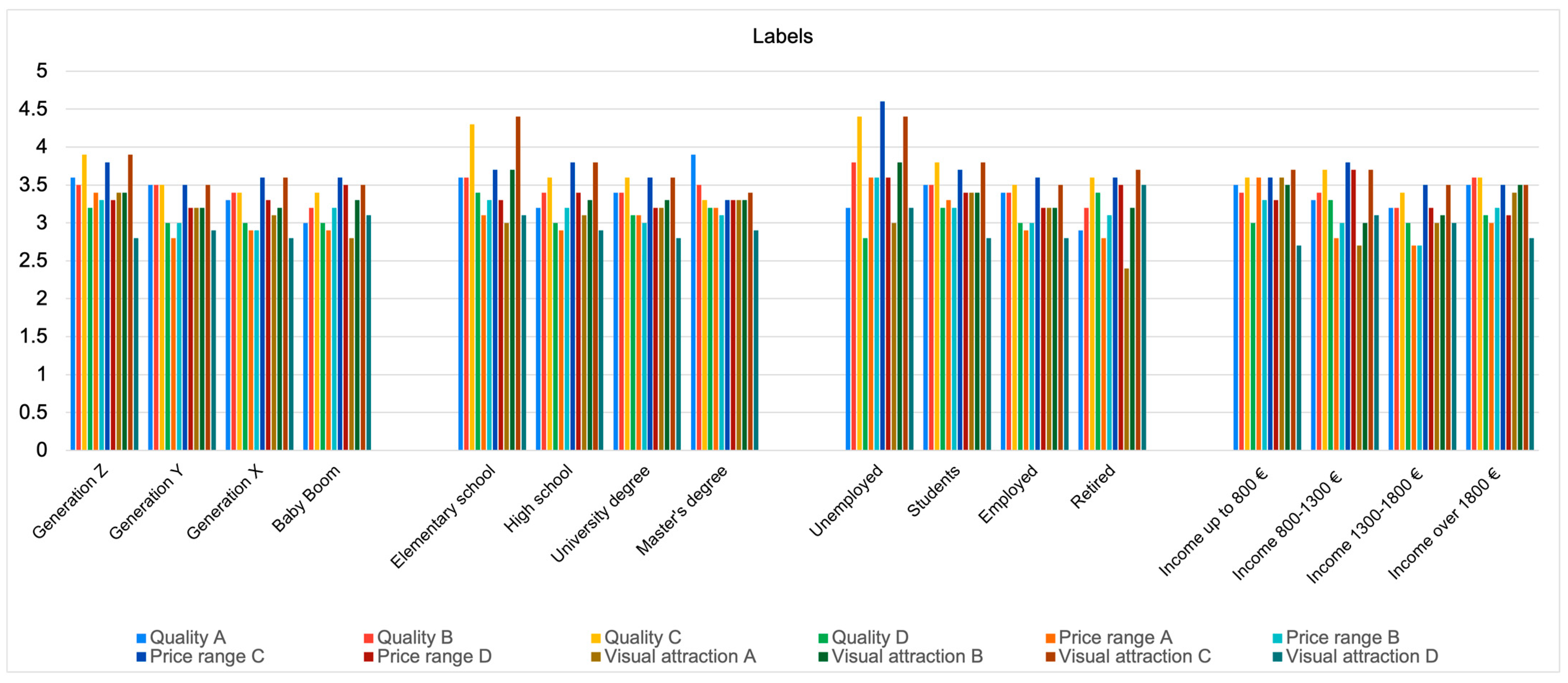
      | Quality | Price Range | Visual Attraction | ||||||||||
|---|---|---|---|---|---|---|---|---|---|---|---|---|
| A | B | C | D | A | B | C | D | A | B | C | D | |
| Generation Z | ||||||||||||
  | 3.6 | 3.5 | 3.9 | 3.2 | 3.4 | 3.3 | 3.8 | 3.3 | 3.4 | 3.4 | 3.9 | 2.8 | 
  | 4 | 4 | 4 | 3 | 3.5 | 3 | 4 | 3.5 | 4 | 3.5 | 4 | 3 | 
  | 4 | 4 | 5 | 4 | 5 | 3 | 5 | 4 | 4 | 4 | 5 | 2 | 
| Generation Y | ||||||||||||
  | 3.5 | 3.5 | 3.5 | 3 | 2.8 | 3 | 3.5 | 3.2 | 3.2 | 3.2 | 3.5 | 2.9 | 
  | 4 | 3.5 | 3.5 | 3 | 3 | 3 | 3.5 | 3 | 3 | 3 | 3.5 | 3 | 
  | 4 | 3 | 3 | 3 | 2 | 3 | 3 | 4 | 3 | 3 | 3 | 3 | 
| Generation X | ||||||||||||
  | 3.3 | 3.4 | 3.4 | 3 | 2.9 | 2.9 | 3.6 | 3.3 | 3.1 | 3.2 | 3.6 | 2.8 | 
  | 3 | 3 | 3 | 3 | 3 | 3 | 4 | 3 | 3 | 3 | 4 | 3 | 
  | 3 | 4 | 3 | 3 | 3 | 3 | 3 | 3 | 3 | 3 | 5 | 3 | 
| Baby boomer | ||||||||||||
  | 3 | 3.2 | 3.4 | 3 | 2.9 | 3.2 | 3.6 | 3.5 | 2.8 | 3.3 | 3.5 | 3.1 | 
  | 3 | 3 | 3 | 3 | 3 | 3 | 4 | 4 | 3 | 4 | 4 | 3 | 
  | 3 | 3 | 3 | 3 | 4 | 3 | 4 | 4 | 1 | 4 | 4 | 3 | 
| Elementary school | ||||||||||||
  | 3.6 | 3.6 | 4.3 | 3.4 | 3.1 | 3.3 | 3.7 | 3.3 | 3 | 3.7 | 4.4 | 3.1 | 
  | 4 | 3 | 4 | 4 | 3 | 4 | 3 | 3 | 3 | 4 | 5 | 3 | 
  | 2 | 3 | 4 | 4 | 2 | 4 | 3 | 3 | 3 | 4 | 5 | 3 | 
| High school | ||||||||||||
  | 3.2 | 3.4 | 3.6 | 3 | 2.9 | 3.2 | 3.8 | 3.4 | 3.1 | 3.3 | 3.8 | 2.9 | 
  | 3 | 3 | 4 | 3 | 3 | 3 | 4 | 4 | 3 | 3 | 4 | 3 | 
  | 3 | 3 | 5 | 3 | 3 | 3 | 4 | 4 | 3 | 3 | 5 | 3 | 
| University | ||||||||||||
  | 3.4 | 3.4 | 3.6 | 3.1 | 3.1 | 3 | 3.6 | 3.2 | 3.2 | 3.3 | 3.6 | 2.8 | 
  | 3 | 4 | 4 | 3 | 3 | 3 | 4 | 3 | 3 | 3 | 4 | 3 | 
  | 3 | 4 | 3 | 3 | 3 | 3 | 3 | 4 | 4 | 4 | 5 | 2 | 
| Master’s degree | ||||||||||||
  | 3.9 | 3.5 | 3.3 | 3.2 | 3.2 | 3.1 | 3.3 | 3.3 | 3.3 | 3.3 | 3.4 | 2.9 | 
  | 4 | 4 | 3 | 3 | 3 | 3 | 3 | 3 | 3 | 3 | 4 | 3 | 
  | 4 | 4 | 3 | 4 | 3 | 3 | 3 | 3 | 3 | 4 | 4 | 3 | 
| Unemployed | ||||||||||||
  | 3.2 | 3.8 | 4.4 | 2.8 | 3.6 | 3.6 | 4.6 | 3.6 | 3 | 3.8 | 4.4 | 3.2 | 
  | 4 | 4 | 5 | 3 | 4 | 4 | 5 | 4 | 3 | 4 | 5 | 4 | 
  | 4 | 3 | 5 | 3 | 4 | 4 | 5 | 4 | 3 | 5 | 5 | 4 | 
| Student | ||||||||||||
  | 3.5 | 3.5 | 3.8 | 3.2 | 3.3 | 3.2 | 3.7 | 3.4 | 3.4 | 3.4 | 3.8 | 2.8 | 
  | 4 | 4 | 4 | 3 | 3 | 3 | 4 | 4 | 4 | 3.3 | 4 | 3 | 
  | 4 | 4 | 5 | 4 | 5 | 3 | 5 | 4 | 4 | 4 | 5 | 4 | 
| Employed | ||||||||||||
  | 3.4 | 3.4 | 3.5 | 3 | 2.9 | 3 | 3.6 | 3.2 | 3.2 | 3.2 | 3.5 | 2.8 | 
  | 3 | 3 | 3 | 3 | 3 | 3 | 4 | 3 | 3 | 3 | 4 | 3 | 
  | 3 | 3 | 3 | 3 | 3 | 3 | 3 | 4 | 3 | 3 | 3 | 3 | 
| Retired | ||||||||||||
  | 2.9 | 3.2 | 3.6 | 3.4 | 2.8 | 3.1 | 3.6 | 3.5 | 2.4 | 3.2 | 3.7 | 3.5 | 
  | 3 | 3 | 4 | 3 | 3 | 3 | 4 | 3 | 3 | 4 | 4 | 3 | 
  | 3 | 3 | 3 | 3 | 4 | 3 | 4 | 3 | 1 | 4 | 4 | 3 | 
| Income up to EUR 800 (net) | ||||||||||||
  | 3.5 | 3.4 | 3.6 | 3 | 3.6 | 3.3 | 3.6 | 3.3 | 3.6 | 3.5 | 3.7 | 2.7 | 
  | 4 | 4 | 3.5 | 3 | 4 | 3 | 4 | 4 | 4 | 4 | 4 | 3 | 
  | 4 | 4 | 3 | 3 | 5 | 3 | 5 | 4 | 4 | 4 | 5 | 2 | 
| Income EUR 800–1300 (net) | ||||||||||||
  | 3.3 | 3.4 | 3.7 | 3.3 | 2.8 | 3 | 3.8 | 3.7 | 2.7 | 3 | 3.7 | 3.1 | 
  | 3 | 3 | 4 | 3 | 3 | 3 | 4 | 4 | 3 | 3 | 4 | 3 | 
  | 4 | 3 | 4 | 3 | 1 | 3 | 4 | 4 | 3 | 4 | 4 | 3 | 
| Income EUR 1300–1800 (net) | ||||||||||||
  | 3.2 | 3.2 | 3.4 | 3 | 2.7 | 2.7 | 3.5 | 3.2 | 3 | 3.1 | 3.5 | 3 | 
  | 3 | 3 | 3 | 3 | 3 | 3 | 3 | 3 | 3 | 3 | 4 | 3 | 
  | 3 | 3 | 3 | 3 | 3 | 3 | 3 | 3 | 3 | 3 | 5 | 4 | 
| Income over EUR 1800 (net) | ||||||||||||
  | 3.5 | 3.6 | 3.6 | 3.1 | 3 | 3.2 | 3.5 | 3.1 | 3.4 | 3.5 | 3.5 | 2.8 | 
  | 3 | 4 | 4 | 3 | 3 | 3 | 3 | 3 | 3 | 3 | 4 | 3 | 
  | 3 | 4 | 4 | 4 | 3 | 3 | 3 | 3 | 3 | 3 | 4 | 3 | 
       
    
    Table A3.
    Descriptive statistics—average rating, median, and mode—for interactive label design according to socioeconomic factors.
  
Table A3.
    Descriptive statistics—average rating, median, and mode—for interactive label design according to socioeconomic factors.
      | Quality of Animation | Visual Appeal | Usability and Practical Value | Ease of Use | Overall Satisfaction | |
|---|---|---|---|---|---|
| Generation Z | |||||
  | 4.3 | 3.7 | 3.5 | 4.2 | 4.1 | 
  | 5 | 4 | 4 | 4 | 4 | 
  | 5 | 4 | 4 | 5 | 5 | 
| Generation Y | |||||
  | 3.7 | 3.8 | 3.3 | 3.6 | 3.7 | 
  | 3.5 | 3.5 | 3 | 4 | 4 | 
  | 5 | 3 | 3 | 4 | 5 | 
| Generation X | |||||
  | 3.9 | 3.7 | 3.2 | 3.4 | 3.5 | 
  | 4 | 4 | 3 | 3 | 4 | 
  | 4 | 4 | 4 | 4 | 4 | 
| Baby boomer | |||||
  | 3 | 3 | 2.6 | 2.6 | 2.8 | 
  | 3 | 3 | 3 | 3 | 3 | 
  | 4 | 4 | 3 | 3 | 3 | 
| Elementary school | |||||
  | 4.5 | 4 | 3 | 4.5 | 4.5 | 
  | 4.5 | 4 | 3 | 4.5 | 4.5 | 
  | 5 | 4 | 3 | 4 | 4 | 
| High school | |||||
  | 3.4 | 3.4 | 2.6 | 3.1 | 3 | 
  | 3 | 3 | 2.5 | 3 | 3 | 
  | 3 | 2 | 2 | 2 | 3 | 
| University | |||||
  | 3.9 | 3.7 | 3.4 | 3.7 | 3.7 | 
  | 4 | 4 | 4 | 4 | 4 | 
  | 4 | 4 | 4 | 4 | 4 | 
| Master’s degree | |||||
  | 4.7 | 4.3 | 3.7 | 3.7 | 4 | 
  | 5 | 4.5 | 4 | 4 | 4.5 | 
  | 5 | 5 | 4 | 4 | 5 | 
| Unemployed | |||||
  | 4.6 | 4.6 | 2 | 2 | 2 | 
  | 5 | 5 | 2 | 2 | 2 | 
  | 5 | 5 | 1 | 2 | 2 | 
| Student | |||||
  | 4.2 | 3.5 | 3.4 | 4.2 | 3.9 | 
  | 4.5 | 4 | 3 | 4.5 | 4 | 
  | 5 | 4 | 2 | 5 | 5 | 
| Employed | |||||
  | 3.9 | 3.7 | 3.3 | 3.5 | 3.7 | 
  | 4 | 4 | 3 | 4 | 4 | 
  | 5 | 4 | 4 | 4 | 4 | 
| Retired | |||||
  | 2.7 | 2.8 | 2.6 | 2.3 | 2.3 | 
  | 3 | 3 | 3 | 3 | 3 | 
  | 3 | 2 | 3 | 3 | 3 | 
| Income up to EUR 800 (net) | |||||
  | 4.2 | 3.4 | 3.4 | 4.4 | 4.1 | 
  | 5 | 4 | 3 | 5 | 4 | 
  | 5 | 2 | 2 | 5 | 5 | 
| Income EUR 800–1300 (net) | |||||
  | 3.1 | 3.1 | 2.9 | 3 | 3 | 
  | 3.5 | 3.5 | 3 | 3 | 3 | 
  | 4 | 4 | 4 | 3 | 3 | 
| Income EUR 1300–1800 (net) | |||||
  | 4.1 | 4 | 3.3 | 3.7 | 3.8 | 
  | 4 | 4 | 3 | 4 | 4 | 
  | 5 | 4 | 4 | 3 | 4 | 
| Income over EUR 1800 (net) | |||||
  | 3.8 | 3.7 | 3.1 | 3.3 | 3.6 | 
  | 4 | 4 | 3 | 4 | 4 | 
  | 5 | 4 | 4 | 4 | 4 | 
References
- Pogačar, A. Smernice za Načrtovanje Interaktivne Trajnostne Darilne Embalaže/Design Guidelines for Interactive Sustainable gift Packaging. Ph.D. Thesis, University of Ljubljana, Ljubljana, Slovenia, 2023. [Google Scholar]
 - Gift Packaging Market Report Summaries. Fortune Business Insights. 2023. Available online: https://www.fortunebusinessinsights.com/gift-packaging-market-103892 (accessed on 17 December 2024).
 - Celhay, F.; Cheng, P.; Masson, J.; Li, W. Package graphic design and communication across cultures: An investigation of Chinese consumers’ interpretation of imported wine labels. Int. J. Res. Mark. 2020, 37, 108–128. [Google Scholar] [CrossRef]
 - Gift Packaging Market Size, Share, and Trends 2024 to 2033, Precedence Research, 17. 6. 2024. Available online: https://www.precedenceresearch.com/gift-packaging-market?utm_source=chatgpt.com (accessed on 17 December 2024).
 - Raithatha, C. Pack(ag)ing a punch. Food Sci. Technol. 2020, 34, 35–37. [Google Scholar]
 - Afif, K.; Rebolledo, C.; Roy, J. Drivers, barriers and performance outcomes of sustainable packaging: A systematic literature review. Br. Food J. 2022, 124, 915–935. [Google Scholar] [CrossRef]
 - Brezet, H. Dynamics in Eco-design practice. Ind. Environ. 1997, 20, 21–24. [Google Scholar]
 - Pogačar, A.; Gregor-Svetec, D. Innovative multipurpose gift packaging. In Book of Proceedings: 9th International Joint Conference on Environmental and Light Industry Technologies, Budapest, Hungary, 10 November 2023; Óbuda University, Sándor Rejtő Faculty of Light Industry and Environmental Engineering: Budapest, Hungary, 2024; pp. 63–73. Available online: https://rkk.uni-obuda.hu/wp-content/uploads/2023/08/Book-of-Proceedings_IJCELIT-2023.pdf (accessed on 10 December 2024).
 - Azzi, A.; Battini, D.; Persona, A.; Sgarbossa, F. Packaging Design: General Framework and Research Agenda. Packag. Technol. Sci. 2012, 25, 435–456. [Google Scholar] [CrossRef]
 - Oloyede, O.O.; Lignou, S. Sustainable Paper-Based Packaging: A Consumer’s Perspective. Foods 2021, 10, 1035. [Google Scholar] [CrossRef]
 - Vila-Lopez, N.; Küster-Boluda, I. A bibliometric analysis on packaging research: Towards sustainable and healthy packages. Br. Food J. 2021, 123, 684–701. [Google Scholar] [CrossRef]
 - Ibrahim, I.D.; Hamam, Y.; Sadiku, E.R.; Ndambuki, J.M.; Kupolati, W.K.; Jamiru, T.; Eze, A.A.; Snyman, J. Need for Sustainable Packaging: An Overview. Polymers 2022, 14, 4430. [Google Scholar] [CrossRef]
 - Hussain, S.; Akhter, R.; Maktedar, S.S. Advancements in sustainable food packaging: From eco-friendly materials to innovative technologies. Sustain. Food Technol. 2024, 2, 1297–1364. [Google Scholar] [CrossRef]
 - Lindh, H.; Olsson, A.; Williams, H. Consumer Perceptions of Food Packaging: Contributing to or Counteracting Environmentally Sustainable Development? Packag. Technol. Sci. 2016, 29, 3–23. [Google Scholar] [CrossRef]
 - Fernqvist, F.; Olsson, A.; Spendrup, S. What’s in it for me? Food packaging and consumer responses, a focus group study. Br. Food J. 2015, 117, 1122–1135. [Google Scholar] [CrossRef]
 - Steenis, N.D.; van Herpen, E.; van der Lans, I.A.; Ligthart, T.N.; van Trijp, H.C.M. Consumer response to packaging design: The role of packaging materials and graphics in sustainability perceptions and product evaluations. J. Clean. Prod. 2017, 162, 286–298. [Google Scholar] [CrossRef]
 - Branca, G.; Resciniti, R.; Babin, B.J. Sustainable packaging design and the consumer perspective: A systematic literature review. Ital. J. Mark. 2024, 12, 77–111. [Google Scholar] [CrossRef]
 - Li, O.; Zeng, X.; Ling, J. Influence Factors of Green Packaging on Consumers’ Willingness to Accept Festive Gifts. In Proceedings of the HCI International 2023 Posters, Copenhagen, Denmark, 26–28 July 2023; HCII 2023. Stephanidis, C., Antona, M., Ntoa, S., Salvendy, G., Eds.; Communications in Computer and Information Science. Springer: Cham, Switzerland, 2023; Volume 1835. [Google Scholar] [CrossRef]
 - Magnier, L.; Crié, D. Communicating packaging eco-friendliness: An exploration of consumers’ perceptions of eco-designed packaging. Int. J. Retail Distrib. Manag. 2015, 43, 350–366. [Google Scholar] [CrossRef]
 - Magnier, L.; Schoormans, J.; Mugge, R. Judging a product by its cover. Packaging sustainability and perceptions of quality in food products. Food Qual. Prefer. 2016, 53, 132–142. [Google Scholar] [CrossRef]
 - Ares, G.; Piqueras-Fiszman, B.; Varela, P.; Marco, R.M.; Lopez, A.M.; Fiszman, S. Food labels: Do consumers perceive what semiotics want to convey? Food Qual. Prefer. 2011, 22, 689–698. [Google Scholar] [CrossRef]
 - Žurbi, T. Pametna Embalaža ZA Prehrambene Izdelke in Njen Vpliv NA Potrošnika/Smart Packaging for Food Products and Its Impact on the Consumers. Ph.D. Thesis, University of Ljubljana, Ljubljana, Slovenia, 2023. [Google Scholar]
 - Crilly, N.; Moultrie, J.; Clarkson, P.J. Seeing things: Consumer response to the visual domain in product design. Des. Stud. 2004, 25, 547–577. [Google Scholar] [CrossRef]
 - Halabi, K.N.M.; Hands, D. Identifying and Aligning Product ‘Attributes’ with Latent Consumer Purchase Motivations. Asian J. Soc. Sci. Manag. Stud. 2018, 5, 16–22. [Google Scholar] [CrossRef]
 - Yuting, T.; Mohamed, F. Examining Consumer Perception and Purchase Intention of Gift Packaging: A Case Study of Chinese Consumers on Green Tea Packaging. Int. J. Acad. Res. Bus. Soc. Sci. 2023, 13, 702–712. [Google Scholar] [CrossRef]
 - Liu, L.; Cheng, X. Material Application and Structural Features in the Design of Sales Packaging. In Proceedings of the 2nd International Conference on Culture, Design and Social Development (CDSD 2022), Nanjing, China, 2–4 December 2022; Atlantis Press: Amsterdam, The Netherlands, 2023; pp. 506–512. [Google Scholar]
 - Liu, L.; Wang, A. Measures for Excessive Application of Gift Packaging Design Materials. In Proceedings of the 2nd International Conference on Culture, Design and Social Development (CDSD 2022), Nanjing, China, 2–4 December 2022; Atlantis Press: Amsterdam, The Netherlands, 2023; pp. 296–302. [Google Scholar]
 - Pogačar, A.; Gregor-Svetec, D. Design of Eco-Friendly Label. In Proceedings of the 9th Conference on Information and Graphic Arts Technology, Ljubljana, Slovenia, 11–12 April 2024; University of Ljubljana, Faculty of Natural Sciences and Engineering: Ljubljana, Slovenia, 2024; pp. 49–57. [Google Scholar]
 - Orth, U.R.; Malkewitz, K. The accuracy of design-based judgments: A constructivist approach. J. Retail. 2012, 88, 421–436. [Google Scholar] [CrossRef]
 - Spence, C.; Velasco, C.; Petit, O. The Consumer Neuroscience of Packaging. In Multisensory Packaging; Velasco, C., Spence, C., Eds.; Springer: Cham, Switzerland, 2019; pp. 319–347. [Google Scholar]
 - Karjalainen, T.M.; Snelders, D. Designing visual recognition for the brand. J. Prod. Innov. Manag. 2010, 27, 6–22. [Google Scholar] [CrossRef]
 - Shukla, P.; Singh, J.; Wang, W. The influence of creative packaging design on customer motivation to process and purchase decisions. J. Bus. Res. 2022, 147, 338–347. [Google Scholar] [CrossRef]
 - Holmes, G.R.; Paswan, A. Consumer reaction to new package design. J. Prod. Brand Manag. 2012, 21, 109–116. [Google Scholar] [CrossRef]
 - Ilich, K.L.; Hardey, M. It’s all about the packaging: Investigation of the motivations, intentions, and marketing implications of sharing photographs of secondary packaging on Instagram. Inf. Commun. Soc. 2020, 23, 1–19. [Google Scholar] [CrossRef]
 
Disclaimer/Publisher’s Note: The statements, opinions and data contained in all publications are solely those of the individual author(s) and contributor(s) and not of MDPI and/or the editor(s). MDPI and/or the editor(s) disclaim responsibility for any injury to people or property resulting from any ideas, methods, instructions or products referred to in the content.  | 
© 2025 by the authors. Licensee MDPI, Basel, Switzerland. This article is an open access article distributed under the terms and conditions of the Creative Commons Attribution (CC BY) license (https://creativecommons.org/licenses/by/4.0/).